Guest Post by Willis Eschenbach
An online friend of mine alerted me to a curious change in the Greenland Ice Sheet. From the Danish Polar Portal, here are two of their graphics.

Figure 1. Surface Mass Balance (SMB), polar year 2022-2023.
The Polar Portal site says:
The blue curve shows the current season’s surface mass balance measured in gigatonnes (1 Gt is 1 billion tonnes and corresponds to 1 cubic kilometre of water).
The dark grey curve traces the mean value from the period 1981-2010.
The light grey band shows differences from year to year. For any calendar day, the band shows the range over the 30 years (in the period 1981-2010), however with the lowest and highest values for each day omitted.
And what is the surface mass balance (SMB) when it’s at home? Again from the Polar Portal.
The difference between snowfall and runoff is known as the SURFACE mass balance. It is always positive over the course of a year as not all fallen snow runs off the ice sheet again.
The surface mass balance is NOT identical to the TOTAL mass balance (i.e. overall gain or loss of the ice cap), which also includes the mass that is lost when glaciers calve off icebergs, the melting of glacier tongues as they come into contact with warm seawater and frictional and other effects at the bottom of the ice sheet.
From my perspective, the oddity is that despite the warmer-than-usual conditions of the North Atlantic for this time of year, the surface mass balance has grown more than at any time in the period 1981-2010. Go figure.
One thing you can depend on the weather to do, and that is, it won’t do what you depend on it to do …
However, this is just the surface mass balance (SMB). The total mass of the Greenland Ice Sheet continues to decline. And here’s where the graphic trickery comes into play. Folks like the Polar Portal are more than happy to show graphs of the cumulative loss of Greenland ice.

Figure 2. Polar Portal graph of ice loss since 2003
Looking for a longer dataset, here’s one I made, based on the British Antarctic Survey (IMBIE) data. Of course, I couldn’t make it all boring like most graphs. I like my graphs to be little works of art.

Figure 3. Cumulative ice mass loss since 1992, Greenland.
YIKES! At the rate that it’s falling, we’re clearly about to lose the Greenland Ice Cap entirely …
… however, this is just the loss. What kind of difference does this make to the total mass of the Greenland Ice Sheet? Figure 4 shows that change.

Figure 4. Change in total Greenland ice mass, 1992-2021.
Once again, it looks like we’re on the brink of a precipice.
However, there’s still one small detail to take into account. When we’re looking at totals of things, like changes in the total Greenland ice mass, it’s important that the vertical “Y” axis starts at zero. This is called a “zero-based” graph, and in the wonderful world of climate science, they’re pretty rare. Figure 5 shows why the alarmists don’t like them.

Figure 5. Zero-based graph of the change in total Greenland ice mass, 1992-2021. Note that this is the exact same data as in Figure 4 just above.
Whew! Looks like the catastrophe is averted. And in fact, if Greenland continues to lose ice at the current rate, it will all be gone around the year 14700AD.
[After comments, edited to add …] Are there times when non-zero-based graphs are appropriate? Absolutely. We need both kinds of graphs. But far too often these days, non-zero-based graphs are just used to frighten folks who are unaware of the relative sizes of things.
Puts me in mind of the old joke. A scientist says “The sun will go nova in five billion years”. One of the people in the audience stands up and says “What! That’s terrifying! What did you say?”
The scientist repeats his statement, and the man says “Oh, thank heavens. I figured I was gonna have to change my lifestyle. I thought you said five million years!”
Crazy world, crazy tune …
Regards to all, h/t to David Hart,
w.
Yeah, I know you’ve heard it before: When you comment, please quote the exact words you are referring to. It avoids all kinds of misunderstandings.
The zero based graph is classic.
About halfway through the melt season, Arctic sea ice extent was at its highest on yesterday’s date since 2015. Over the past decade, since its record summer low of 2012, only 2013 and 2014 were higher. So 2023 was the third highest of the previous 13 years, as 2011 and 2010 were also lower on that date.
The year since 2015 closest to this year’s was 2022, and 2021 was also close, so the current young decade is shaping up to achieve a higher average low than in 2011-20. That would be hard for alarmists to explain.
https://nsidc.org/arcticseaicenews/charctic-interactive-sea-ice-graph/
The September minimum of course depends upon what happens in late summer. Arctic cyclones in August and/or September could spread out and pile up the floes, as happened in 2007, 2012 and 2016 (with cyclones in both months).
yes, thin ice negative feedback
Still way above what it has been for most of the last 8000 years.
Oh the marketing guy cosplaying as a Berkeley scientist is here.
I’m sure Most was intending to be sarcastic, but he’s accidentally, for once said something accurate.
In the arctic, the loss of sea ice is definitely a negative feedback, a strong negative feedback.
The loss of sea ice makes it much easier for the heat in the oceans to escape into space and for the portion of the year where there is actually sun shine on those waters, at the low angles of the sun means most of the energy is reflected off the water, it isn’t absorbed by the water.
In fact given how quickly ice can get dirty, it’s possible that the dirty ice actually absorbs more solar energy than the water does.
That would be hard for alarmists to explain.
not really hard its thin ice negative feedback
Satellite observations of ice thickness for May to September are unavailable for 2021-23. Since extent has grown since 2020, thickness probably has as well.
If the numbers are unavailable, it’s a pretty sure bet that they would be contrary to the narrative that was handed to Mosher and Stokes.
Much as I suspected!
The DMI have automated wether stations across Greenland. I did a brief survey today of those reporting data, for various reasons they don’t always, I couldn’t find one above freezing even coastal sites in the south.
PROMICE Sites
For those like Willis there’s a data portal
This week I watched David Dilley’s video on global cooling. I think his explanations are good.
The sun won’t go nova in five billion years. It will go red giant.
An Overbloated underradiant stellar mass much like the U.S.Government
Whatever … I just hope it’s not on a weekend.
Yeah, that would suck. Worse than being rainy.
Although it might not matter much, as most likely any life left on Earth then would be subterranean.
Plans are already in hand to use Ceres to transfer gravitational potential from Jupiter to Earth by orbiting it between both.
Apparently, one passage every 5000 years or so is enough to cause Earth to slowly move out from the sun, to keep pace with the solar expansion. Jupiter would move closer in to compensate, of course, but probably won’t notice the difference.
Assuming we’re around in a few billion years, and haven’t gone decadent, we’d likely have the means to do the rescue.
Not that we’d need Earth anymore, but the neo-lions, -tigers, and -bears, Oh my! probably would appreciate the lift.
Also possible that Earth’s orbit might move outside the red giant’s engulfing radius as the Sun loses mass. But still too close for comfort.
You’re right though that our descendant species or some other terrestrial species would by then king have left Earth to colonize the solar system and galaxy.
Earth’s surface should become uninhabitable for multicellular life in about 500 million years without heroic intervention by highly advanced beings. We’re about halfway through the complex life capacity of unenhanced Earth.
Isn’t that about when the Milky Way Galaxy begins colliding with Andromeda Galaxy?
Maybe we won’t notice what happens to our red giant solar mass?
Forecast to start in about 4.5 billion years. Unlikely that any indivdual stars will collide, but some could be ejected from each galaxy. That would be exciting.
An extra-galactic rollercoaster ride.
Do both galaxies have supermassive black holes at the centre? Will they collide, pass like ships in the night, or start to orbit each other?
They’re liable to merge, with dire consequences for masses in the area:
https://www.scientificamerican.com/article/colliding-supermassive-black-holes-discovered-in-nearby-galaxy/
Wha-ha-haa! One of my favourite bovine patties, the ole’ colliding galaxies. Have you ever wondered; in a universe originating from a ginormous explosion, with matter flying away and “accelerating” as it does so, please riddle me this: Did Andromeda forget to go pee-pee before she got onto the bus, and now she turned around before she wees in her pants?
How does shrapnel from an explosion reverse course?
Or is the Big Bang perhaps just an excuse for reality differing from the Model, like Black Holes and Dark Matter?
Discuss…
Dude, it’s a JOKE!
As if I didn’t know.
Oh, don’t worry about that. Andromeda and the Milkyway will have their initial collision in about 4.5 billion years. Yes, I know that stars are far apart and odds are it may not effect earth much, but then again it might. And thus the governments of the world need to be working on some solution. [sarc]
classically wrong as it hides information
Or just revises it from the panic narrative. Not bupkis is still not bupkis, and making that clear is information.
That’s a funny way of spelling “provides the context necessary to properly assess the information”, mosh.
Mosh, your drive-by shootings are getting terminally boring.
NOTHING is “hidden” in Figure 5. It’s merely shown as a proportion of the total.
In the other Figures, the relative size of the loss is wildly exaggerated, which is fine if you want to convey panic, but not useful for conveying information in context.
Regards,
w.
Willis, “How to Lie with Statistics” (Darrell Huff) was written a long time ago now.
You seem like the person with the right mix of attitude and ability to produce a modern update. I would buy that book.
yes the original alarmist graph hides information.
It is a deliberate misrepresentation, as all alarmist crapola is.
Did you know that Greenland ice extent is only just a small amount down from its highest extent in some 8000 + years !
Well the current Greenland seaice area is ~1,750,000 m^2 which doesn’t make that graph, perhaps you should follow Willis’s advice about scaling?
The anomaly also hides information. The only difference is that the anomaly is politically useful for those who want to panic the populace into supporting their position.
Yes. Yes, you are.
The information is the same, so how is it “hiding it”?
Mosh doesn’t like it because its shows just how INSIGNIFICANT the gravity measured change really is.
Just like a proper graph of world temperature, (even those measured in urban areas and at airports then adjusted upwards), would show just how INSIGNIFICANT it really is.
Willis,
Figure 4 is missing.
Must be in a figure 4 headlock and going to sleep
Thanks, Ed, fixed.
w.
There is a great little book titled “How to lie with statistics” published in the 1950’s and still in print last I knew, for good reason. It calls this a “truncated graph”.
Common and deceptive.
Good posting, Willis. Looks like the CAGW crowd fits into the Mark Twain (or Benjamin Desrali?) quote “there are three kinds of lies: lies, damned lies, and statistics”. Glad to see you go after statistics in a professional way.
I don’t believe for a second we have the ability to measure ice, snow and runoff that accurately.
But some think you can dig deep into ice and determine what the temperature was thousands of years ago.Sounds bonkers to me.
For polar ice cores there is a fairly reliable method, the ratio of 16O (light) to 18O (heavy) in the ice (water). 16O evaporates more easily 18O condenses more easily. So at high latitudes, the lower the 18O the colder it was. The temperature ratio calibration is done in the lab, the resulting ratio scale then applied to the ice core along its length.
Rud, OK, but how accurate can this be? And, I’d think (not being a scientist) that many measurements would be needed – then some sophisticated statistics applied as to variance, etc. I can’t imagine that this method could do much more than get close to the true figure. I should think there must be lots of problems with this- such as migration of molecules, packing, melting, whatever. Perhaps it’s better than using tree rings as thermometers, but how much better?
According to NSIDC, at high latitudes it’s good to maybe 0.5C. Which for a proxy record is quite good enough. Unlike tree rings, there are no other influences to consider.
The natural ratio is about 1000/1. So fairly robust as modern Mass spec can determine much lower 18O ratios. And again, the ratio/T calibration is done in the lab under tightly controlled experimental conditions: sea water, varying temperature rates of evaporation and condensation. No such lab controls are available for tree rings influences by light and water in addition to temperature.
You want to learn more, the NSIDC discussion is not just thorough, it’s referenced. Worth a gander. I have for over a decade been researching the reliability of all paleoclimate proxies, and the ‘cheats’ thereto. Not at McIntyre level of paleoproxy expertise, but now good enough for most purposes.
OK, interesting- thanks. Good enough to know that Mann’s hockey stick is a misrepresentation of the truth?
Yup for sure.
Another NSIDC learning. There is a second similar method using the H/D ratios of the hydrogen in ice water. The problem is that although much more precise (1H compared to 2D) it is much less accurate since there is so little D compared to so much H. And you would have to correct for the 16O/18O thing via prior water electrolysis.
Since D is so rare (6500H/1D), they do not even bother correcting it using the O relative isotope method—results in an uncertainty of (1000/6500) 15%. Plausible snowfall weather scenarios make up most of the O isotope metric uncertainty (like how much precipitation before the weather system snowed on Greenland?).
Just melt the core ice sample, throw its water into a mass spec, then simply count light/heavy water molecules. Good enough.
IIRC, the Poimas data comes from gravity-based measurements…
It just so happens that Greenland sits over part of the active Iceland magma sac.
Yeah . . . kinda like the third and fourth graphs down (the red-on-black ones) on the right border of this webpage that are under the title “NASA GISS 1880 – 2022 | Anomaly vs. Absolute Temperature”.
“In life, one need keep all things in the proper perspective.”
Great post, as usual!
Here is a rare issue where I disagree with the great Edward Tufte.
”In general, in a time-series, use a baseline that shows the data not the zero point. If the zero point reasonably occurs in plotting the data, fine. But don’t spend a lot of empty vertical space trying to reach down to the zero point at the cost of hiding what is going on in the data line itself. (The book, ‘How to Lie With Statistics’, is wrong on this point.)”
https://www.edwardtufte.com/bboard/q-and-a-fetch-msg?msg_id=00003q’
He is right about the problem, but ignores the obvious solution: show an index or percent change. Which is best depends on the nature of the phenomenon graphed and the audience,
Let us, for the sake of argument, assume that the data is correct as presented. While claiming nothing about the significance of the year to year differences, how can it be argued that if a graph be useful for anything relative to the topic, presenting the graph so that the differences over time are clearly visible, such as in figures 3 and 4, isn’t a valid method? Obviously the data could also be made clear on figure 5, by expanding the vertical axis enough to make the year to year differences clearly visible. The graph would, however, be rather unwieldy. Both versions of graphs are needed for the entire story.
The government doesn’t want you to get the entire story. It would interfere with them increasing their control of your life and livelihood.
This article is for ‘the government’?
The advantage of showing the change over time in terms of an index or percent change is that it shows both the relative size of the change and the trend. Whereas the straight line (like figure 5) does only the first.
A strong trend is often a useful signal that this is worth watching.
A deminumus change to a huge quantity is not a useful signal for any sort of decisionmaking.
Dave,
Excellent response!
Actually, you know why is that Willis, since you recently published how snow cover in Greenland has been increasing over time and it is at an all-time high. More snow means a higher surface mass balance. And a warmer ocean produces more evaporation and brings more moisture to Greenland, which then precipitates as snow.
And it has only just begun, about 10,000 years to go. A lot more of the North Atlantic and North Pacific will hit the 30C temperature limit before the snowfall overtakes the snow melt.
Heat_Ice_Stores.pdf
Arabian Sea and Bay of Bengal are now into cyclic convective instability after overshooting the 30C limit:
https://earth.nullschool.net/#current/wind/surface/level/overlay=cape/orthographic=-287.21,12.51,449/loc=66.627,15.124
This is what most of the northern oceans willl look like in August in 3,000 years. Huge amounts of moisture in the atmosphere due to widespread cyclic convective potential ready to move across the northern land masses as they cool below freezing.
Should the Holocene last 10,000 more years, it will have been an unusually long interglacial. The Eemian (MIS 5e) lasted around 15,000 years, ie about 3600 years more than the Holocene so far, and was warmer, comparable to MIS 11, however only about half as long.
However, MIS 11c lasted close to 30,000 years. The interglacials of MIS 9 and 7 were shorter and cooler. Both were to some extent double dip, with 7 markedly more so, and even cooler.
The modern interglacial is terminating. The warming of the northern ocean surface temperature is well under way and that ultimately increases snowfall. The maximum snow extent in the NH is already trending upward:
Greenland is gaining in both elevation and permanent ice extent.
Just so.
Check out this graph overlaying the current interglacial period with the previous four interglacial periods:

From this overlay, one can first see that 4 of these 5 periods have had warming intervals that lasted at least 15,000 years. Only one was a short as 10,000 years (the green curve designated as “243,800 YBP”). One interglacial (the purple curve designated as “418,400 YBP”) had a warming interval that lasted about 27,000 years before temperatures began to fall.
Second, one sees that interglacial warm periods (time from start of warming above the range of glacial period temperatures until return to the top of such range) have been from about 17,000 years to about 40,000 years.
The current interglacial warming period has lasted some 17,000 years (discounting the ~3,000 year-long transient midway up the total warming trend, with the coldest part of this transient known as the Younger Dryas event).
Finally, one can also see that despite the warming trend over the last 2,000 years, the odds (based on just this overlay) are 3:4 that we should now be in a long-term trend of decreasing global temperatures.
And on top of this, there is the simple analytical “curve-fitting” prediction based on the excellent Fourier-decomposition-like analysis done by Prof. Carl-Otto Weiss (attached graph) that provides strong evidence that, per the GOT TV series, “winter is coming”.
Javier, if that were the cause we’d have seen it in previous years. But we haven’t.
And on a side note, don’t try to tell people what they know and don’t know. You can’t read minds, those are just the voices in your head. Pay them no attention, they’re not your friends.
w.
You are right. My fault. I should not assume that shuffling the data means understanding what it implies.
Well, Javier, since unlike you I can’t read minds, perhaps you could explain what you mean by “shuffling the data”, as well as just who you are saying is doing whatever that is. Also, if the accusation is aimed at me, just what are you saying I don’t understand?
Let me add that posting four totally unsourced, unreferenced, unlinked graphs with an unexplained wide grey bar down the middle doesn’t impress me in the slightest. Is that what you mean by “shuffling the data”?
Next, you claim that “snow cover in Greenland has been increasing over time and it is at an all-time high” … but according to your own chart the “all time high” was two decades ago, and by 2020 it had dropped by ~4% from the peak.
Finally, that graph of the snow area is a perfect example of what this post is about. Here’s the same data, digitized from your graph, but shown zero-based.
Not buying that small change as the explanation for the current situation.
w.
https://www.researchgate.net/publication/363669186_Climate_of_the_Past_Present_and_Future_A_scientific_debate_2nd_ed
page 185.
There you have the sources, except for d), which is Rutgers University snow lab.
I don’t care much for what impresses you or what you buy as an explanation.
The cause for the changes in the Arctic is pretty obvious from the available evidence. Like the rest of the planet, it underwent a climatic shift in 1997, and after an adjustment period, it is in a different climate regime than the one it had during the 1976-1997 regime.
Javier, you say:
Thanks. I looked at that page, but it doesn’t say anything about the Rutgers Snow Lab. In fact, the Rutgers lab isn’t mentioned anywhere in the document. Plus, your graphs have a different letter identification. Seems you’ve taken the Rutgers data, dolled it up to look like the others, and put them all together.
Curious.
You also say:
Of course you don’t. When you have your head up the distal end of your esophagus and you look around, all you can see is yourself.
You are correct that there are major climatic shifts. Per the AMO, they have occurred in 1897, 1929, 1962, and 1997.
However, claiming that those shifts are the “cause” of the changes in the Arctic runs up against a common problem in climate science … what is the cause of the shifts in the AMO? They are quite regular, with intervals of 31.9, 33.2, and 34.8 years … and what is the cause of that?
Bear in mind that this discussion started with my statement that:
I’m sorry, but your saying correctly that there was a climatic shift in 1997 does nothing to explain that oddity.
w.
Gotta start at the EXTREME HIGH levels of 1979 ! 🙂
There has been low pressure over most of Greenland and it is expected to last another couple of weeks, and so we are probably going to see more snow and that line on the SMB graph climb further above the mean.
Javier, it is unlikely to be that simple. For example, the path of the jet stream can either bring storms to Greenland or not. There are many other major factors that may cause more influence than simple water temperature. We don’t know most of these well enough to make a decision, and we don’t even know all of the factors yet. However, we shall continue to collect data so we can learn more about this. Thus the importance of retaining the raw data and history, rather than making only the massaged data available.
Fun factoid. Since Greenland is bowl shaped, calving of rim glaciers cannot ever significantly remove much ice cap mass. It would have to melt. And that is impossible even at hot modeled increases in surface temps.
At the peak of the Eemian interglacial, ice cores show that near the icecap summit, the maximum reduction in elevation was only about 130 meters lower than now. In Greenland, the ice core derived Eemian temperature peak was about 5-8C warmer than now (versus ~2C globally per ocean sediment proxies) and the Eemian sea level highstand was about 6.5 meters higher than now. The geology says reaching that highstand from today’s level took about 3000 years about 125kya. Second fun factoid: ~6500mm/~3000 years =2.2mm/year—the same sea level rise rate as the ~ 60 global dGPS vertical land motion corrected long record tide gauges show since 1900, ~2.2mm/year with no acceleration.
As WE’s excellent last chart shows, cancel the Greenland climate alarm.
The Southern Dome of the Greenland Ice Sheet (at least) completely melted during the MIS 11 interglacial less due to higher temperatures than the Eemian (MIS 5e, the last interglacial) than to its longer duration:
https://www.nature.com/articles/ncomms16008
Peak heat occurred about 411 Ka, but minimal ice happened five to eight thousand years later. Proto-polar bears might well have existed then, but obviously survived, unless Susan be right and the seal-eating type has evolved repeatedly.
The Northern Dome likely also sustained significant ice loss during MIS 11. By contrast, it remained largely intact in the Eemian, while the Southern Dome lost about 25% more than so far in the Holocene. The Eemian was warmer and lasted longer than the Holocene has to date.
“Greenland is bowl shaped.” True. But the bowl is filled with ice high above its rim.
In the middle, not along the rims. See essay Tipping Points in ebook Blowing Smoke for an illustration of Greenland topology and estimates of how long it would take to melt at an ECS>3
Slight quibble:
Could be “In the middle,” at altitude.
From Guide to Greenland:
Altitude plus Greenland’s physical location on Earth means very little ice/snow melts, ever.
https://external-content.duckduckgo.com/iu/?u=https%3A%2F%2Ftse1.mm.bing.net%2Fth%3Fid%3DOIP.4mdU6LTS6N7PUH62OhrHnAHaJA%26pid%3DApi&f=1&ipt=e426a4f9f0549dd8adf6f5b58a11b737f1c9b99befe5983aa153442cb94ccb35&ipo=images
It’s a dome. If what your implying were correct then the ice would be flowing out and calving from great ice sheets running all along the coasts. Instead it has to flow through the lower places along the rim in glaciers.
The whole Greenland ice shelf appears to me an elusive mass to gage accurately. The northern part is largely ice free, since it is said to be too cold to pile up significant snow accumulations. Extreme winds do a lot of snow redistribution in whichever way direction, of unknown impact. Several satellite communication and military radomes have blown away cleanly without a trace. Hence, one can assume significant movement of snow from wind. On the southern and southeastern part the large glaciers move back and forth over a few years, so glacier loss appears not to be a drastic nibble on the overall ice mass. I am reminded of the WWII US aircraft that had to do an emergency landing some 13km inland from the Southern coast. They are now about 350 feet below surface and moved 2 km south. One can only conclude that there was a cumulative ice build-up of over 4.4 feet per annum, all despite the factual continuous melting from the local earth induced heat input at the bottom of the ice sheet. Ice shelf shrinkage could not derive from the ice melting at the surface, otherwise the airplanes would have remained near the surface. My suggestion: those who state ‘true scientific’ and alarmist claims either don’t know or don’t want to see the broader picture with all its uncertainties.
Does that 2.2mm average actually mean anything at all? (assuming that such small numbers have any meaning when the individual measurements (always of a constantly changing medium) are supposedly accurate to +/- 2.5cm on the latest, greatest instruments)
Some tidal gauge locations calculate to more than 10mm rise per year, some calculate definite negative seal level rises, all due to local conditions. Can such measurements really say anything about a global change?
Rud, academic grant-eaters are not paid to point out those facts. They are paid to support Leftist governmental policy.
“One thing you can depend on the weather to do, and that is, it won’t do what you depend on it to do”
Having worked outdoors for 50 years as a forester- I got used to the weather never cooperating. It’s very frustrating. All people working outdoors, farmers, forestry workers, construction workers, etc. all hate it.
Joseph, I grew up on a cattle ranch and worked a lot as a commercial fisherman. You’re right, everyone working outdoors knows that.
Regards,
w.
Well, sometimes the weather is awesome, those are the days that make it worth doing outdoor work- that’s when we say, “too bad for those working indoors on a day like this”.
True. When I was guiding sport salmon fishing on the Kenia I used to say “I have the best work office in the world!”
It is that sense of awe about the weather that keeps me outdoors.
w.
I was my own fishing guide when I lived on the Kenai Peninsula.
One of the Oldtimers convinced me that, to be a real King Salmon fisherman (catch and release) on the Anchor River just above Homer, AK, one had to use about a 9-lb. flyrod and reel with a 20-lb monofilament line attached to the reel-packing line. One also had to cut the barbs off of the treble hook (so the salmon had a chance to throw it) and attach a day-glow spinner so the fish would get mad and snap at the treble hook.
The best time I ever had fishing was when I hooked a good sized King in the Anchor River next to the Silverking Campground. Since I was only using a 20-lb. test line and a treble hook without barbs I had to work him very carefully. In fact I worked him the remaining length of the Anchor River down to the Cook Inlet. I had to stop working him when the waves started overtopping my chest waders. It was then that the King broke my line.
King fishing is shut down this year on the Kenai. But the reds are coming in strong.
Where are you located, Renee? Low King runs?
Reds are fun to catch on a 9lb. fly rod, 2lb. test monofilament, barbless treble hooks, a piece of bright yarn and a lead weight. Gotta be careful not to snag them, though.
That’s what my buddy Ryan Dillon said, Renee, supposed to be a banner year for reds.
Best to you,
w.
Truer words never spoken, from this part time Wisconsin dairy farmer.
Late spring or early fall planting/harvesting are nightmares. Summer rains after you cut alfalfa before it dries and is barned means spoilage hay loss. Fall rain/snow before dried down corn harvest means excessive propane fired drying costs (down to 8% moisture to prevent deadly fusarium mold spoilage).
And that is just starters. 3month lower yield or 4 month higher yield corn hybrid seed planting? Do 4 month seed in a 3 month season and you are screwed. Do 3 month seed in a 4 month season and you are also screwed, just not as much.
And none of that has to do with associated personal discomfort. Once I had to get my 4WD tractor to rescue my 4WD pickup from a muddy suddenly top thawed field where we were trying to bring in two afternoon deer during late November deer gun season (in Wisconsin, it is always Thanksgiving week). Frozen morning no problem, slick top thawed evening mud a big problem thanks to a midday weather front.
A good farmer can lose his entire crop six or seven times in a single season, and still wind up with a record harvest.
That ain[t happening this year out here among the corn and soya bean fields of central and northern Indiana. We just had a two day slow soaker that came at exactly the right time to have maximum effect on yield. As a farmer told me “that was a million dollar rain as far as I’m concerned.”
Outstanding news, rah. I remember the anxious looks on the local farmers faces when I was a kid. Being dependent on the weather sucks.
w.
Was great for the Indiana tomato crop also. The same area is where Red Gold grows their tomatoes.
Temps have been good and now I see that there is a good possibility of rain on Tuesday, Wednesday, and Thursday this week.
You know, “knee high by the 4th of July” went by the wayside long ago. And when I was a kid I could run between the rows and plants in a cornfield with no problem. Now the rows are closer together and plants in the rows so close together you can’t hardly get between them without damaging the plants.
No matter what their education level, the dooms day Bozos can’t seem to get it through their heads that advances in agriculture have led to much greater yields per acre over time.
And they refuse to admit that those advances filter down from the 1st to the 3rd world eventually leading to world wide increases in yields per acre.
So the activists, who claim to be working to eliminate variations, are working to your best interests!
As Joe Bastardi says,
Enjoy the weather. It’s the only weather you’ve got.” Hard to do when your caught in the worst blizzard to hit Bavaria in a decade above the tree line on the highest mountain in German in the dark of the night.
Because most of what precipitation falls on Greenland is snow, a warming North Atlantic won’t necessarily mean less ice mass. In fact, warmer waters introduce more water vapor into the air which generally means more precipitation. If the resulting cyclones track over Greenland you get more mass. If they track somewhere else you get less mass. So mass gain or loss is more dependent on storm tracks than temperature.
Yes, glaciation of the Northern Hemisphere is dependent on the ocean surface getting appreciably warmer by the end of August than now. It has only been warming for a few hundred years. It has a few thousand years of warming yet to come.
June solar intensity at 40N will increase by 23W/m^2 over the next 8.000 years.It is only up 2W/m^2 since the minimum.
Question: in figure three, the axis is labelled Ice Loss in gigatons, and then shows negative numbers.
Isn’t a negative loss a positive gain?
The other graphs of total ice show a loss, not a gain, although it’s tiny compared to the total amount.
This is the usual notation for ice loss. See Figure 2, right scale, for an example.
w.
I arrived at SiGratbeard’s comment as a search result for the word “negative”. I thought exactly the same thing – a negative loss is a gain. THanks to Willis Eschenbach for responding to SG.
Lies, damned lies, and statistics
And in fact, if Greenland continues to lose ice at the current rate, it will all be gone around the year 14700AD.
is that a prediction?
It is a scenario.
Oh, very good, Charles. Much better than my now-discarded answer.
w.
It’s a simple statement. It says that if nothing changes, this will happen.
A prediction would involve a claim that nothing is going to change.
Mosh, are you really this desperate to make a fool of yourself?
I did not understand why a good-seeming comment got to -19 on the sentiment plus/minus buttons. Oh, its about who, not what. C’mon, can’t we all just get along?
figure 6 is a lie as it hides the decline.
again the rule f thumb is do not scale your graph to obscure the slope.
bank to 45.
scale your graph so that rise over run is ~1. this will result in a graph that resents the maximum amount of information x bits and y bits
No, fig 6 is not a lie, it is the absolute truth. It shows the absolute loss of ice mass as insignificant in the total scheme of things.
PS “A rule of thumb is a means of estimation made according to a rough and ready practical rule, not based on science or exact measurement.”
You are thinking like a human. On the geological scale, 14,700 years is but the blink of an eye, or less.
No, Steve, it does NOT hide the decline. It simply shows that compared to the total ice mass the decline is tiny. But it is definitely shown in the graph.
And neither graph shows “maximum amount of information”. They both show the exact same information.
Don’t like it? Sorry, but it’s a fact.
w.
Here’s an example. This is the change in Canadian hectares of forest burned by year, shown your way, where rise over run is ~1. You claim this “represents the maximum amount of information x bits and y bits”.
And here is the zero-based graph of the same trend, with the data shown behind it for verification.
w.
Not a “lie” as it shows the “decline” to be an insignificant portion of the total ice cap mass. Your vaunted “decline” has likely been happening since the end of the last ice age. It is your crowd that embraces the truncated axes and other flimflammery to create a false narratives of catastrophe.
Rubbish. .. but what else do we expect from Mosh !
The decline is minimal and insignificant at best ,.
… and measured by gravity based equipment over an active magma sac.
The current ice area of Greenland is just fractionally down from its highest extent in some 8000 years.
Also, Greenland temperatures are colder than in the 1940s
Also, there was a more negative SMB in the 1930s.
If hiding the slope is a lie, then wouldn’t hiding the true percentage of the loss also be a lie?
Why is it only a lie when it doesn’t support your employers position?
Yeah, I hate it when my graphs get all resentful. Sometimes I have to threaten them with deletion before they start cooperating.
Sorry dude, but your rule of thumb sucks. As a young whippersnapper I tried the same thing. Make the whole depict the changing budget. First time I showed it to my boss, he chewed my butt. He and upper management wanted to know the percent change, not some graph that emphasized a small absolute change. However, this means a zero based graph may not be appropriate either.
The point is to make a graph that people can interpret correctly. Impressing one way or the other is incorrect. A one percent change can be graphed to show both how little change is happening and how much change is occurring. Remember, a one percent change in an annual figure would take 100 years to double the value.
I am confused by figure 1. Looks to me that the chart is saying that there is a total ice loss of nearly -5000 gt, which to me means a gain. Call it the double negative effect. Why is this not correct?
This is the usual notation for ice loss. See Figure 2, right scale, for an example.
w.
Yup, same concern, answered again by the author. It is great to see that people care enough to read the chart axes and wonder what the charted data really says.
Story tip:
https://news.yahoo.com/scientists-discover-lithium-replacement-may-111500394.html
Biodegradable chitin-zinc batteries allegedly superior to Li. Can crustaceans survive Green Energy? Maybe insects and fungi could come to their rescue.
Insects after all are land crustaceans. They might just be uneconomic as chitin sources.
No problem. It can undoubtedly be synthesized from petroleum.
Ba-dump! Rimshot.
Sounds like crickets to me.
Batteries or food… which is it ! ?
Ba-dump!
We’ll be here all week, folks!
“allegedly superior”
Size, density, capacity, shelf life, cost, … sure, I should follow the link to see, but if you’re going to post a link then I assume you read and know the answer?
The paper’s claims are t necessarily credible.
I keep hearing this argument and I’m never sure if it makes sense.
The problem isn’t how quickly Greenland loses all it’s ice, it’s how much water is flowing into the sea. Saying only a tiny fraction of the total ice has so far melted, just means there is still a lot more ice to melt.
Bellman, see Figure 2. In two decades, Greenland ice mass melt is responsible for 12 mm (1/2″) of sea level rise. If you want to consider that’s a “problem”, your choice.
You’ll have to pardon me if I don’t panic. Humanoids have FAR greater problems than that.
w.
If everyone living within 60 miles of the world’s coasts drowned, human population would be driven all the way back to AD 1985 level.
But of course everyone could escape the sea level rise at less than walking speed.
I liked 1985. Michael Jackson and Bill Cosby were still wholesome entertainment choices. The Bears?
I make no mention of how much sea level rise will be a problem. I’m just saying that if that’s what people are interested in the fact that there is a lot more ice still to melt is more of a problem, than if most of the ice had already melted.
Yep, one heck of a lot of ice up there isn’t there. !
Must be pretty darn cold. !
And its not melting much, if any.
Still way higher than most of the last 10,000 years.
You appeared to be making the assumption that enough will melt to cause a serious spike in SLR. There is no reason to be concerned about catastrophic SLR. So called “experts” have predicted it would already have happened and then when it doesn’t they just move the time it will back. The ONLY significant thing that has changed is that they learned to make their predictions of when the disaster will occur far enough into the future that they’ll be dead before the time they have stated arrives.
I don’t see an assumed spike when I read the comment. I’ve wondered the same thing: “what if all of it were to melt”. I don’t believe such an event will happen during my lifetime, I just wonder, theoretically, “what if”?
Yep, Greenland ice extent is only a tiny blip down from its highest extent in some 8000 years.
It has recovered only slightly from the extreme high anomaly of the LIA.
“The total area of Greenland is 2,166,086 km2 (836,330 sq mi) (including other offshore minor islands), of which the Greenland ice sheet covers 1,755,637 km2 (677,855 sq mi) (81%)”
And NYC is STILL above water?
And not yet under a mile of ice, as has been usual at least since the mid-Pleistocene transition, 800 to 1200 Ka.
Insert old joke about 10,000 lawyers on the bottom of the sea.
Most accounts that mention the alleged losses from the Greenland ice sheets, will in the same article also mention that if all of Greenland’s ice were to melt, sea levels would go up by some amount. (Was it 20 feet?)
Both statements are technically true, however by not including the length of time it will take for the the current melt rate to melt the entire sheet, you are deliberately excluding vital information that is needed for people to determine if the melt is a problem or not.
Yes. The 20ft number might or might not be important, but for me it’s fun to know.
Did the Groundwater pumping climate model take this “drastic” ice loss into effect? <sarc>
Did you know that after some warming in the first part of the 20th century, Greenland coastal stations cooled from 1940-2000
It’s been happening for the past 4000 years. It is the Sun.
Kobashi, T., Box, J.E., Vinther, B.M., Goto‐Azuma, K., Blunier, T., White, J.W.C., Nakaegawa, T. and Andresen, C.S., 2015. Modern solar maximum forced late twentieth century Greenland cooling. Geophysical Research Letters, 42(14), pp.5992-5999.
Hence, this trip was possible:
https://www.rmg.co.uk/stories/topics/roald-amundsen-north-west-passage-expedition-1903-06
Cooling cycle might already have begun, but enough warmth was left over from late 19th century warming to let him scrape through.
I had a colleague who used the phrase “Weighing bulls to count fleas” to describe the obsession of some with attaching significance to trivial numerical variations. Kind of like reporting sea levels to a tenth of a mm or temperatures to 0.001 degree. Precision orders of magnitude smaller than the Measurement Uncertainty. But no one would be concerned about “Catastrophic Climate Change” without massive hyping and of false precision.
Wouldn’t measuring cumulative ice loss be the same as measuring cumulative snow melt in my home town? So let’s say we got 3 feet of snow every year and every year 3 feet of snow melted. If that is the case then after 10 years we will have lost 30 feet of snow, oh the horror!
No, because they’re measuring net ice loss (gains minus losses).
Best regards,
w.
Ice bergs aren’t calving in your neighborhood, are they?
No, but the cows are.
I wonder when all the melting ice is going to show up in the ocean and increase the rate of sea level rise, which has been exactly the same for over 150 years?
Once the bottom mud is saturated.
The acceleration thing is kind of a weak argument. It would be much better for skeptics if SL stayed steady without rising…..which is pretty close to the case.
The best places to measure are likely to be the atolls in the Pacific:
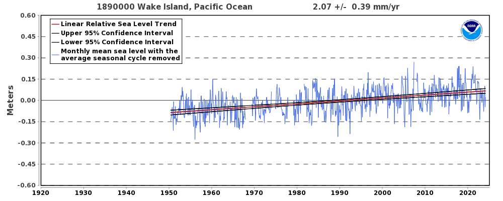
But I do not trust any data published recently by anyone involved in the warmista jackassery, and NOAA is definitely involved.
The tide gauge data is not data, it is modelled results.
IOW, they are not reporting what the tide gauges actually measure…not even close.
They all say this at the bottom of the page:
“Plots show monthly mean sea levels without the regular seasonal fluctuations from coastal ocean temperatures, salinity, wind, atmospheric pressure, and ocean currents. The relative sea level trend is also shown with its 95% confidence interval. Relative Sea Level trends at the coast can be positive or negative. A negative trend does not mean the ocean surface is falling; It indicates the land is rising more quickly than the ocean in a particular area. Trends close to zero indicate the land is rising at nearly the same rate as the ocean.
Plotted values are relative to the most recent Mean Sea Level datum established by CO-OPS. Calculated trends are available as a table in millimeters/year and in feet/century (0.3 meters = 1 foot). If present, solid vertical lines indicate dates of any major earthquakes in the vicinity of the station. Dashed vertical lines bracket any periods of questionable data or a possible datum shift.”
The long term chart is on a far different scale than can be used to determine what is happening to sea level in the short term. Ten meters is a measurement uncertainty on that chart.
Foundations in wirelesspublished 1936 and republished almost yearly thereafter states in the introduction regarding false zero graphs :-“False zeros are sometimes used in a slightly shady manner to give the wrong impression . . . . .is not a true graph of the sort a mathematician would have anything to do with”
85 years later and some people still use them ?
Pity them, for they have learnt nothing.
14,500AD seems about right. Even if the melting 10x today immediately, everyone you ever knew and 10 generations would be dead and gone before the thing was melted completely. I point this out to the Press, who promptly ignore it.