By Christopher Monckton of Brenchley
The cold weather on both sides of the Atlantic last month seems to have had its effect on temperature, which fell sharply compared with November, lengthening the New Pause to 8 years 4 months, as measured by the satellites designed, built and operated by Dr Roy Spencer and Dr John Christy at the University of Alabama in Huntsville:

The graph shows the least-squares linear-regression trend on the monthly global mean lower-troposphere anomalies. The least-squares method was recommended by Professor Jones of the University of East Anglia as a reasonable method of showing the trend on stochastic temperature data.
Recall that the Pause graph does not constitute a prediction: it simply reports the longest period, working back from the present, during which the temperature trend is not positive.
As always, here is the full 45-year UAH dataset from December 1978 to December 2022, showing a far from dramatic global warming trend equivalent to just 0.134 C/decade:

One of the virtues of the long Pauses that have characterized the global-temperature anomaly record even in recent decades is that they provide a simple and instantly comprehensible demonstration that the global-warming rate is proving to be less than half the original midrange prediction in IPCC (1990), which presented four emissions scenarios, of which the business-as-usual scenario A has proven closest to reality. For instance, Scenario B was based on the assumption that emissions would remain constant at the 1990 annual level until 2025. That didn’t happen. Emissions have risen by enough to increase the anthropogenic forcing by more than 1 W m–2 since 1990.
Though emissions have thus proven close to scenario A, that scenario’s 0.3 K/decade midrange medium-term prediction was more than twice outturn: observed warming since 1990 has been only 0.13 K/decade. Since scenario A predicted 3 K ECS, the corrected ECS based on outturn since 1990 is thus just 1.3 K: a beautifully simple argument.
A similar result is obtainable by another simple method: energy-budget analysis. In a recent column I demonstrated that analysis, prompting some commenters to ask for an explanation of the energy-budget equation. So here goes.

The energy-budget equation says that equilibrium doubled-CO2-equivalent sensitivity (ECS), the standard metric, is the product of the anthropogenic fraction M of observed industrial-era warming ΔTobs and the ratio of the doubled-CO2 forcing ΔQ1 to the difference between observed industrial-era forcing ΔQobs and the satellite-observed radiative imbalance ΔNobs.
At a thermal equilibrium (such as the period from 1850-1930 when the trend in global mean surface temperature was zero) the solar radiative energy absorbed in the Earth’s atmosphere and the thermal infrared radiation emitted from Earth to space are about equal.
The positive energy imbalance ΔNobs that has since been measured, however, indicates that the Earth-atmosphere system is gaining energy, which is why it is warming.
The denominator ΔQobs – ΔNobs in the equation is the component in period forcing ΔQobs realized to date in period observed warming ΔTobs. The ratio of doubled-CO2 forcing to that realized component in period forcing converts the anthropogenic fraction of ΔTobs to ECS.
In the equation, if one increases the estimate of any of the four terms shown in red one increases ECS. If, however, one increases the estimate of observed period forcing ΔQobs, shown in green, one reduces ECS.
In short, the energy-budget equation is an excellent way to see what is going on under the hood. One can watch as the usual suspects wrench and torture the data so as to shore up the high-ECS narrative on which the tottering, shoddy edifice of international wreck-the-hated-West policy is unsoundly founded.
Take the anthropogenic fraction Mof industrial-era warming.One may deduce from Table 2 of Wu et al. (2019), giving anthropogenic and natural components in warming over eight periods covering 114 years to 2013 that about 74% of warming to date was anthropogenic. Yet climatology tends to push Mup to 100%, and extremists will try to maintain that Mis about 110%- i.e., the Earth would be cooling were it not for our influence on the climate.
Observed industrial-era temperature ΔTobs is also being pushed upward. HadCRUT4 said warming to early 2022 was 0.93 K – call that 0.95 K to date. But HadCRUT5 pushes that up to about 1.05 K, and IPCC (2021) jumps it up startlingly to 1.27 K.
It is the same sad story with the doubled-CO2 forcing ΔQ1. As far back as the 1980s, we were told that the uncertainty in ΔQ1 was ±10%. However, though the CMIP5 models (Andrews 2012) gave ΔQ1 as a mean 3.45 W m–2, and CMIP6 gave 3.52 W m–2 (Zelinka et al. 2020), IPCC (2021) hikes it by 14% to 3.93 W m–2.
Likewise, the official narrative has for decades tried to minimize the value of observed industrial-era forcing ΔQobs so as to maximize ECS. As Professor Lindzen has long pointed out, a number of dodges are used, not the least of which is the notion that our particulate emissions had caused a large negative aerosol forcing, which the Professor bluntly describes as a “fudge-factor”. The actual aerosol forcing is likely to be vanishingly different from zero. NOAA shows 3.2 W m–2 forcing from anthropogenic greenhouse-gas emission alone, before allowing for ozone forcing of another 0.4 W m–2. However, IPCC (2021), afer deploying the aerosol fudge-factor, gives just 2.8 W m–2 all in.
Hitherto, though, the net radiative imbalace ΔNobs had been left alone. It was generally given as around 0.79 W m–2. However, the increasingly desperate revisionists have been at that one, too, suggesting last year that ΔNobs is more like 1.1 W m–2.
Sure enough, if one plugs all these altered but allegedly “midrange” estimates into the energy-budget equation ECS comes out at 3.2 K, in line with the long-running official narrative. Now you know how the trick is done: change all five variables so as to maximize midrange ECS and thereby purport to justify the otherwise obviously excessive official figure.
Taking the more reasonable and more mainstream values shown in my earlier piece on the energy-budget method gives 1.3 K midrange ECS, in line with the observationally-derived 1.3 K described earlier herein.
Another virtue of the energy-budget method is that it requires absolutely no knowledge of the amplitudes of temperature feedbacks. Which is just as well, because IPCC’s current estimate that ECS is between 2 K and 5 K implies a total absolute feedback strength of between 0.22 and 0.27 W m–2 K–1. The breadth of that interval, just 0.05 W m–2 K–1, is so narrow that any attempt to derive ECS by feedback analysis, whether directly or via diagnosis of feedback strengths from models’ outputs, is, statistically speaking, no better than guesswork. The uncertainties in feedback strength are far too great to give any credence to any prediction from any general-circulation model, since the feedbacks diagnosed from those models exceed the absolute feedback strength by an order of magnitude.
How long will the current Pause last? The UN, getting desperate now that this second Pause is beginning to look rather serious, is saying – probably rightly – that the next el Niño will bring the Pause to an end, just as the last big one ended the previous 19-year Pause. But the fact of these frequent and prolonged Pauses provides a striking visual demonstration of the fact that the world is simply not warming at anything like the originally-predicted 0.3 K/decade.
The profiteers of doom, of course, are presenting the Pause in a quite different light. They say that the eight years of the current Pause showed the warmest temperatures on record. Except that it was a whole lot warmer in the medieval, Roman, Minoan and Egyptian Old Kingdom warm periods, which somehow never get mentioned as part of the record.
Some commenters here have speculated that the Sun can be expected to go through 60 quiet years, leading gradually to global cooling. However, it is not yet clear that reliable long-term forecasts of solar activity can be made. A striking example of the difficulties is the current sunspot record:

The predicted sunspot number is the red curve. Actual data is the black spline curve, with the six-month running mean in blue. The departure from the prediction – on the high side – is worth keeping an eye on. It may be that the Sun’s quiet period is already over. Who can say?
What we can say is this. Even if the whole of the West actually attained net zero emissions by 2050, the world would be just one-seventeenth of a degree cooler than if the current and continuing uptrend in global emissions were to continue. And each $1 billion we spend on destroying the Western economies would prevent between one four-millionth and one thirty-millionth of a degree of future warming. And we can’t even achieve that much, because the necessary techno-metals to attain net zero are just not available.
There will soon be no more talk of “pause”. This is the century when a cooling should begin according to past history….back to the temps of the Little Ice Age. The terminology may shift to “pause” in the cooling trend.
From the standpoint of giving it a rest and putting cAGW to bed, OK.
However, in my opinion, it’s too cold now.
Yeah I’ve been waiting 45 years now to grow tomatoes outside.
Well. Obviously it is not the CO2 doing anything////
https://breadonthewater.co.za/2022/12/15/an-evaluation-of-the-greenhouse-effect-by-carbon-dioxide/
BTW Am I correct in saying that the ‘calculated’ result for CO2 was that there is 3.7W/m2 warming for every doubling of CO2? If we and/or Nature add 2 ppm per year (average of the last 50 years) then by my calculations that works out to only 0.025W/m2/annum. Correct?
Question related to today’s anomalies: the entire NH seems to be going through a January thaw. However, the Southern Hemisphere and Tropics are just a very tiny bit or at base line. This implies that something different is going on; which is what I think all of us have long suspected. I’ve noticed this phenomenon happen over 2022. The year would have been much colder, I think, if it weren’t for this.
https://climatereanalyzer.org/wx/todays-weather/?var_id=t2anom&ortho=1&wt=1
Welcome to natural variability.
The sunspot record became irrelevant with the use of weather satellites measuring top of the atmosphere solar energy which has barely changed in the satellite era — actually down slightly according to NASA — so the sun can not be the cause of any global warming after 1975
“Even if the whole of the West actually attained net zero emissions by 2050″
You know this will not happen, so why even mention it? Over 7 billion of the 8 billion people in the world live in nations that could not care less about Nut Zero, so it is most likely that global CO2 emissions will not stop rising. For example, since the first climate conference in 1979, CO2 has been rising faste and faster (except for 2020). There is no precedent for prediction CO2 emissions to stop rising. Maybe the rate of increase will slow?
The 1979 World Climate Conference, now usually referred to as the First World Climate Conference (FWCC or WCC-1), was organized by a Committee chaired by Robert M. White of the USA and held in the International Conference Centre in Geneva from 12 to 23 February 1979
Mr Greene is as ill-informed about Classical methods of discourse as about everything else. As his kindergarten mistress will explain to him, if even the entire West went net zero and warming prevented would be only 0.06 K, then a fortiori [look it up] if the West does not exceed in attaining net zero the warming prevented will be still less than 0.06 K, in which event spending trillions on attempting to get to net zero will be seen by all except Mr Greene as pointless.
No warming in 100 months despite ever increasing atmospheric carbon dioxide. Where is that dreaded “climate emergency” hiding?
And where is that darn hockey stick?!??
Climate emergency coming in ten years,
for the past 50 years, and will always be
coming in ten years!
I have been slowly building a spreadsheet from the base UAH data, and then mapping that against CO2 and annual variation in temperature for a location (Selectable from a small database). Data for CO2 and UAH is back to the start of UAH in 1978, so a decent time period.
The baseline for the temp anomaly is set to the average annual temp for the location selected. This then shows the anomaly as + or – from the average temp. CO2 is also overlaid from 1978. The background fill shows the range of temps across the year for the location selection (Jan – Dec, Southern Hem, so cold in the middle of the year in the example screen shot)
All I can say is the variability between high/low temps month-on-month so overwhelms the anomaly as to make it a non-event. For my location the UAH trend is basically flat.
Nice.
How did you get the data for your location.
The UAH data includes geographical areas. I used the Australia data set, but you can select any of the UAH areas in my spreadsheet.
For the local temp ranges as the background, I used local weather data from the Bureau of Met in in Oz.
The IPCC and UNFCCC post modern science establishment’s “consensus” is that a modelled future increase in CO2 levels is the main threat to human civilization. This is an egregious error of scientific judgement. A Millennial Solar ” Activity” Peak in 1991 correlates with the Millennial Temperature Peak at 2003/4 with a 12/13 year delay because of the thermal inertia of the oceans. Earth has now entered a general cooling trend which will last for the next 700+/- years.
Because of the areal distribution and variability in the energy density of energy resources and the varying per capita use of energy in different countries, international power relationships have been transformed. The global free trade system and global supply chains have been disrupted.
Additionally, the worlds richest and most easily accessible key mineral deposits were mined first and the lower quality resources which remain in the 21st century are distributed without regard to national boundaries and demand. As population grows,inflation inevitably skyrockets. War between states and violent conflicts between tribes and religious groups within states are multiplying.
2 The Millennial Temperature Cycle Peak.
Latest Data (1) https://www.nsstc.uah.edu/data/msu/v6.0/tlt/uahncdc_lt_6.0.txt
Global Temp Data 2003/12 Anomaly +0.26 : 2022/12 Anomaly +0.05 Net cooling for 19 years
NH Temp Data 2004/01 Anomaly +0.37 : 2022/12 Anomaly +0.21 Net cooling for 19 years
SH Temp Data 2003/11 Anomaly +0.21: 2022/12 Anomaly -0.03 Net cooling for 19 years
Tropics Temp Data 2004/01 Anomaly +0.22 : 2022/12 Anomaly -0.35 Net cooling for 19 years.
USA 48 Temp Data 2004/03 Anomaly +1.32 : 2022/12 Anomaly – 0.21 Net cooling for 19 years.
Australia Temp Data 2004/02 Anomaly +0.80 : 2022/12 Anomaly – 0.38 Net cooling for 19 years
Earth’s climate is the result of resonances and beats between the phases of natural cyclic processes of varying wavelengths and amplitudes. At all scales, including the scale of the solar planetary system, sub-sets of oscillating systems develop synchronous behaviors which then produce changing patterns of periodicities in time and space in the emergent temperature data. The periodicities pertinent to current estimates of future global temperature change fall into two main categories:
a) The orbital long wave Milankovitch eccentricity, obliquity and precession cycles. These control the glacial and interglacial periodicities and the amplitudes of the corresponding global temperature cycles.
b) Solar activity cycles with multi-millennial, millennial, centennial and decadal time scales.
The most prominent solar activity and temperature cycles are : Schwab-11+/-years ; Hale-22 +/-years ; 3 x the Jupiter/Saturn lap cycle 60 years +/- :; Gleissberg 88+/- ; de Vries – 210 years+/-; Millennial- 960-1020 +/-. (2)
The Oulu Galactic Ray Count is used in this paper as the “solar activity ” proxy which integrates changes in Solar Magnetic field strength, Total Solar Insolation , Extreme Ultra Violet radiation, Interplanetary Magnetic Field strength, Solar Wind density and velocity, Coronal Mass Ejections, proton events, ozone levels and the geomagnetic Bz sign. Changes in the GCR neutron count proxy source causes concomitant modulations in cloud cover and thus albedo. (Iris effect)…………………………
See Figs 1,2,3.at https://climatesense-norpag.blogspot.com/
Earth shows net cooling for 19 years and The Rules of the Lebensraum game.
Complete claptrap
Earth does not show a cooling trend for the past 19 years
There is no Millennial Solar ” Activity” Peak in 1991 or at any time in the satellite age.
“Earth has now entered a general cooling trend which will last for the next 700+/- years.”
Humans have a terrible track record for long term climate predictions. If you are a human, you are part of that group.
Richard and readers .Just check the UAH satellite data inked above – notice I report Net Temperature decline. For the activty peak see Oulu GRC in Fig1. For Millennial and 400 year trends see Figs 2 and 3. Richard which data specifically do you challenge as claptrap?
Using the Monckton method, the term for no trend in the temperature of air over Australia is now 10 years 6 months and falling rather fast. This flat trend is being studiously ignored in alarming reports from our Establishment bodies like Academy of Sciences, BOM and CSIRO.
I wonder about mechanisms that claim the well mixed gas CO2 exerts a globally uniform and increasing warming everywhere around the globe. Geoff S
http://www.geoffstuff.com/uahjan2023.jpg
Using ‘TheFinalNail’ method of determining the relevance of 100-month ‘pauses’ in temperature trends for air over Australia, we find that 100-month pauses in warming occur around 25% of the time in Australia (according to UAH). That’s a 1 in 4 probability, even in a statistically significant warming environment.
Nothing to see here, no matter how hard you look.
And all the while co2 looks on……..
“The FInal Nail” does not realize that each time it whines about the frequency of long Pauses it reinforces the main point of these articles, which is that the long-run rate of warming is a very great deal less than had originally been predicted. The long Pauses provide a simple, visually-comprehensible demonstration of that fact.
Monckton does not realize that the CMIP5 predicts about 20% of the months to be included in pause lasting 100 months. That is a 1-in-5 chance so it’s hardly noteworthy that we find ourselves in one now.
The furtively pseudonymous “bdgwx” continues to advertise, without actually saying so, that precisely because so much of the temperature record is trendless the overall warming rate is less than half what had originally been predicted.
We’ve already had this discussion. The IPPC FAR 1990 prediction was actually pretty close. You’re just mispresenting what the IPCC predicted by picking scenario A even though scenario C is most closely matches the GHG concentrations in the atmosphere today.
The IPCC 1990 FAR prediction, under Scenario A, which was the closest to observed emissions, was for 0.3 K/decade. Actual warming on the UAH dataset is 0.13 K/decade.
Scenario A was closest to observations because Scenario B predicted an evolution of forcing near-coincident, from 1990-2025, with the evolution of forcing on the basis that no increases in annual emissions occurred compared with the 1990 annual value. In fact, emissions have continued to rise.
First, IPCC predictions of temperature are not based on emissions. They are based on atmospheric concentrations. Emissions have nothing to do with the temperature predictions and for good reason. It doesn’t matter because something other than humans could (theoretically) cause atmospheric concentrations to increase/decrease completely independent of what humans are doing.
Second, the IPCC’s scenarios of atmospheric concentrations are well representative of human emissions anyway. Remember, the temperature predictions are based on science scenarios which are not the same as policy scenarios which you selected I suspect because the emissions are higher than in the science scenarios. This allows you to misrepresent the IPCC in way that makes it harder to notice.
bgwxyz shills for the IPCC again—
Total clown statement, where does all the bad bad atmospheric CO2 come from then if not emissions?
The Moon or Mars?
Sheesh.
More shilling.
First, I never said it was bad. Second, it doesn’t matter because CO2 (or the GHG molecules) do not behave differently wrt to how they got there. Third, there are many ways CO2 gets into the atmosphere other than via humans including but not limited to volcanic activity, biological activity, hydrosphere outgassing, wildfires, etc. The PETM is an example of non-human pulse of carbon getting injected into the atmosphere.
TFN,
Please read what I wrote and correspond accordingly or not at all, your choice.
Australia now has 127 months of pause, not the 100 that you mention.
Also, please look at the UAH temperature drop for Australia, from the 2016 peak to now. That is a peak to trough temperature drop of 1.88 degrees C in 87 months, which expands in the (debateable) popular manner to a trend of -26 deg C per century. Yes, minus 26 deg per century, not minus 2.6.
Meanwhile, there is knicker-twisting alarmism about warming of 1.4 deg C per century for the globe, described as unprecedented, leading to an existential crisis.
……….
Why is everone so reluctant to discuss this type of cooling trend, its magnitude and its mechanisms?
Is it really like cursing in church?
Geoff S
Here we go again; another whirl on the Merry Monck’s merry-go-round of nonsense.
100 months is a nice neat number. It’s easy, and instructive, to download the UAH data and check just how uncommon (or common) a 100-month period of zero or negative trend is in the statistically significant warming represented by their global lower troposphere record.
So just how unusual is a 100-month period of no warming or cooling in UAH?
There are 430 concurrent, overlapping 100-month periods in UAH_TLT (V6). Of these, 124 have either a zero or a cooling trend. That’s around 29%, nearly a third, of all 100-month periods showing a zero or negative trend, even though the data set shows statistically significant long-term warming.
The answer then is that it’s not at all unusual to see 100-month long periods of zero warming or cooling in data sets that show long-term warming. It almost always results from ENSO variations; but sometimes volcanic activity plays a role.
One last thing to consider: when this so-called pause in global warming started 100 months ago, back in September 2014, the full warming trend in UAH was +0.11C per decade. Currently, after a further ‘100-months of no warming’, the full warming trend in UAH stands at +0.13C per decade.
That’s a strange kind of ‘pause‘, don’t you think?
”, even though the data set shows statistically significant long-term warming.”
I take your idea of ”significant” and ”long term” and replace it with my own. …. ”Not really significant at all” and.. ”how long is a piece of string”
What say you? 🙂
The warming trend in UAH is +0.134 ±0.047 °C/decade (2σ). The best estimate trend is far larger than the margin of error at the 2 sigma level, therefore the warming trend is statistically significant, irrespective anyone’s opinion.
Oh boy, the 50 mK uncertainty nonsense shows up again.
Final Nail See my January 4, 2023 3:46 pm comment below and See Figs 1,2,3.at http://climatesense-norpag.blogspot.com/
Earth shows net cooling for 19 years and The Rules of the Lebensraum game.
The CO2 level growth rate is faster in the current pause than in prior pauses. You forgot to mention that fact.
It’s irrelevant
The furtively pseudonymous “The Final Nail” whines that long Pauses are commonplace. So they are, precisely because the rate of global warming is so slow.
And to answer its childish question about why the long-run trend has lengthened even though there has been no warming for the last 100 months, the longer the Pause continues the closer the trend will be to the 0.12 C/decade that obtained at the beginning of the Pause. The reason is that the effect of the large el Nino of 2016 will gradually become less significant.
The long-run trend hasn’t ‘lengthened’, it has increased.
And it has increased because, with an average anomaly of +0.226, the last 100 months have been the warmest 100 months in the entire record, irrespective of a zero warming trend.
Still dodging the obvious: that the rate of warming is a whole lot slower than IPCC had originally predicted – and continues to predict.
Not the case. Observations are well within the range of model projections.
The range of “model projections” is so broad that as little as 0.2 K/decade warming is within the uncertainty margin: but there has in fact been only 0.13 K warming, below the bottom end of the current uncertainty margin.
Which is exactly what a frequency plot of the UAH regression residuals shows. The 1998 peak looks like just a handful of outliers.
An alternative way of looking at “pauses” is given in the attached graph.
Notes
1) This actually supports, at first glance at least, the “staircase / ladder” view of the satellite TLT datasets.
2) In order to “merge” my pauses 1 and 2 would require constant anomalies of (roughly) -0.06 all the way from now until December 2030.
NB : The last month the anomaly was less than -0.05 was in August 2014.
3) I find MoB’s point of view “interesting”, but I’m not going to really “sit up and take notice” until the UAH TLT anomalies are consistently below the -0.05 level for “an “extended period” (precise value TBD) of time.
Another “not last” thing to consider …
After the 1997/8 El Nino “spike” pushed the “full” trend to 0.165 (°C / decade) it then wandered down to the local minimum of 0.11 in 2015, before the 2015/6 El Nino “spike” pushed it back up to a local maximum of 0.14 at the end of 2020.
The “full” trend has been falling since then (though admittedly very slowly, the latest value is roughly 0.135).
It’s almost as if there’s a large “natural variability” element that can still completely overwhelm the “slow and steady anthropogenic forcing” part, even after 44 years of averaging (when the minimum to be considered as “climate” is only 30 years worth of data).
Looks like the Arctic Ice Melt Out has also paused for a bit.
Maybe this global warming stuff is more complicated than it looks.
Maybe the computer models are wrong and the predictions are off.
Maybe they are lying their heads off.
Here is the same chart for the global sea ice extent. The 2022 mean ended as the 3rd lowest in the period of record behind 2019 and 2017. The 2022 minimum ended as the 2nd lowest in the period of record behind 2020.
As of right now global sea ice is at a record low for this date and will probably set a new record minimum in the next few weeks making the 2023 minimum the new record.
Forgive for me not replicating the format exactly.
It is typical of the proponents of the global warming crisis due to atmospheric CO2 that they change from alarm to alarm over time. For example, increased hurricanes were said to be part of the crisis. They no longer say that.
For years proponents of the global warming crisis talked about arctic amplification and the dire threat of an “ice free” arctic. They no longer talk about that much. They talked a lot about in though in 2012, the record low. If you visit the NOAA arctic ice page with their nice interactive chart, they always show the year 2012 prominently displayed in red. I wonder why?
Now you have switched to a new alarm, global sea ice.
This is cherry picking, pure and simple. This isn’t science in any sense of that word.
The fact that proponents of a global warming crisis refuse to acknowledge the failure of their past predictions is telling. This tactic only works on people who are not paying attention. The people who post on the blog site pay attention.
Isn’t selecting a subset (Arctic) of the whole (Global) a better demonstration of cherry-picking?
At any rate I don’t think sea ice loss in the Arctic, Antarctic, or Global is alarming. But that’s just me. I have a much higher threshold of “alarm” than most other people. It doesn’t really matter because nature doesn’t care about our feelings or whether we are alarmed. The long term trend in both Arctic and global sea ice is decisively down with global sea ice breaking lows everyday at the moment.
I think it is unfair to say that proponents fail to accept past predictions. In 2001 the IPPC predicted that the Arctic would not fall below 10.5e6 km^2 until about 2040. It first happened in 2007 and then 8 other times after that not including 2021 and 2022 at 10.6e6 km2 and 10.7e6 km2 respectively which are very close. And the prediction that Antarctic sea ice would increase (yes, increase) until at least 2030 and possibly 2060 is looking more and more like a failure. Scientists are well aware of their woefully underestimated predictions of sea ice decline.
I cannot find the data set you are referencing in the the graph above. There is no G01235 as far as I can see. G02135 has a number of different data sets. What is the name of the file that contains the data in this graph.
BTW, speaking of cherry picking, it is of interest that the proponents of a climate crisis due to increasing atmospheric CO2 have emphasized minimum ice extend in their writings. Why is that done? It is because maximum and mean ice extents haven’t fallen nearly as much as the minimum extent? What insights are we missing because we only look at part of the data?
Note the attached graphic for max, min, and mean arctic ice.
Typo…I was using G02135…the same as the graph you posted.
https://masie_web.apps.nsidc.org/pub/DATASETS/NOAA/G02135/seaice_analysis/
Can you tell me which particular file you used?
Sea_Ice_Index_Daily_Extent_G02135_v3.xlsx
Thanks a lot for the info.
There is no global ice extent in that file. Am I right to assume that you combined the North and South data to get global data? I have done that and get the attached chart. Max and Mean ice extents have changed much less than Minimum extents, just like the Arctic data. Again, like the Arctic ice, there is no trend (apparent to me) since 2007. So, the global data and the Arctic data show the same trend. And, that is what this discussion started off being about. Is there a continuation of the ice loss and global warming seen in the later 20th century, or are temperatures and ice coverage stabilizing? Looking at these charts, it seems that ice extent is stabilizing. This was not predicted in the latter part of the 20th century by people who say this ice loss was due to rising levels of atmospheric CO2. CO2 has continued to rise inexorably, but ice lost has not, so where is the evidence that rising CO2 caused the loss of ice in the latter part of the 20th century? There is none. The “evidence” proposed by the proponents is a theory and a computer model of that theory. Since the real world data is not matching the computer model, either the theory or the model, or both, need to be modified and, possibly, rejected.
Well global seaice is currently at a record minimum.
This comment is, I believe, an example of how proponents of the theory that rising CO2 levels in the atmosphere are causing a climate crisis, shift the discussion. No one is saying that ice levels have not fallen during the satellite record. And, no one is saying that ice levels are recovering of late. What they are saying is that there is little if any evidence of a lower ice extent for about 15 years. “Skeptics” are asking the proponents for an explanation. The explanation given is that there are unknown forces in nature blunting, for now, the ice loss. That “skeptics” find this unsatisfying is not surprising, since the computer modelling people claim to understand the climate so well that nothing of importance has been left out of their computer models. BTW, let’s keep in mind the the data only goes back 44 years or so. Climate cycles can be much longer.
Global warming is so slight and slow that it’s difficult to measure, let alone notice. The amount of “measured” global warming depends on which temperature index(s) you use:
https://www.woodfortrees.org/plot/gistemp-dts/from:1957.5/mean:12/plot/hadcrut3gl/from:1957.5/to:1989.5/mean:12/offset:-0.33/plot/hadcrut4gl/from:1957.5/to:1989.5/offset:-0.35/mean:12/plot/uah6/mean:12/offset
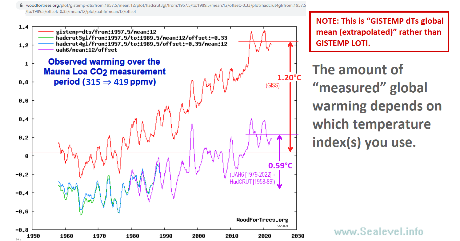
There are two problems: 1) the red line isn’t GISTEMP LOTI, it is dTs extrapolated and 2) it is on the 1951-1980 baseline whereas UAH is on the 1991-2020 baseline.
You need to pick GISTEMP LOTI global mean and UAH6.0 NSSTC lower trop global mean and normalize them both to the same baseline. Here is the woodfortrees graph with both timeseries baselined at 1979-2022 using their period averages of -0.07 for UAH and 0.52 for GISTEMP for the offsets.
https://www.woodfortrees.org/plot/gistemp/from:1979/mean:12/offset:-0.07/plot/uah6/from:1979/mean:12/offset:0.52
As you can see the difference at the end of the period is about 0.15 C which is considerably less than the 1.2 C that you show.
Thanks for pointing out the LOT1 vs dTs difference. (What is their dTs, anyhow?)
But you’ve set the wrong offset. You’ve got GISS starting about 0.15°C lower than UAH.
Here’s the corrected link for the full Mauna Loa CO2 period (using UAH spliced with HADCruT):
https://www.woodfortrees.org/plot/gistemp/from:1957.5/mean:12/plot/hadcrut3gl/from:1957.5/to:1989.5/mean:12/offset:-0.33/plot/hadcrut4gl/from:1957.5/to:1989.5/offset:-0.35/mean:12/plot/uah6/mean:12/offset
That reduces the GISS warming over the period to about 0.95°C.
It’s still about 61% more warming than UAH + HADCruT at 0.59°C.
That’s a good point. Baselining them both at 1979-2022 causes the pivot point to get centered creating a gap not only at the end but the beginning of the period as well.
This is probably more representative of the differences I think.
https://www.woodfortrees.org/plot/gistemp/from:1979/mean:12/offset:-0.52/plot/uah6/from:1979/mean:12/offset
Do you know what their “GISTEMP dTs global mean (extrapolated)” is? I’m not finding it defined on their site.
Thanks to bdgwx for pointing out that “GISTemp dTs” is different from “GISTemp LOTI” (Land-Ocean Temperature Index).
It is interesting that when I edited the image file (above) on my web site (to add the red box’d note at the top-right), it updated in the already-posted WUWT comment! I didn’t expect that. (The red box wasn’t there when bdgwx commented.)
Here’s the equivalent graph using GISTemp LOTI:
https://www.woodfortrees.org/plot/gistemp/from:1957.5/mean:12/offset:0.15/plot/hadcrut3gl/from:1957.5/to:1989.5/mean:12/offset:-0.33/plot/hadcrut4gl/from:1957.5/to:1989.5/offset:-0.35/mean:12/plot/uah6/mean:12/offset
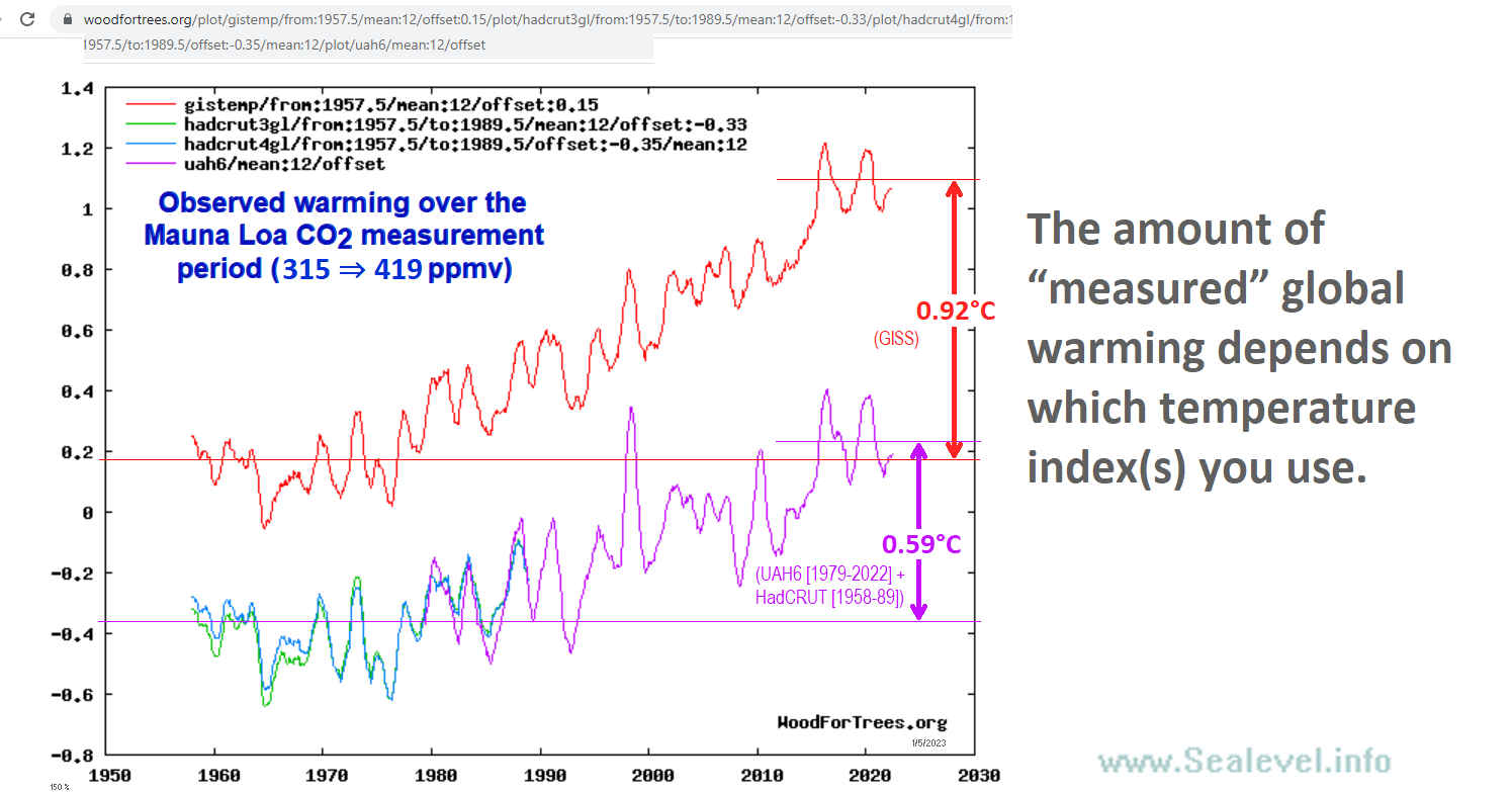
As you can see, the GISS LOTI warming trend (0.92°C) was only 56% more rapid than the UAH6 + HadCRUT warming trend (0.59°C).
W/r/t my question, asking what GISS’s “GISTEMP dTs global mean (extrapolated)” is, I found a note on Paul Cark’s WoodForTrees site, which says:
So it seems odd that it is so much different from their LOTI temperature index, and also odd that I couldn’t find that information on GISS’s site.
BTW, you can estimate “climate sensitivity” to CO2 from this sort of data. Here’s how:
First, note that raising CO2 from 315 ppmv to 419 ppmv is 41.16% of the forcing of one “doubling.”
Second, note that CO2 is generally estimated to account for about 2/3 of the anthropogenic forcing.[1][2][3]
Third, note that the realized warming to date resulting from the effect of the CO2 increase’s radiative forcing should be somewhere between “TCR” and “ECS” climate sensitivity:
TCR represents “short term warming” in a theoretical scenario in which the atmospheric CO2 level rises much faster (+1%/year) than it actually has. (It has actually increased an average of only 0.454%/year over the last 63 years.)
In contrast, ECS represents “long term warming” in a theoretical scenario in which CO2 level has plateaued for a few hundred years, and all the slow feedbacks (except the very slowest, like ice sheet dynamics) have had time to play out. Real-world warming should be somewhere between those two extremes. If ECS is 1.5× TCR (a common guesstimate, though probably a bit on the high side), and if actual warming realized so far is halfway between TCR and ECS (another reasonable guesstimate), then we should have already realized about 83% of the “ECS warming” to be eventually expected from from 41.16% of the forcing from a doubling of CO2.
(The other 17% of expected warming is “in the pipe,” represented by the current radiative imbalance, which is probably about 0.3 W/m² [NCA4 estimates 0.2 to 1.0 W/m²].)
Fourth, let’s assume, for the sake of argument, that 100% of the observed warming over the period was anthropogenic. (This assumption is, perhaps, the weakest part of this analysis.)
Now we have all the pieces necessary to estimate climate sensitivity to CO2:
Using the UAH6 + HadCRUT figure of 0.59°C of warming since 1959:
ECS = (0.59°C × (2/3)) / 0.4116) / 0.83 = 1.15°C per doubling.
TCR = (2/3) × ECS = 0.77°C per doubling
To instead use the GISTemp LOTI figure of 0.92°C, multiply the above estimates by 156%:
ECS = 1.80°C per doubling
TCR = 1.20°C per doubling
If you think that mankind caused less than 100% of the observed temperature increase since 1959, then reduce the above figures accordingly.
As you can see, even if we assume that the warming was 100% anthropogenic, and even if we use GISS’s temperature data, the temperature measurements are wildly inconsistent with most of the CMIP6 climate models‘ baked-in assumptions about climate sensitivity:
BTW, if anyone ever suggests to you that GCMs (climate models) do a good job of modeling reality, you can point out to them that the CMIP6 models differ from one another by a factor of 3.6 (!!!) in their baked-in estimates of ECS climate sensitivity. If the modelers actually knew what they were doing, that wouldn’t be possible.
(“story tip” — Editors, if you think this little analysis [these two comments, including the above WoodForTrees graph] is interesting enough to be its own article, you’re welcome to use it. -DB)
Trendology is in a very sad state this cold January AM:
bellcurveman is down to recycling plagiarized insults and demanding that people give him the respect his ego believes he deserves.
blob, unable to coherently argue for his pseudoscience nonsense with his patented Kamala word salads, is reduced to clicking the downvote button without bothering to read the corresponding post. He’s also graduated to posting inane video memes that I suppose he thinks are insults.
And the sky is still a peculiar shade of green in bgwxyz-world.
Have I missed anything?
Don’t whine.
Thanks for affirming my assessment, have a great day!
And the simple fact remains that “you can *NOT* decrease uncertainty by averaging. You simply can’t.”
Have you explained that to Lord Monckton yet, or Dr Roy Spencer when he put in an appearance?
I assume you still stand by your assertion that UAH has a monthly uncertainty of at least ±1.4°C, and that it’s impossible to establish what any trend is. So have you explained why Monckton’s claim that the trend is less than predicted is meaningless.
bellcurvewhinerman needs to find someone else to play in his three-ring clown circus.
It would seem that a variable so sensitive its start and end points should not be reported without extremely wide error bars.
Ditto for the multiple pauses identified.
Within reasonable limits global temperature has barely moved.
HadCRUT publishes error bars. There has been no statistically significant warming for a decade.
Why would statistically significant warming be expected in a period as short as a decade?
By the way, what is the statistical significance of your 100-month UAH trend?
I checked it for you here, to save you the bother.
It’s -0.004 ±0.5°C/decade (2σ).
So the trend in UAH over the short period you’re focusing on might actually be as high as as 0.5°C per decade!
Still want to talk about statistical significance?
The 2-sigma uncertainty in the UAH dataset is indeed about +/- 0.5 K per decade. But that fact merely confirms that there has been at least a decade of statistically-insignificant warming. The truth is that the world is not warming at anything like the originally-predicted or currently-predicted midrange decadal rate. Indeed, so slow is the warming, and showing so little sign of acceleration in response to rising CO2 emissions, that no serious scientist would now regard global warming as any sort of existential threat. The game’s up.
One would expect statistical significance in as little as a decade if the warming rate were anywhere close to the midrange 0.3 K/decade predicted by IPCC (1990), or the 0.37 K/decade predicted by the current generation of models. Without such rapid warming, one would expect – and one gets – long periods without any warming, and still longer periods without any statistically-significant warming.
Not necessarily true. I added a trend to UAH data to bring it up to 0.3°C / decade.
Using the Skeptical Science Trend Calculator adjustment for autocorrelation I get for the past 10 years a trend of
0.34 ± 0.39°C / decade.
Close to significant, but still not significant at the 2 sigma level.
The actual rate over the last ten years is
0.18 ± 0.39°C / decade.
While commenters are still active on this post, I’d just like to pay an acknowledgement to Bdgwx for staying on and offering responses to the (mostly deserved i.m.o.) slings & arrows aimed at him / her on this, one of the most willing posts I’ve enjoyed this week.
And of course to our level-headed blog hosts and Anthony who have always relished comments from challengers to posters’ articles here.
Would that this approach could be adopted as the standard for open discussion in all online fora.
Alas!
“….and offering responses to the (mostly deserved i.m.o.) slings & arrows aimed at him / her on this…)”
Please expand. Maybe provide a link to an incorrect comment, and a rebut.
Keep up BOB.
Maybe read (and try to comprehend) all the comments and replies?
So, nada? Sorry, except for deflection….
Your apology for your lame attempt at deflection is accepted.
This never mattered… What really matters is the DESIRE of the Owners of the current Civilization, and Their Friends (Billionaires) to CHANGE Their Civilization as They see fit.
No amount of “scientific papers” or data sets that go against the CO2 PROPAGANDA will succeed. What the global herds of modern moron slaves react to is the PROPAGANDA spread via the Regime Media. And since it’s controlled by Them… we just need to wait for the next round of taxes and regulations and bans that will be put in place for US,the herds.
For Them… Nothing of course.
Don’t forget that some of the 2030 GOALS are to be reached (those that aren’t are evidently nº 1 and 2!).