By Christopher Monckton of Brenchley
The New Pause, having paused a month ago, has now lengthened again: this time to exactly eight years. As always, the Pause is calculated as the longest period for which the least-squares linear-regression trend up to the most recent month for which the UAH global mean surface temperature anomaly is available is zero.

The trend on the entire dataset during the 526 months from December 1978 to September 2022 is 0.59 C°, equivalent to only 1.34 C°/century. So slow a rate of warming is well within the natural variability of the climate, and is proving net-beneficial.

The New Pause has grown to fully eight years in length at a most embarrassing point for true-believers: for the cost to the West of the economically suicidal policies that they have long advocated is now becoming all too painfully apparent, just as it is also ever more evident that the warming since 1990 is well below half the midrange prediction made by IPCC that year.
New pause on higher level… come on!
Declining trend typical of reaching a natural peak prior to a downturn.
Yes.
Interesting. Where does this graph come from?
the bowels of a misinformed data analyst
Prof. Carl-Otto Weiss
Says CRU in the title.
https://youtu.be/CVDYh5liQkA?t=1
Urban temperatures, which that graph vaguely represents, (except with more warming adjusted in).
…. will not drop as much as the rest of the globe.
Is the hypothesis that 1890 – 230 = 1660 was as warm globally as it is today?
That is not my hypothesis because I do not have the information required to test it and neither do you.
Who’s hypothesis is it and how do we test it?
It (that the temperature and solar cycles matching) has already been tested. See the video.
I watched the video you posted. He predicted that 2007 would be a local peak with a local trough around 2035. The test isn’t looking good so far.
What is not looking good so far, what is in fact a terrible record of predictive success, is the compendium of every single utterance from every Warmista who ever spoke or wrote anything on the entire subject.
The only reason anyone can look at that chart of UAH TLT satellite time series, and see human caused global warming, is if they have no idea what occurred prior to the period of time preceding this graph.
See here:
Before Jim Hansen (head of GISS) retired in 2007 (?) the record high was still 1937. Even the 1998 super El Niño did not set a new record. On the eve of retirement, Jim pushed the stubborn 1937 and adjacent years temperatures down over 0.5°C, getting rid of the problems of the drastic early run up to the 20th century high occurring while CO2 was at background levels, and the 40 year slide down in temperatures that created “The Ice Age Cometh” panic.
Leonard Nimoy on the coming ice age
In reality, the run-up of temperatures in 1980s and 90s was recovery from this deep cold spell, after which we had an 18 year “Dreaded Pause”!
Having been born in the 30s heat, and hearing the stories from family and their friends who were preoccupied for a couple of decades with this, the horrific drought, crop failures and economic depression, and having lived through the “Ice Age Cometh”. I’m not easy to bullshit with gubmint graphs and “The Science”.
The main link to Leonard Nimoy’s TV production has been obscured by the totalitarians. I wonder why! But here it is.
https://m.youtube.com/watch?v=0-ZDnSbNIYs
”Having been born in the 30s heat, and hearing the stories from family and their friends who were preoccupied for a couple of decades with this, the horrific drought, crop failures and economic depression, and having lived through the “Ice Age Cometh”. I’m not easy to bullshit with gubmint graphs and “The Science”.”
Whether the 30’s heat and/or it’s intensity was concentrated in the NH or not remains an open question but the point here is to show there was no co2 signal in the analysis and that everything points to a peaking (and now flattening out) of the 65 year cycle and probably others as well on top of that.
You are spot on Gary.
James Hansen, the Climate Chiropractor!
Here is an excellent summary of how badly the time series of historical temperature data has been distorted.
It is not the whole story of the alterations to recorded temperature data, but it is a good place to start for anyone not familiar with how bad the lies have become.
Prior to the advent of global warming alarmism, everyone knew perfectly well that as of the late 1980s, there had been no overall warming in the global temperature record for the entirely of the historical record. By 1980, all of the 20th century warming had been erased by a 30-40 year global cooling trend.
See here:
https://www.nytimes.com/1989/01/26/us/us-data-since-1895-fail-to-show-warming-trend.html?src=pm
By this reckoning, the 0.0 line on the UAH graph in the headline post is very close to where the global temperature stood at the end of the Little Ice Age. As can be plainly seen, we are very close to that temperature right now.
By considering the totality of the evidence, it is very easy to make the case that there has been little or no warming of the Earth for over 120 years.
Global warming is ALL man made…conjured up out of thin air by gaslighting and outright data manipulation and fabrication.
See here:
Alterations To The US Temperature Record | Real Climate Science
Exactly! The AMO was rising during the 1990s – now it is falling. Expect a reprise of the 1970s Ice Age scare sometime around the 2040s…
“Expect a reprise of the 1970s Ice Age scare”
That’s what I’m thinking. That’s the pattern from the past: The climate warms for a few decades, and then it cools for a few decades, and then it warms again for a few decades and the highpoints and the lowpoints remain within certain bounds.
Of course, you won’t see that pattern looking at a bastardized Hockey Stick chart because the Hockey Stick charts were created to specifically erase the cyclical nature of the Earth’s climate.
And now we have millions of dupes thinking the Hockey Stick chart represents reality. Propaganda works.
The Holocene has been cooling for the past 4,000 years on a steady downward trend line.
Few know how lucky we are to live during a Mild Thaw up out of the coldest era of the past 8,000 years called the Little Ice Agehttps://businessdevelopmentinternational.biz/climate-change/
Faulty graph, the x-axis is offset by 50 years.
That graph does not including the last 170 years of warming. Also, whoever made that graph did not understand that “before present” is defined in academic literature as 1950.
So who put the date 2000 AD after years before present? If he meant the graph right side X axis was year 2000 then it can’t be off by 170 years.
Phil tell that to Alley. And does that change the idea that it has been cooling for a long time?
The reference is noted.
We already did tell him, about 9 years ago.
https://wattsupwiththat.com/2013/04/13/crowdsourcing-the-wuwt-paleoclimate-reference-page-disputed-graphs-alley-2000/
mkelley said: “So who put the date 2000 AD after years before present?”
I don’t know. What we do know is that the graph was created by someone who is not familiar with the BP standard in paleoclimate research set at 1950.
mkelley said: ” If he meant the graph right side X axis was year 2000 then it can’t be off by 170 years.”
The graph is a plot of this data. The data ends around 1855 which is 95 years before 1950; not 2000. The x-axis labels are off by 50.
‘defined in academic literature as 1950’
Maybe so, but it’s clearly defined in the graph as 2000, which more usefully reflects the date the graph was created.
Hivermind said: “Maybe so, but it’s clearly defined in the graph as 2000,”
That’s what makes the graph wrong.
there are no temperature records that show you inagined cycles
BS.. there are. !
All the raw NH records show the AMO
Of course, there are:
Here’s one, Hansen 1999:
See the cyclical nature of the U.S. chart? See how it warmed by about 2.0C from the 1910’s to the 1930’s and how it cooled by about 2.0C from the 1940’s to the 1970’s, and then it warms again from the 1980’s to 1998, and then it cools again, and warms again to 2016, and now it’s cooling again after the 2016 highpoint, Cyclical.
Seems like there was a chart in your book that showed a cyclical nature to the temperatures. I’ll have to look at your book again. I recall asking you about whether there was a copy of the chart you showed that I could get, but you never replied.
And of course, there are all sorts of regional charts that show the cyclical nature of the Earth’s climate. They show the temperatures warm for a while and then they cool for a while, and they also show that it was just as warm in the Early Twentieth Century as it is today, and they show this is a worldwide phenomenon.
Here’s about 300 of them:
http://notrickszone.com/2017/06/16/almost-300-graphs-undermine-claims-of-unprecedented-global-scale-modern-warmth/#sthash.neDvp33z.hWRS8nJ5.dpbs
I’ll get back to you on that chart in your book.
Yeah, but this is the first AMO cycle that transferred trillions of dollars from some pockets to others before it became obvious in plots and graphs of the curvilinear path. No doubt the money train will resist even the obvious at that point.
ther was no ice age scare
You’re a liar:
https://www.youtube.com/watch?v=7tAYXQPWdC0&t=447s
Mosh has been corrupted by BEST..
He HAS to lie about everything now.
You are getting worse dude.
Whatever happened to you Mosher?
He’s been watching too much YouTube.
Steven,
Read the well researched Angus McFarlane post here on 19 November, 2018, “The 1970s Global Cooling Consensus was not a Myth”.
Some 65% of the peer-reviewed Climate papers that offered an opinion, published between 1965 and 1979 predicted that the global cooling seen at the time would continue.
It is a clear and factual rebuttal of “The Myth of the 1970s Global Cooling Scientific Consensus” in BAMS written by ThomasPeterson, Connolly & Fleck( Peterson, Connolly &Fleck,2008).
That paper is nonsense.
Back on the alarmist payroll for you, eh Steven?
I am not sure how old you are, Steven, but I do know that you are either lying, if you are as old as you look, or simply completely wrong.
But I have to say, if you are too young know you are dead wrong, you are not aging well.
In the 1970s some of the media went nuts about that, but I don’t think it’s a fair analogy insofar as the “Ice Age scare” was very far from approaching being a scientific consensus.
Peterson (2008) did a survey of 68 scientific studies on “global cooling” from 1965-1979 and found that only 10% predicted cooling, while 62% predicted warming, and 28% were undecided.
It seemed like every time I turned around in the 1970’s, somebody was speculating that the Earth might be entering a new ice age.
I read most of the literature. I kept expecting these scientists to show some evidence that humans were causing the Earth to cool, but they never, not once, ever showed any evidence that humans were affecting the climate at that time.
Then we get to the 1980’s and temperatures start warming up and the place to be among alarmists then is promoting human-caused global warming.
But, by that time, I was thoroughly disillusioned with the human-caused global cooling scientists, claiming they had evidence when they did not, and I just started out skeptical about human-caused global warming, and to this day I have seen no evidence that humans are causing the climate to change whether it be making things cooler or making things hotter.
There’s no evidence for any of this hogwash. These alarmists have spent decades trying to find some evidence and they can’t find anything. It’s one of the biggest clown shows in history.
Consensus be damed! Consensus doesn’t mean those involved are not wrong.
Bob,
See my response to Steven Mosher on this thread.
Read the demolition of Peterson (2008) by Angus McFarlane here on 19 November 2018, The 1970s Global Cooling Consensus was not a Myth”.
Andy May deals with this at “Chapter 6: Facts and Theories- Global Cooling” in “Politics and Climate Change”.
As Andy states, the Peterson et al (2008) paper carefully cherry picked 71 papers and claimed only seven papers between 1965 and 1979 disagreed with the “consensus” position that global warming would occur in the future.
Kenneth Richard at NoTricksZone researched this and expanded the time frame from 1960 to 1989, as noted by Angus McFarlane.
Richard found that of 285 papers, 156 discussed the cooling since 1940 and predicted future cooling. Seven tried to show that CO2 might be causing the cooling.
In the same way alarmists fudged numbers to show a 97% consensus, the also fudged the global cooling consensus to show the contrary.
Thanks for the info.
“Declining trend typical of reaching a natural peak prior to a downturn.”
Exactly!
It looks very much like a downtrend began some years ago.
The visual impression of the entire chart will be drastically altered if there is a further decline of a couple of tenths of a degree.
At that point, the cyclical pattern will be plainly evident.
8 years of ever increasing CO2, methane, NO2, etc., emissions and yet we’re back where we started – the value of the pause is that it points out this contradiction to the CO2-Thermostat religion.
If we had better proxy data, Christopher would have justification for Pauses going back 1000, 2000, 3500ish, 8000 years, and even back to the Cretaceous period.
Give him a chance! He hasn’t yet begun to smooth the data to remove in-year anomalies that mess up the data!
You want to see really messed up once-was data.. Go to GISS, BEST etc etc.
” in-year anomalies”
Jezzuz.
PCman999 makes a most interesting point about the true Pause length. The best proxy for temperature change over the past 1000 years is sea-level change (Grinsted et al. 2009). In the medieval warm period, sea level was 8 inches above today’s level. In the little ice age it was 8 inches below. Since there has been no trend in sea level, it is likely that there has been no trend in temperature for 1000 years. Existential threat, forsooth!
Since 7,000 years ago, every millennium has had a lower temperature average than the previous one. That includes the second millennium AD (1001-2000 AD). I have no doubt that this 2001-3000 AD millennium will have a lower average temperature than the past one. The Holocene interglacial is slowly approaching its end. It will be humankind’s greatest test ever. When the Eemian ended our ancestors were not anatomically modern humans and were a tropical species.
And a dowsed trend for 8000 years
Relentless temperature rise challenged quite rightly by 1000 year pauses; how has it come to this sorry pitch with the demonisation of CO2 to be scrubbed from the atmosphere as a dangerous pollutant. When in fact in combination with water and photosynthesis forms cellulose molecules to build plant cell walls which sustain life on Earth
More than cellulose molecules.
Every single molecule of every living thing that exists in the entire biosphere has as it biochemical starting point molecules of glucose, created in plants and other photosynthesizing organisms.
Literally every molecule in everything that has ever lived on Earth started out as CO2 molecules in the air.
True but none of this would be possible without H2O molecules – water with its life saving anomalous properties due to hydrogen bonding.
Let the usual low-intelligence accusations of cherry-picking begin!
Thanks Christopher – I find it so weird that the trendline fits the data reasonably well, and yet when just looking at the data there’s obviously 3 steps about .3°C apart over the 44 years covered by the satellite data, apparently tied to the El Nino of roughly 1998 and 2016. What is it about the El Nino that leaves the world slightly warmer, while the El Nina’s don’t seem to have a big enough effect to counter it’s big brother.
Is El Nino and it’s turn over of the Pacific Ocean the cause or its just something happening at the same time as the step-wise warming?
I’d love to hear your thoughts.
During a natural warming period El Niño events lead to upward stepping and during a natural cooling period like the Little Ice Age La Niña events lead to downward stepping.
The trend line fits the data because it is calculated therefrom by the least-squares linear-regression method, a standard statistical approach recommended by Professor Jones, late of the University of East Anglia. More work goes into these graphs than the shriekers give us credit for.
The most likely explanation for the stepwise increases in temperature is a combination of some substantial el Nino events caused, according to Professor Viterito, by increased subsea volcanism particularly in the el Nino 3-4 region of the tropical eastern Pacific [indeed, he has found that the north-eastern Pacific warm blob was caused by subsea volcanism as well], and the continuing recovery of global temperatures following the little ice age, as well as the recent positive phase of the Pacific decadal oscillation (it is now in its negative phase again, but the negativity has not yet shown up in temiperature), together with a small upward pressure from our sins of emission.
It is now possible to calculate how much anthropogenic warming we may experience till the end of the 21st century. Based on the continuing failure of global temperature to rise at much more than a third of the originally-predicted midrange rate, it is likely that there will be less than 1 K further global warming caused by us this century, even if we make no attempt to abate our emissions.
I appreciate the sound discussions amongst PCman99, Stephan Wilde and Monckton of Brenchley about the impact of ENSO and PDO on global temperatures.
I think it is important for one to look at the Christy et al 2017 “Satellite Bulk Tropospheric Temperatures as a Metric for Climate Sensitivity” paper. This is an excellent and scientifically sound paper that removes well known and understood natural variations (Volcanic episodes and ocean oscillations).
The paper uses the old 5.6 version and only is updated to mid 2017. However it shows that after taking a into account the above mentioned natural volcanoes and ENSO there was no warming from 1991-2015 until the large 2015/16 El Niño came a long.
I hope that Christy et al would update their excellent work to use msu uah version 6 dataset and to extent their analysis to present. It will be interesting to see what is happening in the real world 🙂
Best Regards
TheSunDoesShine
La Niña
There is no pause in the Southern Ocean cooling. It has been trending down since reliable satellite records began more than 40 years ago.
The Nino34 region remains with zero trend throughout the satellite era.
I can guarantee that the warming trend of the past 4 decades in the northern hemisphere will continue because the solar intensity is increasing.
The trend in solar activity as measured by sunspots has been generally downward, though we are now coming out of the trough of the last 11-year cycle.
I believe RickWill is referring to orbital effects.
Typo found. On graph it says 0.59 C trend. In text it says 0.95 C
THe vast majority of people are under the misconception that solar EMR does not change much. That is correct for the sun but is dead wrong for Earth. Earth is constantly presenting a new face to the sun.
This is a 2000 year trend in sunlight in April at 30N with present time at 0.00:
-1.000 405.746351
-0.900 406.156246
-0.800 406.568410
-0.700 406.982423
-0.600 407.397883
-0.500 407.814408
-0.400 408.231635
-0.300 408.649215
-0.200 409.066813
-0.100 409.484100
0.000 409.900750
0.100 410.318143
0.200 410.734184
0.300 411.148357
0.400 411.560133
0.500 411.968970
0.600 412.374329
0.700 412.775676
0.800 413.172498
0.900 413.564305
1.000 413.950642
So 4.2W/m^2 increase in the last 1000 years and 4W/m^2 in the next thousand years. April sunlight is the driver of the boreal summer ocean temperature and May sunlight has most impact on land in June. So boreal summers have to keep warming up.
The reverse is happening in the Southern Hemisphere but most noticeable in the Southern Ocean because reduction in sunlight there has been occurring in that region for a long time.
All the present real temperature trends can be forecast using the changes in solar intensity and the hard limits on ocean temperature of -1.8C and 30C.
The idea that CO2 is responsible for warming in the NH is based on incompetent nonsense.
Every decrease at some latitude and some time of year has a equal and opposite trend at other latitudes and times of year.
Overall, during the course of a year and combining all latitudes into a total amount of energy received by the globe, all of the orbital shifts cancel out.
The date of perihelion changes, as does orbital eccentricity, but the average does not change appreciably.
Whether one is speaking of the precession of the equinoxes or any of the other three Milankovitch cycles, the overall amount of solar energy intercepted by the planet over the course of a year stays constant, except to the extent the solar constant changes over time.
The amount of tilting of the axis of the Earth with respect to the plane of the ecliptic changes in a cycle, as does the date of perihelion, and as does the difference between the Earth-Sun distance at aphelion vs perihelion.
And those changes affect when and where the Sun shines for how long and how direct those rays are.
But the total sum of received solar energy by the planet as a whole does not change as these parameters vary.
Only who gets what, and when.
When the northern hemisphere gets more Sunlight (AKA incident solar radiation) at some particular time of year, the southern hemisphere gets correspondingly less, and vice versa.
How much energy is retained is a different matter, because the hemisphere are not equal with respect to land area, albedo, etc.
But overall, the Earth gets the same amount of sunlight and solar radiation every year, even as these cycles alter the distribution by latitude and season of the year.
Good information, short and sweet. Needs wide distribution.
Many thanks. So successful has the campaign of paid reputational assassination against anyone who departs by so much as a scintilla from the Party Line on the climate question that I very much doubt whether any of the Marxstream media will report that there has been no global warming at all for eight years (or nine years on the terrestrial data).
Ref marxstream media surprisingly BBC 2’s current Horizon type programme on the subject of Temperature, did not mention CO2 at all in atmospheric warming only water vapour. Without the huge absorption of infrared by water vapour and the massive heat sink of the oceans for incident radiation we would be a frozen lifeless planet.
There’s a pause of almost double the length (~15 years) in the September Arctic sea ice extent (canary in the coal mine).
And more like a 30-year pause in the Antarctic, where nine-tenths of the world’s ice is to be found.
Yes, but Antarctic sea ice has been increasing since we’ve had the satellite records and alarmists usually want to ignore this. It’s the Arctic sea ice decline they’ve been exploiting and projecting that the decline will accelerate because of the positive feedback (albedo).
I’ve predicting for some time that it will be the Arctic sea ice increase in the next decades that will bring down the (C)AGW hypothesis.
Really, and yet the minimum Antarctic extent this year was a new record low, just above 2 million km^2 and currently the maximum is around 4th lowest. Next minimum sea ice area could well be below 1 million km^2, doesn’t look like a pause, of course there’s not much scope for further decrease in the minimum!
But the good news for you Warmistas is, you can always just stop talking about any particular topic that cannot have a scary spin applied to it at any particular moment in time, and rest assured in knowing the media will never bring up any subject that is not currently favoring the alarmist narrative.
I am very curious how it must feel to share faith with the long list of historical doomsday panic mongers, but since it is impossible for any of you to share your subjective experience of abject fear, I suppose I am consigned to just keep on imaging how awful it must be to be one of your bedwetting ilk.
……favouring the alarmist narrative……the BBC is the alarmist narrative and there is not one decent scientist among the lot of them; they are all poets and ppe lefties.
Or, alternatively, it could well not be anything of the sort, and in fact may well be precisely the opposite.
But then y’all can just change the central topic of your panic-mongering fear campaign…again.
With a never-ending supply of inclement weather existing for a few brief moments at some place or another on our wide world, the well of fear will never run dry, it seems.
Look, we all know very well that bidness is booming in the “bad weather is BAD” racket, but I am for the life of me just not “getting it” with this whole polar ice dealio.
What exactly, prey do tell, is catastrophic and all about the always-imminent-but-never-arriving disaster scenario of a slightly less frigidly frozen, and marginally less vast, permanently frozen polar wasteland?
Does life itself really depend on keeping our death zones as huge and as deadly as they have long been?
You can call me overly imaginative, and would not be the first to do so, but to my mind, it was when two miles of ice killed every single living thing and kept it dead for some 35 million years and counting, on an entire continent (!), that was, at the time it began, teeming with abundant life…THAT was the disaster!
The ongoing Ice Age our Ice-Age-having planet is currently struggling through the midst of, is not good news, Einstein.
Nor is the near CO2 starvation and subsequent permanent eradication of the entire biosphere.
How can it be that so many are so 100% completely the opposite of correct about so much, for so long?
Erim
Go back 70 years and it’s flat.
Go back 15 years and is flat
Bottom of a cycle, your canary is very much alive.
Is that Schrodinger’s Canary?
There you go, mixing hyperboles again!
Thanks for the chuckle, Clyde!
I’m glad that someone catses my
sickslick humor.When I was learning about graphs in 2nd year at High School that data wasn’t a straight line. I don’t think it is now.
In my interpretation of the data is fairly flat from 1979-96, Decline 1997 to 2012 then flat 2013 – 2022. What that means I do not know, I don’t think you and any Climate Scientist do either. You could hazard a guess by throwing a couple of dice.
Data is data. Linear regression is just to see what the (linear) trend is (+, – or zero). You can fit a linear trend over any data.
I think that the Arctic sea ice variability is an oscillation, so the best fit would be a sine wave, with the wavelength of ~60 years.
Could be a cosine wave. Hard to say without seeing just where it began at the dawn of time.
” So slow a rate of warming is well within the natural variability of the climate, and is proving net-beneficial.”
Well said and I agree 100%. Any other conclusion is valueless.
And yet they get rich and laugh heartily all the way to the bank with OUR money!
Yet somehow our scumbag “journalists” tell people every night on the news “it’s worse than we thought.” I hope enough people wake up in time or we’re in for a lot rougher than massive inflation and stock market crashes.
“Independent” is correct. But the intention of those behind the long campaign of maskirovka (organized and persistent psychological warfare by deception) that is the global-warming scam is the economic destruction and political destruction of the free and democratic West.
We are living through exactly what it means to “lose the peace.”
Excellent catch.
Well spotted! Moderators, please correct!
Now corrected to .59C
Many thanks!
Again a very high 30-day SOI, approaching 20, La Niña works.

https://www.longpaddock.qld.gov.au/soi/
The first breath of winter in North America.
 ?w=632
Go to the Weather Channel’s October forecast map. It shows an exact inverse to this map. Wisconsin and Minnesote are on fire! And they are also posting a story that Intense Hurricanes may Double in the next 30 years. Really? Where are the fact checkers, Politico, Wapo? Oh thats right, they’re too busy fact checking/debunking Trump’s latest opinions.
If only the deranged alarmists would take this opportunity to…. pause and reflect
No money in that.
Deranged alarmists never go on vacation even as their hated molecule CO2 does.
Monckton of Brenchley, thank you for this update. Eventually the unsoundness of the claim that CO2 is the climate control knob will become more obvious. Meanwhile, I remember the placebo thermostat placed by one of our HVAC controls technicians in our office area. It was a pneumatic type, same as the real one, and was supplied with instrument air so as to make hissing sounds to please the complainer who would turn it up or down. But it had no actual effect, with no connection to the heating or cooling unit. Such is the CO2 climate “thermostat” as I see it.
The power of expectations is generally underappreciated.
When I was in college, we played a practical joke on one of our room-mates. We emptied his bottle of vodka and replaced the contents with tap water. The room-mate came home with his girlfriend and made a couple of what they thought were screwdrivers, but were actually just diluted orange juice. They proceeded to get giggly and act slightly drunk for no real reason except that they thought they were under the influence of alcohol.
8-year pauses are very common in surface temperature datasets. The all-important point is that the warming observed does not support the CO2 hypothesis of modern global warming. It is too low (even after adjustments) for what the hypothesis predicts. It is obvious to impartial scientists (like me), that the hypothesis is wrong. The new pause (just the old one interrupted by the 2016 El Niño) is just a manifestation of an insufficient warming rate for the CO2 increase hypothesis.
Figure from my book: Climate of the Past, Present and Future: A scientific debate, 2nd ed.
Also, the annual and monthly changes in temperature are not responsive to the changes in CO2 concentration. Indeed, during the Summer, there is a negative correlation between the change in temperature and and atmospheric CO2 concentration.
“The New Pause Lengthens to 8 Years”
As seen on the BBC, unfortunately I don’t think we will see this headline on the BBC.
It will be interesting to see what happens with global temps over the next few years associated the with the Hunga Tonga eruption. There is a significant cooling event in the Mid latitude Southern Hemisphere in the Lower Stratosphere that will undoubtedly have an effect on Earths climate.
RSS / MSU and AMSU Data / Time Series Trend Browser (remss.com)
This is not seen in the northern hemisphere.


Temperatures have risen in the tropics.
Yes that is correct the eruption was in the South Pacific, it will take some time for the H2O to migrate to the Northern Hemisphere, but the lower pressure caused by the cooling will more than likely cause undulations in the Northern Polar Vortex and lead to a brutal winter this season.
It will not migrate to the Northern Hemisphere. Lower stratospheric circulation is poleward. Most of that water will leave the stratosphere before it reaches the Northern Hemisphere.
The data clearly proves your statement wrong, the plot below shows the lower stratosphere in the Southern Hemisphere showing the warming associated with Pinatubo which was a significant Northern Hemisphere SO2 injection event, and the aerosols clearly made from the North to the South,
Southern Lower Stratosphere with Northern Hemisphere SO2 effects
There are satellite images showing how the water injection anomaly has been migrating from the site of injection, at 22ºS, southward. It is now mostly around 45-50ºS. It is going in the wrong direction to support what you say.
Wrong again my friend, the truth is apparently a quest that you are not interested in.
You have a very weird concept of the truth.
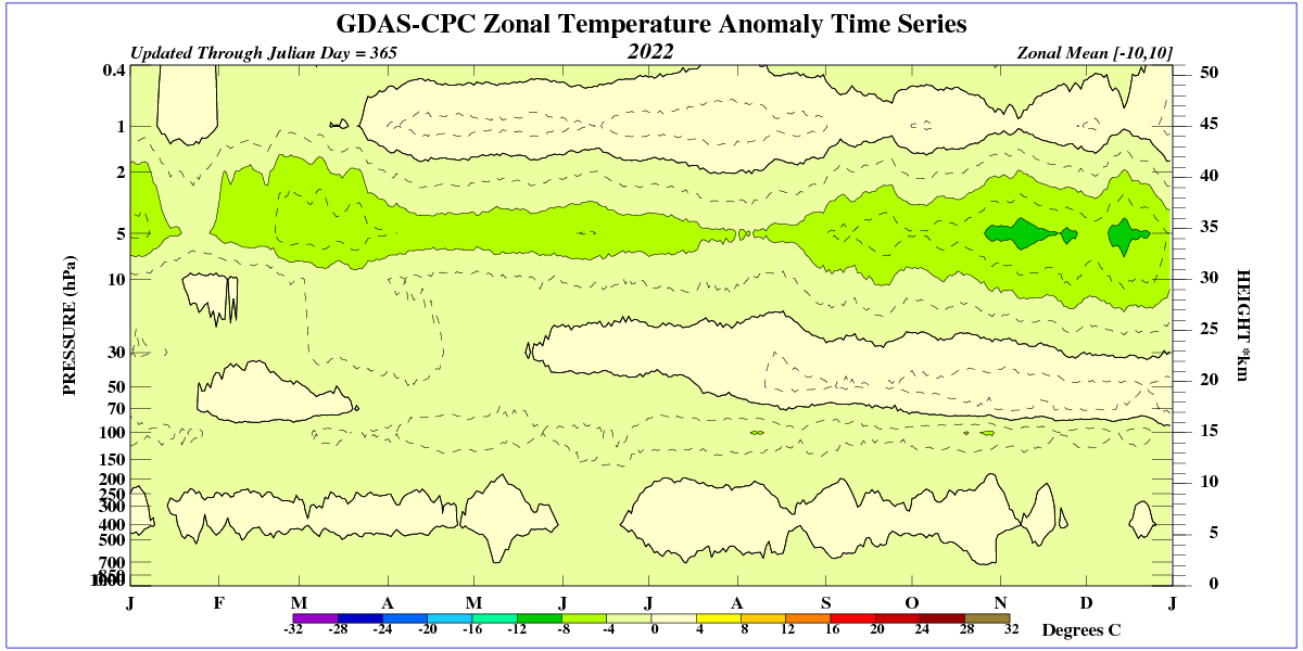
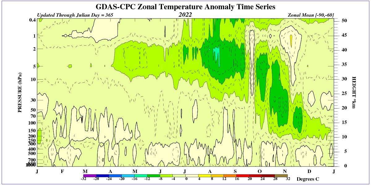
July 2022 record cold values at 10 hPa (ERA5)
NCEP showing the extreme cold anomaly at 50ºS in August. There is no temperature anomaly in the tropics, and the RSS images you posted show the same. No temperature anomaly at the tropics, just at the 25-60ºS.
Either you cannot stand being wrong or you just do not get it?
You said “It will not migrate to the Northern Hemisphere. Lower stratospheric circulation is poleward. Most of that water will leave the stratosphere before it reaches the Northern Hemisphere.”
I show you a plot of water vapor anomalies clearly migrating to the Northern Hemisphere, and you show me a plot of temperature anomalies. This eruption blasted particulate matter all the way to mesosphere. Do you think that cold atmospheric temp anomalies are a proxy for anomalously high water vapor content?
There can be no further contact.
Not only I but everybody else believes an increase in stratospheric H2O leads to stratospheric cooling.
The record cooling at 45ºS in over 30 years of observations can only be explained by the coincident Hunga Tonga eruption. It is not sulfate aerosols, because they warm the stratosphere. It is the extra water vapor.
It is a fact that extraordinary stratospheric cooling is only being observed in the extra-tropical Southern Hemisphere. This was to be expected because winter circulation has been towards the SH. Will it be observed when winter circulation is towards the NH? It is possible but remains to be seen.
The temperature in the upper stratosphere in the tropics has dropped the most, due to a decrease in UV radiation.
An even greater effect in the upper startosphere is seen above 60S.
The presence of a significant increase in stratospheric water from the Hunga Tonga eruption is cooling the lower stratosphere. As a result, the surface of that part of the world should warm from a reduction in outgoing longwave radiation.
The effect over the Northern Hemisphere comes from an alteration in the stratospheric temperature gradients that should result in a slightly increased chance of cold air incursions over northern mid-latitudes this coming winter. As a result the NH winter should be less warm than usual for a La Niña winter.
ENSO did an unusual for the time of the year V-turn last July into an infrequent third-year Niña. I wonder if the stratospheric cooling from Hunga Tonga, as it moved southward through the Brewer-Dobson circulation was responsible for that. At the time I was projecting an ENSO-neutral winter due to higher solar activity.
http://www.bom.gov.au/climate/enso/monitoring/nino3_4.png
The problem with the general consensus about Stratospheric Water Vapor regulating outgoing long wavelength IR is that it does not take into account the energy balance of incoming vs outgoing of the full spectrum. We know that water vapor essentially has no affect on visible light but on incoming UV it is huge. The facts indicate that UV and IR or greatly affected by incoming and since there is no outgoing UV, an energy imbalance exist now relative to conditions before the eruption.
Obviously, this has been looked into.
The cooling effect of stratospheric water vapor on stratospheric temperature is due to its greenhouse IR absorption and emission. This is what produces 95% of its heating rate (negative).
The UV component is not understood, there is almost data and the referenced paper does not touch that issue, but thanks for the link. More UV has been hitting the surface for the last two decades because Stratospheric Water vapor content dropped by 10% after 2001. That will swing back the other direction now. Fortunately nature has provided a grand experiment verify many things about this topic.
UV absorption at the stratosphere warms big time. Water vapor at the stratosphere cools big time. It is actually quite simple, the IR effect of water overwhelms the UV effect of water. What you say cannot be correct.
Well, you can go on believing what you want to believe, -100+ degree H20 cannot possibly have any effect on the surface on upwelling IR and even if it does UV incoming and IR outgoing are decoupled in this context. You are not making any sense when you talk about overwhelming.
You are the one believing things that are not supported by anything. Everybody can see the great cooling effect the H2O injection is having in the lower stratosphere, with record-low temperatures at 40-50ºS. It is just not possible that it comes from enhanced UV absorption, as that would deliver energy increasing the temperature. It must come from radiative cooling and the only possibility is enhanced IR radiation by H2O. It is clear that you are wrong in your unsupported beliefs.
Yes, water in the lower stratosphere radiates strongly into space, but it also warms the lower stratosphere.
Ren, “it also warms” makes no sense. It either warms or cools, as the temperature change is a NET effect.
If you have any articles or data that show the water is warming the atmosphere I’d love to see them because that would mean I would learn something new.
The effect of the extreme stratospheric water injection from the Hunga Tonga eruption is an extreme cooling of the 30-60ºS lower stratosphere, accompanied by the corresponding geopotential height changes. The effect is moving South, not North. That evidence supports my point of view. Where is the evidence against it?
Javier in winter, water vapor from the south in the mid-latitudes competes with ozone that falls from the stratosphere. Of course, water vapor is heated from the surface and in winter can reach as the Arctic, where it raises the temperature throughout the atmospheric column.
“Stratospheric Intrusions are identified by very low moisture levels in the water vapor channels (6.2, 6.5, and 6.9 micron).”
https://www.cpc.ncep.noaa.gov/products/stratosphere/strat_int/
The water vapor transfers heat not only horizontally, but also vertically. It can cool the higher layers of the stratosphere if it reaches there.
Ren, that is not correct. The Longwave radiative heating rate for water vapor is negative at all altitudes. This means water vapor can only cool the atmosphere from IR radiation. It will warm the surface, but it will cool the atmosphere. It can only warm the atmosphere through UV radiation, but there’s very little of it in winter and none in the Arctic at that time.
From Petty 2006 https://www.amazon.com/First-Course-Atmospheric-Radiation-2nd/dp/0972903313
Volcanic ash that enters the stratosphere lowers the temperature in the troposphere, but raises it in the stratosphere because ash, as a solid, absorbs a much larger range of solar radiation. It is simply opaque to infrared radiation.
Javier, hurricanes transfer heat from the ocean surface (ocean surface temperatures can drop as much as two degrees after a hurricane passes) to the stratosphere, where they radiate infrared heat at -80o C.
Hurricanes leave a trail of cooler water, true. But this is mainly due to mixing with the deeper colder layers of water that underlay the surface waters of the entire global ocean.
They do transfer thermal energy poleward, of course. That is the net effect of all weather.
And not exclusively poleward, but also upwards, to space, which is where it all goes in either case.
Hear that huge sucking sound?
That is the infinite cold and black of space absorbing yet another years worth of accumulated solar energy, as the long, dark, polar night settles in and spread towards the Arctic circle for another six months of Cold Hell.
I do not know what is causing the temperature anomalies in the Southern mid latitudes, there is no doubt that it is an after effect of the eruption. It could be water vapor or it could be particulate matter or a combination of both. The lower stratospheric temperature trend has been flat for 20 years and water vapor content has fluctuated and generally been trending up during the same period. Water vapor anomalies have been detected all the way up 15 degrees north and no response is evident anywhere except the Southern Mid latitudes, there is nothing simple about this.
Only a long-term decline in ozone production can lower temperatures in the stratosphere. Only the O2 molecule undergoes photolysis, and in order for an O3=O2+O molecule to be formed, heat must be transferred to another molecule. Otherwise, O3 immediately decays.
Look at the temperature in the lower stratosphere from 2021. Already in 2021 you can see low temperatures with periodic stronger drops.

Note to Self: Do NOT move to the upper atmosphere!
Even the best of times are the worst of times way up there.
An even stronger drop in temperature is seen in the middle stratosphere.


Remind me again, has anyone shown that these movements up, down or horizontal are not natural in origin? ie the curve is doing what it has always done for as far back as we can create proxy data… so CO2 adds a little bit of background warmth hypothetically based on radiative transfer theory, but does it change storm tracks, weather type, frequency or intensity or have any credible real world attribution ? Global temperature anomalies is a meaningless graph to scare people with. We should fight to change the narrative and bring it back to.something grounded in science and the real life experience of humans. The UN propaganda machine should not dictate the price or affordability of energy, food, goods and services through this thing.
Interesting to note that it’s flattering out though all the same.
“Remind me again, has anyone shown that these movements up, down or horizontal are not natural in origin?”
No, nobody has provided any evidence that the climate we see is not natural.
Mother Nature is in control of the climate until proven otherwise, and it has never been proven otherwise. Not in all these decades of trying.
Somebody could prove me wrong with a little evidence, but they won’t because they don’t have any evidence. Right guys? They won’t answer because they have no answer.
You go around all the time saying the other side doesn’t have any proof that CO2 is a demon gas, and all you get from the other side is silence. That ought to tell you all you need to know about alarmist climate science. They have no answers and when you call them on it, they remain silent. The alarmists don’t have what they claim they have.
Meanwhile the Western Democracries are in the process of bankrupting themselves in their efforts to control the benign gas, CO2. Insanity, greed and stupidty, all combined.
It’s a mad, mad, mad, mad, mad, world (from the movie).
Benign only in the sense of any direct influence over Earth’s energy balance.
CO2 is the foundation of abundant life on earth and its historic reduction provided the basic energy store for current human abundance. Human existence, as most know it, is due to the fossilised biomatter long dead that sequestered the carbon from CO2. Humans are doing a little bit to restore a more natural balance to improve conditions for plant life sharing the planet.
I am amazed by the rate of growth of some plant life. There are noticeable changes over periods as short as a day.
Mother Nature planned for all of the changes we have seen. It’s all accounted for in the physics of the universe. Once one looks at the thousands of perfectly quantified physical variables required for life to exist, the thought that more CO2 would produce an existential threat is hilarious.
It is obvious you would make a perfectly awful Climate Scientist™!
Don’t quit your day job, and forget about that gig as a writer of Democrat talking points.
The fact that the Niño 3.4 index remains above -1 indicates a more sluggish decline in global temperature, but an extension of La Niña conditions. And such a condition will remain until a strong increase in the strength of the solar wind, which is now highly variable.
http://www.bom.gov.au/archive/oceanography/ocean_anals/IDYOC007/IDYOC007.202210.gif
http://www.bom.gov.au/archive/oceanography/ocean_anals/IDYOC006/IDYOC006.202210.gif
Kansas, Oklahoma and Texas could use a little rain. This weather pattern has us very dry. It’s had a high pressure system hovering over us, more or less, for six months. But it looks like things are changing a little now.
I was under the impression that La Niña conditions enhanced atlantic hurricanes, but this year seems to be an exception for some reason.
If solar activity does not increase markedly, such conditions of weak La Niña may become established. However, there will be more snowfall in the winter in the Midwest when the jetstream begins to wave.
No Pacific moisture means drought and high pressure. How is the cotton crop?
It’s a serious drought, especially for some locations. It is affecting all crops and livestock.
But we may get some relief before too long.
We had a similar drought back in 2010-2012, only this one lasted about two years. The one we are currently in has lasted about six months.
Conditions in the Nino34 region now are close to what existed in 2009 ahead of the weak 2010/11 El Nino. It is reasonable to expect a weak El Nino in 2023. The 11 to 12 year cycle in this temperature that lags sunspots by 31 months is close to its minimum now. So any El Nino in the next year or so will be similar time of the cycle to 2010 rather than 2016 and 1998.
Moisture over central Australia is already impressive and still in spring.
https://earth.nullschool.net/#current/wind/surface/level/overlay=total_precipitable_water/orthographic=-226.13,-24.53,905/loc=141.138,-25.785
Moisture begets moisture so should be another wet summer. Once the atmospheric moisture gets to 45mm, the atmosphere over land can really pump up and drag mid level moisture from the oceans.
I agree 100 percent.
This is not the end of rainfall in southeastern Australia. More cold fronts from the south will arrive there soon.

This pause is 8 yrs and the last was 18 yrs. I find it odd that with an increasing CO2 ppm we have in excess of 26 yrs with no warming, but alarmists are yelling it is worse than we think.
Alarmists can’t claim that their climate control policies are working. That’s because atmospheric CO2 keeps rising. They’ve really boxed themselves in because they have already taken the money and have only one hill to die on.
Anything else is fraud.
And yet the linear trend, calculated from the beginning of the old pause, in July 1997, up to this month, is 0.11 deg/decade, not dissimilar to the 0.13 for the whole dataset.
As of 2019, there is a clear downward trend in the temperature of the Peruvian Current.
http://www.bom.gov.au/climate/enso/monitoring/nino1.png
Damn, the anchovy catch will be down then.
Conversely, the cool Peruvian Current is an abundance of food for anchovies.
Not only is the anchovy fishery plentiful, but the Galapagos penguin population will increase.
It is warming, el nino, that causes decrease in fish populations.
Cold means upwelling is ongoing, plenty of nutrients, plenty of O2.
The ever-faithful and intrepid Pause Deniers must be on vacay.
Maybe they are all still occupied with trashing CMoB’s reply to Spencer’s post about the feedback paper.
I think they are out looking for firewood.
I think they might be getting extra work from their side gig writing copy for alarmist news media scare pieces, which is currently spewing a firehose-like torrent of outlandish warmista malarkey.
Them panic-mongers LOO-OOVE them some hurricanes, yo!
THis is the turning point maximum of a cycle, warming is over.
As I read the UAH Satellite data, by far the most regularly spaced and consistent instrumetally of any, far better than HADCET 5 that only measures ocean water temps rather irregularly, the global air temperature is currently 0.6 degs colder than the 1998 and 2016 El Nino maximums, at a level it has been for most of the last 24 years. Anyone have a problem with that they can enumerate, using the actual UAH data? THis is also close to the 1939 maximum, before the following cooling. How can this be represented as extreme rate or range warming, except by someone wholly unable to read a data set or a graph. Or a liar.
And of course, it is also below the average temperature of the last 4,000 years. Even the Kobashi multi core data puts it in the middle. Nowhere near “warmer than since records began”. Not in this interglacial or the last 4 either. All warmer.
Just another cycle. “All we see are cycles” , “No monotonic signal” – Carl-Otto Weiss.
How long can this overt bullshit be regurgitated. The observations say NO.
The way I read the temperature record since the 1880’s the recent temperature record shows a continuation of the pause-warming pattern that has existed since the 1880’s. The current pause period began about 2004-5 and should last until about 2035. A period of continuous warming should occur from 2035 until 2065 if the pattern continues. In that case, there will only be forty years of continuous warming in this century
Brian R Catt said: “As I read the UAH Satellite data, by far the most regularly spaced and consistent instrumetally of any”
UAH has poor coverage. Read Spencer et al. 1990 and Spencer & Christy 1992 for details. In a nutshell the coverage is so bad that they had to infill grid cells using cells up to 4160 km away spatial and 2 days temporally. Contrast this with GISTEMP which only infills up to 1200 km away.
UAH is also subject to numerous adjustments that are arguable more numerous and more significant than anything the conventional datasets are doing. In addition each version employs an ever increasing number of adjustments.
Year / Version / Effect / Description / Citation
Adjustment 1: 1992 : A : unknown effect : simple bias correction : Spencer & Christy 1992
Adjustment 2: 1994 : B : -0.03 C/decade : linear diurnal drift : Christy et al. 1995
Adjustment 3: 1997 : C : +0.03 C/decade : removal of residual annual cycle related to hot
target variations : Christy et al. 1998
Adjustment 4: 1998 : D : +0.10 C/decade : orbital decay : Christy et al. 2000
Adjustment 5: 1998 : D : -0.07 C/decade : removal of dependence on time variations of hot target temperature : Christy et al. 2000
Adjustment 6: 2003 : 5.0 : +0.008 C/decade : non-linear diurnal drift : Christy et al. 2003
Adjustment 7: 2004 : 5.1 : -0.004 C/decade : data criteria acceptance : Karl et al. 2006
Adjustment 8: 2005 : 5.2 : +0.035 C/decade : diurnal drift : Spencer et al. 2006
Adjustment 9: 2017 : 6.0 : -0.03 C/decade : new method : Spencer et al. 2017 [open]
That is 0.307 C/decade worth of adjustments jumping from version to version netting out to +0.039 C/decade.
Don’t hear what I’m not saying. I’m not saying UAH isn’t useful. But I am saying that this widespread belief that UAH does not make adjustments or perform grid infilling is just wrong. Furthermore, an argument could be made that not only does UAH do everything that conventional datasets do, but they do more of it.
The UAH satellite data and the Weather Balloon data correlate at about 97 percent, if I recall correctly.
What’s the correlation between the Weather Balloon data and the other data sets?
Hey look! bgwxyz knows how to copy-n-paste!
“What’s the correlation between the Weather Balloon data and the other data sets?”
That is a darn good question, sir.
Perhaps we can jot off a letter to the University of Alabama at Huntsville, and see if maybe Dr. Christy can make us up a graph showing very plainly the correlation in graphical form that cannot possibly be mistaken for one of those Warmista Fake-Graphs-R-Us Blue Light Specials?
It would be even better if we could get him to perform the Herculean task of also plotting on the same graph the predictions of the various global Climate Models, you know, just so we can see if the Warmistas have any idea of what they are talking about, or if perhaps just maybe their diapers are completely loaded with a stinky heap of smelly crap?
Hmmm, if only…
Oops, wrong graph. This one:
And bgwxyz likes to proclaim that IPCC “projections” are accurate.
So, wait…let me see if I have this straight…
A warmista is complaining about adjustments?
And what exactly is “conventional” about altering historical data sets using an algorithm that adjusts every past value according to how much CO2 was in the air at the time?
“NOAA temperature adjustments are doing exactly what they’re supposed to” | Real Climate Science
Let’s consider that number again, briefly: Thirty-Nine One Thousandths of One Degree.
Golly!
Is that a lot?
That is almost as small a number as the percentage of the atmosphere comprised of CO2.
But rounded off to the nearest one tenth of one degree (since the graph we are discussing only shows, you know, tenths of a degree and all), that comes to a grand total net adjustment of…wait for it….drum roll please…
If you guessed it you win the prize Zero Point Zero Degrees!
Celsius!
That 0.0 is in Celsius degrees.
Hoorah!
Now do adjustments to the other satellite data set.
Just in case you never get around to it though…
Erasing The Satellite Hiatus | Real Climate Science
Whoa!
That is more than 39 one thousandths of a degree, aint it?
A lot more!
And Mears went to the trouble of adjusting recent data up, and less recent data adjusted down…way down!
AND data from longer ago adjusted more and more and more, just like…hmm, it is reminding me of something…
Indeed.
Just checked my very amateurish look into the Monthly Southern Oscillation Index, and, damn, first time in 380 months (February 1991), the 30 year average is positive.
Properly understood, the climate is nothing more than a series of pauses and cooling trends. There is no warming.
Must be cherry-picking season again.
Mr. J: And what caused that no warming? Was it no CO2?
You’re fooling nobody.
Looks like a 43 year time series of El Nino’s to me. What’s the latest theory about how CO2 back radiation only warms the lower troposphere during El Nino events no matter what its concentration in the atmosphere is?
Then why is the right-hand side of the temperature line higher than the left-hand side?
It’s a trick of the eye. It’s pauses all the way down.
Here is why, explained and graphed:
Erasing The Satellite Hiatus | Real Climate Science
RSS and UAH used to be a virtual match, but RSS actually showed even less warming than UAH.
And then climate realists referred to it one too many times…
I actually applied to RSS for a job once. That was when I was naive about the politics of global warming and remarked over lunch with the staff and president that I had doubts about global warming. I didn’t get an offer. 🙂
“There is no warming’.
For this time period, it’s warming ARO 2.17 +/- 0.06 degC/century, with an R^2 of ~0.69. Now, you might be right, but here’s the probability that you are:
3.12E-249
The good news is that my engineering laptop can calculate values much tinier than I thought. I already gave you the bad news….
So you’re telling me there’s a chance.
One of Jim Carey’s best lines.
I steal lines too, but attribute them. Maybe the way forward is to answer Mr. Spencer’s good question.
The graph has the correct slope (0.59) while the text has the digits reversed (0.95).
Mea culpa.
Has been corrected to .59C in the text now everyone is happy again.