By Christopher Monckton of Brenchley
The New Pause, having paused a month ago, has now lengthened again: this time to exactly eight years. As always, the Pause is calculated as the longest period for which the least-squares linear-regression trend up to the most recent month for which the UAH global mean surface temperature anomaly is available is zero.

The trend on the entire dataset during the 526 months from December 1978 to September 2022 is 0.59 C°, equivalent to only 1.34 C°/century. So slow a rate of warming is well within the natural variability of the climate, and is proving net-beneficial.

The New Pause has grown to fully eight years in length at a most embarrassing point for true-believers: for the cost to the West of the economically suicidal policies that they have long advocated is now becoming all too painfully apparent, just as it is also ever more evident that the warming since 1990 is well below half the midrange prediction made by IPCC that year.
We can see their models don’t equate to reality. Our sides experts clearly see through research that shifting wind and sea currents are behind a lot of current changes in local weather patterns. The real problem isn’t climate change, or the other so called problems, but is all related to the leftist agenda of Marxism or Egalitarianism. They need to get rid of Western culture and thought. Then they can finally have the equal society that Stalin and Lenin dreamed of. Once they rid us trouble makers out. then communism will suceed. It is a little like the people who advocate the gold standard as money. It is to unreliable and deciding how many shoes equals a bushel of wheat, every minute, is just to complicated. Their side has people like Dr. John Holdren, science advisor for Bill Clinton and Barrack Obama. They predicted in the 70’s that mass population would kill us all by the year 2000 and we need to sterilize people or just get rid of them. We have people like Lord Monckton that see a great future ahead with a little warming. But we are living in the now, where they are living in a fantasy world of mathematical nonsense.
Let’s hope farmers in the Midwest aren’t caught off guard by frost and snow at night.

The 2022 harvest is in full throttle. Maybe not a record year but close again thanks to CO2 fertilization.
CMoB said: “just as it is also ever more evident that the warming since 1990 is well below half the midrange prediction made by IPCC that year.”
You’ve left me no choice. This is straight up disinformation. You know exactly what the IPCC predicted because I’ve pointed it out to you multiple times now. So why do you continue to post something that is patently false? Do you want to post what the IPCC actually predicted or do you want me to? Either way it is getting posted.
Then post it, don’t posture!
I’m going to give CMoB one day out of respect for him.
Prep to be “Commied”. CMoB’s lack of self awareness is most obvious when he whines about the Dr. Evil cabal out to out to get him. The chance of this plot being real is about as high as the chance that RSS temperatures between 1980 and now being flat, or down.
https://wattsupwiththat.com/2022/10/05/the-new-pause-lengthens-to-8-years/#comment-3614990
From the IPCC 1990 first assessment report, page 73:
Of course, it has been “business as usual” since 1990 because there have been no reductions in the rate of atmospheric CO2 emissions as measured by Mauna Loa observatory.
Doonman said: “Of course, it has been “business as usual” since 1990″
Can you post a link to evidence suggesting there is 450 ppm of CO2, 2500 ppb of CH4, and 450 ppt of CFC11 in the atmosphere? I’d like to review it if you don’t mind.
I see a May 2022 CO2 level of 421 PPM from Mauna Loa. So you are correct, in May 2022 we are 6.8% lower concentration than the projected “Business as Usual” IPCC projection made in 1990.
So a 93.2% concentration of the 1990 “Business as Usual” projection is then .27 deg C per decade using the IPCC method of prediction.
What about CH4 and CFC11?
I rounded down to account for the part per billion and part per trillion concentrations of those trace gases. Feel free to waste your time doing a complete accounting for them if you like.
CH4 and CFC11 are not the same thing as CO2. Telling me the ppm of CO2 whether you rounded up or down does not in any way answer the question of what the concentration of CH4 and CFC11 are.
They amount to very little as their postulated warm forcing is far smaller than the already small CO2 forcing.
This is why CH4 is hardly mentioned any more.
The IPCC says that CH4 and CFCs increased the ERF wrt to CO2 by 44% as of 2019. (see AR6 WG1 Annex III for details). Not only did the IPCC think both CH4 and CFCs were important but they also think it is a significant contributor to the ERF and the studied scenarios even in their first assessment report from 1990.
Let me ask you since you want to participate in this discussion. Of the scenarios that the IPCC FAR from 1990 studied which one best matches the emission pathway that humans chose?
No, it is YOU who don’t realize that the IPCC is advancing CH4 a negligible warm forcing contributor for people like YOU who then get excited over it.
long ago learned that anyone befuddled by the misleading IPCC claims for ch4 isn’t worth discussing it with you who will ignore the long known negligible warm forcing effect
I suggest you stop embarrassing yourself over a hyper trace gas.
It doesn’t matter if I’m “embarrassing” myself over CH4 or whether you think an increase of 44% above that of CO2 alone is significant or not. That does not justify Monckton misrepresenting the IPCC or change the fact that their prediction from 1990 was pretty good.
Help me out here. What was the postulated mechanism for the projected increase in methane release?
The IPCC scenarios are based human emissions.
Thanks, but what are the proposed human emissions of methane?
I’ve seem mentions of ruminant production, melting permafrost and methane release as a side effect of coal mining and oil production, but not the breakdowns.
The IPCC scenarios are stupid since CH4 hardly matters in the “heat budget”.
Just because you think the IPCC scenarios are stupid does not give Monckton the right to misrepresent what the IPCC said nor does it invalidate the fact that the IPCC prediction from 1990 was pretty good.
You made a strawman reply,
Congratulations!
I’m not the one who said the IPCC scenarios are stupid in a thread discussing how Monckton misrepresented the IPCC. Don’t put that on me.
Bdgwx will change the subject in 3.. 2.. 1..
In the IPCC first assessment report from 1990 their were 4 scenarios studies including A (business-as-usual), B, C, and D. The scenarios are different depending on the concentration of GHGs in atmosphere. The following is presented in the SPM on page xix. I have marked the concentrations as of 2020.
We can also see the scenarios presented as the amount of RF they would yield. The following is presented in the SPM on page xx.
Based on the scenarios studied a reasonable match to the emission pathway humans chose is scenario C. The following is presented in the SPM on page xxiii. It shows the global average temperature prediction for each scenario studied. As you can see for scenario C the IPCC predicted 0.55 C of warming. Per GISTEMP, HadCRUT, BEST, and ERA the actual amount of warming was about 0.60 C.
Furthermore, the IPCC clearly states in the SPM on page xi that scenario A is expected to have 0.3 C/decade of warming, scenario B is 0.2 C/decade, scenario C is 0.1 C/decade, and scenario D is 0.1 C/decade.
Extrapolations of quantities with huge uncertainty.
YES! Two downvotes for pointing out the obvious.
This is the level of “analysis” in IPCC-ville—straight-line extrapolations.
The final, GMST, graph is for what would now be called the “worst-case scenario”, assuming a “top of the range” ECS value.
For a “best estimate” (/ “most likely” ?) estimate see Figure A.9 on page 336 (of the FAR, WG-I, report from 1990).
NB : The 3.2-3.3°C in 2100 value in Appendix A of the main report is a fair bit below the “frightening” 4.2-4.3°C value in the SPM.
That graph is consistent with the graph in the SPM page xxii. However, this graph is a lot easier to read since it is baselined at 0 C at 1990 and makes it easier to show how Monckton is misrepresenting the IPCC. I was not aware of it until you posted it. I’ll start using it going forward.
I missed that.
It explains the ~1°C delta with the SPM graph, which used “0°C = 1765 / pre-industrial”.
– – – – –
Regarding “recent” warming trends, while CMoB’s “well below half” is an exaggeration — from 1979 to 2021/2 it’s more like 60% of the “0.3°C / decade” trendline (for the original “Scenario A / BaU” option) and two-thirds of the Figure A.9 numbers — that doesn’t mean we should try to imply that “the IPCC was 100% accurate in 1990″.
AR6 used the CMIP6 “pathways”, with a common set of “Historical Data” inputs (forcings) updated to 2014 — the FAR only had data up to the late 1980s — and with the massive “inertia” in the Earth’s climate system the outputs (GMST, sea level rise, …) don’t diverge until after 2025.
Up to (at least) 2023 the “counterfactual” SSP5-8.5 and the “in the absence of additional climate policies … medium … SSP2-4.5” scenarios give almost identical results.
A legitimate argument can be made that the models “run hot”, as even the IPCC partially admits in their AR6 (WG-I) report, although I agree CMoB’s (effective) “more than twice as hot” is a bit over the top.
PS : The reasoning for my “60% of …” and “two-thirds of …” estimates can be more clearly seen if you only plot the trendlines rather than the “raw” (12-month rolling averages) anomaly data.
Apart from methane, Scenarios C and D don’t appear to diverge until at least 2030, so it’s all rather speculative.
Do you know which greenhouse potential values were being used for methane and the refrigerants? There seems to be quite a wide spread.
What does C and D diverging starting around 2030 have to do with Monckton misrepresenting the IPCC? And why is that speculative?
I’m not sure about details regarding the greenhouse potential values used for the scenarios. Why does it matter?
Scenarios C & D are essentially the same until 2030, so any difference between them is purely speculative until that divergence.
Without the comparative greenhouse potential values for methane and the refrigerants, it’s difficult to form any informed . opinion of their contribution to the modelled and observed temperature trend.
The Scenario A methane increase seems rather unlikely, as do the Scenario C & D decreases.
Most of the “pause” posts seem to be a nose tweak or perhaps a wedgie for the monotonic increase crowd.
The methane / refrigerant graphs do strike me as pointing to a useful area of investigation. For example, developing and switching to a low-greenhouse refrigerant may prove disproportionately useful.
Oh, you’re saying the scenarios C and D themselves are speculative. I thought you were saying Monckton misrepresenting the IPCC was speculative. Anyway, it’s moot. The IPCC scenarios could not only be speculative, but completely wrong and it still wouldn’t matter. That does not justify misrepresenting what the IPCC said.
It does appear to be gilding the lily, and should be corrected.
On the other hand, Scenario C was the “mission accomplished” case, so that is excellent news.
“The trend on the entire dataset during the 526 months from December 1978 to September 2022 is 0.95 C°”
The graph displays a trend of 0.59 C. Either the text or the graph needs to be corrected.
When the El Nino hit in 1998, along with the high world temperature that ensued, alarmists hit us over the head repeatedly with the inflated temperature in their zeal to prove that CAGW was real. So I choose to start my graph at the peak of 1998, based on the arguments of alarmists, and draw it to our current world temperature. In other words, the pause has been going on for 24 years, not 8 as you imply.
I’m expecting the Monckton Pause to continue to length in the near term based the simple model I developed which fits the UAH data with an RMSE of 0.13 C which is only 0.03 C higher than the 0.10 C (1σ) uncertainty assessed in Christy et al. 2003.
Reality outgrows models.
LOL.. two FAKE models with assumption built in.
NOT SCIENCE
Spaghetti alert!
Can you provide numerical values for the parameters: C02, EMSOlag5, AMOlag2, PDOlag2, AODvolcanic parameters ?
I want to reproduce your results, and also use the correct units.
What happens when you run your model (with these same coefs) further foward ?
At 1979, with no CO2, you model gets the same value as with CO2 ? I guess for the model this is OK, but if you run the model further backwards, how is the Co2 concentration specified ?
Charles said: “Can you provide numerical values for the parameters: C02, EMSOlag5, AMOlag2, PDOlag2, AODvolcanic parameters ?”
UAH: https://www.nsstc.uah.edu/data/msu/v6.0/tlt/uahncdc_lt_6.0.txt
CO2: https://www.esrl.noaa.gov/gmd/webdata/ccgg/trends/co2/co2_mm_mlo.txt
ENSO: https://www.cpc.ncep.noaa.gov/data/indices/oni.ascii.txt
AMO: https://www.ncei.noaa.gov/pub/data/cmb/ersst/v5/index/ersst.v5.amo.dat
PDO: https://www.ncei.noaa.gov/pub/data/cmb/ersst/v5/index/ersst.v5.pdo.dat
AODvolcanic: https://agupubs.onlinelibrary.wiley.com/doi/full/10.1002/2015jd024313
Charles said: “What happens when you run your model (with these same coefs) further foward ?”
That’s what I did. I started the model in the 1980 and ran it forward. I can make future predictions with the model by plugging inputs for the future as well. CO2 and volcanic AOD are relatively easy to predict several months out. And since the UAH response lags ENSO by 5 months and AMO/PDO by 2 months I get 2 future months with no effort. Extending it behind 2 months requires me to get the ENSO, AMO, and PDO predictions from long lead time global circulation models like the CFS, but the skill of those GCMs drops with each additional month of lead time. I don’t use this model for predictions more than 2 months out. I only use the model to demonstrate how a model based on CO2 is consistent with not only the warming trend, but also the month-to-month variation and extended pauses.
Charles said: “At 1979, with no CO2, you model gets the same value as with CO2 ? I guess for the model this is OK, but if you run the model further backwards, how is the Co2 concentration specified ?”
I can’t run the model for data prior to 1979 because it doesn’t exist (UAH started in 1978/12).
Charles said: “I want to reproduce your results, and also use the correct units.”
Yes. Please do. Maybe you can get a model with a lower RMSE. Though you’ll probably have to incorporate more terms. I trained the model using recursive descent to find the optimal coefficients for each term so I’m reasonably confident that given these terms the model is as good as it gets. I will say that Christy et al. 2003 assessed the uncertainty of the UAH at 0.10 C and my model already has a lower RMSE of 0.13 C. That means there is probably only 0.03 C of skill up for grabs.
HAHAHAHAHAHAHAHAH
Divide it by a hundred! Go for it!
Your AMO/PDO effects are too low and not simple linear values. ENSO is just noise but does have trend effects. That will become obvious when the AMO phase change occurs.
I’ll test any model you want me to. Give me the formula and I’ll report the RMSE.
since temperature is not a linear function of time it is wrong to fit an aphysical linear model to it.
full stop.
Yep, the actual warming has only come at strong El Nino events
Using those steps to create a linear “trend” is WRONG.
But without them.. THERE IS NO WARMING.
CO2 cannot be the cause of warming, if there is no warming
No real time-series data is perfectly linear, always having noise in the form of instrumental error and minor influences from variables other than the independent-variable time. Are you advocating that linear regression should never be used for time-series data analysis?
Instead of making unsupported assertions, how about explaining what you mean and why we should believe you?
Because that is not Mosher’s MO all cryptic drivebys is what he has
I see that I got a negative vote. I guess that someone isn’t in favor of explanations and prefers dogmatic assertions.
Mosher you are such a sad loss to the scientific community.
According to their hypothesis about Man’s CO2 causing CAGW, there shouldn’t be any “pauses” at all. Man’s CO2 and other of Man’s GHG’s have been on a steady rise.
There have been pauses, now and in the past.
Hypothesis nullified.
(Gosh! Maybe “Climate Change” is natural after all!)
See my trivial model above which not only predicts the current pause, but others before it. It also predicts that the pause will likely lengthen in the near term as La Nina gets extended to its 3rd consecutive NH winter. If we remove the CO2 component from the model we actually lose the ability to predict individual pauses with the model.
Also between 1979 and 2021 the CMIP5 suite of models predicts that about 22% of the months should be included in a pause lasting 7.5 years. UAH showed about 25%. It’s not a perfect prediction, but it’s pretty good. I did the analysis several months back. Hopefully I can get time to redo the analysis for 8.0 year pause lengths.
A powerful wave of Arctic air from Canada is coming into the central US. Temperatures will drop below zero C at night and there will be snowstorms in places. The temperature drop will be dramatic.

Sorry.
I know, I saw it on the BBC news. Oh….er…hang on….no, I didn’t….
Cooler air to finally return to much of western US
 ?w=632
Forecasters say a big change will begin Monday. A dip in the jet stream is expected to move into Washington before dropping even farther south Tuesday and Wednesday. Although the West Coast will cool down, the biggest effects may be felt farther east.
“Some locations could see nearly a 20-degree drop within 12 hours,” said Massey.
La Niña is working and will continue to work.
“Recent downpours have pushed Sydney, Australia, to its wettest year on record, as more than 7 feet (2,134 mm) of rain has inundated the region so far in 2022.
On Friday morning local time, Sydney’s Observatory Hill weather station recorded more than 87 inches (2,200 mm) of rain since January 1, 2022, eclipsing the previous annual record of 86 inches (2,194 mm) set 72 years ago in 1950. A deluge that unleashed more than 3.50 inches (91 mm) of rain across the city Thursday morning into Friday was responsible for stamping a new mark in the weather history books. Weather records have been kept on Observation Hill since 1858.
To put that amount of rain into perspective, Sydney, the capital of New South Wales, averages about 39 inches (1,000 mm) a year.”
There seems to be an Indian Ocean Dipole component as well.
I’m not sure that 3 1/2 inches counts as a deluge – it’s nothing unusual.
There are still three months left in the year, and SOI is high.
Oh, yes. We will doubtless get a hell of a lot more rain this year.
Nothing has really dried out, so there are sure to be more floods as well.
Interesting that the current end date for the pause is more or less exactly where temperatures would be if a linear trend over the entire data set.was correct. Also, this is very close to the actual current monthly temperature.
It’s still a bit warmer if the trend up to the start of the pause had continued to the current date.
Somehow “Bellman” has failed to state what the long-term trend is, and how it compares with the 0.34 K/decade confidently predicted by IPCC in 1990.
I assumed you mentioned it in the head posting, you usually do.
Ignoring uncertainties, it’s around 0.134°C / decade. Up to the start of the pause it was 0.110°C / decade.
Your 0.34K/decade is a made up figure which does not appear in the very rough predictions made in the 1990 IPCC report. According to a Christopher Monckton the actual prediction from the IPPC 1990 report was
The trend since 1990 has been 0.138 / decade, slightly below the minimum range.
Of course, if we can cherry pick starting dates the trend since July 2007 has been 0.281°C / decade. So for the last 15 years and 3 months the warming trend has been exactly as predicted by the earliest IPCC report. But who would look at such a short period as having any meaning.
Of course, all this is only looking at the slowest warming satellite data set. Surface data sets show warming rates of between 0.170 and 0.210°C / decade since 1990.
The IPCC did not predict +0.34 K/decade for the emission pathway humans choose. They predicted +0.18 K/decade. See IPCC FAR SPM figures 5 and 9 and on pages xix and xxiii respectively. Out of respect to you I’ll give you the opportunity to post what the IPCC actually said including those figures before I do it myself above.
But Mosher says you can’t use straight lines.
I suppose you know over that period both CO2 emissions and levels have increased greatly, even on a logarithmic scale. Where is the expected, projected, and predicted warming acceleration? For the hypothesis to be correct, the effect must respond to changes in the proposed cause. How do we distinguish it from the null hypothesis that temperature and CO2 are rising due to different causes?
Atmospheric CO2 isn’t that far off a straight line over the period, and UAH data has been accelerating slightly. The trend between CO2 and UAH data is significant, and if anything the pause period has strengthened that trend.
Comparing UAH to the log of the 12 month average of CO2, we have a current trend of 1.87°C per doubling of CO2, with an r^2 on the monthly values of 0.47.
Before the pause the trend was 1.58°C per doubling with an r^2 of 0.27.
If I factor in ENSO with a 6 month lag, the rate of warming for UAH6 increases to 2.12°C / doubling, with an r^2 of 0.60.
The correlation is better with HadCRUT data since 1958.
Trend is 2.25°C / doubling, with an r^2 of 0.79.
Don’t give me that.
The average annual increase in CO2 has tripled in 5 decades, from +0.8 ppm to +2.4 ppm.
Has the average annual temperature increase doubled? multiplied even by 1.5? I’m afraid not. Temperature does not show a significant acceleration.
No clear correspondence between changes in hypothesized cause and effect.
“Has the average annual temperature increase doubled?”
Why would you expect that to happen. The hypothesis is that the amount of CO2 in the atmosphere will determine the eventual equilibrium temperature of the planet, all else being equal. You can’t translate that into a year by year amount of increase in CO2 and increase in temperature.
You should study paleoclimatology.
1) There is no eventual equilibrium temperature. There’s never been one, there will never be one. The planet is always changing its temperature at all timescales.
2) The correlation between CO2 and temperature is extremely poor in paleoclimatology outside the Pleistocene glacial cycle. Very often they are moving in opposite directions for millions of years.
That’s a figure from my book’s chapter 9 “Greenhouse Gases and Climate Change.” That hypothesis has already been falsified by paleoclimatology.
Bellman,
You claim that UAH data show signs of recent acceleration?
For UAH studies, I work mostly with the Australian subset
That subset is very definitely decelerating.
By what mechanism can you explain this apparent discrepancy?
http://www.geoffstuff.com/uahoct.jpg
“How do we distinguish it from the null hypothesis that temperature and CO2 are rising due to different causes?”
I’m not sure I could just by looking at the data. In theory the null-hypothesis is rejected by the statistical significance of the trend. But as both show more or less linear increases, it’s difficult to assume this proves a causal relationship.
The point of science though isn’t to prove a hypothesis, it’s to try to falsify it, and on the basis of UAH over the last 40 decades there is nothing to falsify the claim that increasing CO2 will increase temperatures.
Well, that is not the hypothesis, is it? We agree that an increase in CO2 will increase temperatures. The hypothesis is that all or nearly all warming is due to anthropogenic emissions + land use changes. Just a 30% warming due to natural causes falsifies that hypothesis.
That the hypothesis has not been falsified is arguable, as it is not consistent with a lot of climate phenomena. But in any case, declaring it settled science because it has not been falsified is not scientific. My hypothesis has not been falsified either. Should I call it settled science because nobody has proved me wrong?
And by the way, are the current crop of climatologists trying hard to falsify the CO2 hypothesis? I only see them looking for evidence that supports it, and altering the evidence that does not.
“Well, that is not the hypothesis, is it?”
It’s the hypothesis I’m interested in.
“We agree that an increase in CO2 will increase temperatures.”
Then what are you arguing about.
“The hypothesis is that all or nearly all warming is due to anthropogenic emissions + land use changes. Just a 30% warming due to natural causes falsifies that hypothesis.”
That’s a rather pointless hypothesis, and certainly not one I’m interested in.
“But in any case, declaring it settled science because it has not been falsified is not scientific.”
Science is never settled, the best you can do is avoid falsification (at least that’s the Popper view.)
I am arguing against CO2 (non-condensing GHGs) having a first-order role in climate change, not about it not having a role.
That’s the IPCC-supported hypothesis and the basis for the climate emergency and decarbonization efforts. It is also the basis for a high climate sensitivity value. If natural warming is >30% it all becomes pointless.
Only for a time. Eventually, every scientific hypothesis and theory is shown to be wrong, partial, or incomplete. Otherwise, there would not be scientific advances.
Being a devil’s advocate, the purpose of the null hypothesis is to provide something to reject. Causality wouldn’t come into play in the early rounds.
Better null hypotheses would be “temperature has fallen since 1900” or “temperature has not risen since 1900”.
Others might be “temperatures not risen since 1930” or “the temperature trend 1950 – 2020 is not distinguishable from the temperature trend 1860 – 1930”.
Unfortunately, hypothesis formulation is rather arbitrary.
The null hypothesis can be considered anything incompatible with the hypothesis. In the case of the CO2 hypothesis, the null hypothesis would be the not-CO2 hypothesis.
As formulated by IPCC the CO2 hypothesis is that all warming is anthropogenic in origin. If an important part of the warming has a natural origin the IPCC CO2 hypothesis is rejected.
True, but the usual purpose of a Null is to provide something to be ruled out.
The 1860-1930 trend vs 1950 – 2020 should give some indication, since earlier IPCC reports indicated this to be the period where increases in CO2 would have an effect.
Causality is notoriously difficult to establish with purely observational data.
Oh, is the IPCC hypothesis “all” or “the majority”? The latter makes causality even more difficult to establish.
“As formulated by IPCC the CO2 hypothesis is that all warming is anthropogenic in origin.”
Citation required. AR5 says:
That’s saying it’s extremely likely that more than half of all warming was since 1951 was anthropogenic sources and the best estimate is that all of it was. But that doesn’t mean the “CO2 hypothesis” dictates that all future warming will be caused by humans. It’s just the observation of what’s happened up to that date.
As far as I’m concerned the hypothesis is that CO2 and other GHG’s will cause warming, everything else being equal. But that doesn’t mean year on year changes have to be caused by GHG changes. El Ninos for instance cause much more warming in the short term.
The central estimate for natural forcing is zero. The error range is ± 0.1ºC
Natural climate change is disavowed not only since 1951 but since 1750. Plenty of figures around from the IPCC and other official sources.
As I said, that’s an observation. It’s not the “CO2 hypothesis”. It wouldn’t invalidate the hypothesis if there was a major warming caused by some unexpected change in natural forcings.
That figure is not an observation because it is derived from models, and model results do not constitute evidence, just a thought experiment.
The models that produce that computer result are the realization of the hypothesis. The CO2 hypothesis is in-built into the models. Therefore, that figure is a graphical display of the CO2 hypothesis, not an observation.
Bellman,
Can you please point to experiments that closely link observed temperature changes to observed CO2 changes in circumstances apart from the real atmosphere?
Logically, if a CO2 change leads to a temperature change in a volume of gas, you are away and running. If, OTOH, you cannot show that, it is back to the drawing boards.
Please don’t quote Guy Callendar. Please quote some work after say year 2000, by which time researchers have had some time to think about experimental design.
Geoff S
Old Cocky,
Yes, the way you describe leads to arbitary problems.
The proper scientific way is to conduct experiments that have measurement outcomes.
For example, you start with the main components of a claim that a change of CO2 content of air leads to change of ambient temperature.
It is hard to experiment this on a global scale, so reduce the scale. Devise ways to simulate a column of air, with devices to measure temperature. Change the CO2 partial pressure. Measure temperature changes, if any.
This type of first approach methodology is conspicuous by its absence in climate research.
Is this because it is too hard to replicate the global environment? Or is it because it has been done, but the results are unpalatable for the preferred modern thinking of settled science?
That is the real question to be answered before you get too deep into Popper-land.
Geoff S
Geoff,
As a rule, experiments are useful to obtain additional data for a specific aspect of an hypothesis. Some fields are amenable to experiments, whereas others (such as astronomy) benefit greatly from improved observational methods.
It certainly should be possible with modern equipment to obtain far better values now for the in vitro values of carbon dioxide, methane and CFCs. This would ideally be done both dry and with various controlled amounts of water vapour. That would have the added benefit of testing the extent to which water vapour dominates at various wavelengths.
With respect, the noise level (natural variations) in the data indicates that seeing an “8-year pause in warming” is unlikely to be any more meaningful than looking at the sky and imagining that what you see in the clouds looks like an animal or a face.
I don’t have my statistical testing tools handy at the moment, but I’m almost certain that the data over the last 8 years doesn’t offer any statistically significant evidence of a deviation from the long-term trend.
”I’m almost certain that the data over the last 8 years doesn’t offer any statistically significant evidence of a deviation from the long-term trend.”
The data shows (beyond any doubt whatsoever) that co2 has not controlled temperature on this planet for the last 8 years.
The question that the alarmists should be asking (and answering) is, “If natural variation is negligible, and isn’t driven by CO2 (as evidenced by the lack of correlation over time scales of months to years) then what is driving temperature?”
Bob W,
Quite so, but it is interesting that this lengthening time period or ‘pause’ is not indicative of an acceleration and also not counter to the possibility of a turning point in action, one that indicates a change on the way to overall cooling. Those who queston the significance of the pause need, of necessity, to describe the mechanism(s) operating to combat the global, ever-present everywhere effect postulated for CO2. Usually they avoid mechanism explanations, or obfuscate into imaginary mechanisms. How about some hard measurement evidence of the effects that counter the expected rise from CO2 for 8-10 years at a time? Or even longer?
Geoff S
Basically, it doesn’t give us much useful information.
They really don’t.
All they need to say is it hasn’t become “statistically significant.”
There is no hypothesis that “warming should be happening uniformly at all times.”
The actual hypothesis is something more like this:
T(t) = To + A⋅t + N(t)
where A is the systematic increase, and N(t) is a “noise” process associated with all the other factors which influence temperature but which are believed to average to zero over the long run.
There is nothing to be “explained” until N(t) starts behaving in ways that are statistically surprising compared to prior behavior.
Until that happens, what’s being observed fits the model.
The pattern of the last 8 years doesn’t deviate from prior statistical behavior enough that anyone ought to be surprised.
This way of approaching things (interpreting some parts of behavior as “noise” that we’re not obligated to pay attention to except as a statistical process) is not remotely unique to climate modeling. In any realm where one is looking at a process for which it’s hypothesized that “we understand the broad picture, but there are a lot of effectively random variations on the longer trend,” there is no obligation to explain the fine-grained variations, unless those variations start behaving in uncharacteristic ways.
There have been other times when the measured values have risen faster than the long term trend. Are you going to insist that someone else explain those too? If you’re claiming there isn’t a trend, does that put an onus on you to explain periods of extra fast temperature increase? Or is there a double-standard, so that in that case you’d agree that “it’s just random and doesn’t need to be explained”?
It’s highly sensitive to the start and end dates
If you run it from 2011 to 2022 you get an upward trend of 3.8 C per century.
If you run it from 2016 to 2022 you get a declining trend of 2.2 C per century
It’s just not a very useful way to look at it
If the Pause lengthens, it becomes more and more useful.
David S,
Agreed on start and end dates. Add locations. Here is UAH lower trop over Australia Aug 2012 to now, not a rise of 3.8 C per century 2011-22 as you quote, but a fall. What mechanism causes that?
Geoff S
http://www.geoffstuff.com/uahoct.jpg
What happened with the monthly UAH-report (I could not find the report at WUWT only in Dr. Spencer’s blog)? Why would not have been the report published at WUWT? Hm, maybe Dr. Spencer has been “motivated” by certain circles not to publish NASA measurement data at WUWT? I have real retro-feelings: As in the former East-Bloc countries building socialism/kommunism…
my model is still working and shows that we entered in new AMO cycle for next 60-70 years … not only a pause for a few years …
WUWT doesn’t provide any model and IPCC just extends the values from last 50 years without clear trend , except absurd alarmism …
wait and see …
Nice. I was actually considering swapping out the CO2 term in my model above with the AGGI term. I will say the primary purpose of my model to demonstrate how increasing CO2 is not inconsistent with the observation of large month-to-month variation and extended pauses.
Morning temperatures (in C) in the Dakotas.

Because the PDO has already started its 30-year cool cycle and the AMO’s cool cycle will likely start around 2015, there is a high probability we’ll soon experience a 30-year global cooling phase as occurred from 1880~1920 and 1945~1979 when the AMO and PDO were concurrently in their respective 30-year cool cycles..
When that happens, it will likely only take 3~5 years before a flat/falling global temperature trend develops starting from around 1996 to 2028~2030, at which time, the silly CAGW hoax will be officially disconfirmed.
If a thirty- year pattern of warming-cooling exists, we are in a thirty- year period of pause in warming which began about 2004-5. If this pause is the same as the previous thirty- year pauses, then the last six years or so of the pause will be a temperature down-turn.
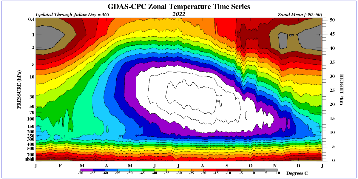
The blocking phenomenon begins high in the stratosphere.

2022/10/07/1800Z/wind/isobaric/10hPa
This is exactly how to report a UAH pause
Short and to the point
The pause could be a very big deal
Or it could be a nothingburger followed by more global warming
No one knows.
But we all know the pause happened
We know Nut Zero is a panic response to CAGW
And we know in the past 8 years there was no CAGW
In fact, there’s no evidence of any global warming in the past 8 years!
The claims about CAGW for the past 50 years were that CAGW was coming in the future. There was global warming from 1979 to 2016. The rate of global warming was predicted to be much faster in the future. But, in fact, the rate of global warming has never accelerated. In fact, the rate of global warming fell to zero after 2016. That’s an important fact because the pause reveals that CO2 is not the “control knob” of the global average temperature. I think that sentence needs to be added to this article!
The pause proves CO2 is not “control Knob” of the climate, just like that lack of global warming from 1940 to 1975, as CO2 levels rose.
The pause proves that predictions of CAGW have been unrelated to climate reality for the past eight years.
The pause does not prove the global warming since 1975 has ended.
Although some people may jump to that conclusion.
If that graph was the chart of a stock I was analyzing, I would expect a breakout to the downside in the near future.
Water vapor is the #1 Greenhouse gas. It does 3/4s of the heating according to GHG theory.
If you can believe the theory.
If the theory is correct water vapor alone will destroy the planet.
The New Pause has grown to fully eight years in length at a most embarrassing point for true-believers:
“pauses like this are expected during any rise in temperature.
its not even a pause since uah adjusts its records downward