Guest Post by Willis Eschenbach
For some years now I’ve been saying that the largest warming is occurring in the northern extratropics, at night, in the winter … and today I realized that I’d always just taken that on faith because I read it somewhere.
Now, folks who know me are aware that I don’t like to trust any claim until I’ve run the numbers myself. So I set out to do that.
I figured I’d look at fairly recent land data since we have much more of that than older data or ocean data. Overall, here are the decadal trends in the maximum temperatures. I’ve used Berkeley Earth data, although I strongly suspect it exaggerates the warming, for a couple of reasons. First, all the records seem to exaggerate the warming, and second, I’m interested in relative trends, not absolute trends.

Figure 1. Maximum monthly average temperature trends, 1950-2020
We can see that the greatest change in maximum temperature is in the northern hemisphere (0.23°C/decade), with the arctic warming the fastest.
Next, here are the trends in the monthly average minimum temperatures. These, of course, are night-time temperatures.

Figure 2. Minimum temperature trends, 1950-2020
Again, the minimum temperatures in the northern hemisphere are indeed warming fastest. They are also warming faster than the maximum temperatures (0.25°C/decade vs. 0.23°C/decade). It’s also worth noting that there are actually a few areas where nighttime temperatures have cooled …
Finally, I took a look at the summer and winter trends by latitude. Figure 3 below shows that result.

Figure 3. Maximum and minimum surface temperature trends by latitude, northern hemisphere (NH) winter and summer.
Turns out that my claim was right. The largest warming is indeed in the northern extratropics, in the winter, at night (dark blue line). Second largest warming is same location, same season, during the day. As you can see, the winter warming is increasing as you go north of about 45°N latitude.
And what are the average daytime and nighttime NH winter temperatures? Figure 4 shows that result.

Figure 4. Northern hemisphere winter daytime (red) and nighttime average temperatures, by latitude
Note that at about 45°N latitude (thin blue vertical line), approximately where the increased warming starts, the daytime temperature averages just below freezing, and the nighttime temperature average is -13°C (9°F) … cold.
This is good news, because I doubt if the people in Vladivostok are going to be unhappy with slightly warmer winter nights … or days, for that matter
And having slept a few times in my youth on a piece of cardboard on the streets of Manhattan in wintertime, with newspapers wrapped around my legs and arms inside my clothing to help keep out the cold, I can personally guarantee that the homeless in New York City won’t object if the winter nights are a bit warmer.
Makes me glad I’m in my nice warm fossil-fuel-heated house tonight …
Best of the late autumn to all,
w.
How does anybody actually measure 0.23 per DECADE???
THEY DON’T!!!!!
It’s a statistical aberration!!!!!
How does anybody actually measure 0.23 per DECADE???
____________________________________________________
They can do better than that, The IPCC tells us that they can measure 0.10°C over a 42 year period in the ocean no less:
IPCC AR4 Chapter 5 Page 387
Executive Summary
The oceans are warming. Over the period 1961 to 2003,
global ocean temperature has risen by 0.10°C from the
surface to a depth of 700 m. C
That too is calculated by linear regression. It can be expressed as a trend over a certain period (decade, century, etc) or, as in this case, as a single figure over the whole data. The precision of the actual measured data is irrelevant. In the case of SSTs most historical data would be in single or half degrees.
You want to provide some reference from an established organization that supports your assertion.
I will give you one that absolutely destroys what you just said.
http://www.chemistry.wustl.edu/~coursedev/Online%20tutorials/SigFigs.htm
You are making yourself look ignorant. Averaging or trending or statistical analysis simply can not increase the precision of what you have measured. Any perceived additional decimal digits of precision are simply artifacts of simple arithmetic and are not significant.
If you wish to continue to state this you will only make people less likely to believe what you say.
If you want to partially redeem yourself, then tell the thread exactly what the standard deviation is of each of the variables that make up your trend. Willis has started your education by showing you that separating the variables in an average can reveal that are otherwise hidden thru mathematical tricks.
I suspect that most readers here already are inclined to disbelieve ToeFungalNail because of the whoppers he has already told.
Mess with anything and it becomes an anecdote. Yup yup.
Nailed it !
Jim I have tried repeatedly on these pages to explain the simple concept of significant numbers. Both sides of the Climate Buffoonery still don’t get it. Your wasting your breath.
If people don’t keep challenging then the folks making propaganda will win. I don’t intend to allow that.
Might as well just invent data if the precision is irrelevant, and you can have a valid regression for anything you want.
… and that is exactly what they do !
They confuse precision with accuracy
A clock is precise when it marks the seconds exactly and unvaryingly but may still be inaccurate if it shows the wrong time.
All the metrics in climate studies are constructs (averages, means, anomalies, trends etc etc).
And terms like “hot” are so meaningless in any description of prevailing environments – what’s “hot” or “cold” to one person is quite comfortable for another.
And yes I totally agree that arguing about temperature constructs in hundredths of a degree over decades is abject nonsense.
I am more practically informed about prevailing conditions by Willis’ description of measures applied to avoid freezing to death while sleeping on the streets of Manhattan in winter.
My experience of that place was the complete opposite – in August buying a bottle of cold water to pour over myself to cool down.
Re your second paragraph, you are exactly right. I sit here in our boat above the 49th parallel, comfortable at 22C in a Tshirt while my wife sits across from me next to the heater in a coat and sweater complaining about the cold. It’s all relative.
“How does anybody actually measure 0.23 per DECADE???”
____________
They don’t ‘measure’ it, it’s a trend. The trend is an intrinsic property of the data. It’s calculated by linear regression. The precision of the original data has no bearing on the precision of the trend. That’s true no matter what it is you’re measuring.
That’s true of every aspect of climate “science”
Tell us something we don’t already know.
The *precision* of the data may not matter much but the uncertainty does. And the uncertainty of the data *doesn* affect the uncertainty of the trend line.
Computers are always precisely wrong.
That must be why they don’t mention uncertainty in either the original data or the trend line. /sarc
Too bad you don’t know what you are talking about.
and what is the trend of this function:
y=Sin(x)
Easy.. up, down, up, down, up, down ……….
No! It is up, none, down, none, up, none, down ……
The trend is 0.
That is, for the range of 0 <= X <= 2*pi
Another lie, ToeFungalNail. Read up on the Deming algorithm (yes, the very same Deming that dramatically improved the quality of Japanese products). It weights each data point by the precision of that data point so imprecisely known data do not overly influence the calculated trend. If the precision of the data did not influence the precision of the trend, as you so falsely claim, a single data point that is wildly wrong but imprecisely known could pull the trend up or down dramatically. Real statisticians know about these things, even if climatologists don’t. You’ve been schooled on this before, LIAR.
But then again, if the data is wrong, you have a precise trend for invalid data.
The trend would have no bearing on reality.
In the end it would be a meaningless exercise in futility.
Another person who is utterly ignorant of GIGO
If you measure the temperature now, then measure the temperature again 100 years later and find that the temperature increased by 1C, then you have a 0.01C increase per year, even if you can’t measure 0.01C.
When that data trend has an R^2 of about 0.3 extrapolation and averages out of that noise are meaningless.
Besides:
The Earth is cooler w atmosphere not warmer.
To perform as advertised the GHGs require “extra” energy upwelling from a BB surface which is not possible.
No greenhouse effect, no GHG warming, no man/CO2 driven global warming or climate change.
What the GMST was/is/will be is moot.
Which temperature Mark?
In any one location you are going to have 60 X 60 X 24 = 86,400 possible temperature readings every single day over a year across > 4 seasons.
And if you decide to pick just one reading from one particular day to use as your base, you’re bound to be accused of “cherry picking”.
So if you then decide to “average” a number of readings over multiple times, days, seasons over the base year, you’re just then using numeric constructs that have no actual existence in the real world.
It’s pea and thimble stuff mate.
And the temperature reading could be different a few feet away. I think computing an average for the entire earth for, say, a hundred years would require several lifetimes with super computers. Why not just walk out the door an call it a nice day or not.
There should still be a cited uncertainty associated with the trend line.
No you don’t. You have a data point 1 degree warmer than another data point 100 years previous. They have no relationship to actual temperatures at any point in between or to a data point 100 years in the future.
Actually, in 100 years you could have had one or more oscillations up/down/sideways and you might be measuring the cooling portion of an oscillation. That’s what we have now. People taking advantage of what may very well be a short trend and they simply ignore the past because they have some “new” possibility that will let them make money.
Or…the temperature fell by a few degrees over approximately 30 years, then rose a few degrees over approximately 30 years, then fell by a few degrees over approximately 30 years. Finally, the temperature rose 1 degree over the next 10 years, following a pattern of going nowhere overall.
Well, I see what happens when one puts a post on in haste, because dinner was calling. Obviously, I should have started off with a fifteen year fall, followed by a 30 year rise, to illustrate my point.
Can you tell me which period you mean with this trend?
For 1979-now, we have
The latter one is indeed near to your 0.23, OK.
And what is the actual baseline average?
IPCC AR5 15 C or 288 K
K-T diagram 396 W/m^2 + S-B = 289 K or 16 C
UCLA Diviner Mission 294 K or 21 C
Hadcrut 4 – GMST = 13.97
NOAA/GISS ?
RSS?
UAH?
JAXA?
Hello Nick Schroeder,
you idea with comparing these time series with their anomalies’ baseline average unfortunately makes few sense, because many of the baselines are calculated out of the absolute data of different reference periods:
Where the absolute data is available, there is no problem to create a baseline according to any reference period located within the time series; but many keep it hidden.
For UAH you can create it out of their monthly climatology, but where would the value of about 264 K help you? To what could you compare it?
All records of a perfectly natural trend. Prove me wrong. We’ll wait….
1979 to 2020 just happens to include almost all of the 1975 to 2020 warming period.
The only period known to have a strong positive correlation of CO2 and temperature.
Some people would call that data mining.
With a Willisomometer, Nick.
Try and keep up.
You have random error and you have systematic error, If you use the same well calibrated instrument to take data by many different observers you will see a random error. The error is due to observer technique. The more data you average the better the precision. If the instrument is out of calibration, then no matter how many observers and how much data the error will persist. But with many observers, some better than others, and many instruments, some well calibrated and some not, the error will be random, and the more data the better the precision. Until the data adjusters arrive with political motives. Then all precision is lost.
Averaging across multiple inputs doesn’t increase precision. It compounds error
The problem with temperature is that you don’t have multiple instruments measuring the same thing at the same time. Every temperature is read by a single instrument a single time. Once that measurement is done what you measured is gone into aether, never to be seen again.
It is only measurements of the same thing that generate a set of random error clustering around an expected value – the true value. As you point out, systemic error is a bias that causes that clustering to be around a value that is not the true value. It is an in-built bias that can’t be eliminated by statistical analysis. What you are measuring will provide some precision, i.e. repeatability, but it may not be accurate. Thus even multiple measurements of the same thing will have some level of uncertainty.
Multiple measurements of different things (like temperature) do not have measurements clustering around an expected value (true value). There is *no* true value in such a case. The uncertainty associated with each measurement contributes to an increased variance of values when you cram them into a data set. You may still calculate a mean but such a mean carries little information about the data set. The data set could actually even be multi-modal with the mean providing even less information about the data set (think combining a January temp in the northern hemisphere with a January temp in the southern hemisphere).
“Every temperature is read by a single instrument a single time.”
Not true.
A significant portion of our planet’s surface is not measured at all.
The temperatures are guessed and the guesses can never be verified.
The use of weather satellites has significantly reduced the percentage of the planet that requires guessing, to about 5%. I believe the guessing for land surfaces is at least quadruple that percentage, but would welcome anyone here
to specify exactly what percentage
of surface measurements are estimates
WITH NO THERMOMETER DATA.
Weather satellites may provide a useful metric but there is no way it can actually be considered an average temperature of the globe. The satellite passes over the same point once every 24 hours. You get one data point per day for every location. That’s not enough to determine an average temperature for any one location let enough to establish a global average.
Unmeasured land locations that are guessed at are a mess. Once you get about 50 miles east/west or north/south apart or have a 1000 foot difference in elevation the correlation coefficient drops to less than 0.8. In other words, weak to no correlation. Using stations farther apart than 100 miles or 1000 ft in elevation to determine an infull value is only fooling yourself.
No, the satellites do not measure surface temperature, instead they measure air temperature over the 0-10km altitude where it is decreasing exponentially.
“The more data you average the better the precision. ”
This is incorrect. Precision can be defined by repeatability and significant digits. A single measurement simply can not have it’s precision increased by averaging with another measurement. Resolution determines the precision of a measurement and the resulting Significant Digits contained in the measurement. Averaging can not not increase the resolution of or the Significant Digits contained in the average. If averaging could increase precision we would have no need for micrometers or atomic clocks.
Here is the best definition I have ever found. It is from Washington University at St. Louis. Take note of “we compromise the integrity of what this number is representing.”
“Defining the Terms Used to Discuss Significant Figures”
“Significant Figures: The number of digits used to express a measured or calculated quantity.”
“By using significant figures, we can show how precise a number is. If we express a number beyond the place to which we have actually measured (and are therefore certain of), we compromise the integrity of what this number is representing. It is important after learning and understanding significant figures to use them properly throughout your scientific career.”
“Precision: A measure of how closely individual measurements agree with one another.”
“Accuracy: Refers to how closely individual measurements agree with the correct or true value.”
http://www.chemistry.wustl.edu/~coursedev/Online%20tutorials/SigFigs.htm
BEST does a fine job. You’re wasting time and not looking your best. When you have more than 500 pretty regular data points, you are measuring. If you want to plead incurable ignorance, that’s not winning.
It’s late spring where I live in the cooling by day Southern Cone.
Unlike much of the rest of the world, BEST gets this region right.
For some years now I’ve been saying that the largest warming is occurring in the northern extratropics, at night, in the winter … and today I realized that I’d always just taken that on faith because I read it somewhere.
__________________________________________
IPCC AR4 Chapter 10 Page 750
Temperature Extremes
…
Almost everywhere, daily minimum temperatures are projected to
increase faster than daily maximum temperatures, leading to a
decrease in diurnal temperature range. Decreases in frost days
are projected to occur almost everywhere in the middle and high
latitudes, with a comparable increase in growing season length.
That is a good thing … more food for more people for more global warming … what is not to like 🙂
Are they projecting the use of more coal?
Arrhenius, in 1897 (excerpt):
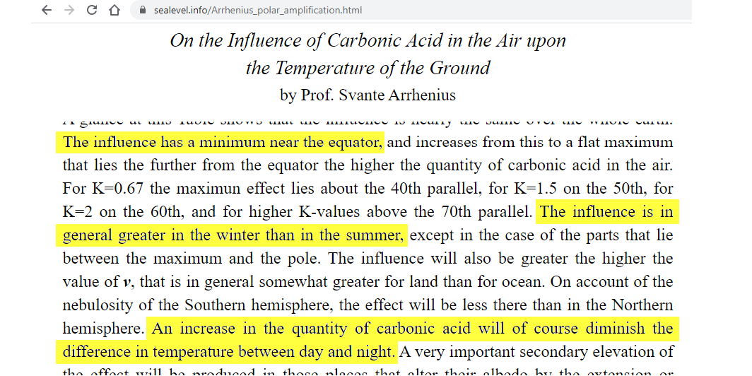
Svante, while overestimating the ECS of CO2, nevertheless rightly considered AGW a great blessing and boon to the frigid world.
Frigid and dangerously starved of plant food, I might add.
Except there isn’t a monotonic decrease in the difference! See Fig. 1 at this link:
https://wattsupwiththat.com/2015/08/11/an-analysis-of-best-data-for-the-question-is-earth-warming-or-cooling/
This graphic is interesting:

When you make the period long enough, all climate graphics show cyclic movements, (be it in a chaotic pattern). 100% opposite to ‘runaway thinking’.
Very interesting. Thanks for posting!
It is Fig. 1 from the link I posted. Apparently you didn’t click on it.
So, the IPCC AR4 statement about min temp increasing faster than max temp seems to be correct for NH extratopics in the NH winter and for SH temperate at the same time (SH summer), but not true for NH extratropics or SH temperate in the NH summer.
Willis,
Thanks for another breath of sanity, and say hello to the Pacific for me!
If every place is warming twice as fast as expected, and most are warming twice as fast as every place else; will we soon be able to throw another logarithm on the fire!
Great analysis, WE. Completely shreds any warming alarm.
And, shreds the climate models that generally do not show this reality. Models show the greatest warming in the tropics (the modeled mid troposphere tropical hot spot that does not exist in reality).
And much of the Arctic warming is simply made up, plus some in the northern temperate zone. A lot of the rest is from the UHI effect and rural land use changes. Throw in natural variation, and there’s little left for the portion of man-made warming from the GHE.
John, it sure looks like your comments about N Hemisphere UHI, etc, is correct, especially since the heat stored in the oceans, with a lot more ocean in the S Hemisphere, should show more heating in the S, but instead it’s in the winter in the N. This whole issue of actual heating of the earth due to anthropogenic causes is really complicated in that we cannot even get the natural variation correct. Canada and Siberia complaining about less freezing winter temperatures is crazy writ large.
My apologies for my crazy fellow Canadians. Can’t say that Siberians can match us in craziness. Perhaps vodka has a more mellowing effect than beer and Canadian whiskey.
Of course, perhaps even they would elect a trust fund kid with funny socks as leader if they had a choice.
John,
How much of the Arctic warming is merely heat from the Tropics conveyed to the north by the various ocean currents?
To the extent that there actually be warming in the Arctic, it is largely thanks to ocean currents, and the major oscillations, like the PDO and AMO, which have warm and cool phases.
There probably has been some air warming in the North Polar Zone, and a portion of that could be from a fourth CO2 molecule per 10,000 dry air moleclues, since the air is drier there. Less H2O makes CO2 more influencial.
But who really notices if dark, winter air T warms up from -39 C to -37?
And there you have the key and the reason for propaganda. Warming from 0.1 to 0.2 is a 100% increase. No wonder the layman is frightened. Yet -39 to -37 is 2 / 39 = 5% increase. Much less frightening and makes it hard to justify upsetting the worlds economies and supply of reliable electricity.
Only a layman would calculate temperature increases in anything other than degrees Kelvin. Percentage increases using any other scale are abitrary and almost meaningless.
Yet degrees C is exactly what CACA spewers rely upon.
John, you misunderstand. You only need Kelvin if you want to calculate percentage increases. For all other purposes, you can use any scale.
I’m not saying that percentages are meaningless. Far from it. But most analyses involve things like trends and relative temperatures, for which K, °C, or °F are equally valid.
w.
OK, let’s go with Utqiagvik, the Alaskan town formerly known as Barrow. If you can believe NOAA, which you can’t, the 30 year annual average baseline there is -9.9 C.
I don’t have its 1901-1990 average, but stipulate two degrees C lower. What climatic effect does warming from an annual average of -12 degrees C to -10 C, mostly at night in winter, have?
Agreed. But I am surprised the warmistas do not use degrees Rankine (°R). The average temperature of the Earth sounds so much warmer at 518°R.
(The best aerospace engineers use °R )
Ok!
-39C = 234K
-37C = 236K
Difference = 2K
(2 / 234) * 100 = 0.85%
Even better. Show that on a graph from 0 – 300!
Shouldn’t we be using absolute temperatures anyway?
Depends what effect it has on the seaice, if the top of the ice is -37 and the bottom is -2 that implies thinner ice.
Most.
Color me unimpressed with a decadal increase of about 2 C over land (no ocean influence) during a periodic upswing in cyclic global temperatures.
Rud,
Not sure why this analysis “shreds any warming alarm”. It shows that the warming trend since 1950 is 0.2 degrees per decade meaning that we are likely to see 2 degrees of global warming by 2050. Which if anything fully supports the alarm over global warming.
What if it’s 0.2 degrees cooler by 2050?
Or 2.0C cooler, like it was from the 1930’s to the 1970’s, according to the U.S. regional chart, Hansen 1999.
Here’s Hansen 1999, alongside a bogus, bastardized Hockey Stick chart:
https://www.giss.nasa.gov/research//briefs/1999_hansen_07/
As you can see, the temperatures shown by Hansen 1999, cooled about 2.0C between the 1930’s and the 1970’s. It would be a cooling of 2.5C if the year 1934 is included. That’s the only quibble I have with Brian Sussman’s book “Climategate”. He says this temperature reduction was 0.18C, but obviously, that isn’t the case in North America.
Also note it was just as cold in the first decade of the 20th century as it was in the 1970’s. We are moving in a channel.
Perhaps you’re younger than me, but I have this sneaking suspicion that I won’t be likely to see 2 degrees of warming or anything else by 2050. So if you are, I’m glad you have something to worry about for your future.
I was extremely worried about the effects of Y2K but that turned out to be bunk. My father was extremely worried about the effects of nuclear fallout in the 1950’s. He died at 90 when his heart finally stopped, after complaining how cold he felt for the last 5 years of his life.
If warming of 0.2C per decade happens from now until 2050, it would be a warming of less than 0.6C. That’s not 2C. If you want to add in 1.4C of warming from an arbitrary point in the pre-industrial past to get to 2C, you should also notice that past warming was *beneficial*, not catastrophic, as being the coldest part of an interglacial isn’t remotely optimal for either mankind or nature. If you also want to claim that the next 0.6C of warming (if it happens) will be catastrophic, make it — it’s a hard sell in a world where the “warming” is biggest in a freezing well-below-zero NH winter, where the daily temperature average range is about 10C, and the global temperature range is about 70C. Reproduce figure 4 with all the figures shifted up by 0.6 degrees and the difference would be imperceptible.
Dale,
Willis’ graph shows a warming trend of 0.2 per decade from 1950 to now. Which means that if that trend continues to 2050 there will have been 10 decades of warming at 0.2 degrees per decade implying 2 degrees of warming compared to 1950.
What is the 95% confidence interval around that nominal value?
Does that 2C represent an increasing minimum temp, an increasing max temp, or a combination of both.
It makes a difference!
It was hotter in the 1950’s than it is now, at least around here.
Those Hockey Stick charts are a distortion of reality.
Are you worried about a 5% increase in temperature? Especially if it is generally making night time temps warmer.
Lets play devils advocate and assume you are right an the increase is a whole 2 degrees of your random baseline chosen… so what the world spontaneously catches fire and blow up? Just trying to clarify what happens given we keep being told it’s unprecedented and a climate emergency.
”It shows that the warming trend since 1950 is 0.2 degrees per decade”
Yeah but it’s not actually doing that. It’s hardly warmed for 80 years.
Mike,
where is the evidence for the claim that it has hardly warmed in 80 years?
Oh for God’s sake! Check the video I posted further down. The weather has warmed a bit over the last couple of decades. The climate hasn’t warmed in at least 80 years and probably several hundred.
Stop confusing weather and climate or we’ll never get off this ridiculous merry-go-round. The data Willis posted above is for entertainment purposes only.
We have been hoodwinked into believing the ”Globe has warmed”
Izick,
Please demonstrate for all us ignorant boobs how dire the warming really is! I think a winter solstice celebration in your shirtsleeves in some place like Tiksi, up in northern Siberia, would do the trick!
If you want to be especially intrepid, slip into your swimming suit and go for a dip in the Lena River, or the Laptev Sea! Just be on the lookout for any polar bears; they’re likely to be quite voracious in winter! Maybe you could pack a case of Coca-Cola along to help them wash down their feast
Is C02 the control knob?
What makes you think this trend is linear, and will continue?
Extrapolation quicksand.
This doesn’t “shred any warming alarm” !
The alarm is based on predictions of climate doom, not climate reality.
Predictions are impervious to facts, data and logic.
Well, here’s one for you: The areas of greatest warming (or, “The areas of greatest warming”) are those in which, I strongly suspect, there are the fewest weather stations (as in Siberia). So then, how much of the apparent greatest warming is actually the “result” of insufficient data from those areas?
My thought too. Antarctica, also extremely remote, shows cooling, though. But if you notice the maps indicate “gridded” data which means they took the temperature from specific locations then extrapolated it to (large) areas with no measurements; a method I contend is scientific malpractice. If you don’t have a measurement and you make one up, that’s not an observation of the natural world, that’s artificial. The Berkeley Earth global gridded data is junk science, although the site helpfully allows browsing individual station data.
The reality is that a few stations in high northern latitudes report warming trends. I want to know details of station locations. Are most of them located in urban areas with infrastructure growth causing artificial warming? Or are they well sited and the data reflects an actual (and inexplicable regional) warming trend? I doubt it. The USCRN has the best-sited stations in the world and they represent only a fraction all U.S. weather stations. I suspect that other countries, Russia in particular, don’t go to the same trouble. Notice that the hot spots are centered in eastern Siberia where an oil and gas boom is causing rapid growth of towns and cities related to the petroleum industry.
Rather than using Berkeley Earth’s maladjusted data, how about Willis tries his R skills on the satellite-only UAH or RSS temperature record?
https://www.nsstc.uah.edu/climate/
A quick glance at UAH shows a dramatic cooling trend above 60° N since 2016 that doesn”t appear in the Berkeley Earth plot. Here’s a plot I did of UAH about a year ago. Click on the legend to add or subtract latitudes. See “Northern Polar (60°N–90°N):
http://yburbs.com/uah-temp-all/uah-temp-all.html?ga=0&npa
Contrast with Berkeley Earth for the same latitude. Oh wait, there is none, only “northern hemisphere” which doesn”t help:
http://berkeleyearth.lbl.gov/regions/northern-hemisphere
Can anyone find UAH or RSS data on the Berkeley Earth site? Or data specific to high northern latitudes? I don’t see any. Let’s see the same comparison with UAH data, Willis.
When it is 50 below it doesn’t take much of an urban island to have a large apparent effect. An actual city glows like a light bulb and smoke and steam from even a small village is visible for miles.
http://yburbs.com/uah-temp-all/uah-temp-all.html?ga=0&npa
WR: Interesting link. Choosing only Northern Polar Land and Northern Polar Ocean, the very equal UAH atmospheric temperatures above both suggest that equal weather patterns cause equal temperature trends.
If Willis used the BEST Primary Product it is not data, it is computer Modelling output.
Convenient but not raw data.
Thanks, AC, but when we talk about a global temperature average, “raw data” are the individual station records. Everything else is those records combined in some manner. So I’m not clear just what “raw data” you are suggesting I use.
w.
~20 years ago I researched this –
USSR High Magnitude Climate Warming Anomalies 1901-1996
http://www.warwickhughes.com/climate/ussr1.htm
Summary of Findings
In not one grid box, in any of the datasets, could this survey find in rural records the 1901-1996 warming magnitudes featured in Karl 1998.
In 80% of comparisons the Jones 1994 trends were warmer than GHCN or GISS. The GHCN and GISS trends are generally in fair agreement considering the sparse station density and frequent gaps in data.
In some cases, strong warming trends were based on data from fast-growing cities such as Irkutsk. In view of the well-documented urban heat island effect in such localities, the use of such data to indicate climatic trends lacks credibility.
Data gaps early in the 1901-1996 period, and the increased likelihood of outlier data in pre-1935 records which are hard to check, may have imparted other non-climatic effects on trends.
Despite the central control of the soviet system, the continuity of meteorological recordings over the period is far from impressive. It also appears that economic and social re-adjustments during the 1990’s have precluded significant improvement in record-keeping over this huge land-mass, despite the sharper focus on climate issues since 1988. Given the substantial contribution of “Soviet warming” to “global warming” shown in Fig 1, it is vital to reassess all of the Soviet station-by-station records.
William D Larson:
No, the warming is not the result of insufficient data.
Atmospheric Industrial Sulfur Dioxide aerosols reflect sunlight and cool the Earth’s surface. Their levels in the atmosphere are monitored by NASA satellites, and as shown in the image below, they are essentially absent from the arctic regions,which allows those regions to warm more rapidly.
William D Larson:
The NASA images of atmospheric SO2 levels are dynamic .Here is another one, from June 27, 2020
And as the warming is from killer cold to slightly less, but still killer cold, forgive me if I am not all that concerned.
Yes, the warming is at night, in winter and the higher latitudes, but that’s not what the so-called mainstream media tells us or shows us. Drought with a blazing sun and dry cracked river bottom mud is the usual fare. Here’s the LINK to an example from NOAA
A simple consideration of how “green house gases” affect sky temperature will point to areas with the lowest temperatures being affected most by changes in “GHG” concentration and hat the effects will be more pronounced at night. Seeing the Arctic warming fastest makes perfect sense.
Since Antarctica has numerous mountains that limit the amount of the most important GHG, water vapor, the warming there is much less pronounced than in the Arctic (may actually be cooling).
And then all the “attribution” studies use projected future average temperatures.
Scarey stuff, good job the global parasite class is planning the “Great Reset” to disenfranchise us plebs so they can splurge our $Trillions on their “Green” plan to transform the global financial system and coral all the worlds resources under their watchful eyes and save us from ourselves.
My energy costs have almost doubled this year, I almost feel safer already, a bit higher and I’m sure I’ll feel completely safe.
https://unlimitedhangout.com/2021/11/investigative-reports/un-backed-banker-alliance-announces-green-plan-to-transform-the-global-financial-system/
Fret not, the U.S.A. government will soon be helping you out even more.
I live in Germany, and I get a big, big laugh about your picture.
Simply because your behavior on this blog reminds me all the German antivax people who
On average, at least 75 % of the ICU patients (up to 90 % in Bavaria) were not vaccinated – though they very well could have been.
The ICUs are in many hospitals filled with Covid patients to such an extent that many other highest priority interventions – like cancer, stroke prevention, orthopedic surgery etc – have to be delayed,
Thanks to these people, we are facing another tough lockdown. Great.
Yeah – this is the dictatorship of the few…
No on average most people in hospitals where partly or fully vaccinated.You keep following your nazi masters again,it sure helped you the first time.Ausweiss bitte!
Wrong! I have followed that on various newspapers and know what I speak about.
And thanks a lot for your completely stoopid and cowardy insult:
” You keep following your nazi masters again,it sure helped you the first time. “
In Berlin, currently 30% of hospitalized Covid patients are fully vaccinated, and that number has increased much faster in recent months than the vaccination rate. The total number of hospitalized Covid patients however is merely ONE THIRD of what it was in April this year, when there was no breakdown of the intensive care system, so THREE TIMES as many patients as we have currently have been cared for in the past and doubtlessly could be cared for again if needs be. The claim of “hospitals breaking down under a flood of Covid patients” is either a lie, or an artifact of hospitals reducing their staff and their number of beds (during a pandemic!) rather than hiring and training new staff and building new units from the enormous income generated by all these vaccinations and treatments so far. The hospitals have stolen that money instead of investing it and now complain about lacking capacities.
Among those with any Covid symptoms (i.e. including the great majority who is not in hospital but quarantined at home), the incidence among vaccinated if one-fifth of that among unvaccinated. With 70% vaccinated against 30% unvaccinated, that translates to a (0.7*0.2) : (0.3*0.8) = 0.14 : 0.24 or roughly 3 : 5 ratio between the actual numbers of vaccinated and unvaccinated persons falling ill from the virus. In other words, the vaccines are a bad joke, not working at all in one of five persons (a fact that sets them apart from other, well-established vaccines like those against measles, polio, or smallpox), yet despite this obvious weakness of the Covid vaccine, vaccinated people are legally allowed – even encouraged – to gather without masks, without distance, without tests (so the many light and completely asymptomatic cases among them have every opportunity to spread the infection to their peers). No wonder the numbers – mostly those of asymptomatic and light cases that are basically harmless as they require just a few days of home quarantine until the affected stop spreading the stuff around – are “exploding”!
Finally, comparing the incidence of even mildly symptomatic cases with the total incidence found by random routine testing of apparently healthy citizens at the workplace or in shopping malls, it shows that roughly two out of three persons won’t even notice that they have caught Covid unless a test shows it. And this number is probably badly underestimated, as only unvaccinated persons (i.e. less than a third of the population) are required to undergo mandatory tests in most places now. If they start (again) to mass-test the vaccinated, the number of identified asymptomatic carriers will likely multiply, because all that these feeble vaccines do is _suppress_the_symptoms_ in 80% of users, so they feel healthy enough to work, party, travel etc. while the virus merrily grows, spreads, and eventually mutates silently among them, while the unvaccinated – both by regulations and by common sense – are much more wary and careful not to risk too much contact to potentially infected strangers, keep better track of their being infected or not by regular testing, and will not so lightheartedly ignore the “common cold” symptoms of Delta-Covid as harmless like those who are being told every day that they needn’t worry because they are vaccinated. Yet, the media continue to talk about the “irresponsible” unvaccinated minority as the cause of all evil.
BTW: All statistics quoted above are taken from the official pages of the local Berlin health authorities: https://www.berlin.de/corona/lagebericht/ No need to even look at “alternative”, possibly faked and “conspirative” non-official sources. Just read the official sources carefully and don’t fall for the shameless spin our politicians and journalists give them!
Sorry I missed the start of this huge distraction. Please take all discussion of COVID to a thread that is actually about COVID. It’s a discussion worth having … but not here. This thread is about the location and timing of warming
Thanks,
w.
Please explain the brand new German study showing a direct correlation between vaccination percent and excess deaths!
The study was only of the German states, but the correlation is beginning to pop up everywhere with high rates of the jabs!
Perhaps you could also explain the growing number of European footballers suffering heart problems recently!
Sorry I missed the start of this huge distraction. Please take all discussion of COVID to a thread that is actually about COVID. It’s a discussion worth having … but not here. This thread is about the location and timing of warming
Thanks,
w.
Sorry Willis
I got a bit unnecessary crazy about this disgusting correlation between people who suspect a problem with CO2, and the Nazi murders.
Shouldn’t have happened; but on the otherhand, such comments are undignified and certainly do not contribute positively to this blog.
Sorry I missed the start of this huge distraction. Please take all discussion of COVID to a thread that is actually about COVID. It’s a discussion worth having … but not here. This thread is about the location and timing of warming
Thanks,
w.
See if you’re still laughing in spring. Hint: TV Biology is cartoon science.
https://gigaohmbiological.com/review
Sorry I missed the start of this huge distraction. Please take all discussion of COVID to a thread that is actually about COVID. It’s a discussion worth having … but not here. This thread is about the location and timing of warming
Thanks,
w.
Weird. According to the CDC, 75% of the hospitalized in a New England county were fully vaxxed. Strange days indeed.
Please, no more covid. This is a thread about climate. Lots of covid threads out there, take it to one of them.
w.
Good cartoon, Gringo! We better not laugh too much, though, because I think AOC has this very vision in her head.
AOC is pushing for 300,000 Climate Change Brownshirts in the new spending bill.
Senator Manchin better be careful voting for something like this, because AOC just might have them “marching” around his houseboat in protest, or surrounding his automobile, screaming at him, if he doesn’t toe the radical leftist line in the future. Be careful what you vote for, Joe Manchin. It may come back to bite you.
A report well worth a read. TPTB really are more of a threat than ever.
Spring and Autumn trends would also be interesting to look at, as the changes in sunshine hours are different for each season.
It’s really when people go inside, in the us there are spikes in the summer, lots of AC
Willis, I’m confused. Figs 3 and 4 are titled “ Land Surface NH” yet the y-axis is Antarctic to Arctic latitude degrees. Would’t Jan-Dec be most meaningful ?
Sorry for the confusion. The title is “Land Surface NH Winter” … meaning the entire land surface at the time of the NH winter, Dec/Jan/Feb.
w.
I had a conversation with a believer in the comments section of another blog. I pointed out a 2004 paper that found only 4 sites in Argentina that had a good record for the 20th C (one starting in 1930s). They had trends of 1 to 2 degrees cooling per century. The other guy pointed out that BEST had over 70 stations (implying that the peer reviewers let fake news slip through). Many of these extra stations were labeled AP and started in the 19th C.
Argentina is coloured as a 0 trend in your plots.
I had looked closely at my home town in BEST. It had a station at the PO from 1889 to late 40s, and an AP site from the end of the war with a few years of overlap. The BEST site labelled AP starts in 1889. The amusing thing is how they have a PO site of the same pre 1945 data but different identification of break points and adjustments. The two sites are 10 km apart. One in the middle of town a short walk from a major river to the north. The other in irrigated farm land surrounded by lawn.
There is good reason that a switch to new instrumentation 10 years ago cause an artificial warming of maximum temperatures (https://jennifermarohasy.com/2014/05/corrupting-australias-temperature-record/), the local vineyards went from overhead and flood irrigation to drip irrigation and other water saving methods, and the local airport went from mid afternoon watering of the lawns to overnight. It’s local lore that watering in the mid afternoon was intentional to keep maximums down in extreme weather to avoid scaring potential tourists.
None of this is identified and corrected for – downwards.
Do I understand you correctly that…
“PO” = “Post Office”?
“AP” = “Airport”?
Your home town was in Argentina?
And BEST thinks there was a temperature gauge at the airport, there, in 1889??
Yes, except for my hometown is in Australia. They treat a combination of two or more stations as one, even though 10 km apart.
Wow.
@Willis – what is with those trend graphs? Unless “NH” means something other than “Northern Hemisphere”?
(Edited – why I thought this was a Dave post completely escapes me. I should be sufficiently caffeinated by this time.)
The coldest I have ever been was in a rice paddy on ambush at night in Vietnam during the monsoon season.
I can believe that you were more miserable then me when on a -33°F night in Iowa I walked 7 blocks home. Nasty, but I wasn’t wet, and I had the right clothing.
And, thanks for the service. John
John, thank you for your kind comment. But I always respond that I was drafted. Plus I say I prepaid my healthcare in Vietnam (VA, which is very good BTW.).
It’s surprising how cold it can feel in Vietnam.
I had less insulating body fat then, Tom.
Me, too. 🙂
It is Arctic amplification, not polar.
How many surface stations are in the Siberian lava traps anyway?
Did the Siberian surface stations pick up the Tsar Bomba 50 mt nuclear test in Oct. 1961?
Tsar Bomba – Wikipedia
This is the raw absolute data out of GHCN daily for the Siberian station nearest to Sukhoy Nos on Severny Island, Novaya Zemlya,
RSM00023146 68.4667 73.5831 2.0 MYS KAMENNYJ
for this magnificent explosion, starting a few days before it happened:
RSM00023146 63-101 1961 10 28 -5.1
RSM00023146 63-101 1961 10 29 -3.1
RSM00023146 63-101 1961 10 30 -1.1
RSM00023146 63-101 1961 10 31 -1.7
RSM00023146 63-101 1961 11 1 -3.3
RSM00023146 63-101 1961 11 2 -19.4
RSM00023146 63-101 1961 11 3 -21.1
RSM00023146 63-101 1961 11 4 -24.1
RSM00023146 63-101 1961 11 5 -25.7
RSM00023146 63-101 1961 11 6 -20.7
RSM00023146 63-101 1961 11 7 -19.2
RSM00023146 63-101 1961 11 8 -19.2
RSM00023146 63-101 1961 11 9 -20.6
RSM00023146 63-101 1961 11 10 -20.7
RSM00023146 63-101 1961 11 11 -16.6
RSM00023146 63-101 1961 11 12 -21.9
RSM00023146 63-101 1961 11 13 -25.6
RSM00023146 63-101 1961 11 14 -15.0
RSM00023146 63-101 1961 11 15 -18.2
RSM00023146 63-101 1961 11 16 -18.8
RSM00023146 63-101 1961 11 17 -15.7
RSM00023146 63-101 1961 11 18 -11.0
RSM00023146 63-101 1961 11 19 -13.0
RSM00023146 63-101 1961 11 20 -19.3
RSM00023146 63-101 1961 11 21 -17.8
RSM00023146 63-101 1961 11 22 -22.8
Maybe you find something.
For me, that looks pretty good like a sudden cooling due to the Sun disappearing for a while…
Aren’t climate warriors using this wonderful available satellite data in their studies, or is it models of their phantasy phizziks only? No wonder there is nothing to worry about. No wonder sealevel rise isn’t accelerating – heating up the winter night from -25C to -23C (only in the NH!), doesn’t produce any meltwater.
Here’s a big tree at Tuktuyaktuk in NW Canada in the Arctic coastal area. It is a 5000yr old white spruce still rooted. Today’s treeline is 100km south, but you would have to go a few 100s kms further south where the temperature averages about ~6-8°C warmer than at Tuk to find a white spruce this size (yes the same species!!). Since Arctic enhancement causes roughly a doubling of the global anomaly, it would indicate that the globe was ~3-4°C warmer than today. How’s that for “precedented”.
Oops link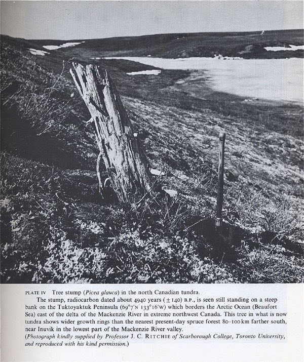
Good heavens how did the polar bears survive?😳
Caviar and mint juleps.
Clyde,
Caviar!? With mint juleps!?
All polar bears know that mint juleps go best with spicy, Southern fried walrus, or seal! Throw in some fried okra and you’ve got a happy bear!
Related paper:
Historical Aspects of the Northern Canadian Treeline
HARVEY NICHOLS
Historical Aspects of the Northern Canadian Treeline (ucalgary.ca)
Fascinating study, John. Real science that specifically discusses alternative theories. Not CliSciFi at all.
Wider rings => Warmer.
“it would indicate that the globe was ~3-4°C warmer than today.”
How can alarmists continue to claim we are experiencing unprecedented warming today given evidence like this that clearly shows it was warmer in the past than now?
There is no unprecedented warming today.
If we draw the 50N parallel, we find that most if not all of orange/red colours area is to the north of it. We also find that excluding northern part of Canada the rest is Russia, mainly Siberia. I have to be convinced that temperature/area function measurements in the either case is as representative of actual situation as it may be in the western Europe or the USA where density of stations is of order of magnitude greater.
This bit got cut off during the edit
“Infrared satellite measurements may be also affected by atmospheric temperature gradient at high laltitudes. Stratosphere in polar regions is as low as 10km altitude.”
In winter, the tropopause above the 60th parallel drops well below 10 km.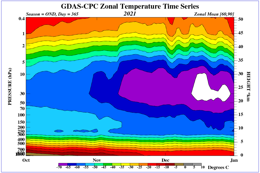
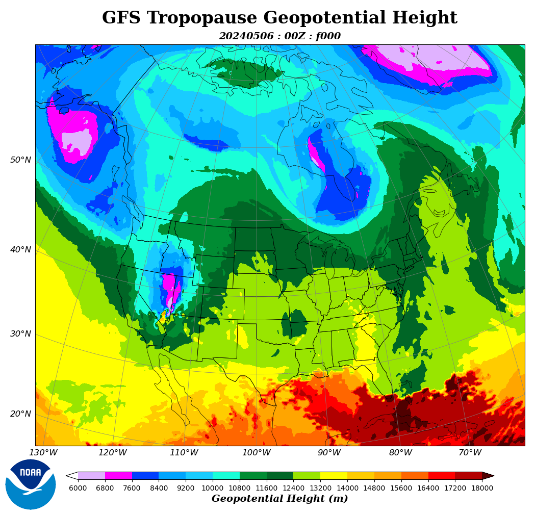
Radiation into space at reduced tropopause height is stronger (decrease in surface temperature).
Interesting as always, a minor criticism: in the interest of clarity the color codes on both global diagrams ought to be the same.
Great stuff! Canada shouod love the warming, but sadly no.
David …. unfortunately in Canada the loons of the left are very loony!!
50 degrees north is mainly all of England and my home town Manchester 53 degrees north. Has it warmed a bit, well yes, as we now rarely get snow but who knows. You see it kind of warmed overnight from 1979 ice age to 1986 dying of heat. It can cool very fast, however, as it did here the 1940s after the wonderful 30s…..maybe soon(hopefully) we will get our regular snow back……it will probably come this winter(sod’s law) just as natural gas prices are taking off to the moon….
Given what I have been reading of the Winter temperatures at the South Pole (lowering over last 60 years and not just fractions), perhaps the Southern Hemisphere should crack a mention more often?
God bless you Willis.
“And having slept a few times in my youth on a piece of cardboard on the streets of Manhattan in wintertime, with newspapers wrapped around my legs and arms inside my clothing to help keep out the cold, I can personally guarantee that the homeless in New York City won’t object if the winter nights are a bit warmer.”
I have done this. Not in NYC but in France and Spain, Tangiers and Gibraltar. Back in the 70s. Had a young lady by my side in those days. Very happy days indeed. Met many (genuinely) good folk. Slept in ruined churches. Been cold many times. A journalist by training and experience – but learned to stick-weld in Gibraltar. Happy days with some good folk. Please keep the faith Willis. Those of us who have been ‘on the road’ understand the complete idiocy of global warming alarmism. The truth will out.
Not lot of fun sleeping in cardboard boxes.I had a go at it in my student’s travels, in the gardens of a gated community in S. France, but got chucked out by a security man. I told him I’ll be back. Now I have an appointment in there.
Willis: Figs 3&4 weight all the latitudes equally but in fact the global area between 30N and 30S is approximately 50% of the planet’s area. As you are using equal areas graphs for Fig 1&2 should you not do the same for Fig 3&4?
I actually thought about it but I was not sure how I could even do that … what would you suggest?
I suppose I could compress the x-axis towards the poles … but my final thought was, how would that change any conclusions about where the warming is occurring?
Ideas?
w.
Well you would have to do the +-30 at 50% of the base and +-60 at 73% or so. It is basically a near sinusoidal layout as I’m sure you are aware.
It won’t change the conclusions about where the warming is occurring but would set that out more accurately in weighting as to its global importance.
As I said you use equal area for Figs 1&2 so why not for Figs 3&4?
Hey, we’re a full-service website. Here you go. Not sure it makes any difference to the point I’m making, but it was an interesting exercise.

Thanks for the push,
w.
Willis: Thanks for that. I note that most sensible people are shifting away from Mercator to prevent the visual distortions that it brings and it is nice to see latitude layout treated the same way.
The point is that it shows is that the warming effects are concentrated in a much smaller area than your previous graph. By far the majority is below 0.2c. Averages which include outliers (such as this shows) are always going to be a problem.
Very interesting Willis, thanks! “Global” warming diminishes going from the North to the deep South.
My guess: there is a strong relationship with changing water vapor, our main greenhouse gas. Changing weather patterns enhance water vapor over the most northern latitudes. Probably lower pressure (during winter, especially north of 45˚N) coincides with the warming pattern.
If so, natural variation is causing warming: regional patterns already suggest. CO2 is rather equally distributed over latitudes and more or less equal for day and night. Still, regional patterns differ, even for day and night. My guess: water vapor plays an important role. And changing weather as caused by changing oceanic behavior could be the cause for [probably temporarily] changing water vapor and temperatures. ‘Temporarily’ means here: over decades, centuries, so at the time scales of the Earth.