By Christopher Monckton of Brenchley
If there’s one thing that upsets true-believers in the cult of Thermageddon, it’s a Pause in global warming. The first Pause lasted 224 months. Now another one appears to have got its boots on, and it has lengthened by 2 months since I first reported it last month. The least-squares trend on the latest UAH data show no global warming for 5 years 6 months from August 2015 to January 2021 inclusive:

Note that UAH has rebased its anomalies. Rebasing does not affect the trend, but I have not yet got the rebased data: they will be available in a few days.
Last month there was quite a bit of screeching in comments from the Thermageddonites about how meaningless this exercise was. So let me explain what such long Pauses mean.
Imagine a staircase. If the rise of each stair remains constant but the runs lengthen, the slope of the stair will decrease. Long Pauses are like stairs with long runs. They provide good illustrations that the overall rate of medium-term global warming may turn out to be a lot less than IPCC et hoc genus omne had originally predicted.
In fact, both in the boundary layer and in the mid troposphere – i.e., just above the ground and about six miles up, the official predictions have been 2.4 times the observed anthropogenic warming rate over the past 30 years. The near-surface warming rate was calculated from the mean of two terrestrial and two satellite datasets.
That is a startling failure. Takes the current 3.7 K midrange equilibrium-sensitivity projection from the CMIP6 models (Meehl et al. 2020), and divide it by 2.4 to bring it into line with observed reality. The ECS prediction falls from 3.7 to just over 1.5 K. That is very far from being a “climate emergency”.
If we were to calculate solely using UAH, the most honest of the four datasets, then we should find that, instead of the predicted 0.34 K decade–1 anthropogenic warming over the 30 years 1991-2020, there was only 0.15 K decade–1 real-world, observed warming, of which only 70% (Wu et al., 2019; Scafetta 2021), or 0.105 K decade–1, was anthropogenic. On that basis, IPCC’s 0.34 K decade–1 prediction was a 3.2-fold overstatement, implying midrange ECS of less than 1.2 K.
Now, where have I seen that value before? Oh yes, my team has calculated that ECS is indeed about 1.2 K, based on recent mainstream midrange observationally-based data and methods.

But let us give the Thermageddonites some crumb of comfort to take away from their abject, continuing and frankly embarrassing failures of prediction. If we were to look at the last eight years’ UAH data, the trend would be equivalent to more than 0.4 K decade–1. That is what a large El Niño – a naturally-occurring process – does to the trend from time to time.

I shall continue to report the present Pause for as long as it may last. And, if we see no very strong El Niño in the next few years, it could be quite a long and telling Pause. The weeping and gnashing of the Thermageddonites’ Obamacare dentures will be as the chirping of six billion bats in a cave in Yunnan.
This is in lieu of the much delayed conversation on cycles of different length that underlie the charts and all the straight lines and UN scare projections.
If you want to see trends of temperature and CO2, CO2 starting measurements at Mauna Loa in 1958 to now, take a look here: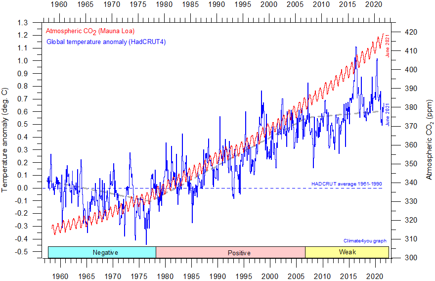
For 32 years, from the end of WWII to the Great PDO Shift of 1977, Earth’s average temperature (to the extent it can be measured) fell despite rising CO2. Then for 29 years, it rose to coincide with still accumulating CO2. But for the rest of this century, the extent of correlation, depending upon “data” set, is ever so slight to negative.
So three tridecadal trends have been observed: negative, positive and now flat for the current interval to date.
I would agree with you. What is interesting is when El Nino starts we see an immediate increase in CO2 as measured at Mauna Loa. You can download this graph here:
https://www.esrl.noaa.gov/gmd/ccgg/trends/graph.html
At the bottom of this graph there is a slider on the left side. Use it to move toward about 2010 or so. You can then really see the increase at 2015-2016 and see that this increase is still steady.
You can then move to see similar increases at 1973, 1987, 1997. Then a return from these increases, but not yet for 2015-2016.
We have now entered La Nina. Will be interesting to see if this increase comes back.
Actually, I would like to see a graph showing CO2 in air since 1958 with ocean surface temperature since then. If this is available, I would like a reply with a link to such.
Thank you.
Without precisely the graph you’d like, but a discussion of the weak connection between CO2 and SST:
https://agupubs.onlinelibrary.wiley.com/doi/pdfdirect/10.1002/jame.20032
SST basically has an upper limit under present insolation regimes, continental configuration, seafloor spreading volcanism and ice albedo. Earth of course has been cooling since the Eocene.
Thank you for your reply. I am not a climate scientist.
I was curious as to why there is a sudden and easily detectable increase in atmospheric CO2 with El Nino, any of them since 1958 when CO2 was measured at Mauna Loa.
With temperature measurements of surface sea level layer, we perhaps could understand that following Henry’s law this increase in air CO2 could be due to increase in the temperature of the sea level surface layer temperature.
Then when La Nina follows, the increase in air CO2 comes back, but not yet with the just started La Nina.
Certainly plausible that Henry’s law about distribution between the water/air layers could be the reason, but this may be too simple.
Thank you for your response.
A chaotic (e.g. “evolutionary”), system or process, including human life, is nonlinear, incompetely or insufficiently characterized, and computationally unwieldy, where we can detect regularity (i.e. stochastic) over a limited frame of reference (i.e. scientific logical domain), and infer (i.e. creative/created knowledge) patterns over a larger frame in time and space.
“I shall continue to report the present Pause for as long as it may last. And, if we see no very strong El Niño in the next few years, it could be quite a long and telling Pause. “
It seems interesting question is when could the two pauses merge?
Granted such time may not last a long time, but it would be a moment of fun. And thereafter one can always talk about the Great Pause.
This was discussed under the last post on the new pause. I think many of us do believe the pauses will merge some time after the AMO goes negative.
The lukewarmers are less likely to believe it will happen as they think CO2 is having enough of a warming effect to prevent it.
Speaking of the “Great Pause”, I first read that as the “Greta Pause”? Not sure what that would be. Maybe the blank look on her face when asked the question, “How do you explain the Great Pause?”.
It’s the Existential Pause that Chuck Schumer fears.
Wasn’t he more concerned about the stolen erection?
Maybe we need Pause T-shirts. Something like “I brake for the Pause”, or “I couldn’t breathe, and then the Pause happened”.
the lack of a super la niña after the super el niño 2015-2016, managed to keep the temperatures higher for about 5 years and should be able to moderate the fall of the moderate la niña 2020-2021 for another year, just as happened in the post super el niño of 1877-1878 that was also not followed by a super la niña, but an interesting fact is that this will interrupt the trend of post-el niño warming jumps that came occurring since the super la niña of 1973-1974, which could start a new cooling period or at least cause a long pause in global temperature.
Do you know if there is a graph showing Mauna Loa air CO2 values from 1958 to with also showing ocean surface temperature?
You can do it with WFT.
https://woodfortrees.org/plot/esrl-co2/from:1958/to/normalise/plot/hadsst3gl/from:1958/to/offset:-0.5
Thank you. Very interesting.
… in the boundary layer and in the mid troposphere – i.e., just above the ground and about six miles up, the official predictions have been 2.4 times the observed anthropogenic warming rate over the past 30 years.
Maybe I’m just a dumb old codger, but I don’t understand how to split out the “anthropogenic warming rate” from the rest of the change. Lord Christopher (or someone) can you please explain it in simple words, suitable for an old man. Thanks
Delighted! Just read Wu et al. (2019), or Scafetta (2021). About 70% of the warming trend of recent decades is thought to have been anthropogenic. But there is no consensus about this in the journals. Legates et al. (2015) reported that, of 11,944 papers on climate and related topics published after peer review in the 21 years 1991-2001, only 41, or 0.3%, even went so far as to say that at least 50% of the warming of recent decades was anthropogenic. Truth to tell, we don’t really know. But we have simply adopted Wu et al for our estimates, because that is what the climate fanatics recognize as “mainstream science”.
“Truth to tell, we don’t really know. But we have simply adopted Wu et al for our estimates, because that is what the climate fanatics recognize as “mainstream science”.”
It doesn’t hurt to remind people that you are just playing on the alarmist’s playing field, using their figures to debunk their claims. 🙂
Mr Abbott has gotten the point beautifully. We accept ad argumentum all of official clahmatawlagy except what we can prove to be nonsense: that focuses Them on addressing the main point we are making.
Can’t believe that so many here miss the POINT…it is not global warming. ohmygodthecllmateischanginganditisallmansfaultitscoldhotwetdry and it is all proof.
Actually, one could calculate a pause going all the way back to ~AD1000…
Considering that the current anomaly is about the same as 1998, the Pause is about 23 years long. And it definitely looks like a pause, as the steady rise in temps ~1975-1998 ended in the El Nino of ’99, and in spite of the carbon orgy in the 2000’s, as China, India, etc. burned their way out of poverty, temps stopped their upward trend of the past and basically ignored the ever increasing CO2 in the air.
I love this site. I cannot verify the accuracy but it seems pretty good to me. No hiding the temperature by the use of anomalies that are adjusted to meet the trend.
http://temperature.global/
Pretty soon the clergy of the global warming religion will have to start adjusting down CO2 levels so as to take credit for preventing the non-existing warming.
Sorry but not this time. CO2 is not only measured at Mauna Loa, but also at 4 or 5 other areas around the world, like Artic, Antarctic etc.. They all show the same yearly average.
And this average has been going up since the first measurements at Mauna Loa in 1958.
Even better. With the pandemic, proposals were made that CO2 would be lower! And Mann on the NPR Science Friday radio was asked about this a few weeks ago. He said YES, CO2 declined by 7%. Pure nonsense. There is a graph from “climate4you” above showing you how CO2 and temperature correlate since 1958 when CO2 was measured up to now in Mauna Loa.
So they can try adjusting as they have with temperature but it will not work with CO2.
Mr Pattullo’s point remains valid. Anthropogenic radiative forcing has been rising in very nearly a straight line for 25 years: yet the warming that had been predicted is not occurring. Only about a third of it is occurring.
There is no pause >>> pending temperature reading adjustments.
Honestly, dedicated leftists don’t really care about facts or data. It’s only about what they can get enough people to believe, and most people do not really pay attention to things like pauses and failed models. I think they believe what they read on social media and in the so-called “mainstream” press. And these channels will not allow information that conflicts with the narrative to be widely discussed.
Well, there are ways to make the Left pay attention. Watch this space.