Reposted from Dr. Roy Spencer’s blog
January 29th, 2021 by Roy W. Spencer, Ph. D.
Several lines of evidence suggest observed warming trends are not nearly as large as what you have been told.
It’s been almost eight years since I posted results on my analysis of the global Integrated Surface Database (ISD) temperature data. Despite finding evidence that urbanization effects on temperature measurements have not been removed from official land temperature datasets, I still refer people to the official products (e.g. from NOAA GHCN, HadCRUT, etc.). This is because I never published any results from my analysis.
But I’ve started thinking again about the question, Just how much warming has there been in recent decades (say, the last 50 years)? The climate models suggest that this should have been the period of most rapid warming, due to ever-increasing atmospheric CO2 combined with a reduction in aerosol pollution. Since those models are the basis for proposed changes in energy policy, it is important that the observations to which they are compared be trustworthy.
A Review of the Diagnosed Urban Heat Island Effect
The official datasets of land surface temperature are (we are told) already adjusted for Urban Heat Island (UHI) effects. But as far as I know, it has never been demonstrated that the spurious warming from urban effects have been removed. Making temperature trends be the same independent of urbanization does NOT mean urban warming effects have been removed. It could be that spurious warming has simply been spread around to the non-affected stations.
Back in 2010 I quantified the Urban Heat Island (UHI) effect, based upon the difference in absolute temperatures between closely-spaced neighboring stations having different population densities (PD). The ISD temperature data are not max/min (as in GHCN), but data taken hourly, with the longest-record stations reporting at just the 6-hourly synoptic times (00, 06, 12, 18 UTC). Because there were many more stations added to the global dataset in 1973, all of my analyses started then.
By using many station pairs from low to high population densities, I constructed the cumulative UHI effect as a function of population density. Here are the results from global data in the year 2000:

As can be seen, the largest warming effect with a change in population density occurs at the lowest population densities (not a new finding), with the most total warming at the highest population densities.
The Effect of Population Density on U.S. Station Temperature Trends
In 2012 I experimented with methods to removed the observed UHI effect in the raw ISD 6-hourly data using population density as a proxy. As you can see in the second of the two graphs below, the highest population density stations had ~0.25 C/decade warming trend, with a reduced warming trend as population density was reduced:

Significantly, extrapolating to zero population density would give essentially no warming in the United States during 1973-2011. As we shall see (below) official temperature datasets say this period had a substantial warming trend, consistent with the warming in the highest population density locations.
How can one explain this result other than, at least for the period 1973-2011, (1) spurious warming occurred at the higher population density stations, and (2) the evidence supports essentially no warming if there were no people (zero population density) to modify the microclimate around thermometer sites?
I am not claiming there has been no global warming (whatever the cause). I am claiming that there is evidence of spurious warming in thermometer data which must be removed.
Next, we will examine how well that effect has been removed.
How Does this Compare to the ‘Official’ Temperature Trends?
Since I performed these analyses almost 10 years ago, the ‘official’ temperature datasets have been adjusted several times. For the same period I analyzed 8-10 years years ago, look at how some of these datasets have increased the temperature trends (I used only CRUTem3 back then):

The CRUTem3 data produce a trend reasonably close to the raw, unadjusted 6-hourly ISD-based data (the correlation of the two datasets’ monthly anomaly time series was 0.994). Note that the latest USHCN data in the above graph has the most warming, at +0.26 C/decade.
Note that this is about the same as the trend I get with the stations having the highest (rather than lowest) population density. Anthony Watts reported qualitatively similar results using different data back in 2015.
How in the world can the warming result from NOAA be reconciled with the (possible zero warming) results in Fig. 2? NOAA uses a complex homogenization procedure to make its adjustments, but it seems to me the the results in Fig. 2 suggest that their procedures might be causing spurious warming trends in the data. I am not the first to point this out; others have made the same claims over the years. I am simply showing additional quantitative evidence.
I don’t see how it can be a change in instrumentation, since both rural and urban stations changed over the decades from liquid-in-glass thermometers in Stevenson screens, to digital thermistors in small hygrothermometer enclosures, to the new automated ASOS measurement systems.
Conclusion
It seems to me that there remains considerable uncertainty in just how much the U.S. has warmed in recent decades, even among the established, official, ‘homogenized’ datasets. This has a direct impact on the “validation” of climate models relied upon by the new Biden Administration for establishing energy policy.
I would not be surprised if such problems exist in global land temperature datasets in addition to the U.S.
I’m not claiming I know how much it has (or hasn’t) warmed. Instead, I’m saying I am still very suspicious of existing official land temperature datasets.
The entire notion of man-caused climate change is spurious.
More spurious than even Roy Rogers! (OK, that’s a stretch. But it may trigger something…)
i like your puns. Hi Ho Silver!
How do your results square with the satellite datasets?
How would you expect the satellite data to be able to differentiate natural vs man-made climate warming?
IIRC, UAH6 shows the 40+ year average over land at about 0.15 C/decade; a lot less than thermometers. This during an acknowledged upswing in cyclical temperature trends and a period where humankind’s CO2 production was exponentially increasing.
Still probably similar or a bit cooler than 1930s/40s though.
Cyclical trends on the upswing during the warm part of the cycle.
What we have to remember is that a lot of the “warming” aka “climate heating” is either hiding in the oceans, or is “baked in”. Thus, we can’t measure it or actually prove that it exists, but we “know” it’s there. Because science.
I may be misinterpreting your comment, but does “science” really “know” that “heat” is “hiding” in the oceans?
Oh yes, James, “science” “knows!”
On this forum, if someone types “because science” you can guarantee that they are using sarcasm as the warming advocates are always using “science” as a cudgel even when it is obvious they have what science is.
The warming advocates generally use ‘the science’ rather than just ‘science’ as the former refers to the data/information/prognostications from so-called scientists and the other is a process (which is ignored by the advocates of ‘the science’).
Okay, makes sense, sarcasm… I’m a little rusty.
To the Alarmists, there is only one “the science”, their science. If you don’t agree with their science, then you don’t agree with “the science”.
It’s a method of shutting down dissent.
They are saying “the {climate] science” is infallible, and they know what that science is, and skeptics do not. So, shut up, skeptics!, they say, when they say “the scicence”.
I am a fan of Dr. Roy’s work and website, but what he has done in Fig. 2 can only be described as “bad”, worthy of 2 out of 10 on a stats exam. A 5th group in the 1024-3125 range would show the problem. Taking a bunch of randomly scattered data and drawing a least squares fit line through it isn’t any more useful than plotting fly specs on a calendar.
Is it kinda like tree ring proxies 🤔
I also am a fan of Dr. Roy. Look at fig. 2 again, it has two parts. The upper part is raw data and has a low, but real R-squared number. The lower part of fig. 2 is subdividing the data into 4 distinct populations, and the resulting R-squared value is very high. The upper raw dataset has a lot more scatter because the data originates in diverse sectors of the UHI problem. I think I will stick with Dr. Roy on this one.
I think it important to remember what the r^2 value means and why is it used. Basically, Fig. 2 says that only about 8% of the variance in the temperature trend can be explained by, or associated with, the city population.
I would consider the point on the extreme right of the graph to be an outlier that is not representative of the general behavior of the data set. I suspect that deleting that point would result in a higher r-value and the consequent r^2 value.
As an after thought, removing what I consider an outlier would increase the slope of the OLS regression line, and lower the y-intercept. That would suggest possible cooling in the absence of warming resulting from land-use changes, i.e. urbanization.
DM,
Hmmm….. Why would a 5th group in the 1024-3125 range show the problem? Are you *assuming* you know what that would come out to be? Or have you calculated it?
The entire “global warming temperature” is nothing more than taking a bunch of randomly scattered data and averaging it together.
Just by eyeballing it, it appears that the variance is greatest at the lowest population density and the least at the highest population density. Wouldn’t that make the trend line through the highest density population points more believable?
“The entire “global warming temperature” is nothing more than taking a bunch of randomly scattered data and averaging it together.”
Relative to the influence of ‘forcing’ on the steady state, a proper average temperature is the fourth root of the average of temperatures raised to the fourth power since it’s emissions, not temperature, that must be averaged.
While the work required to change the temperature is linear to the temperature change, a linear average would be the temperature if all the matter on the surface of the planet was instantly mixed (homogenized) together.
However, once the temperature has changed, the only incremental work required to sustain the new steady state is the work proportional to T^4 offsetting the incremental emissions consequential to the temperature change.
Since most of the change occurs in polar regions, which contribute proportionally less to the planets emissions and energy balance, polar temperature changes are over represented in a linear average.
The 1024-3125 group would have an average below the line as drawn on the second half of fig. 2. The logical conclusion of the resultant flattened line fit might be that a 0.2 degrees (on average) understatement of UHI is evident. Except that an eyeballed standard deviation from the first half of the figure implies that such overstatement of accuracy is unwarranted. A stats prof normally should spend at least a whole lecture on how least squares curve fits through widely dispersed data should not be used to infer or predict anything.
The low R^2 in the top plot shows a poor (but positive) correlation with population density. This probably does indicate that the UHI effect needs more scrutiny but says nothing about the population growth around the stations during the period of the study which would affect the warming rate of the average. However, the huge amount of scatter in the amount of warming station-by-station indicates that the warming rate is also very poorly correlated with the increase of CO2 concentration over the time period which was the same for each station.
A friend put me onto another way to assess this. We were talking about how averaging multiple different populations (individual station station temperatures) adversely affects the overall variance of the combined population. This is never mentioned in a temperature analysis at all and makes the end result much less predictable.
Anyway, he mentioned that since time is on the x-axis, that it probably would be best to treat multiple series as time series and proceed with a time series analysis. Here is a link to a good tutorial. Why Does Stationarity Matter in Time Series Analysis? | by Rayhaan Rasheed | Towards Data Science.
A quote from the paper:
A way too much attention is paid to “error of the mean” in the average values of these trends as if it somehow justifies the correctness of what is being shown. Nothing could be further from the truth when dealing with a continuous function like temperature. It would be like sampling a constantly non-linear, chaotically varying amplitude variation of a frequency. Then averaging the samples and computing some statistical parameters like mean, standard deviation, and error of the mean and declaring a simple average of all the points will give some kind of a correct answer. Total bull puckey from the start to the finish. Just like ignoring measurement error. What you don’t know won’t hurt you I guess.
“It seems to me that there remains considerable uncertainty in just how much the U.S. has warmed in recent decades”
More than considerable! More like SIGNIFICANT!
More like .. IT HASN’T !!
Are we talking T Max or average temperature?
If you Google “Climate Change” and select [images] you get endless pictures of dry cracked river beds from heat waves and drought. The IPCC tells us that in the future the warming will be at night, in winter, in the higher latitudes, and there will be more precipitation.
Obsessing over average temperature if that’s what’s going on here is another example of allowing the alarmists to control the language.
Keep in mind that wonderful quote from Dixie Lee Ray:
During a speech in Pasco, Washington, in 1991, she further denounced the growing number of scientists advancing theories of climate change by telling her audience to “beware of averages. The average person has one breast and one testicle.”
There is only one station in the 3125-126000 group at about 0.35. If we create a 5th group as suggested, we would plot the group about halfway between the two ends and lo and behold, eyeballing the trend shown would indeed be close to 0.35 at the midpoint &&20 or whatever.
Well this establishes that there is some truth to the cagw activist propaganda. There really is an amount of human caused warming overlaying natural temperatures – trouble is it’s due to human technology/activity present in urban areas not due to any kind of trace gas emissions. Time to demand that temperature stations be re-sited in better locations I think.
Would this help?
Adelaide’s official weather observation station is returning to its original location (bom.gov.au)
Despite the fact the Adelaide I remember as a child has changed enormously since the 1950s the bozos still managed to remove one of the longest serving Stevenson Screens in the Southern Hemisphere and move it from the open west park lands and prevailing weather side of the growing city centre to the more built up eastern side of it. Presumably because it was convenient to take the manual readings from the new office digs before automation intervened. Now with a doh! moment they’d like it put back and homogenize it. Anticipate more dooming as a result.
“Well this establishes that there is some truth to the cagw activist propaganda.”
Well you have to understand the dooming is now like living in the old Soviet. Nobody takes Moscow propaganda seriously anymore and you have to read between the lines with Realpolitik. It works like this. Moscow announces bushfires are clear evidence of the dooming unless we all toe the party line and get allocated Teslas. But you’re not supposed to pay it any real heed and act upon it as if parts of the country are now no go wastelands-
Bushfire regeneration | Kangaroo Island and Adelaide Hills | SA T… (southaustralia.com)
Particularly if activists have dacha investments and the like there. So given international capitalists are a bit thin on the ground with Covid then pure locals from urban heat islands like Sydney and Melbourne etc are welcome to pack the kids onboard planes or into SUVs and jet in or drive to catch the diesel ferry and enjoy the rejuvenation of Gaia. Moscow and its satellite control centres thoroughly approves of these things and will take credit for it. That’s how these things work until the facade and propaganda all comes tumbling down.
I agree. Expending energy to do work creates waste heat. Expending a lot of energy creates a lot of heat!
I have no idea how NOAA currently adjusts their data, but a document I collected about a decade ago by Tom Karl suggests they homogenize USHCN data before they apply a UHI correction. Nay, doesn’t just suggest, but states so. Think about this for a moment.
Homogenization followed by UHI correction will spread the yet uncorrected UHI throughout the data, and then adjustment by population will leave most of the UHI intact. It seems to me a reasonable explanation about why the UHI correction is so small, and why the data continue to show the effects of urbanization.
Karl loved doing bad data and statistical methods to support the cause. His 2015 Pause Buster SciMag paper was nothing but an exercise in bad data science.
Yep, same in Australia.
They “homogenise” EVERYWHERE to match urban heated stations,
…. then PRETEND htat because all stations match, there is no UHI effect.
Dr. Spencer provides an excellent analysis of the answer to the headline question: “Could Recent U.S. Warming Trends be Largely Spurious?”
Beyond this, the paleoclimatology scientific data also provides the unambiguous “YES’ answer to this question. Just look at the ten or so interglacial warming periods that have occurred over the last million years on Earth. These warmups, associated with exiting the preceding glacial periods, are always characterized by erratic variations in rate of warming over any given sample duration.
Moreover, in just the last 100 years we have the period of about 1940-1975 and the second period of about 1999-2015 wherein there was no statistically significant warming at all (despite atmospheric CO2 concentration continuing its slow exponential rise uninterrupted over these spans). Since there has been no reasonable, widely-accepted scientific theory for what caused these events, they meet the criteria for causing Earth’s warming over the last 100 years to be characterized as “largely spurious”.
QED.
Since the end of the Little Ice Age (LIA), North American glaciers have melted quite a bit. link So, it has clearly warmed since then, including a substantial period of time when human caused CO2 emissions could not have been the cause.
The null hypothesis should be that the warming out of the LIA continues and explains such slight temperature trend as there may be.
If you were an objective observer, you would see a direct correlation between smoothed land temperature increases over the past 60 years and population increase/density. The UHI effect is both real and growing however you could say this is man-made localized warming which does result in the charts we have showing the increase. I doubt sincerely that the UHI effect was removed entirely from the final datasets. Recent studies by Scafetta show that the .6C warming observed in global datasets from 1940-2020 can be partially due to UHI and other non-climatic biases.
It also appears that record high temps around the world have not increased at all as one would predict in a CAGW scenario. What has increased are low temperature readings which to some degree are an artifact of UHI.
https://www.urban-climate.eu/c/urbanheatisland/
There are several pages to look at.
A nice collection of pictures from space
The first post above shows Paris and surrounding areas.
No.
Berkley Earth already nailed this one.
This is not the case.
Prove it
Comment Griff?
It is obvious that people didn’t know how to measure temperatures before about 2005. Isn’t it great how CliSci advances so rapidly?
griff, Berkeley Earth also determined that a third of all stations worldwide actually showed a negative temperature trend. That, in of itself, is very inconsistent with the claim that CO2 controls the climate as CO2 mixes throughout the atmosphere very quickly and there are only minute differences in the CO2 concentration from station to station. Stating the obvious (well at least obvious to anyone with half a brain), that if 1/3 of stations show a declining temperature the case that a climate crisis is imminent is extremely unlikely.
Berkeley Earth actually acknowledged that the UHI effect exists, they even gave examples like Tokyo having warmed 2 degrees C more than other areas in Japan. They found that urban areas represent only 0.005 of the total global land area so the global average temperature computed with whatever corrections for the UHI effect that are done, isn’t affected by the known UHI effect but this was primarily owing to the extremely small urban/rural area fraction.
One problem with Berkeley Earth’s analysis is that they didn’t account for land use changes near their rural stations – increases in farmed area and irrigation also influences the local temperature near the measurement station. There are very few stations sited in areas that are truly remote – as in the middle of scrub land or the middle of a desert away from all roads, farms, rural airports, etc.
Aye!
Hansen and his ‘team’ removed thousands of rural and higher elevation temperature stations from their data sources.
They also introduced their “use temperature stations from up to 1200 km away as a temperature adjustment method” where they smudge/adjust and otherwise pretend to correct a temperature station.
You are quite predictable. You make a statement as fact, without explanation or data. I have previously pointed out that the approach taken was flawed. Mosher has claimed that the average temperature around cities was not statistically different in rate of change than the city itself. The problem is, there is usually a prevailing wind blowing heat out of the city core. It that excess temperature is averaged with the other three quadrants, the contribution will be difficult to detect. What should be done is compare the temperatures downwind with the temperatures upwind of the city. Actually, studies have been done by NASA demonstrating that temperature and precipitation are significantly increased downwind of Atlanta (GA) for tens of miles.
The biggest problem with the BEST study was that the vast majority of the stations they labeled as rural, weren’t.
Not surprisingly, when the compared suburban stations against other suburban stations, they didn’t find much difference in trend.
Berkeley Earth couldn’t nail a piece of paper to a cork board
They are CON-ARTISTS
Real unadjusted data shows THEY ARE WRONG, and deliberately so
USCRN shows a slight bulge around the 2015/2016 El Nino, but otherwise NO WARMING in 15 years
Don’t know where that image went
Eastern USA has been COOLING since 1901
Basically ALL warming shown in AGW “once-was-data” fabrications in the USA is because of adjustments.
TOB “adjustmentᴸᴼᴸ” has been shown to be totally spurious, not affecting the trend at stations at all
There has been significant DECLINE in temperatures in the majority of states from either the short termm, to the long term
Hi Fred,
Thanks for posting that at least five year old opus, it needs to be redone (-:
Monckton says that the last 5 years have had no temperature trend. Why would you expect Fred’s data to need to be redone? Just so that you can be critical of the implications?
Not your fault that you don’t know who’s data that is. I do sign some of my stuff [stacase] but I didn’t on that one. NOAA does change the data they they use to support their Climate At A Glance website and the data for that map may very well have been rewritten over the last five years.
Monckton may know what the truth is, but to use a quote to explain what may very well be going on:
“It doesn’t matter what is true, it only matters what people believe is true.” -Paul Watson, Co-Founder of Greenpeace
If I do take the time to redo that opus a then and now comparison may very well be in order.
Modern versions of Orwell’s Winston Smith are out and about.
So, you are criticizing Fred for using the only available data, which you haven’t updated? If someone were interested in the truth, wouldn’t an appropriate response be to say something to the effect, “Fred, that is my data and it is out of date. Here is the current data and, and as you can see, it shows …”
Thanks for all your hard work, Fred. It is much appreciated. You provide evidence from all over the world showing it was just as warm in the recent past as it is today.
Fred has written temperature charts from the affected areas and times, showing what he says they show. What do the alarmists have? Answer: Nothing but a bogus, computer-generated, global Hockey Stick chart.
No Bogus Hockey Stick Chart = No Human-caused Climate Change.
The written temperature records tell the story. They say CO2 is nothing to worry about. Spend your money elsewhere.
Many parts of USA have cooling.. here’s just a sample…
So unless you have UNADJUSTED DATA to you can put forward..
EVERYONE must take your comment, as all your other comments
A BOGUS, DELIBERATE LIE
And of course EVERYONE KNOWS that the USHCN “adjustmentsᴸᴼᴸ” are an almost linear match to CO2,
.. this gives ABSOLUTE PROOF of the FRAUD behind these adjustments.
Hi fred,
I’ve seen this image before and it’s very intriguing, but I don’t know where it comes from (correlation between temp adjustments and CO2).
Could you give the sources for the data etc that was used to create the graph?
If it’s genuine then it’s pretty damning.
Many thanks and keep up the good fight!
Chris
Chart is from Tony Heller at https://realclimatescience.com/
And yes it is genuine.
It isn’t damning because it has no relationship to time. You can’t tell what the independent vs dependent variable relationship between them is. Does T up lead/follow CO2 up? Does CO2 up lead/lag T up? Does T change with changing CO2? Who knows from this graph. It is a way to erase the “pauses” in temperature while CO2 is climbing. Otherwise they would need to come up with an explanation for why CO2 doesn’t directly and immediately affect temperature. Like “the heat is hiding in the depths of the ocean”.
That is surprising because the relationship is supposed to be linear with the logarithm of the CO2 concentration. Maybe the adjuster didn’t get the memo!
As usual, it doesn’t matter how bad, or how thoroughly refuted the paper, griff will continue to cite it.
Didn’t Steve post a graph last week showing the changes by GISS to the 1880-2020 dataset over the past 15 years?
Clearly they are cooling the warm period in the early 20th century and warming recent temps? Isn’t this simply manufacturing a hockey stick?
This one: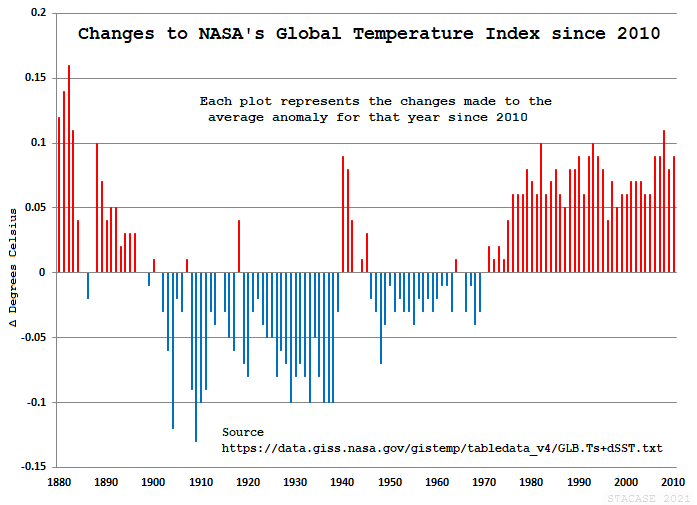
Yes, I would say that chart pretty much demonstrates that the changes to the temperature record have cooled the past and warmed the present.
Human-caused Climate Change is pure fraud. The most expensive fraud in world history, and still counting.
“Isn’t this simply manufacturing a hockey stick?”
Yes, it is.
Found it
Here’s another GISTEMP comparison that illustrates that although the monthly changes are quite small, over the years they have added up changes in the rate of warming:
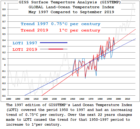
The earliest Land Ocean Temperature index (LOTI) that can be found on the internet Archives Wayback Machine is from1997. What the comparison shows is that the time series covered in 1997 started at 1950 and so the linear trend comparison is only from the 1950 – 1997 time period. The increase from 0.75°C/century in 1997 to 1°C per/century 22 years later, is an artifact of changes made to the existing data.
Exposing inconsistencies particularly concerning timelines is bread-and-butter to trial attorneys and is used to assess the truth and accuracy of statements, juries draw their own conclusions.
It is inconceivable that historical data in epidemiological studies would be altered or ‘adjusted’ years after being recorded and if it were would be subject to extreme sanctions, yet that practice is accepted as normal in climate change™ ‘scienceology’.
when UHI is 7+ degrees….
..and you only adjust for 2 degrees
what the hell do you think is going to happen
Worse, if you homogenize first so the UHI is smeared across the entire dataset, then do a minor tweak so you can say you adjusted for UHI makes that 7 degrees look real across the region. All individual station adjustments should occur before homogenization. Doing it the other way is either malfeasance or incompetence, and I can’t believe they don’t know what they are doing is wrong.
Most of the warming in the land surface datasets is synthetic infilling of empty grids, thus creating “station data” between urban areas warmed by UHI that is insufficiently “adjusted out.”
Climate Science is so much junk in all three legs that are used to support the policy scam.
97% of Climate science is Junk science all the way down.
Joel –
You got it, buddy. To the T. As in Tony Heller, who (if you’ve been watching his YouTube and NewTube channels), has been saying the same thing about these spurious, always adjusted NOAA data sets for the last 12 months or more. It’s all become junk science.
My hope is that this junk “climate science” can be nipped the bud before it’s too late. Because trying to explain it before the U.S. Supreme Court is going to be difficult.
The UHI effect is as intuitive as an Eskimo’s three dog night. It should also be intuitive that it is not related to the dogs’ CO2 output.
It is related to their methane output.
Dr. Roy, It would be helpful to show how this compares to the Climate Reference Network. I know the time period doesn’t match, but I think it is useful to see how the results line up. Theoretically, there is no UHI to adjust in that data, so eyeballing the trends would be pretty convincing.
Indeed, the CONUS part of the Climate Reference Network shows no warming for the past 16 years for the lower 48. At some point, some skilled analyst will look at this data and tell us what it means.
Kent,
I agree it would be nice to see a comparison. But the CRN only has a few more than 100 stations to cover the entire US. I simply find it amazing that people think that few stations can tell us anything about what is happening in the US as far as temperature is concerned. The stations in Texas will give a far different picture than the stations in Minnesota, or at least they better, they are completely different growing zones and the growing zones are a pretty good indicator of climate. If you compare the annual cooling degree-data for Minnesota and for Texas they are quite different! Same for heating degree-days. And degree-days are a much better indicator of climate than is some kind of “average” temperature that doesn’t physically exist anywhere.
Trends at each site are all that matters.
I see someone decided to downcheck me rather than actually refute my assertions.
Dave,
The trend of 70.0F to 70.1F is 0.1F. That is far different than the trend of 0.1F involved with a change from 50F to 50.1F. 0.1/70 = 0.1%. 0.1/50 = 0.2%.
So, yes, trends at each station matters. But so do the absolute temps. If max temps go up from 70F to 73F hardly anyone will notice. If low temps go up from 20F to 23F no one will notice either. Anomalies are only useful to scare people through the scaling on a graph so anomaly trends are pretty much useless as well!
I’m sorry about any misunderstanding my brief statement caused; no offense meant. We are talking about USCRN measurements, as anomalies, spread about the U.S. and their use in describing CONUS temperature trends. While I don’t think anomalies tell the whole story, they are useful for comparing and combining temperature trends at different locations. Taken all together, USCRN is useful in describing whether CONUS is warming or cooling, by how much and over different time periods.
You missed the whole point about anomalies. Look at the percent changes at different temperatures. 1 degree at 80 degrees is a much smaller percent change that 1 degree at 30 degrees. However a simple average does not take this into account.
It is a matter of variance. You can’t combine populations (temperature data at a specific stations) without also increasing the variance of the total.
It seems that it is verboten to even mention this when discussing the Global Average Temperature. Yet it means the anomalies in GAT are useless to tell what is going on. You learn early in metrology that there are times when you must use percent’s to calculate uncertainty rather than absolute values. The same thing applies when trying to combine temperatures.
I’m not going down this rabbit hole, Jim. As long as temperatures are consistently measured at each site with the same instrumentation, there is no reason one can’t get useable information as to the average trends from anomalies. I dislike the idea of a global average temperature but, as the old saying goes: “Although its rigged, its the only game in town.”
Dave,
Again, trending anomalies is not trending the temperature. A temperature trend of 1/70 (slope 0.014) is *not* the same as a temperature trend of 1/20 (slope 0.05). One is four times larger than the other. Yet both come up with same anomaly trend over time.
If you play rigged games in the casino then that’s on you.
The trend slope between 70deg and 71deg is much less than the slope of a change from 20deg to 21deg.
Yet the anomaly trend is the same for both. So how is the anomaly trend useful for comparing trends at different locations?
Who am I talking with, Tim or Jim?
both!
Then, to both of you, I will not continue addressing your collective pet peeve rants.
No rants here. Just standard physical science tenets. Did they determine the acceleration of gravity by averaging measured anomalies at different locations? Or by using measured absolute values!
But you are welcome to ignore physical science methods and practices if you want.
Be it absolute temperatures, or temperature trends. If you don’t have enough stations to paint an accurate picture, you don’t have enough stations.
FFS, I’m done with you guys.
What amazes me Tim is your comment. The CRN stations have all been placed far apart from human structures or other influences and have been uniformly distributed throughout CONUS so that a measure of the lower 48 human-influence-free temperature is provided. The CRN web site includes a map showing the general location and distribution of stations if you are interested. Each site has triply redundant thermometers so that instrument error is virtually eliminated and also measures many parameters other than temperature. To me, establishing the CRN is one of the best things NOAA has ever done with respect to actually measuring global warming.
The Historic Climate Network was never conceived nor implemented as a climate measuring system. Many of the HCN sites are very poorly located from a climate standpoint as Mr. Watts has reported, and cannot possibly represent anything other than the highly local weather conditions near the site. This is an important measurement in many cases. HCN station sites at airports, for example, are essential for safe operation of aircraft. However, my local HCN site is located about 10 feet away from the brick walls of a primary school that is presently heated to about 70F inside. Do you think that HCN thermometer might be affected and if you do, by how much? What I also find amazing is that anyone would think that HCN temperature measurements, regardless of their number, can be collected and adjusted as they are, too accurately or responsibly provide a measure of national or global climate temperature changes.
In my mind, our Government should fund the construction and placement of CRN stations uniformly over the earth’s land surface. If we did so, we could actually measure, with scientific precision, changes in the earth’s land surface temperature, rather than guessing about it as is done now. I suspect the cost would be a small fraction of what we now spend on climate models.
The problem is not the siting. The problem is the sparsity.
Think about it. The temperatures on the north side and south side of the Kansas River valley are many different by more than 2 degrees. Yet there aren’t CRN stations on each side of the valley.
The temperature at the top of Pikes Peak, Denver, and Colorado Springs can vary significantly – by as much as 10F – yet there aren’t CRN stations to track the temperature gradients in those locations.
Using the CRN stations require a lot of “assuming” that surrounding areas have the same temperature, and those surrounding areas are HUGE!
BTW, have three thermometers does *not* mean increased accuracy. When you average three independent measurement devices their uncertainty combines by root-sum-square. Think about it. If the uncertainty in each device is +/- 0.1C then averaging the three of them together becomes sqrt(3) x +/- 0.1C = +/- 0.2C. Then if those three instruments get averaged with the results of two other stations you get sqrt(3) x +/- 0.2C = +/- 0.3C. Pretty darn quickly the uncertainty becomes wider than the changes you are trying to identify!
If you are trying to define a .15C per decade trend and the uncertainty is more than +/- 0.3C then how do you actually see a trend for certain? (btw – the uncertainty will be far more than +/- 0.3C when averaging ten annual values)
DHR –> “The CRN stations have all been placed far apart from human structures or other influences”. Like miles away from urban/suburban EFFECTS? UHI isn’t just locating a station 100 feet from a structures, shade, etc. I can’t find the Chinese study right now but I remember that they found a significant affect downwind of an urban area. The wind would raise the minimum night temperatures a long distance away and which is what is generally increasing anyway. Do CRN stations take this into account?
“How in the world can the warming result from NOAA be reconciled with the (possible zero warming) results in Fig. 2?”
You need clarity about what you are actually correcting for. UHI is not a measurement error; the thermometers reported correctly. It is a (small) sampling bias. The locations really did warm, but they are not representative of the country as a whole. Urban areas were over sampled.
Roy has a dubious model for the component of the whole country temperature that is due to population, and he wants to remove it. That is, he doesn’t want to more correctly measure the warming that happened. He wants to take out a component of warming that happened because he says it is due to population increase and so shouldn’t count. He wants to adjust back to the warming that would have happened in an unpopulated US.
I think his model for that is spurious. But the point here is that he is adjusting to solve an attribution problem, not a measurement problem.
Nick, The attribution vs measurement problem is a problem when you attribute the change to CLIMATE vs local temperature. If the discussion is about how much greenhouse gases are heating the planet, not removing UHI from the data is dishonest. As in Disinformation. Lying. So it is correct that the thermometers are showing NYC is getting hotter, but you don’t get to use that information to say the planet is getting hotter.
“If the discussion is about how much greenhouse gases are heating the planet, not removing UHI from the data is dishonest.”
No, first comes the measurement. How much did the planet actually warm? Then you can argue about what might have caused that. But you must not change the measurement because of your theories about causes.
The problem with Roy’s approach is that it totally depends on modelling. If you want to correct a sampling issue to find what warming really happened, you can do that, as with USCRN. But if you want to find the warming in the absence of population, you would have to either remove the population, or model.
“But you must not change the measurement because of your theories about causes.”
This is exactly what the referenced databases are doing, changing the data. The whole point of the article. Those homogenization algorithms produced adjustments at my local station (350304) of plus 4 degrees in 2011, and minus 9 degrees in 1905. Those adjustments do not coincide with any of the metadata notes about station changes, based purely on theories about causes. This has nothing to do with how accurately the original data was taken, or correcting for UHI. The Raw data for the same station shows almost no warming, since 1895.
“Those adjustments do not coincide with any of the metadata notes about station changes, based purely on theories about causes.”
No, they are based on theories about sampling what really happened. They believe that the station reading was not representative of the temperature of the region, for some reason, and so they use other nearby temperatures to assign a value that they believe is more representative. But it is data based, and tries to represent what actually happened.
What Roy is doing is estimating what might have happened in some hypothetical circumstance (no population effect). That can’t be got using measurements of what actually did happen; it requires a model.
How do they *know* the readings were not representative? Here on the central plains a difference of only 20 miles can make a vast difference in temperatures, even in rural areas. Temperatures north of the Kansas River can differ enough from the south side of the river that it can be snowing north and raining south, or raining north and nothing south. And this is not just an occasional thing. The Kansas River valley can affect temperatures all the time. Cloud cover can be regularly different as well as weather fronts.
Changing raw data without a distinct PHYSICAL reason only distorts results. Saying station 1 reads differently from stations 2 and 3 is *not* a physical reason to adjust the raw data at station 1!
Pot, kettle. Kettle, pot.
The fake homogenisation process is doing exactly that. Claiming that some inconvenient measurement is wrong, and replacing it with some more convenient value. The proof of the convenience comes from the fact that these changes always, always produce a warming trend where none existed before. They never change warming trends into cooling trends.
That is exactly what homogenization does. What might have happened in some hypothetical circumstance. Changing data based upon what you think MIGHT be right is unethical.
Example: You are in charge of the cooling water temperature at a nuclear power plant. You have 5 gauges scattered throughout the piping. Do you change the reading that is different from all the rest to be the average of the other four and record it as actual? Do you certify that you have recorded the temperatures accurately and to the best of your ability? God help us if you answer affirmatively.
Look at what Hivemind posted. Can you show where the pluses and minuses average out? Why are the predominant changes downward in older temps and upwards in recent temps? Has any study ever been done to analyze why this occurs?
Which you can’t find out by smearing Urban Heating all over the surface.
You end up with a LIE.
First we use homogenization to spread the UHI influence over all the stations near a city.
Then we use the fact that the stations near the city have the same trend as the city stations to prove that there is no UHI and our homogenization algorithms are correct.
Trivially true, but with standard CliSci misdirection. Given all the problems with surface and ocean measurements, remote satellite sensing is the appropriate metric. Averaged over 40+ years, UAH6 gives us the not so remarkable warming rate of about 1.15 C/decade, all during a cyclic temperature upswing.
Yep
Satellite data starts out at a point that was probably the coldest period since the LIA.
Certainly the point when there was most Arctic Sea ice.
It’s 1.15C/century, not decade.
Thanks for the correction.
That is one of the least confident contradicting replies from Nick Stokes I’ve seen in a long time. That indicates to me that he has no real argument to counteract what Dr Spencer says
Your logic totally escapes me. You say Dr. Spencer wants to adjust back to the warming that would have happened in an unpopulated U.S., but then also say it is a “small sampling bias”. One would think they are one in the same!
And, by the way, UHI is a measurement error. It happens to be systematic and can not be adjusted for using statistical analysis. It must be CORRECTED by using the results from an analysis such as Dr. Spencer is advocating.
Your method of homogenization is prone to error because you can not determine the boundaries of UHI with any accuracy nor its absolute value at any given location and time. As I’ve said before, you’re a mathematician determined to use statistics to solve anything you don’t like. Somethings just aren’t amenable to statistical probability analysis. Trending of time series are one of them. To paraphrase, there are more things under the sun than means, variances, and averages.
“One would think they are one in the same!”
No. A sampling bias can be improved by better sampling, as with USCRN. But if the whole country is affected by Roy’s “population effect”, better sampling won’t help. In fact, no measurement will. There is no real world in which the US is unpopulated.
Can’t you read? It is *NOT* a sampling bias. It is a systematic measurement bias. It cannot be removed by better sampling.
It’s like two people measuring two different piles of 2″x4″‘s, one using a ruler that is 12 inches long and the other 13″ long and as each is measured it goes into the fire (just like temperature measurements go into the 4th dimension). When you average all the measurements together to find the average length of a 2″x4″ you get an answer that is wrong!
No amount of sampling can fix it because what was being measured is gone. No amount of statistical analysis can fix it. You’ve got bad measurements mixed in with good measurements and no way to separate them. You can do all the homogenizing and smearing you want it won’t fix the problem. All you can do is adjust the lengths to what you think they should be – just like is being done with the surface temp measurements. And the operative phrase here is “what you think they should be”. The fact is that you don’t know so your own BIAS becomes the answer, not physical reality!
That’s what I would have said if I could have expressed it as clearly as that.
“There is no real world in which the US is unpopulated.”
There is; just wait until Biden and his cronies have had a bit of time to work.
The real DUBIOUS models are climate models and climate “adjustment” models
Yes, urban heated areas are massively oversampled, then smeared over vast areas where they should not apply.
Those smearing of UHI effect probably accounts for 1/2 to 2/3 of the warming in the farcical “Global Average Surface Temperature.”
The rest is down to just pure agenda-driven other “adjustmentsᴸᴼᴸ”
Coming from Roy Spencer, this is a highly significant message of data alarm.
Significantly, extrapolating to zero population density would give essentially no warming in the United States during 1973-2011. As we shall see (below) official temperature datasets say this period had a substantial warming trend, consistent with the warming in the highest population density locations.
How can one explain this result other than, at least for the period 1973-2011, (1) spurious warming occurred at the higher population density stations, and (2) the evidence supports essentially no warming if there were no people (zero population density) to modify the microclimate around thermometer sites?
Seems the most straightforward approach would be to remove all sites that have significant population and see how much the relativity empty areas have changed.
You an obtain maps from the government that shows population density by county. Why not exclude any station in a county that has a density of more than 6 people per square mile and is closer than 10 miles to an MSA?
Makes sense to me.
BEST Contiguous USA, 1979 – 2020: Trend = 0.25° / century
UAH Contiguous USA, 1979 – 2020: Trend = 0.17° / century
If USA warming trends are largely spurious, why does satellite data also show a warming trend?
More people
As satellites are sampling the whole globe aren’t they including areas of high UHI effect as well? Perhaps even more bias than the thermometer records, I don’t know.
Presumably having done this work to the data, that can be applied as an adjustment to satellite records. If everything is published then the veracity of the result can be confirmed or not as the case may
In the surface data UHI effects are smeared all over areas where they shouldn’t apply
Urban ares don’t make up as large a proportion of the global surface area as some people imaging
There are VAST areas between urban areas that satellite data picks up as non-urban, but are heavily affected by urban smearing in the farcical surface station fabrications.
That happens when: 1) Procreation is more popular than death; and 2) the U.S. is a better place to live.
0.17C per century isn’t much of a trend. It’s more like a rounding error. Where did you get that data anyway?
I think the units should be C/decade. The 0.17C comes from the UAH data file.
If you properly calculate the trend line:
link
That quote is from October 1. I note that the December anomaly is down a lot so the trend line should be a bit more shallow.
That’s global. We’re talking about USA temperatures here.
Lets have a look at those UAH us temperatures.
Avoiding strong El Ninos , of course, because we are looking for HUMAN CO2 caused warming not NATURAL warming
Strong El ninos in 1978/80, 1998, and 2015/16
So UAH USA 48 from 1980-1998
UAH USA 48 from 2000-2015
The trend quoted was for USA, not globe.
YAWN
Heck, 0.17 deg/decade has a serious uncertainty associated with it for this time frame. Probably something like 0.17 +/-1.0 deg/decade.
The trend is caused only by the 2015/2016 El Nino bulge..
As we progress into the future , it will gradually lessen.
The underlying trend is basically zero.
OOPS, I was referring to USCRN
sorry
The trend up to the start of 2015 is 0.12°C / decade.
Trend to start of 2016 is 0.15°C / decade
Nothing suggests the trend is basically zero.
UTTER BULLS**T
USCRN has a NEGATIVE trend to just before the El nino
As you realised above, you’re talking about USCRN, that only starts in 2005.
Yep after the 1998 El Nino, and shows ZERO human CO2 signal..
GET OVER IT.
You have NOTHING.. and you know it
USA was WARMER in the 1930s, 40s than now
I know you HAVE to start at the coldest period in the NH since the LIA and then use El Nino steps to show any warming….
But really, its time you grew up and stopped being a CLIMATE DENIER.
I started in 1979, because that’s where the satellite data starts. I’d have thought that was obvious. And I compared it with BEST, starting also in 1979 so I was comparing like for like.
UAH USA 48 also has a NEGATIVE TREND from 2000-2015
Now, don’t forget to use that 1998 El Nino step or the 2015 -2016 El Nino bulge ..
ITS ALL YOU HAVE
And your point is?
Lets try this again. I’m trying to compare surface data (BEST) with satellite data (UAH) in order to test the claim that most of the recent surface warming in the USA is spurious and caused by UHI. The assumption is that UAH is not affected by UHI but surface data is. If most of the warming is spurious I would expect to see a lot less warming in the satellite data than in the surface data over the same periods.
Lets see how this works with your new period 2000 – 2015. I’m not sure what exact dates you’re using as I find from the start of 2000 to the end of 2015, UAH shows slight warming, so I’ll use the years 2000 to 2014 inclusive rather than mess about with individual months.
So from 2000 to 2014 I get for UAH a trend of -0.12°C / decade. So, if BEST shows warming over this period we might just be able to use it as evidence that surface warming over that short period was spurious. Alas, it turns out that BEST over the same period had a trend of -0.18°C / decade. Not only was it also cooling, but it was cooling 50% faster.
“I’m trying to compare surface data (BEST)”
.
BEST is made up with the WORST of data..
mangled and tortured to “regional expectations” and whims
It is NON-DATA. !!
It is not worth your efforts, no matter how puny they might be.
——
There hasn’t been any warming in the USA since decent data was available..except for the El Nino bulge
Subtract urban warming, and the USA is most probably COOLING
I’m still not sure if you’re agreeing with me or not. I used BEST out of all the surface data, because it was the easiest way to get individual country data, and because it’s assumed here to be the worst data, and so presumably demonstrates the point about the warming being spurious.
So if satellite data shows comparable levels of warming, or cooling, to BEST, irrespective of what caused the warming what does that tell you about the claim that most warming is caused by UHIs?
Actually, the trend from the cold of the late 1970s will continue until we complete the 70+ year (short) climate cycle and the longer 1000+ year climate cycle. Yeah, I know, I know: Simplification up the ying/yang.
Yes, but from now, as the AMO and PDO start to head downwards, the calculated linear trend with gradually decrease until there is zero trend, then depending where you start, the longer term trend will become negative.
That is why the maxists promulgating this fraud are so, so anxious to get their socialist agenda in place asap.
I’m not sure that the post-LIA warming trend has ended such that we would expect to have a net zero trend when latest 70-year climate cycle ends. The post-LIA warming could go on for some time. It is, however, worrisome to some that the past approximately 6,000-year period has been on a cooling trend. What the hey; I’m 72 and don’t worry about slow-moving climatic phenomena. Hell, even if I were a young adult I wouldn’t worry about it!
Sorry, I meant degrees per decade. Of course if BEST was only showing 0.25°C / century, I doubt many here trying to correct it.
Best is AGW agenda driven, satellite data isn’t
Reason for the trend in USCRN and UAH is the 2015/2016 El Nino bulg
That has now all but subsided as temperatures drop back down to the ZERO TREND value before 2015.
Use that El Nino bulge while it is still there, monkey with a straight edge.
Hence my question. If the trend in surface data is largely spurious, why does the satellite data show any trend?
As I show above, the trend before 2015 was not ZERO. Even after a couple of cool years, 2013 and 2014, it was still 0.12° / decade.
Can you imagine *anyone* noticing the difference between 90F and 90.12F ten years from now? I assure you my tomato plants could care less. Me too!
IT DOESN’T apart from El Nino step events
Between those events there is NO WARMING
USCRN shows a NEGATIVE TREND before 2015
UAH shows a slightly positive trend because of the 1998 El Nino
You HAVE to use El Nino events to get that trend.
There is absolutely no human CO2 signal in the satellite data.
.
You yapped mindlessly .. you mean..
Lets assume for the sake of argument you’re right and all the warming in the USA since 1979 has been caused by El Niños. That would still mean Dr Roy Spencer is wrong, and my point stands. The warming in the US is not spurious, it is getting warmer, is just all those pesky El Niños that are making it warm.
What a PATHETIC call to authority.
Interest in DATA , not anyone else’s lukewarmer opinion.
USA is NOT getting warmer..
It is no warmer now than in the 1940s
It is currently COOLING after the effect of the 2015/16 El Nino
So, absolutely ZERO human CO2 warming signal..
WELL DONE, bellhop….. You finally got there.
Sorry, but what are you on about. Whose authority was I calling on? I’m trying to disagree with Dr Spencer.
Sorry again, but are you saying you with Dr Spencer in this article. Or possibly you didn’t notice who wrote the head post.
Once you’ve run out of amusing things to call me, you might want to look up what “assume for the sake of argument” means.
ie.. you ran out of any real arguments dozens of posts ago.
EMPTY !
So you still haven’t found out what “for the sake of argument” means.
If you only look at the first half of a sine wave you would think the trend is always up. You have to look at the second half to see it coming back down.
Which has nothing to do with the question of UHI causing spurious warming.
It has everything to do with whether the warming is spurious or not.
As does UAH if you start in 2005. It’s the sort of thing that can happen when you look at 10 years of very variable data. 2005 – 2007 where all hot years, 2013, 2014 where both cold.
BEST shows an even bigger cooling trend over that period, -0.44°C / decade, compared with UAH’s -0.24°C / decade.
Yep USA is cooling, apart from El Nino effects
WELL DONE bellhop !!
The several graphs I posted up nearer the top of the topic clearly show that.
All your graphs show is that the USA is cooling except for all the times it’s warming.
I’m really intrigued about how you think this works. On one hand a single El Niño in 1998 causes the whole of the US to heat up by about a quarter of a degree, and this new temperature becomes the new normal for the next 18 years, until another El Niño comes along and makes the country even warmer. Yet you also seem to believe that the effect of the latest El Niño won’t last and temperatures will now start cooling all by themselves.
I’m sure that’s not what you really believe, but I cannot figure out another El Niño effect that would produce the results you’re describing, so I would really be interested if you could explain your thought processes on this.
Which are ONLY at El Ninos
Thanks for agreeing with me, yet again.
That means that there is ZERO HUMAN CO2 warming over the USA .
Exactly what I have been saying all along
Great that we are now in agreement !!
——-
Look at the COOLING after the 1998 El Nino
and the COOLING from the 2015/16 El Nino, back down to temperatures before the El Nino
Gees, do I have to spoon-feed you all the way through your learning process !!
“On one hand a single El Niño in 1998 causes the whole of the US to heat up by about a quarter of a degree, and this new temperature becomes the new normal for the next 18 years, until another El Niño comes along and makes the country even warmer.”
Well, to be technical, not really. The years 1998 and 2016 are statistically tied for the warmest temperatures in the satellite era, so technically, 2016 was no warmer than 1998.
An of course, we are about 0.5C lower in temperature now, than in 2016.
I guess I ought to add:
UAH satellite chart:
This isn’t true of USA temperatures. 2017 was the warmest year, pretty much tied with 2015. 2016 was the third warmest year, 0.1°C cooler than 2015. The warmest year from last century was 1999, 6th warmest overall, 0.25°C below 2017. 1998 was the 8th warmest year.
2020 was the 4th warmest year, 0.16°C cooler than 2017.
Globally 2020 was the 2nd warmest year, so if 1998 was tied with 2016, so was 2020.
I’ll go by the UAH chart. It shows 1998 and 2016 to be the hottest years. That’s why I posted the chart. That way people don’t have to take my word for it.
James Hansen says 1934 was the hottest year in the United States and says it was 0.5C warmer than 1998, which he says was the second hottest year up to that time.
The UAH satellite chart shows 1998 tied with 2016 for the hottest year in the satellite record.
The Climate Temperature Chart Bastardizers spent some time cooling 1998, so that they could then claim several years in the 21st century were the “hottest year evah!”, but the UAH satellite chart puts the lie to that propaganda.
The UAH chart is the only one you can rely on. All the rest have been politically manipulated.
And in the Climategate emails, there is a colleague of Hansen who independently confirmed that 1934 was 0.5C warmer than 1998 (0.49C was his number, if I recall correctly).
As I said,the graph is showing global temperatures, were as I’m talking about USA48. Here’s a comparison of the two:
And closer to Dr Spencer’s graph, here is the comparison between 13 month rolling averages:
“Globally 2020 was the 2nd warmest year, so if 1998 was tied with 2016, so was 2020.”
Yes, I agree, that’s what the UAH chart shows, too.
I love the way the troll just assumes that everyone else is as corrupt as his climate scientists.
What makes you think the satellite record isn’t affected by UHI? The atmosphere over a city is *certainly* warmer than surrounding rural areas. So why wouldn’t the satellite data pick this up?
It was very much the argument for satellite data, that it wasn’t affected by UHI.
I really don’t care what the argument was. It can’t be true. Fodder for the rubes I guess.
Some comments above you find the NASA sat UHI image from Paris in 2003, oe comment below a link to a nice collection UHI sat images.
Satellite data will pick up urban warming over urban areas…..
….(Unlike the surface fabrications that have that urban warming smeared over massive areas of land that have no urban warming.)
We have seen that the REALITY is warming only at El Nino events, so taking urban warming properly into account, probably actually COOLING.
Sorry the concept is too complicated for a bellhop’s addled mind
Are you now saying that satellite data is affected by UHI?
I thought you were explaining above that any effect is tiny compared to the rest of the country. If the urbanization of the US is so great it’s showing up in the satellite data then it isn’t spurious warming. It’s certainly nothing to do with the UHI effect, caused by heat islands moving over ground based thermometers.
YAWN
Minor effect because it isn’t smeared all over the place
But it ISN’T showing up.
No warming apparent apart from El Nino
Cooling after El Ninos, DESPITE urban warming
It really is TOO COMPLICATED for you, isn’t it bellhop.
Go press some elevator buttons, bozo. !
Again, you seem to be violently agreeing with me. UAH does not show UHI, therefore the warming it does show is not from urbanization, therefore this post is wrong to claim most warming is caused by UHI.
This is the case whatever is causing the warming, ENSO, CO2, or magic pixies.
IDIOT.. no wonder you are stuck as a low-end bellhop.
Satellite data is showing no warming DESPITE the contribution of urban heating.. (urban warming is a very small contribution to satellite data, since urban areas are actually a very small part of the globe)
Surface data is massively impacted by urban effects because a large proportion of the sites used are heavily UHI affected.
Other human “adjustments” such as infilling and homogenisation make it even worse, smearing that urban effect over large non-urban areas….. especially in BoM and in GISS and its stable mates.
Surface data is heavily contaminated…
That is what Roy is saying.
USA surface data from USCRN matches UAH USA48 trend very closely….
and that forces them to adjust ClimDiv to match USCRN.
USCRN has brought the manic per-satellite warming adjustments under control and now there is no more warming.
After a bulge from the 2015/16 El Nino, temperatures are back down to where they were before the El Nino.
Yet we keep coming back to the fact that surface data shows warming of 0.25°C / decade, whereas satellite data shows warming at the rate of 0.17°C / decade over the same period.
At best you could claim that UHI is increasing warming by around 50%, but that is not what Dr Spencer is claiming. He says nearly all warming is caused by UHI. Specifically he says that once the surface data is adjusted for urban effects it should only show 0.013°C / decade warming.
The question is, as it always has been, if his arguement is correct, why does his own data show an order of magnitude more warming than he predicts?
Saying that the additional warming was caused by ENSO is irrelevant, because those effects would apply just as much to surface data.
If I’m reading you correctly, what you are saying is that the reason BEST doesn’t show much more warming than UAH is that they’ve adjusted their data to fit USCRN data since 2005. That’s getting us somewhere. But we can test this by looking at the warming during the pre-USCRN period: (1979-2004).
For that I get BEST = 0.32°C / decade, UAH = 0.19°C / decade. Both data sets show more warming up to 2004, and the ratio of BEST being around 50% faster still applies.
For completeness here are the USA trends since the start of USCRN (2005). None of these trends are significant given it’s only 16 years and there area lot of warm temperatures over the last 6 years.
BEST: 0.20°C / decade
UAH: 0.29°C / decade
USCRN: 0.36°C / decade
See how little of even the USA is actually urban area
Why does your tiny bellhop mind think UAH48 satellite data would be affected much by urban warming?
My tiny mind does not think satellite data would be affected much by urban warming. That’s pretty much the whole point I’m trying to make.
That was your argument, you haven’t proven your contention.
Urban areas only take a small proportion of the surface in the satellite data.
(as opposed to surface data where urban warming is massively over-represented and unaccounted for)
Satellite data shows the only warming comes from El Nino events
Is that correct? Don’t satellites sample over city centres and large conurbations which wouldn’t necessarily be included in thermometer records. If the UK Met Office is to be believed in its weather forecasts the UHI extends many miles from even fairly small towns, in my case abot 250K people, and may be up to 4 or 5’C difference.
Yes, but although urban centres seem large.. in reality, they are a much smaller percentage of the Earth’s surface than people think they are and certainly a much smaller area than the land surface data accounts for..
There are vast areas between that are not urban..
Satellite pick those up, Urban smeared surface data doesn’t.
Fred,
Don’t put too much emphasis on satellite data telling you a lot about the global temperature. Remember, the satellite only passes overhead once a day if I remember correctly. Thus it only gives you one sample daily data point for any specific location. While it probably gives you a more consistent indicator of “global temperature” (which I don’t buy into anyway) than the surface temp data, I’m just not convinced it really tells you much at all. It’s pretty hard to take one sample at any one location each day and derive anything concerning climate from it since climate is determined by the entire temperature profile, not one reading per day.
Uh, people: Oceans are 70% of the earth’s surface and people are pretty scarce in much of the other land parts.
And surface SST reading were pretty much non-existant in the SH before the ARGO buoys.
As attested by Phil Jones.
But reinforced with coverage data from Bob Tisdale
(click to expand)
Urban areas don’t make a large part . even of the USA
Urban affected areas are however, heavily weighted in the surface temperature fabrications.
Here is my take. Surface temps are taken at a fairly consistent height above the surface. I sincerely doubt that satellite estimations can accurately measure temperature at ONE consistent height all over the globe. Even an atmospheric slice of 50 meters would give different readings than a surface thermometer.
It is why in metrology you can not use one device to predict the precision and accuracy of another instrument. It is why homogenization sucks. It assumes a person can write an adequate algorithm that can recognize temperature measurements that are out of line.
Ask yourself this question too. Why isn’t an “error” carried forward until the time that a specific station has been recalibrated. Why would a station jump out of calibration for a day, month, year and then jump back into calibration all by itself? “Who knows?” is not a scientific answer!
That should, of course, been degrees per decade, not per century.
BEST Contiguous USA, 1979 – 2020: Trend = 0.25° / decade
UAH Contiguous USA, 1979 – 2020: Trend = 0.17° / decade
Because it is still being affected by the bulge of the 2015/2016 El Nino
A monkey with a ruler, like you, wouldn’t realise that.
Temperatures have infact dropped back down to the same level as before that El Nino effect, where the trend was ZERO.
ALWAYS need those NON-HUMAN-CAUSED El Ninos to find some warming, don’t you bellhop. 😉
That’s only showing a 15 year trend, 10 years before that El Niño you want to avoid. I’m talking about a 40+ year trend.
ROFLMAO
Straight through the 1998 El Nino
So funny
No warming from 1980-1998 in UAH or RSSv$
No warming from 2001-2015 in UAH or RSSv$
—
Let’s watch as you mindlessly use linear trends on psuedo-cyclic data.. 😉
You keep showing us you mathematical ineptituide , every time you post, without even realising it
That is how DUMB and nil0educated you are
Stick to manning elevators, little mind
!
You do have a wonderful habit of making my point. There’s clear warming between your two graphs. Regardless of what caused that warming, it is clearly wrong to say the warming was caused by UHI, therefore the warming is not spurious.
Feel free to explain how all that warming was caused by a single El Niño, but it isn’t the point of this post.
So you admit that it is El Nino warming
Hence , THERE IS NO HUMAN CO2 WARMING signal in the satellite data.
And any warming in the surface data during those must be coming from UHI or “adjustments”
FINALLY you have come to the only logical conclusion.
WELL DONE.
Seek a job advancement from bellhop to lavatory attendant.
Why does any warming from surface data have to be from UHI, but any warming in satellite data is just the results of El Niños?
So without El Nino effects, USA is probably cooling DESPITE Urban warming effects
We can see that in the pre-El Nino data.
A simplistic graph from a simplisitic mind
Designed to hide what is actually happening
You really are a farcical AGW apostle.
Does anyone end up on the floor they ask for ?
Luggage always to the wrong room ???
Not sure how showing annual averages hides what’s really happening. But if you prefer an overly complicated graph that demonstrates how much variation there is in the US month to month, I’m happy to oblige.
Again
YOU HAVE TO USE THOSE EL NINOs
Thanks for proving me correct time and time again. 🙂
USA48 180-1998
USA48 2000-2015
Is the warming trend for UAH from before, or after, they started to add modeled warming into the mix? It looks like after, but I’m not certain.
My mistake, UAH didn’t add modeled warming, that was another satellite group.
“If USA warming trends are largely spurious, why does satellite data also show a warming trend?”
A couple of El Ninos, maybe. One in 1998, which caused the highest temperatures since the 1930’s, and then the recent one that caused the “hottest year evah!” in 2016.
I think we have a flat temperature trend when the El Ninos are removed.
What does it say about El Ninos and temperatures, when we see El Ninos raise the temperatures to the heights reached during 1998, and 2016, and 2020, yet all three of these years are statistically tied for the warmest period in the satellite era (1979 to present), although separated in time by decades?
So, what does this mean? Can an El Nino only raise the temperature so much and then it’s done? El Ninos can’t seem to get the temperature above the 1998/2016 temperatures. They reach that level and then the temperatures start to decline.
Satellite measurements started at the coldest time of the last 100 years.
The Canadian Broadcasting Corporation promotes Michael Mann’s new book…
https://www.cbc.ca/radio/quirks/jan-30-new-climate-war-tactics-lizard-burrows-are-wildlife-condos-sleep-lunacy-and-more-1.5889807/prominent-climatologist-behind-hockey-stick-graph-talks-about-the-new-climate-war-1.5889809
This is in the Quirks and Quarks program led by the uber alarmist agipropist Bob McDonald.
They feature his hockey stick prominently… in 2021!
But Canada has been COOLING since the 1998 El Nino
Both the UHI-adjusted and unadjusted estimates are important because it would provide us with an estimate of the impact of land-use changes above and beyond what CO2 might be doing.
Global temperatures are clearly increasing as evidenced by increased rates of glacier melting, lengthening growing seasons, and changes in time of flowering of plants. However, if a properly UHI-adjusted data set were to show negligible warming in the absence of urban contributions, it would demonstrate the CO2 emissions are a non-issue. After all, even if cities are a source of warming, they still contribute to the overall heating.
The Biden administration seems determined to force changes on us that will impact the economy and our life styles. If the wrong issue is being attacked, then it will all be for nothing.
And coming up to COP26 in Glasgow
There has been NO CLIMATE CHANGE IN GLASGOW IN 22 YEARS OF MEASUREMENT.
https://www.weather-research.com/articles/countdown-to-unfcc-cop26-glasgow
During the Glasgow climate conference next November, there will be an early blizzard in Scotland (including Glasgow). Like what happened in Copenhagen some years ago during that climate change conference. Lol, you can count on it.
Al Gore coming over, is he?
If Al Gore will be there, no problem 😀
Please don’t confuse the CliSci partygoers with facts, Fred.