Guest Post by Willis Eschenbach
OK, here are my questions. We had a perfect petri-dish coronavirus disease (COVID-19) experiment with the cruise ship “Diamond Princess”. That’s the cruise ship that ended up in quarantine for a number of weeks after a number of people tested positive for the coronavirus. I got to wondering what the outcome of the experiment was.
So I dug around and found an analysis of the situation, with the catchy title of Estimating the infection and case fatality ratio for COVID-19 using age-adjusted data from the outbreak on the Diamond Princess cruise ship (PDF), so I could see what the outcomes were.
As you might imagine, before they knew it was a problem, the epidemic raged on the ship, with infected crew members cooking and cleaning for the guests, people all eating together, close living quarters, lots of social interaction, and a generally older population. Seems like a perfect situation for an overwhelming majority of the passengers to become infected.
And despite that, some 83% (82.7% – 83.9%) of the passengers never got the disease at all … why?
Let me start by looking at the age distribution of the Diamond Princess, along with the equivalent age distribution for the entire US.
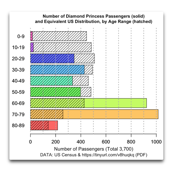
Figure 1. Number of passengers by age group on the Diamond Princess (solid) and expected number of passengers given current US population percentages (hatched).
When as a young man I lived in a port town with cruise ships calling, we used to describe the passengers as “newlyweds and nearlydeads”. Hmmm … through some improbable series of misunderstandings and coincidences, I’m in the orange zone now … but I digress …
In any case, Figure 1 shows the preponderance of … mmm … I’ll call them “folks of a certain distinguished age” on the Diamond Princess. Folks you’d expect to be hit by diseases.
Next, here’s the breakdown of how many people didn’t get the virus, by age group:

Figure 2. Percentage of unaffected passengers on the Diamond Princess. “Whiskers” on the plot show the uncertainty of each percentage.
In addition to the low rate of disease incidence (83% didn’t get it), the curious part of Figure 2 for me is that there’s not a whole lot of difference between young and old passengers in terms of how many didn’t get coronavirus. For example, sixty to sixty-nine-year-old passengers stayed healthier than teenagers. And three-quarters of the oldest group, those over eighty, didn’t get the virus. Go figure. Buncha virus resistant old geezers, I guess …
Next, slightly less than half the passengers (48.6% ± 2.0%) who got the disease showed NO symptoms. If this disease is so dangerous, how come half the people who got it showed no symptoms at all? Here’s the breakdown by age:
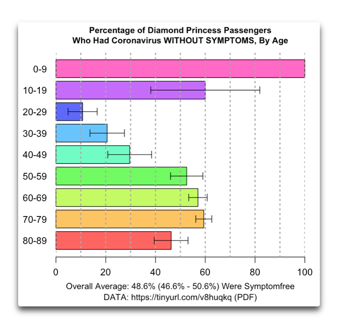
Figure 3. Percentage of Diamond Princess passengers who had coronavirus but were symptom-free. There was only one illness among the youngest group, and they were symptom-free. As in Figure 2, the “whiskers” on each bar of the graph show the uncertainty.
Again, a curious distribution. Young and old were more likely to be symptom-free, while people in their 20s, 30s, and 40s were more likely to show symptoms. Who knew?
There were a total of 7 deaths among those on board. All of them were in people over seventy. So even though the generally young were more likely to show symptoms if they had it, it hits old people the hardest.
Finally, according to the study, the age-adjusted infection fatality rate was 1.2% (0.38%–2.7%). Note the wide uncertainty range, due to the small number of deaths.
For me, this is all good news. 83% of the people on the ship didn’t get it, despite perfect conditions for transmission. If you get it, you have about a 50/50 chance of showing no symptoms at all. And the fatality rate is lower than the earlier estimates of 2% or above.
It is particularly valuable to know that about half the cases are asymptomatic. It lets us adjust a mortality rate calculated from observations, since half of the cases are symptom-free and likely unobserved. It also gives a better idea of how many cases there are in a given population.
To close out, I took a look at the current state of play of total coronavirus deaths in a few selected countries. Figure 4 shows that result.
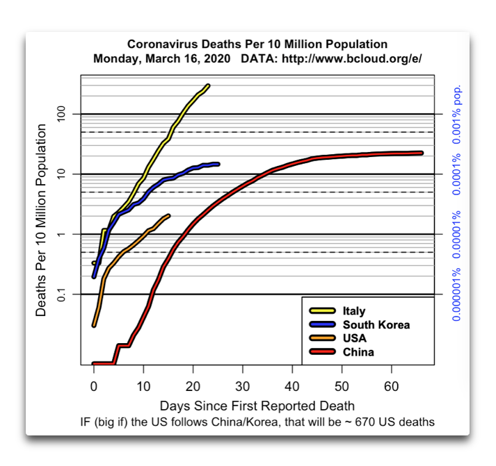
Figure 4. Deaths from coronavirus in four countries. Note that the scale is logarithmic, so an exponential growth rate plots as a straight line. Blue scale on right shows the deaths as a percentage of the total population.
At this point at least, it doesn’t appear that we are following the Italian trajectory. However … it’s still early days.
Finally, a plea for proportion. US coronavirus deaths are currently at 67, we’ll likely see ten times that number, 670 or so, might be a thousand or three … meanwhile, 3,100 people die in US traffic accidents … and that’s not 3,100 once in a decade, or 3,100 per year.
That’s 3,100 dead from auto accidents EACH AND EVERY MONTH … proportion …
My best to all on a day with both sun and rain here, what’s not to like?
w.
As Always: When you comment please quote the exact words you are referring to, so we can all understand who and what you are discussing.
Terminology: Yes, I know that the virus is now called 2019-nCoV, that it stands for 2019 novel CoronaVirus, and that the disease is called Covid-19, and that it stands for COronaVIrus Disease 2019 … so sue me. I write to be understood.
Data: For those interested in getting the data off the web using the computer language R, see the method I used here.
Other Data: A big hat tip to Stephen Mosher for alerting me to this site, where you can model epidemics to your heart’s content … Mosh splits his working time between Seoul and Beijing, he’s in the heart of the epidemic seeing it up close and personal, and he knows more about it than most.
Willis, Great post. However, the 50% asymptomatic ratio is probably off. You wrote:
“It is particularly valuable to know that about half the cases are asymptomatic.”
Accounting for right-censoring of the raw Diamond Princess data, this paper estimates the true asymptomatic proportion at 18%:
https://www.medrxiv.org/content/10.1101/2020.02.20.20025866v2
“We estimated the asymptomatic proportion at 17.9% (95% CrI: 15.5%-20.2%), with most of the infections occurring before the start of the 2-week quarantine.”
Another paper, CDC, dated March 23, 2020, cites the above link (“Estimating the Asymptomatic Proportion of 2019 Novel Coronavirus onboard the Princess Cruises Ship, 2020”) and also says
https://www.cdc.gov/mmwr/volumes/69/wr/mm6912e3.htm?s_cid=mm6912e3_w
“Public Health Responses to COVID-19 Outbreaks on Cruise Ships — Worldwide, February–March 2020”
“SARS-CoV-2 RNA was identified on a variety of surfaces in cabins of both symptomatic and asymptomatic infected passengers up to 17 days after cabins were vacated on the Diamond Princess but before disinfection procedures had been conducted”
Why would the infection rates and symptomless infection rates be lower for people over 50 and even more so for people over 60? What viral event happened 50-60 years ago?
Hong Kong Flu.
This is pure speculation but if the pensioners in areas that were more significantly impacted by Hong Kong Flu are less impacted by Covid 19 then it might be worth looking in to. Maybe the antibodies for Covid 19 are similar to an earlier disease? I don’t have enough access to data to find anything beyond newspaper cuttings but I think Hong Kong, Switzerland and Britain got hit hard.
Andy
(Completely prepared to be shot down on this)
“Why would the infection rates and symptomless infection rates be lower for people over 50 and even more so for people over 60?” I don’t know.
But a possible answer to why are Chinese under-30s are less susceptible than over-30s is oral (OPV) polio vaccination, according to a study that a friend just sent me. Not sure where to find it online but here’s the title:
Can the Poliovirus Vaccine prevent or minimize coronavirus (COVID-19) infection?
Authors: Xie Qiyi, MD.,/MPH/Public Health Medicine/Epidemiologist
Communication: qxie810 at yahoo.com 858 525 5831
Chen Wei, MD.,/MPH/Epidemiologist