James A. Schrumpf
If there’s one belief in climate science that probably does have a 97% — or more — consensus, it’s that the raw temperature data needs meaning, least-squaring, weighting, gridding, and who know what else, before it can be used to make a proper data set or anomaly record. I’ve been told several times that without some adjustments or balancing, my calculations will be badly skewed by the imbalance of stations.
So the null hypothesis of temperature data all along has been, “Just how bad/far off /wrong are the calculations one gets by using raw, unadjusted data?”
NOAA provides access to unadjusted monthly summaries of over 100,00 stations from all over the world, so that seems a good place to begin the investigation. My plan: find anomaly charts from accredited sources, and attempt to duplicate them using this pristine data source. My method very simple. Find stations that have at least 345 of the 360 records needed for a 30-year baseline. Filter those to get stations with at least 26 of the 30 records needed for each month. Finally, keep only those stations that have all 12 months of the year. That’s a more strict filtering than BEST uses, as they allow fully 25% of the 360 total records to be missing. I didn’t see where they looked at any of the other criteria that I used.
Let’s see what I ended up with.
Browsing through the Berkeley Earth site, I ran across this chart, and decided to give it a go.

I ran my queries on the database, used Excel to graph the results, and this was my version.

BEST has more data than I, so I can’t go back as far as they did. But when I superimposed my version over the same timeline on their chart, I thought it was a pretty close match. Mine is the green lines. You can see the blue lines peeking from behind here and there.

Encouraged, I tried again with the contiguous 48 US states. Berkeley’s version:

My version, superimposed:

That’s a bit of a train wreck. My version seems to be running about 2 degrees warmer. Why? Luckily, this graphic has the data set included. Here is BESTs average baseline temps for the period:
% Estimated Jan 1951-Dec 1980 monthly absolute temperature (C): %
Jan Feb Mar Apr May Jun Jul Aug Sep Oct Nov Dec
% -4.07 -1.75 2.17 8.06 13.90 18.77 21.50 20.50 16.27 9.74 2.79 -2.36
% +/- 0.10 0.09 0.09 0.09 0.09 0.09 0.10 0.09 0.09 0.09 0.09 0.09
Here are mine:
JAN FEB MAR APR MAY JUN JUL AUG SEP OCT NOV DEC
-1.26 1.02 5.2 11.13 16.22 20.75 23.39 22.58 18.68 12.9 6.09 .98
.03 .03 .02 .02 .02 .02 .01 .01 .02 .02 .02.02
It’s obvious by glancing at the figures that mine are around two or so degrees warmer. I guess it’s due to the adjustments made by BEST, because NOAA says these are unadjusted data. Still, it’s also obvious that the line on the chart matches up pretty well again. This time, the data set for the BEST version is provided, so I compared the anomalies rather than the absolute temperatures.
The result was interesting. The graphs were very similar, but there was offset again. I created a gif animation to show the “adjustments” needed to bring them into line. The red line is BEST, the black is mine.

At the moment, the GISS global anomaly is up around 1.2, while BEST’s is at 0.8. The simple averaging and subtracting method I used comes closer than another, highly complex algorithm that uses the same data.
My final comparison was of the results for Australia. As with the US, the curve matched pretty well, but there was offset.

The same as with the US comparison, the BEST version had a steeper trend, showing more warming than did the NOAA unadjusted data. For this experiment, I generated a histogram of the differences between the BEST result for each month and the simple method.

The standard deviation was 0.39, and the vertical lines mark the 1st and 2nd standard deviations. Fully 77.9% of the error fell within one standard deviation of the BEST data.and 98.0% within 2.
What does this mean in the grand scope of climate science, I don’t know. I’m certainly no statistician, but this is an experiment I thought worth doing, just because I’ve never seen it done. I’ve read many times that results of calculations not using weighting and gridding and homogenization would produce incorrect results — but if the answer is not known in advance, like how the “heads” result of a million coin tosses will come very close to 1 in 2 is known, then how can it be said that this simple method is wrong, if it produces results so close to those from to more complex methods that adjust the raw data?
We’ve seen this over and over where the official records have cooled the past, and heated the present. This is not a surprise to skeptics who have been following the data sets.
Progressive ( no pun intended ) cooling of the past as has been shown with both US and Aussie data manipulation is very suspicious. However, what does this article add to the discussion?
That is not an hypothesis, it is a question ! Best not to use terms if you don’t know what they mean.
Not gridding data is obviously going to bais results one way or the other as geographic density of sites moves over time. Apparently it has been relatively stable in Europe.
Greg,
I did write poorly there, I admit. The dictionary defines the null hypothesis as “the hypothesis that there is no significant difference between specified populations, any observed difference being due to sampling or experimental error.”
I was attempting to make the point that there’s no significant difference between the simply-calculated anomalies and the gridded/homogenized/weighted/etc. version, except for the adjustments that may or may not be justified.
If there’s no true “expected value” for the mean to move toward, who’s to say which is the “correct” mean? In the case of sampling a population, which is what I was doing, the standard error is a calculation of how close to the mean you’d get 67% of the time if you repeated the entire experiment over with all new samples. It’s not telling one how close to the “true” mean one is.
Thanks for the reply James. The problem is you are lumping everything together: gridding/weighting/homgenisation etc. and some more questionable adjustments.
If you blindly take the simple arithmetic mean of everything, what does the answer indicate? It is a mindless statistic. What is the “true mean” you think you are aiming for?
You need to state what you are seeking to find, then develop a method to get your best approximation to it. If you are seeking to find out whether the world or country as a whole is getting warmer, you need to look at temperature changes ( called “anomalies” ) at each site. You do not want to bias towards a location because there is a high concentration of stations in that region, nor ignore others because they have few recording sites. That is the point of gridding.
Compare the east coast of Australia to the outback. If you take the blind average in Oz you just get the climate of the east coast since it swamps the rest. There is some very dubious manipulations being done by BoM but just doing a dumb average is not going to expose the malfeasance. You actually need to try a bit harder to show anything.
Greg,
I’m still not explaining myself well. I think all one can do with this data is get a “blind average.” Besides, we are doing anomalies, not absolute temperatures. Here’s a graph of the anomalies from 1900-2019 for Alice Springs and Sydney as 10-year running averages. Can you tell them apart?
If there were ten more of one or the other, how much would the mean of them be changed?
“Not gridding data is obviously going to bais results one way or the other as geographic density of sites moves over time.”
The biggest bias comes from the adjustments themselves. If you want to look at temperatures from decades back, the US has the best record around, yet it gets the most adjustments.
That’s why the only land temperature data record I trust at this point is the USCRN, with high quality sites and no adjustments. It only goes back to 2005, but since then temps have gone down not up.
That’s a couple of years out of date now, and temps are down even further recently. The last 6 months are averaging -2.7 degrees below the starting point of the record in Jan 2005.
To me, the fact that historical adjustments introduce warming, and when you eliminate the adjustments it stops warming is strong evidence that the record being reported is heavily biased.
Jeff,
What this post shows is the exact opposite. James is saying that a simple average of NOAA records is virtually identical to more complicated methods for calculating global temperatures. So basically there is no evidence that official records are cooling the past.
14 years ago, the sceptical argument was that it had only warmed 0.6° in the past 100 years and most of it was before 1940. Even Tom Karl said something similar 17 years ago. That has gone up by a third of a degree for the same period, mostly after 1940 now. The post shows that most of that was due to a little offsetting of sections. Hardly what you would expect if they actually did what they claimed.
Reminds me of the Kinnard reconstruction of sea ice extent in the Arctic. They just offset the middle of a 60 year oscillation in an older reconstruction – and cropped one year that suggested you could do the NorthWest passage in a pair of budgy smugglers.
“…So basically there is no evidence that official records are cooling the past…”
Yeah…no evidence aside from the mountains of evidence that official records are cooling the past. What planet have you been living on?
Here’s just one example of NOAA https://climatecenter.fsu.edu/does-noaa-adjust-historical-climate-data
And past one here https://principia-scientific.org/how-noaa-nasa-doctored-temperature-data-to-get-record-warm-years/
And here https://realclimatescience.com/2018/03/noaa-data-tampering-approaching-2-5-degrees/
Try again.
“Try again.”
The conspiracy theory that “they” are tampering the record to make AGW look worse (or even in totality in the extreme Naysayer’s mind), has failed miserably if you look at the big picture…..
The warming trend has been reduced pre 1970.
So yes, the past has been warmed – and considerably so.
Spot the difference since then.
Seems silly to tinker with the odd station’s record, just so you sceptics can “smell a rat” and conjure the crutch of “tampering” and “fraud”, yet manage to make not one just of difference to the overall story.
Sceptical science as the source.
Ha!
What’s next Batman? CNN?
MSNBC?
The Guardian?
Hahahaha, I love how the intellectually inferior continue to ingest information from known liars.
That’s only when you include the ocean temp observations. They cool past land temp observations dramatically. It is very noticeable in the u.s. station data, which is by far the best set of land surface temp observations available for any ‘local’ global region.
It’s really simple.
Someone said, “So basically there is no evidence that official records are cooling the past.” I presented evidence otherwise.
I didn’t say anything about a “conspiracy theory.” I didn’t say that I “smell a rat” or that there was “tampering” or “fraud.” Nor did any of the posts leading to my reply.
So after making all of that ish up and inventing an argument that didn’t exist, your evidence to oppose it was a graph hosted at Skeptical Science and lacking any attribution as to which official record and source it represented (with NOAA adjustments being the ones relevant to the author’s post and particularly in Europe, the US, and Australia).
I’d say “try again” to you as well, but your failures are weighing on society enough as it is.
This is prima facie evidence that the adjusters havent actually adjusted each station based on quality considerations. It has undertaken a gross adjustment of the intact series. It’s as if a thumb tack was used at the pivot point to rotate the curve counterclockwise. The closer you are to the thumb tack, the lesser the adjustment and there is a smooth transition from positive adjustments to the right of the pivot to negative adjustments to the left.
This shouts BS to the quality control argument. Ask yourself, why would the “little bridge” between 1965 and 1980 be perfect without adjustment needed but the earlier be shifted down and the later jerked up!! In a court of law this would be indictable on the evidence.
Whenever I’ve queried some apparent flaw, Nick Stokes or some other is quick to say, yeah, but there was a station move! It kills you in your tracks. But hear that enough and couple it with climate revelations of willful altering that they discussed openly, even corrupting history to support an agenda or such things as Santers rewrite of the IPCC uncertainties into certainties or the Karlization of the Pause, and it dawns you that station moves would be a good way to stop some decline in temperatures. It is likely one of the tools in their fudging toolbox. Why didnt they move bad stations away from A/C exhaust an asphalt parking lots if they were so concerned about quality control.
Yes, there is a thumb tack in the middle, and then they use the Control Knob to rotate the curve counter clockwise.
What is the Control Knob, you ask? Why, it’s CO2 of course!
The past is always cooled, the present is always warmed – statistical chicanery in the service of maximum FEAR, how surprising….
An important new report has just come out that explains these types of reconstructions are hopeless until we address issues of how the temperatures are measured: https://eprints.utas.edu.au/29788/1/JDVlok_Eprints_20190429.pdf
It is by a really clever guy called Jaco Vlok, soon to be out of a job.
In Australia, the change over to automatic weather stations (AWS) combined with no averaging of the one second readings makes for more warming for the same weather. To be clear, the Bureau is not taking spot one second readings and the highest for any one day is recorded as TMax. Also, they have an increasing number of these at airports within reach of the exhausts from large boeing jets.
I’ve written lots on this, something recent that perhaps has relevant links: https://jennifermarohasy.com/2019/04/new-drought-report-consistently/
Rufus Black (UT) and Andrew Johnson (BOM) are currently discussing how to destroy Jaco Vlok without creating another Peter Ridd.
I’ll donate to Volk’s defence . . .
Hi Jennifer (luv your work, btw),
In addition to issues with how the BOM actually measure data (AWS vs analogue readings) – the other impact on their records is their homogenisation, by using non-acorn sites to adjust acorn sites.
Most notably using the Sydney Observatory readings to adjust nearby acorn stations.
That they cannot/willnot/or are unable to allow outsiders to review these processes suggests a corruption of those processes.
If it can’t be reproduced it aint science!
No reflection on all those honest scientists out there whose intellectual intgrity is a core part of their being but I not thet JD Blok has a PhD in Electronic Engineering which I assume means he has not had to take part in the ‘climate science’ group think and group talk at UTas.
UTas has a very solid engineering section with civ-mech-electro associated with a State that is 90% renewable energy droiven via hydro and hs been for decades and a world class maritime section ( Australian Maritime College) with Naval ARchitecture, Ocean Engineering and Marine & Offshore Systems degrees feeding int a range of serious engineering based industries.
It will be interesting to see how JD Blok’s career path continues.
Someday perhaps some climate scientist will write a paper that explains why thermometers always showed too high temperatures before 1960 and too low after.
Of course I’m just joking.
James A. Schrumpf
“My method (is?) very simple. ”
Great post…
I think that the KISS method is the correct one. Whenever I see the
words, “”A Anagram was used”” my BS detector lights up.
A very interesting article, thank you.
MJE VK5ELL
”A Anagram was used”
Especially since it should be “an anagram”. 🙂
Goldilocks adjustments..
The data before 1960 was just too warm
The data after 1980 was just too cold
The data from 1960-1980 was jusssst right
GISSTEMP changes to their Land Ocean Temperature Index (LOTI) since 2002:
https://postimg.cc/YvkVJR1G
Here’s how GISSTEMP’s LOTI adjustments have altered the slope since 1997:
https://postimg.cc/D8kZw3yN
GISSTEMP has probably made nearly 100,000 changes to their LOTI report over the last two decades.
That these changes have been made cannot be disputed. Why they have been made is a matter of opinion.
I produced this a 5 years ago to point out why there was a pause. Better than fitting straight lines and then arguing about choice of end points.
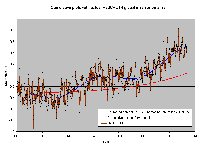
The component consistent with an exponential increase due to increasing human emissions is 1/3 of the hole degree of warming. The rest is an assumed constant rate of warming since the LIA and an oscillation with a 60 year period. Such an opinion shouldn’t make you a heretic of AGW, or even CAGW, but the pause made even this smaller contribution dubious. When human emissions should have been the most noticeable is where the plot strays from fit the most. Relevant to the post because it shows that only small changes are required to make a stronger case for human rather natural reasons for changes that have occurred.
Mods I had a perfectly fine, apropos ad hominem free comment that initially was up and now taken down. Is there an explanation? I know there were changes made but to me it seems almost arbitrary sometimes. For me, some of these are a lot of work.
This happens regularly here. You should always copy and paste into Word or some other WP programme so you have a copy before pressing the Comment button.
You should also assume that the more valuable your comment, the more likely it will be passed around before publication and quite possibly deliberately ditched to prevent claims of prior art…….
The Queensbury Rules do not work in the big bad world of science politics…..
The thing to understand is not whether there are adjustments but why. Logic tells me that over the last 100 years older raw temperatures should be raised and / or later temperatures lowered to take account of the urban heat island effect, yet adjustments almost always go the other way. The lack of verifiable and logical reasons for the adjustments confirms that whether it’s deliberate or just caused by confirmation bias the data provided is misleading . The crazy thing is if we can’t trust scientists in relation to historical data how can we expect any accuracy in their future predictions.
Part of the challenge is there are so many stations to validate. It seems that researchers all try to apply algorithms or other mass review methods to filter through them, when in fact they each need an individual evaluation.
I would rather see wider error bands due to having fewer stations, and only use pristine data. When adjusting data, the error bands are mathematically unknowable. How do researchers expand confidence limits based on possible adjustment error?
+97%
Again, when the range is a degree or two, I just don’t see how we can take anomalies in temperature data seriously.
Suppose a temperature-measuring station consisted of a larger area, where, say 12 different thermometers were distributed throughout the area. I wonder what sort of agreement there would be between the 12 thermometers just for one day, for one station. Would all the readings agree within one degree? Two? A fraction of a degree? [I don’t know]
All the focus, all the calculations, all the discussion around a degree or two still seems bizarre to me.
My take on this is they tell us the adjustments are for data quality issues and give the idea that changes are applied to individual station data – some made warmer, some cooler. If this was the actual case, the result wouldnt look like they stuck a thumb tack in between 1965 and 1980 and rotated the graph counter clockwise about 5 degrees angularly, making it steeper.
How could it be coincidence that no adjustment was necessary on the stretch between 1965 and 1980, but increasing amounts are subtracted from the readings going back to the 19th Century and increasing amounts added coming up to the present. This can only be done by adjusting the trace of the record as a whole (ie, the thumbtack method on the raw data) rather than quality control on the readings themselves. Moreover, it means the entire record at each station individually were “thumb tacked”, i.e. a bad reading was made by an observer in Capetown on the same date as one was being made in Paraguay, Ecuador, Nuuk and Malmo. WUWT?
Average is an abused measure of centrality. They have to process the data in order to get rid of the obvious sampling biases. The more you process, the more difficult it is to interpret and the more likely that human confirmation biases will be introduced to make the data ‘right.’
Finding the ‘average’ is simply trying to put a square peg in a round hole. But it does lead to a lot of papers discussing “proper” treatment and give enough wiggle room to get the numbers “right.”
Ordering-based statistics like the median (as opposed to sum-based stats like the mean) make more sense to me with this type of data .
“I’ve read many times that results of calculations not using weighting and gridding and homogenization would produce incorrect results”
They don’t (or shouldn’t) say that it would produce incorrect results, rather that it could. If you have a biased sample, it only causes trouble if there is a complementary trend in the data. The unweighted dataset will lean heavily to results for ConUS, for example. If ConUS behaves differently to global, this is a problem; if not, not.
I did a recent post here which compared various proper methods with just unweighted averaging. The latter was not particularly biased, but just all over the place. I had to graph it in pale yellow so the proper results would show through. The interest there was that if you take out the main variation that clashes with the sample bias, by subtracting a fit of spherical harmonics which have known (zero) integral, then the unweighted performs quite well.
A major practical problem with sampling without area weighting is that the result depends a lot on what turns up in the sample. It happens that GHCN V4 include a lot of ConUS stations. Someone might compile a set with a different emphasis and get a different result. Proper weighting counters such discrepancies.
To add to what Nick said, simply averaging station values can work IF the following things are true:
1) Stations are well-distributed across the area of interest. For example, if you are averaging all 32,000 or so global land stations with records of meaningful length, you need to account for the fact that around 10,000 of those are in the US. Otherwise you are giving 5% of the world’s land area 33% of the weight in your reconstruction. Thankfully if you are looking at a particular region, such as the US or Europe, stations tend to be well distributed within those regions, so the bias isn’t too large.
2) Station records are continuous through present – or, if they are not, the stations that “drop out” don’t have any climatological bias. In the USHCN dataset, the number of stations available has declined over the last decade. The network was created in the late 1980s and purposefully included stations that were currently reporting at that point in time. As much of USHCN represents a volunteer effort in the form of co-op stations, these volunteers will sometimes quit or pass away, and NCDC has had difficulty finding new volunteers to take over. It turns out that those stations that stopped reporting had an annual average temperature of around 12C, while those that continued reporting were closer to 11.5C. This causes a modest cool bias in the combined record if you average together the absolute temperatures, though you can easily get around this by converting them to anomalies relative to the baseline period. See this post for more details: http://rankexploits.com/musings/2014/how-not-to-calculate-temperatures-part-3/
http://rankexploits.com/musings/wp-content/uploads/2014/06/Climatology-Report-and-Non-Report.png
3) You can’t assign too much meaning to the resulting average absolute temperature values. Stations are located in specific spots, and not every mountaintop or valley in the country is blanketed with stations. Thus their average simply reflects the average of those locations, rather than the average of a wider region. Berkeley attempts to get a more accurate estimate of absolute temperature based on an approach that uses spatial interpolation (kriging) to estimate spatially complete temperature fields, taking elevation at not just the station location but all the areas in between into account. Thats why the climatology differs from a simple average of station values. There are other more sophisticated approaches like reanalysis that give even more accurate climatologies. See this discussion at RealClimate for details: http://www.realclimate.org/index.php/archives/2017/08/observations-reanalyses-and-the-elusive-absolute-global-mean-temperature/
Hi Nick,
The way I view it, the important point is “What are you trying to show?” It seems to me that you believe an average global temperature, or anomaly, can be produced from this data if you weight it, interpolate it, grid it, and subtract from it a fit of spherical harmonics with known integral.
But here’s the thing: you can’t prove you have the “right” answer. My calculated average global anomaly was closer to BEST’s than was NASAs’. Does that mean I’m “more right” than NASA? Or is NASA correct, and BEST and I are way off?
There’s really no way to tell. When sampling a population, a standard error is just a statement of how close your new calculated mean would be to the original mean if you ran the entire experiment over with all new measurements. It tells you nothing about the “correct” mean.
My calculations, on the other hand, are a true representation of the mean of the stations I’ve decided to include in my sample. In my universe, this was the average anomaly for March. UHI doesn’t matter; the city isn’t going to disappear any time soon, so its contribution will be the same every month. My simple calculations will show what’s happening with each station, if I so desire, or for an entire continent.
The bottom line is that with only simple calculations, my anomalies for three different regions of the earth had a standard deviation within ±0.4°C of a “proper” method, and there’s no way to prove which method gave the “right” answer for the Earth.
However, I can show that my methods give the right answer for the stations.
James,
“My calculations, on the other hand, are a true representation of the mean of the stations I’ve decided to include in my sample.”
That summarizes the problem. If you decided to include different stations, you might well get a different answer.
The purpose of calculating an average is usually to estimate a population mean – something that doesn’t depend on what you’ve decided to included in the sample. That is the point of “weighting, gridding, interpolating” etc.
Nick, the standard error — aka the error in the mean — is one standard deviation from the value of the mean. It means that if you took the same number of random samples and performed the entire experiment over again, you would have a 67% chance of coming that close to having he same mean value from the new samples.
That being the case, it stands to reason that if I got a standard error of 0.11 from a sample of 3500 out of 5200 stations, I’d get pretty much the same results if I decided to take a different sample.
I’ve mentioned before of tremendous temperature difference just a few miles apart.
For example, where I work in Mt Vernon, WA, in high summer it may get to 90. By the time I get home, 13 miles straight-line distance, it’s usually 10-20 degrees cooler. The highest disparity I’ve seen was 27f. Which is why infilling and averaging readings from different stations is bad, very bad.
Excellent.
The NOAA GLERL temperature sensor for Chicago sits on the Water Intake Crib, about three miles offshore. I am on their site all the time checking the weather, as I can see it out my window here on the Lake. O-Hare and Midway are both about 9-10 miles the other way.
One day three years ago O-Hare was reporting 71 degrees while NOAA_GLERL Chicago was reporting 41 degrees AT THE SAME TIME. Two stations 14 miles apart, 30 degrees different.
“then how can it be said that this simple method is wrong, if it produces results so close to those from to more complex methods that adjust the raw data?”
By testing it James. Thoroughly and completely.
To test it you use the SAME data!.
To do a proper test you change ONE variable.
You are testing a METHOD.. call it method B
To test it against method A, method C, Method D.
you use ONE data set with the three diferent methods.
Here is one example how to do it
http://static.berkeleyearth.org/memos/robert-rohde-memo.pdf
Simple averaging will always perform WORSE when the following occur
A) there is a change in average latitude over time
B) there is a change in aveverage altitude over time.
The other way to test your method is to randomly remove data from your series
and see if the answer changes.
take your European dataset.
Now remove 10%, 20%, 30%, 40% 50% ect.
See if your curve changes.
if it does, then you know your method is not robust
simple averaging is not robust
What this mean?
Excel is the sign of amatuer at work.
Why Steven, how mean of you to call an amateur an amateur. I’ve never presented myself as a professional statistician, either on your site or mine. I’m doing all my work on an Oracle Enterprise database, various versions of which I’ve been a professional DBA and software developer for over 30 years. However, Oracle’s graphing packages are not something I’ve ever had to use, and so I dump the data and use Excel for graphing. I could have done it with R — would that have made it better for you?
Anyway, here’s a replot of the Europe averages with 60% and 40% of my stations used.
I don’t know, looks pretty robust to me.
“if the answer is not known in advance, ”
But we do know the answer. We’re doomed. So we just have to make sure that the data supports that.
” if the answer is not known in advance,”
But we do know the answer. We’re doomed. So we just have to make sure the data supports that.
James, nice work.
Since you have the numbers try this.
Instead of correlating station ids correlate on lat/lon rounded to 2 decimals. The few times you get overlaps take the average.
Include both v3 and v4 in this process.
Now map the different versions inventory to those same lat/lon readings. Compare!
What do you see?
Sorry, I see now this was not clearly expressed.
Purpose to map temp readings to coordinates is that you can more easily spot trends between different releases at their shared locations. I used 2dec lat/lon because coordinate resolution differs between GHCNM versions.
Comparing GHCNMv3 and GHCNMv4 QCU January files
If you do MIN(tavg) and MAX(tavg) on every shared location for every year and plot them the corrections should be random but instead there is a trend. Average MAX(tavg)-MIN(tavg) starts at 0.057C 1900 and peaks at 0.256C 2010. (This is excluding -9999s and QCFLAGS).
I can also see that the station set has moved north in NH and slightly south in SH. To check what that does with trends I need to use anomaly and gridding and it takes a bit more time.
This was
Now, that’s more work than I was ever planning to do. I’m not looking to find the global average temperature of the Earth — that’s impossible. What I want to do is find the best possible picture of what temps at the stations are doing.
That’s a thing that can be done.
Thanks, James. Interesting to note that part of your work replicates some of that produced by Heller and presented on a youtube here.
https://www.youtube.com/watch?v=6kUAtt2pXlc&feature=youtu.be
(Hopefully WordPress will not truncate the address, or search youtube for Heller Corruption Of The US Temperature Record.)
Heller has done a lot a good work in this field, I realise that some scholars of maths and statistics might not like his presentational methods, but this is a war of minds and sometimes simple (but correct, of course) is best. Do not be overly discouraged by those critiques yourself.
The fundamental point is this:
You are trying to find evidence of a change in the heat input/output balance in the system comprising the sun/atmosphere/rocky planet.
To do so by measuring the air temperature near the surface daily, taking the max/min and dividing by two isn’t really anything like what is needed considering basic physics.
It’s not fit for purpose.
It’s no good arguing that that is all you have got. I’m well aware of that. Arguing doesn’t make it any more fit for purpose, in fact it makes it worse because you are likely to delude yourself.
Try considering what you would ideally like to measure and how, in detail you would do it if , as a thought experiment, you had another rocky planet with an atmosphere and you wanted to monitor the heat input/output over, say, 200 years with current technology.
Where would be the best place to put your temperature probes, how often would you take readings, etc.
Once you have that sorted and agreed then you could start such monitoring here on Earth, let it run and compare with the traditional crock of shite method currently in use.
I’ll wager the results would be quite illuminating.
I’ll stick my neck out and assert they won’t be telling you the same about heat input/output balance.
What you have with the CARW “debate” on here as well as pretty well everyhere else is arguments about the relative merits of the architecural design of the upper stories of the castle. I’m standing a little further away than most of you and all I see is the whole edifice built upon dodgy foundations wabbling from left to right as the wind blows in different directions. The group over here by me is tiny and NEITHER side near the edifice like arguing or talking with us.
Trouble is BOTH camps are going to get squashed when it all comes down and who do you think will have to pick up the pieces. Well I’m getting bored with that. It’s gone on tooooooooo long.
I’m getting my RPG out soon.
You have been warned.
Step away.
Or risk getting squashed.
If you are not sure you are welcome to come over here and look at it from afar, free tea and biscuit and a nice chat too.
You can even handle my RPG before you decide whether to defect or not!
@Badger — Nicely stated. I don’t quite know how the RPG will change anything, but the entire process is highly suspect.
God help you if you try and get someone to explain allocation of resources IF climate change is a dire thing vs IF climate change is not a dire thing. For me, those resources pretty much stay the same in either mode. Help increase transportation, energy availability, shelter, water and sanitation. Maybe not in that order, but those 5 things. Top of the priority list.
CO2… Not on the list of worries for a long long time