Guest Post by Willis Eschenbach
People often say that we’re heading into the unknown with regards to CO2 and the planet. They say we can’t know, for example, what a 2°C warming will do because we can’t do the experiment. This is seen as important because for unknown reasons, people have battened on to “2°C” as being the scary temperature rise that we’re told we have to avoid at all costs.
But actually, as it turns out, we have already done the experiment. Below I show the Berkeley Earth average surface temperature record for Europe. Europe is a good location to analyze, because some of the longest continuous temperature records are from Europe. In addition, there are a lot of stations in Europe that have been taking record for a long time. This gives us lots of good data.
So without further ado, here’s the record of the average European temperature.

Figure 1. Berkeley Earth average European temperature, 1743 – 2013. Red/yellow line is an 8-year Gaussian average. Horizontal red and blue lines are 2°C apart.
Temperatures were fairly steady until about the year 1890, when they began to rise. Note that this was BEFORE the large modern rise in CO2 … but I digress.
And from 1890 or so to 2013, temperatures in Europe rose by about 2°C. Which of course brings up the very important question …
We’ve done the 2°C experiment … so where are the climate catastrophes?
Seriously, folks, we’re supposed to be seeing all kinds of bad stuff. But none of it has happened. No cities
I mean, go figure … I went to Thermageddon and all I got was this lousy t-shirt …
In fact, here’s the truth about the effects of the warming …

Figure 2. Average annual climate-related (blue line) and non-climate-related (red line) deaths in natural disasters. Data from OFDA/CRED International Disaster Database
In just under a century, climate-related deaths, which are deaths from floods, droughts, storms, wildfires, and extreme temperatures, have dropped from just under half a million down to about twenty thousand … and during this same time, temperatures all over the globe have been warming.
So no, folks, there is no climate emergency. Despite children happily skipping class to march in lockstep to the alarmist drumbeat, climate is not the world’s biggest problem, or even in the top ten. Despite the pathetic importunings of “Beta” O’Rourke, this is not World War II redux. Despite Hollywood stars lecturing us as they board their private jets, there are much bigger issues for us to face.
The good news is, the people of the world know that the climate scare is not important. The UN polled almost ten million people as to what issues matter the most to them. The UN did their best to push the climate scare by putting that as the first choice on their ballot … but even with that, climate came in dead last, and by a long margin. Here is what the people of the world actually find important:

Figure 3. Results of the UN “My World” poll. Further analytic data here.
As you can see, there were sixteen categories. People put education, healthcare, and jobs at the top … and way down at the very bottom, “Action taken on climate change” came in at number sixteen.
In summary:
•We’ve done the two degree Celsius experiment.
• The lack of any climate-related catastrophes indicates that warming is generally either neutral or good for animal and plant life alike.
• Climate related deaths are only about a twentieth of what they were a hundred years ago.
• The people of the planet generally don’t see climate as an important issue. Fact Check: They are right.
===========================
Here, my gorgeous ex-fiancee and I are wandering on the east side of the Sierra Nevada mountains. We went and looked at Death Valley. It’s a couple hundred feet below sea level, and very, very dry. In the Valley, I saw that there was a temperature station at Stovepipe Wells. So I immediately looked for that essential accessory to any well-maintained temperature station … the air conditioner exhaust. Here you go, you can just see the air conditioner on the right side of this south-looking photo:

But what good is an air conditioner without some good old black heat-absorbing asphalt pavement to balance it out? So of course, they’ve provided that as well … here’s the view looking west. I’m not sure if this station is still in use, but any readings here would certainly be suspect.

Heck, if we’d parked our pickup truck facing outwards in the next stall to the left and revved the engine, we probably could have set a new
Death Valley itself is stunningly stark, with the bones of the earth poking up through the skin …

Ah, dear friends, the world is full of wonders, far too many for any man to see all of them … keep your foot pressed firmly on the accelerator, time is the one thing that none of us have enough of. As Mad Tom o’ Bedlam sang,
With a host of furious fancies, whereof I am commander
With a sword of fire and a steed of air through the universe I wander
By a ghost of rags and shadows, I summoned am to tourney
Ten leagues beyond the wild world’s end … methinks it is no journey.
Today we’re at Boulder Creek, just east of the Sierras by Owens Lake … or Owens Ex-Lake, because all the water that used to fill the lake now waters gardens in LA.
However, the drought is broken in California, and some of the Sierra ski resorts have gotten forty or fifty feet of snow over the winter, so the east slope of the Sierras look like this where we are:

I am put in mind of what the poet said …
Come, my friends,
‘Tis not too late to seek a newer world.
Push off, and sitting well in order smite
The sounding furrows; for my purpose holds
To sail beyond the sunset, and the baths
Of all the western stars, until I die.
My very best to each one of you, sail on, sail beyond …
w.
I think it’s still too cold outside, but on the plus side, Boeing’s 737 Max saves 14% on fuel costs.
plus, it seems, it helps reduce population numbers, until they fix that part.
The 737 Max 8 is an example of GIGO (Garbage In Garbage Out). The flight control software is verified, validated, and checked three ways from Sunday. One of the physical inputs to the flight control software is a sensor that measures angle of attack. Basically, it looks like a horizontal wind vane.
If the angle of attack sensor gives wrong data, the computer program will think the plane’s nose is pointed up when the plane is, in fact, flying level. The computer program will then try to point the nose toward the ground. So, the computer program is working correctly and the aircraft crashes.
I often point to GIGO with reference to climate models, etc. I suspect that, to some people, it sounds like a quibble. Actually, it’s a profound problem that invalidates even the best crafted software.
…it also gives it the gas
Yes, true to an extent. If you write the code to accept one input as definitive with no validation for whether it is garbage or not, then you are prone to GIGO. But it’s still a design error even if it is not technically a coding bug. It seems that it would not be too difficult to correlate angle of attack measurements with any number of meaningful parameters available to be measured. What is the altimeter doing, what is the airspeed indicator doing, how fast is the shaft turning on each turbofan? If these are out of expected range for an imminent stall, you would want to disregard the angle of attack input and sound an alarm that the angle of attack input may be malfunctioning. Wouldn’t you at least want to have redundant inputs?
Well it’s not as if anything could go wrong if you had an automated system to point the nose toward the ground that you can’t manually override. Why bother with redundancy?
Basically, the design is to prevent THE PILOT from flying the plane at the exact moment when A PILOT is needed to fly the plane.
I’ve been doing it for 30 + years, but somehow I’m not qualified to do it because engineers.
Yes, that’s what makes the idiots who automatically attack your president because Orange Man Bad so ridiculous.
Maybe he shouldn’t tweet as much (or at all), but even when he munges things beyond all belief (which is often), he’s not always wrong:
https://www.popularmechanics.com/flight/a3115/what-really-happened-aboard-air-france-447-6611877/
The old cat skinners had angle of attack sensors mounted to the ROPS, which helped them level the lease. One calibrated for forwards and back. the other left to right. There were malfunction free and immune to computer or software glitches.
They hung two nuts from strings and used an ether pencil to mark level on the roll cage.
They subscribed to the KISS principle.
While the current catastrophe du jour in the airplane world is the 737 Max 8’s Angle of Attack sensor and the Europeans and Chinese are no doubt gleeful about Boeing’s problems, not so long ago Airbus had faulty pitot tube sensors that they were very hesitant to replace.
Then one day in June, 2009, both of these pitot tubes on an Air France Airbus 330 iced up while flying through the top of a tropical thunderstorm over the Atlantic. They stopped sending correct readings to the Airbus flight computer and both pilots ultimately put the aircraft in a high nose up attitude and stalled the aircraft all the way from 37,000′ into the sea at 12,000 feet per minute.
Just like the Max 8 pilots that went down in the two aircraft the computer program won. And this was even after the second crew should have known the issue and flipped the switch to simply turn off the MCAS system. GIGO at its rawest.
In traditional pilot training the pilot was taught to distrust instrumentation so that he/she can understand when it’s not working (lying). Traditionally the solution to recalcitrant equipment was to turn it off and go manual. Sadly there is a growing belief that computer software is better and more reliable than humans.
This is an extract from the FT recently:
“…But Boeing and US regulators are right — to the extent that the aircraft is flawed, the 737 Max 8 can be fixed with new software, better sensors and some pilot training. There is no need to turn off computers and return to humans taking full charge of the controls. Software has proved its value since the 1988 launch of the A320, the first “fourth generation” fly-by-wire aircraft.”
And goes on:
“It is a familiar fact, but worth repeating, that flying is far less dangerous than it was decades ago …..The main contributor to this advance is technology, especially fly-by-wire software that responds to the pilots’ touch on the controls by adjusting the thrust, flaps and other surfaces to produce the desired outcome. This includes “flight envelope protection”, which means that if a pilot tries to turn the jet too sharply, or push up the nose and risk a catastrophic stall, the software can disobey in some modes.”
Airline flight safety has improved year on year irrespective of the introduction of computers as the data shows a steady incremental improvement from the 1960s and in many cases pilots taking a plane outside the flight envelope were not common accidents.
In the right hands, technology and particularly computers are enablers, especially when the user is allowed to question or override that technology. Consider the computer designed wing of the Boeing 787 that failed catastrophically during initial ground tests. (http://old.seattletimes.com/html/boeingaerospace/2009565319_boeing30.html)
So how about these climate models then that must be believed?
I meant to add that importantly Boeing did a real life test on it’s wing and did not believe that the computer had designed a good safe wing.
737 MAX is a good analogy. If it ain’t broke don’t fix it. Not when it’s a hack fix of a speculated problem.
Once was all Boeing aircraft allowed pilots to override computer-enhanced flight control, but I fear no longer. This article implies the 737 form was rendered inherently unstable by the large-diameter engines and the necessary repositoning of same. So like with advanced fighters, humans can no longer react quickly enough to fly it.
http://m.spiegel.de/international/europe/what-s-wrong-with-the-boeing-737-max-8-a-1257608.html
“This one has more lift, don’t stall it!” Warning sign. All they needed….
What I’ve read is that it is still entirely possible for pilots to override MCAS, but Boeing didn’t disseminate that piece of information wide and clear enough. So pilots didn’t know what was making their plane dive and could not take the proper actions.
“it is still entirely possible for pilots to override MCAS”
Let’s think about that … this system is ONLY active when the autopilot is switched off, under manual control. Why is that? Because the plane is not stable, it is liable to pitch up its nose and stall. To make the plane flyable (by humans) they added this patch.
So we have a plane that isn’t really flyable by humans without software assistance, and when the software goes wrong, the advice is … to turn off the software assistance.
Boeing’s 737 Max …
=======
this is an off topic thread hack plain and simple.
On-topic response: The only surprising thing about the UN poll is that “Phone and internet access” came second to last.
Off-topic response: Aircraft progress has been by continually “pushing the envelope”, which does have risks. We can try pushing the CO2 envelope a few degrees at a time; so far all we can say that it is safe.
But if we model the system poorly and re-engineer it with a drastic fix, we risk creating a bigger problem than the one we are trying to solve.
737 Max details from inside sources:
https://www.seattletimes.com/business/boeing-aerospace/failed-certification-faa-missed-safety-issues-in-the-737-max-system-implicated-in-the-lion-air-crash/
“stabilizer runaway.” Millions of commercial airliner flights have been made over the years and I don’t know of any which crashed because of a stall when the equipment was working properly. If the 737 Max design really did risk “high-speed stall”, then that’s a big change and it should have been recertified. “High-speed stall” implies that you would have to be pulling many G’s. Normally stalls are at low speed.
Very interesting article. Yes, in this context sarcastic comment made by Mr Trump about ‘MIT computer scientists needed to fly aircraft’ makes perfect sense. Looks like this time guys and gals from Boeing seriously screwed things up. Blaming by Boeing representatives Lion Air pilots for not being able follow software manual in the stressful situation to override control systems – absolutely appalling.
I’m surprised that such important parameter as angle of attack is read from one simply sensor. As far as I remember local angle of attack (AoA) on the wing can be significantly different that AoA on the sensor next to the fuselage. Wing has distinctive features that change local AoA as twist and mechanisation (flaps, slats, slots). In the best case such sensor can give approximation of the ‘true’ AoA.
Since 2002 there’s the unsolved problem ‘dive or rise’ when there’s no clairement answere from tower:
https://www.google.com/search?client=ms-android-samsung&ei=6XSPXKSHJ86orgTpuJ2oBw&q=Zurich+tower+airplanes+collide+2002&oq=Zurich+tower+airplanes+collide+2002&gs_l=mobile-gws-wiz-serp.
The 2 degree C proposed limit is for increase of global temperature above pre-industrial. The reason is that exceeding that by much for long is modeled to cause drastic melting of Greenland’s ice sheet and intolerable sea level rise.
Europe already warmed by 2 degrees C because part of it has high regional surface albedo feedback, so the temperature of Europe as a whole varies more than the temperature of the world as a whole does.
Wait, so you’re saying that the Holocene Optimum resulted in sea level rise that would be intolerable today? Or are you claiming that we have already reached average temperatures matching the Holocene Optimum?
Is that Richard P. Davis?
I claim that 2 degrees C above pre-industrial (as in before industry caused temperature rise, but after recovery from the LIA was the dominant reason for temperature rise) is warmer than the Holocene Thermal Optimum.
Consider that using Marcott et al according to
https://wattsupwiththat.com/2017/06/09/a-holocene-temperature-reconstruction-part-4-the-global-reconstruction/
Figures 3A, 3b and 4,
The peak spike of the Holocene Thermal Optimum was about 1.45 degrees C warmer than the lowest downward spike of the Little Ice Age, after the amount of smoothing involved, which is by an amount of time short enough to show upward spikes about a century apart and downward spikes about a century apart.
How much time did you have to spend with Scotch tape to try to salvage the shredded Marcott proxy work?
Try a journey through this list:
https://climateaudit.org/tag/marcott/
When pressured and made obvious, Marcott et al. responded:
===|==============/ Keith DeHavelle (@DeHavelle)
Then why did Andy May, a name that I recognize as a multiple times WUWT article poster, post this stuff referencing Marcott?
Let’s skip the attempt at argument from authority. A review using the link that I provided (and others back it up) would show that Marcott et al. are not doing good science, and thus should not be relied upon.
It doesn’t matter who vouched for them. I could now argue that you just referrred to Marcott’s work approvingly, but this would not salvage the dismal science and ad hoc selection of proxies that characterize those papers.
===|==============/ Keith DeHavelle (@DeHavelle)
Keith: Another thing: I cited the small amount of downward global temperature change from the Holocene Thermal Optimum to the LIA, and you posted a response that Climate Audit found an issue with a time range other than the time range that I cited – you mentioned an issue that is limited to post-1900.
It’s true that the quote I included mentioned that particular 20th fallback by Marcott.
However, the link was to a series of examinations of the entire proxy assembly process.
For example, take a look at the link below for an examination of the hemispheric averages for thousands of years from Marcott compared to others.
https://climateaudit.org/2013/03/15/marcotts-zonal-reconstructions/
Elsewhere, the proxy assembly process is meticulously taken apart. Relying upon this dishonest series of reconstructions is unwise, I think.
===|==============/ Keith DeHavelle (@DeHavelle)
Keith: So, since you found a beef against Marcott, what do you propose is a good record of global temperature going back through a majority of the Holocene?
The peak of the MWP in Moberg et al. 2005 was a little more than .15 degree C cooler than the 1961-1990 average (choice of baseline and year cited has me thinking of HadCRUT3). This is according to G.C. Hegerl et al. 2007 as posted in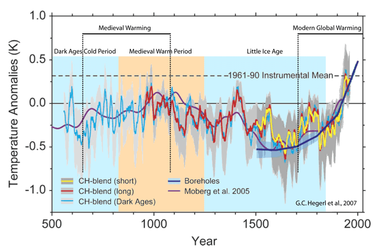
Link obtained by clicking Figure 103 in https://judithcurry.com/2018/02/26/nature-unbound-viii-modern-global-warming/
The LIA dip in Moberg 2005 was about .7 degree C cooler than the MWP peak, about .85 degree C cooler than the 1961-1990 average. Other proxies shown here have similar results, except for upward variation getting as high as -05 degree C (with a surrounding noted gray range getting as high as +.1 degree C) re: 1961-1990 average with what looks like smoothing by at most not a lot more than a decade. The lowest dip of the LIA in any of the curves looking smoothed by at least a decade was about 1 degree C cooler than the 1961-1990 average.
Shortly before 1900 looks like around .5 degree C below 1961-1990 average according to these curves. This disagrees with HadCRUT3 (curve not shown) by about .2 degree C, HadCRUT3 averages around .3 degree C cooler than its 1961-1990 average in 1850-1900.
Whatever happened to the Holocene Climate Optimum we were discussing?
The HCO demonstrates that the projected small amount of warming is not a “catastrophe,” it’s a boon. If it even happens.
===|==============/ Keith DeHavelle (@DeHavelle)
Keith: Does anyone here have a cite other than Marcott for how much warmer the Holocene Climate Optimum was than the MWP? Your cite against Marcott only mentioned other datasets that didn’t go back before the Roman Warm Period.
I went to images.google.com with holocene climate optimum temperature graph
Results I got: Many are repeating peaking almost 2 degrees C warmer than the bottom of the LIA, most results saying something different say not-so-warm, one repeated a few times says not even up to 2004 level but with one proxy peaking slightly over 1 degree C above 2004 level. (2004 level is slightly less than +.5 degree C anomaly, so I suspect that’s 1961-1990 baseline of HadCRUT, which has a fairly level period in 1850-1900 at about -.3 degree C from the 1961-1990 baseline.)
I don’t have citations here, but there have been a number of Holocene studies of glacial and coastal moraines, indicating that the Holocene Arctic Ocean was ice-free at least in summer for thousands of years.
===|==============/ Keith DeHavelle (@DeHavelle)
Donald L. Klipstein March 17, 2019 at 9:22 am
This ‘warming’ follows the Little Ice Age. Are you saying that we should suffer the weather extremes when the world was colder? To actually get a name ‘Little Ice Age’ implies a significant climate change from common expectations. Go back to the beginning of writing and the world was even warmer than now.
Stephen Skinner: I am not claiming that we should suffer what happened during the Little Ice Age. My claim is that global warming to an extent of global temperature 2 degrees C above what global temperature was when industrial-age manmade greenhouse gases became a significant factor is tolerable. This means global temperature warmer than that of the LIA by more than 2 degrees C is tolerable.
This includes tolerance of high latitude Northern Hemisphere regions whose temperature has historically varied more than global temperature did while having temperature correlating well with global temperature, warming more than 2 degrees C above the temperatures that they had when the Industrial Revolution was starting to make its mark on atmospheric greenhouse gas levels.
The 2 degree C proposed limit is for increase of global temperature above pre-industrial. The reason is that exceeding that by much for long is modeled to cause drastic melting of Greenland’s ice sheet and intolerable sea level rise.
Europe warmed more than the world did because part of it has high regional surface albedo feedback.
Also, the way I see the smoothed curve in the graph, Europe’s 1750-1900 temperature was less then it’s recent temperature by an amount less than 2 degrees C, more like 1.6-1.7 degrees C, not counting blips that didn’t last long.
I didn’t mean to say some of this twice. When my phone was still showing what I wrote in the box to type in and what I typed was not yet shown as posted, I thought it didn’t post. Oops!
Happens to me all of the time… 😎
The UK has certainly warmed more than 2 degrees. From the Central England Temperature Record, and taking decadal mean temperatures the (preindustrial) decade 1689 – 1698 saw a mean annual temperature of 8.1oC while the warmest decade to date (1999 – 2008) reached 10.4 oC, a rise of 2.3oC.
Interestingly the decade 1729-1738 reached 9.3 oC. – the 60 years 1679-1738 had a significant trend of 2.6 oC per century while the 60 years 1959 to 2018 could only manage 2.0 oC per century. Temperatures began rising in the 19th century as urbanisation took hold.
Your idea of “pre-industrial decade” seems to be off by nearly 100 years. What is your source of basis for such an early date?
Wiki: “The precise start and end of the Industrial Revolution is still debated among historians, as is the pace of economic and social changes. Eric Hobsbawm held that the Industrial Revolution began in Britain in the 1780s and was not fully felt until the 1830s or 1840s, while T.S. Ashton held that it occurred roughly between 1760 and 1830. Rapid industrialization first began in Britain, starting with mechanized spinning in the 1780s, with high rates of growth in steam power and iron production occurring after 1800.”
Thank you confirming that 1689-1698 is before the Industrial Revolution and is therefore pre-industrial.
Well, I am not certain that this is a good technique. 4000 BC is “pre-industrial” as it is before the Industrial Revolution, but was evidently substantially warmer than today and part of the Arctic-ice-free Holocene Climate Optimum.
Obviously an extreme case, but I think that “immediately pre-industrial” might be a better qualifier, and was what your challenger meant.
===|==============/ Keith DeHavelle (@DeHavelle)
Keith DeHavelle – to be really fair to the term pre-inxustrial we would have to go back to pre-lithic hominids ie to the late Pliocene, which would have been even warmer.
I’d go along with that; my choice of year was merely an example.
According to various catastrophist stories from several years ago, it was human agriculture that was really the trigger of catastrophic climate change. The first planted crop may thus be more significant than the first chipped stone tool.
===|==============/ Keith DeHavelle (@DeHavelle)
That puts us at the start of the Neolithic in the Middle East, around 9,500 BC.
Eric Huxter
I don’t know where your data comes from. Here are some UK trends obtained from the GHCN daily dataset.
1. Station CET: UK000000000 52.4200 -1.8300 78.0 CET CENTRAL ENGLAND (ends in 2016)
1880-2016: 0.09 ± 0.02 °C / decade
2. Average of all available GHCN UK station data :
1880-2018: 0.09 ± 0.01 °C / decade
1979:2018: 0.22 ± 0.07 °C / decade
This is not always the case, but for UK the trends computed out of the absolute values is even lower.
In the sum over the entire period, 156 stations were used (about 100 since 1973, and actually only 22).
A graph showing KU for 1880-2018:
https://drive.google.com/file/d/1M3jK8jhywxcz2lQGjGltyG52BjqWbBtT/view
All in all, UK’s average temperature did not increase by more than 1.1 °C since 1880.
Bindidon – CET monthly mean data are available from 1659
https://www.metoffice.gov.uk/hadobs/hadcet/cetml1659on.dat
From this one can calculate the decadal values and the significant trends for various intervals, I have used the 60 year period.
“Europe warmed more than the world did because part of it has high regional surface albedo feedback.”
Is that because of the snowy Alps and other high-altitude regions that get more snow, or are other factors involved?
I think mostly high latitudes between 50 and 75 degrees N, which have generally warmed more than the rest of the world.
Mr. Klipstein: According to UAH microwave-sounding data, the temperature of the lower troposphere in the Arctic increased by about 1.5 °C in the past 40 years. So it may have warmed by more than 2 °C in since pre-industrial times. If current trends continue, it will reach 2 °C in another ten years.
Thomas: What is considered the maximum safe amount of global warming is global temperature 2 degrees C warmer than just before industry and manmade greenhouse gas emissions started having a significant role in global temperature increase. Warming that is greater than 2 degrees C in regions with regional positive feedback (such as in or near the Arctic) is part of the tolerable 2 degrees C of global warming.
About 1.0 °C global since 1850…
About 0.4 °C NH from 1600-1850…
Nearly 1.5 °C of warming.
From 1900-2017, 99.58% of the Greenland ice sheet didn’t melt…

So… another 0.5-0.6 °C of warming will cause catastrophic ice melt and sea level rise? Central Greenland was 5.0 C° warmer than today the last time that happened.
https://wattsupwiththat.com/2018/03/22/a-geological-perspective-of-the-greenland-ice-sheet/
I don’t count 1650 as representative of pre-industrial in general, because it was in the Little Ice Age. The plateau in HadCrut4 before the eecent El Nino spike is about .8-.85 degree C warmer than the roughly level period from 1850 to 1900. That means 1.15-1.2 degrees C warming above the plateau level of the recent pause is tolerable, plus any excess in the amount of warming reported by HadCRUT4.
1.15C or so would just about get us back to where the world was during the MWP, and still cooler than the Roman and Minoan Warm periods, not to mention 95% of the last 10K years.
Markw: According to Figures 3a, 3b and 4 in
https://wattsupwiththat.com/2017/06/09/a-holocene-temperature-reconstruction-part-4-the-global-reconstruction/
The peak spike of the MWP was .6-.8 degree C warmer than the lowest downward spike of the LIA,
The peak spike of the Roman Warm Period was .8-.9 degree C warmer than the lowest downward spike of the LIA, and,
The peak temperature of the Minoan Warm Period was .9-1.1 degree C warmer than the lowest downward spike of the LIA.
In other words, it is wrong to start a sinusoidal start at a low extreme period, but it’s all right to count the peak at the other end?
riiight…
ATheoK: I don’t consider peaks and dips differently, and I discern sinusoidal trends from linear trends. One thing I say a lot is that from the early 1970s to around 2004-2005 has an upward linear trend that was increased by a sinusoidal trend that was also going upward. Fans of climate models generally think this was a good period for this to be a good time period to hindcast, while thinking that none of the global surface warming during this time was from a sinusoidal component. I figure that about .2 degree C of the global surface warming (as reported by HadCRUT3, similarly reported by all versions of HadCRUT4) from 1975 to 2005 was from multidecadal oscillations, but climate models (at least as of CMIP5) don’t model those, so I figure that climate models that got favorability to being considered are ones that modeled about .2 degree C more global warming to positive feedbacks to manmade increase of greenhouse gases during this time than was actually the case.
The graph over temperatures has a dip during 1945-1980.
Is CO2 not active then?
I have a clue-solar dimming!
Then the heating comes at full speed.
I have a clue-solar brightening.
If you check SO2 and clouds You will be astonished.
This graph has to be explained:
The mid-20th century cooling actually halted the rise in atmospheric CO2 despite rising emissions…
MacFarling-Meure, C., D. Etheridge, C. Trudinger, P. Steele, R. Langenfelds, T. van Ommen, A. Smith, and J. Elkins (2006), Law Dome CO2, CH4 and N2O ice core records extended to 2000 years BP, Geophys. Res. Lett., 33, L14810, doi:10.1029/2006GL026152.
Global temperature (according to HadCRUT3) had a multidecadal oscillation factor that was analyzable using Fourier as having a period of 64 years and peak-to-peak amplitude of .218 degree C over two cycles with peaks in or at the beginnings of 1877, 1941 and 2005. Global temperature shifts the balance between atmospheric and oceanic CO2, and this has been a positive feedback during the first roughly 399,900 of the past 400,000 years that had atmospheric CO2 being one of the positive feedbacks to temperature changes started by something else. (Surface albedo positive feedback was also significant in most of the first 399,900 of the past 400,000 years, when the southern edges of northern hemisphere continental ice sheets were getting a lot of sunlight, so advances and retreats of these continental ice sheets got significant reinforcement.)
So, I think it’s natural for multidecadal oscillations that peaked-up global temperature during WWII to cause CO2 to go above-trend in the mid 1940s. It’s a shame that the Mauna Loa CO2 observatory wasn’t reporting direct and real-time CO2 observations back then, in case they would have added some light to what was reported from the Law Dome. Also, aren’t there other ice core records such as from Greenland during this time?
DLK
You said, “… exceeding that by much for long is modeled to cause drastic melting of Greenland’s ice sheet and intolerable sea level rise.”
Does this imply that the modelers have assumed that much of Greenland has an annual average temperature of 30 F? That seems an unlikely temperature.
Arctic temperature varies more than global temperature does because of regional positive feedback.
DLK
That didn’t really answer my question! Because the ice temperature has to exceed 32 F for melting to occur, even a two-fold increase above the 2 F global limit means that the ice has to be above 28 F to melt. With the ocean water typically around 28 F, and 8,000′ of ice left over from much colder times, I seriously doubt that the bulk of the ice is at or above 28F. When I was in the Army, I supervised a crew surveying the plastic deformation in an ice tunnel in the snout of the glacier about twenty miles east of Thule Airbase. My recollection is that the temperature in the tunnel was about 17 F. Therefore, I’m questioning your claim about “… drastic melting of Greenland’s ice sheet and intolerable sea level rise.”
Clyde: Temperature at the ice surface over your tunnel varies more from day to day and within each day than the temperature inside your tunnel. The ice surface over your tunnel can melt while your tunnel is well below freezing. Also, I suspect that the Greenland location of your tunnel does not say the whole story, because Greenland can have significant ice sheet melting even when only part of it is subject to major melting.
Clyde: Also, Arctic areas can have regional temperature change more than twofold of global temperature change while resulting from, reinforcing, or causing global temperature change. Please have a look at global color-coded maps of temperature anomaly for any recent year, or for rate of temperature change.
Arctic temperatures does not change at all-during summer.
Cloud and ice in the water gives a cool pool.
Oden, the icebreaker from Sweden, was up near the North pole last summer for two months.
“No sundowners until we reached souther shores.”
Lasse: It is mostly the Arctic Ocean that is so far north that it is at least generally icy/mostly-icy year-round that has had surface-level-air temperature nearly-regulated to around freezing during the summer. I generally see such summertime temperature regulation in the Arctic being reported as for 80-plus degrees north latitude, which is about 19% of what’s north of the Arctic Circle, about 11% of what’s north of 60 degrees north latitude. Most of the other 89% of 60-plus degrees north latitude has variable cover of ice/snow and causes high regional surface albedo feedback, even with most of Greenland in that latitude range and having a long-standing ice sheet and presumably surface and surface-air temperature over that ice sheet not getting much warmer than freezing even where/when that ice sheet is experiencing melting.
Lasse
“Arctic temperatures does not change at all – during summer.”
From the monthly anomaly average of all GHCN V3 Arctic stations (above 60 N), for 1880-2018:
1. The top 20 of a descending sort of all months:
1981 1 4.47
2016 2 4.28
2006 12 3.39
2017 3 3.18
2011 12 3.14
2016 1 3.02
2018 2 2.98
2005 12 2.96
2016 11 2.87
2017 12 2.82
2016 3 2.79
2011 3 2.78
2005 1 2.77
2000 2 2.74
1944 12 2.73
1934 2 2.68
2016 4 2.66
2007 4 2.66
1943 11 2.66
1935 2 2.65
2. The top 20 of a descending sort of all summer months:
2016 6 1.38
2013 6 1.31
2002 6 1.07
2016 7 1.05
2003 7 1.03
2003 8 1.02
2006 6 0.99
2012 6 0.98
2016 8 0.93
2007 7 0.82
2001 7 0.81
2011 6 0.80
1932 8 0.77
1998 7 0.76
1991 8 0.73
1915 7 0.71
2017 8 0.68
2015 6 0.67
2013 8 0.66
1995 6 0.66
Reference period: 1981-2010
*
Of course: in the Arctic, winter temperature increase faster than summer temperatures. But that does no mean the latter wouldn’t.
Donald
“… cause drastic melting of Greenland’s ice sheet and intolerable sea level rise.”
What constitutes an “intolerable” sea level rise? Nothing is going to “collapse” as in a Hollywood disaster movie scenario, so we have to accept melting of the ice caps will take several thousands years.
Virtually no building lasts more than a few centuries, max. When buildings are rebuilt, they can be sited on available space. Alternatively, like NYC, the ground can be elevated. Same for downtown Seattle which is much higher above sea level than it was in 1895. It turns out we know how to build.
NYC right downtown is well above the original swamp elevation. A surprising amount of that increase is due to oyster shells. Read a history of NYC garbage.
There is no reason for anyone to worry about sea level rise, literally. Over lifetimes it rises and people move back. When it drops they move forward. So what? People are not dumb, usually. The dumb part is claiming that if sea level is 3 m higher 1000 years from now, those living in that day will be too dumb to know they should build farther from the shore. If that is the case, they deserve to drown, I suppose.
We can’t fix stupid, and we can’t fix sea levels, but we can fix new accommodations.
However far we are up the 2C warming ladder globally, it’s clearly preposterous to suggest that another fraction of a degree is going to significantly melt the Greenland ice cap.
We’ve spent most of the last 10K years well above the supposed 2 degree limit and absolutely nothing bad happened.
The models are hopelessly broken.
MarkW: Can you cite something to support that “most of the last 10K years” was well above 2 degrees (C/K) warmer than the roughly 1850-1900 plateau, when the Industrial Revolution was well underway, but only barely making a mark on global atmospheric CO2?
First of all, let me state that the issue is that you selected a paper of poor science to make a point. It is not up to me to fix that. Nevertheless, I will try to address the underlying issue.
There are two major problems with proxy reconstructions:
• Dishonest selection of proxies
• Incomplete understandings of proxy responses
The first problem is all too typical of Marcott, Mann, and so many others in the “climate catastrophe” business. They develop a planned set of proxies, then de-weight them or even exclude them if they don’t “show the climate signal”. Or sometimes even use them upside down if they fit the narrative better. Or include 400 samples from a thousand years ago but only two from today allowing the story to be skewed to the narrative based upon those two proxies (as has been done with corals in the Great Barrier Reef, for example).
Good proxies are hard to find. Or at least, are hard to get to synchronize their stories. And for political reasons, the stories have been revised.
For example, my 1998 copy of the textbook Paleoclimatology shows a strong Holocene Climate Optimum, degrees warmer than current temperatures. But later editions downplay that HCO strength, as the narrative is that today’s temperature is “harmful” and “getting worse.” Even the name “Optimum” was changed to “Anomaly” so that we think of it as “not normal” instead of “good times” which it was for humanity.
A decent review, which is pro-climate-catastrophe but seems fairly honest about it, can still be found. One good explanation of proxies can been seen in the book The climate in historical times : towards a synthesis of Holocene proxy data and climate models.
I am unaware of “the” proxies to use for a definitive, global reconstruction of temperatures for the past 20,000 years. The infamous tree rings are proxies for temperature, or precipitation, or local events such as taller trees blocking sunlight, or increased CO2, or (in reality) an unspecified mix of all of these things. But they have been flogged and tortured to reveal temps and only temps, adding to the flood of bad science in this area.
I wish I had a better answer.
===|==============/ Keith DeHavelle (@DeHavelle)
Donald
Read the linked paper. If you get it, you will realize why most of us here are sceptic of man made warming..
https://foresight.org/some-historical-perspective/
https://foresight.org/some-historical-perspective/
If you understand the above linked paper you will realize why most of us here are sceptical of man made warming.
Re: “The reason is that exceeding that by much for long is modelled to cause drastic melting of Greenland’s ice sheet . . .” I wonder how they worked that out?
At Kangerlussuaq, it is possible to drive up to the edge of the ice-cap at elevation 500m or 1500 feet. (visible on Google Streetview here https://www.google.co.uk/maps/@67.1527215,-50.0516281,3a,75y,69.05h,81.54t/data=!3m6!1e1!3m4!1suKgMpkxHhXGKuQ2CgO1m-g!2e0!7i13312!8i6656 )
If we assume this represents the permanent snow level, how much higher would the permanent snow level be after 2 degrees of long-term warming? I make it about 1000 feet.
So the Kangerlussuaq road might have to be lengthened by a few kilometres to a location with an elevation of 2500 feet.
This represents a peripheral retreat of the ice cap by a few kilometres. Not insignificant. But “drastic”? Most of the Greenland Ice Cap is far above this level. Does the snow ever melt at Summit Station?
Mebbe we shall reach the Happy Isles. And see the great Achilles whom we knew. I’m
having this read at my memorial service.
Tennyson’s Ulysses is a great poem, especially the third stanza from whence you take those epic lines. I read the third stanza at my retirement ceremony. Don’t know if anyone will read it at my funeral.
Thanks, guys. I don’t want “Ulysses” read at my funeral. I want to read it over and over in my lifetime … evergreen.
w.
Not surprisingly the UK temperature history follows the European chart shown by Willis. What is interesting is that the there is a very close match between the annual average sunshine hours and the temperature (see UK Met Office web site annual records). It would be interesting to know whether this trend is mirrored in the global sunshine records. If so I cannot see a connection with carbon emissions.
I can not see how Figure 2 is correct. In 1975 230,000 people perished when a typhoons hit Bangladesh.
Averaged out per decade, says it in the graph
Jim March 17, 2019 at 9:54 am said
I don’t think that Bangladesh was part of Europe even in 1975. Details matter.
OK maybe I’m in error above. The temperatures are for Europe so logically the deaths should be for the same area. HOWEVER nothing is specified(as far as I can see) for the area, to which the deaths occur, refers. I do see mention of farcebook in top right corner of deaths chart so all bets are of as to reliability of the chart.
Ace Menthead, the Facebook mention is because Bjorn Lamborg posted it on FB. You’re letting your prejudices over-rule your common sense. The actual source of the data is given on the chart and I provided a link.
Regards,
w.
I think it’s A Cementhead.
StandupPhilosopher March 17, 2019 at 5:05 pm
Yeah, I know … should have used the tag, I guess.
w.
Let’s not forget those weather stations look rather “weathered”, too.
Are they pained with observatory white (titanium) paint?
How often are they calibrated?
They look awfully close to the ground
Plus the obvious lack of isolation.
Well, I hope they’re NOT painted with titanium paint. The Cotton Regional Shelter specification very clearly calls for whitewash.
You are just an evil denier who works for the oil company so why should we believe any of these facts when we have glorious models to show us the real truth! / sarc of course.
Why an 8-year average? What natural weather phenomenon has an 8-year cycle?
tgasloli
You asked, “Why an 8-year average?” I wondered the same thing myself.
Does the European temperature chart yield the same warming with a different period for the Gaussian average?
Will: “temperatures in Europe rose by about 2°C”
That is not true at least if we’re talking climate and I suppose we do. Most references state between 1.6 °C and 1.7 °C as decadal averages go. Which is way more relevant for climate change to consider than one or two year blips. For the climate system of one landmass this simply is not that relevant as is suggested here.
https://www.eea.europa.eu/data-and-maps/indicators/global-and-european-temperature-8/assessment
In climatology 101 anyone could learn that sustained changes — all base line changes — and not merely some fluctuating numbers are the main area of concern.
And this infamous two degrees max was picked in relation to the global average which would be currently around one degree up from pre-industrial. And certainly we cannot just map two degrees delta relating to a global system of land masses and ocean basins to the single European landmass and then claim we can compare the numbers and conclude something. No!
And hey, I don’t support climate hysteria but the above issues are very basic. Claiming the two degrees test has “been done” ignores some of the fundamentals even climate skeptics should follow since this is not about alarmism, it’s about understanding the numbers and their meaning.
And this infamous two degrees max was picked in relation to the global average which would be currently around one degree up from pre-industrial.
===========
actually, there was a study that showed there was a net benefit from warming until 1.8C. Then 2C was pulled out of someone’s ass at the IPCC because it was greater than 1.8C.
However, simply because the instantaneous benefit was negative at 2C ignored the sum under the curve; that the total net benefit accumulated until 1.8C would not actually turn negative until temperatures were closer to 3C.
Then, having ignored basic accounting, the 1.8C study was forgotten, so people jumped on the 1.5C bandwagon, because it looked like 2C wouldn’t arrive fast enough to be politically useful.
So in reality, 2C and 1.5C are political numbers, with the scientific basis of 1.8C being long lost to history, and the accumulated benefit from 0C to 1.8C completely ignored in the process.
In other words, the process is a fraud. It violates the most basic fundamentals of cost benefit analysis.
“there was a study that showed there was a net benefit from warming until 1.8C”
Has it been disappeared? That would be an interesting read.
And, metal legs to boot!
Is the Data Raw Berkely or “Final” Berkeley?
Is it my imagination or does the Deaths Graph vertical axis say dearth?
You are correct.
However a “dearth of deaths” is a good thing!
Nice article. And perhaps I am one of the few who knew the tune to Tom O’Bedlam, which I heard in Maddy Prior and Tim Hart’s voices.
Few argue about climate change per se. The real issue is: Is it a catastrophe, or at least more net negative than the proposed mitigation costs? Modeled evidence for that is a long way from convincing.
===|==============/ Keith DeHavelle (@DeHavelle)
“Maddy Prior and Tim Hart’s voices” stunning !
Boys of Bedlam · Steeleye Span – https://www.youtube.com/watch?v=t4UC1KlywOs
“Tom O’Bedlam”, “Bedlam” being English slang for the Bethlehem Royal Hospital, which was an insane asylum.
Also
Steeleye Span- Maddy Prior – ‘Gaudete – https://www.youtube.com/watch?v=OyMLGY4L3Uo
The 2 deg C temperature rise is in the past. Nothing scary of course, because here we are. Alive and well.
No island nations can be found to have drowned. China is busily making island fortresses out of previously sand-coral atolls. Pictures of Bikini Atoll from the 1950’s look exactly as they do today, with the addition of a few lagoon craters. New Orleans and Miami beach continue to sink into the sea, but that has nothing to do with CO2.
No species can be shown to have gone extinct, or levels of extinction attributable to climate change.
The 30-year historical record of world grains and food crops has steadily increased, as CO2 levels have shot-up.
From the past to the currently evolving present, man-made fantasies of the mind dissolve into reality and become fix in the truth of hard records and of memories.
Alarmists of every kind use the future though as their boogeyman to frighten sheeple. The future can be anything of the human imagination. The future is a multiverse of every possible realization of a different state. The cosmologists who use their fancy mathematics to invent Multiverse Theories simply have a sign error in their formulation of the arrow of time — of causality.
Some examples beyond climate ogf future states, some may be rational, some maybe irrational. Let the buyer beware.
– Buy my financial identity protection (i,e, LifeLock) before someone steals your identity and empties your bank accounts runs up loans in your name. Why don’t the bank and the lending institutions safeguard it? (Answer is: well they do to a pretty good degree, because they’d do out of business quickly if they didn’t).
– Instead of demanding the vendors of your computers OS maintain its security, why do so many 3rd parties want you to buy their anti-virus software every year?
– Buy into climate change alarmism. Hand-over your financial future and that of your children’s to far away UN bureaucrats. They are your betters. The elites. They know what is best.
Make enough bad choices about the future and instead of having the bread wait for you at the grocery store, you’ll likely wait for the bread to arrive at the store. Make more bad decisions, and instead to the waiter coming to take your order at a restaurant you can afford, you wait for the soup-kitchen doors to open so you can stand in line to get your government-subsidized meal.
The choices are yours. Choose wisely.
I have no idea what an air conditioning exhaust looks like. Can someone direct me to it please.
It is the dark grey and lighter grey rectangle on the right hand edge of the photo. We can see two sides of a housing like a heat pump. Look at the brown wooden post in the foreground right, look at the top of this post. The right upper edge overlaps the AC unit.
On the ground to the far right….big gray box approx. 2 ft from the window..line up with post..
Cheers fella’s.
Seems a long way to make much difference considering the reflected sunlight from the building itself. There is also, of course, the tatty condition of the Stevenson screen itself.
Scientifically speaking, what are the acceptable parameters of Stevenson screen ‘tattieness’?
Rhetorical…… Just taking the mick out of the concept of scientific reliance on land surface temperatures when, over the last 100 years or so, no one has really given a monkeys about the condition of Stevenson screens.
Re the temp graph. The central line is the arithmetic mean of a number of estimates, with error bars, and a ling-term smoothing function applied, correct? But the actual temp history was just one path. Also correct?
Question: what are the odds of the ACTUAL history being one with large temp swings greater than the last 150 years?
The klimate kidz can relax then, about “no planet B”. We already are planet B.
That Stevenson screen looks like it hasn’t seen maintenance in a couple decades, decreasing albedo, and also biasing the record upwards. Maybe that’s the plan. Or, they’re just lazy.
@Willis
I am wondering what does it mean, “the average European temperature”. Is that similar to the “average European automobile speed”? Both averages will obviously depend on a lot of independent and not-so-independent factors.
So I went to the Berkeley Earth website and learned that the geographical scope did indeed cover all of Europe. And then some, including Iceland and Svalbaard islands up to nearly latitude 80N.
http://berkeleyearth.lbl.gov/auto/Regional/General/Maps/europe-Local.png
So how was the average computed? Probably the average of min and max, which has been hotly debated at WUWT recently. (Which I personally think would provide a reasonable estimate (what I call the “sawtooth” model) if that’s the _only_ data you have going back several centuries).
Was any “reanalysis”, “homogenization” or other adjustment made to the data.?
The reason I ask is that I can show you the min/max thermometer readings for Prague, going back to 1771 up to 2011, with only one gap (from 1939 to 1951).
https://datamarket.com/data/set/1loo/average-monthly-temperatures-across-the-world#!ds=1loo!1n6s=1cr&display=line
As you can see the “trend” is amazing flat. For over two hundred years the annual temperatures in Prague have varied between +20C and -10C, with a warming trend since 1960 in the minimum, which my eyeball says about 1C or so warmer.
Turns out that the Berkeley page above does show the Min/Max trends too. But with considerably more noise and variance. At least it seems to agree with Prague’s record for the two “really hot” years of 1834 and 2006.
http://berkeleyearth.lbl.gov/auto/Regional/TMAX/Figures/europe-TMAX-Trend.png
http://berkeleyearth.lbl.gov/auto/Regional/TMIN/Figures/europe-TMIN-Trend.png
But otherwise, Prague doesn’t show nearly as much noise and variance as the so-called “average European temperature. Why is that? Is Prague data accurate? or is it some kind of exception to the rule?
Mosh, can you answer that?
I suggest that you take a look at the Berkeley data for Prague, compare the Raw to the “Final Product”, their Final is based on the “Continent”.
Another example is the the Irish Weather Station at the Valentia Observatory.
@A C Osborn
“…compare the Raw to the “Final Product”… “
Here is what Berkeley Earth calls “Raw Data relative to Expected Monthly Means” for the Praha/Ruzyne data.
But it does not look “raw” to me because it is expressed as anomalies from the “expected monthly means”, so sounds like some kind of adjustment. Perhaps generated by some reanalysis model? (Mosh?) [“Raw” data should be absolute thermometer readings, IMHO.]
Surprisingly, these “raw” anomalies since 1950 run slightly cooler than the previous years.
But even more surprising (or may not so surprising) the “final” temps show further adjustment, since 1950 running about 1C warmer. Looks like the “adjustment” was made to correct “detected bias” due to “difference from regional expectation”. Is this some kind of “homogenization” to make the temperatures fit some expected values?
http://berkeleyearth.lbl.gov/stations/154538
Here again is the raw temperature data for Praha/Kuzyne [HADCRUT3].
https://datamarket.com/data/set/1loo/average-monthly-temperatures-across-the-world#!ds=1loo!1n6s=1cr&display=line
From 1950 on (after the WWII break) I do see a slightly reduced variance in the min/max temperatures. But this is not bias because it does not seem to affect the overall average value. But I do see that the max and min temps are a bit asymmetrical wrt the month they occur in. Max temps mostly occur in the span of Jun-Aug, min temps mostly in the span of Dec-Feb.
“Another example is the the Irish Weather Station at the Valentia Observatory.”
Here is the raw Irish Valentia temperature record (HADCRUT3). Looks pretty flat to me, from 1870’s up to 2011, i.e. no hockey-stickiness. Again the max and min temps are a bit asymmetrical wrt the month they occur in. Max temps mostly occur in the span of Jul-Sep, min temps in the span of Nov-Mar.
https://datamarket.com/data/set/1loo/average-monthly-temperatures-across-the-world#!ds=1loo!1n6s=1rg&display=line
Oops, try again. Here is what Berkeley Earth calls “Raw Data relative to Expected Monthly Means” for the Praha/Ruzyne data.
http://berkeleyearth.lbl.gov/auto/Stations/TAVG/Figures/154538-TAVG-Raw.png
…
…
…
Johanus
HadCRUT3 is completely outdated. It was stopped around… 2013.
What about using the actual series called HadCRUT4?
Here is data out of the GHCN V3 adjusted record for PRAHA/RUZYNE, much rawer than any evaluation by CRU, BEST, GISS or NOAA.
Linear estimate in °C / decade for
1880-2018: 0.13 ± 0.01;
1979-2018: 0.43 ± 0.11.
https://drive.google.com/file/d/1O0cNeW8KRgD3n_Xow_lkkyuLsMTv36Ho/view
@Bindidon
“What about using the actual series called HadCRUT4?”
Thanks for you information. The “datamarket.com” link I am using above is not my creation,
but is a site I found by accident, while googling for “average city temperatures”. Unfortunately it does not seem to have an option to switch to HadCRUT4 or other more recent resources.
You will notice that the site is amazingly userfriendly and interactive. It allows you to quickly scan the absolute temperature values for virtually every big city (and not-so-small) in the world, rapidly scan each monthly value by float the mouse over the data, and then export any desired data to .csv and other formats.
I was aware that HadCRUT3 had been superceded, but confess that I do not know the reasons why. Did HadCRUT3 use the “original” data? Was it wrong? Does HadCRUT4 use different sources for the data? If not, why did the values change?
I am a skeptic. I cannot rule out the possibility that weather data is being nudged or adjusted to fit some external agenda or expectation. I am a big fan of letting the data (such as it is) “speak for itself”.
It seems strange to me that the HadCRUT3 city data seems much “flatter” historically than the HadCRUT4. So, if neighboring regions are simarly flat, why does HadCRUT4 seem to nudge these cities’ more recent data a bit warmer? Are they using some kind of model to create the “expected values”? I may be mistaken about this. Please inform me if it is incorrect.
Also, why does your HadCRUT4 view only go back to 1880? The HadCRUT3 data for Praha/Ruzyne goes back to the 18th century.
Thanks again for you comments.
Johanus
Many thanks in turn for you interest.
1. “Did HadCRUT3 use the “original” data?”
HadCRUT3’s data was not more “original” than its predecessors and successors.
HadCRUT is a synthesis of HadSST (Hadley Centre, sea surface) and CRUTEM (Climate Research Unit at U East Anglia, land surface).
Both HadCRUT3 and 4 rely on HadSST3; the difference is in the transition frm CRUTEM3 to CRUTEM4, in which
– many stations were additionally integrated, especially in the Arctic;
– the data processing was enhanced.
2. “It seems strange to me that the HadCRUT3 city data seems much “flatter” historically than the HadCRUT4. ”
That is unavoidable when comparing ‘station by station’. Some show higher, some lower temperatures, depending on the station context around them, because all institutions make use of homogenisation detecting spurious differences.
You can view the data for 100 of the 1500 tide gauges worldwide, and think there is a common cyclic behavior among all them. But if you process the whole data, you immediately understand your mistake.
3. “Are they using some kind of model to create the “expected values”?”
That is in my mind unsound skepticism, based on endlessly repeated misinformation.
4. “Also, why does your HadCRUT4 view only go back to 1880? The HadCRUT3 data for Praha/Ruzyne goes back to the 18th century.”
HadCRUT4??? It is GHCN V3:
ftp://ftp.ncdc.noaa.gov/pub/data/ghcn/v3/
Please read my comment again.
I’m a skeptic too, though most ‘skeptic’s (those with quotes around) consider me as a warmist, an alarmist, etc etc. But as opposed to them, I go deep into the data.
Here is a comparison I made some months ago:
https://drive.google.com/file/d/1UlU4pmBJME04Bv7vYXC7nkxUAkAmMejR/view
between the CRUTEM4 dataset:
https://www.metoffice.gov.uk/hadobs/crutem4/data/diagnostics/global/nh+sh/CRUTEM.4.6.0.0.global_n+s_monthly
and the GHCN daily station dataset:
ftp://ftp.ncdc.noaa.gov/pub/data/ghcn/daily/
which is the rawest data I have ever processed.
GHCN is in red, CRU in blue.
If there were so many adjustmenst as pretended, then the running means over the two time series would look by far more different.
Of course: the graph shows anomalies (wrt the mean of 1981-2010) instead of absolute values, whose representation would inevitably give no more than spaghetti on the monitor.
*
It is no problem to go back as far as there is data. But before 1880, the paucity of stations requests much more statistical knowledge than a simple layman like could offer.
“In just under a century, climate-related deaths, which are deaths from floods, droughts, storms, wildfires, and extreme temperatures”
Weather-related, not climate-related.
Tell the Warmunists that.
Jeff Alberts March 17, 2019 at 12:20 pm
True, I suppose … but in that case NO deaths are climate-related, rendering the whole “The Climate Is Killing Us” meme meaningless …
w.
‘you can just see the air conditioner on the right side’
This is like one of those captchas that ask to recognize odd looking cabs, street signs, busses or shops. No, I can’t see the air conditioner.
Willie, regarding the 737. This is a perfect example of “Murphy’s Law” .
“If it can possibly go wrong, it will”.
I recall that Murphy was a engineer on a aircraft carrier during WW2,
and he was talking about control cables in a aircraft which could be fitted in
two ways, correct and incorrect.
Re. the two degrees Celsius, it will not make any difference, the Warmers
lobby do not care about “Facts” They are into emotion and with the willing
help of the Media they will still push their version of the worlds weather
come the 30 year Climate, which is now used as a day to day word.
Only if Pres. Trump using Federal money to publicise the results of the
committee of scientists , i.e. Government Propaganda, and even then all the
big guns of the Green monster will open fire. I truly despair of our side winning this War.
MJE VK5ELL
Michael, I don’t despair of winning. For starters, of the 16 things the UN listed for their poll, climate came in dead last. And if you look at the breakdown analysis, it’s last among just about every group, men, women, young, old …
Glad to see another ham operator here. I’m Hotel 44 Whiskey Echo, a now-defunct ham license from when I lived in the Solomon Islands … every time I used to come up I’d get DXers wall to wall.
Onwards, ever onwards,
w.
Hi you all,
must say I am sure we did more than 2 degrees in the previous interglacial. Here in the Cape [SA] you can see places along the cape coast where the ocean level must have been 30 meters higher than it is today. I recently heard that in the eastern cape there are fossils of shark teeth stuck high up in the hills. That means that there was perhaps not much ice left on the poles in the previous interglacial?
Anyway: Willis, you are not getting any younger = don’t you think you and your gorgeous ex-fiancee should get married soon?
Invite me to the party as well, I know how to make water into wine!
Henry: In the Caribbean you can see notches in promontories and cliff faces ~2m or so above current sea level marking, I suspect, levels at warmer times several thousand years ago (CO2 not apparently much of a factor) and then another higher step with coral outcrops further inland ~30m above, much as you’ve noted in the cape. Those suffering with climatosis must know this.
Oops “Cape”
Thx, ur first comment was completely OK!
henryp March 17, 2019 at 12:34 pm
Been there … done that …
Thanks,
w.
I assume this article is written with tongue firmly in cheek? The BEST algorithm is flawed and just as prone to ‘cooling the past’ as all the other ones.
That 2 degree rise should be taken with a pinch of salt (and/or a tongue firmly placed in the cheek)