Guest essay by Sheldon Walker – (agree-to-disagree.com)
The central objective of the Paris Agreement is its long-term temperature goal to hold global average temperature increase to “well below 2°C above preindustrial levels and pursuing efforts to limit the temperature increase to 1.5°C above pre-industrial levels”.

Below, is an explanation of the different elements of this bar chart.
This bar chart contains a lot of information. Take your time, and study it carefully. You will find a lot of interesting data. The points listed below will help you to get the most out of this bar chart.
This bar chart was made, using the GISTEMP gridded temperature series (Land-Ocean Temperature Index, ERSSTv5, 1200km smoothing).
The bar chart contains information about 8 latitude bands. There is a map of the world at the end of this article, which shows the area of the Earth for each latitude band. From left to right these are:
· 90N to 66N – [the Arctic] – approximately 4% of the Earth
· 66N to 38N – approximately 15% of the Earth
· 38N to 18N – approximately 15% of the Earth
· 18N to Equ – approximately 15% of the Earth
· Equ to 18S – approximately 15% of the Earth
· 18S to 38S – approximately 15% of the Earth
· 38S to 66S – approximately 15% of the Earth
· 66S to 90S – [the Antarctic] – approximately 4% of the Earth
The 2 outside bars are for the Arctic (on the left), and the Antarctic (on the right). These outside bars are narrower than the inside bars, because they represent a smaller area of the Earth, than the inside bars. The outside latitude bands each represent about 4% of the Earth, compared to the inside latitude bands, which each represent about 15% of the Earth. The outside bars are therefore about 1/4 of the width of the inside bars.
The areas of all bars, and all parts of bars, is proportional to the corresponding area of the Earth. You can therefore compare any areas, and even combine different areas, and get an accurate reflection of the real Earth.
The inside latitude bands are split into 2 bars, Land on the left, and Ocean on the right. You can see from the relative heights of each pair of bars (Land and Ocean), how much of that latitude band is made up of Land, and how much is made up of Ocean.
There are 5 temperature categories. Each temperature category shows how much the “theoretical” temperature has increased, since 1880. These are:
· red – the temperature has increased by more than 2.0 degrees Celsius
· orange – the temperature has increased by between 1.5 and 2.0 degrees Celsius
· yellow – the temperature has increased by between 1.0 and 1.5 degrees Celsius
· green – the temperature has increased by between 0.0 and 1.0 degrees Celsius
· blue – the temperature has increased by less than 0.0 degrees Celsius (i.e. the temperature has cooled)
Red and orange can be used to see how much of each latitude band is above the IPCC’s temperature targets, of 1.5 and 2.0 degrees Celsius.
Yellow, green, and blue are all below the temperature target of 1.5 degrees Celsius. However, yellow can be used to see how much of each latitude band is near the 1.5 degrees Celsius temperate target.
All percentages which are read off the Y-axis of the bar chart, are the percentage of the latitude band. However, you can easily estimate the percentage of the Land, or the percentage of the Ocean, by estimating the proportion that a coloured region takes up, of a particular bar. For example:
· The Land bar, of the 38N to 18N latitude band, goes up to about 40% on the Y-axis.
· Green, yellow, and orange go up to about 10%, 30%, and 40% on the Y-axis.
· So we can estimate that green is about 25% of the land bar, yellow is about 50% of the land bar, and orange is about 25% of the land bar.
· The small (1% to 2%) red area has been ignored in the calculation.
Land is anything between the 66N line of latitude, and the 66S line of latitude, where you can stand without getting your feet wet. Land is approximately 26% of the Earth.
Ocean, is anything between the 66N line of latitude, and the 66S line of latitude, where your feet get wet, if you stand there. Ocean is approximately 66% of the Earth.
To determine which 2 x 2 latitude-longitude cells were Land, and which were Ocean, I digitised a big black and white map of the world. This turned the image into 0’s and 1’s, depending on the colour on the map. 1’s corresponded to Land, and 0’s corresponded to ocean. This might not be perfect, but it looked good, and was much faster than doing it manually.
You can judge for yourself, how good my method was, for working out what was Land, and what was Ocean. The following map shows the areas that I used for each region.
The legend is:
• yellow = Arctic region
• green = Antarctic region
• blue = Ocean
• orange = Land

The GISSTEMP Land Ocean Temperature Index (LOTI) changes data every month. If you add up all the monthly entries times all the monthly reports since 2000 it comes to nearly 350,000 data points reported over the last 18 years and if 25% are changed every month (That’s about what it is) that comes to around 85,000 changes to the data since the year 2000. And it forms a pattern:
The data changes every month because the data in the base period: 1951-1980 changes in value every month. One has to wonder what in the world is going on.
Maybe some good ol’ HTML will put up the image:
I agree, loss of automatic images on this site is a shame. Hope our host can fix it. Use to work. Let’s try adding IMG tag:
“loss of automatic images on this site is a shame.”
I think it is more than an shame. It is a severe handicap to this website. It’s also a severe handicap that we currently have no way to identify new posts, so are reduced to re-reading the entire set of comments if we want to read everything. A real big hassle which probably causes a lot of people to miss a lot of information.
Even with the old software, pictures would display, but after the problem with the new software, even pictures won’t display.
“It’s also a severe handicap that we currently have no way to identify new posts”
I have a Mac with the El Capitan OS and I never got that yellowing-of-new-comments feature. (attn Anthony)
If the present doesn’t support your model’s projections, change the past.
Reminds me of an (I guess now) old song, “Does anybody really know what temp it was…”
(I admit. I took a few liberties. The song made better seance than the climate models.)
You dont have to wonder
all the data and code is available.
1. Input data changes. data suppliers to NOAA (GISS use NOAA adjusted data) are constantly
improving their data archives. removing duplicate stations, digitizing old records, improving
QC.
2. Improvements in adjusting software. These happen less often.
3. Changes in how reference stations are built by GISS alogorithms. GISS takes short records
and stitches them together to get longer records as you add more data to a station segment
that can change your estimate of how they should be stitched together in tiny ways.
Here is the clue
GISS do nothing.
1. There is a set of input data that they do not touch. NOAA Adjusted. if that data changes their
answers will change.. AUTOMATICALLY
2. There are a set of algorithms for stitching stations– reference stations. Again, this algorithm
has not changed, but as you go on in time there are few corner cases that will result in different
values for the baseline period.
3. There is an algorithm for UHI adjustment. Its a bi linear adjustment and as you get more
data in it could change the break points in the adjustment for UHI
4. On occasion they delete oddball stations, find an oddball? report it, otherwise they ingest GHCNv3
and SCAR
the month to month changes are trivial. All the result of changes to input data.
the last major update to their methods was 2010. a refactored python version was deployed in 2017. code is on autopilot
https://data.giss.nasa.gov/gistemp/updates_v3/
Again. GISS do nothing. data comes in, code runs, output.
If you want to understand the code, download it. find the bug or the part where you think they are
doing some fraud. you wont find the unicorn.
“Again. GISS do nothing. data comes in, code runs, output.”
Translation: Someone nitpicks the data — code runs — temps in the past are cooled, recent temperatures are raised.
It’s all just a strange coincidence that this fiddling with the data input has a big effect on the apparent warming over the last 150 years?
Steven Mosher – at 2:12 am
Thanks for the reply – NOAA or GISS I really don’t care. It’s the GISSTEMP LOTI [Land Ocean Temperature Index] that I have a collection of. So that’s the one I reference. Mostly what bothers me is the pattern that develops when a comparison of old editions of the LOTI are compared with today’s version. I’m sure you know that the earlier data before 1970 or so is lowered and since then they’ve been increased. It looks like these changes are an artifact of some sort of systematic bias.
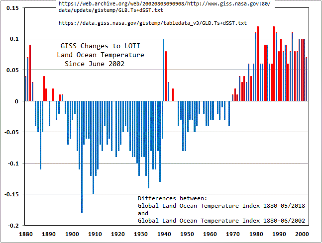
Here’s the URL for a more recent plot than what I posted above.
The Y axis is in degrees Celsius.
Besides the obvious pattern, it’s the sheer number of changes that are made. I only have about 120 of the monthly updates since 2002 so there may be some in the 60-70 that I’m missing that don’t exhibit change from the previous edition, but all the ones that I do have do so.
All I’d like to see from you guys on the other side of the debate is the acknowledgement of the volume and pattern of these changes.
And, all changes are direct admissions that the error bars are at least that large.
Huge error bars, zero credibility.
Welcome to the Adjustocene.
And you believed them?
Thanks Mosher, I feel better now. /sarc
And all this time, I thought the surface temperature record was corrupted by underestimating the UHI effect, elimination of rural temperature stations, and data in filling.
This is based on very rough
so-called surface temperature “data”
not worthy of further analysis.
There were very few
Southern Hemisphere temperature data
available before 1900
There were few data between 1900 and 1940,
outside of Australia.
The majority of “data”, even today,
consist of infilling wild guesses
and adjusted, usually multiple times,
raw data.
Infilling and adjusted data are not real data at all.
These so called data should be laughed at
and dismissed, not analyzed in detail.
This analysis is, in my opinion,
mathematical mass-turbation
on haphazard, mainly
imaginary “data”
… “data” that do not correlate with
weather satellite data
and weather balloon data,
both of which are similar
and both show less warming.
Real scientists don’t use such faulty “data”
merely because its the best they have.
The surface “data”,
especially before 1940
are too rough,
with too many wild guesses,
and far too many “adjustments”,
to be useful
for the kind of detailed analysis
you have done.
GISSTEMP changes the data to their Land Ocean Temperature Index (LOTI) every month. If you add up all the monthly entries times all the monthly reports since 2000 it comes to nearly 350,000 data points reported over the last 18 years and if 25% are changed every month (That’s about what it is) that’s around 85,000 changes to the data since the year 2000. And it forms a pattern:
The reason for the changes is that value for the base period: 1951-1980 changes every month. One has to wonder what in the world is going on.
I don’t think the chart can possibly represent the temperature change in the extreme latitudes since 1880. Is there complete enough data to go back that far?
Even current Arctic values are mostly ‘krigging’ across different media ( ice / water ) which is physically BS.
Land warms about twice as fast as water to an energy input. So the whole idea of a land+ocean index is physically meaningless.
GISS do not krigg. They use IDW.
by the way you dont krig across ice and water.
There are three types of surfaces:
1. SST masked off ice
2. Land
3. Ice.
SST is averaged separately.
land& ice is treated as land.
as an experiment we once did
SST + water under ice ( -1.8c)
land
Answer doesnt change much
Anyway, the krigging solution would typically krig over land and ice.
To check the validity of this several studies have been done. Krigging works.
Luckily there are a few datasets of bouy data and you can check. Also reanalysis
One issue is that
during a month or so of the summer a tiny path of the north pole ( 80N) is
hard limited to the melting point of ice. Excess heat goes into melting ice and not higher air temps.
In general you heard judith curry complain about this but she never actually checked the work that people do.
it sounded smart.
also it is physically meaningful. sorry
Mosher,
How do you explain the pattern in adjustments Steve Case referenced above?
What is the range of error for temperature estimates at 90 degrees latitude North and South for the year 1880?
When the data doesn’t fit consensus theory, alter the data. Très simple when you control the data.
Sorry for the double post, when it doesn’t show for ten minutes I slap it up there again.
I don’t know what’s going on in the background but I’m confident the delays, loss of some of the new features etc. are for a good reason.
(Maybe give a comment 15 instead of 10 to show up? 8- )
Land Surface Air Temperature Data Are Considerably Different Among BEST‐LAND, CRU‐TEM4v, NASA‐GISS, and NOAA‐NCEI
Yuhan Rao
Shunlin Liang
Yunyue Yu
First published: 28 May 2018
https://doi.org/10.1029/2018JD028355
https://agupubs.onlinelibrary.wiley.com/doi/abs/10.1029/2018JD028355
Reply
The mean LSAT anomalies are remarkably different because of the data coverage differences, with the magnitude nearly 0.4°C for the global and Northern Hemisphere and 0.6°C for the Southern Hemisphere. This study additionally finds that on the regional scale, northern high latitudes, southern middle‐to‐high latitudes, and the equator show the largest differences nearly 0.8°C. These differences cause notable differences for the trend calculation at regional scales. At the local scale, four data sets show significant variations over South America, Africa, Maritime Continent, central Australia, and Antarctica, which leads to remarkable differences in the local trend analysis. For some areas, different data sets produce conflicting results of whether warming exists. Our analysis shows that the differences across scales are associated with the availability of stations and the use of infilling techniques.
This post is not any essentially any different than his post about 3 weeks ago when he did it by region and which used the same data set. If you start with a fake data set like GISSTEMP then you can fake any conclusion you want. Mr. Walker you have no shame in presenting this post.
Alan,
as an undercover agent, working for SKEPTIC, I can’t afford the luxury of “shame”. You may have blown my cover.
I am a Skeptic, pretending to be an Alarmist. I present alarmist GISTEMP data, as if it were true, hoping to shame Alarmists into admitting that Global Warming is a lie.
I am using “reductio ad absurdum” (Latin for “reduction to absurdity”), to disprove GISTEMP data, by showing that it inevitably leads to a ridiculous, absurd, or impractical conclusion (i.e. that we should already be surrounded by a dead or dying planet, because we have already exceeded the 1.5 and 2.0 degrees Celsius temperature limits).
Unfortunately, none of the Alarmists understand Latin (reductio ad absurdum), so they don’t realise what I have done.
None of the alarmists will ever admit defeat. It is a religion.
“None of the alarmists will ever admit defeat”
They’re not all that bad. The less committed ones can be peeled off or eroded away with acidic doses of doubt.
Alan T.
Alarmists can not be defeated
— they make the crazy predictions
and own the temperature actuals,
which they can “adjust” at will,
to make their predictions accurate.
It’s a huge conflict of interest,
within the goobermint monopoly.
THERE ARE NO POSITIVE FEEDBACKS
Modern day climate science (aka Climate alarmism) has always promoted the theory of CO2 warming causes a positive feedback of more water vapour which then causes more back radiation which then causes more warming which then causes more water vapour and on and on ad nauseam. This is the so called runaway global warming CAGW armageddon scenario that we are are all familiar with and yet have never experienced. CO2 levels in the past have been almost 8000 ppm and the earth still hasn’t seen armageddon. The reason is that there is no such thing as a positive forcing of temperature in the atmosphere.
The IPCC makes a big deal of this with many different so called greenhouse gases but always forgetting about the largest greenhouse gas water vapour. The IPCC provides no exact method by which positive forcing would happen or when, but instead just provides the general scenario that I did in my 1st sentence. Why has the IPCC been unable to provide a detailed process of CO2 heat forcing? It is because it doesnt exist. The IPCC has been unable to counter the argument that only 8% of the upward IR has even the potential to be absorbed by CO2 and water vapour.
Since water vapour can be anywhere from 0 to 100 times the amount of CO2 in the air , any small increase of CO2 in most any local area is dwarfed by the water vapour content. Since CO2 only increases 1/2 % per year, and water vapour can increase up to 40000 times in any local area, there would have been runaway positive feedback from water vapour itself in a local area. The tiny amount of potential IR (8% ) that may get absorbed by both CO2 and water vapour is immediately carried away to the atmosphere by the N2 and O2 because of the 10^9 number of collisions per second that is happening. To get an idea of how impossible it is for the shorter wavelengths (which are the critical wavelengths for most CO2 absortion)of LWIR to heat the air, try pointing a powerful hand held infrared heater(that heats on the shorter wavelength infrared) upwards towards the sky in a shelter with no roof. No matter how long you point you will not heat that air in the shelter. If it happens to be freezing cold in that shelter in the winter time; you will freeze to death(without cold weather protection) long before your thermometers register a change in temperature. If water vapour was providing a positive reinforcing, the 86.4 W/m^2 of evapotranspiration at the earth surface would have long ago boiled our planet.
Instead water vapour causes 3 negative forcings.
1) The very fact of evaporation of oceans and other water takes heat from the water and transfers it to latent heat. Also a little bit of heat is also taken from the air at the same time and is also turned into latent heat. That water vapour molecule then gets carried upwards by convection and the air eventually saturates and then condenses. The latent heat that is released then travels upwards into the high atmosphere and eventually lost to space. If that wasnt true then the 86.4 W/m^2 of evaporation latent heat would have unbalanced the earth energy budget 4 billion years ago when the oceans formed.
2) WATER VAPOUR IS ONLY PRESENT IN APPRECIABLE QUANTITIES IN THE LOWER 5 KM OF THE TROPOSPHERE.
Increased water vapour in the lower troposphere( 5km or lower)reduces the lapse rate in the troposphere thereby dropping temperatures in the lower troposphere. The opposite happens when water vapour decreases. In that case the lapse rate increases and the temperature increases during the day. We are not talking about cloudy nights in a desert. That is a different phenomenon.
You can easily see the lapse rate conclusions expressed by the fact that dry deserts mean average temperatures are always higher than wet moist jungles at the same latitude.
3) Cloud cover increases with increased water vapour and thus prevents some of the solar radiation during the day from getting to the ground thus cooling the surface.
The UAH satellites have shown warming since 1979 but they have also shown that along with the lapse rate ( the higher regions are colder) the actual RATE of warming over the 38 year period is less the higher you go in the troposphere.
Anybody worrying about ice sheets melting and causing a big decrease in albedo and thus more warming can rest easy because clouds are the cause of 97% of albedo on the earth with 3% caused by ice sheets.
There is even a theory that all of the warming that UAH has shown is a result of the 38 year period having less clouds, thus increasing the solar incidence by 0.143W/m^2.
**********************************************************************
So if water vapour is a negative feedback then we could add all the CO2 we wanted to; to the atmosphere and would only choke when it got to 10000 ppm.
Of course the plants are only asking for 1000 ppm so we won’t go overboard. However at the measly growth rate of 1/2% per year in atmospheric CO2 , It will take us 180 years to 1000 ppm anyway.
P.S. There could never be runaway warming in a desert anyway, because where are you going to get the extra water from ? It’s a desert!!!!!!!!!!
” we could add all the CO2 we wanted to; to the atmosphere and would only choke when it got to 10000 ppm.”
?????
Alan,
The UK workplace exposure limits (WELs) for CO2:
Long-term exposure limit (8-hr reference period) of 5,000 ppm
Short-term exposure limit (15 minute reference period) of 15,000 ppm
NIOSH recommends a maximum concentration of carbon dioxide of 10,000 ppm or 1% (for the workplace, for a 10-hr work shift with a ceiling of 3.0% or 30,000 ppm for any 10-minute period).
This is no choking mater (:-))
Nonsense, there are +ve feedbacks. They are simply not dominant. T^4 Planck f/b dominates. End of.
The paleo records clearly demonstrate this. You should not confuse that with there being “NO” +ve feedbacks.
It might be more accurate to say, “There is no tipping point!” If there was, this old Earth would have tipped long before now and we wouldn’t even be here to argue about it.
What paleo records demonstrate that CO2 leads temperature?
Excellent post, Alan.
I like your Alan.
You could express this better, because clouds do not cool the surface.
Blocking heat is not ”cooling”an object.
It is preventing warming.
3) Cloud cover increases with increased water vapour and thus prevents some of the solar radiation during the day from getting to the ground thus cooling the surface.
Thanks for the chart, which is very interesting.
However, the important point to make about Paris is that the world was being asked to sign up to an agreement which
— if the signatories met their commitments
— and if the advocates’ theory was correct
would not lower emissions and would not have any effect on global temperatures.
And the main reason for this is that the largest and fastest growing emitters have no obligations to lower or even curtail the growth of their emissions.
So, everyone, ask yourself why the advocates of Paris are so emotional about the need for the US to sign up to draconian commitments which, in the advocates view if they were consequent, could have no effect on the supposed problem of civilization destroying warming.
I struggle to find similar examples of the irrational advocacy of irrelevant measures. But as a for instance. Suppose we are persuaded that the release of trace amounts of various chemicals produces a worldwide fertility decrease which, if it continues, will impair the survival of humanity. We tie down who is releasing this stuff. We decide that releases need to fall by two thirds.
Then we sign everyone up to an agreement under which those releasing two thirds of these chemicals just keep on, and even are free to increase.
And we proclaim that our agreement is essential to saving human fertility.
The total irrationality of the thing boggles the mind. If you are serious about reducing emissions and really believe it can be done to limit warming, then start advocating what it will really, according to your theory, take.
It will take global abolition of the ICE auto industry, and it will also take China, India and so on reducing their emissions by at least two thirds. Starting now. It will take getting global emissions down from 35 billion tons a year to something like 5 or lower. You cannot do that while China is emitting 10 billion and rising, and when India and Indonesia will do more than the supposed safe global limit by 2030.
Inconvenient truths.
” we could add all the CO2 we wanted to; to the atmosphere and would only choke when it got to 10000 ppm.”
?????
Alan,
The UK workplace exposure limits (WELs) for CO2:
Long-term exposure limit (8-hr reference period) of 5,000 ppm
Short-term exposure limit (15 minute reference period) of 15,000 ppm
NIOSH recommends a maximum concentration of carbon dioxide of 10,000 ppm or 1% (for the workplace, for a 10-hr work shift with a ceiling of 3.0% or 30,000 ppm for any 10-minute period).
This is no choking mater (:-))
okay okay i got carried away. We will never get near that amount even if we burned all of the fossil fuels on the planet.
I don’t think we would hit 1,000ppm even if we burned all the fossile fuels available. The last figure I recall was something like 800ppm if we burned all the fossil fuels.
Tom
The matter of how much the concentration could rise is contingent on the rate of burning. Because of the continuous drawdown, any increase is moderated. Dr Willem Nel, a South African, calculated that the maximum practical value is in the region of 525 ppm.
The problems not just the limited resources as far as we know and guess, but the practical extraction rates and the limitations of other energy sources point to ‘peak energy’ in 2050 and peak coal in 2070.
If we are lucky we might see 550 ppm but that is iffy if the oceans do not add a lot. We have about a century to find other large, controllable, low pollution or zero pollution energy generating systems.
Thanks, Crispin.
I think that 800ppm estimate I recalled was based on gathering all available fossil fuels together and burning them all at one time! 🙂 It was kind of a worst-case scenario estimate, to make a point.
And when one considers that at times CO2 levels in the Earth’s atmosphere were 7,000 or 8,000ppm without any ill effects to the Earth’s climate, then 550ppm or 800ppm is really insignificant and certainly won’t cause a runaway Greenhouse on Earth.
It is worse than we thought
You ain’t seen anything yet !
“Earth could shrink to 330ft across
if particle accelerator experiments fail, top astronomer warns. Prof Lord Martin Rees, outlines the existential threats facing the planet, which include climate change, nuclear war and artificial intelligence.
As reported by The Telegraph
I absolutely love how CAGW alarmists keep moving the goalposts; first it was CO2 forcing must be kept below 2.0C, or we’re all gonna die, now it’s 1.5C, or we’re all gonna die, and eventually, as the CAGW hypotheis reaches its demise, the goal will be below 1.0C, or we’re all gonna die…
What a joke CAGW has become…
CAGW is a joke and a fraud on the people of the world.
In relation to my last comment about deserts: Can someone explain to me why there could possibly be runaway global warming in a desert? A desert has little or no water. If CAGW depends on CO2 forcing more water vapour, where is that water going to come from in a desert? As for the oceans, the hotter the water gets, the more it evaporates. So because oceans are 70% of the earths surface, they absorb ~ 70% of 47% = 33% of the sun’s solar energy after allowing for the 30% that is reflected by albedo and the 23% that is absorbed by the atmosphere. Since the visible part of solar radiation is 36.661% and the UV and near UV another 3.3% that leaves 60% for the IR part of the solar. So of the original 340W/m^2 of solar average hitting the surface only 112W/m^2 gets absorbed by the oceans. Of that 60% is IR or 67.3 W/m^2. The following 3 points are from Dr. Roger Pielke.
“1. Infrared radiation ………………..causes evaporative cooling of the oceans rather than heating”
“However, since the LWIR …………………… is only capable of penetrating a minuscule few microns (millionths of a meter) past the surface and no further, it could therefore only cause evaporation (and thus cooling) of the surface ‘skin’ of the oceans. ”
Stephen Wilde, LLB (Hons.), Fellow of the Royal Meteorological Society explains this in detail, excerpted below:
“However the effect of downwelling infrared is always to use up all the infrared in increasing the temperature of the ocean surface molecules whilst leaving nothing in reserve to provide the extra energy required (the latent heat of evaporation) when the change of state occurs from water to vapour. That extra energy requirement is taken from the medium (water or air) in which it is most readily available. If the water is warmer then most will come from the water. If the air is warmer then most will come from the air. However over the Earth as a whole the water is nearly always warmer than the air (due to solar input) so inevitably the average global energy flow is from oceans to air via that latent heat of evaporation in the air and the energy needed is taken from the water. This leads to a thin (1mm deep) layer of cooler water over the oceans worldwide and below the evaporative region that is some 0.3C cooler than the ocean bulk below.”
A 2009 paper by Roy Clark, PhD also discusses the physics and concludes, “Application of Beer’s law to the propagation of solar and LWIR [long-wave infrared] flux through the ocean clearly shows that only the solar radiation can penetrate below the ocean surface and heat subsurface ocean layers. It is impossible for a 1.7 W.m−2 increase [predicted by the IPCC due to man-made greenhouse gases] in downward ‘clear sky’ atmospheric LWIR flux to heat the oceans.” (p. 196). Increasing levels of IR-active ‘greenhouse gases’ would instead be expected to cause increased evaporative surface cooling of the oceans. N.B. there is also a negative feedback phenomenon on CO2 levels discussed in a paper published in Nature which shows that the evaporative cooling of the ocean ‘skin’ from increased downwelling IR allows increased uptake of CO2 due to increased solubility of CO2 at lower temperatures.”
This next reason is again from Dr. Pielke
“2. Even if ‘greenhouse gases’ were capable of heating the oceans, the ocean heat capacity is so immense that there would be no significant change in ocean temperature
The huge mass and heat capacity of the oceans regulates and stabilizes global temperatures to a far greater degree than any possible influence from mankind.
The immense heat capacity of the oceans can be illustrated by assuming the oceans could be heated one-way by all solar energy absorbed by the Earth, and assuming no cooling due to convection, evaporation, or radiation. The oceans hold 1.3 billion cubic km of water. Assuming the density is 1 kg per liter, the mass of the oceans is 1.3 billion billion kg or 1.3 yotta grams. The total solar power absorbed by the Earth in one year is 89 peta Watts (PW):
For a thought experiment, assume all 89 PW are taken up by the oceans and that the oceans don’t release any of that heat. That would add 0.67 yotta calories to the 1.3 yotta grams, resulting in an increase in the ocean temperature of only 0.5C after an entire year.
Now, let’s also assume that the IPCC is correct that ‘greenhouse gases’ are causing 1.7 W/m2 ‘radiative forcing,’ and that it is possible for this IR ‘back-radiation’ to penetrate and heat the ocean (even though we’ve already shown that is impossible above). The 1.7 W/m2 works out to 850 Tera watts (TW) [or .85 PW] when multiplied by the total Earth surface area of 500 tera square meters. Thus, the IPCC claims that ‘greenhouse gases’ are preventing .85 PW of energy from leaving the atmosphere to space. This .85 PW is less than the 89 PW from the Sun by a factor of 105 times. Plugging this into our thought experiment above shows that the change in ocean temperature from ‘greenhouse forcing’ would be 0.5C/105 or .005C in one year or only 0.5C after 105 years, assuming the oceans release none of this added heat! In reality, of course, the oceans would release all or most of this added heat by convection, evaporation, or radiation, leaving at most only a few hundredths of a degree temperature change after 105 years. Thus, it is impossible for ‘greenhouse forcing’ to raise ocean heat content to any measurable degree, or cause melting of the icecaps from below, or increase sea levels from thermal expansion.”
“3. Even though IR can travel both ways, The Second Law of Thermodynamics requires heat to flow one-way from hot to cold.
Since the atmosphere is colder (average radiating temperature of ~ -10 C) than the ocean surface (~ 17 C), the 2nd Law of Thermodynamics states that heat can only be transferred one-way from the ocean surface to the atmosphere, not the other way around.
Related:
1. The latest Chilingar et al paper also discusses heat capacity of the atmosphere, which should decrease due to added CO2: “saturation of the atmosphere with carbon dioxide, with all other conditions being equal, results not in an increase but in a decrease of the greenhouse effect and average temperature within the entire layer of planet’s troposphere. This happens despite intense absorption of the heat of radiation by CO2. The physical explanation of this phenomenon is clear: molecular weight of carbon dioxide is 1.5 times higher and its heat-absorbing capacity is 1.2 times lower than those of the Earth’s air. As a result, the adiabatic exponent for a carbon dioxide atmosphere, at the same all other conditions, is about 1.34 times lower than that for a nitrogen–oxygen humid air”
2. Another empirical analysis which finds increased CO2 leads to increased cooling
3. Sea surface temperatures have been on a long-term decline since the Medieval Warming Period (~1000 years ago), Roman Warming Period (~2100 years ago), and Egyptian Warming Period (~3100 years ago):”
Finally I get to speak again. The 2 most destructive and misinforming websites are Real Climate and Skeptical Science. Science of Doom runs a close 3rd. Real Climate is run by Gavin Schmidt and his buddies who claim
” that GHGs heat the ocean by decreasing temperature gradients between ocean and atmosphere:”
http://www.realclimate.org/index.php/archives/2006/09/why-greenhouse-gases-heat-the-ocean/
The only paper they could find shows the relationship between sea surface temp and LW forcing is 0.002ºK (W/m2)-1. In other words, a doubling of CO2 concentrations [alleged to cause 3.7 Wm-2 forcing] would increase sea surface temperatures by .0074 degrees – essentially zero.
Ok, Alan. I’ll play Devil’s advocate just so you have the whole picture.
Warming takes place everywhere. Both land and water warm. One result is higher absolute humidity, even if relative humidity is largely unaffected.
Wind distributes this more humid air around the globe, in search of lower temps where the water can precipitate.
This means that all areas of the planet, averaged over time, have more moisture in the air. Including deserts.
Also, thank you for your excellent and informative post.
Fortunately water is even better than the gold standard. Assuming that the amount of gold mined is just balanced by the amount used in manufacturing processes, the supply of gold reflecting the REAL money supply remains fairly constant. In reality not quite but you get the picture. The only new water created on our globe is the tiny amount that comes in with asteroids or comets that come too close.
Since water is basically a constant, you can’t have an increase worldwide even temporarily, unless the icecaps melt to any significant degree. Even then it isnt an increase overall. Major changes to our climate involve this melting of icecaps or refreezing.
Scientists have concluded that Mars lost its vast oceans of water due to solar winds whipping it to space. The solar winds were able to do this because Mars does not have a substantial planetary magnetic field.
However the key ELEPHANT in the room question for our planet is: What happens to the sensible heat that is released from the latent heat upon condensation? We assume it is lost to space. It cant go back into the oceans or the oceans would boil over. Warming our world would only result in more evaporation from the oceans. That latent heat created in the water molecule then gets released ( upon condensation) to outer space. It has been determined that there is so much evaporation from the world’s oceans that if they didnt get replenished by precipitation and water runoff by rivers that they would soon disappear.
You lost me there on gold standards. Is the missing heat hiding in Ft. Knox? Is that why all the gold is missing?
My point is that if the world is warmer there should be more moisture in the atmosphere. This would also be present over deserts.
As a side note, this extra humidity is often invoked as a reason why we will, likely, maybe , could see devastating rain events with higher CO2 levels. They neglect to point out that precipitation also requires a condensing temperature. If this is also higher then precipitation will not be as high as expected. It could even be lower.
It would certainly mean that more airborne moisture makes its way to the major icecaps of the world.
“They neglect to point out that precipitation also requires a condensing temperature. If this is also higher then precipitation will not be as high as expected. It could even be lower.”
No never lower.
WV condenses in the atmosphere by being lifted in it, whether by convection, orographic or isentropic up-gliding. It’s condensation temp is arrived at earlier in the ascent the more humid it is.
On dry, unstable days FI, CU/Cb cloud will have a higher cloud base and the depth of the cloud reduced, with drier air below allowing for some evaporation.
In a warmer world there will still be the same spacial/temporal variation, but, as you said, specific humidity will be higher generally, meaning more potential precipitable water to rain out.
It will rain
A tiny amount of water, roughly 2X or so that of CO2, is created through the combustion of fossil fuels.
Gotta love those fossil fuels, they are so versatile.
Sheldon, wouldn’t it have been easier to create a trend map with the trends scaled so that the upper end equals a little more than a 2 deg C rise?

We can see that much of Asia and Canada have already exceeded the ultra-silly 1.5 deg C rise in surface temperatures, with parts well over the exceedingly foolish 2 deg C threshold.
I suspect you might find that illustration in my next book.
Cheers
Bob
Hi Bob,
thanks for your comment. I have already done what you suggested.
Here is my version. I did it using a cylindrical equal area projection of the world, so that the polar regions would not be exaggerated.
https://agree-to-disagree.com/global-warming-did-we-pass-or-fail
I forgot to say, I try to present the data in different formats, so that people can find a format that suits them.
I did this bar chart, as another way to show the same data used for the map.
With this bar chart, I used yellow for temperature increases between 1.0 and 1.5 degrees Celsius. So that people can see which areas are near the 1.5 degrees Celsius temperature limit.
For my map, I just used green for between 0.0 and 1.5. I might redo my map using yellow for 1.0 to 1.5, because my map makes it look as if most of the world is ok.
1880 to 2010 presents a trend of 1.34 oC by 2100 from 1880. This is over lapped by a 60-year cycle of sine curve varying between -0.3 to +0.3 oC. According to IPCC, from 1951 more than half of the trend is anthropogenic greenhouse effect plus aerosols effect. From 1880 to 1950, 70 years and from 1951 to 2100, 150 years. That is, for 220 years the raise is 1.34 oC and thus for 150 years it is 0.91 oC. If we take global warming part as 50%, then it is 0.455 oC per 150 years on which -0.3 to +0.3 oC sine curve pattern is superposed.. This is far behind Paris Agreement limit for which they wanted to spend $ 500 billion in five years [if the muster that much amount]. Where will that money go???
Dr. S. Jeevananda Reddy
Skeptics will not like this
here is a test of whether or not skeptics believe in facts, OR if they will hold to their misconceptions
wanna bet?
Skeptic misconception. Every time climate scientists adjust their data the result is an increase in trends?
right?
right? can you give me an amen brothers!
Amen.
Opps:
GHCN version 3 will be replaced with GHCN version 4.
25K stations !
Now, predict! they use more data and do adjustments. what do you predict?
“”In v4, the aggregate impact of
adjustments on global mean land surface air temperature trends is an increase of about 0.2°C during the
period from 1880-2016 whereas in v3, the impact of adjustments on global trends is closer to 0.4°C during
the same period. “
Opps.
Now how long will it take skeptics to change their belief about new versions always be adjusted higher?
Sure, sure, Steve.
https://realclimatescience.com/100-of-us-warming-is-due-to-noaa-data-tampering/
The adjustments correlate almost perfectly with atmospheric CO2. NOAA is adjusting the data to match global warming theory. This is known as PBEM (Policy Based Evidence Making.)
So steve, can you explain why the temperature adjustments have a 98 % correlation with the change in CO2????
Waiting………….
Steve has got his sophistry kit out.
I’m sure he will splain the happy coincidence.
another person fooled by the heller.
a. ushcn is 1200 SPLICED stations
b. heller computes the average wrong.
c. he also cuts off early data in the series that destroys the fit.
d. the data has been smoothed by averaging before the correllation.. no statistical cookie for him.
e. i have told him 100 times to not use ushcn data. Giss dont even use it.
basically he finds a small dataset
he processes it wrong
he lops off years to improve his fit
he averages months to years before doing correlation
punk work
Why not just pick a few dozen to a few hundred land-based sites per continent, far enough from civilization to be uncorrupted by the Urban Heat Island effect, but near enough to be roughly representative of the lion’s share of human-populated land, i.e., roughly evenly distributed from 30S-50N (taking a roughly evenly distributed range of altitudes), then equip these sites with high-accuracy temperature sensors, then take the average?
Sort of a Dow Jones Average of Key Climate Sites.
That way you wouldn’t even need an army of adjusters, you wouldn’t need to be constantly changing algorithms — the general pubic would understand and would actually be willing accept the validity of the anomaly.
Problem, you wouldn’t be able to claim anything was running out of control. And you’d have to find another job, I suppose.
been there done that
I don’t know. How long do you think it will take the mainstream press and environmental groups to look at v4 and admit that maybe things aren’t worse than they thought?
msm? you want to set your standard for
for skeptic behavior based on the most loathsome folks on the planet.
too funny.
Mosher, which one is better?
Does V4 too use a simple circulation model to predict temperatures?
It seems to me that how much the earth is warming depends entirely on your start point.
If you pick the little ice age as your starting point. Yes the earth has warmed since the start of the modern warm period. If you pick any time before the start of the current Ice age not so much. If you want to only use the Holocene any of the warm periods during the Holocene for example the Holocene Climate Optimum, Roman Warm Period or Medieval Warm Period are warmer than the Modern Warm Period.
The second problem I have with the current scare is every known warm period has been good for all life including human and every cool period bad for all life including human.
It’s better than we thought.
John.
7 billion of us exist in our daily lives on a planet where temps swing daily by 30c or more, we quickly adapt to winter or summer , night time lows mid day high’s.
Humans will adapt en mass to ”any” environment temp swings.
Ofcourse we prosper more in warmer climes, and different diets.
So. it’s warmed a bit since 1880. More by land than sea. More by North than South. I think that’s been accepted for a few decades.
I live in Western Canada. I am 61 years old. That means I was a kid in the sixties.
Is it warmer now? Winters certainly are. Summers certainly are not. Do these changes cause problems? Not so far. This is one of the world’s great agricultural areas but it is somewhat prone to drought. The specific nature of drought here is that we tend to be somewhat dependent on the amount of snowfall accumulation we have by spring. This can be quite variable as can also be the amount and timing of rain during the growing season. In the last 20 years we have had pretty well every variation of these patterns. There has been no drought, although we are bordering on one now and are probably overdue.
Another threat to crops here is late and early frost. In this regard the warming we have had is helpful in adding a week or so to the season, but the development of earlier maturing crops has made this much less of an issue anyway.
I am not aware of a single area of the planet where any significant negative impacts are being experienced.
One thing can for sure be said regarding the bar graph. There is NO .. “global” warming. There is mainly arctic warming (the place where we have very few thermometers. There also doesn’t appear to much ocean warming, as the bars clearly show all the warming to be on land. Hmmmmm …. wonder why that is?. …. oh, that’s right, we don’t have a long history of thermometers in the ocean either.
I don’t know why I keep following “global warming” .. it is such a joke. I guess it’s because I like Anthony’s site.