By Javier
In sharp contrast with previous decades, the past 10 years have seen no change in Northern Hemisphere average sea ice extent, according to MASIE (may-zee, Multi-sensor Analyzed Sea Ice Extent) database from the National Sea & Ice Data Center (NSIDC; see figure 1).

Figure 1. MASIE sea-ice extent data for the Northern Hemisphere showing essentially no trend for Arctic sea-ice for the past 11 years.
Based on fundamental climate observations and research it has been proposed by several scientists that the Arctic might have entered a new regime with its most conspicuous consequence a reduction or even inversion of recent Arctic sea ice trends. So far, the data appears to support their interpretation. They are Miles et al. 2014, Wyatt & Curry 2014, and Årthun et al. 2017 (references in the appendix).
Last October I presented some of the evidence at WUWT here.
Despite the complete failure of every Arctic ice-free prediction so far, and the research and evidence that the Arctic is no longer melting as in past decades, some climate alarmists are rabidly attacking this interpretation and those that hold it, including me. See the “Open Mind” post: Extreme Cherry Ice.
MASIE is a relatively new (November 2010) and improved dataset on sea-ice extent for the Northern Hemisphere with very good sea-ice boundary resolution. Sea-ice extent is the preferred measurement by NSIDC to study melting, since surface melting is known to cause sea-ice area measurements to underestimate the sea-ice surface. However, sea-ice extent is rapidly falling out of favor among sea-ice alarmists as an Arctic gauge, replaced by sea-ice volume that has the disadvantage of being modeled, but the advantage that it shows continuous decline, as the models include a temperature factor. Apparently, alarmists believe that Arctic sea-ice is transforming from a pancake into a crepe of the same size.
MASIE starts in 2006. I have determined the start and end dates of the melt season from 2006-2017 (11 complete years; see appendix). The data is presented in table 1.

Table 1. Start day defined as yearly maximum extent day (7-day smoothed). End day defined as yearly minimum extent day. Length is the difference between both in number of days. Extent change is the difference between maximum and minimun sea-ice extent.
The average start for the melt season was on day 68 (March 9 in common years). For the past 12 years there has been a trend towards an earlier start of the melt season, with 2015, and 2016 starting on day 59 (February 28). The trend is very pronounced at –9 days/decade (see figure 2). Stroeve et al. 2014 report a similar trend for 1979-2013 of –2 days/decade. If anything, the trend appears to have accentuated recently. In 2017 the melt season started on day 63 (March 4) as determined by this methodology, right on the trend.

Figure 2. Start of the melt season for the past 12 years showing a pronounced trend towards an earlier start of the melt season.
The average end for the melt season was on day 262 (September 19 in common years). For the past 11 years there has been a trend towards an earlier end of the melt season, with 2016 (leap year) ending on day 253 (September 9). The trend is very pronounced at –11 days/decade (see figure 3). Stroeve et al. 2014 report an opposite trend for 1979-2013 of +3 days/decade. There is a huge inversion of 2 weeks/decade in this trend. According to the trend and methodology, the 2017 melt season is projected to end on day 255 (September 12) ± 1 week.

Figure 3. End of the melt season for the past 11 years showing a pronounced trend towards an earlier end of the melt season.
The observed trends are not sustainable (or the melt period would eventually shift seasons) and probably form part of the observed Arctic regime shift. One possible explanation is that for the past decade winters have become warmer in the Arctic, while summers have become cooler. A good example is this year situation (see figure 4).

Figure 4. Daily mean temperature north of the 80th northern parallel, as a function of the day of year. Source DMI. The average melt season start and end days have been added.
The average melt season length, defined as the number of days from start to end of melt, is 193 days (52.5% of the year, winter is 4 days shorter than summer). For the past 11 years the melt season length has shown a non-significant decrease of –2 days/decade (see figure 5). This contrasts with Stroeve et al. 2014 who report a trend for 1979-2013 of +5 days/decade in melt season length. The evidence does not support the touted increase in melt season length for the past decade. According to the trend, the 2017 melt season is projected to last 192 ± 6 days.

Figure 5. Melt season length for the past 11 years showing no clear trend.
The average extent loss from start to end of the melt season is 10.6 million sq. km. For the past 11 years the extent loss has shown a non-significant increase of 0.65 million sq. km/decade (see figure 6). This trend is dependent on the very low value of the 2006 melt season loss, and shows no increase in surface lost during the melt season from 2007. 2017 started its melt season with a very low value of sea ice extent (14.7 million sq. km), almost as low as 2006 (14.6), and has seen below normal melting so far, so it is likely to end with one of the lowest sea-ice extent losses of the entire series.

Figure 6. Change in extent (sea-ice loss) from start to end day of the melt season for the past 11 years showing no clear trend.
The average sea-ice extent change during the melt season was plotted against the length of the melt season (see figure 7). No significant relation was found as the trend depends fully on two outliers, the very low melting of 2006 and the very high melting of 2012. It is clear that melt season length is not the main determinant of sea-ice extent decrease during the melt season.

Figure 7. Change in extent (sea-ice loss) during the melt season versus the length of the melt season for the past 11 years. No significant correlation is found.
It is important to notice that the analyzed period 2006-2017 includes 7 of the 10 hottest years recorded according to NOAA/NCEI, as reported by Climate Central (see figure 8). 2017 is trending to finish in 2nd-3rd place. The warmest decade in over a century, according to this database, coincides with a decade when no Arctic sea-ice melting has taken place. This demonstrates that global average surface temperatures cannot be the driving force behind Arctic melting, and regional ocean surface temperatures are likely to be more important.

Figure 8. The period analyzed, 2006-2017, includes most of the warmest years ever recorded, and can therefore be considered the warmest decade ever registered. The lack of ice melting demonstrates that global temperatures do not drive Arctic sea-ice melting.
In conclusion, the evidence indicates that for the past 10 years:
1. There has not been any significant Arctic sea-ice melting.
2. Both the melt season start and end have been taking place earlier.
3. The melt season length has not increased.
4. Sea-ice loss during the melt season has not increased.
5. Sea-ice loss during the melt season is not determined by season length or by the average global surface temperature, as claimed by the IPCC.
There is a stark difference between the results from the past 10 years and from earlier decades. This difference suggests a shift in the Arctic ice regime as proposed by Wyatt & Curry 2014 and Miles et al. 2014. The expectation from these authors and from Årthun et al. 2017 is that for the next decade(s) no significant Arctic sea-ice melting should be expected, and a significant increase in Arctic sea-ice is possible.
Appendix.
The MASIE database was downloaded from:
ftp://sidads.colorado.edu/DATASETS/NOAA/G02186/masie_4km_allyears_extent_sqkm.csv
on August 8, 2017.
The Northern Hemisphere data was smoothed with a 7-day centered moving average to reduce daily variability.
Data was plotted with Excel.
Daily polar temperature graph was obtained from the Danish Meteorological Institute at:
http://ocean.dmi.dk/arctic/meant80n.uk.php
Bibliography:
Årthun, M., et al. 2017. “Skillful prediction of northern climate provided by the ocean.” Nature Communications, 8, ncomms15875.
https://www.nature.com/articles/ncomms15875
Miles, M.W., et al. 2014. “A signal of persistent Atlantic multidecadal variability in Arctic sea ice.” Geophys. Res. Lett., 41, 463–469.
http://onlinelibrary.wiley.com/doi/10.1002/2013GL058084/full
Stroeve, J.C., et al. 2014. “Changes in Arctic melt season and implications for sea ice loss.” Geophysical Research Letters, 41(4), 1216-1225. http://onlinelibrary.wiley.com/doi/10.1002/2013GL058951/full
Wyatt, M.G., and J.A. Curry. 2014. “Role for Eurasian Arctic shelf sea ice in a secularly varying hemispheric climate signal during the 20th century.” Climate dynamics 42.9-10: 2763-2782. http://cdn.cnsnews.com/documents/Curry,%20Wyatt%20paper.pdf
Simple solution: MASIE needs to be ‘adjusted’ to be in compliance.
MASIE Dotes, and DOSIE Dotes, and littelambs eat ICIE !
g
Cute, very cute 🙂
Good–but it dates you guys to my vintage.
“…dates you guys to my vintage”
…And what would be so bad about that?
The North West Passage is open for the year boys!
http://nsidc.org/arcticseaicenews/
Yeah, The St Roch and Manhattan route..
Of course it is 🙂
How ironic that while the Arctic has being doing nothing, humans have been freaking out about the Arctic.
Javier, thanks for the informative post. I have been studying MASIE data for years and encouraging others to support NIC, who generate the charts and stats. FYI, here is the last 10 years of Arctic minimums from MASIE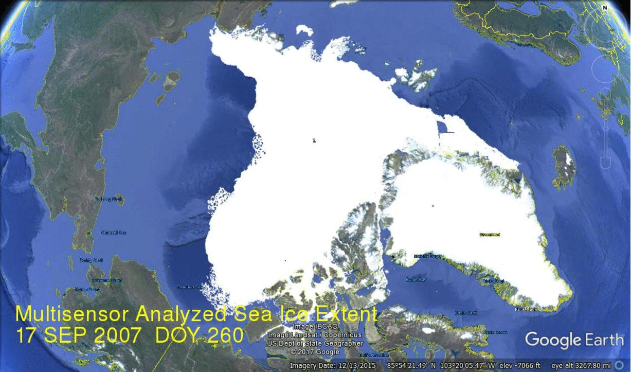 ?w=1137&h=681
https://rclutz.wordpress.com/2017/07/31/arctic-heart-beat/
Testing. Comments are disappearing
Disparaging of MASIE in comments below are mistaken.
https://rclutz.wordpress.com/2017/01/30/support-masie-arctic-ice-dataset/
Javier, what is the “smoothing” that you are using, not a nasty runny average I hope. IMO you will need more than 7 days to get a clear, unique turning point.
I did a similar thing a few years back and found that the Arctic melting period had been getting shorter since 2007, and dropped below 6 months in 2009. It is curious that you do not find a similar result.
https://climategrog.wordpress.com/ant_arctic_melting-3/
I need to update those graphs though the Cryosphere Today extent I used is totally broken now and should be renamed Cryosphere Yesterday. They seem to have lost interest since the “run away ” melting stopped running away.
The 2007-2012 section is not too different from that part of your data.
Ah, found an update of my processing ( using a well-behaved gaussian filter, not a runny mean ).
https://climategrog.wordpress.com/ant_arctic_melting_season/
With the exception of year 2000 the Arctic melting period was longer than 6 months for most of the satellite period but has been under 6 months since 2010.
I use a heavy enough lowpass filter to slug the variability and get a unique change of direction at each season: no flip-flopping.
It doesn’t match the “chicken little” headlines in the media does it? “Well, actually less than 8% of the sky is falling.”
“How ironic that while the Arctic has being doing nothing, humans have been freaking out about the Arctic.”
While the ants freak out about the Antarctic.
“Sea-ice loss during the melt season is not determined by season length or by the average global surface temperature, as claimed by the IPCC”
Brilliant.
Thanks.
I found the exact same thing in a longer dataset.
https://papers.ssrn.com/sol3/papers.cfm?abstract_id=2869646
You appear to have ignored the caveat published on the MASIE website “Use the Sea Ice Index when comparing trends in sea ice over time or when consistency is important. Even then, the monthly, not the daily, Sea Ice Index views should be used to look at trends in sea ice.”
Also in the paper on comparative sources of data https://www.igsoc.org/annals/56/69/a69a694.pdf
Meier et al. made the following points:
” MASIE is not well suited for tracking long-term climate (e.g. trends, anomalies), but is better suited for purposes such as input into synoptic weather models.”
” Operational products (i.e. MASIE), while providing more spatial detail and on average higher accuracy in the ice-edge location, are subject to inconsistencies due to data quality and availability.”
I used a one week averaged daily value, that takes care of the daily variability problem. And the results and conclusions are the same over a wide range of sea ice extent databases including JAXA and DMI. Last year I didn’t use MASIE and got the same result. As it is said, the results are “robust.” According to sea ice extent the ice is just not melting, and with the same measurement it was melting before.
From the above linked pdf:
If you get similar results from data which is not declared to be inconsistent over time I would suggest showing it. MASIE is specifically aimed at operational forecasts ie for people needing to know where ice is to avoid hitting it ! It is not intended to be used as you are an there are specific warnings that it is not suitable.
Thanks greg.
This is not the first time some clown has tried to foist off masie analysis here at wuwt.
The limitations of masie have been explained before.
A good analyst would compare all datasets.
A good analyst would read what the data provider cautioned against.
The fraudulent misuse of open data is one argument those of us who try to free data have a hard time answering. How do we make our data open and prevent frauds like Javier from abusing it?.
We make the data open to increase understanding not to allow people to misuse that data..that just lures people into weak skeptical arguments, makes all skeptics look bad and wastes the time of good analysts.
Mosh,
If Javier, a PhD in molecular biology, is a clown, what does that make you, an English BA salesman associated with a cooked book GIGO exercise in mendacity?
I’ve noticed that Steven Mosher has grown increasingly bitter over the years. Many years ago, I remember that he sometimes had interesting and even insightful things to say. But these days, wherever I come across his name in the blogosphere, his main function appears to be to play the grouch, the snide, the character assassin and the spoiler of comment threads. So most of the time when reading the threads at WUWT I ignore him as a default setting.
Thanks Mosher- the article is garbage for the reasons you suggest. Amusing that the WUWT cretins though resort to ad hominem attacks when they can’t back up their claims with science.
[do you listen to yourself? You call WUWT denizens “cretins” then complain about ad hominem attacks. suggest you comment elsewhere because you clearly don’t understand your own comments – Anthony]
While it may be a wrong use of the data-set, it can hardly be “fraudulent” (involving deception). The recommended data-set for the purpose by NSIDC gives the same answer.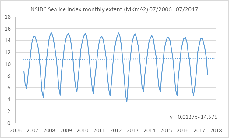
It looks like a full-blown false accusation by Mosher. Nothing out of the ordinary.
True, Mosher should stop that.
Bruce August 11, 2017 at 8:47 pm
Calling real scientists “clowns”, as the salesman Mosh does, isn’t ad hominem?
Standard warmest reply. Thanks Phil, saves Nick the time of having to come over and do it.
Good that they put the disclaimer there, otherwise climate scientists might inadvertently stumble into some actual science.
I mean, why risk actually *measuring* sea ice extent, which might show a heretical result, when you can “model” it and get a properly sanctified one?
Javier August 11, 2017 at 5:44 am
I used a one week averaged daily value, that takes care of the daily variability problem.
But has nothing to do with their point which is inconsistency and MASIE’s unsuitability when comparing trends which is what you are doing.
Let’s cut to the chase: Do you, Phil., disagree with Javier’s fundamental conclusions, that average Northern Hemisphere sea ice extent is unchanged for the last decade?
Alan Robertson August 11, 2017 at 7:47 am
Let’s cut to the chase: Do you, Phil., disagree with Javier’s fundamental conclusions, that average Northern Hemisphere sea ice extent is unchanged for the last decade?
It’s a meaningless statistic since it depends mostly on the winter extent, even a record minimum extent this year wouldn’t change it to a noticeable degree. Hitting zero extent for a couple of days and Javier would still be saying “no change in the Northern Hemisphere average sea ice extent”.
“Do you, Phil., disagree with Javier’s fundamental conclusions, that average Northern Hemisphere sea ice extent is unchanged for the last dec”
It is not possible to draw this conclusion from the MASIE data, because MASIE is described as not suitable for drawing this type of concusion.
That does not make the conclusion wrong, but it is certainly not demonstrated here.
Phil and seaice1,
Assuming, for the sake of argument that your complaints are valid, can we conclude that there is no basis for you or anyone being concerned about declining ice coverage? Do you have an alternative database that you would recommend Javier analyze?
Thanks for replies Phil. and seaice1.
What data would support, or disprove Javier’s point, if such exists and what conclusion could be drawn from that data?
Climate alarmists and IPCC believe that the thermal response to increasing CO2 is a feedback gain from increasing water vapor that results from higher temperatures, leading to much higher temperatures. Current climate model averages indicate a temperature rise of 4.7 C by 2100 if nothing is done, 4.65 C if U.S keeps all its Paris commitments and 4.53 C if all countries keep their part of the agreement. In all cases, with or without Paris agreement we are headed for a disaster of biblical proportions.
As the chart indicates, implementing all of the Paris agreement will delay the end of mankind as we know it by at most 4 years.
Myself and quite a few scientists, meteorologists, but mostly engineers believe the feedback loop in nature is far more complicated than that, in fact, there is a large negative feedback in the system, preventing a temperature runaway, and we have the observations to prove it. The negative feedback manifests itself in 2 ways:
Inorganic feedback, represented by clouds. If there were no clouds, the tropics would average a temperature of 140 F thanks to the greenhouse effect. The clouds reflect back up to 300 W/m2 into space rather than the same energy being absorbed into water or soil. Clouds are highly temperature dependent, especially cumulus and cumulonimbus clouds. Cumulus clouds are formed in the morning, earlier the warmer it is, and not at all if it is cold, thunderstorms appear when it is warm enough. The feedback, which was positive at low temperatures becomes negative at warmer temperatures, and in the equatorial doldrums, surface temperature has found its equilibrium. No amount of CO2 will change that. Equatorial temperature follows the temperature of the ocean, warmer when there is an el niño, cooler when there is a la niña. Here is a chart of temperature increases since satellite measurements began as a function of latitude.
The tropics follow the ocean temperature closely, no long term rising trend, the extratropics are also stable.
Not so at the poles. the temperature record indicate a noticeable warming with large spikes up and down, up to 3 degree Celsius difference from year to year, especially the Arctic. So, how much has the Arctic melted? Here is a chart of Arctic ice cover for 31 May for the last 39 years.
If this trend continues, all ice may melt in 300 to 400 years, faster if there is further warming and nothing else is changing. Let’s take a look at the Arctic above the 80th latitude, an area of about 3,85 million square kilometers, less than 1% of the earth’s surface, but it is there where global warming is most pronounced. Here are two charts from the last 2 years, ending with Aug 10 2017.
Starting at summer 2016, the Arctic was melting quite normally, but something else happened that is not shown in the chart. Every 5 years or so, the Arctic suffer a large storm with full hurricane strength during the summer. In 2016 there was no one, but two such storms, and as they happened late in the season when the ice is rotten they result in a large ice loss, making the ice minimum the lowest on record, and the ice volume nearly 4,000 Gigatons (Gt) less than the 30 year normal. Then the temperature from October thru April did run 7 degree Celsius warmer than normal with a spike as high as 20 degrees warmer. Yet today the deficit is down to 2,500 Gt. What happened? It snowed more than normal. In the Arctic, it gets warmer under clouds, warmer still when it snows. Take a look at Greenland and what has happened this freezing season. It has snowed and snowed and Greenland has accumulated 150 Gt more ice than normal. So, at this point in the season we are a total of 1650 Gt ahead of last year, and this is with Arctic temperatures being seven degrees warmer than normal during the cold season. The counterintuitive conclusion is that it may very well be that warmer temperatures produces accumulation of snow and ice, colder temperatures with less snow accumulates less. What happens during the short Arctic summer? With more snow accumulated it takes longer to melt last years snow, so the temperature stays colder longer. If this melting period ends without melting all snow, multi year ice will accumulate, and if it continues unabated, a new ice age will start.
The second feedback loop is organic. More CO2 means more plant growth. According to NASA there has been a significant greening of the earth, more than 10% since satellite measurements begun. This results in a cooling effect everywhere, except in areas that used to be treeless where they have a warming effect. The net effect is that we can now feed 2 billion more people than before without using more fertilizer. Check this picture from NASA, (now they can publish real science again) showing the increased leaf area extends nearly everywhere.
In addition, more leafs changes the water cycle, increases evapotranspiration, and more trees and vegetation reduces erosion and unwanted runoff. Good news all around.
In short, taking into account the negative feedback occurring the earth will warm up less than 0.5 degrees from now, not at all in the tropics, and less than 3 degrees at the poles.
https://lenbilen.com/2017/06/04/with-the-paris-accord-not-signed-can-the-world-still-be-saved-a-look-at-the-arctic/
39 years ago marked the end of a period where arctic ice levels had been increasing.
and 39 years into what we could therefore consider the next cycle, it is lower than at any point in the 1940s low and still declining
Griff,
You said, “…and still declining.” I didn’t get that from Javier’s analysis. Your source, please.
Mod: Why are most of my posts going to the bit bucket today?
Once again Griff demonstrates that he doesn’t know how cycles work.
So you’re saying there are cycles in play here, Griff? Please describe them for us. It will save tens of millions of dollars in unnecessary research costs.
Griff,
You missed the whole point of this post.
Arctic sea ice is not still declining. It has flatlined for ten years, with the record low five years ago.
This, despite record warm years and steadily rising CO2.
Your hypothesis of man-made sea ice decline is yet again shown false.
Griff,
On the basis of satellite observations so far, the period of decline was 1979-2012. No year since 2012 has been close to that low.
So, unless and until there is a new record low, such as you predicted was a sure thing for this year, the interval of declining ice was 1979-2012, ie 34 years inclusive.
lenbilen
Very cogent analysis.
Griff is on to it! ?w=640
>>The lack of ice melting demonstrates that global
>>temperatures do not drive Arctic sea-ice melting.
So perhaps polar ice extent is albedo regulated, and thus possibly caused by industrial dust and soot. As was true of the great ice ages and interglacials over the last million years.
Is CERES indicating any changes in polar albedo?
Ralph
but there is NO lack of melting.
There was no lack of AMO and ENSO warm phase either. Cycles and waves can be so mean that way, until their slope changes again.
As you yourself admitted a few hours ago, there has been no melting for the last 10 years.
Griff! There is certainly a sufficient lack of melting to destroy your prediction that ALL the ice would be gone by now! How much lack of melting do you want?
P.S.- If freezing counts as a lack of melting then hold onto your hat cuz here it comes!
John, the trend is down, with yearly variation.
The extrapolation from the volume figures gives seasonally ice free in the 2030s
There is less ice now than in the 1940s… the drop in volume and low extent in the last 40 years ahs been truly vast
http://nsidc.org/arcticseaicenews/files/2017/08/Figure3.png
http://nsidc.org/arcticseaicenews/files/2017/07/Figure3.png
That’s July and August.
I don’t see the hiatus.
and June
He’s talking about the last 10 years friend. Your charts proves that over the last 10 years here has been a hiatus. You need to reevaluate your chart.
and extrapolate July out for 100 years and we have NEGATIVE millions of square miles of sea ice. The physical properties of the universe will go through the rabbit hole and we will all implode.
At least your great great grandchildren will have a new field of science to study …. NEGATIVE SEA ICE.
… and how it will trigger the implosion of all human kind.
It seems to get lost of that crowd that you need to be careful taking linear extrapolation to far. Griff had Arctic Ice free by this year remember because the wiggly line had gone into uncharted position or some rubbish. I don’t think anyone will argue it hasn’t lost some ice since the 1980’s but the idea of extrapolating that down to zero is just as stupid as Griff’s ideas. It seems to be a climate science meme extrapolate out to infinity no matter how stupid the answer.
“I don’t see the hiatus.”
Well if you guide the eye by fitting a irrelevant straight line to everything your will conclude that everything is a straight line. That is an obvious result of what you are inputting onto the data instead of looking at the data as it stands.
If you look at your July graph you will find that nothing has changed much in ten years. It was a little lower in 2012 and little higher now. This is the same as what is shown by the annual minimum, which used to be the go-to OMG statistic.
2016 min was the same as 2007 in. That is pretty “hiatus” looking. Certainly not “run away” melting or anything that can be described as a tipping point.
Monthly charts won’t tell you the story, as they are very dependent on Arctic weather. The initial extent and the end extent are what matters, not the actual path from one to the other. Months with a lot of melting are followed by months with little melting.
Thanks. That helps
The extent loss per saison from another extent record ( Jaxa):
It includes data from 2003…2016, a little bit longer than MASIE and without the limitations mentioned by Phil. It seems that in 2007 there was a shift from a loss of about 9.2 Mio km² ( 2003…2006) to about 10 Mio km² thereafter with one outlier: 2012.
Mosher didn’t post any criticism about the JAXA data. How odd.
Good example of how to scale the y-axis to completely exaggerate a data trend.
Yes, it shows poor science (or an attempt to deceive the layman).
And using an old trend to mask the current lack of a trend.
sippeny-fool and it’s fakery.
” If you have to do statistics, you should have done a better experiment ”
Stolen brazenly from Ernest Lord Rutherford; a famous Kiwi Physicist; excuse me that is Nobel Prize winning Physicist. Dunno if his prize was the Physics prize or the Chemistry prize.
Seems to me at Electrons do Chemistry, and nucleons do Physics.
G
PS it would seem that Pres, Donald Trump has given us a new word for “Temperature Anomalies” and “Global Average Temperature .”
……… FAKE NEWS ……
Both describe things that were never actually measured by anyone, anywhere, at any time ! Just think; Anomalies are differences from a fake baseline, and are use to create a new fake baseline, that people are led to believe is real.
The article concerns the last 10 years and you post two graphs covering 36 years. Why don’t you be a sport and post a graph covering the last 100 years and see where we are?
Look from 2006 on and you can’t miss it!
“Monthly charts won’t tell you the story, as they are very dependent on Arctic weather.”
In fact very dependent on the AMO, which was very warm through 2016:
https://www.esrl.noaa.gov/psd/data/correlation/amon.us.data
“Look from 2006 on and you can’t miss it!”
Oh. I get it. You need to cherry pick your start date. I should have known.
Now that I think of it, didn’t Tamino deal with this a few ago?
The guy who cherry picks his start date is whining that someone has cherry picked a different start date.
“the past 10 years have seen no change in Northern Hemisphere average sea ice extent”
That’s not cherry picking…..
ReallyS: the post is about no melting changes since 2006! If we extend your graph back 40yrs more the melt is lower than now.
https://www.sciencedaily.com/releases/2007/12/071210094332.htm
REALLY S, I should add that I salute you for at least coming here. You will admit that you can learn some things here. Also, you will note that your free to disagree and make your points as you see fit with the only restraints being on decency and over the top name calling – even so they aren’t rigid on the rules and political correctness is not at all a constraint.
This site stands out as a place where you will never be censored for your views or ‘take’ on a subject, but be prepared to back up your views among this herd of cats. Try disagreeing with Tamino’s “open mind” or Sceptical Science. At the latter, they even alter their posts afterwards and get rid of comments that don’t fit the redone post!
Finally a word to the wise on your name. Like a ‘tell’ in poker, it protesteth too much. Think Deuche Demokratische Republik, or the Democratic People’s Republic of Korea, or Sceptical Science, or Tamino’s Open Mind- one of the most censored sites on the net. You will get to like having your say and accept that it’s good to be engaged by other minds here.
1979 marked the highest ice levels in the last century. The ice levels have dropped since then is neither surprising nor alarming.
Similarly, the fact that the world has warmed up since the end of the little ice age is neither surprising nor alarming.
Now that is some real “Inconvenient Truth”!
MarkW – can you provide erefence for your assertion? There are studies that contradict you, for example@ur momisugly
http://www.carbonbrief.org/wp-content/uploads/2016/08/Walsh-et-al.-2016-Fig8.png
This guest article is based on the following journal paper: Walsh, J. E., Fetterer, F., Stewart, J. S. and Chapman, W. L. (2016) A database for depicting Arctic sea ice variations back to 1850. Geographical Review, doi:10.1111/j.1931-0846.2016.12195.
Great RECOVERY from the extremes of 1970’s isn’t it. !
Level is still above what it has been for some 90-95% of the last 10,000 years.
Trouble is, reallygullible, that the recovery has stopped, and the AMO is turning.
The benefits of a continued loss to the people living up there of a continued decrease towards the lesser extent of before the LIA would be very significant. Wouldn’t you agree.
Look at all the efforts spent on ice breakers etc in an attempt to get just a few weeks of actual commerce and travel and fishing etc.
Late 1970’s was up there with the extent of the LIA.
Be very happy for the small amount of warming we have had since then.. or move to Siberia (but you won’t will you reallygullible, you like your inner-city warmth and your fossil fuel heating in winter.)
Some exelent points from others. The biggest issue with your post is that the article is discussing 2006 to 2016(2017), whereas you are displaying the 1978-2016 data, and drawing a straight line through it. Kind of hard to show a deflection in the last quarter of a graph when you use a straight line.
Also, at no point did you inform us of the source of your numbers/graph.
Javier never shows his data or code.
He’s the Michael Mann of wuwt
Mosh
And you are the great arm chair QB, how about once you step up and tell us what is going to happen and not just what everyone else doesn’t understand about everything.
Rather: ‘Is deceleration imminent?’
For me, the trendline is actually far too good to be true. Why so? Well, they wouldn’t post it if it wasn’t adjusted.
Steven Mosher August 11, 2017 at 1:51 pm
Javier cites all his sources.
What are you talking about?
1979 is a cherry-picked date to make it look like there is unprecedented melting in the arctic, but if you go back just a few more years you can see that 1979 is a highpoint for ice, but the ice has been thinner in the past than it is today, so today’s situation is not unprecedented in the least.
And here is a longer-term view:
Since the Arctic is where heat goes on its way to space, why wouldn’t it be the last place to show the hiatus? Moreover, if you are saying that the Arctic is still showing warming and we have an hiatus on a global basis, then the rest of the planet must be cooling already!
The natural question that derives from that fact is this:
If the Arctic gets its heat from the tropics, and the tropics are cooling, where will the heat come from to maintain anomalously low ice levels in the Arctic? See how that works when you use logic instead of garbage computer models?
Hint: sea ice has stabilized and will soon start the growth phase of its cycle.
But but but…
http://arctic-news.blogspot.com.au/2017/08/arctic-sea-ice-may-well-be-gone-by-september-2017.html
Yeah Griff was sold on that one and it didn’t work out so well for him.
Hey, there’s still a month to go! A couple more CO2 molecules would probably do it. We’d better all hold our breath! Griff, that means you!
‘may well be’ does not = ‘will’
and if you look at serious discussion of this year’s melt season, with a cold central arctic and storms, then you’ll see many are of the opinion if the weather conditions had been more like 2012, we’d be at a new low well beyond 2012. With amazingly broken up thin ice and storms over the arctic, still a surprise end to the season possible.
The ‘ice free’ arctic and new lows on the path to that unfortunate event are definitely coming.
I followed your link to Tamino’s Open Mind:
https://tamino.wordpress.com/2016/10/18/extreme-cherry-ice/
I noted that of the nine comments that appear in that October 2016 post none of them are yours.
Let me guess, you are banned from posting at Open Mind. Tamino whoever he is, Grant Foster I’m told, banned me when I attempted to defend a graph that I had posted here at WattsUpWithThat
https://tamino.wordpress.com/2016/09/20/misleading-trends-sea-level-version/
that he took issue with. No notice, no nothing, my comments just don’t appear.
He apparently isn’t a very decent fellow.
Yes, I tried to comment on several occasions even before that article and he never accepted any. Only one belief is accepted at the Church of the Global Warming.
Thought so, thanks for the reply.
He’s been caught editing comments in the past as well.
Grant Foster is a coward who will not discuss anything in a context where he does not have total editorial control, where he can and will remove anything that challenges or contradicts what he says.
As such he has no scientific metric.
Open Mind ? What a joke.
“He apparently isn’t a very decent fellow.”
NSSh.
[this commenter has been banned (and told so repeatedly) for spamming threads, using multiple identities, and trying to drive traffic to his own blog -mod]
Where is friend Griff?
my posts have been vanishing -will probably show up later.
I’m sure others have seen this bermuda triangle which sometimes affects this website!
I have had this issue as well. I am most certainly not of the AGW persuasion so there is no discriminatory editing. Why are so many Warmist sites practising that type of editing, Griff? We enjoy (too strong a word) your lunacy here.
If Griff didn’t exist, we’d have to invent him.
Its some internet thing… not related to poster, though it is quite common with this site…
Displaying his parrot like brainwashing elsewhere.
Could be that the Donald’s curtailment of funding climate change has resulted in Griff’s monthly cheque failing to appear.
John, they set the rules how they see them…
The UK Guardian newspaper sets the bar too low, in my opinion – ‘climate change is a fact, therefore a post contradictory to fact gets removed’
Javier, there are a few different data sets out there.
Many of them contradicting each other on a daily basis.
2017 is currently lowest in one second lowest in others and 5th lowest in others.
Who to believe?
Of greatest interest was the widespread belief with the warm arctic winter and low top level that this year would precede to be the lowest September extent on record.
Which is looking far less likely in the last 2 months.
Indeed the number of people commentating on warmest sites has dried up quicker than the ice extent loss has stalled.
Still too early to know.
Several people predicted a slow thaw based on increased NH snow. Ron Clutz did something on the Barent’s Sea. Even Jim Petit put in a prediction that the ice loss would be low.
Maisie has a section that gives the loss in the different seas making up and surrounding the arctic basin.
Perhaps you could comment on that and how CAB and Greenland Sea retention has, to date only, stalled some of the loss.
It is hard to say who is getting the best results. One would think that with high precision instruments measurements would be more consistent, but differences between temperature databases already show that not to be the case. The important think is that they all agree on the basic behavior and trend.
I really don’t follow or have analyzed the sea ice situation by seas and areas, so I can’t comment much on that. It is quite amusing how people (including me) get so interested by things that don’t affect them personally as to follow them in minutia detail. Very like what happens to some sport fans that follow their favorite sport, team and players reading everything that is published every day. However the entertainment value of melting ice is still unrecognized by most.
However the entertainment value of melting ice is still unrecognized by most.
Curling just isn’t popular enough.
Actually, the entertainment value of melting ice is right up there with watching grass grow.
Maybe reduced Solar Activity does have an affect on Arctic Sea Ice…
Except it doesn’t, because the extent and volume in 2017 are currently about the same as 2007 and only a little above 2012 – in other words among the 3 lowest records in the satellite era.
It can be anywhere from 3 to about 10th depending where you cherry pick the point on the graph. However there isn’t supposed to be any is there Griff you had it all gone because it was unprecedented. Only now it’s not so unprecedented is it.
About the same as 2007. In other words no melting in 10 years. Just as the article stated.
Time to call of the panic.
Griff,
As you were told when you predicted a record low this year, you were almost sure to be wrong, unless there were two August or September cyclones again, as in 2012.
In NSIDC “data”, Arctic sea ice extent is currently higher than in 2012 and 2007, tied with 2011 and on track to cross over 2016. Who knows what will happen in the next month, but your wish is probably not going to come true.
Your comment makes Javier’s point for him. For the past decade, Arctic sea ice extent has flatlined. The low year, by a big margin, remains 2012.
Present Arctic sea ice minimum extent is largely a function of wind disturbance and higher winter temperatures as a result of more open water maintaining basically a marine climate. As such, open water in the Arctic is self sustaining. When an extended period of reduced wind or temperatures allows the sea ice to expand beyond a certain (unknown) amount, the sea surface is less disturbed as the ice “protects” the sea from the wind.
In this other stable mode, sea ice expands and the marine characteristics of the weather give way to the colder weather system. This mode also separates the sea water from the air and thereby reduces the heat loss. The result of this is a slowly rising water temperature until the ice becomes too thin to hold together. When it breaks up, the wind driven, constant disruption mode restarts along with an increase in heat rejection. So heat rejection in the Arctic has a multi decade, cyclical aspect that we are in the middle of.
When you use a little analytical thought and common sense without any preconceived idea of what the outcome should be it’s surprising what you come up with. It is the death of ju-ju. CO2 or otherwise.
The freak Greenland surface ice melt brief event in summer 2012 also had alarmists predicting the end of the GIS by 2016. That was a once in 123 years event.
Hey Griff, Tony Mcleods done here in about three weeks because of his bet with me, wanted make it 2 frauds gone? Give me a date when you say the North Pole will be ice free and I’ll bet you that it won’t happen the loser never posts on WUWT again. Come on you creep step and back your BS.
john harmsworth +1
Javier, you didn’t mention the effect of El Nino on 2015-16 which makes your observations even more conservative in terms of little melt. That the ocean has overall been cooler, despite the El Nino which, although high, was not supported by a large volume of warm water.
The precipitous drop in ENSO after the warm peak reflects this and the fact that the warm ‘blobs’ in both hemispheres had turned to large cold Blobs. Moreover, instead of the usual upwelling of cold water in the eastern Pacific to initiate La Nina, the ENSO region was cooled by water slanting westward and equatorward into the region from the cold Blobs in both hemispheres. We are now in La Nina territory which is also getting help from the abundance of other cold water in the blobs which has a stronger cooling of the atmosphere than just from the ENSO.
There has been a cool summer in much of the NH Temperate zone and a colder winter in the SH. Heavy snow fell in Iceland, the Alps and Argentina this July and August. My prediction is for a very cold NH winter. I’ve been discussing this changed scenario here before the El Nino peaked.
As per my post above and in continuance, I believe that we are witnessing a multi-decadal heat rejection cycle in the Arctic. I expect that means that the warming we experienced from approximately 1980 to 2000 is a result of the open water in the Arctic, not the cause of it. This heat rejection phase was almost complete 18 years ago and Arctic ice loss began to slow until it stopped by 2007. The open water there is pretty much self sustaining due to wind and marine temperature effect but the water temps will still slowly drop until widespread freeze over begins to reduce wind disturbance, at which point the expansion and thickening of sea ice becomes self propagating. I suppose someone could model this if they cared about reality instead of their political project.
Excerpted from above commentary by Javier:
Oh my, my, …… just luck maybe …… that it almost coincides with the Autumnal equinox on the 23rd?
Assuming that temperature records are reliable. Big Assumption.
Everybody forgets that in 2012 there was a very strong wind and therefore the satellite measured a larger loss of ice extent. The ice was broken in pieces and the satellite did not reckonise it. It does not change the conclusion, but it is worth to mention.
Even though the past five years, 2012-16, incl, contain the anomalously low record year of 2012 and the super El Nino years of 2015 and 2016, its average Sept minimum (~4.4 million sq km) is scarcely lower than for the previous five years, 2007-11 (~4.5 million sq km).
And you don’t ask yourself how come in 2012 the ice is thin enough to be broken and scattered like that?
you aren’t claiming the 2012 wind as unique?
Interesting. Is there also a shift in the freezing season?
Obviously. It goes from the same dates, just the other half of the year.
Not so obvious, since they only share one date. They can not be totally different but looking at freezing period gives another outlook on the dataset which has very few points and large variability.
Here is what you get if you do both the melting and freezing seasons. Here I plot 1-freezing period to compare directly: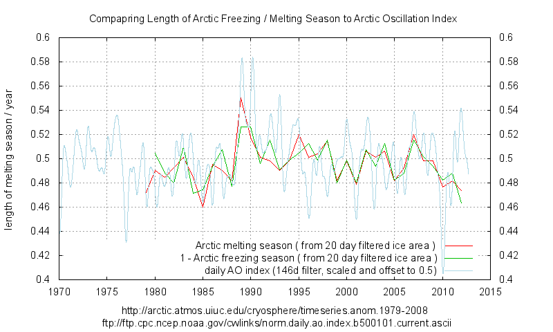
https://climategrog.wordpress.com/arctic_freeze_melting_daily_ao/
Yes winter temperatures are 5 to 8 degrees above normal. On the other side of the debate it’s still bloody cold @ur momisugly minus 30C
Winter temps are higher because of open water, not the other way around. This is the critical information that is key to understanding Arctic cycles.
+20
Javier
I have written two very detailed articles on arctic sea ice melt. The first from 1815 or earlier which lasted intermittently for Some 30 Years and the other the 1920 to 1940 period.
Both times the whalers and scientists talked about the warm winters and in particular the warm currents. In the case of the 1920’s warming the Antarctic also retreated substantially
Tonyb
Tonyb, have you got a link for the articles?
Wim rost
Here is part two
https://wattsupwiththat.com/2014/08/22/historic-variations-in-arctic-sea-ice-part-two/
Within it are links to numerous references.
Just google same title but part one for earlier article
Tonyb
Thanks!
Now tony trusts old sea records.
What are you saying Steven? They were sailing on ice?
Mosh
We have had this conversation before. As you well know I have referenced dozens of articles from scientists who were as famous in their day as Mann or even yourself
Tonyb
Better than trusting you
The named scientists cannot be squared with the models or theory so they must be fictional.
“Winds from Siberia reduce Arctic sea ice cover, Norwegian researchers find
Summary:
The ice cover in the Arctic has decreased dramatically in recent years. Norwegian researchers have discovered that changes in air circulation patterns create winds that push away the ice. The changed wind direction pushes large ice masses away from the Arctic and down along the eastern coast of Greenland. At the same time, less ice forms when the winds over the Arctic are determined by the pressure systems in northern Russia rather than those over the North Atlantic and the Pacific Ocean, as is normally the case”
https://www.sciencedaily.com/releases/2010/04/100427111449.htm
same old , same old-
“Accounts from 19th-century
Canadian Arctic Explorers’ Logs
Reflect Present Climate Conditions’
https://seagrant.uaf.edu/nosb/2005/resources/arctic-explorers.pdf
What people really ought to realise is that current Arctic sea ice levels are only a tiny amount down from the most extreme levels in 10,000 years.
And as shown above, the 1970’s were up there with those LIA extremes.
All this “anguish” and “panic” from the alarmista, is because of a natural recovery from those extreme levels.
Its really quite silly, childish, and reminiscent of the chicken-little story, once put into a longer term perspective.
but 10,000 years ago there was a profound melting driver on the arctic ice which is not in play today – the stage of the Milankovitch cycle then meant that the summer ice received vastly more insolation due to orbital inclination.
you can’t compare 10,000 years ago with now.
https://www.the-cryosphere.net/8/1419/2014/tc-8-1419-2014.pdf
“We find that during peak Eemian conditions, increased insolation contributes 20–50 % to the surface melt anomaly. “
Yet somehow mankind got through those extreme conditions. Go figure.
The polar bears made it too.whew dodged a bullet there
Yes I had not realized they had Polar Bear bones dating back 110,000 years and they managed to survive all the changes in Arctic Ice in that time. That sort of got ignored because it didn’t follow the narrative.
Griff,
You need not go back to the Holocene Climate Optimum, ie 5000 years ago, not 10,000, to find lower sea ice than now. The Minoan Warm Period 3000 years ago, the Roman Warm Period 2000 years ago, the Medieval Warm Period 1000 years ago and even the 1920s-40s had lower Arctic sea ice extent than now.
Nothing the least bit out of the norm is happening there now. Clearly CO2 has nothing whatsoever to do with it, since Antarctic ice grew during the 1979-14 interval, despite steadily rising CO2 levels.
The year 1979 had the highest Arctic sea ice of the past century. Its decline since then is entirely natural. There is no evidence supporting a man-made component, except maybe soot. Or, alternatively, cleaner air.
DENIAL of Arctic history is the only thing that keeps your mindless prattle going.
Eemian ?? WTF?? That was 120,000 year ago, bonehead. !
Ha! Priceless! In every Griff containing thread, there comes a point where someone utterly destroys him. Then he goes away for a few days. AndyG-you are today’s winner! Congratulations and thank you!
“because of a natural recovery from those extreme levels. ”
…the money quote
I must say I don’t care for those time-reversed x-axis charts.
Time is supposed to run left-to-right. Sorry, it just is.
We shouldn’t complain. Sometimes the Warmists use their charts upside down;)
Loss of arctic sea ice is a net negative feedback. It allows the relatively warm ocean to lose ~300 watts which is far more than the loss of albedo allows to be absorbed (water at low angles of incidence is quite reflective and the summers are quite cloudy).
Exactly! It is one part of a multi decade heat rejection cycle.
This isn’t sea ice, but it is significant – this season’s Greenland ice-sheet-surface-mass :
“Top: The total daily contribution to the surface mass balance from the entire ice sheet (blue line, Gt/day). Bottom: The accumulated surface mass balance from September 1st to now (blue line, Gt) and the season 2011-12 (red) which had very high summer melt in Greenland. For comparison, the mean curve from the period 1981-2010 is shown (dark grey). The same calendar day in each of the 30 years (in the period 1981-2010) will have its own value. These differences from year to year are illustrated by the light grey band. For each calendar day, however, the lowest and highest values of the 30 years have been left out”
Graphics shown at this link:
http://www.dmi.dk/en/groenland/maalinger/greenland-ice-sheet-surface-mass-budget/
This is the graph that I was trying to find:
http://polarportal.dk/fileadmin/polarportal/surface/SMB_curves_LA_EN_20170810.png
The longer term Greenland ice area is also instructive
Current levels are pretty much just below the peak of 8000 years …. Just like the Arctic sea ice.
AndyG55 August 11, 2017 at 3:27 pm
The longer term Greenland ice area is also instructive
Which is currently 1.7×10^12 m^2, well below the minimum shown on your graph!
From the OP:
2017 started its melt season with a very low value of sea ice extent (14.7 million sq. km), almost as low as 2006 (14.6), and has seen below normal melting so far, so it is likely to end with one of the lowest sea-ice extent losses of the entire series.
Based on NSIDC Chartic 2017 maxed at 14.42 a bit lower than 2006 (14.68) but not much different. However 2006 had a minimum of 5.774 on the 17th Sept whereas 2017 is already at 5.893 so will probably be below the 2006 minimum in a couple of days with about a month of the melting season to go. Even a low loss of 10 million sq km would give a minimum of 4.42, your linear fit would suggest a loss of ~11 and a minimum of 3.42. So that would imply a minimum between last year and 2007 and slightly lower than the all time record (2012).
Again, it needs to be stressed that tis is an entirely natural drop from levels in the late 1970’s that were similar to those during the LIA.
Its is a RECOVERY to more normal levels.
But with the AMO turning, and the sun having a snooze, I suspect we will see the extent to start to climb again over the next few years. A pity really, because the people up there could have used some respite from the freezing blockade of sea ice.