There has been a visceral reaction by the defenders of the climate faith to the Mail on Sunday article by David Rose…

…where the Karl et al. 2015 “pausebuster” was not just called into question by a NOAA whistleblower, who [says] procedures weren’t followed, and that the authors “played fast and loose with the figures”, but basically called fraudulent on the face of it because it appears to have been done for political gain. In my opinion the lead authors, Thomas Karl and Thomas Petersen both retired from NOAA in the last two years, made this their “last big push”, so they didn’t fear any retribution.
Having met both of these people, and seen their zealotry, none of the shenanigans brought out by the David Rose article surprised me.
The faithful have been claiming that there’s no difference between the NOAA and HadCRUT temperature datasets depicted in the Rose article, saying it’s a baseline error that gives the offset. I’ll give them that, and that may have simply been a mistake by the Mail on Sunday graphics department, I don’t know.

When the baselines for anomalies are matched, the offset goes away:

BUT….there’s other serious problems in global climate data.
Despite what you might think, NOAA and HadCRUT data are not entirely “independent”. They both use Global Historical Climate Network (GHCN) data, and the GHCN was administered by ….drum roll… Thomas Peterson of NOAA, one of the co-authors of the Karl et al. 2015 “pausebuster” paper.
It’s the fox guarding the henhouse, and as you can see below, the data is seriously shonky.
PAUL MATTHEWS writes at the website CliScep:
The purpose of this post is to confirm one detail of Bates’s complaint. The Mail article says that “The land temperature dataset used by the study was afflicted by devastating bugs in its software that rendered its findings ‘unstable’.” and later on in the article, “Moreover, the GHCN software was afflicted by serious bugs. They caused it to become so ‘unstable’ that every time the raw temperature readings were run through the computer, it gave different results.”
Bates is quite correct about this. I first noticed the instability of the GHCN (Global Historical Climatology Network) adjustment algorithm in 2012. Paul Homewood at his blog has been querying the adjustments for many years, particularly in Iceland, see here, here, here and here for example. Often, these adjustments cool the past to make warming appear greater than it is in the raw data. When looking at the adjustments made for Alice Springs in Australia, I noticed (see my comment in this post in 2012) that the adjustments made to past temperatures changed, often quite dramatically, every few weeks. I think Paul Homewood also commented on this himself somewhere at his blog. When we first observed these changes, we thought that perhaps the algorithm itself had been changed. But it became clear that the adjustments were changing so often, that this couldn’t be the case, and it was the algorithm itself that was unstable. In other words, when new data was added to the system every week or so and the algorithm was re-run, the resulting past temperatures came out quite differently each time.
Here is a graph that I produced at the time, using data that can be downloaded from the GHCN ftp site (the unadjusted and adjusted files are ghcnm.tavg.latest.qcu.tar.gz and ghcnm.tavg.latest.qca.tar.gz respectively) illustrating the instability of the adjustment algorithm:

The dark blue line shows the raw, unadjusted temperature record for Alice Springs. The green line shows the adjusted data as reported by GHCN in January 2012. You can see that the adjustments are quite small. The red line shows the adjusted temperature after being put the through the GHCN algorithm, as reported by GHCN in March 2012. In this case, past temperatures have been cooled by about 2 degrees. In May, the adjustment algorithm actually warmed the past, leading to adjusted past temperatures that were about three degrees warmer than what they had reported in March! Note that all the graphs converge together at the right hand end, since the adjustment algorithm starts from the present and works backwards. The divergence of the lines as they go back in time illustrates the instability.
There is a blog post by Peter O’Neill, Wanderings of a Marseille January 1978 temperature, according to GHCN-M, showing the same instability of the algorithm. He looks at adjusted temperatures in Marseille, that illustrate the same apparently random jumping around, although the amplitude of the instability is a bit lower than the Alice Springs case shown here. His post also shows that more recent versions of the GHCN code have not resolved the problem, as his graphs go up to 2016. You can find several similar posts at his blog.
There is a lot more to be said about the temperature adjustments, but I’ll keep this post fixed on this one point. The GHCN adjustment algorithm is unstable, as stated by Bates, and produces virtually meaningless adjusted past temperature data. The graphs shown here and by Peter O’Neill show this. No serious scientist should make use of such an unstable algorithm. Note that this spurious adjusted data is then used as the input for widely reported data sets such as GISTEMP. Even more absurdly, GISS carry out a further adjustment themselves on the already adjusted GHCN data. It is inconceivable that the climate scientists at GHCN and GISS are unaware of this serious problem with their methods.
Finally, I just downloaded the latest raw and adjusted temperature datasets from GHCN as of Feb 5 2017. Here are the plots for Alice Springs. There are no prizes for guessing which is raw and which is adjusted. You can see a very similar graph at GISS.

Full post: https://cliscep.com/2017/02/06/instability-of-ghcn-adjustment-algorithm/
I haven’t seen any reference to the US Committee on Science, Space and Technology response posted yesterday
https://science.house.gov/news/in-the-news/exposed-how-world-leaders-were-duped-investing-billions-over-manipulated-global
Okay the algorithm is unstable. So what? As Bates has pointed out “I learned that the computer used to process the software had suffered a complete failure.”
The computer that ran the unstable algorithm is no longer available to run the unstable algorithm. Problem solved.
/sarc off
In my world, data from properly calibrated instruments doesn’t have to be adjusted.
The kind of slapdash software adjustments described in this story make my guts roil.
commie BOB , Absolutely!
“Conclusion
High precision temperature measurement is possible through the use of well-specified and suitably calibrated sensors and instrumentation. However, the accuracy of these measurements will be meaningless unless the equipment and sensors are used correctly”
commieBob: What you don’t believe that the water temperature being measured by an Argo Buoy suddenly and magically jumped by 0.12C over the temperature that was actually measured?
There are very valid reasons for corrections. In a previous working life doing ballistics work we had a change in the type of pressure gauge specified. The change resulted in an alteration in the volume under the gauge. The change in volume altered the overall pressure in the system, so tests conducted with one type of gauge could not be directly compared to results from the second, later gauge type directly. To enable comparison of the standard product against new and old gauges a correction was determined and was systematically applied where needed (14.4MPa on our standard lot from memory). Both gauge types are fully calibrated, just that in application they will generate different results as they alter the test environment in slightly different ways. I don’t think the adjustments in the climate data fall into this type of adjustment or correction though as they are different on different days, not constant over the time series.
These don’t matter, its all a distraction.
Temps just follow dew point temperature, and if they included dew points, and did they same stuff to both data sets, it would still follow dew point temps. It’s 57 in Cleveland today because warm water vapor out of the Gulf of Mexico blew north instead of east.
Instead of 20 years of arguing about temperature series that don’t prove anything as used. Why doesn’t anyone study how co2 actually affect the day to day change in temperature response?
A nice analysis, here, by micro (Mike Crow);
(emphasis mine)
(Source: https://wattsupwiththat.com/2013/05/17/an-analysis-of-night-time-cooling-based-on-ncdc-station-record-data/ )
There was an American guy, many years ago who was plotting Temp Vs Humidity and Temp Vs Co2 for individual stations.
Humidity correlated CO2 did not.
I just wish I could remember the blog, I remember the post, it was on “Temp being a Random Walk” and it was Bart’s forum and the guy pushing the random walk I think was VS and I think the US guy might hav been Scott something. I will have to try and fing it tomorrow.
He was right. There’s a rel humidity regulation of night time cooling rates, cools really fast until it starts having to cool and condensed water vapor. And you can see the asymmetry in the spring vs the fall as the length of day is changing, longer nights have more time to radiate at the reduced rate.
Here, A. C. Osborn, are some clues for you (I looked it up in my handy, dandy, WUWT 10th Anniversary anthology 🙂 ):
in a comment:
from this thread:
Excerpt
(https://wattsupwiththat.com/2011/02/14/pielk-sr-on-the-30-year-random-walk-in-surface-temperature-record/ )
Note: lots of informative comments on that thread.
ANSWER: Because this does not conform to theory.
You mean do actual observations? … Well, this is just too uncomfortable. I’d have to leave my cozy computer lab and miss lunch at that new bar & grill — I hear they serve a mean burger over there. I burn easily too. Now where did I put that funding application?
Good point.nobody interested.
Theoretically if it was 280 ppm today it would be x degrees if it was 400 it would be x + r degrees under the same other weather conditions.
And it is not.
I nominate Karl for the Lois Lerner and John C. Beale Award in public dis-service. Do I get a concurrence from the FBI?
you got my vote +++
Isn’t the selection and agreement on a baseline important? I mean, if we are continuously told that climate doom kicks in once we are 2 degrees above the baseline, the baseline becomes obviously important. Adjusting that baseline can make it look closer or further from the arbitrary 2 degree mark. Also, are the datasets the same after the baselines are matched? It actually appears to me that NOAA shows more warming starting about 2010.
It is important NOT to post graphs with different baselines on the same chart without telling people that’s what you have done. That’s falsification.
Griff telling anyone what qualifies as falsification in science, classic irony.
The baseline business is an irrelevant distraction.
This graph clearly shows the result of the Karl et al. paper:
http://www.climate4you.com/images/NCDC%20GlobalMonthlyTempSince1979%20With37monthRunningAverage%20With201505reference.gif
“June 18, 2015: NCDC has introduced a number of rather large administrative changes to their sea surface temperature record. The overall result is to produce a record giving the impression of a continuous temperature increase, also in the 21st century. As the oceans cover about 71% of the entire surface of planet Earth, the effect of this administrative change is clearly seen in the NCDC record for global surface air temperature above” (climate4you).
The Karl et al. paper clearly states: “These results do not support the notion of a “slowdown” in the increase of global surface temperature”.
The controversy is about the how why and when surrounding this adjustment.
Posting graphs with only post 1978 dates is also misleading.
Please be sure to only post graphs that at a minimum include the Medieval Warming Period and the Little Ice Age.
Graphs that include all of the Holocene would of course be even more informative.
I’ve been wondering about that – if the ‘reference period’ is adjusted down, doesn’t the ‘anomaly’ go up, even if the actual temperature is unchanged?
All the baseline does is change the height above 0 by a consistent offset. If you plot it with 1950 – 1980 the numbers will all be larger than if you plot it with a 1980-2010 baseline. The shapes will be unaffected.
The shapes look vastly different if plotted over the entire Holocene.
One thing I find odd is that in a group with 8 co-writers, the data and code appears to have only been on one computer, which crashed.
To me that says that NONE of the co-writers actually checked the code or data… AMAZING!!
Oh well, their names are on the piece of anti-science crap now… that is their problem
It is of course supported by other data and as such shows the actual trend in climate.
Oh, of course, Grff.
Climate trend?
Er, since when did ‘climate’ become ‘temperature’ (and vice-versa)?
And since when did a (computer generated) ‘adjustment’ give us a better idea of what ‘actually’ happened in the past?
Virtual fantasy.
Prove your assertions Griff. You aren’t a working scientist. You don’t know what it is to have to debunk fraudulent science to children. I’m one of the scientists who helped establish that Cannabis isn’t related to opiates in medicine. Do you like the government claiming that marijuana is like heroin, telling your child, that heroin and marijuana are about the same, because the scientists of the federal government say so?
No you wouldn’t, that’s fraud. You can not explain away all the fraud: from the Hansen computer programs that don’t have the laws of thermodynamics for the atmosphere in them, to the Mann computer programs that turned out to be nothing more nor less than thousands of lines of Fortran: to manufacture hockey sticks: to the Phil Jones computer programs he was found fraudulently patching together around “Mike’s nature trick” or Phil Briffa’s fraudulent tree dating, using TINY numbers of the WRONG trees to claim the entire history of the world is different.
You can’t explain how no one who claims to believe the fraud, can even discuss basic atmopsherics. You can’t explain how it is you’re so sure it’s right but you don’t know the name of the law to find out the temperature of some air; or why the atmospheric mix, and gases, and vapors even have their own law of thermodynamics to solve their matter/energy relationships.
What is the name of that law Griff?
Why does atmospheric mix and gas, and vapor phase of matter have it’s own law of thermodynamics to solve it’s relationships Griff?
You see how swiftly anybody with any atmospheric specialization at all can check whether you’re just another fraud, like all the other frauds, who came down the pike claiming they were going to unleash an army of bloggers who would rule the world with stupid, and transform science? They did transform it: you helped. Climate science and any of you associated with it are the laughingstocks of the entire earth.
That is correct. After adjustments, all data agree with the models.
Define Climate for us Griff.
Just hang around. Cowtans last major paper used a multiplication by 3 instead of dividing by 3 yet sailed through pal review. I’ll warrant there is a similar massive cock-up in this so-called verification paper. BEST(worst) has blotted its copybook more than once and Hausfather & Cowtan are far from either independent or unbiased. In any event you cannot verify any process that is so demonstrably flawed so Hausfathers effort stands alone now – ready for a climate audit I suspect.
Meanwhile here
https://judithcurry.com/2017/02/06/response-to-critiques-climate-scientists-versus-climate-data/
Bates eviscerates Peter Thorne’s made-up nonsense that you were earlier linking too. Apparently Thorne wasn’t even there at the time!
estimated trend, Griff.
Congrats Griff, that is the most worthless comment you have ever made. I could not have demonstrated your complete ignorance on the subject any better.
Sheesh, we are not talking about an experiment or a theory here. We are talking about the production of a data set intended to be used by other scientists and decision makers around the globe. This is a task that must be done according to a process that includes peer review of ALL changes, proper QC, proper code and data management (CM), etc. Right now it is just a slap dash operation as if they are only using it among themselves, which is undoubtedly how it started.
Time for the professionals (in data management) to step in. This leaves you out Griff as you have no clue what I’m talking about.
The actual trend is that we are now nearing the end of the Holocene.
Andy, that is not uncommon in some operations. When Ms. Griff and collaborators bake a chicken, it’s also being done in just one oven.
Andy the whole nonsense about the original data being lost and the computer braking is just that, nonsense. Almost everyone has enough experience to know computers get backed up, most especially computers used professionally. Most people backup their personal computers even.
And the computer breaking? Is there some reason to think this computer was a one off purpose built machine that has no design documents to go with it? Really? No, that’s absurd. If the computer broke it can be replaced.
It’s just a refusal to produce the requested material and the people responsible need to be held in contempt.
So it seems that Hadley just copies NOAA while we already knew NASA copies NOAA and just adds made-up ‘hot’ data for the Arctic. But these are all described by the zealots as independent. In reality there really is therefore just one official land-based dataset which we now know to be seriously screwed up. Whats left are the 3 satellite, 2 radiosonde and Argo buoy datasets that all agree with each other plus an outlier Berkeley amateur effort which also uses made-up ‘hot’ data in the Arctic and has no data at all for 80% of the planet.
Exactly right, JasG. All the surface temperature data is contaminated and is certainly unfit to use to make public policy.
“Fake but accurate” – Dan Rather.
Chuckle.
A lie that tells the Truth!
time after time the warmists have been shown lying and falsifying data.
the media and western educational system promotes the scam. basically iti s an ideological war against conservatives and free market capitalism.
at least some of the truth is getting exposed.
I think I know exactly why the algorithm is unstable. All of the symptoms make it look like they have implemented it using floating point arithmetic. The floating point rounding errors accumulate the longer running the calculation. This leads to the largest adjustments being made at the end of the run. They start from from the most recent date and run to the oldest meaning that the largest adjustments happen to the oldest data!
/ikh
+1 — I think you might be right!
And, of COURSE they did not intend that. They, uh, ….. they just….. just got their start and end point mixed up. 🙂
It would be more accurate to say that this is a reason the models never give the same result twice. I was going to say the right result, but that is far more fundamental – treating the Earth like an onion, instead of a complex set of heat pumps pushing warm and cold air/water, as it is known to be.
The reason the data munger keeps giving different answers is because , well what else would you expect if you give PhDs in climatology tasks more suited to people that know how to program computers.
A major adjustment that never gets inspected: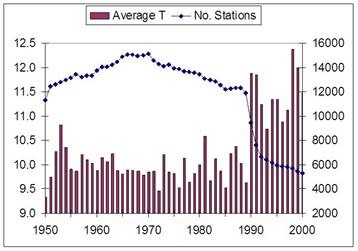
I reported this on TV a few years ago with the men who did the study:
And here is the answer from NOAA
http://www.yaleclimateconnections.org/2010/01/kusi-noaa-nasa/
“In addition, the accuracy of the surface temperature record can be independently validated against satellite records”
Ironic.
“And here is the answer from NOAA”;
‘Extraordinary Claims’ in KUSI Broadcast On NOAA, NASA … but ‘Extraordinary Evidence’?’
Did you really make the “extraordinary” claim that not ALL people with degrees in scientific subjects are incorruptible, Mr. Coleman? The nerve . . ; )
Hmmm…
Thirty-three percent hotter hotter with one third as many stations.
When the stations get down to single digits, we’ll all boil!
It seems to me that the people responsible for this should be on the witness stand testifying under oath with penalty of perjury.
No, the people responsible should be in the dock, defending their crimes.
Ik like this bit from the answer:
“If stations had intentionally been dropped to maximize the warming trend, one would expect to see more divergence between surface and satellite records over time as the number of stations used by GHCN decreases. However, a close examination of the residuals when satellite records are subtracted from surface station records shows no significant divergence over time compared to either UAH or RSS.”
http://www.yaleclimateconnections.org/pics/0110_Figure-42_tmb.jpg
Till 2010 satelite temperatures were in line with surface temperatures.
What happened then?
That was for John Coleman.
There is no doubts that this development at NOAA is the start of a line of whistleblowers who will come out of the woodwork as the rats leave the sinking global warming ship. Whilst Bates seems motivated by genuine concern others will be motivated by self preservation. As the fraud charges begin to flow watch the number of individuals who will happily provide evidence to save their own skin. The extent and magnitude of the scandal will be there for all to see and even the MSM will not be able to ignore it which they are continuing to try to do.
The carnival is over!
Poor Griff, all alone today on this issue. An unarmed man at a battle of wits!
So true. But you have to give him credit for stepping into the lions den. Or maybe not, since that’s a pretty stupid thing to do if you are unarmed.
Griff, has been a lot worse at Tony Heller’s,blog where several people have a field day tearing apart her kindergarten grade replies:
https://realclimatescience.com/2017/02/large-increase-in-multi-year-ice-over-the-past-decade/#comments
Seems to me that a possibility exists that the climate in Alice Springs was a bit different then,that a shift in an ocean current may have occurred sometime in the last century.
One must always challenge assumptions.
You do realize that Alice Springs is basically in the middle of continental Australia don’t you? i.e in the middle of a desert? or did you forget the /sarc?.
Dr. John Bates works to enhance the quality and storage of climate data. He is a better scientist than I am, for I have tried to work with quality and storage, but failed, miserably at times.
In the present blog context of adjustments to some Australian and global temperature data, I here present two working graphs from the towns of Darwin and Alice Springs in the Northern Territory. Others on this blog have presented related graphs that can be compared. BTW, I have stayed in both towns many times since 1960 and am familiar with some relevant history and geography.
The graphs I show are genuine and composed from what was available from a routine search at past times – Nov 2010 for Darwin, Jan 2014 for the Alice. They have lost their metadata in a subsequent disc crash. My apologies.
The explanations for the title blocks are, first for Alice Springs –
BOM CD ca 1993. A colleague purchased from the BOM a full set of station data as it existed for public use in 1993 or close to then.
BOM ONLINE. This is Computer Data Online from the BOM web site http://www.bom.gov.au/climate/data/ This searchable site has been stable and essentially unaltered data since I first viewed it about 2007.
BOM CD 2007 et seq from CDO BOM sold a product, a CD with over 1,000 Australian and Antarctic stations, with the CD record ending March 2007. Daily data with max and min temperatures, considered to be raw through matching with original observer handwritten library records.
NASA GISS HOMOGENISED I cannot recall more detail than this. I would have searched easy key words and graphed what seemed to be the dominant search result. I have lost the version number.
KNMI GHCN ver 2 ADJUSTED. Again, much as it says.
And for Darwin, as above or self-explanatory except for Butterworth, which I recall digitising by hand from a printed graph. See Butterworth I (1993) On the inhomogeneity of climatic temperature records at Darwin. Bureau of Meteorology, Northern Territory Regional Office Research Papers 2:107–110
http://www.geoffstuff.com/spaghetti_darwin.jpg
http://www.geoffstuff.com/spaghetti_alice.jpg
These graphs are shown as examples of the variability of the temperature record over time, but also according to the compiler body. While more comment is available if requested, I simply show these and mention the obvious difficulty for anyone to derive a reliable, low error, summary time series good enough to be the primary standard for these 2 towns into the future.
Remember as well the pair matching procedures that have used pairs up to 1,200 km apart. There are few reliable records 1,200 km from each of these towns, which are themselves 1,200 km apart. The temperature history of Australia relies heavily on the data from these 2 places and to the extent that Australia has most SH records, so does the global mean surface temperature.
Geoff
There are two historic temperature sources that can be added to the existing data that shows the GISS interpretation of Alice Springs is without foundation.
One is Meteorological Data for Certain Australian Locations published in 1933 by the CSIR (http://www.waclimate.net/csir.pdf), which gives monthly averages 1874-1931, and the other is Australia’s 1953 Year Book which provides monthly averages during 1911-40 (http://www.bom.gov.au/jsp/ncc/cdio/weatherData/av?p_display_type=dailyDataFile&p_nccObsCode=122&p_stn_num=015540&p_c=-48294455&p_startYear=1953).
The CSIR and Year Book temperatures are probably totally unadjusted but any changes were made by people who’d never heard of CO2 and global warming. GISS, of course, can also be compared to the BoM’s unadjusted RAW and adjusted ACORN datasets.
http://www.waclimate.net/imgs/alice-springs-giss.gif
CSIR and Year Book verify the bureau’s raw temps. The question of thermometer shelters is convoluted. The ACORN station catalogue (http://www.bom.gov.au/climate/change/acorn-sat/documents/ACORN-SAT-Station-Catalogue-2012-WEB.pdf) states:
“There is no known documentation of the screen type at the Telegraph Station but the observations are consistent with a Stevenson screen having been used there. The site was enclosed by a rock wall about 1m high and painted white that would have interrupted wind flow and reflected heat. Observations moved to the Post Office on 23 January 1932. The Post Office site continued until 1953 but data after 1944 were not used in ACORN-SAT as there appear to have been changes at the Post Office site around the time that the airport site opened.”
Alice Springs in 2010-16 had an ACORN mean of 21.1C, so temps over the past seven years have increased either 0.2C since 1874-1931 according to CSIR and BoM RAW, or 3.1C according to GISS.
If you prefer a probable Stevenson in 1911-40, the Alice Springs mean has increased 0.5C to 2010-16 according to the Year Book and BoM RAW (the YB/RAW 1911-40 vs 2010-16 comparison is actually 20.63 vs 21.06C, so the unadjusted increase was 0.43C), 1.0C according to ACORN, or 2.8C according to GISS.
If the 1m high white wall is considered an artificial factor, note that Darwin to the north was 28.23C in 1882-1931 and 28.07C in 1911-40, a 0.16C cooling that suggests a climate influence (Camooweal 1907-31: 25.06C, 1911-40: 24.95C – 0.11C cooler / Boulia 1889-1931: 24.29C, 1911-40: 24.18C – 0.11C cooler).
Multiple unadjusted sources suggest between 0.2C to 0.5C warming over the past century at Alice Springs. The BoM’s ACORN experts have warmed it by 1.0C, yet GISS has found other unknown reasons to warm it by 2.8C. It might be assumed that Australia’s experts have overlooked 1.8C worth of artificial influence, according to their international compatriots.
It’s noteworthy that the Alice Springs Post Office and Airport had a 12 year overlap 1942-53 during which the PO had a raw mean temperature of 20.41C and the airport had a mean of 20.45C.
Its southern hemisphere isolation makes Alice Springs a very influential site and all the records suggest it’s probably had no natural temperature change, yet adjustments have warmed it from 1.0C to to 3.1C.
Waclimate,
Spot on.
Why are authorities so quiet about the CSIR and Year Book results?
The Global Homogenised Climatology Network or the Global Hysterical Climatology Network, I’m not sure which at present. Where’s Griff when you really need him to clarify these minor errata?
That’s sure telling em!
http://www.xyz.net.au/dear-climate-alarmists-will-never-forget-forgive/
(hat tip JoNova)
From the article: ” Note that this spurious adjusted data is then used as the input for widely reported data sets such as GISTEMP. Even more absurdly, GISS carry out a further adjustment themselves on the already adjusted GHCN data. It is inconceivable that the climate scientists at GHCN and GISS are unaware of this serious problem with their methods.”
That’s right it *is* inconceivable that these scientists were unaware of this problem. This “problem” allowed them to deliberatly lie to the world about the surface temperatures and help promote their human-caused climate change agenda.
Anyone who is paying good money for this contaminted data ought to be suing to get their money back.
The data NOAA/NASA data manipulators have been caught out. I saw a report about it on Fox News this morning, and there were Senate hearing on the EPA administrator, where this subject was broached. This isn’t going away.