Playing around with my hometown data, I was horrified when I found what NASA had done to it. Even producing GISTEMP Ver 2 was counterfactual.

Guest essay by Philip Lloyd
The raw data that is fed to NASA in order to develop the global temperature series is subjected to “homogenization” to ensure that it does not suffer from such things as the changes in the method of measuring the mean temperature, or changes in readings because of changes in location. However, while the process is supposed to be supported by metadata – i.e. the homogenizers are supposed to provide the basis for any modification of the raw data.
For example, the raw data for my home city, Cape Town, goes back to 1880:

http://data.giss.nasa.gov/tmp/gistemp/STATIONS/tmp_141688160000_0_0/station.txt
The warmest years were in the 1930’s, as they were in many other parts of the globe. There was then a fairly steep decline into the 1970’s before the temperature recovered to today’s levels, close to the hottest years of the 1930’s.
In NASA’s hands, the data pre-1909 was discarded; the 1910 to 1939 data was adjusted downwards by 1.1deg C; the 1940 to 1959 data was adjusted downwards by about 0.8 deg C on average; the 1969 to 1995 data was adjusted upwards by about 0.2 deg C, with the end result that GISS Ver 2 was:-

Being curious, I asked for the metadata. Eventually I got a single line, most of which was obvious, latitude, longitude, height above mean sea level, followed by four or five alphanumerics. This was no basis for the “adjustments” to the raw data.
Which should I believe? The raw data showed a marked drop from the 1940’s to the 1970’s, which echoed similar drops elsewhere. Time magazine covers showed the 1970’s were indeed cold.


The raw data is probably accurate. The homogenized data is certainly not. It is difficult to avoid the conclusion that “homogenization” means “revise the story line” and “anthropogenic global warming” really means “humans changed the figures”.
Prof Philip Lloyd, Energy Institute, CPUT, SARETEC, Sacks Circle, Bellville
Discover more from Watts Up With That?
Subscribe to get the latest posts sent to your email.
Nick Stokes January 29, 2017 at 3:12 am
Nick, sometimes you are so right, and other time … that is not “Berkeley’s plot of temperatures nearby relative to Cape Town”. LOOK AT THE Y AXIS LABEL. It is a plot of the NUMBER of stations within a certain distance. As a result, all of your lovely conclusions about the plot and about Cape Town based on the plot are … well …
Priceless.
w.
Willis,
Yes, indeed, you are right and I misread the diagram.
Willis,
I have now found that the old Cape town station, CSIR, that moved to the airport, also continued on as a separate GHCN station. So we can do direct comparison of changed and continued. It’s in my reply to Phili[ below.
Thanks, Nick, I saw that. Nice piece of detective work.
w.
Errare humanum est 🙂
The data manipulation goes way beyond just the temperature data. They manipulate the peer review process, they only give the public 1/2 the information, and they adjust their data to “hide the decline” so their models give them the answers that they want.
Climate “Science” on Trial; Data Chiropractioners “Adjust” Data
https://co2islife.wordpress.com/2017/01/29/climate-science-on-trial-data-chiropractioners-manipulate-data/
I have in an Excel spreadsheet the record highs and lows reported for my little spot on the globe from 2002, 2009, 2012 (twice) and a more recent ones. The numbers have been changed, some as much as 5 degrees F.
After all the manipulations, I think it’s safe to say that we don’t really KNOW for sure what the past temperature of the globe has been. At best we have educated guesses (along with a few political assertions).
Bet a few trillion in a game where a few cards are missing from the deck?
From NOAA temperature station maintenance teams:
Ocean temperature measuring devices, buoys, ARGO, JASON, etc. are similarly affected, only by different organisms; e.g. algae, barnacles, mollusks, bird droppings, etc.
Each time the instrument used is changed introduces error.
The size of the error is unknown unless there were side by side exacting measurements for several cycles (years). Crude changes to high/low temperatures are equivalent to fresh manure of the foulest origins
Each time a temperature instrument is changed, that is the end of temperature measurement for the previous instrument and the beginning of a new temperature measurement series from the new instrument.
As mentioned in other articles, splicing is improper.
Showing the various temperature series on the same graph is possible so long as each end/begin is clearly demarked.
Each time a temperature station is infested/inhabited by any creatures, that contaminates the temperature record.
Whether it is wasps/bees cooling and warming their nests or chipmunk squatters, the temperatures taken during the infestation are contaminated. There is no possible adjustment!
Wasps/bees cool their nests during the day by helping the structure ventilate and then turn around to warm the nest at night, by vibrating/buzzing to generate warmth.
This brings up the classic comment, “good enough for government work”. But seriously suspect for declaring anomalies/records by fractions of a degree.
Siting temperature stations in poor locations or allowing the local land use to change again, seriously compromises temperature records.
Stations record day/night differences anywhere from a few degrees to over thirty Fahrenheit degrees on any day.
Changes in land use affect these daily and seasonal fluctuations; and as people notice in their car thermometers, UHI can change measured temperatures by multiple degrees.
Adjustments must be based on long term dual measurements tracking the changes by minutes. Again over multiple full cycles.
Our previous discussions, involving Engineers and discussing how error rates are properly carried forward from initial measurement through presentation, included a number of other issues. But reached the same conclusions.
Spliced records are improper and usually invalid.
Adjustments to records should never be performed without full disclosure of all adjustments and reasons for every adjustment. Showing the historical record and then following with a graph of the proposed adjustments is best, so that analysts understand the full impact.
In the real world, changing or adjusting data is wrong and often illegal. When the bank makes an adjustment, they have all metadata, every record and reason for every adjustment. Even then, adjustments are clearly marked in any charts.
When architects design a structure, but the owner or contractors involved decide to change numbers so they can utilize ‘shortcuts’; when discovered, charges and/or fines are applied.
When structures are repeatedly invaded by pests, it is time to devise as impregnable a structure as possible; or perhaps completely revise how temperature is measured.
Strategy “search and destroy”:
“Being curious, I asked for the metadata. Eventually I got a single line, most of which was obvious, latitude, longitude, height above mean sea level, followed by four or five alphanumerics. This was no basis for the “adjustments” to the raw data.”
__________________________________________
Escalates any following ‘civilized’ debate.
Here we can see that 2016 wasn’t everywhere the hottest evah:
http://ds.data.jma.go.jp/tcc/tcc/products/gwp/temp/fig/dec_wld.png
But yes it’s true, we must take that with some caution: the JMA is known to be highly underrepresented in the Arctic regions.
Exactly where even UAH6.0 shows, in its 2.5° grid data, a warming trend of over 4 °C / century, namely in the latitudes 80N – 82.5N.
Anyway, it’s nevertheless nice to read that not all people tell you the same refrain.
Here we can see that 2016 wasn’t everywhere the hottest evah
That’s the month of December. JMA ranks 2016 as the warmest calendar year.
http://ds.data.jma.go.jp/tcc/tcc/products/gwp/temp/fig/an_wld.png
http://ds.data.jma.go.jp/tcc/tcc/products/gwp/temp/ann_wld.html
This time you’re right barry! I clicked on the wrong line in the browser’s history.
Thank you.
That could be a reason for a ‘full stop now’ to any further data access by members of the former Obama administration
until the data is shaped into a reasonable form
of the original data till now.
Thank you, Nick Stokes and others for providing the missing metadata. It, however, does not provide a very satisfactory explanation for changing the raw temperature data. Nick’s Berkeley Earth glitch lets me draw attention to the fact that several other stations along the South African coast saw a marked drop in temperatures over the 1950 – 1980 period. Being coastal, I would have expected an oceanic impact to moderate any nearby land temperature shift.
I am interested that more did not comment on the cooling. There had to be some reason for the Time covers. There is an excellent explanation of this hiding the decline over at Climate Depot http://www.climatedepot.com/2016/09/13/83-consensus-285-papers-from-1960s-80s-reveal-robust-global-cooling-scientific-consensus/. Then the northern hemisphere land temperature drop was reported in the literature at around -0.4 deg C over 30 years. It doesn’t seem to be in modern records.
specifically the last 30 years, 27 stations NH and 27 stations SH [balanced to zero latitude]
my data show NH warming by about 0.026K/annum whilst in the SH it is 0.0014K/annum
IOW the warming is basically nothing in the SH
giving me an overall average of about of 0.013K/annum, globally, the past 30 years,
which btw is close to what UAH and RSS is reporting.
\
my problem was
how to explain the difference?
bw
Henry
Thank you, Nick Stokes and others for providing the missing metadata. It, however, does not provide a very satisfactory explanation for changing the raw temperature data. Nick’s Berkeley Earth glitch lets me draw attention to the fact that several other stations along the South African coast indeed saw a marked drop in temperatures over the 1950 – 1980 period. Being coastal, I would have expected an oceanic impact to moderate any nearby land temperature shift.
I am interested that more did not comment on the cooling. There had to be some reason for the Time covers. There is an excellent explanation of this hiding of the decline over at Climate Depot http://www.climatedepot.com/2016/09/13/83-consensus-285-papers-from-1960s-80s-reveal-robust-global-cooling-scientific-consensus/. In the early 1980’s the northern hemisphere land temperature drop was reported in the literature at around -0.4 deg C over 30 years. It doesn’t seem to be in modern records.
I regret the link to the data no longer works. The link changed twice while I was playing with the data. Could it be a policy to do so, to frustrate those asking simple questions?
” Nick’s Berkeley Earth glitch lets me draw attention to the fact that several other stations along the South African coast indeed saw a marked drop in temperatures”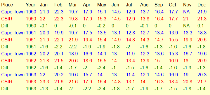

Well, they didn’t show that 1960 drop. Here is the Berkeley plot I should have shown. It shows the sharp 1960 drop relative to neighbors. That is what the homogenization saw as a non-climate change that needed correcting, and it did match the timing of the move to the new airport.
But I can now wrap this one up. The Cape Town station was formerly known as CAPE TOWN-SAAO:CSIR. In January 1961 it moved to Cape Town airport. The NOAA sheet is here. But the CSIR station continued as a separate GHCN station, with an 002 appended (to show it was related). Its sheet is here. It has a small overlapping record. Here is a table, from unadjusted GHCN V3 data, of the ongoing Cape Town record as shown in the head post, and the CSIR record, which is the continuation of the old station – ie CT before 1961. You can see that the records are virtually identical in 1960, but CT drops by 1.6 in 1961 and stays about that level.
Here is a graph, continuing to about 1975. You can see why the algorithm adjusted pre-1961 figures down by about 1.2°C.
Sorry, I didn’t show the Berkeley plot I said I would. It is here. But I think it is superseded by finding the old station continued.
Oops
Given that the station move to the airport in 1961 was supposedly made inland, the sharp DOWNWARD adjustment of earlier temperatures in GHCN3 doesn’t make any physical sense. All of the Matroosfontein district is still within the sea-breeze regime, despite some sheltering by Table Mountain. If anything, one should expect HIGHER temperatures at the airport than at the coast.
1sky1
” If anything, one should expect HIGHER temperatures”
Then one would be disappointed. What I have shown in the table are the actual measured, unadjusted temperatures. The airport is measured to be cooler than the Observatory.
What’s truly disappointing is the cavalier disregard of physical basics in interpreting field data by blind number crunchers. That “the airport is measured to be cooler than the Observatory,” which is ~4km closer to the coast, should alert one that something other than climatic factors are at play. To geophysicists somewhat familiar with Cape Town, the reason for this is quite apparent: the Observatory is also that much closer–in fact, adjacent–to the urban center of a city that had grown enormously prior to the 1961 opening of the new airport. The “homogenization” of the airport record to conform to that of the UHI-corrupted Observatory is a poster child of how a bogus trend gets baked in by geophysical amateurs while manufacturing ostensibly “better” up-to-date station records.
1sky1
“The “homogenization” of the airport record to conform to that of the UHI-corrupted Observatory”
The airport record is not modified to conform; the observatory part of the record is realigned to match the airport near 1960.
I have plotted together here all the temperature records – CT combined (as shown in head post, pink), CT adjusted (green), and the observatory record as it is given from 1960 (blue). It is annual average data. The continuous record at the Observatory is seen by following the pink to 1960, then the blue. Since 1900, at least, the Observatory record runs parallel to the CT adjusted. The offset does not affect any climate analysis, since the first step is to subtract a mean to get anomalies.
This is sheer semantic casuistry! Since there was no record at the airport prior to 1961, the realignment of the UHI-corrupted observatory record prior to that date to match the cooler airport temperatures constitutes a major modification of the 20th century record for Cape Town.
In the absence of strong UHI at the Observatory, the in corpore realignment near 1960 splice would have been in the OPPOSITE direction, obviously affecting the 20th century trend at Cape Town. As it stands, even the mean required to obtain anomalies is corrupted by such blind “realignment.”
“In the absence of strong UHI at the Observatory, the in corpore realignment near 1960 splice would have been in the OPPOSITE direction”
That is your opinion. But the duty of the various people here does not include injecting such opinions. It is the duty of the people reporting measurements to simply do so, and not opine about UHI. Then the people homogenising, seeing a clear inhomogeneity, have to allow for it. There is no choice.
Then comes the question of UHI. GISS does allow for that. Here is their station plot for Observatory post-1960:
As you see, they raise past values – ie lower the trend. It would be good to see what they did before 1960, but there is a surprise. GISS only gives UHI adjusted (which is what they then use) back to 1942. Since they have GHCN adjusted back to 1857 or so, that means that they are discarding the old part because they could not do a UHI adjustment, presumably for lack of stations to compare.
So to get back to the topic of this thread, that is why homogenisation did what it did. There was a clear break, with cause.
HADCRUT took the alternative approach. They treated the Observatory record as one entity, and the airport as a new record starting in 1961. The effect is much the same.
The characterization of well-established geophysical expectations in the coastal zone as mere personal “opinion” speaks volumes. By-products of such willful ignorance on the part of “people homogenising” are yearly Cape Town temperatures incredibly down in the low 14s Celsius during the earliest part of the putative record and the equivocation of the downward slope of temperatures during the 1960s.
The production of bogus trends by people who have scant concept of temperature variability in situ and mistakenly think that simple offsets are adequate compensation for UHI is commonplace throughout GHCN 3. The truly sad part of that venture into pseudo-science is that far-more-skillful combinations of neighboring records into long continuous series, such as done by the South African Weather Service (see GHCN Ver2: https://data.giss.nasa.gov/cgi-bin/gistemp/show_station.cgi?id=141688160000&dt=1&ds=1) are discarded in favor of fragmented fictions that support the AGW narrative in the minds of climatological amateurs.
Philip Lloyd January 29, 2017 at 6:27 pm
I am interested that more did not comment on the cooling. There had to be some reason for the Time covers.
The one with the penguin on it was about Global warming and dates from 2007, the fake version you showed is apparently a photoshopped version of that one.
Yes, others have drawn my attention to misinterpretation of both quoted covers. I used them for illustrative purposes without checking their provenance. They were to draw attention to the widespread documentation of global cooling between 1950 and 1980, a cooling that was recorded in the raw data and is no longer apparent in the homogenized version. I do not believe the error to be material.
Philip Lloyd on January 30, 2017 at 12:47 pm
They were to draw attention to the widespread documentation of global cooling between 1950 and 1980, a cooling that was recorded in the raw data and is no longer apparent in the homogenized version.
A widespread mistake. There is no global cooling documented by GISS between 1950 and 1980, even not in the 2011 archive. The cooling period was between 1940 and 1975, as is represented by WFT
http://fs5.directupload.net/images/170130/n9xwi9f2.png
and calculated by Cowtan’s trend calculator:
1940-1975: -0.023 ± 0.045 °C / decade (2σ)
1950-1980:+0.046 ± 0.056 °C / decade (2σ)
” I do not believe the error to be material.”
But neither had anything to do with the alleged cooling. If you had a point to make, how can this not be material.
The Old Capetown Station continues to have a record.
What happened in that GHCN made the mistake in their adjustment.
There are two stations in the GHCN database.
The original station Capetown WMO identifier 68816
http://climexp.knmi.nl/data/ta68816.png
And the new airport station Cape_Town WMO identifier 68816.2
http://climexp.knmi.nl/data/ta68816.2.png
It is the NCDC and Nick who have made the mistake here. The adjustment should be reversed.
Bill Illis,
“And the new airport station Cape_Town WMO identifier 68816.2”
No, it is your mistake, as clearly shown on your second graph. The identifier SAAO:CSIR means South African Astronomical Observatory (located in Observatory, Cape Town), and CSIR is the organisation which ran the station. That is not the airport. Another clue is that the second, observatory record ends in 2002, while the top one goes to present. Here is December’s CLIMAT form, marked DF Malan, the old name for the airport.
I have been reading WUWT for many years but never knew Mr Watts was once a Capey. Me too. Excellent blog Mr Watts, keep it up.
I have a suggestion for assessing the quality of the century plus temperature records from around the world. Capetown’s record looks pretty much like USA’s, Greenland ‘s, Iceland’s, Siberia’ s Paraguay’s,….. in terms of the thirties being hottest, a notable decline between 1945-1975, and many other details of the up’s and downs of these records. These widely spaced similarities are powerful support for the raw records as useful data for assessing the state of the global climate.
If global warming is going to be significant, then the raw data of even a handful of such scattered records is early warning enough. Let’s say that when the the raw temperature record in the future surpasses those of the 1930s temperatures at 50% of these scattered global sites by 1C, then we will be on “first” alert. Until then give this issue a well deserved rest. Similarly If the sea could rise a metre or more in a century, stop rushing down to the shore with a micrometer gage!!
Ferdinand
to quote from your quote
On a global scale, therefore, the magnitude of the effect of biological drawdown on surface water pCO is similar in magnitude to the effect of temperature, but the two effects are often compensating. Accordingly, the distribution of pCO in surface waters in space and time, and therefore the oceanic uptake and release of CO , is governed by a balance between the changes in seawater temperature, net biological utilization of CO and the upwelling flux of subsurface waters rich in CO.
sic [there is an important word missing, ‘differs’, and CO2 not CO? ]
Henry says
I figure that all of what you say is theoretical, not empirical,
iow
show me your data,
man, method, machine, sampling procedure and all that jazz?
show me in your closed vessel how 70 ppms of CO2 difference above the water makes any difference to any parameter measured in the water of your vessel??
ooohh
you did not do the test?
I am so sorry
this comment should have been posted on a different blogpost
[getting old and confused…]
guys

@Bindidon and them
you cannot really compare data from before 1970 with those after 1970. It is like comparing apples with pears.
Since 1970 we have seen the introduction of thermocouples and continuous recorders with measurements taken every second or minute. Before that time we had wind up recorders that measured T and RH and had to be filled with ink…
Before the 1950’s they did not even re-calibrate the thermometers used. In those days they had to rely on people taking a measurement 4 x a day…..
Do you honestly want me to believe that before 1970 is the same as after 1970?
Hence looking from 1976
there has been no warming here in South Africa, whatsoever,
The average warming in the SH has been zero since 1976, if you are prepared to believe my results.
Thanks for putting together this informative data.
Interesting how the “Big Chill” cover is not about global warming and the “Surviving the Coming ice Age” is a fake, but despite this being pointed out my several commenters it has not been corrected.
The author, Philip LLoyd, has been made aware of these errors and has responded, but he apparently doesn’t feel the need to ask for a correction either.
One might raw the conclusion that these covers are just “alternative facts” and that real facts have no place here.