Homogenization of Temperature Data By the Bureau of Meteorology

Guest essay by Brendan Godwin

Background

I worked for Australia’s Bureau of Meteorology – BOM for 2 years from 1973 to 1975. I was trained in weather observation and general meteorology. I spent 1 year observing Australia’s weather and 1 year observing the weather at Australia’s Antarctic station at Mawson.

As part of it’s Antarctic program, Australia drills ice cores at Law Dome near it’s Casey station. On our return journey in 1975 we repatriated a large number of ice cores for scientific analysis. The globe’s weather and climate records are stored in these ice cores for the past 1 million years approximately.

Australia’s Antarctic program went by the name of Australian National Antarctic Research Expedition or ANARE for short. This is now known as Australian Antarctic Division or AAD. Returned expeditions formed a club called the ANARE Club of which I have been a member since 1975. Members have many functions and reunions and they have a reunion dinner every year. At this dinner there has always been guest speakers from Australia’s Antarctic Division. These guest speakers are usually someone of the caliber of the Divisions Chief Scientist or the Operations Manager and the talks are designed to keep members updated on the Antarctic scientific program.

The annual dinner is also a place where members keep in touch with each other and network and this communication continues throughout the year via email.

The International Panel on Climate Change – IPCC

The IPCC was created by and is a joint 50/50 partnership between the World Meteorological Organisation – WMO and United Nations Environment Programme (UNEP). It has extremely narrow terms of reference in that it’s role is to determine that humans are causing global warming. In that regard it is only looking at human induced forcings over the past 150 years, just to make sure it reaches that result. That makes it a political body with a political agenda.

World Meteorological Organisation – WMO

The WMO has structurally changed since 1974. Today it is headquartered in Geneva, Switzerland. When I went through training with the BOM, the WMO had a shared global headquarters between Melbourne, New York, Moscow and London. I don’t know when this structure changed. Australia had a leading role in the WMO and was a dissemination point for weather data.

Australia’s Bureau of Meteorology – BOM

BOM’s headquarters are in Melbourne. Australia has claim to 5.9 million square kilometres, about 42% of Antarctica. That claim is on hold while the Antarctic Treaty is in place. On the Antarctic continent Australia has 3 full time stations, Mawson, Davis and Casey, as well as a 4th, Macquarie Is., in the Southern Ocean. BOM has a full time presence on all these stations. Weather data is collected throughout the day and night at all these stations. At Mawson in 1974, we collected not only our own data but all the weather data from Davis, the Japanese station at Syowa and the Russian station at Molodezhnaya. Mawson sent all this data to the Overseas Telecommunications Commission – OTC in Sydney where it was forwarded on to BOM in Melbourne. A second Russian station, Mirny, was collected by Casey and forwarded on the BOM Melbourne via OTC.

BOM used this data, in conjunction with all the observational data obtained from all the weather stations and observational points throughout Australia, as part of Australia’s weather maps and forecasting. Additionally, Melbourne was the WMO distribution point for all weather data in our region. BOM Melbourne collected and collated all this data and forwarded it on to the WMO.

Temperature Data and IPCC’s Climate Change

In 2013 I attended an ANARE Midwinter Dinner – MWD. Australian Antarctic Division – AAD’s Acting Chief Scientist Dr Martin Riddle was our guest speaker at this function. I met with him over canapes before the dinner and spoke with him for about 20 minutes. I tried to get a sneak preview what his talk was going to be about. He said he was Australia’s lead scientist on the IPCC and, aside from giving us an update on the scientific program in the Antarctic, he was going to talk about climate and global warming. I asked him, were we not in an interglacial warm period in the 100,000 year Milankovitch Cycle and wasn’t all this current warming natural? His jaw dropped and was aghast. Our discussion ended there and he raced off not looking too happy. I couldn’t help but getting the feeling that I wasn’t supposed to know anything about the Milankovitch Cycles. It seemed like no one was supposed to know this.

It seems apparent that we all are just supposed to listen to what the IPCC are telling us and don’t ask questions. So what are the IPCC telling us?

The IPCC have produced 102 climate models to predict our future climate. The world’s meteorological organizations use weather models to forecast and predict weather and have been for many years. They have proved to be very accurate over 4 days and reasonably accurate over a week. The IPCC’s climate models are notoriously inaccurate. We’ve had these models now for some 30 years and we now have 30 years of data to compare them against. They are not even close to accurate.

Dr Roy Spencer is a meteorologist, Principal Research Scientist at the University of Alabama in Huntsville, and the U.S. Science Team leader for the Advanced Microwave Scanning Radiometer on NASA’s Aqua satellite. At an International Conference on Climate Change in his presentation he said referring to the IPCC models below.

Climate models are not even forecasting. Those curves on the chart are hindcasts.¹ They already knew what the answer was but still can’t get them right.

clip_image002

In spite of this, the IPCC seem adamant that there is nothing wrong with their models and it must be the data that is not right. Roy Spencer said: There’s no comparison. The IPCC are now hinting, maybe we shouldn’t trust the observations, let’s just trust the models.

Temperature Adjustments – Homogenization

One has to be excused for being skeptical here but it does look prima facie like the IPCC has asked their 50% partner, the WMO, to give them some temperature data that more closely matches their models. At least 3 of the WMO’s senior partners, BOM – Australia, National Oceanic and Atmospheric Administration – NOAA – America and Met Office – UK are adjusting their temperature data to something that has a much more closer resemblance to the IPCC’s models. There is no evidence that Hydrometeorological Centre of Russia – (Roshydromet), is involved with these adjustments.

They are taking this:

clip_image004

And turning it into this:

clip_image006

An Australian scientist, Jennifer Marohasy, has been taking a close interest in the adjustments BOM are making.² She produces weather forecasting models and has a grave concern about these adjustments. One of the data inputs to weather forecasting models in temperature. It appears that the temperature is not correct/accurate now.None of these organizations will say or explain what they are doing or are being vague when asked. Raw data is being removed from public scrutiny and no one knows if it is actually being destroyed. Officially they are providing no scientific basis for making these adjustments. The adjustments they are making are complex. The 1940/41 and 1998 El Ninos have been wiped from these records.

But they haven’t just lowered and raised the temperatures in one hit, they’ve slowly incriminated the adjustments so that it all looks natural. If they’d lowered and raised them in one hit you’d have a chart that looks like this.

clip_image008

At one of our recent MWD reunions I caught up with and spoke to a colleague who spent many years working at the BOM as a weather observer and forecaster both in Antarctica and Australia. This person is outside of the realm of politics and wishes to remain anonymous. The person’s last job was working on these temperature adjustments. The job of this person’s team was to adjust the temperatures upwards so has been working on adjustments from 1990 until the present.

I asked, why was BOM making these adjustments and it was explained to me this way.

When there are temperature observational points located in the CBD area of large cities where there are tall buildings, it has been well known to BOM and generally, that these temperatures would be half to one and a half degrees C cooler if the tall building and the city wasn’t there. It is a phenomenon known as “the island effect”. It is the same as when, on a cold day, the hairs on your arm stand up and that insulates a warm layer of air close to the skin. Tall buildings do the same thing. Additionally, these tall buildings are heated and air conditioned and every time people walk in and out of the building, hot or cold air blows out altering the ambient street temperatures.

But the anomaly in what this person is saying here is that this person’s team is adjusting country temperatures upwards by half to one and a half degrees C so that they match the city temperatures. That’s creating about a degree C of warming when if they had adjusted the city temperatures down half to one and a half degrees C, they’d be creating approximately a half a degree of cooling.

Jennifer Marohasy’s charts for Rutherglen in country Victoria show this quite clearly. Note these are truncated to 1910.

clip_image010

Conclusion

The Australian Climate Observations Reference Network–Surface Air Temperature (ACORN-SAT) Technical Advisory Forum released a report in 2015 confirming that the Surface Air Temperatures were being adjusted, confirming the process is called Homogenization, confirming that other weather monitoring institutions around the world are making these same adjustments and purporting to justify why the adjustments are being made. Observing practices change, thermometers change, stations move from one location to another and new weather stations are installed. They refused to release their complex mathematical formula used to make the adjustments. They claim that homogenisation is essential in eliminating artificial non-climate systematic errors in temperature observations. non-climate related factors include:

  •  the replacement of thermometers;
  •  changes in observing practices;
  •  expansion of the network into remote locations;
  •  changes in infrastructure surrounding a weather station;
  •  relocation of weather stations.

The only reason on that list that really makes any sense is changes in infrastructure surrounding a weather station. You can’t calibrate a thermometer used 100 years ago with one used today. When reviewing Jennifer Marohasy’s paper on Rutherglen, just as one example, none of the above apply yet Rutherglen’s temperatures were still adjusted. In her report Jennifer wrote:

In a special advisory issued by the Bureau in September 2014, it is claimed that the adjustments – which create the artificial warming trend in the homogenised temperature minima – were necessary to make the Rutherglen series consistent with the trends measured at neighbouring weather stations. However, it is apparent that in this advisory, annual raw minima values from Rutherglen are compared with data from neighbouring sites that have already been homogenised. This approach, which may once have been considered fraudulent, is now consistent with the postmodernist epistemology that underpins homogenisation as practiced by the Bureau . . .

Jennifer has requested of BOM why Rutherglen was adjusted when none of the BOM’s homogenization criteria applied and received no response.

My observation of all of this is that these so called reasons for making these adjustments are not reasons but excuses. If any adjustments are to be made, city/urban temperatures should be adjusted down to match what the temperature would be without tall buildings. Adjusting country/regional temperatures upwards to match the city is a fabrication to suit an hypothesis or agenda and the reasons are just an excuse. If there was any real reason for an adjustment, aside from the island effect in cities, it would be for where there is a Stevenson Screen out in the middle of an asphalt car park. That temperature should be adjusted down. Yet all these adjustments are both up and down, depending on the time period, with the end result a temperature chart that resembles catastrophic warming. And that is coincidentally exactly what the IPCC are looking for.

That makes these adjustments political not scientific.

  1. It is reasonable to make certain adjustments that are intended to improve accuracy.
  2. Adjustments should be rare.
  3. Adjustments should not be to suit a political purpose and there should be no mechanism that allows to even make this possible.
  4. As a scientific practice, the reporting agencies should ALWAYS maintain and report the original raw data. It should be publicly available for download. It should be easy to find and not buried under numerous web pages making it impossible to find.

Once you start introducing reasons to make adjustments then it becomes too easy to use them as an excuse to adjust everything to suit a purpose. It becomes easy to allow for political interference. Political interference should be impossible.


1 https://www.youtube.com/watch?v=ExgKJpJyDXQ

2 Temperature Change at Rutherglen in South-East Australia

Brendan Godwin was a Radio Technical and Officer Weather Observer Bureau of Meteorology for Mawson Station in the Antarctic 1974

5 2 votes
Article Rating
263 Comments
Oldest
Newest Most Voted
Inline Feedbacks
View all comments
Latitude
December 21, 2016 9:24 am

When you adjust the past temperature….and hindcast/tune the computer games to that…..you can’t wonder why they are so off predicting the future

Joel O’Bryan
Reply to  Latitude
December 21, 2016 9:48 am

“so off” is merely a point of view. To the political handlers wanting a fake message from those met offices, they are “spot on”.

urederra
Reply to  Latitude
December 21, 2016 12:26 pm

It is worse. Models were calibrated with unadjusted temperatures. Now model outputs are compared to present adjusted temperatures, and yet, they fail.

December 21, 2016 9:30 am

When you look at temp data not affected by urban heating then the hockey stick completely disappears :
http://irishenergyblog.blogspot.ie/2016/05/a-brief-history-of-climate-change-in.html

December 21, 2016 9:30 am

When you look at temp data not affected by urban heating then the hockey stick completely disappears

Joel O’Bryan
December 21, 2016 9:44 am

Once Again, the Upton Sinclair quote comes to mind as the most plausible explanation of this behavior by climatists and assorted pseudoscience charlatans.
“It is difficult to get a man to understand something, when his salary depends on his not understanding it.”
The first step to correcting is to drain the swamp in the various capitols around the world.
The second step is for Trump and Congress to bar US funding of the UNFCCC-IPCC.
An associated step is to defund GISS.

MarkW
Reply to  Joel O’Bryan
December 22, 2016 8:19 am

“It is difficult to get a man to understand something, when his salary depends on his not understanding it.”
For some reason, Griff comes to mind.

Bloke down the pub
December 21, 2016 9:49 am

Unfortunately, however many times this issue is raised, there is never a response from the authourities that rings true.

December 21, 2016 9:52 am

Brendan Godwin
Thanks for a very insightful article, verification of the method of manipulation.
Senator Malcolm Roberts must see this article, and I would encourage you contact him.
In his position he can raise the order that the raw data be impounded and made safe.

Climate Heretic
Reply to  ozonebust
December 21, 2016 10:33 am

And the RAW DATA released to the public.
Regards
Climate Heretic

Reply to  Climate Heretic
December 21, 2016 2:00 pm

“And the RAW DATA released to the public.”
This is nuts. The raw data is all released, and always has been. Ever seen one of those Goddard plots showing adjusted-raw? He makes elementary mistakes with averaging, but he did have raw data. It’s all here, in the GHCN Daily files. The daily min and max, as read, and the average. For every adjusted data that is published, you can get the unadjusted data.
Of course, no one in this chorus are ever going to look. Easier to shut your eyes and be a heretic.

tetris
Reply to  Climate Heretic
December 21, 2016 4:24 pm

Nick
You are suffering from acute short term memory loss. The raw data has always been available – you must be kidding.
Care to explain why it is that systematically the past that gets adjusted downward and the present/near present warmer – in the process “disappearing” the warm periods in the early and mid 20th century and now even the 1998 El Nino, getting rid of any downward variation?

Bulldust
Reply to  Climate Heretic
December 21, 2016 4:37 pm

Nick – given the warning at the top of that page, how many people will dare to click the links? Available perhaps, but much like the destruction of the earth plans were available in the Hitchhikers’ Guide, no?

Nick Stokes
Reply to  Climate Heretic
December 21, 2016 4:56 pm

BD,
“Nick – given the warning at the top of that page, how many people will dare to click the links?”
I’m not sure which warning you mean. But yes, the files are large. You’ll need computer skills to do anything with them. But what do you expect? If you want raw data, there is just a lot of it. NOAA can’t change that.
If you want individual locations, there is a gadget here which will let you select them. That cuts down to a few Mb, but you’ll still need a computer.
Or if you aren’t totally hung up on raw, then like most people you can settle for GHCN Monthly, which combines that data (for longer records) into monthly averages. Still about 50Mb. That’s just the way it is.
tetris
” The raw data has always been available – you must be kidding.”
Still more determined eyes shut, ears closed. I’ve shown where it is, what is your issue?

Robert from oz
Reply to  Climate Heretic
December 22, 2016 12:21 am

Ahh Nick , I think the man was talking about BOM and if you can find a record from BOM pre 1910 that’s on the up and up I’ll see you in the CAGW church on Sunday .

Nick Stokes
Reply to  Climate Heretic
December 22, 2016 1:07 am

“if you can find a record from BOM pre 1910 that’s on the up and up”
Nothing easier. Here is Cape Otway, starting 1868, unadjusted. You can generate them as you please, starting here.

MarkW
Reply to  Climate Heretic
December 22, 2016 8:20 am

How can data that has been lost, be released to the public?

Reply to  ozonebust
December 21, 2016 10:41 am

The easiest way to make it permanently safe is to publish it

Caligula Jones
Reply to  Jay Willis
December 21, 2016 11:13 am

Don’t tell the idiots who are “archiving” climate data to keep Trump’s hands off it.
Or something. I don’t actually speak tin-foil hat, so I may have missed the translation.

4 Eyes
Reply to  ozonebust
December 21, 2016 1:31 pm

Brendan, please send your essay directly to every federal MP in Australia, their email addresses are available at the parliament house website

ozspeaksup
Reply to  4 Eyes
December 23, 2016 5:38 am

I have sent it direct to Cory Bernardi and Sen Chris Back in WA
but it wont hurt if more send it too;-)

Horace Jason Oxboggle
Reply to  ozonebust
December 23, 2016 1:34 am

The millions of radiosondes have, since first launched, shown the absence of the claimed hot-spot, and this as been confirmed by satellite measurements. Can we get someone (Dick Smith, Donald Trump) to fund and build a manned radiosonde, in which we send believers to experience the cold where they claim the hot-spot is? Please? They should stay there for at least a year, or preferably thirty, to cover El Nino/La Nina occurrences. I expect thousands of them to volunteer for this – including maybe some who went to Antarctica on that ship several years ago. After all, think of the children!

Dr. Deanster
December 21, 2016 10:00 am

I’ve always wanted to see a raw data chart made of areas that have practically no humidity. With all the hubbub about GHG’s influence, and that of CO2, it would seem pertinent that if you really want to see the impact of CO2 on temperature, it would be in areas that have little to no water vapor.
I’d say the SW US, but it has been contaminated by farming and irrigation practices. Antarctic is another choice, and as I recall, the satellite data says it is cooling. How can it be cooling if CO2 warms it?

Wim Röst
Reply to  Dr. Deanster
December 21, 2016 11:01 am

“I’ve always wanted to see a raw data chart made of areas that have practically no humidity.”
I suppose the lowest humidity (total precipitable water) will be at the South Pole: https://earth.nullschool.net/#current/wind/surface/level/overlay=total_precipitable_water/orthographic=235.71,-88.95,508/loc=134.623,-89.885
The raw data (temperature anomaly) for the Scott-Amundsen base at 90S:
http://berkeleyearth.lbl.gov/auto/Stations/TAVG/Figures/166900-TAVG-Raw.pdf

Dr. Deanster
Reply to  Wim Röst
December 21, 2016 11:37 am

That’s pretty much what I thought.
I don’t see much of a warming trend there ….. do you? In fact, in the period 1980-2000, where the temp rose the fastest and most according to GISS, et al., , we see temp decreasing. Kinda smacks of the adiabetic theory of Global Warming that states more CO2 actually cools the earth.

Joel O’Bryan
Reply to  Wim Röst
December 21, 2016 2:02 pm

Maybe Mosher can explain why all the QC fails are on the negative anomaly side.

Dr. Dave
Reply to  Dr. Deanster
December 21, 2016 11:55 am

“I’ve always wanted to see a raw data chart made of areas that have practically no humidity.”
Me too… seems like a no brainer.

Paul belanger
Reply to  Dr. Dave
December 21, 2016 12:32 pm

” People can believe with all their heart and mind that they are telling the truth and still be wrong.”
I concur, rather like ‘if you like your doctor you can keep him’, or ‘I have released all my Emails’. On and on ad finitum

rocketscientist
Reply to  Dr. Dave
December 21, 2016 1:57 pm

“It ain’t what you don’t know that gets you into trouble. It’s what you know for sure that just ain’t so.”
Mark Twain

December 21, 2016 10:05 am

Adjusting data after you have seen the results is typically forbidden in science because it violates the double blind experimental design process required to prevent human bias from contaminating the result.
None of us are immune from this process and it is below the level of human consciousness. We can truly state on a stack of bibles that we did nothing improper and in our hearts we will believe we are speaking the truth. But we will be wrong.

Reply to  ferd berple
December 21, 2016 10:17 am

Excellent point. People can believe with all their heart and mind that they are telling the truth and still be wrong. An argument against the temperature adjustments being wrong is often “do you really think all these people are deliberately not telling the truth”? My answer is no, I think they believe what they are saying, but that does not equate to it being true. In spite of the fact that those on the warming (or is it extreme weather now?) side think they are immune from confirmation bias, everyone is affected by it and one can really, really believe in something that is not true. At one time science had checks and balances, but not anymore. No one polices science to keep it objective since it became political.

Reply to  Reality check
December 21, 2016 11:00 am

No sorry, Reality check – I like your attempt to justify this kind of activity, and to give these people the benefit of the doubt. But I think they know exactly what they are doing. They can read Brendan’s words, and many that have said the same things. They can understand them as easily as anybody. The only rational scientific response to a logical and careful criticism such as the one Brendan makes is to publish all the data, all the methods, and all the adjustments. There is no reasonable excuse not to. Anything else just demonstrates that the data reported are unreliable. Risible excuses such as the original data were lost in a fire are childish and silly, not worthy of serious response.

Reply to  Reality check
December 21, 2016 11:36 am

Jay:
“The only rational scientific response to a logical and careful criticism such as the one Brendan makes is to publish all the data, all the methods, and all the adjustments.”
You assume a rational, scientific response. Yet there is no evidence whatsoever that scientists are rational or scientific in any or all instances. They are human beings with all the defects involved in being human. If science were run by robots programed by totally dispassionate human beings, then it might be realistic to believe that scientists, ie the robots, are rational and scientific. With humans involved, no.

FTOP_T
Reply to  Reality check
December 21, 2016 12:17 pm

It is a handful of scientists that have gained too much on the ride up and are being purposeful in their misinformation. Many are just susceptible to the aura of those credentialed in their field or brow beaten to conform…
Unfortunately, the “giants” in a scientific area can hold court for many years…
In 1923, leading American zoologist Theophilus Painter declared, based on poor data and conflicting observations he had made,[20][21] that humans had 24 pairs of chromosomes. From the 1920s to the 1950s, this continued to be held based on Painter’s authority,[22][23][24][21] despite subsequent counts totaling the correct number of 23.[20][25] Even textbooks[20] with photos showing 23 pairs incorrectly declared the number to be 24[25] based on the authority of the then-consensus of 24 pairs.[26][22]
This seemingly established number created confirmation bias among researchers, and “most cytologists, expecting to detect Painter’s number, virtually always did so”.[26] Painter’s “influence was so great that many scientists preferred to believe his count over the actual evidence”,[25] to the point that “textbooks from the time carried photographs showing twenty-three pairs of chromosomes, and yet the caption would say there were twenty-four”.[25] Scientists who obtained the accurate number modified[27] or discarded[28] their data to agree with Painter’s count.
https://en.m.wikipedia.org/wiki/Argument_from_authority

rishrac
Reply to  Reality check
December 21, 2016 2:08 pm

Snowden wasn’t the only person working on the project he was involved in. You can know something isn’t right, but are you going to sacrifice your future, your family, do jail time, and be labeled a traitor ? People are getting paid, jobs are not that plentiful, and saying or doing anything against those that want certain results will get you blacklisted. For some reason the only job you might get is, you want fries with that burger, if you don’t end up in court.
Mt own family declared me a traitor and soft on terrorism when I made it very clear… there were no weapons of mass destruction in Iraq. ( before a repeat of shock and awe, a slam dunk ) Publicly, it was worse. Don’t tell me that there can’t be group think and enforced concensus . There never was any debate on climate science . AGW was settled science from the outset.
It is the die hard efforts of skeptics that has kept the western world from turning into a giant slum. Nobody in China, India, or Russia believes AGW. They will give lip service if they think they might get some money out of it.

rw
Reply to  Reality check
December 22, 2016 12:17 pm

I dunno. If they believe what they say, why would they hurry off when they hear the word “Milankovitch”?

paqyfelyc
December 21, 2016 10:07 am

1984 : Who controls the present controls the past. Who controls the past controls the future.
Nothing new, actually, the same kind of “adjustment” was also done centuries and millennia ago.
This had to happen: we collectively tried to bind politics with science, so politicians retaliated back by binding science funding (that is, science itself) to their agenda.
And so we lost science in the process.
Actually we misunderstood the “science is settled” statement. “settled” has several meaning, in this instance it really meant “colonized”. “Science is settled”, indeed, pretty much like Australia was settled, just guess by whom ?
Bottom line : don’t ever try to use science for anything else than technical matters, like making a plane fly

December 21, 2016 10:13 am

Reblogged this on Climatism and commented:
“None of these organizations will say or explain what they are doing or are being vague when asked. Raw data is being removed from public scrutiny and no one knows if it is actually being destroyed. Officially they are providing no scientific basis for making these adjustments.”
“Once you start introducing reasons to make adjustments then it becomes too easy to use them as an excuse to adjust everything to suit a purpose. It becomes easy to allow for political interference. Political interference should be impossible.”
Welcome to the political, pseudoscientific world “man-made” global warming…

December 21, 2016 10:18 am

Raising rural temperatures to match urban UHI is a version of the regional expectations/ pairwise homogenization problem. A UHI correction would warm the past (leaving present unchanged to match reported) in order to get the trend right. NASA Giss uses Tokyo as the example. In fact, GISS does the opposite. All this and more documented in essay When Data Isn’t, including a more extensive discussion of BOM, Rutherglen, and other Australian examples like Darwin.

Joel O’Bryan
Reply to  ristvan
December 21, 2016 6:22 pm

Karl’s 2015 NOAA pause buster adjustment did something analogous to the SS temps too.
Remember, they adjusted the more accurate but cooler buoy derived SST data using the less accurate but warmer ship water intake data. And then they used the higher quality statistics of the buoy data to more heavily weight the resulting combined data set. To have done it the other way would have cooled the resulting anomaly figure, and they couldn’t allow that.

Owen Suppes
Reply to  Joel O’Bryan
December 22, 2016 6:41 pm

Joel, this was the “heads are gonna roll”, dataset. Karl is finished and NOAA will be restructured. NOAA just went too far, exposing their bias.

commieBob
December 21, 2016 10:20 am

But the anomaly in what this person is saying here is that this person’s team is adjusting country temperatures upwards by half to one and a half degrees C so that they match the city temperatures.

The problem is that …

Three percent of the world’s land surface is covered with urban areas, … link

That means 97% of the weather over the land happens away from cities. The adjustment is exactly backward. This is so glaringly obvious that, if it went to court, the judge might use the words: “knew or should have known”. It looks fraudulent to me.

mountainape5
December 21, 2016 10:23 am

They adjust it to profit.

ferdberple
December 21, 2016 10:30 am

Using urban stations as inputs to the homogenization process will contaminate rural stations with urban heating, including artificial heating due to land use and energy use.
Once thus contaminated, using the rural stations as inputs to the homogenization process will further contaminate both rural stations and urban stations, until the entire record is contaminated and CANNOT BE TRUSTED. Any policy decisions based on the contaminated data are likely to be wrong and as such are likely to cause more harm than good.
In seeking to improve the data quality, contamination has reduced data quality.

December 21, 2016 10:31 am

“The IPCC have produced 102 climate models to predict our future climate. ”
Wrong.
The IPCC have produced ZERO climate models.
The climate models are produced by various labs and university’s.
Since this is a post about getting things right…. start with your own understanding of what the IPCC is and is not.

Reply to  Steven Mosher
December 21, 2016 1:46 pm

*universities* Geez, aren’t you an English major?

Reply to  Chuck Peebles (@bigpeepz)
December 21, 2016 3:17 pm

He wasn’t objecting to the grammar. He was objecting to the ignorant claim that the IPCC creates GCMs.

paqyfelyc
Reply to  Chuck Peebles (@bigpeepz)
December 22, 2016 3:15 am

“He was objecting to the ignorant claim that the IPCC creates GCMs.”
IPCC does indeed created those models it use. Without IPCC, no sane modeler would have make a model where GHG are the sole control knob of climate, so we would have a few of them, not 102. And there would be so many other models with other control knobs (if they already exist, somehow they don’t appear in the work of IPCC. I wonder why …)

Steve T
Reply to  Chuck Peebles (@bigpeepz)
December 23, 2016 4:06 am

Steven Mosher
December 21, 2016 at 10:31 am
“The IPCC have produced 102 climate models to predict our future climate. ”
Wrong.
The IPCC have produced ZERO climate models.
The climate models are produced by various labs and university’s.

Chuck Peebles (@bigpeepz)
December 21, 2016 at 1:46 pm
*universities* Geez, aren’t you an English major?

Many people who went to universities have difficulty spelling (not all), but perhaps there is a simpler reason – maybe there’s a greengrocer in the family tree! 🙂
SteveT

Reply to  Steven Mosher
December 21, 2016 2:23 pm

Another gem of accuracy is this
comment image
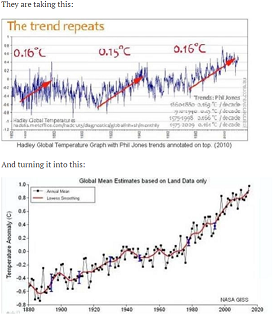
The top graph is just regular HADCRUT land/ocean. Phill Jones just added the arrows. The second is GISS land stations only, as it very clearly says. No-one is turning one into the other. They are different records about different places, and both published.

Reply to  Nick Stokes
December 21, 2016 3:05 pm

“And the adjustments and homogenisations have had absolutely zero impact on the way the graphs look?”
Very little. In fact, HADCRUT, featured here, does not homogenise. The differences between versions are almost entirely due to the addition of new data.

Dr. S. Jeevananda Reddy
Reply to  Nick Stokes
December 21, 2016 8:33 pm

GISS land stations — rural area covers more than two-thirds f land area and urban urban area with less than one third covers the met network. That means urban effect is added — positive change but rural effect is not covered — negative change. In the real case steep rise would not be the scenario.
Dr. S. Jeevananda Reddy

Nick Stokes
Reply to  Nick Stokes
December 22, 2016 1:14 am

“are a confession”
No confession, just an observation. If they made a big difference, it would still be the right thing to do.
People use the data for constructing indices. Indices are their best estimate of what happened. If all he signs point to an inhomogeneity that should be contacted, that’s where their best estimate leads.

Brett Keane
Reply to  Nick Stokes
December 22, 2016 6:36 pm

@ Nick Stokes
December 21, 2016 at 2:23 pm: In fact, Nick, Stephen, like you, was pretending a superiority he does not possess. You are both shills of narrow understanding, so making fools of yourselves is easy. . But thankfully we will not have to put up with such tedious sneering for much longer.

Sleepalot
Reply to  Steven Mosher
December 21, 2016 9:34 pm

Mosher equivocating on the term “produced”, from “presented” to “created”.

Kamikazedave
December 21, 2016 10:45 am

I saw the same pattern when doing a similar study for the state of Virginia with my students in the late 80’s. Beginning at 1920, a steady increase in temperature until the mid 40’s, then a steep decline until the late 60’s, then an increase until the end of my data, which at that time was 1988. The only exception to this pattern was Washington DC, a large metropolitan area experiencing exponential growth. Had DC not seen such growth, I suspect the temperature pattern would be the same as the rest of the state.
I should mention that I used the raw data copied from annual reports of the Climatic Data Center from the ODU library.

December 21, 2016 10:46 am

As a scientist it is easy to see the many ways this practice is wrong, if it’s intent was simply to find and publish the truth about local weather observations. It defy’s all good rules of scientific practice. Politicians however see this as just another way of saying what they think the voters need to hear. This is all considered excellent work in the realm of politics (or advertising), the intent of which is to make people believe things that are clearly not true. The absurdity of this behaviour becomes clearer as one looks down the road to a time when I’ll be outside in a thick coat, gloves, boots and a woolen hat scraping ice off my windshield while the politically correct climatologists are advising us all to put on sun screen, avoid the heat and keep hydrated.

William Astley
December 21, 2016 10:47 am

The Liberal’s word of the year is ‘surreal’.
The Liberals have selected an appropriate word; however, they are clueless as to what will or will not be surreal.
It is surreal that the cult of CAGW have spent 30 years altering the past temperature record to create a hockey stick as the unadjusted temperature record (last 150 years) does not support CAGW. The temperature record of the last 150 years does not even support AGW.
It is surreal that there are at least a dozen independent observations that support the assertion that there is something fundamental incorrect with the greenhouse gas calculations/atmospheric assumptions for the calculations.
Temperature record climategate type adjustments does not change the fact that solar cycle changes caused the majority of the warming in the last 150 years, as opposed to the increase in atmospheric CO2.
http://realclimatescience.com/wp-content/uploads/2016/12/Screen-Shot-2016-12-19-at-9.44.41-AM-1.png
We are going to move from surreal to super surreal. The solar cycle has been interrupted which is different than a simple ‘slowdown’ in the solar cycle. Significant unexplained planetary cooling is going to change everything.
http://www.ospo.noaa.gov/data/sst/anomaly/2016/anomnight.12.19.2016.gif

Latitude
Reply to  William Astley
December 21, 2016 11:26 am

comment image

Dr. Deanster
Reply to  Latitude
December 21, 2016 11:44 am

Linky??

Menicholas
Reply to  Latitude
December 21, 2016 9:08 pm

Yeah, but, but…um…uh…sea ice.
Yeah…sea ice!
That’s the ticket!

Dr. Deanster
Reply to  William Astley
December 21, 2016 11:45 am

Where does the top difference graph come from …. linky??

Reply to  Dr. Deanster
December 21, 2016 11:59 am

Tony Heller blog Deplorable Real Climate Science. He has posted the computational spreadsheet and the data. It was also independently verified by Steve Case using Wayback Machine when Gavin Schmidt tried to pretend it isn’t true using an age old graphing trick. About maybe 3 days ago.

Steve Case
Reply to  Dr. Deanster
December 21, 2016 12:31 pm

ristvan December 21, 2016 at 11:59 am
Tony Heller blog Deplorable Real Climate Science. He has posted the computational spreadsheet and the data. It was also independently verified by Steve Case using Wayback Machine when Gavin Schmidt tried to pretend it isn’t true using an age old graphing trick. About maybe 3 days ago.

Thanks for the credit, I appreciate it (-:

Reply to  Dr. Deanster
December 21, 2016 2:05 pm

” He has posted the computational spreadsheet and the data.”
I would like to see someone produce that spreadsheet. He says he has published it, but he hasn’t. Nothing that will actually produce the results.

Steve Case
Reply to  Dr. Deanster
December 21, 2016 2:28 pm

Nick Stokes December 21, 2016 at 2:05 pm
” He has posted the computational spreadsheet and the data.”
I would like to see someone produce that spreadsheet. He says he has published it, but he hasn’t. Nothing that will actually produce the results.

You could take a trip to the Internet Archives WayBack Machine and duplicate it for yourself, it’s not that difficult.

Reply to  Dr. Deanster
December 21, 2016 3:15 pm

“You could take a trip to the Internet Archives WayBack Machine and duplicate it for yourself, it’s not that difficult.”
Nonsense. The graph is actually made with currently available data on adjustments. Well, currently at the time; the graph is itself a few years old and refers to a long ago version of USHCN. What you need to calculate it is Goddard’s unique (and totally wrong) method of comparing averages. That is in code.

Latitude
Reply to  Dr. Deanster
December 21, 2016 4:15 pm

refers to a long ago version of USHCN……
So you’re saying it would be even worse now…
…unless you’re trying to say they stopped adjusting after that graph was made

Steve Case
Reply to  Dr. Deanster
December 21, 2016 5:55 pm

“You could take a trip to the Internet Archives WayBack Machine and duplicate it for yourself, it’s not that difficult …
”Nick Stokes December 21, 2016 at 3:15 pm
Nonsense. The graph is actually made with currently available data on adjustments. Well, currently at the time; the graph is itself a few years old and refers to a long ago version of USHCN. What you need to calculate it is Goddard’s unique (and totally wrong) method of comparing averages. That is in code.

Here’s the page from the WayBack Machine with the old data:
GHCN 1701-12/2000 (meteorological stations only)
Here’s the Link to Tony Heller’s Blog Post
Gavin says his data is fake
You can go dig up the current data and do the comparison to Tony’s chart yourself. I did a 5 year average just like he did and here’s my quick and dirty chart I put up there a few days ago:
http://realclimatescience.com/wp-content/uploads/2016/12/32096-1.gif
You can call it nonsense all you want, but just like calling the tail on Abe Lincoln’s dog, a leg doesn’t make it one.

Steve Case
Reply to  Dr. Deanster
December 21, 2016 6:01 pm

“You could take a trip to the Internet Archives WayBack Machine and duplicate it for yourself, it’s not that difficult.
”Nick Stokes December 21, 2016 at 3:15 pm
Nonsense. The graph is actually made with currently available data on adjustments. Well, currently at the time; the graph is itself a few years old and refers to a long ago version of USHCN. What you need to calculate it is Goddard’s unique (and totally wrong) method of comparing averages. That is in code.

Here’s the page from the WayBack Machine with the old data:
GHCN 1701-12/2000 (meteorological stations only)
Here’s the Link to Tony Heller’s Blog Post
Gavin says his data is fake
You can go dig up the current data and do the comparison to Tony’s chart yourself. I did a 5 year average just like he did and here’s my quick and dirty display I put up there a few days ago:
http://realclimatescience.com/wp-content/uploads/2016/12/32096-1.gif
You can call it nonsense all you want, but just like calling the tail on Abe Lincoln’s dog, a leg doesn’t make it one.

Steve Case
Reply to  Dr. Deanster
December 21, 2016 6:05 pm

“You could take a trip to the Internet Archives WayBack Machine and duplicate it for yourself, it’s not that difficult.
”Nick Stokes December 21, 2016 at 3:15 pm
Nonsense. The graph is actually made with currently available data on adjustments. Well, currently at the time; the graph is itself a few years old and refers to a long ago version of USHCN. What you need to calculate it is Goddard’s unique (and totally wrong) method of comparing averages. That is in code.

Here’s the page from the WayBack Machine with the old data:
GHCN 1701-12/2000 (meteorological stations only)
Here’s the Link to Tony Heller’s Blog Post
Gavin says his data is fake
You can go dig up the current data and do the comparison to Tony’s chart yourself. I did a 5 year average just like he did and here’s my quick and dirty display I put up there a few days ago:
http://realclimatescience.com/wp-content/uploads/2016/12/32096-1.gif
You can call it nonsense all you want, but just like calling the tail on Abe Lincoln’s dog, a leg doesn’t make it one.

Steve Case
Reply to  Dr. Deanster
December 21, 2016 6:07 pm

“You could take a trip to the Internet Archives WayBack Machine and duplicate it for yourself, it’s not that difficult.
”Nick Stokes December 21, 2016 at 3:15 pm
Nonsense. The graph is actually made with currently available data on adjustments. Well, currently at the time; the graph is itself a few years old and refers to a long ago version of USHCN. What you need to calculate it is Goddard’s unique (and totally wrong) method of comparing averages. That is in code.

Here’s the page from the WayBack Machine with the old data:
GHCN 1701-12/2000 (meteorological stations only)
Here’s the Link to Tony Heller’s Blog Post
Gavin says his data is fake
You can go dig up the current data and do the comparison to Tony’s chart yourself. I did a 5 year average just like he did and here’s my quick and dirty display I put up there a few days ago:
http://realclimatescience.com/wp-content/uploads/2016/12/32096-1.gif
You can call it nonsense all you want, but just like calling the tail on Abe Lincoln’s dog, a leg doesn’t make it one.

Hugs
Reply to  Dr. Deanster
December 22, 2016 6:50 am

Nick,

What you need to calculate it is Goddard’s unique (and totally wrong) method of comparing averages.

I’m neither trusting Heller uses a spatially averaged model but rather some direct average of numbers. But the graph is intriguing and I don’t believe a second it is a fake. There might be some artifacts, but the accurate fit means there is something weird going on.
I really loved to see duplication of Heller’s graph.

Nick Stokes
Reply to  Dr. Deanster
December 22, 2016 11:32 am

Steve Case,
Sorry, I thought we were talking about Latitude’s Goddard graph, which appears immediately above. Yes, GISS has varied somewhat since 2000; many of the adjustments, like TOBS, were introduced in about 2001. I note that you are showing not global bat land stations only, where this has a disproportionate effect.

Nick Stokes
Reply to  Dr. Deanster
December 22, 2016 11:49 am

Hugs,
The problem with Goddard’s averaging is more elementary. He’s dealing with absolute temperature, and the set of stations in his “raw” average (those that reported) is different from the final (all stations, with estimates for non-reporting stations). Absolute temperatures vary a lot in time and space, and when you compare non-matching groups, a big factor is just whether one included warmer places (by climate) than the other.
But some alignment is expected. USHCN adjustments are dominated by TOBS, which is basically the accumulation of events where observers switched observing times, predominantly from evening to morning. So they are cumulative in time, and the USHCN plots of them show this. CO2 also increases with time.
I’ve never understood what people think the evil scientists are up to here. Usually the canard is that they are adjusting temperatures to align with CO2. But why on earth would they want the adjustments to align with CO2. That would only have the effect of aligning temperature increases if they were already proportional to CO2, but with different slope.

Chimp
Reply to  Dr. Deanster
December 22, 2016 11:53 am

Nick,
Evil, yes. Scientists, no.
Decidedly not.

Chimp
Reply to  Dr. Deanster
December 22, 2016 12:01 pm

To be a scientist, you have to practice the scientific method.
At least until post-modern “science” as imagined by historian Naomi Oreskes, that meant: 1) making a guess, 2) making testable, falsifiable predictions on its basis, 3) collecting observations of objective reality in order to test the guess and 4) seeing if the predictions are confirmed or shown false. That is not how climate pseudoscience proceeds, nor do its advocates like Oreskes, cartoonist Cook and English major Mosher even accept the validity of the real scientific method, tried and tested for 500 years or more.
Adjusting data to make alleged observations seem to fit GIGO models is the Bizarro World antithesis of the scientific method.

Johannes Herbst
Reply to  Dr. Deanster
December 22, 2016 9:23 pm

Nick Stokes,
By comparing if CO2 fits to temperature, You haver to find a timeframe where it fits to the temperature and checking then, if the rest of the graph fits.
http://www.woodfortrees.org/plot/hadcrut3vgl/from:1958/mean:21/plot/esrl-co2/mean:13/normalise/offset:0.22/scale:1.1/plot/hadcrut3vgl/from:1974/to:1999/trend/plot/hadcrut3vgl/from:1999/trend/plot/hadcrut3vgl/from:1958/to:1974/trend
From the seventies to the nineties, there was a nice fit between both. Therefore scientists started to believe, that the world is warming through CO2. But before and after, it’s just not working.
And even in the 25 years of somehow proper fit, there is a lot of up and down, showing that even other natural cycles are involved.

Nick Stokes
Reply to  Dr. Deanster
December 22, 2016 9:58 pm

“it’s just not working”
This is the juvenile skeptic device of using HADCRUT 3, which is not only obolete, lacking Arctic data, but has not had any data for at least three years. Here is a HADCRUT 4 version:
http://www.moyhu.org.s3.amazonaws.com/2016/06/CO2vsHAD.png
WFT link
” Therefore scientists started to believe, that the world is warming through CO2. “
No, their belief was never based on correlation of a few years. The physics goes back to Arrhenius (1896). These plots add confirmation.
” there is a lot of up and down, showing that even other natural cycles are involved”
Yes, of course.

Paul of Alexandria
December 21, 2016 10:50 am

I couldn’t help but getting the feeling that I wasn’t supposed to know anything about the Milankovitch Cycles. It seemed like no one was supposed to know this.

So what did he say in the presentation?

ralfellis
Reply to  Paul of Alexandria
December 21, 2016 11:12 am

And I doubt if he spoke about the Milankovitch insolation cycle averaging 23ky, and so we are on the brink of a new ice age. Very close to the brink, so I believe.
R

Brendan
Reply to  ralfellis
December 21, 2016 6:56 pm

No he didn’t mention Milankovitch.

Brendan
Reply to  Paul of Alexandria
December 21, 2016 6:55 pm

Paul,
He was straight down the line in his presentation. He updated us all on the scientific program then talked about his version of AGW.

Reply to  Brendan
December 22, 2016 9:40 pm

He [Martin Riddle] updated us all on the scientific program then talked about his version of AGW.
How decidedly odd. Martin would certainly know about the program given he was the manager until his recent retirement. However, I’m left wondering about “his version of AGW”.
Despite our somewhat orthogonal views regarding CAGW, Martin usually refuses to discuss it based on his assertion that I know rather more about climate than he does. And we’d much rather remain friends than not. Perhaps he was “given the job” as was The Git back in the early 90s when he was invited to be one of several talking heads on ABC Radio National discussing global warming. None of us knew WTF we were talking about at that time. Nice thing about ignorance; it’s rather easily fixed 🙂

Tom Halla
December 21, 2016 11:01 am

Another piece of information on the “adjustment” of temperature records. Adolph Schickelgruber’s “big lie” as applied to “science”?

ralfellis
December 21, 2016 11:08 am

>>You can’t calibrate a thermometer used 100 years
>>ago with one used today.
They could. I have seen these thermometers in technology museums. All they need to do is set up an old thermometer, in a station box from a century agao, and take readings for a couple of years alongside the new thermometer system. This will not adjust for environmental changes, but it would eliminate instrument differences.
R

Sun Spot
Reply to  ralfellis
December 21, 2016 11:19 am

ralfellis. . . and how would you eliminate the human eyeball error measurement differences ?

Fred Harwood
Reply to  ralfellis
December 21, 2016 11:36 am

Reportedly, LIG thermometers may need recalibration due to changes in the amorphous glass over time. If an old museum thermometer were reemployed, it might need to be again calibrated.

Gary Pearse
Reply to  Fred Harwood
December 21, 2016 1:03 pm

In the British Museum there are two thermometers that were used by two British scientists taking temperatures in Australia in the 19th Century. I had mentioned these and other thermometers there and suggested in a comment to Lord Monckton it would be a good experiment to have these calibrated to see how close they were to a modern temperature measurement. I think there are enough historical thermometers to settle the question about them measuring too warm and thus rationalizing cooling the past and warming the present in adjustments. Maybe one day. (I can’t find the link now)

Ian W
Reply to  Fred Harwood
December 21, 2016 1:46 pm

What cannot be calibrated is the owner of the human eyeball and how that observer felt about the observation being made. It is highly unlikely that the observer thought that centuries hence the measurement would be adjusted in hundredths of degree steps to prove a case. Therefore, some would see accurate to ~a degree was good enough. I would think that the majority of observations before climate science was a funded alchemy would see no reason at all to be accurate to any more than a degree. There is something about being out at 0 dark hundred with sleet being blown down your neck that makes better than a degree accuracy as unlikely as unicorns.

James Francisco
Reply to  Fred Harwood
December 21, 2016 4:38 pm

Ian W. What make you think that anyone went out to look at the thermometer at 0 dark thirty with the sleet blowing. My educated guess is that many of the written records were pincil whipped.

TA
Reply to  Fred Harwood
December 21, 2016 5:38 pm

“What cannot be calibrated is the owner of the human eyeball and how that observer felt about the observation being made.”
What’s better, that human eyeball, or some modern NOAA/NASA guess as to the value of the reading?

terrahertz
Reply to  ralfellis
December 21, 2016 1:14 pm

“You can’t calibrate a thermometer used 100 years ago with one used today.”
And there I was thinking reference thermometers are calibrated against physical constants such as the freezing and boiling point of water, at known standard pressure. Are these things supposed to have ‘drifted’ enough to make a significant difference over the last hundred years? How?
I smell bullshit.
It’s also bullshit to suggest this ‘homogenization’ of the data is being done from unconscious bias. No, these people are entirely aware that they are lying, and there’s no scientific basis for their actions. Their behavior gives them away. Just like that talk presenter who ran away at the mention of Milankovitch Cycles, their evasive behavior demonstrates malevolent intent. If a scientist won’t publish his raw original data you can be sure he’s being deceptive, and you can start working on _why_ he’s deceiving. With the AGW cabal we already know why:
http://everist.org/archives/links/__AGW_quotes.txt
The only remaining questions are:
* How to shift these liars from positions of authority, to courtroom prisoner docks.
* Does the original raw, uncorrupted data even exist anymore? (Publish it!)
* How much (if any) of the money embezzled by the AGW cult can be clawed back.
* Can nations rebuilt their mothballed/destroyed coal power stations fast enough to help with rising power needs as we go into the impending ice age?

rishrac
Reply to  terrahertz
December 22, 2016 2:41 am

The original raw, uncorrected doesn’t exist. When they had the data, they adjusted it, and threw the originals away. When the issue was brought up, efforts were made to retrieve it, but deterioration in the landfill made it beyond recoverable. It’s anybodys guess as to what they did. Assertions were made even then that they had adjusted the data upwards to show warming. Since that time, they’ve adjusted the data several more times.
The mercury thermometers were pretty accurate. In using one, I was surprised at just how accurate it was. I think that they were common in the weather stations. I remember seeing one in a picture of group that went to Antarctica. There was a reason for that. You don’t stake your life on an about.

Jonathan Sturm
Reply to  terrahertz
December 22, 2016 9:45 pm

It’s not the thermometer alone; it’s the combination of screen and thermometer. There was a paper published in Australia some years ago comparing thermal sensors inside a Stephenson screen. All sensors agreed regarding the freezing and boiling point of water. What they didn’t agree on was air temperature.

Richard
December 21, 2016 11:16 am

While IPCC create their own reality, nature spoils their narrative with its own.
Snow falls in the deep hot Sahara for the first time in 37 years.
Bob Geldof and Midge Ure’s 1984 Band Aid prediction that “there won’t be snow in Africa this Christmastime” has once again been proven wrong, with snow falling in the Algerian town of Ain Sefra, deep in the dry, hot Sahara desert on December 19.

stan robertson
December 21, 2016 11:17 am

Several times per year I drive through Oklahoma City and Tulsa, both E-W and N-S. During a half hour city transit, the car’s outside air thermometer goes up about 2F and then back down. This occurs at all seasons. It is called the urban heat island effect. So why is Australia’s BOM adjusting city temps downward?

RWturner
Reply to  stan robertson
December 21, 2016 12:52 pm

They aren’t, they are adjusting rural temperatures upwards to match the inaccuracy derived from urban heat island effect. Much like NOAA is adjusting buoy temperatures up to match ship intake temperatures.

Greg
December 21, 2016 11:21 am

The International Panel on Climate Change – IPCC

OH come on Brendan, this is the kind of mistake most people were making back in 2007 !
The International Panel on Climate Change
That makes it a political body with a political agenda.

Greg
Reply to  Greg
December 21, 2016 11:22 am

oops, copeid the text and failed to correct it. :
The Intergovernmental Panel on Climate Change

Brendan
Reply to  Greg
December 21, 2016 6:58 pm

Sorry, you’re correct.

Greg
Reply to  Greg
December 21, 2016 11:28 am

The IPCC have produced 102 climate models to predict our future climate.

The IPCC does not ‘produce’ models , does not do science it produces political documents alledgedly reflecting the current knowledge of climate.
Thanks for taking the time to post an article but after those two bloopers, I’m off to read something else.

Reply to  Greg
December 21, 2016 11:38 am

Actually, 32 different models with 102 ‘complete’ runs archived per the AR5 CMIP5 experimental protocol as revised and published in 2012. Available on line.

Bengt Abelsson
Reply to  Greg
December 21, 2016 11:54 am

On Polar bears, methinks

Janice Moore
Reply to  Greg
December 21, 2016 1:01 pm

Dear Greg,
First of all, thank you for your careful attention to detail and sharp-minded insights. You keep us accurate, here at WUWT and I am thankful for you.
After “… 102 climate models to predict our future climate …” you missed some intriguing information.
Just a bit of advice (sorry for the scold, but, I think the author deserved a more careful read, this time): try to better distinguish mistakes of inconsequence from mistakes of substance grievous enough to make an entire article not worth reading.
And, yes, I am stepping up to defend the author not just on principles of basic fairness, but largely due to my temperament which resulted in my being a bit angry at your being harsh and unkind to Mr. Godwin. I’m sorry that life is not going well (well, Greg, I have, over the past few years, seen that you are a decent, fair minded, kind, person, thus, I conclude it is your circumstances which are causing you to be short with Godwin).
I hope things look better tomorrow.
Try spending a little time with a good friend:
http://www.classicexhibits.com/tradeshow-blog/wp-content/uploads/2013/10/happy-dog-happy-owner.jpg
🙂
Your WUWT ally,
Janice

Janice Moore
Reply to  Greg
December 21, 2016 1:03 pm

And I want to affirm you, here, Greg (in view of an apparent mis-reading of you above) — I realize that you were focusing on the fact that the IPCC does not “produce” models as in create (as opposed to merely archive/make available for viewing). You were understood by me.

Editor
Reply to  Greg
December 21, 2016 11:32 am

Got it in one there, Greg!!

Scouse Skeptic
December 21, 2016 11:24 am

The AGW has become a Tiger being held by the tail, nobody dare let go or they will be consumed. It has become belief based, a religion, no proof is required. Any rational challenge being met with cries of heresy, denier, the science is settled and to quote the President of the United States, Barrack Obama, “a flat Earther”! The men in the tweed jackets have spoken but are they providing the latest version of the Emperor’s new clothes or a newer revamped and more sinister version that sees man as the enemy of the planet.

Phillip Bratby
December 21, 2016 11:32 am

It’s not called man-made global warming for nothing.

lewispbuckingham
December 21, 2016 11:33 am

The decision by BOM to homogenise Rutherglen, a grape growing area, with Hillston, part of the Australian arid zone, was for me, the final nail in the coffin.
I just can’t believe the BOM models.
Then they themselves discovered that the models do not predict climate change in Continental Australia.
So neither do they believe their Australian models.
Unless they still believe that the dams will all dry, a la Professor Flannery and children will not know what snow is like.,
All climate data has to be publicly available and beta tested.
We are paying for it.
Don’t argue its a defence issue.
Even India now has a satellite that can predict our cropping yields.
China has our metadata anyway, they just hacked it.
As a nation and scientists, we just look stupid pumping out unreliable homogenisations and expecting the models to come up with reliable useful predictions so economically viable plans may be made.
Just as an aside the BOM station in Melbourne was closed after showing a flat trend line.
Why?

Nick Stokes
Reply to  lewispbuckingham
December 21, 2016 6:31 pm

“Just as an aside the BOM station in Melbourne was closed after showing a flat trend line.
Why?”

Well, it’s what WUWT wanted. But it isn’t closed, just moved.

Bill Johnston
Reply to  lewispbuckingham
December 22, 2016 12:17 am

I suggest everybody takes a breather.
Rutherglen data are as useless as any other Australian site for tracking climate warming (or not). While comments are useful, few actually hunt down information. I have and It’s easy to dispel the myth that data are in anyway sound. The first part of the Rutherglen record is ‘compiled’ from somewhere else. The mid-part has many missing data and there are at least two site moves. Up to 1995 data are manually observed thermometers in a large Stevenson screen. Data after 1996 are reported by an automatic weather station high-frequency (1/sec) PRT probe in a small screen and are processed (filtered to remove spikes) in Melbourne. (I don’t think I can post a picture; but if I could, I would.)
Taking extraneous factors (site and instrument changes) into account, the null hypothesis, which is that trend is zero, can’t be disproved.
It is as fictitious to focus on selected contradictory evidence, as it is to homogenise data that don’t agree with models.
For both raw and homogenised data, key issues that are are evaded/ignored are tarted-up as science. At Sydney Observatory for example, aerial photographs show Stevenson screens moved around 1950 and that site-ambience materially changed in ~1972 due to building of a brick wall. Both changes are disregarded by homogenisation. People chatting about this stuff rarely do the hard-yards to find out what actually happened.
At both Rutherglen and Sydney Observatory (which is one of the longest continuous series in the Southern Hemisphere); Wagga Wagga, Broome, Geraldton, Alice Springs, Adelaide Airport, Cape Bruny, Townsville,Laverton, Ceduna and Cape Leeuwin; data are too coarse. Thus there is no possibility of showing a climate related trend exists.
Cheers,
Dr Bill
If you think there is, than show us your evidence.

Robert from oz
Reply to  Bill Johnston
December 22, 2016 12:33 am

Scientists that worked at Rutherglen for many years and workers at and near the site dispute the moving of the screen so do you know someone that can refute this .

Nick Stokes
Reply to  Bill Johnston
December 22, 2016 2:13 am

Between 1960 and 1964, temperature and evaporation readings ceased. But rainfall was still reported. It sounds like something happened.

December 21, 2016 11:39 am

A grammatical mistake:

As part of it’s Antarctic program, Australia drills ice cores at Law Dome near it’s Casey station.

Those apostrophes need to go away, because the posessive of it is “its”, not “it’s”. “It’s” is the contraction of “it is”.

The Monster
Reply to  tarran
December 21, 2016 2:56 pm

Indeed. It’s really annoying when people make simple mistakes like this.
“It’s” can also be the contraction of “It[ ha]s”, as in “It’s been a long time since we could trust Climate ‘Science’!”

Roger Knights
Reply to  tarran
December 21, 2016 10:54 pm

There’s a simple trick for getting that right: just memorize this: “NEVER POSSESSIVE!”

December 21, 2016 11:50 am

We are talking about a temperature range between zero and one degree, right ?
Dumb questions:
(1) What is the margin of error of an official temperature-measuring thermometer?
(2) How does this error propagate in the averaging process?
(3) What percentage is the final error in this temperature range between zero and one degree?
The controversy built around such a small temperature range and its associated margin of error, itself, seems more of a concern to me than the methods by which officially agreed-upon figures are agreed upon within such a narrow range. It seems like two fleas contesting over whose grain of sand is a molecule bigger or smaller.

poitsplace
Reply to  Robert Kernodle
December 21, 2016 2:13 pm

(1) about a degree
(2) it depends on many things. The assumption is that errors can be averaged for increased accuracy. I’m not entirely sure so don’t read much into this, but I believe they tend to fail in one direction. Most equipment is like this.
(3) Not entirely sure what you’re asking there. The measurement error alone according to Hadley is about +/-.15C. Yes, this means that many of those “the hottest year ever” claims over the year are from the start, unknowable (.3C is a substantial portion of the total warming)
The problem with homogenization is this. As stations are moved and maintained, the data makes a step change. The homogenization routine stitches these together by aligning them…moved out of a city, temperature drops, *Poof* the past in the city is cooled.
Now on the surface this seems reasonable..and I believe up until the specific problem was identified, it was an honest error. HOWEVER, when you think about what is actually happening, you get a series of slowly warming trends (from UHI, screens getting darker as the pain ages), followed by a drop. In an imaginary test world in which temperatures are flat outside of UHI impacts, this would result in a saw-tooth temperature output as stations were moved…unfortunately the homogenization routine would stitch this together, making all of those slow increases accumulate.
BTW, the final minus raw is very misleading. There are a lot of changes that have some real justification. The accumulating errors I described above only add a small amount to the trend. But the world is already at such an observably low rate of warming that it’s pretty clear that the best course of action is to do nothing. If those small errors do anything to lower the already low trend, its just that much more of a non-issue
However, there’s another issue. You see, part of the whole point of some of the many adjustments is to help eliminate the impacts of UHI (urban heat island) but then basically the automated homogenization routines just go ahead and put much of it right back when they adjust for those station moves. So the “final minus raw”…is actually “final minus UHI polluted raw”…and we’re back to square one on the UHI problem.

Robber
December 21, 2016 12:15 pm

Well presented analysis. Please send a please explain to Minister for Environment & Energy Josh Frydenberg with copy to Senator Roberts.

Editor
December 21, 2016 12:21 pm

Thanks, Brendan. Good post.
Cheers.

Janice Moore
Reply to  Bob Tisdale
December 21, 2016 1:05 pm

+1

December 21, 2016 12:47 pm

Thank you Dr Brendon Godwin Background for this illuminating article!

RWturner
December 21, 2016 12:49 pm

Agenda driven science is everywhere.

Bindidon
December 21, 2016 12:49 pm

What a boring sequence of ancient past, Stonehenge-like “thoughts” on climate!
I literally feel thrown back to WUWT’s early times. Inbetween, a number of intelligent persons have published here interesting head posts on climate.
This is such a poor post! Inimaginable.
Brendan Godwin never and never has read anything on homogenisation, UHI adjustmenst and the like.
He is simply repeating what you can read everywhere on ultraskeptic web sites, all I consider be nio more than the inverse of this religious “Skeptical Science” corner.
– Did he ever design and implement software able to compare GHCN station datasets?
– Did he ever really compare surface, radiosonde and satellite data?
His graphs presented here are no more than simple copy and paste!

Reply to  Bindidon
December 21, 2016 3:09 pm

“the brave new post truth world you live in. Some of us have been left behind in the days when data was what was actually measured and recorded not hidden and destroyed.”
That is the post truth world. I can point out endlessly that data people claim is destroyed is perfectly accessible, on the web, and always has been. Nope, we’re post-truth now. It is being hidden and destroyed.

Hivemind
Reply to  Nick Stokes
December 21, 2016 7:20 pm

And yet we see many cases where people have asked for the real data and been told either that it was ‘lost’, or we won’t give it to people that don’t truly believe.

Reply to  Nick Stokes
December 21, 2016 7:39 pm

What on earth use is such a comment. If you have something to say, then say what you are talking about. It bears no relation to met data which is clearly visible, on-line, now.

Robert from oz
December 21, 2016 12:51 pm

Rutherglen is very close to where I live and I first learned about this from Jennifer Marohasy on her website a few years ago .
I did write a letter to a polly and received pages of the usual line of crap by way of explanation , but just parroted from what the BOM had already espoused .
The explanation that surrounding sites were measuring different values so they had to homogenise was a cracker when you consider the distance between the sites and the totally different climates and topography.
I have also came across some flood level data that had been ” homogenised ” by our BOM and queried my local polly but received the same response in email form about two or three pages long.
I did send a message to Jennifer Marohasy asking if she was aware that BOM had adjusted flood levels and she was surprised and asked for the link which I sent on .
I have also spoke to someone who lived quite close to the Rutherglen research station and had some dealings with station on the agriculture side and he was adamant that the Stevenson screen had never moved while he was there .
Would be great to ask him a bit more of his recollections of his time at Rutherglen but unfortunately his funeral is on Friday .

Bill Johnston
Reply to  Robert from oz
December 22, 2016 1:29 am

You are deluding yourself Robert. Do some research.
You can look at the current Ruthenglen site on Google Earth: Latitude -36.1047, longitude 146.5094; I could send you a photo taken in November 2016. I had work there too.
The present site is 1/2 a mile from the office. Do you truly think in the olden days some poor sod kept a horse handy so that every 4-hours he/it went there to read thermometers? You could track-down aerial photographs that show unequivocally the site moved. Instead of lambasting and blogging-on you could do some research yourself and add value to the conversation instead of noise. Do some yards at your expense; then post a considered view.
Anyway, whose funeral is Friday?
Cheers,
Dr Bill

Steve Case
December 21, 2016 12:56 pm

Great post, written so my eyes didn’t glaze over which is often the case.
But, and by the way, the sea level by satellite guys are doing pretty much the same thing. Since 1992 the rate of sea level rise has been bumped up nearly a millimeter per year. This can be easily verified by taking your Excel spread sheet on a trip to the Internet Archives WayBack Machine and comparing Data from 2004 with the current data.

CheshireRed
December 21, 2016 12:59 pm

Raw data MUST be kept in future. No erasing or adjusting and then binning it whatsoever, on pain of imprisonment. It’s government-taxpayer intellectual property. The stakes (ie cost of government policies) are too high.

Reply to  CheshireRed
December 21, 2016 2:13 pm

“Raw data MUST be kept in future.”
Raw data is always kept, and published. No-one here seems to want to kn ow about it. GHCN Daily, the original min/max readings, are here. In the US, at least, you can get the original, mostly handwritten pages <a href="here“>here.

gymnosperm
Reply to  Nick Stokes
December 21, 2016 9:14 pm

Um, I believe he is talking about the BOM data…

Reply to  Nick Stokes
December 21, 2016 9:26 pm

“Um, I believe he is talking about the BOM data…”
The Australian data in GHCN is BoM data. Where else do you think they get it from?
But if you want to get the same data, direct from BoM, it’s here. You can download a complete zip file of daily (unadjusted) information for each station – and that includes far more than the 110 or so in Acorn.

Robert Austin
December 21, 2016 1:10 pm

But they haven’t just lowered and raised the temperatures in one hit, they’ve slowly incriminated the adjustments

At first I thought that you meant to use the word “incremented” but on second thought “incriminated” is appropriate.

Brendan
Reply to  Robert Austin
December 21, 2016 7:13 pm

thank you for picking up on that typo.

M Seward
December 21, 2016 1:12 pm

And here’s me thinking it was just some sort of inadvertent or mathematical overweighting of the UHI affected data, sort of a convenient error or just some klutzy, mathematically ignorant mis-use of the kriging methods, to coarse a data set etc. No, its a deliberate, straight out fraud. Instead of filtering out or truly homogenising the data by giving the true representative weighting to UHI affected data ( i.e. based on the area of the UHI in each case) you distort all the unaffected data to fit the affected data.
Hallelujah!! I’m now a fully fledged denier! (and ashamed to be an Australian).
Thankyou Brendan Godwin.

Gary Pearse
December 21, 2016 1:16 pm

Hmm, one dimension of the cook-up I hadn’t thought of until reading this is that they likely deliberately and unnecessarily made some station moves to give cause for adjustment. How about the Rutherglen and Darwin?

Ed Zuiderwijk
December 21, 2016 1:28 pm

The Rutherglen pre- and post-homogenisation data demonstrate clearly that those who did the measurements back then were STUPID! The guys or women in 1910 were so stupid as to measure a whopping full degree too little, imagine that! But there’s something very CLEVER about their STUPIDITY: you see the ones in 1910 were over a degree off, the ones in 1920 slightly less off, then in 1930 still off but a little bit less again, and so on. Until in the year 2000 they finally got it right. Or are they in danger of overshooting in 2020, who knows?
Anybody who takes that “homogenisation” seriously will also believe that pigs can fly.

DCS
December 21, 2016 1:31 pm

Jennifer Marohasy presented at the 2014 ICCC on the homogenization of temperature data that changed high quality temperature data from a cooling trend to a warming trend (increase of 2C).. She discusses a twitter conversation with Gavin Smidt of GISS on the homogenization. The video is available at:
https://youtu.be/OK6k3w21EFQ

willhaas
December 21, 2016 1:40 pm

The fact that there are so many models is evidence that a lot of guess work has been involved. Only one model can possible be the correct model. Unitl the IPCC decides which model is the correct one, their entire modeling effort cannot be taken seriously becsuse it involves guess work. Hence the results of all efforts using these models must also be disregarded. If the temperature data needs to be adjusted then the data is wrong and needs to be thrown out. Adjusting the data turns it into fiction and all work based on data that is either wrong or fictious needs to be thrown out.
According to the AGW conjecture, the surface of the Earth is 33 degrees C warmer because of the action of so called greenhouse gases that provide a radiant greenhouse effect. At one time it was felt that a greenhouse stayed warm because of the action of LWIR absorbing greenhouse gases. But through experimentation that was found to be false. A real greenhouse stays warm because the glass reduces cooling by convection. It is a convective greenhouse effect. There is no radiant greenhouse effect associated with a real greenhouse. So to on Earth. As derived from first principals, the surface on the Earth is on average 33 degrees C warmer then it would be without an atmosphere because gravity limits cooling by convection. It is a convective greenhouse effect. The 33 degrees C is what is calculated from first principals and the 33 degrees C is what has been observed. There is no room for an additional radiant greenhouse effect. The radiant greenhouse effect has not been observed anywhere in the solar system. The radiant greenhouse effect is hence fiction and because the AGW conjecture is based on a ficticious radiant greenhouse effect, the AGW conjecture must also be fiction. If CO2 really affected climate then the change in CO2 over the past 30 years should have caused at least a measureable change in the dry lapse rate in the troposphere but such has not happened. There is no real evidence that CO2 has any effect on climate.
A most important task for the IPCC is to establish the climate sensivity of CO2. In their first report the IPCC published a wede range of guesses for what they considered to be the possible values for the climate sensivity of CO2. Only one value can be correct. In their last report eh IPCC published the exact same range for their guesses as to the value of the climate sensivity of CO2. So after more than two decades of effort the IPCC has learned nothing that would allow then to narrow the range of their guesses one iota. Theri efforts to date have been totally useless. An orginazation like the IPCC, that deals in wrong models, ficiticious and wrong data, and makes no progress, should have their funding cut.

AGW is not Science
Reply to  willhaas
December 22, 2016 7:50 am

Can’t argue with cutting the funding of the IPCC, but then the IPCC never should have received any funding to begin with – it was an organization that started with its conclusion and worked its way backward trying to justify the pre-conceived conclusion.
Can you provide more information, or links, regarding the first principal derivation of the convective limitation on cooling? I’ve long been skeptical of the “radiant greenhouse effect” since it is based on experiments conducted in a sealed container of fixed size, not open to the vacuum of space, and not subject to any atmospheric processes, in other words, NOTHING like the Earth’s atmosphere (and therefore, the results cannot be reasonably extrapolated to what will occur IN the Earth’s atmosphere).

willhaas
Reply to  AGW is not Science
December 22, 2016 4:00 pm

Try doing a search on “The convective greenhouse effect” and look at articles appearing on “They Hockey Schtick”. They in turn reference work by James Clerk Maxwell. I myself wanted to use AGW as another reason for us to conserve on the use of fossil fuels but AGW is based on only partial science and is hence only science fiction. I canot defend it. Most of the postulates of the AGW conjecture turn out not to be true.

Jonathan Sturm (AKA The Pompous Git)
Reply to  willhaas
December 22, 2016 10:17 pm

The fact that there are so many models is evidence that a lot of guess work has been involved. Only one model can possible be the correct model.
I don’t think you understand how climate modelling works. Quoting Trenberth:

None of the models used by IPCC are initialized to the observed state and none of the climate states in the models correspond even remotely to the current observed climate. In particular, the state of the oceans, sea ice, and soil moisture has no relationship to the observed state at any recent time in any of the IPCC models. There is neither an El Niño sequence nor any Pacific Decadal Oscillation that replicates the recent past; yet these are critical modes of variability that affect Pacific rim countries and beyond. The Atlantic Multidecadal Oscillation, that may depend on the thermohaline circulation and thus ocean currents in the Atlantic, is not set up to match today’s state, but it is a critical component of the Atlantic hurricanes and it undoubtedly affects forecasts for the next decade from Brazil to Europe. Moreover, the starting climate state in several of the models may depart significantly from the real climate owing to model errors. I postulate that regional climate change is impossible to deal with properly unless the models are initialized.

willhaas
Reply to  Jonathan Sturm (AKA The Pompous Git)
December 22, 2016 11:14 pm

So you are saying tht I am being overly optimistic in saying that one madel may be correct. I can agree with that.

Jonathan Sturm (AKA The Pompous Git)
Reply to  Jonathan Sturm (AKA The Pompous Git)
December 23, 2016 1:14 am

@ willhaas You got it 🙂

December 21, 2016 1:54 pm

Gday Brendan
Congratulations on your post, and welcome to the club! There are a number of us who have been digging into BOM and Acorn for nearly 5 years. If I may be a little immodest, I brought this to light in 2012 https://kenskingdom.wordpress.com/2012/05/14/acorn-sat-a-preliminary-assessment/
(and HQ before that in 2010), including Rutherglen. Several follow ups since then. Acorn is complete rubbish. The adjustments cannot be replicated as no daily data is publicly available for most stations before 1957 – that’s the most glaring of many problems. Drop me a comment at kenskingdom.wordpress.com (any post will do) if you would like more info. I’d certainly like to see what else you’ve found.
Cheers
Ken Stewart

Nick Stokes
Reply to  kenskingdom
December 21, 2016 10:48 pm

“The adjustments cannot be replicated as no daily data is publicly available for most stations before 1957”
That’s not true if you go to BoM direct, as here. I looked up your favorite Rutherglen, which goes back to 1913, when it started (max and min T). Or Cape Otway, back to 1864.

Bill Johnston
Reply to  Nick Stokes
December 22, 2016 1:38 am

Nick; are data allegedly measured at Rutherglen Research before1925 actually measured there; or are you just projecting and having yourself on?
Cheers,
Dr Bill

Nick Stokes
Reply to  Nick Stokes
December 22, 2016 1:59 am

Bill,
The metadata file for Rutherglen is here. It describes the equipment installed in 1913. I have no rason to doubt that the readings are from there. Do you?

Reply to  Nick Stokes
December 22, 2016 2:31 am

There you go- sometime in the last 12 months daily data for Acorn sites has been digitised on Climate Data Online. This was missing from a very large number of sites until at least October 2015- that’s three and a half years after Acorn was released. I admit I took my eye off Acorn sites because I was so disgusted with the missing data, the errors, the adjustments which made Acorn less comparable with neighbours… I can see I will have to go back and have another look, but I don’t know if I have the stomach for it.

Julien
December 21, 2016 2:43 pm

Thank you for sharing all this with us, it’s extremely insightful and unfortunately comfirms my fears. We can see that local warming which is a direct effect of urbanization (uhi), is being transformed into global warming by homogenization of the rural stations so that they match the warming trends of the cities.
Unfortunately, when your weather station records the temperature in a city growing from 100 thousand to 1 million people over a few decades, what you are measuring is a growing heat island which is directly proportional to urbanization…
The correct science to clean up the urban stations temperature records from the local warming interference, would be to subtract the uhi value from the station record. Then remains only the global trend component. But then unfortunately, the warming trend doesn’t look very threatening anymore and doesn’t require immediate action to shift energy production or use electric cars anymore. I can understand that this result would go strongly against the agenda of the people who are planning to make money from the energy transition.

Mat L
December 21, 2016 2:51 pm

So much wrong with this article.
” were we not in an interglacial warm period in the 100,000 year Milankovitch Cycle and wasn’t all this current warming natural?” There is a reason why his draw dropped. Milankovitch Cycles act over tens to hundreds of thousands of years. Warming of the last 100 years is not related to Milankovitch cycles.
“The IPCC have produced 102 climate models”. Shows the author doesn’t understand what the IPCC does, they synthesise existing research. As they say, IPCC “does not conduct any research nor does it monitor climate related data or parameters.”
Dr Roy’s graph, presented “At an International Conference on Climate Change in his presentation”… failed to mention it was the Heartland Institute conference with a clearly stated political view rather than a scientific conference. Why does the graph end in 2013? What data is “Real World”? Why do “Real World” measurements start below model runs? There are updates of the graph available, for example Nick Stokes recent update, why not use them?
The figures aren’t labeled, but on homogenisation “They are taking this: And turning it into this:” is comparing global temperature (Hadley) with land only (GISS)… no wonder they are different!
“they’ve slowly incriminated the adjustments so that it all looks natural.” The adjustments are being incriminated? How unjust! Does he mean incremented? Why choose a single site at Rutherglen? When the entire Australian record is assessed, it shows homogenisation has in fact had the effect of reducing the apparent extreme temperature trends across Australia.
Better quality articles please.

Reg Nelson
Reply to  Mat L
December 21, 2016 3:55 pm

“Dr Roy’s graph, presented “At an International Conference on Climate Change in his presentation”… failed to mention it was the Heartland Institute conference with a clearly stated political view rather than a scientific conference. Why does the graph end in 2013? What data is “Real World”? Why do “Real World” measurements start below model runs? There are updates of the graph available, for example Nick Stokes recent update, why not use them?”
You realize that the Climategate emails revealed that Gavin Schmidt’s (now head of NASA GISS) Real Climate site was set up for political (propaganda) reasons not scientific ones. They even had a code name for this: “The Cause”. Furthermore Gavin maintained this site on company (taxpayer’s) dime.
Dr. Spencer appeared on the the Charlie Rose and was happy to debate Gavin, but the coward refused to even appear on the same set as Dr. Spencer.
Regarding NIck Stokes graph: it’s clear he is using recently adjusted temp data as the there is no evidence of the eighteen pause. He also disingenuously excludes the UAH sattelite data which was included in Dr. Spencer’s original graph.

Nick Stokes
Reply to  Reg Nelson
December 21, 2016 5:05 pm

” He also disingenuously excludes the UAH sattelite data which was included in Dr. Spencer’s original graph.”
No, the original inclusion was dishonest. The CMIP 5 data shown was surface. They compared with measurements in a different place (LT). It’s like showing Fed plots of US inflation forecasts, and saying they failed because they didn’t match Japan’s data.

Reg Nelson
Reply to  Reg Nelson
December 21, 2016 6:21 pm

“No, the original inclusion was dishonest. The CMIP 5 data shown was surface.”
And the surface temperature data only covers approximately 25% of the the Earth’s surface — the rest is made up. So what is your point exactly — that the models agree with some fabricated and adjusted data set? And are therefore somehow close to being accurate?
How does this even remotely resemble actual science?

richard verney
Reply to  Reg Nelson
December 21, 2016 6:47 pm

Nick
Not quite so since isn’t AGW a top down effect? The surface warms in response to a warming atmosphere such that one would expect to see the first signs of AGW in the LT measurements.

Nick Stokes
Reply to  Reg Nelson
December 21, 2016 6:55 pm

“would expect to see the first signs of AGW in the LT measurements”
One might. And one might be disappointed. The point is that they are not the same. If you want to check a prediction, check against the measure of what was predicted. If you want to test a theory about where AGW might appear first, that is something else.
Inter alia, LT actually includes some of stratosphere, which is expected to cool (and in fact has).

DCS
Reply to  Reg Nelson
December 21, 2016 7:22 pm

Reason why the graph ended in 2013 is because the Youtube video of Dr Roy Spencer was published in 2014. He presented earlier this month in Washington, DC (At the Crossroads III: Energy, Climate and Policy Summit). The you tube link is here:
https://youtu.be/gpCaTs_8QCo?t=3729
Videos of the complete summit are here:
http://www.texaspolicy.com/content/page/crossroads-2016

garykerkin
December 21, 2016 2:56 pm

The body in New Zealand which has taken on itself the responsibility of maintaining climate records is the National Institute of Water and Atmospheric Research (NIWA). It has a very close relationship with the Australian Bureau Of Meteorology (BOM), as you will see below. NIWA maintains a temperature series (7SS), a composite of records from seven stations scattered through New Zealand which it is very careful to point out is not an “official” temperature record but which has acquired de facto status as such.
Like the record maintained by the BOM it has been “homogenised” to the extent that the record, since 1910, shows a linear trend approaching 1ºC per century. Earlier versions of the series on NIWA’s web site stated that the adjustments to the record had been made according to a methodology of Rhoades and Salinger published in 1993. In 2015 De Freitas, Dedekind, and Brill published a paper (peer reviewed) which (re)calculated adjustments to the 7SS using the methodology described by Rhoades and Salinger 1993. They found the adjusted series to show a linear temperature increase less than half that shown by the adjusted 7SS. Subsequently NIWA revealed that it did not use the Rhoades and Salinger methodology at all, but they have, to the best of my knowledge, steadfastly refused to divulge the methodology. It also claimed that the methodology it used was peer reviewed by the BOM, but has refused to divulge the contents of that review.
I have no problem with accurate and appropriate adjustment of a temperature series to account for, and correct, changes to the location of stations and instrumentation. For example, the station at Hokitika, New Zealand, was shifted from beside the estuary of the Hokitika River, at sea level, to the bench on which the airport is located, a height change of something like 30-40m. But why would NIWA want to keep the methodology secret?
Coincidentally, last year I wrote an essay on the relationship between carbon dioxide and temperature, confining it to data pertinent to New Zealand only. My primary reason was to show that contrary to the popularly promoted hypothesis, for changes over consecutive periods of 25 years in the New Zealand data, there is no obvious relation between an ever increasing carbon dioxide composition and temperature as shown by the 7SS. It is a very simple analysis which requires no knowledge of, or application of statistical theory. Anyone with access to the data can look at it for themselves. The data is publicly available on the NIWA and other web sites. The essay was published on the NZ Climate Science Coalition website. There was some criticism levelled from a variety of sources that it was too simple, and the data was “cherry-picked”. Well, I did use the “official” information so it is hard to accept that I cherry-picked the data!
We often seem to forget, when debating the fine points of data representation and adjustments, that the point of difference between those who support the hypothesis of anthropogenic global warming is not that climate is changing, but the extent to which carbon dioxide contributes to temperature increase. We often forget that no experimentation has determined a relationship between increasing temperature and increasing carbon dioxide. Those who promote the hypothesis and who brand sceptics (like me) “deniers” forget, or refuse to acknowledge, that we do not deny that climate is changing. We know it is! But we do not agree with the hypothesis they promote.
I have been reviewing that essay, particularly as to the number of years over which the changes in temperature and carbon dioxide are taken. I have placed a slightly updated version of the essay on my web site at http://kerkin.co.nz/climate/nz_data.php. It contains references to the information I have cited above and on the last line contains a link to a supplementary page which looks at the data in more detail and which provides further links to pages which allow exploration of the end points of the temperature series and variation in the number of years chosen for a comparison between temperature and carbon dioxide changes.

Patrick MJD
Reply to  garykerkin
December 22, 2016 1:20 am

I worked for NIWA as a contractor so I am not entirely confident about the accuracy of ther work based on what I know about how they collect data. But NIWA’s 7SS “record” has become the defacto standard for alarmists.

Brendan
Reply to  garykerkin
December 22, 2016 2:41 am

Excellent Gary thanks

David IDM
December 21, 2016 2:56 pm

Up until a few years ago it was possible to view long term (Tmax, Tmin) trends for any site in the BOM’s database, but it’s unfortunately no longer available.
There were quite a few rural sites with raw data collected since early or mid 1900’s that exhibited no long term warming trend, nor any significant trend post 1970.
The BOM does concede that UHI impacts city temperatures, and Sydney Observatory Hill is one such site that’s always significantly warmer than surrounding sites, particularly when the wind is blowing from certain directions, and the same applies to Sydney Airport, but a few years ago when both stations recorded their highest ever temperatures, the BOM validated both of them.
I’m not sure that those stations are included in the ACORN data, but they still create temperature records that are added to the greater dataset from which statistics show that record high temperatures are increasing faster than record low temperatures. I’m sure that this is common practice around the world, so whether the world is heating or not from CO2, UHI is still contaminating data that’s being used as evidence for enhanced GHE.
And of course, the Left media along with relevant agencies including the BOM make a huge amount of noise when these records tumble, even though they know that the data is very UHI contaminated.
For the record, the state’s highest temperature was recorded in a remote area

Robert from oz
December 21, 2016 3:02 pm

I think that the two biggest surprises to me about average temperatures in oz are .
1- I was taught that to average something like temperatures for say one month you add up all the temps for the month then divide by the number of days in the month , no they model the average now .
2- when we hear on TV news/weather that it was the hottest day on record I always thought this would mean for 100 or so years but discovered it may only mean as little as 10 years but normally 20 years depending on which channel you’re watching .

Toneb
December 21, 2016 3:14 pm

So much wrong with this article.”
Yep indeed Mat L – and further to your critique of the MC comment …….
“I asked him, were we not in an interglacial warm period in the 100,000 year Milankovitch Cycle and wasn’t all this current warming natural? His jaw dropped and was aghast. Our discussion ended there and he raced off not looking too happy. I couldn’t help but getting the feeling that I wasn’t supposed to know anything about the Milankovitch Cycles. It seemed like no one was supposed to know this.”
Actually, Milankovitch cycles (apart from being irrelevant on human time-scales) tell us the we are at the base of a trough in a cooling trend…..comment image
So, a tad fanciful that an IPCC climate scientist would a) not know about them and b) that it was actually far from a warming upturn.

Brendan
Reply to  Toneb
December 22, 2016 2:53 am

Toneb,
The IPCC climate scientist know about the Milankovitch Cycles alright. He was aghast that I knew, I was the one who was not supposed to know.

Reply to  Brendan
December 22, 2016 9:21 am

Brendon, he was most likely aghast that you could make such an elementary error. Milankovitch cycles act over mellinnia not centuries.

lewispbuckingham
Reply to  Brendan
December 22, 2016 7:02 pm

The problem for the climate establishment is subtle.
If every heating change in a human life time is theoretically caused by man, then there is no room to discuss anything else.
By doing that you were not on message.

Jonathan Sturm (AKA The Pompous Git)
Reply to  Brendan
December 22, 2016 10:31 pm

So when was Martin promoted to “IPCC climate scientist”? Until his recent retirement, he managed expeditioners to the Antarctic. He was in the dim and distant a biologist specialising in benthic foraminifera.

December 21, 2016 3:26 pm

“The IPCC was created by and is a joint 50/50 partnership between the World Meteorological Organisation – WMO and United Nations Environment Programme (UNEP)”
is this really true?
i had thought that the WMO’s role was only to provide office space to the ipcc

Brendan
Reply to  chaamjamal
December 22, 2016 2:54 am

It is true

Graeme
December 21, 2016 3:53 pm

A question for Nick: I believe that you know how the BOM homogenise Aust. temp. figures, so can you please advise whether Brendan Godwin is correct in his assertion that country temps are adjusted upwards to match CBD temps. A simple yes/no would suffice.

lewispbuckingham
Reply to  Graeme
December 21, 2016 6:01 pm

Well Yes!
How is the homogenisation at BOM done?
What are the algorithms?
Like the data which is being painstakingly mined from the searchable old newspaper records in Australia,
where is the place where the public may find the method of homogenisation,and as in science, replicate it.
The run QA.

Reply to  lewispbuckingham
December 21, 2016 9:33 pm

As I noted here, you can get the complete code and run it yourself, if you want.

lewispbuckingham
Reply to  lewispbuckingham
December 22, 2016 12:37 pm

Your link ‘here’ just puts me back to your previous comment on this thread where’ the page cannot be found’.

Nick Stokes
Reply to  Graeme
December 21, 2016 6:24 pm

“country temps are adjusted upwards to match CBD temps”
Very unlikely, IMO. It’s based on ignorance of how homogenisation works. It doesn’t change overall temperatures to match others. It changes (generally removes) jumps that are outside some range and are not matched by nearby observations. When that happens, the revised jump is determined by the neighbors, and possibly for some period, if the station data continues to appear unreliable (or has missing obs). I don’t think there is anything that gives preference to CBD.

DCS
Reply to  Nick Stokes
December 21, 2016 7:32 pm

Nick,
You should watch the presentation by Dr. Jennifer Marohasy I posted above and you may change your mind. Or watch the presentation by Dr. Roy Spencer. If you seriously consider these, I don’t think you will be so hasty to make the comment you made.

Nick Stokes
Reply to  Nick Stokes
December 21, 2016 7:37 pm

“You should watch the presentation by Dr. Jennifer Marohasy”
I don’t much listen to videos. They take far too much time, and are not usually informative. If you can point to something in writing, I’ll read it.
But I don’t think Jennifer knows much about homogenisation.

DCS
Reply to  Nick Stokes
December 21, 2016 10:51 pm

Nick,
The paper listed with this post is by Dr Marohasy and is a detailed discussion of the problems with homogenization. I thought you may not want to read it. In the video she discusses a twitter conversation with Gavin Schmidt (at 6:50). Referring to the rhobust data set from Amberly, GISS changed a 1degree cooling to a 2degree warming. Gavin stated that there was a discontinuity in the data in about 1980 and it was homogenized with nearby stations. In response to her inquiry regarding their locations, he provided a list of 310 stations from a radius of 600mi and in totally different climatic zones – across the Coral Sea and over the great divide. The un-homogenized data from the nearest station (Brisbane Arrow?) has the same cooling trend and the local network of 6 stations in the immediate area do not have the warming trend of the homogenized data. It is quite understandable that homogenization with data from such a wide area WILL create an artificial trend. Algorithms used for homogenization can either inadvertently or purposefully create an artificial trend. While the concept of homogenization may have some merit in correcting non-weather effects in the data, the use of computer algorithms without ground truthing is a grave mis-application and in my opinion has been used for political purposes.

Robert from oz
Reply to  Nick Stokes
December 22, 2016 12:50 am

Nick the reason Jennifer first came across the BOM scam was she was trying to work out if increased irrigation in the area was having an effect on temperatures , it was during her research she discovered the “homogenisation ” and couldn’t get an answer from BOM about why that staked up .
You have to realise there were many older retired scientists and workers who denied the site moves ever happened .
Jennifer’s research was actual climate science as I mentioned above not any of your CAGW type crap science where the end is worked out before the start .
Personally her theory about increased irrigation and irrigation channels having an effect on local climate is certainly a worthwhile effort and to me makes more sense than studying oceans becoming more acidic .

Bill Johnston
Reply to  Robert from oz
December 22, 2016 12:50 pm

The Rutherglen story is getting twisted out of shape. It is the Bureau that claimed in the ACORN catalogue that the site was always in the same place (and Robert its really better to have studied whht is known about a site before chasing rabbits down a hole).
Reality is the site had moved. Early data are compiled from the Rutherglen Post Office and a previous site referred to as “viticulture” and also possibly Corowa. The site moved then, and again in 1965, and if you took the time, you could show that by studying aerial photographs.
Here from Simon Torok’s thesis (Uni Melb):
Rutherglen 82039 and 82038
01/1914 Composite site move
09/1924 First correspondence
05/1939 Screen opens to west
12/1949 Long grass around site
05/1975 Good site, no changes.
Here is what the ACORN catalogue said:
History
There have been no documented site moves during the site’s history. The
automatic weather station began operations on 29 January 1998.
(Can you spot anything that seems to contradict?)
If you take the data and toss on an Excel line; whatever the trend is, is an artefact.
The Bureau’s homogenisation of the data is also creates an artefact trend. Rutherglens artifacts are shared around by the use of its demonstrably artefact data to homogenise other sites.
Using one myth to dispel another is hardly arguing from a position of strength.
Cheers,
Dr Bill

Nick Stokes
Reply to  Nick Stokes
December 22, 2016 1:00 am

DCS,
As it happens, I did my own analysis of Amberley here. It’s an absolutely straightforward case, and they have no choice but to adjust. Mosh and I say over and over – GISS does not do these adjustments. NOAA did, and they would have no reason to cast a wide net; there are enough stations within 100Km. And they all say the same thing. It isn’t an issue with trends; there is just a discontinuity at 1980, and comparison with neighbors tells you how much. make that single adjustment and Amberley falls into line.

Hugs
Reply to  Nick Stokes
December 22, 2016 7:05 am

It changes (generally removes) jumps that are outside some range and are not matched by nearby observations.

How do you know the jumps are unbiased? How on Earth you balance out the probable imbalance that comes from land use changes (etc) that are gradual like growing trees and spikes like felling them? These changes match, but the speeds are different in different directions.
I have really much trouble finding anyone who can explain how homogenitasatiion works and how we know it works right. Not that many sciences would be much different though.

Bill Johnston
Reply to  Nick Stokes
December 22, 2016 1:51 pm

Amberley is also a problem. The site itself is sprayed-out; it is bare black soil much of the time; with some annual weedy re-growth at other times.
Using tests designed to detect changes in the mean (or variance) (not process control or Shewhart charts); whatever happened in 1980, caused a highly significant down-step in average Tmin (-0.8 degC; P = 4.85E-05). Nick claims to have analysed the data carefully. It is an abrupt step-down not a trend that only affects Tmin at that time.
Mean Tmax abruptly steps up 0.70 degC in 1991 (P = 2.15E-05). Spraying the site-out would restrict transpiration sufficient to do that. An automatic weather station was installed in 1997 in a small Stevenson screen. (Previously the site had a large screen). Previously, there was also a Fielden analogue AWS for temperature and RH, but there is no record of when that was used/disused.
Cheers,
Dr. Bill
.

December 21, 2016 5:59 pm

Yup, three climate optimums separated by cooling in the last 4000 years the little ice age ending in1880 and the whole community is focusing on the warming from a #!@!!!/??#!! Old period. What gives with all of you! It had better warm up!
Merry Christmas!

Steve Case
December 21, 2016 6:06 pm

Test Post

Steve Case
Reply to  Steve Case
December 21, 2016 6:10 pm

My reply to Nick Stokes just doesn’t want to appear

Roger Knights
Reply to  Steve Case
December 21, 2016 11:11 pm

Hit the refresh button. (Save your reply’s text first!)

Steve Case
December 21, 2016 6:09 pm

“You could take a trip to the Internet Archives WayBack Machine and duplicate it for yourself, it’s not that difficult.
”Nick Stokes December 21, 2016 at 3:15 pm
Nonsense. The graph is actually made with currently available data on adjustments. Well, currently at the time; the graph is itself a few years old and refers to a long ago version of USHCN. What you need to calculate it is Goddard’s unique (and totally wrong) method of comparing averages. That is in code.

Here’s the page from the WayBack Machine with the old data:
GHCN 1701-12/2000 (meteorological stations only)
Here’s the Link to Tony Heller’s Blog Post
Gavin says his data is fake
You can go dig up the current data and do the comparison to Tony’s chart yourself. I did a 5 year average just like he did and here’s my quick and dirty display I put up there a few days ago:
http://realclimatescience.com/wp-content/uploads/2016/12/32096-1.gif
You can call it nonsense all you want, but just like calling the tail on Abe Lincoln’s dog, a leg doesn’t make it one.

Hugs
Reply to  Steve Case
December 22, 2016 6:54 am

Wasn’t this the fifth instance of this message already?
Like HERE

Hivemind
December 21, 2016 6:35 pm

“…it would be for where there is a Stevenson Screen out in the middle of an asphalt car park…”
I don’t think I would even accept an adjustment in this case. The data source should be completely excluded as not being of sufficient quality.

richard verney
December 21, 2016 6:41 pm

One of the main issues is whether the globe is any warmer today than it was in the 1940s. Unfortunately, the Southern Hemisphere is sparsely sampled so we really do not know what the position is with respect to the southern Hemisphere. We have a reasonable handle only on the Norther Hemisphere.
In the early 1970s the accepted climate data was as set out below:
http://realclimatescience.com/wp-content/uploads/2016/12/Screen-Shot-2016-12-21-at-5.27.38-AM-down.gif
This is from Science News Volume 107.
This plot was made before Hansen and Schmidt and company got their hands on the data, and cooled the past and warmed the present.
It will be noted that the 1940s anomaly was about 0.7 to 0.8 deg warmer than the 1970 anomaly. Let us assume that since the early 1970s there has been about 0.6 to 0.8 deg C warming, although the satellite data would suggest only about half that amount.
IF the there has been warming of about 0.6 to 0.8degC since the early 1970s, it means that we are today at about the same temperature as was seen in the late 1930s/early 1940s.
This is significant since during this period some 95% of all manmade CO2 emissions have taken place and yet there may have been no measurable change in temperature. If that is the case then it would appear that Climate Sensitivity to CO2 is zero or close thereto.

Nick Stokes
Reply to  richard verney
December 21, 2016 6:51 pm

“In the early 1970s the accepted climate data was as set out below:”
What is set out is, as it clearly says, NH ocean temperature.

richard verney
Reply to  Nick Stokes
December 22, 2016 3:46 am

Nick, thanks your comment but I think that you are mistaken.
What appears to be set out is the Northern Hemisphere temperature.
As I noted, we have no proper handle on Southern Hemisphere temperatures since it is so sparsely sampled. Thus for example in the 1880s there was only about a dozen stations reporting temperature data. And as you are aware, BOM does not wish to use the data from 1880 which appears to be one of the warmest periods in Australia because it takes issue with the quality of screens etc. This excuse may or may not have some merit, or it may be that the data is inconvenient. I know too little about it to stray into making a comment upon it, other than to note that BOM does not use 19th century data. You will know much more about that than I do.
If the plot is Northern Hemisphere ocean temperature data then that is a very good metric for Northern Hemisphere land temperature since it is the oceans that drive the atmosphere and thus it is the oceans that largely dictate land temperature.
I do not consider the plot it is ocean temperature data since the variation is way too large. As you are aware, due to the vast heat capacity of the oceans, ocean temperature variation is muted.

paqyfelyc
Reply to  Nick Stokes
December 22, 2016 6:01 am

Where do you see the word “ocean” in this ?
In fact, considering that back in those time ocean data was close to nil, i guess the word “land” was implicit
In any case, NH temp or NH land temp.

richard verney
Reply to  Nick Stokes
December 22, 2016 7:33 am

@ paqyfelyc
I agree.
The plot does not describe itself as ocean temperature, and there is no way that Northern Hemisphere ocean temperatures cooled by about 0.8 degrees. I do not know why Nick considers that it pertains to ocean temperature. I consider that he is mistaken.
This plot is pre ARGO, so there was as you suggest little in the way of ocean sampling.
Further, this plot may cover the change from bucket to engine room measurements. The warmists claim that the change from bucket measurements to engine room measurements warmed the data, and there have been recent adjustments cooling the engine room data. If that adjustment is valid, it would suggest that the 1970 data is running too warm (since it would be engine room data) and needs to be further cooled below the minus 0.2 anomaly!!
There are a number of lines of evidence that suggest that temperatures today, at any rate in the Northern Hemisphere, are not materially different to the temperatures measured in the late 1930s/early 1940s. It may be that there has been no measurable warming since the 1940s
It may be that all that has happened is that there has been some post 1940s cooling, and then some mid 1970s onwards warming such that today it is approximately the same temperature as was observed back in the 1940s.

Nick Stokes
Reply to  Nick Stokes
December 22, 2016 10:53 am

Richard,
My apologies, you are right. My reading eyesight is not wonderful, and I read mean as ocean.

Matt G
Reply to  richard verney
December 23, 2016 3:41 pm

Exactly Richard.
I see little/no evidence the northern hemisphere is any warmer now than back in the 1930’s and 1940’s. The Arctic has warmed more than other places on the planet, but the difference is still relative and formed similar trends. There is no evidence that the planet trend would change from the Arctic one and the latter showed no difference between the 1930’s and 1940’s and recent centuries temperatures.
http://i772.photobucket.com/albums/yy8/SciMattG/ArcticTempsSurface1936_zpspod7pd2i.png
GISS and HADLEY adjusted warmer temperatures recently in (increasingly false) data sets that can’t have been due to just a bit more Arctic inclusion. It doesn’t make any sense when satellites have been covering far more of the Arctic in area and have not warmed like them.
These adjusted temperatures for GISS and HADLEY do not apply to warmer periods like in the 1930’s and 1940’s plus the cooling period after. Therefore the warming periods in the Arctic when the mid-latitudes are more favourably cold are adding extra warm that was missed previously, giving bias confirmation. Over the decades I have been increasingly appalled by the continuing adjustments with little/no science reasoning involved.
I couldn’t believe the HADLEY grid compared with land temperatures during 2010 for the UK. It was also appallingly biased and the grid looked nothing like the actual observed instrumental station temperatures. The SST’s were really cold around the UK too at the time.
Fair enough include more Arctic coverage, but as soon as this happens it becomes incompatible with observations prior to it. This is also impossible to fix when there are no observations in place before and we are trying to measure such a small change in temperature.
Can’t believe they never thought in the propaganda that colder mid-latitude temperatures were actually caused by warmer air moving into the polar regions. Although as this was somehow new just recently and could be blamed on global warming.

Nick Stokes
December 21, 2016 7:33 pm

“They refused to release their complex mathematical formula used to make the adjustments.”
Again, that just isn’t true. The Forum (a review body) being cited, said:
“The Forum notes and commends the transparency offered by access to computer code, which is available (in the language Python) from the Bureau on request. This fact is advised on the ACORN- SAT pages on the Bureau of Meteorology website at http://www.bom.gov.au/climate/change/acorn- sat/#tabs=Methods&-network= , referencing the e-mail address Helpdesk.Climate@bom.gov.au.
The Python code was developed for broader use outside the Bureau, as the original development of the code for internal use within the Bureau was in Fortran. The Forum recommends that the Python code be made available as a downloadable link rather than by request.”

Bruiser
Reply to  Nick Stokes
December 21, 2016 11:59 pm

The BOM does not need a mathematical formula to make adjustments. 2013 was notionally the hottest year on record in Australia. It was also a year of record solar radiation; by 2 Mjoule per day across the continent. Early in 2014, the BOM comprehensively falsified the data to remove the record radiation.

Nick Stokes
Reply to  Bruiser
December 22, 2016 12:52 am

Weird conspiracy stuff, with no backing, and incomprehensible.

Toneb
Reply to  Bruiser
December 22, 2016 1:06 am

A bald accusation with zero offering of any proof.
Would you care to?

Patrick MJD
Reply to  Bruiser
December 22, 2016 1:17 am

“Toneb December 22, 2016 at 1:06 am
A bald accusation with zero offering of any proof.”
Like AG?

Philip Schaeffer
Reply to  Bruiser
December 22, 2016 2:46 am

“Like AG?”
Whataboutism. If you object to certain behavior, then why aren’t you leading by example in your opposition to it?

Bruiser
Reply to  Bruiser
December 22, 2016 4:10 am

To Nick. thanks for your scepticism. As a passionate Australian, I used to think that our scientific organizations were beyond politics. My disappointment is profound. https://www.skepticalscience.com/australias-hottest-year-humans-caused-it.html The attached link is a discussion from the Sceptical Science web site, where I engaged in a discussion about the temperatures in Australia in 2013. The relevant comments (13 – 35) cover a debate about the BOM published data for solar radiation. The bottom line was that ” Barry” accepted my assertion that the BOM published chart for solar radiation bore no resemblance to the actual data. Some time between Jan 14 when “Barry” undertook to contact the BOM about the inaccuracy of their chart and May 2014, the Bureau comprehensively falsified the data to match the chart. I have downloaded data for Sydney, and a spreadsheet that shows pre and post revision values for Sydney. Canberra. Melbourne, Adelaide, Alice Springs, Perth, Derby, Darwin, Cairns, Brisbane and Hobart. As you can see from the list, the data covers every capital city plus a few regional centres that cover the entire continental area.
2013 in Australia was remarkable because of the continental scale blocking “Highs” that pushed the normal sequence of cold fronts over Tasmania. This (in my opinion) was due to a combination of a few dominant climate influences. A positive Indian Ocean Diode, an abortive El Ninyo and a positive Southern Annular Mode. The weather experienced if fundamentally in keeping with the major climate influences in play at the time. The high level of recorded solar radiation is also in keeping with the very low levels of humidity associated with the blocking highs.
The negative feedback associated with water vapour (not clouds) seems to be universally ignored in the climate debate. It is no coincidence that the hottest regions on earth are not in the tropics and it has little to do with albedo. The climactic influences in play in Australia in 2013 offer a very plausible alternative explanation to the record temperatures. If the science of AGW was settled. there would be no requirement for the BOM to falsify the data.

paqyfelyc
Reply to  Bruiser
December 22, 2016 6:23 am

Just remember that “settled” has several meaning, and “colonized” is one of them.
So “science of AGW is settled”, indeed. To bad the settlers are not the kind of neighbor you’ll want.

Toneb
Reply to  Bruiser
December 22, 2016 10:11 am

Like AG?”
Assuming you mean AGW – the the proof stretches back ~150 years my friend and has been observed to comply with the basic physics of Tyndall, Arrhenius, Fourier and other pioneers at the turn of the last century. Nothing has contradicted that in the satellite age. We have discovered the complexity of the way climate stores and redistributes heat (vis PDO/ENSO) and that heat is being stored away in the oceans prodigiously despite a sun that’s been slowly declining in strength for ~50 years.
The world’s experts are of course incompetent and or in a scam to impose a world-wide socialist gubbermint. And all the “experts” on here know better than them. I mean it’s just common sense innit? (Sarc).
The hand-waving assertions of denizens, such as the one I asked proof of, do nothing but raise cheers from the fan-boys here.
It’s not science and neither is skewing the axes graphs of CO2 vs GMST as happened in a recent thread.
Then we have the hypocrisy of double standards whereby UAH and RSS are just dandy (but chiefly now UAH) because they are the coolest, despite monumental and repeated adjustments – but the likes of GISS is fraudulent because of obvious and exhaustively explained homogenisation of small parts of the world … even with the major change being to sea temps where buoy data has reduced the rate of GW.
Proof iis supplied and you could always climb out of this rabbit-hole and look for yourself.
Or not.
Either way.
Don’t be a hypocrite.

Nick Stokes
Reply to  Bruiser
December 22, 2016 11:17 am

Bruiser,
I read the SkS stuff – it still seems, well, paranoid. You found something on the BoM website which seemed to indicate big increases in solar radiation; BoM was contacted, and amended the website to show more normal values. To most people, that sounds like a mistake on the website was fixed. But you insist that they “comprehensively falsified the data”. But why? Why would scientists rush to cover up an increase in solar radiation (which would be very interesting, if true) just to make sure no-one thought it might be responsible for a warm summer?

paqyfelyc
Reply to  Bruiser
December 22, 2016 11:21 am

@ toneb
http://eaps4.mit.edu/research/Lorenz/Chaos_spontaneous_greenhouse_1991.pdf
executive summary :
it’s just impossible to attribute GW (or cooling, or whatever) to any external cause, manmade or otherwise (sun or whatever). The simplest hypothesis (Occam’s razor) is that it is just a product of the very nature of climate, which is to produce this kind of record, because this is Chaos.
But I guess to you Lorenz is just another “denizen”, “”experts” on here that know better than [real experts that toneb is fit and able to distinguish]” (sarc)
what do you know of science, toneb ? do you know how to prove things in science ? Then go get the Nobel Prize you deserve. Because, so far science never has been able to prove a single hypothesis. Never. A Single. One.
Science works the reverse way : it destroys a previous theory with new evidence.
And here you come, and pretends that the GHG theory, the “A” from AGW, has proof ? nonsense.
To prove the “A” from AGW would require to disprove the “Non A”, which is has never been done. And, alas for you, cannot be done: just read Lorenz.
Now, if you just stated : “I think AGW is a better hypothesis that (nonA)GW because …” you could be heard. Wrong, but arguable. But stating that “AGW is proven” is just proving you don’t know Sh!t.

Toneb
Reply to  Bruiser
December 22, 2016 11:30 am

“And here you come, and pretends that the GHG theory, the “A” from AGW, has proof ? nonsense..
If you say so my friend.
QED.

Toneb
Reply to  Bruiser
December 22, 2016 11:34 am

BTW:
Do you even get why I say QED?
FI do you read the *science* any place else than a *sceptic* blog?
Hint:
If so that is ergo why you think the *proof* is “nonsense”.
And so QED

Chimp
Reply to  Bruiser
December 22, 2016 11:50 am

Toneb,
Please state what you imagine to be conclusive evidence that human activities are the primary cause of alleged global warming since, when? You pick a date.
AD 1700? 1750? 1800? 1850? 1900? 1950? 1977? 1988?
There could be a Nobel Prize in it for you, since no one else has yet been able to show such a causative relationship with any high degree of confidence, if at all. The evidence just isn’t there. Indeed all the evidence in the world shows the conjecture false. But, please, have at it. Some of us are all ears, ready to receive the benefit of your mastery of all the relevant scientific disciplines and data.

Toneb
Reply to  Bruiser
December 22, 2016 2:40 pm

Chimp:
“There could be a Nobel Prize in it for you, since no one else has yet been able to show such a causative relationship with any high degree of confidence, if at all. The evidence just isn’t there. Indeed all the evidence in the world shows the conjecture false. But, please, have at it. Some of us are all ears, ready to receive the benefit of your mastery of all the relevant scientific disciplines and data..
Now, let’s be honest here.
There is no evidence (it exists in abundance), that would in anyway sway you.
Same for 90% odd denizens. It is simply a self-fulfilling prophecy borne from the function of this Blog.
I fully realise that and merely post here to combat ignorance, as regularly reviewed and corrected by Leif (on a current thread FI) and Nick (on many threads). A few others do to as well as me.
None of us do it with hopes of changing minds, I’m sure, but simply to give the alternative, and often empirical science, that is expressed via thousands of scientists in the IPCC AR’s.
If you wish to have an entire echo-chamber then fine. Never confront what real science says rather than the often mythic and biased stuff that “citizen scientists” here post, and who many come along to clap and cheer uncritically.
What would you say if the peer-review process was like that?
And please don’t give the usual “pal-review” response.
If the science is wrong it will be found out later, if not it will hold, just like QT and SR/GR has up to now.
And anyone espousing the ludicrous scam/frauds argument immediately loses any credibility in the real world, though not here it seems.
The world works via cock-up my friend and not conspiracy.
So we are left with these alternatives….
A) The world’s Earth sciences experts are incompetent.
B) The world’s Earth sciences experts are frauds.
C) They know more than you.
If you come up with anything other than C) you are well buried in this Lewis Carroll land.
Aside from the evidence that is there in abundance if you look at links that Leif, Nick, Griff, DwR54 and a few others who can be bothered with the comeback of the ignorants on here, then just exactly what IS causing warming.
Let’s hunt for the squirrel/s eh?
Let’s see…
It’s not the Sun *stupid* – ask Leif.
It’s not volcanoes.
It’s not CR’s – again ask Leif.
It’s not EN’s (please don’t bury into the centre of the Earth to finger that).
(Clue: it’s a cycle and the oceans are storing heat copiously. If it were a net source of climate heat it should be cooling. (Given energy balance at TOA).
What’s causing the oceans to heat?
No,not sea-floor volcanoes. Just work out the ZJ’s required to raise ocean waters by 0.1C never mind to melt polar ice.
It’s GHG’s.
No models required.
Look at the match of 5.35ln(400/280) – Empirically found via experiment – here….
(Modded to fit with intercepts and volcanic forcing but the curve modelled by the above equ.)
http://berkeleyearth.org/wp-content/uploads/2015/02/annual-with-forcing-small.png
Observed to be exerting an increasing forcing….
http://phys.org/news/2015-02-carbon-dioxide-greenhouse-effect.html

Jonathan Sturm (AKA The Pompous Git)
Reply to  Bruiser
December 22, 2016 10:48 pm

Hint:
If so that is ergo why you think the *proof* is “nonsense”.

Proof is only available in mathematics and logic. CAGW is neither. You display your ignorance; I suggest you fix that.

paqyfelyc
Reply to  Bruiser
December 23, 2016 6:57 am

@toneb
well, let’s us explain what QED means by example.
Suppose you cope with a fellow that you suspect don’t know sh!t of science. You present him basic science facts, and of course he cannot cope with it : so he changes matter, says “blablabla i don’t hear you” and tries to take high ground by, say, asking if you know what QED means .
Which is proof that, indeed, he doesn’t know sh!t about what he talks about :
QED
[ serioulsy … who you think you are, to dare ask if I know what QED means ? If I didn’t, I would just had to ask internet anyway. ]

paqyfelyc
Reply to  Bruiser
December 23, 2016 8:16 am

BTW:
Do you even get why I said “blablabla I don’t hear you ?”
No hinting.
That’s because I just gave you a reference, peer-reviewed, never falsified, from a respected founding father of climatology. Article that says “be careful guys, we deal with chaos here, strange things happen without any external cause, without any change in the system. It’s just impossible to be sure. Caution, false dilemma ahead” . And then you blablabla : let prove this must be anthropologic just by excluding a few others possibility.
facepalm
A)
“The world’s Earth sciences experts” (WESE) keep saying “we need to study this thing a lot more”, “we need much more data” Which translates “sorry, we are doing are best, but our current best is not enough, still we are incompetent”
So, they are incompetent, so they say themselves.
B)
Con-men always pretend to know and surely don’t let doubt slip out of their mouth, this would let their victim escape. Most WESE don’t do that, so, if they are frauds, they are very inefficient frauds ; I reject this hypothesis, which is not needed anyway (see D). Some do : these are frauds. You know them, it’s easy: those you see in media saying “we know for sure” [be happy : this include those saying “i can prove for sure it’s XXX” where XXX is anything, sun or whatever]. And, happily, some WESE are just saying what I say.
C) They know more than you.
They do. But this doesn’t help. They have to eat (see D).
I have to eat, too, but I don’t depend on a side, whether Koch bro’s or Soros’. I am free to keep to simple scientific facts
D)
Other WESE are just in a loophole: either let their work used in fraud, or don’t work. I guess i would do as they do: pack the thing in enough fuzz-words and pretend this is enough to keep clean, and hope for the best.

Bruiser
Reply to  Bruiser
December 23, 2016 11:36 pm

@toneb. As someone who was interested in the weather in Australia, I actively monitored the 2013 BOM data as the year unfolded. In April, the solar radiation data hit record levels across the content. The trend continued to the end of the year. I do have proof that the BOM falsified the data. In the case of the Sydney data, the alterations go back to 1 Jul 11. Judging from your later posts, your assumed intellectual and moral superiority is totally unjustified.

Brendan
Reply to  Bruiser
December 23, 2016 11:41 pm

Bruiser
December 23, 2016 at 11:36 pm
@toneb. . . . In April, the solar radiation data hit record levels across the content. The trend continued to the end of the year. I do have proof that the BOM falsified the data.
Can you please post your proofs, I would be extremely interested to read them.

Brendan
Reply to  Bruiser
December 24, 2016 12:25 am

Global temps peaked 8,000 years ago and have been going up and down in a downward trend channel since in line with grand solar cycles. Global Temps bottomed out in 1650 to 1700 during that grand solar minimum when there were no sun spots recorded for 50 years and the Thames river froze over. We’ve just passed our grand solar maximum.
Recent research by Professor Valentina Zharkova (Northumbria University) and colleagues Written by Global Warming Policy Forum and published on the Principia Scientific International web site at http://principia-scientific.org/new-solar-research-raises-climate-questions-triggers-attacks/?utm_source=feedburner&utm_medium=email&utm_campaign=Feed%3A+psintl+%28Principia+Scientific+Intl+-+Current+News%29 shows that solar cycles can now be forecast and that we are heading to another grand solar minimum between 2020 and 2053.
The other thing no one talks about is the precession cycles of the earth’s tilt. Currently the southern hemisphere is at perihelion (closest to the sun).

Patrick MJD
Reply to  Bruiser
December 24, 2016 3:01 am

To Phillip and Tony, there is NO proof of AGW (Yes AGW is what I meant).

Brendan
Reply to  Nick Stokes
December 22, 2016 2:15 pm

Nick, that link doesn’t work.

Nick Stokes
Reply to  Brendan
December 22, 2016 2:44 pm

I’m quoting from the pdf report of the Review Committee in 2015. I presume the link worked then. In any case, that rather high-level committee assures us that the code is available.

Reply to  Brendan
December 22, 2016 8:16 pm

Nick there appears to be a superfluous space in the link, I’ve corrected it.

Nick Stokes
Reply to  Brendan
December 22, 2016 8:40 pm

Thanks, Phil.
The link does sa“Full details on how the Bureau has prepared ACORN-SAT are available from the technical report “ (link given there)
and
“Python computer source code implementing the percentile-matching algorithm is available by request to: helpdesk.climate@bom.gov.au

Brendan
Reply to  Nick Stokes
December 22, 2016 2:18 pm

This fact is advised on the ACORN- SAT pages on the Bureau of Meteorology website at http://www.bom.gov.au/climate/change/acorn- sat/#tabs=Methods&-network= ,
Nick, this link doesn’t work.

Brendan
Reply to  Nick Stokes
December 22, 2016 2:20 pm

This fact is advised on the ACORN- SAT pages on the Bureau of Meteorology website at http://www.bom.gov.au/climate/change/acorn- sat/#tabs=Methods&-network= ,
Nick, that link doesn’t work.

lewispbuckingham
December 21, 2016 9:40 pm

http://www.bom.gov.au/climate/change/acorn-
This page cannot be found.

December 21, 2016 9:49 pm

It’s worth noting perhaps the most significant artificial influence in Australia’s temperature record that the BoM chose NOT to homogenise … the 1972 Celsius metrication of all weather stations.
A majority of Australian weather stations had a 1972 step change up in recorded temperatures, with charts for many sites showing among the biggest jumps in their long-term records that year, particularly minima.
Averaged among all the 112 ACORN stations across Australia, their original raw recordings increased 0.24C in max and 0.34C in min from 1957-71 to 1973-87.
Rutherglen raw is missing 1963 and 1964 annual temps but a comparison of 1965-71 and 1973-79 shows max up 0.27C and min up 0.32C, although the breakpoint is difficult to spot in charts because the site has had an ongoing propensity to cool (until 1998, coinciding with an equipment change).
In its ACORN technical report, the BoM wrote:
“All three comparisons showed mean Australian temperatures in the 1973-77 period were from 0.07 to 0.13°C warmer, relative to the reference series, than those in 1967-71. However, interpretation of these results is complicated by the fact that the temperature relationships involved (especially those between land and sea surface temperatures) are influenced by the El Niño-Southern Oscillation (ENSO), and the 1973-77 period was one of highly anomalous ENSO behaviour, with major La Niña events in 1973-74 and 1975-76. It was also the wettest five-year period on record for Australia, and 1973, 1974 and 1975 were the three cloudiest years on record for Australia between 1957 and 2008 (Jovanovic et al., 2011). The broad conclusion is that a breakpoint in the order of 0.1°C in Australian mean temperatures appears to exist in 1972, but that it cannot be determined with any certainty the extent to which this is attributable to metrication, as opposed to broader anomalies in the climate system in the years following the change. As a result no adjustment was carried out for this change.”
So 1972 metrication didn’t need adjusting by 0.1C because there was record rainfall in following years and, as we all know, whenever there’s heavy rainfall (involving a 10.67% increase in daytime cloud cover from 1966-71 to 1973-78), it causes both min and max to increase (/sarc, just in case).
A possible explanation is that more than 50% of all Australian temperatures from 1957 to 1971 were recorded with a rounded .0 in Fahrenheit, according to the BoM. Another possible explanation is that metrication involved plenty of changes at many Australian sites, including thermometers and in some cases screens as well as a few probable small shifts when the new metric equipment was being installed.
The mean 1972 breakpoint increase of 0.1C acknowledged by the BoM (more likely between 0.2C-0.3C) was probably caused by the combination of temp rounding and equipment changes. It’s possibly the most obvious, universal and understandable artificial influence on trends since the ACORN start year of 1910, and probably accounts for about 20% of the claimed 1C increase in Australian temps over the past hundred years, but too much rainfall means it can be ignored.
It’s part of the Oz ACORN joke, although many countries converted from F to C in the 1970s, which is the decade that climate warming supposedly began to influence trends globally.

Roger Knights
December 21, 2016 10:51 pm

The IPCC’s acronym would be more accurate if it were IGPOCC. I encourage greater use of this silly-sounding version, because (for one thing) it would avoid the common misinterpretation of its “I” as meaning “International.”

Tony Price
December 22, 2016 12:13 am

What everyone’s missed to date is that the BOM have NEVER adjusted temperatures for station moves, etc. If they had, the data would be adjusted forward from the date of the change. Instead they adjust backward from that date, changing the past. For Rutherglen, homogenised temperatures should be tracking HIGHER than raw at present, but they’re tracking together, and the past has been cooled in two steps.
The anomalies they claimed to have been adjusting for are still there, in the record, but hidden by altering historical data. They’re not in the business of correction, but obfuscation and ultimately creating warming where none exists. The CIA is more open and up-front than the BOM. They say they use “statistical techniques” but won’t say what they are. GHCN/GISS has data that has somehow “disappeared” from the BOM database. If the BOM doesn’t like some data, they find an excuse to delete it, except that they never bother to tell anyone what they’ve done.
The contrast between the BOM in Melbourne, and the Tidal Unit in Adelaide (formerly the National Tidal Unit, and before that, a department of Flinders University) is stark. They preserve everything, provide details of technology, methodology, equipment, dates and maintenance logs. Nowhere will you find “Global Warming” or “Climate Change” mentioned. Assessments of historical sea-level change are factual, balanced, logical and easy to read. They are meticulous in presentation, and ease of access, and in recent months, have produced data updates a just a month in arrears. November data will be available in the next week or two. The only adjustments made for a subset of stations is for barometric pressure, and if you’re so inclined, you can find full details of the changes and reasons for making them. Raw data is available for those stations also.
The main BOM is secretive, self-serving, defensive and hostile to enquiry, and are clearly working to an agenda. In Australia, they’re a national disgrace – funded by the taxpayer, the BOM just serves itself, and provides disinformation for the dollars they spend.

tony mcleod
Reply to  Tony Price
December 22, 2016 5:06 pm

Utter nonsense. Confirmation bias at it’s most pathological. Go and speak to them Tony, they are actually very friendly and helpful unless you open up with this sort misapprehended spew.
The main BOM is secretive, self-serving, defensive and hostile to enquiry, and are clearly working to an agenda. In Australia, they’re a national disgrace – funded by the taxpayer, the BOM just serves itself, and provides disinformation for the dollars they spend.

December 22, 2016 1:14 am

“The IPCC have produced 102 climate models to predict our future climate.”
I think you mean “presented” not “produced” and “project” not “predict”. Though I do agree that too many scientists and others claim (falsely) that the models are intended to predict.
That the models cannot predict is obvious from the fact the projected temperatures have not converged in decades. If I understand correctly AR5, reported an increase in spread of projections.
The models have not converged because the modelers cannot agree on the impact of water vapor and the role of clouds. So much for consensus.

rishrac
Reply to  Frederick Colbourne
December 22, 2016 1:58 am

They may have produced them to present, however, the reality is that the models are being used that supercede reality. Whatever the word usage is, is pretty much nitpicking and overlooks what alarmists are actually doing with those ” presentations “. They are attempting to use those presentations to affect laws. And are doing so by executive fiat at least here in the US. …. also the presentations do not alter the fact that data is being compromised in a desperate attempt to agree with the models . Temperature trends are not the only thing they are changing, co2 records have been changed as well.

Mike T
December 22, 2016 2:27 am

Quite a good effort despite a few *it’s* when *its* was required, and the somewhat more egregious *much more closer resemblance*. I too was a Bureau Observer although a little later than the writer, and share his concern about “homogenisation” of data.

Johann Wundersamer
December 22, 2016 6:18 am

v’

Richard Ilfeld
December 22, 2016 8:01 am

It is easy to lose site of the notion that what is important is the consequence of a change.
Humans and other organisms adapt. If one were to study the growth bands of various crops over, say, a hundred years, one would see a series of evolutionary changes as the local climate changed. Study of the tree line in mountain regions shows the same evolution over centuries. Cities evolve as well; overlay most any city’s current arial with one from a century ago, and the changes will be evident. Any sea level rise, or fall, and temperature rise, or fall will have to be and will be adapted to. Looking at, say, Britain, it appears the the onset of climate changes is considerably less sudden than the onset of unpayable energy bills. Dear warmists. I don’t give a darn about your hundred year arguments when I can’t pay my bill next month.
The stress on the grid in many parts of the world is a real problem today. The poverty of billions with no proven solution that doesn’t involve economical and dispatchable energy is also a real problem.
The systematic distortion of records to justify policy, as accused, if true, is a real problem but the lack of transparency is a crime against humanity, as as some of what a government keeps secret is trivial but some is not and the tendency towards and permitting of secrecy is typically fatal.
The crap has exceeded reasonable tolerance – we have folks here claiming and defending transparency but Dr, Mann( as a proxy) still defends his data, and the behaviour of the agencies is at best obfuscation and confusion and at worst a cover-up and outright lie..
Let’s throw the whole mess out, get on with our lives, and start over. The satellite record would be a good start.
Solar and wind will find a market without force feeding. The technology will evolve. There will be many failures, and tiny improvements, and fortunes gained and lost, and when needed, if needed, it will likely be ready. Presumptive implementation of today’s technology on a large scale where a market is typically locked in to investments for 30-50 years makes little sense.
From Australia to Britain to the bird killers in the southwest US, we are proving this the hard way. Let’s turn off the grant money and mandates, and see what survives as Science when resources are limited.

December 22, 2016 9:41 am

https://wattsupwiththat.com/2016/12/21/homogenization-of-temperature-data-by-the-bureau-of-meteorology/#comment-2380318
Nick I don’t understand your graphs. You show Amberley both hotter and colder pivoting around 1980. You say you’ve made an adjustment beginning that year – which does as you say – bring it into line with other stations but your first and last chart show changes to the total record for Amberley; the graphs do not match. I’m sure I’ve probably missed something but it is still not clear what you have done. Those places are all noticeably different in terms of temperature and I know this from first hand experience. I lived in Brisbane and commuted to work at Mt Glorious passing through Stamford twice a day. Mountains to Mangroves is the name of the nature corridor that covers the region and the range of climates across that area is varied to say the least. Isn’t the doctrine of anomalies being consistent across zones a James Hansen invention/theory(?). I have a lot of trouble accepting some of these implicit arguments/theories you are accepting as revealed truth without an explanation. To be clear there is no good theory as to why any of theses stations should follow each other. If it is truly so, then why have stations when one will do just as well! I’m asking a genuine question and am not being critical for the sake of it. I’m finger typing on a mobile device – which I hate to do – please excuse my typos!

Reply to  Scott Wilmot Bennett
December 22, 2016 2:11 pm

Samford grrrrr!!

Nick Stokes
Reply to  Scott Wilmot Bennett
December 22, 2016 7:36 pm

Scott,
The sentence just above the first graph says:
“I then subtracted the monthly means for that decade, to remove seasonality. So here is the graph:”
“monthly means” is important; it takes out the seasonal variation. It is just anomaly, which wasn’t invented by Hansen or climate science. Subtracting the mean is a standard statistical device.
The second graph, as noted, is a difference graph. The others differ only in the shifts of the red Amberley curve.

willhaas