Stunning new data indicates El Nino drove record highs in global temperatures suggesting rise may not be down to man-made emissions
- Global average temperatures over land have plummeted by more than 1C
- Comes amid mounting evidence run of record temperatures about to end
- The fall, revealed by Nasa satellites, has been caused by the end of El Nino

By David Rose
Global average temperatures over land have plummeted by more than 1C since the middle of this year – their biggest and steepest fall on record. According to satellite data, the late 2016 temperatures are returning to the levels they were at after the 1998 El Nino.
The news comes amid mounting evidence that the recent run of world record high temperatures is about to end. The fall, revealed by Nasa satellite measurements of the lower atmosphere, has been caused by the end of El Nino – the warming of surface waters in a vast area of the Pacific west of Central America.
Some scientists, including Dr Gavin Schmidt, head of Nasa’s climate division, have claimed that the recent highs were mainly the result of long-term global warming.
Others have argued that the records were caused by El Nino, a complex natural phenomenon that takes place every few years, and has nothing to do with greenhouse gas emissions by humans.
The new fall in temperatures suggests they were right.
Big El Ninos always have an immense impact on world weather, triggering higher than normal temperatures over huge swathes of the world. The 2015-16 El Nino was probably the strongest since accurate measurements began, with the water up to 3C warmer than usual.
It has now been replaced by a La Nina event – when the water in the same Pacific region turns colder than normal.
This also has worldwide impacts, driving temperatures down rather than up.
The satellite measurements over land respond quickly to El Nino and La Nina. Temperatures over the sea are also falling, but not as fast, because the sea retains heat for longer.
This means it is possible that by some yardsticks, 2016 will be declared as hot as 2015 or even slightly hotter – because El Nino did not vanish until the middle of the year.
But it is almost certain that next year, large falls will also be measured over the oceans, and by weather station thermometers on the surface of the planet – exactly as happened after the end of the last very strong El Nino in 1998. If so, some experts will be forced to eat their words.
Last year, Dr Schmidt said 2015 would have been a record hot year even without El Nino.
‘The reason why this is such a warm record year is because of the long-term underlying trend, the cumulative effect of the long-term warming trend of our Earth,’ he said. This was ‘mainly caused’ by the emission of greenhouse gases by humans.
Dr Schmidt also denied that there was any ‘pause’ or ‘hiatus’ in global warming between the 1998 and 2015 El Ninos.
But on its website home page yesterday, Nasa featured a new study which said there was a hiatus in global warming before the recent El Nino, and discussed why this was so. Last night Dr Schmidt had not returned a request for comment.
However, both his own position, and his Nasa division, may be in jeopardy. US President-elect Donald Trump is an avowed climate change sceptic, who once claimed it was a hoax invented by China.
Last week, Mr Trump’s science adviser Bob Walker said he was likely to axe Nasa’s $1.9 billion (about £1.4 billion) climate research budget.
Other experts have also disputed Dr Schmidt’s claims. Professor Judith Curry, of the Georgia Institute of Technology, and president of the Climate Forecast Applications Network, said yesterday: ‘I disagree with Gavin. The record warm years of 2015 and 2016 were primarily caused by the super El Nino.’
The slowdown in warming was, she added, real, and all the evidence suggested that since 1998, the rate of global warming has been much slower than predicted by computer models – about 1C per century.
David Whitehouse, a scientist who works with Lord Lawson’s sceptic Global Warming Policy Foundation, said the massive fall in temperatures following the end of El Nino meant the warming hiatus or slowdown may be coming back.
‘According to the satellites, the late 2016 temperatures are returning to the levels they were at after the 1998 El Nino.
The data clearly shows El Nino for what it was – a short-term weather event,’ he said.
Look here at the strange temp config vis the Arctic and Siberia.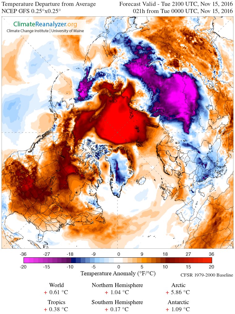
Both of the order of 20C anomalous to their average.
The NH Pole of Cold shifted entirely from a SEA basin (Arctic ocean) to LAND (Siberia Russia)
Interesting. The massive ‘hot spot’off the north tip of Greenland is almost perfectly centered over the Gakkel Ridge – a well-known center of sea floor spreading, recent lava flows, and the northernmost extension of the Mid-Atlantic Ridge. We don’t have active monitoring of geological activity in this area, but perhaps we should since large-scale heat releases there could significantly affect the Arctic ice thickness.
Recent articles on effect on Arctic sea ice of past and present (1999-2016) volcanic and seismic activity along the Ridge:
Nov 2015
http://climatechangedispatch.com/heat-from-deep-ocean-fault-punches-hole-in-arctic-ice-sheet/
Jan 2016
https://iceagenow.info/underwater-volcanoes-melting-arctic-ice-says-geologist/
Oct 2016
https://watchers.news/2016/10/23/earthquake-gakkel-ridge-volcano-north-pole-october-2016/
What I see is a huge amount of water dumping huge amounts of energy into a very cold space.
Do not pass Go, Do not collect $200!
Yes.
That’d be water undergoing phase changes. 😉
“What I see is a huge amount of water dumping huge amounts of energy into a very cold space.”
What unscientific nonsense.
The water (Arctic) is mostly ice covered for a start.
Secondly the “huge amount of energy, is, I assume you mean, warm(er) air.
SO how can warm air “dump” it’s warmth onto a different region and make it colder?
Answers on a post card please.
Warm spots dump their heat faster to space than cold spots do. So that warm spots is dumping heat to space, and that makes more cold air.
Why not post an up-to-date one, instead of something 2 weeks old.
Because the deceptive graph published by Rose is not “up to date”
That’s pathetic, even for you !
You know the most recent charts show the warm anomaly moving away from the Arctic down through Canada, don’t you, little worm. That is why you won’t show them.
You know the Arctic sea ice will now expand rapidly.
The Siberian very cold blob has spread out to Europe.
Pity those who have to pay their electricity bill…
… and let’s hope the debilitated electricity supplies in Europe, UK don’t collapse
And these graphs showing the 8 month changes in RSS and UAH land data, ARE up to date

They show the deepest and fastest cooling on land in the whole satellite data.
Get over it !
the FACTS are against you, as always.
And please tell us how the topic graph is out of date?
Or are you LYING yet again.
“maybe there is a perfectly sensible explanation. I will post David Rose’s answer should he get around to answering my query.”
What’s “pathetic” my friend, is your is your lack of basic common-sense.
Do you say that Rose’s “graph” is constructed to show the data for the 28th Nov?
Look in the RSS data file….
Last entry
06/11/2016, 03:28:00
“Why not post an up-to-date one, instead of something 2 weeks old.”
“That’s pathetic, even for you !”
AndyG55:
What’s “pathetic” my friend, is your is your lack of basic common-sense.
Do you say that Rose’s “graph” is constructed to show the data up 28th Nov?
Look in the RSS data file….
Last entry
06/11/2016, 03:28:00
I believe time will prove the subject chart to be incorrect. Where’s the data?
Here, Mr. Graney: https://wattsupwiththat.com/2016/04/07/no-statistically-significant-satellite-warming-for-23-years-now-includes-february-data/
And here: https://wattsupwiththat.com/2016/09/19/uah-and-enso-now-includes-july-and-august-data/
Selected quote for your convenience:
GAME. OVER.
Janice, I think the request for data refers to the “stunning new data”. Nothing you posted shows the NASA satellite data showing a 1C drop in the last few months.
Several people have asked about the source of the data, and as far as I can see, no one can point to the original data. Every time I try googling this, I just get links to the same article with no indication of what satellite it is, or what part of the atmosphere is being measured, or what the date is for the final data data point in the graph.
If you have links the THAT data, I am sure people will want to see it.
Thank you, Mr. Folkerts, for explaining what Mr. Graney actually meant by “the subject chart.” Well, lol, at least he got data for part of that chart.
GAME. OVER.
Sounds like MISSION ACCOMPLISHED – equally flippant and equally specious.
I charted the USCRN data through October. It looks nothing like that. Since we’re not even through November, I’m assuming the OP chart is only through October. I’d like to see the data for that chart.
Tim Folkerts November 28, 2016 at 2:20 pm
Janice, I think the request for data refers to the “stunning new data”. Nothing you posted shows the NASA satellite data showing a 1C drop in the last few months.
Several people have asked about the source of the data, and as far as I can see, no one can point to the original data. Every time I try googling this, I just get links to the same article with no indication of what satellite it is, or what part of the atmosphere is being measured, or what the date is for the final data data point in the graph.
If you have links the THAT data, I am sure people will want to see it.
Here it is:
http://data.remss.com/msu/monthly_time_series/RSS_Monthly_MSU_AMSU_Channel_TLT_Anomalies_Land_v03_3.txt
Re: GAME. OVER. and MISSION ACCOMPLISHED.
Your verbal slithering will not change the fact that, given an accurate and meaningful definition of “Mission accomplished,” President George W. Bush was right to say that aboard that ship.
The same with the fact that the AGW battle is OVER. CO2 UP. WARMING STOPPED.
That there are deluded troops hiding out on the frontiers of the theater of war (some of whom are named McLeod) , still firing off pot shots, ready to return should we on the side of science relax our vigilance, changes that not a wit.
NASA (National Aeronautics and Space Administration)
Just curious — where did “Nasa” (in the above article) come from?” In Hebrew, “nasa” means “to lift up, take up, carry.” That’s very cool (that NASA’s purpose and nasa’s meaning coincide), but, I’ve never seen NASA called “Nasa” in any official documents. Anyone have the answer to this mystery?
Probably additional typos Janice, just as the missing “.” after “Dr” and “Mr”.
Janice and John–I think it is just the tendency to convert pronounceable acronyms into words. As it is “nassa” rather than enayessay, it tends to become an ordinary word, like snafu or fubar.
Thanks for trying to help me, JohnWho and Tom. 🙂
I think “nassa” when I read “NASA.” I don’t hear (in my mind) “N” “A” “S” “A.” Like NOAA (I always read/hear/think “noah”). Unlike the F.B.I. (for me, always said/heard, “the ‘F’ ‘B’ ‘I’ “).
And, hey! That reminded me of another Q!
Q: Why do British writers sometimes call NOAA “the NOAA?”
Just British useage, no doubt. In American useage, we leave off the “the” of most acronyms, e.g., “I’m flying into JFK.”** (not: “I’m flying into the JFK.”) Like (I think, lol) a U.K. resident would say, “I’m flying into Heathrow.” (not: “I’m flying into the Heathrow.”)
**JFK = {The} John F. Kennedy {Airport}
I get that we sometimes use English differently, e.g., British: “He is in hospital.” American: “He is in the hospital.” I’m just wondering if it is, indeed, British useage here or just the writer’s mistake when I read “the NOAA.”
Again, thank you, so much, for taking the time to respond, gentlemen.
Janice
Sigh (smile). Yes, yes, it should have said, “I’m flying in to …” not crashing my plane!! lol
He is in hospital – he is ill, and is being treated by doctors in a hospital
He is in the hospital – if you want to know where he is, he is in that building over there, which is a hospital
And in a similar vein
The bread and butter are on the table – On the table you will find a loaf of bread and a dish of butter
The bread and butter is on the table – On the table there are several slices of buttered bread
English language is great1
Thank you, Mr. Barraclough! Someone answered! Yay! 🙂
Well, while Americans use “hospice” {dying patient care} the way the British use “hospital” (“He’s in hospice.”), Americans don’t have the concept of “hospital” as a state of care, just a building. “In hospital” just sounds nonsensical. Weird (of us), huh? 🙂
“Church,” on the other hand, is like the British “hospital:”
“She is going to church,” (going to attend a worship service in a church building); and
“She is in the church.”
*******************************************
So — what about “the NOAA”?…. I’ve seen it more than once…. but, perhaps it is just a common typo?
Say it out loud, but instead of reading the acronym as a noun (I’m way over my head here), say what the initials stand for.
I think that answers your question, but then creates a new one you had never thought about before 🙂
Thanks, Mike! Yes, that was my guess. The British are thinking, every time, “N” “O” “A” “H,” thus, they put a “the” in front. And, as you said I wish someone British would answer the Q, why they do that? Not that there need be a “reason,” but, given that they would have heard of it first from Americans who always say just plain, “noah,” why change it?
I wonder if they EVER leave the “the” off ANY acronym? Kinda defeats the purpose of an “acronym” to put a “the” before it and always enunciate every single letter of the acronym.
Aaa. Who cares? lol They pronounce French and Spanish words such as valet and taco in their own British way. And wigwam. Vive la difference! Go, British! AND, GO, BREXIT!
#(:))
Advice from my mother: “Always make your word’s sweet, because you never know when you may have to eat them yourself.”
So your mum had a few spare apostrophes then?
Just think how much lower the temperatures will go with so much less Green to burn!
Dr. Gavin Schmidt isn’t available for comment since he working feverishly altering the data to show continued “unprecedented” warming.
/cynic
Trends between the El Ninos, taken back to common starting point
Immigrant Gavin has a lot of ‘splaining to do.
‘splaining? Maybe UAH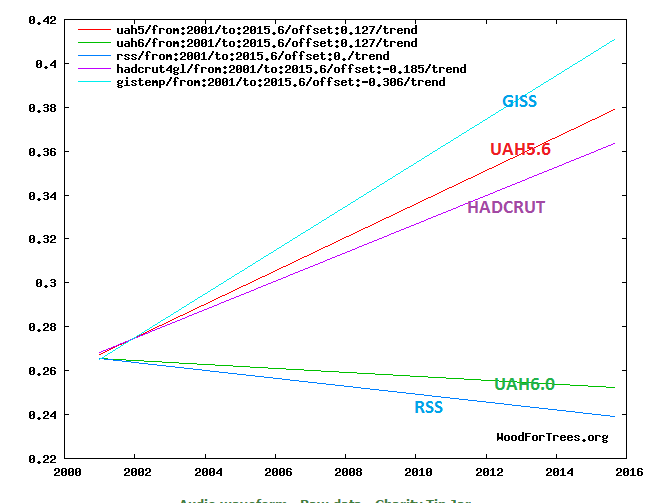
Nick,
UAH makes justified corrections.
GISS and NOAA practice politically motivated anti-science fiction.
Yes, they found a drift in the satellites and fixed it.. Its called SCIENCE and ENGINEERING.
What don’t you comprehend !!
Are you REALLY that brain-washed and dumb? !
I’m really beginning to think you are !
Yes, AndyG, and when “Chimp” uses her or his real name, we will know it.
I think the chimp is really a snake in a cheap wig and an overcoat. The snake’s grossly inaccurate statements don’t fool most WUWTers, but, just in case one of the AGW Cult Members is reading WUWT, the snake comes here to keep their minds enslaved by the Cult of Sustainability and AGW’s junk science teachings.
Janice,
What allegedly grossly inaccurate statements do you have in mind?
All of them.
If this is “land only” satellite temperature this is going to be misleading. There is more land in the NH than in the SH and there has been a rather huge cold anomaly as the polar air mass slipped down over Siberia during November. This might be more “weather” than “climate”.
crosspatch, crosspatch, Don’t you know that it’s only “weather” when the temperature drops? When it rises it’s “global warming”. If it’s a natural “disaster” then it’s “climate change”. 😎
Yes.
Try reading the thread.
If it were a NH vs. SH thing, wouldn’t we see something similar every fall?
No, because this is “anomaly” not “absolute” temperature. If the polar vortex had not moved out of the Arctic ocean away from the pole, we would not see such a drop in land area temperatures (because the polar air mass, being over the Arctic Ocean would not be included as “land”).
Thank you crosspatch, the graph in the article makes sense to me now with your explanation. It captures the negative anomalies in Asia from the displacement of the Polar Air mass without capturing the positive anomalies left in it’s wake in the Arctic Ocean.
Exactly, and therefore, it is misleading.
That guy Gavin is full of schmidt!
Gosh, we should have just checked Accuweather.com first, and saved ourselves a lot of bother. They have the definitive explanation for the now-defunct “pause” (RIP):
http://www.accuweather.com/en/weather-blogs/climatechange/new-insights-to-the-previous-s/61810926
Brian — the “pause” cannot be said with any meaningful degree of confidence to be “defunct.” Rejoice! Not RIP but, “we must wait a few years and see” — what the data turns out to be. That is, an El Nino blip on the temperature plateau is not an end to warmING. It is only a temporary rise in temps.. The TREND is still flat.
CO2 UP. WARMING STOPPED. 🙂
Dear MOD — PLEASE FIX MY MISTAKE JUST ABOVE to read: “is not a RESUMPTION OF warming” instead of “end to warmING”. THANK YOU!
The starting point of proving the AGW theory should be to explain how atmospheric CO2 can warm the oceans by 3°C, and then cool the oceans by 3° or more. There is 3,000x more heat in the oceans than the atmosphere, and CO2 is predicted to only be able to warm the atmosphere by 1.6°C. The numbers simply aren’t there. CO2 simply doesn’t trap enough energy to warm the oceans, let alone the atmpshere.
Applying the scientific method to climate “science.”
Null Hypotheses: Man-Made CO2 is causing Global Warming.
Evidence: IPCC Models and Temperature Reconstructions
Analysis of Data:
Conclusion: Reject the Null
Did you ever compare satellite data with the IGRA radiosonde dataset, or even with its most homogenised variant called “RATPAC B monthly combined” ?
I guess that if you ever had like I did, you wouldn’t have presented Spencer’s chart.
The one and only (small) subset of the IGRA network fitting satellite data at the same atmospheric pressure level consists of 31 of the 127 US IGRA stations, nearly all located in the CONUS.
The list of these carefully selected, “US controlled” {sic} balloons you find in a 2006 paper written by… John Christy and William Norris.
Search, download, process and… compare!
Feel free to post that analysis. It would be welcome, and while you are at it, please explain how 13µ to 18µ can warm the oceans. That would be a good starting point because if you can’t explain how atmospheric CO2 can warm the oceans, you can’t explain why the atmosphere is warming.
Feel free to post that analysis. It would be welcome…
Will be done as soon as I have access to my LINUX system.
and while you are at it, please explain how 13µ to 18µ can warm the oceans.
Sorry: I’m not interested here in any CO2 discussion.
There is enough to do with the question why even UAH6.0beta5 shows, for the “pause” period 2000-2013, a linear trend of over 4 °C / century in the latitude stripe 80-82.5N, and of over 3 °C / century in the stripe 80-82.5S:
Oooops?! A comment is missing here.
co2islife, I’ll manage to do that as soon as I have access to my LINUX guy.
BTW: no interest in these fruitless CO2 discussions!
” if you can’t explain how atmospheric CO2 can warm the oceans, you can’t explain why the atmosphere is warming.”
The absorption of the infrared emission from atmospheric greenhouse gases reduces the gradient through the skin layer, the flow of heat from the ocean beneath will be reduced, leaving more of the heat introduced into the bulk of the upper oceanic layer by the absorption of sunlight to remain there to increase water temperature.
That is we are talking NOT about the gradient between sea surface and overlying air, but we are talking about the gradient THROUGH THE SKIN – i.e., the water temperature difference between the top and bottom of the skin layer, which controls how heat flows across this layer, from the bulk of ocean water below to the surface. Obviously, if you heat the top of the skin layer, this reduces the heat flow across this layer from below
Note: the above really only applies fully to calm water.
Turbulent motion (just look at the average sea surface) dominates and of course any warming of the skin layer will get mixed down.
“Feel free to post that analysis.”
How about this …..
https://tamino.wordpress.com/2015/12/11/ted-cruz-just-plain-wrong/
+ follow-up
https://tamino.wordpress.com/2016/04/02/new-rss-and-balloons/
You have that wrong. the null hypothesis is always “no effect” – that is why it is so called. The null hypothesis must be that CO2 is not affecting the climate.
+ 1 🙂
Can you show that CO2, and only the ~3% from humans, is? I didn’t think so.
The null hypothesis is that nothing unusual is happening in earth’s climate, requiring a special explanation.
There is zero evidence that anything unusual is happening, let alone catastrophic man-made global warming due to anthropogenic GHGs.
Thus the null hypothesis cannot be rejected. Hence, no worries.
What is in evidence however is the salubrious effect on life on our planet of one more molecule of CO2 (up from three to four) per 10,000 dry air molecules over the past 250 years or so, since the onset of the Industrial Revolution.
Does this drop re-establish “the Pause ” which has been charted by Monckton on this site in the past ?? If it has, it would be great to see his updated analysis here on WUWT
You first should carefully analyze how the “drop” was brought into this guest post.
Of course not
What a desperately superficial guest post!
Not only based on the classical cherry-picking, but without any references to any source (like some other commenters, I know where it comes from).
It is ridiculous, yet misleading and thoroughly unscientific to hide here the use of land data (RSS3.3 TLT‘s northern mid latitude zone) where it shows by accident exactly what one wants to pretend, namely an anomaly drop from 1.323 °C in February 2016 down to 0.385 °C in October!
I guess David Rose would never tell you that RSS3.3 TLT‘s zonal trend for the northern mid latitudes from 1979 till today is… 0.213 °C / decade, i.e. about twice as much as for the entire Globe.
The maximal drops of global tropospheric temperature anomalies in 2016 are as follows:
– UAH6.0b5 Globe land: 0.81 °C
– RSS3.3 TLT Globe: 0.64 °C
– RSS4.0 TTT Globe land: 0.62 °C
and last not least (/sarc)
– UAH6.0b5 Globe: 0.42 °C
In comparison to such poor work, Werner Brozek’s posts look quite a bit more professional, even if he often confounds ENSO signals and tropospheric anomalies, and above all thoroughly misunderstands the concept of statistically significant warming.
The 2015/16 ENSO edition was by no means stronger than that of 1997/98. The latter has been the real Super El Niño, even stronger than the 1877/78 and the 1982/83 editions.
a) Look at this graph comparing the 3 most recent editions
http://fs5.directupload.net/images/161129/dyyvksu2.jpg
b) Here is my usual cherry-picking answer, showing how much stronger the troposphere reacted to the 1997/98 ENSO signal in the Tropics than elsewhere in the Globe (here using UAH data):
http://fs5.directupload.net/images/160922/oayqquai.jpg
(RSS3.3 TLT and RSS4.0 TTT show the same behavior).
Thus: Steepest drop in global temperature on record?
Ridicule, Monsieur Rose!
Bindidon November 28, 2016 at 4:00 pm “What a desperately superficial guest post!”
The pain, the agony you must be feeling.
3 desperately superficial replies with nary a hint of warmist bile.
Better get used to it.
There are more falls to come.
marty November 28, 2016 at 4:53 pm “I propose to wait these few days until the November data are there!”
Very wise.
But miss the chance to celebrate?
The anticipated drops in temp may take until January to fully kick in but we can hope.
I remember a blog a few years ago saying the temp for the year was set by the temp in the first 3 months more or less. So a hot 2016 still but hopefully a very cold 2017 when of course it will all be a La Nina event [JCH] though this was all a AGW event.
angech on November 28, 2016 at 6:50 pm
Typical skeptics blah blah: “pain”, “agony”, “warmist bile”, “”there are more falls to come”, … words, words, but: no data, no arguments.
I like sound skepticism.
“The 2015/16 ENSO edition was by no means stronger than that of 1997/98. The latter has been the real Super El Niño”
Why then, does GISS flatten out the the 97/98 spike yet gleefully include that of 2015/16? As I recall this is the only data set that does this
Michael Carter on November 28, 2016 at 7:09 pm
Why then, does GISS flatten out the 97/98 spike…
Where is your proof they really do what you claim?
The GISS land-only data shows higher temperatures in the past and lower temperatures in the present than those shown by the GHCN station data they rely on, and which GISS processes further in order to eliminate outliers, weaken the data of rural stations with higher nightlight down to their real rural context, etc.
And above all: why do you speak about “GISS flattening” but not about UAH and RSS showing the same for the Globe, but NOT in the Tropics, as you can see in the chart above comparing UAH “Globe” with UAH “Tropics Ocean” ?
What about you comparing UAH Tropics data with GISS’ data in the same region?
I propose to wait these few days until the November data are there!
La Nina came in with the cold.
Alarmists predictions on hold.
So the eighteen year pause
is now nineteen, because
no sunspots, a sight to behold. https://lenbilen.com/2016/11/28/the-nineteen-year-temperature-pause-is-back-a-limerick/
I glanced at the article and saw the two words ‘Schmidt head’ together. Is there such a thing as a ‘Freudian Glance’?
Yes. Both auditory and optic signals pass through the center of the brain before being routed to the auditory and visual cortices. The brain center contains a semi-autonomous protective core that can make independent decisions as to what is seen or heard.
I can’t find a single source that shows a TLT drop anywhere close to that claimed in the cited article. Can someone point to a possible source for this? One possibility that occurs to me is based on the “surface” and “over land” phrase, which would exclude the exceptionally high temperatures in the Arctic, while including the cold blast that slid down into Siberia, and skew the global temperature set. This raises the question of intentional misrepresentation.
It’s from this obsolete and deprecated set.
What makes this data set obsolete and deprecated?
It is v3.3; v4.0 is out now, but they haven’t yet released TLT. Of V3.3, the people who create it, RSS, say:
“The lower tropospheric (TLT) temperatures have not yet been updated at this time and remain V3.3. The V3.3 TLT data suffer from the same problems with the adjustment for drifting measurement times that led us to update the TMT dataset. V3.3 TLT data should be used with caution.”
Slipstick on November 28, 2016 at 11:16 pm
What makes this data set obsolete and deprecated?
Simply the fact that Remote Sensing Systems has released a new revision “RSS 4.0” of their troposphere measurement data, intended to replace the revision “3.3”:
http://www.remss.com/measurements/upper-air-temperature
http://www.remss.com/node/5166
The old revision 3.3 is still accessible for the TLT level; but there is no RSS 4.0 TLT available.
The interesting fact here is that in his Senate Testimony presented 2006 Feb 2, John Christy (UAH) carefully avoided to present any TLT data. All UAH data referred to in this document solely concerns TMT (mid troposphere).
“Nick Stokes November 28, 2016 at 8:49 pm”
Do you mean inconvenient dataset?
“Do you mean inconvenient dataset?”
No. The people who create dataset know the issues. They say it is unreliable and should be used with caution. Do you know better? Who does?
“Nick Stokes November 29, 2016 at 12:36 am”
Ah, who does? They don’t, clearly. Thanks for confirming my suspicion the data is bogus!
No Nick. that data matches the other satellite data very well.
It also has an almost exact trend match to the only pristine surface data in the world.
It all comes down to if the guys at RSS think they can get away with their “politically based adjustments”
The REAL this obsolete and deprecated sets are the FARCE that are GISS and all other products using the much FABRICATED NOAA surface mess.
“the people who create it, RSS, say:… blah blah.
Yes, we all know that those people are “believers” in the AGW scam.
So far they have put science ahead of their belief, unlike you.
” FABRICATED NOAA surface mess.”
You really have no idea, how about-face this is, do you?
You have one satellite with different “algorithms” working on the AMSU sensors to come up with a Global average surface mean temp.
Never mind that it’s over a layer in the troposphere.
That we are now on V6 (Beta5) of UAH and V4.0 of RSS doesn’t tell you something about, err….
“FABRICATED …. mess”?
And to boot – go look at the disjoint where the 14 MSU ends and the 15 AMSU sensor starts versus RATPAC sonde data.
One sat sensor vs 10’s thousands of surface thermos.
UAH are just assuming that the newer AMSU is of “”Cadillac”-quality calibration”.
Whilst RSS admit they do not know which sat sensor is/was wrong and have smoothed out the difference!!
Homogenisation of the surface thermo record (apples and apples) can be found in documentation and which even when discounted makes not a whit of difference in the outcome.
The only reason UAH is the fave is because it’s the coldest.
RSS was and now Mears has said that it should not be treated a better than the surface obs and V4.0 has made it warmer, you have relegated that.
Oh, and I guess you don’t like climate models either?
That the algorithms use them when working out when the time of max/min temp should be when they sample a surface outside of that time and plug that is as the value, no doubt make perfect sense to you. Does it?
And does and weather observer read the max/min at the wrong time and then proceed to check what the NWP model had for them and record them as fact??
http://www.drroyspencer.com/2016/03/comments-on-new-rss-v4-pause-busting-global-temperature-dataset/”
“RSS uses the diurnal cycle from a climate model (CCM3), with empirical adjustments. We (UAH) use a pure empirical adjustment based of the the observed drift between NOAA-18 and NOAA-19 (for the “1:30” satellites) and NOAA-15 and Aqua (for the “7:30” satellites).”
Re the misaligned MSU/AMSU sensors used by the sat dat series.
What if all the mercury thermos around the world were replaced by ERT’s.
Then we notice a difference.
The new ERT’s are reading colder.
Wot to do.
Go with the new coz it’s, err, new.
Or split the difference?
In one case we end up with a possible wrong answer (50/50).
In the other we end up with a deffo wrong answer.
And your LOGIC says the “NOAA surface mess”.
Sat temp series data the “Gold standard” (Curry) my arse.
That you don’t see it is part of the issue.
Toneb–you have perhaps seen the coverage map for surface stations? Notice how warm many of the “infills” are? When there is a great deal of “warming” in areas with no actual thermometers, perhaps something is going on? The satellites at least do not have the infill problem.
You might have a point, if all of the published temperature series weren’t half made up data, and the rest is homogenized, and that’s ignoring all of the retro adjustments to the data.
When you remove all of this junk, the temp series looks a lot like the satellite.
“When you remove all of this junk, the temp series looks a lot like the satellite.”
The people who say that never do it. I have, and it makes very little difference. And when you say “like the satellite”, the question is, which satellite?. As I posted above, you can have UAH 6 trends differing from GISS, when V5.6 trend was very similar.
The one that looks like this
Ncdc gsod dataset.
You may like the look of it. But what does it mean?
I looked at GSOD a few years ago. I compared with GHCN data for a global index. Very little difference:
But they still should be very correlated. The 0.12 reading is the 3rd lowest since 2013, and those other months were at or below Pause average globally. So, I would guess that UAH will catch up to RSS this month. Its hard to say this record plunge means nothing. But we’ll see in a few days when UAH comes out.. .,
Slipstick, it’s this dataset:
http://data.remss.com/msu/monthly_time_series/RSS_Monthly_MSU_AMSU_Channel_TLT_Anomalies_Land_v03_3.txt
It’s the first column, 70ºS to 82.5ºN, over land only.
This drop is just about wnat I expected. It is a consequence of the twenty-first century temperature variations which started with the appearance of a step warming in 1999. No one understood it and they paid no attention to my analysis of it. This step warming followed immediately upon the departure of the super El Nino of 1998 and very likely is comprised of the warm water the super it left behind. In three years this raised global temperature by 0.3 degrees Celsius and then stopped. As a consequence, all twenty-first century temperatures were higher than the the eighties and nineties had been before the appearance of that super El Vino .The hiatus of the early twenty-first century rested upon the raised top of this temperature platform.This general temperature rise led to numerous “warmer than ever” peak temperature claims. Hansen was quick to notice that nine out of ten “highest ever” temperatures congregated in the first decade of the twenty-first century and quickly claimed them all for greenhouse warming. This is impossible because according to the Keeling curve no carbon dioxide was released when the step warming took place. If this warming really was fueled by warm water left behind by the super El Nino of 1998 then no replenishment is possible and we should observe a steady decline of temperature after the initial spurt of warming. Judging by the latest UAH temperature release the cooling already has started. It is not easy to see because it is confounded by the La Nina of 2008, the El Nino of 2010, and the present El Nino of 2016 that all have to be crossed. The cooling is visible as a downslope from 2002 to 2012, beyond which the 2016 El Nino takes over. But by extrapolating that downslope ahead of the El Nino of 2016 the temperature beyond it should drop quite low, just as the present surprise observation shows. It may eventually drop to the level of the eighties and nineties that served as a base upon which the step warming of 1999 was built up. And while on the subject, eighties and nineties had no warming and were a hiatus period of 18 years. The crooks running the global temperature archive wiped it out and substituted a phony warming in its place.
In all of this ‘hottest year ever’ discussion, don’t forget the 1915 to 1945 warm period where NOAA/NASA substantially reduced temp data for this period and added temp for 2000+ to artificially make the later temps appear warmer. Take a look at Hansen’s curve prior to the chilling of the 1930/40’s and Chen’s (2011) non-homogenized temps for the U.S. Hansen’s 2001 curve shows at least 5 years in the 1920s and 1930s that are warmer than 1998 and 2 warmer than 2015. Chen’s ‘de-homogenized’ curve shows 5 years warmer than 2015.
“…for the U.S…” is the operative phrase here. You are looking at data set that represents less than 2% of the Earth’s surface; extrapolating that to the entire globe has no validity.
… extrapolating that to the entire globe has no validity.
Easterbrook has been told that many times, Slipstick. Like many commenters of his kind (TA etc) he will never change his opinion, and always pretend the same invalid stuff.
Slipstick and Bandidon
What is the correlation coefficient between US and Global Temperatures since 1880?
Slipstick
November 28, 2016 at 11:47 pm
“…for the U.S…” is the operative phrase here. You are looking at data set that represents less than 2% of the Earth’s surface; extrapolating that to the entire globe has no validity
Admitting to Hansen’s data manipulation of his GISS record is not your friend: “False in one, False in all.”
What actually does have validity in real science is CO2-Climate Change’s Global Record of [100%] Prediction Failure = Scientific Falsification.
“What actually does have validity in real science is CO2-Climate Change’s Global Record of [100%] Prediction Failure = Scientific Falsification.”
Yes, of course it has – that’s plain to see.
If you meant the consequences of the above.
I know of none that would be obvious for some decades.
But maybe you have a time-machine – so I bow to your clairvoyance.
Funny, this is what’s measured.

and the Range between Min and Max.
Co2 can not be causing this pattern of warming (max going up, while min isn’t).
cerescokid on November 29, 2016 at 6:44 am
What is the correlation coefficient between US and Global Temperatures since 1880?
Interesting question! But I’ll have to answer it on the base of GHCN station data, as I lack regional GISS datasets. I’ll consult data ar home. But one detail I can write right now: CONUS is wrt temperature an incredibly more stable landscape as is the whole Globe 🙂
cerescokid on November 29, 2016 at 6:44 am (2)
I suppose that with “correlation coefficient” you mean the ratio of their linear trends.
GHCN station data , 1880-2016
– Globe: 0.214 °C / decade
– CONUS: 0.024 °C / decade
Please keep in mind when comparing that GHCN is unadjusted data, and hence subject to major processing by its suppliers (e.g. GISS), with as goals e.g. elimination of outliers and UHI effects.
The difference at global level is really great:
GISS land-only data, 1880-2016
– Globe: 0.097 °C / decade
GISS land+ocean data, 1880-2016
– Globe: 0.071 °C / decade
Maybe the fact that the US data got fiddled with, on the same level as all global weather stations their data does give him a point of the question:
if they messed up with 2% of the data how did they mess up the other 98% of it?
It’s all ENSO since 1960. AGW should be renamed EGW (ENSO global warming)
It’s not only all ENSO since 1960… Have for example a look at this:
http://research.jisao.washington.edu/data_sets/quinn/quinn15251987.gif
Unfortunately it stops in 1987, and so doesn’t show the rest. But you can compare its end with the beginning of Klaus Wolters’ extended Multivariate ENSO index
http://www.esrl.noaa.gov/psd/enso/mei.ext/ext.ts.jpg
So indeed at a first glance, ENSO seems to drive everything.
But if it does: why is then the 1997/98 El Niño weaker represented by all global surface and satellite records than is the 2015/16 edition?
Look at the comparison between 1997/98 and 2015/16 using five different ENSO indices:
http://fs5.directupload.net/images/161129/g5kyem82.jpg
Following the higher ENSO power of the 1997/98 edition, should not all temperature measurements have shown this in their records? Why did they all not?
The only exception: satellite data restricted to the Tropics latitude band (25S-25N)…
“But if it does: why is then the 1997/98 El Niño weaker represented by all global surface and satellite records than is the 2015/16 edition?”
Really quite simple. The AMO induced loss of sea ice in the Arctic has driven up the global temperature a bit more in 15/16 than was the case in 97/98. This is clear when you look at the February anomaly vs. the June anomaly. The biggest effect of open water heating in the Arctic takes place in the NH winter.
That should be obvious.
There was a series of super El Ninos in the 1980s and ’90s, so more heat was blown off. There was no super EN between 1998 and 2016 supers, and a lower than average number of normal ENs, so more heat had accumulated in the tropical Pacific to be released this year.
Richard M on November 29, 2016 at 7:53 am / Chimp on November 29, 2016 at 2:09 pm
Two quick answers: none happened to satisfy me. I compared a lot of data:
MEI:
http://www.esrl.noaa.gov/psd/enso/mei/table.html
AMO:
http://www.esrl.noaa.gov/psd/data/correlation/amon.us.data
UAH:
http://www.nsstc.uah.edu/data/msu/v6.0beta/tlt/uahncdc_lt_6.0beta5.txt
Arctic sea ice extent & area:
ftp://sidads.colorado.edu/DATASETS/NOAA/G02135/
http://fs5.directupload.net/images/161130/immxy9vn.jpg
1. A look at the chart containing their running mean plots convinced me that AMO has much less direct correlation with Arctic sea ice decline than Richard M supposes. In 1998, the ASI decline was low just in the “moment” where AMO peaked together with MEI and UAH. In 1985, the inverse happened.
2. Chimps idea of the 2016 UAH heat spike being boosted by a lack of recent Niño events since 1998 is a nice try, but makes no sense because
— the argument is of no use for UAH Tropics (the 1998 peak is there higher than that of 2016);
— there were indeed more Niño events before 1998, but two of them were heavily masked by volcanic eruptions (St Helens + El Chichon; Pinatubo).
Bindidon, the AMO peaked around 2010. It just went positive in 1995. Your claim is utter nonsense and shows a complete lack of climate knowledge. Also, the AMO always seems to get a little boost during El Nino years which is what you showed. If you can’t even look at the simple stuff and get it right why do you think you can possibly understand the bigger complexities?
Dr:.png/250px-Ocean_Heat_Content_(2012).png)
I’m sure you will agree that an EN heats the atmosphere by bringing warmer waters to the surface.
I’m also sure you will agree that it cannot heat the air without that water cooling.
SO:
“All ENSO since 1960”, eh?
In that case either the OHC should have gone down since then, or the Sun would have to be providing the energy to both heat the oceans and allow them the disgorge some of that heat periodically to heat the atmosphere. Progressively.
Please explain why also that this last EN (just for instance), although weaker than the 97/98 one managed to make the atmosphere hotter than 18 years ago.
So even La Ninas come in a warmer and warmer variety as time progresses…
http://blog.chron.com/climateabyss/files/2013/01/GISTEMPjan13.gif
Consider an El Nino as putting a pot of water on to boil, it’s all the water vapor they generate that then blows down wind to cool. That is why they generate warming. Thought the 97 El Nino left a change in the 20 to 35 North Latitudes where the sensitivity to solar went up and never came back down.
LOL. ‘David Rose’?
Check out that guy’s record for accuracy on climate stories.
LOL “Griff”,
Check out that fool’s record on ever getting anything right !!
“Griff November 29, 2016 at 1:06 am
Check out that guy’s record for accuracy on climate stories.”
Stories?
Yes Patrick MJD: stories. An example, pretty good debunked by people having the knowledge needed to discover flaws:
https://www.carbonbrief.org/the-mail-on-sunday-david-rose-and-climate-misinterpretation-round-two
Like I said, stories.
Do I have to mention Gore, Mann, Jones, Flannery et al too?
Patrick MJD on November 29, 2016 at 3:38 pm
Do I have to mention Gore, Mann, Jones, Flannery et al too?
No, there is some evidence that it is superfluous. Simply because all your comments are a signal that you basically follow the negative interpretation given by the people you mentally follow.
What might persons like you really know about Michael Mann or Phil Jones?
Yes do:
https://blog.metoffice.gov.uk/2012/10/14/met-office-in-the-media-14-october-2012/
https://blog.metoffice.gov.uk/2014/02/17/met-office-in-the-media-16-february-2014-response-by-professor-mat-collins-and-the-met-office/
https://blog.metoffice.gov.uk/2013/09/15/met-office-in-the-mail-on-sunday/
[snip -language -mod]
So where has the CO2 gone?
Mr CO2 is on holiday in our Big Swimming Pool, where it got married to Ms. Heat 🙂
TRUMP: I was joking when I said the Chinese ‘created’ the concept of climate change
’nuff said
Well, now that the science is settled, perhaps someone can explain what causes El Nino and what make makes El Nino go away and what makes El Nino reappear and what makes it go away again, and ……..
Clearly, since the climate can be predicted 100 years hence then it should be a CO2 laden breeze to provide the answer to this question.
John,
Ian Wilson has proposed a contestable theory.
http://astroclimateconnection.blogspot.com.au/2015/01/the-el-ninos-during-new-moon-epoch-5.html
His ENSO prediction record holds to date.