Guest Post by Bob Tisdale
This post provides updates of the values for the three primary suppliers of global land+ocean surface temperature reconstructions—GISS through September 2016 and HADCRUT4 and NCEI (formerly NCDC) through August 2016—and of the two suppliers of satellite-based lower troposphere temperature composites (RSS and UAH) through September 2016. It also includes a few model-data comparisons.
This is simply an update, but it includes a good amount of background information for those new to the datasets. Because it is an update, there is no overview or summary for this post. There are, however, summaries for the individual updates. So for those familiar with the datasets, simply fast-forward to the graphs and read the summaries under the heading of “Update”.
(I’m still on holiday, yes still, so I may not get a chance to respond to comments.)
INITIAL NOTES:
We discussed and illustrated the impacts of the adjustments to surface temperature data in the posts:
- Do the Adjustments to Sea Surface Temperature Data Lower the Global Warming Rate?
- UPDATED: Do the Adjustments to Land Surface Temperature Data Increase the Reported Global Warming Rate?
- Do the Adjustments to the Global Land+Ocean Surface Temperature Data Always Decrease the Reported Global Warming Rate?
The NOAA NCEI product is the new global land+ocean surface reconstruction with the manufactured warming presented in Karl et al. (2015). For summaries of the oddities found in the new NOAA ERSST.v4 “pause-buster” sea surface temperature data see the posts:
- The Oddities in NOAA’s New “Pause-Buster” Sea Surface Temperature Product – An Overview of Past Posts
- On the Monumental Differences in Warming Rates between Global Sea Surface Temperature Datasets during the NOAA-Picked Global-Warming Hiatus Period of 2000 to 2014
Even though the changes to the ERSST reconstruction since 1998 cannot be justified by the night marine air temperature product that was used as a reference for bias adjustments (See comparison graph here), and even though NOAA appears to have manipulated the parameters (tuning knobs) in their sea surface temperature model to produce high warming rates (See the post here), GISS also switched to the new “pause-buster” NCEI ERSST.v4 sea surface temperature reconstruction with their July 2015 update.
The UKMO also recently made adjustments to their HadCRUT4 product, but they are minor compared to the GISS and NCEI adjustments.
We’re using the UAH lower troposphere temperature anomalies Release 6.5 for this post even though it’s in beta form. And for those who wish to whine about my portrayals of the changes to the UAH and to the GISS and NCEI products, see the post here.
The GISS LOTI surface temperature reconstruction and the two lower troposphere temperature composites are for the most recent month. The HADCRUT4 and NCEI products lag one month.
Much of the following text is boilerplate that has been updated for all products. The boilerplate is intended for those new to the presentation of global surface temperature anomalies.
Most of the graphs in the update start in 1979. That’s a commonly used start year for global temperature products because many of the satellite-based temperature composites start then.
We discussed why the three suppliers of surface temperature products use different base years for anomalies in chapter 1.25 – Many, But Not All, Climate Metrics Are Presented in Anomaly and in Absolute Forms of my free ebook On Global Warming and the Illusion of Control – Part 1 (25MB).
Since the July 2015 update, we’re using the UKMO’s HadCRUT4 reconstruction for the model-data comparisons using 61-month filters.
And I’ve resurrected the model-data 30-year trend comparison using the GISS Land-Ocean Temperature Index (LOTI) data.
For a continued change of pace, let’s start with the lower troposphere temperature data. I’ve left the illustration numbering as it was in the past when we began with the surface-based data.
UAH LOWER TROPOSPHERE TEMPERATURE ANOMALY COMPOSITE (UAH TLT)
Special sensors (microwave sounding units) aboard satellites have orbited the Earth since the late 1970s, allowing scientists to calculate the temperatures of the atmosphere at various heights above sea level (lower troposphere, mid troposphere, tropopause and lower stratosphere). The atmospheric temperature values are calculated from a series of satellites with overlapping operation periods, not from a single satellite. Because the atmospheric temperature products rely on numerous satellites, they are known as composites. The level nearest to the surface of the Earth is the lower troposphere. The lower troposphere temperature composite include the altitudes of zero to about 12,500 meters, but are most heavily weighted to the altitudes of less than 3000 meters. See the left-hand cell of the illustration here.
The monthly UAH lower troposphere temperature composite is the product of the Earth System Science Center of the University of Alabama in Huntsville (UAH). UAH provides the lower troposphere temperature anomalies broken down into numerous subsets. See the webpage here. The UAH lower troposphere temperature composite are supported by Christy et al. (2000) MSU Tropospheric Temperatures: Dataset Construction and Radiosonde Comparisons. Additionally, Dr. Roy Spencer of UAH presents at his blog the monthly UAH TLT anomaly updates a few days before the release at the UAH website. Those posts are also regularly cross posted at WattsUpWithThat. UAH uses the base years of 1981-2010 for anomalies. The UAH lower troposphere temperature product is for the latitudes of 85S to 85N, which represent more than 99% of the surface of the globe.
UAH recently released a beta version of Release 6.0 of their atmospheric temperature product. Those enhancements lowered the warming rates of their lower troposphere temperature anomalies. See Dr. Roy Spencer’s blog post Version 6.0 of the UAH Temperature Dataset Released: New LT Trend = +0.11 C/decade and my blog post New UAH Lower Troposphere Temperature Data Show No Global Warming for More Than 18 Years. The UAH lower troposphere anomaly data, Release 6.5 beta, through September 2016 are here.
Update: The September 2016 UAH (Release 6.5 beta) lower troposphere temperature anomaly is +0.45 deg C. It is basically unchanged since August (an increase of about +0.01 deg C).

Figure 4 – UAH Lower Troposphere Temperature (TLT) Anomaly Composite – Release 6.5 Beta
RSS LOWER TROPOSPHERE TEMPERATURE ANOMALY COMPOSITE (RSS TLT)
Like the UAH lower troposphere temperature product, Remote Sensing Systems (RSS) calculates lower troposphere temperature anomalies from microwave sounding units aboard a series of NOAA satellites. RSS describes their product at the Upper Air Temperature webpage. The RSS product is supported by Mears and Wentz (2009) Construction of the Remote Sensing Systems V3.2 Atmospheric Temperature Records from the MSU and AMSU Microwave Sounders. RSS also presents their lower troposphere temperature composite in various subsets. The land+ocean TLT values are here. Curiously, on that webpage, RSS lists the composite as extending from 82.5S to 82.5N, while on their Upper Air Temperature webpage linked above, they state:
We do not provide monthly means poleward of 82.5 degrees (or south of 70S for TLT) due to difficulties in merging measurements in these regions.
Also see the RSS MSU & AMSU Time Series Trend Browse Tool. RSS uses the base years of 1979 to 1998 for anomalies.
Note: RSS recently release new versions of the mid-troposphere temperature and lower stratosphere temperature (TLS) products. So far, their lower troposphere temperature product has not been updated to this new version.
Update: The September 2016 RSS lower troposphere temperature anomaly is +0.58 deg C. It rose noticeably (an uptick of +0.11 deg C) since August 2016.

Figure 5 – RSS Lower Troposphere Temperature (TLT) Anomalies
GISS LAND OCEAN TEMPERATURE INDEX (LOTI)
Introduction: The GISS Land Ocean Temperature Index (LOTI) reconstruction is a product of the Goddard Institute for Space Studies. Starting with the June 2015 update, GISS LOTI uses the new NOAA Extended Reconstructed Sea Surface Temperature version 4 (ERSST.v4), the pause-buster reconstruction, which also infills grids without temperature samples. For land surfaces, GISS adjusts GHCN and other land surface temperature products via a number of methods and infills areas without temperature samples using 1200km smoothing. Refer to the GISS description here. Unlike the UK Met Office and NCEI products, GISS masks sea surface temperature data at the poles, anywhere seasonal sea ice has existed, and they extend land surface temperature data out over the oceans in those locations, regardless of whether or not sea surface temperature observations for the polar oceans are available that month. Refer to the discussions here and here. GISS uses the base years of 1951-1980 as the reference period for anomalies. The values for the GISS product are found here. (I archived the former version here at the WaybackMachine.)
Update: The September 2016 GISS global temperature anomaly is +0.91 deg C. According to the GISS LOTI data, global surface temperature anomalies made a downtick in September, a -0.06 deg C decrease.

Figure 1 – GISS Land-Ocean Temperature Index
NCEI GLOBAL SURFACE TEMPERATURE ANOMALIES (LAGS ONE MONTH)
NOTE: The NCEI only produces the product with the manufactured-warming adjustments presented in the paper Karl et al. (2015). As far as I know, the former version of the reconstruction is no longer available online. For more information on those curious NOAA adjustments, see the posts:
- NOAA/NCDC’s new ‘pause-buster’ paper: a laughable attempt to create warming by adjusting past data
- More Curiosities about NOAA’s New “Pause Busting” Sea Surface Temperature Dataset
- Open Letter to Tom Karl of NOAA/NCEI Regarding “Hiatus Busting” Paper
- NOAA Releases New Pause-Buster Global Surface Temperature Data and Immediately Claims Record-High Temps for June 2015 – What a Surprise!
And recently:
- Pause Buster SST Data: Has NOAA Adjusted Away a Relationship between NMAT and SST that the Consensus of CMIP5 Climate Models Indicate Should Exist?
- The Oddities in NOAA’s New “Pause-Buster” Sea Surface Temperature Product – An Overview of Past Posts
- On the Monumental Differences in Warming Rates between Global Sea Surface Temperature Datasets during the NOAA-Picked Global-Warming Hiatus Period of 2000 to 2014
Introduction: The NOAA Global (Land and Ocean) Surface Temperature Anomaly reconstruction is the product of the National Centers for Environmental Information (NCEI), which was formerly known as the National Climatic Data Center (NCDC). NCEI merges their new “pause buster” Extended Reconstructed Sea Surface Temperature version 4 (ERSST.v4) with the new Global Historical Climatology Network-Monthly (GHCN-M) version 3.3.0 for land surface air temperatures. The ERSST.v4 sea surface temperature reconstruction infills grids without temperature samples in a given month. NCEI also infills land surface grids using statistical methods, but they do not infill over the polar oceans when sea ice exists. When sea ice exists, NCEI leave a polar ocean grid blank.
The source of the NCEI values is through their Global Surface Temperature Anomalies webpage. Click on the link to Anomalies and Index Data.)
Update (Lags One Month): The August 2016 NCEI global land plus sea surface temperature anomaly was +0.92 deg C. See Figure 2. It increased (a rise of about +0.05 deg C) since July 2016.

Figure 2 – NCEI Global (Land and Ocean) Surface Temperature Anomalies
UK MET OFFICE HADCRUT4 (LAGS ONE MONTH)
Introduction: The UK Met Office HADCRUT4 reconstruction merges CRUTEM4 land-surface air temperature product and the HadSST3 sea-surface temperature (SST) reconstruction. CRUTEM4 is the product of the combined efforts of the Met Office Hadley Centre and the Climatic Research Unit at the University of East Anglia. And HadSST3 is a product of the Hadley Centre. Unlike the GISS and NCEI reconstructions, grids without temperature samples for a given month are not infilled in the HADCRUT4 product. That is, if a 5-deg latitude by 5-deg longitude grid does not have a temperature anomaly value in a given month, it is left blank. Blank grids are indirectly assigned the average values for their respective hemispheres before the hemispheric values are merged. The HADCRUT4 reconstruction is described in the Morice et al (2012) paper here. The CRUTEM4 product is described in Jones et al (2012) here. And the HadSST3 reconstruction is presented in the 2-part Kennedy et al (2012) paper here and here. The UKMO uses the base years of 1961-1990 for anomalies. The monthly values of the HADCRUT4 product can be found here.
Update (Lags One Month): The August 2016 HADCRUT4 global temperature anomaly is +0.78 deg C. See Figure 3. It had an uptick from July to August 2016, an increase of about +0.04 deg C.

Figure 3 – HADCRUT4
COMPARISONS
The GISS, HADCRUT4 and NCEI global surface temperature anomalies and the RSS and UAH lower troposphere temperature anomalies are compared in the next three time-series graphs. Figure 6 compares the five global temperature anomaly products starting in 1979. Again, due to the timing of this post, the HADCRUT4 and NCEI updates lag the UAH, RSS, and GISS products by a month. For those wanting a closer look at the more recent wiggles and trends, Figure 7 starts in 1998, which was the start year used by von Storch et al (2013) Can climate models explain the recent stagnation in global warming? They, of course, found that the CMIP3 (IPCC AR4) and CMIP5 (IPCC AR5) models could NOT explain the recent slowdown in warming, but that was before NOAA manufactured warming with their new ERSST.v4 reconstruction…and before the strong El Niño of 2015/16. Figure 8 starts in 2001, which was the year Kevin Trenberth chose for the start of the warming slowdown in his RMS article Has Global Warming Stalled?
Because the suppliers all use different base years for calculating anomalies, I’ve referenced them to a common 30-year period: 1981 to 2010. Referring to their discussion under FAQ 9 here, according to NOAA:
This period is used in order to comply with a recommended World Meteorological Organization (WMO) Policy, which suggests using the latest decade for the 30-year average.
The impacts of the unjustifiable, excessive adjustments to the ERSST.v4 reconstruction are visible in the two shorter-term comparisons, Figures 7 and 8. That is, the short-term warming rates of the new NCEI and GISS reconstructions are noticeably higher than the HADCRUT4 data. See the June 2015 update for the trends before the adjustments.

Figure 6 – Comparison Starting in 1979
###########

Figure 7 – Comparison Starting in 1998
#####

Figure 8 – Comparison Starting in 2001
Note also that the graphs list the trends of the CMIP5 multi-model mean (historic through 2005 and RCP8.5 forcings afterwards), which are the climate models used by the IPCC for their 5th Assessment Report. The metric presented for the models is surface temperature, not lower troposphere.
AVERAGE
Figure 9 presents the average of the GISS, HADCRUT and NCEI land plus sea surface temperature anomaly reconstructions and the average of the RSS and UAH lower troposphere temperature composites. Again because the HADCRUT4 and NCEI products lag one month in this update, the most current monthly average only includes the GISS product.

Figure 9 – Average of Global Land+Sea Surface Temperature Anomaly Products
MODEL-DATA COMPARISON & DIFFERENCE
As noted above, the models in this post are represented by the CMIP5 multi-model mean (historic through 2005 and RCP8.5 forcings afterwards), which are the climate models used by the IPCC for their 5th Assessment Report.
Considering the uptick in surface temperatures in 2014, 2015 and now 2016 (see the posts here and here), government agencies that supply global surface temperature products have been touting “record high” combined global land and ocean surface temperatures. Alarmists happily ignore the fact that it is easy to have record high global temperatures in the midst of a hiatus or slowdown in global warming, and they have been using the recent record highs to draw attention away from the difference between observed global surface temperatures and the IPCC climate model-based projections of them.
There are a number of ways to present how poorly climate models simulate global surface temperatures. Normally they are compared in a time-series graph. See the example in Figure 10. In that example, the UKMO HadCRUT4 land+ocean surface temperature reconstruction is compared to the multi-model mean of the climate models stored in the CMIP5 archive, which was used by the IPCC for their 5th Assessment Report. The reconstruction and model outputs have been smoothed with 61-month running-mean filters to reduce the monthly variations. The climate science community commonly uses a 5-year running-mean filter (basically the same as a 61-month filter) to minimize the impacts of El Niño and La Niña events, as shown on the GISS webpage here. Using a 5-year running mean filter has been commonplace in global temperature-related studies for decades. (See Figure 13 here from Hansen and Lebedeff 1987 Global Trends of Measured Surface Air Temperature.) Also, the anomalies for the reconstruction and model outputs have been referenced to the period of 1880 to 2013 so not to bias the results. That is, by using the almost the full term of the data, no one with the slightest bit of common sense can claim I’ve cherry picked the base years for anomalies with this comparison.

Figure 10
It’s very hard to overlook the fact that, over the past decade, climate models are simulating way too much warming…even with the small recent El Niño-related uptick in the data.
Another way to show how poorly climate models perform is to subtract the observations-based reconstruction from the average of the model outputs (model mean). We first presented and discussed this method using global surface temperatures in absolute form. (See the post On the Elusive Absolute Global Mean Surface Temperature – A Model-Data Comparison.) The graph below shows a model-data difference using anomalies, where the data are represented by the UKMO HadCRUT4 land+ocean surface temperature product and the model simulations of global surface temperature are represented by the multi-model mean of the models stored in the CMIP5 archive. Like Figure 10, to assure that the base years used for anomalies did not bias the graph, the full term of the graph (1880 to 2013) was used as the reference period.
In this example, we’re illustrating the model-data differences smoothed with a 61-month running mean filter. (You’ll notice I’ve eliminated the monthly data from Figure 11. Example here. Alarmists can’t seem to grasp the purpose of the widely used 5-year (61-month) filtering, which as noted above is to minimize the variations due to El Niño and La Niña events and those associated with catastrophic volcanic eruptions.)

Figure 11
The difference now between models and data is almost worst-case, comparable to the difference at about 1910.
There was also a major difference, but of the opposite sign, in the late 1880s. That difference decreases drastically from the 1880s and switches signs by the 1910s. The reason: the models do not properly simulate the observed cooling that takes place at that time. Because the models failed to properly simulate the cooling from the 1880s to the 1910s, they also failed to properly simulate the warming that took place from the 1910s until the 1940s. (See Figure 12 for confirmation.) That explains the long-term decrease in the difference during that period and the switching of signs in the difference once again. The difference cycles back and forth, nearing a zero difference in the 1980s and 90s, indicating the models are tracking observations better (relatively) during that period. And from the 1990s to present, because of the slowdown in warming, the difference has increased to greatest value ever…where the difference indicates the models are showing too much warming.
It’s very easy to see the recent record-high global surface temperatures have had a tiny impact on the difference between models and observations.
See the post On the Use of the Multi-Model Mean for a discussion of its use in model-data comparisons.
MODEL-DATA COMPARISON – 30-YEAR RUNNING TRENDS
Yet another way to show how poorly climate models simulate surface temperatures is to compare 30-year running trends of global surface temperature data and the model-mean of the climate model simulations of it. See Figure 12. In this case, we’re using the global GISS Land-Ocean Temperature Index for the data. For the models, once again we’re using the model-mean of the climate models stored in the CMIP5 archive with historic forcings to 2005 and worst case RCP8.5 forcings since then.

Figure 12
There are numerous things to note in the trend comparison. First, there is a growing divergence between models and data starting in the early 2000s. The continued rise in the model trends indicates global surface warming is supposed to be accelerating, but the data indicate little to no acceleration since then. Second, the plateau in the data warming rates begins in the early 1990s, indicating that there has been very little acceleration of global warming for more than 2 decades. This suggests that there MAY BE a maximum rate at which surface temperatures can warm. Third, note that the observed 30-year trend ending in the mid-1940s is comparable to the recent 30-year trends. (That, of course, is a function of the new NOAA ERSST.v4 data used by GISS.) Fourth, yet that high 30-year warming ending about 1945 occurred without being caused by the forcings that drive the climate models. That is, the climate models indicate that global surface temperatures should have warmed at about a third that fast if global surface temperatures were dictated by the forcings used to drive the models. In other words, if the models can’t explain the observed 30-year warming ending around 1945, then the warming must have occurred naturally. And that, in turns, generates the question: how much of the current warming occurred naturally? Fifth, the agreement between model and data trends for the 30-year periods ending in the 1960s to about 2000 suggests the models were tuned to that period or at least part of it. Sixth, going back further in time, the models can’t explain the cooling seen during the 30-year periods before the 1920s, which is why they fail to properly simulate the warming in the early 20th Century.
One last note, the monumental difference in modeled and observed warming rates at about 1945 confirms my earlier statement that the models can’t simulate the warming that occurred during the early warming period of the 20th Century.
MONTHLY SEA SURFACE TEMPERATURE UPDATE
The most recent sea surface temperature update can be found here. The satellite-enhanced sea surface temperature composite (Reynolds OI.2) are presented in global, hemispheric and ocean-basin bases.
RECENT RECORD HIGHS
We discussed the recent record-high global sea surface temperatures for 2014 and 2015 and the reasons for them in General Discussions 2 and 3 of my recent free ebook On Global Warming and the Illusion of Control (25MB). The book was introduced in the post here (cross post at WattsUpWithThat is here).
The other method of calculating global temp anomalies is calculated by Dr. Ryan Maue of WeatherBell where he takes the NCEP CFSR/CFSv2 temperatures used to initialize the global models and calculates an average temp of the NH, SH and global. Kind of hard to fudge these numbers or the various forecasting models will be even more inaccurate.
They are currently behind the WeatherBell paywall so I can’t link to them, but they show us at +.171C over that past 10 years. I wish he would put this in the public domain as to me it is probably the best representation of “accurate” temperatures out there, imo.
I’ve mentioned this before, this is from a coding solution to the original cold models.
The original models all ran cold, and they struggled to make them warm as the climate appeared to be warming.
Their solution shows up here
http://www.cesm.ucar.edu/models/atm-cam/docs/description/node13.html#SECTION00736000000000000000
The call it either energy or water conservation modeling, and it’s all about the air/water boundary, and the ability to evaporate water. What I read was they all ran cold, until they added code like what they use in CMIP models, they were not getting a multiplying effect, the co2 water feedback like they expected. So they put a kluge in to make the model more “accurate”, and then the models all ran too hot. So at the time they did not have good aerosol data, so they just adjusted the aerosol levels to dampen out warming to match measurements. But they don’t have aerosols for the future.
And they coded the models to run hot, and so now all of the future forecasts run hot by default.
“It’s very hard to overlook the fact that, over the past decade, climate models are simulating way too much warming…even with the small recent El Niño-related uptick in the data.”
This echoes a point in Ridley’s presentation.
I don’t agree: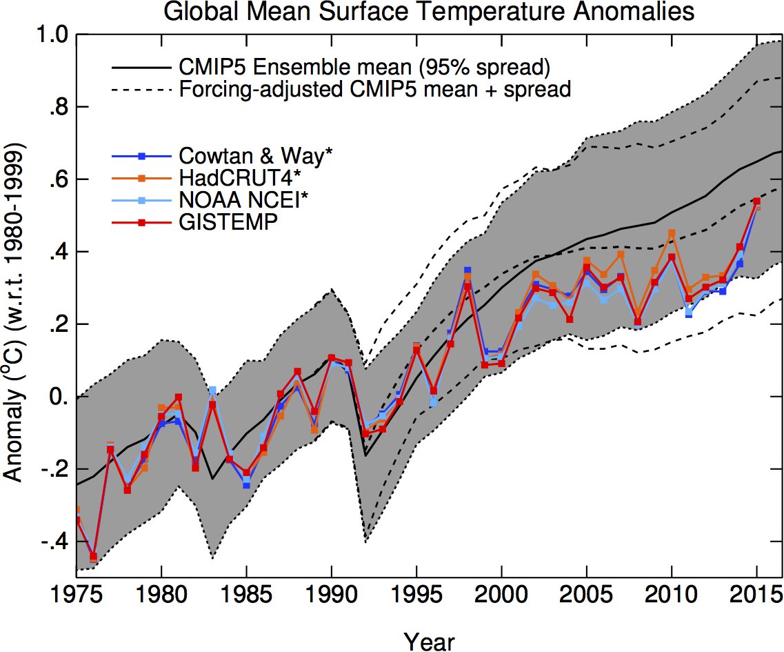
You need to redraw the CMIP5 predictions first before comparison, as the +ve forcings turned out less than projected.
There is no way to do a forcing adjusted restatement of CMIP5. You would have to assume proportionality, and that is not how the models actually work. You woild have to rerun them with the observed forcings. The chart is a neat but utterly false way to try to minimize the growing discrepancy between CMIP5 and reality.
There also two other ways to independently discredit CMIP5:
1. Absence of the modeled tropical troposphere hotspot. Christy UAH Feb 2016 Congressional testmony was >3x too hot in models. The new Mears et. al. paper fiddled some stratosphere adjustments to claim ‘only’ 1.7x in RSS after fiddles.
2. Observational ECS is half of CMIP5’s median 3.2. See, for example, Lewis and Curry 2014.
” as the +ve forcings turned out less than projected.”
Don’t follow, what +ve forcings were more than used in the models?
Actually to do it properly one should probably compare the absolute temp outputs from the climate models with as measured absolutes.
“There is no way to do a forcing adjusted restatement of CMIP”
“Don’t follow, what +ve forcings were more than used in the models?”
http://www.realclimate.org/index.php/archives/2015/06/noaa-temperature-record-updates-and-the-hiatus/
“The current temperatures are well within the model envelope. However, I and some colleagues recently looked closely at how well the CMIP5 simulation design has held up (Schmidt et al., 2014) and found that there have been two significant issues – the first is that volcanoes (and the cooling associated with their emissions) was underestimated post-2000 in these runs, and secondly, that solar forcing in recent years has been lower than was anticipated. While these are small effects, we estimated that had the CMIP5 simulations got this right, it would have had a noticeable effect on the ensemble. We illustrate that using the dashed lines post-1990. If this is valid (and I think it is), that places the observations well within the modified envelope, regardless of which product you favour.”
http://data.giss.nasa.gov/modelforce/
http://data.giss.nasa.gov/modelforce/Marvel_etal2015.html
Tone Bee! LOL. The model envelope is bounded by error bars so wide as to be MEANINGLESS.
GCM Fortan Coder: “Oh, yes, our guess (DID I JUST SAY ‘GUESS??!!?’ — I MEAN PREDICTION!) was folded and spindled and adjusted and tweaked and carefully placed inside a model envelope of (+ or – 75), so, you see, the models have it covered!”
(eye roll)
Thanks for the reply Tony.
That just shows how desperate they are. We have been told cor decades that the changes in solar forcing are too small have any significant impact and looking at the NASA graph in the link you provided it is a barely visible ripple along y=0 axis.
http://data.giss.nasa.gov/modelforce/Miller_et_al14_fig2_upd.png
So now Gav what suggest that being an even smaller part of insignificant somehow becomes a significant difference.
The volcanic forcing has already been inflated by about one third from what physics based calculations estimated by the NASA group in 1992 said. The sole motivation of that change was to reconcile GCM output with the 1960-1990 climate record ( without reducing CO2 climate sensitivity ).
https://judithcurry.com/2015/02/06/on-determination-of-tropical-feedbacks/
Again, the piddling volcanic activity since 2000 is an even smaller ripple than the solar ripple.
Neither of these changes ( nor their sum ) will make a visible improvement to the model projections.
They’ve manipulated a whole raft of poorly constrained parameters to get the result they CAGW results they wanted and it turned out to be wrong. The minute changes in ‘forcings’ do not make the slightest difference the grossly exaggerated warming in the models.
Gavin Schmidt’s claims are false and disingenuous.
Had, NOAA, GISS.. all those “adjustments” and still nowhere near.
Embarrassing !! ,
Janice.
They just need to build a bigger barn ! 🙂
“Neither of these changes ( nor their sum ) will make a visible improvement to the model projections.”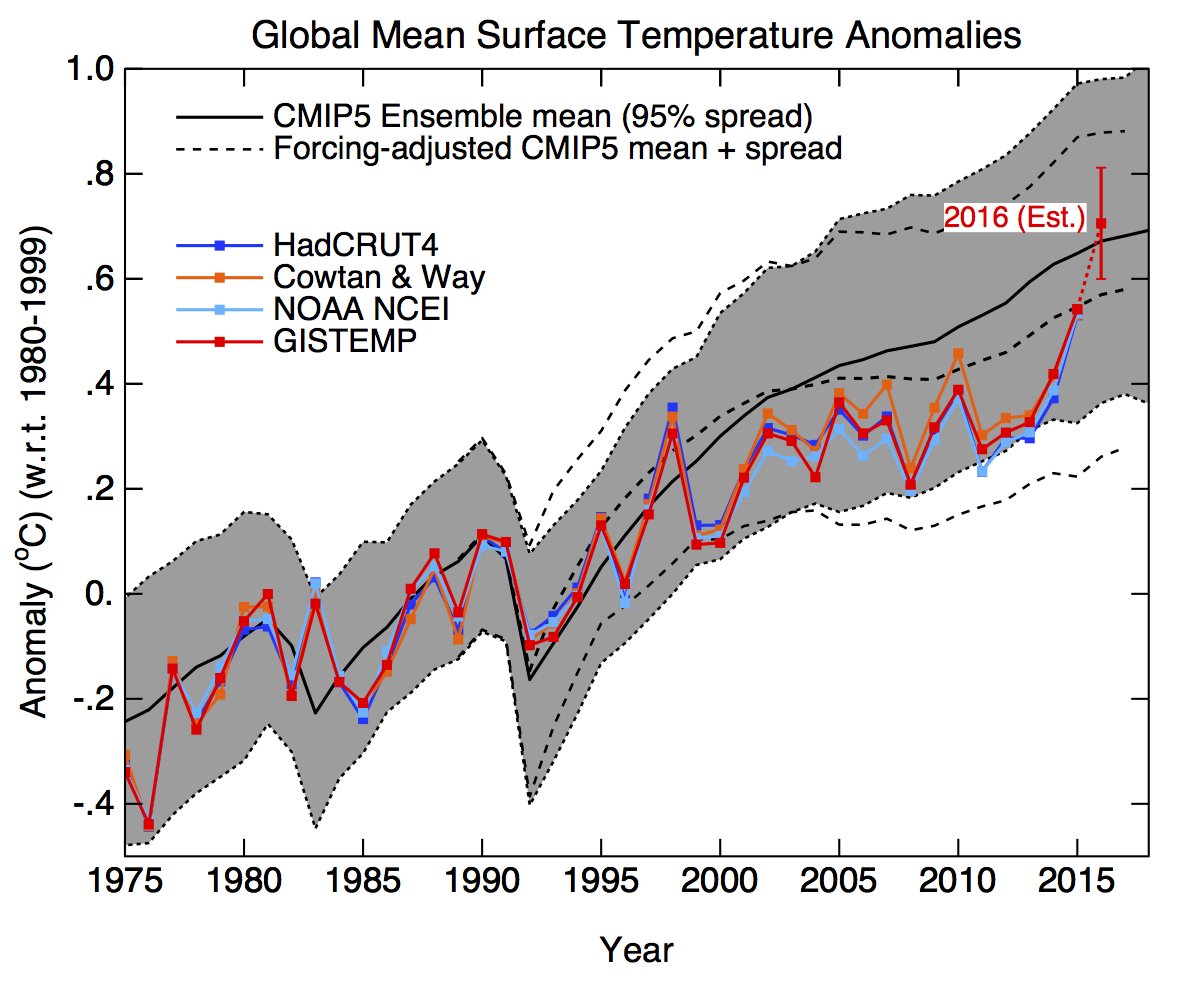 :large
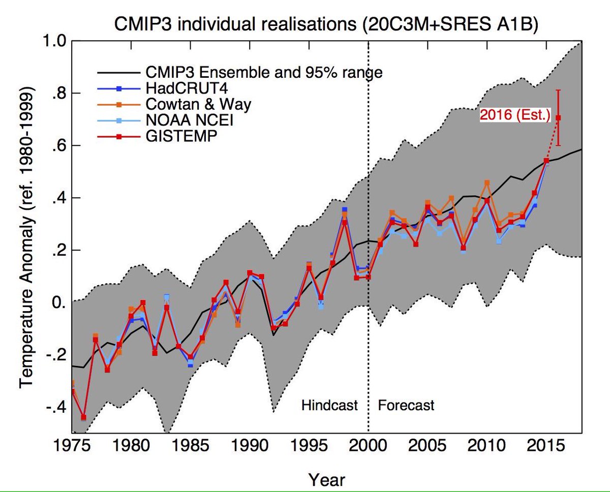
I don’t know what you’re looking at but the graph I am, makes it distinctly visible….
Oh, and how about the CMIP3 realisations…
Both show obs well withing the 95% cl’s of the models and have this last year on (and projected to be) above the median.
And don’t say it’s because of the EN.
That just destroys the sceptic reasoning behind the pause.
If you accept that a +ve PDO/ENSO/EN has a large effect on GMT’s then you must accept that the slowing of warming was due in large part by the lengthy -ve PDO/ENSO/LN regime recently ended.
Andy G. — (smile) And, if they aimed at it, they STILL wouldn’t be able to hit the broad side of it! lolololol
“The model envelope is bounded by error bars so wide as to be MEANINGLESS.”
So you subscribe to the theory that all science is meaningless then?
Interesting – as the 95% confidence level is the accepted measure of meaningfulness in science…
Oh, wait this is WUWT … sorry.
“Andy G. — (smile) And, if they aimed at it, they STILL wouldn’t be able to hit the broad side of it! lolololol”
So you need to wear glasses like bottle bottoms as well
Again
Interesting.
In addition I’ll add an “eye roll” LOL
Come off it Toneb.
The models are totally discredited.
Give it up.
Excellent post. I’m sharing it with my circle of friends. And may we all sleep the sleep of the righteous, because I think “the cure for climate change” is coming no matter how compelling the evidence against it.
First graph
Update: The September 2016 UAH (Release 6.5 beta) l”
There is NO 6.5 , it’s 6.0 beta5 . Please pay attention.
I just want to remind people of one trick that the “pause buster” data employs. The Pause Buster data increases the trend post 1998 El Nino when compared to HADCRUT, but when you compare the trend from 1979 forward, both HADCRUT and GISS (with Pause buster) show a similar trend (see figure 6).
On the surface, pun intended, people will say that that trends for both are the same, which is 100% accurate. The trick is in how they managed to get the same trend. The “Pause buster” data simply decreased the trend from 1979 to 1998, then increased the trend from 1998 to present and BONGO, you get the same trend.
This is an incredibly creative way to play the game. Back in 1998, they were able to claim warming that they now claim never happened. Now forward to today and they can claim recent warming that never happened.
Of course this is just a matter of perspective, but I must admit I am impressed with their creativity and their ability to depend on people not caring enough to ask questions.
Just a note to any non-tech people reading here who are thinking, “But, but, the models are all so very closely following the DATA…. looks like the models are doing great.”:
(from above Tisdale article)
For the models, once again we’re using the model-mean of the climate models stored in the CMIP5 archive with historic forcings …..
Think of it like a driver of a race car in a long turn, to keep on that curving line, they have to correct….. correct……. correct-correct-a-little
Or a sailor keeping a ship on course…. right rudder 15 deg…….. come right 2 deg….. etc….
IOW: The models are being guided along, i.e., “forced” to match the real world data**.
************************************
That is, as others pointed out above, indirectly, Bob Tisdale is not displaying the HORRIBLY FAILED simulated projections by the climate models which he discusses in his book:
Climate Models FAIL
(FREE ed. here: https://bobtisdale.files.wordpress.com/2016/05/tisdale-climate-models-fail-free-edition.pdf )
*************************************************************
**Note: “Real world data” is a redundant phrase, but, the model “data” created by computer simulations is often called “data” by the AGW Gang, thus, for people like me who are not scientists, I write that way to be clear.
From my perspective, the difference is observational data vs model generated data. I guess that you could also consider processed data, which is observational data that is processed to produce an output, like the homogenization process for surface data.
Very good point Janice (and hello to you! 🙂 ). This is something that needs to be pointed out again and again. By the way, I love your energy. If you could bottle that, you’d make a fortune. 🙂
Hi, Alison D.!
Well! Thank you. 🙂
And I love your generous, kind, spirit and your passion for truth! Your posts are pungent with wisdom and goodness and their fragrance fills all the WUWT room. I am grateful for you.
And, finally (!), I have the opportunity (sure hope you see this) to say thank you for your very kind compliment about “Here lies.” You were NOT “late to the party.” You just timed your arrival for when things were really getting fun around the place!
I hope that all is very well with you in Australia. Any writing projects that are giving you special delight, these days? As C. S. Lewis said, you just cannot command “the muse.” She comes when she pleases. Lewis also used the phrase “with book” (as in pregnant with a book). He felt that his stories were really given to him and he was only a skilled scribe of sorts, a Balaam’s donkey, that he was not “in control,” but, mostly just “giving birth” to his books. As you can see, he was humble. Like you. That is probably why he came to mind, just now.
Take care.
Your WUWT friend,
Janice
Hi Janice. Thank you kindly for your generous words and it’s always good to hear from you. I have been busy of late and coming up to completion of book 3. Yes, the “fire” has got me again and I’m burning to write. 🙂
I cannot miss being here too long though as I also have a strong drive to know what’s going on! The topics discussed on WUWT matter very much.
By the way, I know you found my blog. If you drop me a line there just saying hello, that will give me your email address without the world knowing it, then we can chat behind the scenes if you wish a pen-pal from Oz. Up to you of course.
Meanwhile, all the best to you too – and Good Luck in the coming election!
“The September 2016 UAH (Release 6.5 beta) lower troposphere temperature anomaly is +0.45 deg C.”
_____________
Yet the link says 0.44C. (And it’s ‘6.0 beta 5’, not ‘6.5 beta’).
Sometimes they misunderestimate their over exagerrations! ; )
value is 0.44.
are “errors” always in the same direction ?
Hi, Janice, How did the Pac NW survive the “STORM OF THE CENTURY” last week? ( we all know of course). Not hearing from Skagit had me like really , really worried, ( ; ) . But then I guess the Seattle MSM was so embarrassed after the non 24 hr “up to the minute reports”, they decided not to report anything at all! ROTFLMAO ( sorry I shouldn’t gloat that is a bad thing to do, because the next one might be a real winter storm, I hope not btw) , Take care, ^^.
(But sorry I still have a bit of a smile, no grin, about the whole thing, I know, I shouldn’t really, really shouldn’t but for some reason I just can’t stop)
Hi, Asybot,
Thank you for asking. It petered out into such a nothing that I didn’t even think to post anymore reports. Also, a certain Alberts was so angry about my posting “personal” stuff at the time, that I thought it best to just go silent. All is well. The power didn’t go out — yay!
Go ahead and laugh — the hysterical reporting was ridiculous.
But, don’t take anymore of the U.S.. You grabbed all of Washington, Oregon, and part of Northern CA!! lol All is forgiven — the 9 is right next to the 0…. Now, if you had said Canada’s border runs along the 45th parallel…. I would have to go oil up the guns. 🙂
Bye for now and you guys keep warm, up there,
Janice
What is going on here?
http://i.imgur.com/LMDQLXh.png
I have a challenge to any AGW apostle or serfs.
in this chart. show us pictures of the surface stations that contribute data to the six circled points.
Show us they are “high” quality sites
Mosh, Toneb and other similar worshipers.
Time to shine.
Note that ALL the grey areas have NO TEMPERATURE DATA WHATSOEVER.
Also.. please show us where sea temperature data was measured before 2003 (ARGO).
oops missed an important word..
FABRICATION !!!!
I have no interest whatsoever in responding to you in any way my friend.
One look at the current thread at Roy’s is enough to make it abundantly clear to any *warmist* that one would only get dragged down the rabbit-hole and waved at, at best, and likely soon followed by invective – as has already been demonstrated to me personally by the oh so incisive “idiot” that came back from you in another thread here.
But please keep it up, and you will soon follow geran, wild and painter, at Roy’s
You are a positive plus for us “warmists”.
AndyG55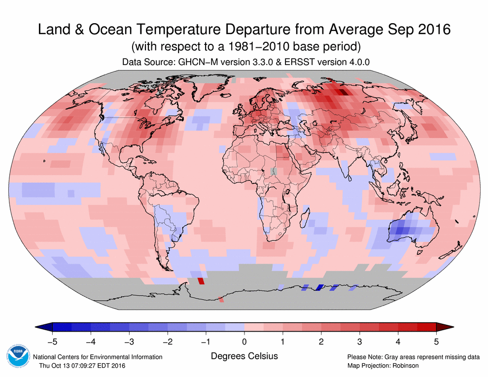
Compare the NOAA global surface data extrapolated image with the UAH lower troposphere image for the month of September 2016:
UAH: http://www.nsstc.uah.edu/climate/2016/september/SEPTEMBER%202016.png
NOAA:
Considering they represent a measure of two different things (average surface temperature versus average temperature of the lower troposphere), there’s a pretty good spatial relationship between the warmer and cooler regions. For instance, the cold spot south of Greenland is there, as are the unusually warm regions of Northern Europe and Russia.
There’s also good agreement in Australia, southern South America, the Antarctic Peninsula and above the Great Lakes region in N. America.
This suggests that the NOAA extrapolation techniques, which are all described in peer reviewed publications, are in good spatial agreement with observations from satellites; at least as far as warmer and cooler regions on a month-to-month basis are concerned.
August


This
becomes
compare to
See all that “record heat” in Africa.. where there are no thermometers.
Seems like you want to join in the hunt for pictures of those weather stations.
Go for it.
The surface NOAA only match the satellite in decent coverage areas at times. Other areas are made up with their warm bias nonsense.
How does average satellite temperature in regions become record heat in the surface? Yes, they are measuring two different things, but average 850mb temperatures for example don’t cause records at the surface.
I’ve noticed this for years and is blatant warming biased underlying the very poor limited worldwide surface coverage.
AndyG55, Matt
Would accept that the extrapolations made by NOAA, based on its limited spatial coverage, are well matched by the coverage shown in the satellite data? They certainly seem to be.