Guest Post by Bob Tisdale
I include a graph in my monthly global surface temperature and lower troposphere temperature anomaly updates that compares the average of the global surface land+ocean temperature anomaly products (from GISS, NCEI and UKMO) to the average of the global lower troposphere temperature anomaly products (from RSS and UAH). (See Figure 9 from the most recent August update for an example.) Because all of the suppliers use difference base years for their anomalies, I’ve recalculated the anomalies for all using the WMO-preferred reference period of 1981-2010.

Figure 1
My Figure 1 is similar to Figure 9 from those updates, but in it, I’ve also shown the linear trends for the global surface and lower troposphere temperature anomaly products. The linear trend, the warming rate, presented by the average surface-based products is noticeably higher than the average lower troposphere products. This, of course, according to Dr. Gavin Schmidt (head of NASA GISS), is the opposite of what the anthropogenic global warming hypothesis tells us is supposed to happen, which is that the lower troposphere is supposed to warm at a faster rate than the surface. See Screen Cap 1.

Screen Cap 1 (Click for full size)
BUT WHEN DO THE SURFACE AND LOWER TROPOSPHERE PRODUCTS BEGIN TO DIVERGE?
To determine this we need to look at the warming rates (linear trends) of the average surface and lower troposphere temperature data.
With a start year of 1979 and working backwards in time from 2015 to 1989, I had EXCEL calculate the annual linear trends of the average surface temperature and average lower troposphere temperature anomaly data. Table 1 shows the lower troposphere and surface temperature trends from 1979 to the listed end years of 2015 to 1989. With the exception of a few end years from the late 1990s to the early 2000s, the average lower troposphere temperature data have noticeably lower warming rates than the average surface temperature products. The similarities in the trends from the late 1990s through to the early 2000s are likely caused by the excessive response of the global lower troposphere temperatures to the 1997/98 El Niño.

Table 1
NOTE: For those new to the discussion, there are very fundamental reasons why the lower troposphere has an excessive response to a massive El Niño. The lower troposphere warms for two reasons during an El Nino. First, it warms because the Earth’s surface warms as a result of the El Nino. Second, the lower troposphere warms an additional amount because the El Niño’s higher sea surface temperatures in the tropical Pacific cause a tremendous amount of moisture to be evaporated from its surface and that moisture releases more heat to the troposphere after it rises into the atmosphere, condenses and forms clouds. [End note.]
Plainly, the 1997/98 El Niño appears to have caused a temporary alignment of the trends of the average surface and average lower troposphere temperature products. Regardless, the trends of the two metrics align at the end year of 1999, so we’ll use that as our breakpoint in this discussion. See Figure 2.

Figure 2
From 1979 to 1999, the trends of the two metrics are the same at 0.147 deg C/decade.
WHAT ARE THE TRENDS AFTERWARDS?
Figure 3 illustrates the linear trends of the average global surface temperature and the average global lower troposphere temperature products from January 2000 to now, August 2016. The average global surface temperature data almost double the warming rate of the average global lower troposphere temperature data during this period.

Figure 3
But according to the hypothesis of manmade greenhouse gas-driven global warming, the opposite is supposed to happen…the lower troposphere is supposed to be warming faster than the surface.
THREE POSSIBLE REASONS WHY DATA CONTRADICT HYPOTHESIS
Of course, there are three possible reasons why the global lower troposphere and surface temperature products do not agree with the hypothesis of human-induced global warming:
- First, the global lower troposphere data are flawed, causing warming rates that are too low.
- Second, the surface temperature data are flawed, causing warming rates that are too high.
- Third, the hypothesis of human-induced global warming is flawed, along with the computer models that support it.
Take your pick and discuss the reasons.
DATA SOURCES
Surface:
NOAA/NCEI (Click on the link to Anomalies and Index Data.)
Lower Troposphere:
RSS (September version with higher trend)
THE BAD NEWS:
Analyses of 35 year periods of average temperature are most likely nothing more than studies of meaningless short-term random variations, and measurements errors … for a planet that is not in thermodynamic equilibrium and has a constantly changing average temperature.
In addition, charts with a vertical range of less than 2 degrees C. may be easy to read, but they make mountains out of tiny, unimportant data changes, and doing that visually promotes coming climate catastrophe fear mongering.
THE GOOD NEWS:
If I am wrong, and 35 years is important, then Bob Tisdale is a great choice for the analysis.
His charts are easy to read.
His writing is easier to read than most people writing about science and presenting data.
On a planet that’s 4.5 billion years old, 35 years is a meaningless period — 35 years is not a long term trend — it’s barely a short-term trend — and the surface measurements must have at least a +/- 0.5 degree C. margin of error, for at least two reasons:
(A) A tiny percentage of the surface is measured, and many grids are filled in with arbitrary wild guesses, and
(B) The people doing the measurements make wild guess predictions of a climate catastrophe … and then, to avoid looking foolish, they repeatedly manipulate temperature actuals with arbitrary “adjustments” to create more warming, in a smarmy effort to make their long-term predictions look less stupid.
It is a conflict of interest for the same organization to make long-term average temperature predictions and also compile actual average temperature data (if you own the data, your predictions can always be “correct”, if that’s the result you want the public to see, and to put on your resume).
Bob,
Isn’t Your first explanation of the surface/TLT discrepancy the most likely one?
“First, the global lower troposphere data are flawed, causing warming rates that are too low.”
Regarding TLT (or troposphere) trends, UAH v6 is a low and lonely outlier. I say lonely because RSS TLT 3.3 is no longer endorsed by RSS due to drifts. Until RSS make a new TLT v4 you can compare with RSS TTT v4 which has a trend of 0.178 C/dec. The trends of TTT and TLT products are relatively similar..
Another option is to make your own RSS TLT v4. As I wrote in a comment elsewhere:
“Use the UAH v6 TLT formula “LT = 1.538*MT -0.548*TP +0.01*LS” with channel data fom RSS. However, RSS doesn’t think that tropopause channel data (MSU 3) is reliable before 1987, so you have to splice on early data from UAH to make the tropopause channel of RSS complete..
Doing this results in a RSS v4 TLT trend of 0.207 C/decade”
If you want to use “pure” RSS data in the formula above, the trend from 1987 til now is 0.217 C/dec.
You can also look at radiosonde data, for instance Ratpac A 850-300 mbar, which has a trend of 0.188 C/dec in the satellite era.
RATPAC B (unadjusted) shows not much difference with both RSS and UAH and shows a lower trend (use the data only not the algorithems included for larger coverage
RATPAC A is the station’s data homogenized over large area’s using infilling.
so you only can compare the regional UAH/RSS data with the same area’s RATPAC B data and they are pretty close to each other.
seen the fact RATPAC A bases the world’s temp on 87 locations compared to the near total earth coverage for RSS and UAH it’s not a good commparison.
FYI Ratpac’s explenation from NCDC
so there you have the reason why RATPAC is not comparable with RSS or UAH. I know Bobs way of working too well, so if that set would have been a good valid third TLT set he would have included it.
A “ratpacised” UAH v6 TLT, produced by subsampling of data from the 85 Ratpac station locations, and globally weighted by the Ratpac A method, is similar to the original fully global UAH TLT:
https://drive.google.com/open?id=0B_dL1shkWewaT083ZHdiWHhieTA
Hence, Ratpac A has a good global representation, and can be directly compared with UAH TLT Global.
I have made a difference-chart with comparisons between UAH and Ratpac, including subsampling of UAH and TLT-weighting of Ratpac A.
The comparisons are quite similar, suggesting that UAH TLT lose about 0.2 C per decade vs Ratpac A, since the introduction of AMSU:s at about year 2000 (transition period autumn 1998-summer 2001).
https://drive.google.com/open?id=0B_dL1shkWewaVUdobkJYcjM5VmM
UAH and RSS over the USA are an almost exact trend match for USCRN.
RAOB & MSU analyses differ from each other much less than they all differ from the modeled Hot Spot.
Yes, but MSU has a poor vertical resolution, unlike radiosondes.
Here is fig 1 in Sherwood and Nishant 2015, with zonal trends (C/decade) from 1960-2012:
http://cdn.iopscience.com/images/1748-9326/10/5/054007/Full/erl510711f1_online.jpg
Here is fig 2 with trends for 30N-30S:
http://cdn.iopscience.com/images/1748-9326/10/5/054007/Full/erl510711f2_online.jpg
Yes, even the Sherwood result ( which makes the probably invalid assumption of homogeneity ) is more different from the models than from the other observational analyses.
The 1960-2012 period is similar to the 1958-2015 trends I posted above.
Should also ask, though, why the Sherwood analysis fails to indicate an Arctic Maximum a la both RATPAC, UAH, and RSS.
T E,
I think you can find a warming spot (0.3 C/ decade) near the surface at 50-75 N in fig 1.
When comparing your figure with this one, you have to consider the different colour schemes, different trend units and different vertical scales.
I plotted the Sherwood stuff a while back, but he can’t be too proud of it because there’s not an ongoing archive.
Bob Tisdale – this temperature chart by GISS et al. that you show is falsified from 1980 on to show more warming than rhere actually exists. There is no warming in the eighties and nineties but your graph shows a temperature rise of 0.2 degrees Celsius there. That fake warming is then carried on to the super El Nino of 1998 which follows. And fake warming, once established, continues into the entire twenty-first century that follows next. You then draw as straight line through all that make-believe warning that is not justified. There are three regions in this graph that have independent origins and must be separately analyzed. First we have a hiatus from 1979 to 1997 that fits a horizontal straight line.. The super El Nino that follows the hiatus is next. It is not part of ENSO and is sui generis. It must not be included with any other temperature segment here. And then there is the twenty-first century rise. It starts with a step warming from the bottom of the 1999 La Nina and raises global temperature up by a third of a degree Celsius in only three years. Numerous claims of “warmest ever” temperature peaks followed. Hansen himself observed that nine out of ten warmest years ever clustered in the first decade of the twenty-first century and thought it was caused by the greenhouse effect. He was wrong. The warmth came from the large amount of warm water that the super El Nino left behind. That warm water is now cooling and as a result the temperature from 2002 to 2012 has dropped. I see that you are well aware of this fact and have constructed your figure 3 to try to hide it. Tell your buddies at IPCC that it did not work. As to your figure 2, it displays the forgery your buddies performed in the nineties quite well. The real temperature there fits a horizontal straight line as may be observed in figure 15 of “What Warming?” And by the way, you still owe me an apology for the libel you placed as a comment to my article in WUWT.
In the Satelitte data, there is all but no significant warming between 1979 (inception) and the run up to the 1997/98 Super El Nino. When one takes account of realistic measurement/system errors, it is not possible to say that there was any warming between 1979 to the Super El Nino of 1997/98.
If one ignores the present ENSO cycle which is part way through and which is yet to complete with a La Nina in late 2016/17 (not certain that this will happen but presently it appears that way), the satellite data suggests that almost all the observed warming occurred as a single one off and isolated event around the 1997/98 Super El Nino. Following this event, there was a long lasting step change in temperature of about 0.3degC (may be a little less).
The satellite data, which will soon be covering 40 years, is completely incompatible with CO2 induced warming.
If the present La Nina conditions continue and strengthen (and this requires more than 3 months of data) then the pause will reappear in the data set sometime in early/mid 2017, and when it reappears it will be over 20 years in duration. In essence it will show an almost 20 year period (1979 to late 1996/early 1977) where temperatures were flat, and another 20 year period (1997 to 2017) where temperatures are essentially flat, and a single one off and isolated step change in temperatures around the Super El Nino of 1997/98. The satellite data will show 2 pauses not 1, both of about 20 years duration.
Of course, it appears that the satellite is more sensitive to El Ninos than La Ninas, but of course that is to do with hot air rising (convection in the tropics).
Watch this space in 2017.
“In the Satellite data, there is all but no significant warming between 1979 (inception) and the run up to the 1997/98 Super El Nino.”
No warming between 2001, and start of 2015/16 El Nino
Thank you AndyG55.
The satellite record covers the period when about 60 to 65% of all mandmade CO2 emissions has taken place.
As can be seen in your two plots, there is much short term variability, eg., peaks and troughs associated with ENSO, and short term troughs associated with volcano eruptions, but all of that variation is short lived.
CO2 cannot explain:
1. Why temperatures remained essentially flat during the first period.
2. Why temperatures remained essentially flat during the second period.
3. Why there was a significant step change in temperature coincident upon the 1997/98 Super El Nino.
Unless scientists can put forward a convincing argument as to how CO2 drives ENSO, the satellite record disconfirms that CO2 drives temperatures to any significant degree.
Arno Arrak says: “First we have a hiatus from 1979 to 1997 that fits a horizontal straight line..”

You simply drew a horizontal straight line onto your graph, Arno, when you posted that nonsense here at WUWT.
From the WUWT post here:
https://wattsupwiththat.com/2015/10/29/karl-et-al-do-not-know-that-we-have-two-hiatuses-not-one/
But it was a straight line that was not supported by linear trend analysis of the lower troposphere temperature data. It’s an imaginary straight line created by you. As noted in Table 1 in this post, a linear trend analysis by MS EXCEL shows there are trends in the surface temperature data and in the lower troposphere temperature data from 1979 to 1997.
Arno Arrak says: “The super El Nino that follows the hiatus is next. It is not part of ENSO and is sui generis.”
“It is not part of ENSO…”? You live in a fantasy world, ARNO. The 1997/98 El Niño makes its presence known in every ENSO index, as does the 2015/16 El Niño.
Arno Arrak says: “Tell your buddies at IPCC that it did not work. As to your figure 2, it displays the forgery your buddies performed in the nineties quite well.”
My buddies at the IPCC? Who are they, Arno? You simply make up crap as you go along.
Arno Arrak says: “And by the way, you still owe me an apology for the libel you placed as a comment to my article in WUWT.”
Thanks for closing your comment with that, Arno. It made me laugh.
My comments on the thread of your post are here:
https://wattsupwiththat.com/2015/10/29/karl-et-al-do-not-know-that-we-have-two-hiatuses-not-one/#comment-2060565
And here:
https://wattsupwiththat.com/2015/10/29/karl-et-al-do-not-know-that-we-have-two-hiatuses-not-one/#comment-2060568
And my favorite one here:
https://wattsupwiththat.com/2015/10/29/karl-et-al-do-not-know-that-we-have-two-hiatuses-not-one/#comment-2059175.
It reads:
Arno: It’s good to see you up to your old tricks of misrepresenting data. Your first illustrations show no warming for RSS and UAH lower troposphere temperature anomaly before the 1997/98 El Niño.
http://wattsupwiththat.files.wordpress.com/2015/10/clip_image00210.jpg
Anyone who has every studied those datasets knows the data show warming from 1979 to 1997, Arno.
So tell us, Arno. Why do the data contradict your nonsensical graph?
You have just lost your credibility here, Arno.
Adios.
####
No apologies are due to you, Arno. You give skeptics a bad name. On the other hand, you owe me an apology for wasting my time once again.
Bob
All our data sets are flawed, and that is the problem.
With a theory that says temperatures must always increase whenever CO2 levels increase, it is in principle appropriate to look at short periods to see whether the theory hold true.
The problems is what length of time is significant? The higher the sensitivity of CO2 the less length of time is required. Aliter, if the sensitivity is low. The higher the accuracy of our measuring, the less length of time data stream is required. Aliter, if our measuring is not accurate and riddled with error margins.
Where there are other causes that also impact upon temperature, these can again impact the length of data stream required to tell us something of significance. If natural variability is large, a lengthy period of data is required. Aliter, if natural variability is small.
The more inertia, dampening, lags etc, in the system being studied, the greater the time required before the data tells us something of significance.
But in my opinion, Arno has a point. What is plainly apparent is that there is much short lived variability in the data and this makes data interpretation extremely difficult.
If the satellite had come on stream just a few months later, your trend would look very different (and that is an artifact of the noise of natural variability, and why one needs to be very cautious when interpreting this type of data).
Back in 1996, if you had been presented with the data, which would cover inception to 1996, and someone asked you “what next?” You would no doubt have replied, ‘I do not know for sure, but it is likely that the cooling that had started in 1995 would continue for a little while.’ After all there had just been 4 ups and down, so why not a fifth? But of course, it did not carry on cooling for a little while. Why was this? I would suggest that the reason why that did not occur was not because of CO2, but rather due to some natural variability that interrupted what at first glance appears to be repetitive multiyearly variability.
It is very dangerous putting linear trend lines through this type of data. In fact I would say misleading. But if one is going to go along that approach, it may well better to look at the peaks 1980, 1983, 1987. 1991 and 1995.
Undoubtedly, there has been some slight warming during this period, but it is very slight (possibly around 0.04degC per decade) and when one considers the margins of error that are inherent in the measurements one cannot say for sure that there has been any warming (of course errors operate both ways so the real change in temperatures could be much higher, but we just do not know). I would suggest to you that in reality the temperatures are all but flat, and that is a reasonable interpretation of the data (for that period). I am not sure what lies behind the placement of the yellow dots/points on Arno’ s plot, but one can see what he is trying to achieve.
That is of course, a period of 15 years within the data set. Is it significant? Well at one time Santer thought that a period of 15 years would be significant. I myself am much more circumspect because of the large range of natural variability, inertia in the system, and I consider the margins of error inherent in this data set are probably far larger than presently acknowledged.
But one thing does appear clear from the satellite data and that is that something has changed coincident upon the 1997/98 Super El Nino. It is not just the rate of temperature change altered subsequent to that event, but also that there has obviously been a step in the data. I am not attributing cause. Of course, if that Super El Nino had not released so much energy into the system (which has yet to dissipate), it maybe that the warming of about 0.04/0.05degC (seen in the earlier period) would have continued more uniformly over the course of the entire record (which incidentally is an average of your two UAH trends). That of course is speculation, and nothing more.
PS. I am not concurring with what Arno says about ENSO.
CO2 levels are increasing continuously but in the past 20 days I am experiencing highly variable temperatures — diurnal and as well day to day –, variable winds, cloud cover, relative humidity in San Francisco suburb. The forecasts are coming true every day.
Dr. S. Jeevananda Reddy
i go for number 2 and 3
surface temp is so over adjusted that it shows more warming then there is
3 CAGW is b**ls**t i think with all adjustments gone UHI data gone that rural stations would warm as much as RSS and UAH, which would point to one thing: the warming we see is entirely natural with some urban land use changed zones that show an increase/decrease of the warming which is the anthropogenic signal.
Look at what I found in the Guardian:
https://www.theguardian.com/environment/climate-consensus-97-per-cent/2016/oct/14/climate-scientists-published-a-paper-debunking-ted-cruz
The Juicy tidbits that explains why the deniers are stupid:
“So, this recent paper did a few things. First, they took the contrarian argument that the mid-troposphere temperatures have been rising at only 1/3 the rate predicted by models. They found that Christy’s team neglected the contamination of the cooling in the upper stratosphere. When they applied this correction, they found that Christy’s claim was incorrect. Differences between modeled and observed warming rates were much smaller, and had known explanations.
Next, the authors asked whether it is true that there has been no warming in the lower atmosphere (troposphere) in the past 18 years. They found that for five of the six groups that provide satellite temperature analysis, this claim was also incorrect.
Finally, they asked whether it is true that the temperature changes in different layers of the atmosphere are in disagreement in models and measurements. Their result is that when temperature changes in different layers of the atmosphere are compared, one of three satellite records is in close agreement with the climate models. ”
Paper: http://journals.ametsoc.org/doi/abs/10.1175/JCLI-D-16-0333.1
Since I enjoy spinning an issue on it’s head and providing a different perspective so here goes:
So the divergence issue was real just like the deniers had always said it was. Warmists knew this was the case yet fought hard to deny that the divergence issue was real, and it is only now that the warmists can find a rebuttal. Now with the rebuttal in hand, they will acknowledge that the deniers were right all along.
(Feel free to insert other issues like the Pause or SLR or Antarctic ice or Hotspot etc. in place of divergence and it applies)
So why are we the deniers again?
Frederik Michiels on October 14, 2016 at 12:28 pm
RATPAC B (unadjusted) shows not much difference with both RSS and UAH
Did you ever download and process any Ratpac data? Probably not. Because if you had, you would better know about what you “speak”.
Here is a chart comparing GISS land+ocean (surface), RATPAC B (radiosonde, 700 hPa) and UAH6.0beta5 (satellite) measurements:
http://fs5.directupload.net/images/161014/x2dyxyku.jpg
You clearly see that RATPAC B when operating at an atmospheric pressure level of 700 hPa (i.e. at about 3 km altitude) is much nearer to GISS than to UAH.
To have RATPAC B akin to UAH, you probably will have to select about 250 hPa, i.e. an altitude above 10 km. I can easily compute that if you want 🙂
In other words, UAH seems to operate a an altitude much higher than the ‘lower’ troposphere.
richard verney on October 14, 2016 at 12:33 pm
When one takes account of realistic measurement/system errors, it is not possible to say that there was any warming between 1979 to the Super El Nino of 1997/98.
Aha.
In 2014, a group of scientists around Bejamin D. Santer and Céline Bonfils extracted all ENSO and volcano influences out of the temperature series RSS3.3 TLT.
They computed a residual warming of about 0.085 °C per decade, to be compared with RSS’ original trend of about 0.130 °C /decade.
Source: Volcanic contribution to decadal changes in tropospheric temperature
https://dspace.mit.edu/handle/1721.1/89054
More to the point, the 1980 to 1999 trends at the same rate, compared to the first chart, where 1980 surface data has been adjusted down and now rises at a higher rate, seem to be a smoking gun pointing to dirty tricks with the surface data.
Occam tells me that anthropogenic waste heat and albedo mods must certainly impart a warming term to surface records.
Jeez
1. First, the global lower troposphere data are flawed, causing warming rates that are too low.
2. Second, the surface temperature data are flawed, causing warming rates that are too high.
3. Third, the hypothesis of human-induced global warming is flawed, along with the computer models that support it.
First. You got the Theory wrong
” The linear trend, the warming rate, presented by the average surface-based products is noticeably higher than the average lower troposphere products. This, of course, according to Dr. Gavin Schmidt (head of NASA GISS), is the opposite of what the anthropogenic global warming hypothesis tells us is supposed to happen, which is that the lower troposphere is supposed to warm at a faster rate than the surface. See Screen Cap 1.”
TWITTER COMMENTS ARE NOT THE CONSENUS.
The Linear trend of the whole trop is NOT THE ISSUE BOB!
Start here
http://www.climatedialogue.org/the-missing-tropical-hot-spot/
So you have blown your credibility from step 1.
This is not to say that there isnt an active debate about the the hot spot, but you are not addressing the real issue.
but let’s return to what you did do and your questions
1. First, the global lower troposphere data are flawed, causing warming rates that are too low.
2. Second, the surface temperature data are flawed, causing warming rates that are too high.
3. Third, the hypothesis of human-induced global warming is flawed, along with the computer models that support it.
Lets start with
4! you did your comparison WRONG. First, you only look at AMSU years. Different type of sensor.
Second, yous failed to mask the data appropriately to compare the differences. Compare them where
BOTH DATA SETS have data.
back to your options..
1. First, the global lower troposphere data are flawed, causing warming rates that are too low.
There are several issues with the trop data. I will list them.
A) you are comparing temperature data from a VOLUME of atmosphere ( miles thick) to data
taken at a standard Height. 1.5m.
B) you are comparing data that is at diffferent times during the day and adjusted to a “local noon”
to data that is taken twice a day ( min and max) and averaged. I would not expect a trend
in “local noon” temperatures to match the average of Min and Max trends, especially since
AGW theory suggests that trends in Tmin and Tmax may differ.
c) Its Not an Issue of data being FLAWED.. ALL DATA HAS FLAWS.. especially MODELLED DATA
and both UAH and RSS are models of temperature. The issue is the UNCERTAINTY in the
adjustments both groups perform. Specifically the STRUCTURAL UNCERTAINTY. Its quite
large.
D) Both UAH and RSS make an assumption that the Emissivity of the surface is UNCHANGED since
1979. For the Ocean this makes sense ( and note how well the series agree) BUT for the land
This assumption ( AS THEY NOTE IN THEIR CODE DOCUMENTATION) may not be corrrect.
Is it any wonder then that the Satellite series and group temps DIFFER THE MOST in
High latitude… you know where the snow covers the ground.. sometimes..
2. Surface temps. Like satellite series the surface temps model an entire field of data. using one
method over land and another method over water. The Ocean temps match RSS and UAH much
better than the 30% of the land temps. See above as perhaps as to why. The land temps are
different than RSS and UAH.. but remarkably this difference is Coincident with the
introduction of a NEW TYPE OF SENSOR (AMSU) in the satellite series. Last point, we might think that land temps are wrong due to two factors A) Adjustments.. B) UHI
Problem A. If we think that land temps are wrong due to adjustments, then there is an easy way
to test that. Different land masses ( North America, Europe, Africa) all have direct directions in their
adjustments. The US is adjusted UP, Europe is not adjusted, and Africa is cooled by adjustments.
IF adjustments explained the difference, then you would expect to see this pattern when you differenced satellite series and land series. you dont. So adjustments dont explain the difference
Problem B. UHI. Same argument as above. You see nothing in the pattern of differences between
Sat data and Land data that indicates UHI is the cause.
What you do see is that the majority of difference between satillite data over land and land temperature
records, happens at High latitudes and higher elevation locations.
When time permits I’ll chart up that difference as a function of land cover ( ie snow ) because the satellite models, assume that emissivity of the land is fixed and never changes.
3. Third, the hypothesis of human-induced global warming is flawed, along with the computer models that support it.
two problems here. You have conflated two issues. There is FIRST the Theory of AGW, and second
the Hypothesis about about the hotspot. And you’ve confused the role of models in theory and hypothesis creation. the THEORY of AGW says nothing about hot spots. However, when people
run models, they do see a hot spot in the model results. So you have multiple reasons why this can be the case:
A) the models are implemented incorrectly
B) the models are missings key physics
C) the models are missing key inputs
D) the models are run with the wrong inputs
E) the models have key physics wrong
F) the models dont reflect the theory
You seem to want to think there is a single answer. There is no single simple answer or choice. Science is not an election of a best candidate.
“Science is not an election of a best candidate.”
Thanks for DESTORYING the CONSENSUS myth.
You have just lost yet another sale of your lemon, Mr 2nd hand car saleman.
“So you have blown your credibility”
roflmao !!
from you, that is height of irony
You lost yours the second you signed on with Muller. !!
Too funny
Ya know Anthony signed on too, and then backed out.
That said I have plenty of disagreements with Dr. Muller. You apparently dont read everything I write.
Change that bad habit.
Read every last word. you know you want to.. stalker..
I backed out because Dr. Muller FLAT OUT LIED TO ME. I gave him preliminary data, with the agreement that he would only use it for a scientific publication, next thing I know, he’s parading it in front of Congress against my protests.
Falsus in uno, falsus in omnibus
“Second, the surface temperature data are flawed”
Even you know that most of the so-called warming is where there are few thermometers.
HUGE gaps in the surface data, all filled with dubious method by rabid AGW-mongers.
Adjusted to “regional expectations”, adjusted to match urban heat trends.
Homogenised and mal-adjusted to flatten any inconvenient peaks.
You KNOW the surface data is a farce. !!
Everybody KNOWS the surface data is a FARCE. !!
A ting of ‘Confirmation bias’ would seem to be showing through with the statement “You seem to want to think there is a single answer.”
A more open response might have been written as: “You might be surprised to see that there is more than one answer.”
the word SEEM should have been your clue, were you not bound and dertmined to try to find anything wrong with what I wrote.
Read Bob again.. he seems to think that that answers are mutually exclusive.. they are not.
there is plenty of error to pass around
A job for you Mosh.
Here is a graphic of August land-only temperatures from NOAA
Your task is to find pictures of the thermometers that contribute to the areas in yellow circles.
Show us just how pristine they are ! 😉
Note for others. In some cases there may be only ONE thermometer for the whole square
And look at all the grey area.. NO DATA.
ALL FABRICATED. !!!
Wrong.
That is why we use data sources in addition of GHCN M
But here is what you find.
Use only 100 stations..
you get the same answer
WHY?
because as Willis showed here you can reliably predict (infill) temperature data using on elevation, season and latitude ( or sun position)
MOSH.. where are you !! ????
Seems you have NOTHING
Do you really DENY that there is no data for ALL that grey area?
Do you REALLY pretend that you can MAKE UP that much missing data, and call it science ?????
REALLY ???
“because as Willis showed here you can reliably predict (infill) temperature data using on elevation, season and latitude ( or sun position)”
This was ok for a crude version, but far from suitable when looking for changes less than 0.1c per global year. Inversions are very common all over the planet especially over land.
In meteorology, an inversion is a deviation from the normal change of an atmospheric property with altitude. It almost always refers to a “temperature inversion”, i.e. an increase in temperature with height, or to the layer (“inversion layer”) within which such an increase occurs.
https://en.wikipedia.org/wiki/Inversion_(meteorology)
Even the warm spots away from civilization with no other station anywhere near, is still likely to be modelled, guessed or made up. They are rubbish because land and ocean warm and cool a lot differently and inversions make the estimates worthless.
…”Start Here”…You must have just discovered KODI ! Or TVAddons…
“A) the models are implemented incorrectly
B) the models are missing key physics
C) the models are missing key inputs
D) the models are run with the wrong inputs
E) the models have key physics wrong”
YES x 5
Assertion is not science, bud
Come on Mosh.. show us ALL where the data for those 6 yellow circles comes from. !
As a salesman, surely you can do that..
Or do you KNOW that the surface temps are JUST ANOTHER LEMON.
From: http://www.remss.com/blog/RSS-TMT-updated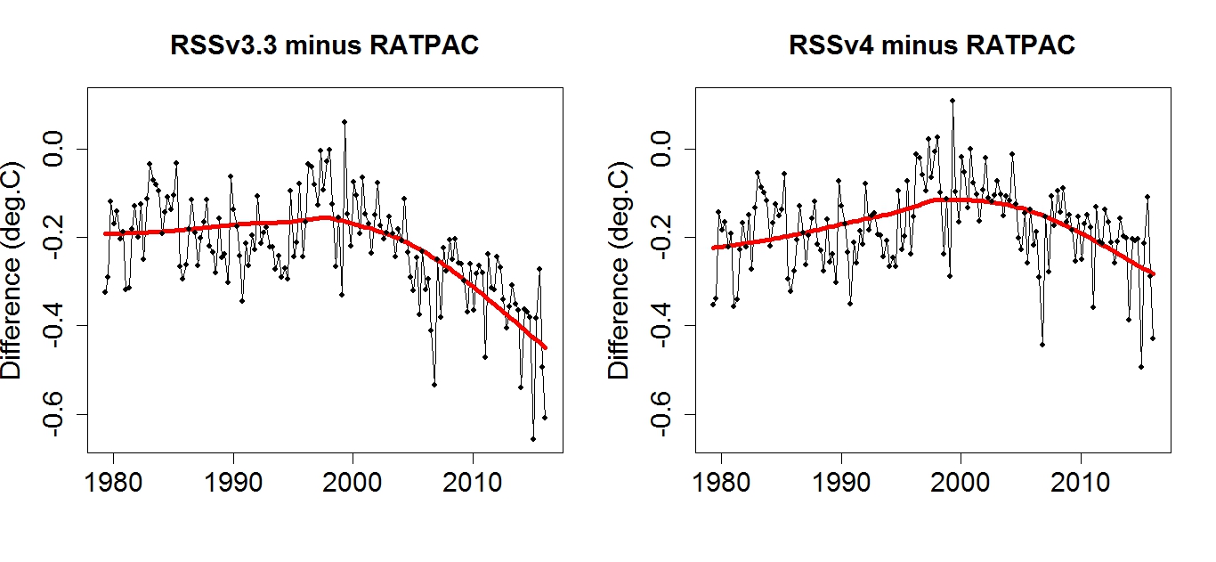
“We agree that there is a problem with either NOAA-14 or NOAA-15, or both. We explicitly discuss the problem with the NOAA-14/NOAA-15 overlap in the paper. We do not know if the problem is due to NOAA-14 or NOAA-15. If we assume that all the drift is due to NOAA-14, as Dr. Spencer would like us to do, we can eliminate the use of NOAA-14 after 1999 so that its (potentially erroneous) trend during the overlap period does not affect the overall results. If we do this, the overall trend is decreased by 0.019K/decade.
Using the current trends through February 2016, this would lead to a decrease from 0.133 to 0.114 K/decade. This adjusted number is still well above the trend in our previous versions, and also above the trends in UAH V6, UAH V5.6, or NOAA STAR V3.0.
There is no evidence that NOAA-14 drifts for time periods before 1998, because it agrees well with measurements made by other MSU satellites (NOAA-11 and NOAA-12) over the ocean, where the diurnal adjustment is not important. The drift would have to suddenly appear in 1998.
So we cannot assume that the problem is with NOAA-14. We instead explore
the 3 cases:
1. we assume NOAA-14 is wrong and remove it to the extent possible* This leads to a decrease of 0.019K/decade
2. we assume NOAA-15 is wrong, and remove it to the extent possible. This leads to an increase of 0.010 K/decade
3. we assume that the error is shared between them, and we keep all the data.
*we keep about a year of data during the MSU/AMSU overlap period as any shorter time period would lead to excess noise in the MSU-AMSU difference we use to adjust AMSU to match MSU.
These results are reported in the paper, and the differences between them should be viewed as part of the uncertainty in the final results. For the final dataset, we used case 3 where the errors are shared between NOAA-14 and NOAA-15, which is reasonable because we do not know the source of the problem.”
That “problem” can be seen here…..
My hypothesis is that the divergence (vs surface and radiosondes) in satellite troposphere products is caused by a rouge AMSU-5 sensor onboard NOAA-15, with a mysterious error that the standard calibration routines can’t check..
Mears et al have stated that the difference in the TMT-channel between NOAA-14 and NOAA-15 is 0.2 C/decade.
Thus, I have attempted a correction model for UAH v6 TMT as follows:
When NOAA-15 flies alone I add =0.2/120 C to that month
When NOAA-15 flies with one other satellite I add 0.2/120/2 C to that month
When NOAA-15 flies with two other satellites I add 0.2/120/3 C to that month
etc.
The corrective additions are accumulated month by month
The satellite use is crudely picked by eye in figure 1, and from the figure legend here:
http://www.drroyspencer.com/2015/04/version-6-0-of-the-uah-temperature-dataset-released-new-lt-trend-0-11-cdecade/
By doing this I arrived in an accumulated correction for the most recent month of +0.149 C
The corrected TMT dataset had an overall trend of 0.117 C/dec (originally 0.82 C/dec)
With the corrected TMT in the v6 TLT formula the trend became 0.176 C/decade,
and the trend 2000-now being 0.161 C/decade
With such corrections UAH v6 TLT is playing in the same league as RSS TTT and the surface datasets.
However, my correction is simple, and I don’t have a clue how errors in NOAA-15 propagate via the complex algoritms of intercalibration, in the actual datasets…
“… I’ve recalculated the anomalies for all using the WMO-preferred reference period of 1981-2010…”
_____________
As far as I know the WMO still advocates the 30/30 model. This is the 30 year average according to the latest full 30 year period.
Therefore the current anomaly baseline, according to the WMO, is 1961-1990. This is the base period used by HadCRUT4, for example. It’s also the base period used by the WMO when calibrating the various surface temperature data sets.
This period will switch to 1991-2020 in 2001.
That last line should read: ‘This period will switch to 1991-2020 in 2021’, not 2001, sorry.
DWR54, the WMO discussion of climatologies can be found here:
http://www.wmo.int/pages/prog/wcp/ccl/guide/guide_climat_practices.php
It reads:
“Congress, through Resolution 16 (Cg-17), endorsed the recommendation of CCl-16: “The Climatological Standard Normal be calculated every 10 years at the start of every new decade having year digit 1; to serve as the updated official Climatological Standard Normal; that it applies to the most recent 30-year period, with 1981–2010 being the new current standard; and that for specific purpose of long-term climate change monitoring, the period 1961–1990 be retained as a reference period in perpetuity or until such time as a compelling scientific case to change it arises”.
The satellite-based TLT data are not “long term”. And since they start in 1979, the base years of 1961-1990 cannot be used.
Thanks Bob.
I read section 4.8.1 ‘Period of calculation’ as stating: “Under the WMO Technical Regulations, climatological standard normals are averages of climatological data computed for the following consecutive periods of 30 years: 1 January 1901 to 31 December 1930, 1 January 1931 to 31 December 1960, and so forth…
Where climatological standard normals are used as a reference, there are no clear advantages to updating the normals frequently unless an update provides normals for a significantly greater number of stations.”
Has this been superseded elsewhere in the publication? Thanks again.
nuff said
If you say so
However:
There is a problem.
Evident from the point of the MSU to AMSU changeover (mid 1998).
That UAH does not address and RSS v4.0 fudges at best.
The Curry “Gold standard” indeed.
This is what you would get if we could magically use just one thermometer for all the readings made at the surface, having not done a comparison v the previous “thermometer”.
That’s why homogenisation is done to correct for instrument changes (as well a practises) to the surface record against surrounding stations which did not make a change FI.
On a global scale (because there are thousands of thermometers) those things drop out as insignificant.
But the Sat temp record?
Nah.
Don’t know which “thermometer” is the wrong one of the two.
And one IS wrong.
So we cannot “believe ” what the Sat temp record says for the last 18 years.
Again:
If you say so.
Like I said.
the divergence stems from the switch over to AMSU.
That is why Fu et al gets the right result of no divergence
Instead of producing all the time aggressive but useless commends, AndyG55, you better should learn how to produce correct graphs for temperature series, you are at level minus ten here.
http://www.woodfortrees.org/plot/gistemp/from:1998/offset:-0.428/mean:12/plot/rss/from:1998/offset:-0.093/mean:12
http://fs5.directupload.net/images/161015/2r2jfe2i.png
Looks a bit different huh?
Yep. still shows that manifest SCAM of the GISS adjustments
You do know GISS is based on measurements that cover barely half of the global land surface, , many with massive urban effects… don’t you ???
Up a few posts.. 6 yellow circles.
Pictures of the temperature station required to show that they have zero UHI effect
Put up or STFU !!
Why did you leave the trend lines off..
oh I wonder !!! 😉
You don’t fool anyone but yourself.
Were you looking fo these trend lines by chance?
http://www.woodfortrees.org/plot/gistemp/from:1998/offset:-0.428/mean:12/plot/rss/from:1998/offset:-0.093/mean:12/plot/gistemp/from:1998/trend/offset:-0.25/plot/rss/from:1998/trend
I have heard of all these excuses as why the lower troposphere temperatures do not match the surface temperatures, but to me they are just BS. The heat in the lower troposphere comes entirely from the surface, and therefore the rises and falls in temperature of the lower troposphere over time must mimic the surface temperatures. No matter how much divergence there is at any given point in time, the long term trend in lower troposphere temperature has to be a mirror of the surface temperature trend. The reason for the discrepancy can easily be explained by the totally unscientific method of gathering surface temperature. With ridiculously uneven coverage by ground stations, and UHI adjustments being pure guesswork, why would anyone expect the results to have any degree of accuracy? The satellite measurements could also be inaccurate because of orbital drift and instrument faults. but when the radiosonde measurements approximately agree with them, that argument doesn’t hold water.
Absolutely.
Also the satellite data is referenced checked against radiosonde measurements so that provides some reassurance that the data is in the ball park.
Further, unless I am mistaken, isn’t the output of models supposed to be LT and not surface temp? If that is so, then when considering the performance of models, it makes more sense to compare these with the satellite data rather than with the various land based data sets.
Tamino has removed ENSO, volcanoes, and solar from satellite data and from surface data. Obviously ENSO does not account for the satellite trend diverging lower than surface after 2000. So Bob Tisdale is wrong. https://tamino.wordpress.com/2016/10/14/by-request-adjusted-satellite-and-surface-data. See also Tamino’s earlier post https://tamino.wordpress.com/2016/10/14/divergence-between-bob-tisdale-and-proper-analysis/
roflmao..
Tamino models a deliberate rise then gets a deliberate rise… DOH !!!
The JOKE is on ANYONE that takes anything he presents seriously.
“Tamino has removed ENSO, volcanoes, and solar from satellite data and from surface data.”
Or so he claims, but since we are not capable of attributing warming to specific causes properly, what he has done is construct a fantasy that has no relationship with reality, where he can then draw his fantasy conclusions. Anything goes by the name of science these days. Some of these people should be working for the entertainment industry.
“construct a fantasy that has no relationship with reality”
The name of this science fantasy is “Anthropogenic Global Warming” or “Climate Change™”
Or so he claims, but since we are not capable of attributing warming to specific causes properly, what he has done is construct a fantasy that has no relationship with reality
Well Javier, I can understand that some people produce nonsense because their knowledge is of a very low level.
But from your side I’d expected something morfe accurate… what about looking at the 2014 paper of Santer & alii:
Volcanic contribution to decadal changes in tropospheric temperature
https://dspace.mit.edu/handle/1721.1/89054
I can’t imagine you ignoring that or even pretending it’s just entertainment, and even today I still don’t understand why Willis had such a harsh reaction against it, it seemed to me he had read the paper a bit too quickly two years ago.
Bindidon,
Santer et al., 2014 is nothing but a coarse attempt at matching the temperature data to the model output. The goal of the research was established beforehand and then the necessary assumptions were made along the way.
The truth is that we are living through a volcanic lull, with only two significant eruptions in terms of SO4 in 50 years. The low volcanic activity is just adding to the question of why temperatures are not rising as they should if the hypothesis was correct.
One day you will wake up to the realization that building a hypothesis on the warming that took place in the 80-90’s was a mistake. I already did.
“I can understand that some people produce nonsense because their knowledge is of a very low level.”
Yes.. we have been watching you !!
j, I’ve long called that attribution to CO2 for the warming of the last quarter of the last century the grandest example yet of the post hoc, ergo propter hoc fallacy. It is an undipped heel in the whole delusion.
=======================
Javier on October 15, 2016 at 3:24 am
Santer et al., 2014 is nothing but a coarse attempt at matching the temperature data to the model output. The goal of the research was established beforehand and then the necessary assumptions were made along the way.
Jesus what an arrogant and respectless blah blah, based on nothing else than suspicion, supposition and the like, instead of being the result of a fair, scientifically valuable falsification.
Would you ever be able to do that? ¡Entonces dame alguna prueba!
An accurate description of Santer, et. al. 2014.
“Jesus what an arrogant and
respectlessblah blah, based on nothing else than suspicion, supposition and the like, instead of being the result of a fair, scientifically valuablefalsification[research].”I think that description adequately represents the article. It is very arrogant to think that not being able to quantify the amount of warming produced by CO2 for over 30 years during which climate sensitivity has not been determined, they are capable of quantifying the amount of warming produced by volcanic activity, and ENSO and subtract it and the result will have any value.
Here is what you really get when you remove the effects of the El Nino events
The divergence:
http://i1039.photobucket.com/albums/a475/Knownuthing/Doubletrend_zpssq4dejir.png
Lots of insightful comments.
I’ll stick with Bob Tisdale.
Charlie Skeptic
The battle of the charts, the divergence is becoming harder to ignore, this is getting exciting.
Will Phil Jones continue to try to keep up with Gavin Schmidt’s attempts to validate the climate models?
“The battle of the charts, the divergence is becoming harder to ignore, this is getting exciting.”
Would that be the divergence of the AMSU sensor from RATPAC radiosonde since it’s introduction.
Rhetorical.
A real trend or natural climate variation. The longer temperature history indicate that SST and air temperatures follow each other. We will see after the next la nina. See Nic Lewis exellent analysis at Climate Audit:
https://climateaudit.org/2016/07/12/are-energy-budget-tcr-estimates-biased-low-as-richardson-et-al-2016-claim/#more-22048
My comment there: “Nor is there good observational evidence that air over the open ocean warms faster than SST.”
I have reconsidered, and think that Nic Lewis has a good point.
HadMAT1 (ocean air temperatures) and HadSST (ocean water temperatures) seem to follow each other very close through a timescale from 1870 to 2000.
After a paper from N A Rayner et. al 2003 http://badc.nerc.ac.uk/data/hadisst/HadISST_paper.pdf
The divergence (a more accurate version, made by somebody who really knows how to bring together baselines wrt 1951-1980 and 1979-1998, because he has good a dozen of temperature series stored in his computer):
http://fs5.directupload.net/images/161015/ofhayaik.png
http://www.woodfortrees.org/plot/gistemp/from:2003/offset:-0.428/mean:12/plot/rss/from:2003/offset:-0.093/mean:12/plot/gistemp/from:2003/offset:-0.428/trend/plot/rss/from:2003/offset:-0.093/trend
Moreover, persons really knowing about such series know also that such short periods aren’t worth the pixels they are displaed with 🙂
From Kevin Cowtan, http://www.ysbl.york.ac.uk/~cowtan/applets/trend/trend.html:
RSS trend 2003-2016: 0.084 ±0.278 °C/decade (2σ)
GISS trend 2003-2016: 0.199 ±0.182 °C/decade (2σ)
For GISS, the 2σ reaches the trend, that’s worse enough! And for RSS the trend is anything you want.
Well that was a nice incompressible mess of a post. Well done !!
English is your third language, is that your excuse?
Yes.
P:S: may I suppose that you in fact intended to write “incomprehensible” ? That would make your comment indeed more comprehensible.
Darn spell checker !!
Hilarious that you KNEW the exact word I meant to type. 🙂
Allan M.R. MacRae:
“First, CO2 lags temperature at ALL measured time scales, both during warming and cooling periods AND in the short and long term. The ice core record is well-established. The short-term record is also clear ”
Yes the carbon cycle in nature CO2 does follow temperature.
However mankind has circumvented that process by burning fossil fuel.
with a small proportion of additional CO2 beyond the carbon cycle’s ability to sink it.
The VAST majority of atmos CO2 is natural and of course does follow temp – the inter-annual NH cycle of sinking/sourcing FI.
And TOTAL does to as there is THERMAL INERTIAL LAG in the climate system.
You are seeing the effect of seasonal temperature changes in the Earth’s biosphere in the balance of CO2 sinks and sources in your WFT graph.
The tiny advance of incremental CO2 increases will not be shown as coming first.
In fact it’s thought that anthro CO2 emissions lag by around 10 years ….
“http://iopscience.iop.org/article/10.1088/1748-9326/10/3/031001
“Our results indicate that as CO2 continues to accumulate in the atmosphere, the full warming effect of an emission may take several decades, if not centuries to emerge. A large fraction of the warming, however, will be realized relatively quickly (93% of the peak warming is realized 10 years after the emissions for the 1000 PgC pulse). This implies that the warming commitment from past CO2 emissions is small, and that future warming will largely be determined by current and future CO2 emissions. Each additional CO2 emission will contribute to warming that will persist almost indefinitely. Thus, emission reductions implemented today will equally benefit current and future generations.”
This does not prove AGW theory wrong.
It just shows the flaws in you understanding.
“the full warming effect of an emission may take several decades, if not centuries to emerge”
ie LONG after their erroneous science can be held to account.
Read again:
“A large fraction of the warming, however, will be realized relatively quickly (93% of the peak warming is realized 10 years after the emissions for the 1000 PgC pulse).”
Except it AIN’T HAPPENING !!!
Tone b, you carefully omitted the last line of the Abstract in the paper you cited, which reads:
“Most of the warming, however, will emerge relatively quickly, implying that CO2 emission cuts will not only benefit subsequent generations but also the generation implementing those cuts.”
Your comments are cargo-cult nonsense – global warming religious crap. I will not comment on the cited paper, except to say it is probably just more of the usual climate cargo-cult crap.
Global warming alarmists all have the same approach – you start with the conclusion: “There IS a global warming crisis!”, based on NO credible evidence, and then you scam some nonsense analyses and conclude: “”Therefore, there IS a global warming crisis! Be very afraid!” I call bullsh!t.
There are some worthwhile posts on this thread. Try to keep up.
Actually Allan Tone did not quote the abstract at all, he quoted the summary paragraph in its entirety. Perhaps it is you who should keep up.
As I expected.
No science – just hubristic hand-waving.
You could try logic, but that seemingly evades you also.
Did you even manage to wrap your brain around why CO2 follows temp even on short time scales.
That’s it’s dominated by the natural carbon cycle?
Or do you want to hand-wave some more?
Thank you Toneb, for trying to “explain” how the future causes the past. Maybe you could give that cargo-cult-concept just a bit more thought.
It appears that you are a warmist troll, but just in case you are not, I comment as follows:
Your comments indicate that you do not understand the WFT graph I posted above (read the formula – included in the url), which ~removes the seasonal signal and depicts annualized (12-month) changes.
It is correct that the seasonal CO2 “sawtooth” (with an annual amplitude of ~16ppm at Barrow AK, ~8 ppm at Mauna Loa and near-zero at South Pole) also follows temperature (via the carbon cycle and appears to be dominated by the larger Northern Hemispheric landmass, among other factors), but this WFT graph intentionally removes that seasonal signal.
Your slight-of-hand happens here, when you wrote this:
“The tiny advance of incremental CO2 increases will not be shown as coming first.
In fact it’s thought that anthro CO2 emissions lag by around 10 years ….”
There is no evidence that CO2 is a significant driver of global temperature – if CO2 drives temperature at all, its effect is so small as to be insignificant. That is why the only signal that is apparent in the data is that CO2 lags temperature at all measured time scales and temperature (among other factors, which could include fossil fuel combustion, land use changes, etc.) drives CO2 much more than CO2 drives temperature.
Repeating, there is NO evidence that CO2 is a significant driver of global temperature.
There is no credible scientific basis for the alleged catastrophic manmade global warming crisis.
“that CO2 emission cuts ”
roflmao
Another record for CO2 emissions in 2016.
China, India, and many other countries will continue to provide MUCH NEEDED atmospheric CO2 for many years to come.
Andy is right. As I stated previously, the Grand Experiment is on. Feeble Western CO2 curbs will ensure, according to CAGW IPCC climate models, we will blow past the +2C limit.
Technology improvements and adaptation are the only sane policy options for CAGW adherents. Squandering needed resources on fruitless mitigation seems contrary to the wellbeing of future generations that the CAGWers claim to care about.
Charlie Skeptic
Two factors are patently at play in the divergence between surface and TLT data: the surface temps are intrinsically more volatile and the surface data are subject to corruption by UHI and other non-climatic factors. The greater surface volatility is due to the fact that most of the thermalization of insolation takes place near the surface. Notwithstanding that difference, there’s strong coherence between natural surface and TLT variations. On the other hand, there’s negligible coherence between UHI effects and natural variations. Merely comparing “trends” in (often quite short) data series is wholly inadequate for discerning the nature of the divergence.
Given that around 70% of surface data represents ocean surface temperatures, how does UHI corrupt the record?
Surface area should not be confused with data coverage. Oceanic coverage is very poor in actual SST records, with long series virtually non-existent outside of well-traveled sea lanes. Thus UHI-corrupted island station records, extrapolated over great distances, figure prominently in the data coverage of global indices.
Where are the uncertainty intervals for the trends? No decent analysis without that.
The trend uncertainties overlap. Just as there has been no statistically significant warming since 1998,
there is no statistically significant divergence since then. Or since 2000.
The uncertainly analysis is not optional, and it blows your hypothesis out of the water, Bob.
NOT A WHOLE LOTTA GLOBAL WARMING GOIN’ ON!
Bill Illis’s work on this concept predates mine by years. Somehow I missed his stuff and thought I had discovered something new – Haw! Bill’s post is here.
https://wattsupwiththat.com/2016/09/23/lewandowsky-and-cook-deniers-cannot-provide-a-coherent-alternate-worldview/comment-page-1/#comment-2306066
Bill’s equation is:
Tropics Troposphere Temp = 0.288 * Nino 3.4 Index (of 3 months previous) + 0.499 * AMO Index + -3.22 * Aerosol Optical Depth volcano Index + 0.07 Constant + 0.4395*Ln(CO2) – 2.59 CO2 constant
Bill’s graph is here – since 1958, not a whole lotta global warming goin’ on!
My simpler equation using only the Nino3.4 Index Anomaly is:
UAHLTcalc Global (Anom. in degC, ~four months later) = 0.20*Nino3.4IndexAnom + 0.15
Data: Nino3.4IndexAnom is at: http://www.cpc.ncep.noaa.gov/data/indices/sstoi.indices
It shows that much or all of the apparent warming since 1982 is a natural recovery from the cooling impact of two major volcanoes – El Chichon and Pinatubo.
Here is the plot of my equation (Apology – the title is truncated – it should read ”leads by four MONTHS”):
https://www.facebook.com/photo.php?fbid=1106756229401938&set=a.1012901982120697.1073741826.100002027142240&type=3&theater
I agree with Bill’s conclusion that
THE IMPACT OF INCREASING ATMOSPHERIC CO2 ON GLOBAL TEMPERATURE IS SO CLOSE TO ZERO AS TO BE MATERIALLY INSIGNIFICANT.
Regards, Allan
If you say so Allan.
However the elephant in the room is that the AMSU sensor is drifting colder than the radiosondes that the MSU sensor previously wasn’t.
Yes,yes.
We know it’s the “Gold standard” (sarc)
Cherry-pick your data series, and trends are still 2 times less than IPCC climate models.
Still want to turn your society and economy over to 3rd World social justice?
Toneb:
You are dodging and weaving like a typical warmist bullsh!tter. I cannot be bothered with you and your fellow trolls.
Your audience is elsewhere – most of the people on wattsup are too intelligent to be duped by your nonsense.
As George Carlin said:
“You know how stupid the average person is, right? Well, half of them are stupider than that!”
That bottom half is your audience Toneb – perhaps some of them will believe you.