Guest essay by Javier*
Arctic sea ice has been on a declining trend since at least 1979, and probably since the bottom of the Little Ice Age. 2007 was a bad year for Arctic sea ice. It got to a low maximum in March, although not as low as the previous year that still holds the record, and then it proceeded to melt an impressive 1.5 million km2 more (15% ice extent data) than a year earlier, reaching values that were not expected to happen until the 2030’s. This gigantic drop, the biggest on record, triggered a concerted campaign on the media that surely didn’t hurt Al Gore’s chances of winning his Peace Nobel Prize over Irena Sedler, a Polish lady that saved 3,000 babies during WWII, that died the next year.
Ever since we have been subjected to a fear campaign over a “dying”, “screaming”, or “in a death spiral” Arctic sea ice. Such campaign chose the polar bear for an icon, as a supposedly immediately threatened species by climate change and more specifically Arctic sea ice melting. It is very ironic that in a letter to the journal Science in 2010 by a group of scientists over their integrity on climate change issues, the editors chose a fake picture of a lone polar bear over a tiny iceberg on an open sea to illustrate it (figure 1).
 Figure 1. Announcement (Top) by the Science Journal that the letter to the editors of Science “Climate Change and the Integrity of Science” had been published with a fake picture. The picture (bottom left) was also available with a penguin in case it was needed to illustrate Antarctic melting (bottom right).
The fear campaign increased considerably when in September 2012 the Arctic sea ice took another beating establishing the current low record. That was the year that Greenpeace started its “Save the Arctic” campaign for donations. And while establishing an Arctic natural sanctuary is a worthy goal that deserves the support of all conservationists, the end does not justify the means of collecting money through misrepresentation and fear.
The last episode in this fear campaign has been the curious announcement from the National Snow an Ice Data Center (NSIDC) that “2016 ties with 2007 for second lowest Arctic sea ice minimum“, that has been widely circulated despite being preliminary data. The announcement was dated on September 15th and referred to the minimum reached on September 10th, Although their data shows it taking place on September 7. It is curious that when skeptics are told that the Pause is not significant because it is only 20 years long, the NSIDC is making the headlines with a climate claim based on one day’s data.
But the NSIDC is forced to recourse to daily data because the monthly data supports the opposite interpretation, that Arctic sea ice has been increasing since that fateful September of 2007 (figure 2).

Figure 2. Average Arctic sea ice extent during the month of September between 2007 and 2016 with linear trend.
While for someone worried about Arctic sea ice loss an increase should be better than a decrease, almost everybody would say that a 9 year long trend is not significant. However I’m going to present evidence that suggests that a change of trend might be under way.
So how can we identify a change of trend without having to wait 30 years? Trends are very important in the stock market, so investors have tools to indicate when the chances of a trend change are increasing, and technical analysis of stocks includes a figure, the symmetrical triangle, that looks similar to what Arctic sea ice is showing (figure 3). This figure indicates that the force that was driving the previous trend is debilitating and the new equilibrium of forces is increasingly constraining the values. At some point the triangle is broken and the trend resumed (figure 3 A) or a new trend started (figure 3 B). With this figure it is important to wait for a confirmation of the breaking, because false breaks do happen, as in 2012.

Figure 3. Maximum (March) and minimum (September) Arctic sea ice extent trends according to the Ocean and Sea Ice Satellite Application Facilities (OSI SAF) of EUMETSAT. Purple and blue lines help define triangles of progressively decreasing range variation with two possible scenarios. Scenario A is a downward break with a continuation of the previous trend, while scenario B is an upward break with the confirmation of a new trend. September 2012 constitutes a false break because it was not confirmed afterwards. Source: OSI SAF Ice Graphs.
Technical analysis has a weak predictive power, that is why it is used, and while a symmetrical triangle cannot predict the direction of the breakup or its timing, it does predict a continuation of the figure until the break happens. Based on that, last June when Arctic sea ice set a new record low for May, I had the following to say here at WUWT:
“Arctic sea ice is getting constrained in its variation, waiting for a definitive break of one of the lines. We will know in just a few years. In the meantime it is more probable that we do not have a record low in summer Arctic sea ice this year. Once again the alarmists have gone to the newspapers too soon”. Javier at WUWT, June 14, 2016.
That is the reason they had to rush the “tied with 2007” claim to the media with preliminary data, because the monthly data was going to show different and all the baseless hoopla of June was going to be exposed.
Although I got it right, obviously this is not scientific method. Even if I personally will be convinced that a change of trend has taken place if the triangle is broken towards the up side and confirmed, we will be needing empirical evidence that the situation for the Arctic sea ice has changed. However we already have a consilience of evidence supporting the claim that a change of trend is taking place in Arctic sea ice.
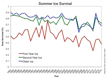
First it is not only ice extent that it is increasing since 2007, but also ice age. A lot of importance has been placed on the disappearance of old ice, so it should be a motive for celebration that since 2007 summer ice survival in the Arctic has been on the increase (figure 4).

Figure 4. Summer Ice Survival has also increased since the 2007 minimum. Source: NSIDC.
In a recent article at Climate Etc., “Is the Arctic sea ice ‘spiral of death’ dead?“, Greg Goodman showed that something else has also changed in Arctic sea ice: Since 2007 the date of the minimum extent stopped increasing and started decreasing (figure 5). It appears that since 2007 the melting season might be ending sooner, and the 2016 melting season is significantly shorter than average. According to Tony Heller, 2016 has the shortest Arctic melt season on record, and the previous record was in 2015. Now here are some climate records that are not being reported by the media.

Figure 5. Variation of date of sea ice minimum also shows a change of trend in 2007. Source: Greg Goodman at Climate Etc.
The shortening of the melting season is not the only evidence besides sea ice extent and age that something new is going on in the Arctic since 2007. Arctic waters main exchange is with the North Atlantic Ocean, and since 2007 the heat content of the North Atlantic has been dropping as fast as it increased in previous decades, having already given up all the heat gains since the mid-90’s (figure 6).

Figure 6. North Atlantic heat content anomaly (0-700m) also shows a change of trend in 2007. Source: Climate4you.
But we do not only have strong evidence from ice extent, ice age, melting season length, and North Atlantic heat content, we also have a theoretical framework that links Arctic sea ice to the Atlantic Multidecadal Oscillation (AMO). Miles et al., 2014 show that AMO proxies and Nordic Seas ice proxies, although not a perfect inverted match, display a high degree of synchrony in their phases since at least the 1570’s with sea ice usually slightly ahead of AMO (figure 7).

Figure 7. Persistent multidecadal fluctuations in sea ice linked to the AMO. Original time series (gray) and multidecadal 50–120 year component (blue) reconstructed from wavelet decomposition: (Top) AMO proxy index, not detrended, 10 year running average. (Bottom) Western Nordic Seas sea-ice extent proxy reconstruction. The numbers in parentheses indicate the amount of variance in the nonsmoothed time series that is explained by the multidecadal component. The color bar in bottom panel indicates periods with reduced ice (red) and cold periods with increased ice (blue) inferred from the wavelet-filtered signal. The reduced ice periods are marked by light red shading and are seen to correspond to warm AMO periods. Source: Miles et al., 2014. Red arrows have been added to mark the two big known Arctic melting events of 1920’s and 1980’s.
As Miles et al., 2014 put it:
“We establish a signal of pervasive and persistent multidecadal (~60–90 year) fluctuations… Covariability between sea ice and Atlantic multidecadal variability as represented by the Atlantic Multidecadal Oscillation (AMO) index is evident during the instrumental record. This observational evidence supports recent modeling studies that have suggested that Arctic sea ice is intrinsically linked to Atlantic multidecadal variability.
Given the demonstrated covariability between sea ice and the AMO, it follows that a change to a negative AMO phase in the coming decade(s) could —to some degree— temporarily ameliorate the strongly negative recent sea-ice trends”.
This last phrase, indicating that despite a found natural correlation between Arctic sea ice and AMO, this can only reduce the trends imposed by the overwhelming effect of the atmospheric increase in greenhouse gases, is designed to bow to the current dominant hypothesis to increase the chances of the article being accepted. It does not affect what the evidence showed in the article demonstrates. We are already seeing since 2007 that the natural variability is strong enough to revert the previous trend, not produce some degree of temporary amelioration.
I have already shown here in some of my comments at WUWT that the correlation between AMO and Arctic sea ice is clear also in modern data (figure 8). It is not clear to me what causality underlines this correlation. According to the Stadium Wave hypothesis of Wyatt and Curry, 2014, both Arctic sea ice and AMO are in the same temporal group of the climate signal that travels the Earth’s oceans, sea ice, and atmosphere with a periodicity of 60-90 years. However in Wyatt’s data, as in Miles’ data sea ice changes appear to slightly precede AMO changes. We should not conclude that Arctic sea ice depends on AMO, but that both appear to change together. Wyatt and Curry conclude:
“But according to stadium-wave projections… this trend should reverse… Rebound in WIE [West Eurasian Seas Ice Extent], followed by ArcSib [Arctic Seas of Siberia Ice Extent] should occur after the estimated 2006 minimum of WIE and maximum of AMO.”
Looks like they also nailed it, like Miles et al., 2014, except that as scientists should do, Wyatt and Curry only bowed to the data.

Figure 8. September Arctic sea ice extent (green) inverted and superimposed over Atlantic Multidecadal Oscillation non-detrended anomaly. Source: Arctic sea ice reconstruction Cea-Pirón and Cano-Pasalodos 2016, AMO graph Trenberth and Shea, 2006, updated to 2011 by NCAR.
To contrast all the evidence that we are witnessing a change in Arctic sea ice trend with the official projections of a continuous decline, I have chosen a figure from NSIDC scientist J. C. Stroeve et al., 2012, as displayed in the “Melting Ice” chapter of “Our Changing Climate” report by the National Climate Assessment. Over that figure (figure 9) I have extended the Arctic sea ice reconstruction based on Russian aerial charts to 1935 by Cea-Pirón and Cano-Pasalodos 2016, that should not be very controversial as it lays squarely within the grey band of uncertainty of the original figure. And I have added an exponential fit in red that was very much in fashion between alarmists around 2012 based on Piomas ice volume modeling, and an AMO model fit in orange using the AMO trend and data from figure 8.

Figure 9. Reconstructed (1935-1979), measured (1979-2016), and projected Arctic sea ice extent between 1890-2090. Source of original figure: NCA. Red dashed line, 1979-2011 exponential fit. Orange dashed line, 1935-2015 sinusoidal AMO fit with AMO trend from figure 8. Red box, satellite data window. Forward projections are completely different, and AMO model is the only one predicting two or more decades of no significant Arctic ice melting or even ice growth.
Based on exponential fit or linear acceleration a group of scientists headed by Peter Wadhams and Wieslaw Maslowki, and parroted by Al Gore, defended a complete melting of Arctic sea ice by 2012-2020. They are completely discredited already in scientific circles, which doesn’t prevent them from reaching to the media and contributing to the fear campaign without being contradicted.
Based on accelerating melting, more mainstream ice scientists like Mark Serreze, director of NSIDC, defend 1 million km2 ice free conditions by 2030.
IPCC defends an Arctic essentially free of ice by 2050, and its followers, like notorious commenter Steven Mosher, accept that claim uncritically.
The CMIP5 ensemble of climate models projects an ice-free Arctic by 2060 in the unrealistic RCP 8.5, and by 2080 in the intermediate RCP 6.0 and 4.5 scenarios, as figure 9 shows.
But the evidence indicates that they are all wrong because they have based their analysis in the satellite window that by chance coincides exactly with the downward phase of AMO and Arctic sea ice. There is evidence that a very big Arctic melting took place in the 1920’s (first red arrow in figure 7), and Tony Heller has made a good job of unearthing it from newspapers reports. It is surely reflected in the scientific literature of the time, but climate scientists appear to be too lazy to walk to the library and use the photocopier in these days of internet. By using only recent data and by blatantly ignoring the evidence of the relationship between AMO and Arctic sea ice they have set themselves for failure. Climate models are essentially demonstrating the ignorance of climate modelers of the very same thing they are trying to model. They have either failed to read the relevant scientific literature or failed to understand its consequences.
While a linear extrapolation of the AMO model suggests that the Arctic could be reduced to 1 million km2 by 2200 AD it is unwise to make climate projections from extrapolation over such long periods. Lets just say that there is a significant probability that Arctic sea ice will not significantly melt over the next few decades and could even grow. Whether that is positive or negative depends on personal opinion on the importance of Arctic sea ice.
Conclusions
Empirical evidence supports the notion that a change of trend in Arctic sea ice took place in 2007. Due to that change, Arctic alarmists have been reduced to make climate claims based on daily data. It is very likely that Arctic sea ice might not significantly melt or even grow during the next few decades. The pause in Arctic melting was predicted in the scientific literature by 2014 before it was evident in the data. The pause in Arctic melting that started in 2007 is hereby officially inaugurated.
*Javier is a first name only. He has also published on Dr. Judith Curry’s site. Both she and I know his full identity. While normally we require guest authors use their full name, Javier’s employment situation is such that he’s likely be penalized in some way for posting at Curry’s and especially here. He has satisfied my need and Dr. Curry’s need for this exception, and is a well published scientist in a non climate related field that requires similar statistical analysis skills.
UPDATE: 10/18/16 by Anthony
Methods and Data for Evidence that multidecadal Arctic sea ice has turned the corner
Figure 2 data was downloaded on October 2nd, 2016 from:
ftp://sidads.colorado.edu/DATASETS/NOAA/G02135/Sep/N_09_area_v2.txt
year mo data_type region extent area
2007 9 Goddard N 4.32 2.79
2008 9 Goddard N 4.73 3.22
2009 9 Goddard N 5.39 3.72
2010 9 Goddard N 4.93 3.29
2011 9 Goddard N 4.63 3.18
2012 9 Goddard N 3.63 2.37
2013 9 Goddard N 5.35 3.75
2014 9 Goddard N 5.29 3.70
2015 9 Goddard N 4.68 3.37
2016 9 NRTSI-G N 4.72 2.81
Data on Arctic Sea Ice extent was graphed with Excel, using the display linear trend
option.
Figure 3 graph was downloaded from:
http://osisaf.met.no/p/new_ice_extent_graphs.php
Symmetrical triangle technical analysis was performed graphically by joining with a
straight line the most recent maxima and with another the most recent minima.
2012 minima was not accounted because according to technical analysis, a break
that is not confirmed is a false break.
Figure 4 graph was downloaded from:
http://nsidc.org/arcticseaicenews/2015/10/2015-melt-season-in-review/
Link:
http://nsidc.org/arcticseaicenews/files/1999/10/survival-350×259.png
A linear trend with an arrow was traced between 2007 and 2015 data.
Figure 5 was copied from Greg Goodman’s article at Climate Etc.
https://judithcurry.com/2016/09/18/is-the-arctic-sea-ice-spiral-of-death-dead/
He provides an adequate description of how he made it.
Figure 6 was copied from Climate4you:
http://www.climate4you.com/SeaTemperatures.htm#North%20Atlantic%20(60-
0W,%2030-65N)%20heat%20content%200-700%20m%20depth
Figure 7 was copied from:
Miles, Martin W., et al. “A signal of persistent Atlantic multidecadal variability in Arctic
sea ice.” Geophysical Research Letters 41.2 (2014): 463-469.
http://folk.uib.no/ngftf/CV/PDF_Furevik/miles_et_al_grl_2014.pdf
For clarity the two relevant panels were retained, and Little Ice Age maximum was
indicated. Red arrows were added to mark the two big known Arctic melting events of
1920’s and 1980’s.
Figure 8 was copied from NCAR:
http://www.cgd.ucar.edu/cas/catalog/climind/AMO.html
Artic sea ice data from:
Pirón, Miguel Ángel Cea, and Juan Antonio Cano Pasalodos. “Nueva serie de extensión
del hielo marino ártico en septiembre entre 1935 y 2014.” REVISTA DE
CLIMATOLOGÍA 16 (2016).
http://webs.ono.com/reclim11/reclim16a.pdf
Was graphed, inverted and overlaid over the figure.
Figure 9 was downloaded from NCA:
http://nca2014.globalchange.gov/report/our-changing-climate/melting-ice
Arctic sea ice observed data was corrected and extended towards the past with data
from:
Pirón, Miguel Ángel Cea, and Juan Antonio Cano Pasalodos. “Nueva serie de extensión
del hielo marino ártico en septiembre entre 1935 y 2014.” REVISTA DE
CLIMATOLOGÍA 16 (2016).
http://webs.ono.com/reclim11/reclim16a.pdf
And was extended towards the future with data from NSIDC (see figure 1 origin).
The red quadratic exponential fit to sea ice extent or volume predicting an end (< 1
million sqkm) to summer sea ice between 2020 and 2025 was popular in 2011-12:
https://tamino.wordpress.com/2012/11/22/sea-ice-forecasts/
http://neven1.typepad.com/blog/2011/04/trends-in-arctic-sea-ice-volume.html
The orange curve was obtained by the opposite procedure to figure 8. The AMO data
and trend were inverted and overlayed and a sinusoidal curve was fitted to the trend
and data.
Is the extent of ice at one pole valid on its own ?
I was fascinated in a recent article here which explained the obliquity of the earth in relation to the sun. As the angle of the earth to the sun changes back and forth over years and decades either one or other pole receives more light and heat energy from the sun.
That seems to mean that as the ice at one pole expands, as the antarctic has been doing, then the ice at the other (arctic) shrinks and vice versa. Assuming that is correct then the measurement of ice at just one pole as an indicator of “global warming” aka climate change is simply a red herring.
Seems to me that the closest one can get to using polar ice as a CC indicator would be to take the combined extent of both poles. Any thoughts on that ?
Old England,
The changes in obliquity and precession are very slow and probably its effects cannot be noticed over the course of a human life. But you are correct in two things, that there appear to be teleconnections between the poles as this is the basis of some theories like the bipolar see-saw, and that sea ice is not a very good indicator of climate change, as it has a lot of noise and displays multidecadal oscillations.
Total sea ice is surprisingly constant for the entire satellite period so we cannot use it as CC indicator because we would have to conclude that there has been none.
Javier,
thanks for that – I guess that explains why the focus is almost entirely on Arctic ice extent – as I was thinking might be the case.
With total ice levels remaining fairly constant then, as you say, it cannot be used as a CC indicator because it shows none.
Javier
October 7, 2016 at 7:31 pm: None. Yep, you’ve nailed it there, mate.
Antarctic sea ice extent this year had its 10th-lowest maximum and earliest maximum date (only time occurring in August) in the satellite record.
Old England
I have recently and remain diligent in the study of polar sea ice. After studying the previous 35 year records using raw data, plus introducing other key controlling and influencing factors, and producing at least 300 charts, on an individual seasonal basis I have found that there is a specific link in the September period. The same sequence occurs, with any variation in timing bought about by the same factors.
It is almost like the Antarctic maximum and the Arctic minimum are connected by a spongy umbilical cord, an atmospheric umbilical cord. Note that the second and final Antarctic dip occurred at the same time as the Arctic minimum this year, although they are 20,000 kilometers apart. The same signal appears to control both on an annual basis. During the Arctic High and Antarctic low in March the relationship is less precise
ozonebust,
thanks for that.
I wondered if that might be the case and it seems to illustrate that there has been no real change in either temperature or atmospheric heat energy, and that would apparently indicate there has been little or no effect from any GHG.
“That seems to mean that as the ice at one pole expands, as the antarctic has been doing, then the ice at the other (arctic) shrinks and vice versa. Assuming that is correct then the measurement of ice at just one pole as an indicator of “global warming” aka climate change is simply a red herring.
Seems to me that the closest one can get to using polar ice as a CC indicator would be to take the combined extent of both poles. Any thoughts on that ?”
Yes.
You are presuming that both poles have the same constraining conditions (geography).
The two poles are vastly different.
The only thing they have in common is the fact that they are “poles”.
Antarctic sea-ice is completely open to ocean, having a vast icy continent at its centre with an average altitude of 8,000ft.
Frigid air spills constantly from that out over the Antarctic seas.
The Arctic is virtually land-locked, and is subject to air heated over land during the NH summer, and to warm air advected in from the Pacific and Atlantic in winter. FI: the air temp at the pole rose above 0C for a short time this last winter.
The arctic is constrained in it’s maximum ice extent and has fresher water.
Antarctic sea-ice isn’t constrained by land, only by wind fields – those wind fields having an effect on deeper waters reaching to the surface and via thermohaline stratification.
OldEngland: You’re looking at the Milankovitch cycles, in particular the one for earth tilt. That takes about 41,000 years to cycle, so isn’t significant for changes over the last few years or decades. The precession (timing of spring relative to perihelion) has periods of 19,000 to 23,000 years. So, again, too slow for current changes. But most interesting in their own right.
For theories of ice ages, the fact that the tilt affects the poles oppositely has been one of the major challenges. Rather than continental ice advancing on one pole while retreating on the other, it generally does the same on both poles. (Note: continental ice. Sea ice doesn’t leave the nice record that continental ice does.)
For studying climate change, my own take is that it’s desirable to collect the largest domains that we can expect to vary in the same way and analyze them together. By going to larger domains, we’re protected against squiggles that affect only the one point but nowhere else. On the other hand, we also know that oceans respond differently than atmospheres, that high latitudes respond differently than tropics. And that the Arctic responds differently than the Antarctic. So lumping those different areas together obscures our understanding rather than aiding it.
algae
That’s the only thing we have to worry about. If algae exist then humidity exists at one time a metor hit this planet we came to and a lot of different things was in our atmosphere preventing the sun’s solar power ⛮ to heat primarily the weekest area space can come close to the Arctic. The water with no algae froze for so many centuries and now we have a colder year it will recover. Wow who are we fooling.
If you want to know why algae is bad it’s because if you take slush and put algae into it, it will freez but as soon as the sun hits the algae it breaks apart quickly because of the non water elements. But I’ll try to be positive and say your right were OK the Arctic is just pure clean water. No oil spills no algae no pollution no change in water current flow it’s all good.
QED!
My comment should have appeared below Javier’s at October 7, 2016 at 7:31 pm
Something funny going on here!
And, given warming, you’d expect there to be less. So what’s up, eh?
===================
Nowt. There never was.
Heh, it’s a travesty we don’t know what’s going on in the oceans.
==========
Here’s another thing look at the ships that their finding and lol alien space ships that’s under the ice even pyramids ohhhh no was that a knock at the door men in black. The ice will melt unfortunately this planet is not God’s freezer
Since nobody knows what the ice level should be and why it should be there and why more or less ice is abnormal why don’t we all just accept that the ice level is exactly the perfect level given all the conditions that go into the creation of sea ice? Once we accept that the level is what the level will be we can try to understand what all the conditions are that affect sea ice. We need to start saying “we don’t know” when we don’t know why things are what they are rather than imagining that conditions of our manufacture but which we can’t quantify, test, or model are to blame.
In a very important way, one of the SOLE MEASUREMENTS of whatever’s postulated as ”science” is
”HOW does it FARE in analysis, once the NAMES are removed?”
Believers in the GHE INVENTED connecting scientific truthfulness to the reputation of the name associated with it.
*How’s that working out, CLIMASTROLOGY? LoL.
All our reputations who told the world climastrology is pure trash – they’re still perfectly intact.
The reputations of the NAME WORSHIPPERS
is through the floor.
NOT
the other way around.
“[Arctic sea ice] got to a low maximum in March [2007], although not as low as the previous year that still holds the record…”
_____________________
According to which data set? According to NSIDC and NASA 2016 holds the record for lowest maximum Arctic sea ice extent in March, followed by 2015: http://www.nasa.gov/feature/goddard/2016/2016-arctic-sea-ice-wintertime-extent-hits-another-record-low
Where does this author’s claim come from?
NSDIC has the ice extent for March tied for lowest between 2006, 2015 and 2016 within 0.5% variation.
However the Danish Meteorological Institute and OSI SAF seem to think that 2006 was the lowest of the three:
http://osisaf.met.no/quicklooks/sie_graphs_new/osisaf_nh_iceextent_monthly-03.png
In any case if three years are statistically tied, it is not incorrect to say that the first one established the record.
Javier,
“In any case if three years are statistically tied, it is not incorrect to say that the first one established the record.”
_________________
Thanks, but your article states that Arctic sea ice in March 2007 was “not as low as the previous year that still holds the record”. The DMI chart shows 2007 as the lowest March extent on record. What previous record low March extent did your original comment refer to?
DWR54,
Look at the DMI graph better. The inside ticks correspond to January 1st of the year. The lowest value in that graph corresponds to March 2006.
I think it is clear to all that March 2006 showed one of the lowest if not the lowest value for the month of March in the entire series since 1979. I fail to see a problem with this.
Stock market trend analysis is based on long term moving averages, minima, and maxima whereby a triangle indicative of a breakout is based on market sentiment and market positioning, and is not correlatable to natural systems tending to be based on parameterized interactions, You can take a natural system and do principal component analysis to see subsignals, but this is not done in market trend analysis. Often, up and down momentum is measured by stacking all the ups, then starting the next column stacking all downs, etc with each price change, compressing the horizontal time scale with breakout signals such as triangles and types of tops/bottoms, I find none of that useful in natural systems. The best fit for Arctic Ice so far is sinusoidal and not a breakout function at all.
Note that Science Magazine suppressed the image that clearly demonstrated cooling in the tropics….
OMG, sea level rise had flooded the Sahara and dromedaries are clinging the last bits of the east Antarctic ice sheet floating by.
It’s worse than we thought.
I just find it hilarious that a fake picture would be chosen to illustrate a letter on scientific integrity. They were really inspired that day.
I must say that I do think a great majority of scientists are honest and integrous. Perhaps not 97% because there is quite a lot of irreproducibility going on in science and a lot of pressure to publish or perish, but a great majority nonetheless. Problem is scientists are wrong as often as the rest of the people but they don’t acknowledge it.
BTW, that PB has a scientific name, Ursus bogus. It provided some good comic relief during the Gleick affair.
https://wattsupwiththat.com/2010/05/12/new-bear-species-discovered-ursus-bogus/
There’s also a three penguin version:
Thank you, Ralfellis, that provided a burst-out-laughing and sheer fun moment for me. 🙂
And thank you, Javier, for an excellent article. This is important stuff that clearly upsets the trolls and those who can only denigrate. Keep up the excellent work and don’t ever let the b*ggers get you down.
Really? We are supposed to take this seriously?


Lets look at the latest NSIDC update:
http://nsidc.org/arcticseaicenews/
“Through 2016, the linear rate of decline for September is 87,200 square kilometers (33,700 square miles) per year, or 13.3 percent per decade.”
Here’s the diagram:
http://nsidc.org/arcticseaicenews/files/2016/10/monthly_ice_09_NH.png
And:
“Despite the generally unfavorable weather conditions, the seasonal minimum of 4.14 million square kilometers (1.60 million square miles), reached on September 10, ended up in a statistical tie with 2007 as the second lowest in the satellite record.”
(the author by the way needs to look at the way NSIDC calculates and presents extent data -his claims are based on a clear misunderstanding of it)
And:
“there has been an overall decline in ice age, particularly the oldest ice types—ice that has been in the Arctic for more than four years. Near-real-time updates (which are preliminary) indicate that at this year’s minimum, only 106,000 square kilometers (41,000 square miles) of 4+ year old ice remained, or 3.1 percent of the total ice extent. This is in stark contrast to the mid-1980s when over 2 million square kilometers (33 percent, or 772,000 square miles) of the summer minimum extent was composed of old ice that had survived at least four summer melt seasons.”
Also you might like to look at how that ‘rapid refreeze’ is tailing off:
and you might like to compare these two thickness charts:
Really? We are supposed to take this seriously?
You think cherry picking one month of the year from 37 years worth of daily data and drawing a straight line through it is most informative analysis of what is happening. That’s your best shot, that’s it?
And I suppose you consider that irrefutable evidence that the straight line will continue until there is not ice left and is formal proof that it’s all being driven by CO2.
+/- 2 SDs missing from the graph. Any significance in that?
Sea Surface Temperature Anomalies, Ice and Snow Cover.
Great essay. One of the early signs that the climate consensus is hype was the consistent ignoring of historical data. The Arctic is very dynamic, caused by Arctic amplification. The climatocracy is mistaken in thinking that Amplification is new or only works one way. The consensus claims about Arctic ice importance are also, based on the evidence, wrong. We have had a big 30 year decline in sea ice, and what impact has it had on the world, or even the Arctic?
I am to the point now where now it is a wait and see game. Let’s see how quiet the sun becomes going forward and if it does become quiet let’s see what climatic impacts may come about.
Everything over the last several years all of the angles from solar to AGW warming have been exhausted in my opinion.
I am now in the reaction stage meaning where I go from here will be dictated by the climate with the solar and AGW angles in mind.
How I go about arguing my points which I have made many times over, will depend on what course the climate takes and why.
For the record I think prolonged minimum solar conditions will if they materialize has been shown in the historical climatic data will once again result in global cooling.
Then again as I have said let’s see what the climate does from here.
Now that the increases GCR looks like a bad forecast for the winter.
http://www.cpc.ncep.noaa.gov/products/stratosphere/strat-trop/gif_files/time_pres_HGT_ANOM_ALL_NH_2016.png
I used to say the next 15-20 years will be interesting. Now I say the next 5-10 years will be.
First major event will be the AMO going negative.
Next, solar cycle 24 sinking into an extended minimum.
There will not be a persistent decline in global temperatures until the AMO goes persistently negative. The recent persistent decline between 0-700m in the North Atlantic ocean is just the first sign of this happening.
This link may not work?
Global temperatures warm and cool in phase with the AMO and is flat with this removed.
http://s772.photobucket.com/user/SciMattG/media/RSS%20Global_v_RemovedAMO2_zpsssrgab0r.png
http://s772.photobucket.com/user/SciMattG/media/RSS%20Global_v_RemovedAMO2_zpsssrgab0r.png.html
AO very low.
http://www.cpc.ncep.noaa.gov/products/precip/CWlink/daily_ao_index/ao.obs.gif
Am I correct in thinking that the negative AO behaves with response to the decreasing solar wind and ionization strengthening? If this persists through winter with low solar activity then a cold/severe winter may lie ahead for NE America and most of Europe. Especially when the signs for weak La Nina are more favourable so far than a stronger one. The North Atlantic cold pool is also becoming resilient again.
You said.
“The pause in Arctic melting that started in 2007 is hereby officially inaugurated”.
Unless, as appears highly likely, the next couple of summer extents also drop into the 4 million km level or below… then of course the so-called “pause” will be as inconsequential as any other blip when looked at such a short period.
Why doesn’t the author mention sea ice volume, the true measurement of the sea ice?
Why don’t you tell us,David?
Volume doesn’t give you the area of the high albedo surface, and that’s important do track how much sunlight the poles reflect/emit to space.
As for the volume this changing rapidly, even within one year.
http://ocean.dmi.dk/arctic/icethickness/images/FullSize_CICE_combine_thick_SM_EN_20161005.png
Alarmist climate scientists have ignored ocean cycles and indices like the AMO for decades. The irony when only the changing of these cycles actually brings about any change to global temperatures with any underlying signal not detected.
The AMO and Arctic go hand in hand and observed changes in this gate way around the deeper oceans of the North Atlantic ocean, have huge clues what we can expect in the future. Therefore it Is more likely with recent changes here, that we will continue further what currently only seems a number of years of recovery.
It is does seem recently that Arctic ice and volume has recovered slightly with a stabilizing over a number of years. Don’t forget it was Hansen 1988 after only 8 years of slight global warming that this scare evolved from. Those claiming 8 to 10 years is not enough, it was for the alarmist scientists in the first place.
Dead cat bounce and that is being generous.
Not sure why you’re showing the March PIOMAS data?
Here is last month’s data:
http://psc.apl.uw.edu/wordpress/wp-content/uploads/schweiger/ice_volume/BPIOMASIceVolumeAnomalyCurrentV2.1.png
The length of the illustrated graph only covers the warm phase of the AMO generally. Therefore the AMOC during it’s quickest and warmest phase, moving increased energy into the North Atlantic Ocean and Arctic ocean waters. There is no surprise there and expected to do so in this scenario.
Hansen had more than 8 years when he said that. The 80s were warmer than the 70s, were warmer than the 60s, were warmer than the 50s.
That said, at the time most of the community, including me, thought he was wrong in saying that we were going to see continued warming from that point. Almost 30 years on, he was right. 1988 would now be considered a cool year.
Not true, the planet cooled from the 1940’s until the 1970’s not too dissimilar from the northern hemisphere example shown below at the time. The planet had only warmed for around 8 years in 1988 after a minimum point in the 1970’s with the scare of an ice age. Older data didn’t show the 1950’s to be cooler than the 1980’s.
http://s772.photobucket.com/user/SciMattG/media/NH%20temperatures%201982_zpsplh6gz9e.png.html
Older data didn’t show the 1950’s to be cooler than the 1980’s including the Arctic too.
http://s772.photobucket.com/user/SciMattG/media/ArcticTempsSurface1936_zpspod7pd2i.png.html
The shape of the NSIDC sea ice curve has been simultaneously uncharacteristic in both The Arctic and Antarctic been and followed instrumentation failure in satellite F17 and change to F18. Here is part of a warning note from their website:
However, NSIDC is still working on the calibration of the F18 data so temporarily the F18 data will be uncalibrated and using F17 tie points.
https://nsidc.org/data/docs/daac/nsidc0081_ssmi_nrt_seaice.gd.html
There are a slew of metrics used for tracking polar ice: depth, extent, old ice v new ice, summer ice, winter ice, etc. Every chart seems to have a slightly different story to tell.
I have to recall a point my father once made to me: “A man with one watch knows what time it is. A man with two watches can never be sure what time it is.”
The data clearly can tell you WHEN something is going on that is different from the past, but it cannot itself tell you WHAT is going on, nor WHY it is happening.
Until was have an *empirically verifiable* theory of climate with extensive confirmed predictions (which will require a much larger database of observations), long-range forecasts are an exercise in futility.
Anomalous melting of Arctic sea ice is strongly affected by significant pulses of super-heated and chemically charged fluid flow the Mid-Arctic Rift. Although data on this geologically induced activity is scant, there is enough to demonstrate its importance. Woods Hole institute and others have shown that the Rift “pulsed” in the 2007 to 2008 time frame. This event likely continued in limited form into the 2009 to 2010 time period.
This heating is here contended to be the root cause of the 2007 to 2012 melting trend.