Climate researchers have a problem. A degree or two of global warming simply isn’t scary. When Hollywood created “The Day After Tomorrow”, the cold snap allegedly triggered by global warming was by far the most deadly threat faced by the heroes.
So Ed Hawkins, a professor at University of Reading, has ditched boring old graphs, and created an animated graphic which attempts to maximise the emotional impact of global warming data.
Spiralling global temperatures from 1850-2016 (full animation) https://t.co/YETC5HkmTr pic.twitter.com/Ypci717AHq
— Ed Hawkins (@ed_hawkins) May 9, 2016
A good artistic effort – the scary spiral thing seems to leap straight out of the page at you. But is the choice of data range reasonable? I would suggest not – most people would be hard pressed to tell whether temperature in a room had changed by one or two degrees.
So how does it look when you represent temperature change on a more reasonable scale, say 10c, a magnitude of change which most people could actually feel?
It will look mostly like a little squiggly dot at that scale.
Another aspect of this graph is that when temperatures go DOWN it simply overwrites the previous spirals and you don’t perceive it as change. Only when the spirals expand and the ave. temp. goes UP do you see a marked change. Run it again and watch for intervals where the spirals don’t expand and even contract. You have to be very perceptive to catch them.
Interesting animation. Now, can I please see the same animation using the “unadjusted” data?
Two teachers that I have enjoyed are J.W. Turkey and his Honestly Significant Difference Test, and Edward R. Tufte, author of Visual Display of Quantitative Information.
A sister-in-law posted this on FaceBook commenting I was sure to have something to say about it. Indeed I did. I posted the following over several comments:
Ric Werme I saw a couple other references to this but haven’t checked them out. My initial reaction includes:
1) the starting 0.0C temperature is not a typical average, but the start of the temperature data displayed. Yes, the Earth’s temperature has gone up since 1850. The question is why. It appears that climate models give CO2 credit for 2X to 3X more impact than it deserves.
2) The dynamic display is cute, but hides some very important features, like the warming in the late 1930s or the cooling in the 1970s. By using a circle, it implies the effect of temperature change is proportional to area – it’s not, it’s proportional to the radius or diameter, both which are a little tough to read. A center point or starting the display at 0 would have helped.
3) Ending at the peak of the 2105/2016 El Nino plays to the tactic that CRU and others have been milking for the last couple of years. The ENSO sea surface temperatures that drive El Nino are crashing and it looks like we’ll be in a severe La Nina by the end of the year. It’s going to be interesting. Don’t assume you can grow southern plants next year.
4) There is an increasing disparity between the ground level temperature and the satellite record. Some of the adjustments made to the ground record are questionable, some made last year are reprehensible. Keep an eye on both – I’ll post a couple.
Other people probably have more criticisms, I might post some of those too.
Ric Werme – Some of this is harder to hunt down than it should be – most graphs only cover the period from the late 70s because the previous data is doesn’t follow the script.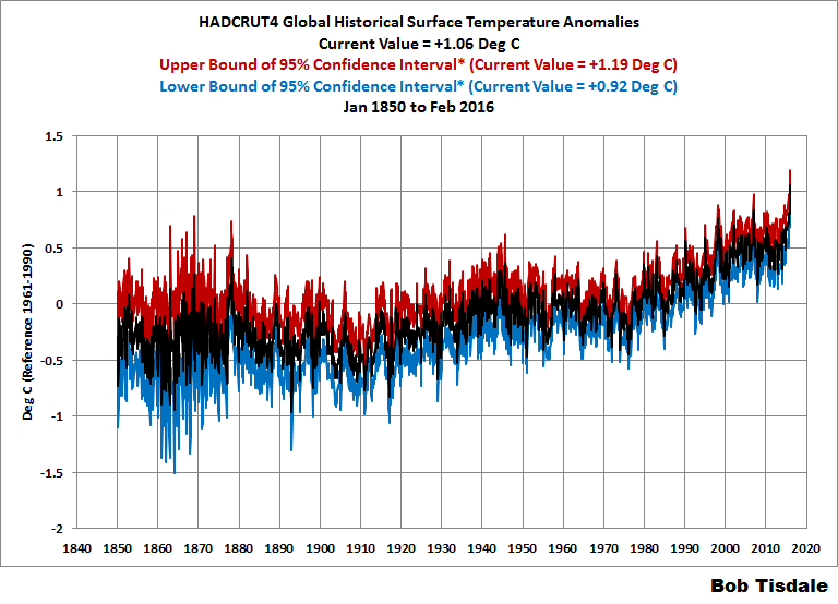
The rise from 1910 to 1945 is similar to 1975 to 2005. Did you see the decline from 1945 to 1975 in the GIF? No? They didn’t want you to notice. The GIF is cute, the graph is informative.
Ric Werme – The satellite record starts in 1979. It samples the “lower troposphere”, which is pretty high up, about Pikes Peak level. That has both positive and negative features. El Nino/La Ninas affect those temperatures with a few months delay, for the same reason a teapot doesn’t boil the instant you put it on the stove.
The temperature scale is based on the WMO recommended 30 year period for “climate normals”, very different from the HadCRUT starting point, the 20th century average that some people like, etc.
Ric Werme – One more – this shows how quickly El Nino is fading. SST is the sea surface temperature anomaly, greater than +0.5 is “El Nino Conditions” (the actual declaration depends on several months of data) and less than -0.5 is La Nina conditions.
http://www.cpc.ncep.noaa.gov/products/people/wwang/cfsv2fcst/images3/nino34MonadjPDFSPRDC.gif
The problem is that “Global” warming is not “Global”.
What we see is an increase in nighttime temperatures, mostly in the Northern Hemisphere, towards the Pole. We do not see a matching rise in summer temperatures, nor do we see a rise in Southern Hemisphere temperatures.
This pattern of warming CANNOT be due to CO2, because we are told that CO2 is WELL MIXED globally. The warming should be global as a result, but it is not global. This represents one of many failed predictions of the CO2 theory of Global Warming.
In Science, when a theory gets a prediction wrong, that is PROOF, not simply evidence, but PROOF that the theory is wrong.
The CO2 theory of Global Warming predicts that the warming will be Global. However, the observed warming is not global, it is concentrated in nighttime temperatures in the Northern Hemisphere. This is not and was not predicted by the CO2 theory, which is conclusive proof that the theory is wrong.
The most likely cause of the observed Hemispheric Warming is something specific about the Northern Hemisphere. This cannot be CO2, because CO2 is well mixed.
If humans are the cause, and this is a big if, because we have no idea what caused the Little Ice Age, nor why things are warming up since the LIA, it would seem most likely it is due to land use changes. There is much more land in the Northern Hemisphere than the Southern Hemisphere, and over the past 150 years humans have gone from using 4% of the land surface to using 40%.
This huge increase in the amount of land used by humans is largely ignored as the cause of climate change. Yet it is a much closer fit to temperature than CO2.
Why is it so hard to imagine that cutting down millions of square miles pf forests and replacing them with blacktop, concrete, crops and irrigation does not change the local climate? And when repeated time and time again over the globe, why is it so hard to imagine that this will result in a global change?
The answer is simple. We know we cannot do anything about land use change. We imagine we can do something about energy usage.
“If humans are the cause, and this is a big if, because we have no idea what caused the Little Ice Age, nor why things are warming up since the LIA, it would seem most likely it is due to land use changes. ”
So there was an LIA?
That means we know, for certain, that temperatures were cooler back then?
Like 1.5C cooler.. Nobody can feel that. It wasnt real
when the last ice age scraped canada to bedrock and deposited 180 ft of topsoil across the great plains of the usa, yeah, it was a little bit colder then.
if somebody didn’t feel it, maybe he homogenized himself and infilled his temperature with that of the average temperature of humans in deserts and tropical islands.
or maybe people weren’t that stupid back then – after all, there were no universities.
As a matter of fact, we do know that there was an LIA.
You cherry pick your posts to respond to, to get your whit in.
Naughty boy.
You like consensus, the consensus is there was an LIA and MWP
The consensus is there was a pause.
Denier
😛
During LIA sea level fell [though also had periods [decades] of rising sea level.
Main noticeable effect of LIA was advancing glaciers in Temperate Zone, or end of LIA
is marked by the majority of glacier retreating and start of continuous rise in sea levels- with only short term and minor dips in global the long term sea level rise- which is about 8 inches per century.
“nor do we see a rise in Southern Hemisphere temperatures.”
Really?
and
http://www.bom.gov.au/climate/current/annual/aus/2015/20150106_SSTa_plot.png
“This pattern of warming CANNOT be due to CO2, because we are told that CO2 is WELL MIXED globally. The warming should be global as a result, but it is not global. This represents one of many failed predictions of the CO2 theory of Global Warming.”
No.
The warming is global – there are obvious differences in the geography of the hemisphere that prevent equal warming in both hemispheres…
The Northern Hemisphere has a much larger proportion of land relative to the oceans – the oceans representing about 85% of the Southern Hemisphere and thus the dominating influence on the climate there, causing a dampening of any large swings. There is a cooling effect on the SH with heat transport via ocean currents into the NH (this increasing the deltaT between them even more).
“it is concentrated in night-time temperatures in the Northern Hemisphere. This is not and was not predicted by the CO2 theory, which is conclusive proof that the theory is wrong.”
No.
For the reason above – the SH is mostly ocean and as such the LWIR absorption has less warming effect at night than over land.
Land has a greater diurnal deltaT and thus the small raising of nigh-time minima will be much smaller in comparison with land when a diurnal temps range may cover ~20C (or more over desert).
http://media.bom.gov.au/upload/images/Media%20Statement1.jpg
Also
“On the Origin of the Surface Air Temperature Difference between the Hemispheres
in Earth’s Present-Day Climate”
http://journals.ametsoc.org/doi/pdf/10.1175/JCLI-D-12-00636.1
About the fire in Fort McMurray, here we go the doomsayers are coming out
http://www.msn.com/en-ca/news/world/the-arsonists-of-fort-mcmurray-have-a-name/ar-BBsY6qb?ocid=spartandhp
Just use this graph – more demonstrative:
http://4.bp.blogspot.com/-lPGChYUUeuc/VLhzJqwRhtI/AAAAAAAAAS4/ehDtihKNKIw/s1600/GISTemp%2BKelvin%2B01.png
Demonstrative but nearly devoid of information. Go read Edward Tufte.
“Just use this graph – more demonstrative:”
It is (very) …. but not of what you allude.
It just shows that there is no alarming global warming…
“Introducing the global warming speedometer”
Love it. That one’s going on the fridge.
I’m going to make a button with that on it….if I can snag it that is.
Back on topic:
Has anyone else noticed the reference point of 0 disappeared so you couldn’t really see the years that flew by that went below zero?
Facebook suspended my account. Had to prove I wasn’t a spambot and agree to play nicey, nicey.
Former Facebook employees recently admitted to spiking stories favorable to conservatives on their “Trending” page.
Anonymous former Facebook contract workers said that.
Predictably the wild fire in Alberta has been unofficially blamed on the fossil fuel companies and global warming.
Dude !!! Watch that graphic with the blacklight turned on and listening to Black Sabbath !!
Dude !!!!!!
A fine work of self mockery.
If there was the “unprecedented” steady warming claimed the spiral pattern would be so much cleaner.
Instead so much in-crossing that its the blob.
Another home goal by “The Team” ™ IPCC.
I think this boils down the genuine skeptic viewpoint in a nutshell. There’s an effect. Just not a scary one – certainly not worth billions, and certainly not worth rolling back western civilization.
Sorry Ed
My underwear remains undampened.
Just saw a poster on a bus here in Toronto that had the requisite toddler and the the phrase: “When she what you did about climate change, what do you tell her”.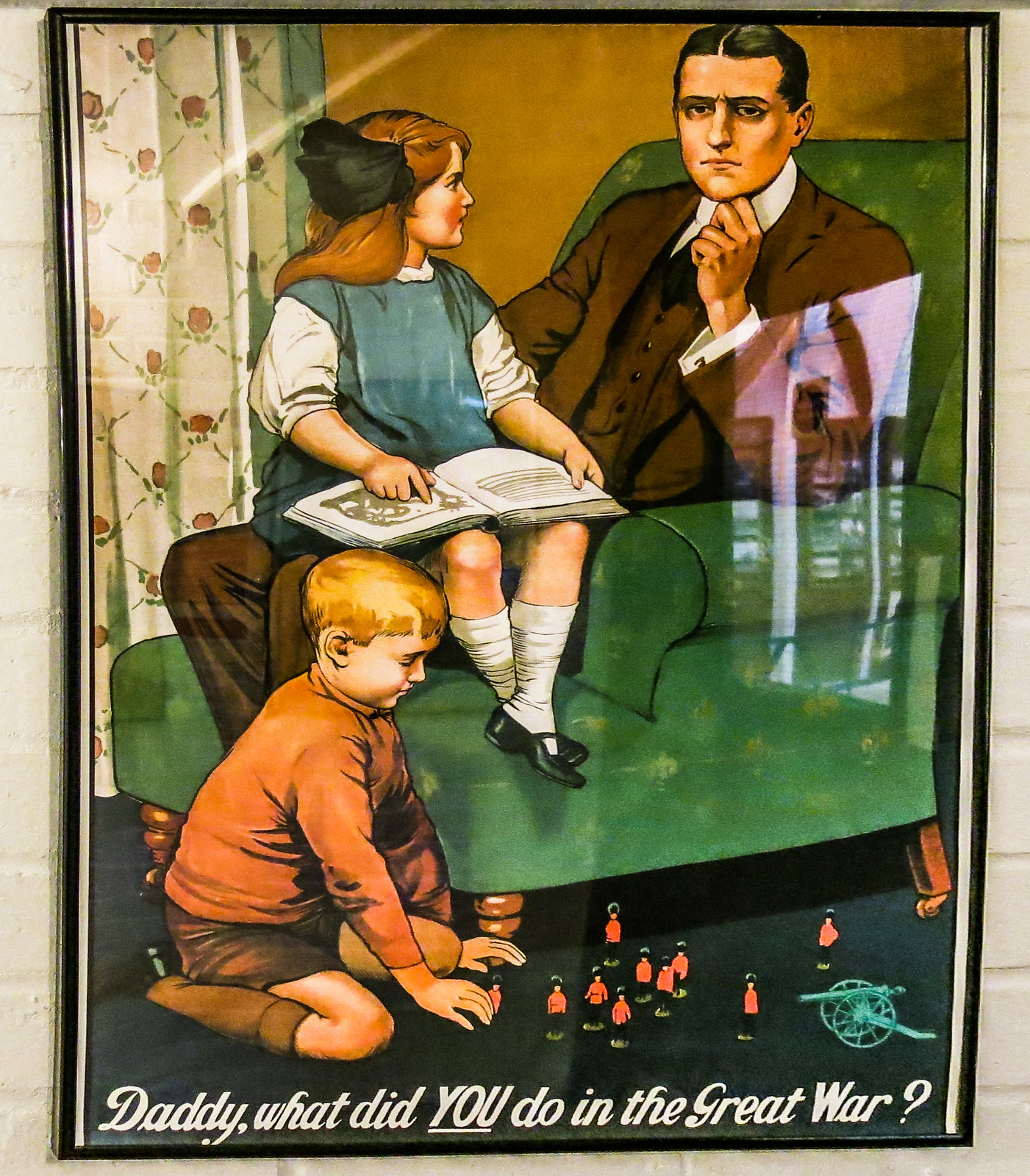
Reminds me of this poster:
Truly, these people are despicable.
Er, should read, in English: “Just saw a poster on a bus here in Toronto that had the requisite toddler and the phrase: “When she asks what you did about climate change, what do you tell her”?”
“I didn’t shovel shiit in Louisiana.”
This triggers fond memories of placid hours of meditative relaxation spent playing with my Spirograph. Thank you Ed.
all is good with the Spirograph as long as you had colored pens
“So how does it look when you represent temperature change on a more reasonable scale, say 10c, a magnitude of change which most people could actually feel?”
The LIA was approximately 1.5C lower than today.
I guess it didnt exist because nobody could feel the difference
The benefits of the warming from the LIA must be an illusion since no one could feel 1.5C
Today the world is about 15C
Last time it was 20C there alligators at the north pole. But hey, nobody can feel 5C
Its a cool chart. Charts are not science. dont get your panties all twisted up
Have you taken your meds today, steve? You seem more-than-the- usual pissy.
Maybe check your own shorts.
Still having trouble selling his lemons , is my guess.
Dodgy !!!
oh, i can’t wait to see alligators pole dancing!
alligators should be the poster pets of global warming, no?
forget about polar bears- they only say ‘not cold’
alligators say ‘hot hot hot!’
our children just won’t know from polie bears
beside, reptiles ruled the earth for 150 million years- they can do it again.
Will someone please twist up Mosher’s panties?
Steven; I believe it was named the “Little Ice Age” because it was, well, “Little”. Temperatures have since risen approximately 1.5 C according to some reconstructions, most estimate between 1 and 1.5, but the uncertainty in that number is absurdly high given it is a reconstruction, what with thermometers being so rare at the beginning. Your comparison of the Carboniferous to current climate is even more speculative since neither thermometers nor qualified operators were around at the time. I understand Mann extrapolates from tree rings, or is it chicken bones?
It never ceases to amaze me when alarmists just blithely rattle off numbers like that. It’s right up there with Hawkins’ chart, with 0.1 C resolution going all the way back to 1880. Ludicrous really, some might say “arrogant and stupid”, I prefer less obnoxious terms more along the lines “ignorant and mentally challenged” myself.
Posting a graphic of my recent weight gain is a low blow 😉
It works for hypnotizing my cat.
Do NOT let your cat see that graph.
That graph makes humans look stupid.
It’s important that we humans do not completely humiliate ourselves in the eyes of other more intelligent species.
Too late … typical cat response …
Well, Ed Hawkins has been struggling for some time, to master the art of propaganda.
Here’s a previous attempt to construct a scary narrative:
“To summarise, if you had measured temperatures in your back garden for the last 150 years you would probably be able to see the signal of global temperature change emerging from the noise of local fluctuations. ” – Ed Hawkins October 2015.
Holy shit – that sounds so really scary. I’m so startled right now!!!
(That’s apart from the fact that I do not believe that he is correct. And certainly not unless this mythical 150 year old meteorologist had accounted for time of observation, station movement, sheltering by buildings and trees, urban heat island effects, instrumentation changes – etc etc etc)
http://www.climate-lab-book.ac.uk/2015/what-have-global-temperatures-ever-done-for-us/
Nice spiraling graphic but totally meaningless. However, I suppose, if a simple-minded CAGW parishioner of the global warming faith was to replay and stare at the spiraling graphic over and over again, I would surmise that he / she would encounter nirvana by getting hypnotized.
Now it seems past civilization demise has an answer!!!!
http://www.mnn.com/earth-matters/climate-weather/blogs/5-ancient-civilizations-were-destroyed-climate-change
Sorry to go off topic. Is it confirmed that Peter Glieck resigned as President of Pacific Institute?
Maybe they shall use this gadget in a tesla car displaying energy consumption against battery capacaty.
The last Thames Ice Fair 1814, just over 200 years ago less than 100 years before my mother was born. Hopefully there won’t be another in the lifetime of my grandchildren.
Apparently changes to the London Bridge have made the chance of freeze over much lower. I’ve forgotten the details, maybe a Brit can fill them in.
“During the Great Frost of 1683–84, the worst frost recorded in England, the Thames was completely frozen for two months, with the ice reaching a thickness of 11 inches (28 cm) in London. Solid ice was reported extending for miles off the coasts of the southern North Sea (England, France and the Low Countries), causing severe problems for shipping and preventing the use of many harbours.” source wikipedia.
Alarmists like to emphasize the role played by the now removed Old London Bridge. Even on the wikipedia page from which the above was taken.
I would invite anyone to explain quite how a bridge contributed to the above events.
The bridge happened to have been demolished in 1831 – i.e. after a few centuries during which the Thames froze (to some degree) on 26 occasions.
If we suppose that the bridge had nothing to do with this – then the only alternative explanation is that it was formerly colder and that by 1831, it had already started warming.
However, since warming can only be caused by industrial CO2 – we must necessarily hold the bridge to be the dominant factor. #blamethebridge
Ric – The river was wider and a lot shallower then. Since the construction of various embankments over the years it is now narrower and consequently more fast flowing. Of course, there is a good chance that the reconstruction of the bridge was necessitated by that narrowing. It seems inconceivable to me that changes to the bridge could, by themselves, cause a lessening of the likelihood of a total freeze.