From Dr. Roy Spencer
The Version 6.0 global average lower tropospheric temperature (LT) anomaly for April, 2016 is +0.71 deg. C, down slightly from the March value of +0.73 deg. C (click for full size version):

The global, hemispheric, and tropical LT anomalies from the 30-year (1981-2010) average for the last 16 months are:
YEAR MO GLOBE NHEM. SHEM. TROPICS
2015 01 +0.30 +0.44 +0.15 +0.13
2015 02 +0.19 +0.34 +0.04 -0.07
2015 03 +0.18 +0.28 +0.07 +0.04
2015 04 +0.09 +0.19 -0.01 +0.08
2015 05 +0.27 +0.34 +0.20 +0.27
2015 06 +0.31 +0.38 +0.25 +0.46
2015 07 +0.16 +0.29 +0.03 +0.48
2015 08 +0.25 +0.20 +0.30 +0.53
2015 09 +0.23 +0.30 +0.16 +0.55
2015 10 +0.41 +0.63 +0.20 +0.53
2015 11 +0.33 +0.44 +0.22 +0.52
2015 12 +0.45 +0.53 +0.37 +0.61
2016 01 +0.54 +0.69 +0.39 +0.84
2016 02 +0.83 +1.17 +0.50 +0.99
2016 03 +0.73 +0.94 +0.52 +1.09
2016 04 +0.71 +0.85 +0.58 +0.94
I expect average cooling to continue throughout the year as El Nino weakens and is replaced with La Nina, now expected by mid-summer or early fall. Nevertheless, 2016 could still end up as a record warm year in the satellite record…it all depends upon how fast the warmth from the El Nino dissipates and La Nina sets in.
The “official” UAH global image for April, 2016 should be available in the next several days here.
The new Version 6 files (use the ones labeled “beta5”) should be updated soon, and are located here:
Lower Troposphere:http://vortex.nsstc.uah.edu/data/msu/v6.0beta/tlt/uahncdc_lt_6.0beta5.txt
Mid-Troposphere:http://vortex.nsstc.uah.edu/data/msu/v6.0beta/tmt/uahncdc_mt_6.0beta5.txt
Tropopause:http://vortex.nsstc.uah.edu/data/msu/v6.0beta/ttp/uahncdc_tp_6.0beta5.txt
Lower Stratosphere:http://vortex.nsstc.uah.edu/data/msu/v6.0beta/tls/uahncdc_ls_6.0beta5.txt
Anyone feeling dead or uncomfortable yet?
You might need a Ouija board …
You’d better be doing your part to save the Earth, just like North Korea here.
http://thefederalist.com/wp-content/uploads/2015/03/Earth-Hour-Victory.jpg
Challenge Question: When will global cooling start?
In 2002 we wrote that global cooling would start by 2020 to 2030.
We now say global cooling will start before 2020, probably by 2017.
[Definition: The commencement of global cooling is deemed to start when the Lower Tropospheric (LT) temperature anomaly as measured by UAH satellite data starts to decline below the +0.2C anomaly and the LT trend then declines further.]
http://www.drroyspencer.com/latest-global-temperatures/
Bragging rights to whoever gets it right.
Ladies and germs – faites vos jeux!
Regards to all, Allan
Post Script:
I hope to be wrong about global cooling, because humanity suffers greatly in a cooling world. The current Excess Winter Mortality Rate equals about 100,000 deaths per year in the USA, up to 50,000 in the UK and several million worldwide, even in warm climates. There is NO significant Excess Summer Mortality Rate.
References:
Cold Weather Kills 20 Times as Many People as Hot Weather
June 13, 2015
By Joseph D’Aleo and Allan MacRae
https://friendsofsciencecalgary.files.wordpress.com/2015/09/cold-weather-kills-macrae-daleo-4sept2015-final.pdf
Presentation of Evidence Suggesting Temperature Drives Atmospheric CO2 more than CO2 Drives Temperature
September 4, 2015
By Allan MacRae
https://wattsupwiththat.com/2015/06/13/presentation-of-evidence-suggesting-temperature-drives-atmospheric-co2-more-than-co2-drives-temperature/
Yes, Allan, and here at WUWT we can call it, “The Last Leif Falling: Global Cooling In The Near Future”
“We now say global cooling will start before 2020, probably by 2017.”
_________________
Whereas in 2008 you were claiming it had already started in 2007: http://icecap.us/index.php/go/joes-blog/is_this_the_beginning_of_global_cooling/
Seems that every time there’s a La Nina ‘global cooling’ has begun.
SC24 was already predicted to be a weak solar cycle by 2008. While it hasn’t been cooling since 2008, UAH temps HAVE been cooler than they were a decade ago when inconvenient truth came out. After this el nino, with the approach of the next solar minimum, we may well see the long awaited cooling that allan described in ’08. One thing we can predict is that YOU won’t be around here when it happens to tell allan that he was right…
[Definition: The commencement of global cooling is deemed to start when the Lower Tropospheric (LT) temperature anomaly as measured by UAH satellite data starts to decline below the +0.2C anomaly
I think you need a more dramatic fall in temperature than that.
The UAH anomaly was lower than that as recently as last July, and you would guess that it will be again within the next year or so, without “global cooling” having begun in earnest.
Judging from the 1998 El Niño peak, it will be about 12 more months before we know where we are in terms of warming. The 2016 peak is 0.1°K warmer than the 1998 peak. We will see how the 2017 valley compares to the 1997 valley.
sorry, 1999 valley
They keep on using 1979 as the base for all these graphs about how hot it is today. !979 here in Upstate NY was like Siberia during the Napoleon invasion: bitter cold.
The last 6 months from October 2015 to March 2016 set monthly records. However April 1998 was 0.743 and April 2016 was 0.71. As well, RSS is out and April 2016 came in at 0.757. This is 0.1 lower than the 0.857 from 1998.
Prior to this year, the UAH April 1998 anomaly of 0.743 held the record for almost 18 years until it was broken by the February 2016 anomaly of 0.833.
As we all know, both 1998 and 2016 were impacted by very strong El Ninos. It may be interesting to compare the first 4 months of 1998 with the first 4 months of 2016 on UAH.
For 1998, the average was (0.479 + 0.653 + 0.475 + 0.743)/4 = 0.5875.
For 2016, the average is (0.541 + 0.833 + 0.734 + 0.71)/4 = 0.7045.
This is a difference of 0.117 C over 18 years which translates to 0.65 C per century. That is certainly nothing to worry about!
I am expecting a big drop in May. See the following:
https://ghrc.nsstc.nasa.gov/amsutemps/amsutemps.pl
I realize May is only 5 days old, but all 5 days so far for 2016 are below 2010 on ch06. The May 2010 values for UAH and RSS were 0.414 and 0.526 respectively.
How many beach condos were abandoned?
haha, man I should go back and find all the WUWT commenters claiming that there is no global warming at all and that everything showing any warming is based on doctored temperature records.
Now even Dr. Spencer’s results show record warming. It would be really good if some of those commenters would come out of the woods now and at admit that they were wrong.
Yes, they may still claim that ‘it doesn’t matter’. But so many people swore that there was no warming at all, while now clearly there is. So. Looking forward to all the hat eating! 😉
Cheers,
Ben
i’m surprised that you actually bothered to look at the data.
I take it you don’t understand El Ninos?
The concept of enthalpy is probably foreign to him too.
You had it right at “I take it you don’t understand”.
oh, ok so “it’s the el nino” is going to be the party line. So explain to me this: we’ve had el nino’s for a very long time. If there was no base line warming then the peak of each el nino would stay the same. However, this peak is higher than the previous ones, indicating el nino + baseline warming.
The cognitive dissonance is strong in Paul Homewood!
Benben:
No one doubts we’ve enjoyed about 0.82C of beneficial warming recovery since the end of the LITTLE ICE AGE in 1850, of which, CO2 has perhaps contributed about 0.2C of the total…
So what???
For the past 20 years, there hasn’t been a global warming trend, despite 30% of all manmade CO2 emissions since 1750 being made over just the last 20 years….
We’ll get about another 0.3C of beneficial CO2 warming recovery between now and 2100 per CO2 doubling, LESS the cooling effects of the coming Grand Solar Minimum expected to start around 2035 and last 50~100 years…
There is a good chance global temps may well be cooler by 2100 than they are now….
The disconfirmed CAGW hypothesis predicted 3C~6C of CO2 induced warming by 2100, which is impossible, and explains why the disparity between CAGW projections are so devoid of reality:
http://www.drroyspencer.com/wp-content/uploads/CMIP5-73-models-vs-obs-20N-20S-MT-5-yr-means1.png
You do realise there are natural warming cycles, and we are in a long term one since the Little Ice Age? Hence some warming is to be expected on long term trends (ie ones that pre-date any effect man could have with CO2 emissions?)
benben, I’ve not seen any WUWT posters saying there has been no warming at all. All agree there has been cumulative warming since the LIA, with repeated periods of cooling and lulls in that warming trend. I only saw claims that the last 18 or so years have not warmed, despite a continued increase in atmospheric CO2.
P.S. There is no “party line” among skeptics, only among CAGW adherents.
SR
Temperatures have been rising since at least 1800, Benben. Where were you getting gas for your SUV back then. It’s nothing to do with CO2 and we can’t stop it. We don’t even understand it. A bunch of pathetic models have been created by idiots lined up for billions in free money and they can’t even doctor the data enough to make them work out. Just look at the facts, man. Don’t you feel like you’re trying to push a fat man up a ladder and he keeps crapping his pants?
benben, I know you are being paid to make warmistas look stupid, but dang, do you have to be so good at it?
Everybody was saying a year ago that the coming El Nino would cause a big temperature spike, just as every previous El Nino has done.
Do you really believe that after hiding for almost 20 years, CO2 warmth suddenly jumped out and caused more warming in 6 months than had been seen in over 40 years?
I’m waiting for the coming La Nina to cause a big drop in temperature, then we can drag out all these posts and use them to taunt benben and our other warmistas.
All the short warming increase lines up with El-Nino’s.
The 1982,1998,2005 2010 and now this, all has been warming when they were ongoing.Surely you didn’t miss that?
Here you go Ben,seeing this for the first time in your life.From the NOAA:
Cold and Warm episodes by the Season
http://www.cpc.ncep.noaa.gov/products/analysis_monitoring/ensostuff/ensoyears.shtml
john harmsworth
Love the picture you created!
+ several shedloads.
Thanks!
Auto
You guys have short memories. Back when the satellite records showed no significant warming at high altitudes, but all the land/ocean based records did show significant warming, there were A LOT of posters saying that it was a massive scam and that the only reason there was any warming at all was because of fraud.
Now the satellite records show some pretty strong warming as well, these conspiracy theorists are not commenting (where are you when I need you DBstealy?).
So obviously, all you guys that said there was warming, but argue that it’s not significant, or not due to CO2, this message was not meant for you as I’m not commenting on that here! So no need for angry comments. Although I understand that being angry on the internet is a big hobby for some, so keep at it if it makes you happy I guess.
Cheers,
Ben
[benben doesn’t have the skills to be able to separate warming in both the satellite and surface record from the recent record el nino induced warmth. Once the el nino disappears (and its already on its way out), temperatures will fall. benben’s point is moot, just ignore him, because he’s posting from Yale under a fake name and email, and you can always tell a Yale man, but you can’t tell him much -mod]
Mod I believe the word you’re looking for is ‘alias’, not fake.
The el nino increases temperature every 4 years, but one el nino peak should still be the same as all the other ones, if there was no baseline warming. Which clearly there is.
But sure, lets see what the temp looks like in a year or so.
Greetings from rainy New Haven 🙂
Ben
Ah, so your name isn’t Ben, Ben?
Hold your horses, big ben… wait patiently for the el nino to run its course along with the ensuing la nina. And after all is said and done, and we see some net warming at then end of the day, THEN you can go round showing all those short sighted “watties” your fine peacock feathers. On the other hand, should lord monkton resume posting his pause graphs, then it is the watties who will be showing YOU…
hello afonzarelli,
Thanks for your reply. Although the increase in absolute peak temperature definitely warrants a bit of fun at the expense of the people saying that THERE IS ABSOLUTELY NO WARMING WHATSOEVER, you are also right that for a conclusion about a break in trend that would satisfy the crowd here we should just wait a year or two to see how the lowest temps develop. So, lets meet at exactly this spot in two years shall we?
Cheers,
Ben
benben says:
… the people saying that THERE IS ABSOLUTELY NO WARMING WHATSOEVER
Once again: name those people. Or ar you just making up fictitious statements again?
“So, let’s meet at exactly this spot in two years shall we?”
Make it three and you’ve got a deal…
I do not know anyone who thinks that anything more than the short year trend is controlled by el nino la nina. I have heard almost no comments that the moderate year ~ 175 trend is not a warming trend (after all it is the “Modern Warm Period” that started at the end of the “little Ice Age”. I have also heard almost no comment from the Warmest crowd that all the some what longer trends are all growing colder be they the ~8,000 trend from the Holocene maximum. The longer term trend from the start of the Pleistocene ~ 2.5 million years ago of the even longer term trend from the Eocene Optimum ~50 million years ago(when it was ~6 degrees warmer than now).
Benbenbenben … How many straw men does it take to change a lightbulb?
One to hold the bulb and three to turn the table stood on….
It takes a Tin Man and a Cowardly Lion and one little dog to turn the tables.
Yeah Benben as per usual your statement is “Much ado about nothing” Only 0.117 degrees since 1998 which will disappear when the La Nina follows next year and the pause comes back.
What was typically said is that there was no significant warming for the last 18 years, and the 18 years is significant because Ken Santer said If there were no warming for 17 years, then AGW would be disproved.
I doubt if Santer did say that mainly because it isn’t true. The sensitivity of the climate to CO2 might be called into question with an extended period no no warming but that does not necessarily invalidate AGW theory.
I thought he said that the models would be discredited or something along those lines.
well, then the typical person has nothing to prove by responding to my posts, because I only want to poke fun at those who deny any warming at all.
benben,
You’ve repeatedly claimed that there are lots of folks here who deny that there has been any global warming.
I’ve repeatedly challenged you to name even one, but…
…*crickets*
dbstealey
October 1, 2013 at 10:51 am
…That being the case, explain why there is NO ocean warming. …
dbstealey
October 1, 2013 at 7:48 pm
Konrad,
jai mitchell cannot produce any empirical evidence at all showing measurable changes in temperature due to human emissions. Neither can anyone else.
That is not to state conclusively that AGW cannot exist. It is certainly possible. But if it exists, it is such a small forcing that it cannot even be measured. Therefore, AGW should be completely disregarded for any policy decisions.
If something is too small to measure, it is hardly science…
ens josh,
You’re deflecting.
I commented on AGW, not on global warming in general. And the ARGO submersibles indicate that since their deployment, deep ocean warming has been non-existent almost everywhere.
And of course there has been natural global warming, ever since the Little Ice Age wound down. I’ve never said there wasn’t. I did point out that jai mitchell couldn’t produce any measureable evidence of AGW. For that matter, neither can you. But AGW is not ‘global warming’, it is only a small subset of global warming.
But it’s nice to know I have a follower who has nothing better to do than to desperately comb through years of comments, hoping to find something that contradicts what I wrote. Sorry you failed, ens josh.
But I love knowing you tried, and that you’re so fixated on me that you’ve spent hours searching for those comments. They just don’t show what you thought they did. But good for you, you tried.
Now, try getting a life…
dbstealey said (to ens josh): “Now, try getting a life…”
That’s a rich comment, coming from someone who lives on WUWT.
[When one is retired, one HAS lived a life. And has earned the right to live a second one as he (or she) chooses. .mod]
So Muhammad Ali hasn’t lived a life? Or Jimmy Carter?
It’s one thing to post many a comment of a high degree of value here at wuwt (regardless of whether or not one is retired). Quite another to take the time, energy that ens josh did and wind up missing the point any way…
[Reply: or even worse, being an impostor and stealing the name of a legitimate commenter. The real Johann Wundersamer did not make the last two comments above. They were forged by an identity thief/site pest. -mod]
afonzarelli,
Thank you. And I notice a moderator has found a counterfeit commenter. An impostor. It’s pretty sad, when someone pretends he has more support than he actually has — and that fakir says other folks don’t have a life!
I’ve always known the alarmist clique is pretty small potatoes. The true ‘consensus’ has always been heavily on the side of skeptics of the man-made global warming scare. The fake comments above prove they have no honesty, either.
Well, typically, you misrepresent pretty much everything skeptics and most posters say. ‘BenBen’ – jeez, why not just go with ‘Bobo’?
Or maybe “Bozo”.
benben:
This is the world’s oldest temp record. See the green line? Still think it’s CO2…since 1659? Really? Way before the internal combustion engine, ship engines, cement works. Still think it’s CO2?
http://c3headlines.typepad.com/.a/6a010536b58035970c0120a7c87805970b-pi
Um that’s the temperature in England. For the sake of honesty, shouldn’t you point that out? Just in case someone thought it was a global temp. record?
Why on earth are you shrinking the temperature record to a small section of the graph and overlaying it with a graph of human CO2 emissions which has been stretched to 6 times the size of the temperature?
Why not compare with CO2 levels?
Why draw a single linear trend line for the entire 350 years, when it’s obvious the temperatures have not been rising linearly?
And finally, how do you get that red dotted line at the top, labelled “climate model prediction”? Which models have predicted annual Central England temperatures would rise to 17C?
Bellman,
US CO2 emissions have declined substantially:
But I don’t see you railing against China, Russia, India, and a hundred other countries, whose emissions continue to rise:
http://edgar.jrc.ec.europa.eu/img/part/co2_report_2015_009g_muc15.png
Next, the rise in CO2 tracks the rise in wealth:
http://climate.mr-int.ch/images/graphs/gdp_vs_carbon.png
What you’re arguing is that people should remain poor in order to feed your green fantasies. But in reality, the rise in CO2 has been entirely harmless, and extremely beneficial to the biosphere.
As it has turned out, the “carbon” scare has been 100.0% WRONG. Either admit it, or you’re just another True Believer in Algore’s Church of Globaloney. That’s the difference between a scientific skeptic, and a True Believer: skeptics will change their minds if/when the facts change. Believers can never admit that they were wrong, even when told by the ultimate Authority: Planet Earth.
Just for the record:
CET from 1659 to 2015 (the green line in bazzer1659’s graph) has a linear trend of 0.27C per century.
CET from 1950 to 2015 has a linear trend of 1.72C per century.
Bellman,
It’s natural, and it’s happened before:
http://oi45.tinypic.com/125rs3m.jpg
Yes, very steep rise up to 1741 in England. Probably didn’t cause much panic then because they were coming out of the very cold temperatures in the late 17th Century. (Though it’s difficult to be too certain of the rate of warming given the CET is less reliable that far back.)
All of which agrees with my point that the trend has not been linear as bazzer1959 was suggesting.
dbstealy,
You seem to be arguing with a post I haven’t made. My only mention of CO2 emissions was to point out the nonsense of bazzer1959’s graph.
wow, that is some random abuse of line drawing right there. I’ll save that image! Beautiful
benben,
Still waiting for you to link to a name of someone here who says there hasn’t been any global warming.
It’s just like all your other assertions: baseless nonsense.
One month? Three months? Half a year?
All are in the weather category, not climate.
But then benji, you claim to already know such things. The minor fact that you never state plain facts, but rely upon sophistic falsehoods, just proves your sham.
Um that’s the temperature in England.
For the sake of honesty, shouldn’t you point that out? Just in case someone thought it was a global temp. record?
You mean, if they can’t read that big banner at the top of the plot? Do we really need that level of hand-holding for the terminally stupid?
Benben.
Just a couple of things….
From: Tom Wigley
To: Phil Jones
Subject: 1940s
Date: Sun, 27 Sep 2009 23:25:38 -0600
Cc: Ben Santer
So, if we could reduce the ocean blip by, say, 0.15 degC,
then this would be significant for the global mean — but
we’d still have to explain the land blip.
It would be good to remove at least part of the 1940s blip, but we are still left with “why the blip”.
di2.nu/foia/1254108338.txt
Oh and could you please supply me with a list of temperature recording sites operational circa 1880 for the following locations.
Arctic. Antarctic. Africa. Siberia. South America, Southern Atlantic and Southern Pacific Oceans.
Thanks.
bonbon sez:
haha, man I should go back and find all the WUWT commenters claiming that there is no global warming at all and that everything showing any warming is based on doctored temperature records.
benben, I challenge you to post only a half dozen names of commenters who said what you’re alleging — out of the thousands of posts here that actually don’t say that, and never have.
So give us the names of commenters who have said “that there is no global warming at all.”
Can you name even ONE??
The gauntlet is down, benben. Put up or shut up. And if you can’t do either, at least we’ll be able to re-post your non-answer. IF you have one.
DB, I’m quite sure you at a certain point came out and claimed that temperature increase was driving the CO2 increase. That’s even dumber than looking at the temperature record 1880-2016 and claiming there is no warming whatsoever. Because, you know, where did that quarter trillion tons of CO2 come from, if not from fossil fuels?
Anyway, I’m still ignoring you because of the incredibly unpleasant things you said about people in the third world. Bye DB
benben,
Quit your incessant deflecting. You stated unequivocally that lots of commenters here have said that global warming never happened. I’ve repeatedly challenged you to post their names.
Since I never said that, you’re just deflecting. Either back up your claims, or we’ll know you’re making baseless and false accusations.
I think I remember you…are you the guy who couldn’t grasp the concept of extending a trend backwards and was always claiming the data was cherry-picked? The claim you could never comprehend was that there was no global warming in the past “x” months and “y” days, not that global warming was non-existent and going to be that way forever and ever. And the data you’re looking at…well, if you had paid any attention, the current peak was well-anticipated by posters on this according to El Nino strength and history (most notably 98-99). So maybe you should have paid more attention to the posters here instead of your strawman.
I apologize if I have confused you with another idiot.
I expect you are thinking of me. Though I didn’t have a problem with the concept of extending a trend backwards, I just couldn’t understand why anyone thought it made a difference.
For example I can now extend the trend backwards over RSS data, to see that the rate of warming since November 2007, (8 years and 6 months) has been rising at over 3.5 C per century. That would be an example of cherry picking. I deliberately looked backwards to find the longest period I could that was rising at such a rate and ignore the fact it ends (or starts) with an El Nino.
Benben, there was no warming during the time they claimed no warming. Why does that disturb you?
Lots of your heroes also claimed we were not warming during the same time…
Dr. Phil Jones – CRU emails – 5th July, 2005 – “The scientific community would come down on me in no uncertain terms if I said the world had cooled from 1998. OK it has but it is only 7 years of data and it isn’t statistically significant….”
__________________
Dr. Phil Jones – CRU emails – 7th May, 2009 – ‘Bottom line: the ‘no upward trend’ has to continue for a total of 15 years before we get worried.’
__________________
Dr. Judith L. Lean – Geophysical Research Letters – 15 Aug 2009 – “…This lack of overall warming is analogous to the period from 2002 to 2008 when decreasing solar irradiance also countered much of the anthropogenic warming…”
__________________
Dr. Kevin Trenberth – CRU emails – 12 Oct. 2009 – “Well, I have my own article on where the heck is global warming…..The fact is that we can’t account for the lack of warming at the moment and it is a travesty that we can’t.”
__________________
Dr. Mojib Latif – Spiegel – 19th November 2009 – “At present, however, the warming is taking a break,”…….”There can be no argument about that,”
__________________
Dr. Jochem Marotzke – Spiegel – 19th November 2009 – “It cannot be denied that this is one of the hottest issues in the scientific community,”….”We don’t really know why this stagnation is taking place at this point.”
__________________
Dr. Phil Jones – BBC – 13th February 2010 – “I’m a scientist trying to measure temperature. If I registered that the climate has been cooling I’d say so. But it hasn’t until recently – and then barely at all. The trend is a warming trend.”
__________________
Dr. Phil Jones – BBC – 13th February 2010
[Q] B – “Do you agree that from 1995 to the present there has been no statistically-significant global warming”[A] “Yes, but only just”.
__________________
Prof. Shaowu Wang et al – Advances in Climate Change Research – 2010 – “…The decade of 1999-2008 is still the warmest of the last 30 years, though the global temperature increment is near zero;…”
__________________
Dr. B. G. Hunt – Climate Dynamics – February 2011 – “Controversy continues to prevail concerning the reality of anthropogenically-induced climatic warming. One of the principal issues is the cause of the hiatus in the current global warming trend.”
__________________
Dr. Robert K. Kaufmann – PNAS – 2nd June 2011 – “…..it has been unclear why global surface temperatures did not rise between 1998 and 2008…..”
__________________
Dr. Gerald A. Meehl – Nature Climate Change – 18th September 2011 – “There have been decades, such as 2000–2009, when the observed globally averaged surface-temperature time series shows little increase or even a slightly negative trend1 (a hiatus period)….”
__________________
Met Office Blog – Dave Britton (10:48:21) – 14 October 2012 – “We agree with Mr Rose that there has been only a very small amount of warming in the 21st Century. As stated in our response, this is 0.05 degrees Celsius since 1997 equivalent to 0.03 degrees Celsius per decade.”Source: metofficenews.wordpress.com/2012/10/14/met-office-in-the-media-14-october-2012
__________________
Dr. James Hansen – NASA GISS – 15 January 2013 – “The 5-year mean global temperature has been flat for a decade, which we interpret as a combination of natural variability and a slowdown in the growth rate of the net climate forcing.”
__________________
Dr Doug Smith – Met Office – 18 January 2013 – “The exact causes of the temperature standstill are not yet understood,” says climate researcher Doug Smith from the Met Office.[Translated by Philipp Mueller from Spiegel Online]
__________________
Dr. Virginie Guemas – Nature Climate Change – 7 April 2013 – “…Despite a sustained production of anthropogenic greenhouse gases, the Earth’s mean near-surface temperature paused its rise during the 2000–2010 period…”
__________________
Dr. Judith Curry – House of Representatives Subcommittee on Environment – 25 April 2013 – ” If the climate shifts hypothesis is correct, then the current flat trend in global surface temperatures may continue for another decade or two,…”
__________________
Dr. Hans von Storch – Spiegel – 20 June 2013 – “…the increase over the last 15 years was just 0.06 degrees Celsius (0.11 degrees Fahrenheit) — a value very close to zero….If things continue as they have been, in five years, at the latest, we will need to acknowledge that something is fundamentally wrong with our climate models….”
__________________
Professor Masahiro Watanabe – Geophysical Research Letters – 28 June 2013 – “The weakening of k commonly found in GCMs seems to be an inevitable response of the climate system to global warming, suggesting the recovery from hiatus in coming decades.”
If the only warming that occurs is during El Niño’s and it is less then the direct affect of CO2 doubling, then that is nothing more then another mark against CAGW theory.
Nino3.4 is crashing, as it did following the peak of the strong 97/98 Super El Niño, and La Niña conditions could start as early as November of this year.
By next month, UAH temp anomalies should start reflecting this El Niño collapse, and should fall precipitously over the next 18 months as La Niña conditions cause global temps to fall.
By the end of 2017/early 2018, a flat global temp trend from the middle of 1996 should reappear, extending the “hiatus” to 21 years….
CAGW is so screwed.
If NH is down 0.09C, Tropics down 0.15C and SH only up 0.06C, why is the global figure only down 0.02C?
Because (-0.09+0.06)/2 = -0.015 ~ -0.02.
Tropics have nothing to do with it, because NH and SH include the tropics too, AFAIK.
Rich.
Ah!!
I like that measurement to thousandths of a degree. Somebody spills an ice cube in Cancun and the world’s temperature could drop to .01 degree rise!
John, If you calculate a number from measurements from a number of satellites and do the necessary adjustements for each single satellite, then you get very easy some thousands.
“If you calculate a number from measurements from a number of satellites and do the necessary adjustements for each single satellite, then you get very easy some thousands.”
Which – being purely a product of False Precision Syndrome – are of course entirely meaningless.
Tropics do not count since they are split between north and south. And 0.09 down and 0.06 up averages 0.03/2 = 0.015 down over the globe. To 2 digits, this is 0.02 down. Note that the average of 0.85 and 0.58 is 0.715, so there was a rounding issue here to get 0.71.
Northern and southern hemispheres cover the full globe. Add them and divide by two, plus or minus for rounding. The tropics are a portion of each hemisphere.
its a conspiracy called math
Steven M, what childish snark. A simple question was asked and answered. The questioner accepted the answer with gratitude.
Eejit…
oooooh, the global warming acceleration, the planet is angry
“the 30-year (1981-2010) average” ….
Why do decadal ranges quoted by climate scientists
usually begin with a year ending in ‘1’ and end with a
year ending in ‘0’ ?
Is there some law against : 1980-2009 ?
I suppose they think “the 1960s” began in 1961
Rex, for the same reason weeks range from Sunday through Saturday. Sure, Saturday through Friday is a week long, but is not a “week” in the sense of “this week” or “next week”.
Each “decade” is one of a series of decades that began with the decade of year 1 through year 10. Each decade is a ten year period ending at the end of Dec. 31 of each tenth year, which year thus has an ending 0.
P.S. The 1st century ended at the end of Dec. 31 (as we count it) of the year we call 100, and the 20th century ended at the end of Dec. 31, 2000.
SR
Because there was no year “0”.
Yes, I know, but personally I have no objection to calling the years BC1, AD1, …, AD9 a “decade”. Everything is on a pretty arbitrary base, so convenience for us now, to be able to call 1990-1999 a decade and to have a new millennium start in 2000 and not 2001, as the digits click, should override everything else IMHO.
Rich.
there was in Cambodia under the Khmer Rouge
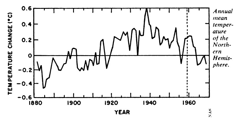
So we are still in the 1930’s-1998 temperature downtrend.
We could break out of this downtrend, but it hasn’t happened yet. February 2016 broke the downtrend, but the temperature is lower now, and feels like its going to go lower to me.
We seem to be having a very mild spring in the central U.S., consistent with the mild weather in the 21st century. I’m talking tornadoes mostly here. We can still get some hot summer temperatures, tornadoes or no tornadoes, but that still doesn’t change the fact that the weather is less extreme today.
2016, and all the 21st century years have to be cooler than in some previous decades, if we go by the “extreme climate events equals a hotter atmosphere” formula.
There is no comparison to the benign weather we have experienced in the 21st century compared to the really extreme weather that was experienced in the 1930’s and 1950’s. It was hotter then than now.
Even if the current 1930’s-1998, temperature downtrend line is broken, the temperatures would still have to exceed the 1930’s maximum in order to be characterized as unprecedented. And even then, that’s no guarantee that humans had anything to do with the heat, since it got that hot before, naturally, without human help.
What’s that 1930’s maximum figure? I don’t know. Ask the Climate Change Gurus. They are the ones with the database. See Climategate emails for details.
All I know is the Climate Change Gurus said the 1930’s was hotter than 1998, and they had to conspire to hide this information and make it look like the Earth was in a warming trend when, in fact, it was, and is in a cooling trend. Clever little conspirators aren’t they. Look at all the damage they have done.
That applies to the US only.
John Finn wrote: “That applies to the US only.”
So which temperature data records of the 1930’s, did the Climate Change Gurus manipulate for their current surface temperature chart, the U.S. only data?
“That applies to the US only …”.
=========================
Not so:
http://www.climate4you.com/images/70-90N%20MonthlyAnomaly%20Since1920.gif
Australia was pretty hot back around that time too. Certainly there were episodes of hotter than now, covered in newspaper reports at the time, including how birds fell dead out of the sky due to the heat and people were forced to leave for the coast. JoNova covered it very well.
Why not just use global temperatures? And over a decent timespan:
e.g. http://climate.nasa.gov/vital-signs/global-temperature/
which shows a +.87 degrees C rise since 1880. Pretty robust looking trend.
“Why not just use global temperatures? And over a decent timespan …Pretty robust looking trend …”.
============================
Robust my foot, they keep fiddling with it:
http://www.climate4you.com/images/GISS%20Jan1910%20and%20Jan2000.gif
John Finn wrote: “That applies to the US only”

Here’s a chart of the UK that shows the 1930’s temperature profile in the UK was a pretty close match to the unomodified U.S. surface temperature charts which show the 1930’s as being hotter than subsequent years. Only the U.S.?
For comparison:
http://realclimatescience.com/wp-content/uploads/2015/12/2015-12-18-12-36-03.png
Another one:
I’m trying to reply to Chris Hanley’s post where he says there’s no trend…
@chris: you accuse people of fiddling, but then you decide to ignore all the data prior to 2008. Why?
Anyway, my point it this: there seems to be a habit here of either: picking individual countries rather than looking at global temperatures, or picking short time windows rather than looking at the entire record. Again, there are lots of sources for global temperatures, over a decent timespan. They all look pretty much like this:
http://climate.nasa.gov/vital-signs/global-temperature/
Yes you can focus on a small window, focus on only some countries. But why would you do that? It’s global effects that matter, and long-term trends. Please explain how the graph above doesn’t show a warming trend?
“Again, there are lots of sources for global temperatures, over a decent timespan. They all look pretty much like this: ”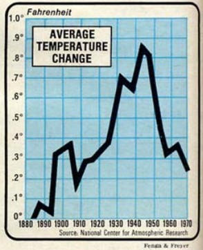
===================================
Not even close. The 1980s GMT chart look a great deal like the US only charts and like the 70 to 90degree north charts. Here is1980s…
Here is the N.H….
BTW, what kind of error bars should we place on 1880s GMT?
Also what constitutes a “decent timescale” as we are in a long term cooling trend.
@David A: neither of those are global, are they?
@David A: If you scroll down, you’ll see that I posted a graph of the global data that DBStealey was talking about. The upward trend is blindingly obvious.
“The upward trend is blindingly obvious.”
Show us.
@David A: You’ve also ignored all the data we’ve captured since 1970. Any particular reason for that?
@David A:
taking your N.H. data, if we include the more recent data, and include the rest of the world, it looks like this:
http://data.giss.nasa.gov/gistemp/graphs_v3/Fig.B.gif
Giving a complete picture like this:
http://data.giss.nasa.gov/gistemp/graphs_v3/Fig.A.gif
which is the same thing I posted lower down. So, unless you’re contesting the data itself, that does look like a significant upward trend.
http://www.climate4you.com/images/GISS%20MaturityDiagramSince20080517.gif
Before February 2009 (the Obama Administration) the trends between the first and last half of the 20th century wasn’t a lot different. The post 2008 temperature adjustments are an Obamanation.
It’s a convention. Unless there is a compelling reason to do so, calendars begin with ‘Year 1’, not year 0.
I’m with Rex: I’ve always thought it was a silly convention. If we knew that Jesus was born in AD 0 or AD 1 then it might be a different matter. As it is, yes, for most people the Sixties is 1960-1969 and a 30 year period 1980-2009 would make eminent sense.
Rich.
There are a lot of things in this world worth worrying about.
This isn’t one of them.
Who really,really cares about averages or miniscule degree changes.
. The fact that I may get fewer apples this year or the Rhineland in Germany is having a terrible frost which is decimating the vineyards or the Netherlands getting snow on top of their beautiful tulips I believe is a little more reverlent to what matters in the greater scheme of things.
Given that a global temperature decline of less than one interval on your scale would herald a new glacial maximum, the point I assume you’re trying to make is a silly one.
John Finn,
Your comment is a silly one. There is no decline. There is no scary warming, either. There is only a tiny 0.7ºC fluctuation over nearly a century and a half.
That chart debunks the global warming scare. Too bad you’re incapable of admitting it.
Here’s a GISS chart in Kelvin:
http://4.bp.blogspot.com/-lPGChYUUeuc/VLhzJqwRhtI/AAAAAAAAAS4/ehDtihKNKIw/s1600/GISTemp%2BKelvin%2B01.png
Even less scary, isn’t it?
dbstealey:
You seem to think that posting this graph is rather clever and meaningful. (I does often seem to appear on here)
May I suggest that the next time you are hauled into A&E with a heart attack that you request that the medics attenuate the y-axis on the electrocardiogram trace to hide the fact that you are having one.
Clue: It doesn’t make the problem go away in that case and not in the case of AGW.
PS:
And the irony is that Brandon Gates (pro-science) – was the first to post it here as a tongue-in-cheek wind-up of denizens.
To funny.
It is valid to put things on a properly scaled graph to see that such flux is really quite minor compared to historic flux throughout the geological record.
The analogy to a heart attack is ass-backwards, as the earth is recovering from dangerously low CO2, so CO2 is the life support needed, and in denying it, you are preventing the patient from recovery.
I have little interest in Brandon’s games, other then they demonstrate his lack of seriousness.
“It is valid to put things on a properly scaled graph to see that such flux is really quite minor compared to historic flux throughout the geological record.”
So you are saying the earth’s temperature has fluctuated by 120F, or 320K, during the geological period?
dbstealey said: “Here’s a GISS chart in Kelvin:….Even less scary, isn’t it?”
You’ve just proven how pointless these graphs are. Yes, any variation in a measurement over time will appear smaller when plotted against a larger Y axis range. So when you have a temperature variation of .7C, or 1, or 2, or any small number, yes, it will look smaller when you increase your Y axis bounds. Gee, why not choose a range of 0 – 1000K to make the increase appear even smaller!
I got a great name for this: The Hockey Puck Graph
Chris says:
So you are saying the earth’s temperature has fluctuated by 120F, or 320K, during the geological period?
How could you possibly conclude that?
Trot along back to hotwhopper, or wherever they consume nonsense statements like that.
@dbstealey:
here’s precisely the same data, only on a slightly less stupid scale:
http://data.giss.nasa.gov/gistemp/graphs_v3/Fig.A.gif
Plotting things on stupid scales is a very transparent way of trying to obscure patterns in the data. Why would anyone do that?
Nope, that’s the anomaly. Don’t you know the difference? Evidently not. Showing an anomaly doesn’t give anyone the true picture; it makes the slight rise look dramatic; which is what you were going for. Latitude’s graph shows ACTUAL average temperature, yours doesn’t. There isn’t a scare, so one is manufactured. It’s the politics of fear, and it is being rolled out by governments and institutions across the world. We, here in Britain, are being treated to it as a consequence of leaving the EU. But, like almost all politics, it’s devoid of truth, and doesn’t serve the people in making a decision. Basically, it’s undemocratic and fraudulent.
alvahillbilly wrote: “here’s precisely the same data, only on a slightly less stupid scale:”
Yeah, you are showing the same bastardized data that the Climate Change Gurus used to make this “BIG LIE” surface temperature chart.
The Climate Change Gurus said that the 1930’s was hotter than 1998. There is no disputing that. Care to dispute it? Does your chart show the 1930’s as being hotter than 1998? No, it does not.
What you see in your chart is what it looks like after the Climate Change Gurus modified the data to make it appear that the 1930’s was cooler than 1998. You are perpetrating the Climate Change Gurus’ lies by showing this chart and calling it legitimate.
The anomaly is just raw_data – mean_temp. So it just shifts the graph up. So the raw data has the same shape and pattern, like this:
https://www.google.co.uk/url?sa=i&rct=j&q=&esrc=s&source=images&cd=&ved=0ahUKEwjmoub8wsXMAhVHtRoKHQhsCvkQjRwIBw&url=http%3A%2F%2Fwww.bbc.co.uk%2Fbitesize%2Fks3%2Fscience%2Fenvironment_earth_universe%2Fchanges_in_environment%2Frevision%2F6%2F&psig=AFQjCNGPRgbUSi0PjO39vT-U6bfeJ5JBhQ&ust=1462626388403411
The only difference is a constant.
So I guess you’ll now have to cling to the idea that the data is wrong.
TA, and bazzer1959 are correct. Toneb, hilbilly, and Chris simply don’t understand the difference. Really, they don’t understand much of anything.


It’s clear that the alarmist contingent is at a loss to counter real world evidence. They’re off-balance. To help them tip over the edge, here are some more charts showing exactly the same thing — the fact that natural global warming has been so minuscule that their argument goes down in flames:
http://i1.wp.com/www.powerlineblog.com/ed-assets/2015/10/Global-2-copy.jpg
We see that any changes in global T are so minuscule they’re not worth worrying about.
And what the alarmist crowd wants is a scale showing scary warming. But they don’t get that with a reasonable axis beginning at zero:
http://s27.postimg.org/68cs7z8wj/Hadcrut4_Kelvin_1850_to_2013.png
Before the current “dangerous AGW” nonsense, the accepted scientific view was that global temperatures fluctuated:
http://realclimatescience.com/wp-content/uploads/2016/04/Screenshot-2016-04-08-at-05.24.44-AM-down.png
Back in the ’70’s they were worried about global cooling. Now they’re worried about global warming. They’re just a bunch of worry-warts. And since showing whole degrees isn’t scary, they super-magnify the temp record, to get this:
This is what’s actually happening:
As skeptics know but alarmists don’t, there is no corellation between the rise in (harmless, beneficial) CO2, and subsequent warming:
http://jonova.s3.amazonaws.com/guest/de/temp-emissions-1850-web.jpg
The same goes for the Central England Temperature record; the longest running thermometer record in existence:
The current natural warming episode is no different from past warming steps:
http://jennifermarohasy.com/wp-content/uploads/2013/07/Screen-Shot-2013-07-17-at-9.07.15-PM.png
The alarmist crowd is doing nothing but hand-waving. They just emit their baseless opinions, and hope something sticks. But as usual, they’ve got nothin’.
dbstealey:
Well done!
Brandon will be pleased I’m sure.
Nice to see that the irony is lost on you and you inadvertently take the piss out of yourself.
Brandon has skedaddled. He couldn’t compete with skeptic logic. So, nice try.
It’s precisely the same data that dbstealey just posted. If you’re now saying that the data is wrong, why post that graph?
If that global temperature data is wrong, please give me a link to global temperature data, over the past 100+ years (including the most recent data), that you consider to be true.
Yes, it is normal to show the anomaly rather than the raw data. If you wanted to plot the raw data, you would scale the y axis to fit the data so you can see it. dbstealy has put the data in a range of -40 to +120, despite the fact that that is stupidly bigger than the historical temperatures of the earth. If you don’t like the anomaly approach, just show the raw data. Only plot it in a range where we can see it, and where it’s not imperceptible. It’s just basic skills in plotting data.
I could take a similar approach, and plot the FT index in a range -1000 to +20000. You’d see a straight line. I could do that with any data.
hillbilly,
1. They are not my graphs. The linked graphs are from various sources. The alarmist clique believes that everyone is wrong. But they don’t post their own graphs, do they?
2. The ranges are all different. Some begin at 0º, some at –10º, etc. But no matter what is posted by skeptics, the alarmist ignoratii always say, ‘That one is wrong, why didn’t you start at a different point?’ It’s just incessant arguing, because as usual, they’ve got nothin’.
3. If you can ‘take a similar approach’, be my guest. I stand by what the charts I posted show: there is absolutely nothing unusual or unprecedented happening. Thus, there is nothing to worry about.
And hilbilly says:
It’s precisely the same data that dbstealey just posted. If you’re now saying that the data is wrong, why post that graph?
What graph? Who are you replying to? Your comment makes no sense. Not a surprise.
alvahillbilly:
I haven’t seen you on here before.
But a heads-up.
Don’t expect reciprocity from dbstealey (as his name corruption of you illustrates).
He is way, way down the rabbit-hole.
His hand-waving is of course correct ( and anyone is in doubt that is deffo (sarc)).
The scientific community is of course all agog on his very words.
Because as we all know it’s cutting-edge “science” (sarc)
Toneb says:
Don’t expect reciprocity from dbstealey…
Wrong as always, Toneb. I answer questions — unlike the alarmist crowd, which typically asks incessant questions but never answers questions. That includes you.
As usual, I posted numerous facts, evidence, links, and rational arguments. Nine (9) charts from different sources — versus your fact-free pablum.
Wake me when you can compete on the science. Because it hasn’t happened yet…
@dbstealy:
So far, I’ve seen the following strategies from the [snip . . site rules . . mod]:
When posting graphs of global temperature, either pick a short period from around 2000 ish and ignore all the previous data, or show data up until about 1970 and ignore all the subsequent data, or only show data for one country. When forced to actually show *global* data for the whole of 1880 ish until now, plot with axes scaled so that all the patterns are crushed into about 2 pixels. Presumably on the basis that you think that a range of 120 degrees is a reasonable one to capture the earth’s historical temperature range. Obviously you have some unique knowledge of the earth that says that it has fluctuated around by 100-ish degrees in the past,yes? While maintaining life on it? What would temperature data of, say, the last 400,000 years you like on your scale? Or how about if we went all the way back to the PETM extinction event – what would that look like on your scale? Just a minor blip, right?
Suggestion: try plotting longer temperature records on your scale, and see how easy it is to spot the major events that we know have happened. Like mass extinctions.
Really impressive guys.
And then if I show a plot of the same data, only with the full global data on a scale you can actually see, you then claim that the data is wrong anyway, so the whole thing is a waste of time.
I asked the question before, and it was avoided with silly tactics. So I’ll ask again:
Can you point me to a source of global – yes, I do mean global – temperature data for period 1880iish until present – and yes I do mean that whole period, or more – that you are willing to accept?
I won’t engage further until I get an answer to that.
thank you.
alva hilbilly wrote:
Can you point me to a source of global – yes, I do mean global – temperature data for period 1880iish until present…
Since you refuse to accept the first two charts I posted above that show global T from the 1800’s, your mind is made up and closed tighter than a submarine hatch. Rational thought apparently can’t penetrate. So I don’t mind in the least if you disengage and go away.
For other readers, I have similar charts like those. If anyone would like to see them, just ask.
@dbstealy:
no, your charts were fine, it’s just you chose a y-axis scaling that meant you can’t see any of the patterns in the data. What’s strange is that you were talking about a cooling trend, which you can only see if you use a small y-axis range. But when I post longer-term data with a similar scaling, you say that it’s been exaggerated. So you want a small scaling when you talk about cooling, but then shrink it again when I mention the obvious warming trend.
My other comment was a response to TA, who said that the data that I (and you) posted was the ‘BIG LIE’.
alvahillbilly says:
you chose a y-axis scaling…
They’re not my charts. They are from various sources.
That’s why I ask you to cut and paste my comments, verbatim. You know, the way I do with you and others.
And regarding “other patterns in the data”, what you want is a chart that magnifies teeny, tiny fluctuations of tenth- and hundredth-degree wiggles so you can say, “AHA!! Look at the temperatures! They’re going up!”
Well, they’re going down, too. Or they’re flat, like they have been for most of the past couple of decades.
For 95%+ of the temperature record, whole degrees were used. But that didn’t scare the public, so now you insist on using tiny fractions of a degree — as if that will do anything except add more confusion.
Your confirmation bias smothers any possible skepticism. Because you want to Believe. But Planet Earth is demonstrating that there is nothing unusual or unprecedented happening.
You can’t accept that. Why not?
@dbstealy
my mistake, it was Andrew claiming that there’s a cooling trend, not you. So I guess you would agree with me that there’s no cooling trend? I mean if you think your chart is a reasonable way to plot the data, it means that basically there’s no real variation in the climate at all?
alvahilbilly,
State your parameters.
@dbstealey:
you posted several graphs with a very large scale on the y-axis, and said:
“We see that any changes in global T are so minuscule they’re not worth worrying about.
And what the alarmist crowd wants is a scale showing scary warming. But they don’t get that with a reasonable axis beginning at zero:”
followed by a plot with an even bigger y-axis range (down to absolute zero).
that was you, right? You also posted a chart with a y-axis range of 120 degrees, with a heading “Normal view of global warming”, to contrast it with one with a heading “Magnified view of global warming”
So: if you’re saying that these ranges are good ones to use for the y-axis, presumably you think that the cooling that Andrew was talking about doesn’t exist? Agree?
alvahillbilly,
Why don’t you ask Andrew? It’s his statement that you’re trying to get me to interpret. Just bypass the middleman, and go directly to the source.
Regarding the lack of global warming for most of the past 20 years: that isn’t disputed, except by a small handful of alarmists who are mindlessly repeating the latest talking point that global warming never stopped.
And where the chart axis begins isn’t relevant. The relevant point is that the endless predictions of accelerating global warming were flat wrong. All of them. Despite the steady rise in (harmless, beneficial) CO2, global T did not accelerate upward as predicted.
As Prof Richard Feynman (and Einstein, and Popper, and Langmuir, and many others) have pointed out: when a hypothesis is contradicted by real world observations, the hypothesis is wrong. It is falsified.
That’s all there is to it — and it doesn’t require lots of examples. Just one observation that contradicts a hypothesis is enough to falsify that hypothesis. The CO2=cAGW hypothesis (really, only a conjecture) has been repeatedly contradicted by observations. Therefore, it is false. It is wrong. It’s been debunked by Planet Earth herself.
So, in honest science it should be ‘back to the drawing board’; discard that failed conjecture, and formulate a new conjecture or hypothesis that takes into account all current information and contradictory observations.
But the alarmist crowd refuses to admit that their conjecture has been falsified. That would mean the hated skeptics were right all along. Can’t have that, so now they are lying about it outright, and claiming that global warming never stopped.
But that’s not science. That’s just politics and propaganda. They’ve jettisoned the Scientific Method because it’s too inconvenient; it didn’t give the answers they wanted. So now it’s just the alarmist Narrative and their anti-science talking points.
The alarmist contingent could still win the political argument. But they have decisively lost the scientific argument.
@dbstealey:
that’s fascinating, but doesn’t answer my question. My question was:
So: if you’re saying that these ranges are good ones to use for the y-axis, presumably you think that the cooling that Andrew was talking about doesn’t exist? Agree?
…if you’re saying that these ranges are good ones to use for the y-axis, presumably you think that the cooling that Andrew was talking about doesn’t exist? Agree?
alvahillbilly, you’re conflating a chart’s axis with global cooling. Please try to get your thoughts in a coherent order before posting. Thanks.
And you’re fixated on the axis scale. That is irrelevant. What matters is not the scale, or whether the chart shows global T, or global T anomalies, etc.
What matters is the trend. And the trend has a major disconnect with the rise in CO2.
Draw your own conclusions…
Chris says:
You’ve just proven how pointless these graphs are.
Wrong. YOU have just proven once again that you’ve got nothin’. Nothing but baseless assertions.
Graphs are produced for a very good reason: they allow the public to see what’s happening — or not happening — at a glance. And what they see is that the alarming predictions of runaway global warming and climate catastrophe are total nonsense.
Toneb says:
You seem to think that posting this graph is rather clever and meaningful.
Another baseless assertion, with nothing of substance beside Toneb’s opinion.
In fact, that graph is packed with meaning, even though that meaning flew right over Toneb’s head.
So, what does it mean?
It means that all the wild-eyed panic eminating from the alarmist crowd is debunked nonsense. The planet has just been through more than a century of the most benign temperatures in the entire geologic record. You cannot find a flatter century long temperature record.
To people like Toneb that is ‘meaningless’. Why? Because if he admitted that chart had meaning, his entire argument would crash and burn. Which is what’s happening anyway, like it or not.
A third grader doing graphs knows enough not to make the Y axis 50-100x larger than the range of the variable being graphed. This is true whether we are talking temperature data, or stock share prices, or the price of tea in China. It doesn’t matter that “someone produced” these graphs, they are useless and a completely transparent attempt to minimize the temperature increases that have occurred. I could minimize the increase in the federal debt by making my Y axis 1000 Trillion dollars – “see, the federal deficit hasn’t changed at all!” But that would be ludicrous, just as your charts are.
The current El Nino has no more to do with average global energy change (temperature change = energy change divided by effective thermal capacitance) than a rogue wave has to do with sea state.
Dan
Agreed.
Appreciated, too.
But do try not to battle rogue waves.
They are ship-breakers.
I hit a hole in the ocean in 1984 in the North Sea.
Three wave-trains – and something like a 24 metre – 80 foot – hole in the ocean
‘Iolair’ – with green water over the bridge.
Bottom of the ‘platform’ set up about half a metre.
We had the naval architects on boars asking about the hundred year wave . . . .
[Refer above for “[7 billion plus lies]”]
Auto – still talking to seafarers about the sea.
What part of the EM spectrum does UAH V6 measure and include in its results?Just IR?
UAH V6 is not a sensor.
To see the sensor specs
Google MSU and AMSU
basically they are inferring temperature from microwave. Not IR
If you want IR look at ASTR ( as I recall)
So what this chart is telling us is that we have another month of Global Cooling despite the presence of increased C02.
Andrew
What is it about the movement of heat in a climate system that has ~93% of it’s total energy residing in a fluid (the oceans) that would make you expect temperatures to consistently rise month on month (essentially a slightly upwardly sloping straight line.
2 things.
1) CO2 is the increasing driver of AGW but there are internal cycles and variability imposed upon the ~7% of the system that receives the bulk of it’s energy (directly from the Sun but ) indirectly from the oceans (globally and seasonally).
2) would you expect that your house when internally heated not to have deltaT between rooms and therefore draughts?
I hope your statement is sarcastic and you missed off the (sarc) tag.
But somehow I think not.
And, do you know what?
The ignorance displayed staggers me.
I’m just responding to the “more c02 makes it warmer” claim.
Clearly it doesn’t, according to the chart. We have Global Cooling in the presence of more C02.
The claim needs to be retracted.
Andrew
I think Bad Andrew is onto something. I think he ought to write a short article about it – the ability to look at the graph and see a clear global cooling trend is quite remarkable.
Andrew:
“Clearly it doesn’t, according to the chart. We have Global Cooling in the presence of more C02.
The claim needs to be retracted.”
Staggering denial my friend.
You conflate a period of slower warming that was caused by a long spell of -ve PDO/ENSO (sorry, cant have it both ways …. if the warming now is due to a EN, now can you?) with CO2 rises, and come up with, well bollocks.
Like my OP stated , and what those that know the science (indeed you seem to when it explains a warming spell for you).
The Earth’s climate system MOVES HEAT AROUND.
There’s actually a good English word for that and it begins with H and ends with a y, oh and the second word is a “y” as well.
Otherwise …. whatever you say.
“the ability to look at the graph and see a clear global cooling trend is quite remarkable”
I didn’t say I saw a cooling trend.
I said: “We have Global Cooling in the presence of more C02.”
Andrew
Preceded by warming, then cooling, then warming, then cooling etc etc etc.
It’s called noise.
“Preceded by warming, then cooling, then warming, then cooling etc etc etc.”
Correct. So the phrase “more c02 makes it warmer” is not sufficient to describe what is happening in the chart.
If increased C02 sometimes results in Global Cooling according to the squiggly line, it logically follows that C02 frequently has no warming effect at all, if the squiggology is that the line going “up” is “warming” and the line going down is “cooling.”
I want climate science lingo to match what the line actually does, if I’m to begin to take any of it seriously.
Andrew
Andrew:
Yes of course we do…..
Stands out a mile, eh?
“Stands out a mile, eh?”
What stands out a “mile”?
Andrew
‘I want climate science lingo to match what the line actually does, if I’m to begin to take any of it seriously.’
Have you ever actually done any real science? If you’re saying that theories must always match the wiggles of graphs, that clearly have multiple sources of variability and noise, we’d throw away quite a lot of current science – not just climate science, but the whole lot.
We cannot measure temperature at every point on the earth. So we make do with a finite number of sensors. Heat moves around, so there is local variability in the readings of these sensors. But if we average all the sensors, we get an approximation to the actual global temp. It won’t ever ever match perfectly the actual global temp, because of the heat flow causing local fluctuations. So we get a noisy estimate.
Asking a theory to match all the wiggles is impossible and stupid. No theory can ever do that. So you haven’t just ruled out AGW, you’ve ruled out every other possible theory.
Presumably this is why deniers don’t have an alternative theory, is it? I mean you may drone on about sunspots and all that, but try predicting all those wiggles from sunspots! Or anything else! You can’t.
No theory can match the wiggles. The fact that you are asking one to, shows very clearly that you have no idea what you’re talking about, and should probably go and learn something somewhere.
Temp, El Niño and AMO… AMO spiked at the end of the 1997-1998 and 2009-2010 El Niños… Ain’t happening now
http://woodfortrees.org/graph/esrl-amo/from:1996.6/to:2016.5/plot/esrl-amo/from:2015.2/plot/esrl-amo/from:1997.29/to:1998.4/plot/esrl-amo/from:2009.58/to:2010.33
http://woodfortrees.org/plot/esrl-amo/from:1996.6/to:2016.5/plot/esrl-amo/from:2015.2/plot/esrl-amo/from:1997.29/to:1998.4/plot/esrl-amo/from:2009.58/to:2010.33
One of the key factors driving up temperatures during the 2015-16 El Nino is the Arctic. Back in 1998 the Arctic sea ice extent was much larger. This prevented heat loss into the atmosphere. This is a big reason why the NH anomaly is so high now. However, this will equalize a lot more as we get into summer as the Arctic temperature is pretty consistent over the summer months.
This factor will also become important next winter as the La Nina sets in. Another low sea ice extent would reduce the impact of the La Nina on global temperatures. OTOH, with all the heat loss over the past winter there’s a pretty good chance we won’t see a low summer minimum and the ice could see a large gain by next winter.
Very interesting, Richard, very interesting…
Aren’t we 2 degrees above that optimum pre-industrial global temperature? So according to the IPCC and other alarmists we should all be very afraid of floods, droughts, crop failures, millions of climate refugees, coastal areas under water.
err no.
Something benben said made me wonder a bit: he seems to believe somehow that every El Nino magnitude is identical, so that a higher peak implies a baseline increase.
I don’t know of anything that would cause identical magnitudes in separate El Nino events – does anyone else?
Hey! thanks for listening. I wouldn’t say identical. It’s randomly distributed. Some will be higher others will be lower. But they should be all over the place, not clearly trending upwards (just look at the last 10 el nino peaks or so)
You wrote “If there was no baseline warming then the peak of each el nino would stay the same”.
“stay the same” is what you claimed. Now you are claiming that they would be “randomly distributed”.
You have no basis to claim either “stay the same” or “randomly distributed”.
You wrote “However this peak is higher than previous ones, indicating el nino + baseline warming”
So, this peak is higher than the previous one. What caused the baseline warming?
“Something benben said made me wonder a bit: he seems to believe somehow that every El Nino magnitude is identical, so that a higher peak implies a baseline increase.
I don’t know of anything that would cause identical magnitudes in separate El Nino events – does anyone else?”
They are not but they ride upon the background AGW signal.
http://blog.chron.com/climateabyss/files/2013/01/GISTEMPjan13.gif
Toneb,
If you’re claiming that there is an “AGW signal”, you need to produce measurements quantifying AGW.
But so far, no one has ever measured AGW, out of all global warming.
Please don’t make assertions unless you can back them up.
Something benben said made me wonder a bit: he seems to believe somehow that every El Nino magnitude is identical, so that a higher peak implies a baseline increase.
williamhhowell, I hope I inderstand you well and don’t reply with information useless for you.
Here is a graph comparing, for RSS3.3 TLT, UAH6.0beta5 TLT, and GISS surface, the two strongest El Niños in the last decades (1997/98, 2015/16) from january x till april x+1 of these two periods:
http://fs5.directupload.net/images/160506/t5uhdym8.jpg
All the data presented have the same baseline (1981-2010).
1. On the one hand you see that benben’s assumption isn’t quite wrong: everything in 2015/16 looks quite similar, but starts at about 0.4 °C above the 1997/98 stuff.
2. On the other hand you see that while GISS’ trend is higher for the recent event, the trends for RSS/UAH are higher for 1997/98 than for 2015/16.
3. And both the RSS and the UAH records show in 1997/98 a second peak in april, what they didn’t for 2015/16 (GISS data for april 16 isn’t available yet).
4. Interesting details:
– while surface and TLT differ in trend for 1997/98, they don’t for 2015/16;
– the UAH and RSS trends for 2015/16 are identical.
bindidon says:
…benben’s assumption isn’t quite wrong
That means it isn’t quite right. As usual.
The experiment has been done. Either CO2 has no significant effect on temperature or fossil fuels just prevented another LIA.
What was the purpose of posting this at WUWT on 5/5 when Dr. Roy Spencer posted this at drroyspencer.com on 5/2?
[no link? But, discussing opposite or contrasting ideas is seldom wrong. .mod]
[This is an impostor pretending to be Don Klipstein. ~another mod]
WUWT has wider coverage.
Back in 2014 some strange things happened to the maps of SST and SST anomalies, particularly in the Pacific ocean.
For a while it looked like Pacific SSTs, especially north Pacific, were very cool.
Then there was talk about adjustment and reassigning of the SST baseline period for SSTs.
Suddenly the Pacific came over all reassuring yellow and orange again.
Can someone reassure me that the entire recent 2015-2016 peak in global temperature anomalies, from which such a goldmine of political capital has been gained by the catastrophist misanthropes, and which is built primarily on Pacific temperatures, is not simply an artefact of the 2014 readjustment in SST baselines?
A hopefully useful hint would be to go to Japan’s Tokio Climate Center web site
http://ds.data.jma.go.jp/tcc/tcc/products/gwp/temp/map/temp_map.html
to select there “Annual” and to move back step by step from 2015 to e.g. 1996 by clicking on “-1year”, and to come back year by year witn “+1year” while each time inspecting the blue/red ratio in the Pacific.
I hope we get at least +2C warming from a quadrupling of CO2. I’d hate to think all we get from fossil fuels is abundant cheap energy and a large increase in crop yields. The interglacial is overdue to end, after all. But we’ll never know. We’d only be back to the Holocene Optimum.
Don’t wonder if your insurance lets you or your children then pay a quadruple of what you pay today… because reinsurance companies will do the same with their clients 🙂
http://c3headlines.typepad.com/.a/6a010536b58035970c0120a7c87805970b-pi
Sorry: this is – as usual – the completely wrong graph.
1. CET is by no means representative for the planet as a whole, even if both Greenland, the Arctic and CONUS temperatures looked similar at comparable time intervals.
For example, 1934 was one of the warmest CONUS years, and it was quite warm at that time in Greenland too, but this year is, at planet level, in position 49 in the ranking list. We should always keep in mind that there is this rather cool Southern Hemisphere!
2. It is really meaningless to compare CO2 emissions with temperatures: about 50% of these emissions after all are stored within the oceans, and only atmospheric CO2 concentration has an influence on global temperatures.
Even a relation between atmospheric CO2 concentration and temperature increase hasn’t been definitively demonstrated.
1. CET is by no means representative for the planet as a whole…
How would you know?
And:
…a relation between atmospheric CO2 concentration and temperature increase hasn’t been definitively demonstrated.
It certainly has been demonstrated:
(click in chart to embiggen)
∆CO2 follows ∆T. On both long and short time scales.
But there is no similar evidence showing that ∆CO2 causes ∆T.
The graph is a fake.
[You have duplicated this statement several times, but have not offered any supporting evidence for the claim. ??? .mod]
desmond asserts:

The graph is a fake.
You are a fake, ‘desmond’. Here are more charts from various sources, showing the same CO2/temperature relationship. Note that ∆T always comes first, followed by ∆CO2:
[click in charts to embiggen. Note the ‘Note’ in the chart above]
http://www.daviesand.com/Choices/Precautionary_Planning/New_Data/IceCores1.gif
http://www.geo.arizona.edu/BGDL/images/Vostok_CO2_airt.gif
http://theinconvenientskeptic.com/wp-content/uploads/2010/09/Vostok-CO2.png
http://www.woodfortrees.org/plot/esrl-co2/isolate:60/mean:12/scale:0.2/plot/hadcrut3vgl/isolate:60/mean:12/from:1958
Finally, the rise in CO2 has not caused anywhere near the predicted warming:
http://cosy.com/Science/CO2vTkelvin.jpg
All this is confirmed by this published, peer reviewed paper:
http://icebubbles.ucsd.edu/Publications/CaillonTermIII.pdf
Pretty pictures. At least 2-years of sharp global cooling dead ahead. It’s 1998 all over again.
So my previous two posts seem to have mysteriously disappeared… let’s see if this one survives. Here goes:
Can the [snip . . site rules mean that the use of certain words gets your post put into moderation automatically. The use of the word “denier” is one such word. It sits there till a moderator gets around to checking it out. Your reference to mystery is indicative of a certain amount of unjustified paranoia on your part. If you stick to the site rules your posts will be automatically loaded. Be kind to yourself and read the site rules . . . mod] point me any source of GLOBAL temperature data, over the WHOLE period of 1880-present, or longer, that they are willing to accept.
Secondly, as dbstealy is saying that theories must match all the little wiggles in the data, is there any conceivable theory that you would ever accept? E.g., if you’re claiming that sunspots are driving the climate, how would they predict all the little wiggles? How would any ever predict all the little wiggles?
Thanks.
Apologies, I didn’t realise some words were off-limits – I should have read the site rules. Sorry about that.
The “d’s” are not a club, a group, or a conspiracy and if you want any respect here at all you will stop using the d-word. As far as a global temperature data set that all sceptics would agree on…forget it. Some people here will jump on whatever makes an argument (not unlike you more alarmist types) while some simply don’t trust anything that has been adjusted (lack of trust of the adjusters, see climategate), and some that don’t think the earth’s temperature can be accurately measured.
So trying to put sceptics in some sort common “all d’s think this” box is really naive. So waving your condescension aside, how would you propose this graph to be constructed? Would it use uninterrupted instrument data that covered the entire globe (including oceans) equally distributed with an overall accuracy tight enough to actually measure theoretical temperature changes caused by man’s release of CO2? Or would you use a consistent proxy or group of proxies that met the above critetia?
Or
Could you for one minute be completely honest and admit that the data we have for past global temps is seriously lacking in accuracy and spacial coverage…
Well I apologise about the d word, I didn’t realise it was seen as offensive. My mistake.
I wasn’t trying to pretend that all skeptics are an amorphous blob with identical beliefs. I was actually hoping to get individual responses about what data they were happy to accept. Maybe there would actually be some kind of discussion between them? Maybe if one skeptic is happy with one data source but another thinks it’s rubbish, they could actually discuss that?
Personally I’m happy with the data we currently have, but I accept that it is problematic. Of course it is lacking in accuracy and coverage. And I’m sure there are conversations about how that might be improved. But I’m highly unconvinced that it’s wrong in a way that it has manufactured a fictitious trend of around 1.4 degrees.
In any case, we never get perfect data in the real world. And I don’t require perfectly problem-free data when making decisions about other things. The potential risk for runaway climate change is so high that I think it is foolish and dangerous to just assume that there’s no problem here. Most of the responses I’ve had have not been to do with accuracy and coverage BTW, they have been completely blatant attempts to hand-pick subsets of the data, or plot it in a way that you can’t see it.
I don’t count myself as an alarmist whatever that means, so please don’t put me in that box either. I actually came here because a friend of mine is a real skeptic, and he said that I had preconceptions about skeptic websites being populated by conspiracy theorists. I’m not sure yet who’s right on that one.
My other point was about theories. Are you really happy with the idea that theories have to fit all the variations and noise? If not, please say so and explain your thinking. This doesn’t have to be a d-people vs alarmist war. If you think that dbstealy was wrong on that, it would be good to say so. If you don’t, I’d be interested to hear why. Otherwise it just looks as though skeptics just close ranks, and behave exactly like the amorphous blob that you’re saying they are not.
Well, my career is in aviation and accurate data is all the rage as you could imagine. I am also old enough to remember catastrophic ozone holes, acid rain, pollution induced ice ages, cholesterol, dietary fat, second hand smoke and saccharine. I am also not a scientist and I try to stay out of debating the science even though I have hundreds of hours reading it over the past 11 years.
You see a high risk of runaway climate change, and I see a stable system regulated with natural negative feedbacks. You see unprecedented weather, and I yawn and find a previous storm that was worse.
I am a small government, free market-loving classic liberal and you are probably an environmentally conscience, progressive social democrat…I say this because the science is crap and you can draw a line down the middle of this debate idealogically with very few exceptions. If I missed on your politics please accept my apologies.
On to your point, a theory doesn’t have to be an exact fit but should be consistent over time to be believable. Trenberth, Hansen, Mann, Schmidt and countless others have not only been inconsistent but verifiably wrong, and have shown extreme bias toward an alarmist view. Many sceptical scientists have also been wrong. How much has man affected the climate? I don’t know and science doesn’t know. In the meantime I keep reading and waiting for better science. I like Judith Curry’s take on things, her discussions on uncertainty are worth a read no matter where you stand on the debate.
Good luck to you and thanks for giving an open mind a shot.
.
+97%!
Thanks for that 🙂
it’s nice to get a well-reasoned reply. My background is in machine learning and neuroscience BTW.
I think what I see is a system that might be in runaway mode, but might also self-correct. But two problems: if it is our CO2 that the principal driver, the runaway looks like it might swamp any self-correction if we carry as usual. The other problem is that the consequence of runaway warming is completely catastrophic. And if we wait until we’re really certain, it could be miles too late to change things. Nonlinear dynamics can be like that.
To me it’s like your doctor telling you that you have a blood marker that’s increasing, and might indicate cancer. Then again, it might not. And it’s a bit noisy. But if it is cancer and you do nothing, it will likely kill you soon. To make the analogy closer, we’ve got several opinions from other doctors and they all – bar one – tell us the same thing. I’m not sure I’d be quick to dismiss the risk, or argue about the precise details of whether the marker went up or down on a particular day.
I’ll leave politics out of this if you don’t mind 🙂 Just another distraction.
Right, I’m off to see what Judith Curry has to say…
cheers
alvahilbilly says:
I think what I see is a system that might be in runaway mode…
There is not a shred of evidence showing that. Thus, your argument fails.
And:
… as dbstealy is saying that theories must match all the little wiggles in the data…
When did I ever say that?
Cut and paste my words verbatim, then we can discuss any differences.
@dbstealy:
these words here:
“If increased C02 sometimes results in Global Cooling according to the squiggly line, it logically follows that C02 frequently has no warming effect at all, if the squiggology is that the line going “up” is “warming” and the line going down is “cooling.”
I want climate science lingo to match what the line actually does, if I’m to begin to take any of it seriously.”
I interpreted that as meaning that the theory had to match the wiggles in the data. Sorry if I got that wrong – what did you mean then?
I didn’t mean anything, since I didn’t write what you’re quoting.
Right. Andrew again.
“if it is our CO2 that the principal driver, the runaway looks like it might swamp any self-correction if we carry as usual”
alvahillbilly, looks like andrew is getting a bad rap without being here to defend himself
{8^) -|–<
The carbon growth rate has been tracking with temperature since the inception of the mauna loa observatory data set 58 years ago:
http://www.woodfortrees.org/graph/plot/esrl-co2/from:1958/mean:24/derivative/plot/hadcrut4sh/from:1958/scale:0.31/offset:0.09
If the past is any indication of the future, "business as usual" won't have any more impact on the carbon growth rate. It would also mean that efforts to reduce human emissions won't have any impact on the carbon growth rate either…
@afonzarelli:
Has Andrew left the forum? If not, he can respond just like anyone else – just like you’ve done, right now.
I don’t know what your graph is because there’s no labels – it’s some data and its derivative? Who knows. In any case the graph clearly has an upward trend.
If temperatures and CO2 concentrations seem to be correlated – which they are – it suggests that they may be causally related.
It’s difficult to see how CO2 concentrations would to totally unrelated to human emissions. You’re saying that the amount of CO2 in the atmosphere is totally unrelated to how much CO2 we release? How could that be?
Just taking advantage of andrew there by interjecting a little jocularity. (it actually had nothing to do with my point)…
Great comment and great questions that you ask here… The vertical axis is the growth rate of atmoshperic CO2 in parts per million PER MONTH. (so you’d have to multiply that number by 12 to get the yearly growth rate) The temperature is the hadcrut4 SOUTHERN HEMISPHERE data which is a very good match with the global satellite data (which only go back to 1979). Unfortunately, wood for trees only allows for scaling of one of the two. To get an estimate, you might just try comparing that hadcrut4sh data with Dr Spencer’s graph. (as i said, i would have used his but it doesn’t go back all the way to 1958)…
“Your saying that the amount of CO2 in the atmosphere is totally unrelated to how much CO2 we release ? How can that be?”
Yours is the million dollar question… There are a couple of exceedingly brilliant people who debate this very point right here at WUWT. But, they can never get beyond disagreeing whether or not the correlation is spurious (meaning false) despite my pleading for them to do so. Your questions really are beyond me, but here’s what i do think i can say: If two data sets are lock step for over half a century, chances are the correlation will continue. (i found this out in ’08 and haven’t been disappointed yet) It seems that one of two things would have to be happening here. Either we have an anthropogenic rise which is being highly regulated by temperature (probably due to the fluctuation of temperatures influencing the anthropogenic sink rate mainly in the oceans). OR the rise is natural, meaning that instead of the anthro sink rate being roughly 50%, it’s a lot closer to 100% and a temperature driven imbalance such as henry’s law is the cause of the rise. While deeper ice core data would appear to refute this, shallow (high resolution) ice cores tend to show much greater variability of carbon growth than anthro emissions can explain. As well, C13 data going back hundreds of years also indicate that a warming world would imitate the anthropogenic C13 “finger print”. Which of the two is correct IS the big QUE. That’s why i always try to coach my initial point as delicately as i can. If the carbon growth rate continues to track with temperature going into the future (especially if we see cooling), then sooner or later policy makers will be forced to take notice…
@afonzarelli
Thanks for your reply 🙂
Ok, thats’ given me a lot to think about… I shall go and do that. My understanding is that the following things are pretty much accepted:
global temp has a significant upwards trend over the past 100 years or so
atmospheric CO2 is up
CO2 in plants is up
pH in top ocean layer is down, which could be due to increase CO2 being dissolved. Of course it may not, but it is suspicious.
human-caused CO2 emissions are positive and increasing. All that carbon has to go somewhere.
I don’t see any reason at the moment to rule out AGW. But there may be other explanations.
@dbstealey:
I know you’ve made some comments about Feynman and Popper, and probably want to jump in and say that AGW is already falsified. I’ll respond to that later, but the problem is around how to do falsification when the area is noisy and probabilistic. There’s been a lot of criticism of Popper because of exactly that.
hillbilly says:
I know you’ve made some comments about Feynman and Popper, and probably want to jump in and say that AGW is already falsified.
Wrong, as usual. I have never said that AGW is falsified. I’ve always stated that I think AGW exists.
However, since there have never been any empirical, testable, and verified measurements quantifying the fraction of AGW out of all global warming, the conclusion is obvious: AGW is too small to measure with current instruments. Furthermore, the rise in CO2 has been only one part in 10,000, over the past century+. That minuscule rise is claimed to be the cause of just about every current observation: Arctic ice fluctuations, and the claimed decimation of Polar bears, and accelerating sea levels rise (which is not happening), and extreme weather events (which have been moderating decade over decade); and it is the basis of the ridiculous “carbon” scare.
That tiny rise of one part in 10,000 supports the skeptics’ view that AGW is a complete non-problem. It is only a minuscule 3rd-order forcing, which is swamped by larger 2nd-order forcings. Thiose in turn are both are swamped by much larger 1st-order forcings (cf: Willis Eschenbach). Both 1st- and 2nd-order forcings are natural; we can do nothing about them. We acan likewise do nothing about the rise in CO2 from China, India, Russia, and a hundred other countries. But somehow, the focus is always on the US and the West (in the US, CO2 emissions have actually begun to decline):
The central premise and predictions of the climate alarmist crowd stated that human CO2 emissions will cause runaway global warming, leading to climate catastrophe. Since it is clear that was wrong, they’ve backtracked, and they now refer to ‘runaway global warming’ as “climate change”; a vague and meaningless phrase which can mean anything — or nothing at all.
Finally, we have learned much more over the past several decades based on empirical observations, and one thing has become abundantly clear: the rise in CO2 has been very beneficial to the biosphere. The planet is measurably greening as a direct result of more CO2. Agricultural productivity is rising in lockstep with rising CO2, thus food costs are being held down — a life-saving benefit for the one-third of humanity subsiting on less than $2 a day.
We have also found that more CO2 is completely harmless; more CO2 is beneficial, and there is no observed downside. More CO2 has been a net benefit, with no global damage, or global harm due to the rise in that tiny trace gas, which is as necessary to life on earth as H2O. Thus, we can confidently state that more CO2 is “harmless”.
Since you’re new here you may not have been aware of my position in this debate. There it is. I’ve not changed that position over the years. It’s always been exactly as stated here. So once again, please don’t put words in my mouth, or presume to know what I’m thinking. Instead, quote my words verbatim, by cutting and pasting them. That way you won’t get off on the wrong foot like you did here, by assuming something not in evidence.
“All that carbon has to go somewhere.”
Yes, and i think that this is the danger of how AGW is shaking out politically. If AGW is falsified or it becomes crystal clear that there is not much we can do about it (as perhaps carbon growth rates tracking temps suggests) then AGW may well fade away politically. This actually happened with the global cooling scare back in the 1970s, so this would not be unprecedented. We still have the problems of how all this extra CO2 may be effecting ecosystems. (for example, wuwt did a piece recently on how excess growth is diluting protein ratios in plants) If AGW goes away, it may affect the political impetus to deal with any of these side issues. As is, we’re having a difficult enough time in doing anything about fossil fuels anyway. That’s why the importance of honest debate and good governance must rule the day (as the unintended consequences of bad politics may well be huge)…
@dbstealey:
what you said was:
“As Prof Richard Feynman (and Einstein, and Popper, and Langmuir, and many others) have pointed out: when a hypothesis is contradicted by real world observations, the hypothesis is wrong. It is falsified.
That’s all there is to it — and it doesn’t require lots of examples. Just one observation that contradicts a hypothesis is enough to falsify that hypothesis. The CO2=cAGW hypothesis (really, only a conjecture) has been repeatedly contradicted by observations. Therefore, it is false. It is wrong. It’s been debunked by Planet Earth herself.”
that sounded to me as though you were claiming AGW had been falsified. Reading it back now, it still sounds like that. Obviously I’ve misunderstood, but I’m not sure that I’m really ‘putting words in your mouth’.
you say:
“Furthermore, the rise in CO2 has been only one part in 10,000, over the past century+.”
what do you mean? The atmospheric concentration of CO2 has gone from about 290 ppm to over 400. If you’re saying that the concentration of CO2 is so low that it can’t affect the climate, then you are contradicting every climate scientist that I’ve read. Is that what you’re saying?
you say
‘More CO2 has been a net benefit, with no global damage, or global harm due to the rise in that tiny trace gas, which is as necessary to life on earth as H2O. Thus, we can confidently state that more CO2 is “harmless”.’
Well that’s your opinion. As you know, many cilmate scientists believe that there are many downsides, including:
loss of ice leading to large increases in sea level, making many cities unviable.
increase in sea temperature, and increase in sea acidity, possible causing large scale extinctions.
You may think they’re wrong, but that is their view. And your view is only your view, Your view is not an established fact.
you said:
“You are trying to put the onus on skeptics of the “dangerous AGW” scare. That’s wrong. Skeptics have nothing to prove.”
I did no such thing. Please post my own words where I tried to put the onus onto anyone. Now it’s you putting words in my mouth. In fact I’m just trying to understand the science. I think we all have a responsibility to do that.
You said:
“Every scary and alarming prediction made by the alarmist crowd has turned out to be flat wrong. When someone makes numerous alarming predictions, and they all turn out to be wrong — contradicted by observations — then that side has lost the science debate.”
I disagree. They predicted that global temperatures would rise, and they have. You may not think that’s scary, but I do. And I’m entitled to that opinion. The plain fact is that temperatures have risen.
you said:
“So the question is this: which side are you on? Are you a scientific skeptic (the only honest kind of scientist, or student of science)? Or, are you happy to promote the new alarmist propaganda talking points?”
Neither. I can take any position I want. I’m just trying to understand. I feel no obligation to take sides, and it’s nothing to do with you whether I do or not.
alva hillbilly said:
that sounded to me as though you were claiming AGW had been falsified.
The hypothesis, as I’ve repeatedly stated, is the CO2=cAGW conjecture. That is what I am responding to, not whatever else you fabricate or read into it. You re-posted my words without mentioning the hypothesis I was commenting on. That shows me you’re looking for something, anything, that will rescue your point of view.
I’m careful when I comment. You’re just not very careful when you read my comments. You read things into them that are simply not there. You repeatedly confuse my comments with Andrew’s.
As I’ve stated for many years: I think AGW exists. I have never said anything different. And yes, that’s just my opinion, because there are no measurements quantifying AGW. No one has ever produced any such measurements. So it’s all opinion.
I’m a skeptic; I have nothing to prove. But as you point out, there are alarmist opinions. The fly in the ointment for them is that there are no credible measurments quantifying AGW. You can’t falsify something that you can’t measure. So yes, you were putting words in my mouth — again.
Next, your arithmetic-fu is lacking if you can’t see that a rise from 300 ppm to 400 ppm is exactly the same as a rise of one part in ten thousand. Alarmists like to use parts per million because “million” sounds scary. And I’m getting tired of your comments like: “…if that’s what you’re saying”. I write what I’m saying, no more and no less. Try to pay attention, without reading other things into my comments.
What I wrote in the next paragraph is not my “opinion”, it is an accepted fact; CO2 is as necessary to life on earth as H2O. But if you can identify any global damage, or harm as a result of the rise in CO2, then post it here. Finally, I reject your vague, “many climate scientists believe”. Post facts, not your opinion of what other folks’ opinions might be.
Next, global sea ice is right at its long term average. The alarming predictions were that global ice would melt due to global warming. But that did not happen. So they backtracked, to “Arctic” ice. But since the debate is about global warming, cherry-picking only the Arctic is simply deflection.
Next, the oceans are not “acidifying”. Do a search for ‘acidifying’ here. You will find reams of discussion falsifying the “acidifying” nonsense.
Possibly a flying saucer will come and rescue the True Believers; and just as “possibly”, there will be your “large scale extinctions”. But there’s no sign of either large scale extinctions or flying saucers, so maybe you’re on the wrong site. We like to stick with verifiable science here, not speculative “What Ifs”. The fact that there are no large scale extinctions due to CO2 is accepted science. It’s not an opinion. Prove me wrong, if you can: identify any large scale extinctions due to the rise in CO2.
Next, if you’re truly “trying to understand the science”, the place to start is to be skeptical of all claims, unless they are corroborated by the real world, or by undeniable facts, or by verifiable evidence and observations. But mere assertions should be looked upon with a jaundiced eye.
Next, once again you are reading assumptions into what I wrote, by commenting on things that I never mentioned. That’s called a ‘strawman’ argument: setting up a false argument, then arguing with it. It is a logical fallacy. So please try to pay attention. I pointed out that not one scary, alarming prediction has ever come true. If you disagree, name one. There are plenty to pick from: Polar bears, Tuvalu and Florida being submerged, vanishing glaciers, extreme weather events, accelerating sea level rise, etc. &etc.
And of course there has been global warming. That’s not in dispute. But we’re trying to determine the cause, and so far, natural variability and the planet’s natural recovery from the Little Ice Age — one of the coldest episodes of the entire 10,000+ year long Holocene — is the most reasonable answer.
Occam’s Razor states that extraneous variables should be discarded, and that the simplest answer is most likely the best answer. Natural climate variability, and the planet’s recovery from the LIA are the simplest explanations; there is no need to invoke extraneous variables such as CO2.
I could also “predict” that global T will continue to rise — until it doesn’t. Then it will flatten, or decline. But as I do not make predictions like that, that’s just my opinion. Again, it’s the cause that’s in question, not the observation of what are most likely natural events.
Finally, by admitting you’re not a skeptic, you have, in fact, taken sides. Because the only honest kind of scientist is a skeptic. If you look at the alarmist crowd, you will not find a single scientific skeptic among them. Not one.
Skepticism is what brings about progress in science. When the smoke clears, the only hypotheses that remain standing are those that have withstood all-out attacks by scientific skeptics. What remains is as close to scienitific veracity as we can currently get.
In science, if you want to get to the truth of the matter, you must be a skeptic. There is far too much easy grant money — more than a $Billion every year is shoveled into “studying climate change” — to assume that there aren’t ulterior motives, fueled by greed and ambition, among those sounding the “carbon” false alarm. That much money buys whole a lot of ‘opinions’. And those grants go into the pockets of scientists and organizations that promote the “dangerous man-made global warming” scare, while sceptical scientists hardly get the crumbs.
Bottom line: if you’re not a skeptic, you’re just another eco-acolyte in Algore’s Church of Globaloney Warming. Your mind is already made up, and you’re just looking for cherry-picked factoids that feed your confirmation bias.
@db:
“And I’m getting tired of your comments like: “…if that’s what you’re saying”. I write what I’m saying, no more and no less. Try to pay atention, and don’t read other things into it.”
I also asked whether that was what you were saying. You didn’t answer. I’ll try again:
Are you claiming that CO2 concentration is so low that it can’t affect the climate? Are you claiming that a change of 290 ppm to 400 ppm could not affect the climate?
From now on I will make no inferences about what you’re saying at all.
I will shortly provide a source that shows that the pH of the surface layers of the ocean have indeed reduced.
The harmful effects of CO2 are that it causes climate change (hypothesised. And rejected by some people). I am aware that CO2 is essential for life. The fact that CO2 is essential for life does not rule out the possibility that increasing it quickly can cause climate change.
As for the word ‘skeptic’. In the normal use of the word, yes I am a skeptic. That is, I am skeptical about the conventional view on AGW. I am also skeptical on the views expressed here, including yours. Unfortunately the word ‘skeptic’ has several different meanings in climate science. Some people use it to mean ‘someone who absolutely rejects the conventional view on climate change’. I’m not one of those. Hopefully that’s cleared that one up.
alvahillbilly says:
Are you claiming that a change of 290 ppm to 400 ppm could not affect the climate?
Correctomundo. More accurately: that change does not measurably affect global T.
From current concentrations (≈400 ppm), CO2 could rise by 10%, or 20%, or 50%, and it would cause no measurable global warming. Does that answer your question?
CO2 has a log effect on temperature:
If you extrapolate from the current 400 ppm and add, say, another 100 ppm, or 200 ppm, how much warming would that cause? Look closely at the chart. You can figure it out.
Answer: the warming would be too small to measure.
I trust that settles the question. CO2 is a non-problem. It is just a tiny trace gas. If it were not for sensitive instruments, you wouldn’t be able to tell the difference between 300 ppm and 400 ppm. Plants could tell. But you couldn’t.
The “carbon” scare is based upon a series of false assumptions. Any scientific skeptic would look at all available evidence and observations, and promptly reject the conjecture that more CO2 is a problem.
It isn’t. More CO2 is a net benefit, with no observed downside.
@dbstealey
And a graph, which is a fake again: It presents ~0,3 Celcius degree per doubling of CO2 concentration.
The moderator is right. Baseless assertions like yours mean nothing. Post verifiable facts.
That graph was posted in 2010, on this site. Do a search, and you can find it. You’re the only one (besides the hillbilly) who questions its veracity. But all you’ve got is your baseless opinion. Everyone’s got those. But they mean nothing unless you can support your contention that the chart isn’t accurate.
dbstealey said: “However, since there have never been any empirical, testable, and verified measurements quantifying the fraction of AGW out of all global warming”
That’s not true, the impact of CO2 on radiative forcing has been measured and quantified.
http://newscenter.lbl.gov/2015/02/25/co2-greenhouse-effect-increase/
Chris,
your link admits:
…scientists linked this upswing in CO2-attributed radiative forcing to fossil fuel emissions and fires.
That is hardly a testable, verifiable ‘measurement’. They are attributing CO2 forcing to fossil fuel use. What they’re doing is making assertions; they’re not posting verifiable measurements. In fact, there is not one measurement of AGW in the entire link.
All they assert is that “CO2 was responsible for a significant uptick…” That’s not a measurement. That’s just an opinion, nothing more. And since it came from B.E.S.T., I wouldn’t put much credence in it:
If they could post a definitive measurement quantifying AGW, among other things there would be headlines in every major newspaper, and the Nobel committee would be meeting, and we would be able to precisely predict the amount of global warming per X amount of CO2 emitted.
None of that is happening. In fact, no one was able to predict the most significant global temperature event of the past century: the fact that global warming stopped for alomost twenty years (the ‘pause’, ‘hiatus’, etc).
You can believe press releases if you want. I’ll believe it when internationally respected scientists like Prof Richard Lindzen state that they’ve accurately measured AGW.
dbstealey said: “That is hardly a testable, verifiable ‘measurement’.’
If you are insisting on a measurement for which all other possible sources other than CO2 are eliminated, then you are asking for something that can’t be done. Just as we can’t isolate the exact impact of El Nino compared to the other factors just as aerosols, volcanoes, change in solar insolation, etc, we can’t remove all other factors from the earth and only view the impact of CO2. The same is true for estimating the gravitational forces of various planets on each other – you can’t remove all but the one you want. So you are saying that the way that science is being done in all of these fields in invalid.
If you are insisting on a measurement for which all other possible sources other than CO2 are eliminated, then you are asking for something that can’t be done.
Wrong, as usual. Furthermore, there are no measurements quantifying AGW.
Those kind of excuses don’t fly in science. They’re tantamount to throwing up your hands and giving up.
There are no measurements of AGW for the reason I give you constantly: AGW is simply to minuuscule to measure. It’s there, but it’s just too small to quantify.
If it wasn’t, it would be quantified with measurements.
The proof is in the fact that despite a rather large rise in CO2, global warming has not accelerated. In fact, it stopped for almost twenty years — unlike your eco-religious belief, which has never stopped despite all the contrary evidence.
alvahillbilly says:
…as dbstealy is saying that theories must match all the little wiggles in the data…
I have never said that. Please stop inventing your strawman arguments. If you’ve got nothin’, just read the comments, don’t post your fabrications.
Calm down dude, I already said above that it was my mistake in thinking you said that. It was Andrew who said that. I’ve already apologised for that.
So, what do you think about the chart above? Does that clarify the situation? Does it help to explain why there’s been no measurable global warming despite the steady rise in CO2? Do you see why the alarmist cult was so wrong about their “carbon” scare?
@db
“So, what do you think about the chart above? Does that clarify the situation? ”
Where does that graph come from? I doubt its accuracy very much.
alvahillbilly,
That chart was posted on this site six years ago. Use the search box, you can find the article and comments.
You will notice that in hundreds of comments, no one questions the chart. You just don’t like it because it debunks the “carbon” scare. But unless you can show conclusively that it’s wrong, your opinion carries no weight.
dbstealey says:
“You will notice that in hundreds of comments, no one questions the chart. You just don’t like it because it debunks the “carbon” scare. But unless you can show conclusively that it’s wrong, your opinion carries no weight.”
Why does your opinion carry any weight? You won’t post the source of your charts, and we’re supposed to take it at face value just because you say so? That’s not science, in fact that’s the opposite of science, unless your definition of science is “Believe this because I say it’s true.”
@db
I already found that graph on this site. Where does it originate? Did someone just draw it, or is from data, or an equation, or an AI graph-drawing bot??
The fact that you are appealing to ‘You will notice that in hundreds of comments, no one questions the chart’ is worrying. I thought we were supposed to be skeptics?
Chris says:
Why does your opinion carry any weight?
I explained, but it clearly went right over your head:
…in hundreds of comments, no one questioned the chart. You just don’t like it because it debunks the “carbon” scare. But unless you can show conclusively that it’s wrong, your opinion carries no weight.
You and the hillbilly seem to be the only ones who can’t find the source of a chart with a single click. If you had clicked on the chart you would have seen that it was posted in an article here in October 2011.
But the issue isn’t where the chart came from, it’s your baseless claim that there’s anything wrong with it. If you suspect there is, you need to do some research and find out. Just saying “we’re supposed to take it at face value just because you say so” means you’ve got nothin’ — as usual. Who really cares if you don’t believe it? Who are you, anyway, but an anonymous commenter?
Alvahillbilly is arguing the same strawman. If there’s something wrong with the B.E.S.T. chart, post it here. But I should warn you: Steven Mosher is a member of the B.E.S.T. team. I’ve posted that chart for him several times, and discussed it with him. He has never said it’s not based on accurate data.
The problem with both of you is that your minds are already made up. Neither one of you is a scientific skeptic. You believe in the CO2=cAGW conjecture, despite the fact that there are no corroborating measurements, and the real world is not acting anything like it would if that conjecture was valid.
ALL available evidence supports the view that the rise in CO2 is completely harmless, and very beneficial to the biosphere. There is no observed downside to more CO2, which is every bit as essential to life on earth as H2O. In the past, CO2 has been more than 15X current levels, without ever causing global warming.
Rational folks have already accepted skeptics’ arguments. You won’t, for whatever reason. But skeptics have already won the science debate. That leaves politics, payola, and propaganda. And the green eco-religion that has bamboozled so many folks.
[Deleted. Impostor/ID thief. -mod]
@ur momisugly dB
I ask where a chart comes from, and get yet another tirade from you. It’s unbelievable. If no one here ever asks where plots have come from, they’re not being very skeptical.
Let’s try again: where does the chart come from? What is the data source? Why does this simple question get such a response from you. I don’t get it. You’re reinforcing every prejudice about climate skeptics.
alvahillbilly,
Please do your own homework. I could do it for you, but you can just as easily research the same data.
You have no credible answer, so you baselessly question anything provided. That’s because your eco-belief won’t allow you to accept the fact that the evidence for what you believe is lacking.
Here is another chart from the WoodForTrees database. It corroborates the B.E.S.T. chart I posted, and it extends to a more recent year (through 2015).
Notice that the longer term trend was broken in ≈2005. Global T declined somewhat since then, which puts another nail in the coffin of catastrophic AGW.
I know this won’t make the slightest impact on the true believers in the alarmist cult. They don’t care about scientific veracity anyway. They just believe.
alva, you won’t get a source out of db. I asked him once before about another chart, and he said “it was in a folder on my computer” – really and truly, that’s what he said.
Chris,
What’s wrong with that?
You constantly emit baseless opinions, which are certainly more questionable than re-posting someone’s chart.
You just don’t like to admit that all you’ve got is your belief. You have no credible evidence showing that dangerous AGW exists. Do you?
If you do, post it here.
@db
So basically you’re not willing to say where the data in that chart came from. I’m just going to ignore it then.
I’ll ignore you, too, since you can’t produce a shred of evidence to support your eco-belief system. It’s interesting that out of all the dozens (hundreds, really) of charts I’ve linked to, you’re only fixated on one. That sure smells like a “gotcha” which you’re using in place of having a worthwhile argument.
You have a hard time understanding anything that doesn’t fit your preconceived beliefs. When you write something you can’t support with real world evidence, I will be certain to put you in your place — at the back of the class, facing the corner and with your dunce cap on.
You don’t like it? Then either produce credible evidence of the eco-nonsense you’re trying to peddle here, or admit you don’t have any. Then we’ll get along fine.
BTW, you never responded to my comment that the person who would know more than you will ever learn, and a member of the B.E.S.T. team, has never said that chart is based on wrong data.
BTW, here is another chart that shows the same thing as the B.E.S.T. chart, and it’s more up to date. Let’s see you nitpick that one.
Trot along now back to ‘skepticalscience’, or wherever you get your misinformation from. You’re in over your head here.
This graph actually ends in May 2010, regardless what final date you put in. And they made a glaring error in the end where I understand they just had Antarctic data to cause a huge drop that has long been fixed, but WFT has not updated BEST since May 2010!!!
Check the “raw data” to verify what I just said. Or look at the graph itself. It never reaches 2012.
If you want to see an up to date BEST, you need to go here:
http://moyhu.blogspot.ca/p/temperature-trend-viewer.html
Werner,
Thanks for that. I just put in the current full year in Wood For Trees, not realizing that BEST had stopped in 2010.
My point remains, though. Hillbilly and Chris are nitpicking that one chart, out of many that I’ve posted, because I said it was in a folder with other charts but I had forgotten where I had found it. They’re nitpicking that one chart because that’s all they’ve got to try and rescue their losing argument.