Guest Post by Bob Tisdale
This post provides an update of many of the ENSO-related variables we presented as part of last year’s 2014-15 El Niño Series. For the posts this year, we’ve used the evolution years of different El Niños as references to the goings-on in 2015. This month we’re including the 1982/83 and 1997/98 El Niño because they were the strongest El Niños in our short instrument temperature record, comparable to the one this year.
INTRODUCTION
There are a couple of notable things this month. First, NOAA uses the sea surface temperature anomalies of the NINO3.4 region as their primary metric for determining the strength of an El Niño. Based on the weekly and monthly Reynolds OI.v2 data, NINO3.4 region sea surface temperature anomalies are still running slightly ahead of the 1997/98 El Niño. However, as we discussed in the post Is the Current El Niño Stronger Than the One in 1997/98?, the 1997/98 El Niño was a stronger East Pacific El Niño than the one taking place now. Also see the post The Differences between Sea Surface Temperature Datasets Prevent Us from Knowing Which El Niño Was Strongest According NINO3.4 Region Temperature Data, because the results vary depending on the sea surface temperature dataset. And if you still want to argue that the El Niño this year is stronger than the 1997/98 event, see the post Exactly the same, but completely different: why we have so many different ways of looking at sea surface temperature at the NOAA ENSO Blog.
Second, a pocket cooler-than-normal subsurface waters has begun to migrate east along the equator in the Pacific (along the subsurface current known as the Cromwell Current or the Pacific Equatorial Undercurrent). NOAA is showing that as an upwelling Kelvin wave in the Hovmoller diagram of weekly subsurface temperatures for the equatorial Pacific on page 15 of their Weekly ENSO Update, which I’ve included as my Figure 00. Will it initiate a La Niña for 2016/17?

Figure 00
We can also watch the migration of cooler-than-normal subsurface waters along the equatorial Pacific in the animation of subsurface temperature cross-sections from the NOAA GODAS website. See Animation 1, which begins with the pentad (5-day period) centered on October 5 and ends with the pentad of November 29, 2015.

Animation 1
Third, the Southern Oscillation Index for November 2015 has increased to the point that it’s above the threshold of an El Niño. However, daily values have reached well into El Niño territories again over the past 12 days.
Fourth, weekly sea surface temperature anomalies for the NINO3.4 region have recently started to decline, but it’s still too early to tell if that signals we’ve reached the peak of the 2015/16 event.
ENSO METRIC UPDATES
This post provides an update on the progress of the evolution of the 2015/16 El Niño with monthly data through the end of November 2015, and for the weekly data through early-December. The post is similar in layout to the updates that were part of the 2014/15 El Niño series of posts here. The remainder of the post includes 17 illustrations and 4 .gif animations so it might take a few moments to load on your browser. Please click on the illustrations to enlarge them. And you may need to click-start the animations.
Included are updates of the weekly (and monthly) sea surface temperature anomalies for the four most-often-used NINO regions. Also included are a couple of graphs of the monthly BOM Southern-Oscillation Index (SOI) and the NOAA Multivariate ENSO Index (MEI).
For the comparison graphs we’re using the El Niño evolution years of 1997 and 1982 (the two strongest El Niño events during recent decades) as references for 2015. In many respects, the event this year is lagging behind the event of 1997/98.
Also included in this post are evolution comparisons using warm water volume anomalies and depth-averaged temperature anomalies from the NOAA TOA project website.
Then, we’ll take a look at a number of Hovmoller diagrams comparing the progress so far this year to what happened in both 1982 and 1997.
Last, using maps and cross sections available from the NOAA GODAS website, we’ll present animations of sea surface height anomalies, sea surface temperature anomalies, average subsurface temperature anomalies to depths of 300 meters (a.k.a. T300) and equatorial cross-sections of subsurface temperature anomalies, from the start of 2015.
NINO REGION TIME-SERIES GRAPHS
Note: The weekly NINO region sea surface temperature anomaly data for Figure 1 are from the NOAA/CPC Monthly Atmospheric & SST Indices webpage, specifically the data here. The anomalies for the NOAA/CPC data are referenced to the base years of 1981-2010.
Figure 1 includes the weekly sea surface temperature anomalies of the 4 most-often-used NINO regions of the equatorial Pacific. From west to east they include:
- NINO4 (5S-5N, 160E-150W)
- NINO3.4 (5S-5N, 170W-120W)
- NINO3 (5S-5N, 150W-90W)
- NINO1+2 (10S-0, 90W-80W)
As of the week centered on December 2, 2015, the sea surface temperature anomalies for the often-referenced NINO3.4 region are above the values reached at the peak of the 1997/98 El Niño. (Again, see the discussions here and here that were linked in the Introduction.) But they’re falling well behind the 1997/98 El Niño in the NINO3 and NINO1+2 regions.

Figure 1
Note that the horizontal red lines in the graphs are the present readings, not the trends.
EL NIÑO EVOLUTION COMPARISONS FOR NINO REGION SEA SURFACE TEMPERATURE ANOMALIES
Using weekly sea surface temperature anomalies for the four NINO regions, Figure 2 compares the goings on this year with the 1997/98 event. While sea surface temperature anomalies in the NINO4 and NINO3.4 regions are higher than they were in 1997, the NINO1+2 and NINO3 regions are still lagging well behind the 1997/98 El Niño. In other words, the 1997/98 El Niño was a stronger East Pacific El Niño than the 2015/16 El Niño.
Note how the NINO3.4 sea surface temperature anomalies (and those of the NINO4 and NINO3 regions) are showing declines over the past few weeks. It’s a little early to tell if we’ve seen the peak there. It could just be weather noise.

Figure 2
Weekly NINO region data before 1991 are not available from the NOAA webpage data here. So in Figure 2 Supplement, we’ll switch to the monthly sea surface temperature anomalies for the four NINO regions for comparisons with the 1982/83 and 1997/98 El Niños. (The monthly Reynolds OI.v2 sea surface temperature data were downloaded from the KNMI Climate Explorer.)

Figure 2 Supplement
THE MULTIVARIATE ENSO INDEX
The Multivariate ENSO Index (MEI) is another ENSO index published by NOAA. It was created and is maintained by NOAA’s Klaus Wolter. The Multivariate ENSO Index uses the sea surface temperatures of the NINO3 region of the equatorial Pacific, along with a plethora of atmospheric variables…thus “multivariate”.
According to the most recent Multivariate ENSO Index update discussion, strong El Niño conditions exist, but they are lagging behind the events of 1982/83 and 1997/98:
Compared to last month, the updated (October-November) MEI has recovered slightly (0.08) to +2.31, but been overtaken by 1982 to now reach the 3rd highest ranking , which is actually only 0.1-0.3 sigma behind 1982 and 1997 at this time of year. The August-September 2015 value of +2.53 remains the third highest overall at any time of year since 1950. It seems noteworthy that the 1997 El Niño event displayed a similar ‘weak’ spell around October as monitored by the MEI, only to recover most of the lost ground in early 1998.
There’s something else to consider about the MEI. El Niño and La Niña rankings according to the MEI aren’t based on fixed threshold values such as +0.5 for El Niño and -0.5 for La Niña. The MEI El Niño and La Niña rankings are based on percentiles, top 30% for the weak to strong El Niños and the bottom 30% for the weak to strong La Niñas. This is difficult to track, because, when using the percentile method, the thresholds of El Niño and La Niña conditions vary from one bimonthly period to the next, and they can change from year to year.
The Multivariate ENSO Index update discussion and data for October/November were posted on December 3rd. Figure 3 presents a graph of the MEI time series starting in Dec/Jan 1979. And Figure 4 compares the evolution this year to the reference El Niño-formation years of 1982 and 1997.

Figure 3
# # #

Figure 4
EL NIÑO EVOLUTION COMPARISONS WITH TAO PROJECT SUBSURFACE DATA
IMPORTANT NOTE: The 1982 values of the TAO Project subsurface data have to be taken with a grain of salt. The deployment of the TOA project buoys started in the late 1980s and was not compete until the early 1990s. Also keep in mind that these values are the output of a reanalysis, not observations-only-based data.
The NOAA Tropical Atmosphere-Ocean (TAO) Project website includes the outputs of a reanalysis for two temperature-related datasets for the waters below the equatorial Pacific. See their Upper Ocean Heat Content and ENSO webpage for descriptions of the datasets. The two datasets are Warm Water Volume (above the 20 deg C isotherm) and the Depth-Averaged Temperatures for the top 300 meters (aka T300). Both are available for the:
- Western Equatorial Pacific (5S-5N, 120E-155W)
- Eastern Equatorial Pacific (5S-5N, 155W-80W)
- Total Equatorial Pacific (5S-5N, 120E-80W)
Keep in mind that the longitudes of 120E-80W stretch 160 deg, almost halfway around the globe. For a reminder of width of the equatorial Pacific, see the protractor-based illustration here. Notice also that the eastern and western data are divided at 155W, which means the “western” data extend quite a ways past the dateline into the eastern equatorial Pacific.
In the following three illustrations, we’re comparing reanalysis outputs for the evolution of the 2015/16 El Niño so far (through month-to-date December 2015) with the outputs for the evolutions of the 1982/83 and 1997/98 El Niños. The Warm Water Volume outputs are the top graphs and the depth-averaged temperature outputs are the bottom graphs. As you’ll see, the curves of two datasets are similar, but not necessarily the same.
Let’s start with the Western Equatorial Pacific (5S-5N, 120E-155W), Figure 5. The warm water volume and depth-averaged temperature anomalies show the Western Equatorial Pacific began 2015 with noticeably less warm water than during the opening months of 1997. The warm water volume in 1982 was comparable at the start of this year but depth-averaged temperature anomalies started off higher in 2015 than in 1982. Both western equatorial datasets now, though, are higher than in both 1982 and 1997.

Figure 5
Both warm water volume and depth-averaged temperature anomalies in the Eastern equatorial Pacific (5S-5N, 155W-80W) in 2015 continue to lag behind the values of 1997, but have been greater than the 1982 values for most of the year. See Figure 6.

Figure 6
The total of the TAO project eastern and western equatorial subsurface temperature-related reanalysis outputs, Figure 7, are as one would expect looking at the subsets.
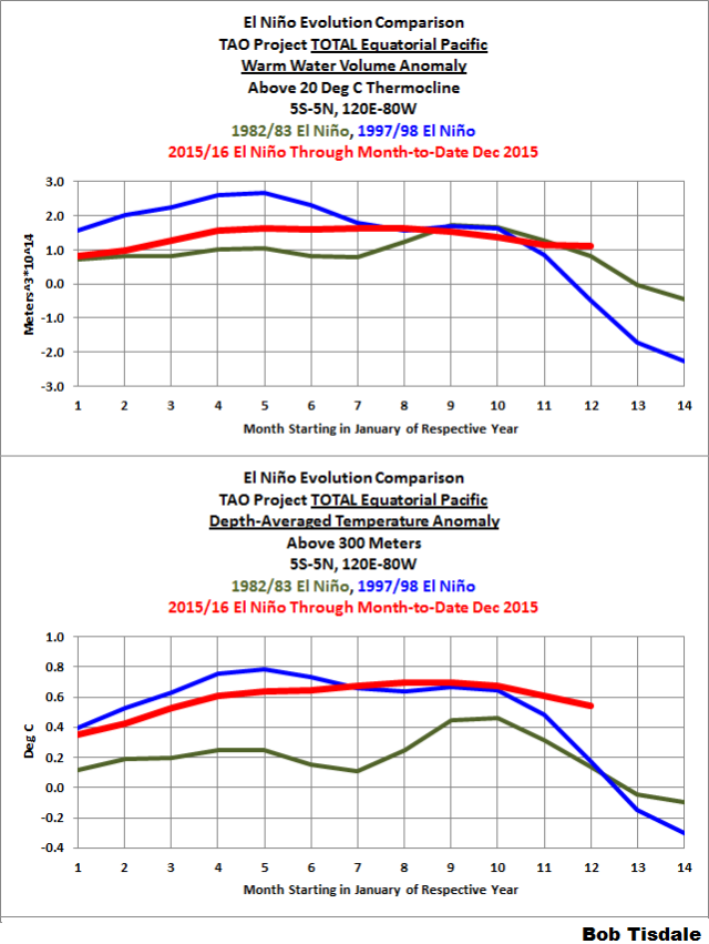
Figure 7
SOUTHERN OSCILLATION INDEX (SOI)
The Southern Oscillation Index (SOI) from Australia’s Bureau of Meteorology is another widely used reference for the strength, frequency and duration of El Niño and La Niña events. We discussed the Southern Oscillation Index in Part 8 of the 2014/15 El Niño series. It is derived from the sea level pressures of Tahiti and Darwin, Australia, and as such it reflects the wind patterns off the equator in the southern tropical Pacific. With the Southern Oscillation Index, El Niño events are strong negative values and La Niñas are strong positive values, which is the reverse of what we see with sea surface temperatures. The November 2015 Southern Oscillation Index value is -5.6, which is a lesser negative value than the threshold of El Niño conditions. (The BOM threshold for El Niño conditions is an SOI value of -8.0.) Figure 8 presents a time-series graph of the SOI data. Note that the horizontal red line is the present monthly value, not a trend line.

Figure 8
The graphs in Figure 9 compare the evolution of the SOI values this year to those in 1982 and 1997…the development years of the 1982/83 El Niño and the 1997/98 El Niño. The top graph shows the raw data. Because the SOI data are so volatile, I’ve smoothed them with 3-month filters in the bottom graph. Referring to the smoothed data, the Southern Oscillation Index has recently surpassed the values in 1997 but is still lagging behind the values in 1982.

Figure 9
Also see the BOM Recent (preliminary) Southern Oscillation Index (SOI) values webpage. The current 30-day running average is continuing to run in ENSO neutral territory, while the 90-day average is still in El Niño conditions. Note, however, in the daily data, the recent return of strong El Niño values (high negative numbers) during the past 12 days.
COMPARISONS OF HOVMOLLER DIAGRAMS OF THIS YEAR (TO DATE) WITH 1982 AND 1997
NOTE: The NOAA GODAS website has not yet added 2015 to their drop-down menu for Hovmoller diagrams. For the following illustrations, I’ve used the Hovmolller diagrams available for the past 12 months, deleted the 2014 data and aligned the 2015 data with the other 2 years.
Hovmoller diagrams are a great way to display data. If they’re new to you, there’s no reason to be intimidated by them. Let’s take a look at Figure 10. It presents the Hovmoller diagrams of thermocline depth anomalies (the depth of the isotherm at 20 deg C. Water warmer than 20 deg C is above the 20 deg C isotherm and below it the water is cooler). 2015 is in the center, 1997 on the left and 1982 to the right. (Sorry about the different sizes of the Hovmollers, but somewhere along the line NOAA GODAS changed them, but they are scaled, color-coded, the same.)
The vertical (y) axis in all the Hovmollers shown in this post is time with the Januarys at the top and Decembers at the bottom. The horizontal (x) axis is longitude, so, moving from left to right in each of the three Hovmoller diagrams, we’re going from west to east…with the Indian Ocean in the left-hand portion, the Pacific in the center and the Atlantic in the right-hand portion. We’re interested in the Pacific. The data are color-coded according to the scales below the Hovmollers.

Figure 10
Figure 10 is presenting the depth of the 20 deg C isotherm along a band from 2S to 2N. The positive anomalies, working their way eastward early in 1982, 1997 and 2015, were caused by downwelling Kelvin waves, which push down on the thermocline (the 20 deg C isotherm). You’ll note how the anomalies grew in strength as the Kelvin wave migrated east. That does not mean the Kelvin wave is getting stronger as it traveled east; that simply indicates that the thermocline is normally closer to the surface in the eastern equatorial Pacific than it is in the western portion. In this illustration, we’re looking at anomalies, not absolute values.
Based on thermocline depth anomalies, the El Niño conditions were much stronger in 1997 than they were in 1982 and so far in 2015.
Figure 11 presents the Hovmollers for wind stress (not anomalies) along the equator. The simplest way to explain them is that they’re presenting the impacts of the strengths and directions of the trade winds on the surfaces of the equatorial oceans. In this presentation, the effects of the east to west trade winds at various strengths are shown in blues, and the reversals of the trade winds into westerlies are shown in yellows, oranges and reds. To explain the color coding, the trade winds normally blow from east to west; thus the cooler colors for stronger east to west trade winds. The reversals of the trade winds (the yellows, oranges and reds) are the unusual events and they’re associated with El Niños, which are the abnormal state of the tropical Pacific. (A La Niña is simply an exaggerated normal state.)

Figure 11
The two westerly wind bursts shown in red in the western equatorial Pacific in 1997 are associated with the strong downwelling Kelvin wave that formed at the time. (See the post ENSO Basics: Westerly Wind Bursts Initiate an El Niño.) Same thing with the three westerly wind bursts early in 2015, January through March: they initiated the Kelvin wave this year. Throughout 1997, there was a series of westerly wind bursts in the western equatorial Pacific. Same thing occurred in 2015. There were comparatively few westerly wind bursts early in 1982 and they appear early that year to have been weaker than those in 1997 and 2015, according to this GODAS reanalysis. But there was a strong westerly wind burst later in 1982. Returning to this year, the most recent westerly wind burst happened in November.
Figure 12 presents the Hovmollers of wind stress anomalies…just a different perspective. But positive wind stress anomalies, at the low end of the color-coded scale, are actually a weakening of the trade winds, not necessarily a reversal.

Figure 12
NOTE: There are a number of wind stress-related images on meteorological websites. Always check to see if they’re presenting absolute values or anomalies.
And Figure 13 presents the Hovmollers of sea surface temperature anomalies along the equator.

Figure 13
Notice how warm the eastern equatorial Pacific got during the evolution of the 1997/98 El Niño. While the sea surface temperatures this year have reached well above threshold of a strong El Niño, they’ve still well behind those of the 1997/98 El Niño…especially east of 120W (to about 90W), where sea surface temperature anomalies were more than 4.0 deg C at this time. In 1982, sea surface temperature anomalies also reached 4.0 deg C, but we have yet to see those values in 2015.
That is, as noted earlier, the 1997/98 was a stronger East Pacific El Niño than the one taking place in 2015.
ANIMATIONS OF GODAS MAPS AND CROSS SECTIONS – JANUARY 2015 TO PRESENT
Animation 2 includes the subsurface temperature anomalies along the equator (2S-2N) for the pentads (5-day averages). The equatorial Indian Ocean is to the left in both Illustrations and the equatorial Atlantic is to the right. We’re interested in the equatorial Pacific in the center.

Animation 2
The recent upwelling (cool) Kelvin wave makes its presence known with the cooler-than-normal subsurface waters that are beginning to migrate east along the Cromwell Current, the Pacific Equatorial Undercurrent. Sea surface temperatures along the equator should start to drop in response over the next few months, initially toward the west and then working eastward.
Animation 3 presents global maps of the depth-averaged temperature anomalies to depths of 300 meters (a.k.a. T300 anomalies). The downwelling Kelvin wave that initiated this El Niño stands out. The impacts of the recent upwelling Kelvin wave are not yet visible. The other noteworthy thing: The Blob in the eastern extratropical North Pacific still makes its presence known in the T300 data. It could re-emerge next year in the sea surface temperature data. We’ll have to watch and see if the upcoming La Niña (assuming one forms) puts an end to The Blob.

Animation 3
Sea surface height anomalies, Animation 4, are often used as a proxy for temperature anomalies from the surface to the ocean floor. The downwelling Kelvin waves this year also stands out. The Blob is also visible.
Animation 4
The sea surface temperature anomaly maps at the GODAS website normally lag by a few weeks, but they’ve caught up recently. Animation 5 shows the sea surface temperature anomaly maps for 2015 from the GODAS website. The impacts of the El Niño are plainly visible in the tropical Pacific. The North Atlantic has yet to show a response, but the Indian Ocean has shown warming. See the time-series graphs of the North Atlantic (here) and the Indian Ocean (here) from the November 2015 sea surface temperature update. The North Pacific (here) is showing the impacts of The Blob and the El Niño, and the sea surface temperatures of the South Pacific (here) have recently surged in response to the El Niño.

Animation 5
Let’s hope a very strong La Niña follows the El Niño this year and finally overcomes the residual effects of “The Blob” on the North Pacific. Even then, there may have been an upward shift in sea surface temperatures there, which would impact the entire east Pacific. We’ll have to keep an eye on it over the next few years.
The most recent update on The Blob is here, dated August 12, 2015. I’ll try to provide an update in the next few weeks. The Blob appears to be dissipating some, but there is still a lot of warm water at depth created by the Blob.
EL NIÑO REFERENCE POSTS
For additional introductory discussions of El Niño processes see:
- An Illustrated Introduction to the Basic Processes that Drive El Niño and La Niña Events
- El Niño and La Niña Basics: Introduction to the Pacific Trade Winds
- La Niñas Do NOT Suck Heat from the Atmosphere
- ENSO Basics: Westerly Wind Bursts Initiate an El Niño
Also see the entire 2014-15 El Niño series. We discussed a wide-range of topics in those posts.
WANT TO LEARN MORE ABOUT EL NIÑO EVENTS AND THEIR AFTEREFFECTS?
My ebook Who Turned on the Heat? goes into a tremendous amount of detail to explain El Niño and La Niña processes and the long-term aftereffects of strong El Niño events. Who Turned on the Heat? weighs in at a whopping 550+ pages, about 110,000+ words. It contains somewhere in the neighborhood of 380 color illustrations. In pdf form, it’s about 23MB. It includes links to more than a dozen animations, which allow the reader to view ENSO processes and the interactions between variables.
Last year, I lowered the price of Who Turned on the Heat? from U.S.$8.00 to U.S.$5.00. And the book sold well. It continues to do so this year.
A free preview in pdf format is here. The preview includes the Table of Contents, the Introduction, the first half of section 1 (which was provided complete in the post here), a discussion of the cover, and the Closing. Take a run through the Table of Contents. It is a very-detailed and well-illustrated book—using data from the real world, not models of a virtual world. Who Turned on the Heat? is only available in pdf format…and will only be available in that format. Click here to purchase a copy.
My sincerest thanks to everyone who has purchased a copy of Who Turned on the Heat? as a result of the El Niño posts in 2014 and from this year’s El Nino series.
A NEW BOOK AND IT’S FREE
I also published On Global Warming and the Illusion of Control (25MB .pdf) back in November. The introductory post is here. It also includes detailed discussions of El Niño events and their aftereffects…though not as detailed as in Who Turned on the Heat?
Thanks, Anthony.
Bob, I don’t know how you do it but this is a tour de force we should all be grateful for!
I have no idea, how the hell I am supposed to be able to understand all of that stuff, you just put up there.
But I have a solution.
I don’t need to understand any of that stuff, because I’m damned sure that YOU do understand all of that stuff.
Problem solved; I can get back to the stuff that I’m damned sure that I understand; happy that you’ve got this covered for me.
g
Bob,
Our leader,
Many thanks! Terrifically impressive.
Now, plainly, whatever will be will be.
– But, if [Still quite a big if] the La Nina takes over, do we all have to stock up on logs, and batteries, and freeze-dried watermelons, warmists, warmunists, etc.?
Look like that, if the glaciers come back. If.
I don’t know.
I hope not.
Bit simplified, bit /sarc.
But just asking – as I, for one, would rather strip to a shirt and shorts for six weeks in the UK, than need to wear three or four layers indoors – and more outside – for four months, in London Town . . . .
Never mind the dead that cold brings.
Ask Napoleon, ask Hitler, about Russia’s greatest General, General Winter.
Auto
Auto
Another superb post by ‘The Bob’ about the blob.
I don’t want to appear critical, but for me, your in depth analysis of anomalies lacks a context that would make it more intuitive or approachable to the layman:
The anomalies in the equatorial regions have the same colors and values as anomalies for the northern Pacific at 40 to 50 deg. latitude, yet I know the actual temperatures should be quite disparate. Would it be possible in the future for you to include a chart that shows the Actual temperatures of the respective anomalies so that we mortals can gain a grasp of what the normal temperature should be at 0 deg Lat vs 45 deg N Lat?
I once had the opportunity to pose this same question to Dr. Cristy about tropospheric temperatures as anomalies vs actual temperatures and how few people actually understand how cold it is in the mid troposphere. His response (with a smile) was: If we used kelvin the anomalies would hardly be noticeable.
For me anomalies always lack context.
Thanks, Richard
After Xmas, the el Nino leaves us and gets a gender change operation and returns as la Nina. As always. 🙂
And we tax payers pay for the operation; just like in San Francisco.
g
Your Enso 3.4 diagram is different from the one on the actual web site. The addresses are slightly different. The one on WUWT has a higher peak for the 2015 El Nino than the one on the web site. The peak matches 2010 on WUWT and maybe even 1998.
Were you hacked?
Here is the one on the original site:
https://www.ncdc.noaa.gov/teleconnections/enso/indicators/sst.php
No, jim2. I wasn’t hacked. As discussed in the post linked in the post above…
https://bobtisdale.wordpress.com/2015/11/21/the-differences-between-sea-surface-temperature-datasets-prevent-us-from-knowing-which-el-nino-was-strongest-according-nino3-4-region-temperature-data/
…there are different sea surface temperature datasets each offering different results.
Cheers.
Thanks, Bob, for the excellent ENSO view you give us. This one is specially detailed.
And especially useful. I’m not sure some realise just how valuable our Bob is. I feel especially privileged to have free and regular access to such immensely important work. Mr Tisdale, you are a fine example to us all. All the best to you good sir.
What’s up with Word Press?
After yesterday’s MS update to Win 10 my comments go to the bit bucket. Tried three pcs. After an hour, exa t comment gives me duplicate error message.
Windows 10 lasted approx. 3 hours on my computers before I reverted them back !!! EVERYTHING started to fail !!! Garbage….IMHO
Windows 10 was the reason i switched to all home computing to Linux. I had enough with Windows 7, didn’t like 8 or 10, too much lost user control. I still have to have my Windows Laptop from Work unfortunately, but only have to use it at work (Win 7 Enterprise), and I can usually get everything running on Linux in WINE or Dosbox if there is something i need (Very rarely). But i don’t advise it to most people, unlike most Linux users that think it’s for everyone.
I went totally OS X running Windows VM (VM Ware) for anything I really need Windows for and have never had an issue since. Still use my 2010 Macbook Pro that runs El Capitan with no issues along with my new Macbook which is all digital and fast as heck.
And I own a company that develops products for Windows.
The only problems I ever have are with my Office for Mac developed by, of course, Microsoft.
…OW, now my wittle bwain hurts……….
I know the feeling. Once you read “Who Turned On The Heat” it gets easier and makes more sense. So enjoy the warmth while it lasts and brace for the inevitable next phase of la-nina coldness.
Thanks for the update Bob.
The Australian BOM agrees in their report from today:
http://www.bom.gov.au/climate/enso/
Another outstanding posting from the go-to guy for el Ninos.
Trenberth’s temp step-up from the 97-98 El Nino was followed by the 1999-2001 La Nina which played out during Solar Cycle 23 max. Conjecture could be that that coincidence of timing, along with then AMO and PDO alignments, conspired to keep the 97-98 temp step-up in place. Indeed some data would argue (RSS and UAH LT temps) a slower return to pre- 97 temps was occurring from 2002 – 2013, before this El Nino heat release from Western Pacific tropics reversed the slow decline.
A 2016-2017 La Nina would occur though as SC 24 is approaching its finishing min, the AMO is entering cooler period, and PDO is still in a negative phase. So the conjecture would be for a coming La Nina to not only reset the temp anomalies from the current El Nino, but the 1990’s as well.
Nature, not models, will tell us the truth.
Joel, I don’t know why you say that the PDO is still in a negative phase. Here are some data from http://research.jisao.washington.edu/pdo/PDO.latest .
Rich.
[Inserted table formatting with html codes “pre” and “/pre” .mod]
Rich, as Bob has explained before the PDO is always positive during an El Nino and negative during a La Nina. It is the average across many years that gives the PDO its real value and we usually see that during more neutral conditions. We won’t really know if it has changed until after the coming La Nina event.
I saw an article today where Trenberth is hoping that the negative PDO has ended. I suspect he will be disappointed.
I already asked about this as the blob did look like a temporary PDO switch.
especially the way it moved made me to think that. Seeing now the numeric PDO values it grows my suspicion on that: In the autumn of 2013 ‘the blob’ started it’s move and very simultaneously you see the PDO rise.
from what i read about the PDO and understood is that the PDO is not as cyclic as the AMO. this mainly due to ENSO impacts. Like this, ENSO can “zero” the “average negative episode value” of a PDO and accentuate the positive episodes. Maybe that’s why the warming we see is driven by ENSO as is explained so well by Bob himself.
See – owe to Rich, (whatever kind of cryptic screen name that is???)
See this:
http://www.climate4you.com/images/PDO%20AnnualIndexSince1900%20With7yearRunningAverage.gif
But your point is well taken, on a yearly scale of several years short term variations +/- occurs, they matter for important weather trends.
But the Decadal trends (7 yr running average) were what I looked at (as in decadal oscillations).
The infamous NE Pacific blob is likely not a decadal trend, but a shorter multiyear trend that is now (seemingly?) dissipating. The next year will tell.
Your point though is well taken. Yearly trends can and do matter to people getting hammered by weather, like today’s Portland, OR rain event.
That has always been the problem with Climate Science. Claims of effect are time scale dependent.
Here in NorCal the dud factor is in evidence already.
We have yet to experience any sort of atmospheric river – the systems have tracked mostly from N to S or at best NNW to SSE, either completely over land or only over the NE corner of the Pacific. Heck, a few days ago we were in a cold blast (cP) that was more like something in January, with really low dew points. La Nada!
(Time to start injecting filtiered wiz into the aquifers baby!)
I wouldn’t call this a dud until it actually starts to decay and the heat moves to the atmosphere. January-March could be extremely wet.
Why inject it (filtered waste water) into the aquifers? Just send it back in to the carbon filter and chlorinator. Bon appetite!!
The rain has been decent here in Trinity County. Even had one night of moderate snow early Sunday morning that left several inches for most of the day. It has since warmed up, and the rain is reduced to drizzles with occasional moderate rain. Portland, Oregon is getting whacked…http://koin.com/2015/12/07/standing-water-blustery-winds-complicate-commute/
Having trouble posting
Testing Word Press.
[Please use the link (at the top of the page) to the WattsUpWithThat “Test” thread for such checks. .mod]
Another outstanding posting from the go-to guy for el Ninos. Excellent!
Thanks Bob, lots of data as usual.
But for the less intense el-nino-ologist, who might have a TL;DR moment, I think an executive summary explaining in a paragraph what all the following graphs mean would be helpful
The 98 event is called by some warmists (Trenberth I think) the great climate shift, where the averages all took a notch upwards to a new warmer state. Yes la Nina will be a cooling event, but the longer term effect will be what?
Thanks again for all the hard work to analyze and collect this data.
I agree…either an executive summary at the beginning, or a conclusion section at the end. I would like to know that I’m taking away the correct “take-aways”.
But my sincere thanks to Bob Tisdale for this and all his other great work.
Bob rarely does predictions. I doubt he will make one now.
I am in agreement with joelobryan’s comment. Since the 1998-00 La Nina occurred close to a solar maximum, it probably energized the oceans enough to create the subsequent warming. That will not be the case this time as we are approaching minimum for a weak cycle.
Insightful Bob… Please take your precious time and peruse my own take on climate change. Ur contributions are most welcome
Well thanks for giving us YOUR take on climate change.
But this is an el nino thread; not climate change !!
g
All the same George, thanks.
Excellent work as always.
Thanks Bob! (Now we need a tutorial on forecasting the strength and duration of a La Nina…)
Bob, margins of error on all those graphed measurements? Does no one in the climate world believe in reporting margins of error? I suggest that each paper should include an “error analysis” section. Let’s see if we can shame the alarmists into following correct scientific procedure by doing it ourselves.
Latest SOI …
http://s24.postimg.org/7tyxk9xsz/Troup_SOI.png
Comparison if Indices …
http://s24.postimg.org/e8xygy4ir/Indices.png
A big glob of energy has just dissipated into the southern hemisphere. Start here and advance one day at a time. That’s taken the oomph out of it.
3pm ET (8pm UK) Ted Cruz US presidential candidate holds investigation
Data or Dogma? Promoting Open Inquiry in the Debate over the Magnitude of Human Impact on Earth’s Climate
with witness: Judith Curry, Mark Steyn, Dr. John Christy, Dr. William Happer, Dr. David Titley (Rear Admiral, USN (ret.))
should be available live on this site
As an avid skier, I can report that this El Nino is definitely helping the Sierra snow pack. The last 4 years have averaged less than 1/2 of normal and if the forecasts for the next couple of weeks hold true, we could exceed the total amount of snow received all of last year before the end of this year, especially at the lower elevations. I just hope the current continues hold through at least March.
Thanks Bob!
Bob
FYI
Compare the recent sea surface temperature series at
http://weather.gc.ca/saisons/animation_e.html?id=year&bc=sea
and that for 1957-58 at
http://sabolscience.blogspot.com.au/2015/08/a-deeper-look-at-top-10-el-ninos-since.html
Gday Bob, another engrossing post in an excellent series.
By the way, the BOM has recently(?) changed the SOI threshold for El Nino to -7, from -8.
I’ve looked at how this El Nino rates compared with SOI values from 1876, using the -7 threshold, and found: it is nowhere near the most intense, longest, or strongest.. See https://kenskingdom.wordpress.com/2015/12/03/how-significant-is-this-el-nino/
Just another moderately strong El Nino, at least by SOI values.
It’ll be interesting to see whether this El Nino event leaves us with another persistent step increase in global temperatures. I assume that’s what you’d predict Bob?
If it does, then that’ll be another nail in the coffin of the models’ ability to predict warming as none of them (AFAIK) produce global warming increases as a result of ENSO events and instead they all seem to arbitrarily warm the planet over time.
This might become a win for the weather models that last month forecast a December peak while alarmists were forecasting a super monster Godzilla El Nino — and for NOAA, which remained a voice for moderating amidst the hysteria. While the full effects of this have not been seen yet, massive devastation seems unlikely if it peaks in December.
Also, now — during the Paris parties at COP21 — is a good time to ponder the effects of another blown prediction by alarmists. as I asked in the October 26 post What if the “Godzilla” El Niño is a dud? (which got much abuse from activists on Twitter, and lectures from activist scientists about the certainty of disasters).
Bob, thanks for this excellent analysis.
So it does seem to be running out of steam as generally predicted, about now.
I have an old-school traditional understanding of el Nino which involves the Bjerknes feedback, that is, during an el Nino the Peruvian upwelling is completely interrupted and the trade winds (which normally are driven by the same upwelling) also stop and even reverse.
This time neither of those things really happened.
Despite the odd feint at a westerly wind burst, with the trades it was mostly business as usual. No reversal, not even that much weakening.
For the Peruvian upwelling the same story. The upwelling did slacken and shift south, but was never interrupted. The best evidence for this as always was the Peruvian anchovy fishery. The fishery management authorities, under pressure from relentless and shrill alarm warnings of a monster el Nino, were constantly warning of a major hit to the anchovy fishery which in the end never happened. However now that the “el Nino” is coming to an end, Peruvian fisherman are – possibly – finally seeing a negative effect of it on the fishery, although only for 5 days:
https://www.undercurrentnews.com/2015/12/08/peru-anchovy-catchers-start-noticing-effects-of-strong-el-nino/
Here is a basic question:
Does a large warm anomaly in the east equatorial Pacific always and only mean el Nino?
Is this the definition of el Nino? Simply an east equatorial Pacific warm anomaly?
Is el Nino the only thing that can cause this?
Or does el Nino refer to a mechanism, e.g. the Bjerknes feedback?
And are there circumstances/mechanisms other than el Nino, that can also cause east Pacific equatorial warmth?
I guess part of the answer to this is how the “el Nino” ends. Your figure 7 is most important in this regard. The expectation from other el Ninos is that equatorial Pacific heat will now decrease. Normally at the start of the second el Nino year, this heat decreases quite steeply. This is the downstroke of the ENSO heat pump (aka Willis Essenbach). The equatorial heat concentrated by el Nino is pumped pole-wards by the reactive La Nina. Thus the equatorial Pacific cools while the rest of the world experiences a step-up in global temperature from all that recirculated heat, as your publications clearly explain.
However what if there were no reactive La Nina, and the el Nino heat just dissipated slowly, to space? I suspect the reactive La Nina is part of the Bjerknes feedback, and with such weak evidence of this feedback so far, it may not happen. Figure 7 also suggests that the end of el Nino heat removal from the equatorial Pacific is slower than usual. As you have explained, it is the La Nina that is responsible for the heat distribution that causes el Nino to eventually raise global temperatures.
So perhaps a following La Nina is necessary to confirm that an “el Nino” really was an el Nino. And it indicates whether the long term effect on climate will be a warming one – in the case that La Nina does follow – or perhaps if there is no La Nina and only slow dissipative cooling, then a neutral or even cooling effect.
Of course we could now see a big La Nina – which would prove my suspicion completely unfounded. But that’s science – and that’s OK.
philsalmon
December 9, 2015 at 12:24 am
Phil
Have a look at the couple of sites I posted above.
It started with a question of why this “el Nino” had most of the hot water north of the equator. I posed this question and I was pointed to the second site – and apologies to the pointer that I can’t credit as our computer got”electrified” and I lost some things
And for our area of Oz 1957-58 wasn’t a drought so we live in hope. But then we’ve been doing that for some years and, when your in ranching, that is getting pretty thin.
Bob Tisdale, how you considered looking at in-going, out-going radiative flux, and albedo over the relevant regions and comparing to 97/98?
What about precipitation rate and land/sea relative fractions?
It’s important to analyse and understand this phenomenon, but I remember another post, here, on El Nino, on the 22nd of November, when I asked a question that I still keep asking: why wasn’t El Nino from 1939/1940 taken into consideration? Many countries struggled one of the harshest winters and I wonder if that couuld happen again.
Keep in mind that 90% of the data we have on El Nino is from satellites. Researchers were not really sure it existed until some of the earliest satellite data became available. We have very little usable data for the 1939 to 1940 event and we don’t know how it compared to today’s El Nino. Could it happen again. Yes.
Prof. Stephan Brönnimann et al.,Letter to Nature (NATURE |VOL 431|21 OCTOBER 2004) concludes “that the global climate anomaly in 1940 to 1942 — previously poorly documented — constitutes a key period for our understanding of large-scale climate variability and global El Niño effects”. See details: http://www.ocean-climate-law.com/12/home.html paying little attention that the winter 1939/40, 1940/1 and 1941/42, became the coldest in Europe for a century. Northern Europe from London to Moscow was particularly affected. At some regions the cold was the severest since the early 19th century. Brönnimann just make a claim, but provides no evidence.
The global climate anomaly 1940–1942
http://onlinelibrary.wiley.com/doi/10.1256/wea.248.04/abstract
Hello Bob,
I apologize that this is off topic. However something came up at a hearing and I was wondering if you can verify something. On this post:
http://wattsupwiththat.com/2015/12/09/tables-turned-scientist-judith-curry-and-author-mark-steyn-question-school-sen-markey-on-climate/
Sen. Markey comments about the record Boston snowfall recently and claims the water off Boston was 21 degrees above normal at the time. I could believe 2.1, but not 21. Do you have the time and/or the interest to verify this? Thank you!
No SST’s off Boston were 21 degrees above normal even if Fahrenheit was used. Around the coast up to around 8 degrees F, but further away where the Gulf stream is placed it was around 12 to 14 degrees F above normal.
http://www.maineharbors.com/weather/seatemp2.htm
Thank you!
I always enjoy reading your insightful posts, thanks Bob. And thanks for taking the time and effort to produce ‘On Global Warming and the Illusion of Control’ free of charge. Hopefully many others will share this valuable contribution and consider donating a tip.
NCEP.NOAA
18NOV2015 23.8 2.1 28.0 3.0 29.7 3.1 30.4 1.8
25NOV2015 24.4 2.4 28.0 3.0 29.6 3.0 30.3 1.8
02DEC2015 24.7 2.4 27.9 2.9 29.5 2.9 30.2 1.7
There are signs this El Nino has already peaked around middle of November and SST’s have been recently declining except in NINO1+2.
The signs of the atmosphere are not suggesting a cold pattern for NW Europe anymore and likely to continue the same trend with more recent strong El Ninos. The result therefore means a particularly mild winter for NW Europe and NE USA. This has been relentless so far into December and generally doesn’t look like changing much anytime soon. El Nino’s can often help amplification and blocking in mid-polar latitudes producing colder winters, but the strongest ones seem to be the exception to the rule.
This looks bad for breaking the California drought. While we are getting a few systems so far we’ve had no atmospheric rivers and trajectories continue to have a very strong N-S component. These air masses are quite cold and the systems are not especially moisture rich.