Guest essay by Andy May
Soon, Connolly and Connolly (2015) is an excellent paper (pay walled, for the authors preprint, go here) that casts some doubt about two critical IPCC AR5 statements, quoted below:
The IPCC, 2013 report page 16:
“Equilibrium climate sensitivity is likely in the range 1.5°C to 4.5°C (high confidence), extremely unlikely less than 1°C (high confidence), and very unlikely greater than 6°C (medium confidence).”
Page 17:
“It is extremely likely that more than half of the observed increase in global average surface temperature from 1951 to 2010 was caused by the anthropogenic increase in greenhouse gas concentrations and other anthropogenic forcings together.”
Soon, Connolly and Connolly (“SCC15”) make a very good case that the ECS (equilibrium climate sensitivity) to a doubling of CO2 is less than 0.44°C. In addition, their estimate of the climate sensitivity to variations in total solar irradiance (TSI) is higher than that estimated by the IPCC. Thus, using their estimates, anthropogenic greenhouse gases are not the dominant driver of climate. Supplementary information from Soon, Connolly and Connolly, including the data they used, supplementary figures and their Python scripts can be downloaded here.
It is clear from all satellite data that the Sun’s output varies with sunspot activity. The sunspot cycle averages 11 years, but varies from 8 to 14 years. As the number of sunspots goes up, total solar output goes up and the reverse is also true. Satellite measurements agree that peak to trough the variation is about 2 Watts/m2. The satellites disagree on the amount of total solar irradiance at 1 AU (the average distance from the Earth to the Sun) by 14 Watts/m2, and the reason for this disagreement is unclear, but each satellite shows the same trend over a sunspot cycle (see SCC15 Figure 2 below).

Prior to 1979 we are limited to ground based estimates of TSI and these are all indirect measurements or “proxies.” These include solar observations, especially the character, size, shape and number of sunspots, the solar cycle length, cosmogenic isotope records from ice cores, and tree ring C14 estimates among others. The literature contains many TSI reconstructions from proxies, some are shown below from SCC15 Figure 8:

Those that show higher solar activity are shown on the left, these were not used by the IPCC for their computation of man’s influence on climate. By choosing the low TSI variability records on the right, they were able to say the sun has little influence and the recent warming was mostly due to man. The IPCC AR5 report, in figure SPM.5 (shown below), suggests that the total anthropogenic radiative forcing (relative to 1750) is 2.29 Watts/ m2 and the total due to the Sun is 0.05 Watts/ m2.

Thus, the IPCC believe that the radiative forcing from the Sun is relatively constant since 1750. This is consistent with the low solar variability reconstructions on the right half of SCC15 figure 8, but not the reconstructions on the left half.
The authors of IPCC AR5, “The Physical Science Basis” may genuinely believe that total solar irradiance (TSI) variability is low since 1750. But, this does not excuse them from considering other well supported, peer reviewed TSI reconstructions that show much more variability. In particular they should have considered the Hoyt and Schatten, 1993 reconstruction. This reconstruction, as modified by Scafetta and Willson, 2014 (summary here), has stood the test of time quite well.
Surface Temperature
The main dataset used to study surface temperatures worldwide is the Global Historical Climatology Network (GHCN) monthly dataset. It is maintained by the National Oceanic and Atmospheric Administration (NOAA) National Climatic Data Center (NCDC). The data can currently be accessed here. There are many problems with the surface air temperature measurements over long periods of time. Rural stations may become urban, equipment or enclosures may be moved or changed, etc.
Longhurst, 2015, notes on page 77:
“…a major survey of the degree to which these [weather station] instrument housings were correctly placed and maintained in the United States was made by a group of 600-odd followers of the blog Climate Audit; … “[In] the best-sited stations, the diurnal temperature range has no century-scale trend” … the relatively small numbers of well-sited stations showed less long-term warming than the average of all US stations. …the gridded mean of all stations in the two top categories had almost no long term trend (0.032°C/decade during the 20th century), Fall, et al., 2011). “
The GHCN data is available from the NCDC in raw form and “homogenized.” The NCDC believes that the homogenized dataset has been corrected for station bias, including the urban heat island effect, using statistical methods. Two of the authors of SCC15, Dr. Ronan Connolly and Dr. Michael Connolly, have studied the NOAA/NCDC US and global temperature records. They have computed a maximum possible temperature effect, due to urbanization, in the NOAA dataset, adjusted for time-of-observation bias, of 0.5°C/century (fully urban – fully rural stations). So their analysis demonstrates that NOAA’s adjustments to the records still leave an urban bias, relative to completely rural weather stations. The US dataset has good rural coverage with 272 of the 1218 stations (23.2%) being fully rural. So, using the US dataset, the bias can be approximated.
The global dataset is more problematic. In the global dataset there are 173 stations with data for 95 of the past 100 years, but only eight of these are fully rural and only one of these is from the southern hemisphere. Combine this with problems due to changing instruments, personnel, siting bias, instrument moves, changing enclosures and the global surface temperature record accuracy is in question. When we consider that the IPCC AR5 estimate of global warming from 1880 to 2012 is 0.85°C +-0.2°C it is easy to see why there are doubts about how much warming has actually occurred.
Further, while the GHCN surface temperatures and satellite measured lower troposphere temperatures more or less agree in absolute value, they have different trends. This is particularly true of the recent Karl, et al., 2015 “Pause Buster” dataset adopted by NOAA this year. The NOAA NCEI dataset from January 2001 trends up by 0.09° C/decade and the satellite lower troposphere datasets (both the RSS and the UAH datasets) trend downward by 0.02° to 0.04° C/decade. Both trends are below the margin of error and are, statistically speaking, zero trends. But, do they trend differently because of the numerous “corrections” as described in SCC15 and Connolly and Connolly, 2014? The trends are so small it is impossible to say for sure, but the large and numerous corrections made by NOAA are very suspicious. Personally, I trust the satellite measurements much more than the surface measurements, but they are shorter, only going back to 1979.
The IPCC computation of man’s effect on climate
Bindoff, et al., 2013 built numerous climate models with four components, two natural and two anthropogenic. The two natural components were volcanic cooling and solar variability. The two anthropogenic components were greenhouse warming due mainly to man-made CO2 and methane, and man-made aerosols which cool the atmosphere. They used the models to hindcast global temperatures from 1860-2012. They found that they could get a strong match with all four components, but when the two anthropogenic components were left out the CMIP5 multi-model mean hindcast only worked from 1860 to 1950. On the basis of this comparison the IPCC’s 5th assessment report concluded:
“More than half of the observed increase in global mean surface temperature (GMST) from 1951 to 2010 is very likely due to the observed anthropogenic increase in greenhouse gas (GHG) concentrations.”
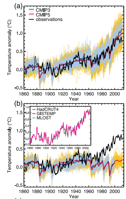
The evidence that the IPCC used to draw this conclusion is illustrated in their Figure 10.1, shown, in part, above. The top graph (a) shows the GHCN temperature record in black and the model ensemble mean from CMIP5 in red. This run includes anthropogenic and natural “forcings.” The lower graph (b) uses only natural “forcings.” It does not match very well from 1961 or so until today. If we assume that their models include all or nearly all of the effects on climate, natural and man-made, then their conclusion is reasonable.
While the IPCC’s simple four component model ensemble may have matched the full GHCN record (the red line in the graphs above) well using all stations, urban and rural, it does not do so well versus only the rural stations:
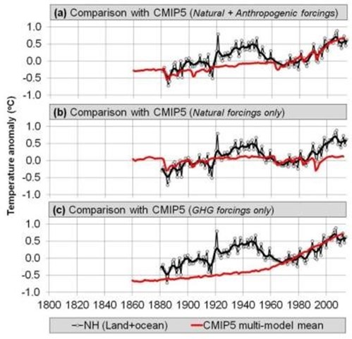
Again, the CMIP5 model is shown in red. Graph (a) is the full model with natural and anthropogenic “forcings,” (b) is natural only and (c) are the greenhouse forcings only. None of these model runs matches the rural stations, which are least likely to be affected by urban heat or urbanization. The reader will recall that that Bindoff, et al. chose to use the low solar variability TSI reconstructions shown in the right half of SCC15 Figure 8. For a more complete critique of Bindoff, et al. see here (especially section 3).
The Soon, et al. TSI versus the mostly rural temperature reconstruction
So what if one of the high variability TSI reconstructions, specifically the Hoyt and Schatten, 1993
reconstruction, updated by Scafetta and Willson, 2014; is compared to the rural station temperature record from SCC15?

This is Figure 27 from SCC15. In it all of the rural records (China, US, Ireland and the Northern Hemisphere composite) are compared to TSI as computed by Scafetta and Willson. The comparison for all of them is very good for the twentieth century. The rural temperature records should be the best records to use, so if TSI matches them well; the influence of anthropogenic CO2 and methane would necessarily be small. The Arctic warming after 2000 seems to be amplified a bit, this may be the phenomenon referred to as “Polar Amplification.”
Discussion of the new model and the computation of ECS
A least squares correlation between the TSI in Figure 27 and the rural temperature record suggests that a change of 1 Watt/m2 should cause the Northern Hemisphere air temperature to change 0.211°C (the slope of the line). Perhaps, not so coincidentally, we reach a value of 0.209°C assuming that the Sun is the dominant source of heat. That is, if the average temperature of the Earth’s atmosphere is 288K and without the Sun it would be 4K, the difference due to the Sun is 284K. Combining this with an average TSI of 1361 Watts/m2 means that 1/1361 is 0.0735% and 0.0735% of 284 is 0.209°C per Watt/m2. Pretty cool, but this does not prove that TSI dominates climate. It does, however, suggest that Bindoff et al. 2013 might have selected the wrong TSI reconstruction and, perhaps, the wrong temperature record. To me, the TSI reconstruction used in SCC15 and the rural temperature records they used are just as valid as those used by Bindoff et al. 2013. This means that the IPCC and Bindoff’s assertion that anthropogenic greenhouse gases caused more than half of the warming from 1951 to 2010 is questionable. The sound alternative, proposed in SCC15, is just as plausible.
The SCC15 model seems to work, given the data available, so we should be able to use it to compute an estimate of the Anthropogenic Greenhouse Warming (AGW) component. If we subtract the rural temperature reconstruction described above from the model and evaluate the residuals (assuming they are the anthropogenic contribution to warming) we arrive at a maximum anthropogenic impact (ECS or equilibrium climate sensitivity) of 0.44°C for a doubling of CO2. This is substantially less than the 1.5°C to 4.5°C predicted by the IPCC. Bindoff, et al., 2013 also states that it is extremely unlikely (emphasis theirs) less than 1°C. I think, at minimum, this paper demonstrates that the “extremely unlikely” part of that statement is problematic. SCC15’s estimate of 0.44°C is similar to the 0.4°C estimate derived by Idso, 1998. There are numerous recent papers that compute ECS values at the very low end of the IPCC range and even lower. Fourteen of these papers are listed here. They include the recent landmark paper by Lewis and Curry, and the classic Lindzen and Choi, 2011.
Is CO2 dominant or TSI?
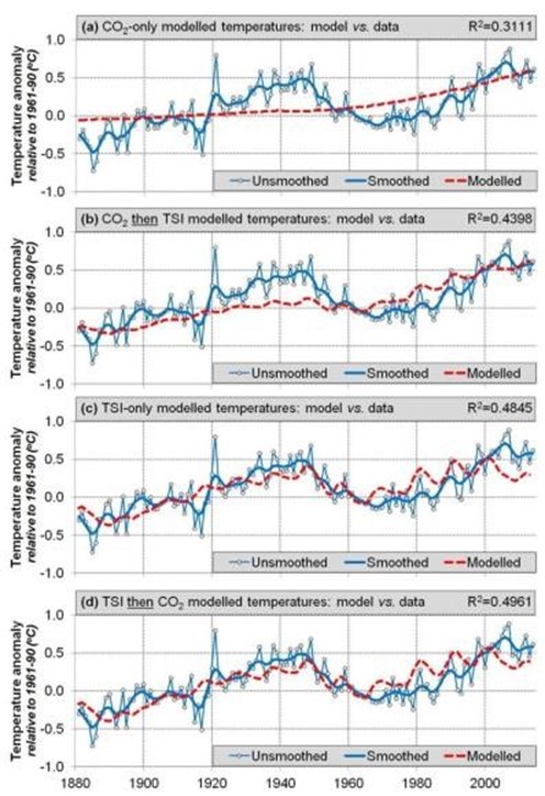
SCC15 then does an interesting thought experiment. What if CO2 is the dominant driver of warming? Let’s assume that and compute the ECS. When they do this, they extract an ECS of 2.52°C, which is in the lower half of the range given by the IPCC of 1.5°C to 4.5°C. However, using this methodology results in model-data residuals that still contain a lot of “structure” or information. In other words, this model does not explain the data. Compare the two residual plots below:

The top plot shows the residuals from the model that assumes anthropogenic CO2 is the dominant factor in temperature change. The bottom plot are the residuals from comparing TSI (and nothing else) to temperature change. A considerable amount of “structure” or information is left in the top plot suggesting that the model has explained very little of the variability. The second plot has a little structure left and some of this may be due to CO2, but the effect is very small. This is compelling qualitative evidence that TSI is the dominant influence on temperature and CO2 has a small influence.
The CAGW (catastrophic anthropogenic global warming) advocates are quite adept at shifting the burden of proof to the skeptical community. The hypothesis that man is causing most of the warming from 1951 to 2010 is the supposition that needs to be proven. The traditional and established assumption is that climate change is natural. These hypotheses are plotted below.
This is Figure 31 from SCC15. The top plot (a) shows the northern hemisphere temperature reconstruction (in blue) from SCC15 compared to the atmospheric CO2 concentration (in red). This fit is very poor. The second (b) fits the CO2concentration to the temperature record and then the residuals to TSI, the fit here is also poor. The third plot (c) fits the temperatures to TSI only and the fit is much better. Finally the fourth plot (d) fits the TSI to the temperature record and the residuals to CO2 and the fit is the best.
Following is the discussion of the plots from SCC15:
“This suggests that, since at least 1881, Northern Hemisphere temperature trends have been primarily influenced by changes in Total Solar Irradiance, as opposed to atmospheric carbon dioxide concentrations. Note, however, that this result does not rule out a secondary contribution from atmospheric carbon dioxide. Indeed, the correlation coefficient for Model 4[d] is slightly better than Model 3[c] (i.e., ~0.50 vs. ~0.48). However, as we discussed above, this model (Model 4[d]) suggests that changes in atmospheric carbon dioxide are responsible for a warming of at most ~0.12°C [out of a total of 0.85°C] over the 1880-2012 period, i.e., it has so far only had at most a modest influence on Northern Hemisphere temperature trends.”
This is the last paragraph of SCC15:
“When we compared our new [surface temperature] composite to one of the high solar variability reconstructions of Total Solar Irradiance which was not considered by the CMIP5 hindcasts (i.e., the Hoyt & Schatten reconstruction), we found a remarkably close fit. If the Hoyt & Schatten reconstruction and our new Northern Hemisphere temperature trend estimates are accurate, then it seems that most of the temperature trends since at least 1881 can be explained in terms of solar variability, with atmospheric greenhouse gas concentrations providing at most a minor contribution. This contradicts the claim by the latest Intergovernmental Panel on Climate Change (IPCC) reports that most of the temperature trends since the 1950s are due to changes in atmospheric greenhouse gas concentrations (Bindoff et al., 2013).”
Conclusions
So, SCC15 suggests a maximum ECS for a doubling of CO2 is 0.44°C. They also suggest that of the 0.85°C warming since the late-19th Century only 0.12°C is due to anthropogenic effects, at least in the Northern Hemisphere where we have the best data. This is also a maximum anthropogenic effect since we are ignoring many other factors such as varying albedo (cloud cover, ice cover, etc.) and ocean heat transport cycles.
While the correlation between SCC15’s new temperature reconstruction and the Hoyt and Schatten TSI reconstruction is very good, the exact mechanism of how TSI variations affect the Earth’s climate is not known. SCC15 discusses two options, one is ocean circulation of heat and the other is the transport of heat between the Troposphere and the Stratosphere. Probably both of these mechanisms play some role in our changing climate.
The Hoyt and Schatten TSI reconstruction was developed over 20 years ago and it still seems to work, which is something that cannot be said of any IPCC climate model.
Constructing a surface temperature record is very difficult because this is where the atmosphere, land and oceans meet. It is a space that usually has the highest temperature gradients in the whole system, for example the ocean/atmosphere “skin” effect. Do you measure the “surface” temperature on the ground? One meter above the ground? One inch above the ocean water, at the ocean surface or one inch below the ocean surface in the warm layer? All of these temperatures will always be significantly different at the scales we are talking about, a few tenths of a degree C. The surface of the Earth is never in temperature equilibrium.
“While… [global mean surface temperature] is nothing more than an average over temperatures, it is regarded as the temperature, as if an average over temperatures is actually a temperature itself, and as if the out-of-equilibrium climate system has only one temperature. But an average of temperature data sampled from a non-equilibrium field is not a temperature. Moreover, it hardly needs stating that the Earth does not have just one temperature. It is not in global thermodynamic equilibrium — neither within itself nor with its surroundings.”
From Longhurst, 2015:
“One fundamental flaw in the use of this number is the assumption that small changes in surface air temperature must represent the accumulation or loss of heat by the planet because of the presence of greenhouse gases in the atmosphere and, with some reservations, this is a reasonable assumption on land. But at sea, and so over >70% of the Earth’s surface, change in the temperature of the air a few metres above the surface may reflect nothing more than changing vertical motion in the ocean in response to changing wind stress on the surface; consequently, changes in sea surface temperature (and in air a few metres above) do not necessarily represent significant changes in global heat content although this is the assumption customarily made.”
However, satellite records only go back to 1979 and global surface temperature measurements go back to 1880, or even earlier. The period from 1979 to today is too short to draw any meaningful conclusions given the length of both the solar cycles and the ocean heat distribution cycles. Even the period from 1880 to today is pretty short. We do not have the data needed to draw any firm conclusions. The science is definitely not settled.
It really doesn’t matter any more. The Russians slipped missiles into Iran under the cover that they were going to Syria. Iran will use them against Israel within 3 years tipped with nukes that the Obama backed deal let them have. So who cares whether the “average global temperature” varies a few degrees whatever the cause. Now where did I leave my Dad’s 1950’s bomb shelter plans?
… and if Iran uses their nuclear missiles against Israel, Israel will use their nuclear missiles at Dimona against Iran; and in Florida, you can sit back and watch it all on TV.
Nukes ??
Come on, the retaliation kinda kills all the fun.
Can you imagine spending 20 years in a missile silo, or on a submarine, just waiting for the “go” message.
Somebody’s gotta do it.
You’re talking about a cult that WANTS to die !!!!! ” Mutually Assured Destruction ” means nothing to them !!!! 72 year old virgins are better than goats ya know
But you fail to take account that it is the religion of peace, or so our political masters keep telling us. Do you think that empirical observational ground based evidence tells a different story? Does that sound a familiar story in the cAGW debate?
I’m sure this is on topic, but I think Iran is a different bird than the ISIS beard boys.
And, every time somebody is worried over Israel being nuked I wonder what was the biggest lesson of WWII? It was that the more Jews Hitler killed, the more arms Jews collected after the war. You can’t beat Israel in preparedness for war. Now if there is somebody who could end up be nuked, it is not Israel, I tell you.
(Godwin)
NSF, NOAA and NASA gave Shukla’s IGES tens of millions of dollars in gov’t funds for a minimal amount of some minimal type of research. Yet NSF, NOAA and NASA gave zero for Soon, Connolly and Connolly to do some unique solar focused research.
John
Can you imagine if the the funding was …GASP ..equal !!!! This discussion would have ended years ago and we’d be worrying about ” Global Cooling ” !!!!
Marcus,
Or, we would be worrying about things that might really be a problem:
http://www.express.co.uk/news/science/610777/NASA-asteroid-warning-86666-near-miss-planet-Earth-48-hours
!!!
BTW the original paper is definitely worth reading. The first half of the paper is full of information about all the problems with historical temperature estimates and historical TSI estimates. Really good discussion about this in the paper, you get a very good sense that we just don’t have enough quality data to make firm conclusions about anything.
Unfortunately they should have stopped there… the human instinct to always find a cause whether one exists or not was apparently irresistible..
Peter
i agree peter . the actual discussion within the paper is as good a commentary on the problems surrounding the science as can be seen anywhere. as for the conclusion, i am quite happy for people to have their own opinions as long as the un and national governments do not waste trillions of tax payer dollars as a result.
Let’s take a vote. Who agrees or disagrees with my below guess.
Based on her book ‘Merchants of Doubt’ I can guess what a wildly frantic Naomi Oreskes would say about the SCC15 being published without any funding outside of the author’s own funds. She would say, but but but years ago one of them got some funding from a source she disapproved to do a previous research paper and since they didn’t disclose in this paper about that previous funding on another paper then this paper and authors are immoral and evil.
Well . . . .
John
John,
I don’t think the funding matters, only the validity of the science.
Bingo, Dr. Svalgaard. (For Anthony’s study on climate stations, we rely on elbow grease.)
Evil
Just kidding.
Leif,
You are right.
And I am still deeply concerned that, to the people llke Naomi Oreskes, Michael Mann and the ‘team’ from IPCC AR3/AR4/climategate(s) fame, it is legend that they think it deeply matters who funded any research/paper significantly critical of the warming hypothesis/theory.
John
+1
Allan MacRae wrote:
National Post – reader’s comment
5 October 2010
Excerpt from my 2010 post below::
“Climate sensitivity (to CO2) will be demonstrated to actually be an insignificant 0.3-0.5C for a hypothetical doubling of atmospheric CO2.”
I suggest 0.44C is between 0.3C and 0,5C.
My guess today is the correct value of ECS is even lower, if ECS exists at all in the practical sense.
As we wrote with confidence in 2002:
“Climate science does not support the theory of catastrophic human-made global warming – the alleged warming crisis does not exist.”
Regards, Allan
http://www.pressreader.com/canada/national-post-latest-edition/20101005/282694748507765/TextView
I have researched the field of climate science and manmade global warming since 1985.
I have found NO EVIDENCE to support the hypothesis of dangerous manmade global warming, and credible evidence that any such manmade warming is insignificant*, and the modest global warming that has occurred since 1975 is almost entirely natural and cyclical.
I believe Earth is now ending a 30-year warming half-cycle, probably associated with the Pacific (multi-) Decadal Oscillation, and is now entering a 30-year cooling cycle.
We’ll see who is correct.
Notes:
* Climate sensitivity (to CO2) will be demonstrated to actually be an insignificant 0.3-0.5C for a hypothetical doubling of atmospheric CO2.
IPCC computer models typically assume a value about ten times higher to produce their very-scary global warming scenarios.
How can this be?
Doubling of CO2 would theoretically cause global warming of 1 degree C, in the absence of feedback amplifiers. The IPCC assumes, without any evidence, that these feedbacks are strongly positive. There is significant evidence that these feedbacks are, in fact, significantly negative. See work by Richard Lindzen of MIT, Roy Spencer, and others.
PPS:
There is a significant warming bias of just under 0.1C per decade in the Surface Temperature data of both Hadley CRU and NASA GISS, and this data cannot be used for any serious scientific research.
The ClimateGate emails further reveal the shoddy quality of the CRU dataset, and the lack of competence and ethics of those who are involved in its preparation and dissemination.
The NASA GISS dataset, if anything, is less credible than CRU.
To be clear:
There is increasing evidence that the sensitivity of climate to increased atmospheric CO2 is so low as to be practically inconsequential.
Regards, Allan
Cosmic rays are high.
http://oi60.tinypic.com/n5kgt3.jpg
Location of the polar vortex is bad for northeastern North America.
http://oi57.tinypic.com/2nhko3r.jpg
Beautiful Auroras photographed by amateurs (well, pretty professional they look)
More here (look at pictures at Oct 8)
https://www.taivaanvahti.fi/observations/browse/pics/1042017/observation_start_time
This suggests the effect of CO2 doubling is less than 0.03 deg C rather than the ridiculous 6 deg C.
http://wattsupwiththat.com/2010/03/08/the-logarithmic-effect-of-carbon-dioxide/
That would be about right . I’ve calculated that co2 adds to warming about 3% of the total increase. Since the IPCC uses 270 as the base we’ve added about 48% more co2 which now stands at roughly 400 ppm. Given the increase that they say is about 0.5 C that comes out to 0.015 C increase in temperature, which is roughly half of 0.03 C. Calculations were not based on the log of co2, but dismissing positive feedback. In my mind latent heat from water vapor doesn’t make its way back into the atmosphere, there is nothing for that heat to bounce off to be retained. It’s cold up there to start with, and there is more space/cubic meter, also there is something I consider an impedance mismatch, like cars on a freeway going from 2 lanes to 8. It violates laws on thermodynamics. It comes down to whether more heat is retained or lossed in the upper atmosphere. That’s why I keep bringing up the study about the incoming and outgoing watts/meter. It wasn’t in balance when they published it (it was at least 100 w/m^2) how many ^2 meters on earth times the number of days times the number of years)) and it should be increasing every year since they published it. Thats where they got the tipping point. So much co2, so much retention, viola! Tipping point! You can see it in the graphs and projections the IPCC make. It is an enormous amount of heat. A little 0.01 C increase in temperature increase is ridiculous in light of that factor, hottest year or not. If AGW were true nobody in their right mind would be questioning it, it’d be a fact. It isn’t and it didn’t happen. Other factors are certainly at work in the recent run up. Scientificly, AGW is a dead theory, politically it’s a zombie theory, just won’t die.
So, the fundamental question still remains, does the sun affect “climate” on this rock?
No the question is “do CHANGES in the Sun affect climate on this rock?”
More accurately, “do changes in the Sun affect the climate on this rock where the affects are distinguishable from dozens of other causes in the time frame and accuracy of our current data set”.
Because if not all of those are true, then you can’t see it statistically. Even if there is a physical effect, it’s not currently visible. This is where the data all seems to point – it’s not currently visible – at least without a lot of dubious post-hoc tweaking of the data, which this paper both demonstrates exists in the existing literature and then unfortunately goes on and does to itself…
Peter
Can i say something?
Medium confidence that CO2 sensitivity is not above 6 K… Medium..
6K is what the entire atmospheric CO2 content approximately contributes to the greenhous effect on Earth.
(6 K = 20% of total Earth Greenhouse effect of around 30 K)
How nice that IPCC is “medium confident” that ONE CO2 doubling does not give more greenhouse effect than the entire atmospheric CO2 content 🙂
( PS: From models we know that one CO2 doubling should give around 9 times as much forcing as the entire CO2 column )
“…a major survey of the degree to which these [weather station] instrument housings were correctly placed and maintained in the United States was made by a group of 600-odd followers of the blog Climate Audit;
I didn’t know Climate Audit was duplicating our Surface Stations project.
Thanks Andy for writing this positive summary of our collaborative paper with Willie Soon which was recently published in ESR!
I’m just on lunch break and so don’t have time to respond to the various comments above at the moment. But, I will try and respond in more detail this evening (Greenwich Mean Time) and/or over the weekend.
One point that is probably worth mentioning (and has already been alluded to by several commenters) is that our analysis in Section 5 of the paper specifically focuses on the updated Hoyt & Schatten TSI reconstruction. This was one of the TSI reconstructions that the IPCC neglected for their latest CMIP5 hindcasts – mostly they just used Wang et al., 2005. So, since we had already compared our new mostly-rural Northern Hemisphere temperature reconstruction to the CMIP5 hindcasts in Section 4.5, we felt it would be useful to also compare it to the Hoyt & Schatten TSI reconstruction.
Obviously, this comparison with the Hoyt & Schatten reconstruction (which Andy summarised in this post) will appeal to many readers of this blog who have been arguing that solar variability is the primary driver of climate (and not CO2!). However, if you read Section 2 of our paper, you’ll probably agree with us that the debate over which (if any!) of the TSI reconstructions is most reliable has not yet been satisfactorily resolved. However, as we discuss in Section 5.1, there is considerable justification for arguing that the Hoyt & Schatten TSI reconstruction is at least as plausible as the Wang et al., 2005 reconstruction that the IPCC relied on for their latest reports.
there is considerable justification for arguing that the Hoyt & Schatten TSI reconstruction is at least as plausible as the Wang et al., 2005 reconstruction that the IPCC relied on for their latest reports
Not even my old colleague Ken Schatten believes their old reconstruction is valid.
Leif,
I’ve not run across Ken Schatten statements on their old reconstruction, which isn’t surprising since I’m not a solar scientist.
Do you have some pointers about where Ken Schatten has made statements in the literature or at conferences or on blogs about their old reconstruction or has he publically said anything about any updates /commentary made of works either supporting him or critiquing him?
John
Ken does not go around saying things like that. In discussions with me, he has said the the H&S TSI was a mistake. You will have to take my words for that. But, perhaps the fact that Ken is a coauthor of http://www.leif.org/research/Reconstruction-of-Group-Number-1610-2015.pdf lends some weight to his lack of clinging to old mistakes.
John, it may be of interest to actually read how H&S constructed their TSI series:
http://www.leif.org/EOS/H-and-S-TSI-Paper.pdf
then you can judge for yourself how much credence you would give them.
Leif,
I think one of the highlighted papers focused on by SCC15 is the Scafetta & Willson, 2014 update to the Hoyt & Schatten 1993 dataset. So, in Schatten’s private discussions with you that you previously mentioned, did Schatten refer to his original Hoyt & Schatten 1993 or did he refer to Scafetta & Willson 2014 update the H&S1993?
As to Schatten (of H&S1993) collaborating with you on the recent Reconstruction of Group Number project, doesn’t each piece of research stand on its own reality based merits independent of the other? That a former work associated with Schatten differs with a later work associated with Schatten doesn’t necessarily mean the later has more reality based merit. At least I wouldn’t think so, just the reality based merits of each one would seem to be the only importance.
John
I disagree. Papers remain in journals even if, at a later date, they are considered wrong. The only time papers are removed is if malfeasance is later shown. Research is a long-term endeavor. Mistaken theories from the past are generously represented in the literature. And there is no reason to believe that current articles are any less represented by theories that one day will also be shown to be mistaken. Which is why anyone engaging in scientific debate had better be schooled in research critique methods, else the phrase uneducated fool comes to mind.
Pamela,
The papers should stand on their own forever.
Papers thought wrong can still be resurrected if any subsequent knowledge shows reality supports them. That is science.
There is no statute of limitations on a paper thought wrong, it remains in the corpus forever.
John
The Scafetta and Willson ‘update’ of H&S is just adding data since 1998 so is not relevant for the long-term change. I think the H&S TSI is simply dead by now and should not be used for anything, unless, of course, you wish to use it to bolster a pet theory.
Leif, as an armchair amateur, I also think the H&S reconstruction, new and old, is dead in the water no matter how many more decades of data is amended to it. Yet it should remain in the literature as a paper trail of the scientific method whereby new paradigms or data analysis replace older ones. You and the team developed a new reconstruction BECAUSE there was an archived hard copy (original?) direct observation paper trail (which you included in your early papers and presentations regarding this subject- loved it).
As an aside, unfortunately, temperature record paper trails will be a lot harder to find and examine. To the detriment of the science behind climate change.
Ronan, I totally agree. No one has created a sound TSI reconstruction to date. All of them can be picked apart. Plus the data we have now is of dubious quality. But, for AR5 to claim high confidence when they ignored so many plausible high TSI variability reconstructions in their study is inexcusable. Hoyt and Schatten is only one of many as you point out in the paper.
For the gas laws to apply the temperature ( T), pressure (p ) and volume v) each have one value at any one time.
The T and p of the atmosphere do not have a single value at any one time they have range of values at all times.
The gas laws cannot be applied to the atmosphere
They can claim “high certainty” all they want, but they are still trying (and failing badly) to predict the future of temperatures based on CO2 as the global control knob.
This spectacular failure of the models to predict temperatures seems to be the “new normal” for climate and weather.
http://realclimatescience.com/2015/10/final-joaquin-scorecard/
When climate and weather experts use a cone of prediction that sends a major hurricane slamming into the Eastern seaboard, the true confidence of that prediction should be reflected in the size of the cone. To miss so badly is a indelible stain on their credibility.
Abe
Here is the truth for aviation purposes of cosmic rays.
http://sol.spacenvironment.net/nairas/index.html
http://sol.spacenvironment.net/raps_ops/current_files/globeView.html
This all nonsense, surface temperatures do not follow the solar forcing. Cooling in the 1970’s was due to a stronger solar signal increasing positive NAO/AO, which then cools the AMO (and Arctic), and increases La Nina, both which increase continental interior rainfall and cause further surface cooling. Much of the surface warming from 1995-2005 is the corollary of that, with declining solar forcing increasing negative NAO/AO, warming the AMO (and Arctic), and reducing continental interior precipitation, further adding to the global surface mean temperature.
http://snag.gy/HxdKY.jpg
Ulric, come on.
First, let us hope you have not committed plagiarism. Your graph is either your own reconstruction, or contains data from some other source/person without citation.
Second, if solar parameters forces a trend in NAO/AO, it must be beyond the error bars of natural NAO/AO variation. Is it? And which solar parameter(s) are you talking about? Who’s theory is it and where are your links and citations? As it stands, CO2 forcing appears more plausible than your input to this discussion.
I do not just pick on you. I call to task anyone who speaks of a theory other than natural intrinsic variation, including Earth’s weather and climate pattern extremes that trend with Earth’s orbital mechanics around the Sun (because the Sun isn’t the thing that wobbles around us…duh).
“..if solar parameters forces a trend in NAO/AO, it must be beyond the error bars of natural NAO/AO variation.”
No the natural variability of the NAO/AO is solar forced at down to daily scales. The trend is a just a construct.
http://cmatc.cma.gov.cn/www/ckeditor_upload/20141015/dd7087e3c34043e4b8970fc438b4c7c8.pdf
http://onlinelibrary.wiley.com/doi/10.1029/2003GL017360/abstract
http://www.leif.org/EOS/Tin_rev.pdf
Solar plasma data source: http://omniweb.gsfc.nasa.gov/form/dx1.html
“As it stands, CO2 forcing appears more plausible than your input to this discussion.”
I can’t buy that, because increased CO2 forcing will increase positive NAO/AO conditions, but the NAO/AO became increasingly negative from the mid 1990’s.
http://www.ipcc.ch/publications_and_data/ar4/wg1/en/ch10s10-3-5-6.html
In the replies to the third comment here, you can read my forecast for NAO/AO variability through to next Spring:
http://blog.metoffice.gov.uk/2015/04/13/more-warm-weather-this-week-but-whats-in-store-for-the-summer/#comments
Hi all,
I haven’t time to respond in detail to all of the comments on our paper which Andy reviewed in this post. But, below are some comments on the debate over the Total Solar Irradiance (TSI) reconstructions which most of the discussion seems to be currently focusing on. For anyone who hasn’t had the chance to read the paper yet, I would recommend reading Section 2 as most of the following is discussed in more detail there.
Several people have already noted with some dismay the fact that even within the satellite era, the various estimates of mean TSI at 1 Astronomical Unit (AU) vary by up 14 W/m2:
http://s10.postimg.org/extg5whop/Fig_02_satellite_era_raw.jpg
So, it is probably worth noting that even these estimates involve a certain amount of adjustment of the actual raw measurements. When researchers are looking at quantifying solar variability, it is important not to conflate the variations in the irradiance leaving the Sun (“solar variability”) and the variations in the irradiance reaching the Earth due to the non-circular orbit of the Earth around the Sun. During the Earth’s annual orbit of the Sun, the Earth-Sun distance gradually increases and decreases in a periodic manner (since the Earth’s orbit is elliptical). The TSI reaching the Earth (and hence our TSI satellites) will increase and decrease throughout the year accordingly. Therefore, a lot of the variation in the raw TSI measurements throughout the year doesn’t reflect actual solar variability, but is a consequence of our elliptical orbit:
http://s17.postimg.org/p28oh0jfz/Fig_01_daily_TOA.jpg
Mean daily variability of TSI at the top of the Earth’s atmosphere over the annual cycle. Averaged from the SORCE satellite mission (2003-2015).
For this reason, when the satellite groups report the “1AU” data, all of the measurements have been adjusted from what was actually measured by the satellites to what they would have measured if they had remained at a fixed distance from the Sun, i.e., 1 Astronomical Unit (AU) – the average distance of the Earth from the Sun. However, if we are studying the effects of solar variability on the Earth’s climate then it is probably the unadjusted measurements which are more relevant.
If you compare the two figures above you’ll probably notice that most of the “trends” in the first figure would be swamped by the seasonal 88 W/m2 cycle. Fortunately, over timescales less than a few thousand years, the Earth’s orbit is very constant and predictable (although people interested in longer timescales will probably note the significance of the “Milankovitch cycles”). More importantly, if we are only looking at solar variability from year-to-year, much of the seasonal variability should average out over the annual cycle. This is why the various satellite groups correct all their data to 1AU and many of the TSI reconstructions are discussed in terms of annual trends. But, if any of you are wondering why most of the TSI reconstructions focus on the TSI at 1AU distance and mostly ignore the actual TSI reaching the Earth, then I’d agree this is a good question…
Still, for now, let’s wave our hands and mutter something like, “we’re only interested in the annually averaged trends…”, and get onto the next problem: how do we stitch together the various measurements from each of the individual TSI satellites to construct a reasonably accurate estimate of TSI trends over the entire satellite era (1978-present)?
As we discuss in the paper, this is a very tricky problem and the various attempts which have been made to do so have each involved a number of subjective decisions and assumptions. Ideally, we might hope that the TSI community would be open and frank about the uncertainties associated with these attempts and warn the users of the estimates to treat them cautiously. However, instead, the debate over the various rival composites has become highly emotive and opinionated.
In particular, the rivalry seems to be particularly bitter between the PMOD group (who claim that TSI has generally decreased over the entire satellite era) and the ACRIM group (who claim that TSI generally increased from 1980-2000, but has since been decreasing). There is also a third composite, RMIB, which suggests that TSI has been fairly constant over the entire period (except for the ~11 year cycle).
The PMOD composite has an obvious appeal to those arguing that recent global warming is due to CO2 and not solar variability, while the ACRIM composite would obviously appeal to those arguing for a strong solar influence on recent temperature trends – especially those arguing that there has been a “hiatus” in warming since ~2000. But, nature doesn’t care what we think it should be doing! So, when we are assessing which (if any!) of the composites are most reliable, we should do our best to avoid letting our own prior expectations bias our assessment. We should also recognise the possibility that (on this highly politicised topic), the groups might also have their own prior expectations, and confirmation bias may have influenced their subjective decisions and assumptions.
Here’s some interesting quotes from some of the researchers involved (references given in our paper):
Here’s a perspective from another researcher who has recently joined the debate:
We would recommend treating all three of the current TSI composites (PMOD, ACRIM and RMIB) cautiously.
—
Before the satellite era, we have to rely on indirect proxies for TSI. Below are some of the main solar proxies we found.
Solar proxies with data pre-1800:
http://s16.postimg.org/nmifoqn6d/fig_4_long_solar_proxies.jpg
Solar proxies which don’t have data before the 19th century:
http://s3.postimg.org/t3u5fe2f7/fig_05_short_solar_proxies.jpg
By far the most popular of the above proxies are the “Sunspot Numbers” (SSN) and the cosmogenic nuclides. The cosmogenic nuclides are very indirect proxies of solar variability – as solar activity increases, so does the strength of the solar wind, reducing the amount of cosmic rays reaching the lower atmosphere, and hence altering the rate of cosmogenic nuclide formation. However, they’re basically our main proxy for solar activity before the 17th century.
The popularity of the Sunspot Numbers is understandable. Aside from the cosmogenic nuclides, they’re basically the only solar proxy with (almost!) continuous records back to 1700 (or earlier). Also, unlike the cosmogenic nuclides, they are direct measurements of an aspect of solar variability, i.e., sunspots.
Moreover, when we compare the sunspot cycles to the TSI measurements during the satellite era, they seem to be closely related:
http://s22.postimg.org/aetxu4gpt/fig_07_SSN_vs_satellite_TSI_with_SCs.jpg
If the PMOD composite is reliable, then the relationship between SSN and TSI is very close, i.e., almost an exact match for Solar Cycles 21 and 22, and a reasonable match for Solar Cycle 23 and 24. On the other hand, if the ACRIM composite is reliable, then the relationship between SSN and TSI is good, but not perfect.
So, many of the groups which rely on the PMOD composite (or one of the semi-empirical TSI models like SATIRE which imply similar trends to PMOD) have basically assumed that the changes in TSI during the pre-satellite era are almost exactly proportional to SSN.
Indeed, although the Wang et al., 2005 reconstruction initially sounds very complex and technical, you can see from below that it is basically the same as a rescaled version of Hoyt & Schatten’s SSN dataset:
http://s27.postimg.org/8fe2dlucz/Fig_09_evolution_of_Lean_et_al.jpg
As far as I remember (?) from previous WUWT threads, Leif Svalgaard reckons our best estimate of TSI is a simple rescaling of SSN… provided we use his version of the SSN, i.e., the new Clette et al., 2014 SSN dataset. Is that correct, Leif?
—
As a digression, it might be helpful to briefly mention something about some of the researchers we’ve been talking about above.
Doug Hoyt was the Principal Investigator in charge of the first of the TSI satellites, i.e., NIMBUS7/ERB. In 1993, after NIMBUS7 had finished, together with Ken Schatten (who Leif mentioned earlier), they used this data to calibrate their Hoyt & Schatten TSI reconstruction (back to 1700) which we have been discussing.
Like Leif, they have also been concerned with some potential problems with the conventional SSN dataset, i.e., the Wolf numbers, a.k.a., Zurich numbers, a.k.a., International SSN. A few years later, Hoyt & Schatten also developed a new SSN dataset – Hoyt & Schatten, 1998, a.k.a., the “Group Sunspot Number” (GSN).
The Hoyt & Schatten GSN dataset has been the main SSN dataset used by the TSI community since then, and most of the TSI reconstructions have relied on this for their SSN.
Recently, Leif and several colleagues have tracked down some further information on some of the sunspot observers, which they have used to develop a third SSN dataset (Clette et al., 2014). In the figure above (labelled “Solar proxies with data pre-1800:”) we compare and contrast all three of the SSN datasets, i.e., plots (a)-(d). In my opinion, all three datasets are broadly similar (particularly for the post-1800 period we were interested in), but there are definitely some noticeable differences between them in the relative magnitudes of different peaks, e.g., the Clette et al., 2014 dataset has slightly reduced sunspot numbers for the late 20th century.
Dick Willson (quoted above) was and still is the Principal Investigator in charge of the ACRIM satellites (1980-present), and is also the main developer of the ACRIM TSI composite. Although the IPCC seem to hate the ACRIM TSI composite and to prefer the PMOD composite instead, all three of the TSI composites are heavily based on the underlying ACRIM satellite data. As an aside, it seems kind of ironic to me that PMOD (and their supporters) are so dismissive of the ACRIM group’s composite yet are happy to use the ACRIM group’s satellite data for their analysis.
Nicola Scafetta joined the ACRIM group a few years back, and in Scafetta & Willson, 2014 (see their appendix), they updated the Hoyt & Schatten, 1993 TSI reconstruction using the ACRIM composite instead of Hoyt’s NIMBUS7. This updated TSI reconstruction is the one we consider in Section 5 of the paper.
Judith Lean (also quoted above) together with Claus Froehlich developed the PMOD TSI composite. She also was one of the main developers of the Wang et al., 2005 TSI reconstruction which the CMIP5 climate modellers were recommended to use.
—
By the way, Leif mentioned above:
lsvalgaard October 9, 2015 at 6:10am and 9:19 am
We were in touch with Doug Hoyt (and also, separately, with Dick Willson and Nicola Scafetta) before and after finishing the paper, and they still seem to feel it was a useful reconstruction – although, if you read their papers (and also Hoyt & Schatten’s 1997 book), they were (and still are) quite upfront about the uncertainties and limitations of the available data and challenges in deriving a reliable TSI reconstruction with the limited available data.
But, I haven’t contacted Ken Schatten, so I don’t know how he currently feels about the Hoyt & Schatten, 1993 reconstruction. Leif, were there particular aspects of the reconstruction that he now regards as problematic, or is it the whole thing? After all, unlike most of the TSI reconstructions (which are primarily derived from SSN and/or cosmogenic nuclides), they used multiple solar proxies.
—
Getting back to the solar proxies, if we rely on the PMOD composite (or SOLSTICE model), then on the basis of Solar Cycles 21, 22 and 24 (and to a lesser extent, 23) it is tempting to assume sunspot numbers are an almost exact proxy for TSI. In that case, simply calibrating SSN to the TSI measurements during the satellite era would give us a reasonable TSI reconstruction for the entire period from 1700 (or 1610 if you use Hoyt & Schatten’s GSN).
If so, then the main priority in assessing the TSI reconstructions (post-1700) would probably be in improving the reliability of the SSN dataset. Leif has argued on other threads that his new dataset (Clette et al., 2014) is the best of the three, and that this should be the new basis for TSI reconstructions.
A corollary of that assumption would be that TSI reconstructions which substantially differ from a simple rescaling of SSN are “unreliable”. This would apply to the updated Hoyt & Schatten reconstruction, since – unlike most of the TSI reconstructions – they used multiple solar proxies and not just SSN. Unlike the heavily SSN-based reconstructions, the Hoyt & Schatten, 1993 reconstruction implies the mid-20th century solar peak occurred in the 1940s rather than the late 1950s. It also implies a more pronounced decline in solar activity from the 1950s-1970s than the SSN datasets. Finally, Scafetta & Willson’s 2014 update to it used their ACRIM composite for the satellite era, instead of the PMOD composite.
But, is SSN actually an exact proxy for TSI? While several groups are quite adamant it is, and while there is a lot of literature supporting this assumption, we also found a lot of literature which suggests problems with the assumption – for a detailed discussion, see Section 2.2.
One problem is that sunspots are actually believed to decrease the TSI, since they are “dark spots” on the sun. Yet, we saw from the above figure that when sunspot numbers increase, TSI increases! The standard explanation is that when sunspot activity increases, this coincides with an increase in the number and area of faculae (“bright spots”) which in turn leads to an increase in TSI. So, when sunspot activity increases, the extra sunspots decrease TSI, but the extra faculae increase TSI. During the satellite era, the facular increase seems to have outweighed the sunspot decrease – leading to the (initially counterintuitive) result of increases in SSN being correlated to increases in TSI.
The theory that SSN is an accurate proxy for TSI therefore assumes that the ratio between sunspot and facular areas has remained relatively constant over the entire sunspot record. Unfortunately, although the existence of faculae has been known since near the beginning of sunspot observations, the “bright spots” were harder for the earlier observers to record than the “dark spots”, and so we don’t have many systematic facular measurements until quite recently (e.g., the San Fernando Observatory’s measurements which began in 1988).
The Royal Greenwich Observatory (RGO) did maintain a continuous record of faculae from 1874 to 1976 – see plot (b) in the post-1800 solar proxies figure above. Interestingly this suggests that the mid-20th century solar peak occurred in the 1940s (as Hoyt & Schatten, 1993 suggested) rather than the late-1950s (as SSN suggests), and that solar activity decreased between 1940-1970 (again agreeing with Hoyt & Schatten, 1993, but not SSN). e.g., see Peter Foukal’s recent pre-print on arXiv.
This would indicate that the ratio between faculae and sunspots did not remain constant over the sunspot record, meaning that the key assumption behind SSN as a TSI proxy wouldn’t hold. But, the RGO observations were quite limited as they were based on white light measurements. So, some researchers have argued that they are unreliable. If so, then maybe the facular-sunspot ratio did remain constant after all… But, is that just wishful thinking? We don’t know, because if we discard the RGO observations then we’re basically back to relying on observations during the satellite era.
One possible argument in favour of the assumption that the faculae-sunspot ratio remains fairly constant is that there is a good match between F10.7 cm radio flux measurements (F10.7) and sunspot numbers over Solar Cycles 19-22. F10.7 is believed to originate from the coronal plasma in the upper atmosphere of the Sun – a different part of the Sun than the region where sunspots and faculae occur. So, if F10.7 is highly correlated to sunspot activity then this suggests a strong unity between multiple different solar activity components. This would be consistent with SSN being a strong proxy for TSI.
On the other hand, while F10.7 seems to have been closely correlated to sunspot numbers for Solar Cycles 19-22, the relationship was not as good for Solar Cycle 23. Having said that, Leif has done some interesting research on this apparent breakdown, and along with Livingston et al., he has come up with a plausible explanation as to why the relationship broke down for Solar Cycle 23 (references in Section 2.2.1). But, unfortunately, the F10.7 records only began in 1947, so for now we are limited to 5 complete solar cycles for our F10.7:sunspots comparisons…
Hopefully, this will give some of you a flavour of the complexities of the debate over TSI reconstruction, but if you haven’t already, I’d recommend reading Section 2 of our paper where we provide a more detailed discussion and review.
—
We think the updated Hoyt & Schatten TSI reconstruction involves some interesting approaches which the TSI reconstructions used for the latest IPCC reports didn’t.
e.g., it incorporates several other solar proxies as well as sunspot numbers and it doesn’t use the PMOD composite used by the IPCC-favoured reconstructions, but uses the ACRIM composite. Therefore, we think it is worth considering as a plausible reconstruction.
In Section 4.5, we compared our new mostly-rural Northern Hemisphere temperature reconstruction to the CMIP5 hindcasts, but the hindcasts didn’t seem to work whether using “natural and/or anthropogenic forcings”:
http://s8.postimg.org/iolfjopsl/Fig_25_comparison_with_CMIP5_hindcasts.jpg
Since the CMIP5 hindcasts didn’t consider the updated Hoyt & Schatten reconstruction, we decided to test this as well in a separate section. We found quite a good match that we felt was worth noting and discussing in more detail. This led to the analysis in Section 5.
But, as I think should be clear from the paper (and the above discussion), although Willie has used this reconstruction in several of his papers in the past, our literature review (and analysis of the data) for this new collaborative paper has made us very wary of all of the current TSI reconstructions…
What I do think it is fair to conclude from our analysis is,
1. If the TSI reconstructions used by the CMIP5 hindcasts are accurate then, the present climate models are unable to adequately explain our new mostly-rural Northern Hemisphere temperature reconstruction – regardless of whether they use “natural” (solar & volcanic) and/or “anthropogenic” (GHG and man-made aerosols) forcings. This suggests that the current climate models are leaving out some key factors which have played a major role in temperature trends since at least 1881. It also suggests that the IPCC’s conclusion that global temperature trends since the 1950s are “extremely likely” to be mostly anthropogenic should be revisited…
2. On the other hand, if the updated Hoyt & Schatten TSI reconstruction is accurate, then this indicates that Northern Hemisphere rural temperature trends since at least 1881 have been primarily driven by changes in solar activity.
3. If neither the Hoyt & Schatten nor the TSI reconstructions used by CMIP5 are accurate, then more research should be prioritised into developing new (more accurate) TSI reconstructions. Until then, the exact role solar variability has played on temperature trends since the 19th century will probably have to remain an open question.
—
In summary,
Reviewing the extensive literature on this topic, it is striking how certain many researchers seem to feel that their TSI reconstruction and/or analysis is the best. We are of the opinion that much of this “certainty” is currently unjustified.
But wasn’t the reconstruction a correction to previous weighting differences that have now been reconciled so that data is consistently numbered? In addition, other currently measured cyclic parameters consistently follow SSN and these parameters can be reconstructed from ice core proxies, which then allows a reasonable person to surmise solar activity during the Maunder Minimum. That this was done openly and with a rather large team of scientists, seems to me to be calling out to all scientists to re-address their own work in light of this correction. I would conclude that those who do NOT do this are unjustified. That would mean your work as well.
If the TSI reconstruction supports somebody’s particular pet theory, reconstruction is clearly correct….
Here are some comments by Ken Schatten from our fist SSN workshop:
http://www.leif.org/research/SSN/Schatten.pdf
We do have a good proxy record of F10.7 back to the 18th century:
http://www.leif.org/research/Reconstruction-of-Solar-EUV-Flux-1740-2015.pdf
This record does not support the H&S TSI reconstruction.
The way out of this problem might be that H&S TSI is correct, and ALL other proxies are hopelessly wrong.
Leif,
Thanks for these links!
Those comments by Ken Schatten on the various sunspot number datasets are good to know. My own views on the three different SSN datasets are pretty similar (although I realise his comments referred to a preliminary version of the Clette et al., 2014 dataset), but it is interesting to see his suggestion that the group numbers (G) may be capturing a slightly different aspect of solar variability than the sunspot numbers (S):
This is in keeping with our discussion of the various solar proxies in Section 2.2, where we discuss the possibility that each of the proxies may be capturing different aspects of solar variability. It also seems to agree with your observation in your second link that the diurnal variation of the geomagnetic field seems to be more closely related to G than S.
I think Ken Schatten’s closing line in that presentation echoes a main theme of our literature review:
By the way, that second link is an interesting paper and an intriguing solar proxy. I see you’ve uploaded it to arXiv in June 2015. Are you also planning on submitting it for peer review? It seems like a nice link between several of the solar proxies, and I’d say it would be of great interest to the solar community.
By the way, that second link is an interesting paper and an intriguing solar proxy. I see you’ve uploaded it to arXiv in June 2015. Are you also planning on submitting it for peer review?
Has been submitted. Is under review.
lsvalgaard October 15, 2015 at 6:53 am
Great to hear! Hope the review process goes well!
We know that climate models are poor on a regional basis, but do the climate models do each hemisphere separately, or only the globe as a whole?
The southern hemisphere may well act as a bit of a damper (due to the larger oceanic content), and may be more influenced by oceanic cycles particularly that of the Pacific.
If some climate models do the Northern Hemisphere separately, a comparison with the output of those models would be useful.
Your comparison seems to suggest that the models cannot in particular explain the 1920s to 1940s warming, nor the 1945 to 1965 cooling. Until there is satisfactory explanation of these events, the Climate Models should be viewed with extreme caution, so to the assertion that late 20th Century warming is not due to natural variation.
Richard,
This is an important point, and it is something we are looking to investigate in follow-on research. There are 3 separate, but complementary, approaches we have been considering:
1.) All of the CMIP5 output data can be downloaded from the CMIP5 website once you have created an account: http://cmip-pcmdi.llnl.gov/cmip5/data_getting_started.html
Most of this data is in NetCDF format (.nc), and so you would probably need to be (or to become!) familiar with handling data in this format. But, in principle, with a bit of work, it should be fairly straightforward to extract the hindcast trends for not just Northern Hemisphere land, but also each of the four regions we analysed in our paper. This would allow a more direct comparison of the CMIP5 hindcasts with our new mostly-rural hemispheric (and regional) temperature reconstructions.
However, one of our main conclusions in this paper is that the CMIP5 hindcasts only considered a small selection of the available datasets – even though the “detection and attribution” studies which were based on these hindcasts were the primary justification for the widely-cited IPCC claim that global temperature trends since the 1950s are mostly anthropogenic in origin. So, perhaps a more productive approach would be to carry out fresh hindcasts in a more systematic and comprehensive manner.
2.) So, another approach would be if one (or more) of the CMIP5 groups were to carry out new “detection and attribution” studies, taking into account the discussions in our paper. We have been contacting some of the CMIP5 groups to see if this is something they might be interested in.
3.) Some of the CMIP5 groups have provided publicly downloadable versions of their climate models which can be run at home on a Linux box (for instance).
e.g., NASA GISS: http://www.giss.nasa.gov/tools/modelE/
e.g., NCAR’s “Community Earth System Model” (CESM): https://www2.cesm.ucar.edu/models/current
Obviously you couldn’t run the models with as high a resolution as the groups can on their in-house dedicated hi-spec computer servers, but if you have (or can get) a cheap Linux box (or several) that you don’t mind setting aside to run simulations for a few months, and you are less ambitious in how computationally expensive you need your simulations to be, you should be able to get results that could be useful. To get an idea of how much computer time is required, typically the CMIP5 groups allowed ~2-3 CPU weeks for each run.
Having said all of that, I should point out that, if you’ve read our blog and/or our “Physics of the Earth’s atmosphere” papers, you will probably realise that Michael and I believe there are serious problems with how the current climate models treat energy transmission throughout the atmosphere. As a result, in our opinion, the current climate models dramatically overestimate the influence that infrared-active gases (i.e., greenhouse gases) have on atmospheric temperature profiles.
So, we don’t think that the current models are very useful in understanding past (and future!) temperature trends. We are of the opinion that focusing more on empirical observations and less on climate model outputs is probably a more effective approach to understanding the climate system.
But, Michael & I are both fans of Konrad Lorenz’ “morning excercise” regime for research scientists ;),
and also we are conscious of John S. Mill’s observations in his On Liberty book,
http://s17.postimg.org/txvs1hvdr/opposing_perspectives.png
So, when we are assessing the arguments of other scientific studies, we first try to do the best we can to leave our own opinions by the door… With this in mind, among the climate science community, the current Global Climate Models (GCMs) are widely believed to be the best tools we have for understanding past and future climate trends. So, while I may disagree with that, I can respect that others think that, and therefore, analysing the GCM results is of relevance…
As a follow on to my comment to Richard above (currently in moderation due to the multiple links???), some of you may be interested in seeing exactly how the datasets used for “natural and anthropogenic forcings” in the current Global Climate Models (GCMs) translate into their projections and hindcasts for global temperature trends. This is particularly relevant for understanding the significance of the choices of TSI datasets.
Below are the different “forcings” used by NASA GISS for the hindcasts they submitted to the previous IPCC reports, i.e., the 2007 AR4 reports (CMIP3 instead of CMIP5):
http://s24.postimg.org/ix0azkuf9/Rad_F.gif
The TSI dataset they used (“Solar Irradiance”) was Lean, 2000 (which is an earlier version of Wang et al., 2005 and a later version of Lean et al., 1995).
Below is the “Net Forcings”:
http://s9.postimg.org/d7xzp1inz/Net_F.gif
And below, is the results of their hindcasts (which I have adapted from Figure 6 of their Hansen et al., 2007 paper):
http://s18.postimg.org/442a9ogeh/Hansen2007_Fig6b_adapted.jpg
The hindcast graph only runs up to 2003, but the two “forcings” graphs have been updated to 2012 – downloaded from here: http://data.giss.nasa.gov/modelforce/
But, notice that the shape of the global temperature trends (“surface temperature anomaly”) is very closely related to the shape of the “Net Forcings” plot. In other words, despite the complexity and heavy computational expense of the current models, the “global temperature trends” that they produce are almost directly proportional to the sum of the “external forcings” datasets you plug into them!
This is in keeping with Marcia Wyatt’s recent guest post at Judith Curry’s blog (http://judithcurry.com/2015/10/11/a-perspective-on-uncertainty-and-climate-science/) where she criticised the current models and the IPCC for assuming global temperature trends are dominated by external forcing and that internal variability is basically negligible
At any rate, this means that effectively the vast majority of the “natural variability” modelled by the current GCMs consists of (a) their “stratospheric volcanic cooling” dataset and (b) their TSI dataset. For the CMIP5 hindcasts used for the latest IPCC reports, while several different datasets were suggested for volcanic cooling, all of the groups were strongly recommended to just consider Wang et al., 2005 for TSI.
Since the volcanic forcings lead to “cooling”, and the long-term trends arising from “internal variability” are almost negligible in most GCMs, basically the only mechanism for “natural warming” in the CMIP5 hindcasts was the slight increase in TSI from the late 19th century up to the late-1950s implied by the Wang et al., 2005 TSI reconstruction…
Mods: I tried posting this comment a few minutes ago but it seemed to get eaten without even an “awaiting moderation” note. Then when I tried reposting, I was told I’d already posted this. I’ve removed a file extension in the original comment (which I suspect may be to blame?), but could you remove any several duplicates if there are any?
Richard,
This is an important point, and it is something we are looking to investigate in follow-on research. There are 3 separate, but complementary, approaches we have been considering:
1.) All of the CMIP5 output data can be downloaded from the CMIP5 website once you have created an account: http://cmip-pcmdi.llnl.gov/cmip5/data_getting_started.html
Most of this data is in NetCDF format, and so you would probably need to be (or to become!) familiar with handling data in this format. But, in principle, with a bit of work, it should be fairly straightforward to extract the hindcast trends for not just Northern Hemisphere land, but also each of the four regions we analysed in our paper. This would allow a more direct comparison of the CMIP5 hindcasts with our new mostly-rural hemispheric (and regional) temperature reconstructions.
However, one of our main conclusions in this paper is that the CMIP5 hindcasts only considered a small selection of the available datasets – even though the “detection and attribution” studies which were based on these hindcasts were the primary justification for the widely-cited IPCC claim that global temperature trends since the 1950s are mostly anthropogenic in origin. So, perhaps a more productive approach would be to carry out fresh hindcasts in a more systematic and comprehensive manner.
2.) So, another approach would be if one (or more) of the CMIP5 groups were to carry out new “detection and attribution” studies, taking into account the discussions in our paper. We have been contacting some of the CMIP5 groups to see if this is something they might be interested in.
3.) Some of the CMIP5 groups have provided publicly downloadable versions of their climate models which can be run at home on a Linux box (for instance).
e.g., NASA GISS: http://www.giss.nasa.gov/tools/modelE/
e.g., NCAR’s “Community Earth System Model” (CESM): https://www2.cesm.ucar.edu/models/current
Obviously you couldn’t run the models with as high a resolution as the groups can on their in-house dedicated hi-spec computer servers, but if you have (or can get) a cheap Linux box (or several) that you don’t mind setting aside to run simulations for a few months, and you are less ambitious in how computationally expensive you need your simulations to be, you should be able to get results that could be useful. To get an idea of how much computer time is required, typically the CMIP5 groups allowed ~2-3 CPU weeks for each run.
Having said all of that, I should point out that, if you’ve read our blog and/or our “Physics of the Earth’s atmosphere” papers, you will probably realise that Michael and I believe there are serious problems with how the current climate models treat energy transmission throughout the atmosphere. As a result, in our opinion, the current climate models dramatically overestimate the influence that infrared-active gases (i.e., greenhouse gases) have on atmospheric temperature profiles.
So, we don’t think that the current models are very useful in understanding past (and future!) temperature trends. We are of the opinion that focusing more on empirical observations and less on climate model outputs is probably a more effective approach to understanding the climate system.
But, Michael & I are both fans of Konrad Lorenz’ “morning excercise” regime for research scientists ;),
and also we are conscious of John S. Mill’s observations in his On Liberty book,
http://s17.postimg.org/txvs1hvdr/opposing_perspectives.png
So, when we are assessing the arguments of other scientific studies, we first try to do the best we can to leave our own opinions by the door… With this in mind, among the climate science community, the current Global Climate Models (GCMs) are widely believed to be the best tools we have for understanding past and future climate trends. So, while I may disagree with that, I can respect that others think that, and therefore, analysing the GCM results is of relevance…
Excellent Ronan! +1
Assuming deltaTSI is the dominant ‘forcing’, it would be helpful if it were possible to have a function for increased and decreased albedo in the NH fall to spring inclusive due to changes in snow cover to augment the increase and decrease caused by delta TSI. Check delta snow cover vs delta TSI
There seems to be some confusion over the debate over the various Sunspot Number (“SSN”) datasets (i.e., the Zurich dataset vs. Hoyt & Schatten, 1998 vs. Clette et al., 2014) and the related, but distinct, debate over the various Total Solar Irradiance (TSI) reconstructions.
Perhaps this is partly due to the fact that Hoyt & Schatten were actively involved in both debates:
Hoyt & Schatten, 1998 describes an alternative SSN dataset based on “group numbers” to the conventional Zurich dataset.
Hoyt & Schatten, 1993 describes a TSI reconstruction that is based on multiple solar proxies. It is correct that one of these solar proxies is a smoothed version of the Zurich SSN, but they used several non-SSN proxies. Interestingly, as we note in Section 2.2.1, one of the non-SSN proxies they use actually seems more closely related to a smoothed version of the Clette et al., 2014 SSN than their smoothed Zurich SSN…
But, another factor seems to be that several of the recent TSI reconstructions are very heavily dominated by the sunspot number datasets. Indeed, Leif (“lsvalgaard”) has argued elsewhere that (as an approximation) we can simply assume an exact linear relationship between TSI and SSN (provided we use his Clette et al., 2014 dataset):
lsvalgaard May 8, 2015 at 4:51 pm
However, as we discuss in detail in Section 2, while the sunspot cycles definitely seem to describe a major aspect of solar variability, and it is tempting to assume a linear relationship between SSN and TSI (it would make things much simpler), there is considerable evidence that the situation may unfortunately be more complex than that.
Certainly there is a lot of literature and several prominent solar researchers (including Leif) who have argued strongly in favour of the assumption that there is a linear relationship between SSN and TSI. However, we also found a lot of literature highlighting potential problems with that assumption. We tried to summarise the literature and data from all perspectives as objectively as we could, in such a way that the reader would be aware of the pros and cons for both arguments.
With that in mind, it may be helpful to summarise the main components of each of the TSI reconstructions in Figure 8 of our paper:
http://s10.postimg.org/6bulj1gc9/Fig_08_double_column_all_8_TSI.jpg
These are some of the most recent TSI reconstructions we were able to find, and includes all 4 of the TSI reconstructions used for the CMIP5 hindcasts, i.e., the four on the right hand side. The reason why some of the CMIP5 groups used different reconstructions than Wang et al., 2005 was that Wang et al., 2005 only goes back to 1610 (since it’s basically just a slightly modified version of the group sunspot record). Some of the CMIP5 groups were also contributing to the PMIP3 project which hindcasted temperatures of the last millennium. So, some of these groups used one of the other three longer reconstructions – either instead of, or to extend the Wang et al., 2005 reconstruction.
For more details on each of the reconstructions, see Section 2.2.4 of the paper (and the references themselves, of course!). But, in summary, 4 of the reconstructions are primarily based on sunspot number records (specifically, Hoyt & Schatten’s group sunspot dataset). These are Lean et al., 1995; Wang et al., 2005; Krivova et al., 2007 and Vieira et al., 2011. 2 of the reconstructions are derived from cosmogenic isotope records: Steinhilber et al., 2009 and Bard et al., 2000. The Shapiro et al., 2011 reconstruction used both sunspot numbers and cosmogenic isotopes. They used sunspot records to describe the “high frequency variability” and the cosmogenic isotopes for describing the “low frequency variability”. The Hoyt & Schatten, 1993 reconstruction used a composite of multiple solar proxies. Some of these were derived from the sunspot records (ironically, this was the only one of the above that used the original Zurich dataset – not surprising since they hadn’t developed their popular 1998 group sunspot dataset at this stage!). However, they also used several different solar proxies. Their rationale was that each of these proxies could be capturing a different aspect of solar variability, and that if we want to estimate the true TSI trends it is important to consider the many different aspects of solar variability.
As can be seen from Figures 4 and 5 of our paper, while most of the solar proxies suggest fairly similar trends, there are some subtle, but often non-trivial, differences between each of them.
I posted these already in an earlier comment, but here’s Figure 4 from our paper:
http://s16.postimg.org/nmifoqn6d/fig_4_long_solar_proxies.jpg
And here’s Figure 5:
http://s3.postimg.org/t3u5fe2f7/fig_05_short_solar_proxies.jpg
P.S. Some commenters have wondered how the three different sunspot number datasets would influence TSI trends since the late 19th century in the various TSI reconstructions. It may be helpful to carefully compare Figures 4(a)-(c) and also (d) in the above figures for the period 1880-2014 which our paper focused on. Certainly, there are some important differences between the three datasets. And this is particularly relevant for those TSI reconstructions which primarily relied on sunspot numbers. However, in our opinion, these are of more importance for comparing the early and late periods, and are not as major for the 1880-2014 trends of the TSI reconstructions. Others may disagree…