Guest essay by Andy May
Soon, Connolly and Connolly (2015) is an excellent paper (pay walled, for the authors preprint, go here) that casts some doubt about two critical IPCC AR5 statements, quoted below:
The IPCC, 2013 report page 16:
“Equilibrium climate sensitivity is likely in the range 1.5°C to 4.5°C (high confidence), extremely unlikely less than 1°C (high confidence), and very unlikely greater than 6°C (medium confidence).”
Page 17:
“It is extremely likely that more than half of the observed increase in global average surface temperature from 1951 to 2010 was caused by the anthropogenic increase in greenhouse gas concentrations and other anthropogenic forcings together.”
Soon, Connolly and Connolly (“SCC15”) make a very good case that the ECS (equilibrium climate sensitivity) to a doubling of CO2 is less than 0.44°C. In addition, their estimate of the climate sensitivity to variations in total solar irradiance (TSI) is higher than that estimated by the IPCC. Thus, using their estimates, anthropogenic greenhouse gases are not the dominant driver of climate. Supplementary information from Soon, Connolly and Connolly, including the data they used, supplementary figures and their Python scripts can be downloaded here.
It is clear from all satellite data that the Sun’s output varies with sunspot activity. The sunspot cycle averages 11 years, but varies from 8 to 14 years. As the number of sunspots goes up, total solar output goes up and the reverse is also true. Satellite measurements agree that peak to trough the variation is about 2 Watts/m2. The satellites disagree on the amount of total solar irradiance at 1 AU (the average distance from the Earth to the Sun) by 14 Watts/m2, and the reason for this disagreement is unclear, but each satellite shows the same trend over a sunspot cycle (see SCC15 Figure 2 below).

Prior to 1979 we are limited to ground based estimates of TSI and these are all indirect measurements or “proxies.” These include solar observations, especially the character, size, shape and number of sunspots, the solar cycle length, cosmogenic isotope records from ice cores, and tree ring C14 estimates among others. The literature contains many TSI reconstructions from proxies, some are shown below from SCC15 Figure 8:

Those that show higher solar activity are shown on the left, these were not used by the IPCC for their computation of man’s influence on climate. By choosing the low TSI variability records on the right, they were able to say the sun has little influence and the recent warming was mostly due to man. The IPCC AR5 report, in figure SPM.5 (shown below), suggests that the total anthropogenic radiative forcing (relative to 1750) is 2.29 Watts/ m2 and the total due to the Sun is 0.05 Watts/ m2.

Thus, the IPCC believe that the radiative forcing from the Sun is relatively constant since 1750. This is consistent with the low solar variability reconstructions on the right half of SCC15 figure 8, but not the reconstructions on the left half.
The authors of IPCC AR5, “The Physical Science Basis” may genuinely believe that total solar irradiance (TSI) variability is low since 1750. But, this does not excuse them from considering other well supported, peer reviewed TSI reconstructions that show much more variability. In particular they should have considered the Hoyt and Schatten, 1993 reconstruction. This reconstruction, as modified by Scafetta and Willson, 2014 (summary here), has stood the test of time quite well.
Surface Temperature
The main dataset used to study surface temperatures worldwide is the Global Historical Climatology Network (GHCN) monthly dataset. It is maintained by the National Oceanic and Atmospheric Administration (NOAA) National Climatic Data Center (NCDC). The data can currently be accessed here. There are many problems with the surface air temperature measurements over long periods of time. Rural stations may become urban, equipment or enclosures may be moved or changed, etc.
Longhurst, 2015, notes on page 77:
“…a major survey of the degree to which these [weather station] instrument housings were correctly placed and maintained in the United States was made by a group of 600-odd followers of the blog Climate Audit; … “[In] the best-sited stations, the diurnal temperature range has no century-scale trend” … the relatively small numbers of well-sited stations showed less long-term warming than the average of all US stations. …the gridded mean of all stations in the two top categories had almost no long term trend (0.032°C/decade during the 20th century), Fall, et al., 2011). “
The GHCN data is available from the NCDC in raw form and “homogenized.” The NCDC believes that the homogenized dataset has been corrected for station bias, including the urban heat island effect, using statistical methods. Two of the authors of SCC15, Dr. Ronan Connolly and Dr. Michael Connolly, have studied the NOAA/NCDC US and global temperature records. They have computed a maximum possible temperature effect, due to urbanization, in the NOAA dataset, adjusted for time-of-observation bias, of 0.5°C/century (fully urban – fully rural stations). So their analysis demonstrates that NOAA’s adjustments to the records still leave an urban bias, relative to completely rural weather stations. The US dataset has good rural coverage with 272 of the 1218 stations (23.2%) being fully rural. So, using the US dataset, the bias can be approximated.
The global dataset is more problematic. In the global dataset there are 173 stations with data for 95 of the past 100 years, but only eight of these are fully rural and only one of these is from the southern hemisphere. Combine this with problems due to changing instruments, personnel, siting bias, instrument moves, changing enclosures and the global surface temperature record accuracy is in question. When we consider that the IPCC AR5 estimate of global warming from 1880 to 2012 is 0.85°C +-0.2°C it is easy to see why there are doubts about how much warming has actually occurred.
Further, while the GHCN surface temperatures and satellite measured lower troposphere temperatures more or less agree in absolute value, they have different trends. This is particularly true of the recent Karl, et al., 2015 “Pause Buster” dataset adopted by NOAA this year. The NOAA NCEI dataset from January 2001 trends up by 0.09° C/decade and the satellite lower troposphere datasets (both the RSS and the UAH datasets) trend downward by 0.02° to 0.04° C/decade. Both trends are below the margin of error and are, statistically speaking, zero trends. But, do they trend differently because of the numerous “corrections” as described in SCC15 and Connolly and Connolly, 2014? The trends are so small it is impossible to say for sure, but the large and numerous corrections made by NOAA are very suspicious. Personally, I trust the satellite measurements much more than the surface measurements, but they are shorter, only going back to 1979.
The IPCC computation of man’s effect on climate
Bindoff, et al., 2013 built numerous climate models with four components, two natural and two anthropogenic. The two natural components were volcanic cooling and solar variability. The two anthropogenic components were greenhouse warming due mainly to man-made CO2 and methane, and man-made aerosols which cool the atmosphere. They used the models to hindcast global temperatures from 1860-2012. They found that they could get a strong match with all four components, but when the two anthropogenic components were left out the CMIP5 multi-model mean hindcast only worked from 1860 to 1950. On the basis of this comparison the IPCC’s 5th assessment report concluded:
“More than half of the observed increase in global mean surface temperature (GMST) from 1951 to 2010 is very likely due to the observed anthropogenic increase in greenhouse gas (GHG) concentrations.”
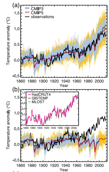
The evidence that the IPCC used to draw this conclusion is illustrated in their Figure 10.1, shown, in part, above. The top graph (a) shows the GHCN temperature record in black and the model ensemble mean from CMIP5 in red. This run includes anthropogenic and natural “forcings.” The lower graph (b) uses only natural “forcings.” It does not match very well from 1961 or so until today. If we assume that their models include all or nearly all of the effects on climate, natural and man-made, then their conclusion is reasonable.
While the IPCC’s simple four component model ensemble may have matched the full GHCN record (the red line in the graphs above) well using all stations, urban and rural, it does not do so well versus only the rural stations:
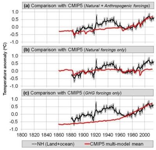
Again, the CMIP5 model is shown in red. Graph (a) is the full model with natural and anthropogenic “forcings,” (b) is natural only and (c) are the greenhouse forcings only. None of these model runs matches the rural stations, which are least likely to be affected by urban heat or urbanization. The reader will recall that that Bindoff, et al. chose to use the low solar variability TSI reconstructions shown in the right half of SCC15 Figure 8. For a more complete critique of Bindoff, et al. see here (especially section 3).
The Soon, et al. TSI versus the mostly rural temperature reconstruction
So what if one of the high variability TSI reconstructions, specifically the Hoyt and Schatten, 1993
reconstruction, updated by Scafetta and Willson, 2014; is compared to the rural station temperature record from SCC15?

This is Figure 27 from SCC15. In it all of the rural records (China, US, Ireland and the Northern Hemisphere composite) are compared to TSI as computed by Scafetta and Willson. The comparison for all of them is very good for the twentieth century. The rural temperature records should be the best records to use, so if TSI matches them well; the influence of anthropogenic CO2 and methane would necessarily be small. The Arctic warming after 2000 seems to be amplified a bit, this may be the phenomenon referred to as “Polar Amplification.”
Discussion of the new model and the computation of ECS
A least squares correlation between the TSI in Figure 27 and the rural temperature record suggests that a change of 1 Watt/m2 should cause the Northern Hemisphere air temperature to change 0.211°C (the slope of the line). Perhaps, not so coincidentally, we reach a value of 0.209°C assuming that the Sun is the dominant source of heat. That is, if the average temperature of the Earth’s atmosphere is 288K and without the Sun it would be 4K, the difference due to the Sun is 284K. Combining this with an average TSI of 1361 Watts/m2 means that 1/1361 is 0.0735% and 0.0735% of 284 is 0.209°C per Watt/m2. Pretty cool, but this does not prove that TSI dominates climate. It does, however, suggest that Bindoff et al. 2013 might have selected the wrong TSI reconstruction and, perhaps, the wrong temperature record. To me, the TSI reconstruction used in SCC15 and the rural temperature records they used are just as valid as those used by Bindoff et al. 2013. This means that the IPCC and Bindoff’s assertion that anthropogenic greenhouse gases caused more than half of the warming from 1951 to 2010 is questionable. The sound alternative, proposed in SCC15, is just as plausible.
The SCC15 model seems to work, given the data available, so we should be able to use it to compute an estimate of the Anthropogenic Greenhouse Warming (AGW) component. If we subtract the rural temperature reconstruction described above from the model and evaluate the residuals (assuming they are the anthropogenic contribution to warming) we arrive at a maximum anthropogenic impact (ECS or equilibrium climate sensitivity) of 0.44°C for a doubling of CO2. This is substantially less than the 1.5°C to 4.5°C predicted by the IPCC. Bindoff, et al., 2013 also states that it is extremely unlikely (emphasis theirs) less than 1°C. I think, at minimum, this paper demonstrates that the “extremely unlikely” part of that statement is problematic. SCC15’s estimate of 0.44°C is similar to the 0.4°C estimate derived by Idso, 1998. There are numerous recent papers that compute ECS values at the very low end of the IPCC range and even lower. Fourteen of these papers are listed here. They include the recent landmark paper by Lewis and Curry, and the classic Lindzen and Choi, 2011.
Is CO2 dominant or TSI?
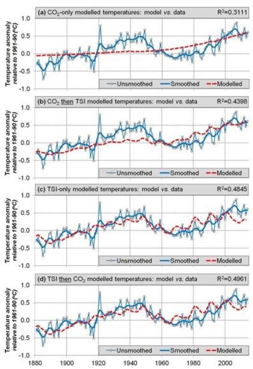
SCC15 then does an interesting thought experiment. What if CO2 is the dominant driver of warming? Let’s assume that and compute the ECS. When they do this, they extract an ECS of 2.52°C, which is in the lower half of the range given by the IPCC of 1.5°C to 4.5°C. However, using this methodology results in model-data residuals that still contain a lot of “structure” or information. In other words, this model does not explain the data. Compare the two residual plots below:

The top plot shows the residuals from the model that assumes anthropogenic CO2 is the dominant factor in temperature change. The bottom plot are the residuals from comparing TSI (and nothing else) to temperature change. A considerable amount of “structure” or information is left in the top plot suggesting that the model has explained very little of the variability. The second plot has a little structure left and some of this may be due to CO2, but the effect is very small. This is compelling qualitative evidence that TSI is the dominant influence on temperature and CO2 has a small influence.
The CAGW (catastrophic anthropogenic global warming) advocates are quite adept at shifting the burden of proof to the skeptical community. The hypothesis that man is causing most of the warming from 1951 to 2010 is the supposition that needs to be proven. The traditional and established assumption is that climate change is natural. These hypotheses are plotted below.
This is Figure 31 from SCC15. The top plot (a) shows the northern hemisphere temperature reconstruction (in blue) from SCC15 compared to the atmospheric CO2 concentration (in red). This fit is very poor. The second (b) fits the CO2concentration to the temperature record and then the residuals to TSI, the fit here is also poor. The third plot (c) fits the temperatures to TSI only and the fit is much better. Finally the fourth plot (d) fits the TSI to the temperature record and the residuals to CO2 and the fit is the best.
Following is the discussion of the plots from SCC15:
“This suggests that, since at least 1881, Northern Hemisphere temperature trends have been primarily influenced by changes in Total Solar Irradiance, as opposed to atmospheric carbon dioxide concentrations. Note, however, that this result does not rule out a secondary contribution from atmospheric carbon dioxide. Indeed, the correlation coefficient for Model 4[d] is slightly better than Model 3[c] (i.e., ~0.50 vs. ~0.48). However, as we discussed above, this model (Model 4[d]) suggests that changes in atmospheric carbon dioxide are responsible for a warming of at most ~0.12°C [out of a total of 0.85°C] over the 1880-2012 period, i.e., it has so far only had at most a modest influence on Northern Hemisphere temperature trends.”
This is the last paragraph of SCC15:
“When we compared our new [surface temperature] composite to one of the high solar variability reconstructions of Total Solar Irradiance which was not considered by the CMIP5 hindcasts (i.e., the Hoyt & Schatten reconstruction), we found a remarkably close fit. If the Hoyt & Schatten reconstruction and our new Northern Hemisphere temperature trend estimates are accurate, then it seems that most of the temperature trends since at least 1881 can be explained in terms of solar variability, with atmospheric greenhouse gas concentrations providing at most a minor contribution. This contradicts the claim by the latest Intergovernmental Panel on Climate Change (IPCC) reports that most of the temperature trends since the 1950s are due to changes in atmospheric greenhouse gas concentrations (Bindoff et al., 2013).”
Conclusions
So, SCC15 suggests a maximum ECS for a doubling of CO2 is 0.44°C. They also suggest that of the 0.85°C warming since the late-19th Century only 0.12°C is due to anthropogenic effects, at least in the Northern Hemisphere where we have the best data. This is also a maximum anthropogenic effect since we are ignoring many other factors such as varying albedo (cloud cover, ice cover, etc.) and ocean heat transport cycles.
While the correlation between SCC15’s new temperature reconstruction and the Hoyt and Schatten TSI reconstruction is very good, the exact mechanism of how TSI variations affect the Earth’s climate is not known. SCC15 discusses two options, one is ocean circulation of heat and the other is the transport of heat between the Troposphere and the Stratosphere. Probably both of these mechanisms play some role in our changing climate.
The Hoyt and Schatten TSI reconstruction was developed over 20 years ago and it still seems to work, which is something that cannot be said of any IPCC climate model.
Constructing a surface temperature record is very difficult because this is where the atmosphere, land and oceans meet. It is a space that usually has the highest temperature gradients in the whole system, for example the ocean/atmosphere “skin” effect. Do you measure the “surface” temperature on the ground? One meter above the ground? One inch above the ocean water, at the ocean surface or one inch below the ocean surface in the warm layer? All of these temperatures will always be significantly different at the scales we are talking about, a few tenths of a degree C. The surface of the Earth is never in temperature equilibrium.
“While… [global mean surface temperature] is nothing more than an average over temperatures, it is regarded as the temperature, as if an average over temperatures is actually a temperature itself, and as if the out-of-equilibrium climate system has only one temperature. But an average of temperature data sampled from a non-equilibrium field is not a temperature. Moreover, it hardly needs stating that the Earth does not have just one temperature. It is not in global thermodynamic equilibrium — neither within itself nor with its surroundings.”
From Longhurst, 2015:
“One fundamental flaw in the use of this number is the assumption that small changes in surface air temperature must represent the accumulation or loss of heat by the planet because of the presence of greenhouse gases in the atmosphere and, with some reservations, this is a reasonable assumption on land. But at sea, and so over >70% of the Earth’s surface, change in the temperature of the air a few metres above the surface may reflect nothing more than changing vertical motion in the ocean in response to changing wind stress on the surface; consequently, changes in sea surface temperature (and in air a few metres above) do not necessarily represent significant changes in global heat content although this is the assumption customarily made.”
However, satellite records only go back to 1979 and global surface temperature measurements go back to 1880, or even earlier. The period from 1979 to today is too short to draw any meaningful conclusions given the length of both the solar cycles and the ocean heat distribution cycles. Even the period from 1880 to today is pretty short. We do not have the data needed to draw any firm conclusions. The science is definitely not settled.
Those confidence statements taken together imply that the IPCC thinks it more likely that the climate sensitivity is greater than 6 degrees, than less than 1 degree.
The skew that implies is just ludicrous.
And furthermore, there has only been 0.8 degrees of warming observed with approximately a 42% increase in CO2. That would mean that the remaining 0.7-3.7 (high confidence) or 5.2 degrees (medium confidence) of warming would need to occur as a result of the remaining 58% increase in CO2. This, of course, is exactly the opposite of where most of the forcing from the greenhouse gases take place since there are strongly diminishing returns. Their “science” is so bad it’s criminal.
Time will tell. I am in a wait and see mode.
In the meantime, I notice the record heat temperatures by NWS, the melting Glaciers from when I was a Ranger in GNP Not to mention worldwide, NASA reports that there is more particulate in the stratsphere than troposphere, lack of significant snow for 3 years, the Union of Concerned Scientists’ opinion and theoriy, the lab confirmation at Berkely CA and the jet aerosol spraying proven to take place at geoengineeringwatch.org and my own data. Regardless of Willie Hocks Soon work, somebody needs to explain why the obvious signs and data of warming! Just hollering it aint so in Chinese does not chage the data that proves something bad is going on…
And the military spends $25 biliion of your taxes to spray for SOME reason….
Francis if you do a short study of the advance and retreat of glaciers over geological times some of your fears may be controlled. Using your lifetime to determine climate trends is always risky since cycles are often measured in hundreds or thousands of years.
The obvious signs and data warming…. OK I’ll explain it to you. It isn’t the relationship between co2 and temperature. The math is simply wrong. Cherry picking dates or not, the fact is that current Temps are below the lowest levels projected by the IPCC. Since they’ve cut off debate about past cooling and warming, like the MWP or the LIA, my concern isn’t warming it’s cooling. If AGW works the way it’s suppose to then real Temps are in fact falling. As stated above there has been a 0.8 degree increase, half of that by the IPCC has been attributed to natural forces, which leaves the math even more wrong. If AGW works the way the IPCC says it does, we are in deep do do because Temps are falling and fast.if the Temps were suppose to go up by even 1 degree, and you only have a 0.4 increase, another drop of 0.6 would put us in negative real numbers. In view of the amount of co2 that we’ve put in the atmosphere, in this case, the drop is significant.
So far the only graph that is pretty close is the harmonic one, and if warming occurs next year due to El nino, then it will be exactly on track. Or at least within the ranges. BTW, it too has the highest level of the wave below the IPCC s lowest projection.
Wait and see?
How old are you, when do you expect a doubling will occur?
I don’t expect to be here and can’t live with this nonsense.
It is likely that ECS turns out to be inconsequential, as the major “terror rationale” is Sea-Level Rise that “threatens” coastal regions throughout the world.
Trouble is that a methodical slight unwavering rise due mostly to thermal expansion has not accelerated AT ALL as measured by tide gauges in tectonically inert (neither rising or subsiding) areas around the world.
Why is this lack of acceleration significant? Because CO2 has risen 38% over the past 130 years and NO acceleration is visible. If a 38% increase cannot affect Sea-Level acceleration, then decreasing CO2 won’t either!!!
Spend the $billions$ elsewhere, electrify the world, and light up humankind.
Thank Soon, Connolly & Connolly for turning on the light switch!!!
If the Hoyt & Schatten reconstruction and our new Northern Hemisphere temperature trend estimates are accurate
This is the money quote. The Hoyt $ Schatten TSI reconstruction is NOT accurate, so any conclusions drawn from assuming that it is, are suspect.
Any conclusion that ECS is less than 1.2 is also suspect, because the dominant water vapor feedback is positive. The question is only by how much. All the recent observational energy budget studies suggest something between 1.45 and 1.65. NOT 0.44.
” because the dominant water vapor feedback is positive.”
A very unscientific statement, you obviously have not been following Willis’ Thunderstorm Posts.
All forms of water are a Stabalising influence not a “Positive Feedback”.
Stabilising even.
Careful – Thin Ice Alert
Water vapor has the same spectroscopic problem as CO2, the absorption bands are saturated, and to a far greater extent. To have a temperature feedback effect, you need to increase the lower atmosphere Absolute Humidity, (RH does not cut it) and that does not seem to be happening. The TAO buoy array in the Pacific has some great data, which Willis did a great workup on.
Clouds – Say no more.
At the end of it all, water will be shown not to participate in any “forcings” or “feedbacks”. I think there is absolutely no evidence that water vapor is driven by CO2 in any way.
ristvan writes
So the IPCC and AGW enthusiasts say. But what is this claim really based on?
Which reconstruction do you consider most accurate?
His own!
“The Hoyt $ Schatten TSI reconstruction is NOT accurate”
Out of curious where does it fail and which (if any) is your preferred one? Does that one show a similar better relationship with the temp series than CO2?
their paper:
http://www.researchgate.net/profile/Ken_Schatten/publication/23818119_A_discussion_of_plausible_solar_irradiance_variations_1700-1992/links/02e7e53b4c9d116994000000.pdf
As far as I can see from the paper, Hoyt and Schatten’s go-to graph is a statistically manipulated temperature data set smoothed with an 11 year running average, compared to a model of TSI changes likely also manipulated with an 11 year running average or bin equation.
In my opinion, this graph very likely demonstrates auto-correlation between two data sets, one being an 11 year modeled TSI output not observations, and the other being 11-year smoothed temperature data to match an 11 year solar cycle. In other words, they appear to be manipulated with obvious similar re-calculations forcing a match, which renders the graph useless. Except as a warning to others about autocorrelation.
Things brings me to one of my long-held beliefs, having done research and statistical analysis. We should not let folks near research unless we have independent statistical audits as part of peer review. My work had such an audit.
Damn. Head thinks of one word, fingers type another. Replace “Things” with “This”.
“This is also a maximum anthropogenic effect since we are ignoring many other factors such as varying albedo (cloud cover, ice cover, etc.) and ocean heat transport cycles.”
This is not true. If the anthropogenic effect is identified as a residual, then unmodeled factors can have a positive or negative effect on the residual.
Which makes the science totally “unsettled”.
{The authors of IPCC AR5, “The Physical Science Basis” may genuinely believe that total solar irradiance (TSI) variability is low since 1750. But, this does not excuse them from considering other well supported, peer reviewed TSI reconstructions that show much more variability. In particular they should have considered the Hoyt and Schatten, 1993 reconstruction. This reconstruction, as modified by Scafetta and Willson, 2014 (summary here), has stood the test of time quite well.}
Why should the IPCC, a government sponsored agency, consider any science that doesn’t support their agenda. If one thinks that just because a human is a ‘scientist’, then that human is a pure, ethical, moral, honest, etc., and ALWAYS performs in the expected manner of a holy ‘scientist’. Some of the commenters and authors seem to think so – IMO, you have no conception of human behavior, regardless of profession.
The IPCC remit is to prove that human activity causes global warming so will deliberately ignore any contrary information.
Don’t despair I listen Robert and I agree – 100%.
Yes, of course it would be nice to have high-precision measurements of incoming and outgoing irradiation and be able to measure the greenhouse effect unambiguously. However, I do think that the limited precision data have been put to good use by Spencer and by Lindzen, who have correlated fluctuations in the radiation budget with changes of bottom of the atmosphere temperatures to obtain (low) estimates of climate sensitivity. Do you see anything wrong with their work?
I could be considered to be a specimen of species that Dr. Brown often despairs of.
Having that in mind, I compare three variables here
http://www.vukcevic.talktalk.net/CSAT.gif
It can be seen that there is a partial correlation between all three.
It is said that solar activity doesn’t change enough to explain rise in the temperature, but graph suggests opposite, despite correlation being ‘transitory’.
It is almost certain that the CET cannot drive the far North Atlantic tectonics, and yet there is partial correlation there too. However, the opposite is not only possible but even likely.
But to the dismay of those that are a bit more advanced specimens, there is also partial correlation between solar activity and the tectonics; even worse
http://www.vukcevic.talktalk.net/Arctic.gif
Since we know that Arctic atmospheric pressure is the north component of the NAO, which is considered to control the polar jet stream’s meandering, a less advancement specimen of species may conclude:
Solar periodic activity and tectonics are related through common parentage (but as usual two siblings are not identical), tectonics drives change in the Arctic atm. pressure and the jet stream governs the temperature changes in the N. Hemisphere.
I’m done for now.
I have a problem with partial correlation.
Either something correlates or it does not. It is an all or nothing matter, if something only partially correlates it is akin to being partially pregnant. Something that only partially correlates, does not correlate – period.
If something does not correlate, but it is claimed that there is partial correlation, I prefer using the expression ‘there are some similarities’ or some such equivocal expression.
Many people, at least on a sub conscious level, equate correlation with causation. Of course, correlation is not causation, but due to the sub conscious connection using expressions like partial correlation tend to over weight the conclusion to be drawn from the data presentation.
PS. I always like reading your comments. They always give something to think about, even if, at times, they may be no more than curve fitting, or coincidence.
The earth’s magnetic field exerts tectonic and meteorological influences that are independent of the thermal energy imparted by electromagnetic radiation and cannot be measured in watts per square meter.
Leif will be happy to agree that the sun influences, and possibly even creates the earth’s magnetic field.
Hi Mr Verney
You need to read Dr. Brown (rgb@duke) more thoroughly.
One of his important statements is:
Earth climate change is a multi-variant process.
Pregnancy tends to have (perhaps except in vitro) an invariant and unique cause, a one off shot, so to say. As a WUWT experienced and valued commentator, you are well aware that CAGW crowd is a ‘one shot idea’; only persistence of the current pause is forcing them to think of natural variability.
Natural variability is one part of the rgb’s multivariance, with other knowns or unknowns.
Nature has its many cycles, solar lunar-tidal, and possibly some related to internal geo-dynamics, etc. Some go up others go down and so on, ad infinitum.
Climate (temperatures) may respond to the whole bunch of them to a different degree of phase and intensity changes.
In my graph’s partial correlations, that you appear to have a problem with, only two external variables are considered, solar and tectonic activity. If I had continuous and not partial correlations I not only would be greatly surprised but would reject it as ‘no good’.
I happen to like results with partial correlations (you are in good company, Dr. Svalgaard always instantly reject any as ‘nonsense’) because that is how the multi-variant causes drive natural world.
Despite your ‘problem’ with it, I will carry on as before, equally I will regularly read your comments, since most of time are valuable contribution, as are those from Dr. Svalgaard and Dr. Brown; more often than not, tell me that I am totally wrong.
All the best. m.v.
Thanks tour comment.
I am well aware that there is variability due to natural processes, and that there is interaction between these natural process which can at time cancel each other out (in whole or part) or can amplify/add to the effect (in whole or part). But this does not alter my point.
Anyone who proffers a theory based upon the actions of X, and claims that X does Y and then produces data with a plot showing the relationship between X and Y, as soon as X does not do Y in that plot, an explanation is needed as to why during the period of discrepancy X has not done Y. There may be a valid explanation consistent with the underlying proposition X does Y, but if no identifiable reason (the reason being backed up with appropriate data) is put forward then the claim that X does Y is undermined.
In global warming the claim is that CO2 is a ghg such that an increase in CO2 will cause temperatures to rise. CO2 is not sometimes a ghg, and at other times not a ghg, CO2 will not sometimes lead to warming of the atmosphere, and at other times will cause no warming of the atmosphere but instead will cause the oceans to warm. Whatever the properties of CO2 are, they will be and always will be until the effects of CO2 are saturated.
So each year that CO2 increases there must be a corresponding increase in temperature, unless some other process is at work nullifying the effect of the increase in CO2. This means that each year when C02 increases and there is not a corresponding increase in temperature consistent with whatever Climate Sensitivity is claimed for CO2, an explanation is required as to why the theoretical predicted increase in temperature did not occur. This may be that there was a volcano, or that it was a particularly cloudy year, or that it was a particularly snowy year, or the snow melted later than usual, or that it was a La Nina year, or that oceanic cycles led to cooling, or delayed oceanic heat sinks or whatever explains why there was no increase in temperature that particular year/that particular period. It may be that no explanation can be offered and the proponent is left to fall back on ‘it was natural variation that cancelled out the warming or even exceeded the warming from CO2 leading to cooling’. But natural variation is the last refuge of the theorist since it merely confirms that we do not what is going on or why.
I do not like partial correlation because this raises questions, but if there is partial correlation then an explanation is required for every period where there is not correlation and this explanation must be consistent with the underlying theory that is being proposed. That explanation may open a can of worms, since if that explanation holds good for the period where there was no primary (first order correlation), what effect does that explanation have on periods where there is correlation. It may be that the explanation given for periods where there is no correlation, would if applied uniformly move periods where there is correlation into periods where there should/would be no correlation.
I do not want you to do things differently I always enjoy and consider your posts. Obviously Dr Svalgaard and Dr Brown rarely raise points that lack merit, but given that so little is known or understood about the Earth’s climate and what drives it, it does not necessarily follow that points/issues raised that have obvious merit are in fact correct. Only time and with it better knowledge and understanding will tell.
This ‘science’ is problematic since it is based upon the over extrapolation of poor quality data, often accompanied by dodgy statistical analysis and/or with a blinkered imagination that there must always be some linear fit. The fact is that quality data, fit for purpose, is thin on the ground, and that is why we are debating issues. If the data was good, I am sure that there would be no or little extensive genuine debate.
I will quote Donald Rumsfeld:
“There are known knowns. These are things we know that we know. There are known unknowns. That is to say, there are things that we know we don’t know. But there are also unknown unknowns. There are things we don’t know we don’t know.”
As long as our knowledge is such, I am entirely content with partial correlations, but for anyone else it is matter of a personal choice.
Don’t worry Robert. You are obviously of the species Homo Sapiens Sapiens. The species of the ones you worry about is in doubt but the sapiens sapiens bit is definitely missing.
Homo Simp.
(Not mine–I read it somewhere. (Mencken?) I suspect that “Homer Simpson” was inspired by “Homo Simp.”)
“I could wax poetic about this, but I don’t have time and besides, no one listens.”
=============
Nah, we listen, sometimes even comprehend.
Then again, there are those pesky squirrels that need to be dealt with.
My weak ass BB gun will teach them a stinging lesson they might never forget. 🙂
And then they also try to equate temperature to heat, and seem to forget without including the water content.
Notice that water vapor, once generated, also requires more heat than dry air to raise its temperature further: 1.84 kJ/kg.C against about 1 kJ/kg.C for dry air.
The enthalpy of moist air, in kJ/kg, is therefore:
h = (1.007*t – 0.026) + g*(2501 + 1.84*t)
g is the water content (specific humidity) in kg/kg of dry air
http://www.mhi-inc.com/PG2/physical_properties_for_moist_air.html
One wonders how it could ever rain, much less snow. All that retained heat continually heating up the atmosphere.
rishrac, remember snow is a thing of the past , rain will soon follow /
Thank you, well said.
Rgbatduke; I am a simple lay person but I have developed a great respect for your opinion. Not only do you have a way with words your ideas as far as I can gather make a lot of sense. You need to have a higher public profile since your way of saying things make a lot of sense. You get my vote for president assuming your common sense is characteristic of all your ideas.
“If nominated, I will not run. If elected, I will not serve.”
I would much rather remove my own appendix with a rusty razor and dental floss than be POTUS.
Y’know the kids in high school who participated in everything, who were everybody’s friend, who ran for student “office” like class president, who have neatly coiffed hair (male or female alike) and a broad expanse of smiling perfect teeth in their yearbook photo? The ones who remembered everybody’s name (even the ones they really didn’t like but smiled at anyway)?
I’m not one of those kids. I haven’t quite forgotten my own kids’ names, but I do have to work to get to all of my nieces and nephews (whom I actually do like) and my cousins are pretty much out of the question. Like honey badger, I just don’t give a s**t.
Besides, I’m busy.
rgb
rgb,
The 14 Watts/m2 disagreement among the satellite measurements of TSI is quite alarming.
If such a fundamental quantity has this 1% uncertainty, then I suggest that all climate scientists (and skeptics) should be more cautious with their claims.
It’s a calibration problem. If your 1 kg scales weight or metric tape measure is suspect you can go to International Bureau of Weights and Measures in Paris and check it out, if you are uncertain about accuracy of your wrist watch you can go to Greenwich (UK) and wait at noon (in the winter or 1pm in summer) for the copper ball to drop down the pole.
I have no idea where you could go to calibrate satellite instrumentation.
RGB, thankyou, dead right you are that the data is not good enough. Wish we could all admit this and stop havering!
The entire AGW argument is invalidated by IPCC’s own statement: ‘more than half of the observed increase … from 1951 to 2010’.
There was never any argument that the direct impact of CO2 doubling in the 300-600 ppm range was large enough to be of significance. The whole argument for large impact relied on feedback. To argue that feedback will amplify the effect of CO2 for large warming also required arguing that there is no natural variation, otherwise the same feedback mechanisms will amplify the natural signal as well (this why the hockey stick paper was their holy grail).
By stating that half and not the entire 1950-2010 warming is anthroprogenic forcing (CO2 and other) also means that there is natural variation, so they cannot claim that feedback amplifies the CO2 signal but not the NV signal.
Joe says:
“There was never any argument that the direct impact of CO2 doubling in the 300-600 ppm range was large enough to be of significance.”
How can you say that – there is a massive argument – which is simple to explain and understand ….
CO2 is a radiative gas that emits LWIR in all directions, including upwards into space. Forget the CAGW obsession with downward emissions for a moment – if you increase the atmospheric CO2, you obviously increase upward emissions into space which are lost forever. This means the planet as a whole is COOLED by increasing atmospheric CO2, not warmed!
It really is that simple.
If there were no ghgs in the atmosphere upward emissions would emanate directly from the surface – and still be lost forever. It is the altitude at which energy is emitted which governs the amount of warming from the greenhouse effect.
I’m sceptical of CAGW but the lack of understanding regarding basic greenhouse theory among a lot of sceptics is worrying.
John Finn,
some claim that w/out ghgs the air would be heated by diret contact with the surface, As w/out ghgs there is no means for the heat to escape exept through contact with the surface at a cooler place, the air and the surface would heat up considerately.
There are always some molecules with 3 or more atoms ( IR active, GHG’s ) in our or any atmosphere.
Well, no, it really isn’t that simple. If you add CO2 to the atmosphere you raise the scale height where the emissions occur. Since it is colder up there, you radiate less. The atmosphere is already saturated with CO2 and is completely opaque to LWIR in its absorptive band after a distance of a few meters, a distance that gradually increases as one goes up the atmospheric column to lower overall density and pressure and temperature until LWIR photons have an even chance of getting out to space. The emissions at that height are at intensities characteristic of that height.
If you care about being correct, as opposed to parroting something that is quite simply wrong, I can recommend either an AJP review paper by Wilson and Gea-Banacloche (AJP 80, p 306, 2012) or the lovely spectrographs in Grant Petty’s book “A First Course in Atmospheric Radiation” (well worth the investment if you know enough physics to be able to follow it, that is if you are/were at least a physics minor and have a clue about quantum mechanics) or you can read Ira Glickstein’s review article on the subject on WUWT, that summarizes Petty (for the most part) for a lay audience. But in the end, it comes down to what I described above. LWIR from the surface is immediately absorbed by CO2 on its way to infinity. It is immediately transferred by collisions to O2 and N2, nearly always before the CO2 re-emits the same quantum of energy it absorbed, effectively maintaining the temperature of the air to correspond with that of the ground so that it stays close to in balance near the surface (close to but usually lagging or leading a bit as things heat or cool during the day).
In the bulk of the atmospheric column it has almost no net effect — each parcel of air is radiating to its neighbors on all sides and absorbing almost the same amount from its neighbors on all sides, with a small temperature effect that makes radiation up slightly unbalanced relative to radiation down (but only a bit). Again, it just helps promote “local” equilibrium in the atmosphere as it causes slightly warmer parcels to lose energy to slightly cooler parcels and reduce the thermal gradient between them. So we can pretty much ignore the greater part of the atmospheric column as a zero sum game; even the slight upward diffusion of energy is just one part of vertical energy transport, and often not the most important one.
The really important second factor in the atmospheric radiative effect (misnamed “greenhouse effect”) is convection. Parcels of air in the atmosphere are almost always moving, moving up, moving down, moving sideways. Since conduction in air is poor, since radiation by parcels of air to their neighbors is mostly balanced, as a parcel rises or falls it does so “approximately” without exchanging energy with its neighbors. This is called an adiabatic process in physics. A gas that adiabatically expands cools as it does so, just as a gas that is adiabatically compressed warms as it does so. This is all well understood and taught in intro physics courses, at least to majors — not so much to non-physics majors any more. The turbulent mixing as the atmosphere warms at the base, rises, cools (by losing its energy to space, not adiabatically) and falls creates a thermal profile that approximates the adiabatic temperature profile expected on the basis of the pressure/density profile. The temperature drop per meter is called the Adiabatic Lapse Rate and while it is not constant (it changes with humidity, for example), it is always in an understandable range. It is why mountain temperatures are colder than sea level temperatures, and why even in the tropics, pilots in WWII had to wear warm clothes when they flew in open aircraft at 15,000+ feet.
The ALR exists from ground level to the top of the troposphere, a layer called the tropopause. Above the tropopause is the stratosphere, where temperatures level because there is no driving bottom heating any more, air flow tends to be lateral, and temperatures start to slowly rise with height but in air so thin that the “temperature” of the air is all but meaningless as far as human perceptions are concerned. Also it starts out at the temperature of the tropopause, which is very, very cold relative to the ground.
CO2 doesn’t radiate away to space (as opposed to other air) until one gets well up close to the top of the troposphere. There, it radiates energy that is net transferred to the CO2 by collisions with the surrounding O2 and N2 away to infinity, and thereby cools the air. The air’s density increases, it falls as part of the turbulent cycle that maintains the ALR and energy has been transported from the ground to space.
The trouble is that the power lost to space in the absorption band, radiated from near the cold tropopause, is much, much smaller than the power radiated from the Earth’s surface that was originally absorbed. It is left as an exercise in common sense to remember that energy is conserved, the Earth is a finite system, and that on average input energy from the sun must be exactly balanced by radiative losses to infinity (detailed balance). When it is NOT in detailed balance, it either warms until it is (as outgoing radiation increases with temperature) or cools until it is (as outgoing radiation decreases with temperature). It doesn’t even really matter where this warming of the system occurs (atmosphere or land/ocean surface, since the ALR maintains the same gradient of temperatures in the atmosphere to the surface, warming (on average) anywhere in the atmosphere ultimately means surface warming and vice versa. Fortunately, the surface loses energy in bands not blocked by CO2, so as it warms it quickly restores detailed balance.
So, the presence of CO2 in the atmosphere takes a bite out of the outgoing power in one band of the spectrum, all things being equal. So, test time (to see if you’ve been paying attention or have understood a work I’ve said).
Since energy in from Mr. Sun is independent of the increase of CO2, we expect the Earth to be:
a) Warmer when there is CO2 in the atmosphere relative to an atmosphere consisting only of non-radiating (in LWIR) O2 and N2.
b) Cooler when there is CO2 in the atmosphere relative to an atmosphere consisting only of non-radiating (in LWIR) O2 and N2.
c) Not change temperature when there is CO2 in the atmosphere relative to an atmosphere consisting only of non-radiating (in LWIR) O2 and N2.
I already described the expected marginal response to increasing CO2 concentrations above. Note well that they are not linear — the atmosphere is already very, very opaque to CO2 so adding a bit more “trace gas” won’t make it significantly MORE opaque anywhere near the ground. Nor does it produce much of a change in its broadening of spectral lines — pressure broadening isn’t strongly dependent on partial pressure, only on collision rates without much caring about the species. All it does is raise the level at which the mean free path of in band LWIR photons reaches “infinity” in the direction of space, and hence decrease the temperature and radiated power a bit.
Now there is considerable uncertainty in the strength of this effect. We expect it to be logarithmic in CO2 concentration, but computing the multiplier of the log a priori precisely is impossible, all the moreso when one considers that even expressing it as a single term means one is averaging over a staggering array of “stuff” — variations in the ALR, the effects of mountains, variations in land surface, the ocean, ice — all of this shifts the balance around to the point where at the poles one can see the ALR inverted with the air warmer than the surface as one goes up, to where latent heat from the oceans and radiation from water vapor cooling to form high albedo clouds is added to the “simple” mental picture of radiated heat entering a turbulent conveyor belt to be given off at height. And there are more greenhouse gases, and CO2 isn’t even the most important one (water vapor is, but a substantial amount). So its marginal contribution, and feedbacks, and mixes of natural variation, are all extremely difficult to compute or even estimate, and there is little reason to give too much credence to any attempts to do so, as when I say “extremely difficult” I mean that it is a Grand Challenge Problem, one that we simply cannot solve and that nobody can see a way clear TO solve with our existing theories and resources. We don’t even have the data needed to drive a solution if we could solve it, or to check a solution accurately if a magician tapped a computer with a magic wand and started any of the existing computations with the absolutely precise values for the starting grid.
Most computations of the CO2 only, no lag, no feedback warming are expressed as “total/equilibrium climate sensitivity”, the amount of warming expected if CO2 is doubled (logarithm, remember). The number obtained is around 1 C, which is not catastrophic according to anybody’s sane estimation, even the IPCC’s. They only extrapolate to “catastrophe” by adding positive feedback warming, mostly from water vapor.
The trouble is, nobody really understands the water cycle. We are still learning about it. Furthermore, the granularity of the GCM is so large that it cannot resolve things like thunderstorms that transport large amounts of energy vertically very rapidly (think about the temperature drop that occurs with a thunderstorm!) There are many other places where parameters are simply guessed at, or fit to reproduce the warming in the 1980s and 1990s. The problem with a guess is obvious (and these parameters are often set differently in different GCMs, as a clear indication of our uncertainty as to their true values). The problem with fitting the 1980s and 1990s is that this is the only 20 year stretch of rapid warming that occurred in the last 75 years!
Now, I’m a wee bit of a statistician and predictive modeler — I’ve founded two companies that did commercial predictive modeling using tools that I wrote (learning in the process that building excellent models, difficult as it is, is still easier than building a successful business, but that’s another story:-). I cannot begin to point out the problems with doing this. It is literally a childish mistake, and the IPCC is paying the price for it as their models diverge from reality. Of course they are. They were built by complete idiots who already “knew” the answer that the models were going to give them and didn’t hesitate to fit the one stretch of the data that described that answer.
At this point, however, the whole thing has passed beyond the realm of scientific research. The climate science community has bet the trust and reputation of scientists in all disciplines in the shoddy presentations of the assessment reports, specifically the summary to policy makers where assertions of “confidence” have been made that are utterly without foundation in the theory of statistics. They have not infrequently been made either in contradiction to the actual text in th WG chapters or over the objections of contributing authors in those groups, minimizing uncertainty and emphasizing doom. As a consequence, the entire world economy has been bent towards the elimination of the abundant natural energy resource that has literally built civilization, at a horrific cost. But now entire political careers are at risk. The objectivity of an entire scientific discipline is at risk of being called into question and exposed to a scrutiny that it surely will not survive if their expensive predictions turn out to be not only false, but in some sense passively falsified if only as an accessory after the fact.
We already know enough to reject the results of most of the GCMs as being anything like a good representation of the Earth’s climate trajectory. They fail on almost every objective measure. They are not suitable for the purpose they have been put to, and the ones that are working best are not even given an increased weight in what has been presented to policy makers, as the purveyors of the computations desperately hope that a warming burst will catch everything up to their predictions. A measure of the gravity of the problem can be seen in the recent “pause busting” adjustments to ocean data that have (unsurprisingly) tried to maintain the illusion of a rapidly warming Earth for just a bit longer to try to give the models more time to be right, and to give the massively invested political and economic parties involved one last chance to make their draconian measures into some sort of international law and guarantee wealth and prosperity for the people on that bandwagon for another decade or more.
But nature doesn’t care. I don’t know if the models are right or wrong — nobody does. What we do know is that they aren’t working so far, and that we aren’t using the ones that are working best so far and throwing away the ones that aren’t working at all. Maybe in a decade, warming will be back “on track” to a 4x CO2-only warming high feedback catastrophe. Maybe in a decade, the Earth will be cooling in the teeth of increasing CO2 because solar hypotheses or other neglected physics turns out to be right , or just because the no-feedback climate sensitivity turns out to be less than 1.C and net feedbacks turn out to be negative, so that a round of natural cooling from any incomputable chaotic cause is enough to overwhelm the weak CO2 driven warming. None of these is positively ruled out by the pitiful data we have in hand, and most of these possibilities are within the parametric reach of GCMs if they were retuned to fit all 75 years of post-1950 data accurately, and not just the 20 years of rapid warming.
And then, three different reputable groups have claimed that they have solved the fusion problem and will build working prototypes within the next 1-5 years, in some cases large scale working prototypes. I know of one other group that is funded on a similar claim, and I’m willing to bet that there are a half dozen more out there as there are literally garage-scale approaches that can now be tried as we have apparently mastered the physics of plasmas, which turned out to be nearly a Grand Challenge Problem all by itself.
If they succeed, it will be the greatest achievement of the human race, so far. It will be the true tipping point, the separator of the age, the beginning of the next Yuga. Fusion energy is literally inexhaustible within any conceivable timeframe that the human species will surfive in. It will transition civilization itself from its current precarious position relying on burning stuff for energy, stuff that we will need unburned later where I’m talking later for the next thousands of years, not in the next decade. It is silly to burn oil and coal as it is valuable feedstock for many industrial processes — it is just that we have no choice (yet) as no alternatives but perhaps nuclear fission are up to the task of providing an uninterruptable energy base for civilization.
Won’t the catastrophic global warming enthusiasts feel silly if they do? Within a decade, assuming that the Bern model is correct CO2 will start to aggressively level and will likely asymptotically approach a value around 450 to 500 ppm at most before slowly starting to recede. Even pessimistic models can’t force more than half a degree C, 1 F more warming out of that, which is the kind of “climate change” one can experience by driving fifty miles in any direction. We will have spent hundreds of billions if not trillions of dollars, enriched a host of “entrepreneurs” selling tax-subsidized alternative energy systems that will at that point have a shelf life of zero as conventional energy prices plummet, and condemned tens to hundreds of millions of the world’s poorest people to death and misery by artificially inflating the price of energy and delaying its delivery to the third world cultures, preserving their quaint 17th to 19th century lifestyles for a few more decades.
rgb
I applaud for professor Brown’s comment above.
If only there were more people like rgbatduke, the climate debate would make some sense.
And rgbatduke, don’t think nobody learns anything. You actually explained things that I’d been wondering even today related the physics of CO2 in stratosphere. That is a pretty extraordinary thing. You really did something that mainstream media hasn’t and would never do: explain in technical terms how GHG works.
I’d like to return to your comment later on, but I’m afraid it is buried here in the n’th thread in a random blog entry.
rgbatduke writes
No it doesn’t and you even mentioned it yourself. It varies with the GHG, water vapour. So if increased CO2 in the atmosphere resulted in a very slightly decreased lapse rate (because we already know that the moist lapse rate is lower than the dry lapse rate) then its entirely possible that the ERL may be at a greater altitude but at the same temperature and therefore there is no need for the surface to warm.
My intuitive belief is that the ERL will increase a bit (as you say) and the lapse rate will decrease a bit so that the new ERL is a little warmer than it started out and therefore radiates more energy. As well as the surface warming a little bit so the non-GHG captured radiation increases a little bit. And clouds will reflect a little bit more with the slightly increased water vapour in the atmosphere. And the water cycle will increase a little to help support the first point I made. And storms (as per Willis’ pet love) will do the same.
And all these feedbacks will be negative on the CO2 forcing. Or put simply The IPCC is wrong with their “highly likely” prediction that feedbacks are positive and will result in a forcing greater than the CO2 forcing alone.
I’ll even go a bit further with this and say the IPCC’s prediction is based on “recent measurements” where we have overshot the equilibrium and that has been seen by them as an undershot with more warming in the pipeline.
I had no idea that that there was anything like a 14 w%m^2 unknown variance in insolation measurements . That’s 3c at these intensities .
“However, as we discussed above, this model (Model 4[d]) suggests that changes in atmospheric carbon dioxide are responsible for a warming of at most ~0.12°C [out of a total of 0.85°C] over the 1880-2012 period”. 0.12 degrees out of 0.85 degrees, or 14%. This compares nicely with the conclusion reached in Mike Jonas’ essay (The Mathematics of CO2) where he found that when he used the IPCC models to hindcast temperatures in the geological past, only 12% of global warming could be attributed to CO2.
🙂
There are many problems with the surface air temperature measurements over long periods of time. Rural stations may become urban, equipment or enclosures may be moved or changed, etc.
====
and every time they enter the most recent set of numbers…..the past is automatically adjusted
You can never do real science when your data change before you finish…
eye off ball alert……seems that the science has changed too
Now CO2 is the only driver…
….originally it was the small increase in temp from CO2 would create runaway global humidity
the humidity is what would cause global warming..
IIRC, I think Gore was the first guy to claim permadrought in the breadbasket and increasing deserts as part of his movie debut scare package.
Combining this with an average TSI of 1361 Watts/m2 means that 1/1361 is 0.0735% and 0.0735% of 284 is 0.209°C per Watt/m2. Pretty cool, but this does not prove that TSI dominates climate.
Pretty cool? Seems to me you’ve applied a linear calculation to a relationship that is known not to be linear (Stefan Boltzmann Law) and come up with a number that seems significant only by pure coincidence. If you can supply a logical explanation for this math in context of known physics (SB Law) I’d be interested to hear it.
applied a linear calculation to a relationship that is known not to be linear
When changes are small everything is linear. But the percentage change should be divided by four:
dT% = d(TSI)/4%
Going from 0 to 1361 isn’t “small”, it is the whole range, and my thought was calculating over that range to come up with a number that applies to a small change at one end of the range doesn’t make sense to me.
AND it needs to be divided by 4, thanks for adding that.
Going from 0 to 1361 isn’t “small”
But the variation of TSI is not from zero to 1361, but from 1361 to 1362. The derivation goes like this:
TSI = S = a T^4, dS = 4*aT^3 dT = 4 S/T dT, or dS/S = 4 dT/T, or dT/T = dS/S / 4 or dT% = dS%/4
But the variation of TSI is not from zero to 1361, but from 1361 to 1362.
Well of course. But if (for sake of argument) TSI was 650, and the variation was from 650 to 651, the change would still be small, still be roughly linear for practical purposes, but a completely different dT for the same value of dS (1). Would it not?
Since S is only half, dS/S% would be twice the 0.0735%, i.e. 0.15% and dT would be 0.15/4= 0.0384% of 288K = 0.11K
Well not everything. But differientiable functions yes.
Nice to see there are nerds around to fix obvious logical errors. 🙂
I’d like so much to go on flamebaiting how I have a little bit of trouble believing in א0, let alone א1. Like, you know, every layman like me is so intelligent that can toss 50% of known mathematics just by asserting how stupid it is. And besides, Brouwer was right, Hilbert wrong. /end stupid assertions
(well in fact I think Brouwer was weird – as weird as Hilbert or weirder – I’m not sure who in philosophy of mathematics I could agree with, but surely there must be some).
But at what wavelength and what effect do they have.
Solar irradiance variations show a strong wavelength dependence. Whereas the total (integrated over all wavelengths) solar irradiance (TSI) changes by about 0.1% over the course of the solar cycle, the irradiance in the UV part of the solar spectrum varies by up to 10% in the 150–300 nm range and by more than 50% at shorter wavelengths, including the Ly-a emission line near 121.6 nm [e.g., Floyd et al., 2003a]. On the whole, more than 60% of the TSI variations over the solar cycle are produced at wavelengths below 400 nm [Krivova et al., 2006; cf. Harder et al., 2009]
These variations may have a significant impact on the Earth’s climate system. Ly-a, the strongest line in the solar UV spectrum, which is formed in the transition region and the chromosphere, takes an active part in governing the chemistry of the Earth’s upper stratosphere and mesosphere, for example, by ionizing nitric oxide, which affects the electron density distribution, or by stimulating dissociation of water vapor and producing chemically active HO(x) that destroy ozone [e.g., Frederick, 1977; Brasseur and Simon, 1981; Huang and Brasseur, 1993; Fleming et al., 1995; Egorova et al., 2004; Langematz et al., 2005a]. Also, radiation in the Herzberg oxygen continuum (200 – 240 nm) and the Schumann-Runge bands of oxygen
(180–200 nm) is important for photochemical ozone production [e.g., Haigh, 1994, 2007, accessed March
2009; Egorova et al., 2004; Langematz et al., 2005b; Rozanov et al., 2006; Austin et al., 2008]. UV radiation in the wavelength range 200–350 nm, i.e., around the Herzberg oxygen continuum and the Hartley-Huggins ozone bands, is the main heat source in the stratosphere and mesosphere [Haigh, 1999,
2007; Rozanov et al., 2004, 2006].
Considering UV will heat water to “meters’ of depth and gets absorbed by ozone (having to later be radiated out of the system), the 60% change is more of a driver than just TSI.
Forgot the paper – here – https://www.google.com/url?url=https://www2.mps.mpg.de/homes/natalie/PAPERS/jasr-haberreiter.pdf&rct=j&q=&esrc=s&sa=U&ved=0CB8QFjACahUKEwiYq7aR6bPIAhVHjw0KHdW2Aa0&usg=AFQjCNFnRNJk0OfyaLiE7q2XCvMHMVhdpA
You are confused between absolute and relative changes. The loose change in my pocket varies enormously from hour to hour, while my savings account does not. The variation of my loose change is not a good indicator of the variation of my total assets.
more than 60% of the TSI variations over the solar cycle are produced at wavelengths below 400 nm
This is a common misconception. The high variability of the UV is a relative variability, but since the part of TSI form UV is small, the variation in terms of energy is actually very small:
If you consider that the TSI varies by 0.1% you can infer that the spectral band short of 400 nm, about 10% of TSI, cannot vary by more that 1% – or it would account for the entirety of the TSI variation. Likewise the band short of 300 nm, about 1% of TSI, cannot vary more than 10%, etc.
Playing Devil’s advocate…
I know that the Maximum Usable Frequency (MUF) for ionospheric propagation via the F2 layer can vary by a factor of two between a sunspot minimum and a sunspot maximum. Whether or not the enough of the EUV that ionizes the F, E and D layers makes it down to where it can affect climate is a bit of an open question. An equally open question is the mechanism that EUV affects the climate, assuming that it does indeed affect the climate.
BTW, I did download your paper on reconstructing the SSN’s and made one pass through it and planning to make at least another pass before sending off comments.
In my view this is the money observation. “Considering UV will heat water to “meters’ of depth and gets absorbed by ozone (having to later be radiated out of the system), the 60% change is more of a driver than just TSI.” I have frequently made this point.
It is not necessarily a simple matter as to the extent that TSI as a whole varies, but also a matter as to how TSI varies throughout its wavelength since the absorption of energy by the oceans is dependent upon the wavelength of the ER. subtle variations in the distribution of wavelengths could be significant.
In a 3 dimensional world, a watt is not necessarily just a watt. May be not all watts are born equal since precisely where a watt appears in a 3 dimensional world could be very important.
The bulk of the Earth is oceans and they have orders of magnitude more heat capacity than the atmosphere so considering the behaviour of the oceans is paramount. The energy that the oceans radiate is from the surface, but the energy absorbed by the oceans is not at the surface. The oceans absorb energy right from surface down to a 100 metres (or even more), albeit that the bulk of the energy is absorbed within the 50 cm to 5 metre range. The K & T energy budget cartoon assumes that all the incoming energy (including that back-radiated) is absorbed at the surface but that is not so as far as the oceans are concerned (and DWLWIR cannot effectively be absorbed since given the omnidirectional nature of this it cannot penetrate more than about 4 microns and no one seems to put forward a mechanism how the energy absorbed in 4 microns can be sequestered and dissipated to depth at a rate faster than the energy in that small layer would simply drive evaporation)
But how long does it take energy that is absorbed at 5 metres to resurface? We do not know. What if that energy is not being absorbed at 5 metres but due to changes in wavelength is being absorbed at 6 metres? How long would it then take for energy absorbed at 6 metres to resurface? We do not know. We do not know whether such subtleties could have an impact upon multidecadal temperature trends.
Personally, I consider it more complex than just TSI.
“This is Figure 27 from SCC15. ”
Where oh where is Figure 27 hiding?
Thanks
Never mind – sorry – it must be me. . . finally it loaded . . refreshed . . and it didn’t load. Rebooted – all is fine. Weird.
There’s a very nice long back and forth between one of the authors and Willis starting at this comment:
http://wattsupwiththat.com/2015/09/22/23-new-papers/#comment-2040808
(also note raw data link is in that comment, unlike above)
My high level summary of this discussion is that Willis claims about the SCC paper:
(1) estimated TSI based on sunspot numbers is wrong if you didn’t take into account sunspot counting methodology changes done in 2014 (SCC paper didn’t)
(2) it’s too easy to create a spurious correlation by tweaking both the TSI AND the temperature record. You often end up getting what you are looking for, even if you didn’t think you are trying to. The authors counterclaim they were just messing with the temperature records first (“a priori”)
(3) autocorrelation, Bonferroni, or Monte Carlo were not considered. These three factors and (2) dramatically change the claim of significance.
There’s a pretty good back and forth, if you want the details go read it. Not sure it will get repeated here or not.
My take is that if you can’t make a good case with a “standard” temperature history estimate and some other standard TSI history estimate, then you are well within the measurement error limits of the estimates and you are just correlating noise. Both the estimated temperature history and estimated TSI history have a large quantity of noise, there’s simply no real signal to correlate to.
Also I don’t buy the “a priori” order of development argument. Human brains are instinctive pattern matchers, you could have just seen something out of the corner of your eye and you just cherry picked without realizing it. That’s why we have double blind studies.
The same argument applies to the warmists of course. Except that there’s not nearly as much noise in the C02 record.. (which is irrelevant, there’s plenty in the temperature record, and anyways correlation is not causation…. but I digress)
Peter
Peter, Willis and Ronan are getting a bit in the weeds. The data, relative to the error in measurement, is not adequate to explain a 0.85 degree shift in any context or over any period of time. The “standard” temperature reconstruction (GHCN) is no better supported on a worldwide basis than Ronan’s. I liked the paper because it showed a very plausible alternative to AR5 that could not be refuted, except by arguments that also refute AR5.
Well they should have spent more time refuting their own hypothesis and then using the same techniques to refute AR5.
Now THAT would be an interesting paper. Propose 4-5 reasonable sounding hypothesis, refute them with sound statistics and signal processing techniques, and then go back and apply those same techniques to AR5 as the finishing touch. Show that there’s no useful signal in any of the data*
Peter
* Other than ENSO. I believe it’s been shown that there’s a definitive, statistically sound ENSO signal in ESST
Hi Peter,
I was busy with work on Tues and Wed and didn’t get a chance to reply to Willis’ last comment until yesterday morning, but when I went to post my response (which addresses most of the issues you mention), I found comments were closed! This was presumably because that thread is now several weeks old.
In case you (or any of the others) are interested, I will repost my response to Willis below. But, it is quite a long response (with a lot of links – meaning it’ll probably go into moderation), and is quite specific to the discussion Willis and I were having on that thread. So, maybe one of the mods could move it to the original “23! New! Papers!” thread?
P.S. Yes, Feynman’s approach to science is definitely an influence on mine!
Mods: As mentioned above, this was a reply to Willis’s Tuesday comment, that I had meant to post on this thread (http://wattsupwiththat.com/2015/09/22/23-new-papers/#comment-2040808) yesterday, but the comments had been closed. Is it possible to move my reply there?
[no, it isn’t, there is no “move” feature in wordpress -mod]
——
Hi Willis,
Ah, no, I wasn’t claiming that, but I can see how you might have thought that! Sorry for the misunderstanding! It probably would help to read the Urbanization bias III paper where we carried out that analysis. When we found that only 8 stations met our ex ante conditions, we concluded that this was simply too small a sample size to construct a “global” (or even “hemispheric”) temperature reconstruction. So, that was the end of our attempt – the sample size meeting our ex ante conditions was too small.
…However, we then speculated that maybe some might argue, “well, why not use them anyway, if that’s all you’ve got?”. So, we decided to carry out a brief assessment of those stations, to see if there were any useful information we could extract from them. The 8 station records are shown below:
http://s2.postimg.org/5lnpfu3m1/8_rural.jpg
We concluded that, not only was the sample size too small for constructing a “global temperature” reconstruction, but the lack of consistency of the trends between all 8 stations and the possibility of non-climatic biases (non urban-related!) meant that, without obtaining further information on the individual stations (e.g., detailed station histories), it was difficult to determine which trends in which stations were genuinely climatic.
But, in any case, our proposed reconstruction had already failed and been abandoned before we “looked at the trends” due to sample size issues.
So, from our 2014 analysis we concluded that without further information the data is probably too problematic for constructing a reliable long-term “global temperature estimate” by simply “throwing everything into the pot”. Of course, you could do it anyway – that’s essentially how the ‘standard temperature datasets’ are constructed, after all. But, we concluded that these simplistic analyses are significantly affected by urbanization bias. When your data is problematic, going with the “simple solution” isn’t necessarily a good plan:
By the way, if anyone is interested in reading our 2014 Urbanization bias papers, below are the links.
“Urbanization bias I. Is it a negligible problem for global temperature estimates?”
Paper: http://oprj.net/articles/climate-science/28
Data: http://dx.doi.org/10.6084/m9.figshare.1005090
“Urbanization bias II. An assessment of the NASA GISS urbanization adjustment method”
Paper: http://oprj.net/articles/climate-science/31
Data: http://dx.doi.org/10.6084/m9.figshare.977967
“Urbanization bias III. Estimating the extent of bias in the Historical Climatology Network datasets”
Paper: http://oprj.net/articles/climate-science/34
Data: http://dx.doi.org/10.6084/m9.figshare.1004125
Our analysis of the Surfacestations results might also be of relevance.
“Has Poor Station Quality Biased U.S. Temperature Trend Estimates?”
Paper: http://oprj.net/articles/climate-science/11
Data: http://dx.doi.org/10.6084/m9.figshare.1004025
And for anybody who is interested in our new Earth-Science Reviews paper we’ve been discussing here, there’s a pre-print here: http://globalwarmingsolved.com/data_files/SCC2015_preprint.pdf and a copy of the SI here: http://globalwarmingsolved.com/data_files/SCC2015-SI.zip.
Which brings me back to this new paper.
We had concluded from our 2014 analysis that the data is probably too problematic for a simple global temperature reconstruction. However, because the average climatic trends within a given region tend to be fairly similar (e.g., see rural Ireland stations below), for this new paper, we suggested that maybe, by focusing on individual regions and carefully assessing the data for some of the regions with the highest densities of rural records, we might be able to achieve the less ambitious goal of constructing some new regional temperature reconstructions.
http://s13.postimg.org/3qkdu9ron/Fig_16_Ireland_trends.jpg
We already had a rural U.S. regional estimate (although we updated it for this paper), since this region has a high density of fully rural stations with fairly long and complete records (thanks to the COOP project and the construction of the USHCN dataset). As discussed above, there are no other regions which come close to matching this…
However, looking at the distribution of fully rural stations two regions with a relatively high density are China and the Arctic – these also are regions that Willie has done some research on. So, we decided to try and see what we could do for those two regions.
As we discuss in the paper, we had to take a number of assumptions with both of these regions, and we stressed that they need to be treated cautiously. We made several recommendations on how they could be improved, e.g., compilation of station histories, updating those station records which stop in 1990 in the GHCN dataset, but which are still in operation.
We also were able to obtain station histories and parallel measurements for one of the 8 fully rural stations identified in our 2014 analysis, i.e., Valentia Observatory, and we were able to use this to correct for non-climatic biases in the station record, giving us a handle on rural Irish trends.
Initially, when we started working on these new regional estimates, we were just considering writing a couple of short letters with Willie. But, when we had compiled those four regional estimates, we noticed that they were actually quite well distributed throughout the Northern Hemisphere:
http://s23.postimg.org/yypdlhpzv/Fig_19_map_NH_composite.jpg
We also noted that with these 4 regions we were already using nearly half of the fully rural GHCN stations in the Northern Hemisphere (and nearly 2/3 of those with data for the early 20th century).
For these reasons, we suggested that if we used an area-weighted mean of these four regional estimates, this could provide us with a new mostly-rural Northern Hemisphere temperature reconstruction.
It’s not that we set out saying, “the way to construct a Northern Hemisphere reconstruction is to pick ‘our favourite regions’ and stitch them together” (though in hindsight, I can see why you got that impression!). Rather it was that we had tried to create as many regional estimates as we felt we could from the data (which was four), and then realised, “hey, we can use these to construct a mostly-rural Northern Hemisphere estimate!”.
We certainly agree that, with more work, and ideally the collection of station histories and/or other station information, there are probably other regions in the Northern Hemisphere that could be constructed. In our paper, we suggest that tracking down station histories for some of the European fully rural stations could be a good place to start. We also suggest that obtaining similar regional estimates for the tropics should be a high priority.
… However, when you look at the data that is actually available, it is surprisingly limited. For fully rural station, most of the records are either short (only covering the 1951-1990 period) or else have several huge unexplained gaps in them. Moreover, they tend to be fairly isolated geographically, meaning that there aren’t nearby fully rural stations to compare trends with, making it even harder to identify non-climatic trends.
For instance, here are all the fully rural stations for India. There are 8 – the white diamonds on the map, i.e., the ones labelled “Still rural” (this map was taken from our Urbanization bias II paper and was considering a separate issue)
http://s3.postimg.org/v9evrxm2b/India_stations.jpg
http://s24.postimg.org/t2j32ydet/India_rural_trends.jpg
We are of the opinion that – without compiling further information on these stations and their records (station histories, etc.) there is really not much that we can say about rural Indian temperature trends. What about you?
By the way, I should stress that when I say the records don’t seem suitable, I’m not commenting on whether the trends are “right” or “wrong” – that would be data snooping, as you correctly point out! It’s just that we don’t feel we are in a position to judge which parts of the various Indian fully rural records are “climatic” and which are “non-climatic”.
I appreciate there is the potential for some confusion over the use of the term “significant”.
However, when the term “significant” is being used to describe an amount, this is not quite the same as describing a result as “significant”.
For instance, if I say, “there is a significant amount of money on the table”, this is different from saying, “there is a significant chance that there is money on the table”.
When describing the latter, the main priority would usually be establishing what the chance that there is money on the table is, e.g., by applying appropriate statistical tests. However, for the former, it is already known that there is an amount of money. The main priority would usually be in quantifying exactly how much money there is, e.g., by counting it.
In the former case, the term “significant” is an indication that it is not a trivial amount, but doesn’t specify exactly how much.
In our 2014 papers we established that urbanization bias has introduced a “significant” warming bias into current global temperature estimates, i.e., it is not a small or negligible problem (as several groups had previously argued). However, as we discussed in those papers, quantifying the exact magnitude of this bias is surprisingly challenging.
So, in that context, the use of the word “significant” indicates that the magnitude of the effect is not exactly known, but is not trivial. It is not being used to indicate whether or not there is an effect – there is!
Specifically, in Paper 1 we showed that urbanization bias is not a “negligible”/trivial problem for global temperature estimates (as several studies had claimed). In Paper 2 and 3, we showed that the current automated homogenization algorithms used for “removing” urbanization bias don’t work correctly, and often introduce as much bias as they remove! In Paper 3, we also showed that, in the US, urbanization bias had introduced a warming bias of ~0.5°C/century into the fully urban stations (10% of stations) relative to the fully rural stations (22% of stations), and that for the fully rural stations temperatures in the 1930s/1940s were roughly comparable to present:
http://s11.postimg.org/3kiuuksgz/US_TOBS_UHI.jpg
We also showed that the majority of stations with reasonably long and complete records are not fully rural, but are urbanized to some extent:
http://s7.postimg.org/uay0chswr/x_GHCN_urban_ratio.jpg
Because the 20th century was accompanied by a dramatic increase in urbanization, this means that relying on urbanized stations for studying long-term (e.g., greater than 50 years) temperature trends will introduce urbanization bias into your estimates.
http://s8.postimg.org/a8w35i185/schematic_UHI.jpg
The main problems in quantifying the exact magnitude of urbanization bias in the standard estimates is that there are very few cases where apples vs. apples comparisons can be made. Because rural stations are by their very nature quite far from civilisation, they are much harder to staff and maintain over a long, continuous period than urban stations. With the invention of automated weather stations, this is no longer as big a problem, but these only started being installed in the late 20th century.
In this new paper, we were able to provide another apples vs. apples comparison for China during the 1951-1990 period as there are more than 400 GHCN stations during this period, and they are split reasonably evenly between fully rural, intermediate and fully urban:
http://s28.postimg.org/6fglzr0l9/China_map_all_stations.png
http://s8.postimg.org/moafga111/China_UHI_study.png
However, it is still not clear exactly how much urbanization bias has affected the standard estimates. In Section 4.1, we compared a simple gridded average of all Northern Hemisphere GHCN stations (either homogenized or unhomogenized) with all the standard Northern Hemisphere, land-only estimates, and as you had noted earlier (and has been widely noted), they all imply basically the same trends:
http://s18.postimg.org/yzg0za26h/Fig_20_other_NH_estimates.jpg
When we compared our new mostly-rural Northern Hemisphere land-only reconstruction to the red curve in the above graph, we obtained the following:
http://s11.postimg.org/kdj63v0v7/Fig_21_comparison_of_ours_vs_all_GHCN.jpg
Note that in your original comment on our paper your comparison seems to have been with HadCRUT4 (global?). Our new reconstruction is for Northern Hemisphere land surface air temperatures, so a more appropriate comparison would have been with one of the Northern Hemisphere land-only estimates, e.g., CRUTEM4 (N. Hem.)
It is possible that most of the differences between these two estimates are “urbanization bias” since our new estimate should be relatively unaffected by urbanization bias, but there are other factors contributing to the differences, e.g., the extra warming introduced by NOAA’s automated homogenization, the poor station coverage in the tropics of our reconstruction. So, I used the term “significant urbanization bias” – as in non-trivial amount, as I do not think we have determined the exact amount.
In some of the other examples you quoted, the term would have been used in a similar context, e.g.,
Here’s Figure 2:
http://s10.postimg.org/extg5whop/Fig_02_satellite_era_raw.jpg
The full paragraph you quoted from was,
With this in mind, some more limitations of the current data are apparent from Fig. 2. A close inspection of the individual satellite measurements in Fig. 2 reveals that there are subtle, but significant differences in the trends between cycles. For instance, while the ACRIM3 and TIM satellites both are currently reporting similar values for Total Solar Irradiance, when TIM was first launched, it was recording a lower Total Solar Irradiance than ACRIM3. When we combine this with the fact that each of the satellites implies a different absolute Total Solar Irradiance value it is unclear exactly how to stitch the different satellite results together.
The point we were making here was to simply draw the reader’s attention to the fact that each of the satellites implies slightly different trends and the final composite you get will depend on which datasets you use. In other words, there is considerable subjectivity in how the TSI composites are constructed. We felt this was an important point as many people who are unfamiliar with how the TSI composites are constructed typically assume it’s a straightforward process and that it’s just a matter of putting the satellite up there and pressing “record”!
We felt that a mere visual inspection of the ACRIM3 vs. TIM example would be sufficient for most readers to illustrate that point. Again, in this context, “subtle, but significant” means the differences are “non-trivial” and this has significance for the construction of a TSI composite, and for users of those composites.
Section 2 was a literature review. We were summarising the key claims and findings of the main papers of relevance. I definitely agree that it could be useful to the community if researchers with a statistical background went back and re-examined many of these claims of significance and strong correlation. But, the purpose of our literature review was to let the reader know what is being said in the literature, rather than just reviewing the bits we “liked”… 😉
My own feeling is that many of the studies both purporting to have found and purporting to have disproved a strong solar influence on climate are based on poor statistical analysis…
As you point out in your October 5, 2015 at 4:01 pm comment,
I agree with you. (And that is a very clear & illustrative example, by the way!)
Willis Eschenbach October 5, 2015 at 11:02 pm
I think Willie did some studies looking at the cosmic ray/cloud cover theory at the time Svensmark first proposed it. But, in my own opinion, the alleged evidence in support of this theory seems at best ambiguous. It’s quite like your comments about studies looking for a strong relationship to the ~11 year solar cycle. If there is a link, it doesn’t seem to be an obvious one. Having read the literature and looked briefly at the data, it’s not a research avenue that seems to me like it would be particularly fruitful, especially given the limited data. So, at the moment, this is not a high research priority for me. But, apparently there are quite a few researchers who are very interested in it. So, we felt it was important to briefly summarise the ongoing debate.
We were writing this paper with a general scientific audience in mind, and therefore tried to minimise the use of more technical statistics for the benefit of those readers without much statistical background. In the above case, we felt that the more visually-based discussion (in terms of residuals) was already sufficient to establish that the the “upper bound” for a contribution from CO2 was already much smaller than had been previously assumed. Yes, of course, correcting for autocorrelation would reduce that upper bound even further! But, the visual analysis based on residuals already established that for Model 4 (i.e., Figure 29), CO2 could only explain at most ~0.12°C of the warming over the 1881-2014 period and implied a “climate sensitivity” to a doubling of CO2 of at most ~0.44°C. We felt this would already be quite a shocking result for many readers.
For the benefit of the others who haven’t looked at the paper yet, the two figures Willis is referring to are when we tried to:
(a) see if increases in CO2 (or GHG) could explain any of the residuals after we accounted for solar variability (Figure 29):
http://s28.postimg.org/qllj8anjx/Fig_29_TSI_residuals_fitting.jpg
(b) see if we could explain our new Northern Hemisphere reconstruction trends in terms of increases in CO2 (Figure 30):
http://s4.postimg.org/72hnal1il/Fig_30_CO2_fitting.jpg
Yes, as Willis points out, correcting for the autocorrelation problem would make the (already poor) fit of the residuals to CO2 concentrations even worse!
Compare this to the case where we only attempted to fit our reconstruction in terms of the updated Hoyt & Schatten TSI reconstruction:
http://s10.postimg.org/lwqi8f2x5/Fig_28_TSI_fitting.jpg
Below are our four attempts at fitting our Northern Hemisphere temperature reconstruction in terms of CO2 and solar (using Hoyt & Schatten TSI):
http://s27.postimg.org/cbqaqe7r7/Fig_31_model_comparison.jpg
In our opinion, the “TSI-only” model actually seems to explain much of the trends (residuals are relatively small). CO2 doesn’t seem to majorly improve the models, and as Willis points out, much of the apparent “fit” to CO2 could be just a consequence of autocorrelation.
But, since many people strongly believe that CO2 has played a major role on Northern Hemisphere temperature trends since the 19th century, we tried to estimate an upper bound for the potential role of CO2. This was already quite low as it was (e.g., compared to the IPCC reports), without correcting for autocorrelation!
Of course, it should be stressed that the four models above assume that the updated Hoyt & Schatten TSI reconstruction is an accurate reconstruction. If you read Section 2 of our paper, you’ll probably agree with us that this has not yet been satisfactorily resolved. However, as we discuss in Section 5.1, there is considerable justification for arguing that the Hoyt & Schatten TSI reconstruction is at least as plausible as the Wang et al., 2005 reconstruction that the IPCC relied on for their latest reports.
+1, thanks Ronan.
Ronan
There is a lot to consider, thanks for posting this. Hopefully, Willis will revert with some further comments, but perhaps he is no longer following this particular thread.
Recently (the last 2 or 3 months) there have been many interesting articles on temperature data sets, problems with measurement, corrections, models etc. Whilst this would involve a lot of work for the moderators, I consider that it would be useful if all of these were put in some reference folder (for ease of reference) such as the folders on sea ice. Perhaps, they could be a sub folder of the global temperature folder on the reference page.
It seems to me that your recent post could easily be lost amongst the noise of the vast amount of comments that recent articles have generated. Perhaps it should be re-submitted as a thread on its own so that it can be discussed and commented upon as warranted by the further detail that you have provided. Just a thought.
I need to think about it before commenting on the merits of the information that you have provided.
What happens to the math that states ALL the warming is due to co2 alone? Isn’t that the reason for the alarm? A very high confidence level? What happens to all the explanations on the science of how all that heat is retained? Was that science or guess work? Now it’s only slightly more than half? So is that 0.25 C increase in temperature from co2 since 1950 or before that? Add in all the other factors, does CAGW have any idea what they are talking about?
A very persuasive summary that clearly shows the deficiencies in the “consensus” models. The differences will be even more apparent if all the graph ordinates were correlated so that the anomaly data intercept were all zeroed at 1950. That way it will be even more apparent precisely how hind casts compare with “projections.”
This just turned into one of my favorite sendups on spurious correlation (or the lack thereof):
http://wattsupwiththat.com/2015/10/08/solar-update-october-2015/#comment-2044770
Hi,
I would like to draw your attention to two Finnish studies given below.
Best wishes, Antero Jarvinen
http://butler.cc.tut.fi/~trantala/opetus/files/FS-1550.Fysiikan.seminaari/Fileita/KauppinenJ-IREPHY-21Nov13.pdf
http://multi-science.metapress.com/content/mp5g3q2496256015/?p=af97e4f2b8b9424a9ba6a77d55be4062&pi=8&referencesMode=Show
Well, Mr Järvinen has found a sufficiently sceptic presentation, though I assume the quote count has so far been quite low.
Interesting. appears well worth a read, as many have postured that small changes in cloudiness, patterns of cloudiness and/or humidity could explain the 20th century temperature, so to see a study on this is useful..
Having read the paper, I think there are a couple of errors in the article above.
The sensitivity to +400ppmv of CO2 is calculated as 0.44 deg C or 2.52 deg C (depending upon whether the starting assumption is that TSI or CO2 is the dominant force.
However, for a doubliing of CO2 from pre-industrial times (+280ppmv), the paper states that the result is either 0.31 or 1.76 deg C. It wold be helpful if you were to correct the article to include these numbers, not the numbers for +400ppmv.
The significance of this is that both the numbers are below the magic 2 deg C “safe limit” asserted by the IPCC. This renders the Paris summit irrelevant; we don’t need a global agreement; we can stop spending on silly, intermittent renewables and cut dramatically climate research budgets and allocate that money to more productive use.
Here is the same post as above, but this time with properly executed block quote commands:
– – – – – – –
If one has an ‘a priori’ premise that burning fossil fuels causes significant and dangerous warming then this SCC15 paper is anathema.
Where is Naomi Oreskes screaming frantically that the very idea of a 0.44°C max ECS for a doubling of CO2 must be evilly constructed by shills for the fossil fuel (oil, coal, gas) companies?
John
I’m still waiting for my FF money…did you get yours yet ????
Marcus on October 8, 2015 at 2:30 pm
– – – – – –
Parody time . . . maybe the FF industry will send me some money that will arrive in black stealth helicopters at midnight on the new moon to avoid detection by Naomi Oreskes . . . end of parody time.
John
The sad thing about global mean temperature is that over large parts of the Southern Hemisphere there were no, *no*, reliable observations till the just before the IGY. Consequently one cannot say anything about the global mean temperature till that date.
Naomi’s moronic theory works thusly:
IF
Evidence against AGW,
THEN
Evidence must be from evil anti-AGW companies.
Figure 27 is a bit of a blinder! I would like to have some more information on how TSI is modelled / reconstructed in SCC15 though. Excuse my ignorance of the methods, but if they rely on proxies that are themselves influenced by surface temperature then could we be looking at some circular reasoning here?
There is no real evidence that CO2 has any effect on climate. There is no such evidence in the paleoclimate record. There is evidence that warmer temperatures cause more CO2 to enter the atmosphere but there is no evidence that this additional CO2 causes any more warming. If additinal greenhouse gases caused additional warming then the primary culprit would have to be H2O which depends upon the warming of just the surfaces of bodies of water and not their volume but such is not part of the AGW conjecture.
The AGW theory is that adding CO2 to the atmosphere causes an increase in its radiant thermal insulation properties causing restrictions in heat flow which in turn cause warming at the Earth’s surface and the lower atmosphere. In itself the effect is small because we are talking about small changes in the CO2 content of the atmosphere and CO2 comprises only about .04% of dry atmosphere if it were only dry but that is not the case. Actually H2O which averages around 2% is the primary greenhouse gas. The AGW conjecture is that the warming causes more H2O to enter the atmosphere which further increases the radiant thermal insulation properties of the atmosphere and by so doing so amplifies the effect of CO2 on climate. At first this sounds very plausible. This is where the AGW conjecture ends but that is not all what must happen if CO2 actually causes any warming at all.
Besides being a greenhouse gas, H2O is also a primary coolant in the Earth’s atmosphere transferring heat energy from the Earth;s surface. which is mostly H2O, to where clouds form via the heat of vaporization. More heat energy is moved by H2O via phase change then by both convection and LWIR absorption band radiation combined. More H2O means that more heat energy gets moved which provides a negative feedback to any CO2 based warming that might occur. Then there is the issue of clouds. More H2O means more clouds. Clouds not only reflect incoming solar radiation but they radiate to space much more efficiently then the clear atmosphere they replace. Clouds provide another negative feedback. Then there is the issue of the upper atmosphere which cools rather than warms. The cooling reduces the amount of H2O up there which decreases any greenhouse gas effects that CO2 might have up there. In total H2O provides negative feedback’s which must be the case because negative feedback systems are inherently stable as has been the Earth’s climate for at least the past 500 million years, enough for life to evolve. We are here. The wet lapse rate being smaller then the dry lapse rate is further evidence of H2O’s cooling effects.
A real greenhouse does not stay warm because of the heat trapping effects of greenhouse gases. A real greenhouse stays warm because the glass reduces cooling by convection. This is a convective greenhouse effect. So too on Earth..The surface of the Earth is 33 degrees C warmer than it would be without an atmosphere because gravity limits cooling by convection. This convective greenhouse effect is observed on all planets in the solar system with thick atmospheres and it has nothing to do with the LWIR absorption properties of greenhouse gases. the convective greenhouse effect is calculated from first principals and it accounts for all 33 degrees C. There is no room for an additional radiant greenhouse effect. Our sister planet Venus with an atmosphere that is more than 90 times more massive then Earth’s and which is more than 96% CO2 shows no evidence of an additional radiant greenhouse effect. The high temperatures on the surface of Venus can all be explained by the planet’s proximity to the sun and its very dense atmosphere. The radiant greenhouse effect of the AGW conjecture has never been observed. If CO2 did affect climate then one would expect that the increase in CO2 over the past 30 years would have caused an increase in the natural lapse rate in the troposphere but that has not happened. Considering how the natural lapse rate has changed as a function of an increase in CO2, the climate sensitivity of CO2 must equal 0.0.
The AGW conjecture talks about CO2 absorbing IR photons and then re radiating them out in all directions. According to this, then CO2 does not retain any of the IR heat energy it absorbs so it cannot be heat trapping. What the AGW conjecture fails to mention is that typically between the time of absorption and radiation that same CO2 molecule, in the lower troposphere, undergoes roughly a billion physical interactions with other molecules, sharing heat related energy with interaction. Heat transfer by conduction and convection dominates over heat transfer by LWIR absorption band radiation in the troposphere which further renders CO2’s radiant greenhouse effect as a piece of fiction. Above the troposphere more CO2 enhances the efficiency of LWIR absorption band radiation to space so more CO2 must have a cooling effect.
Willhaas,
+1000
In your second paragraph, you state …
“The AGW theory is that adding CO2 to the atmosphere causes an increase in its radiant thermal insulation properties causing restrictions in heat flow which in turn cause warming at the Earth’s surface and the lower atmosphere.”
You and I both know that “radiant thermal insulation properties” is an oxymoron. If something is radiating, it is not insulating!
CO2 is a radiative gas that emits LWIR in all directions, including upwards into space. Forget the CAGW obsession with downward emissions for a moment – if you increase the atmospheric CO2, you obviously increase upward emissions into space – which are lost forever. This means, as you say in your final sentence, the planet as a whole is COOLED by increasing atmospheric CO2, not warmed!
It really is that simple.
CO2 is not an energy source and it s not a reflective agent so the only way it can affect climate is to act as some sort of insulator. A good absorber is also a good radiator so what ever LWIR absorption band radiation it absorbs it will radiate away if it can hold on to that energy long enough. The time between absorbing an LWIR absorption band IR photon and radiating that same photon of energy away is about .2 seconds for an undisturbed CO2 molecule. However in the lower troposphere that same CO2 molecule will be disturbed. In will interact with neighboring molecules on average of an order of a billion times, sharing energy with each interaction.. In the troposphere, conduction and convection dominate so much so that the LWIR absorption and radiation properties of CO2 is insignificant. Because of it’s heat capacity, adding CO2 actually increases the lapse rate which renders a cooling effect. And yes, in the stratosphere, where radiation dominates, adding CO2 causes the Earth to radiate more efficiently to space which is a cooling effect. In terms of the back radiation concept, the effect of CO2’s LWIR absorption band radiation is insignificant in the troposphere and according to the laws of thermodynamics, a cooler object cannot cause a warmer object to increase in temperature. At best it can only effect the rate of cooling but the effect of the atmosphere on cooling is dominated by heat transfer by conduction, convection, and phase change by H2O via the heat of vaporization. The AGW conjecture is based on the idea that energy moves off the surface of the Earth, only by LWIR absorption band radiation which is clearly false.
rgb says
I’m not worthy agreeing, but I must say it pays listening to him.
Both Venus and Mars had oceans of water which are now gone. Both planets do not have a magnetic field. Mars does have spots of magnetic fields, but nothing planet wide.
As part of the ongoing effort to prove AGW is real, a study was done to show the amount of incoming watts/meter as to watts/meter outgoing. The results showed a net retention. Over the last 20 years that is an enormous amount of heat. Has any study been done to refute that? No, I haven’t seen it. Something is wrong, either there is just an incredible amount of heat somewhere or the people at AGW lied. Take into consideration that the amount that should be retained should be increasing year after year as more co2 has been added. Anybody remember the tipping point where run a way global warming occurs? Not happening is it?
Over at least the past 500 million years, the Earth’s climate has been stable enough for life to evolve. We are here. In all that time CO2 has been at time more than 10 times what it is today yet no tipping point was ever encountered. In terms of the radiant greenhouse effect, the primary greenhouse gas in the Earth’s atmosphere is H2O and it provides negative feed backs to changes in other greenhouse gases so as to mitigate any effect they might have on climate. The feed backs have to be negative for our climate to have been stable over at least the past 500 million years.
The temperature at one bar in the atmosphere of Venus compared to the temperature at one bar in the atmosphere of the Earth can all be explained by the planet’s proximity to the sun. The more than 96% CO2 on Venus, compared to Earth’s .04%, does not provide a measurable radiant greenhouse effect. This is consistent with the idea that the climate sensitivity of CO2 equals 0.0.
When this debate, if you want to call it that, started I thought the co2 levels were approaching 8,9,10%. Then I found out 0.039 %. Are you kidding me? I asked a chemist friend of mine about this… his reaction was ” we re stuffing the atmosphere with co2″… then I asked him, “how much? .. he didn’t know. I told him 0.039%… the stunned look and silence spoke more than words. At these levels climate sensitivity is effectively 0.
rishrac,
You’d better get back to your chemist friend and tell him that you misled him with old information.
It’s no longer 0.039%, it’s now increased all the way to 0.04%. 🙂
Pretty cool, but this does not prove that TSI dominates climate. It does, however, suggest that Bindoff et al. 2013 might have selected the wrong TSI reconstruction and, perhaps, the wrong temperature record.
I like the modesty of your conclusion. “Might”, “maybe”, “perhaps” and such are my favorite words in this debate. With competing models on file we have competing anticipations (predictions, scenarios, expectations, calculated results, etc) of the future, and we ought to have a better idea 20 years from now of whether any of them are trustworthy for the rest of the century.