This article presents a method for calculating the Earth’s rate of warming, using the existing global temperature series.
Guest essay by Sheldon Walker
It can be difficult to work out the Earth’s rate of warming. There are large variations in temperature from month to month, and different rates can be calculated depending upon the time interval and the end points chosen. A reasonable estimate can be made for long time intervals (100 years for example), but it would be useful if we could calculate the rate of warming for medium or short intervals. This would allow us to determine whether the rate of warming was increasing, decreasing, or staying the same.
The first step in calculating the Earth’s rate of warming is to reduce the large month to month variation in temperature, being careful not to lose any key information. The central moving average (CMA) is a mathematical method that will achieve this. It is important to choose an averaging interval that will meet the objectives. Calculating the average over 121 months (the month being calculated, plus 60 months on either side), gives a good reduction in the variation from month to month, without the loss of any important detail.
Graph 1 shows the GISTEMP temperature series. The blue line shows the raw temperature anomaly, and the green line shows the 121 month central moving average. The central moving average curve has little month to month variation, but clearly shows the medium and long term temperature trend.

The second step in calculating the Earth’s rate of warming is to determine the slope of the central moving average curve, for each month on the time axis. The central moving slope (CMS) is a mathematical method that will achieve this. This is similar to the central moving average, but instead of calculating an average for the points in the interval, a linear regression is done between the points in the interval and the time axis (the x-axis). This gives the slope of the central moving average curve, which is a temperature change per time interval, or rate of warming. In order to avoid dealing with small numbers, all rates of warming in this article will be given in °C per century.
It is important to choose the correct time interval to calculate the slope over. This should make the calculated slope responsive to real changes in the slope of the CMA curve, but not excessively responsive. Calculating the slope over 121 months (the month being calculated plus 60 months on either side), gives a slope with a good degree of sensitivity.
Graph 2 shows the rate of warming curve for the GISTEMP temperature series. The blue line is the 121 month central moving slope (CMS), calculated for the central moving average curve. The y-axis shows the rate of warming in °C per century, and the x-axis shows the year. When the rate of warming curve is in the lower part of the graph ( colored light blue), then it shows cooling (the rate of warming is below zero). When the rate of warming curve is in the upper part of the graph ( colored light orange), then it shows warming (the rate of warming is above zero).

The curve shows 2 major periods of cooling since 1880. Each lasted approximately a decade (1900 to 1910, and 1942 to 1952), and reached cooling rates of about -2.0 °C per century. There is a large interval of continuous warming from 1910 to 1942 (about 32 years). This reached a maximum rate of warming of about +2.8 °C per century around 1937. 1937 is the year with the highest rate of warming since the start of the GISTEMP series in 1880 (more on that later).
There is another large interval of continuous warming from about 1967 to the present day (about 48 years). This interval has 2 peaks at about 1980 and 1998, where the rates of warming were just under +2.4 °C per century. The rate of warming has been falling steadily since the last peak in 1998. In 2015, the rate of warming is between +0.5 and +0.8 °C per century, which is about 30% of the rate in 1998. (Note that all of these rates of warming were calculated AFTER the so‑called “Pause-busting” adjustments were made. More on that later.)
It is important to check that the GISTEMP rate of warming curve is consistent with the curves from the other temperature series (including the satellite series).
Graph 3 shows the rate of warming curves for GISTEMP, NOAA, UAH, and RSS. (Note that the satellite temperature series did not exist before 1979.)

All of the rate of warming curves show good agreement with each other. Peaks and troughs line up, and the numerical values for the rates of warming are similar. Both of the satellite series appear to have a larger change in the rate of warming when compared to the surface series, but both satellite series are in good agreement with each other.
Some points about this method:
1) There is no cherry-picking of start and end times with this method. The entire temperature series is used.
2) The rate of warming curves from different series can be directly compared with each other, no adjustment is needed for the different baseline periods. This is because the rate of warming is based on the change in temperature with time, which is the same regardless of the baseline period.
3) This method can be performed by anybody with a moderate level of skill using a spreadsheet. It only requires the ability to calculate averages, and perform linear regressions.
4) The first and last 5 years of each rate of warming curve has more uncertainty than the rest of the curve. This is due to the lack of data beyond the ends of the curve. It is important to realise that the last 5 years of the curve may change when future temperatures are added.
There is a lot that could be said about these curves. One topic that is “hot” at the moment, is the “Pause” or “Hiatus”.
The rate of warming curves for all 4 major temperature series show that there has been a significant drop in the rate of warming over the last 17 years. In 1998 the rate of warming was between +2.0 and +2.5 °C per century. Now, in 2015, it is between +0.5 and +0.8 °C per century. The rate now is only about 30% of what it was in 1998. Note that these rates of warming were calculated AFTER the so-called “Pause-busting” adjustments were made.
I was originally using the GISTEMP temperature series ending with May 2015, when I was developing the method described here. When I downloaded the series ending with June 2015 and graphed it, I thought that there must be something wrong with my computer program, because the rate of warming curve had changed so dramatically. I eventually traced the “problem” back to the data, and then I read that GISTEMP had adopted the “Pause-busting” adjustments that NOAA had devised.
Graph 4 shows the effect on the rate of warming curve, of the GISTEMP “Pause-busting” adjustments. The blue line shows the rates from the May 2015 data, and the red line shows the rates from the June 2015 data.

One of the strange things about the GISTEMP “Pause-busting” adjustments, is that the year with the highest rate of warming (since 1880) has changed. It used to be around 1998, with a warming rate of about +2.4 °C per century. After the adjustments, it moved to around 1937 (that’s right, 1937, back when the CO2 level was only about 300 ppm), with a warming rate of about +2.8 °C per century.
If you look at the NOAA series, they already had 1937 as the year with the highest rate of warming, so GISTEMP must have picked it up from NOAA when they switched to the new NCEI ERSST.v4 sea surface temperature reconstruction.
So, the next time that you hear somebody claiming that Global Warming is accelerating, show them a graph of the rate of warming. Some climate scientists seem to enjoy telling us that things are worse than predicted. Here is a chance to cheer them up with some good news. Somehow I don’t think that they will want to hear it.
Shouldn’t the question be “How fast is the climate changing?”. Answer: Nobody actually knows.
The climate is not changing (at any rate not so far to date) since climate is the mix of a number of different parameters each parameter constantly changing over a wide band, the width of which is set by natural variation.
Temperature is just one of the many parameters, and the change of 1/3 to 1 deg C is well within the bounds of natural variation
As soon as one accepts that climate is dynamic and constantly changes, then mere change alone is not in itself evidence of climate change. It is just what climate does.
Climate is regional, so for example, is the climate in the US materially different to that seen in the 1930s? Where is the evidence that it is? I have not seen any produced.
As far as I am aware, in my life time, not a single country has changed its Koppen classification, and those countries which were on the cusp of two climatic zones when the list was first produced, are still on the cusp and have not crossed the boundary into a new climate zone.
Richard: do you have reference to work relating to Koppen changes over time? This would indeed be interesting, especially in locations near the original boundaries.
WMO give urban data a zero for quality. 3% of land is urbanized and 27% of the temps stations are in urban areas. So 27% of temp data info straight off is of zero quality.
Africa is one fifth of the worlds land mass. The majority of the African temp data is from urban areas. So thats Africa out of the loop.
Add in the vast areas of the world where there are no temp stations.
Several observations.
1) I’ve always thought the rate of change in temperature was a more significant parameter than temperature itself. I would approach this more directly, before applying any smoothing (like CMA here), by using 12 month first differences.
2) Almost any smoothing method will provoke controversy. I like Hodrick-Prescott, but I get much the same pattern with a 36 month centered moving average. The longer CMA used here is going to smooth out some significant shorter periodicities, which are seen clearly in Vukcevic’s spectrum analysis above (at 12:48). In defense, finding periodicity was not the objective here. But it does lead to the next observation.
3) Once the temperature data is stated in terms of rate of change, I’ve always been intrigued by the apparent homeostasis in the data. Obviously there are physical processes constraining rates of change in temperature: when the rate of change gets too high, it falls, and vice versa. How well do we understand the physical processes that account for this?
4) There is still an obvious upward trend/slope in the rate of change. How much of this is real, and how much of it is imagined? By “imagined” I mean here the result of constant data massaging that may be motivated by a desire to demonstrate a particular conclusion (like “there is no pause”). Some of the real upward trend undoubtedly owes to warming from natural causes. Can we really extract an anthropomorphic cause after allowing for that?
5) As to the final conclusion –“So, the next time that you hear somebody claiming that Global Warming is accelerating, show them a graph of the rate of warming.”– this post hasn’t disputed that. (See Point #4.)
Yep, Nature has built in safety valves. H20 is the the main moderator. H20 evaporates, absorbing heat, it rises, condenses releasing heat to the upper atmosphere. More heat, more H20, more coulds, less sunlight reaching earth to warm it. O3 also traps heat and alters the jet stream. Etc etc etc.
“So, the next time that you hear somebody claiming that Global Warming is accelerating, show them a graph of the rate of warming.”
Why bother? Like the author they will probably not understand that the graph shows that Global Warming is accelerating. Somewhere around 1 C/century^2.
Considering the fact that we only have 30 years worth of usable data, how can you be so confident of the long term rate of warming, especially considering all we have learned in recent years regarding decade and century long trends in climate data?
The entire troposphere (except for the corrupted surface) is .3 degrees cooler then 1998.
I am waiting peer-reviewed research that shows the optimum climate for our biosphere. The first question that would naturally flow would be where is our current climate and trend in relation to this finding.
Strangely, nobody seems interested in this vital comparison. Not so strangely, the solutions that are frequently demanded in the most urgent voice, all converge on a socialist worldview: statism, bigger government, higher taxes, less personal liberty, even fewer people. That bigger picture tells me all that I need to know about “climate science”.
Even Phil Jones (in an interview for the BBC) accepted that there was no statistical difference in the rate of warming between the early 20th century warming period of 1920 and 1940, and the modern era/late 20th century warming period between late 1970s and ending in 1998.
Accordingly, it is common ground, even with warmists, that the rate of warming has not accelerated between the time when CO2 is said to have driven most of the observed warming (ie., late 1970s to about 1998). and the time when manmade emissions of CO2 were too modest to have driven the warming (1920 to 1940).
I cannot recall, but Phil Jones might have accepted that the late 19th century warming had a statistically similar rate as that seen in the warming periods of 1920 to 1940, and the period late 1970s to 1998.
The fact that the rate of warming in these 3 warming periods is similar is strong evidence that CO2 is not significantly driving temperatures.
Lindzen frequently made the same point. See essay C?agw. Cuts to the heart of the attribution issue.
I’ve talked with a number of warmists who proclaim that it doesn’t matter what caused the 1920 to 1940 warming, because we know that the current warming is being caused by CO2, the models prove that.
Imagine if courts of law used such sophistry as evidence of crimes?
Anybody could be convicted of anything they were accused of, as being accused is proof of guilt in and of itself.
Further evidence is the fact that earth cooled during the first 32 years of the postwar surge in CO2, as it again has during the continued rise since c. 1996.
Why this is so damning:
1) CO2 has a relatively linear rate of change (ROC). The rate of change of temperature is highly non-linear. The same analysis can be applied to sea level and the results will be the same.
2) CO2 has its greatest impact at the lower CO2 levels. As the concentration of CO2 increases it’s W/^M^2/PPM decreases. CO2 would show a much greater impact of the ROC of temperature when it increased from 180 to 250 than from 250 to 400. 1900 to 1940 ROC seems about the same as 1945 to 1980.
3) If this analysis is applied to Vostok ice core data which has steps of 100 years, you will see that the ROC variation between 1880 and 2015 is nothing abnormal, in fact it will likely fall at the low range of the scale. Even if you just use the Holocene it still won’t fall outside the norm.
4) CO2 in no way can explain the rapid decreases, negative or pauses in the ROC. The defined GHG effect drivn by CO2 is a doomsday model. CO2’s increase is linear, man’s production of CO2 is not linear, temperature has to be linear under the GHG effect as defined by the warmists.
BTW, where did the data come from between 1830 and 1880? The 1880 shows a 100yr ROC of -0.5°C. Where did the data come from to get that number? Is the 100 years for the 1880 number 1830 to 1930, or is it 1780 to 1880? If it is 1830 to 1930, how is the 2015 value calculated?
This is starting from a corrupted data set. Also, UAH and RSS data sets are too short to perform meaningful analysis.
Actually, it is starting from a corrupted temperature anomaly set, since data ain’t data post “adjustment’, but only estimates.
Post adjustments, the only thing that is estimated by the data sets is how much the warmista data manipulators estimate they can get away with…so far.
Here is the rate of change of HadCRUT4 , mixed land+sea “average” anomaly, using a couple of well-behaved filters.
Firstly we can note that the apparent trough around 1988 in Sheldon’s fig 2 is figment of the imagination due to using a crappy running average as a low-pass filter. Once again please note folks RUNNING MEANS MUST DIE.
Secondly, the downward tendency at the end has stopped by 2008 and we don’t have enough data to run the filter any further. The continued trend in Sheldon’s graph is a meaningless artefact or running a crap filter beyond the end of the data.
Unless you wish to get laughed at, it would be best not to show his Graph 2 to anyone, except as an example of the kind of distortion and false conclusions that can happen with bad data processing.
Finally, please note that taking the “average” of sea temperatures and land near surface air temperatures has no physical meaning at all. This was just a less rigged dataset than the new GISS and NOAA offerings. You can’t ‘average’ the physical properties of air and water.
On the other hand, what the above rate of change graph does show is that the accelerating warming ( steady upward trend in rate of change ) that had everyone in a panic in 1999, had clearly not continued since. The link to every increasing atmospheric CO2 and the suggestion of “run-away” warming and tipping points are clearly also mistaken.
Or is a figment of him using GISS and you using HADCRUT. Try changing one variable at a time…
In general I support your criticism but I’d rather see the argument done correctly…
Peter
Both are ludicrous fictions in the service of a criminal conspiracy.
Again cherry picking the data because if one goes back to the Holocene Optimum the question is how fast is the earth cooling?
Since the Holocene Optimum 8000 years ago the earth has been in a gradual overall cooling trend which has continued up to today punctuated by spikes of warmth such as the Roman ,Medieval and Modern warm periods.
The main drives of this are Milankovitch Cycles which were more favorable for warmer conditions 8000 years ago in contrast to today , with prolonged periods of active and minimum solar activity superimposed upon this slow gradual cooling trend giving the spikes of warmth I referred to in the above and also periods of cold such as the Little Ice Age.
Further refinement to the climate coming from ENSO, volcanic activity , the phase of the PDO/AMO but these are temporary earth intrinsic climatic factors superimposed upon the general broader climatic trend.
All the warming the article refers to which has happened since the end of the Little Ice Age, is just a spike of relative warmth within the still overall cooling trend due to the big pick up in solar activity from the period 1840-2005 versus the period 1275-1840.
Post 2005 solar activity has returned to minimum conditions and I suspect the overall cooling global temperature trend which as been in progress for the past 8000 years ago will exert itself once again.
We will be finding this out in the near future due to the prolonged minimum solar activity that is now in progress post 2005.
I’d really like to see error bars put on those graphs.
The idea that we knew what the earth’s temperature was, within a few tenths of a degree C back in 1880 is utterly ludicrous. Given the data quality problems, equipment quality problems and the egregious lack of coverage, the error bars are more in likely in the range of 5 to 10C. The error bars have improved somewhat in recent decades, but they have at best been halved.
When the signal you are claiming is 1/2 to 1/5th your error bars, you doing pseudo science. And that’s being generous.
Heck, the “adjustments” to the data are greater than the signal they claim to have found.
Junk from top to bottom.
Because the analysis transform is somewhat complex you’d have to do that in the form of a Monte Carlo simulation. I doubt you can do that in Excel. You need a Real tool, e.g. matlab, R, etc…
Even that is difficult because you’d have to know what size and distribution the errors should be. They may not be Gaussian, as the underlying distributions of temperature measurements (in space and time) are highly autocorrelated.
Peter
Peter Sable,
http://www.metoffice.gov.uk/hadobs/hadcrut4/HadCRUT4_accepted.pdf
… references this paper: Mears, C.A., F.J. Wentz, P. Thorne and D. Bernie (2011). Assessing uncertainty in estimates of atmospheric temperature changes from MSU and AMSU using a Monte-Carlo estimation technique, Journal of Geophysical Research, 116, D08112, doi:10.1029/2010JD014954
You can get the output of each realization here: http://www.metoffice.gov.uk/hadobs/hadcrut4/data/current/download.html
… along with the calculated uncertainty and error estimates on a GRIDDED basis by MONTH if you’re feeling especially masochistic.
If you don’t know the accuracy of the data you are using, then you aren’t doing science.
Nice, thanks, I’ll have to track this down.
Here’s another for you that’s potentially Yet Another Big Hole in CAGW: This paper (Torrence and Compo) uses an assumption of red noise (alpha = 0.72) to see if fluctuations in SST temperature are random in nature or not at any particular frequency. (the Null Hypothesis is that they are random, and test against that). They manage to find an ENSO signal using this method, but reject all other signals from the SST record.
http://citeseerx.ist.psu.edu/viewdoc/download?doi=10.1.1.28.1738&rep=rep1&type=pdf
Now take this same idea in Torrence and Compo and see if you can find a warming trend that exceeds the 95% confidence interval of alpha=0.75 red noise.. Here’s a preview hint: The confidence interval goes through the roof the lower the frequency of the data… which means since trend is the lowest frequency component all temperature signals are far below this confidence interval. In my early, unpublished replication the only two signals in GISS that I can find above 95% confidence interval is 2.8 years, which is roughly “once in a blue moon”, as well as the 1 year seasonal cycle. Which means all the “warming” going on is just random fluctuation, the null hypothesis.
Peter
from http://www.metoffice.gov.uk/hadobs/hadcrut4/HadCRUT4_accepted.pdf
Ugh, Morice Kennedy et. al. assume way too much normal distribution with no correlation.
There’s lots of spatial correlation even across 5 degree grids as well as inside grids. My Monte Carlo experiments indicate that the std error is 2.4x that of a Gaussian distribution when a surface is auto correlated. The distribution is also slightly skewed – to the high end…
They also assume that adjustments have a poisson distribution and are not autocorrelated and have a zero mean. They might be be correlated, both with themselves and with the surrounding grid as well. I think it’s been clearly shown that adjustments do not have a zero mean…
They should validate their “not correlated” assumptions and “zero mean” assumptions. There are well known techniques for doing this but they didn’t use them in the paper.
GIGO.
Peter
Peter Sable,
You’re welcome.
I skimmed it, don’t see where they reject all other signals.
1) Why have you not published?
2) As this level of math is well above my paygrade, please explain to me how a wavelet analysis is feasible — or even desireable — when the hypothesized driving driving signal isn’t periodic … and even if it was, has not completed a complete cycle?
The way I’m reading that, they’re saying that the error model has no temporal or spatial correlation, not that the data themselves lack it. From other readings, literature is chock full of discussing spatial correlations in the observational data — it’s my understanding that GISS’ homogenization and infilling algorithms rely on it.
The section you quote cites Brohan (2006): http://onlinelibrary.wiley.com/doi/10.1029/2005JD006548/pdf
… and Jones (1997): http://journals.ametsoc.org/doi/pdf/10.1175/1520-0442%281997%29010%3C2548%3AESEILS%3E2.0.CO%3B2
Perhaps those will clear it up for you … but I’m beginning to suspect that you’ll only find more GIGO … 🙂
This one I’m certain you misread: To generate an ensemble member, a series of possible errors in the homogenization process was created by first selecting a set of randomly chosen step change points in the station record, with each point indicating a time at which the value of the homogenization adjustment error changes. These change points are drawn from a Poisson distribution with a 40 year repeat rate.
Clearly not, I’m quite sure they’re aware of that, and they’re certainly not claiming they do.
In both cases I think you’re conflating characteristics of observational data with things that are not.
GISTEMP is entirely a work of science fiction, useless for any actual scientific purpose. It’s designed as a political polemical tool, not a real data series based upon observation.
Why is the GISTEMP construction used instead of just the RSS and UAH numbers? I can understand why a reconstruction would be used for pre-1979 data, but what sense does it make to claim July was the hottest on record when the RSS/UAH data say that July was pretty average?
Mr. Walker,
Comparing rate of temperature change to an absolute CO2 level at a point in time is not very meaningful. Comparing rate to rate would be better, but even then, change in temperature is responsive to change in forcing — which for CO2 is a function of the natural log of concentration. Regressing GISTEMP against the natural log of CO2 (120-month moving averages for both) gives a coefficient of 3.4.
The common rule of thumb is: ΔT = 3.7 * ln(C/C₀) * 0.8 = 2.96, which is within striking distance my calculated 3.4 but not very satisfying. When I add a solar irradiance time series (120 MMA again, in Wm^-1) to the regression, lo and behold, the ln(C/C₀) regression coefficient drops to 3.0 in line with expectations — about as good as an amateur researcher using simple spreadsheet functions could hope to expect.
In sum, ignore other significant and well-known climate factors at your peril.
Yes, that follows. Here’s a comparison between ERSST.v3b and v4 from NCEI itself:
Just eyeballing the thing, it’s easy to see that the period between 1930 and 1942 was more steeply adjusted upward than 2002-2015. The source page for that image is here: https://www.ncdc.noaa.gov/news/extended-reconstructed-sea-surface-temperature-version-4
… wherein they explain:
One of the most significant improvements involves corrections to account for the rapid increase in the number of ocean buoys in the mid-1970s. Prior to that, ships took most sea surface temperature observations. Several studies have examined the differences between buoy- and ship-based data, noting that buoy measurements are systematically cooler than ship measurements of sea surface temperature. This is particularly important because both observing systems now sample much of the sea surface, and surface-drifting and moored buoys have increased the overall global coverage of observations by up to 15%. In ERSST v4, a new correction accounts for ship-buoy differences thereby compensating for the cool bias to make them compatible with historical ship observations.
This does NOT explain the changes in the ’30s and ’40s, which is annoying. Further, it’s much discussed elsewhere that during the war years, more temperature readings were taken from engine coolant intakes than via the bucket method relative to pre-war years. This would tend to create a warming bias in the raw data warranting a downward adjustment. Instead, the v4 product goes the other way, which is confusing … and also quite annoying.
Revisiting your Graph 4 …
… and again relying on my eyeballs, it’s easy to see that this rate graph has a positive slope with respect to time over the entire interval. Positive value of a 2nd derivative is positive acceleration, yes?
Next time a working climatologist says that Global Warming is accelerating, ask them, “Over what interval of time?” and use that interval in the rate analysis … because chances are they’re talking about something rather greater than a decade, and I find it’s best to compare apples to apples.
MOD: oi, I missed a closing italics tag after “In ERSST v4, a new correction accounts for ship-buoy differences thereby compensating for the cool bias to make them compatible with historical ship observations.” Please fix.
Fixed.
w.
Thanks.
“The average temperature increase will be so much higher than the previous record, set in 2014, that it should melt away any remaining arguments about the so-called “pause” in global warming, which many climate sceptics have promoted as an argument against action on climate change.”
http://www.independent.co.uk/environment/climate-change/climate-change-2015-will-be-the-hottest-year-on-record-by-a-mile-experts-say-10477138.html
I always find it somewhat morbidly amusing when someone predicts that a certain event or piece of evidence will end “any remaining arguments”. In this particular case, the rebuttal has been in place since the tail end of last year: it’s ENSO whut diddit.
I think the problem here may have something to do with using units of distance (miles) to measure energy content of air.
Their belief system isn’t founded on evidence in the first place. Therefore nothing as trivial as evidence will shake their belief system.
Why begin a temperature trend at the end of the well-known “Little Ice Age”? The result is always going to be warming because that is what happens at the end of a protracted cold period. People condemn Michael Mann for hiding the LIA – posts like this one are in the same camp. The current trend is lacking a critical context and if this is all we have then I’d have to agree with the wackiest nutters out there that the world is on track to smouldering ruin. Stop doing that – it isn’t helping.
dp,
Almost certainly due to the relative dearth of thermometers and daily record keeping in the 17th century. Of course, when climatologists DO splice together proxy estimates of temperature trends with estimates obtained from the instrumental record, a great hue and cry of protest goes up from these quarters.
Sorry, but the planet does not just decide, “well, it’s been cold for a spell, time to warm up now because that’s what’s supposed to happen.” Physical systems do things for a physical reason. In this case, a good starting point is the Sun:
http://climexp.knmi.nl/data/itsi_wls_ann.png
You are going to have to describe what your rationale is for a world that does anything but warm after an LIA event. Warming is the only option. Nothing else is logical.
*gasp*
The sun!
Talk about a hue and cry!
“HUE AND CRY…
a : a loud outcry formerly used in the pursuit of one who is suspected of a crime
b : the pursuit of a suspect or a written proclamation for the capture of a suspect “
dp,
Again:
http://climexp.knmi.nl/data/itsi_wls_ann.png
As I mentioned elsewhere in this thread, the last glacial maximum was 6 degrees cooler than the Holocene average. Based on precedent alone, logically the LIA could have been much cooler for a much longer period of time. However, logic works best when it considers as much available evidence as is possible. Looking at solar fluctuations since the 1600s is only the barest beginning of that exercise … but it IS a good place to start.
Indeed.
It is no shock at all to me.
That the big shiny hot thing in the sky is responsible for not only the temperature of the Earth, but also to variations in such, is only logical to my way of thinking.
Powerful evidence that it could not possibly have any effect would need to be presented to even begin to rule it out, IMO.
I have never seen evidence to rule out the sun.
In fact we know it to be at least somewhat variable in it’s output.
And we know these variations in output are only part of the story, and that variances in the solar wind and magnetic fields exert powerful influence on the incoming cosmic rays.
There are also questions regarding the direct effects of the shifting magnetic and electric fields on the atmosphere and also on the interior of the Earth.
It would not surprise me in the slightest to find that we have incomplete knowledge of the amount that it can vary, and the number of ways these variations can effect the Earth.
I also wonder about ocean stratification and overturning, specifically in the Arctic region.
Many in the warmista camp have argued for many years that the sun can be disregarded.
And have specifically said as much in regard to the solar cycles, and any effects associated with these cycles.
That refusal to consider the sun as a source of climatic variation is a glaring blind spot in what passes for climate science these days.
IMO.
The entire troposphere, except for the maladjusted surface, is .3 degrees cooler then in 1998.
Menicholas,
You DO realize that you’re preaching to the choir with me on this point.
Neither have I. My own back of envelope calcs put it at 0.2 C per 1 Wm^-2 change in TSI (0.25 Wm^-2 to account for spherical geometry * 0.8 C / Wm^-2 climate sensitivity parameter). That works out to about + 0.1 C contribution to the global temperature trend from 1880 to present, or about 1/6 the total increase. By way of comparison to literature, in GISS model E net change in solar forcing works out to about 1/9 of the total forcing change since 1880.
Do you not understand that the end of a cold period unavoidably implies a warm period ensues? If this simple and self-evident process does not happen then the cold period cannot be said to have ended. The LIA did not stop getting colder, it did not stop being cold, the LIA ended and the world warmed and that has continued since the end of the LIA. And nobody knows why. The best brains in the moronosphere blame humans for the warming. They may be morons but they at least acknowledge it has warmed since the end of the LIA. They also like to use the ending of that LIA to exaggerate the rate of warmth and do so without giving the context of that starting point. That is cherry picking.
Yes, the Sun. That really shouldn’t be a shocker.
I was going more for loud outcry, but the sense of pursuing a criminal fits. An already condemned one, at that.
above is for Menicholas August 29, 2015 at 6:02 pm
BTW, I agree that certain crimes have been committed.
This was why I thought it apropos to include that etymology of the phrase.
I am less certain that we agree on just what these crimes, who the criminals, are.
Seems my first reply got attached in the wrong place.
Apologies.
Menicholas,
Re: threading — I can’t tell which of us screwed up the threading, not worried about it.
I understand that it’s popular on my side of the fence to consider AGW contrarians criminal. I could, if pressed, rattle off some particularly egregious suspected offenders, but would rather not go there. Certainly neither our host nor the vast majority of participants here would qualify.
The earth is not warming on any meaningful time scale. Quite the opposite.
It is warmer now than 320 years ago, during the depths of the LIA and Maunder Minimum. It is warmer than 160 years ago, at the end of the LIA. It is however probably not warmer than 80 years ago, during the early 20th century warming. It is cooler now than 20 years ago, during the late 20th century warming, too.
But most importantly, it is colder now than during the Holocene Optimum, c. 5000 years ago, than the Minoan Warm Period, c. 3000 years ago, than the Roman Warm Period, c. 2000 years ago, and than the Medieval Warm Period, c. 1000 years ago. The planet is in an at least 3000-year, long-term cold trend.
This trend is worrisome.
The first major error was your title:
“How fast is the Earth warming?’
I’m afraid you have fallen into the climate doomsayers “trap” of debating climate minutia.
Many other people here love to debate how much the Earth is warming, based on surface data handed to them by dubious, biased, highly political sources.
First of all, there is no scientific proof an average temperature statistic is important to know.
And there is no scientific proof that warming is bad news.
And there is no common sense in believing an average temperature change of less than one degree C. is important to anyone, and much sense in believing a few tenths of a degree C. change in either direction are nothing more than meaningless random variations.
I say average temperature data are so inaccurate:
— IT IS IMPOSSIBLE TO BE SURE that there was ANY global warming since 1880.
( using a reasonable margin of error — I’d say at least +/- 1 degree C. )
.
If you want to assume average temperature is a meaningful statistic, then you have to admit average temperature data are inaccurate.
— Especially the limited data from the 1800s, when thermometers were few, non-global, and consistently read low.
— And the data collection methodology was, and still is in different ways, very haphazard (such as sailors with thermometers throwing wood buckets over the sides of ships, almost always in Northern hemisphere shipping lanes, and then several significant changes in ocean temperature measurement methodology).
— The huge reduction in the number of land weather stations in use between the 1960’s and 2000’s, especially the reduction of cold weather USSR, other high latitude, and rural stations, which are now “in-filled” = a huge opportunity for smarmy bureaucrats to “cook the books”.
— And the owners of the data so frequently create “warming” out of thin air with “adjustments”, “re-adjustments”, and “re-re-re- adjustments”.
Even today, I doubt if more than 25% of our planet’s surface is covered by surface thermometers providing daily readings … and if that is true, that means a large majority of the surface numbers must be in-filled, wild guessed, homogenized, derived from computer models, satellite data, pulled out of a hat, or lower, etc.
We might be able to prove urban areas are considerably warmer than elsewhere (common sense), and urban areas cover many more square miles in 2015, than in 1880, so there must be LOCAL warming just from economic growth.
We might be able to prove LOCAL warming in the northern half of the Northern Hemisphere in recent decades, as measured by satellites (perhaps from dark soot on the snow and ice?), exceeded any reasonable margin of error.
Ignoring the (unknown) margins or error for a moment:
— My examples of LOCAL warming probably do add up to a higher global average temperature, but the details would be FAR different than the “global warming” envisioned from having more CO2 in the air (warming mainly at BOTH poles).
Free climate blog for non-scientists
– No ads
– No money for me
– A public service
– Only climate blog with climate centerfold
http://www.elOnionBloggle.Blogspot.com
Richard Greene,
Consider that average global temperature during the last glacial maximum ~20 k years ago was only 6 degrees C cooler than the Holocene average. As well, note that the last time average temperature was 2 degrees C higher than the Holocene average during the Eemian interglacial ~140 k years ago, sea levels were 3-7 meters higher than present. A one degree positive change from present is halfway to that high water mark. You do the math.
Since 1950, global temps have risen about 0.6 degrees C. From 1880 through 1949, the standard deviation of GISTEMP (monthly) is 0.18. I don’t think 3.4 standard deviations is something I can dismiss lightly.
By that logic, it could be a whole degree hotter since 1880 than the current GISS mean estimate puts it.
You just said above there was a dearth of thermometers in the 1700’s and here you are telling us you know the temperature of the world to +-0.0 degrees and that it was exactly 6 degrees cooler than now.
Notice the lack of decimal places after the 6 in “6 degrees C cooler”.
Sea levels are showing no trend to accelerate their steady rise of the past 150 years or so.
This is using actual NOAA tide gauge measurements.
The average of all tide gauges show a rate of rise of about 1.1mm/year.
At this rate, assuming it continues as is, in 100 years sea levels will have risen 101 mm.
About FOUR INCHES!
Sea level trends are barely perceptible, even using a direct comparison of old photographs and videos and comparing them to pictures and videos of the exact same locations today.
I have a collection of photos of various places, including one of the ocean at Collins Ave in South Beach from the 1920s. Same road, same hotels, same place, and the ocean looks…exactly the freakin’ same!
Mr. Gates, are you suggesting that there is a direct and invariant correlation between some measurement of the global average temp and the sea level of the world ocean?
You seem to be an individual given to backing up any claims a person might make.
Any particular evidence for your implication that sea levels must somehow rise several meters if the world warms two degrees?
Lummus Park, a long time ago(Note the cars):
http://img0.etsystatic.com/000/0/5744229/il_fullxfull.210079858.jpg
Lummus Park, now (more or less…note the cars):
http://media-cdn.tripadvisor.com/media/photo-s/06/79/e1/fd/lummus-park-from-our.jpg
By that logic, it could be a whole degree cooler since 1880 than the current GISS mean estimate puts it.
Exactly the same problem, we do not know and can not be so certain.
menicholas,
Church and White (2011):
http://www.cmar.csiro.au/sealevel/images/CSIRO_GMSL_figure.jpg
Query: why else do you think they would be rising at at all?
Why would you assume that the rate is going to remain constant when:
1) data suggest it isn’t and
2) landed ice melt in both Greenland and Antarctica are also accelerating?
1/100 is a reasonable general estimate for shoreline slope, so you’re talking 400 inches of beach lost at high tide.
That’s as good an argument as I can think of to NOT use anecdotal evidence like photographs for this exercise.
Direct yes, though not the only factor (high latitude insolation a la Milankovitch, ice albedo, ocean current changes, ice “dam” formation are four others I can think of off the top of my head). Certainly not invariant, definitely not linear …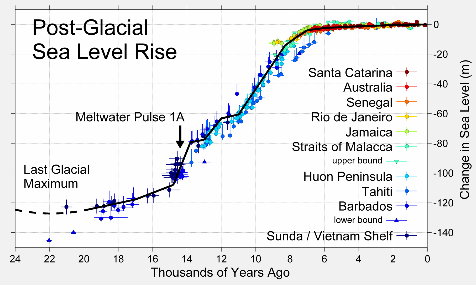
… but almost certainly significantly and causally correlated.
Cuffey (2000) estimates at least three meters, probably more than five during the Eemian: ftp://soest.hawaii.edu/coastal/Climate%20Articles/Cuffey_2000%20LIG%20Greenland%20melt.pdf
Not that it will happen right away, mind. IPCC’s worst case AR5 estimate is 82 cm by 2100. Remember to multiply by 100 … nearly one American football field of beach gone really should register as a significant problem best avoided.
john robertson,
Let’s keep in mind that +/- 1 C is an uncertainty “estimate” dp apparently pulled out of a hat. OTOH, GISS puts the uncertainty range at +/- 0.05 C for annual temps in recent years, +/- 0.1 C around 1900. x3 for monthly data. They, at least, went to the trouble of publishing their methods and reasoning for arriving at those figures. Why anyone would trust idle speculation from J. Random Internet d00dez over documented professional research is quite beyond me, but hey, to each their own.
I very much doubt any risk manager in their right mind would consider a coin-toss a good bet. OTOH, casinos and the Lotto are Big Business, so I perhaps should not be terribly surprised.
On that note, it’s my personal observation that the majority of participants in this forum consider whatever low-end bound they come across (or conjure out of thin air) the most likely for reasons I cannot discern from simple wishful thinking. And almost to a man (or woman) are DEAD certain that temperatures have not risen since 1998 based on lower troposphere (NOT surface) satellite estimates which don’t directly measure temperature at all.
The mind boggles.
Since 1998 the atmosphere has cooled, quite a bit as a matter of fact.
Right on cue. Well, let’s see, the latest from UAH says for 1998 annual mean (which is the mother of all cherry-picks) vs the same for 2014, the change is -0.29 C. Yet elsewhere on this very thread we have folk saying a 1 degree increase is nothing to worry about. So you’re calling ~1/3 of nothing to worry about, “quite a bit”. Funny how numbers preceded by a negative sign are more significant than ones which are positively signed, innit.
Like I said, the mind boggles.
Brandon Gates:
You say
Only a mind that is devoid of logical ability would be boggled by the greater importance of an observed negative trend in the data than an observed positive trend in the data when considering claims that a positive trend ‘should’ exist in that sub-set of the data.
And, as my above post to you, none of the data are meaningful because their error estimates are known to be wrong but it is not known how wrong they are.
Richard
Well Brandon, I am sorry your mind boggles so easily.
The surface record is clearly FUBAR, with adjustments since 2001 only 400 percent larger then their error bars, let alone far larger adjustments prior to that. The satellites are calibrated against very accurate weather balloons, are immune to UHI and homogenization, incorporation of old SST and ship bucket and intake readings, and confirmation bias, and clearly cover far greater area.
I am also sorry your boggled mind and so easily accepts one SL data set clearly contradicted by numerous data sets and other peer review reports, as well as millions of eyes all over the world from folk who live on the ocean and observe that fifty years from now they MAY need to take two steps back to keep their feet dry.
Currently active NOAA tide gauges average 0.63 mm/year sea level rise, or two inches by the year 2100.
University of Colorado (after yet more adjustments) claim five times that much. Eighty-seven percent of tide gauges are below CU’s claimed rate.
Reasonable minds rebel at FUBAR records being used to justify skyrocketing electrical rates and global government control.
Oh, BTW Mr. Mind-Boggled, 1998 it is not a cherry pick at all. It is the answer to a question…
How much has the earth’s atmosphere COOLED since its warmest year on record, and how long ago was that.
Now that is certainly a reasonable question to ask before trillions are wasted on CAGW mandates.
The answer is .3 degrees and 17 years ago. NONE as in ZERO of the climate models come CLOSE to duplicating that.
I did say thermometers (that survived) from the 1800s tended to read low, and I doubt if human eye readings could possibly be better than to the nearest degree (so a +/-0.5 degrees C. margin of error from that fact alone).
It could easily be, based on an assumed +/- 1degree C. margin of error, that there was really no warming since 1880 … or close to two degrees C. of warming.
.
The measurements are not accurate enough to be sure.
Based on the climate proxy work of geologists:
(1) They identified unusually cool centuries from 1300 to 1850, and
(2) Their ice core studies showed repeated mild warming / cooling cycles, typically lasting 1000 to 2000 years, in the past half million years,
… I think it would be common sense to guess the multi-hundred year cooling trend called The Little Ice Age, would be followed by hundreds of years of warming — let’s call this the Modern Warming, and estimate that it started in 1850 (not started by Coal power plants or SUVs).
It could last hundreds of years more, or it could have ended ten years ago, since the temperature trend since then has been flat. No one knows.
The Modern Warming is great news.
It was too cold for humans in The Little Ice Age, and green plants wanted a lot more Co2 than the air had in 1850, at least according to the wild guesses of Co2 levels based on ice cores. (of course I’m speaking on behalf of green plants and greenhouse owners).
I sure hope there really +2 degrees C.of warming since 1850 !
That would make the silly, wild guess, +2 degree C. “tipping point / danger line” look just as foolish and arbitrary as anyone with common sense already knows it is.
Of course I am that rare “ultra-denier” who wants MORE warming and MORE CO2 in the air.
I doubt if CO2 is more than a minor cause of warming, given the lack of correlation, but I’ll take more warming any way I can get it.
The only other choice is global cooling … or glaciation covering a lot more of our planet.
1,000 years of written anecdotes clearly shows people strongly preferred the warmer centuries.
And, getting personal, I live in Michigan and don’t want my state covered with ice again — I can’t ice skate.
richardscourtney,
1) The UAH v6 trend, when properly calculated using a linear regression instead of subtracting one end point from the other, is 0.001 C/decade.
2) When calculating trends on a subset of data, the analysis is so sensitive to choice of endpoint that spurious results are the default expectation, not the exception. For example, for the interval 2000-2010, the trends (C/decade) are as follows:
GISTEMP: 0.079
HADCRUT4: 0.029
UAH TLT v6: 0.033
Oh look, UAH agrees with HADCRUT4!
Same method for 1981-1999
GISTEMP: 0.203
HADCRUT4: 0.235
UAH TLT v6: 0.212
Oh look, UAH agrees with everything!
I can do this all day … picking cherries is easy for EVERYBODY.
3) The IPCC make it abundantly clear that future decadal trends from ensemble model means are not to be taken as gospel truth not only because THEY’RE DERIVED FROM MODEL OUTPUT with all the error and uncertainty that entails, but also because of the magnitude of decadal variability found in empirical observation.
4) From 1980-2015 I calculated the linear trend for all three products, calculated the annual difference from the predicted value, and took the standard deviation of the resulting residuals:
GISTEMP: 0.082
HADCRUT4: 0.087
UAH TLT v6: 0.142
Taken at face value, it would seem that the lower troposphere is more sensitive to change than the surface … consistent with GCM predictions. However, some of the “noise” in the UAH series could be due to larger error/uncertainty bounds. It’s difficult to tell because Spencer and Christy don’t publish annual uncertainty values as are done for GISTEMP and HADCRUT4 … only error estimates for long-term trends.
For sake of argument, let’s assume that the higher deviation in UAH is a reasonably real representation of annual temperature fluctuations. From that it follows that decadal trends could be similarly more sensitive.
I don’t know the answers. It’s my opinion that the experts don’t know either … there are many competing hypotheses which are not mutually compatible. I’d expect that an honest person who reviewed the extant literature would adopt the same attitude of uncertainty.
Yeah, and UAH publishes different error estimates than GISSTEMP and HADCRUT4.
David A,
It would be interesting to compare the magnitude of UAH TLT adjustments to their error bars.
1) Weather baloons: Po-Chedley (2012) disagrees with you: http://www.atmos.washington.edu/~qfu/Publications/jtech.pochedley.2012.pdf
See Table 1, top right of p. 4 in the .pdf.
2) immunity to UHI: um, yeah, the people who do this are aware of the issue … and deal with it. One paper of many: http://onlinelibrary.wiley.com/doi/10.1029/2012JD018509/full
3) immunity to bucket brigades: UAH doesn’t cover the time period when bucket vs. ERI vs buoys issues were at their most extreme, namely during and after WWII.
4) immunity to homogenization: no, there are outliers, biases and other gremlins in the raw satellite data which need to be, and are, handled as they become known.
5) immunity to confirmation bias: LOL! Spencer and Christie are robots? You’re killing me.
6) spatial coverage: Temporal coverage is an issue. If one is interested in temperature trends since increased industrialization, satelites won’t help.
And which datasets would those be?
What millions of people allegedly think about SLR is not exactly what I consider compelling evidence of anything.
Linear extrapolation applied to a non-linear phenomenon like ice sheet mass loss? Really?
http://climexp.knmi.nl/data/idata_grsa.png
http://climexp.knmi.nl/data/idata_anta.png
David A,
Ok, the COLDEST temperature anomaly on record for UAH v6 is -0.36 in 1985, through July 2015, 0.21, a warming of 0.57 C. Over the same interval, CO2 increased 54.6 PPMV. What’s the problem?
Eyah, because looking at one annual outlier and subtracting that value from one YTD value is SUCH a robust analytic method in a noisy data set representing processes which play out over multiple decades to centuries.
As I and others here have explained ad naseum the AOGCM runs used in IPCC ARs don’t even remotely attempt to model the exact timing of El Nino events because they’re designed to project climate outcomes based on various emissions scenarios, not to be 85-year weather forecasting systems. Were it not so, we’d be better off gazing into crystal balls or staring at randomly scattered chicken bones.
Richard Greene,
As good a reason for any to do bias adjustments as I can think of.
+/- 1 degree is a figure I’ve seen floating around, no idea its provenance, but it seems reasonable for sake of argument.
Well .. no, for two main reasons:
1) Measurement uncertainty improved over the course of time.
2) We expect “eyeball errors” to be normally distributed. So for 30 days of observations from just one station in 1880, the standard error of the mean will be much smaller than 1 C.
Low accuracy can be dealt with so long as the measurements are consistently inaccurate.
You’re not seriously implying that temperature proxies are more precise than thermometers … are you?
1) Ok sure.
2) With pretty clear 140 k year major glaciation/deglaciation cycles.
It may be common sense, but I’m telling you that common sense can and does fail you when dealing with complex physical systems. Temperature trends don’t spontaneously occur … there are physical reasons for them, and one big part of those proxy studies you mentioned goes well and beyond just figuring out what temperatures did … but why as well.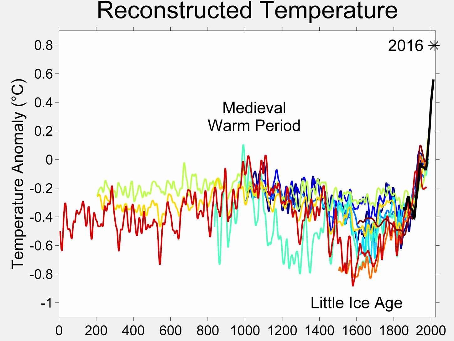
One thing to look at is not just the magnitude of change since 1850, but the rate at which it occurred:
If your what goes down must come up hypothesis holds any water, my own naive assumption would be that the rate of the rebound would be similar to the decline. I’m not seeing it.
I have a pretty good idea why the surface temperature slowdown: prolonged period of La Nina conditions, plateauing of the AMO, and a slight decline in solar output. These notions come from reading the literature, and confirming it by crunching the data — a LOT of data — myself.
lol, you hold up proxy data to support your argument for temperature trends, but for CO2 they’re just wild guesses.
Humans and plants made it through 180 PPMV CO2 and -6 C degree temps. My sense is that it’s not the absolute values of CO2 and temperature which are most important, but rates at which those things change. One argument for the success of our species is the relative stability of temperatures in the 10,000 or so years of the Holocene as compared to volatility of the several hundred thousand years prior. I’m inclined to put stock in that argument because any mass extinction I can think of has been tied to very rapid global climate changes … including both rapid warming or cooling.
There’s a hard upper limit to human ability to tolerate heat: 35 C wet bulb temperature. Spend several days in those kind of temperatures and you will assuredly die.
I’ve never seen it written that 2 C is a tipping point. I have seen it written that it is mainly intended as a policy target which some experts considered feasible to stay below IF significant emission reductions were undertaken in a timely fashion. Which has not happened. As such, for the Obama Administration, apparently 3 C is the new 2 C.
On a less tongue-in-cheek note, the way I understand it is that risk increases as temperature does, and that there’s no temperature in the IPCC’s worst-case nightmare scenario at which everybody dies.
Lack of correlation? Try looking at data prior to 1998.
While that was a passing notion promoted by some researchers in the 1970s, we know quite a bit more about Milankovitch orbital forcing cycles these days. According to that theory we’re in a sweet spot of the cycle where the decline of insolation at high northern latitudes is quite shallow … as in not enough to trigger a full-on ice age … and actually due for a another upturn within the next few centuries. This really is not a system following a completely indecipherable “random” walk.
I’m sure there are some equatorial countries with favorable immigration policies that would let you move there right now. I’ve been to one … I loved everything except the oppressive heat. The locals were fine with it of course, having adapted to it over their many generations … but see again, no human can survive 35 C wet bulb temps for days on end and live to tell about it. If there’s any hard do-not-cross threshold in this topic, that would be it.
Also note: 1,000 years ago, world population was somewhere between 250-320 million people. Bit more freedom to move, much less built up infrastructure adapted to local conditions … basically not what I consider a reasonable comparison.
Let me put it this way: if several degrees cooling was the concern, I would see plenty of risk for some of the very same reasons you’ve cited, and would still be of the mind to stabilize temperatures as close to present levels if at all possible.
If there’s anything most working climatologists are NOT alarmed about, it’s a return of glaciers to any part of Michigan … not even the northernmost parts.
Brandon Gates:
Your irrelevant twaddle supposedly in response to my post here says
Yes, of course you can, and you do it all the time.
But none of that is relevant to the contents of my post which it purports to answer.
And hereI have refuted other untrue nonsense from you in this thread.
Richard
Response to Brandon’s response…
David A, says
Oh, BTW Mr. Boggled, 1998 it is not a cherry pick at all. It is the answer to a question…How much has the earth’s atmosphere COOLED since its warmest year on record, and how long ago was that?
Brndon Gates says…Ok, the COLDEST temperature anomaly on record for UAH v6 is -0.36 in 1985, through July 2015, 0.21, a warming of 0.57 C. Over the same interval, CO2 increased 54.6 PPMV. What’s the problem?
======================================================================
There is no problem. The pause turned into .3 degrees cooling over the last 17 years. Really, it did. Heat is not the mean of a smoothed five year tend line. The atmosphere was far warmer in 1998 then it is now. 1998 was the warmest year on record. The atmosphere has cooled .3 degrees since 1998. If YOU must put a cooling rate on that, the atmosphere is cooling at about 1.8 degrees per century. It has warmed about .4 degrees in the 46 years of the data set record.
=====================================================
Brandon quotes David A “Now that is certainly a reasonable question to ask before trillions are wasted on CAGW mandates.
Brandon says… Eyah, because looking at one annual outlier and subtracting that value from one YTD value is SUCH a robust analytic method in a noisy data set representing processes which play out over multiple decades to centuries.
=====================================================================
Brandon what was the question. It was, “How much has the earth’s atmosphere COOLED since its warmest year on record, and how long ago was that? Again Heat is not the mean of a smoothed five year trend, it is what it is, when it is gone, guess what, it is no longer there. The answer could have been 0 days and it is warmer, not cooler, but that did not happen. When the answer is already two decades, and over that period the answer is cooling not warming, and over that period, and over the entire data set the climate models predict three times the warming that did occur, there is no reason to spend trillions on a broken busted theory when the only consistent evidence for anything from additional CO2 is increased crop yields.
===================================================
Brandon quotes the anser to the question…The answer is .3 degrees and 17 years ago. NONE as in ZERO of the climate models come CLOSE to duplicating that.”
Brandon says….”As I and others here have explained ad naseum the AOGCM runs used in IPCC ARs don’t even remotely attempt to model the exact timing of El Nino events because they’re designed to project climate outcomes based on various emissions scenarios, not to be 85-year weather forecasting systems. Were it not so, we’d be better off gazing into crystal balls or staring at randomly scattered chicken bones.”
=================================================================================
Brandon, I am sorry now that you feel both ill and your mind is boggled. However you entirely missed the point of my comment.
None, as in ZERO of the climate models can produce a world where increased CO2 causes the surface to warm to record levels by a few hundredth of a degree, and the bulk of the atmosphere to cool by ten times the claimed warming, which is what the failed surface data sets show.
However the rest of your comment is of no value either. Let us discuss ENSO and CO2 emissions. Since our emissions are on track with Hansen’s highest emission scenarios, and since the atmosphere has not warmed at all and the atmosphere is in fact cooler then it was 17 years ago, and this years super duper El Nino does not appear to be getting us close to 98 warmth either, there is perhaps, oh say a 50/50 percent chance that your chicken bones would beat the failed climate models, but again, you missed the point.
NONE, as in zero of the climate models are remotely close over the past two decades or the entire data set, to getting the bulk of the atmospheric T correct. Also we have had multiple positive and negative ENSO events over this period, and the postive ENSO events in 1998 including the AMO at that time, likely explain what little warming there actually was. ENSO works both ways, so you can not claim it caused the cooling in the troposphere since 1998, but had nothing to do with the warmth.
So Brandon, why is the world spending trillions over a scientific method no more accurate then the casting of chicken bones?
Response to Brandon G;s response.
Brandon quotes me,
The surface record is clearly FUBAR, with adjustments since 2001 only 400 percent larger then their error bars, let alone far larger adjustments prior to that.
Brandon says…It would be interesting to compare the magnitude of UAH TLT adjustments to their error bars.
============
Be my guest, but please compare against the total changes over time including the lowering of the past 1980 ish NOAA graphics.
==============================
Brandon quotes D.A. The satellites are calibrated against very accurate weather balloons, are immune to UHI and homogenization, incorporation of old SST and ship bucket and intake readings, and confirmation bias, and clearly cover far greater area.
Brandon says…
1) Weather baloons: Po-Chedley (2012) disagrees with you: http://www.atmos.washington.edu/~qfu/Publications/jtech.pochedley.2012.pdf
See Table 1, top right of p. 4 in the .pdf.
———————————————————————————————————————–
Brandon, The paper you linked is about small changes and advocates the need for RSS and UAH to more closely aligned, which they now are, and both data sets are indeed verified by the weather balloons. I am not certain how discussion of a radiosonde mean estimate for UAH of 0.051 plus or minus 0.031 for the period of January 1985 to February 1987 disputes this contention.
—————————————————————————————————————–
Brandon continues…
2) immunity to UHI: um, yeah, the people who do this are aware of the issue … and deal with it. One paper of many: http://onlinelibrary.wiley.com/doi/10.1029/2012JD018509/full
====================================================================
Brandon likes to ignores the papers that demonstrate how UHI is poorly dealt with. Since the publication of those papers the homogenization of UHI to rural areas has increased, with USHCN now making up up to fifty percent of their data. The satellites are non controversial in this manner, and are verified by weather balloon readings, the most accurate thermometers we have. There is little doubt that this is part of the reason for the impossible physics of the divergence between the surface and the satellites One of them is wrong, and the evidence strongly points to the surface.
========================================================================
Brandon contnues…
3) immunity to bucket brigades: UAH doesn’t cover the time period when bucket vs. ERI vs buoys issues were at their most extreme, namely during and after WWII.
==========================================================================
Who said they did. I just pointed out that they are immune to such problems which vastly increase the error bars of the surface record.
===========================================================================
Brandon continues….
4) immunity to homogenization: no, there are outliers, biases and other gremlins in the raw satellite data which need to be, and are, handled as they become known.
=============================================================================
Yes Brandon, and those relatively small adjustments, compared to up to 50 percent of valid USHCN stations not even being used and those records adjusted by stations up to 1000 K away, are verified by weather balloon readings verses the speculative nature of the surface changes, many of which are not even discussed, they just continue to happen.
===============================================================================
Brandon continues….
5) immunity to confirmation bias: LOL! Spencer and Christie are robots? You’re killing me.
=====================================================================
Ok Brandon, we get it, Your mind is boggled, your feel flu-like, and now you are dying…
Confirmation bias is classic social science, the primary factors involving finance, peer pressure, and career advancement. Hundreds of posts have been written and sections of numerous books have been dedicated on how these factors come into play to move Universities and University Scientists into promoting the CAGW agenda. Thousands of articles have been written that promote the ever missing100 percent failed predictions of this politically driven drivel. There is no remote similar evidence of the opposite happening. Spencer and Christie have none of the classic reasons for confirmation bias.
=========================================================================
Brandon continues…
6) spatial coverage: Temporal coverage is an issue. If one is interested in temperature trends since increased industrialization, satelites won’t help.
==============================================
So you agree the spatial coverage of the surface record is poor even now compared to the satellites. I never asserted that the satellite record is long, only that it is more accurate and spatial coverage is one of many reasons for that accuracy, and the divergence is a huge problem for the CAGW community.
==============================================
Brandon continues
I am also sorry your boggled mind and so easily accepts one SL data set clearly contradicted by numerous data sets and other peer review reports …
And which datasets would those be?
============================================================
Several discussed here… http://joannenova.com.au/2014/08/global-sea-level-rise-a-bit-more-than-1mm-a-year-for-last-50-years-no-accelleration/
It is actually similar to the surface satellite divergence issue only reversed, with however very logical regions to accept that the satellite T record is more accurate, and the TREND in the tide gauge record is more accurate. More papers available here. Also go to Poptech for additional papers. http://scienceandpublicpolicy.org/images/stories/papers/reprint/the_great_sea_level_humbug.pdf
============================================================================
Brandon continues to quote me …… as well as millions of eyes all over the world from folk who live on the ocean and observe that fifty years from now they MAY need to take two steps back to keep their feet dry.
Brandon says…
What millions of people allegedly think about SLR is not exactly what I consider compelling evidence of anything.
=======================================================================
The fact that millions of people who have lived all their lives on the coast, and have never been impacted by rising global sea levels that are suppose to have displaced millions by now or soon, with ZERO sign of that happening, is cogent to me, and them, regardless of your take on it.
====================================================================
Brandon continues, quoting me……
Currently active NOAA tide gauges average 0.63 mm/year sea level rise, or two inches by the year 2100.
Brandon responds…
Linear extrapolation applied to a non-linear phenomenon like ice sheet mass really?
=========================================================================
We are not discussing your one sided view of ice loss. Do you wish to?
Tide gage TRENDS over time are accurate, as land flux changes, up or down are very slow and not temporally relevant to most current studies, and so the trend is accurate. The gauges show no acceleration whatsoever. They would if there was. Also we DO NOT live in the maladjusted satellite sea level arena, we live where the gauges are. The paper I linked to above discusses the tide gauge trends in detail. Expand your mind Brandon so it does not boggle so easily and make you feel nausea and like you are dying.
David A,
I would were it not for two things:
1) It’s your argument, not mine.
2) UAH doesn’t publish error estimates for either monthly or annual means.
Read Mears (of RSS) (2012) on the difficulty of determining whether balloons or MSUs are better at representing troposphere temperature trends: http://onlinelibrary.wiley.com/doi/10.1029/2012JD017710/full
Well now, I consider that a fair point. Upon closer reading, Po-Chedley also limited the analysis to NOAA-9. It appears that Mears (2012) does a more comprehensive analysis, and being that his day job IS producing temperature time series from MSUs, I think his is the more credible paper.
Such as ____________________?
I can’t parse the meaning of, “homogenization of UHI to rural areas has increased”. How is this measured? How much of an increase? What are the implications? What is your source of this information?
I find I’m out of creative ways to rebut this mantra. Read Mears (2012), particularly the parts where he discusses the various bias adjustments necessary to homogenize — yes, homogenize — radiosonde time series.
They’re both wrong.
And I am pointing out that when the questions involve temperature changes since the beginning of industrialization, we need data that extend back to that period of time. Satellites are 100% useless for determining trends from the mid to late 1800s regardless of their purported accuracy.
1) Please quantify the relative adjustments. With references. Thanks.
2) USHCN station dropoff effect on global temps (Zeke Hausfather):
http://rankexploits.com/musings/wp-content/uploads/2010/03/Picture-98.png
The full post with lots of other pretty pictures: http://rankexploits.com/musings/2010/a-simple-model-for-spatially-weighted-temp-analysis/
Yes, and nobody is immune. Not Spencer. Not Christy. Not even me.
He’s here all the week, folks. Oi. My sides ache.
No.
Bizarre.
A preprint of Beenstock (2015) can be found here: http://econapps-in-climatology.webs.com/SLR_Reingewertz_2013.pdf
Here’s the salient portion of their conclusion:
The substantive contribution of the paper is concerned with recent sea level rise in different parts of the world. Our estimates of global SLR obtained using the conservative methodology are considerably smaller than estimates obtained using data reconstructions. While we find that sea levels are rising in about a third of tide gauge locations, SLR is not a global phenomenon. Consensus estimates of recent GMSL rise are about 2mm/year. Our estimate is 1mm/year. We suggest that the difference between the two estimates is induced by the widespread use of data reconstructions which inform the consensus estimates. There are two types of reconstruction. The first refers to reconstructed data for tide gauges in PSMSL prior to their year of installation. The second refers to locations where there are no tide gauges at all. Since the tide gauges currently in PSMSL are a quasi-random sample, our estimate of current GMSL rise is unbiased. If this is true, reconstruction bias is approximately 1mm/year.
Boiled down to its essence: since SLR is not constant at all locations and because it is negative in some locales, SLR is not global. Which is a stretch. Then they immediately contradict themselves by saying the global mean is 1 mm/year … which is significant because the consensus estimate is double because it relies on (biased) data reconstructions (which are necessarily wrong, because all data reconstructions are BAD).
“IF this is true …” Well, I have to give them credit for allowing uncertainty in their findings. You? Not so much.
Also to their credit, next paragraph says:
In the minority of locations where sea levels are rising the mean increase is about 4 mm/year and in some locations it is as large as 9 mm/year. The fact that sea level rise is not global should not detract from its importance in those parts of the world where it is a serious problem.
Yes I get that. Anecdote is something you consider compelling. I do not.
Please supply the source of the “now or soon” prediction. Best if that comes from a source which is providing information intended for policy makers … like the IPCC.
Yes I know “we” aren’t discussing it.
By all means.
Not a word about landed ice loss acceleration in any of that. Color me shocked.
Try understanding the concept of convergence of multiple lines of evidence, and then perhaps I won’t get gigglefits when you lecture me about mind expansion.
Brandon Gates is desperately nitpicking throughout this exchange, trying to support his belief in dangerous man-made global warming (MMGW). But his nitpicking misses the big picture:
There has been no global warming for almost twenty years now.
In any other field of science, such a giant falsification of the original conjecture (CO2=cAGW) would cause the proponents of that conjecture to be laughed into oblivion.
But that hasn’t happened, and the rest of us know the reason:
Money.
Federal grants to ‘study climate change’ in the U.S. alone total more than $1 billion annually. That money hose props up the MMGW narrative. But there is one really big fly in the ointment:
So far, there has never been any empirical, testable measurements quantifying the fraction of man-made global warming (AGW) out of total global warming, including solar, and the planet’s natural recovery from the LIA, and forcings from other natural sources.
Science is all about data. Measurements are data. But there are no quantifiable measurements of MMGW. None at all. No measurements of AGW exist. How does the climate alarmist clique explain that? They can’t. So they rely on nothing more than their data-free assertions.
The entire “dangerous MMGW” scare is based on nothing but the opinon of a clique of rent-seeking scientists, and their Big Media allies, and greenie True Believers like Gates and his fellow eco-religionists. The “carbon” scare is based on nothing more than that. It is certainly not based on any rational analysis, since global warming stopped many years ago. Almost twenty years ago! That fact has caused immense consternation among the climate alarmist crowd. Nothing they can say overcomes that glaring falsification of their CO2=CAGW conjecture.
The endless deflection and nitpicking, the links to blogs run by rent-seeking scientists and their religious acolytes, and the bogus pronouncements of federal bureaucrats running NASA/GISS and similar organizations for the primary purpose of their job security, are all trumped by the plain fact that their endless predictions of runaway global warming and climate catastrophe have never occurred. EVERY alarming prediction made by the climate alarmist crowd has failed to happen. No exceptions.
Fact: There is nothing either unusual or unprecedented happening with the planet’s ‘climate’ or with global temperatures. What we observe now has been exceeded naturally many times in the past, when human emissions were non-existent. The current climate is completely natural and normal. If Gates or anyone else disputes that, they need to produce convincing testable evidence. But so far, the alarmist crowd has never produced any testable, verifiable evidence quantifying MMGW (AGW).
Because there is no such evidence. The only credible evidence we have shows that the current warming trend is completely natural:
http://jonova.s3.amazonaws.com/graphs/hadley/Hadley-global-temps-1850-2010-web.jpg
As we see, the recent warming step changes have happened repeatedly in the past, when human CO2 emissions were negligible to non-existent. What is happening now has happened before, and it will no doubt happen again. But there is no empirical, testable evidence showing that CO2 has anything to do with global T. It may. But if so, its effect is simply too minuscule to measure. CO2 just does not matter.
That chart is derived from data provided by Dr. Phil Jones — one of the warmist cult’s heroes. If any alarmists have a problem with that, they need to take it up with Dr. Jones. The rest of us have yet to see any credible evidence showing that the current ‘climate’ and global temperatures are anything but completely normal and natural.
dbstealey,
Thus begins another Stealey patented boilerplate Gish Galloping stump speech … which don’t actually address any of my specific, well-cited, points — or as he calls it, “nitpicking”. I think he missed his calling as court jester.
For every thousand times you trot out this unsupportable statement …
http://climexp.knmi.nl/data/itemp2000_global.png
… I easily rebut it 1,001 times with data you assiduously ignore. I think “the rest of us know the reason”.
[looks up]
[grins at the irony]
Call Dr. Freud, you appear to be slipping.
Yah. Rising AMO and solar output:
http://1.bp.blogspot.com/-o4vtAlhwkrI/VTrVEyu5ceI/AAAAAAAAAcs/MuA5KTmbm5I/s1600/HADCRUT4%2B12%2Bmo%2BMA%2BForcings%2Bw%2BTrendlines.png
The dotted green line is a model which includes both of those, plus volcanic aerosols, length of day anomaly and ENSO. R^2 in the high 90s. This stuff is not so magical and unfathomably mysterious as you would have your followers believe.
Remove the CO2 from the regression and the model goes as belly-up as your latest deluge of red herring.
Ayup, DB’s got no problem with surface temperature data. You read it here first.
The problem is not with Dr. Jones, but your (mis)interpretation of what else that plot shows … namely that pauses in the record have occurred in the past and they’ve ended after a period of about 30 years. By your “logic”, we’ve got about 10 years of “pause” to go.
Your most glaring error is your failure to notice that each subsequent uptrend ends at a higher point than the previous one. Simple addition and subtraction using the source data will get you there as obviously your eyeballs have failed to see it.
Actually, trends do spontaneously occur when the data is autocorrelated. The AR1 autocorrelation of GISS temperature is at least 0.54. So trends occur naturally by random chance. I’m not going to repost stuff that’s in a thread below but there’s a way of determining whether any part of a signal is due to random chance or due to measurable physical phenomena.
See this paper, in particular Figure 3. Note as the period increases the confidence that it’s not noise goes down.
http://citeseerx.ist.psu.edu/viewdoc/summary?doi=10.1.1.28.1738&rank=1
Peter
Peter Sable,
I see similar things about random chance written in consensus climate literature, and it drives me bats because I think it’s sloppy and unphysical. Weather, and therefore climate, are deterministic phenomena following a chain of causality. What people generally mean by “random” in this context is “unpredictable”. The better term would be “chaotic”. Sometimes we can broadly suss out causality after the fact. You’ve been discussing ENSO as an example, and I agree with you on that point. However: try predicting the next El Nino years in advance, and it’s all but certain abject failure will be the result.
In case you’ve not read it, try Lorenz (1962), Deterministic Nonperiodic Flow: http://journals.ametsoc.org/doi/pdf/10.1175/1520-0469%281963%29020%3C0130%3ADNF%3E2.0.CO%3B2
From your August 30, 2015 at 12:44 pm response to Willis:
When you detrend the entire series, it stands to reason that you’re not going to find the long term signal we’re looking for.
See again my question to you from this post: http://wattsupwiththat.com/2015/08/28/how-fast-is-the-earth-warming/#comment-2017954
2) As this level of math is well above my paygrade, please explain to me how a wavelet analysis is feasible — or even desireable — when the hypothesized driving driving signal isn’t periodic … and even if it was, has not completed a complete cycle?
… which was part of our discussion about Torrence and Compo (1998).
For an example of what I mean by “driving signal”, check out Landais (2012), Towards orbital dating of the EPICA Dome C ice core using δO2/N2: https://hal.archives-ouvertes.fr/hal-00843918/document
This seems a more appropriate use of wavelet analysis.
Brandon Gates August 31, 2015 at 12:59 pm
While his terminology may not be of the best, his point is clear. Trends in autocorrelated data are much more common than in random “white noise” data. And while in nature as you point out they are not “random”, in random autocorrelated data they are indeed random.
And in either case, regardless of their cause, this is important when determining statistical significance.
All the best to you,
I don’t understand that at all. If you have a 100-year cycle in a thousand years of data which contains an overall trend over the period of record, detrending the data will do nothing to our ability to identify the 100-year cycles. What am I missing?
w.
Willis,
I’m with you.
Sure. At risk of beating the point to death, I’m saying we should not then make the mistake of thinking of the underlying processes as “truly” random just because we modeled a statistical test that way. That is all.
I guess I missed it that he was running this over 1,000 years of data looking for 100 year cycles. Starting with this post: http://wattsupwiththat.com/2015/08/28/how-fast-is-the-earth-warming/#comment-2017285
… my impression is that he was attempting to compare his wavelet analysis to Sheldon’s results using HADCRUT4.
Cheers.
The article simply asks how fast the planet is warming. But Boggleboi is arguing with everyone, as usual, about every nitpicking thing. That’s a tactic to distract from the plain fact that the planet hasn’t been warming at all:
http://realclimatescience.com/wp-content/uploads/2015/06/ScreenHunter_9549-Jun.-17-21.12.gif
I’m surprised the Boggled one doesn’t trot out his Marcott nonsense again:
http://www.realclimate.org/images//Marcott.png
dbstealey,
No kidding.
Note that DB can’t be troubled to point to any particular examples. Or explain why they’re “nitpicky”.
ROFL! Take it up with the author of the top post:
And since you apparently didn’t even read the article, allow me to highlight this point from the body text:
1) There is no cherry-picking of start and end times with this method. The entire temperature series is used.
Compare to the method used to generate the plot you just posted.
GISSTEMP??
To quote a certain religious True Believer: “ROFL!”
GISTEMP is simply not credible. So let’s use the best global T measurements available: satellite data.
The endlessly predicted runaway global warming never happened. If the planet is warming, it’s not warming measurably. The plain fact that global warming has stopped for nearly twenty years would make any rational person re-assess their ‘dangerous AGW’ conjecture.
But not Brandon Gates. His mind is made up and closed tight. He staked out his position early on, and nothing is gonna change it now. That’s because he would have to admit he was wrong. Only honest scientists do that. The rest make excuses, pontificate, deflect, misrepresent, and argue endlessly, nitpicking everything to the point that most readers just move on.
Planet Earth is showing everyone that the alarmist cult was flat wrong. Does it surprise anyone that they can’t admit it?
Day to Day Temperature Difference


This is a chart of the annual average of day to day change in min temp.
(Tmin day-1)-(Tmin d-0)=Daily Min Temp Anomaly= MnDiff = Difference
For charts with MxDiff it is equal = (Tmax day-1)-(Tmax d-0)=Daily Max Temp Anomaly= MxDiff
MnDiff is also the same as
(Tmax day-1) – (Tmin day-1) = Rising
(Tmax day-1) – (Tmin day-0) = Falling
Rising-Falling = MnDiff
Average daily rising temps
(Tmax day-1) – (Tmin day-1) = Rising
Normalized Day to day difference with Daily Solar Forcing(WattHrs) and Rising temps
Yearly Average Min and Max Diff w/trend line Plus Surface Station count.
Day to Day Seasonal Slope Change
If you plot daily MnDiff daily for a year, it’s a sine wave.
You can take the slope of the months leading up to and past the zero crossing,
both for summer (cooling) and winter (warming)
and plot thoses.
Global
Southern Hemisphere
is flat, other than some large disturbances in the 70’s and 80’s, and then again 2003.
Northern Hemisphere has a slight curve. A disturbance in 1973 when surface stations were changed,
And 1988
There are a number of regions with few stations, making some areas susceptible to large fluxuations,
or it could be a real disturbance in temps, they are timely to the transistions in the
Ocean cycles and the warm cycle and the start of the cooling cycle.
US Seasonal Slope
The US has the best surface station coverage in the world.
Eurasia Seasonal Slope
Northern Hemisphere w/trend line
Southern Hemisphere w/trend line
Surface data from NCDC’s Global Summary of Days data, this is ~72 million daily readings,
from all of the stations with >360 daily samples per year.
Data source
http://sourceforge.net/projects/gsod-rpts/
ftp://ftp.ncdc.noaa.gov/pub/data/gsod/
This comments section grossly exceeded my average ability to process; I concede victory to the blathering experts. BTW, what happened to the pause?
The pause turned into .3 degrees cooling over the last 17 years. Really, it did. Heat is not the mean of a smoothed five year tend line. The atmosphere was far warmer in 1998 then it is now. 1998 was the warmest year on record. The atmosphere has cooled .3 degrees since 1998. If you must put a cooling rate on that, the atmosphere is cooling at about 1.7 degrees per century.
The “pause” was “adjusted” during yet another “adjustment” to cool the warm 1930’s — two “adjustments” for the price of one.
The “pause” was really irritating the climate doomsayers — they had hoped calling it a “hiatus” would have disguised the truth, and it almost worked.
For years I thought a “hiatus” was a medical condition involving the abdominal muscles, and had nothing to do with the climate.
Both “pause” and “hiatus” are propaganda terms, because they strongly imply the 1850 Modern Warming will resume, which no one actually knows.
The climate astrologists know their computer games are right, so the raw data collected in the field must be wrong, therefore it needed “adjusting” to make them right.
After all, real science is sitting in air conditioned offices,
playing computer games,
on the government dole,
while making scary climate predictions that get you in the media
… while you tell friends at cocktail parties that you are working “to save the Earth”
After sufficient “adjustments”, my photograph, at age 60+, looks just like Sean Connery when he was a swimsuit model.
Long live “adjustments”!
Climate doomsaying really has nothing to do with science — it’s politics — the governments paying for the scary predictions could not care less about honest science — so sometimes I can’t take this subject seriously, as the real scientists here do. … I do have a BS degree, but forgot everything the day after receiving my diploma.
Earth is now cooling under rising CO2, just as it did from about 1945 to 1977. The anomalous excursion was the slight warming, also under rising CO2, of 1978-96, when temperature just happened accidentally to go up along with the beneficial, plant food, essential trace gas carbon dioxide.
So for more than 50 of the past 70 years of monotonously climbing CO2, planet earth has cooled.
I did a little playing around with the lengths of your boxcar (moving average) filters and I’m finding those little peaks (e.g the small ones at 1925 and 1980 ) are very sensitive to how long your filter window is (especially the one where you take the slopes, aka the difference).
When publishing this kind of analysis you should also publish a sensitivity analysis alongside it.
Basically, you are doing one slice of a wavelet decomposition on the difference using a boxcar wavelet (aka moving average). This is a pretty poor choice of wavelets for this type of work. Also, by failing to do the full wavelet decomposition you are not showing where the strong locii of energies are at and which ones are relatively weak (such as 1925 and 1980 are weak, but 1938 is very strong).
What makes a boxcar wavelet an even poorer choice is using it on a difference signals. Difference signals have a blue noise type of spectrum and the poor filtering characteristics of a boxcar filter are especially prone to aliasing and phase distortion on blue noise.
I suggest you find a tool that can do wavelet decomposition and publish that result. It’d be more accurate and interesting. (alas Octave doesn’t have a wavelet library, I’m still hunting around for an open source version).
Peter.
Example:
http://paos.colorado.edu/research/wavelets/wavelet2.html
Sounds about as convincing as Sheldon’s reasons for using a boxcar filter ! Not encouraging.
sorry actual paper: http://citeseerx.ist.psu.edu/viewdoc/download?doi=10.1.1.28.1738&rep=rep1&type=pdf
Abstract looks like it be useful but I can’t find a link to the paper on that page. Do you have a link to anything more than the abstract?
Weird this link works for me:
http://citeseerx.ist.psu.edu/viewdoc/download?doi=10.1.1.28.1738&rep=rep1&type=pdf
The citeseer page, I grabbed the cached copy. If you don’t know how to use citeseer, you should learn, it’s very useful when doing “open source” science.
http://citeseerx.ist.psu.edu/viewdoc/summary?doi=10.1.1.28.1738&rank=1
Peter
Peter, you are definitely one of the more technically competent commenters here so I’m rather surprised you write this. It clearly depends what data is, as much as whether is a difference.
Temperatures are highly autocorrelated for obvious reasons and have a ‘red’ spectrum, so on the contrary it is likely the dT/dt will have a more random, white spectrum rather than a ‘blue’ one.
While you could technically argue that a ‘boxcar’ filter is one part of a wavelet analysis, it clearly isn’t because no sane person would use rectangular wavelet and one run is not ‘part of’ anything else it is just a crappy, distorting pseudo low-pass filter used by people who do not even know they are trying to use a low-pass filter.
Mike August 29, 2015 at 9:52 pm
Thanks, Mike. Temperature assuredly has a “red” spectrum, meaning positively autocorrelated. Modeling HadCRUT4 as an ARIMA function with no MA (moving average), we get:
Call:
arima(x = hadmonthly, order = c(1, 0, 0))
Coefficients:
         ar1  intercept
      0.8928    -0.1069
s.e.  0.0102     0.0289
But the dT/dt of the Hadcrut data is just as assuredly blue, viz:
Call:
arima(x = diff(hadmonthly), order = c(1, 0, 0))
Coefficients:
          ar1  intercept
      -0.3714     0.0006
s.e.   0.0210     0.0022
w.
Sorry, I was referring to temperature difference data which as Willis just looked at is blue. It was probably wrong to apply it generically. Hacking Octave and posting too fast. Differences in general remove low frequencies so the general movement towards “blueness” is conceptually correct but I could probably make a more accurate general statement with more experiments but it’s not important, so I won’t.
Thanks Willis for the check on Hadcrut4. I’m looking at GISS 201505 with poor tools in Octave and I’m getting 0.77. I’m still learning this procedure though… BTW did you detrend the data first? It’s definitely not stationary if you don’t…
Using https://onlinecourses.science.psu.edu/stat510/node/33 as a reference and minimizing use of built in functions so I can get a feel for the underlying math…
Peter
Willis, I think I’ve found a gun that might be smoking, see above post about whether a temperature signal is distinguishable from noise.
I’m finding at least for GISS that the global temperature history is indistinguishable from red noise. According to Torrence and Compo they can distinguish ENSO in SST but that’s it. I really like their technique of looking at frequency (period) bins and seeing if there’s a signal that’s above 95% CI against red noise.
Wish I could get your email address, would love to correspond. Anthony is free to give you mine, not sure how this works around here…
http://citeseerx.ist.psu.edu/viewdoc/summary?doi=10.1.1.28.1738&rank=1
Paper here:
BTW here’s a very rough draft (not up to my usual standards) of GISS temperature data versus hopefully equivalent red noise. ?dl=0
?dl=0
Basically, the 1 year and 2 year signals are significant (well duh), blue moon interval of 2.7 years might be interesting (p=0.2), and possible ENSO spikes. The rest is indistinguishable from red noise. This tells me that trying to elicit a C02 signal from the temperature data is impossible. The lower frequency the signal you are looking for, the bigger the errorbars. A trend is as low frequency as it gets…
Source code:
https://www.dropbox.com/sh/qi9h70otb2p9j9h/AABPE2Uf-s8xe8iGGr1BhQULa?dl=0
Peter
Reference: http://citeseerx.ist.psu.edu/viewdoc/summary?doi=10.1.1.28.1738&rank=1
As usual, I found bugs. Scaling the red noise is fairly difficult. I found two grotesque errors and some subtle ones. The major error was taking the RMS of the non-detrended signal (whoops) and also not reading the paper closely for the method to turn an ar1+ar2 into an ar1 model for generating the red noise. You’ll note a change to the exponent in the title. ?dl=0
?dl=0
I also tried using an ARM model to generate the noise, because ar2 is significant according to an ARM on the residuals. Scaling that model proved more difficult. At any rate, there are some likely ENSO signals that are now shown as significant. I still have this nagging suspicion about aliasing lunar cycles (there’s a peak there, the “blue moon” peak @ur momisugly 2.7 years) but it could also be an ENSO peak. I’d need hourly or daily records for 80+ years to be sure…
My conclusion is still unchanged. with an autocorrelated series the “it’s random” null hypothesis has very wide confidence intervals at low frequencies and thus there’s no way to determine that any part of the signal is caused by C02. I also have low confidence in any attempt to relate solar cycles or natural cycle XYZ to temperature. There’s simply not enough data to distinguish from random noise.
Source code same as link above. New graph:
Peter
It’s all fraud –
“From: Tom Wigley
To: Phil Jones Subject: 1940s
Date: Sun, 27 Sep 2009 23:25:38 -0600
Cc: Ben Santer
It would be good to remove at least part of the 1940s blip, but we are still left with “why the blip”.
http://realclimatescience.com/2015/08/spectacular-fraud-on-the-other-side-of-the-pond/
There seems to be a form of circularity in the method of analysis. In calculus terms, a moving average is an integral, while the slope is a derivative. The two operations effectively cancel. What presumably results in this setting is some sort of approximation to a centered difference between temperatures 10 years apart. Nothing wrong with that, but a rather indirect way of getting something along those lines.
Yep. First thing I do when playing around with this type of thing is delete some operations to see if this has any effect. I also put in red noise, white noise, ramps, step functions, and impulse functions because you should be able to predict the results of those waveforms from basic principles, and if you don’t get the expected result, you need to fix something.
Peter
Following the highly appreciated comment by Dr. Brown (rgbatduke) at
http://wattsupwiththat.com/2015/08/28/how-fast-is-the-earth-warming/#comment-2017769
I decided to redo CruTem4 spectrum but for a limited period (just happen to be 121 years), which may be more representative of the reality.
http://www.vukcevic.talktalk.net/CT4-Spectrum2.gif
I am wondering if I can get you to look at the data I’ve generated from NCDC, GSoD
https://sourceforge.net/projects/gsod-rpts/files/Reports/
The Yearly Continental zip has both global and regional scale spreadsheets.
In particular the MnDiff (Tmin day-1) – (Tmin day 0) shows a strong regional component. These are Yearly averages of daily anomalies.
There are also many different scales (1×1, 10×10, latitude bands) Plus there’s Daily reports of the many of the same areas. The daily reports would have a very strong yearly cycle (as you would expect), and it should have much the same yearly components.
MxDiff (Tmax d-1)-(Tmax d0) shows very little variation, basically no carry over of maximum temperatures from one year to the next.
Hi micro
Thanks for your note. I’ll be away from home and my pc for the most of September (many readers may be pleased to hear that) but I will eventually look at the files, time permitting.
Thanks!
I think it’ll be worth the effort, it’s unmolested actual surface data, as opposed to the various published dregs.
This isn’t to say temps have not gone up during the summer in some areas (and quite possibly have gone down in other areas), just that there’s no loss of nightly cooling from Co2, and the GMT are constructed in a way to hide this(whether intentional or not).
I’ll look forward to hearing from you. If you’d like, mods you can give vukcevic my email address.
I’m not a mathematician but this method, this statistic, feels like a very reasonable approach to establishing the empirical rate of warming at the earth’s surface. Thank you. 121 month central moving average. So simple. Too bad it doesn’t require a supercomputer and millions of dollars to calculate it! LOL.
In response to prof. Dr. Robert Brown, rgbatduke (rgbatduke August 30, 2015 at 2:28 pm)
http://wattsupwiththat.com/2015/08/28/how-fast-is-the-earth-warming/#comment-2018314
“… your peak in the 60 year range may be an artifact and — although I note the same thing and it is apparent in the top article if one looks for it (1937 to 1998 being 61 years) — I would avoid making a big deal out of it.”
Dr. Brown, this is an important point since many learned papers refer to existence of the 60 year cycle.
Does CruTem4 as one of the leading GT indices have or has not 60 year periodicity or is it an end effect?
I looked at the CET, the much longer temperature record and it doesn’t have 60 year, but it has 55 and 69 year periodicities, which may average out for the shorter data to about 62 year.
There is a number of ways to reduce the end effect (de-trending if there is an up or down ramp, employing wide band Gaussian filter to reduce end transitions, symmetric zero padding, etc. or combination of two or more of the mentioned.
One thing I found in my early days of analysing audio signals is that it is difficult to destroy fundamentals even by sever data processing . When in doubt I often applied following method: take difference between two successive data points, three point difference, etc. then compare spectral components to the original after normalising much smaller amplitudes of the differentials. .
Here is what I found for the CruTem4 data
http://www.vukcevic.talktalk.net/CT4-Spectrum4.gif
None of three difference data streams contain 60 year, but all contain the CETs 55 year.
However I am pleased to report that the solar magnetic cycle is as strong as ever, no doubt about its presence!
Dr. Brown, thanks for the warning. Not only that “I would avoid making a big deal out of it” , but as result of this analysis, from now on will not ‘make any deal whatsoever out of it’.
Many readers may consider this as a dissent, but in my view it is best ‘not accept but investigate’.
The point is that if one FTs (say) 600 years worth of data — enough that a cycle or cycles anywhere in the BALLPARK has a reasonable chance of being extractable and not being artifacts or just plan accident — would the 60 year peak be there, or would it have broken up into several peaks?
Yet another issue appears when I fit HadCRUT4 — if I fit it to a log of CO2 concentration plus a (single) sinusoid, I get a best fit with a period of 67 years. The fit is pretty compelling. The point is that the background log warming has a fourier transform too! Then there are harmonic multiples of the visible 22 year peak (where a triplet would be 66 years and indistinguishable from 67 years over that short a fit region) Note that the 44 year peak exists but is (perhaps) suppressed because the log function is asymmetric and only picks up odd harmonics.
The absolute fundamental problem with the FT (or Laplace transform, which is equally relevant to analysis of the temperature curve as it gives one an idea of the decay constants of the autocorrelation time, maybe, if you once again can extract any slowly varying secular functional dependence) is that knowing the FT doesn’t necessarily tell you the physics. It might — as you say the 20-something year peak is logically and probably connected with the solar cycle. But the ten year(ish) peak(s)? The five year(ish) peak(s)? The five year peak I find compelling because eyeballing the data suggests it before you even do the FT. Ten year and up are more difficult. The 67(?) year peak is simple and obvious in HadCRUT4, not so much if you look back at longer proxy-derived records (that are, however, both lower resolution temporally and higher error so it could just be getting lost).
Getting lost is the fundamental issue. FTs, LTs, and other similar decompositions are ways of organizing information. But information is lost, irretrievably as one moves into the more distant past. We simply don’t have accurate scientific records, and if time of day corrections can add up to a significant chunk of the “measured” global warming using reasonably well placed scientific instrumentation think about how much less accurate proxy-based results are likely to be when they are almost invariably uncontrollably multivariate, noise-ridden, poorly temporally resolved projections of temperature (and rainfall, and animal activity, and wind, and ocean current, and insect subpopulations in a various predator-prey and breeding cycles, and disease, and ….) at a far, far smaller sampling of non-uniformly distributed sites.
I don’t think climate scientists realize how badly they shoot themselves in the foot when they shift contemporary assessments of the global temperature by a significant fraction of a degree due to a supposed systematic error (that one can never go back to verify, making it utterly safe to claim) in a sea surface temperature measurement method. If one can shift all the main global anomalies by (say) half of their claimed error in a heartbeat in 2014 with huge numbers of reporting sites and modern measuring apparatus, what are the likely SST error estimates in (say) the entire Pacific ocean in 1850, where temperatures were measured (if you were lucky) by pulling up a bucket of water from overboard and dunking a mercury or alcohol thermometer in it and then pulling it out into the wind to observe and record the results, from a tiny handful of ships sailing a tiny handful of “sea lanes”?
So some fraction of the long-period FT of the anomaly is noise, cosmic debris, accident. So is some (rather a lot, I expect) of the short period component. One can hope that at least some of the principle peaks or bands correspond to some physics down there — a generalized “climate relaxation rate”, some quasi-stationary periods in major climate modes. But it isn’t clear that we can get much information on the meso-scale processes between 20 or 30 years out to the long period DO events, the still longer glaciation cycles, etc. Certainly we can’t from the thermometric record.
rgb