Guest Post by Bob Tisdale
I just finished the illustrations and text for another chapter of my upcoming book. The latest was about sea ice data. I believe you’ll be interested in one of the topics from that chapter. As noted in the title of the post, the topic is the “pause” in global sea ice extent anomalies.
It is well known that there have been gains in sea ice extent and area in the Southern Hemisphere during the satellite era. Those gains have been exceeded by the losses of sea ice in the Northern Hemisphere, so that globally there has been an overall decrease in sea ice extent and area.
There was a resurgence of sea ice globally in 2013 and 2014, however. That recent resurgence allows us to present the data in another way. We can use a linear trend analysis, starting in April 2015, to determine how far back in time we can go while the global sea ice extent data show no losses or no gains. See Figure 1. Based on the linear trend, there has been no loss (or gain) in global sea ice extent for 178 months…almost 15 years.

Figure 1
Note: Anomalies were calculated against the WMO-preferred period of 1981-2010.
Let me try to counter in advance the misdirection by the CO2 obsessed.
You’ll note that the anomalies on average over that time period are about 400 thousand sq. km below the average for base years of 1981-2010. Keep in mind two things, though. (1) The average global sea ice extent for that period is about 23 million sq. km. On a percentage basis, 400 thousand sq. km is less than 2% of 23 million sq. km. (2) Annual global sea ice extent anomalies have been positive in 2013 and 2014. In other words, for the past 2 years, global sea ice extent has been above, not below, the average for the period of 1981-2010. In fact, global sea ice extent anomalies in 2014 are comparable to those 3 decades ago in 1980 and 1981. See Figure 2.

Figure 2
CLOSING
Global sea ice extent anomaly data are quite volatile. In coming years, the global sea ice extent anomalies could once again fall below “normal”. That, of course, would reduce the length of the pause. Then again, the very noticeable recent increase in global sea ice extent could very well continue.
One thing is for sure: global sea ice is not cooperating with the climate models used by the IPCC for their prognostications of gloom and doom.
SOURCE
The NSIDC sea ice extent data are available in “daily” form during the satellite era. In reality, the daily data only cover the period from July 9, 1987 to present, while, from October 26, 1978 to July 7, 1987, they were supplied every two days. They require a little effort to put them into monthly and annual formats. The Northern Hemisphere data are available here, and the Southern Hemisphere data are here. The NSIDC maintain the data up-to-date at those links. For documentation, see the Arctic and Antarctic Sea Ice Concentrations from Multichannel Passive-Microwave Satellite Data Sets: October 1978 – September 1995 – User’s Guide.
I have long believed that the extent of Antarctic sea ice is a much better indicator of global climatic conditions than the Arctic sea ice. Just look at a globe or a map of the world. The Arctic ocean is 80% landlocked. The only major link to the rest of the world’s oceans are in the North Atlantic, around Greenland and Iceland. There is only a very narrow channel between Alaska and Siberia that connects the Arctic to the Pacific. And the Indian ocean has no connection to the Arctic at all. The Arctic ocean is more like a gulf or a huge saltwater lake than an ocean.
Compare that with the seas surrounding Antarctica. These seas in which the ice has been steadily increasing, in spite of Al Gore’s wet dreams, are completely open to the warmer waters of the Atlantic, Pacific, and Indian oceans. Heat can easily transfer from the equator to the Antarctic region by conduction or convection.
This graph shows sea ice from 1975 (Arctic) it was less than it is now, so no NH ice is exactly the same it was 30 years ago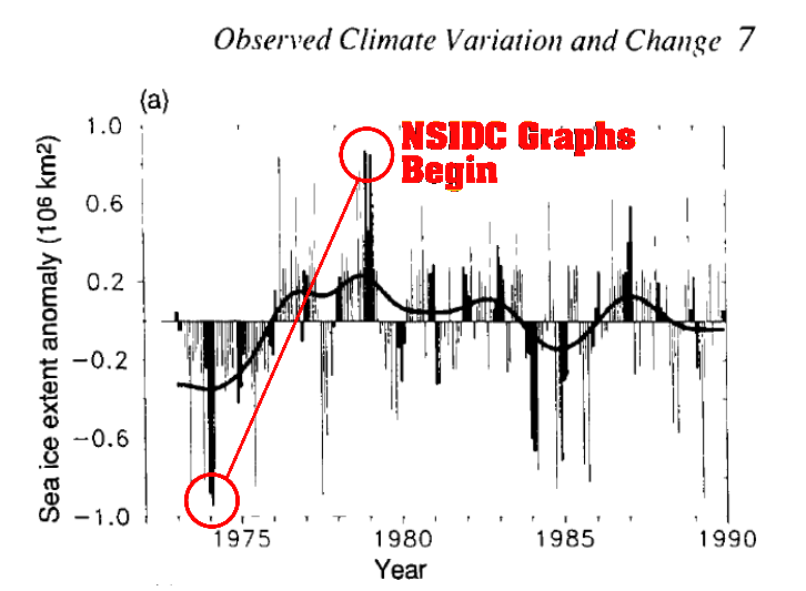
Actually it was much less than it is now