Guest Post by Bob Tisdale
This post provides an update of the unusual warming event in the sea surfaces of the eastern extratropical North Pacific…what is now regularly called “The Blob”. It does not appear to be ready to depart anytime soon. See the sea surface temperature anomaly map in Figure 1 for the location of The Blob.

Figure 1
For a reasonably easy-to-understand overview of The Blob and its companion the Ridiculously Resilient Ridge, and their impacts on North American weather, see the recent USAToday article How ‘the blob’ caused USA’s weird weather. The article, of course, closes with a seemingly mandatory alarmist prophecy about future weather. Other than that, it’s well worth the read if this subject is new to you. There are links to a number of other posts and papers about The Blob at the end of this post.
In this post, we’ll look at the impacts of the North Pacific on global sea surface temperatures and global land+ocean surface temperatures. As I’ve stated before, the unusual warming of the North Pacific, which is linked to weather there, was the primary cause of the record high global surface temperatures reported by GISS, NCDC and the UKMO in 2014.
Lower troposphere data are next. The Blob appears in the lower troposphere temperature anomaly data, though it was stronger in 2013 than 2014.
We’ll present the sea surface temperature anomalies for a number of regions of the North Pacific, zooming in on the location of The Blob in the eastern extratropical portion. Sea surface temperature anomalies for The Blob are higher in the first 3 months of 2015 than they were in 2014.
Next is the depth-averaged temperature data for the North Pacific during the ARGO-era, including the depths of 0-700 and 0-2000 meters. The North Pacific to depth has cooled, not warmed, since 2005, even with The Blob.
Last, I’ve included an animation of the sea surface temperature anomalies for the North Pacific, which indicates The Blob originated in the western extratropical North Pacific and worked its way eastward.
As a reminder, let’s start with the absence of warming in the surface of the North Pacific for the 2+ decades, leading up to the formation of The Blob.
NORTH PACIFIC SEA SURFACES SHOWED NO WARMING (BASED ON THE LINEAR TREND) FOR ALMOST TWO AND A HALF DECADES
This portion of the post is for those new to the discussion of the North Pacific sea surface temperatures and The Blob.
Figure 2 shows the annual sea surface temperature anomalies for the period of 1989 to 2014. As you’ll note, the periods of 1989 to 2012 and 2012 to 2014 are shown in different colors. Based on the linear trend of 0.00 deg C/decade for the period of 1989 to 2012, the data for the surface of the entire North Pacific ocean shows no evidence of long-term warming for 24 years, almost 2 ½ decades. Then, in 2013 and 2014 there were weather-related upticks, which, laughably, alarmists claim were evidence of human-induced global warming.

Figure 2
I’ve borrowed Figure 3 from the post here. In addition to the sea surface temperature data for the North Pacific, it shows that the average of the outputs of the climate models used for the IPCC’s 5th Assessment Report, basically the consensus of the models. The models indicate the surface of the North Pacific should have warmed more than 0.5 deg C from 1989 to 2012…IF it was warmed by the manmade greenhouse gases that drive the climate models…but the surface there didn’t warm.

Figure 3
And as I noted in that post, If the manmade greenhouse gas-forced climate models used by the IPCC cannot explain the 24-year absence of warming of the surface in the North Pacific, it can’t be claimed that the weather-related warming there in 2013 and 2014 were caused by manmade greenhouse gases. That little bit of common sense eludes alarmists.
For a more detailed look at how poorly climate models simulate the surfaces of the oceans during the satellite era, see the January 2015 post Alarmists Bizarrely Claim “Just what AGW predicts” about the Record High Global Sea Surface Temperatures in 2014.
And for a discussion on the use of the model mean, see the post here.
THE SIZEABLE WEATHER-RELATED UPTICK IN NORTH PACIFIC SEA SURFACE TEMPERATURES WAS THE PRIMARY CAUSE OF THE REPORTED RECORD-HIGH GLOBAL SURFACE TEMPERATURES IN 2014
We discussed in a number of posts over the past year how the weather events in the North Pacific—The Blob and the impacts of the developing El Niño—were responsible for the record high global sea surface temperatures in 2014. We can once again show this by comparing the observed global sea surface temperature anomalies to the global data with the North Pacific removed. See Figure 4. In it, we used the coordinates of 0-65N, 100E-90W for the North Pacific data and assumed that the North Pacific covered 21.3% of the surface of the global oceans. (Refer to the NOAA webpage here.) Without the impacts of the two weather-related events in the North Pacific in 2014 (The Blob and the El Niño), the record-high year for global sea surface temperatures would still be 1998.

Figure 4
And for those interested, we can perform the same simple analysis with the global land+ocean surface temperature products from GISS, NCDC and UKMO. I’ve used their respective sea surface temperature datasets (ERSST.v3b for GISS and NCDC and HADSST3 for the UKMO HADCRUT4 data), the coordinates of 0-65N, 100E-90W for the North Pacific, and assumed the North Pacific covers 14.9% of the globe. The results for the three surface temperature products are shown in Figure 5.

Figure 5
Without The Blob and the El Niño events in the North Pacific in 2014, 2010 would still be the warmest year…and that was a result of the aftereffects of the 2009/2010 El Niño.
DOES THE BLOB SHOW UP IN THE LOWER TROPOSPHERE TEMPERATURE DATA?
We only need to look at lower troposphere temperature anomaly maps of the North Pacific region for the year 2014 to answer that question. Refer to Figure 6. Both RSS and UAH lower troposphere temperature anomalies are displayed.

Figure 6
Figure 7 compares the sea surface temperature anomalies for The Blob region (35N-55N, 150W-125W) to the lower troposphere temperature anomalies. All show sizeable upticks in 2013, with the lower troposphere data rising faster. Then, in 2014, the lower troposphere data show a slight cooling while the sea surface temperature data continue to rise. But that divergence is not unusual for two different metrics in such a small part of the globe. As shown, the sea surface temperature data and the lower troposphere data are often out of synch there.

Figure 7
REGIONAL SEA SURFACE TEMPERATURE DATA FOR THE NORTH PACIFIC
For each of the following portions of the North Pacific, I’ve provided two graphs. The top cells are time-series graphs for the full term of the monthly Reynolds OI.v2 sea surface temperature data, November 1981 to March 2015. Before the upswings in 2013 and 2014, all regions show multidecadal periods of little-to-no warming based on the linear trends. I’ve shown those periods in blue for each region, along with the linear trend line, to reinforce that point.
The bottom graphs compare the evolutions of the sea surface temperature anomalies for the years 2012, 2013, 2014 and year-to-date 2015.
North Pacific – Figure 8 presents the monthly sea surface temperature anomalies for the North Pacific from the equator to the Bering Strait (0-65N, 100E-90W). See map here. It’s quite obvious that the monthly and yearly sea surface temperatures of the North Pacific are quite volatile, and that can be said for all of the smaller subsets that follow. But as noted earlier, the data showed no long-term warming from 1989 to 2012. Then, quite surprisingly, sea surface temperatures there took a sizeable upswing in 2013 and 2014. The upswings, of course, were caused by The Blob and the evolution of the 2014/15 El Niño.

Figure 8
The surface temperature anomaly data for the North Pacific show large seasonal components in 2013 and 2014, with the anomalies peaking in August in 2013 and in August and September in 2014. Sea surfaces in the North Pacific warmed noticeably in 2013 and 2014.
Extratropical North Pacific – For this portion, we’re using the coordinates of 20N-65N, 100E-100W. Think of the North Pacific north of the big island of Hawaii to the Bering Strait. See the map here. The sea surfaces of the extratropical North Pacific, Figure 9, also show an extended period with little long-term warming before the upswing in 2013 and 2014. Here, the period without warming lasts from 1994 to 2012, almost 2 decades. The temporary dip and rebound from 1991 to 1993, likely caused by the effects of the eruption of Mount Pinatubo, impose a slight warming trend on this region if we try to extend the period back to 1990.

Figure 9
The seasonal components for the extratropical North Pacific sea surface temperature data during 2013 and 2014 are also very strong. This year, the sea surface temperatures are comparable to 2014, though they are evolving differently.
Eastern Extratropical North Pacific – Closing in on The Blob, Figure 10 presents the sea surface temperature anomalies for the eastern extratropical North Pacific (20N-65N, 180-100). See the map here. So we’re looking at the portion of the North Pacific that’s north of the big island of Hawaii and east of the dateline. There, looking backwards before the upswing in 2013, there is no long-term warming (based on a linear trend) from 1984 to 2012, even with the temporary warming event of 2004/05.

Figure 10
The sea surface warming in the eastern extratropical North Pacific occurred primarily in 2013. There was a seasonal warming in 2014, but 2014 and 2015 are starting at basically the same value. Sea surfaces there in March 2015, however, are about 0.3 deg C warmer than in March 2014.
The Blob – For Figure 11, I’ve used the coordinates of 35N-55N, 150W-125W for The Blob. See the map here for the location. While quite volatile, the sea surface temperatures of this region showed no warming (based on the linear trend) from the start of the Reynolds OI.v2 data to 2012. That’s 3 decades of no surface warming in that region before the upticks in 2013 and 2014.

Figure 11
The Blob definitely evolved in 2013. In fact, compared to 2013, the sea surface temperature anomalies of the blog remained relatively flat in 2014. Sea surface temperatures of The Blob are rising early in 2015 and are presently well above the levels seen in 2014.
And just in case you’re wondering, The Blob region shows no long-term warming for 80 years, according to NOAA extended reconstructed sea surface temperature dataset ERSST.v3b. See Figure 12. Unlike the other graphs in this section, I’ve included the years 2013, 2014 and year-to-date 2015 in that trend analysis.

Figure 12
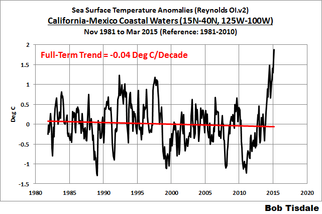
California-Mexico Coastal Waters – The surface temperatures of the waters off the coasts of California and Mexico also made a recent upswing, but there it happened in 2014. Refer to Figure 13. For this region, we’re using the coordinates of 15N-40N, 125W-100W. See the map here. Prior to 2014, the sea surfaces there cooled since the start of the Reynolds OI.v2 data. In fact, the California-Mexico coastal waters still show no long-term warming, even if we include the 2014 and 2015 data. See the graph here.

Figure 13
The surface warming of the California-Mexico coastal waters began late in 2013, which is well before the strong Kelvin wave, which initiated the 2014/15 El Niño, reached the coasts of the Americas. As you will see, however, in an animation that follows, the California-Mexico coastal waters warmed from the south northward, which suggests that the warming there was also not caused by the warm waters of The Blob migrating southward.
There was a recent study of the sea surface temperatures in that region. See Yuan and Yamagata (2014) California Niño/Niña. The California Niño/Niña is said to be independent of the El Niño/La Niña events in the tropical Pacific. That California Niño/Niña phenomenon, however, occurs in July-August-September, which doesn’t align with the warming there in 2014.
ARGO-ERA NODC DEPTH-AVERAGED TEMPERATURE ANOMALY DATA SHOWS THE NORTH PACIFIC COOLING TO DEPTHS OF 700 METERS AND 2000 METERS SINCE 2005
Figure 14 presents the NODC’s annual depth-averaged temperature data for the North Pacific (0-65N, 100E-90W) for the depths of 0-700 meters and 0-2000 meters. Note that the NODC depth-averaged temperature data for the depths of 0-2000 meters begins in 2005 at the KNMI Climate Explorer, limiting the data to the ARGO era, so I’ve also only illustrated the 0-700 meters data for that time period. Both show noticeable negative trends over the past decade.

Figure 14
The Blob does appear in the depth-averaged temperature data to those two depths. See Figure 15, which uses the coordinates of 35N-55N, 150W-125W for The Blob. At both depths, the upticks in 2014 were greater than those of 2013.

Figure 15
HOW DEEP DOES THE BLOB GO?
Figure 16 is a cross section of the subsurface temperature anomalies of the Eastern Pacific Ocean available from the ECMWF webpage here. It presents the output of their ORAS4 reanalysis. Keep in mind, a reanalysis is the output of a computer model that uses data as inputs. But with all of the ARGO floats bobbing around in the oceans, and assuming the ARGO data are used in this reanalysis, this should be a reasonable representation.

Figure 16
The cross section is for the month of March 2015 and, in the top portion, it presents the average subsurface temperature anomalies to depths of 500 meters. The x-axis (horizontal axis) stretches from 50S on the left to 50N on the right. The longitudes are 160W-90W. Basically, if we were to take a slice of the Pacific Ocean that was bordered by the coordinates of 50S-50N, 160W-90W and look from east to west, those are the average temperature anomalies at depth. The Blob is visible to the right, and appears as the elevated subsurface temperature anomalies. So The Blob is not simply a surface phenomenon. But we would expect that with wind-driven ocean mixing.
I’ve also highlighted the most recent Kelvin wave, which is making its way from west to east along the equator. Much of that pocket of warm water will rise to the surface over the upcoming months and likely strengthen the current El Niño.
NORTH PACIFIC SEA SURFACE TEMPERATURE ANOMALY ANIMATION
I’ve provided Animation 1 to confirm that the elevated sea surface temperatures originally formed, as one would expect, in the west-central North Pacific during the back-to-back La Niñas of 2010/11 and 2011/12. What came next was unexpected. Those elevated sea surface temperatures then migrated eastward to create The Blob.
Animations of maps of monthly sea surface temperature anomalies can be quite volatile, with weather effects and seasonal components creating a lot of visual noise. To minimize the monthly volatility, each of the following maps presents the average sea surface temperature anomalies for a full year. The annual maps then advance on a monthly basis. That is, the first map covers the 12-month period of January 2010 to December 2010. The second map is for February 2010 to January 2011. The third map: March 2010 to February 2011. And so on through the last map for April 2014 to March 2015. This is similar to smoothing time-series data with a 12-month running-mean filter.
Animation 1
You’ll also note the evolution of the 2014/15 El Niño later in the animation. It appears to enhance The Blob and cause the sea surface temperatures to rise along the west coast of North America.
FURTHER READING
We’ve been discussing the unusual warming event in the North Pacific since it first made its presence known in the July 2013 sea surface temperature data. For additional information, see the posts:
- About the Unusual Warming Event in the Extratropical North Pacific Sea Surface Temperature Anomalies (August 2013)
- The Hotspot in the North Pacific (February 2014)
- June 2014 Sea Surface Temperature (SST) Anomaly Update (July 2014)
- On The Recent Record-High Global Sea Surface Temperatures – The Wheres and Whys (August 2014)
- Axel Timmermann and Kevin Trenberth Highlight the Importance of Natural Variability in Global Warming… (November 2014)
- Researchers Find Northeast Pacific Surface Warming (1900-2012) Caused By Changes in Atmospheric Circulation, NOT Manmade Forcings (December 2014)
- Did ENSO and the “Monster” Kelvin Wave Contribute to the Record High Global Sea Surface Temperatures in 2014? (December 2014)
- Alarmists Bizarrely Claim “Just what AGW predicts” about the Record High Global Sea Surface Temperatures in 2014 (January 2015)
Also see Anthony Watts’s April 2015 post “Warm blob” in Pacific Ocean not caused by climate change, affects U.S. weather at WattsUpWithThat. It includes the press release for two papers: Bond et al. (2015) Causes and Impacts of the 2014 Warm Anomaly in the NE Pacific and Hartmann (2015) Pacific sea surface temperature and the winter of 2014.
CLOSING
The Blob is a naturally occurring weather event. Along with another natural event, the El Niño of 2014/15, The Blob caused the reportedly record-high global surface temperatures in 2014. The Blob is coupled with an atmospheric phenomenon known as the Ridiculously Resilient Ridge. The Blob and the Ridiculously Resilient Ridge have enhanced the drought in California and are responsible for the reported high surface temperatures there as well. Likewise, they are also said to be major contributors to cold weather and snow in the eastern U.S.
The sea surfaces of the North Pacific hadn’t warmed for nearly 2.5 decades and then warmed unexpectedly in 2013 and 2014. The sea surfaces of The Blob region according to NOAA’s long-term data show no warming for 8 decades. Regardless of that reality, alarmists nonsensically attribute The Blob to the emissions of manmade greenhouse gases.
The Blob is not only a sea surface temperature phenomenon. It appears in the Lower Troposphere Temperature data and in the NODC’s depth-averaged temperature data for the depths of 0-700 meters and 0-2000 meters. Of course, the NODC depth-averaged temperature data for the North Pacific show no warming during the ARGO era.
There are a number of questions now, including:
- How long will The Blob and the Ridiculously Resilient Ridge last?
- Assuming a La Niña follows this El Niño, will the La Niña be strong enough to overcome The Blob and the Ridiculously Resilient Ridge?
- What will be the combined effects of the strengthening El Niño, The Blob and the Ridiculously Resilient Ridge on weather worldwide over the next 12 months?
- Will the El Niño be strong enough to overcome the other two and bring rain to California, or will The Blob and the Ridiculously Resilient Ridge continue their influences there?
- Will The Blob have a long-term impact on the sea surface temperatures of the Eastern Pacific Ocean as a whole? That is, will The Blob be responsible for another upward shift in the sea surface temperatures of the East Pacific Ocean like that in 1976/77?
I’m sure you can think of others.
SOURCE
The data and maps presented in the post are available through the KNMI Climate Explorer.
Thanks, Bob.
This is, as always, a wide and deep view. Your work is highly appreciated.
The questions you rise about “The Blob” are central, but do we know enough to even start answering them?
Bob, doesn’t look like it’s strengthening to me……just spreading out on the surface
If one looks at the late 1950s in Figure 12 we can see a similar series of years with the current period a little warmer than it was then. That was also an El Nino period, but it looks like the blob has added a bump to the temperatures.
This should be a phenomena ripe for study. Lots of possibilities. It’s actually quite amazing that nothing has been published so far. It says a lot about this field of science.
I was a little premature. There is one study I could find.
http://onlinelibrary.wiley.com/doi/10.1002/2015GL063306/abstract
What l find interesting about the animation is how the blob is linked to changes in the Great Lakes.
When the NE Pacific was cool the Great Lakes were warm, but as the blob takes hold it switches the Great Lakes from warming to cooling. This helps to point out the real threat from this weather pattern should it become more common over the next few years. Because it draws down cold air from the Arctic down across North America. This is where the threat is with this weather pattern should it become a long term weather pattern rather then the drought in the west.
I think that this is representative of the preconditions for the cooling that takes place during a solar grand minimum event.
Is there some giant magnifying glass in space being focused on that part of our anthill?
Is this the Earth’s version of Jupiter’s Big Red Spot, or Saturn’s “great white spots”?
The location seems rather close to the North American edge of the Ring of Fire, is there a link?
Bob,
I found some original data on the Blob from 1958:
http://loyalkng.com/wp-content/uploads/2010/12/Blob-Town-The-Blob-1958-Documentary-@-Phoenixville-Pennsylvania-by-James-Rolfe.jpg
There are a number of questions now, including:
•How long will The Blob and the Ridiculously Resilient Ridge last?
I will take a crack at this question and say the Blob has around 12 months left at which time it will start to diminish in response to a cold PDO phase and a tendency toward at least neutral ESNO conditions, Going forward as the decade proceeds I think the cold phase of the PDO will dominate with neutral to weak La Nina conditions being the rule.
If this is correct the blob and ridge should show a gradual diminishing trend over time.
If someone held a gun to my head that would be my forecast. Confidence not that high but that is my best estimate on what I think might happen.
If it should turn out that way then any long time lasting effects of the blob will not be present.
“any long time lasting effects of the blob should not be present”
Better tell Jerry Brown and the almond growers, who are about to lose decades old trees which produce a large percentage of the world’s almond supply.
My amateur forecast has this current drought breaking with the upcoming winter 2015/16. The next year after that should be a flood year for the Pacific NorthWest. That will certainly finish the drought. This will also mean that a La Nina will have to be in place for the flood to strike. The important rains for the state take place in the northern half of the state where most of the reservoirs and hydroelectric plants are situated. The water stored there, then gets shipped south out of the delta through the California aqueduct system.
Sorry to hear someone’s holding a gun to your head. I hate it when that happens to me.
Really good TPW just north of here, go blob! Now, if only the jet would steer a bit more south.
I think the blob shows how little we understand the climatic system.
This is why AGW theory is laughable not to mention they have yet to make one prediction that has come to be. If the theory is so good they should have been able to predict the blob, just like they predicted the lower tropospheric hot spot.
The event AGW theory did not predict (the blob) becomes reality while the event AGW theory predicted (the lower tropospheric hot spot ) never sees the light of day. The conclusion is AGW theory has not a clue as to where the climate is heading or why.
Salvator del Prete: I think the blob shows how little we understand the climatic system.
I second that. Every year brings surprises, big areas of unusually warm or unusually cool temperatures, whose causes are mostly conjectural (narrations based on nothing more than observed co-occurrences), and whose durations and consequences are not known.
Undersea volcanic activity long that off shore fault, That big west coast earthquake is in the near future !!!
The 2 overdue locations are the Cascadia Fault up north, and the Hayward Fault on the east side of the SF/Bay Area. The Hayward Fault runs right through the middle of every city on the east side of the bay. You can see how this affects sidewalks, roadways, foundations, and so on. That could turn into a very bad event.
goldminor
Thought the LA “key” (the jog where the San Andreas kicks sideways south of the mountains before resuming its nw-se trend) is the next earthquake zone because it has NOT moved far enough to release the stored energy below. Hayward fault has moved, but the LA zone has not. Is that wrong? I do know the middle-CA range has slowly and steadily moved along the fault almost continuously, so there will likely be no big quake at all in the middle range between LAX and SFO.
Either end? Big trouble coming.
Look at this article for information on the Hayward Fault. It states that the last big quake there was in 1868…http://www.earthquakesafety.com/earthquake-hayward-fault.html
Notice on the map shown That the Hayward Fault disappears shortly after it enters the upper SF Bay where the Sacramento River comes in. I was wondering if that quake which Napa had last year might not mark a connection between Napa and the northernmost point of the Hayward Fault. Either way as the article suggests a large quake on the Hayward could be an extremely damaging event with much loss of life. I mentioned the Cascadia, which runs from offshore of Eureka Ca and up to Canada, because it has a known periodic ability. The LA region has had multiple events in my life time of 65 years. That doesn’t mean that it isn’t still very dangerous, just as the 1989 SF World Series Quake does not mean that it won’t strike again in the near term.
I am wondering about the potential influence of the upcoming solar change to trigger some large Earth events.
Thanks again.
If the manmade greenhouse gas-forced climate models used by the IPCC cannot explain the 24-year absence of warming of the surface in the North Pacific, it can’t be claimed that the weather-related warming there in 2013 and 2014 were caused by manmade greenhouse gases. That little bit of common sense eludes alarmists.
The difficulty is that high-dimensional nonlinear dissipative systems, like the climate, do not behave according to common sense. Step changes in measured quantities are common in experimental and computational examples. Extant models are inaccurate, but that does not imply that CO2 is not causing warming.
We discussed in a number of posts over the past year how the weather events in the North Pacific—The Blob and the impacts of the developing El Niño—were responsible for the record high global sea surface temperatures in 2014.
What caused the “weather events”?
Animation 1 shows the disappearance of below-average North Pacific temperatures during the evolution of the blob up til now. Isn’t it remarkable that the entire N. Pacific is at or above average temperature for this time of year? It also show the dramatic cooling of the Great Lakes during the same time.
matthewrmarler commented
I live 30 miles south of lake Erie, 41N 81W. Last summer reminded me of the weather of my childhood here (60’s).
This presentation done by Bob is fantastic.
Salvatore Del Prete: This presentation done by Bob is fantastic.
I second that as well. Bob presents a lot of informative posts.
I apologize for misspelling your name above.
No problem.
This pattern is not new. Is just shifted to the east. Jumping solar activity only exacerbate it.
The loading pattern of the AO is defined as the leading mode of Empirical Orthogonal Function (EOF) analysis of monthly mean 1000mb height during 1979-2000 period.
http://www.cpc.ncep.noaa.gov/products/precip/CWlink/daily_ao_index/new.ao.loading.gif
The temperature distribution at the height of 45 km.
http://www.cpc.ncep.noaa.gov/products/stratosphere/strat_a_f/gif_files/gfs_t01_nh_f00.gif
lf asked “how long will this weather pattern last” then l would have to say l don’t know.
But if asked “how long can this weather pattern last” then l would have to say, as long as a ice age.
Because the effects that this weather pattern cause and what happened during the last ice age are to close for comfort.
So, the super ENSO alarmists hoped for fervently is hiding out in the NE Pacific?
I have been watching this for some time, also. I noticed that at the beginning of this month that there were cool inroads being made into the center of the Blob. There would be a cool intrusion, and then the warm would push back. These are impacting approximately from mid California to southern California. At first it was just a tiny blip of cool showing up in the vast warm region of the Blob, but in the last 3 days this has changed to what looks to me to be the very start of what will become a cool intrusion through the center of the Blob. Metaphorically striking at the heart of the Blob. Yesterday,s ssta data shows the best look at this. Tropical tidbits this morning also clearly shows the first changes to be clearly seen. The temps in the sst graphs have also moved slowly further south. This has carried cooler sst,s all the way down to Baja, California. I had originally thought that this might have taken place last year. Now it looks like it is time.
Something else that has caught my attention is the surface wind changes over the last month. I have the impression that they are going to shut down the warm ENSO over time. With a noticeable break coming around July of this year. Time will tell the full story.
The animation of the time-evolution of anomalies in the N. Pacific doesn’t really provide any convincing indication of the origins of The Blob in the western Pacific. While ABSOLUTE values of temperature, salinity, organic matter, etc. can be used as tracers of mass transport by currents, mere anomalies offer no such firm indication. They are subject to strong LOCAL variation due to the NON-advective component of the material (Stokes) derivative.
Bob,
The present super Blob appears to have formed by the fusion of two smaller blobs. Maybe there is some subsurface connection between the larger, more northerly blob, which crossed the Pacific from west to east, & the southern one, which seems to have formed independently off central Mexico, then spread to Baja and Alta California, ultimately to unite with the bigger trans-Pacific blob, but it’s not obvious to me.
OK, I’m a dirty denier, well, more like a luke-warmer, but riddle me this Bob Tisdale – how is it, exactly, that we know, for certain, that ACO2 did not not cause the blob?
The back-story here is that some folk have suggested, on here, that the energy that El Nino belches into the atmosphere from time to time is simply ACO2 warming finally coming home to roost in the atmosphere after spending some time in the briny deep. Why is it that the blob cannot be some similar manifestation?
How would co2 have the ability to do that ? What do you see that is different from El Ninos of the past 30 years, as compared to the known history of El Nino/La NIna over the last 1,000 years? Why isn’t co2 also warming the rest of the global oceans to where we might wonder “what is going on with the all of the Blobs in the oceans”?
“ACO2 warming finally coming home to roost in the atmosphere after spending some time in the briny deep.”
How exactly does this happen?
My understanding is that the briny deep is a rather frigidly cold place. How does cold water from the briny deep belch heat into the atmosphere?
If someone can explain that, in plain language, graphs, or diagrams, I would be sincerely grateful.
Living on Vancouver Island, I’ve learned to stop worrying and love the Blob.
I hear wedding bells in your future! 🙂
Bob, what I wonder about is the development and spread of the blob, from a relatively small phenomenon in the NW Pacific to a widespread, intense phenomenon in the NE Pacific. What could cause/ account for that particular accumulation of warm water? Saying “ocean currents and clouds,” while possibly correct at that broad level of description, is not very helpful. I’m pointing specifically to the size/ shape (3 dimensions — which you have not shown) of its initiation and development. There’s something important going on here, even more so than ENSO, that relates to our understanding of climate — or, rather,to our lack of understanding. If this phenomenon can raise global air temps so much, we really ought to try to understand what causes this.
“If this phenomenon can raise global air temps so much, we really ought to try to understand what causes this.”
I suspect most of this phenomenon takes place in software long after the measurements are taken.
micro6500…I live in Northern California. I can feel the effect that the Blob has had on the area where I live. This last winter for example, which I had correctly forecast to be above average temps because of the Blob back in August of last year, turned out around 20 F warmer. That impressed the local postmaster as I had described to him back in August what the coming winter would be like. It is real enough. The warmth of the Blob making it,s presence known around here started at the beginning of 2014.
I don’t doubt there’s heat coming in off the ocean, but I’m inclined to say your +20F was probably cancelled out by the many -20F days we had in the arctic Midwest this winter. That it’s was just mostly moving big blobs of heat around the oceans, warming what ever land is down wind, cooling the places the blobs left.
You are correct. I have similar thoughts as to what is happening. I thought you were implying that the Blob was being somewhat adjusted. Prior to this change in the ocean took place at the start of last year, the 3 previous winters were very cold where I live. It is interesting to see how the warm to cool regions shift over time. I am learning as I go, and I have been developing a good forecast ability from the process. The online observational tools are tremendous. They supply volumes of information to me, as I have always had a strong inner visual component. Back in my school days, I was known for being able to run geometry functions and algebra equations internally. Math was my easy subject back then. I am able to apply that ability to the visual data that I take in. That is why I look at and save daily copies of observations of the changes taking place around the globe. This all makes sense to me, and also aids me in following the conversation here.
I should really finish my thoughts, and that while I think the over all temp hasn’t really gone up, post processing turns move heat into a warming trend.
This may sound naïve, but is there any chance that the unusually warm air temperatures, which have persisted for an extended period of time, are heating the surface waters of the ocean below?
Or is the warm water “upwind” of the anomalously warm air?
It seems to me that this blob or region of warmer water is saturated with energy. Being unable to absorb more energy, the energy is following winds and ends up further east than normal. Being land rather than sea water, there are more surfaces and objects to absorb the energy.
How do I get a research grant to study this?
“It seems to me that this blob or region of warmer water is saturated with energy.”
It is easy for those of us who are not oceanographers or experts in such matters to be misled by the maps presented above. Those represent temperature anomalies, or departures from average. They are indicative of actual water temperatures. In fact, this is not warm water, and is in no way “saturated” with energy.
Here in Florida, the water is very much warmer, but is far from saturated with heat, whatever that means. It gets much hotter.
Here is what the actual water temperatures are right now: (green is about 59-60 F)
http://weather.unisys.com/surface/sst.gif
Excuse me “… they are not indicative of actual…
What a difference between what Unisys shows versus NOAA, Tropical Tidbits or Weather Bell. Unisys lacks the definition of the other three.http://data.theweather.com.au/access/imageserver.jsp?image=grads/sst/sstanom_hires.latest.global.png
Linked the wrong pic. This is what I meant to show…http://polar.ncep.noaa.gov/sst/rtg_high_res/color_newdisp_sst_global_lat_lon_ophi0.png
Interesting. Looking at the actual colours, it appears you can see the Antarctic Circumpolar current, the Gulf Stream from Florida to Iceland and the flow from Japan to North America and spreading north and south along the North American west coast from Alaska to Baja. Or maybe I am just seeing things. But nice graphic.
The surface temperature will now fall.
http://earth.nullschool.net/#2015/04/25/0300Z/wind/isobaric/70hPa/orthographic=22.58,102.51,385
This article is making the case that ENSO during prolonged weak solar minimum periods is more in a neutral state.If prolonged minimum solar conditions exist going forward maybe ENSO will feature less extreme El Nino ,and La Nina events.
Analysis of the multi-proxy reconstruction revealed considerable ENSO variability
over the past five centuries. Our results are consistent with the conclusions of
D’Arrigo et al. (2005) concerning solar/temperature related modification of ENSO
behaviour. Periods of inactivity were identified throughout the record; most notably,
during the 1600s ENSO appears to have weakened, coincident with the height of
the commonly defined Little Ice Age (∼A.D. 1550–1850) and Maunder Minimum
(∼A.D. 1645–1715) epochs. Hendy et al.’s (2002) coral Sr/Ca SST reconstruction
shows northern Australian SSTs 0.2◦ to 0.3◦C cooler than the long-term average
between 1565 and 1700. This corresponds to enhanced La Niña activity in our
reconstruction (1520s to 1660s) and a period of relative El Niño quiescence from
the 1600s to 1780s.
Hendy et al. (2002) also note a conspicuous period from their Sr/Ca SST reconstruction
from the 1700s to the 1870s show a consistent warming comparable to
the SST warmth of the early 1980s. A Pacific coral Sr/Ca SST reconstruction from
Rarotonga (Linsley et al. 2000) also shows SSTs for the 18th and 19th centuries
that are as warm as, or warmer than, the 20th century. Interestingly, this period
corresponds to a pronounced period of La Niña activity (see Table 9). Aboveaverage
SSTs persist through most of the 18th and 19th centuries, a period notable
La Niña activity in our reconstruction, before cooling to a minimum in the early
As the blob continues to move east it will start to include up-welling of cold water from the depths, which will rapidly lead to its demise. Or that is my guess, judging from how fast such events seem to have faded, using the scant records we have from the past.
I imagine the speed with which the blob fades will catch many by surprise, and make a mess of long range forecasts. I fear it will be one of those rough situations for forecasters wherein no forecasters are correct, and the best ones will be the ones who are quickest to recognize the unexpected change is happening, and quickest to change their forecasts as a result.
Caleb, what do you think of this big spin in the north western Atlantic?http://earth.nullschool.net/#current/wind/isobaric/1000hPa/orthographic=-0.87,57.19,671
That has been spinning there for around 4 days that I know of. It looks to me like it is affecting the Gulf Stream.
goldminor, that big spin is a area of low pressure that has been sitting in the Atlantic. Because a area of high pressure has been over or near the UK for the last 2 weeks and its blocking the lows path across the Atlantic. Thank’s to this high the UK has been enjoying some nice spring weather as the lows have had to sit it out in the Atlantic.
Thanks, I remember reading of a wind that crosses through Spain and southern France that was going to bring a warm spell to the UK region. I also see that is still functioning. It certainly brought a lot of change with it. Although, I am also seeing quite a bit of wind change all around the globe when using earth.null lately. What caught my attention with the Atlantic wind is that it must be having quite an affect on the Gulf Stream, as earth.null also shows when switched to sst and wave movement.
That spin is a feature that is generally dubbed “the Icelandic Low”, and is the Atlantic version of the Pacific feature called “the Aleutian Low”. They take turns at bossing around the northern hemisphere’s jet stream. When one is strong the other tends to be weak. As “taxed” noted, their positioning can lead to a “blocking pattern”, which gives some areas extended periods of rotten weather as other areas get extended periods of gorgeous weather.
How does this effect the Gulf Stream? It must, but exactly how is still a mystery. The AMO is shifting to displaying attributes of its “cold” phase, and the last time this happened we lacked the satellites we now have. This is the first time we have been able to sit back and study what nature does.
My own guess is that, when the Icelandic Low persistently blows across the Gulf Stream, the flow of the surface water must be shifted. That in turn creates Atlantic versions of cold and warm “blobs”. The blobs in turn encourage or discourage the Icelandic Low to position itself east or west, or north or south. Then the winds over the Gulf Stream shift, and the current shifts again. The factors influence each other, and trying to say which came first is like saying the chicken came before the egg.
Once the AMO shifts it has a huge effect on things like fishing grounds. I had some fun discussing this at http://wattsupwiththat.com/2014/01/09/author-of-its-own-demise-musings-on-the-amo/
I think the way we will learn more about the factors that shift the AMO is to do exactly what Bob Tisdale is doing: Observe; Observe; Observe.