Initial Notes: This is the first monthly update to include lower troposphere temperature (TLT) anomaly data.
To make this post as timely as possible, only GISS LOTI and the two lower troposphere temperature datasets are for the most current month. The NCDC and HADCRUT4 data lag one month.
This post contains graphs of running trends in global surface temperature anomalies for periods of 13+ and 16+ years using GISS global (land+ocean) surface temperature data. They indicate that we have not seen a warming halt (based on 13 years+ trends) this long since the early-1970s or a warming slowdown (based on 16-years+ trends) since about 1980.
Much of the following text is boilerplate. It is intended for those new to the presentation of global surface temperature anomaly data.
Most of the update graphs in the following start in 1979. That’s a commonly used start year for global temperature products because many of the satellite-based temperature datasets start then.
We discussed why the three suppliers of surface temperature data use different base years for anomalies in the post Why Aren’t Global Surface Temperature Data Produced in Absolute Form?
GISS LAND OCEAN TEMPERATURE INDEX (LOTI)
Introduction: The GISS Land Ocean Temperature Index (LOTI) data is a product of the Goddard Institute for Space Studies. Starting with their January 2013 update, GISS LOTI uses NCDC ERSST.v3b sea surface temperature data. The impact of the recent change in sea surface temperature datasets is discussed here. GISS adjusts GHCN and other land surface temperature data via a number of methods and infills missing data using 1200km smoothing. Refer to the GISS description here. Unlike the UK Met Office and NCDC products, GISS masks sea surface temperature data at the poles where seasonal sea ice exists, and they extend land surface temperature data out over the oceans in those locations. Refer to the discussions here and here. GISS uses the base years of 1951-1980 as the reference period for anomalies. The data source is here.
Update: The April 2014 GISS global temperature anomaly is +0.73 deg C. It warmed slightly (an increase of about 0.03 deg C) since March 2014.
Figure 1 – GISS Land-Ocean Temperature Index
NCDC GLOBAL SURFACE TEMPERATURE ANOMALIES (LAGS ONE MONTH)
Introduction: The NOAA Global (Land and Ocean) Surface Temperature Anomaly dataset is a product of the National Climatic Data Center (NCDC). NCDC merges their Extended Reconstructed Sea Surface Temperature version 3b (ERSST.v3b) with the Global Historical Climatology Network-Monthly (GHCN-M) version 3.2.0 for land surface air temperatures. NOAA infills missing data for both land and sea surface temperature datasets using methods presented in Smith et al (2008). Keep in mind, when reading Smith et al (2008), that the NCDC removed the satellite-based sea surface temperature data because it changed the annual global temperature rankings. Since most of Smith et al (2008) was about the satellite-based data and the benefits of incorporating it into the reconstruction, one might consider that the NCDC temperature product is no longer supported by a peer-reviewed paper.
The NCDC data source is usually here. NCDC uses 1901 to 2000 for the base years for anomalies. (Note: the NCDC has been slow with updating the normal data source webpage, so I’ve been using the values available through their Global Surface Temperature Anomalies webpage. Click on the link to Anomalies and Index Data.)
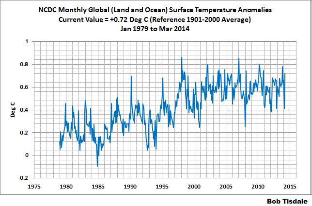
Update (Lags One Month): The March 2014 NCDC global land plus sea surface temperature anomaly was +0.72 deg C. See Figure 2. It rebounded considerably (an increase of +0.31 deg C) since February 2014.
Figure 2 – NCDC Global (Land and Ocean) Surface Temperature Anomalies
UK MET OFFICE HADCRUT4 (LAGS ONE MONTH)
Introduction: The UK Met Office HADCRUT4 dataset merges CRUTEM4 land-surface air temperature dataset and the HadSST3 sea-surface temperature (SST) dataset. CRUTEM4 is the product of the combined efforts of the Met Office Hadley Centre and the Climatic Research Unit at the University of East Anglia. And HadSST3 is a product of the Hadley Centre. Unlike the GISS and NCDC products, missing data is not infilled in the HADCRUT4 product. That is, if a 5-deg latitude by 5-deg longitude grid does not have a temperature anomaly value in a given month, it is not included in the global average value of HADCRUT4. The HADCRUT4 dataset is described in the Morice et al (2012) paper here. The CRUTEM4 data is described in Jones et al (2012) here. And the HadSST3 data is presented in the 2-part Kennedy et al (2012) paper here and here. The UKMO uses the base years of 1961-1990 for anomalies. The data source is here.
Update (Lags One Month): The March 2013 HADCRUT4 global temperature anomaly is +0.54 deg C. See Figure 3. It rebounded (about +0.24 deg C) since February 2014.
Figure 3 – HADCRUT4
UAH Lower Troposphere Temperature (TLT) Anomaly Data
Special sensors (microwave sounding units) aboard satellites have orbited the Earth since the late 1970s, allowing scientists to calculate the temperatures of the atmosphere at various heights above sea level. The level nearest to the surface of the Earth is the lower troposphere. The lower troposphere temperature data include the altitudes of zero to about 12,500 meters, but are most heavily weighted to the altitudes of less than 3000 meters. See the left-hand cell of the illustration here. The lower troposphere temperature data are calculated from a series of satellites with overlapping operation periods, not from a single satellite. The monthly UAH lower troposphere temperature data is the product of the Earth System Science Center of the University of Alabama in Huntsville (UAH). UAH provides the data broken down into numerous subsets. See the webpage here. The UAH lower troposphere temperature data are supported by Christy et al. (2000) MSU Tropospheric Temperatures: Dataset Construction and Radiosonde Comparisons. Additionally, Dr. Roy Spencer of UAH presents at his blog the monthly UAH TLT data updates a few days before the release at the UAH website. Those posts are also cross posted at WattsUpWithThat. UAH uses the base years of 1981-2010 for anomalies. The UAH lower troposphere temperature data are for the latitudes of 85S to 85N, which represent more than 99% of the surface of the globe.
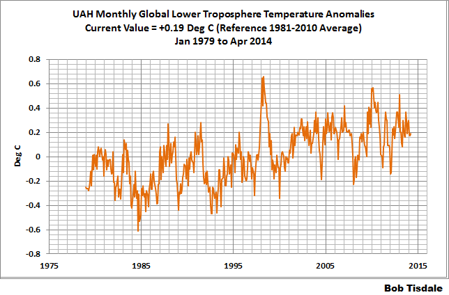
Update: The April 2014 UAH lower troposphere temperature anomaly is +0.19 deg C. It is rose slightly (an increase of about +0.02 deg C) since March 2014.
Figure 4 – UAH Lower Troposphere Temperature (TLT) Anomaly Data
RSS Lower Troposphere Temperature (TLT) Anomaly Data
Like the UAH lower troposphere temperature data, Remote Sensing Systems (RSS) calculates lower troposphere temperature anomalies from microwave sounding units aboard a series of NOAA satellites. RSS describes their data at the Upper Air Temperature webpage. The RSS data are supported by Mears and Wentz (2009) Construction of the Remote Sensing Systems V3.2 Atmospheric Temperature Records from the MSU and AMSU Microwave Sounders. RSS also presents their lower troposphere temperature data in various subsets. The land+ocean TLT data are here. Curiously, on that webpage, RSS lists the data as extending from 82.5S to 82.5N, while on their Upper Air Temperature webpage linked above, they state:
We do not provide monthly means poleward of 82.5 degrees (or south of 70S for TLT) due to difficulties in merging measurements in these regions.
Also see the RSS MSU & AMSU Time Series Trend Browse Tool. RSS uses the base years of 1979 to 1998 for anomalies.
Update: The April 2014 RSS lower troposphere temperature anomaly is +0.25 deg C. It rose (an increase of about +0.04 deg C) since March 2014.
Figure 5 – RSS Lower Troposphere Temperature (TLT) Anomaly Data
A Quick Note about the Difference between RSS and UAH TLT data
There is a noticeable difference between the RSS and UAH lower troposphere temperature anomaly data. Dr. Roy Spencer discussed this in his July 2011 blog post On the Divergence Between the UAH and RSS Global Temperature Records. In summary, John Christy and Roy Spencer believe the divergence is caused by the use of data from different satellites. UAH has used the NASA Aqua AMSU satellite in recent years, while as Dr. Spencer writes:
…RSS is still using the old NOAA-15 satellite which has a decaying orbit, to which they are then applying a diurnal cycle drift correction based upon a climate model, which does not quite match reality.
I updated the graphs in Roy Spencer’s post in On the Differences and Similarities between Global Surface Temperature and Lower Troposphere Temperature Anomaly Datasets.
While the two lower troposphere temperature datasets are different in recent years, UAH believes their data are correct, and, likewise, RSS believes their TLT data are correct. Does the UAH data have a warming bias in recent years or does the RSS data have cooling bias? Until the two suppliers can account for and agree on the differences, both are available for presentation.
13-YEARS+ (160-MONTH) RUNNING TRENDS
As noted in my post Open Letter to the Royal Meteorological Society Regarding Dr. Trenberth’s Article “Has Global Warming Stalled?”, Kevin Trenberth of NCAR presented 10-year period-averaged temperatures in his article for the Royal Meteorological Society. He was attempting to show that the recent halt in global warming since 2001 was not unusual. Kevin Trenberth conveniently overlooked the fact that, based on his selected start year of 2001, the halt at that time had lasted 12+ years, not 10.
The period from January 2001 to April 2014 is now 160-months long—more than 13 years. Refer to the following graph of running 160-month trends from January 1880 to April 2014, using the GISS LOTI global temperature anomaly product.
An explanation of what’s being presented in Figure 6: The last data point in the graph is the linear trend (in deg C per decade) from January 2001 to April 2014. It is basically zero (about 0.02 deg C/Decade). That, of course, indicates global surface temperatures have not warmed to any great extent during the most recent 160-month period. Working back in time, the data point immediately before the last one represents the linear trend for the 160-month period of December 2000 to March 2014, and the data point before it shows the trend in deg C per decade for November 2000 to February 2014, and so on.
Figure 6 – 160-Month Linear Trends
The highest recent rate of warming based on its linear trend occurred during the 160-month period that ended about 2004, but warming trends have dropped drastically since then. There was a similar drop in the 1940s, and as you’ll recall, global surface temperatures remained relatively flat from the mid-1940s to the mid-1970s. Also note that the early-1970s was the last time there had been a 161-month period without global warming—before recently.
16-YEARS+ (203-Month+) RUNNING TRENDS
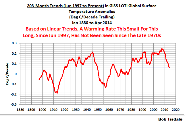
In his RMS article, Kevin Trenberth also conveniently overlooked the fact that the discussions about the warming halt are now for a time period of about 16 years, not 10 years—ever since David Rose’s DailyMail article titled “Global warming stopped 16 years ago, reveals Met Office report quietly released… and here is the chart to prove it”. In my response to Trenberth’s article, I updated David Rose’s graph, noting that surface temperatures in April 2013 were basically the same as they were in June 1997. We’ll use June 1997 as the start month for the running 16-year+ trends. The period is now 203-months long. The following graph is similar to the one above, except that it’s presenting running trends for 203-month periods.
Figure 7 – 203-Month Linear Trends
The last time global surface temperatures warmed at this low a rate for a 203-month period was the late 1970s, or about 1980. Also note that the sharp decline is similar to the drop in the 1940s, and, again, as you’ll recall, global surface temperatures remained relatively flat from the mid-1940s to the mid-1970s.
The most widely used metric of global warming—global surface temperatures—indicates that the rate of global warming has slowed drastically and that the duration of the halt in global warming is unusual during a period when global surface temperatures are allegedly being warmed from the hypothetical impacts of manmade greenhouse gases.
A NOTE ABOUT THE RUNNING-TREND GRAPHS
There is very little difference in the end point trends of 13+ year and 16+ year running trends if HADCRUT4 or NCDC or GISS data are used. The major difference in the graphs is with the HADCRUT4 data and it can be seen in a graph of the 13+ year trends. I suspect this is caused by the updates to the HADSST3 data that have not been applied to the ERSST.v3b sea surface temperature data used by GISS and NCDC.
COMPARISONS
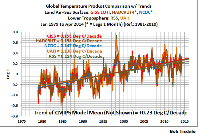
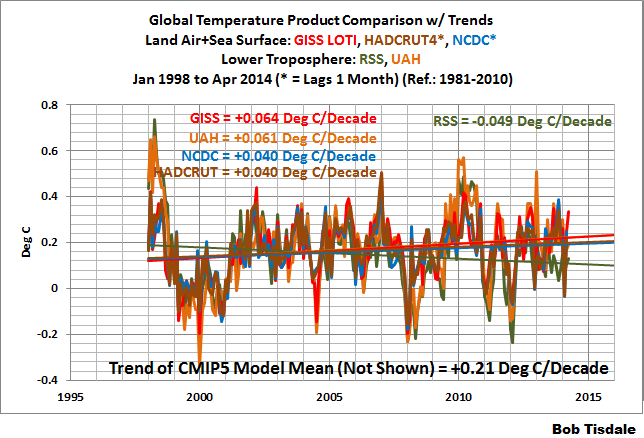
The GISS, HADCRUT4 and NCDC global surface temperature anomalies and the RSS and UAH lower troposphere temperature anomalies are compared in the next three time-series graphs. Figure 8 compares the five global temperature anomaly products starting in 1979. Again, due to the timing of this post, the HADCRUT4 and NCDC data lag the UAH, RSS and GISS products by a month. The graph also includes the linear trends. Because the three surface temperature datasets share common source data, (GISS and NCDC also use the same sea surface temperature data) it should come as no surprise that they are so similar. For those wanting a closer look at the more recent wiggles and trends, Figure 9 starts in 1998, which was the start year used by von Storch et al (2013) Can climate models explain the recent stagnation in global warming? They, of course found that the CMIP3 (IPCC AR4) and CMIP5 (IPCC AR5) models could NOT explain the recent halt in warming.
Figure 10 starts in 2001, which was the year Kevin Trenberth chose for the start of the warming halt in his RMS article Has Global Warming Stalled? Because the suppliers all use different base years for calculating anomalies, I’ve referenced them to a common 30-year period: 1981 to 2010. Referring to their discussion under FAQ 9 here, according to NOAA:
This period is used in order to comply with a recommended World Meteorological Organization (WMO) Policy, which suggests using the latest decade for the 30-year average.
Figure 8 – Comparison Starting in 1979
###########
Figure 9 – Comparison Starting in 1998
###########
Figure 10 – Comparison Starting in 2001
AVERAGE
Figure 11 presents the average of the GISS, HADCRUT and NCDC land plus sea surface temperature anomaly products and the average of the RSS and UAH lower troposphere temperature data. Again because the HADCRUT4 and NCDC data lag one month in this update, the most current average only includes the GISS products.
Figure 11 – Average of Global Land+Sea Surface Temperature Anomaly Products
The flatness of the data since 2001 is very obvious, as is the fact that surface temperatures have rarely risen above those created by the 1997/98 El Niño in the surface temperature data. There is a very simple reason for this: the 1997/98 El Niño released enough sunlight-created warm water from beneath the surface of the tropical Pacific to permanently raise the temperature of about 66% of the surface of the global oceans by almost 0.2 deg C. Sea surface temperatures for that portion of the global oceans remained relatively flat until the El Niño of 2009/10, when the surface temperatures of the portion of the global oceans shifted slightly higher again. Prior to that, it was the 1986/87/88 El Niño that caused surface temperatures to shift upwards. If these naturally occurring upward shifts in surface temperatures are new to you, please see the illustrated essay “The Manmade Global Warming Challenge” (42mb) for an introduction.
MONTHLY SEA SURFACE TEMPERATURE UPDATE
The most recent sea surface temperature update can be found here. The satellite-enhanced sea surface temperature data (Reynolds OI.2) are presented in global, hemispheric and ocean-basin bases.






Bob,
Always well thought out and presented.
Thank You.
Thanks Bob!
….glad to see that someone finally admitted the sea level satellites have a decaying orbit
oh wait!……….LOL
So come all you scientists
And follow your own rules
Keep your eyes on the data
And patch up your tools
Your orgs and your models
Are making you fools
When they tell you the earth will be burnin
For the warm it is now will be later to cool
For the Würm it is a turnin
Well, I don’t like these numbers at all. “The pause” is coming to an end and with the developing El Niño, the flat trend comes to an end. Too bad… I’d love some cooling, instead…
Considering where the temperature’s going, the current forecasts for my region is starting to look like we’ll break every heat record that is possible for the month of May, anticipated near triple-digit temperatures again might occur early next week which might be the first time it ever happens for the month of May (I remember when I was a kid, triple digit temperatures just didn’t happen so early in the year).
Add in the (declared) wildfire season start in California obliterating the old record and I do hope that we don’t end up finding that the side most talented in name-calling and ad-hominem attacks end up being the ones who are right (depending on how far the temperatures go up during the El Nino and how the current heat compares with previous warm periods). Otherwise people might start watching shows like Ancient Aliens and ponder if who we say are crazy are actually the most truthful :-/
If the AGW side is right, then they will have all the ammo they need to argue that you should send all of your money to the government to let them dole out a perfect distribution of wealth (one for you, now one for you, here’s one for you, ect…).
I have a question for Bob or anyone else tht might be able to shed some light for me with my question.
The NSIDC wrote about the April Antarctic sea ice extent that said,
“The increased extent in the Weddell Sea region appears to be associated with a broad area of persistent easterly winds in March and April, and lower-than-average temperatures (1 to 2 degrees Celsius, or 2 to 4 degrees Fahrenheit cooler than the 1981-2010 average). A separate region of cool conditions extends over the southern Indian Ocean coastline, with temperatures as much as 2 to 3 degrees Celsius (4 to 5 degrees Fahrenheit) cooler than average.”
I just want to focus on the statement regarding the southern Indian Ocean coastline, where they wrote that it was 4 to 5 degrees Fahrenheit cooler.
Now when I look at Bob Tisdales April 2014 Global Sea Surface Temperature Anomalies map, I don’t see any data in the map that even suggests a hint that there is any cooling to that degree.
I guess what I want to ask is, If the NSIDC suggests there was cooling in that region for the month of april and your map don’t show the cooling for that region to that extent, where who what or why don’t these two statements/graphs seem to jive?
Thanks for your reply
Way to go, Bob; your usual good job.
However, today French foreign minister Fabius told John Kerry (who apparently agreed) “…as I said, we have 500 days [approx 19 months] to avoid climate chaos…”. Of course, nobody presented any real or imagined data; these guys will undoubtedly be HUGELY relieved when they see Bob’s analysis.
I’m guessing Fabius’ comments are Europe’s update on England’s Prince Charles’ May, 2008 prediction (72 months ago) that the world had 18 months to avoid “…seeing more drought and starvation on a grand scale. Weather patterns will become even more terrifying and there will be less and less rainfall”. (Question: Did I miss something here or was this prediction well,,,er,,,wrong)?
/sarc off.
Ooops – no sarc intended on the “good job” for Bob’s work.
It will be interesting to see what these trends look like by the end of the year. Even IF we get an El Nino (which is still not guaranteed) and even IF that leads to a record year by some metrics (which it may not hit even then) longer trends will still likely be well below predicted pace.
Thanks very much Bob. I wonder would it be worthwhile to present the running trends for the same duration from month to month? Instead of reporting lengthening running trends from the same starting point you could stick with 160 and 200 months (arbitrarily chosen) to allow month to month comparison of the running trend? Sam
Jill Abramson was outed from NYT !
ANDREW C. REVKIN needs to go … subliminal … now … and pronto … [Andy: deny everything the NYT Police Demand] !
[Transfer bank account from NYC banks ! and same goes for property holdings. NYT will contact NYC for bank, property and tax records (an arrest records of course). Got to stay two steps ahead of the NYT Police.]
Adam from Kansas do you really live in Kansas, you must not be to old. I lived In Moorhead Minnesota in 1980 the temperature for Fargo airport that year on April 21 was 100 F, now you live on the plains a lot further south don’t tell me the weather you are having is not abnormal go look at the daily records you will find most of the high for each day was set in the first half of the 20th century not the last half and not in the 21st century. educate yourself don’t be a guppy and by the latest adult male bovine fetal matter the present agents of smart are trying to sell you. Oh by the way, I live in Arizona and we are not having 100 + day yet and that not the normal also, although once we pass through that threshold we will not see day time temperatures below 100s until some time in September, and I also talked to my coworkers in North Dakota it was below freezing this morning, again not out of the normal but still had to take, one of the reason I left North Dakota is spring is forever and summer is far to short.
My goof I meant we are not having 100 + days yet, yes we have had a few that warm already. Again nothing out of the ordinary except the heat could be on right now and it is not.
Sorry if this way off topic (not to mention possibly a dumb question):
I see all of the anomalies and I see the scales. Sure it’s interesting to see the minute wiggles blown up to great detail… But what if I wanted to look at the anomaly with a normal temperature range / scale? If I took, for example, GISS from 1880 to present with an offset of 20 (to put it about 68 F), and then I put an OLS smoothed random noise at -17 (to equate to 0 F) and another at 49 (to equate to about 120 F). Maybe even slap the satellite record on there too? Would that be horribly wrong? Can I do that with anomalies?
I realize that it wouldn’t be an actual location/temperature, but a construct… a fictitious place that just happens to have exactly the same average temperature swings as whatever data set I chose… based upon an 68 F starting point. And, of course, calibrated to whatever base period they used for that data set.
In talking to folks I invariably want for a an visual representation of an average temperature at a scale that folks are used to seeing. It’s very calming to see a flat line versus a hockey stick.I think the realistic scaling helps keep this whole affair in perspective.
Where did I go wrong?
http://woodfortrees.org/plot/noise/offset:-18/from:1979/trend/plot/gistemp-dts/from:1880/offset:20/to:2014/plot/noise/from:1979/offset:38/trend/plot/rss/offset:20/plot/uah/offset:20
@jumbofoot – Yakutsk is a city that has experienced a record maximum of 38.4°C and record low of -64.4°C. Its daily mean is -8.8°C for the year. This scale would ram it home that humans can cope.
if u contextualise the 30 year snapshot within the ice age cycles what it looks like is nothing to worry about.
ClimateForAll, the cooling they were discussing was on land.
http://data.giss.nasa.gov/cgi-bin/gistemp/nmaps.cgi?sat=4&sst=3&type=anoms&mean_gen=04&year1=2014&year2=2014&base1=1951&base2=1980&radius=1200&pol=rob
AdamfromKansas
Considering where the temperature’s going, the current forecasts for my region is starting to look like we’ll break every heat record that is possible for the month of May, anticipated near triple-digit temperatures again might occur early next week which might be the first time it ever happens for the month of May
Don’t know which part of Kanasa you are from, but by far the hottest May was in 1962 in KS.
100+ temps were common, and 103F was clocked in Johnson on the 12th.
http://www.ncdc.noaa.gov/IPS/cd/cd.html;jsessionid=C0ECFAC6549A7E89E17701B5F46C90BB?_page=0&jsessionid=C0ECFAC6549A7E89E17701B5F46C90BB&state=KS&_target1=Next+%3E
http://www1.ncdc.noaa.gov/pub/orders/IPS/IPS-B60B5CAF-E18B-4572-ADC5-2D992AB0525B.pdf
There may of course be other years with similar temps. For instance, the May 1934 State Climatological Report gives a top temp that month of 106F at Oketo and Valley Falls on the 30th, and quotes
a mark that has been exceeded but twice in previous Mays of record
http://www1.ncdc.noaa.gov/pub/orders/IPS/IPS-CB5B67CA-2931-4649-A9EC-86874453566B.pdf
Bob
Any idea why satellites and surface have diverged so much this year?
Paul
Excellent work as usual Bob.
It looks like the El Nino is definitely strengthening now.
http://www.ospo.noaa.gov/data/sst/anomaly/2014/anomnight.5.15.2014.gif
Hard to call it an El Nino since the warm-enough water is still mainly in the eastern part but definitely looking more El Nino-like now.
It was 27 F around Ord, Nebraska this Morning and 46 F in the Houston area. 5-15-14
Paul Homewood says: “Any idea why satellites and surface have diverged so much this year?”
Looking at the difference between the average TLT anomalies and average surface temperature anomalies, this year doesn’t look unusual:
http://bobtisdale.files.wordpress.com/2014/05/ave-tlt-minus-ave-surface.png
Regards
Adam,
http://blogs.mprnews.org/updraft/2014/02/coldest-winter-in-30-years-so-far-warmer-pattern-shift-next-week/
Don’t recall you noting Kansas had the 17th coldest winter since records were kept (1894)??
It get’s hot, it get’s cold. Neither data point supports legislation by our “helpers” in government.
Frost is forecasted for tonight in parts of NE and NC Kansas….
Don’t know where you are getting the above average temps…
Normal last day of frost for NC Kansas is 5 May.