
Richard S. Courtney writes in comments on the Mann and misrepresentations thread…
Anthony:
In the same week as MBH98 was published I wrote an email on the ‘ClimateSkeptics’ circulation list. That email objected to the ‘hockeystick’ graph because the graph had an overlay of ‘thermometer’ data over the plotted ‘proxy’ data. This overlay was – I said – misleading because it was an ‘apples and oranges’ comparison: of course, I was not then aware of the ‘hide the decline’ (aka “Mike’s Nature trick”) issue.
Unknown to me, somebody copied my email to Michael Mann and he replied.
‘Climategate’ revealed that email from Michael Mann and it can be read here:
http://www.ecowho.com/foia.php?file=3046.txt&search=medieval
Mann’s response consists solely of personal abuse against me and, importantly, it does not address the issue which I had raised immediately upon seeing the ‘hockeystick’ graph. Hence, I am certain that the graphical malpractice of the ‘hockeystick’ was both witting and deliberate.
I’ve reproduced the email below, the redactions were in the linked content that Courtney cites. Mann’s claims about dataset splicing are laughable, as even the Muir Russell investigation (for the later version which appeared in the IPCC TAR) labeled it as such, as McIntyre notes:
Here are Muir Russell’s comments on the IPCC 2001 incident (of which Mann was Lead Author), which they somewhat conflated with the WMO 1999 incident of the “trick” email:
In relation to “hide the decline” we find that, given its subsequent iconic significance (not least the use of a similar figure in the TAR), the figure supplied for the WMO Report was misleading in not describing that one of the series was truncated post 1960 for the figure, and in not being clear on the fact that proxy and instrumental data were spliced together. We do not find that it is misleading to curtail reconstructions at some point per se, or to splice data, but we believe that both of these procedures should have been made plain – ideally in the figure but certainly clearly described in either the caption or the text.
Here is the email Courtney speaks of:
date: Tue, 18 Jul 2000 16:41:12 +010 ???
from: Phil Jones <???@uea.ac.uk>
subject: Re: Global Surface Record Must Be Wrong
to: ???@uea.ac.uk,???@uea.ac.uk
>X-Sender: ???@holocene.evsc.virginia.edu
>Date: Tue, 18 Jul 2000 10:29:15 -0400
>To: ???@lanl.gov
>From: “Michael E. Mann” <???@virginia.edu>
>Subject: Re: Global Surface Record Must Be Wrong
>Cc: ???@geo.umass.edu, ???@uea.ac.uk
>
>Chick,
>
>This guys email is intentional deceipt. Our method, as you know, doesn’t
>include any “splicing of two different datasets”-this is a myth perptuated
>by Singer and his band of hired guns, who haven’t bothered to read our
>papers or the captions of the figures they like to mis-represent…
>
>Phil Jones, Ray Bradley, and Malcolm Hughes dispelled much of the mythology
>expressed below years ago.
>
>This is intentional misrepresentation. For his sake, I hope does not go
>public w/ such comments!
>
>mike
>
>>Date: Tue, 18 Jul 2000 08:38:35 +0100 ???(BST)
>>X-Envelope-From: ???@courtney01.cix.co.uk
>>X-Sender: ???@mail.compulink.co.uk
>>To: Chick Keller <???@lanl.gov>
>>From: COURTNEY <???@courtney01.cix.co.uk>
>>Subject: Re: Global Surface Record Must Be Wrong
>>X-MIME-Autoconverted: from quoted-printable to 8bit by
>holocene.evsc.virginia.edu id DAA27832
>>
>>Dear Chick:
>>
>>Your past performance demonstrates that your recent piece to Peter Dietze is
>>unworthy of you. Smears and inuendoes are not adequate substitutes for
>>evidence and reasoned argument. You say;
>>”As to Michael Mann’s “hocky stick” paleo-temperature graph, I realize why
>>many attack it for it puts the nail in the coffen of the argument that
>>recent natural variability is as large as what has been observed in the 20th
>>century.”
>>
>>No ! People attack the ‘hockey stick’ because it is uses an improper
>>procedure to assess inadequate data as a method to provide a desired result.
>>I have defended Mann et al. from accusations of scientific “fraud” because I
>>am willing to accept that this was done in naive stupidity, but I am not
>>willing to accept that is good science. As you say, “people like Mann,
>>Briffa, Jones, etc.” have conducted “careful work”, but doing the wrong
>>thing carefully does not make it right.
>>
>>The ‘hockey stick’ is obtained by splicing two different data sets. Similar
>>data to the earlier data set exists for up to near the present and could
>>have been spliced on, but this would not show the ‘hockey stick’ and was not
>>done.
>>
>>Also, it is not true to say, as you have;
>>”But, it’s going to take more than rhetoric about Europe’s Little Ice Age
>>and Medieval Warming to get around the careful work of people like Mann,
>>Briffa, Jones, etc.”
>>Nobody in their right mind is going to place more trust in the proxy data of
>>”Mann, Briffa, Jones, etc.” than in the careful – and taxed – tabulations in
>>the Doomesday Book. The Medieval Warm Period is documented from places
>>distributed around the globe, and it is not adequate to assert that it was
>>”not global” because it did not happen everywhere at exactly the same time:
>>the claimed present day global warming is not happening everywhere at the
>>exactly the same time. Indeed, you say;
>>”recent temperature anomalies show that, while the tropics is cooler than
>>usual due to La Niña, the rest of the world is pretty much still as warm as
>>in 1998.”
>>
>>It is historical revisionism to assert that the Little Ice Age and Medieval
>>Warming did not happen or were not globally significant. It will take much,
>>much more than analyses of sparse and debatable proxy data to achieve such a
>>dramatic overturning of all the historical and archaelogical evidence for
>>the Little Ice Age and the Medieval Warm Period. Those who wish to make
>>such assertions should explain why all the historical and archaelogical
>>evidence is wrong or – failing that – they should expect to be ridiculed.
>>
>>All the best
>>
>>Richard
>>
>>>Dear Peter,
>>>
>>>In a recent message to Tom Wigley you wrote:
>>>
>>>>”Nowadays, what is measured is mostly quite correct. This holds for the
>>>>counts of frogs, butterflies and for the MSU measurements as well as for
>>>>the ground station readings. What is seriously flawed, are the biased
>>>>*interpretations*. So the surface record may be not wrong at all and
>>>>part of the warming is indeed anthropogenic. Wrong is only the paradigm
>>>>that ground warming is mostly caused by CO2 – and that this warming has
>>>>to show up in the lower troposphere as well. It is striking how the
>>>>ground warming grid pattern coincides with winter heating (Vincent Gray)
>>>>- if the warming was caused by CO2 it should rather be evenly
>>>>distributed over the globe, MSU-detected and only being modified by
>>>>meteorological conditions. Note that this energy caused warming only
>>>>depends on our energy demand and does hardly increase with CO2
>>>>concentration. So this warming should neither be allocated to the CO2
>>>>increment nor be misused with future CO2 projections.”
>>>
>>>I have been looking at NCDC plots of global temperature anomalis divided
>>>into three regions- tropics (20N–20S) and the rest of the
>>>globe–(20N–90N) and (20S–90S). When looked at that way, recent
>>>temperature anomalies show that, while the tropics is cooler than usual due
>>>to La Niña, the rest of the world is pretty much still as warm as in 1998.
>>>This is particularly true of northern subtropics and southern subtropical
>>>oceans. The most recent data in fact show the following: for the period
>>>March-May 2000, the northern subtropics are the warmest march-may ever, and
>>>the southern subtropics are essentially as warm as in 1998. Note that this
>>>is not in the winter for either hemisphere. Thus, it would seem to be
>>>important not to make too much of the winter-only observations.
>>>
>>>As to Michael Mann’s “hocky stick” paleo-temperature graph, I realize why
>>>many attack it for it puts the nail in the coffen of the argument that
>>>recent natural variability is as large as what has been observed in the
>>>20th century. Gene Parker in the most recent Physics Today just pushed
>>>that point of view citing 20 year-old work as his only support. But, it’s
>>>going to take more than rhetoric about Europe’s Little Ice Age and Medieval
>>>Warming to get around the careful work of people like Mann, Briffa, Jones,
>>>etc. And more recently , Tom Crowley’s article in last week’s Science!!!
>>>Their work includes those acknowledged regional events (LIA and MWP) and
>>>still shows the 20th cent. to be anomalous. (I might add here that it also
>>>calls into question suggestions that solar variability has an additional
>>>indirect forcing amplification since that should have come out of the data.
>>>Instead most published studies show a significant solar influence but a
>>>moderate one.) And so the only way around recent thousand year paleo
>>>studies is for more comprehensive hemispheric and global studies that fill
>>>in acknowledged gaps and in addition show that climate variability is
>>>larger than recent studies show.
>>>
>>> Perhaps a more fruitful approach would be to ask what the magnitude
>>>of regional variations has been in the past 150 years. If there are no
>>>regions whose temperature variations were very far from the global average,
>>>then one could legitimately ask how clear anomalies such as the little ice
>>>age could have been sustained in the face of the larger hemispheric
>>>climate. As one example I might cite the eastern United States and perhaps
>>>a large region to the north east since 1940. It clearly has not
>>>participated in the global trend, so much so that urban heat island fans
>>>cite it as an example of how good records (the US) don’t show as much
>>>warming as bad records (the rest of the world).
>>>
>>>Regards,
>>>Charles. “Chick” F. Keller,
>>>Institute of Geophysics and Planetary Physics/University of California
>>>Mail Stop MS C-305
>>>Los Alamos National Laboratory
>>>Los Alamos, New Mexico, 87545
>>>???@lanl.gov
>>>Phone: (505)???
>>>FAX: (505)???
>>>http://www.igpp.lanl.gov/climate.html
>>>
>>>Every thoughtful man who hopes for the creation of a contemporary culture
>>>knows that this hinges on one central problem: to find a coherent relation
>>>between science and the humanities. –Jacob Bronowski
>>>
>>>
>>
>>
>>
>_________________________________________
> Professor Michael E. Mann
> Department of Environmental Sciences, Clark Hall
> University of Virginia
> Charlottesville, VA 22903
>_________________________________________
>e-mail: ???@virginia.edu Phone: (804)??? FAX: (804)???
> http://www.evsc.virginia.edu/faculty/people/mann.html
>
>
Prof. Phil Jones
Climatic Research Unit Telephone +44 ???
School of Environmental Sciences Fax +44 ???
University of East Anglia
Norwich Email ???@uea.ac.uk
NR4 7TJ
UK
============================================================
UPDATE: Steve McIntyre responded in comments, saying he didn’t think the “splicing” issue in MBH98 was a substantial issue for him, and I responded to him, giving my reasons for why I disagree.
For the sake of completeness to discussing this issue, I’m elevating his comment and my response to the body of the post. – Anthony
Anthony, this post has numerous errors, none of which should be made by people interested in this topic. It is very disappointing to read such material.
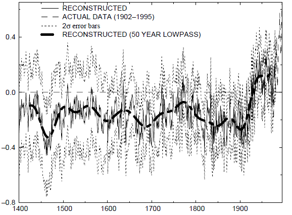
In Mann et al 1998 (as Jean S first figured out), to calculate the smooth, Mann padded the MBH98 proxy reconstruction after its 1980 end point with instrumental data. Mann only used the smooth up to 1980. This was “Mike’s Nature trick”. Jean S observed the irony of this procedure, given Mann’s protestations against splicing, but the effect was relatively subtle. Contra Courtney’s conflation of “hide the decline aka Mike’s Nature trick, Mike’s Nature trick applied in Mann et al 1998 had NOTHING to do with “hide the decline” – which was an issue with the Briffa reconstruction.
Further, in Courtney’s 1998 email, he said:
The ‘hockey stick’ is obtained by splicing two different data sets. Similar data to the earlier data set exists for up to near the present and could have been spliced on, but this would not show the ‘hockey stick’ and was not done.
In the Mann et al 1998 diagram criticized in Courtney’s email, the proxy reconstruction and the observed data are distinguished by being plotted in different colors or different line type. In other words, they were not “spliced” in the diagram. In Courtney’s recent email to Anthony, he says that the above email “objected to the ‘hockeystick’ graph because the graph had an overlay of ‘thermometer’ data over the plotted ‘proxy’ data. This overlay was – I said – misleading because it was an ‘apples and oranges’ comparison: of course,” I, for one, would never have guessed that this was the criticism being made in the original email. While Mann’s response was marred by his all-too-typical invective, I can well understand why he rejected the allegation in Courtney’s email.
In Courtney’s recent covering email to Anthony, he now characterizes his earlier objection as an objection to proxy reconstructions being plotted on the same graph as observations as follows:
That email objected to the ‘hockeystick’ graph because the graph had an overlay of ‘thermometer’ data over the plotted ‘proxy’ data. This overlay was – I said – misleading because it was an ‘apples and oranges’ comparison: of course, I was not then aware of the ‘hide the decline’ (aka “Mike’s Nature trick”) issue.
While, as noted above, it would have been very difficult, if not impossible, for a contemporary reader to discern this meaning, this criticism is equally invalid in my opinion. I, for one, absolutely do not take issue with plotting a proxy reconstruction on the same scale as observations. I and others take issue with the “divergence problem” precisely because when one plots the Briffa reconstruction against observed temperatures in the 20th century, the two plots diverge. According to Courtney’s criticism, it would be invalid to do such a plot. This is absurd. This does not mean that I endorse the muddiness of Mann’s graphics or other defects. Only that I, for one, do not take issue with plotting a reconstruction and observations on the same scale. On the contrary, it is something that I’ve done on many occasions. As I said to Courtney at CA on this point, if I’m unconvinced on this issue, I can’t imagine why a judge or jury would be convinced.
In the WMO 1999 graphic, Jones deleted values of the Briffa reconstruction after 1950 or so (the decline), spliced instrumental temperature to the end of the record, smoothed the combination and plotted the spliced version (without peeling back to 1950 as in Mike’s Nature trick.)
Muir Russell criticized the truncation and splicing of data in WMO1999 as follows:
the figure supplied for the WMO Report was misleading in not describing that one of the series was truncated post 1960 for the figure, and in not being clear on the fact that proxy and instrumental data were spliced together.
However, he did not take issue with plotting proxy reconstructions and observations on the same graphic. (Not that Muir Russell would be definitive on this.)
There are important issues in connection with the Mann corpus. This is not one of them. Too often, Mann’s opponents make irrelevant and easily rebutted criticisms. Unfortunately, this makes it easier for Mann to avoid more substantive criticisms. For a full explication of the differences between the various incidents, I refer people to the following CA post: http://climateaudit.org/2011/03/29/keiths-science-trick-mikes-nature-trick-and-phils-combo/
========================================================================
REPLY: Thanks for your opinion and clarifications Steve. Bear in mind that Courtney wrote this before the “trick” and truncation was known. While I often defer to your superior knowledge on the subject of MBH98 it is my respectfully differing opinion that plotting the two datasets together (proxy reconstruction and instrumental temperatures) is indeed problematic and misleading in that both techniques have different samplings and sensitivities to temperature.
Instrumental temperature is much more sensitive than tree ring derived proxy temperature, which has a long time domain and is not exclusively a representation of temperature, due to equal if not greater sensitivity to other variables, as I pointed out here: http://wattsupwiththat.com/2009/09/28/a-look-at-treemometers-and-tree-ring-growth/
While Courtney’s complaint is most certainly incomplete in today’s perspective, we shouldn’t just say that plotting two dissimilar datasets on the same chart without proper caveats is a proper practice.
An analog to the spliced combination plot of Mann’s MBH98 graph in today’s climate arena might be this: suppose somebody wants to argue that hurricanes in the NH are becoming more frequent, and they are the more frequent now than in the last 1000 years.
One way to do this is to look at historical reports of hurricanes in literature, newspapers, magazines and other historical writings. These would be a “proxy” for the actual frequency of hurricanes in a given year. Suppose that the researcher was able to find enough reports to to make what looks like a viable dataset, but that instead of using historical writings to determine frequency of hurricanes in the 20th century, the actual record of named hurricanes (essentially observations) was used, such as this graph, which has a nice “hockey stick” shape implying that hurricanes frequency had increased dramatically in the late 20th century.

Arguably, that’s incomplete, showing only the Atlantic, but it’s the best I can do on short notice before I head to work this morning.
The combination of the two datasets, historical literature accounts, plus named storms in the north Atlantic might very well look much like Mann’s flat section of the hockey stick up to about 1925…mostly flat, maybe a slight increasing trend. It would likely look a lot like this graph you plotted in the CA discussion of Besonen et al 2008 (which has other issues independent of this discussion, I’m only using it as an example of what such a graph for this discussion might look like).

To the layman and even to some scientists, they might take such a construct of hurricane historical accounts (proxy) and named storms (observations) as being proof that hurricane frequency is indeed dramatically increasing in the 20th century.
But the issue is sampling and sensitivity. As you’ve pointed out many times, low sampling and/or selected sampling of proxies leads to spurious results when extrapolated to a larger scale (regional to global for example).
From a sensitivity standpoint, since human literature is less frequent as a we go back in time, we’d expect any dataset of historical hurricane accounts to have lower sensitivity to the actual number of hurricanes in any given year simply due to population density and the lack of communications. Many storms would go unreported.
Even in the 20th century data, as shown in the Pew graph above, this effect is likely, due to the early part of the century having lower population, and less ability to observe hurricanes due to a lower level of technology. I talk about this effect in the reporting bias of “extreme weather” here: http://wattsupwiththat.com/2011/04/19/why-it-seems-that-severe-weather-is-getting-worse-when-the-data-shows-otherwise-a-historical-perspective/ So even the Pew graph would almost certainly have a lower representation for named storms in the pre-satellite era.
So, for the purposes of my exercise, knowing that the two datasets for hurricane frequency would have different samplings and sensitivities to actual hurricane frequency in the NH, would it be proper to put these two datasets together into a single graph to argue that hurricane frequency in the NH is the “highest ever” at the endpoint of the graph?
From my viewpoint it would not be, because these two datasets have significantly different samplings and sensitivities to actual hurricanes. The layman doesn’t likely know this, and many of the media that might seize on such a graph probably wouldn’t note this as they often work from press releases. A press release about this hurricane frequency “paper” probably wouldn’t trumpet the fact that the two datasets are greatly dissimilar, and that as you go back in time, the sampling is less, and the sensitivity in the last part of the graph to hurricanes is dramatically higher than any part of the record.
And that’s why I see the splicing in MBH98 as another “trick”. Putting the two dissimilar datasets together implied they have equal sampling and sensitivity to temperature, when they clearly don’t, and the public and the media ran with that visual almost entirely without questioning it, because even though the colors were different, many newspapers back then didn’t reproduce in color, and many people simply take the graph’s “total shape” at face value, without realizing the differences between the two datasets.
(added, here is what a newsprint version of MBH98 might look like…note the dataset delineations disappear, laymen and politicians certainly wouldn’t be able to see beyond the total graph shape in B&W))

To me, that’s just as wrong as the truncation and the overlay issues.
Plotting/splicing two similar datasets of equal sampling and sensitivity in my mind is not an issue. Plotting two greatly dissimilar datasets with unequal sampling and sensitivity, is an issue.
While I am still in the middle of getting caught up to date on May12ths harvest of fascinating clarifications about MBH98 and Mann between Steve McIntyre and Richard S Courtney, let me kindly REMIND readers and participants about the crucial shifting grounds underlying IPCC science and traditional practice in climatology back then.
The era 1998 to 2001 was a crucial time because the IPCC changed from observing and describing the potential AGW problem (1990 and 1995) to making a definite attribution of ‘a discernable human influence upon the climate’ (SPM, 2001, if memory correctly serves), and claiming the anthropogenic theory of global warming as “science.”
Over the late 1990s, also, I think, we saw the changing of the guard from the Old School cautious, synoptic climatologists to the Young Turks like Mann and climate modellers like Ben Santer, aggressively staking out their carerr-building claims making their international scientific reputations, and as respectable scientific pioneers. Old School climatologists such as Richard Lindzen – and even founders of the field’s methods like William Gray – began retiring then, and with them their venerable tradition of scrupulous scientific conduct and that remains beyond reproach, as well as cautious claim-staking and caveat-making in their science. These senior scientist cohorts definitely dominates at gatherings like the Heartland Institutes (soon to be) 9 Conferences, in stark contrast to the Richard Alley’s and Peter Gleick’s that populate AGU conferences.
My point is this: the issue of data handling, presentation with appropriate sensitivities, and allegations of misuse of the record between Steve and Richard here is absolutely fundamentally the same as the one waged between, say, Bill Gray and Kevin Trenberth in Colorado, or Will Happer and Michael Oppenheimer at Princeton University.
By the turn of the century, the effects of the Clinton era’s federal spending upon ‘climate science’ – increasing the budget 10 times in a single budget year of 1993 – had created a swarm of New Recruits to do the governments and eco-activists work on the global warming problem. This resulted in not only a dilution of cautious traditions that have been crowded out in publicity and personnel, but also important changes in the accepted and acceptable methods of science.
I can understand that Steve McInyre is not much interested in tracking and following this signal transition – and Richard Courtney may or may not either – but many kibitzers here reading the many blogs that attempt to follow and criticize climate science are.
To my mind, Steve is the brilliant analyst and revered master of long-form science criticism – and Richard is the leading role-model of the shortest form (with possibly many other commenters coming a close second), usually posting here.
While Anthony Watts himself is an indefatigable and timely master science-provocateur, his concision is sometimes uneven. And thus while his productivity is without peer and his shared talent pool unequalled, science bloggers like Joanne Nova and climatologists Judith Curry (as well as Roy Spencer and Roger A. Pielke, Sr.), are either more consistently concise or else measured and fair to the material, I believe.
After our most accomplished host come a few other skeptic bloggers like Jeff Id and Andrew Monfort. No doubt other serious readers will come different estimates of the bloggoverse – with maybe a different list of candidates – than I do.
These kudos dished out, I hope the larger picture of hoping and attempting – and yes, needing – to better understand the transition from traditional climatology to the well-poisoning free-for-all of climate science’ is very important to diagnosing the institutional transition that vexes CAGW-skeptics. This larger perspective is essential to ‘get right’ if anything appropriate is ever going to done to right the good ship of sound climate science, so the world can continue to flourish with human benefit.
This thread untangling of the Hockey Team’s exegetical founding claims over Mann reminds me of a famous quote from Sir Walter Scott: “Oh what a tangled web we weave, When first we practice to deceive.” Richard’s complaint goes to Mann’s motives – and Steve and he differ as to how revealing those motives might be interpreted in MBH1998s crucial graph.
I still remember this period (1998-2001) of science news, and it affected my own transition to becoming a “worried warmer” – if the replication of these findings occurred. And with the IPCCs TAR in 2001, it did. And this transition of my own personal commitments (and back again, but sharply qualified and more deeply informed) is shared with the popular science writer Matt Ridley, as he explained in his Prospect review of Montford’s “The Hocker Stick Illusion.”
I want to thank the named and many unnamed participants to this thread for once more clarifying my understanding of “The Age of Global Warming (as historian Rupert Darwell trenchantly dubs it).
Richard reminded: “Yes, the proxy data sets were selected to do that using the (ridiculous) assumption that the proxy values which did that would have done the same previously and subsequently.”
The minor definition of “sophisticated” comes to mind: “Perverted or corrupted (an argument, etc) by sophistry.”
It was especially jaw dropping to me early on, as a trained laboratory scientist, that Mann’s followup to his original hockey stick used an algorithm to cherry-pick versus reject noisy individual proxies that likely randomly matched the recent instrumental data, claiming this was “objective” and so perfectly legitimate. A sense of everyday perspective is called for here, as would be lawyers try to turn everything into linguistic technicalities.
It’s also funny how the trolling opportunist Mosher thinks he has a his own hockey stick halo just for bashing Mann. That’s the oldest me-too trick in the book of snake oil salesmanship.
@Steve in Seattle
>Thank You Aphan ! !
>>Yes, the two different data sets were clearly shown in two different colors. The problem is that by overlaying them in a point where they “match up”, and then continuing on with only ONE of the sets, it automatically leads the viewer to assume…
I am not correcting your position or comment, but I want to extend it a little by pointing that there is an inherent claim in MBH98 regarding the core message. The core message is that the temperature of the NH and therefore probably the planet was pretty constant for centuries and leapt up suddenly when the industrial revolution got under way – because of CO2.
There are two data sets shown in the relevant graph: some ‘proxy data’ and some temperature measurements. The temperatures were measured with thermometers. It is crucial to understand (and state) that the other line’ is not a set of temperature data, nor is it a proxy for temperature data as it is contradicted by anthologies of weather reports and actual measurements.
To know what that line actually is, it is necessary to understand what Steve McIntyre uncovered and I don’t have time for all that here. But it is enough to remember that it is not a set of temperature data, proxy or not. It is just a wiggly line that was produced by a method that has no validity, and which happened to overlap some of the real temperature data during part of the time series. The included data sets were chosen on that basis.
The graph is a plot of the wiggly line that is not temperature, truncated so the part after the overlapping portion was not visible (because it did not agree with the instrument temperatures). The second thing that happened is the temperature plot was also truncated but on the older part leading up to the overlap, again, to prevent us seeing that the wiggly line did not agree with it.
The core claim in the paper is that the wiggly line represents the temperature of the planet (or NH if you like) and it is displayed in a manner that makes it look as if, when instruments became available, they overlapped (“affirming the accuracy” of the wiggly line) and thereafter instrument temperatures were shown. I have carefully considered Steve M’s point that a splice is two things represented graphically as one and not clearly stated as being different. He is right in general, but this is a special case of deception because Mann knew that the wiggly line was not representative of temperatures, and he went out of his way to make the overlapping period appear to confirm that it was, stating they were two different sets of information. We know Mann knew it was not representative of temperatures because when the rest of the data he had in hand was included, the MWP appeared. He only got his wiggly line by selectively removing data sets (tree rings) from those available, famously hiding those extracted from the set in a file called “Censored data”. This was not initially revealed in the ClimateGate emails, it was worked out before that by Steve, amazingly.
Richard’s complaint was that the way this thing was done is a ‘splice’. Consider: If I did it with two tree branches, it would be a splice. If I did it with two garden hoses that happened to cross each other at some point, it would be a splice. If I did it with two different sizes and colours of wire, cutting off the unused portions, such an overlapping joint is called a ‘splice’.
My telling you I have, for example, two types of apple trees on a single root stock trunk does not mean the joint is not a splice; one can’t say the wires were not spliced. That is what a splice is: I take the bottom of the tree cutting off all the branches I don’t want to keep and splice onto into it one or more branches I like. I report to the buyer that is what I did and how I created it. My wife has such a tree with 5 varieties of apples on it.
The core issue is whether or not you are led to believe that the root stock is also an apple tree. It could be an orange tree. “Apples” in Mann’s case are temperatures measured by instruments. Mann claimed that the wiggle line was also ‘temperatures’ produce by his jiggery-pokery method of analysing tree ring widths. That line does not in fact represent temperatures and he knew it when he made the claim in a way that induced people to believe that it did.
A key process in this inducement was to show an overlapping section at the ‘end’ of the wiggle line and the beginning of the ‘instrument line’. This splice is analogous to splicing an apple tree branch onto an orange tree trunk. Both are ‘truncated’ in order to create the chimera. Inspecting the overlap (literally in both cases) could convince an unsuspecting customer that the root stock is also an apple tree. As they grow so well together at the overlap, a claim that ‘this is an apple tree’ made from two distinct tree parts from different gardens might be convincing, even if untrue.
Richard is calling an orange an orange, an apple an apple. Mann’s claim the whole tree “is the same as an apple tree” is bogus, we now know, on two counts: The splice was a convenient subterfuge and the wiggly line did not represent the historical temperatures of the NH. It was a slick piece of work, but made in support of fraudulent claims: that there was no MWP and that human industry was causing an unprecedented rise in global temperatures by releasing CO2 into the atmosphere.
What followed from this crafted lie has been a very expensive piece of human history and the noble-cause corruption of the field of climate science, its publications and many of its main actors.
Your hurricane analogy is not valid. Now if your proxy is up to date through the 1900s, then you could plot both and compare, and of course your modern numbers would be invalid.
Late to the party as usual, I do wonder why such an honest and objective person as Steve McIntyre has taken so much offence at what seem to me (and many others here) to be perfectly reasonable initial remarks by Richard Courtney.
However, there is someone else commenting on this thread, who really does deserve to be called out. I’m no Josh, but I have my talents!
There was once a young fellow called Mosher,
Whose conduct got gaucher and gaucher.
He called names in blank verse,
“Third-rate thinker,” and worse!
Don’t you understand, Steve, that ain’t kosher?
My view is that the MBH98 hockey stick graphic in question was a dramatically crafted sales device to a targeted customer. It was made possible by members of the climate science community who were in support of a need for a sales pitch and additionally made possible by peer review in a scientific journal as scientific status for the sales pitch.
It is apparent that the intended general customer for the sales pitch was the IPCC TAR process and the specific customer was the group leading the IPCC TAR chapter that Mann (one of MBH98’s authors) became an IPCC lead author of.
The IPCC’s charter is to myopically prove significant AGW from fossil fuels (not to objectively study the Earth Atmosphere System for increased understanding of it), and I think Mann’s work product aspects are consistent with 100% support of that charter by some questionably expedient means.
However, those problematic aspects do not mitigate the specific issues with richardscourtney’s year 2000 email (to Keller at Los Alamos Nat’l Labs) nor does it mitigate issues with his criticism of Mann’s comments about that email.
John
John Whitman:
I make no comment but ask a question because I am curious to know so I suspect others may be, too.
re your post at May 13, 2014 at 8:40 am,
what “issues” require what “mitigation” and why?
Richard
My thoughts on this: I suspect the major area of “vigorous discussion” among friends here is largely due to an elephant in the room that’s so obvious it hasn’t really been called out.
There are (at least) two significant audiences for that graph, with two widely divergent methods of interpretation.
Audience #1 is the scientific community. Serious scientists understand first of all that simple correlation doesn’t imply all that much. Many scientists do various comparisons between data sets, statistically, visually and by other means. There’s nothing wrong with this. A scientist can validly claim that this aspect of such a comparison is perfectly valid. And Mann can claim with some validity that if their graph is misinterpreted by those who don’t understand, that’s not their problem.
Audience #2 is the public, specifically the public who absorb mass media. The public barely understands science let alone statistics. Sadly, a majority today are quite gullible. Sadly too, many in the media are just about as gullible, and too easily will reproduce a nice looking graph and cut its meaning off at the knees by failing to recognize that the color in the graph had crucial importance.
Feynman argued that one of the most important duties of the scientist is to carefully avoid misleading anybody. Sadly again, too many scientists today do not follow that advice.
My sense:
Steve McIntyre is looking at Audience #1 and correctly stating that from a scientific perspective, there are bigger / more meaningful errors that can’t even pass scientific muster.
Richard, Anthony and more are looking at Audience #2 and correctly stating that from a communication perspective, Mann’s graph is clearly and unequivocally misleading to the public.
IMHO, you’re both correct.
{all bold emphasis mine – JW}
– – – – – – – – – –
Orson,
I think you “believe” what you said about our host at WUWT.
But, you must address a question which you begged in your assessment of our WUWT host. Your begged question is: Why?
Why does our WUWT host achieve the well-recognized goal of a very educational stimulation of both scientists and supporters of science? It is likely because of tolerance for the open marketplace for climate science ideas in a reasonably moderated and civil setting. Our host simply does this better than the other venues you mentioned.
I respect you for saying your somewhat critical comment about our WUWT host to his face here at WUWT. Thank you for that integrity. I have little respect of the lack of integrity shown by richardscourtney in his backhanded insulting comment here at WUWT about Steve McIntyre; richardscourtney should have had the integrity to say it directly to Steve McIntyre at CA.
John
John Whitman:
Your post at May 13, 2014 at 9:27 am ignores my request to you for clarification in my post at May 13, 2014 at 9:01 am. I remind that that my request was
Instead, your post adds two more offensive and unclear and probably untrue assertions; viz.
What “it” was a “backhanded insulting comment” and why should I have said “it” “directly to Steve McIntyre at CA”?
Richard
There’s no point going back to apple trees to discuss the term “splice”, because to anyone writing in paleoclimate of the last millennium, the term means a digital combination of two series. That’s how Mann (or myself) would interpret the complaint in Courtney’s original email. Now it seems that Courtney’s complaint pertained to plotting. But there’s no way that Mann (or myself) would have been able to guess that from Courtney’s email.
People who take umbrage at plotting the reconstruction and observations on the same plot should also recall that this was regularly done in articles to which Courtney did not object. Briffa et al 1998 – which showed the divergence problem – showed such a plot.
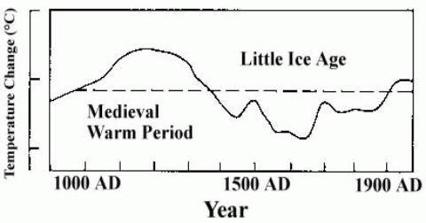
But to fully show the absurdity of Courtney’s complaint, recall the famous Lamb diagram of the MWP (also shown in IPCC 1990). The Lamb diagram showed the Central England temperature record in its later portion and a reconstruction from documents in its earlier portion. It didn’t merely show these two disparate records on a graphic, but actually spliced them. Anyone who is complaining about the Mann 1998 graphic should be hyperventilating about the Lamb diagram.
Too much of this present thread seems to be animated merely by dislike of Mann and partisan cheering of someone merely for opposing Mann than by informed skepticism.
On the Lamb Diagram point about splicing in IPCC 1990, this one:
Steve is correct. See here. http://wp.me/p6iHb-Ny
But the Lamb figure also illustrates one of my points, that when reproduced in B&W, anyone looking at it would have no clue about the splicing.
Mann’s actual figure in his MBH98 paper:
Only a trained eye could pick out the differences in plot lines. Laymen and general public would likely take it as the sum of its parts.
Steve McIntyre:
Your post at May 13, 2014 at 10:26 am begins saying
Taking your latter quoted point first, you seem fixated on the irrelevance of Briffa reconstructions. This thread is about my complaints at MBH98 in years prior to its inclusion in IPCC AR3.
Those complaints are evidenced in the ‘climategate’ email quoted above. The Briffa reconstructions with associated ‘divergence problem’ did not then exist so could not be pertinent to the subjects under discussion. And those subjects have both scientific and historical importance because the errors I pointed out would have been sufficient to reject the MBH98 graph for the use the IPCC gave it.
Your first objection is daft. It says
There was no reason to “guess” because my words in the email were clear and explicit ; i.e.
Clearly, Keller raised the issue of “Michael Mann’s “hocky stick” paleo-temperature graph” and I addressed the subject of that graph. The splicing concerned the data sets shown in that graph.
Also, when you disputed the matter in this thread my response pertained directly to the graph. At May 12, 2014 at 8:58 am I replied to you saying
The remainder of your post has no relevance to this thread and is silly. For example, you say I should object to Lamb having spliced similar data because I object to Mann having spliced dis-similar data. There are many, many things I have not done but none of them are pertinent to the validity of my early objection the the MBH98 ‘hockey stick’. And the splicing of similar data is not the same as splicing dis-similar data.
Richard
Mods:
My reply to SteveM is stuck in moderation probably because it quotes the f word.
Please retrieve it.
Richard
– – – – – – – – –
richardscourtney,
Issues.
Please see my only comment that was prior to your voluntary withdrawal (now lapsed) from this thread (your withdrawal which started with your comment informing withdrawal => richardscourtney @ur momisugly May 12, 2014 at 2:41 pm)
Please see my six comments posted after your voluntary withdrawal (now lapsed) from this thread.
Any questions?
John
John Whitman:
re your post at May 13, 2014 at 11:30 am.
I certainly do have “questions” and I stated then in my post addressed to you at May 13, 2014 at 10:16 am which is here.
None of your “six comments” answers any of those questions. And until you do provide answers then your posts which the questions request clarifying remain unsubstantiated smears and innuendos.
Richard
OK Richard S. Courtney you’re done on this thread then.
NOTE: This is my final comment on this thread.
* * * * * * *
– – – – – – – – –
richardscourtney,
Steve McIntyre’s rebuke of you at CA was sufficient unto your personal insult to him here at WUWT. In the situation he was a gentleman and was quite benevolent.
My respect for him went up.
John
Anthony
Two years ago I carried out my own reconstruction of CET to 1538 and used as a comparison the Hockey Stick and the IPCC’s graphic based on Lamb 1965
http://judithcurry.com/2011/12/01/the-long-slow-thaw/
Yes, the original IPCC graph undoubtedly came from the Lamb 1965 version but almost certainly the IPCC had come across it in the much more recent book of Lambs ‘Climate History and the Modern World’ dating from 1982, figure 30 chapter 5 figure a b and c
This was one of hundreds of diagrams Lamb drew and is merely an approximate schematic broadly representing the temperature, and for people to call the data he used, ‘spliced’ puts it on a par with the deliberate juxtaposition of data that appeared in Manns version.
Dr Mann knew this graph of his was the centrepiece of the IPCC document and it should have been more clearly labelled as it purported to be an accurate historic and scientific representation,which Lambs original graphic was never intended to be.
I have obtained Manorial Records, translated estate documents from Latin. unearthed diaries and other works from the Met Office library and elsewhere, back to 1200AD, so can say that Lambs crude schematic is generally historically more accurate than Manns Hockey stick.
However, Lamb underestimates the warmth of the 16th century I feel, and also the late 1300’s were very warm. Incidentally, numerous scientists have confirmed that CET is a reasonable-but not perfect proxy for global or at least NH temperatures.
The paleo proxy data is not capable of showing the annual and decadal temperatures and in consequence the variability shown in the hockey stick and the Spaghetti derivatives are unrealistic under representations of our actual real world climate.
We could of course have another discussion as to whether a ‘global’ temperature has any real meaning but we can leave that to another time.
tonyb
Further to my comments of circa 2006, above at
http://wattsupwiththat.com/2014/05/12/a-mann-uva-email-not-discussed-here-before-claims-by-mann-spliced-and-diced/#comment-1634104
I suggest that there are so many errors in MBH98 that Richard, Anthony and Steve can all be essentially correct. There is much fine detail in this discussion, but the conclusion remains:
“Mann and the IPCC were clearly wrong about the hockey stick – the only remaining question is not one of error, it is one of fraud.”
I suggest that events since 2006 have clearly decided the question of error versus fraud.
“It took eight years before the “Divergence Problem” was revealed, also in testimony. Mann grafted modern surface temperature data onto earlier tree ring temperature proxies to produce his upward-sloping “hockey stick” graph. Grafting together two different datasets is usually NOT good scientific practice.”
Why did it take eight years for the Divergence Problem to be revealed and only in testimony, presumably under oath? Does this suggest honest scientific practice?
Finally and for the record, I have found Richard S Courtney to be a highly intelligent, informative and honorable person, and a first-rate thinker. I have found his respectful disagreements in his long debate with Ferdinand Engelbeen to be highly informative. Furthermore, Richard has pointed out pertinent papers to me that demonstrate that he is widely read on this subject of climate science. I have great respect for Richard and value him as a knowledgeable colleague in this important debate.
Regards to all, Allan
Tony Brown,
Thank you for your paper at
http://judithcurry.com/2011/12/01/the-long-slow-thaw/
See Figures 12 to 14.