Harold Ambler writes:
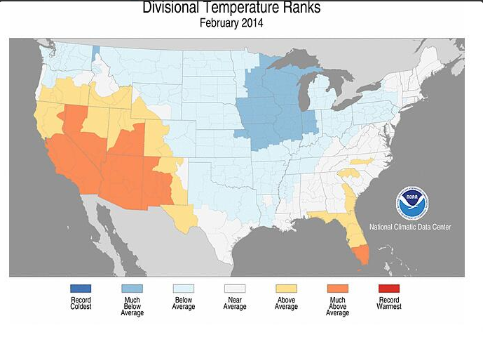
NOAA’s map of February temperatures across the United States got New England all wrong. It wasn’t “near normal,” at all, as the people of the region can well attest. Oh, and the data, too: Hartford, CT, as an example was actually 5.1 degrees below normal.
As the map above shows, NOAA seems to have struggled in creating a temperature map that accurately conveys what New Englanders recently experienced: a frigid February. Hartford was 5.1 degrees below normal for the month; Boston was 3.1 degrees below normal. Providence was 4 degrees below normal for the month. And yet all three locations fall within the “near normal” portion of NOAA’s map. What’s up with that?
How well did NOAA do representing February temperatures where you live?
Read more here:
NOAA map of February temperatures less than accurate
Well, with CAGW “abnormal” is the new normal. Didn’t somebody say that?
what is the tolerance band for each category? If it was +/-5, then only Hartford falls outside ‘normal’.
Its the message that matters not the facts , so they done the job they wanted to.
Don’t be ridiculous…..the orange and yellow have to be bigger than the blue
…it’s in the rules
If Virginia Beach was near normal in February, I’m Pope John Paul III.5.
Extreme distorted weather. It’s the new normal.
Perhaps your area has something like this.
http://www.erh.noaa.gov/iln/lcdpage.htm
Wonder what the difference between that one and this one (also Feb 2014)
http://www.cpc.ncep.noaa.gov/products/analysis_monitoring/regional_monitoring/us_monthly_tanom.shtml
A spot check of New England state’s February data does show Maine, Vermont, New Hampshire, and Massachusetts withing 1 C of the 1901-2000 average, consistent with the map graphic: http://www.ncdc.noaa.gov/cag/ Wisconsin was several degrees C below normal and California was several degrees above. That’s as far as I looked.
No way was Atlanta average. Had to be in coldest quartile by most any measure.
The hue and saturation of the color they chose to display the “below average” area is much less visually impacting than what they chose for the “above average” areas. The very light blue for the “below average” is almost indiscernible from the “near average” white.
The opacity of the two “above average” classes is greater as well, with the roads and state boundaries blotted out by the “warm” colors but visible thru the transparent “cool” colors.
Lying sacks of $#!^. People should lose their jobs over things like that.
Selective data and misleading graphics. That’s the new “normal”.
It’s real tough to get the temperature right when you got your head buried deep in the global warming sand.
I coulda’ pointed out that their heads were up…
Well, you know, where the warmists collectively put their heads; so their brains keep warm while they expound and emit high IR CO2 and CH4 gases.
Are we sure Hansen retired?
Northern Arkansas. We’re all still complaining that this was far and away a colder February than normal. The whole damn winter was colder than normal. Everybody I know (who’s old enough) is comparing this winter to the winters we had back in the 70s. I’ve never heard such belly-aching, and I was leading the chorus.
Am about 25 miles west of Boston and been here about 20 years.
We may get one night where it gets below zero. This year about 10. This is easily the coldest winter evah. The graphic does not capture this at all.
Close enough for government work.
They show central Florida as “above average” – when the temps here were pretty close to average for the month, and might have beat the “average” by a tenth of a degree or so…
“The great thing about science is that it doesn’t matter how many [scientists] you are up against. Ultimately the right ideas win out. Science is not a popularity contest. Galileo was right, but his ideas weren’t popular at the time. The bet is still open.”
Niel Turock, physicist (on possibly losing his bet over an expanding vs cyclic universe with Stephen Hawking.)
He could have been referring to AGW skepticism.
20 miles south of boston..kids are still pondskating
Stick that on your gragh
I had jokingly said, “as the global temperature plummets bitterly cold winters will become the norm”. Maybe NOAA agrees.
Ohio wasn’t below average…. it was much below average.
It could have something to do with this. They changed to a new system on March 13.
AVG. MAXIMUM 33.8 40.1 -6.3
AVG. MINIMUM 11.2 18.0 -6.8
MEAN 22.5 29.0 -6.5
This gets this area shaded in light blue. SE Nebraska.
For the fourteen county area in South Texas the map shows average. The 6 preliminary CF6 reports for the area average -1.6 below normal.
NOAA speaks with various maps to show February temperatures over the USA 48
http://www.warwickhughes.com/blog/?p=2790
Houston had its 2nd coldest Feb ever and they have it as ‘near average’
Here is a link explaining how NCDC categorizes:
https://www.ncdc.noaa.gov/monitoring-references/dyk/ranking-definition
Basically, it breaks the rankings into thirds for above/below average (e.g., if Feb 2014 falls in the top 3rd coldest Febs. on record, it’s in the “below average” category.) In order to fall into the “much” above/below category, it must have been within the top/bottom 10% of years.
These rankings just don’t make sense. For example Ft. Wayne, IN had its 5th coldest Feb. on record, 3.2F colder than the 12th coldest (bottom 10% cutoff) Feb. on record; yet somehow the NE Indiana climate division doesn’t make it into the “much below average” temperature category.
http://www.crh.noaa.gov/iwx/?n=2013_2014winter
Good lesson for the “children” – major distortion by your gov betters.
NOAA is just a propaganda organization.
Eventually Obama will have his “Hitler Reacts” moment before the end of his “Presidency”.
Oh gawd, those ugly orange and yellow blotches are back…..
I also have property in the Ozarks. Mean -5.9 there.
North Central Alabama was super cold, for us.
I’m in southern New Hampshire. February temperatures were definitely below average, as the maple tappers can attest. Tapping normally should have started last month; instead, sap is just barely starting to trickle. Snowfall here was about average, but the cover on the ground is still much higher than usual for mid-March, because the low ongoing temperatures haven’t let the accumulation melt away.
My cat did a double take. Mid Eastern Shore (De,Md,Va peninsula) was also about 5 degrees off, plus our coldest day (-7) since a -9 in 1918. My electric company didn’t get the memo I guess…the average temp is on the bill.
In the ten years I’ve lived east of Baton Rouge, I never had to sweat couplings onto burst water pipes in the attic of my non-heated shop. This year I had to do it twice. The second time I swear I had the water dripping, but forgot the back hose bib. I don’t think there’s anyone around here who would say it was near average.
Long time reader, rare commenter here. It’s stuff like this that really irritates me, knowing that my tax dollars go to producing this total garbage. Raw data for departures from normal are located here:
http://weather.noaa.gov/pub/data/raw/cx/
For example, the LAX one is here:
http://weather.noaa.gov/pub/data/raw/cx/cxus46.klox.clm.lax.txt
It shows a departure from normal of +2.6, yet the area is in the “much above average” category when BWI’s departure from normal is -2.9 and the area is listed as “near normal”.
Would it be possible to crowdsource this and make a true map with accurate data and a color scheme that does not mischaracterize the cold?
Kudos for bringing this up. I was just as annoyed with it as Bastardi was.
===================================================
A new system? Does that mean they changed the “yard stick”?
How does a “new system” change the past?
It is a very $Taxing way they use to display this information.
Has anybody considered U H I in these numbers or is this raw data.
RE: Carl “Bear” Bussjaeger says:
March 18, 2014 at 3:29 pm
To add to your southern New Hampshire report: I’ve lived on or close by the farm where I work since 1988 (and visited it on and off all the way back to 1968,) and I can never remember feeling at all safe about walking on the farm pond’s ice this late into March. It must be two, and may be three, feet thick. Because 1/10th of an iceberg is above water, the ice is several inches higher than the outlet to the pond. You could drive a truck across it.
Two years ago it hit 80 on St. Pat’s Day, the earth was thawed, and I planted my peas the earliest ever. This year? My bet is planting won’t be possible until late April.
we had a few warmer than normal days here in central maine, wonder if they were (on the whole) enough to offset the colder than normal temps.
while our colder days were colder than normal for the most part each one alone wasn’t a huge difference and the few 45-48 F days may just have offset them.
I suppose its all in how the data is massaged. I seldom pay attn to the cold because…well..its Maine.
This is good. It needs to be encouraged. When the average person sees this, they will KNOW, without doubt that we are dealing with a bunch of liars. Any future pronouncements from these organizations will be given the credibility it deserves.
This can only be good.
Nick Stokes says:
March 18, 2014 at 2:51 pm
It could have something to do with this. They changed to a new system on March 13.
————————
Where I come from, we call that “moving the goalposts.”
NYC. Coldest in years.
Thank you for the link, Nick Stokes.
Using the national temperature rank maps for February of 2013 and 2014, using their scale of 0 (record coldest) to 120 (record warmest); February of 2013 was ranked as ’71’ and 2014 was ranked as ’37’.
Looking at the divisional map (as shown above for February of 2014) for February of 2013, it looks a heck of a lot colder than the above map shows, even though it was a much warmer February than this year. Wonder which map they promoted last February? I’ll bet it wasn’t the divisional map…
Somewhere there is an email from on high that says “hide the decline.”
http://www.ncdc.noaa.gov/sotc/national/2014/2/supplemental/page-1/
Yes this one is upsetting to realists. This link is the un-massaged data.
I can certainly tell you thay have Virginia incredibly wrong. Way, way, way wrong. It was cold as $#^* here and I have the heating bill to prove it. We had record snow and record cold. How the hell they have that shaded “normal” defies any logic.
So presumably in future NOAA will describe any temperatures which are 3-5 deg f above average as near normal. The fact that they don’t and won’t exposes their alarmist agenda.
Just checked and confirmed. My area of SW Virginia was 2.5-3F below normal for February. I would not call that “near normal”.
MattN says:
March 18, 2014 at 5:22 pm
Yep.
They also have a section of North Carolina shaded in as “Above normal” and I ASSURE you that is laugh out loud funny. Why don’t you go tell the residents in that area they were actually above normal and let me know what kind of reaction you get…
Let’s see. 28 days, 3 above normal. All time record lows set on 2 days, virtually all the rest way below normal! But given the report of Gail Combs in a recent comment (Sorry Gail, I forgot where you left it), they seem to be adjusting the temperatures up so that snow becomes rain.
They blew it here! It was the coldest February in this area in the last 30 years. Nowhere near normal (central Virginia).
[snip – fair warning, tone it down or find yourself on pre-moderation -mod]
Hmmm… changing the metrics so that – on pure coincidence, mind you – the cold that has pervaded the US this winter can be made to look like a generally warmer than average year. What luck the change happened this year! How about that? Thank goodness this is a governmental organization that we can trust and we have no reason to suspect of pushing an agenda.
And just to cover my backside: /sarc.
It would be nice to know what it takes to go from ‘below average’ to ‘much below average’? I did a quick calculation. I went to Wunderground weather history for my nearest location here in Bozeman, Montana. I calculated the departure from average for each day. Averaging all departures, I get this February of ours at nearly 12 degrees below average. We had only 8 days above average, 19 days below and 1 right at average. We set a record for Feb 6 at -34 degrees. If I measure this February in firewood units, I probably averaged twice what I normally use.
As a matter of fact I was kinda keeping track of the local temps in relation to actual and considered reporting my findings and asking the same question asked in this post.
For the last couple of years the temps have been about 3-4 degrees high but since the first of this year the temps have been anywhere from 2-8 degrees F high.
This effect is most noticeable when the real temperature is slightly below freezing and making ice at my house while the temps reported (2 1/2 miles away) report anywhere from 34 degrees to 39 degrees.
Area is about 40 miles south of Cleveland Ohio, USA
NOAA’s boss needs Warming, so with their pen they gave it to him.
I wonder if they would be willing to supply a map using last year’s method. A digitized map and the raw data should take about 1 hour or less because they obviously have the code for the old pattern.
I don’t get it. There should only be 3 categories.
1. Above average
2. Much above average
3. Record warmest
I can understand if the weather isn’t cooperating but that is no reason for NOAA to change their format.
/s
No way Maryland was near normal. This is the coldest winter in a long time. We had cooler winters for the last few and last winter was cold. This winter was extremely cold. According to me electric utility it was 5 degrees colder than last year.
It is striking how the light blue is almost white to not be noticeable.
That is on propose obviously.
Not an oversight.
Everyone that looks at map fast will think the areas in red are much bigger then blue.
And the government (and warmists in general) wonder how they constantly fail to get the ‘message’ across. Call me crazy, but I think it just might have something to do with talking total bollocks and patronising people.
I was pretty curious about this, so I went to NOAA’s data site and compared places between the data series and the map, including Hartford, CT. It’s a big country and I only have so much patience, so I’m sure someone will find anomalies that I missed. My conclusion: They misclassified New England as being near average when they should’ve put in light blue along with Pennsylvania and a bunch of New York.
But New England wasn’t nearly as cold in February, relative to the average, as the darker blue areas around the Great Lakes were. Departures from average in New England ranged from Hartford at 5.5 degrees under to Burlington, VT at 1.3 under. Similar departures were seen in places like Portland (OR), Redmond (OR), and Seattle, which were colored in light blue. That’s why I say they misclassified New England.
But in the coldest ares of the Great Lakes region, you had places like Milwaukee at 9.5 under, Chicago at 10.4 under, Wausau (WI) at 12.8 under, Minneapolis at 12.3 under, Duluth at 9.8 under, and Waterloo (IA) at 14.8 under. The closest I could find in the region to anywhere in New England was Des Moines (IA) at 5.8 under.
I think NOAA tried to simplify things, and wasn’t trying to minimize things. The most accurate presentation would’ve been a tabular format by city, but how much appetite do people other than total nerds like you and me really have for looking at a column of numbers?
http://www.nws.noaa.gov/climate/
Nick Stokes says:
March 18, 2014 at 2:51 pm
It could have something to do with this. They changed to a new system on March 13.
What a coincidence… They change to “nClimDiv dataset” and it just happens to make February
not look like a cold winter?
You guys are pathetic. And you all wonder why we don’t trust climate science.
My winter average is inversely proportional to my heating bill. Highest it has ever been since I moved here in 2000. Not so much snow, but record cold for some days. Farmers here usually plant winter wheat, but most have planted rye grass or let the fields go fallow rather than lose another crop to the cold and wet like last year.
Hmm, maybe I spoke too soon. From checking some of the departures on the upside, it becomes clear that you didn’t need nearly as much of an upside from average to qualify for “much above average” status as you needed on the downside of average to qualify for “much below average” status.
So within the categories they were pretty much okay, but that map definitely exaggerates the warmth in the Southwest relative to the cold in the Midwest and the East. No question about it.
Well at Green Cross International,
they have a saying, which goes
something like this, I gather …..
When the facts don’t fit our theory,
we alter the facts to suit our theory.
At no time can you expect that we
will ever revise our theory. It was
written by Marx & Engels.
– Dr. Carmine Banner
Many more people will see the bogus
diagram, even if it were later corrected
that doesn’t matter, because people will
not see the correction, or will lose interest.
NCDC has been pulling this garbage for years. After all, they are and have been the great perpetrator of AGW!
Waterloo is maple syrup country and it might start to run this week, then stop again on Monday. For a couple of days. Kids are still pond skating in the park behind the house. February was at least 10F below normal. Many homes have 5 ft piles of snow beside the driveway. Roads suffered terribly from frost heaves.
Can dept of frost be used as a average temperature indicator? Sounds like a good metric to me. Winnipeg had frost a metre deeper than normal (3.3 ft).
This was more like the winters I remember as a young’un here in Georgia – lost eight patient days in February and the power bill comes close to setting a personal record, yet we are “average”? And they also say we are in drought conditions again despite the ground being saturated for the last several months when it was not frozen?
Recorded min and max here at the QTH in N. Central Tejas for February … too late to post the data (it was taken with pencil on paper).
Summarizing, in Feb. we had one (1) 14 degree day, nine (9) 20 degree (29.9 deg F or less) days but, five (5) 70 degree days (of 70 deg F or better as the high temp) as well and a lot in between.
We also several multi-day periods (2 and 3 days contiguous) where we saw ice/sleet storms or snow. My notes also show the first 11 days of the month with ‘overcast’ or foggy ‘sky’ conditions.
When it was bad February it seemed very very bad, and when it was good, it seemed great!
.
In Ohio it’s been the coldest since 1994 some places in Michigan coldest since the “Little Ice Age” period of the mid to late 19th century.
The drought in the West is probably mostly responsible for higher than normal temperatures in that region. When it doesn’t rain, i.e. when there’s no cloud cover, it’s warmer.
This was more like the winters I remember as a young’un here in Georgia – lost eight patient days in February and the power bill comes close to setting a personal record, yet we are “average”?
NWS records for Atlanta say the temp was 0.1 degree above average for February, and the U.S. Drought monitor shows no drought in Georgia.
http://www.nws.noaa.gov/climate/
http://droughtmonitor.unl.edu/Home.aspx
EW3 says:
March 18, 2014 at 2:28 pm
Am about 25 miles west of Boston and been here about 20 years.
We may get one night where it gets below zero. This year about 10. This is easily the coldest winter evah. The graphic does not capture this at all.
================================================
Woostah heah,
Not the snowiest, but very cold. Harbah didn’t freeze though, did about a 5 yeahs ago. (according to memory)
EW 3 can translate for everyone else.
The drought in the West is probably mostly responsible for higher than normal temperatures in that region. When it doesn’t rain, i.e. when there’s no cloud cover, it’s warmer.
“The West” is a very big place. There’s a drought in most of California, but it’s not nearly as severe as 1976-77 or 1923-24. In many places (WA, OR, ID, MT, the Dakotas, WY, most of CO, much of UT) it’s either over with, rapidly diminishing, or never happened. And the Colorado River Basin snowpack is above normal.
And the temperature increases in the “hot” areas of the west are, generally speaking, a lot less than the downside departures from normal in the Upper Great Lakes. This deeply disappoints the “usual suspects,” of course. But maybe not Obama’s “science advisor,” who began his career (such as it has been) by co-authoring a book with Paul Ehrlich in 1971 that warned of a new Ice Age.
Am about 25 miles west of Boston and been here about 20 years. We may get one night where it gets below zero. This year about 10. This is easily the coldest winter evah.
I lived in Boston from 1990 to 1996, and from 1998 to 2003. There were plenty of below-zero nights, and heavy snows. And, as you know, it gets a lot colder in Wistah. No need to play with numbers the way “they” do.
I just checked the average February departures for the locations of family members I have bookmarked on Accuweather. I know its not NOAA but its quick for me. Orange County California shows a departure of 0, the Albany area of New York was -4 degrees, northern Ohio is listed as -11 degrees and central Montana is listed as -13 degrees.
So according to the NOAA chart a 0 departure equals well above average, a -4 degree departure equals normal and a -11 and -13 degree departure equals below average. This agrees with alot of the previous comments.
I measure things for a living (a surveyor) and know the departures for those areas listed seem correct to me and not just for the cities but for the counties they live in. So either the Accuweather departures are total crap or NOAA’s chart is total crap and from what I have seen lately from NOAA I will say that their stuff is crap.
Hopefully every one will start listing the departures and not just what they think it felt like.
Where the archives to the older maps?
I think the new map is an abomination with it’s too pale blue and lack of numbers in the legend.
Look here at bug in the Climate At A Glance charts from http://www.ncdc.noaa.gov/cag/
Captured Image (In Facebook)
I took the February temps and shortened the interval from 1895-2014 to 1940-2014, thought something wasn’t right, further narrowed until 1995-2014 (above image). The “regression line” still slopes upwards at the same 0.3deg F / decade ! The fine print of the legend says that it is still the 1895-2014 trend even though I have 1995 in all three start date combos.
Maybe it is a bug… maybe it is a feature… but it is not science.
woodfortrees is a better product.
@TC, I cherish my anonymity, so all I’ll say is that I have a background in numbers and their analysis and use. To me, it is all about the numbers. This is what has ultimately led me to this site. I do my best to ignore any right-wing ax grinding I might occasionally find (ahem, Mr. Monckton), and focus entirely on the numbers.
I also have an accounting background, although (thank God) I have never actually been an accountant. But I am very big on the fundamental concept of honest accounting (yes, it exists), called “materiality.” Which, in my former occupation (I’m retired) translated into the avoidance of what I’d call “false precision.” You focus on what matters.
You seek to find reliable, comparable, honestly acquired and presented numbers. When it comes to analysis and presentation, the political appointees in American government will play games. But, to date, the actual numbers themselves are still reliable. Hence my focus on the data itself, filtered through the screen of materiality, with a recognition of fallible human nature. Until I am shown incontrovertible evidence to the contrary, I will assume good faith and diligence in the collection and tabulation of basic data. Which might not be accurate; there are often genuine challenges involved, but in most cases the errors are consistent, and that’s usually good enough for honest analysis.
This is far too long a way of suggesting that you go to the National Weather Service tabular data. I’ll (for the third time in this thread) give the link below. The NOAA graphic does NOT equate zero. A comparison of the map in the article on which we’re commenting, and the tabular data, will show you this. I do think that someone at NOAA has incorrectly (in their map) wound up equating “much above average” with “much below average,” but I’d need evidence of nefarious intent before imputing it.
Finally, there are certainly things I don’t know. I assume, maybe incorrectly, that the private services, i.e., Accuweather, get their data from NOAA. If they don’t, I’d love to know. I’d also be really interested in tabular databases of Accuweather historical numbers that can be compared to NOAA’s numbers. If NOAA is falsifying the data itself, then it’s truly all over, isn’t it?
http://www.nws.noaa.gov/climate/
Any flat map is automatically a spatial distortion. I don’t recognize that particular projection, but it is way too straight along the US/Canadian border to be an equal area projection. So New England is shown much larger than reality and stretching away from the cold.
Like statistics, map projections can be manipulated.
I think I figured out what they are up to. By using ranking instead of absolute deviation from the average, I think they make it harder for an area to reach “much below average” than to reach “much above average”. This would be so if (as I suspect) bitter cold excursions are more common in the winter than very warm excursions. That would make it require a larger deviation to crack that lower 10% in the rankings than to crack the upper 10%. Also it might require a larger deviation to reach the coldest third than to make the warmest third. I think this has been tested by some commenters, who have looked at the absolute deviations from the average that were enough to get an area labeled warm, vs. the deviations required to get an area labeled cold. It could be further tested by looking at the distribution of February temperatures for an area (say daily lows or daily average), and see if it has a fatter tail on the cold side than the warm side. At any rate, the map’s labels are incorrect, because they state that the map is showing an area’s extent of deviation from the average (“much colder than average” for example), when it is actually showing the area’s percentile ranking, which is not necessarily indicative of how far that area’s temperatures were from the mean. Oh well, probably an honest mistake — NOT.
I live in Kenosha county in Wisconsin.
For Feb 2014: the average high was 8.9 degrees F below normal and the average low was 11.1 degrees below normal.
Sucks to be me.
Re: Nick Stokes at 2:51 pm
It could have something to do with this. They changed to a new system on March 13.
Map of Max Temperature Anomaly, Div, Feb. 2014 (Image)
It give a different sense than the ranking map on the head post.
The above blockquote from 10:04 pm was from the AP via
http://www.foxnews.com/politics/2014/03/19/obama-administration-unveils-climate-change-data-initiative/
At the bottom they say
The Ides of March in the Climate saga.
Well, NJ had it’s 35th coldest February out of 120 years of records with the average high temp being 4.5 F below the mean. You’d never know it from the map. Aside from that, the colors are incredibly misleading as the extremely light blue (below average) blends into the background while the “above average” looks like a massive amber alert.
I’m so tired of people referring to these clowns as scientists. This is marketing at it’s worst, including the silly voiceover “But wait! There’s more…”
@bryanwoodsmall at 9:58 pm
I agree. By using the Ranking method for the metric, the “Much Colder than Average” is not accurate. It is instead “Very Rarely This Cold”.
The Messaging is getting in the way of the science.
Old quote, “Good enough for Government work”$or as in the Hills of Kentucky, “Gooferment.”
It seems that it all comes down to a different baseline:
http://talkingabouttheweather.wordpress.com/2014/03/18/noaa-map-of-february-temperatures-less-than-accurate/
See?
Nick Stokes says:
March 18, 2014 at 2:51 pm
It could have something to do with this. They changed to a new system on March 13.
Nick, why the hell do you come here to defend your friends and do it in such a stupid way. Of course it’s a new system. One that makes very cold look like normal. IT’S CHEATING, IT’S MISREPRESENTATION.
OR maybe you are not defending them but being careful not alienate yourself from the AGW team.
Oddly such approaches are not necessarily a bad thing from an AGW sceptics view point , that they come out with claims which widely differ from peoples actual experience means that in the end the people simply stop trusting them altogether. And once that feeds through the political process , and remember rule one of a politician is get elected with rule being stay elected , the political support the alarmist need simple drains away. So we should actual encourage such approaches and the madder the better. That is way Mann is such a ‘good ‘ spokes persons.
“Below average” gets a subtle light blue, practically the same value as “near average”, while “above average” is a dark yellow that jumps out of the page at you and shocks the eyes. I ask, why not a subtle yellow, practically the same value as “near average”?
Everyone forgets, they are not providing it as data, they are using it to sell AGW to the casual observer.
Phoenix, it was 81, or 4 degrees (F) above normal. I guess that is “Way above normal”
Of course, this is a 1996-2012 average. Data before 1996 is considered “unreliable”
My tomato plants are doing just fine, just started harvesting my early varieties. I expect to get a bumper crop this year.
A little data adjustment and bam, the 11 people in Baltimore that died from the cold this [average, though no one who lives here would ever call it that] winter are brought back to life. NOAA works miracles!
If this winter was average, we desperately need some global warming!
NOAA and the global warmists are to accurate reporting of the climate as the Union of Concerned Scientists were to accurate reporting of nuclear power safety in the United States. Expect a heavily distorted and inaccurate version of events under the cover of “science”.
Comments have been helpful. Not a true map of anomalies / Fun and games with averages. I cannot see any white v. light blue difference on my screen. But I’m guessing if you had a gradient of 10 shades of blue instead of two, the need for differentiation between lightest blue and white wouldn’t be as critical..
Still looking for a reconciliation of NOAA monthly temps v. reports and personal reports for specific cities like Atlanta and Boston. How do you get a report of several degrees lower for several cities in the same general area and a report for a state in the center of that area of just a degree or less.
NOAA has now necessitated an independent reconstruction. Thanks a bunch for your advocacy. Meanwhile from NASA goes full Ehrlich: http://www.theguardian.com/environment/earth-insight/2014/mar/14/nasa-civilisation-irreversible-collapse-study-scientists
I posted the following comment on Ambler’s blog, where it lies in moderation. As that blog has been echoed uncritically here, it is also relevant here. My comments about the incompetence demonstrated by Ambler in this case must also apply to Watts, who so uncritically reposted his nonsense:
NOAA provides a clear definition of what is meant by near normal, saying:
That means that for the 120 year record from 1895-2014, any division with a temperature ranking between 41st and 80th of those year years is “near normal”.
NOAA also provides a map showing the actual rankings of each division. Using the example of New England, we find that all divisions in New England, except for one in Connecticut (1st division, ranking 36th), have rankings between 42nd and 70th. They are, therefore, correctly classified by NOAA.
It is an apples to oranges comparison to look at anomalies when trying to rebut claims about rankings. The two will only be approximately related, and can be seen by comparing the map of anomalies to that of rankings from NOAA. It is, at best, astounding laziness to base a post on such an invalid comparison rather than actually comparing rankings. That laziness compounds to outright incompetence (at best) when you do not notice the anomaly you are using is for the 1981-2010 rather than the actual comparison period used in the rankings (1895-2014). (Note: Tamino uses the 1901-2000, the default period for anomalies in map linked above. That is still inaccurate for comparison, but far less so than the period used by Ambler.) For what it is worth, I have only verified the ranking of one New England division (Massachusetts Coastal, ie, the division including Boston)
The compounded errors of Ambler are bad enough. That superficial readings of Ambler are then used to justify vilification of NOAA and its employees shows much about the integrity of those making the accusations, and nothing about that of NOAA. Clearly they would rather vilify on the on checked word of a random blogger than actually check the facts, uncomfortable as those facts are to their world view.
You have to remember that rankings include some very cold periods during the 130-year history. So, when you include the 1880s and the 1960s/70s, what might be considered “normal” using the 30-year average is “much above normal” using 130 years of data. Interestingly, if “normal” continues to be defined as the 30-year average, then we should be seeing more “below normal” as cooling continues.
Weird – so 2 degrees is way above normal but 9 below is just a little below.
http://blogs.woodtv.com/2014/03/19/february-u-s-temperatures/
Other departures: LAN -9.2, Kalamazoo -10.0, Holland -10.8, JXN -9.3, BTL -9.4, DTW -8.7, APN -9.5, HTL -9.4, TVC. -8.5, FWA -10.7 (5th coldest), Fargo ND -10 below normal. Grand Forks -11.6. Aberdeen SD -11 below norm. Rapid City SD -8.6 below. Great Falls MT -12.6.
Compare that to the “MUCH above” area in the SW: Los Angeles +2.6, San Diego +3.3, Las Vegas +4.1, Kingman AZ +3.9, Phoenix +4.7, Yuma +4.4, Sacramento +3.0, San Francisco +2.0.
re: Coach Springer says March 19, 2014 at 5:30 am
… I cannot see any white v. light blue difference on my screen. ..
Geez – was it me or my monitor (a ViewSonic Professional Series P815 CRT-type) late last night; I completely MISSED the fact they used those two different quote colors unquote!!!!
I think it was, is HIGHLY disingenuous of NOAA’s NCDC to make have made color choices for a presentation like this.
But then again, is this not the NCDC, home of Director T. Karl (Thomas Karl? Why is that name familiar? Where have I seen it before?) I wonder if Director Karl can see the ‘shade’ difference during a casual viewing …
(NCDC org chart can be seen on this pdf: http://www.ncdc.noaa.gov/sites/default/files/20140227-NCDC-Organization-Chart.pdf
Do they (the NCDC) not employ AT LEAST ONE graphic artist?
The NCDC grade on this: an obvious FAIL.
.
.
PS. In case any of the usual ‘suspects’ suggests that the image was possibly ‘doctored’ for the head post (or the blog from from where the story originates), SEE THE ORIGINAL IMAGE here on the NCDC website (before it gets Winston Smith’d down the memory hole):
http://www.ncdc.noaa.gov/sites/default/files/February-2014-US-Divisional-Temperature-Ranks-Map-460×300.jpg
.
PPS. Winston ‘T Karl’ Smith – was this your work? What are you guys always seemingly trying to HIDE things?
.
What Nick Stokes neglects to mention in pointing us to this announcement.
“NCDC will transition to the nClimDiv dataset on Thursday, March 13, 2014. This is coincident with the release of the February 2014”
Is that the new nClimDiv dataset drops 1895 – 1939 from their data. They just magically erased that annoying and aggravating warming period of the 1930’s with that bit of slight of hand. By declaring a new dataset to compare with they now can make it read better for their purposes.
Ridiculous. Hagerstown, MD is shown “near average”. This (definitely UHI-affected) station shows -3.8F for Feb:
http://i4weather.net/feb14.txt
An explanation:
tamino.wordpress.com/2014/03/19/what-were-up-against/
re: low contrast btw ‘wht’ and ‘lt blue’ colors used on the map
An improved/enhanced contrast map that allows the distinction btw aveage and below average temp areas to be seen (by those like myself with red-green color perception difficulties?):
http://i57.tinypic.com/91mnn9.jpg
.
Map with enhanced contrast and 2x size:
http://i58.tinypic.com/2ues2ug.jpg
or
http://oi58.tinypic.com/2ues2ug.jpg
.
re: Leo Geiger says March 19, 2014 at 6:35 am
Can I re-write that to perhaps clarify the intent?
Winston Smith says: Let me emphasize that: what was normal for the 20th century, now seems bitterly cold.
Winston does not seem to (should be said: ” is not paid to “) understand multi-decadal influences of various global factors like ocean currents/temperatures (La Nina, El Nino, the Atlantic multidecadal oscillation et al) on the air masses that affect the few pieces of dry land we live on …
.
.
Further clarity for the novitiate re: Winston Smith A fictional character and the protagonist of George Orwell’s 1949 novel Nineteen Eighty-Four who worked as a clerk in the Records Department of the Ministry of Truth whose job it was to rewrite historical documents such that they matched the constantly changing – and current – ‘party line’.
.
Per org chart ref’d earlier:
. . . Graphics – S. Veasey
FAIL, S. Veasey.
.
In a world where truth is more important than spin, the data would be warped to match the projection. In Arcmap all one needs to do is change the data frame properties and “forget” to reproject the data and space can be warped in amazing ways around the data. If you look at the attribute table, all the data is still there…
There’s a very slick trick going on in that color map. How clever they are. Back in Art School we were taught about color values. Consider a black & white photograph compared to a color photograph of the same item. The black & white photo will show the relative lightness and darkness [i.e. the ‘values’ (tones)] of the items in the photo. Without these values one could not distinguish between the items in the photo. Needless to say, a significant contrast between two items would help to pop them forwards or backwards – to stand out – in the photo. A color photo has the exact same values, however it’s not as easy to observe as in the b & w photo. We were taught to observe this by squinting our eyes (as a near-sighted person I do this all the time) when looking at the color photo. That technique makes the relative values more apparent on the color photo.
Try squinting at the National Obama Agenda Administration (NOAA) map above. The below normal temperature areas, colored in light blue, almost disappear against the normal temperature areas delineated in white. But, the above normal temperatures, colored in yellow, remain quite apparent. While the below and above normal temperature variance is probably identical, the values in which they are represented (and in which we would perceive them to be represented) are not. A graphic designer would know this. We were taught that.
Slick trick.
Tom Curtis says:
March 19, 2014 at 5:30 am
You offer a Red Herring as a defense of NOAA’s map. The technical details of how the map is constructed are not what is at issue here. The outrageous labels on the map are at issue here. If the map can label Southwest Virginia as near normal then it must be rejected. Labeling SW Virginia as near normal is worse than misleading and borders on outright misrepresentation.
What’s up with this? Notice the ‘near average’ temp island nestled within a ‘below average’ area in the state of Louisiana –
http://oi58.tinypic.com/2ues2ug.jpg
Interesting how that can ‘happen’ … eh (list this in the category of ‘more fun with numbers/statistics’ no doubt) … notice further on a larger map, the above/below temp anom seems to be computed for some sort of ‘area’ other than just counties, e.g. various NWS forecast areas or zones.
.
the colder days this last winter were not exceptional compared to the coldest days ove3r the last century, in the early part there were colder winters.
it was cold compared to the last thirty years – and peoples’ memories. Perhaps you have to be over 60 to be aware that this cold winter was about average for fifty years ago, but i8s exceptionally cold compared to the last few decades.
those that think this winter was ‘excedptionally’ cold are being misled by the recent rapid warming and insufficiently long memories to noticed the climate shift.
The disparity in NOAAS catagories is because they are comparing to a much longer baseline than the short 30year one used by weathermen and local news.
@izen – when you set multiple cold records, records that date back to the late 19th century, it is a cold winter. It has nothing to do with people’s memory (and I guess you are still a young pup as my memory stretches back almost 60 years, twice your 30 years).
Those of us who correctly note the winter was ‘exceptionally cold’ do so based upon empirical data, not subjective whim. You need to learn the difference.
izen on March 19, 2014 at 8:03 am
You don’t know diddly squat about graphic design do you? Any graphic designer would know what was being done with that map. That temperature map of the Continental US was not rendered in an attempt to inform. When taxpayer dollars are used against the taxpayer by the very government that is supposed to be the servant of the people then something is very amiss. Do you find this acceptable because your standards, like theirs, are blocked from elevation by the impediment of ethics?
My house, in South Carolina, is shown as yellow. Most days in February they were talking on the news about how cold it was. Though there were a few days when it got warm. But there always are.
@- Tom J
“You don’t know diddly squat about graphic design do you? Any graphic designer would know what was being done with that map. That temperature map of the Continental US was not rendered in an attempt to inform.”
I used to do graphic design for web pages, but that is irrelevent. The map portrays accurate information about recent temperatures in comparison to the baseline average. However it uses a looonnng baseline, over a century I think. That is why it seems to conflict with peoples experience, and short memories. Nothing to do with any flaw, intentional or otherwise in the graphics.
The ducks are finding it a bit cold:
http://globalnews.ca/news/1212546/thousands-of-dead-ducks-appearing-all-over-the-great-lakes/
As are humans, from the linked story: “This is unprecedented. Biologists who’ve worked here for 35 years have never seen anything like this,”
izen says:
March 19, 2014 at 8:57 am
You, too, are buying into a Red Herring. The technical details behind the map are not at issue. What is at issue are the labels. Focus on the word ‘labels’. Attaching the label “near normal” to SW Virginia is at best very misleading and probably amounts to outright misrepresentation.
Now, if you want to defend NOAA, address the real issue, namely, the labels.
If this winter in SW Virginia was “near normal,” then everyone who moved here in the last year will most definitely leave. In addition, many of those who have lived here all their lives will most definitely leave.
page488 says:
March 18, 2014 at 3:28 pm
North Central Alabama was super cold, for us.
I’m in the same region….You are correct!!!
Warmist rule no. 8: If the data does not fit your agenda then use only qualitative terms that are not clearly defined, i.e. much above average.
It seems the “S. Veasey” (‘Graphics’ on the DCDC org chart’) is Sara Veasey … an interesting set of links appear when googling her and the acronym IPCC:
https://www.google.com/search?q=Sara+Veasey&oq=Sara+Veasey&aqs=chrome..69i57&sourceid=chrome&espv=210&es_sm=93&ie=UTF-8#q=%22Sara+Veasey%22+IPCC
More – via publicly accessible Linked In page:
1) Graphics Team Lead – Visual Information Specialist
. . NOAA National Climatic Data Center
. . Government Agency; 10,001+ employees; Govt Administration industry
. . January 2001 – Present (13 years 3 months) Asheville, NC
2) Creative Director
. . The EDI Marketing Group
. . September 1998 – January 2001 (2 years 5 months) Asheville, NC Area
3) Graphic Designer
. . CarePartners
. . Nonprofit; 10,001+ employees; Hospital & Health Care industry
. . 1996 – 1998 (2 years)
– – – – – – – – – – –
Hmmm … looks a little ‘light’ in the ‘graphics’ area …. no doubt she needs some ‘pointers’ in communicating the climate change meme more a little clearly … or maybe not.
(/sarc tag in case it’s needed)
.
Confirming Albany, NY as a 4 degree (F) departure below the “normal” temperatures provided on Accuweather for February.
Hi Sara. How goes it at the NCDC?
Do you ever take into account how different persons with differing color perception might not be able to see or view your ‘artwork’ correctly on account of the color choices you make?
Have you ever heard of the ADA? I think your activities might just fall within the intent of that act … (and if it doesn’t prescribe in the law for that I will contact my congressman and work towards that goal.)
UPDATE – Oh, look what I just found:
Website Accessibility Under Title II of the ADA
In this chapter, you will learn how the nondiscrimination requirements of Title II of the ADA apply to state and local government websites.1 Chapter 5 answers the following questions:
Which provisions of Title II of the ADA apply to websites?
What technologies do people with disabilities use to access the Internet?
How do poorly designed websites pose barriers to people with disabilities?
http://www.ada.gov/pcatoolkit/chap5toolkit.htm
– – – – – – –
Bolding above mine.
.
For those few doing few design/graphics interested in seeing their work interpreted correctly (if at all in some cases!) by a group of people (estimated to be at least 10 million American males) afflicted by color perception difficulties (aka color blindness) from birth, take a moment and review this subject:
Goog search – Website guidelines for color blindness
This search returns, for instance, these sites:
Developing & Testing for Color-Blindness
http://www.epa.gov/inter508/developers/colorblind.htm
Can Color-Blind Users See Your Site?
http://msdn.microsoft.com/en-us/library/bb263953(v=vs.85).aspx
Visual Disabilities – Color-blindness
http://webaim.org/articles/visual/colorblind
.
A test – Quick check for color blindness:
. . Color vision test
. . (caveat: Refer to your eye doc/med. prof. for 100% accurate results and advice)
.
@Nick Stokes
Changing to new systems seems to account for just about all the global warming that has been claimed over the years.
The only thing the federal mafia knows how to do is lie. Believing anything the government says is a fool’s errand.
re: JohnWr says March 19, 2014 at 9:05 am
The ducks are finding it a bit cold: …
Bah!
Ducks JUST have short memories! (quoting what the ‘Winston Smiths’ from the Ministry of Trvth Climate Sci Dept. might proffer for consideration …)
.
maybe someone has said this but I’ll say it again. How does the temp.
know where the state bounders are? If a person wanted to make a map
with cred. the colored areas would look like blobs, ovals, funny shapes <?"?…..
@Tom Curtis, interesting stuff. A couple responses.
1. Gov’t weather and climate data is scattered all over the place, and not easy to find.
2. The “divisional” anomalies in New England, anyway, simply do not match the NWS readings for the cities in those regions. Can you explain why not?
3. It would seem, if rankings are the basis for the characterizations of “much above,” “much below,” etc., that the Southwest has much less average winter temperature variation than New England.
Since we all know that the surface temperature record is ‘adjusted’ a rather simple, but tedious and informative check is the local newspapers and their archives. Usually these temperatures are from the local met office well before the data is ‘manipulated’. Yes, it’s time consuming but telling.
@Weather Dave, some examples would help.
re: Jake J says March 19, 2014 at 11:28 am
@Weather Dave, some examples would help.
I don’t intend to speak for WxDave, but, I thought I would ask if you had seen or are familiar with this post from 2012:
NOAA’s National Climatic Data Center caught cooling the past –
modern processed records don’t match paper records
http://wattsupwiththat.com/2012/06/06/noaas-national-climatic-data-center-caught-cooling-the-past-modern-processed-records-dont-match-paper-records/
It begins thusly:
and then proceeds further on to point to the article upon which the post on WUWT is based:
Which in part says:
– – – – – – – – – – – –
Just some ‘food for thought’, Jake.
.
The much above average orange has more visual impact than the record coldest blue.
re: Alfred Alexander says March 19, 2014 at 10:44 am
maybe someone has said this but I’ll say it again. How does the temp. know where the state bounders are?
Alfred, the temps appear to ‘graded’ by areas called (or defined by the NCDC as) “U.S. Climate Divisions” which roughly follow state boundaries but further divide a state (presumably by local ‘climate’) as shown on the map below:
http://www.ncdc.noaa.gov/monitoring-references/maps/us-climate-divisions.php
.
Isn’t 30 years a period also used by climatologists?
If 2013 had been a hot year in the US, I suspect NOAA would have used a 30-year base period, to maximize the number of record highs (avoiding the dirty thirties).
I posted on weatherbell.com on this matter last night and may reprise it in my patriot post blog this week ( minus my snide comments ) for the good of the general public.
“it was cold compared to the last thirty years – and peoples’ memories. Perhaps you have to be over 60 to be aware that this cold winter was about average for fifty years ago, ”
that is nonsense. The winters of the early 60s were cold, but not this cold as you can see if you simply put them against the recent 30 year means
winters 1960-1961 through 64-65
http://www.esrl.noaa.gov/psd/cgi-bin/data/composites/comp.pl?var=Air+Temperature&level=Surface&mon1=11&mon2=1&iy=&iy=&iy=&iy=&iy=&iy=&iy=&iy=&iy=&iy=&iy=&iy=&iy=&iy=&iy=&iy=&iy=&iy=&iy=&iy=&ipos%5B1%5D=1961&ipos%5B2%5D=1965&ineg%5B1%5D=&ineg%5B2%5D=&timefile0=&tstype=0&timefile1=&value=&typeval=1&compval=1&lag=0&labelc=Color&labels=Shaded&type=2&scale=100&labelcon=1&switch=0&cint=.5&lowr=-10&highr=10&proj=USA&xlat1=0&xlat2=90&xlon1=0&xlon2=360&custproj=Northern+Hemisphere+Polar+Stereographic&level1=1000mb&level2=10mb&Submit=Create+Plot
this year was colder than those, and next year will be also with the modiki enso after the prolonged cold enso ( similar to 09-10)
http://www.esrl.noaa.gov/psd/cgi-bin/data/composites/comp.pl?var=Air+Temperature&level=Surface&mon1=11&mon2=1&iy=2014&iy=&iy=&iy=&iy=&iy=&iy=&iy=&iy=&iy=&iy=&iy=&iy=&iy=&iy=&iy=&iy=&iy=&iy=&iy=&ipos%5B1%5D=&ipos%5B2%5D=&ineg%5B1%5D=&ineg%5B2%5D=&timefile0=&tstype=0&timefile1=&value=&typeval=1&compval=1&lag=0&labelc=Color&labels=Shaded&type=2&scale=100&labelcon=1&switch=0&cint=.5&lowr=-10&highr=10&proj=USA&xlat1=0&xlat2=90&xlon1=0&xlon2=360&custproj=Northern+Hemisphere+Polar+Stereographic&level1=1000mb&level2=10mb&Submit=Create+Plot
since the pdo flip in 07 winters are growing colder . The winters of the early 60s and indeed through the 70s were during the cold PDO, WHICH IS OUR POINT, THAT OUR WINTERS WILL TURN COLDER. WAIT TILL THE AMO FLIPS. and they are cold in tandem… LIKE THE 60S AND 70S
@Joe Bastardi,
If am not mistaken, the Winter of 1961-62 (Northern Hemisphere) was the coldest winter on a global scale for the 20th Century. And I think the winters of 46-47 and 41-42 were also in the top 10 for the Century.
My personal memory can still recall the bitter winters of 75-76 and 77-78. The winter of 75-76 was especially cold, as the frigid temps arrived in late November. However, I can never recall this can of cold lasting past mid Feb. Normally, even after a bitter late Dec through mid Jan, a 2-3 week thaw sets in through most of the country.
Finally, I also remember the drought/heatwaves of the mid to late 1970s. The summer of 77 was especially nasty. I was spending it with my sister in Boston, and I can still remember the heat induced black-outs up and down the East Coast.
By coming up with a new system and/or putting the numbers into a new system it will be more difficult for us “Joe-six-packs” to use thing like TheWayBackMachine (http://archive.org/web/web.php) to check and see how past numbers have been changed.
@Leo Gieger,
But, NOAA and NASA use means from the late 20th Century. What Tamino admits to is a moving of goal posts. Many years ago I advocated using a 100 year mean instead of the 30 year mean that is so popular. You cannot have it both ways. Well, actually, the Alarmists do.
Up where I live (right in that good old white “near average”) we ran 5-20° below normal for all but a few days in February (3, I think). The furnace has been running nearly continually since late October, & even the older people round here are agog at thier heating bills (well, there’s also that whole “Under my plan, energy prices will necessarily skyrocket.” thing that a certain light-bringer once promised, but the actual physical amount of fuelstuffs consumed is quite a lot above average this Winter).
But the NOAA can surely tell much better from their $1800 executive chairs in Washington DC than us yobs out in it every day.
Theo Goodwin
March 19, 2014 at 7:48 am
When you are criticizing someone, technical details matter. NOAA has a defined methodology that they use in constructing these maps, and have used several years. Are you suggesting that they should have changed their methodology just because you think the US had a cold winter? If not, if their defined and pre-existing methodology classifies a temperature as “Near normal” or “Near average” (although the term “near median” would be better), then that is how they should portray it on the map.
Turning to your specific example, south West Virginia is split among three divisions, South Western, Central, and Southern. Central extends south almost to the south border of West Virginia, but also north to the Northern Border. They had rankings of 35, 43, and 51 respectively. Had the central division been three rankings lower, it would have been classified as “below normal”, while the southern division was below median but definitely near to it.
Switching to anomalies with respect to 1901-2000 (the anomaly interval used on the map), the divisions had anomalies of, respectively, -2.0 F, -1.4 F, and -0.4 F. That certainly seems consistent with the classification. The anomaly with respect to the current “climate normal” (1981-2010), ie, the 30 year period used for baselines as per WMO recommendations, are -3.1 F, -2.8 F, and -1.6 F.
For the southern division, that compares to anomalies compared to the current climate normal of plus 7.0 F in 1927 (rank 120), and -11.8 in 1895 (rank 1), making it far closer to the warmest February than to the coolest. As recently as 1978 the February average has been -11.6 F (rank 2), and as recently as 2007, it has been -8.0 F (rank 13), so you don’t even have the XKCD excuse.
Jake J says:
March 19, 2014 at 10:52 am
1) If you are going to write a blog on how unbelievable the NOAA rankings map is, you have an obligation to find that data. It isn’t that hard. You go to NOAA’s home page, click on “Climate Information”, then “Climate of the US”, then “Climate at a Glance”. By default, that brings you to the time series page, which shows the data as both a graph and a table. You can then press on maping to see the data for a single month or year laid out on a map of the contiguous USA. It took me less than 15 minutes to find, and I was not even writing a blog.
2) The NWS figures use a 1981-2010 baseline. In the case of the Massachusetts coastal division, that increases the anomaly figures by 2.7 F relative to the 1901-2000 baseline used on the Climate at a Glance map. That is, in the Massachusetts coastal division, February temperatures from 1981-2010 averaged 2.7 F greater than they did over the period 1901-2000. That makes the temperatures seem much colder to us, with our recent perspective than they actually are compared to the centenial average, let alone the 1895-2014 interval used for the rankings. For comparison, the anomalies are:
1981-2010: -2.3 F
1901-2000: 0.4 F
1895-2014: 0.2 F
I don’t think anybody would be inclined to argue that a temperature 0.2 F greater than the mean is not “near average”. Our perspective is distorted, however, from recent (1981-2010) warm temperatures.
3) The North East probably does have more climate variability than the South West, in that climate variability, on average, increases as you move away from the equator towards the poles. The NOAA map does not show that, however. Rather it shows that the South West was warm this year while the North East was cool relative to recent experience. The US is a big place, and does not have the same weather everywhere.
Some people have complained about the relative obscurity of the light blue “below normal” areas on the map. That obscurity is likely a function of the monitor they use. On my monitor, colours near that colour tend to be washed out to white when viewed directly, but are very clear when viewed at an indirect angle. I do not know how wide spread that feature is. If it is, NOAA should not use that colour in graphics. However, it is an oddity of my current monitor in my experience, so not something you would automatically think of. (I did not notice it until I discovered error margins often printed in that colour, and became puzzled as to which error margins people were referring to.) If you are experiencing that problem, I certainly recommend contacting NOAA to let them know about the problem – but I doubt anything can be read into their not having noticed so obscure an issue.
Are you color blind like (statistically) more than a few of us are? Few ppl take any pains to assure their graphics are viewable by this small percentage of color-vision impaired. Your response comes off as a little more then arrogant on this point, BTW.
Of course, you didn’t see this posting made earlier on the subject of considering allowances for the color-vision impaired:
http://wattsupwiththat.com/2014/03/18/noaas-odd-way-of-presenting-feb-temperatures/#comment-1593902
Anybody competent creating material on a government website should already be informed on this subject, especially some like Sara Veasey whose specialty and responsibility in the department is shown on the official org chart as ‘Graphics’. Why are we paying these specialists if they fail repeatedly in their positions and responsibilities? (preceding sentence was rhetorical)
This is aside from the ‘artful’ choice of colors chosen by anyone at NCDC to deceive/mislead any member of the public who may casually view these graphics.
.
jim, I took the colour blindness test you linked to. The result: “normal answers: 31/31”. So, I would hazard a guess that just as in my youth, I am not colour blind.
The feature that I described is a real fact about my monitor. The colour shown depends on the angle of viewing, which results in light blue colours becoming washed out, or disappearing when viewed directly rather than obliquely. Consequently, the light blue “below normal” areas on the map are very faint, or invisible (depending on the version of the map) when I look at the monitor directly. That is not a result of colour blindness, and it is arrogant of you to assume so.
It is even more arrogant of you to assume that the choice of colour was “artfull” and done with intent to “deceive/mislead”. It is also downright obnoxious.
As to my own supposed arrogance. I described a problem with my monitor, and suggested it might be more widespread but specifically disavowed knowledge of how wide spread the problem is. I’m happy to concede that for some people the problem may be colour blindness, and that NOAA should provide versions of their maps easily readable by colour blind people. Of course, they have done so in the map that actually lists rankings by division.
If you are going to write a blog on how unbelievable the NOAA rankings map is, you have an obligation to find that data. It isn’t that hard. You go to NOAA’s home page, click on “Climate Information”, then “Climate of the US”, then “Climate at a Glance”. By default, that brings you to the time series page, which shows the data as both a graph and a table. You can then press on maping to see the data for a single month or year laid out on a map of the contiguous USA. It took me less than 15 minutes to find, and I was not even writing a blog.
Calm down. First off, I’m not “writing a blog.” I commented on a blog. I looked for information using Google. I’ve long had trouble easily finding weather data. Thanks for the link you provided. I’ve bookmarked it.
The NWS figures use a 1981-2010 baseline. In the case of the Massachusetts coastal division, that increases the anomaly figures by 2.7 F relative to the 1901-2000 baseline used on the Climate at a Glance map. That is, in the Massachusetts coastal division, February temperatures from 1981-2010 averaged 2.7 F greater than they did over the period 1901-2000. That makes the temperatures seem much colder to us, with our recent perspective than they actually are compared to the centenial average, let alone the 1895-2014 interval used for the rankings. For comparison, the anomalies are:
1981-2010: -2.3 F
1901-2000: 0.4 F
1895-2014: 0.2 F
I don’t think anybody would be inclined to argue that a temperature 0.2 F greater than the mean is not “near average”. Our perspective is distorted, however, from recent (1981-2010) warm temperatures.
I didn’t know that the NWS baseline was different than the Climate at a Glance baseline, and it wasn’t readily apparent. I completely agree about not arguing over 0.2 degrees being near normal.
The North East probably does have more climate variability than the South West, in that climate variability, on average, increases as you move away from the equator towards the poles. The NOAA map does not show that, however. Rather it shows that the South West was warm this year while the North East was cool relative to recent experience. The US is a big place, and does not have the same weather everywhere.
You don’t have to be quite so condescending about the U.S. being a big country. And, so you know, I haven’t questioned the actual temperature data, only the presentation. I didn’t use any invective. I am actually quite disinclined to see malfeasance or conspiracy at the data gathering level. If I didn’t adequately communicate that before, I hope I have now.
Tom Curtis says March 19, 2014 at 5:03 pm
jim, I took the colour blindness test you linked to. The result: “normal answers: 31/31″. So, I would hazard a guess that just as in my youth, I am not colour blind.
Very good. You realize, of course, that represents a poor first-level ‘screening’ for color blindness. A check with an ophthalmologist (or suitable designee trained in color testing) would be conclusive (as they will have the proper ‘color plates’ used to properly perform a diagnoses.)
You should be further informed of a fact, such as the RGB makeup of the lt blue and so-called ‘white’ colors as determines by the “ImageJ” image editing/metrics program:
Lt blue = 222, 243,255 and White = 247,247,247
As you can see, there isn’t a substantial difference in the red and green values. These are the particular colors I have trouble with (the cones I have do not seem to differentiate or respond properly to these wavelengths.) You will notice and enhanced (and enlarged) map conveys the intention behind the map much better than the feeble attempt put forth by the ‘professionals’ at the NCDC.
http://oi58.tinypic.com/2ues2ug.jpg
It is even more arrogant of you to assume that the choice of colour was “artfull”
I said this was an aside; others are contending it was on purpose and I label it as an ‘artful’ deceit, if indeed that was the intent, to provide barely recognizable differences between those two levels. PS – One ‘L” in artful.
On the last point, I saw it as simple ‘blasting’ those who could not see the difference on their monitors, and moreso to the exclusion of any possible, plausible factors. I hope you seriously consider this aspect in the future when discussions of this nature arise. As to providing a listed ‘ranking’, this is a far cry from meeting the intent of the ADA act and/or the various requirements various US govt agencies have regarding this issue (see for instance the EPA guidelines I linked above) for their websites and material.
.
Jake J, my criticism has been directed in two ways. I have heavily criticized Ambler, and to a lesser extent A Watts who are writing blogs, and should have done the research. Anthony Watts is a meteorologist who has published a peer reviewed article on USHCN temperatures. He at least should know about baselines and that an anomaly from a recent 30 year baseline is not a good guide to rankings, which of necessity cover the 120 years of data. Indeed, given his professional background that comes under a minimum level of competence. Ambler presents himself as a journalist, with a significant interest in climate, and should likewise have that basic knowledge, and at minimum should have done the research. It took me 15 minutes. Is that too much to ask before researching a blog? If it is, he needs to subtitle his blog as “Ill informed ramblings” so people will know what they will get.
I have secondarily criticized those readers who have jumped to a conclusion of malfeasance by NOAA based on Ambler’s (as it turns out) ill informed ramblings. When a person indicates that there is a potential error in an experts work, it must at least occur to casual readers that it is the non-expert blogger rather than the professionals they are criticizing who have made the mistake. If it occurs to them, then why have they accepted Ambler’s implied criticisms without double checking? And if they have double checked even casually, why have they not noticed that Ambler is criticizing a map of rankings based on anomalies? Or not actually checked the rankings?
If you do not fall into either of those two categories, I have not criticized you. I have only rebutted your false claim that it was difficult to find the relevant data.
Finally, I was not being condescending with my comment about the size of the US. I was drawing a connection between an obvious fact and its corollary so that you could understand the point from implicit reasoning rather than simply from my assertion.
jim, your picture is indeed clearer, but does not provide room on the colour scale for “record warmest” and “record coldest”. If you can show me a seven value colour scale such that, each value is equally spaced from adjacent values in terms of colour, and it uses the intuitive red=hot, blue=cold axis for temperatures, and which also avoids problems for those who are colour blind, or have less than perfect monitors, then I will accept that your scheme is better than that of the professionals, and quite happily write to NOAA recommending they adopt it. As it is, it is always easy to ‘solve’ problems by ignoring design requirements (thus setting up other problems).
RE: Leo Geiger says:
March 19, 2014 at 6:35 am
I was born in Boston and have lived in New England for most of my 61 years. I have worked jobs outdoors more than jobs indoors. In my opinion this winter is one of the five worst. For you to swallow Tamino’s explanation, “Because recent Februarys have been so hot, it seemed bitterly cold compared to what people have gotten used to over the last three decades or so,” dismisses my first-hand experience. I find Tamino disrespectful, and you gullible.
One thing that has occurred in the east is that the rushes of warm air up the coast often have lasted a matter of hours, while the cold has lasted days. Temperature charts seem utterly incapable of making this distinction. If a daily maximum only covers a brief period of a day, while the cold covers a prolonged period of the same day, the warm reading still gets the same weight as the cold period, when it comes to computing that day’s mean. If a low’s warm sector pushes in at 11:00 PM and leaves at 1:00 AM, a warmth lasting two hours can weigh as much as 46 hours of cold
Because the thermometers are six feet off the ground, they cannot measure how little effect the hurrying warm sectors often had, this past winter. The snow on the ground didn’t even get sticky enough to make a snowball, yet the day’s high temperature still stands on charts as being above freezing, and the mean is greatly effected by that ineffectual warmth.
This past winter was not striking in terms of record setting cold. I can remember winters when temperatures dipped below minus-20, and this winter only touched minus-ten. However what was striking about this winter was how unrelenting the cold was.
Sometimes I get weary of people who do not go outdoors, and who have no first-hand experience of what a location has experienced, looking at computer readouts indoors and adopting a condescending tone, when speaking to local people who have been out in the cold.
Very good point; these periods ought to be integrated (heating degree hours?) so as to arrive at a more representative climate ‘figure’ or indicator. We have seen these ‘brief’ warm-ups too, then the cold poured back in again and along with overcast sky conditions we were in the ‘deep freeze’ for another period again. As I posted earlier above, the first 11 days in February for us were overcast sky conditions. Normally the cold fronts (for us) will clear the overcast skies, but a number of these cold air intrusions were so cold and dense, they didn’t extend very high up and we had freezing precip and overcast vs the usual ‘clearing skies’ …
.
We have become so candy bottomed that utterly normal weather tickles the gizzards of mikee and Izen such that they have gut feelings that the climate is under the influence of a performance enhancing gas.
Never mind the lack of a plausible mechanism, colors will be shaded, projections will be stretched, data will be revised. If you don’t realize spin is in motion, you simply aren’t paying attention.
Both sides of the debate are guilty of this. The cold in the east and the drought in the west this year are utterly unremarkable in the big picture. One side fixates on one, the other side the other.
Whaay, this weather is EXTREME!
Caleb, Accuweather has the Boston daily maximum and minimum temperatures of February, 2014. The mean of all daily maximum and minimum temperatures was 29 F, ie, the same as the mean temperature given by NWS for Boston, confirming that they are using the same data set. The anomaly of minimum temperatures relative to “historical averages” is -2.4 F, the same as the anomaly relative to 1981-2010 given by NWS of -2.4 F. The anomaly of minimum temperatures relative to “historical averages” is -3.1 F, which is the same as that given by NWS. That tells us that the historical averages given by Accuweather are the mean values for 1981-2010.
I note that, the mean Hi temperature anomaly was smaller (more negative than) the mean low temperature anomaly. Twenty days had hi temperatures less than the February average hi temperature, whereas only seventeen days had lo temperatures below the February average. Of the seventeen days with a lo temperature below the historical average, only five also had a hi temperature above freezing. These facts do not sit well with your explanation of why the recorded temperature was not as low as you would like to imagine it. The lower hi temperature anomaly and more low hi temperature days suggests strongly that it was not a case of very low minimum temperatures mitigated by aberrant high temperature readings. Rather, it suggests low high temperatures had greater impact in reducing the overall low monthly average. Further, the infrequent hi temperatures above freezing on days with unusually cold minimums (for the last thirty years) suggests your anecdotal evidence of a snow ball free Boston really only applies to a few days, not the entire month – and that the temperature records agree with you anecdotal evidence on those days.
Anecdotal evidence is among the worst possible forms of scientific evidence. So much so that many scientists will not admit it as scientific evidence at all. Humans bodies are poor measurers of temperature, and even poorer comparers of temperature across time. Many of us have the experience of going back to a place we have not visited since we were young, and being astounded by how small everything is. That gives a feeling of how poorly we compare things across time when we must use only our own senses as yardsticks. It is also a very apt analogy, as it is well known that people feel cold more with age so that personal yardsticks are biased to thinking past times are warmer – just as they are biased to thinking everything large when we are young. In addition to such biases, we also inflate significance, forget days that aren’t that unusual and, in general find every way we can to fool ourselves. That is not dissing you. That is just the nature of anecdotal evidence.
However, I do have to admit I disrespect you, just as I have no respect for anyone foolish enough to think their individual anecdotal evidence trumps instrumental measurements with careful record keeping as a source of scientific information.
@ Tom Curtis,
I agree with you whole heatedly. We should be using centennial baselines when giving temperature means whenever possible. However, GISS, and NOAA use 30 baselines. I wonder how many of the unprecedented warm records would be filtered out with a 100 year mean? The alarmists seem to wish to have it both ways. It’s this constant changing of the goal posts that infuriates so many skeptics. I wonder if NOAA used 1976-2005 as a mean how much of their trend analysis would go down to toilet. Not that I would recommend this period – as it is anomalously warm. Using that period would give people an incorrect picture. But, that is my point.
JP, neither trends nor records are affected by choice of baseline. Changing the choice of baseline only changes anomaly values, not their relative position or difference from each other.
Absolutely does not surprise me. On one particularily cold morning here in Montana, my household thermometer read -20 f, my car read -20 f, the bank read -20 f, NOAA reported -8 f. I am a scientist by profession. I appreciate that thermometers vary, but by 1-2 degrees, not 12.