No mention though of the possibility that this is all part of a natural pattern, and of course no mention of Ms. Stroeve’s Greenpeace connections to her research, which brings her scientific objectivity into question. UPDATE: A graph submitted by a commenter suggests otherwise as does recently published paper. See below. UPDATE2: data source has been added.
From NSIDC and UCL:
New data confirms Arctic ice trends: sea ice being lost at a rate of five days per decade
The ice-free season across the Arctic is getting longer by five days per decade, according to new research from a team including Prof Julienne Stroeve (Professor of Polar Observation and Modelling at UCL Earth Sciences). New analysis of satellite data shows the Arctic Ocean absorbing ever more of the sun’s energy in summer, leading to an ever later appearance of sea ice in the autumn. In some regions, autumn freeze-up is occurring up to 11 days per decade later than it used to.
The research, published in a forthcoming issue of the journal Geophysical Research Letters, has implications for tracking climate change, as well as having practical applications for shipping and the resource industry in the arctic regions.
“The extent of sea ice in the Arctic has been declining for the last four decades,” says Julienne Stroeve, “and the timing of when melt begins and ends has a large impact on the amount if ice lost each summer. With the Arctic region becoming more accessible for long periods of time, there is a growing need for improved prediction of when the ice retreats and reforms in winter .”
While temperatures have been increasing during all calendar months, trends in melt onset are considerably smaller than that of autumn freeze-up. Nevertheless, the timing of melt onset strongly influences how much of the Sun’s energy gets absorbed by the ice and sea. This in turn is affected by how reflective the surface is. Highly reflective surfaces, such as ice, are said to have a high albedo, as they reflect most of the incoming heat back into space. Less reflective surfaces like liquid water have a low albedo, and absorb most of the heat that is directed at them.
This means that even a small change in the extent of sea ice in spring can lead to vastly more heat being absorbed over the summer, leading to substantially later onset of ice in the autumn. There is also a second effect, in that multi-year ice (which survives through the summer without melting) has a higher albedo than single-year ice that only covers the sea in winter. Since the 1980s, the proportion of the Arctic winter ice that is made up of multi-year ice has dropped from around 70% to about 20% today, so the changes are quite substantial
These feedback effects, in which small changes in atmospheric temperature and sea ice lead to large changes in heat absorption, was what the team set out to study.
Stroeve’s team analysed satellite imagery of the Arctic region, dating back over 30 years. The data breaks down the whole region into 25x25km squares, and the team analysed the albedo of each of these for each month for which they had data. This allowed them to update trends and add an extra 6 years onto the most recent analysis of its kind. The new data continues the trend towards longer ice-free periods previously observed.
“The headline figure of five days per decade hides a lot of variability. From year to year, the onset and freeze-up of sea ice can vary by about a week. There are also strong variations in the total length of the melt season from region to region: up to 13 days per decade in the Chukchi Sea, while in one, the Sea of Okhotsk, the melt season is actually getting shorter.”
The amounts of energy involved in these changes are enormous – hundreds of megajoules of extra energy accumulated in every square metre of sea. This is equivalent to several times the energy released by the atom bomb at Hiroshima for every square kilometre of the Arctic ocean.
For organisations such as oil drillers operating in the Arctic region, a sophisticated understanding of when the sea will freeze up is essential. For climate scientists, this type of study helps them better understand the feedback mechanisms inherent in the Arctic climate. The results from this study are closely in line with previous work and therefore give added confidence that models of the complex Arctic climate are broadly correct.
Notes
- The research appears in a paper entitled “Changes in Arctic melt season and implications for sea ice loss”, to be published in a forthcoming issue of the journal Geophysical Research Letters. An online pre-print is available now on the journal website.
- Julienne Stroeve is a recent appointment to UCL Earth Sciences, joining the department from the National Snow and Ice Data Centre in Colorado, USA.
Related links
- Article in Geophysical Research Letters
- UCL Earth Sciences
- National Snow & Ice Data Center
- Centre for Polar Observation and Modelling
High-resolution images
Satellite view of sea ice
This image may be reproduced freely as it is in the public domain
Map of changing melt seasons in the Arctic
This image is available under a Creative Commons Attribution Non-commercial No-derivatives licence. It may additionally be reproduced for the purpose of news reporting.
Researcher profile
=================================================================
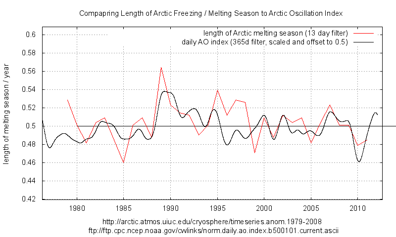
UPDATE: Gail Combs offers this graph in comments which suggests that there is no long term trend for the data back to 1979, only a recent drop. FTP Data source listed below.

UPDATE2: Les Johnson Sends over his spreadsheet with data. He writes:
This is my spreadsheet on arctic ice max/min. The data is taken from the link in the sheet. I apologize as its not user friendly, nor fully automated. I did not expect to share it. I filter by year, and take the max/min and the respective dates. That’s it. The assumption is that after max, the ice is melting, until minimum is reached.
1979-2011 arctic melt season (XLSX)
Also Greg of “climategrog” says he thinks the graph needs more context. So, here it is with his links:
The data source listed on that graph is the original data source from which it is derived. It is not the data which is shown in the plot. I know because it’s my processing of that data.
Taken out of context it is rather misleading. Indeed you seem to have (not unreasonably) misunderstood it be the data in the FTP link that is plotted directly. It would seem more appropriate to provide a link to my documentation of how it was derived.

==============================================================
By way of explaining the recent drop in days, we have this recently published paper Via the Hockeyschtick:
New paper finds lows of Arctic sea ice in 2007 and 2012 were due to storms
A new paper published in The Cryosphere finds that the 2 recent lows in Arctic sea ice over the past decade during 2007 and 2012 were strongly related to storm activity, rather than a long-term effect of climate change. According to the authors, “Strong summer storms on the Siberian side of the Arctic Ocean may have been important contributions to the recent [Arctic sea ice minimums] in 2007 and 2012.” Arctic sea ice strongly rebounded in 2013 by up to 78% in comparison to 2012, suggesting the 2007 and 2012 lows were just natural variation.
The paper adds to many other peer-reviewed publications finding Arctic sea ice extent is due to natural variability from winds and storms, not AGW.
The Cryosphere, 8, 303-317, 2014
http://www.the-cryosphere.net/8/303/2014/tc-8-303-2014.html
Cyclone impact on sea ice in the central Arctic Ocean: a statistical study
A. Kriegsmann1,* and B. Brümmer1
1Meteorological Institute, University of Hamburg, Hamburg, Germany
*now at: Climate Service Center, Hamburg, Germany
Abstract.
This study investigates the impact of cyclones on the Arctic Ocean sea ice for the first time in a statistical manner. We apply the coupled ice–ocean model NAOSIM which is forced by the ECMWF analyses for the period 2006–2008. Cyclone position and radius detected in the ECMWF data are used to extract fields of wind, ice drift, and concentration from the ice–ocean model. Composite fields around the cyclone centre are calculated for different cyclone intensities, the four seasons, and different sub-regions of the Arctic Ocean. In total about 3500 cyclone events are analyzed. In general, cyclones reduce the ice concentration in the order of a few percent increasing towards the cyclone centre. This is confirmed by independent AMSR-E satellite data. The reduction increases with cyclone intensity and is most pronounced in summer and on the Siberian side of the Arctic Ocean. For the Arctic ice cover the cumulative impact of cyclones has climatologic consequences. In winter, the cyclone-induced openings refreeze so that the ice mass is increased. In summer, the openings remain open and the ice melt is accelerated via the positive albedo feedback. Strong summer storms on the Siberian side of the Arctic Ocean may have been important contributions to the recent ice extent minima in 2007 and 2012.
To Greg:
You might want to note that Bikini was the site of 23 separate nuclear explosive tests.
The figure that was quoted was only for the largest, “Castle Bravo”. The cumulative
megatonnage of all the shots is close to 3 times the figure quoted. I believe the final
shots were set off in 1958.
@ur momisugly tty March 5, 2014 at 8:18 am
I got a bit sloppy — I was trying to find some larger cities around the Arctic (with recognizable names) to use as examples, and clealry missed the mark with Murmansk. I should have picked some other Russian port on the Arctic Ocean.
But the point still stands. The original paper in NOT about the dates of max or min ice for the entire Arctic (which are pretty steady) — so “Gail’s graph” is immaterial. The original paper is about the dates at a specific point. As the overall extent decreases, the number of days of ice at a given location most certainly will drop. Somewhere not too far from Murmansk that used to average 20 days of ice each winter might average only 15. Somewhere a litttle farther away that averaged 40 days of ice might average 35.
Greg says: March 5, 2014 at 10:35 am
>>>>>>>>>>>>
Sorry I did not link to your name but I did not have that info on the notes when I booked marked it.
(I thought the graph itself was quite clear that the number of days of the melt season was growing shorter BTW.)
Tim Folkerts says: @ur momisugly March 6, 2014 at 12:20 pm
…But the point still stands. The original paper in NOT about the dates of max or min ice for the entire Arctic (which are pretty steady) — so “Gail’s graph” is immaterial. The original paper is about the dates at a specific point. As the overall extent decreases, the number of days of ice at a given location most certainly will drop. Somewhere not too far from Murmansk that used to average 20 days of ice each winter might average only 15. Somewhere a litttle farther away that averaged 40 days of ice might average 35.
>>>>>>>>>>>>>>
That is useless logic because the sea ice is wind driven and therefore one particular point is a really rotten method of measuring what is happening in the Arctic. Unless of course you are tracking the change from one climate regime to a different climate regime and are therefore tracking the change in the wind effects. But again it is still a rotten measure especially with satellite data available.
Gail, I fully agree that any one point would be a poor metric for sea ice — just like the temperature at one station is a poor metric for global warming. But when averaged, then clearer trends show up. That is what the paper seems to be addressing. Your graph has nothing to do with this downward trend in the length of the ice season at individual locations.
Perhaps the “UPDATE” was simply Anthony misinterpreting the significance of the graph you posted. But it sure looks like you thought that graph somehow repudiated the conclusion of the original paper (“Seems the NOAA data does not agree.”)
Tim Folkerts says:
March 6, 2014 at 5:16 pm
You have come back to that point several times -> Obviously, you feel it is important.
May I ask two complimentary questions:
1. Arctic sea ice extents maximum has “slowed” significantly the past 4 years: Look at the NSIDC Arctic Sea Ice extents plot for 2010-2011-2012-2013 (And now 2014). The maximum point has occurred later each year as time passes. Would not a later maximum point (or its equivalent: a longer broader maximum arc of the curve across more weeks each March) almost force a shorter melt season since the mid-September low point has remained stationary?
2. Why do you believe the Arctic sea ice extents season, or a lower Arctic sea ice extents level in September even be a problem, or contribute anything but additional hysteria to the CAGW hype?
RACook
1) Everything else being equal, I would expect that the date of max ice would get later as the extent gets smaller. In a year with lots of ice, the ice necessarily extends farther south. This southernmost ice would naturally start to melt a little earlier than ice farther north. I don’t see a strong trend eyeballing the data, but the day of max ice does seem to be getting a little later.
2) Why do you believe that I believe the things you attributed to me? I try to avoid hysteria. 🙂
Tim Folkerts says: @ur momisugly March 6, 2014 at 7:00 pm
1) Everything else being equal, I would expect that the date of max ice would get later as the extent gets smaller. In a year with lots of ice, the ice necessarily extends farther south….
>>>>>>>>>>>>>>>
Not necessarily. The ‘Shape’ of the ice cap is wind driven and lopsided. It is not the same shape year to year.
You can sort of see what I mean in these comparisons: http://home.comcast.net/~ewerme/wuwt/cryo_compare_small.jpg
This is the graph of years 2005 to present: http://ocean.dmi.dk/arctic/plots/icecover/icecover_current.png
I should also add the wind determines where the multi-year ice builds up. This is most apparent in the fall where the shape really differs year to year.
Gail,
Yeah, I should not have said “necessarily” but rather something more like “generally” or “typically”. But again the point still stands. Less overall ice is naturally associated with less ice farther south. There will be some variation in the distribution from year to year, but it is tough to imagine the maximum dropping by ~ 2 million km^2 but at the same time having the ice extend farther south.
Gail Combs says: March 6, 2014 at 4:00 pm
Thanks for posting the length of melt season graph. I previously noted that there was a shift in the annual maximum just as something interesting. With the timing of the annual minimum staying the same, coupled with a shorter season and a later maximum would seem to imply a longer ice growing season. Even more interesting.