No mention though of the possibility that this is all part of a natural pattern, and of course no mention of Ms. Stroeve’s Greenpeace connections to her research, which brings her scientific objectivity into question. UPDATE: A graph submitted by a commenter suggests otherwise as does recently published paper. See below. UPDATE2: data source has been added.
From NSIDC and UCL:
New data confirms Arctic ice trends: sea ice being lost at a rate of five days per decade
The ice-free season across the Arctic is getting longer by five days per decade, according to new research from a team including Prof Julienne Stroeve (Professor of Polar Observation and Modelling at UCL Earth Sciences). New analysis of satellite data shows the Arctic Ocean absorbing ever more of the sun’s energy in summer, leading to an ever later appearance of sea ice in the autumn. In some regions, autumn freeze-up is occurring up to 11 days per decade later than it used to.
The research, published in a forthcoming issue of the journal Geophysical Research Letters, has implications for tracking climate change, as well as having practical applications for shipping and the resource industry in the arctic regions.
“The extent of sea ice in the Arctic has been declining for the last four decades,” says Julienne Stroeve, “and the timing of when melt begins and ends has a large impact on the amount if ice lost each summer. With the Arctic region becoming more accessible for long periods of time, there is a growing need for improved prediction of when the ice retreats and reforms in winter .”
While temperatures have been increasing during all calendar months, trends in melt onset are considerably smaller than that of autumn freeze-up. Nevertheless, the timing of melt onset strongly influences how much of the Sun’s energy gets absorbed by the ice and sea. This in turn is affected by how reflective the surface is. Highly reflective surfaces, such as ice, are said to have a high albedo, as they reflect most of the incoming heat back into space. Less reflective surfaces like liquid water have a low albedo, and absorb most of the heat that is directed at them.
This means that even a small change in the extent of sea ice in spring can lead to vastly more heat being absorbed over the summer, leading to substantially later onset of ice in the autumn. There is also a second effect, in that multi-year ice (which survives through the summer without melting) has a higher albedo than single-year ice that only covers the sea in winter. Since the 1980s, the proportion of the Arctic winter ice that is made up of multi-year ice has dropped from around 70% to about 20% today, so the changes are quite substantial
These feedback effects, in which small changes in atmospheric temperature and sea ice lead to large changes in heat absorption, was what the team set out to study.
Stroeve’s team analysed satellite imagery of the Arctic region, dating back over 30 years. The data breaks down the whole region into 25x25km squares, and the team analysed the albedo of each of these for each month for which they had data. This allowed them to update trends and add an extra 6 years onto the most recent analysis of its kind. The new data continues the trend towards longer ice-free periods previously observed.
“The headline figure of five days per decade hides a lot of variability. From year to year, the onset and freeze-up of sea ice can vary by about a week. There are also strong variations in the total length of the melt season from region to region: up to 13 days per decade in the Chukchi Sea, while in one, the Sea of Okhotsk, the melt season is actually getting shorter.”
The amounts of energy involved in these changes are enormous – hundreds of megajoules of extra energy accumulated in every square metre of sea. This is equivalent to several times the energy released by the atom bomb at Hiroshima for every square kilometre of the Arctic ocean.
For organisations such as oil drillers operating in the Arctic region, a sophisticated understanding of when the sea will freeze up is essential. For climate scientists, this type of study helps them better understand the feedback mechanisms inherent in the Arctic climate. The results from this study are closely in line with previous work and therefore give added confidence that models of the complex Arctic climate are broadly correct.
Notes
- The research appears in a paper entitled “Changes in Arctic melt season and implications for sea ice loss”, to be published in a forthcoming issue of the journal Geophysical Research Letters. An online pre-print is available now on the journal website.
- Julienne Stroeve is a recent appointment to UCL Earth Sciences, joining the department from the National Snow and Ice Data Centre in Colorado, USA.
Related links
- Article in Geophysical Research Letters
- UCL Earth Sciences
- National Snow & Ice Data Center
- Centre for Polar Observation and Modelling
High-resolution images
Satellite view of sea ice
This image may be reproduced freely as it is in the public domain
Map of changing melt seasons in the Arctic
This image is available under a Creative Commons Attribution Non-commercial No-derivatives licence. It may additionally be reproduced for the purpose of news reporting.
Researcher profile
=================================================================
UPDATE: Gail Combs offers this graph in comments which suggests that there is no long term trend for the data back to 1979, only a recent drop. FTP Data source listed below.

UPDATE2: Les Johnson Sends over his spreadsheet with data. He writes:
This is my spreadsheet on arctic ice max/min. The data is taken from the link in the sheet. I apologize as its not user friendly, nor fully automated. I did not expect to share it. I filter by year, and take the max/min and the respective dates. That’s it. The assumption is that after max, the ice is melting, until minimum is reached.
1979-2011 arctic melt season (XLSX)
Also Greg of “climategrog” says he thinks the graph needs more context. So, here it is with his links:
The data source listed on that graph is the original data source from which it is derived. It is not the data which is shown in the plot. I know because it’s my processing of that data.
Taken out of context it is rather misleading. Indeed you seem to have (not unreasonably) misunderstood it be the data in the FTP link that is plotted directly. It would seem more appropriate to provide a link to my documentation of how it was derived.

==============================================================
By way of explaining the recent drop in days, we have this recently published paper Via the Hockeyschtick:
New paper finds lows of Arctic sea ice in 2007 and 2012 were due to storms
A new paper published in The Cryosphere finds that the 2 recent lows in Arctic sea ice over the past decade during 2007 and 2012 were strongly related to storm activity, rather than a long-term effect of climate change. According to the authors, “Strong summer storms on the Siberian side of the Arctic Ocean may have been important contributions to the recent [Arctic sea ice minimums] in 2007 and 2012.” Arctic sea ice strongly rebounded in 2013 by up to 78% in comparison to 2012, suggesting the 2007 and 2012 lows were just natural variation.
The paper adds to many other peer-reviewed publications finding Arctic sea ice extent is due to natural variability from winds and storms, not AGW.
The Cryosphere, 8, 303-317, 2014
http://www.the-cryosphere.net/8/303/2014/tc-8-303-2014.html
Cyclone impact on sea ice in the central Arctic Ocean: a statistical study
A. Kriegsmann1,* and B. Brümmer1
1Meteorological Institute, University of Hamburg, Hamburg, Germany
*now at: Climate Service Center, Hamburg, Germany
Abstract.
This study investigates the impact of cyclones on the Arctic Ocean sea ice for the first time in a statistical manner. We apply the coupled ice–ocean model NAOSIM which is forced by the ECMWF analyses for the period 2006–2008. Cyclone position and radius detected in the ECMWF data are used to extract fields of wind, ice drift, and concentration from the ice–ocean model. Composite fields around the cyclone centre are calculated for different cyclone intensities, the four seasons, and different sub-regions of the Arctic Ocean. In total about 3500 cyclone events are analyzed. In general, cyclones reduce the ice concentration in the order of a few percent increasing towards the cyclone centre. This is confirmed by independent AMSR-E satellite data. The reduction increases with cyclone intensity and is most pronounced in summer and on the Siberian side of the Arctic Ocean. For the Arctic ice cover the cumulative impact of cyclones has climatologic consequences. In winter, the cyclone-induced openings refreeze so that the ice mass is increased. In summer, the openings remain open and the ice melt is accelerated via the positive albedo feedback. Strong summer storms on the Siberian side of the Arctic Ocean may have been important contributions to the recent ice extent minima in 2007 and 2012.
The Inuvik to Tuktoyuytuk ice road (about 160 miles) on the Mackenziie River and then on the Beaufort Sea has seen slightly increasing open for travel dates since the 1980’s. That does not seem to align with the findings of this paper.
Anthony.moderators”
I have my spreadsheet and chart on arctic ice melt season. I can make this available, so everyone can see that the melt season is increasing at only 0.5 days per century, and not the ludicrous clain in this paper.
5 days per decade is her “trend”!! LOL.That’s a slope of 0.00137! Help, help! The world is sliding into an abyss!
sarc off.
The only abyss here is the one this cretin’s objectivity and scientific integrity is in, along with the rest of her tribe of scientific hillbilly Taliban.
Les, since there is a sizeable circa 14d ripple in the data, taking one day min/max can push the individual dates a week or so either way. How those ripples land in relation to annual min and max makes a very significant difference to the calculated “melt period”. There is also large weather based differences based on timing of storms etc.
That is why the annual ice minimum jamboree is stupid. We have DAILY data available. There is no good reason to select just one or two data points per year and ignore the rest.
See my links above for how to deal with short term variation and get a more objective assessment of the long term changes , having removed the weather.
Agreed, the atom bomb equivalent is relevant only in noting the power of the sun. An easy calculation shows that a Hiroshima bomb/squ. km would melt ice to a depth of ~25 cm.
The low resolution satellite MSU have a single pixel resolution of 25x25km. So we know that is what was used for this study. In each pixel, the ice water ratio is determined by the difference in their dielectric constants. This works fine in winter, when ice is ice and seawater is not. It does not work well at all in late spring and early summer when meltwater can pool on top of ice before it breaks up into small flows. And it does not work well (because of resolution) for ‘slushy’ conditions with lots of ice fractured by storms, such as trapped a lot of Northwest passage vessels August 2013. It does work again well for refreeze conditions when ice again becomes ice while water remains water. So the papers focus on melt timing picks the poorest quality sat data.
And, most of the satellite era decline took place during the pause.
And, there is lots of Danish and Russian regional summer ice map evidence that Arctic ice was as low in the late 1930’s early 1940s as from 2002 to 2012. RCMP Larsen completed his east-west Northwest Passage transit of 1944 in just 86 days by sailing vessel, using a more northerly route than before.
Flawed methods over a short period that does not even take in one ocean cycle are not very impressive. No wonder others have pointed out the papers conclusions are just wrong, evenmformthe satellite era.
Greg: Yes, and over time those “ripples” will average out. They are not that sizeable, either.
By taking maximum extent and minimum extent only, one will get, on average, the melt season for the entire arctic.
Over the record, the melt season got above and below 1 sigma only 6 times; 3 above and 3 below.
The experts get larger numbers than me, but much smaller numbers than Stroeve. They also get that the minimum date, and the maxmium date, are both coming earlier. They also get my result that the change in melt seasons is not significant.
http://pielkeclimatesci.wordpress.com/2009/09/09/temporal-trends-in-arctic-and-antarctic-sea-ice-maximum-and-minimum-areal-extents/
Who of the above commenters has read the paper? It’s open access, no excuses.
This is careful work, based on satellite observations mostly, with references to all databases employed, and a reasonable discussion of uncertainties. I did find one minor error in a table in Supporting Information, emailed the author, and received an immediate reply that the error would be corrected as soon as possible. (There are no mentions of hydrogen bombs in the paper. That is PR flak.)
@tony b, march 4, 12:49pm
As always, Excellent!
The Hiroshima bombs equivalents tells you all you need to know about this “study” … it’s just more alarmist baloney!
Les Johnson says:
March 4, 2014 at 1:24 pm
Greg: Yes, and over time those “ripples” will average out. They are not that sizeable, either.
By taking maximum extent and minimum extent only, one will get, on average, the melt season for the entire arctic.
—–
Why do you assume that something “averages out” . If they are lunar tidal effects, as I suspect is mainly the case, they will shift in phase relative to the annual cycle. You cannot presume how that will affect one day per year extrema.
The fact that you get significantly different profile to what I get when I filter them out suggests your assumption is wrong.
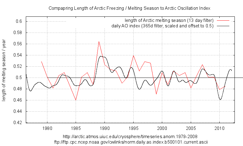
The graph which Gale linked is basically this one from ice extent. It is fairly flat but with a down ward trend since 1995 and a strong shortening of melt period since 2007.
http://climategrog.wordpress.com/?attachment_id=206
The other graph I did is based on ice area from Crypsphere Today (same stuff Pielke used but he also makes the mistake of one day per year).
http://climategrog.wordpress.com/?attachment_id=210
This is quite similar in form to ice extent but shows strong spike in 1989 and basically shortening ever since. It is interesting that this ties in quite closely with Arctic Osc. Index.
I would note that your graph also shows a high point in 1997 and downwards since. In that respect it is similar to what I found. Just that by filtering the bumps mine jumps about less. It appears that the high you show in 1997 was at least to some extent a result of where the bumps lined up.
Both extent and area shows a notable shortening since 2007. It looks like this is starting to have an impact in the last couple of years.
The Stroeve paper , despite it’s complexity, also seems to rely on since day events
‘The ice-free season across the Arctic is getting longer by five days per decade…’
They’re not merely moving the goal posts, they’re renaming them, too!
Fabi, yes a number of people picked up that BS statement. You’ll note that this is science by press release. They can paraphrase the paper however they like, spin it with a bit of AGW and everyone can quote it.
I don’t think you’ll find that in the paper.
I took the maximum and minmum ice extent, and the date, for every year in the record.
If we are getting different results, it may be the data source.
http://arctic.atmos.uiuc.edu/cryosphere/timeseries.anom.1979-2008
Again, Chapman gets similar results in 2009. Both the max and min dates are getting earlier, neither are significant. While his increase in melt season is larger than mine, its also much smaller than Stroeves.
Ok, lets do the sniff test.
According to Stroeve et al, the melt season should be 17 days longer now, than at the start of the record in 1979.
I see no indication that the melt season has increased by over 1/2 a month over that period.
I don’t see of that in your chart either.
“NSIDC’s Greenpeace connected researcher claims less days of Arctic sea ice being seen”
That’s totally wrong. Maybe fewer days of Arctic sea ice are being seen, and maybe not.
Agreed, my ice extent graph shows about 0.51 years at the start and 0.49 years now. That’s 6 days shorter , melting season.
My ice area treatment shows a jump to longer melting season in 1989 and drift back to about the same value now. Depending upon where you start and end it could be marginally longer now by a day or two in 35 years but you’d need to pick you cherries with some care. I’d have to say it’s indistinguishable between the start of the record an the end of my graph.
This also underlines once again the fallacy of fitting straight lines to everything (anything) in climate. Climate is anything BUT straight lines. Even if the ice area may indicate roughly same values now it’s clear that melting season has been getting shorter since 1989 and it is currently shorter than 6 months.
It’s interesting to note that there was a major geomagnetic storm in 1989, I don’t know if that’s related but both melting season and AO took a jump that year and seem to have been recovering since.
The paper seems to be claiming melting season is currently getting longer on average across the arctic. I find it hard to see that in the data. It should be noted that they are reworking all this from the basic microwave data. That implies that they are in effect saying the Cryo Today and NASATEAM extractions are wrong.
I suspect that they’ve just diced it small, given it a good shake and added some home made curry sauce.
re: Lance Wallace says March 4, 2014 at 1:26 pm
“Who of the above commenters has read the paper? It’s open access, no excuses.”
Me; I went to the website and looked at it, skimmed some parts and concentrated on others, then read the conclusion part …
Did you read it?
.
I wonder, was there any sampling of ‘ground truth’, e.g. using Mark I eyeballs via aircraft or higher-res visible satellite imagery (hard to do in arctic winter perhaps) to verify MSU data? Having skimmed the paper I don’t recall any sampling or verification … I would check now, but, have to runs some errands pronto.
.
“The Hiroshima bombs equivalents tells you all you need to know about this “study” … it’s just more alarmist baloney!”
talking of Hiroshima, the atomic bomb at Bikini atoll , 1000x the strength of the Hiroshima bomb , heated the waters to 55,0000 degrees, vaporized three island, shock waves were felt 200 kilometres away , it left a crater 2 kilometres wide and 73 meters deep, and today the coral is dong well and in pristine condition,
55,000 degrees
Ah , I think I have found it :
“For the Arctic as a whole, the observed difference in freezeup between 1982–1999 and 2000–2012 is about 6 days. In other words, freezeup is occurring 6 days later during the last 13 years than in the previous 19 years when averaged over all sea ice regions. ”
So what they call the “headline figure” of 5 days per decade is indeed a cherry pick. Take the midpoints of the those two periods : 1990 and 2006 , it’s basically the period of the accelerating downward trend, cut off just before it starts to flatten out.
http://climategrog.wordpress.com/?attachment_id=496
All the rest is breaking it down to find regional variations so they can play the “. up to 11 days per decade later than it used to” game.
As someone once said: “if you want to make cherry pie, you have to pick cherries.”
Arctic amplification led to a 50% increase of September Arctic seas ice and volume on 2012. 2013 was the coldest central Arctic Ocean air temps since 1957 on the DMI record. We are doomed.
Richard says:” ….and today the coral is dong well and in pristine condition”
Pristine except for the fact that much of the calcium and potassium has been replaced by Strontium 90 and Caesium 137.
Your recommendation to save coral reefs is what then? It’s like pruning roses? Nuke em hard and next spring they’ll be full of buds? I suppose it’s a cheap and effective way to impose a marine natural reservation area.
Perhaps this season’s swimwear can be yellow and black triangled bikini’s to celebrate.
Eyeballing the arctic ice maximums over the last several years, they seem to occur about ten days later recently. Look at the DMI graph on the Sea Ice Page, it is noticeable comparing the mean to the recent years. I don’t see the same at the minimum.
http://ocean.dmi.dk/arctic/plots/icecover/icecover_current_new.png