Don Easterbrook has updated his projection graph. Unfortunately, he did not update the graph that I complained about a few weeks ago, shown on the left in Figure 1. In that graph his projections started around 2010. He appears to have updated the Easterbrook projections graph on the right, where the projections started in 2000.

Figure 1
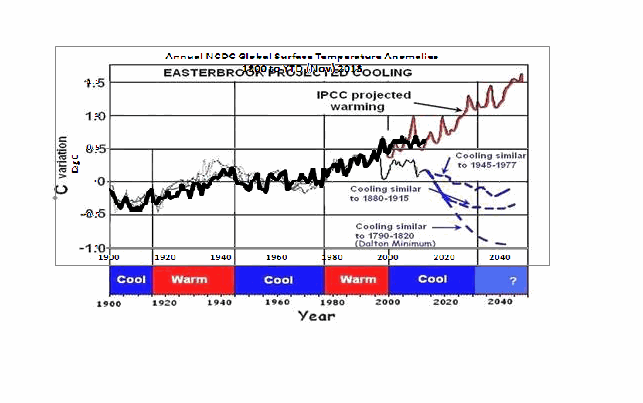
I raised a few eyebrows a couple of weeks ago by complaining loudly about a graph of global surface temperature anomalies (among other things) that was apparently created to show global cooling over a period when no global cooling existed. My loud and persistent complaints were in response to Figure 4 from Don Easterbrook’s post Cause of ‘the pause’ in global warming at WattsUpWithThat. In response to my reaction to his graph (and other things), Don Easterbrook wrote the post Setting the record straight ‘on the cause of pause in global warming’, which did not address my concerns.
It was on the thread of the “Setting the record straight” post that I presented how Don Easterbrook created the cooling of global surface temperatures during a period when no such cooling existed. The cooling effect was created by splicing global lower troposphere temperature anomalies from 1998 to about 2008 onto a graph of NCDC global surface temperature anomalies. See my Figure 2.

Figure 2
The graph in question was not created by splicing land surface air temperature data from 1998 to 2010 onto the end of the land+ocean surface temperature data as Don had explained in his “Setting the record straight” post (my boldface).
This curve is now 14 years old, but because this is the first part of the curve that I originally used in 2000, I left it as is for figure 4. Using any one of several more recent curves from other sources wouldn’t really make any significant difference in the extrapolation used for projection into the future because the cooling from 1945 to 1977 is well documented. The rest of the curve to 2010 was grafted on from later ground measurement data—again, which one really doesn’t make any difference because they all show essentially the same thing.
There are two errors in the above quote. First, the graph in question could not be 14 years old, because it included TLT data from 1998 to about 2008. Second, land surface temperature data do not show “essentially the same thing” as land+ocean surface temperature data. Land surface temperature data have continued to rise since 1998.
The graph in question also included a curve in red identified as “IPCC projected warming” and a number of Don’s predictions, blue curves, starting around 2010. See the full-sized version of Easterbrook’s projections that started in 2010 here. It’s a cleaner version of Don’s Figure 4 from his two posts.
On the thread of the “Setting the record straight” post, Anthony Watts asked Don Easterbrook to update the graph in question. See Anthony’s January 21, 2014 at 9:26 am comment here. (At that time we were responding to Easterbrook’s statement that he had merged land surface temperature data with land+sea surface temperature data.)
THE NEW EASTERBROOK PROJECTION
About a week after his original post, Don presented an update to his projections. See my Figure 3. As noted in the opening, it was not an update of the graph in question. The graph in question included projections starting around 2010 and it included an “IPCC projected warming” curve. On the other hand, the projection in Don’s newly furnished update starts a decade earlier in 2000 and excludes the “IPCC projected warming”.

Figure 3
Don wrote about the updated graph:
Here is an updated version of my 2000 prediction. My qualitative prediction was that extrapolation of past temperature and PDO patterns indicate global cooling for several decades. Quantifying that prediction has a lot of uncertainty. One approach is to look at the most recent periods of cooling and project those as possibilities (1) the 1945-1975cooling, (2) the 1880-1915 cooling, (3) the Dalton cooling (1790-1820), (4) the Maunder cooling (1650-1700). I appended the temperature record for the 1945-1975 cooling to the temperature curve beginning in 2000 to see what this might look like (see below). If the cooling turns out to be deeper, reconstructions of past temperatures suggest 0.3°C cooler for the 1880-1915 cooling, about 0.7°C for the Dalton cooling (square), and about 1.2°C for the Maunder cooling (circle). We won’t know until we get there which is most likely.
This updated plot really doesn’t change anything significantly from the first one that I did in 2000.
Again, that wasn’t the graph in question.
It is also blatantly obvious that his graph does not include the data from 2000 to 2013. Don has curiously omitted one of the primary reasons for someone to update a projection graph.
Another curiosity, there’s some data missing from his projections. It is supposed to represent “appended 1945-1975 temps”, meaning he spliced 1945-1975 global surface temperature anomalies onto the end of the 1999 data. However, the spike in response to 1972/73 El Niño is missing, and so is the spike in response to the 1957/58 El Niño. There’s also a spike missing in August 1945. The missing spikes stand out in Animation 1.

Animation 1
Or is that what the “appended” means…that he’s modified the 1945-75 data? I’m not sure why he’d delete those spikes, but I noticed it right away.
The little uptick at the end of the Easterbrook update is also a curiosity. It was the response to the Pacific Climate Shift of 1976, so the projection includes data beyond 1975.
And Don Easterbrook presented monthly HADCRUT3 data, as opposed to the annual NCDC data that he had used in his graph in question. I also have no idea why he would use HADCRUT3 data instead of HADCRUT4 data, especially when he wanted to use 1945 to 1975 data to show cooling during his projection. Why? HADCRUT3 data does not show cooling during that period, while HADCRUT4 data does. See Figure 4. That change in trend was a result of the revisions to the HADSST data…the corrections they made to eliminate the 1945 “discontinuity”.

Figure 4
I suspect that Don Easterbrook left out the “IPCC projected warming” curve because of the way he spliced the models onto his abridged and modified data in his graph in question (the one with the projections starting in 2010; i.e. his Figure 4 in both of his posts). See the animation here, from my January 19, 2014 at 6:34 am comment on the first of the Easterbrook threads.
MY REPLICA OF THE NEW EASTERBROOK PROJECTION
Don did not include the recipe for splicing the data starting in 1945 onto the data ending in 1999. Figure 5 is my attempt to replicate his newly updated graph. The January 1945 through December 1977 data was shifted back in time to start in January 2000. Then the relocated data was shifted upwards by 0.354 deg C so that the January 2000 (relocated January 1945) value equaled the December 1999 value. Figure 5 is a reasonable replica of Easterbrook’s revised update.

Figure 5
In Figure 6, I’ve included the surface temperature anomalies from January 2001 through December 2013. The Easterbrook projection looks a little low.

Figure 6
The projection really looks low when the data are presented in annual form, (see Figure 7), which is how Easterbrook presented his projections originally. The warming during the projection stands out like a sore thumb with the annual data.

Figure 7
NEW EASTERBROOK PROJECTION USING HADCRUT4 DATA
Figures 8, 9, and 10 run through the same process as Figures 5, 6, and 7, except that I’ve used HADCRUT4 data in the following three graphs.

Figure 8
# # #

Figure 9
# # #

Figure 10
The cooling in the projection using the HADCRUT4 data would have stood out even more if I had ended the data used in the projection in 1975, as Easterbrook had claimed. But I used the data through 1977 as he included in his graph.
NOTE: To maintain continuity between the monthly graphs and the annual graphs shown in Figures 7 and 10, I converted the monthly data to annual data. That is, I did not start with annual data for Figures 7 & 10 and splice annual data together.
MY UPDATE OF EASTERBROOK GRAPH WITH PROJECTIONS STARTING IN 2010
If Don Easterbrook had used annual HADCRUT4 data for his updated projection graph (black curve), and if he had spliced the 1945-1975 HADCRUT4 data on at 2010 (blue curve), and if he had used the multi-model ensemble mean of the CMIP5-archived models (using the RCP6.0 scenario) for his “IPCC projected warming” (red curve) using the same base years as the HADCRUT4 data, then his update to his graph in question would have looked like Figure 11. (I didn’t bother with his Dalton minimum or his Maunder cooling projections.)

Figure 11
The models look bad enough without having to add non-existent cooling to the data by splicing lower troposphere temperature data onto surface temperature data.
CLOSING
Global warming skeptics will be hurt, not helped, by those who manufacture datasets to create effects that do not exist.
Global warming skeptics do not have to help climate models look like crap. They’re doing a good job of that all on the own. See Figure 12.

Figure 12
SOURCES
The monthly HADCRUT3 data are available here. The monthly HADCRUT4 data are linked here. The annual HADCRUT4 data are available here. And the CMIP5 climate model outputs are available through the KNMI Climate Explorer.
jai mitchell:
I don’t know why I’m doing all the pretty pictures but…. Cartoon time it is.
http://i29.photobucket.com/albums/c274/richardlinsleyhood/jaimitchellsulphateoverlay7_zps011f142e.gif
So tell me – where the correlation was again?
I have looked long and hard but I still only get it one in four. I MUST be doing something wrong. Can you help me out with a picture of your own?
Before 1945 or so everything just seems to have no relationship, one to the other. But when we get to 25,000 or so, it does seem to kick in. The massive rise to just over 60,000 does slow things down very slightly – it almost goes flat there, but after 1970 or so things just take off again all on their own.
Now I know you believe that there are other factors that come in, just in time, to save the day but don’t you find that all just a little co-incidental?
Can’t it be the simple, red wriggly line (nearly sine wave) that is doing all this, all on its own? No SO2 at all. Where’s that Occam’s Razor when I want it?
RichardLH,
did you intentionally miss the SO2 inflection point located at 1900?
The break in slope is horribly obvious.
The problem I have with your graphic is that you did not use the same 15-year smoothing that you used for the temperature data, so they are incompatable.
also, you used such a thick line that it obscures the actual data. I see I will have to do it for you.
here, review this graph that I made for you and I will make a correct graphic with the correct inflection points (and I won’t use a VERY thick line to prevent you from being able to see the actual data!)
http://oi62.tinypic.com/p9jco.jpg
ok! that was easy!
here you go,
SO2 Curve with Inflection points
RichardLH
you mislabeled your last graphic:
http://oi58.tinypic.com/ida936.jpg
between 1880 and 1910 you have a temperature decline, not a rise
between 1910 and 1945 you have a temp rise and an SO2 stagnation
between 1945 and 1975 you have a temperature fall and a large SO2 rise
after 1975 you have a large temperature rise and a medium SO2 fall.
JM: Thank you for your first image that can be used as a reasonable comparison and with the particular points you wish to address clearly identified. I have taken the liberty of adding in the temperature curve so as to provide a direct 1:1 overlay. I have only slightly enhanced the lines for clarity and kept the line width down to where we can clearly identify the points to be considered. (smack hand on me).
(I do notice that the request to supply this data in a digital form – via dropbox? – so that a true, proper, professional, comparison without all the other visual clutter has still not been met – I’ll try to work with what we have).
http://i29.photobucket.com/albums/c274/richardlinsleyhood/jaimitchellsulphateoverlay8_zps16eb5410.gif
So to deal with the new amalgam point by point.
1. The time period before 1880.
There is NO association of any form between SO2 and temperature as the SO2 figure is non-existent. Despite this fact the temperature figure displays a rise to about 1875 and then, all on its own, starts to drop. This happens BEFORE the SO2 starts to climb so that cannot be considered to be the cause.
2. The time period between 1880 and 1912.
Here we do have a potential inter-action as the SO2 figure is indeed rising and the temperature is indeed falling. Please note the slopes involved. The temperature figure drops by some 0.2C. The SO figure rises to 18,000 or so.
3. The time period between 1912 and 1942.
I will admit I had missed that as an inflexion point. The slope change is so small. Indeed if you had supplied the data instead of just the image I am fairly confident that a proper low pass treatment (such as you suggested) would make this point difficult to distinguish on the graph. Still, work with what we have.
Now we have a reduced rate of rise in SO2 from 18,000 to 23,000 over that time. The temperature figure now climbs by more than 0.4C however during this period. So this small change in rate of rise of the slope produces a massive rise now in temperature. A very large effect. Considerably more than the effect of the previous drop.
4. The time period between 1942 and 1975.
Now we have a massive rise in SO2 from 23,000 to over 70,000. This is met by a very tiny fall in temperature. A reversal of the effect from the period before where a much smaller rise was met by a large rise in temperature.
5. The time period after 1975.
Now SO2 ceases to have any real effect on temperature. It’s is almost like a switch is turned off. Something else, anything else, must be the driver from now on.
If you like I can pull the two important lines in question out of all of the visual clutter so a more direct comparison can be made. What vertical compression do you suggest to ensure the correct multiplier can be used? Or would you like to pre-plot the SO2 data onto a log scale (or add other factors as required) if that helps. Or you could dropbox the data and I’ll do the work for you.
I also note that you didn’t comment on the fact that the ~60 year wriggle is present in the Mann data as I had previously noted. So temperature does move around on these timescales in a purely natural basis as even suggested by the rather massaged flat Mann data. It is even more strongly present in other proxy data set which I can also supply on demand.
I mean no offence RichardLH, but I think you need to pay closer attention to to what jai mitchell is saying. I think you may be paddling a little outside your depth on these issues.
Are you sure you aren’t pushing for what you already believe rather than what the data suggests?
Of course, I will be happy to eat my words publicly eat my words if the math shows me to be wrong.
And of course you can’t edit anything in this useless communications system… Gawd… why isn’t this place set up like rage3d?
RichardLH,
Thank you for the graphic, I think that the main problem was that you were trying to put the inflection points onto the stretched graphic, making it much harder to see them. I made the inflections points and then stretched the graphic.
Unfortunately, I do not have the raw data used to make the graphic in the report, the best I could find was decadel information that wouldn’t serve the needs, we could eyeball the values and make an annual graphic from a reproduction but I don’t think that is necessary.
I will respond to your post
-First, a statement on the analysis. The important point of the analysis is to look at the periods between the points, not the points themselves. The points represent breaks in the temperature/SO2 emission trend. Without looking at the trends of growth/decline/stagnation between the periods, it will be impossible to extract a correlation.
-Second, Without having read the rest of your post, just looking at your graphic. The correlation is now extremely obvious, the 15-year curve creates a positive convex shape between the points that SO2 either levels or goes down. The 15-year curve creates a negative shape between the points that SO2 has an upward slope. The break points are the locations where the trend reverses on both curves.
Ok, point by point.
1. Time period before 1880
-yes, I agree
2. 1880-1912
-yes I agree, the temperature goes down and the SO2 begins to go up. It should be noted at this point that another major factor has skewed the temperature graph. That is why I provided this image earlier. http://oi58.tinypic.com/29ws45u.jpg The three large stratospheric volcanic eruptions during this period created a larger cooling effect than the SO2 emissions. In view of this, and the fact that in the 30 years prior, temperatures were very stable, I would say that the very slight warming signal ( and SO2 emission effect) are almost indestinguishable. So I would call it inconclusive but likely.
3. 1912-1942
-Yes you are right, the stretching of the graphic made this one harder to extract from the data. The time period shows a large warming effect and the rate of SO2 increase is reduced slightly. I would again refer you to the picture above that indicates that there was a suprisingly quiet volcanic period which also provided an additional warming signal during this time. Another factor, one that I have not yet seen in the literature, is the massive amounts of black carbon that was released due to the burning of europe, the south pacific, japan and china during this time. These things worked to assist the SO2 value in allowing more warming. However what this shows is that the CO2 signal is now becoming much more clear in the trend, beginning to become a dominant factor (though not quite yet). it should also be noted that a volcanic eruption in the late sixties also helped to keep the earth cooler until 1975 (review the picture).
4 1942-1975
-The massive rise in temperature happens when the rate of SO2 emission is reduced significantly. By 1975, the artificial cooling of the earth by SO2 had worked so well to reflect incoming solar energy that the effect of the continuous buildup of CO2 during this time was without effect. This shielding effect was able to hold temperatures steady even though CO2 concentrations exploded during this time. The spring is being compressed as warming potential grows but the blackbody radiation levels are still low since the earth stopped warming.
5 post 1975
-I disagree with your conclusion, the decrease in SO2 emissions directly correlates with a massive jump in the increase in temperatures. This can be clearly seen by the divergence of the two curves. The warming during this period occurs at a rate that has not been previously experienced in over the last 10,000 years. This warming trend, as compared with the GISP2 record is 2 times as fast as any warming trend since before the last glacial maximum.
I do wish I had the data for the annual emissions but I don’t I don’t think that we need to worry about scales since we are only performing a trend analysis.
On the Mann data, I didn’t comment on the 60-year trend because of the large error bars in the Mann data, while he has a best fit curve, the error margins makes your 60-year analysis not really accurate. In addition, without some kind of causation, finding a 60-year trend isn’t really, well, scientific. Do you have an idea why there would be a 60-year trend in the long-term temperature data? what theory do you postulate?
final note–
The argo ocean temperature data is a direct measurement of the amount of extra warming that is currently happening on our planet. The overwhelming majority of global warming energy has always been expected to occur in the oceans where circulation patterns and the much (thousandfold!) higher specific heat capacity keeps the ocean cool while sucking up the energy.
Significant work has been done recently (and is being submitted this week!) that will show how absolutely conclusive the amount of global warming energy imbalance the earth is in. And how it has fit, completely, the models being used to predict future energy imbalances.
–this has been a good exchange. Thanks for your work.
drumphil says:
February 9, 2014 at 6:06 am
“I mean no offence RichardLH, but I think you need to pay closer attention to to what jai mitchell is saying. I think you may be paddling a little outside your depth on these issues.
Are you sure you aren’t pushing for what you already believe rather than what the data suggests?”
I am ONLY dealing with what the data shows. Nothing more. If the data does not align with a theory then no matter how ‘excellent’ the theory – it is dust.
The simple fact is that natural viability with this sort of period and this sort of magnitude occurs during the whole of the temperature record. Including in the proxy record immediately preceding the higher quality thermometer record.
That SO2 is sort as an answer to the variability that has ben observed is stretching credibility to its limits.
I do not seek out the cycle. A simple low pass, broadband, high quality filter shows it is there.
DP:
You do realise that this is a high quality, ‘Gaussian’, low pass, filter with a ‘corner’ at 15 years that uncovers a ‘cycle’ with a period of about ~60 years. Now you can’t just make that sort of stuff up. It is just the data and a summary of that data. Nothing more. It needs explaining. Properly.
The filter is just the logical extension of that used for Day, Month, Year, etc. Just stretched ever so slightly to 15 years to move above decadal. Why is it that short filters are normal (even if they are mathematically inferior such as a single mean) and OK but longer (better?) filters are wrong? It is some form of discrimination?
Multiple, co-incidental, factors in order to come to the same conclusion does not cut it in my book.
Occam’s razor says there is only one explanation needed. Natural variability with a period (at this time at least) of ~60 years and some other underlying function.
That ‘other function’ cannot be (solely?) CO2 because the start point for the rise is too early and in any case it is dropping at the start of the record. Some portion of the rise may be due to CO2. But how much?
JM:
Thank you for your reply. Basically it all comes down to if the variability seen is caused by SO2 or something else (though as I noted you do required multiple other factors as well, it is not just SO2 you are relying on – and they have to fall co-incidentally in the right time frame for the whole thing to hang together).
So to reply on a point by point.
1. You accept that natural variability must be explanation for the rise and drop around 1875. This is in fact the smallest of the peak to peak movement recorded but the record itself is becoming fairly thinly based on measurements at that point so an under-record may well be the reason.
2. You require other co-incidental factors to help the case.
3. Again other factors are required. I should note that the underlying function which is uncovered by the >75 years filter happens to start too early as far as I can tell for it to be CO2 that is the cause. YMMV.
4. Again other factors play a large part of the support for the case for SO2.
The fact that such a small change in slope in 1910 causes such a large change in temperature (and in a different direction as well) is I think the weakest part of the case for SO2.
I will bring in two new images here to help further. First is a very early first pass at extending an aligned temperature record back a further 50 years by including two proxies, Mann and Loehle. The alignment of these is at a very early stage at present and may well change in the future. They do, however show that this sort of natural variability in both range and period occurs before the start of the record we have been dealing with to date.
http://i29.photobucket.com/albums/c274/richardlinsleyhood/Extendedtempseries-firstpass_zpsb3e45db0.gif
I will also add an updated Hansen graphic which seems to show that, for whatever reason, temperatures are in fact following the dotted line drawn by Scenario C on his work. This is a surprise and does throw into question the whole CO2 driven conclusion (as Scenario C was the one with effectively no input from CO2/CO2 change – after 2000).
http://i29.photobucket.com/albums/c274/richardlinsleyhood/HansenUpdated_zpsb8693b6e.png
RichardLH
What we were trying to show is the significance of the SO2 curve and how it related to temperatures. The rate change of temperture showed an inverse correlation to the rate change curve of emissions.
The fact that there are other forces besides GHGs and SO2 that affect the climate (i.e. volcano eruptions and black carbon should not suprise you.
To find out what the most likely set of factors are that affect the amount of heat energy (forcing) that is increasing in our atmosphere, you can find the individual values here
http://www.pik-potsdam.de/~mmalte/rcps/
look for the 20c3m down page to get the xcel databases for emissions and forcings.
jai mitchell says:
February 9, 2014 at 11:31 am
“What we were trying to show is the significance of the SO2 curve and how it related to temperatures. The rate change of temperture showed an inverse correlation to the rate change curve of emissions.”
Indeed we are. The problem is that data from before the SO2 plot shows that natural variability of this range and period is present in the data at that time as well. This severely diminishes that claim that the variations seen since 1850 are ALL (or even mostly) caused by SO2, CO2, Black Carbon, etc. and all the other factors that are bought in to support the claim that pure natural factors are not a significant part (or possibly up to all?) of the data shown.
I understand that there has been significant work done to collect together all of the factors in such a way as to construct the picture shown. I am just observing that another alternative still exists. Within the data available and soundly scientifically based.
Perhaps, as currently suggested by the IPCC, up to 50% of the variability in the figures can be attributed to ‘natural variability’ as shown by the near periodic nature of the temperature signal that I have tried to show. Perhaps more.
As you well know, the temperature figures have failed to follow the climate models recently. The Hansen graphic demonstrates that rather well I think.
So we are getting close to the point that, if the temperatures continue on their current trend, then only a few more years will make it more and more difficult to say that we totally or even partly understand what is going on.
I find the jigsaw/house of cards piecemeal reasoning here that all of the pieces have to fit by co-incidence into the time frame in order to create the overall picture as just too unlikely to be true. If anyone one of them is wrong, then the whole thing comes crashing down.
I believe that this is the first time that anyone has run high quality low pass filters on the data sets to uncover the internal variability frequencies and their distributions. It was a great surprise to me to get such a clear ~60 year signal out of the data. I find no explanation in the literature that says why it is there. The removal of that signal leaves a residual that, again, does not fit with the current view. It starts too early (and is dropping anyway at the start of the record) for it to be caused by CO2 and the like.
The proxy record supports the natural variability case as well. I note that you have not claimed that there is anything wrong in the data treatment I have shown, unlike others who even claimed running means were not FIR filters in the first place!
There are, however, significant papers in the literature that also demonstrate ~60 year periodicity in the climate. Some going back 1000’s of years. Some very recent.
So I will stick to my guns and claim that the ~60 year ‘cycle’ is natural in basis and is not caused by greenhouse gasses in the main or possible even in part.
I would have to agree that, if there is a 60 year cycle that can be accurately tracked back to the proxy data (remember the problem with error margins for that data!) then that 60 year cycle would have to be separate from the CO2 emissions of the last 150 years.
That being said, as the CO2 forcing values go up then the natural variability becomes less inflective. We see that now in the “hiatus” that has been directly measured and attributed to the following:
The recent solar minimum – 5%
Increases in SO2 emissions in south east asia – 20%
increases in the trade winds- 75%
The paper shows that the tradewind effect results in a cooling of .1 to .2C since 2001, that variability is the total amount of heating that occurred in the 1880-1910 period.
jai mitchell says:
February 9, 2014 at 7:48 pm
“I would have to agree that, if there is a 60 year cycle that can be accurately tracked back to the proxy data (remember the problem with error margins for that data!) then that 60 year cycle would have to be separate from the CO2 emissions of the last 150 years.”
As the errors margins track rather well at almost the same boundaries from the central value it becomes a bit difficult to tell of course. One could draw almost any pattern through the data and claim its presence or absence. It is likely that errors in the first few years back into the data are less than those a long way into the past and I am only trying for a 50 year backwards extension in time here. The only logical course is to assume that the central value is correctly capturing these short term patterns IMHO.
“We see that now in the “hiatus” that has been directly measured and attributed to the following:
The recent solar minimum – 5%
Increases in SO2 emissions in south east asia – 20%
increases in the trade winds- 75%”
Two out of three for natural factors I see 🙂 Two of them possibly cyclic to boot and together 80% of the change! Now if we factor that sort of ratio back into the earlier figures 🙂
By the way, my S-G >15 curve, trained as it is by the >15 CTRM filter, does show that we are over a peak and on a downward track into the near future. I place less reliance on this than the full kernel plot as it, like LOWESS, does tend to ‘whip’ around on new data but everybody wants to know what happens next and this is the best guidance I can provide.
http://i29.photobucket.com/albums/c274/richardlinsleyhood/Extendedtempseries-secondpass_zps089e4c7d.gif
I do realise that nothing I present can be considered ‘proof’. But it does raise interesting questions that may allow what we have seen to be derived from factors other than that of greenhouse gasses (in part or in main).
RichardLH says:
“I do realise that nothing I present can be considered ‘proof’.”
Richard, NOTHING, either proven or even very likely, will ever sway jai mitchell, who is a True Believer and thus impervious to facts that do not support his religious belief.
Argue with him for the sake of other readers. But you will never convince jai mitchell that CO2 emissions [the basic issue in all these discussions] are harmless.
The facts show that “carbon” emissions are, in fact, harmless [there being no identified global harm from CO2], but that is one of the real world facts that slide off mr mitchell like water off a duck’s back.
dbstealey says:
February 10, 2014 at 4:21 am
“Richard, NOTHING, either proven or even very likely, will ever sway jai mitchell, who is a True Believer and thus impervious to facts that do not support his religious belief.”
It helps to sharpen ones argument in discussion against a good opponent. He will present all the facts from his side. I can then consider how to rebut them one by one.
Nat Drake PhD proved to be a less worthy opponent. Jai has turned out quite interesting 🙂
Always use a good stone to sharpen a knife.
Suppose,
just suppose,
you don’t believe the physics. You don’t believe the satellite data, you don’t believe the ARGO buoy data. You don’t believe the proxy data from tree rings, you don’t believe the proxy data from seafloor core samples, you don’t believe the proxy data from lakebed core samples, you don’t believe the cooling effect from smokestack emissions, or from volcanoes.
Suppose you don’t believe that our physical measurements of temperatures are done accurately enough to tell if there is a warming trend actually going on.
Just suppose that you choose to discount all of this data, the collective evidence of hundreds of thousands of hours of work, cumulative, in the fields of climate analysis.
then, and ONLY THEN, would you say that CO2 cannot possibly cause global warming.
jai mitchell says:
February 10, 2014 at 8:34 am
“Suppose, just suppose, you don’t believe the physics.”
Suppose, just suppose, you don’t believe the simplest of tools.
A simple extension of same mean used for Hour, Day, Month, Year and Decade, just slightly stretched to only 15 years. Mathematically improved to ‘Gaussian’ to overcome the rather pathetic frequency response characteristics that an ordinary sub-sampled single running means provides with all the distortions and noise it otherwise includes.
A very nicely tuned Occam’s razor of a tool to explore the extremely short temperature (and proxy) data series we have.
Supported by observations from the satellite, through thermometer, through to the proxy since 1800.
All showing a surprisingly regular natural variation to the signal. With a consistent magnitude and period. And not even close to the corner frequency used to uncover it.
Who could ignore such a clear signal? Who indeed!
P.S. I believe ALL of the data. Just not the explanation and hand waving given so far.
JM:
Simple tools rather than complicated ones very time.
http://i29.photobucket.com/albums/c274/richardlinsleyhood/HeathRobinsonPotatoPeeler_zps5197e1e9.png
jai mitchell,
Just suppose you dispense with the strawman arguments. ‘K? Thx.
Now, I do not recall anyone stating that global warming is not happening at all. It is also my thinking that CO2 is one forcing among many. But CO2 is insignificant, therefore it’s effect should be disregarded.
This chart shows why. During the first ≈20ppmv – 100 ppmv, yes, CO2 has a measurable warming effect. But as we see, at current atmospheric concentrations, the effect of CO2 is so minuscule that it cannot even be measured. It is that small. It is too small to measure. The chart shows you that.
Without measurements, there is really no science. Is there? Without measurements, you are in the realm of baseless assertions; witch doctor territory. You see, we need measurements. Without them, all you have is your True Belief. That is fine at church. But you are trying to tell people here that your Belief must be acted upon.
If and when you have any measurements showing that X number of CO2 molecules will cause Y degrees of global warming, then we will have something quantifiable to discuss. But now you are just regurgitating baseless assertions that you get from your thinly-trafficked, censoring alarmist blogs. Not good, because here you will be told to put up or shut up.
So, produce measurements that can be checked and verified — or you will rightly be disregarded as just another Chicken Little, mindlessly clucking about the [repeatedly debunked] “carbon” scare. Your credibility is at stake. In that regard, you have nowhere to go but up.
Climate Scientist: I want a tool to examine Climate Temperatures.
Geek: How do you define Climate?
Climate Scientist: Longer than 30 years.
Geek: So you want a tool that will show how the planet’s temperature responds in periods of more than 30 years?
Climate Scientist: Yes.
Geek: Well basic theory says that a Low Pass filter with a corner frequency of 15 years will do exactly what you want.
Climate Scientist: But that’s not complicated enough and anyway that does not show me what I like to see. It says that there are natural oscillations in the signal and my theory says they don’t exist.
Geek: ??????????
jai Mitchell:
Your thoughts on how this 200+ year temperature combined data series can be reconciled with your SO2 plot?
http://i29.photobucket.com/albums/c274/richardlinsleyhood/200YearsofTemperatureSatelliteThermometerandProxy_zpsd17a97c0.gif