Don Easterbrook has updated his projection graph. Unfortunately, he did not update the graph that I complained about a few weeks ago, shown on the left in Figure 1. In that graph his projections started around 2010. He appears to have updated the Easterbrook projections graph on the right, where the projections started in 2000.

Figure 1
I raised a few eyebrows a couple of weeks ago by complaining loudly about a graph of global surface temperature anomalies (among other things) that was apparently created to show global cooling over a period when no global cooling existed. My loud and persistent complaints were in response to Figure 4 from Don Easterbrook’s post Cause of ‘the pause’ in global warming at WattsUpWithThat. In response to my reaction to his graph (and other things), Don Easterbrook wrote the post Setting the record straight ‘on the cause of pause in global warming’, which did not address my concerns.
It was on the thread of the “Setting the record straight” post that I presented how Don Easterbrook created the cooling of global surface temperatures during a period when no such cooling existed. The cooling effect was created by splicing global lower troposphere temperature anomalies from 1998 to about 2008 onto a graph of NCDC global surface temperature anomalies. See my Figure 2.

Figure 2
The graph in question was not created by splicing land surface air temperature data from 1998 to 2010 onto the end of the land+ocean surface temperature data as Don had explained in his “Setting the record straight” post (my boldface).
This curve is now 14 years old, but because this is the first part of the curve that I originally used in 2000, I left it as is for figure 4. Using any one of several more recent curves from other sources wouldn’t really make any significant difference in the extrapolation used for projection into the future because the cooling from 1945 to 1977 is well documented. The rest of the curve to 2010 was grafted on from later ground measurement data—again, which one really doesn’t make any difference because they all show essentially the same thing.
There are two errors in the above quote. First, the graph in question could not be 14 years old, because it included TLT data from 1998 to about 2008. Second, land surface temperature data do not show “essentially the same thing” as land+ocean surface temperature data. Land surface temperature data have continued to rise since 1998.
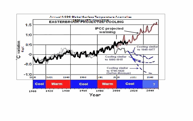
The graph in question also included a curve in red identified as “IPCC projected warming” and a number of Don’s predictions, blue curves, starting around 2010. See the full-sized version of Easterbrook’s projections that started in 2010 here. It’s a cleaner version of Don’s Figure 4 from his two posts.
On the thread of the “Setting the record straight” post, Anthony Watts asked Don Easterbrook to update the graph in question. See Anthony’s January 21, 2014 at 9:26 am comment here. (At that time we were responding to Easterbrook’s statement that he had merged land surface temperature data with land+sea surface temperature data.)
THE NEW EASTERBROOK PROJECTION
About a week after his original post, Don presented an update to his projections. See my Figure 3. As noted in the opening, it was not an update of the graph in question. The graph in question included projections starting around 2010 and it included an “IPCC projected warming” curve. On the other hand, the projection in Don’s newly furnished update starts a decade earlier in 2000 and excludes the “IPCC projected warming”.

Figure 3
Don wrote about the updated graph:
Here is an updated version of my 2000 prediction. My qualitative prediction was that extrapolation of past temperature and PDO patterns indicate global cooling for several decades. Quantifying that prediction has a lot of uncertainty. One approach is to look at the most recent periods of cooling and project those as possibilities (1) the 1945-1975cooling, (2) the 1880-1915 cooling, (3) the Dalton cooling (1790-1820), (4) the Maunder cooling (1650-1700). I appended the temperature record for the 1945-1975 cooling to the temperature curve beginning in 2000 to see what this might look like (see below). If the cooling turns out to be deeper, reconstructions of past temperatures suggest 0.3°C cooler for the 1880-1915 cooling, about 0.7°C for the Dalton cooling (square), and about 1.2°C for the Maunder cooling (circle). We won’t know until we get there which is most likely.
This updated plot really doesn’t change anything significantly from the first one that I did in 2000.
Again, that wasn’t the graph in question.
It is also blatantly obvious that his graph does not include the data from 2000 to 2013. Don has curiously omitted one of the primary reasons for someone to update a projection graph.
Another curiosity, there’s some data missing from his projections. It is supposed to represent “appended 1945-1975 temps”, meaning he spliced 1945-1975 global surface temperature anomalies onto the end of the 1999 data. However, the spike in response to 1972/73 El Niño is missing, and so is the spike in response to the 1957/58 El Niño. There’s also a spike missing in August 1945. The missing spikes stand out in Animation 1.

Animation 1
Or is that what the “appended” means…that he’s modified the 1945-75 data? I’m not sure why he’d delete those spikes, but I noticed it right away.
The little uptick at the end of the Easterbrook update is also a curiosity. It was the response to the Pacific Climate Shift of 1976, so the projection includes data beyond 1975.
And Don Easterbrook presented monthly HADCRUT3 data, as opposed to the annual NCDC data that he had used in his graph in question. I also have no idea why he would use HADCRUT3 data instead of HADCRUT4 data, especially when he wanted to use 1945 to 1975 data to show cooling during his projection. Why? HADCRUT3 data does not show cooling during that period, while HADCRUT4 data does. See Figure 4. That change in trend was a result of the revisions to the HADSST data…the corrections they made to eliminate the 1945 “discontinuity”.

Figure 4
I suspect that Don Easterbrook left out the “IPCC projected warming” curve because of the way he spliced the models onto his abridged and modified data in his graph in question (the one with the projections starting in 2010; i.e. his Figure 4 in both of his posts). See the animation here, from my January 19, 2014 at 6:34 am comment on the first of the Easterbrook threads.
MY REPLICA OF THE NEW EASTERBROOK PROJECTION
Don did not include the recipe for splicing the data starting in 1945 onto the data ending in 1999. Figure 5 is my attempt to replicate his newly updated graph. The January 1945 through December 1977 data was shifted back in time to start in January 2000. Then the relocated data was shifted upwards by 0.354 deg C so that the January 2000 (relocated January 1945) value equaled the December 1999 value. Figure 5 is a reasonable replica of Easterbrook’s revised update.

Figure 5
In Figure 6, I’ve included the surface temperature anomalies from January 2001 through December 2013. The Easterbrook projection looks a little low.

Figure 6
The projection really looks low when the data are presented in annual form, (see Figure 7), which is how Easterbrook presented his projections originally. The warming during the projection stands out like a sore thumb with the annual data.

Figure 7
NEW EASTERBROOK PROJECTION USING HADCRUT4 DATA
Figures 8, 9, and 10 run through the same process as Figures 5, 6, and 7, except that I’ve used HADCRUT4 data in the following three graphs.

Figure 8
# # #

Figure 9
# # #

Figure 10
The cooling in the projection using the HADCRUT4 data would have stood out even more if I had ended the data used in the projection in 1975, as Easterbrook had claimed. But I used the data through 1977 as he included in his graph.
NOTE: To maintain continuity between the monthly graphs and the annual graphs shown in Figures 7 and 10, I converted the monthly data to annual data. That is, I did not start with annual data for Figures 7 & 10 and splice annual data together.
MY UPDATE OF EASTERBROOK GRAPH WITH PROJECTIONS STARTING IN 2010
If Don Easterbrook had used annual HADCRUT4 data for his updated projection graph (black curve), and if he had spliced the 1945-1975 HADCRUT4 data on at 2010 (blue curve), and if he had used the multi-model ensemble mean of the CMIP5-archived models (using the RCP6.0 scenario) for his “IPCC projected warming” (red curve) using the same base years as the HADCRUT4 data, then his update to his graph in question would have looked like Figure 11. (I didn’t bother with his Dalton minimum or his Maunder cooling projections.)

Figure 11
The models look bad enough without having to add non-existent cooling to the data by splicing lower troposphere temperature data onto surface temperature data.
CLOSING
Global warming skeptics will be hurt, not helped, by those who manufacture datasets to create effects that do not exist.
Global warming skeptics do not have to help climate models look like crap. They’re doing a good job of that all on the own. See Figure 12.

Figure 12
SOURCES
The monthly HADCRUT3 data are available here. The monthly HADCRUT4 data are linked here. The annual HADCRUT4 data are available here. And the CMIP5 climate model outputs are available through the KNMI Climate Explorer.
Discover more from Watts Up With That?
Subscribe to get the latest posts sent to your email.
RichardLH says
hey! thats pretty cool, Can you extract the 15-year trend from the rest of the data and simply plot that against the SO2 emissions curve? If you do you will clearly see a negative correlation to increases in SO2 emissions both in the 1880-1910 and the 1945-1975 periods. You will also see that, in the absence of increased SO2 emissions, temperatures go up.
If you then plot GHG radiative forcing (not combined forcing that already includes aerosols) you will see that the cooling trends line up with the emission increases for SO2 AND that they are proportional to the relative forcing of GHGs at the time.
Dbstealey
you are not posting global data, you are posting northern hemisphere data. There are reasons that the deep ocean warming is happening in specific regions. The earth is not uniform in its warming and its response to increased GHGs (obviously!)
Here is the actual global data (through 2010). Still think that ARGO doesn’t show ocean warming?
Amen to that.
Bob Tisdale presents data as honestly and truthfully as possible. I suspect that, like me, he hates the thought that some researchers try to exaggerate the significance of their convictions by using misleading data – whichever side of the debate they happen to support.
I don’t necessarily agree with all of Bob’s conclusions but I’ve never felt the need to check any of the data he’s presented to support his arguments.
Thanks, Bob, you provide an invaluable service to those who frequent this blog.
RichardLH
What do you think of this?
http://oi58.tinypic.com/29ws45u.jpg
jai mitchell,
I posted current data. Your [questionable] chart ends in 2010 — ending almost 4 years ago. What are you hiding?
Furthermore, it does not show much warming. And it conflicts with the data I posted, which shows ocean cooling.
Face it, the oceans are doing what the planet is doing: showing no global warming.
Bob Tisdale says:
February 7, 2014 at 2:48 pm
“And as I’ve presented in an early comment, I too can show similar long-term projections by splicing the multidecadal variations of surface temperatures to the present value. It’s simply a matter of what period we elect for the start of the repeated signal: the 1880s-1910s cooling period or the 1940s-1970s hiatus period.”
Agreed. That is exactly what I have done also. The third curve, if you haven’t guessed it, is a straight reversal of the curve that got us here 🙂
jai mitchell says:
February 7, 2014 at 5:19 pm
“hey! thats pretty cool,”
Thank you. I thought so too.
“Can you extract the 15-year trend from the rest of the data and simply plot that against the SO2 emissions curve? If you do you will clearly see a negative correlation to increases in SO2 emissions both in the 1880-1910 and the 1945-1975 periods. You will also see that, in the absence of increased SO2 emissions, temperatures go up.
If you then plot GHG radiative forcing (not combined forcing that already includes aerosols) you will see that the cooling trends line up with the emission increases for SO2 AND that they are proportional to the relative forcing of GHGs at the time.”
As you are obviously not very good at visual data analysis I’ll help you out a bit.
http://i29.photobucket.com/albums/c274/richardlinsleyhood/jaimitchellsulphateoverlay2_zps90677ed8.gif
Here I have highlighted the ‘zero crossing’ points of the signals UNCOVERED by the 15 year and 75 year low pass filters from the previous image. I have labelled these points A,B and C for easy identification.
First to answer an obvious question from you. What are the ‘zero crossing’ points? They are what happens if you run the ‘greater than 75 years’ filter to remove the ~60 year signal uncovered by the ‘greater than 15 years’ filter so as to get whatever residual is then left. This then provides a very nice ‘centre’ around which the higher frequency signal is beating.
So. Before ‘A’ the ~60 year signal uncovered by the ‘greater than 15 years’ and ‘less than 75 years’ combined filter set (.i.e. a nice broadband, flat topped, band bass filter combo) shows a cyclic fall of the ~60 year signal towards ‘A’.
Between ‘A’ and ‘B’ the ~60 year signal is below the residual, again in a cyclic manner. Between ‘B’ and ‘C’ the ~60 year signal is back above the residual, again in a cyclic manner, and is falling towards the ‘zero crossing’ point well before the SO2 data starts to rise significantly. Only after ‘C’ is there any chance for the attribution of SO2 as it being the modulator of temperature as being true. 1 (possibly) out of 3 is just not good enough.
jai mitchell says:
February 7, 2014 at 5:59 pm
“What do you think of this?
http://oi58.tinypic.com/29ws45u.jpg”
Interesting, but not in the way you hoped. Your use of GISS data means a one to one comparison is more difficult. It does show that the ~60 year signal is present in both of the data sets though. So you cannot object to that line in my presentation. It relies on the volcano signal to explain the drop to ‘A’ in the presentation above which is another co-incidental happening. Now we have two co-incidences, first volcano and then SO2 to explain the two downward parts of the cyclic manner of the signal. Stretching it a bit far aren’t you?
Would you like me to add a similar low pass treatment of Mann 2005 to demonstrate that this ~60 year signal is present in the data all the way back to the year 200? In his data. Now finding extra co-incidental reasons for why the ~60 year cycle does not exists is going to be a large challenge. Beyond, I suspect, even you.
jai mitchell says:
February 7, 2014 at 5:19 pm
“Here is the actual global data (through 2010). Still think that ARGO doesn’t show ocean warming?”
Oh PLEASE.
You use 5 years of data to try and prove anything! It takes 4 years for the Earth to return to the Sun being at the same point in the sky at the same time of year. (8 hours shift per year then add a day).
I would EXPECT there to be at least some 4 year pattern to the temperature data given that the acceptance ratio of land to ocean is so different.
DBStealey,
the ocean data you showed had only northern hemisphere oceans, most of the deeper warming has ocurred in the southern hemisphere (where most of the oceans are) The graphic I showed contained ARGO data from 60’south to 60’north latitudes. The rate of deep ocean warming is actually increasing, so later years (2010-2014) would show a higher value than the graphic showed.
https://climatedataguide.ucar.edu/climate-data/ocean-heat-content-10-1500m-depth-based-argo
The information in the bottom of the graphic shows that over this range, the 2010 value of energy being put into the oceans accounts for 0.54watts/meter^2 . This is a value that yeilds an approximation to the TOP of ATMOSPHERE imbalance, the amount of extra energy that global warming is putting into the earth every year. This is a DIRECT MEASUREMENT.
RichardLH
Instead of marking the zero crossings, you need to mark the peaks and troughs.
then mark the peaks and Troughs of the SO2 emissions curves to extract any potential causation. Marking the zero points, as you did provides no indication of effects on temperatures (since the second order derivative is zero)
http://i29.photobucket.com/albums/c274/richardlinsleyhood/jaimitchellsulphateoverlay2_zps90677ed8.gif
you will find that the first peak (1/2 cycle before your point A) begins as the SO2 curve begins to rise. Then the second peak (a trough) between your points A and B happens when the SO2 curve levels off in 1910.
after that, the SO2 curve stays relatively steady until 1945 (corresponding to the peak locted between your points B and C. It should be noted that, during this period, the increase in radiative forcing is beginning to become the dominant signal which is why we see the uptick in temperatures even though there is (a slight) increase in SO2 in the 1938-1941 period.
from the next peak to trough, 1945 to 1977 IN YOUR CURVE lines up DIRECTLY with the SO2 emissions rate of increase.
finally, the last trough (the resumption of warming) in your curve shows how temperatures continued to increase after SO2 emissions were reduced.
This is a very HIGH negative correlation.
RichardLH
go ahead and show the 60-year filter of the mann data, hell, why just stick with the mann data?
why not go with the GISP2 data? The GISP2 data, normalized with the deviation from the mean value (anomaly) reduced by a factor of 4 is a reasonable approximation to the difference in global average temperature anomaly.
Here, Try this (RTF format)
Here is the GISP2 data to play with
jai mitchell says:
February 8, 2014 at 9:46 am
“Instead of marking the zero crossings, you need to mark the peaks and troughs.”
Why? Zero crossing has always considered to be the most reliable form of signal detection. Peaks have always been considered unreliable because of known outlier influences.
“Marking the zero points, as you did provides no indication of effects on temperatures (since the second order derivative is zero)”
As the ‘zero crossings’ track the longer term, residual, function they can hardly be unimportant. Indeed they provide a perfect example of how the shorter term signal is completely uninfluenced by the SO2 figure. This is the main take home here. Short term, ~60 year, cyclic figures are not caused or related to SO2.
If you wish to provide the relevance that you are suggesting can be displayed then please do supply an image marked up to show those point clearly. Preferably using HadCrut data but I can switch to the shorter GISS data if you can’t manage it.
As far as I can see from the various images the SO2 is a nearly constant and gentle rise to point C and only after that point does it in any way become dominant. You should note that the cyclic rise and fall of the ~60 year line is almost exactly the same peak to peak throughout this whole graph, centred nicely around the residual left by running the 75 year low pass. The residual in no way relates to the rise in SO2 either (or to CO2 for that matter).
And then you suggest that we switch to another forcing because the SO2 runs out of steam!
So let me get this right. We have :-
1. Volcanos supply the initial dip because SO2 can’t.
2. SO2 supplies the second dip.
3. CO2 rise overcomes the SO2 and pulls the line back into alignment so the picture is perfect.
And all of this just happens, quite co-incidentally, to conform to time periods that means (pun) the ~60 year cycle doesn’t exist?
P.S. You forgot the rise before ‘A’ and the drop to that point.
“go ahead and show the 60-year filter of the mann data”
OK. (By the way – there is no 60 year filter here. This is all the frequencies between 15 and 75 years and greater than 75 years as red and blue traces). If you see 60 years then that is YOUR call.
http://i29.photobucket.com/albums/c274/richardlinsleyhood/Mann15and75yearlowpass_zps4ad7ca90.gif
Nice ~60 year wriggle. Not fully cyclic but that would have been just too unlikely. Significant regular deviations around the longer term, greater than 75 year, residual signal though 🙂
As the GISP2 data would mean (again pun) that the graphs we are currently using would end up in being some 1/10 inch portion to the very right hand end I am not sure ~60 years will show up that well :-). Using Mann with its 2000 years makes the graphs to date a fairly small sliver.
jai mitchell says:
February 8, 2014 at 10:10 am
“Here is the GISP2 data to play with”
Thanks for that. I may well have a play later.
From the file
1855 -0.2416
1843 -0.25184
1837 -0.24537
1831 -0.24457
1831 -0.24384
1825 -0.26637
1818 -0.28567
1811 -0.29727
1805 -0.31444
1798 -0.325
1798 -0.33827
…
So the data is already sampled below Yearly and appears to not be a monatomic sampling interval. This does tend to play havoc with any attempt an analysis. Jitter is possible the worst of time sampling distortions that can occur in a data stream.
1791 -0.36314
1785 -0.38587
1778 -0.3905
“hey! thats pretty cool,”
Thank you. I thought so too.
“Can you extract the 15-year trend from the rest of the data and simply plot that against the SO2 emissions curve? If you do you will clearly see a negative correlation to increases in SO2 emissions both in the 1880-1910 and the 1945-1975 periods. You will also see that, in the absence of increased SO2 emissions, temperatures go up.
If you then plot GHG radiative forcing (not combined forcing that already includes aerosols) you will see that the cooling trends line up with the emission increases for SO2 AND that they are proportional to the relative forcing of GHGs at the time.”
As you are obviously not very good at visual data analysis I’ll help you out a bit.
http://i29.photobucket.com/albums/c274/richardlinsleyhood/jaimitchellsulphateoverlay2_zps90677ed8.gif
Here I have highlighted the ‘zero crossing’ points of the signals UNCOVERED by the 15 year and 75 year low pass filters from the previous image. I have labelled these points A,B and C for easy identification.
First to answer an obvious question from you. What are the ‘zero crossing’ points? They are what happens if you run the ‘greater than 75 years’ filter to remove the ~60 year signal uncovered by the ‘greater than 15 years’ filter so as to get whatever residual is then left. This then provides a very nice ‘centre’ around which the higher frequency signal is beating.
So. Before ‘A’ the ~60 year signal uncovered by the ‘greater than 15 years’ and ‘less than 75 years’ combined filter set (.i.e. a nice broadband, flat topped, band bass filter combo) shows a cyclic fall of the ~60 year signal towards ‘A’.
Between ‘A’ and ‘B’ the ~60 year signal is below the residual, again in a cyclic manner. Between ‘B’ and ‘C’ the ~60 year signal is back above the residual, again in a cyclic manner, and is falling towards the ‘zero crossing’ point well before the SO2 data starts to rise significantly. Only after ‘C’ is there any chance for the attribution of SO2 as it being the modulator of temperature as being true. 1 (possibly) out of 3 is just not good enough.
jai mitchell says:
February 7, 2014 at 5:59 pm
“What do you think of this?
http://oi58.tinypic.com/29ws45u.jpg”
Interesting, but not in the way you hoped. Your use of GISS data means a one to one comparison is more difficult. It does show that the ~60 year signal is present in both of the data sets though. So you cannot object to that line in my presentation. It relies on the volcano signal to explain the drop to ‘A’ in the presentation above which is another co-incidental happening. Now we have two co-incidences, first volcano and then SO2 to explain the two downward parts of the cyclic manner of the signal. Stretching it a bit far aren’t you?
Would you like me to add a similar low pass treatment of Mann 2005 to demonstrate that this ~60 year signal is present in the data all the way back to the year 200? In his data. Now finding extra co-incidental reasons for why the ~60 year cycle does not exists is going to be a large challenge. Beyond, I suspect, even you.
Oops sorry mods – can you trim the double posted bits – pretty please – after the “hey! thats pretty cool,” in the second post. 🙂
jai mitchell says:
February 8, 2014 at 10:10 am
“Here is the GISP2 data to play with”
Thanks for that. I may well have a play later.
From the file
1855 -0.2416
1843 -0.25184
1837 -0.24537
1831 -0.24457
1831 -0.24384
1825 -0.26637
1818 -0.28567
1811 -0.29727
1805 -0.31444
1798 -0.325
1798 -0.33827
…
So the data is already sampled below Yearly and appears to not be a monatomic sampling interval. This does tend to play havoc with any attempt an analysis. Jitter is possibly the worst of time sampling distortions that can occur in a data stream.
[mods – previous post was an inadvertent copy of part of a previous comment as well – please replace that with this]
RichardLH
The reason that you need to change the data points to the max/min differential between the 15 and 75 year curves (as opposed to the zero point) is that these points show the actual break points of the temperature trend and therefore provides correlation analysis to the SO2 Curve.
And, yes, the amount of influece of SO2 is proportional to the amount of total GHG forcing, so, as the GHG forcing (anthropogenic, absent of volcanic spike) increases in intensity, a greater SO2 delta is needed to produce the same cumulative effect.
Pretty basic stuff if you ask me!
jai mitchell says:
February 8, 2014 at 12:36 pm
“The reason that you need to change the data points to the max/min differential between the 15 and 75 year curves (as opposed to the zero point) is that these points show the actual break points of the temperature trend and therefore provides correlation analysis to the SO2 Curve.”
I am sorry I do not follow your reasoning. The ‘zero crossing’ points are the places where the high frequency signal crosses above or below the lower frequency signal in the data.
What has that to do with correlation with SO2? There are just designations of correlation between the high/low frequency signals.
The Red trace (which shows ALL signals of any period greater than 15 years in any case) will have to do on its own then.
http://i29.photobucket.com/albums/c274/richardlinsleyhood/jaimitchellsulphateoverlay4_zpsae006736.gif
Please state how this correlates to the SO2, both before and after 1970.
jai mitchell says:
February 8, 2014 at 12:36 pm
Despite the fact that I cannot see why your request is valid I have done as you requested and marked up the ‘anything greater than 15 years’ curve at the inflexion points.
http://i29.photobucket.com/albums/c274/richardlinsleyhood/jaimitchellsulphateoverlay5_zps28651e19.gif
Please talk me through how you consider these points, and the changes in the direction of the temperature they designate, are correlated to the SO2 rise. All of them please.
RichardLH
Please state how this correlates to the SO2, both before and after 1970.
I will do better than that, just eyeballing the graphic of course
period between peaks and nunber change in Change in
troughs of the 15-year average of years 15 year curve SO2 emissions
1878-1900 22 -0.1C +8,000Mtonnes
1900-1943 43 +0.3C +10,300Mtonnes
1943-1970 27 0 +68,700Mtonnes
1970-present 40 +0.55 -22,000Mtonnes
Average Annual Average Annual
Temperature Change SO2 Emission Change
-.00454C/yr +363.6Mtonnes/yr
+.0070C/yr +239.5Mtonnes/yr
0 C/yr +2,544Mtonnes/yr
+.0138C/yr -550Mtonnes/yr
There you go, the negative correlation to SO2 as a cooling mechanism (negative forcing) as is well documented by experimental, modeling and physical observation.
so, what is your causation for your percevied 60-year fluctuation? solar cycles??? Planetary alignments???
Having a harmonic in the temperature data is all good and fine, but without causative correlation it doesn’t really mean anything, I am sure you agree.
RichardLH
Thanks for doing that, Can I request one more silly picture, should be easy!
Place 4 simple markers on the SO2 emissions graphs that also show the break points were a large relative rate of increase or decrease of emissions can be eyeballed from the curve.
Just add it to your last one and that should do it.
http://i29.photobucket.com/albums/c274/richardlinsleyhood/jaimitchellsulphateoverlay5_zps28651e19.gif
oh by the way
to be consistent, you will also have to eyeball an approximate 15-year smoothing function for the SO2 curve.
crap, that column formatting didn’t work AT ALL!
Here is the post in graphic format
http://oi59.tinypic.com/2ms0n78.jpg
OK Picture annotated as requested.
http://i29.photobucket.com/albums/c274/richardlinsleyhood/jaimitchellsulphateoverlay6_zps31c45d7f.gif
OK. So what do we have.
Period to 1. Rising temps. Flat SO2.
Period to a. Falling temps. Flat SO2.
Period to 2. Falling temps. Rising SO2.
Period to b. Rising temps. Rising SO2.
Period to c. Rising temps. Falling SO2.
Period to d. Rising temps. Rising SO2.
Period to 3. Level temps. Falling SO2.
Period to e. Level temps. Falling SO2.
Period to 4. Falling temps. Rising SO2.
Period to f. Level temps. Rising SO2.
Period to g. Rising temps. Rising SO2.
Period to h. Rising temps. Falling SO2.
Period to i. Rising temps. Level SO2.
Period to j. Rising temps. Falling SO2.
Period to k. Rising temps. Falling SO2.
I think that covers just about all the possible combinations of Temps and SO2 there are.
So based on that, no correlation between Temps and SO2 at all. YMMV.
Want to try again?
“so, what is your causation for your percevied 60-year fluctuation? solar cycles??? Planetary alignments???”
I don’t know. Do you think that there is a ~60 curve we should be finding an attribution for? No point in looking for something if it does not exist, is there 🙂
“oh by the way – to be consistent, you will also have to eyeball an approximate 15-year smoothing function for the SO2 curve.”
I tell you what. Upload the data as a table (monthly resolution if you can please) and I’ll take the time to load it into R and do just that for you. It’s only a very few lines of R but….. Some people are just so difficult to please.
I am getting really confused now. At the following, we see this quote:
http://wattsupwiththat.com/2014/02/05/press-for-a-climate-scientist-who-got-it-right/
“For the next 20 years, I predict global cooling of about 3/10ths of a degree Fahrenheit, as opposed to the one-degree warming predicted by the IPCC,” said Easterbrook
However the graph with this article shows the y axis in degrees C for what looks to be a 1 C difference between two lines over 20 years.
Then on Dr. Spencer’s site, Dr. Easterbrook says:
“In 2000, I downloaded the IPCC temp prediction to 2100 from the official IPCC website showing a 1 F warming from 2000 to 2010.”
See:
http://www.drroyspencer.com/2014/02/95-of-climate-models-agree-the-observations-must-be-wrong/#comment-103749
Did the IPCC use F at any time?
P.S. If I do run a ‘anything greater than 15 years’ low pass filter on the SO2 curve it may well not present the data in a way you’ll be happy with. I will guess a gently accelerating curve to about 1970 and then an inflexion about there. Which will hardly match to the oscillating temperature curve until then will it?
JM: “Having a harmonic in the temperature data is all good and fine, but without causative correlation it doesn’t really mean anything, I am sure you agree.”
Harmonic! Who said anything about harmonics? Now just because a figure happens to a multiple of something else doesn’t mean it’s a harmonic.
In fact if you look very, very carefully you might just observe that this oscillation is asymmetric. Longer on the negative side than the positive (for now anyway). So I’m not sure which half we should be looking at for the harmonic. Care to help?