Don Easterbrook has updated his projection graph. Unfortunately, he did not update the graph that I complained about a few weeks ago, shown on the left in Figure 1. In that graph his projections started around 2010. He appears to have updated the Easterbrook projections graph on the right, where the projections started in 2000.

Figure 1
I raised a few eyebrows a couple of weeks ago by complaining loudly about a graph of global surface temperature anomalies (among other things) that was apparently created to show global cooling over a period when no global cooling existed. My loud and persistent complaints were in response to Figure 4 from Don Easterbrook’s post Cause of ‘the pause’ in global warming at WattsUpWithThat. In response to my reaction to his graph (and other things), Don Easterbrook wrote the post Setting the record straight ‘on the cause of pause in global warming’, which did not address my concerns.
It was on the thread of the “Setting the record straight” post that I presented how Don Easterbrook created the cooling of global surface temperatures during a period when no such cooling existed. The cooling effect was created by splicing global lower troposphere temperature anomalies from 1998 to about 2008 onto a graph of NCDC global surface temperature anomalies. See my Figure 2.

Figure 2
The graph in question was not created by splicing land surface air temperature data from 1998 to 2010 onto the end of the land+ocean surface temperature data as Don had explained in his “Setting the record straight” post (my boldface).
This curve is now 14 years old, but because this is the first part of the curve that I originally used in 2000, I left it as is for figure 4. Using any one of several more recent curves from other sources wouldn’t really make any significant difference in the extrapolation used for projection into the future because the cooling from 1945 to 1977 is well documented. The rest of the curve to 2010 was grafted on from later ground measurement data—again, which one really doesn’t make any difference because they all show essentially the same thing.
There are two errors in the above quote. First, the graph in question could not be 14 years old, because it included TLT data from 1998 to about 2008. Second, land surface temperature data do not show “essentially the same thing” as land+ocean surface temperature data. Land surface temperature data have continued to rise since 1998.
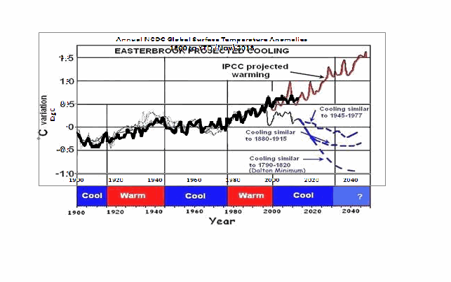
The graph in question also included a curve in red identified as “IPCC projected warming” and a number of Don’s predictions, blue curves, starting around 2010. See the full-sized version of Easterbrook’s projections that started in 2010 here. It’s a cleaner version of Don’s Figure 4 from his two posts.
On the thread of the “Setting the record straight” post, Anthony Watts asked Don Easterbrook to update the graph in question. See Anthony’s January 21, 2014 at 9:26 am comment here. (At that time we were responding to Easterbrook’s statement that he had merged land surface temperature data with land+sea surface temperature data.)
THE NEW EASTERBROOK PROJECTION
About a week after his original post, Don presented an update to his projections. See my Figure 3. As noted in the opening, it was not an update of the graph in question. The graph in question included projections starting around 2010 and it included an “IPCC projected warming” curve. On the other hand, the projection in Don’s newly furnished update starts a decade earlier in 2000 and excludes the “IPCC projected warming”.

Figure 3
Don wrote about the updated graph:
Here is an updated version of my 2000 prediction. My qualitative prediction was that extrapolation of past temperature and PDO patterns indicate global cooling for several decades. Quantifying that prediction has a lot of uncertainty. One approach is to look at the most recent periods of cooling and project those as possibilities (1) the 1945-1975cooling, (2) the 1880-1915 cooling, (3) the Dalton cooling (1790-1820), (4) the Maunder cooling (1650-1700). I appended the temperature record for the 1945-1975 cooling to the temperature curve beginning in 2000 to see what this might look like (see below). If the cooling turns out to be deeper, reconstructions of past temperatures suggest 0.3°C cooler for the 1880-1915 cooling, about 0.7°C for the Dalton cooling (square), and about 1.2°C for the Maunder cooling (circle). We won’t know until we get there which is most likely.
This updated plot really doesn’t change anything significantly from the first one that I did in 2000.
Again, that wasn’t the graph in question.
It is also blatantly obvious that his graph does not include the data from 2000 to 2013. Don has curiously omitted one of the primary reasons for someone to update a projection graph.
Another curiosity, there’s some data missing from his projections. It is supposed to represent “appended 1945-1975 temps”, meaning he spliced 1945-1975 global surface temperature anomalies onto the end of the 1999 data. However, the spike in response to 1972/73 El Niño is missing, and so is the spike in response to the 1957/58 El Niño. There’s also a spike missing in August 1945. The missing spikes stand out in Animation 1.

Animation 1
Or is that what the “appended” means…that he’s modified the 1945-75 data? I’m not sure why he’d delete those spikes, but I noticed it right away.
The little uptick at the end of the Easterbrook update is also a curiosity. It was the response to the Pacific Climate Shift of 1976, so the projection includes data beyond 1975.
And Don Easterbrook presented monthly HADCRUT3 data, as opposed to the annual NCDC data that he had used in his graph in question. I also have no idea why he would use HADCRUT3 data instead of HADCRUT4 data, especially when he wanted to use 1945 to 1975 data to show cooling during his projection. Why? HADCRUT3 data does not show cooling during that period, while HADCRUT4 data does. See Figure 4. That change in trend was a result of the revisions to the HADSST data…the corrections they made to eliminate the 1945 “discontinuity”.

Figure 4
I suspect that Don Easterbrook left out the “IPCC projected warming” curve because of the way he spliced the models onto his abridged and modified data in his graph in question (the one with the projections starting in 2010; i.e. his Figure 4 in both of his posts). See the animation here, from my January 19, 2014 at 6:34 am comment on the first of the Easterbrook threads.
MY REPLICA OF THE NEW EASTERBROOK PROJECTION
Don did not include the recipe for splicing the data starting in 1945 onto the data ending in 1999. Figure 5 is my attempt to replicate his newly updated graph. The January 1945 through December 1977 data was shifted back in time to start in January 2000. Then the relocated data was shifted upwards by 0.354 deg C so that the January 2000 (relocated January 1945) value equaled the December 1999 value. Figure 5 is a reasonable replica of Easterbrook’s revised update.

Figure 5
In Figure 6, I’ve included the surface temperature anomalies from January 2001 through December 2013. The Easterbrook projection looks a little low.

Figure 6
The projection really looks low when the data are presented in annual form, (see Figure 7), which is how Easterbrook presented his projections originally. The warming during the projection stands out like a sore thumb with the annual data.

Figure 7
NEW EASTERBROOK PROJECTION USING HADCRUT4 DATA
Figures 8, 9, and 10 run through the same process as Figures 5, 6, and 7, except that I’ve used HADCRUT4 data in the following three graphs.

Figure 8
# # #

Figure 9
# # #

Figure 10
The cooling in the projection using the HADCRUT4 data would have stood out even more if I had ended the data used in the projection in 1975, as Easterbrook had claimed. But I used the data through 1977 as he included in his graph.
NOTE: To maintain continuity between the monthly graphs and the annual graphs shown in Figures 7 and 10, I converted the monthly data to annual data. That is, I did not start with annual data for Figures 7 & 10 and splice annual data together.
MY UPDATE OF EASTERBROOK GRAPH WITH PROJECTIONS STARTING IN 2010
If Don Easterbrook had used annual HADCRUT4 data for his updated projection graph (black curve), and if he had spliced the 1945-1975 HADCRUT4 data on at 2010 (blue curve), and if he had used the multi-model ensemble mean of the CMIP5-archived models (using the RCP6.0 scenario) for his “IPCC projected warming” (red curve) using the same base years as the HADCRUT4 data, then his update to his graph in question would have looked like Figure 11. (I didn’t bother with his Dalton minimum or his Maunder cooling projections.)

Figure 11
The models look bad enough without having to add non-existent cooling to the data by splicing lower troposphere temperature data onto surface temperature data.
CLOSING
Global warming skeptics will be hurt, not helped, by those who manufacture datasets to create effects that do not exist.
Global warming skeptics do not have to help climate models look like crap. They’re doing a good job of that all on the own. See Figure 12.

Figure 12
SOURCES
The monthly HADCRUT3 data are available here. The monthly HADCRUT4 data are linked here. The annual HADCRUT4 data are available here. And the CMIP5 climate model outputs are available through the KNMI Climate Explorer.
Jai Mitchell:
Up thread you requested that I look to the published literature for an explanation of the apparent ~60 year periodicity in the Climate temperature record. I have done and responded as you requested.
I can find NO scientific correlation between aerosols and the data curvature at all (as I mentioned above – but you may have missed it).
http://i29.photobucket.com/albums/c274/richardlinsleyhood/HadCrut4Monthly11575Lowpass1575SGExtensions_zps41a6d312.png
To suggest that the period 1945-1970 can be derived from the effects of aerosols is stretching scientific credibility to its limits and beyond.
To have a co-incidental ‘bump’ that reverses the waveform rise and provides an opposing ‘signal’ that is exactly the right length, phase and magnitude to provide the required outcome is down in the very lowest of reasonable statistics. Well beyond them I would say.
Please note that this treatment of the data is mathematically and scientifically valid and sound. It is nothing more than a true ‘Gaussian’ extension of the same mathematics that provides the Day, Month, Year, Decade Means that are the backbone of Climate studies. Even Hansen uses Gaussian at Decadal length in his papers.
As far as I can tell no-one has previously run it at a 15 year corner frequency but have instead preferred FTs and the like to do the heavy lifting for the longer periods. That has many drawbacks and does not, in any case, refute the use of the more primitive tool that Cascaded Triple Running Means provide. Any disparity is down to the inappropriateness of the shiny DSP toy rather the inaccuracy of the Occam’s Razor that CTRMs provide.
So I ask once again, can you provide me with a correlation example that demonstrates the ‘fit’ of aerosols to the HadCrut data in such a way to provide a period, phase and magnitude ‘drop in’ that makes your case?
P.S. I am sure you are aware that Savitzky-Golay is an engineers alternative to LOWESS. They both work on the same basic principles. The parameters in the S-G are constrained by the need to make them match over the ‘training’ overlap period with the unchanging, full kernel, CTRM. I believe that my choice of parameters is correct. Perhaps you would like to choose others?
JimF says: “So what now Bob, bread and circuses? Just because the masses have been lied to by slimebags, we should jump on the bandwagon and continue to try to get their attention by using the lies by the liars as the comparison…”
As I noted in the closing to the post:
Global warming skeptics do not have to help climate models look like crap. They’re doing a good job of that all on the own.
http://bobtisdale.files.wordpress.com/2014/02/figure-12.png
Regards
drumphil says:
February 7, 2014 at 12:56 am
“In all my readings of Don Easterbrook’s work I see a broad theory proposed, that based on the geologic record sometimes it is warmer and sometimes it is colder, and there is correlation with the PDO, and it is cyclical, and it is about to get colder. See any heavy math in that?”
I have roughly the same opinion myself. I fully accept that the actual figures that Don used were very poorly chosen. That poor choice does not refute his underlying premise.
Here is another alternative view that uses the concept but with more modern data and which still comes to the same basic conclusion. Other things than CO2 may well drive climate, on a ~60 year and longer period.
http://i29.photobucket.com/albums/c274/richardlinsleyhood/HadCrut4MonthlyDonEatserbrook3Alternatives_zps2c0e2406.gif
Bob Tisdale says:
February 6, 2014 at 6:59 pm
“he has not acknowledged that his selection of datasets showed cooling over a period when none existed.”
That is probably the most important point to be made. It is the only real untruth that is present in what he said. I think it is a great pity that he did not just repeat his work with modern data (as I have done above) and move on.
Very, very few industrial aerosols teach the stratosphere. Most remain in the atmosphere for a few days – maybe a few weeks – before they are rained out. Volcanic aerosols area different matter. The study you cite is highly questionable and it certainly cannot be used to conclude anything about a change in forcing due to aerosols. Take for example this statement
To put this into perspective, CO2 forcing to date since 1850 is only about 2 watts/m2 in TOTAL. The forcing for CO2 doubling is 3.7 w/m2. Further on we have
I’m not sure where these “selected sites” are but if the rest of the world has only experienced a fraction of the increased solar insolation at these “selected sites” then it would explain all the global warming we’ve seen since 1990 and a lot more.
PS I’m not paying to access the study.
In a nutshell. There was very little cooling after about 1955 across the rest of the world (despite the claimed aerosol increase between 1960 and 1980) . Most of the cooling occurred in the arctic (more than 1 degree C) which is largely unaffected by aerosol cooling.
RichardLH says: “I fully accept that the actual figures that Don used were very poorly chosen. That poor choice does not refute his underlying premise.”
The “graph in question” is not his only poor choice. Easterbrook was somewhat of an illusionist even with his original projections.
I’ve tried a number of ways to make those curves fit, but they don’t.
Bob Tisdale says:
February 7, 2014 at 4:07 am
“I’ve tried a number of ways to make those curves fit, but they don’t.”
I have tried too and they don’t. I can however make a similar treatment to the more modern data as I have shown above. Same logic, different data, similar projections.
RichardLH, your last post quoting me, is a quote of me quoting someone else. My opinion was directly under the bit you quoted…
Of course it would all be a lot clearer if this place used some kind of sensible threaded discussion system.
drumphil says:
February 7, 2014 at 5:18 am
“RichardLH, your last post quoting me, is a quote of me quoting someone else. My opinion was directly under the bit you quoted…
Of course it would all be a lot clearer if this place used some kind of sensible threaded discussion system.”
I do apologize. I did realise that after I posted but the actual comment stood regardless of the originator of the bit I then quoted. I did not mean to imply that you too held that position. Sorry.
Reading through this curent track , two sayings come to mind . One is “the devil is in the detail” and the other is “one cant see the forest due to the trees “ I hope that both parties can see that there are genuine merits and valuable insights in what each was saying to the other . I continue to be a supporter of both despite this extended debate.
Important post at Tallbloke:
http://tallbloke.wordpress.com/2014/02/07/anti-scientic-intimidation-of-journal-editors-and-publishers-by-ipcc-authors/
Anthony, you may consider to re-blog it on WUWT.
To Bob Tisdale says:
February 7, 2014 at 4:07 am
Bob try to understand that the Don’s graph is just a sketch. It was likely based on the idea that you neew to include a millennial oscillation (which you are not considering) and the idea that the observed variability is mostly due to natural oscillations. It was not supposed to be rigorous but to give an idea.
Don’s graph was fine considering the time when it was first produced. You need to study my papers to know more details on the new models. All this waving from you just show your inability to fully understand these issues in their complexity.
Try to understand that there is some difference between a trained senior scientist and somebody that just plays around with scientific issues which is what you and Willis are doing.
RichardLH,
Here, I created a very simple image to sum absolutely everything up. Think you might like it
http://oi59.tinypic.com/9tiw4w.jpg
DS says:
February 7, 2014 at 9:22 am
“Here, I created a very simple image to sum absolutely everything up. Think you might like it”
You might like to add a ‘compress=12’ to each of those to make the cartoon more complete. 🙂
DS
you say that heat isn’t accumulating in the oceans I say yes it is you say that “even if it is, good. . .” and I say, if you are incorrect on even the most basic understanding of the current climate, why should I credit you with valuable knowledge about what the (growing) imbalance of energy at the Top of the Atmosphere means for future generations of human beings?
RichardLH
I think it is pretty funny that you say that you can find no scientific correlation to the increase in sulfate emissions that start in 1945 and then peak in 1975 as a possible causative factor in the cooling (and the PDO) during this period. I especially find this amusing when you then subject the temperature data to a series of low-pass filters, decide that you see a harmonic and, without causation, claim some kind of scientific relevance.
Nicola Scafetta:
At February 7, 2014 at 8:27 am you write to Bob Tisdale saying
Oh, I’m interested in that because I am a “trained senior scientist”: indeed, I was the Senior Material Scientist at the UK’s Coal Research Establishment.
So, I would welcome information on the “difference” you assert.
Does it include lesser skill at tying shoelaces by a “trained senior scientist”? If so then I point out that I am quire good at it.
Richard
Scaffeta plagarizes again
‘Try to understand that there is some difference between a trained senior scientist and somebody that just plays around with scientific issues which is what you and Willis are doing”
How many times did we hear this line from gavin, from Hansen, from Mann?
Scaffetta’s work would not win at the local middle school science fair. Even children know they have to show their work.
So what do make of a trained scientist who wont show his work?
there is a word for that and it starts with F and rhymes with maude
Nicola Scafetta: Dear Anthony, there is no need of a repository/archive of data and code that I use.
Your assertions would gain credibility if you provided your code and data as used. Plus, there is the possibility (some would say probability or likelihood) that any errors would be discovered. Everybody makes errors sometimes — why pretend otherwise?
jai mitchell,
Nutticelli’s graph is an assertion, and a false one at that. This is the problem with the alarmists’ Belief system: it is based on false information. In reality, the 3,351 ARGO buoy array indicates deep ocean cooling.
There is no scientific evidence showing that the planet’s oceans are heating up. Like the planet itself, the oceans stopped warming about 17 years ago. In fact, the ARGO evidence shows recent ocean cooling.
Scientific EVIDENCE consists of either empirical [real world] observations, or verifiable, measurable raw data. Evidence is not computer models, or pal reviewed papers. And it is certainly not an assertion by Dana Nuticelli.
DS: http://oi59.tinypic.com/9tiw4w.jpg
That’s cute.
Nicola Scafetta: Try to understand that there is some difference between a trained senior scientist and somebody that just plays around with scientific issues which is what you and Willis are doing.
This is a standard ad hom argument that some scientists make whenever they are shown to be wrong, to have made a mistake, to have incomplete evidence, to have incomplete understanding, to have unverified computer code, to have inaccurate models or inadequate statistical analyses, or any of the other imperfections that plague us all. The “scientific” approach, abandoned on such occasions as illustrated here by Nicola Scafetta, is to correct the error, address the discrepancy, and otherwise stay focussed on the scientific points that are addressed.
Bob Tisdale and Willis Eschenbach have contributed good data analyses that will in the fullness of time have an impact. I have critiqued a few technical problems, as I have perceived them, and I have also recommended a more formal approach to publication than either one actually aspires to. Whatever. Their contributions are basically sound, and they should be credited rather than blamed that they do this work as amateurs.
jai mitchell says:
February 7, 2014 at 9:56 am
“RichardLH
I think it is pretty funny that you say that you can find no scientific correlation to the increase in sulfate emissions that start in 1945 and then peak in 1975 as a possible causative factor in the cooling (and the PDO) during this period. I especially find this amusing when you then subject the temperature data to a series of low-pass filters, decide that you see a harmonic and, without causation, claim some kind of scientific relevance.”
I see no harmonic. If you see one that is it is because the data says it is there. Anything greater than 15 years periodicity will be present in the output. ANYTHING.
So you believe that you can conjure up a ‘anti-cycle’ from the Fig you referenced that will co-incidentally ‘fit’ the observed periodicity/downward trend in the measured data over the relevant period. Go for it. Good luck on demonstrating that with an overlay.
You just don’t get it do you? I am only using the same mathematics that make the Day, Month, Year Means that you rely on, only with better mathematics and longer periods. Please give me a scientific explanation of why that treatment is not valid.
http://i29.photobucket.com/albums/c274/richardlinsleyhood/GaussianSimpleMeanFrequencyPlots_zps151bdb91.png
For a ‘proof’ of the better response characteristics of a Gaussian filter over a single mean.
And please do tell me why a Gaussian of 10 years as used by Hansen in his published papers is good, but a Gaussian of 15 years as used by me is bad.
jai mitchell says:
February 7, 2014 at 9:56 am
As I don’t want to make too much work for you I have merged the two images in question.
http://i29.photobucket.com/albums/c274/richardlinsleyhood/jaimitchellsulphateoverlay_zpsa4aa248d.gif
I am still unable to derive a correlation. Can you help?
RichardLH says: “I have tried too and they don’t. I can however make a similar treatment to the more modern data as I have shown above. Same logic, different data, similar projections.”
And as I’ve presented in an early comment, I too can show similar long-term projections by splicing the multidecadal variations of surface temperatures to the present value. It’s simply a matter of what period we elect for the start of the repeated signal: the 1880s-1910s cooling period or the 1940s-1970s hiatus period.
Regards
Frankly, I’m sick of Don’s bullshit. Three times now this has been gone over and the best he can do is attempt to shoot the messenger.
Look at his behavior in this thread. One post attacking Bob Tisdale, again, and then he disappears, never having actually addressed the specific issues raised.
I can imagine exactly what would be said about him if he was arguing for “the other side”, but he still gets published on the front page here.
jai mitchell says:
February 7, 2014 at 9:56 am
“you say that heat isn’t accumulating in the oceans I say yes it is you say that “even if it is, good. . .” and I say, if you are incorrect on even the most basic understanding of the current climate, why should I credit you with valuable knowledge about what the (growing) imbalance of energy at the Top of the Atmosphere means for future generations of human beings?”
Okay, so first, let’s both recognize that your supplied graph quits at 2008. (which is an extremely interesting choice to end it, as you will see in just a second). I don’t think you will dispute this, but if you do, let me know.
So, let’s have a good look at your graph
http://oi61.tinypic.com/n695op.jpg
Congratulations, you showed how El Nino and a Positive PDO phase influence the oceans!
Would be nice if to see what has happened now, since their cut-off date was exactly where the PDO switched back. Would also be nice to see it without the 3 year running average, to see just how much impact each event had individually. We can see the impact 3 years (and just short of 48 months) of inactivity from 1979-1981 had – all the Warming went away!
Now that we have seen the effects of the cycles though, how about we start talking about actual Temperatures? Sound good?
http://www.sciencemag.org/content/342/6158/617
“Observed increases in ocean heat content (OHC) and temperature are robust indicators of global warming during the past several decades. We used high-resolution proxy records from sediment cores to extend these observations in the Pacific 10,000 years beyond the instrumental record. We show that water masses linked to North Pacific and Antarctic intermediate waters were warmer by 2.1 ± 0.4°C and 1.5 ± 0.4°C, respectively, during the middle Holocene Thermal Maximum than over the past century. Both water masses were ~0.9°C warmer during the Medieval Warm period than during the Little Ice Age and ~0.65° warmer than in recent decades. Although documented changes in global surface temperatures during the Holocene and Common era are relatively small, the concomitant changes in OHC are large.”
As you can see, ~1,000 years ago temperatures were much warmer. Oh, and over the last 400 years, temperatures have risen roughly 0.25 Degrees C total. So… at this current pace of “catastrophic warming”, we might be back to MWP (circa 1,000AD) temperatures by the year 2814. (Omg!!! Right? I mean, we might be back to the temperatures we were at ~1000 years ago in another nearly 1000 years??? OMG, OMG, OMG! We’re all gonna die!!!)
That is the difference between people knowing what they are actually studying, and doing it purely for Science (my reference,) and people studying something to try and prove their point without having any idea what they are actually studying, or worse, knowing and still trying to use it to mislead the uninformed sheeple of the world (your graph)
And now that we have cleared up the nonsense about deep ocean warming (and made you look like a uninformed sheeple perfect for manipulating) how about we get back to the topic at hand? That is,
http://oi59.tinypic.com/9tiw4w.jpg
So the question remains: Under their/your proven incorrect excuse (“warming is hiding in the deep oceans”) how exactly does the CO2 cause said deep ocean heating without first heating the Air and Surface? (which the entire thought of that is so unbelievably asinine, I am a tad shocked anyone believed it. As I said, go hold a heat lamp above a filled bathtub and see what heats first. They might as well be saying something like “Skeptics are eating all the CO2 out of the air just to prove us wrong” – it really is that idiotic)