Don Easterbrook has updated his projection graph. Unfortunately, he did not update the graph that I complained about a few weeks ago, shown on the left in Figure 1. In that graph his projections started around 2010. He appears to have updated the Easterbrook projections graph on the right, where the projections started in 2000.

Figure 1
I raised a few eyebrows a couple of weeks ago by complaining loudly about a graph of global surface temperature anomalies (among other things) that was apparently created to show global cooling over a period when no global cooling existed. My loud and persistent complaints were in response to Figure 4 from Don Easterbrook’s post Cause of ‘the pause’ in global warming at WattsUpWithThat. In response to my reaction to his graph (and other things), Don Easterbrook wrote the post Setting the record straight ‘on the cause of pause in global warming’, which did not address my concerns.
It was on the thread of the “Setting the record straight” post that I presented how Don Easterbrook created the cooling of global surface temperatures during a period when no such cooling existed. The cooling effect was created by splicing global lower troposphere temperature anomalies from 1998 to about 2008 onto a graph of NCDC global surface temperature anomalies. See my Figure 2.

Figure 2
The graph in question was not created by splicing land surface air temperature data from 1998 to 2010 onto the end of the land+ocean surface temperature data as Don had explained in his “Setting the record straight” post (my boldface).
This curve is now 14 years old, but because this is the first part of the curve that I originally used in 2000, I left it as is for figure 4. Using any one of several more recent curves from other sources wouldn’t really make any significant difference in the extrapolation used for projection into the future because the cooling from 1945 to 1977 is well documented. The rest of the curve to 2010 was grafted on from later ground measurement data—again, which one really doesn’t make any difference because they all show essentially the same thing.
There are two errors in the above quote. First, the graph in question could not be 14 years old, because it included TLT data from 1998 to about 2008. Second, land surface temperature data do not show “essentially the same thing” as land+ocean surface temperature data. Land surface temperature data have continued to rise since 1998.
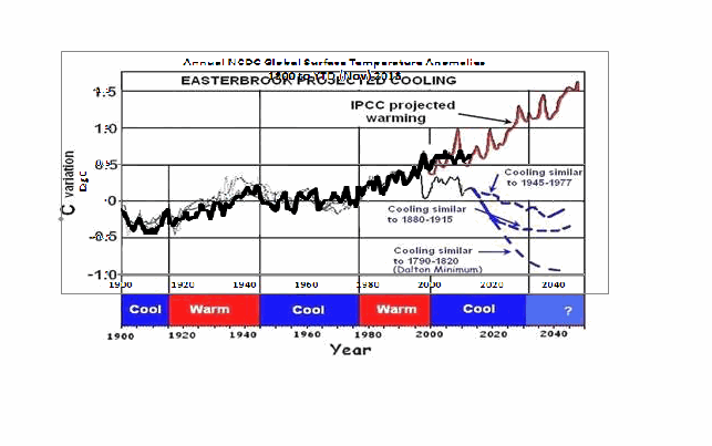
The graph in question also included a curve in red identified as “IPCC projected warming” and a number of Don’s predictions, blue curves, starting around 2010. See the full-sized version of Easterbrook’s projections that started in 2010 here. It’s a cleaner version of Don’s Figure 4 from his two posts.
On the thread of the “Setting the record straight” post, Anthony Watts asked Don Easterbrook to update the graph in question. See Anthony’s January 21, 2014 at 9:26 am comment here. (At that time we were responding to Easterbrook’s statement that he had merged land surface temperature data with land+sea surface temperature data.)
THE NEW EASTERBROOK PROJECTION
About a week after his original post, Don presented an update to his projections. See my Figure 3. As noted in the opening, it was not an update of the graph in question. The graph in question included projections starting around 2010 and it included an “IPCC projected warming” curve. On the other hand, the projection in Don’s newly furnished update starts a decade earlier in 2000 and excludes the “IPCC projected warming”.

Figure 3
Don wrote about the updated graph:
Here is an updated version of my 2000 prediction. My qualitative prediction was that extrapolation of past temperature and PDO patterns indicate global cooling for several decades. Quantifying that prediction has a lot of uncertainty. One approach is to look at the most recent periods of cooling and project those as possibilities (1) the 1945-1975cooling, (2) the 1880-1915 cooling, (3) the Dalton cooling (1790-1820), (4) the Maunder cooling (1650-1700). I appended the temperature record for the 1945-1975 cooling to the temperature curve beginning in 2000 to see what this might look like (see below). If the cooling turns out to be deeper, reconstructions of past temperatures suggest 0.3°C cooler for the 1880-1915 cooling, about 0.7°C for the Dalton cooling (square), and about 1.2°C for the Maunder cooling (circle). We won’t know until we get there which is most likely.
This updated plot really doesn’t change anything significantly from the first one that I did in 2000.
Again, that wasn’t the graph in question.
It is also blatantly obvious that his graph does not include the data from 2000 to 2013. Don has curiously omitted one of the primary reasons for someone to update a projection graph.
Another curiosity, there’s some data missing from his projections. It is supposed to represent “appended 1945-1975 temps”, meaning he spliced 1945-1975 global surface temperature anomalies onto the end of the 1999 data. However, the spike in response to 1972/73 El Niño is missing, and so is the spike in response to the 1957/58 El Niño. There’s also a spike missing in August 1945. The missing spikes stand out in Animation 1.

Animation 1
Or is that what the “appended” means…that he’s modified the 1945-75 data? I’m not sure why he’d delete those spikes, but I noticed it right away.
The little uptick at the end of the Easterbrook update is also a curiosity. It was the response to the Pacific Climate Shift of 1976, so the projection includes data beyond 1975.
And Don Easterbrook presented monthly HADCRUT3 data, as opposed to the annual NCDC data that he had used in his graph in question. I also have no idea why he would use HADCRUT3 data instead of HADCRUT4 data, especially when he wanted to use 1945 to 1975 data to show cooling during his projection. Why? HADCRUT3 data does not show cooling during that period, while HADCRUT4 data does. See Figure 4. That change in trend was a result of the revisions to the HADSST data…the corrections they made to eliminate the 1945 “discontinuity”.

Figure 4
I suspect that Don Easterbrook left out the “IPCC projected warming” curve because of the way he spliced the models onto his abridged and modified data in his graph in question (the one with the projections starting in 2010; i.e. his Figure 4 in both of his posts). See the animation here, from my January 19, 2014 at 6:34 am comment on the first of the Easterbrook threads.
MY REPLICA OF THE NEW EASTERBROOK PROJECTION
Don did not include the recipe for splicing the data starting in 1945 onto the data ending in 1999. Figure 5 is my attempt to replicate his newly updated graph. The January 1945 through December 1977 data was shifted back in time to start in January 2000. Then the relocated data was shifted upwards by 0.354 deg C so that the January 2000 (relocated January 1945) value equaled the December 1999 value. Figure 5 is a reasonable replica of Easterbrook’s revised update.

Figure 5
In Figure 6, I’ve included the surface temperature anomalies from January 2001 through December 2013. The Easterbrook projection looks a little low.

Figure 6
The projection really looks low when the data are presented in annual form, (see Figure 7), which is how Easterbrook presented his projections originally. The warming during the projection stands out like a sore thumb with the annual data.

Figure 7
NEW EASTERBROOK PROJECTION USING HADCRUT4 DATA
Figures 8, 9, and 10 run through the same process as Figures 5, 6, and 7, except that I’ve used HADCRUT4 data in the following three graphs.

Figure 8
# # #

Figure 9
# # #

Figure 10
The cooling in the projection using the HADCRUT4 data would have stood out even more if I had ended the data used in the projection in 1975, as Easterbrook had claimed. But I used the data through 1977 as he included in his graph.
NOTE: To maintain continuity between the monthly graphs and the annual graphs shown in Figures 7 and 10, I converted the monthly data to annual data. That is, I did not start with annual data for Figures 7 & 10 and splice annual data together.
MY UPDATE OF EASTERBROOK GRAPH WITH PROJECTIONS STARTING IN 2010
If Don Easterbrook had used annual HADCRUT4 data for his updated projection graph (black curve), and if he had spliced the 1945-1975 HADCRUT4 data on at 2010 (blue curve), and if he had used the multi-model ensemble mean of the CMIP5-archived models (using the RCP6.0 scenario) for his “IPCC projected warming” (red curve) using the same base years as the HADCRUT4 data, then his update to his graph in question would have looked like Figure 11. (I didn’t bother with his Dalton minimum or his Maunder cooling projections.)

Figure 11
The models look bad enough without having to add non-existent cooling to the data by splicing lower troposphere temperature data onto surface temperature data.
CLOSING
Global warming skeptics will be hurt, not helped, by those who manufacture datasets to create effects that do not exist.
Global warming skeptics do not have to help climate models look like crap. They’re doing a good job of that all on the own. See Figure 12.

Figure 12
SOURCES
The monthly HADCRUT3 data are available here. The monthly HADCRUT4 data are linked here. The annual HADCRUT4 data are available here. And the CMIP5 climate model outputs are available through the KNMI Climate Explorer.
jai mitchell says:
February 6, 2014 at 2:32 pm
“The thing that is missing from this piece is the overwhelming consensus that a large proportion of the observed cooling from 1945 to 1977 has been attributed to the increase of aerosols, especially the reflective cooling effect of coal-produces sulfur dioxide (the same stuff that tropical volcanoes put into the upper atmosphere to cool the planet).”
So co-incidence is the reason rather than other possible causes?
It is purely down to that and that alone that there is an apparent ~60 year cycle in the data? The bump just happens to be in the right place?
Despite that there are significant papers putting forward other climate observations that also support an ~60 year cycle. Ones that can hardly be attributed to aerosols. Such as AMO, PDO, Polar Vortex, Stadium Wave, etc.
I am sorry. Co-incidence of attribution to a very poorly globally sampled figure is getting very far out on a limb.
Nicola Scafetta says:
February 6, 2014 at 2:15 pm
I did not refer to your paper for the data. This is an independent conclusion based on there being something in the data above 15 years that looks like a ~60 year cycle plus a longer, probably 100+ cycle also.
It is present in most of the climate data, not just HadCrut4. It is even there quite strongly in the SST data as well.
I do not, as yet, have a definite attribution for it. But its presence as a cycle rather than a co-incidental ‘bump’ is, I believe, certain.
The link to my comment above…
http://multi-science.metapress.com/index/Q8G396420R003483.pdf
Anthony, both authors of this paper, Klyashtorin and Lyabushin, identify the 60 year
cycle over 1,400 years. Therefore, the cycle exists. Therefore, the Plateau set in, in
order the next cycle can follow. Now, Willis is the staunch cycle fighter. But why do you not give
credit to Klyashtorin and Lyabushin (2003)? Why has cycle fighter Willis such influence on you?,
He is off-road concerning cycles….Think again…..
Richard,
Please review:
Figure 2
http://www.pnl.gov/main/publications/external/technical_reports/PNNL-14537.pdf
I doubt if there’s even a consensus on this now. It makes no sense. The effect of aerosols is regionally specific. They are short-lived in the atmosphere (unlike CO2). The 1945-77 cooling was dominated by arctic cooling of around 1 degree C over the 30 year period. The NH mid-latitude regions (the regions that provided the source of the aerosol emissions in post-war period) experienced little cooling – and certainly no more than the rest of the world in general.
That’s not to say that a small proportion of aerosols didn’t find their way to the arctic. They did but aerosols in the arctic cause WARMING – not cooling. See Arctic Haze
http://en.wikipedia.org/wiki/Arctic_haze
richardscourtney said:
“Bob Tisdale:
Thankyou for this clear and lucid exposition of your disagreement with the presented exposition by Don Easterbrook. Excellent!
I now look forward to Don Easterbrook providing a response to your above article.
This is how real science is done: by the clash of understandings openly and honestly expressed. I congratulate you both and look forward to your continued blunt debate.
Richard”
Bob Tisdale has laid out time after time exactly what it is he talking about. Don, time after time, has talked about anything except the point Bob has made, and updated a different graph to the one in question, and not provided the data.
Am I suppose to believe that Don doesn’t understand what Bob is talking about, and that his failure to update the correct graphs and provide the data is just a misunderstanding?
The way Bob has dealt with this, providing thorough reasoning, analysis and data speaks for itself, as does Don’s behavior, dodging the point, updating a different graph, and failing to provide data.
RichardLH says: February 6, 2014 at 3:45 pm
I did not refer to your paper for the data.
***********
RichardLH you do not need to refer to my paper for the data. I do not use “special” and “mysterious” data as Anthony is claiming. I have analyzed a lot of data that can be downloaded in Internet by everybody (HadCrut4, HadCrut3, PDO, NAO, AMO, SLR, LOD, Monsoon etc). All these records present a quasi 60 year oscillation and other characteristics highlighted in my papers.
If you have used some of some of these data and used correct mathematical tools you had to find my same conclusion. This is the nice thing of science. People can repeat things independently. As you correctly did.
(Note that Anthony knows well that my data are easily available in Internet, He is just behaving like Pinocchio.)
“See Anthony, your way of arguing does not make any sense.”
It continues to amaze me how intelligent, highly educated people can act with such transparent clownery. It’s really tremendously depressing.
jai mitchell says:
February 6, 2014 at 4:23 pm
“Richard,
Please review:
Figure 2”
I did and can find no correlation between that and a ~60 cycle in the temperature data. Can you demonstrate one?
Bob Tisdale says: “…Global warming skeptics will be hurt, not helped, by those who manufacture datasets to create effects that do not exist….” Like the manufactured Hadcrut whatever? Like these datasets that have the 1930-40 decade, when many of America’s (the world’s?) hottest temperature readings occurred, now look like a period out of the Little Ice Age? (Remember Darwin, Australia, courtesy of Willis?). I’m perfectly happy to have Don present a prospective “SWAG” that merely uses something that sort of gets the shape of the T curve correct, because the point is he is saying the future is “DOWN” while the people who manufacture these datasets and assorted other BS, are saying it’s “Nothing but UP, Baby!” (and they have their thumbs on the scales). If he were to try to publish this in GSA or Science, then I think your l_e_n_g_t_h_y criticisms (and thinly-veiled charge of “Liar”) would be in order.
But Don, it would be wise to rework it to avoid this, if you’re going to promote it somewhere other than here.
“I’m perfectly happy to have Don present a prospective “SWAG” that merely uses something that sort of gets the shape of the T curve correct, because the point is he is saying the future is “DOWN” while the people who manufacture these datasets and assorted other BS, are saying it’s “Nothing but UP, Baby!” (and they have their thumbs on the scales).”
Because after all the actual literal truth isn’t the important thing. The important thing is winning!
” If he were to try to publish this in GSA or Science, then I think your l_e_n_g_t_h_y criticisms (and thinly-veiled charge of “Liar”) would be in order.”
Bollocks. If those criticisms are valid anywhere, they are also valid here.
jai mitchell says:
February 6, 2014 at 2:32 pm
“The thing that is missing from this piece is the overwhelming consensus that a large proportion of the observed cooling from 1945 to 1977 has been attributed to the increase of aerosols, especially the reflective cooling effect of coal-produces sulfur dioxide (the same stuff that tropical volcanoes put into the upper atmosphere to cool the planet).”
That is not true. Every year more and more data is showing how little an impact aerosols have. Climate Modelers themselves have even recently stated that Solar and Aerosols together can only explain, at most, about 20% of their failed projections. Their projections are off by roughly 0.5 Degrees, so that leaves Aerosols & Solar accounting for roughly 0.1 Degree over the past 17 years. That means they feel Aerosols are accountable for fractions of a degree over a pause lasting more then 50% of the cooling during the 70s. (In fact, I am fairly confident that is even the IPCCs started reason for their confidence level rising from 90% to 95%; they found out Aerosols cool much less then they thought.)
“Unless the author (don) states specifically that he attributes his future cooling trend to be caused by south-east asia air pollution (and therefore analogous to the 1945-1977 causation) then he is simply grabbing a convenient curve and tacking it onto the end of the current record to make a projection, WITHOUT REAL CAUSATION.”
His Causation is the effects of La Nina, and the corresponding Negative Cycle of the PDO. During El Nino/Positive periods there is warming. During the La Nina/Negative periods there is cooling. The PDO has switched cycles in 2008, 1977, 1946 and 1915. Take 2 minutes with WFT and Photoshop and you can see what you call merely a “convenient curve” for yourself. But here, I have quickly done it for you to make sure you see it for yourself
http://tinypic.com/m/i2owtl/4
That sure is one hell of a “convenient curve” – I can’t imagine a person could even manipulate the data and come up with such a strong match going all the way back to the 1890s
Note that while doing that, one can also see it is the period prior to 1880 where Warming really took place. Clearly that time frame did not see one of the 4 repeating natural pasterns we have seen since. (and seemingly 5, as we just entered a new one in 2008; the one Eastbrook is projecting outward, witch is so far matching 6 years in) That 1850-1880s anomaly conveniently corresponds with a Negative PDO cycle that really never was (from 1853-1884) and is a portion of what brought us out of the LIA.
But all of that is probably a coincidence, I’m sure.
Two things:
First:
Ed Reid says:
February 6, 2014 at 5:28 am
“Neither HadCRUT3 nor HadCRUT4 is “data”, as they are referred to above. Rather, both are temperature anomaly records built from data which has been “adjusted”. The anomalies would likely be smaller, if built from the actual “data”. However, that would make the performance of the models appear even worse.”
Given that the jiggery-pokery of temp record adjustments all add heat (enough to have shoved 1930s/mid 40s down several tenths thereby anhilating the real record temps), it is highly questionable to be arguing precision here, especially since we are talking about a 2000 prediction before there was a clear hiatus and before there was even HadCrut 4, which was itself done in the hope that the “pause” could be bent up a bit to give continuity – the vain hope being that a little nudge would be enough to bridge to the big rise coming by 2003/5. Don had the decline occur essentially after 2000 – hey, so what? The big news was a prediction that said we weren’t going ever forward and upward.
Bob, who never disputes the Hadcruts (and there will be a desperate flurry of several more if the “hiatus” goes on much longer), takes Don to task for not getting the inflection right and for being worse than the IPCC, only in the other direction. He argues Don used the wrong HadCrut.
Don, who really only had to say, hey, we were talking about the future (in 2000) and my point was that, at that time, to be calling for a decline in temps was the balsy prediction I made. He didn’t need to make it perfect in retrospect by trying out various inappropriate products in recent years to illustrate the earlier prediction. Don thereby robbed himself of a solid place in history; Bob makes firm, aggrieved critical points using the product manufactured by the “We’ve-been-had-and-crudded-4-times Office”
Both you guys are now off on a tangent. I’m curious as to what Mosher has to say about the HadCrut stuff. They jacked up the temps for H-4 because they felt that the arctic was under measured for heat and then, using this idea, made the worst minimum Arctic Ice projection of the 25 or so estimators being a couple of million sq km under the 5Msqkm for a couple of years running.
All of the above post said, I stand with Tisdale in wishing Easterbrook would not manipulate data, ensure he has his dates lined up right, and clarify exactly what he is saying.
As it stands, the evidence is on the side of his argument, but his argument is not going well.
If one calculates out the year over 62nd year anomaly with a 10 year running average, we have been running at a very stable +0.3 since roughly 1945. No warming, no cooling; just a pretty stable +0.3 anomaly trend. That being the case, I think a +0.3-0.4 over the mid 70s is probably likely come 2038/2039, when this Negative PDO cycle is scheduled to end. That means about a 0.3 decrease over the next 25 years.
That all adds up to a pretty strong argument, and it should be playing out much better then it is.
drumphil says:
February 6, 2014 at 5:25 pm: Explain yourself, idiot. What does this mean: “…Because after all the actual literal truth isn’t the important thing. The important thing is winning!…” Which “literal truth” are you going to enlighten us with? We’re all waiting to hear your pronouncement.
Winning in what way? Easterbrook made a projection. If he’s right, then we all lose. If he’s wrong, then he loses. Bollocks back at you.
Gary Pearse says: “Both you guys are now off on a tangent.”
My primary arguments of this post were that (1) Don manufactured a global surface temperature dataset that showed cooling when non existed. (2) He was asked to update it by Anthony. (3) He chose to update another graph, a graph that had no bearing on the discussion. You’ve lost sight of that.
Don has always been off on a tangent. He has acknowledged that he spliced two totally different datasets together for the graph in question, but his explanation was wrong. He has also claimed that mixing two totally different datasets together was okay because they basically showed the same thing, when we all know that’s wrong. Last, he has not acknowledged that his selection of datasets showed cooling over a period when none existed.
drumphil says: “Because after all the actual literal truth isn’t the important thing. The important thing is winning!”
Here’s a great example of getting caught by presenting something other than the “actual literal truth”. For years, people have been told that the last decade was the warmest on record. They expect a graph to show that. They may (or may not) accept the hiatus period, but when they do look at a graph, they expect to see the last decade as the warmest. Easterbrook’s graph…
http://bobtisdale.files.wordpress.com/2014/02/full-sized-easterbook-projection-2010.png
…doesn’t show that, so those people know the graph is something other than the “actual literal truth”.
If you had run through the comments on the thread of the CNSNews article about Easterbrook, you would have noted that Easterbrook got caught numerous times for just that reason.
People can’t win with lies. Lies eventually become visible. It’s only a matter of time.
Bob Tisdale says:
February 6, 2014 at 7:22 pm
“…For years, people have been told that the last decade was the warmest on record. They expect a graph to show that. They may (or may not) accept the hiatus period, but when they do look at a graph, they expect to see the last decade as the warmest. Easterbrook’s graph…
http://bobtisdale.files.wordpress.com/2014/02/full-sized-easterbook-projection-2010.png
…doesn’t show that, so those people know the graph is something other than the “actual literal truth”….”
So what now Bob, bread and circuses? Just because the masses have been lied to by slimebags, we should jump on the bandwagon and continue to try to get their attention by using the lies by the liars as the comparison, except to say that maybe the end isn’t just around the corner, because, well, uhh, the ENSO, you know…. (And the masses aren’t hearing one tittle about this little conflagration in a tin pot that you are stoking).
Easterbrook put out something that isn’t a science paper – it was, I think, a GSA poster session originally. Provocative, but never pretending to be anything other than one man’s guess. Now it’s gone farther out than that, but it is still an opinion that he has to defend and be judged on depending on RESULTS. I don’t see one damned thing that purports to being anything other than matching shapes of curves and making an analysis and stating an opinion. But you want to make a federal case out of it, and throw up the liars’ datasets as the determinative information. Easterbrook is a superb geologist, and he can wave his arms all he wants, in my opinion. Sometimes he gets it right. Like you may have with your “step-wise ENSO analysis”, which is just lines drawn on a fabulous T chart and a bold assertion as to what those lines mean.
A debate as to the precision of the 5th decimal in a field where data is limited to the first decimal at best. Give it a rest. So you don’t like his graph. Like this is the first graph in history that combined various sources of data and we can spit out “data splicing” as an epithet.
In all my readings of Don Easterbrook’s work I see a broad theory proposed, that based on the geologic record sometimes it is warmer and sometimes it is colder, and there is correlation with the PDO, and it is cyclical, and it is about to get colder. See any heavy math in that? Graphs are an illustration, not a proof
Picking nits on the details of graph construction may satisfy a personal need but does nothing to affirm or deny the basic premise, sometimes it is warmer and sometimes it is colder and we are about to get colder based on the geologic record.
Sometimes the techies just simply cannot accept the fact that the conclusion is correct. They have to focus on every statement and slide and graph and vehemently disagree with the presentation and go into crazy attack mode. This is like an argument about choosing a route for a cross country trip, He wants to go north and you don’t, so lets have a blood-letting fight over it.
You have done credible work on Enso, Attacking others for offending your personal sensibilities will not enhance your standing. Yep, we know that is not how you would have done it, but it is his presentation, not yours. Deal with the conclusions and be done with it.
John Finn,
The proportion of sulfates in the atmosphere in the 1945-1977 era was so much greater than the amount of current forcing that it produced a cooling effect. The arctic haze you are talking about is not important in this regard. The reflective cooling comes from the proportion of SO2 that reaches the stratosphere, and lingers there for a decade or so. That is why the link I provided (see figure 3) is so important.
D.S.
Yes, they have a massive effect, Aerosols are the reason for volcanic cooling. You do believe in that don’t you???
If you look at the rate of heat accumulation in the deep ocean you will see that the rate of total heat deposition in the earth is still growing at a near exponential rate. The surface (air and land) temperature increases are miniscule compared to the energy deposition in the oceans.
The next time we get a massive el nino like we did in 1998 we will see another jump in temperatures, right back to the projections. I hope you are ready to admit that you were wrong and will accept that we must take decisive actions to limit CO2 emissions when that happens, because, I am afraid, after that, it may already be too late
jai mitchell says:
February 6, 2014 at 9:04 pm
Yes, they have a massive effect, Aerosols are the reason for volcanic cooling. You do believe in that don’t you???
For how long? Oh yeah…
But anyway, as I told you earlier (but you ignored)
“Trenberth, for example, analyzed their impacts on the basis of satellite measurements of energy entering and exiting the planet, and estimated that aerosols and solar activity account for just 20% of the hiatus.”
So the question becomes; is Kevin Trenberth, who happened to be the lead author of multiple IPCC reports, completely wrong, or are you? (and while I think he is an opportunistic piece of trash riding a wave of fraud perpetrated off peoples gullibility, I’m still more inclined to believe his take on aerosols then yours. In fact I’m a tad shocked he even admitted reality, it hurts his position)
“If you look at the rate of heat accumulation in the deep ocean you will see that the rate of total heat deposition in the earth is still growing at a near exponential rate. The surface (air and land) temperature increases are miniscule compared to the energy deposition in the oceans.”
There is no heat accumulation in the ocean. That is a theory to where maybe the missing heat they think must exist might be. And why do they have this theory? Because they can’t admit they are wrong, they are much too invested at this point (and making a fortune off it!) So they stick to nature having nothing to do with anything since 1950, despite http://oi57.tinypic.com/av1rev.jpg
But if there really was heat building up in the ocean – good! Sediments show our Oceans are currently at least 1 degree lower than they have been most of the past 10,000 years. And while there has been a small increase over the past 400 years (that brought us out of the Little Ice Age) we are still sitting well below what looks to be normal. That means we are still possibly in the danger zone of going right back into another LIA in the near future (this is especially dangerous while we are sitting in a Negative PDO cycle and witnessing what is quite possibly the start of a new Maunder Minimum)
“The next time we get a massive el nino like we did in 1998 we will see another jump in temperatures, right back to the projections. I hope you are ready to admit that you were wrong and will accept that we must take decisive actions to limit CO2 emissions when that happens, because, I am afraid, after that, it may already be too late”
Seeing as we just started the La Nina cycle it will likely be another 30 or so years before we see another strong El Nino like that. Well, one that isn’t merely a response to a La Nina at least. Besides, the El Nino you are going to be waiting for is thought to be the biggest we have seen. It might be another 1,000 years before we see another like it, for all we know. And that is what you are waiting for to find your missing heat?
I do have to say though, it is interesting that CO2, which was supposed to have heated the planet evenly as if it were a blanket on the planet (as we were told for years until they finally admitted to the stall and started looking for any and every excuser the past 2 years. Now it is nature that controls the man made global warming that is controlling nature, apparently.) …getting back to my sentence; so now CO2 doesn’t heat the Atmosphere or the SST, and instead jumps straight down to the deep oceans where we cant measure it? So how does that work exactly? I admit I am not a learned Climatologist and all, but I know if I hold a heat lamp a few feet above the surface of my bathtub, the air and surface heat first. But CO2 generated heat has the ability to decide to go out of its way to bypass reality and cause this magical devastation?
No matter. If you are really worried about CO2, then I will help you. That is, I will help pay for your plane ticket if you feel the need to go cut down the Amazon in your effort to save us all from the evil CO2 it is emitting
http://hockeyschtick.blogspot.com/2014/02/new-paper-finds-amazon-can-be-net.html
Not sure what you will do about the Arctic Tundra though
http://hockeyschtick.blogspot.com/2014/02/new-paper-finds-arctic-tundra-is-net.html
By the way, you want to know what might really hurt crops in Iowa? The extreme Cooling they (like most of the US) have been experiencing since 1998
http://www.ncdc.noaa.gov/cag/time-series/us/13/00/tmp/ytd/12/1998-2013?base_prd=true&firstbaseyear=1901&lastbaseyear=2000&trend=true&trend_base=10&firsttrendyear=1998&lasttrendyear=2013
They are on pace to lose a full 10 degrees by the year 2097! Quick, somebody get that state some more CO2; the CO2 they have been releasing above their state is obviously broken
JimF said:
“Winning in what way? Easterbrook made a projection. If he’s right, then we all lose. If he’s wrong, then he loses. Bollocks back at you.”
What is your understanding of the issues raised by Bob, and the adequacy of the response from Don? I’d love to know how exactly you think my position is bollocks.
Tee Jay said:
“A debate as to the precision of the 5th decimal in a field where data is limited to the first decimal at best. Give it a rest. So you don’t like his graph. Like this is the first graph in history that combined various sources of data and we can spit out “data splicing” as an epithet.
In all my readings of Don Easterbrook’s work I see a broad theory proposed, that based on the geologic record sometimes it is warmer and sometimes it is colder, and there is correlation with the PDO, and it is cyclical, and it is about to get colder. See any heavy math in that?”
Math is required to produce accurate graphs, otherwise you will end up misleading people, and shouldn’t publish the graph in the first place.
“Graphs are an illustration, not a proof”
If what they illustrate isn’t supported by solid science they are misleading.
“Picking nits on the details of graph construction may satisfy a personal need but does nothing to affirm or deny the basic premise, sometimes it is warmer and sometimes it is colder and we are about to get colder based on the geologic record.”
If that is true, the data to support the graph should be easy to show. If you can’t support such a graph with the data, how can you claim to know those things.
“Sometimes the techies just simply cannot accept the fact that the conclusion is correct. They have to focus on every statement and slide and graph and vehemently disagree with the presentation and go into crazy attack mode. This is like an argument about choosing a route for a cross country trip, He wants to go north and you don’t, so lets have a blood-letting fight over it.”
That is weak. We should overlook the accuracy of the supporting data and analysis and focus on the “fact” that the conclusion is correct?? This is madness.
“You have done credible work on Enso, Attacking others for offending your personal sensibilities will not enhance your standing. Yep, we know that is not how you would have done it, but it is his presentation, not yours. Deal with the conclusions and be done with it.”
Who gives a damn about anything except the scientific issue at hand.. everything else is a sideshow distraction.
Tee Jay says: “A debate as to the precision of the 5th decimal in a field where data is limited to the first decimal at best.”
I suggest you take a closer look at the units in the y-axis:
http://bobtisdale.files.wordpress.com/2014/02/figure-2-easterbrook-recipe2.png
Tee Jay says: “Like this is the first graph in history that combined various sources of data…”
Please provide links to all of the examples of graphs on this website where two datasets of completely different variables (like global land+ocean surface temperatures and lower troposphere temperatures) have been spliced together when there was data available for the primary dataset (global surface temperatures in this example).
Tee Jay says: “In all my readings of Don Easterbrook’s work I see a broad theory proposed, that based on the geologic record sometimes it is warmer and sometimes it is colder, and there is correlation with the PDO, and it is cyclical, and it is about to get colder. See any heavy math in that? Graphs are an illustration, not a proof”
It almost sounds as though saying that you condone manufacturing a graph to confirm a theory, when no confirmation exists; that is, Easterbrook’s creating the appearance of cooling when none existed.
Easterbrook didn’t need to splice two incompatible datasets together to confirm his original theory, which included a flattening of surface temperatures, in addition to two cooling curves:
http://bobtisdale.files.wordpress.com/2014/02/agu2.png
Yet he did for reasons known only to him.
Tee Jay says: “You have done credible work on Enso…”
Thank you.
Tee Jay says: “Attacking others for offending your personal sensibilities will not enhance your standing.”
Are you saying that expecting skeptics to adhere to the same high standards we would want from the climate science community will hurt my “standing” here at WUWT? I disagree, and so would others who commented earlier on this thread.
Regards