Don Easterbrook has updated his projection graph. Unfortunately, he did not update the graph that I complained about a few weeks ago, shown on the left in Figure 1. In that graph his projections started around 2010. He appears to have updated the Easterbrook projections graph on the right, where the projections started in 2000.

Figure 1
I raised a few eyebrows a couple of weeks ago by complaining loudly about a graph of global surface temperature anomalies (among other things) that was apparently created to show global cooling over a period when no global cooling existed. My loud and persistent complaints were in response to Figure 4 from Don Easterbrook’s post Cause of ‘the pause’ in global warming at WattsUpWithThat. In response to my reaction to his graph (and other things), Don Easterbrook wrote the post Setting the record straight ‘on the cause of pause in global warming’, which did not address my concerns.
It was on the thread of the “Setting the record straight” post that I presented how Don Easterbrook created the cooling of global surface temperatures during a period when no such cooling existed. The cooling effect was created by splicing global lower troposphere temperature anomalies from 1998 to about 2008 onto a graph of NCDC global surface temperature anomalies. See my Figure 2.

Figure 2
The graph in question was not created by splicing land surface air temperature data from 1998 to 2010 onto the end of the land+ocean surface temperature data as Don had explained in his “Setting the record straight” post (my boldface).
This curve is now 14 years old, but because this is the first part of the curve that I originally used in 2000, I left it as is for figure 4. Using any one of several more recent curves from other sources wouldn’t really make any significant difference in the extrapolation used for projection into the future because the cooling from 1945 to 1977 is well documented. The rest of the curve to 2010 was grafted on from later ground measurement data—again, which one really doesn’t make any difference because they all show essentially the same thing.
There are two errors in the above quote. First, the graph in question could not be 14 years old, because it included TLT data from 1998 to about 2008. Second, land surface temperature data do not show “essentially the same thing” as land+ocean surface temperature data. Land surface temperature data have continued to rise since 1998.
The graph in question also included a curve in red identified as “IPCC projected warming” and a number of Don’s predictions, blue curves, starting around 2010. See the full-sized version of Easterbrook’s projections that started in 2010 here. It’s a cleaner version of Don’s Figure 4 from his two posts.
On the thread of the “Setting the record straight” post, Anthony Watts asked Don Easterbrook to update the graph in question. See Anthony’s January 21, 2014 at 9:26 am comment here. (At that time we were responding to Easterbrook’s statement that he had merged land surface temperature data with land+sea surface temperature data.)
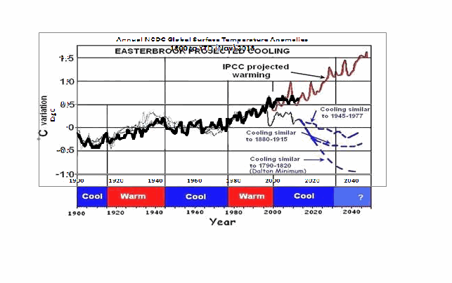
THE NEW EASTERBROOK PROJECTION
About a week after his original post, Don presented an update to his projections. See my Figure 3. As noted in the opening, it was not an update of the graph in question. The graph in question included projections starting around 2010 and it included an “IPCC projected warming” curve. On the other hand, the projection in Don’s newly furnished update starts a decade earlier in 2000 and excludes the “IPCC projected warming”.

Figure 3
Don wrote about the updated graph:
Here is an updated version of my 2000 prediction. My qualitative prediction was that extrapolation of past temperature and PDO patterns indicate global cooling for several decades. Quantifying that prediction has a lot of uncertainty. One approach is to look at the most recent periods of cooling and project those as possibilities (1) the 1945-1975cooling, (2) the 1880-1915 cooling, (3) the Dalton cooling (1790-1820), (4) the Maunder cooling (1650-1700). I appended the temperature record for the 1945-1975 cooling to the temperature curve beginning in 2000 to see what this might look like (see below). If the cooling turns out to be deeper, reconstructions of past temperatures suggest 0.3°C cooler for the 1880-1915 cooling, about 0.7°C for the Dalton cooling (square), and about 1.2°C for the Maunder cooling (circle). We won’t know until we get there which is most likely.
This updated plot really doesn’t change anything significantly from the first one that I did in 2000.
Again, that wasn’t the graph in question.
It is also blatantly obvious that his graph does not include the data from 2000 to 2013. Don has curiously omitted one of the primary reasons for someone to update a projection graph.
Another curiosity, there’s some data missing from his projections. It is supposed to represent “appended 1945-1975 temps”, meaning he spliced 1945-1975 global surface temperature anomalies onto the end of the 1999 data. However, the spike in response to 1972/73 El Niño is missing, and so is the spike in response to the 1957/58 El Niño. There’s also a spike missing in August 1945. The missing spikes stand out in Animation 1.

Animation 1
Or is that what the “appended” means…that he’s modified the 1945-75 data? I’m not sure why he’d delete those spikes, but I noticed it right away.
The little uptick at the end of the Easterbrook update is also a curiosity. It was the response to the Pacific Climate Shift of 1976, so the projection includes data beyond 1975.
And Don Easterbrook presented monthly HADCRUT3 data, as opposed to the annual NCDC data that he had used in his graph in question. I also have no idea why he would use HADCRUT3 data instead of HADCRUT4 data, especially when he wanted to use 1945 to 1975 data to show cooling during his projection. Why? HADCRUT3 data does not show cooling during that period, while HADCRUT4 data does. See Figure 4. That change in trend was a result of the revisions to the HADSST data…the corrections they made to eliminate the 1945 “discontinuity”.

Figure 4
I suspect that Don Easterbrook left out the “IPCC projected warming” curve because of the way he spliced the models onto his abridged and modified data in his graph in question (the one with the projections starting in 2010; i.e. his Figure 4 in both of his posts). See the animation here, from my January 19, 2014 at 6:34 am comment on the first of the Easterbrook threads.
MY REPLICA OF THE NEW EASTERBROOK PROJECTION
Don did not include the recipe for splicing the data starting in 1945 onto the data ending in 1999. Figure 5 is my attempt to replicate his newly updated graph. The January 1945 through December 1977 data was shifted back in time to start in January 2000. Then the relocated data was shifted upwards by 0.354 deg C so that the January 2000 (relocated January 1945) value equaled the December 1999 value. Figure 5 is a reasonable replica of Easterbrook’s revised update.

Figure 5
In Figure 6, I’ve included the surface temperature anomalies from January 2001 through December 2013. The Easterbrook projection looks a little low.

Figure 6
The projection really looks low when the data are presented in annual form, (see Figure 7), which is how Easterbrook presented his projections originally. The warming during the projection stands out like a sore thumb with the annual data.

Figure 7
NEW EASTERBROOK PROJECTION USING HADCRUT4 DATA
Figures 8, 9, and 10 run through the same process as Figures 5, 6, and 7, except that I’ve used HADCRUT4 data in the following three graphs.

Figure 8
# # #

Figure 9
# # #

Figure 10
The cooling in the projection using the HADCRUT4 data would have stood out even more if I had ended the data used in the projection in 1975, as Easterbrook had claimed. But I used the data through 1977 as he included in his graph.
NOTE: To maintain continuity between the monthly graphs and the annual graphs shown in Figures 7 and 10, I converted the monthly data to annual data. That is, I did not start with annual data for Figures 7 & 10 and splice annual data together.
MY UPDATE OF EASTERBROOK GRAPH WITH PROJECTIONS STARTING IN 2010
If Don Easterbrook had used annual HADCRUT4 data for his updated projection graph (black curve), and if he had spliced the 1945-1975 HADCRUT4 data on at 2010 (blue curve), and if he had used the multi-model ensemble mean of the CMIP5-archived models (using the RCP6.0 scenario) for his “IPCC projected warming” (red curve) using the same base years as the HADCRUT4 data, then his update to his graph in question would have looked like Figure 11. (I didn’t bother with his Dalton minimum or his Maunder cooling projections.)

Figure 11
The models look bad enough without having to add non-existent cooling to the data by splicing lower troposphere temperature data onto surface temperature data.
CLOSING
Global warming skeptics will be hurt, not helped, by those who manufacture datasets to create effects that do not exist.
Global warming skeptics do not have to help climate models look like crap. They’re doing a good job of that all on the own. See Figure 12.

Figure 12
SOURCES
The monthly HADCRUT3 data are available here. The monthly HADCRUT4 data are linked here. The annual HADCRUT4 data are available here. And the CMIP5 climate model outputs are available through the KNMI Climate Explorer.
Discover more from Watts Up With That?
Subscribe to get the latest posts sent to your email.
Don Easterbrook says:
February 6, 2014 at 8:35 am
I need to get back to some serious work, so can’t afford to waste any more time.
<<<<<<<<<<<<<<<<<<<<<<>>>>>>>>>>>>>>>>>>>>>>>>>
Do you really feel that you have wasted your time here?
rogerknights says:
February 6, 2014 at 7:28 am
If 2014 or 2015 is cooler than 2008
I do not know if you have read Walter Dnes article at
http://wattsupwiththat.com/2014/02/01/the-january-leading-indicator/
Nor do I know how accurate it will be for this year. Nor do I know if a La Nina will develop this year since the latest number is -0.7 C. However the January anomaly for RSS was 0.262 so the best “guess” according to my interpretation of Walter Dnes would be an average of 0.205 or a rank of 11 for RSS. 2008 had an average of 0.046 and is ranked 24.
I don’t know. I get what you are saying that the splicing does not match up well and in places it actually contradicts actual measurements. But the salient point I get from Dr. Easterbrook is that past cooling patterns may repeat again (i.e. climate cycles), and his ‘copy/paste’ of those past patterns onto current measurements is simply an illustration of what these cooling cycles may look like in the future. It’s a prediction, and he is on-record. He may very well be wrong .. or, in 30-40 years we may find that the real measured temperatures look remarkably similar to one of his predictions. The important aspect of his prediction, in my opinion, is that it is by-definition precedented; it is based on natural climate cycles. This is very different from IPCC and alarmist predictions which are ‘unprecedented’ and have no consideration for natural cycles.
I suppose it’s valid to pick-apart the specifics of how the prediction was spliced, and point out the contradictions in some of the overlapping portions, but I see that is splitting hairs and is not really counter to his argument.
I suspect the larger concern is with the general idea of making predictions of any kind. Perhaps science should NEVER try to predict the future .. maybe there is merit to that idea, but I doubt it’s very realistic.
Don Easterbrook says: “You STILL don’t get it–you’re still missing the point! You’ve wasted a huge amount of time dancing on a pin that doesn’t invalidate any of my conclusions in either of my two previous posts on this subject. NOTHING you have said in any of your tirades relates to my conclusions…”
Actually, Don, it’s you who does not get it. This post was not about your conclusions. This post wasn’t a tirade. This was a presentation of data.
This post was about your presentation of data and claims you’ve made that contradict themselves. You’ve presented a graph of global surface temperatures that is obviously wrong. The cooling of global surface temperature anomalies during the 1998-01 La Nina was not as you portrayed it in your graph. You, Don, achieved that illusion by splicing TLT anomalies onto global surface temperature anomalies. You’ve tried repeatedly to skirt that issue for very obvious reasons. We all understand those reasons.
I didn’t ask you to update the graph in question, Don. Anthony Watts did. You, Don, elected not to update that graph. You elected to try to redirect the discussion. Unfortunately, your misleading presentation of data won’t disappear, Don, until you make it disappear, and the only way to do that is by admitting the error and correcting the error. The ball’s in your court.
Don Easterbrook says: “I’m not the enemy–we really don’t have any reason to quarrel.”
Did you read my post, Don? Here’s the first of my closing points:
Global warming skeptics will be hurt, not helped, by those who manufacture datasets to create effects that do not exist.
You may not think of yourself as the enemy, Don, but your presentation of manufactured data is hurting the credibility of global warming skeptics. And the fact that you continue to try to misdirect and argue is telling.
An old saying:
I’d rather be approximately right, than precisely wrong.
Bob is saying that it is better still to be precisely right, which is true enough. But with all the incertainies in temperature measurememt and projection, sometimes a rough estimate is all you need to get the point across.
False precision (think models) bugs me just as much as imprecision.
Sigh!!☹
Quite a while back, I made a decision not to get into any dispute between two people. But I feel compelled to say something now.
Don Easterbrook says:
February 6, 2014 at 8:35 am
Your latest rant is a total waste of time
QUANTIFYING THAT PREDICTION HAS A LOT OF UNCERTAINTY.
I respect what you are saying Dr. Easterbrook, and I agree with the general thrust of what you are saying, but as things stand right now, you are about as much below the actual happenings as the IPCC is above. And you can believe me that other sites that I will not name know this and laugh at your expense for in effect throwing stones in a glass house. As Bob says, you do not need to exaggerate how bad the IPCC is as shown below.
In the previous article you say:
http://wattsupwiththat.com/2014/02/05/press-for-a-climate-scientist-who-got-it-right/
“When we check their projections against what actually happened in that time interval, they’re not even close. They’re off by a full degree in one decade, which is huge. That’s more than the entire amount of warming we’ve had in the past century. So their models have failed just miserably, nowhere near close. And maybe it’s luck, who knows, but mine have been right on the button,” Easterbrook told CNSNews.com.
I will apologize in advance if I am wrong, but your “full degree in one decade” is only because your own estimate was way too low. So I do not agree with “but mine have been right on the button”. My understanding is that the IPCC is only about 0.3 C per decade too high, which is bad enough.
Don Easterbrook says:
February 6, 2014 at 8:35 am
————————————-
The issue is not about your conclusions, which many here agree with, that global temps are going to turn downwards. When I read the CNS article, the chart shown in the article made no sense to me. What understanding is an average going to gain from looking at a chart that does not depict reality? The article itself is ok, but the chart should have an explanation as to what is being shown, and why it is being shown in that fashion.
Don should get out of this projection business entirely and realize that the future temperature is flat, period. I said nothing about his idiosyncrasy except to introduce my version based on physics. But here he makes a major mistake trusting the major land-based temperature curves that are all falsified to increase apparent warming. An example of that is the fake warming in the eighties and nineties. I spotted it writing my book and even put a warning about it into the preface. Nothing happened for two years but then the big three of temperature, GISTEMP, HadCRUT3 and NCDC, decided they did not want to show it any more. What they did was secretly and retroactively to line up their data for this period with satellites which do not show the warming and not give any explanation. Interestingly, while HadCRUT3 made the correction, HadCRUT4 is still showing the old version. Just use satellite data from 1979 on and forget these guys entirely. If you wonder why they faked it, bear in mind that this period includes 1988, the year that Hansen told the Senate that greenhouse warming has arrived. Looking at the satellite data you see that the ENSO oscillation was very busy then and produced five El Nino peaks between 1979 and 1997. I advise you to look up Figure 15 in my book. I see no global warming peak there that Hansen spoke about. And yet another mistake Easterbrook makes is to bring in PDO. To me it is an illegitimate construct and has no explanatory power except perhaps for salmon fishery. How can you take anything seriously if its definition requires you to look up twenty diverse quantities that seem to have nothing in common?
Don Easterbrook says:
February 6, 2014 at 8:35 am
“I’m not the enemy–we really don’t have any reason to quarrel.”
Too true. To have the details of a particular potential outcome being used to discredit the whole concept is a step too far I think.
I do also see the point about being open about where the various bits come from though.
Try this for Scenario A,B and C for potential outcomes 🙂
http://i29.photobucket.com/albums/c274/richardlinsleyhood/HadCrut4MonthlyDonEatserbrook3Alternatives_zps2c0e2406.gif
P.S. For the picky – they are all drawn from the one existing data set, just cut and overlaid. If you want to add in Dalton Minimum and the other options you will have to do those on your own.
[snip – Nicola, more “read my papers” with links is not a response. How about data and code in a repository or SI? That would be an appropriate response. If you don’t have any that you can share in such a manner, or refuse to do so, just say say so and I won’t pursue the matter further. – Anthony]
Reply to: Don Easterbrook February 6, 2014 at 8:35 am
Don, I don’t agree either with you or with Bob Tisdale. Tisdale just does not get it together and has written a book claiming that ENSO causes global warming. Told him ENSO is an oscillation that repeats itself but could not get through. The real story of how it works is in my book. Anthony has decided to give Bob a big play even though he does not have the ability required for analyzing issues that come up. At the same time when I offered him my Arctic paper he went crazy and told me he did not want it because I did not use English grammar correctly. Obviously a phony reason. I did put another comment out about your work in here in which I explain why I do not agree with you. What I say has to do with science and is nothing personal. Give it some thought and lets see if we can resolve the issues involved.
Open public debate. That’s what we are seeing.
But that means it can’t be climate science.
Alright it is science — just not climate science.
Should climate science be renamed Catastrophic Anthropological Climate Science? Seems fitting.
My brain is having a slow morning.
Eugene WR Gallun
Arno Arrak says:
February 6, 2014 at 10:39 am
Reply to: Don Easterbrook February 6, 2014 at 8:35 am
“Don, I don’t agree either with you or with Bob Tisdale. Tisdale just does not get it together and has written a book claiming that ENSO causes global warming. ”
I sort of agree with both of them though. Don I agree with in the sense that there is a ~60 year pattern overlaid on a longer pattern that underlying pattern may well have reached its peak and could easily go down now.
http://i29.photobucket.com/albums/c274/richardlinsleyhood/HadCrut4MonthlyDonEatserbrook3Alternatives_zps2c0e2406.gif
Bob in the sense that, given the timescale over which he has mostly analysed the data (i.e. since 1979), it has indeed risen.
http://i29.photobucket.com/albums/c274/richardlinsleyhood/HadCrut4Monthly11575Lowpass1575SGExtensions_zps48569a45.gif
Nicola Scafetta says:
February 6, 2014 at 10:17 am
Nicola: Have you looked at my low pass filter treatments of the Climate series to date? They seem to support your work, at least in part.
Please note that the methodology used will show ANY cycle greater than 15 years. I did not choose the ~60 year cycle, the data demonstrated it was there.
RichardLH says:
February 6, 2014 at 12:00 pm
Yes, Richard. I did not choose the ~60 year cycle either, the data demonstrated it was there.
Everybody looking at the data can see it.
To Anthony. Dear Anthony notice that I did not give any data or code to RichardLH. He simply took that data I am using in my paper and did something similar to what I did, e.g. a low pass filter treatments and found one of my results easily.
nicola
REPLY: Still, you haven’t addressed the question. Where’s your repository/archive of data and code? Why must people reverse engineer your papers? Are you afraid that if you make it too easy you’ll be disproved? As I note that much like Mann, your ego precludes such a possibility, so the explanation must lie elsewhere. – Anthony
Thanks. But even if 2014 is 11th, that’ll still fall through the lower rising line of IPOCC’s 95% confidence envelope.
First let me thank bob Tisdale again for some good work.
Don Easterbrook: You STILL don’t get it–you’re still missing the point! You’ve wasted a huge amount of time dancing on a pin that doesn’t invalidate any of my conclusions in either of my two previous posts on this subject. NOTHING you have said in any of your tirades relates to my conclusions. Your latest rant is a total waste of time–it certainly doesn’t disprove any of my contentions about what the future climate might be.
I think Bob Tisdale made useful corrections to your graphs, and we readers got better information regarding your contentions than were presented in your originals. It’s no fun to be corrected in public but the usual etiquette is to thank those who took the trouble to make good corrections. I think you should thank him for his interest and effort.
Nicola Scafetta: To properly make a global surface projection one needs to understand at least the plausible physical cause of the natural oscillations of the climate system so that they can be projected in the future. One needs also to include effect of anthropogenic and volcano forcings.
The advantage of Don Easterbrook’s method is precisely that it does not depend on hypothetical mechanisms (knowledge of which may be incorrect, or exaggerated) or on assumed exact periodicities. His approach may be found 30 years hence to have made the best projection of all, if what we now call “understanding” of the plausible physical causes turns out to be imprecise, incomplete or worse.
The first discovery of the Temp Plateau (please anyone add earlier papers), was the
Nov 2003 article: L.B. Klyashtonin, A.A. Lyubushin “On the coherence between Dynamics
of the World Fuel Consumption and Global Temperature Anomaly”, Journal
Energy&Environment, 14, nr. 6 (2003). The Russian authors detect Nick Scafettas 60 year
cycle and predict, see their abstract, a cooling 2003-2029 of 0.15 to 1.00 C.
Honour to those who are the first in line. The second in line is Nicola Scafetta.
To Prof. Easterbrook: There is no paper earlier than 2003.
If all of us look, we will find the honoured first author of the Temp Plateau, which
will continue to at least 2040, in line with the 60 year cycle. Suggestions anyone
and lets find out!!
JS
Dear Anthony, there is no need of a repository/archive of data and code that I use.
They can be obtained in Internet, in books and by properly using the information listed in the papers. You need to follow the instruction written in the paper. That is sufficient to replicate everything written in my papers. Of course you need to have the scientific knowledge to do that and, above all, a little bit of good will.
See Anthony, your way of arguing does not make any sense.
If you really want that I lecture you in some way (for example if you want that I send you the HadCRUT4 record I used because you are not able to download it from internet) that cannot be free. How much are you willing to pay?
REPLY: Again, a dodge, equivalent to your “read my papers, read my papers” mantra. Show your code. Pointless to continue with you. – Anthony
‘To Anthony. Dear Anthony notice that I did not give any data or code to RichardLH. He simply took that data I am using in my paper and did something similar to what I did, e.g. a low pass filter treatments and found one of my results easily.”
This ladies and gentleman is Dr. Scaffetta doing his best Michael Mann impersonation.
How many times did we ask Mann for data and code? And what were his answers?
1. Read my papers ( yup Dr. Scaffetta learned that from mann)
2. You can’t understand my work ( yup Dr. Scaffetta stole that excuse as well )
and Finally 3. Mann pointed to other people who “replicated” his Hockey Stick
So here, Scaffetta has accomplished the trifecta. He’s “plagarized” every one of michael mann’s excuses: read my papers, its all in there; you can’t understand my work; other people have done similar things.
None of the these excuse stolen from Mann’s playbook Answer the question. None of them address the simple request. All of them move the shells around in his pea game.
On this, Mr. Mosher and I agree.
Steven Mosher and Anthony: That’s exactly what we’re seeing from Don Easterbrook. Lots of talk (misdirection), no data, and a list of his papers.
Anthony, Anthony, Do you (together with Mosher) really think to fool the readers of this blog? Do you really think that everybody is stupid? You are really behaving like Pinocchio with Mosher behaving as Pinocchio’s friend Lucignolo (Lampwick).
About something more interesting. Read this comment I wrote on Tallbroke
http://tallbloke.wordpress.com/2014/02/06/the-sun-drives-climate-not-co2/comment-page-1/#comment-67524
This has to do with the Copernicus-Censorship-Affair. If you would like to give some positive contribution to humanity, it is better that you focus on the issue that I stress there.
REPLY: Nicola, for the record, your opinion is noted. It will also be the last one you post here until such time that you produce data and code as requested, which is apparently impossible for you, so you go off on conspiracy theory.
– Anthony
This is a great piece of work, in that it attempts to show consistency of data. It is one of the continual pitfalls of people who make projections (whether it is future climate or stock prices!) to discount data that doesn’t fit their previous work.
The thing that is missing from this piece is the overwhelming consensus that a large proportion of the observed cooling from 1945 to 1977 has been attributed to the increase of aerosols, especially the reflective cooling effect of coal-produces sulfur dioxide (the same stuff that tropical volcanoes put into the upper atmosphere to cool the planet).
Unless the author (don) states specifically that he attributes his future cooling trend to be caused by south-east asia air pollution (and therefore analogous to the 1945-1977 causation) then he is simply grabbing a convenient curve and tacking it onto the end of the current record to make a projection, WITHOUT REAL CAUSATION.
link:
Surface incident solar radiation G determines our climate and environment, and has been widely observed with a single pyranometer since the late 1950s. Such observations have suggested a widespread decrease between the 1950s and 1980s (global dimming), that is, at a rate of −3.5 W m−2 decade−1
HADCRUT4 is computer generated fiction. The overwhelming majority of temp data from paleo studies show that the 1930s are the warmest decade since the LIA. There is no evidence that temps since 2000 are warmer than the 1930s.