Don Easterbrook has updated his projection graph. Unfortunately, he did not update the graph that I complained about a few weeks ago, shown on the left in Figure 1. In that graph his projections started around 2010. He appears to have updated the Easterbrook projections graph on the right, where the projections started in 2000.

Figure 1
I raised a few eyebrows a couple of weeks ago by complaining loudly about a graph of global surface temperature anomalies (among other things) that was apparently created to show global cooling over a period when no global cooling existed. My loud and persistent complaints were in response to Figure 4 from Don Easterbrook’s post Cause of ‘the pause’ in global warming at WattsUpWithThat. In response to my reaction to his graph (and other things), Don Easterbrook wrote the post Setting the record straight ‘on the cause of pause in global warming’, which did not address my concerns.
It was on the thread of the “Setting the record straight” post that I presented how Don Easterbrook created the cooling of global surface temperatures during a period when no such cooling existed. The cooling effect was created by splicing global lower troposphere temperature anomalies from 1998 to about 2008 onto a graph of NCDC global surface temperature anomalies. See my Figure 2.

Figure 2
The graph in question was not created by splicing land surface air temperature data from 1998 to 2010 onto the end of the land+ocean surface temperature data as Don had explained in his “Setting the record straight” post (my boldface).
This curve is now 14 years old, but because this is the first part of the curve that I originally used in 2000, I left it as is for figure 4. Using any one of several more recent curves from other sources wouldn’t really make any significant difference in the extrapolation used for projection into the future because the cooling from 1945 to 1977 is well documented. The rest of the curve to 2010 was grafted on from later ground measurement data—again, which one really doesn’t make any difference because they all show essentially the same thing.
There are two errors in the above quote. First, the graph in question could not be 14 years old, because it included TLT data from 1998 to about 2008. Second, land surface temperature data do not show “essentially the same thing” as land+ocean surface temperature data. Land surface temperature data have continued to rise since 1998.
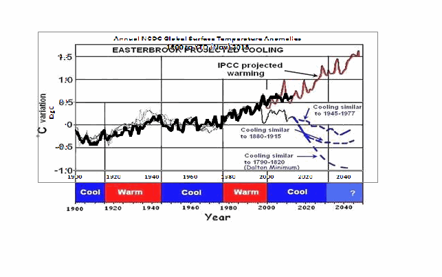
The graph in question also included a curve in red identified as “IPCC projected warming” and a number of Don’s predictions, blue curves, starting around 2010. See the full-sized version of Easterbrook’s projections that started in 2010 here. It’s a cleaner version of Don’s Figure 4 from his two posts.
On the thread of the “Setting the record straight” post, Anthony Watts asked Don Easterbrook to update the graph in question. See Anthony’s January 21, 2014 at 9:26 am comment here. (At that time we were responding to Easterbrook’s statement that he had merged land surface temperature data with land+sea surface temperature data.)
THE NEW EASTERBROOK PROJECTION
About a week after his original post, Don presented an update to his projections. See my Figure 3. As noted in the opening, it was not an update of the graph in question. The graph in question included projections starting around 2010 and it included an “IPCC projected warming” curve. On the other hand, the projection in Don’s newly furnished update starts a decade earlier in 2000 and excludes the “IPCC projected warming”.

Figure 3
Don wrote about the updated graph:
Here is an updated version of my 2000 prediction. My qualitative prediction was that extrapolation of past temperature and PDO patterns indicate global cooling for several decades. Quantifying that prediction has a lot of uncertainty. One approach is to look at the most recent periods of cooling and project those as possibilities (1) the 1945-1975cooling, (2) the 1880-1915 cooling, (3) the Dalton cooling (1790-1820), (4) the Maunder cooling (1650-1700). I appended the temperature record for the 1945-1975 cooling to the temperature curve beginning in 2000 to see what this might look like (see below). If the cooling turns out to be deeper, reconstructions of past temperatures suggest 0.3°C cooler for the 1880-1915 cooling, about 0.7°C for the Dalton cooling (square), and about 1.2°C for the Maunder cooling (circle). We won’t know until we get there which is most likely.
This updated plot really doesn’t change anything significantly from the first one that I did in 2000.
Again, that wasn’t the graph in question.
It is also blatantly obvious that his graph does not include the data from 2000 to 2013. Don has curiously omitted one of the primary reasons for someone to update a projection graph.
Another curiosity, there’s some data missing from his projections. It is supposed to represent “appended 1945-1975 temps”, meaning he spliced 1945-1975 global surface temperature anomalies onto the end of the 1999 data. However, the spike in response to 1972/73 El Niño is missing, and so is the spike in response to the 1957/58 El Niño. There’s also a spike missing in August 1945. The missing spikes stand out in Animation 1.

Animation 1
Or is that what the “appended” means…that he’s modified the 1945-75 data? I’m not sure why he’d delete those spikes, but I noticed it right away.
The little uptick at the end of the Easterbrook update is also a curiosity. It was the response to the Pacific Climate Shift of 1976, so the projection includes data beyond 1975.
And Don Easterbrook presented monthly HADCRUT3 data, as opposed to the annual NCDC data that he had used in his graph in question. I also have no idea why he would use HADCRUT3 data instead of HADCRUT4 data, especially when he wanted to use 1945 to 1975 data to show cooling during his projection. Why? HADCRUT3 data does not show cooling during that period, while HADCRUT4 data does. See Figure 4. That change in trend was a result of the revisions to the HADSST data…the corrections they made to eliminate the 1945 “discontinuity”.

Figure 4
I suspect that Don Easterbrook left out the “IPCC projected warming” curve because of the way he spliced the models onto his abridged and modified data in his graph in question (the one with the projections starting in 2010; i.e. his Figure 4 in both of his posts). See the animation here, from my January 19, 2014 at 6:34 am comment on the first of the Easterbrook threads.
MY REPLICA OF THE NEW EASTERBROOK PROJECTION
Don did not include the recipe for splicing the data starting in 1945 onto the data ending in 1999. Figure 5 is my attempt to replicate his newly updated graph. The January 1945 through December 1977 data was shifted back in time to start in January 2000. Then the relocated data was shifted upwards by 0.354 deg C so that the January 2000 (relocated January 1945) value equaled the December 1999 value. Figure 5 is a reasonable replica of Easterbrook’s revised update.

Figure 5
In Figure 6, I’ve included the surface temperature anomalies from January 2001 through December 2013. The Easterbrook projection looks a little low.

Figure 6
The projection really looks low when the data are presented in annual form, (see Figure 7), which is how Easterbrook presented his projections originally. The warming during the projection stands out like a sore thumb with the annual data.

Figure 7
NEW EASTERBROOK PROJECTION USING HADCRUT4 DATA
Figures 8, 9, and 10 run through the same process as Figures 5, 6, and 7, except that I’ve used HADCRUT4 data in the following three graphs.

Figure 8
# # #

Figure 9
# # #

Figure 10
The cooling in the projection using the HADCRUT4 data would have stood out even more if I had ended the data used in the projection in 1975, as Easterbrook had claimed. But I used the data through 1977 as he included in his graph.
NOTE: To maintain continuity between the monthly graphs and the annual graphs shown in Figures 7 and 10, I converted the monthly data to annual data. That is, I did not start with annual data for Figures 7 & 10 and splice annual data together.
MY UPDATE OF EASTERBROOK GRAPH WITH PROJECTIONS STARTING IN 2010
If Don Easterbrook had used annual HADCRUT4 data for his updated projection graph (black curve), and if he had spliced the 1945-1975 HADCRUT4 data on at 2010 (blue curve), and if he had used the multi-model ensemble mean of the CMIP5-archived models (using the RCP6.0 scenario) for his “IPCC projected warming” (red curve) using the same base years as the HADCRUT4 data, then his update to his graph in question would have looked like Figure 11. (I didn’t bother with his Dalton minimum or his Maunder cooling projections.)

Figure 11
The models look bad enough without having to add non-existent cooling to the data by splicing lower troposphere temperature data onto surface temperature data.
CLOSING
Global warming skeptics will be hurt, not helped, by those who manufacture datasets to create effects that do not exist.
Global warming skeptics do not have to help climate models look like crap. They’re doing a good job of that all on the own. See Figure 12.

Figure 12
SOURCES
The monthly HADCRUT3 data are available here. The monthly HADCRUT4 data are linked here. The annual HADCRUT4 data are available here. And the CMIP5 climate model outputs are available through the KNMI Climate Explorer.
Discover more from Watts Up With That?
Subscribe to get the latest posts sent to your email.
Bob: I have presented to Don on the other thread my updated version (based on HadCrut4) of what he was trying to show.
http://i29.photobucket.com/albums/c274/richardlinsleyhood/HadCrut4MonthlyDonEatserbrookAlternative_zps997c2b44.gif
I agree his figure leaves a lot to be desired but I don’t think that it alone is sufficient to disprove his suggestion that past history may well repeat.
I started preparing this post on Sunday, so it is not a response to Don Easterbrook getting press from CNSNews.com about his projections of cooling. See Anthony’s post here. I had planned to post this on Friday, but considering the attention that post received at WUWT yesterday, I bumped it forward a day.
Oops. Label swapped. Now corrected.
http://i29.photobucket.com/albums/c274/richardlinsleyhood/HadCrut4MonthlyDonEatserbrookAlternative_zps3ddfbe2e.gif
RichardLH says: “I agree his figure leaves a lot to be desired but I don’t think that it alone is sufficient to disprove his suggestion that past history may well repeat.”
“A lot to be desired” is a nice way to put it. My complaints have never been about Don’s suggestion that history may repeat itself. As you’ll recall, I’ve presented something similar:
http://bobtisdale.files.wordpress.com/2013/10/figure-43.png
The graph is from this post:
http://bobtisdale.wordpress.com/2013/10/14/will-their-failure-to-properly-simulate-multidecadal-variations-in-surface-temperatures-be-the-downfall-of-the-ipcc/
Regards
Obviously as it’s a fact that CO2 has little to do with temperatures (Mediaeval Warm Period hotter with much less CO2 as just one example) then natural cycles drive temperature, thus it is logical to assume that past climate cycles will repeat.
As it appears that we are at a Holocene Climactic Optimum based on longer term patterns it is logical to assign a high probability to a cooling trend over the next few decades, especially given the lack of warming over the past 17 years.
It’s admirable of Bob and Anthony to maintain integrity, coherence and scientific accuracy with regard to skeptical articles, this is important given the propensity of the Alarmists to seize on any detail they can to attempt to discredit all skeptical analysis.
Bob Tisdale says:
February 6, 2014 at 3:28 am
““A lot to be desired” is a nice way to put it. My complaints have never been about Don’s suggestion that history may repeat itself. As you’ll recall, I’ve presented something similar:”
I do try very hard to be nice 🙂
I think that Don was the first to suggest that the figures might go down as well as up though.
Look out Bob, you’ll be getting an invite to join the Team before you know it. They could do with someone who can create a graph.
Bloke down the pub, they may need someone who can create a graph, but they do not like to show how model outputs do not agree with data. I don’t think the team will be making any offers in the near future…unless the offer is to stop showing how badly the models perform.
If the temperature actually matches what Figure 11 projects, it will be frustrating to both sides of the debate, because it will mostly go sideways, with fake-out feints up and down. (Fate being the trickster it is, that seems in character.):
2014: Below 2008. Hooray for our side. But the downtrend won’t continue:
2018: Highest yet. Warmists rejoice.
2021: Below 2001-02. Hooray for our side.
2023-27: Plateau’s at a slightly higher level than today’s plateau.
2029: Below 2001-02 again, but not as low as in 2012.
2030-40: Plateau’s at the current level, with wider up-and-down swings.
But, every year, the Growing Gap between reality and projections will undermine the models and the CACA Case they’re built on. The sharp drop in 2021 ought to kill them off.
For a guy that got a day job and was going to reduce his blogging, you’re still blogging a lot !!!
Excellent work Mr. Tisdale
Thanks Bob.
Neither HadCRUT3 nor HadCRUT4 is “data”, as they are referred to above. Rather, both are temperature anomaly records built from data which has been “adjusted”. The anomalies would likely be smaller, if built from the actual “data”. However, that would make the performance of the models appear even worse.
Ed Reid says:
February 6, 2014 at 5:28 am
“Neither HadCRUT3 nor HadCRUT4 is “data”, as they are referred to above. Rather, both are temperature anomaly records built from data which has been “adjusted”. The anomalies would likely be smaller, if built from the actual “data”. ”
You can achieve exactly the same output as Anomalies if you run a 12 month/365 day Low Pass filter over the data. Try it for yourself and you will see. In fact if you use a proper Gaussian Low Pass Filter you will get results that are much more mathematically accurate than the sub-sampling single mean that is often used.
Bob Tisdale:
Thankyou for this clear and lucid exposition of your disagreement with the presented exposition by Don Easterbrook. Excellent!
I now look forward to Don Easterbrook providing a response to your above article.
This is how real science is done: by the clash of understandings openly and honestly expressed. I congratulate you both and look forward to your continued blunt debate.
Richard
Bob, Your call for more accuracy and integrity should be applauded. All sides will make mistakes, but skeptics must bend over backwards to be as accurate as possible. Otherwise we skeptics loose trustworthiness.
The old adage, “let the data speak” should be emblazoned on every forehead. Someone, somewhere, added on to that phrase the following: “…for me.” Don makes the mistake of wanting data to say what he wants it to say. Bob seems devoid of such emotional attachments. Data is neither your friend or your enemy. Your greatest enemy is usually yourself.
Thanks Bob. Good debate!
I hope all skeptics will be careful and accurate when posing arguments.
If 2014 or 2015 is cooler than 2008, that will take the observed trend below IPOCC’s projected 95% confidence envelope, giving our side a huge talking point: “97% of climatologists have been 95% wrong. Don’t let them fool you twice!”
“Your greatest enemy is usually yourself.”
Ain’t that the truth.
To properly make a global surface projection one needs to understand at least the plausible physical cause of the natural oscillations of the climate system so that they can be projected in the future. One needs also to include effect of anthropogenic and volcano forcings.
The correct way to do this is already published in the scientific literature (many times), for example see here:
Scafetta, N. 2013. Discussion on climate oscillations: CMIP5 general circulation models versus a semi-empirical harmonic model based on astronomical cycles. Earth-Science Reviews 126, 321-357.
http://www.sciencedirect.com/science/article/pii/S0012825213001402
or read my web-site
http://people.duke.edu/~ns2002/#astronomical_model_1
Easterbrook’s proposal was a preliminary hypothesis that dates back in 2000 based on the idea that the cooling observed from ~1940s to ~1970s could be repeating from 2000s to 2030s because already several climatic indexes were indicating at the time the existence of a ~60-year climatic oscillation. However, today the things are known in more details.
To better understand the origin of these natural oscillations read my review paper
Scafetta, N., 2014. The complex planetary synchronization structure of the solar system. Pattern Recognition in Physics 2, 1-19.
http://www.pattern-recogn-phys.net/2/1/2014/prp-2-1-2014.pdf
Here it is argued that the solar system is highly synchronized because characterized by a specific set of gravitational and electromagnetic harmonics that are then found in both solar and climate records. This is a kind of extension of the Milankovic theory. These harmonics regulate the natural variability of the climate (and of the Sun) that the current IPCC climate model do not capture. So, these harmonics can be used to produce more accurate temperature projections for the 21st century. These projections imply half of the warming currently projected by the IPCC.
REPLY: “read my website, read my papers” same old stuff Nicola. How about you produce some data and code so a critical review of your work can be done? It has been asked for before, now I’m asking again. I don’t believe your cyclic work can stand up to critical review, as do many others.
So do you have the courage to provide the data and the code to replicate your work?
-Anthony Watts
richardscourtney says:
February 6, 2014 at 5:56 am
<<<<<<<<<<<<<<<<<<<<<<<>>>>>>>>>>>>>>>>>>>>>
DITTO
The fallacy of basing climatic evolution on a temperature record… Just what the creators of Hadcrut and other GISS wanted.
Thanks Bob.
It’s sad that you had to go through all that work to reconstruct what should have been provided as a matter of course by the author.
While you and I may disagree about the causes of global warming, you like Willis, have always made your work open an easily accesssible so that people may either build on it or criticize it.
Others are not so dedicated to openness. They take the attitude of Jones.
They want to protect their years of work from critics.
Bob Tisdale,
You STILL don’t get it–you’re still missing the point! You’ve wasted a huge amount of time dancing on a pin that doesn’t invalidate any of my conclusions in either of my two previous posts on this subject. NOTHING you have said in any of your tirades relates to my conclusions. Your latest rant is a total waste of time–it certainly doesn’t disprove any of my contentions about what the future climate might be. A I said from the start, “My qualitative prediction was that extrapolation of past temperature and PDO patterns indicate global cooling for several decades. QUANTIFYING THAT PREDICTION HAS A LOT OF UNCERTAINTY. One approach is to look at the most recent periods of cooling and project those as possibilities (1) the 1945-1975cooling, (2) the 1880-1915 cooling, (3) the Dalton cooling (1790-1820), (4) the Maunder cooling (1650-1700). I appended the temperature record for the 1945-1975 cooling to the temperature curve beginning in 2000 to see what this might look like.” These several possible scenarios mean that, at best, any quantitative estimate is really just a guess, so it makes little or no real difference where you splice the 1945-1977 data onto the end of a curve.
Your personal vendetta in trying to discredit me is very curious. You’ve said nothing that invalidates any of my work. Take a look at the pages and pages of your tirades–“Methinks thou dost protest too much.” I’m not the enemy–we really don’t have any reason to quarrel.
I need to get back to some serious work, so can’t afford to waste any more time.
I agree with ed and Tom ude above Hadcrut is just that had-crud as is Giss etc all adjusted please refer to Steven Goddards adjusted temp GISS and NOAA graphs. The only reliable ones are CET (no change), global RSS (No change) and global UAH AMSU slight warming maybe….