UPDATE: Corrected the typo in Figure 3. 1988 now correctly reads 1989.
# # #
There’s lots of blogosphere chatter about the warm temperatures in Russia in November 2013. In their global State of the Climate Report this month, NOAA stated:
According to Roshydromet, Russia observed its warmest November since national records began in 1891. Some areas of the Urals, Siberia, south of the Far East region, and on the Arctic islands in the Kara Sea had temperatures that were more than 8°C (14°F) higher than the monthly average.
NOAA even discussed the record warm temperatures on their global map here.
It might be true that Russian land surface air temperatures were at record levels for the month of November, but NOAA failed to present something that’s blatantly obvious in the data. In 1988, surface air temperature anomalies for much of Russia shifted upwards by more than 1 deg C.
The Russian “hotspot” stands out very clearly in the NOAA map presented in Figure 1. Based on it, I’ve used the coordinates of 50N-70N, 30E-140E for the NOAA NCDC data, and the climate model outputs, presented in the following graphs. That region covers a major portion of Russia.

Figure 1
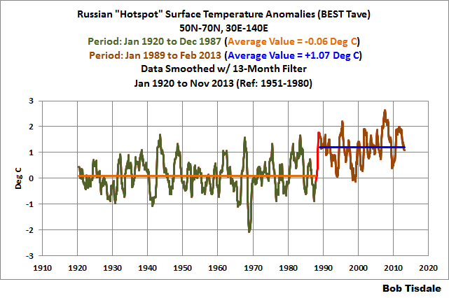
Figure 2 presents the NCDC land surface air temperature anomalies for the Russian “hotspot”, for the period of January 1920 to November 2013. I’ve highlighted about when the shift occurred. Before that shift, surface temperatures there warmed very little, if at all. And after it, surface temperatures appear to have warmed, but not at an excessing rate. We’ll confirm that later.

Figure 2
The shift is much easier to see if we smooth the data with a 13-month filter, minimizing the visual impact of the monthly variations. In fact, with the aid of period average temperatures (the horizontal lines) and with some color-coding, the shift in 1988 becomes obvious. See Figure 3. Based on the period-average temperatures before and after 1988, that climate shift raised Russian “hotspot” surface temperatures by about 1.1 deg C.

Figure 3
MODEL-DATA COMPARISON BEFORE AND AFTER THE 1988 SHIFT
Figure 4 is a model-data comparison graph for the surface air temperature anomalies of the Russian “hotspot” for the period of January 1920 through December 1987. Both the NCDC surface temperature data and the climate model outputs have been smoothed w/ 13-month running average filters. The climate models are the multi-model ensemble mean of the models stored in the CMIP5 archive, using the historic and RCP6.0 scenarios. The CMIP5 archive, as you’ll recall, was used by the IPCC for their 5th Assessment Report. And we discussed why we use the model mean in the post here.

Figure 4
NOTE: The trends in Figures 4 and 5 are based on the “raw” data and model outputs, not the smoothed versions.
The models did a reasonable job of simulating the warming rate from 1920 to 1987. In more than 65 years, they only overestimated the warming by about 0.23 Deg C. But the models perform quite poorly for the period from January 1989 to November 2013. See Figure 5. During this much-shorter 25-year period, the models overestimated the warming by more than 1.1 deg C.

Figure 5
Let’s state that again: the models overestimated the warming by more than 1.1 deg C over the most recent 25-year period.
Climate model failings at the regional levels are not unusual. We discussed those failings in numerous posts over the past year and in my book Climate Models Fail.
WHAT CAUSED THE SHIFT?
The timing of the shift in the Russian surface temperatures is similar to the shift in Scandinavian surface air temperatures. See the post here. There we discussed that the shift in surface temperature was possibly a response to a shift in the sea level pressure and interrelated wind patterns associated with the Arctic Oscillation.
Additionally, see de Laat and Crok (2013) A Late 20th Century European Climate Shift: Fingerprint of Regional Brightening? The authors argue that a shift in the North Atlantic Oscillation (similar to the Arctic Oscillation) in the late 1980s caused more sunlight to warm European surface temperatures in an apparent shift. I would suspect that something similar occurred over Russia at that time as well.
CLOSING
Like other regions, a climate shift, not the long-term effects of manmade greenhouse gases, is responsible for a major portion of the warming that occurred over much of Russia.
And, of course, climate models performed poorly when attempting to simulate the warming that occurred there since the 1988 shift, overestimating the warming by a large amount. So what else is new?
SOURCE
The NCDC surface temperature data and the CMIP5-archived climate model outputs are available through the KNMI Climate Explorer.
@Bernie. You are technically correct. The filter coefficients should be balanced to completely eliminate the one month variation.
Applying the standard 13 point filter reduces inter-monthly variation by 92.2% while using your filter reduces it by 94.4%.
But in this post there is a 1.0 degree shift in the data. That is a far greater issue than 2.2% improvement in filtering. But you are technically correct.
Also note that the 2.2% reduction is the absolute greatest difference (the worst variation). The average variation (of the difference between the two filters for all values is 0.0%).
Steve from Rockwood on December 20, 2013 at 3:01 pm said in part:
” @Bernie. You are technically correct. ”
Thank you Steve. And I basically agree with you too.
But I think it CAN be very important to be factually correct, especially about something well known to the general public – that there are 12 and not 13 months in a year. When Al Gore said (factually incorrect) that the rocks below our feet were millions of degrees, he basically got away with it because not that many people had any idea about it.
It seems to be a lot easier (and more satisfying) to just do things exactly right rather than to have to explain (possibly to contentious listeners) why it does not really matter. Credibility is too often fragile at best.
Bernie
Björn was the first to explain correctly the instant +1C leap.
Under reporting your local temperatures increased your coal allowance off the state. When the system was declared bankrupt the remaining stations started to report the real temperatures.
Isn’t it about time Hadley corrected the past?
Moreover, seems the same Hadley have also falsely reported Russian data too. A time will come to pay the piper.
The authors contradict themselves. First they claim the shift shows up in satellite and ground-based temperature records. Then they argue is spurious. And then again they want it considered as “a fingerprint of European brightening during the last few decades.”
I checked global satellite and ground-based records and there is no trace of any shift in 1988. That year just happens to be the peak year of the 1988 El Nino, the one that Hansen told the senate was proof of global warming. Between 1979 and 1997 there are five such El Nino peaks, with La Nina valleys in between. That 1988 El Nino is the middle one of these five. They are an unremarkable part of the ENSO oscillation in the eighties and nineties.
bones says:
December 20, 2013 at 10:07 am
You can find a chart of the great dying of Russian thermometers here: http://s1244.photobucket.com/user/stanrobertson/media/tempstations.jpg.html?sort=3&o=94
————————————–
It should be possible to backward recalculate temperature anomalies prior to 1989 using just the temperature stations used after 1989. If the shift remains, it isn’t the great dying of Russian thermometers.
Perhaps the warm Russian November was influenced by the brief sharp drop in neutrons.
http://wattsupwiththat.com/reference-pages/solar/
Steven Mosher says: “The NCDC chart is based on Monthly data and of course when you use a subset of all the data you’ll increase the odds of finding odd stuff.”

The shift in the region I’ve identified as the Russian “Hotspot” also shows up in the annual data:
Your “subset of all the data” argument has got to be the silliest thing you’ve ever written, Steven. If I had wanted to present global data I would have presented global data, but the subject of the post was the Russian “Hotspot”. Thus I presented data for the Russian “Hotspot”. Get it? It’s a simple concept.
Steven Mosher says: “A good analyst looks at all datasources.”
I did, and I also found the same Arctic Oscillation-related shift in the BEST Tave, Tmin, and Tmax. But the subject of this post was the NCDC data, not BEST data.
Steven Mosher says: “Plus, defining russia by lat lon is a really stupid approach when you can actually use the exact border to pull out the data.”
Apparently, you didn’t note my data source, which, as usual, is the KNMI Climate Explorer. There, data are requested by coordinates. That’s the same approach used by NOAA for their NOMADS website. Are you suggesting KMNI and NOAA are stupid? If so, I suggest you take it up with them.
But, FYI, the BEST Tave data for RUSSIA is available from the Berkeley website here:
http://berkeleyearth.lbl.gov/auto/Regional/TAVG/Text/russia-TAVG-Trend.txt
And LO and BEHOLD, it shows the same shift as seen in Figure 3 above:
Thanks for wasting my time, Steven. My tip jar is here, BTW, if you’re feeling so inclined:
https://www.paypal.com/cgi-bin/webscr?cmd=_donations&business=C6Y5VHZNFB9QL&lc=US&item_name=Bob%20Tisdale¤cy_code=USD&bn=PP%2dDonationsBF%3abtn_donateCC_LG%2egif%3aNonHosted
Joe Born says: “Forgive the tangent, but here’s something that seems to be apparent to everyone but me: Why the 13-month filter?”
My apologies for not replying earlier. I was off running holiday-related errands.
To answer your question, I use a 13-month filter that’s shown on the 7th month, so it is centered; that is, there are six months on either side. And it makes very little difference to the presentation if I use a 12-month or a 13-month filter, but I prefer to have the smoothed data centered.
I find this argument weak.
Sorry but I can really only see the shift you talk about in the graphs if I squint and turn my head sideways while standing on one leg wearing welding goggles and drinking whiskey through a straw. The colorized versions with distraction lines do help a bit to see what you are talking about. But I wouldn’t have picked a shoft there without that assistance. Your conclusion that this is a “climate shift” and not warming seems like an exercise in semantics. I see what you are saying (I think) but I’m unconvinced.
The bottom line for me is that recorded land temperatures in November in Russia are higher than usual. Why? Is this a real effect or a consequence of lousy Russian weather measurement. Russian scientists are capable of doing very good science. But in Russia government run programs like temperature measurement are often poorly managed. In fact the Russians “have form” for messing up their climate data. Back in 2008 they actually got the month wrong and created a whopping temperature anomaly out of nothing.
http://climateaudit.org/2008/11/10/did-napoleon-use-hansens-temperature-data/
The satellite measurements show slightly warm in Russia in November but not usually so. Until the data is thoroughly checked by someone I trust, I’ll stick with the satellite measurements. December in Russia is definitely not shaping up to be warm, if the news reports can be believed.
http://voiceofrussia.com/news/2013_11_12/Temperature-extremes-as-Russian-winter-sets-in-7057/
izen says: “It is most likely a response to the polar amplification of the AGW which was predicted, with warmer air moving further North.”
Climate models can’t simulate polar amplification. Been showing that for years:
http://bobtisdale.wordpress.com/2012/04/24/polar-amplification-observations-versus-ipcc-climate-models/
So your “polar amplification of the AGW which was predicted” is just your usual nonsense.
Steve from Rockwood says: “Has anyone else ever reported on this and if not, did you just recently find the shift?”
I’ve seen it discussed before, but I haven’t presented it. When I saw the hotspot this month, it seemed like a logical time to present it again.
MikeN says: “Regarding the model temperature graph, are you saying they overestimated global temperatures by 1C, or temperatures in Russia?”
The data and models presented in this post are only for the “Russian Hotspot”, using the coordinates of 50N-70N, 30E-140E.
John Eggert says: “SHORT VERSION: I have seen this 13 month averaging a number of times now and cannot see the justification for that time period. It would retain a sinusoidal element in the calculated data as periods are over-represented by the first month.”
SHORT ANSWER: See my reply to Joe Born above.
John Eggert: Oops, I pushed the “Post Comment” button by accident.
In this post, because the data are so volatile, there is a small residual as opposed to a 12-month filter. But it makes little difference to the presentation.
http://bobtisdale.files.wordpress.com/2013/12/figure-3c-12-month.png
When I’m discussing annual (seasonal) variations in anomalies, then I’ll use the 12-month filter. But at other times, I prefer to have the data centered.
Curt says: “Bob: What do the satellite measurements for the Siberia area report?”
The problem is the short run-up (pre-1988) time. There’s only 9 years of data. So there’s really no point of reference for the shift.
MarkB says: “For what it’s worth, if one splits this temperature record into a pair of before/after linear trends without the (hokey IMHO) jump discontinuity…”
The discontinuity stands out like a sore thumb in my Figure 3:
http://bobtisdale.files.wordpress.com/2013/12/figure-3c.png
cynical_scientist says: “I find this argument weak.”
Anthony is preparing a follow-up post.
Regards
Maybe they accidentally repeated the October data.
izen says:
December 20, 2013 at 5:40 am
“The climate shift seen in Russia coincides with the rapid rate of ice loss in the Arctic … ”
Darn. I was just getting used to the idea that ice loss in the Arctic made the NH cold. Sure wish they’d get this science settled.
The November anomaly for HadCRUT4 just came in. It was 0.596 which puts November 2013 as its third warmest November behind 2005 at 0.620 and 2001 at 0.604.
As far as I can tell, from examination of the satellite data-bearing in mind the caveat that I am using version 5.5 although the latest data from UAH is 5.6, sadly KNMI does not have 5.6 yet-I estimate that:
Over the region in question, a change in the LT temperature of one degree in November corresponds to a change of ~1.62 at the surface. Using this factor, the LT anomaly for November (+2.24229) should correspond to an anomaly of +3.64945 at the surface. Setting the NCDC data to the same baseline: +5.16835. It appears, to me at least, that *this* November was not as warm in the region in question as NCDC estimates.
My methodology for finding that factor was to take the November anomalies from 1981-2010 climatology for UAH data and NCDC data in the region in question, then detrend both, then do a simple linear regression with the UAH detrended November anomalies as the independent variable and the NCDC detrended november anomalies as the dependent variable. I then take the slope of the regression, multiply the UAH anomalies (*non* detrended, now) by that factor, and compare them to the NCDC non-detrended anomalies. That’s good, I think many people here would “like” that answer. On the other hand if I take all the months, calculate their trends, and take the average of 11 and 13 month centered averages for each (which makes a nice annual smoothing technique, a little less attenuation than just the 13 month centered average) and remove the trends from those, and do a regression like I described (detrended smooth UAH as the predictor, same NCDC as the predictee) I get a factor of about 1.58, and if I then use this factor together with the UAH anomalies to “predict” the surface anomalies, the predicted annually smoothed anomalies warm at a rate of 0.047 K per year versus 0.028 K per year for the actual NCDC anomalies in this region. Many among the alarmed will like this: it suggests NCDC has *underestimated* warming in this region, at least since 1979, although it can’t speak to prior to that.
I will also note that I have done the analysis for USHCN: again there is a *cooling* bias if any, but this time it is tiny to the point that it is almost certainly not statistically significant-it’s certainly not a significant fraction of the trend. This good agreement over the US ought to convince anyone who thinks the USHCN algorithm is good that my technique is probably pretty good. Of course, I’m sure many here, and many skeptics, will decide my technique can’t be right, USHCN has to be warm biased. Has to be.
Now that I have all skeptics ringing their hands angry at me and all the alarmed cheering me, I can drop the real bombshell. I have done this same kind of analysis with global data from various sources, and whether I use GISS or HADCRUT4 or even Cowtan and Way (and I would bet good money NCDC, too, though I can’t recall doing the analysis for that) and it generally shows that the factor for UAH as a predictor for surface temp anomalies globally should be ~.77 (in one case with GISS I got an even smaller factor!): using such an analysis I generally find a *warming bias* of the global surface temperature datasets on the order of ~.1 K per decade. That is a *huge* warming trend bias. Keep in mind the surface warming trend is something on the order of-what, .15 per decade, give or take a couple of hundredths? Wow. That’s two thirds of the warming in the last 30 years that is just a warming bias.
Incredible turn around! I can already hear the hissing and booing as the alarmed recoil in pain! “He has trickeds us! Tricked we says! He is tricksy!” For they thought, here’s something wonderful, the satellite data showing that warming is understated! And when I pull back the curtain to reveal the rest of the iceburg, it is like Dracula finding he has been made to touch a cross.
Wow. My most beautiful mixed metaphor yet.
Bob, I cringe every time I read on WUWT that temperatures warm. Also you abuse the English language when you write “surface temperatures there warmed very little”. Is it so difficult to write: “surface temperatures there increased very little”? A temperature does not warm. A temperature is not a physical entity (like air or water) that can be warmed.
If anyone wants to take this one on, the Carbon Dioxide Information Analysis Centre (CDIAC) has been archiving a lot of the old temperature records.
They have an archive of 518 Russian temperature stations and another of 223 former USSR stations from 1881 to fairly recent. Looks like a lot of work however.
http://cdiac.ornl.gov/ndps/russia_daily518.html
http://cdiac.ornl.gov/ndps/ndp040.html
And for serious users, there are a lot of old records in the Archive, this http:/FTP directory. Have a look around. The description of what’s in each NDP__/whatever subdirectory is at the bottom of the page. Some are interesting, some not so, some requiring a fortran program.
http://cdiac.ornl.gov/ftp/
Burt Ruttan interview explained most of this.
Ron.
Large hotspots on the globe look like jet stream sourced blocking highs to me. The shape and location of the Russian hotspot is correct for such an occurrence. My hunch is that there are correlating weather pattern variation events that would predict such a temperature trend. Certainly the anthropogenic portion of CO2 greenhouse effects would not be able to produce such a large scale and fairly well defined and oval shaped event. Not enough energy available to produce the regional large scale atmospheric conditions necessary for such a temperature rise. Anthropogenic CO2 can be easily and readily dismissed in this case.