Anyone who visits the Unisys sea surface temperature anomaly webpage will have noted the recent cool sea surface temperature anomalies off the southwest coast of Europe. Since the map on their main page is updated daily, I’ve presented the most recent map in their archive as Figure 1.
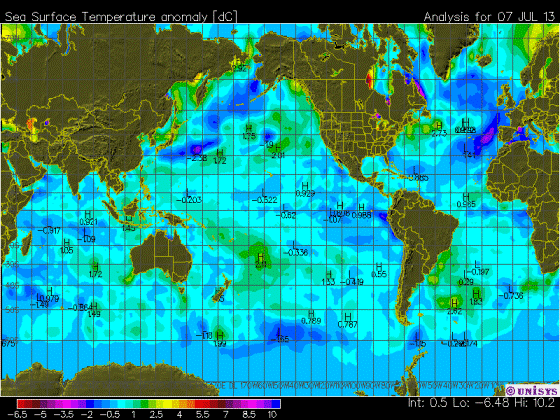
Figure 1
The direct link to that archived map is here.
The color-coding of the Unisys maps of course makes the data appear cool, but even so, the June 2013 sea surface temperature anomalies, based on the Reynolds OI.v2 data, are in fact cool off the southwest coast of Europe. As shown in Figure 2, the data for the coordinates of 35N-55N, 20W-5E haven’t been that cool since 1993-94.

Figure 2
But—there’s always a but—the sea surface temperature anomalies to the north and northwest of Europe (55N-75N, 20W-55E) are running on the warm side. Refer to Figure 3.

Figure 3
As a whole, though, the sea surface temperature anomalies for European coastal waters are pretty typical of the values for the last decade, as shown in Figure 4.

Figure 4
And of course, there’s nothing in the ocean heat content data and the satellite-era sea surface temperatures to indicate that manmade greenhouse gases were responsible for the warming of the global oceans. If that topic is new to you, refer to the illustrated essay “The Manmade Global Warming Challenge”.
A COUPLE OF CLOSING QUESTIONS
Figure 5 is a map that captures the June 2013 sea surface temperature anomalies for the portions of the Arctic Ocean, Mediterranean Sea and North Atlantic discussed in this post. While the warm anomalies at high latitudes are likely the result of a weather pattern, it almost appears as though Iceland is somehow responsible for part of the warming.

Figure 5
And that leads to my questions:
Has anyone ever seen a study of the impacts of volcanic ash and pumice on the optical properties of sea water and/or on sea surface temperatures? And has anyone seen a study of the impacts of volcanic ash from recent high-latitude eruptions on the albedo of sea ice?
SOURCES
The Sea Surface Temperature anomaly data used in this post is available through the NOAA NOMADS website:
http://nomad1.ncep.noaa.gov/cgi-bin/pdisp_sst.sh
or:
http://nomad3.ncep.noaa.gov/cgi-bin/pdisp_sst.sh?lite=
I am also struck by the relative coolness of the swath of the Atlantic where the hurricanes seem to form.
But, but – look at the anomaly off Manitoba / Nunavut! There’s the proof of CAGW right there! In fact, it’s worse than we thought! Soon we’ll have palm trees growing there and coral reefs in Hudson Bay!
Starzmom, good observation. Potentially the dearth of large hurricanes will continue. Welcome news to me on the east coast.
Very confusing color scheme.
Of course, I’m a man so I can’t tell one color from another anyway, but the -2 and +10 color looks almost identical to me.
I assume we are seeing the minus numbers in the N. Atlantic.
http://www.cefas.defra.gov.uk/our-science/observing-and-modelling/monitoring-programmes/sea-temperature-and-salinity-trends/presentation-of-results/station-18-dover.aspx
Thanks Bob.
James Cross says:July 13, 2013 at 5:53 am
The colors do look identical. Why they don’t use green, middle of light spectrum, for neutral, and tend toward the red end for hot and blue end for cold. Seems simple enough. The NWS uses a spectrum that keeps shifting the temperatures attributed to a color, makes me nuts.
The Iceland question is very interesting.
Looks like most colors are used twice. Since it is summer in Northern latitudes without having additional info. I would just have assumed that it was the higher ones that applied.
Strange how the NCEP data seems to be at odds with the Unysis chart. As seen on the sea ice page http://polar.ncep.noaa.gov/sst/ophi/color_anomaly_NPS_ophi0.png
The centre of the north icelandic hot spot is right over the where the mid-atlantic plates are pulling apart. Perhaps magma close to the surface is warming the water there, from below.
Underwater volcanoes ? Iceland is very active geologically
it almost appears as though Iceland is somehow responsible for part of the warming.
It is not Iceland itself but Kolbeinsey Ridge I have posted about few times in pst.
http://www.vukcevic.talktalk.net/CET-NV.htm
it almost appears as though Iceland is somehow responsible for part of the warming.
It is not Iceland itself but Kolbeinsey Ridge I have posted about few times in past.
http://www.vukcevic.talktalk.net/CET-NV.htm
“UNISYS Current Sea Surface Temperature Anomaly Plot”
http://wattsupwiththat.com/reference-pages/climatic-phenomena-pages/enso/
Why the two maps?????????
Hey Kev-
Here’s your missing heat.
An interesting article. On the color scheme topic I agree with James Cross and Steve Keohane. I am somewhat color challenged (my wife doesn’t have to dress me) so am easily confused by many temperature charts. In Figure 1 the color scheme for -6.5 to -2. seems to be repeated for +5.5 to +10. Are there no standards or commonly accepted practice for color schemes for figures such as these? I know color has the most impact but for clarity I would prefer contour lines with temperature displayed at the center of each critical region.
I agree : near bordeaux the weather is rather hot but (32°C) non exceptional. Nevertheless the ocean is cold less than 18 C !!!
Ok, visualize a “sarc tag” at the end of my post immediately precedent, this one. I say this just in case someone thinks I was serious and would take me to task… it would be a stretch to consider the warmed waters shown in the graphs as accounting for Trenberth’s missing heat.
Anthropogenic Global Warming heats up the deep ocean, disrupts the Gulf Stream and causes an Ice Age in Europe. Shows my model. More research is needed. Please send money. /sarc
I agree with above comments about the color chart. With the technology available, someone must REALLY want to be incompetent to produce a chart like that.
(That of course does not reflect on Bob, or his effort in bringing this post to us.)
Bob
Anomalies of fractions of a degree be blowed. I can tell you from first hand experience 10 minutes ago that the ocean 100 yards from my house in the South West Tip of England is 3 degrees Centigrade cooler than it ‘usually’ is.
Mind you we have had a prolonged sunny spell-our first for 7 years and it may warm up enough in the next few weeks for people to take off their wet suits.
tonyb
If volcanic ash in sea water – or submarine volcanicc emanations were responsible for the warmer waters, the warmists would say that CO2 induced back radiation caused the warming, not SI, another case of unexpected catastrophic consequences of the burning of tarsands brought to a refinery by a pipeline.
And they would get a multi-year grant to study the issue.
Updated
http://www.vukcevic.talktalk.net/CET-NV.htm
link, since the older version was posted
Bob,
Thanks for this post, I don’t normally study these maps but this one is interesting and I spent some time studying it.
Given the temperature anomalies shown for the Atlantic, I am confused as the hurricane predictions based on claimed higher ocean temperatures. Possibly you can clarify this, Bob.
I do know the Ocean temperatures off Atlantic City NJ are unusually cold for this time of year at 60 F which is consistent with the figure you provided.
http://www.nodc.noaa.gov/dsdt/cwtg/catl_tmap.html
Although I initially missed it, there are H’s by the positive anomalies and L’s by the negative anomalies so the Atlantic off the US is below normal not above.
The potential confusion in the color code is unnecessary.
http://www.meteociel.fr/accueil/sst.php
for Yves de mars
A bit more than 18°C on this map; I have even seen one giving 23°C,what is above the mid july mean ; but probably , it is to satisfy the tourists