Guest post by Willis Eschenbach
Bob Tisdale has discussed a variety of issues with the hemispheric and basis-by-basin Levitus summary of the ARGO data in his excellent post here on WUWT. I wanted to take a larger look at at the global ocean data, to provide it with some context. After following a variety of blind paths and dry holes, I arrived at Figure 1. This shows the Levitus data, along with several datasets for both the sea surface temperature (SST) and the land surface air temperatures.
 Figure 1. Three land surface air temperature datasets, three ocean surface temperature datasets, and two measures of the deeper ocean. Datasets from KNMI, except the Levitus ocean data. Levitus data have been converted from ocean heat content values to temperature values.
Unfortunately, we only have pentadal (5-year centered average) data for the deeper ocean layer from 1955, no annual data for the deeper layer is available before 2005. So I have shown the other data as pentadal averages as well, so that they can be compared directly. Now, I have no profound conclusions from this, but there are some curiosities about these results.
The most obvious oddity involves the sea surface temperature data. Two of the datasets, the ERSST and the HadISST, are quite similar, but are offset over much of their length by an amount that varies in an odd stepwise fashion. In particular, they diverge significantly in the period 1997-2001. They have the same small peaks and valleys, but the land is going up while the sea temperature is dropping. Figure 2 shows this in more detail:
 Figure 2. Sea surface temperatures (SSTs) from three different sources. The vertical axis scale is different from Figure 1.
On the other hand, Figure 2 also shows that the ICOADS dataset runs almost exactly in parallel with the HadISST data up until 1997, when it shifts gears and goes up to agree with the ERSST dataset.
I have absolutely no idea what happened in 1997, or in earlier periods, which allowed the three datasets to vary so much. Always more questions than answers.
The next oddity involves the changes in the land and ocean surface temperatures. Figure 3 is like Figure 1 but leaves out the sub-surface temperatures:
 Figure 3. Three land surface air temperature and three ocean surface temperature datasets.
The oddity here is two-fold: what happened around 1977 or so, and what happened around 2002 or so? From 1977 on, after twenty years with no significant land or sea temperature change, both land and sea temperatures start to rise. In addition, the land temperature rises much more rapidly than the SST. Then around 1998, SSTs start to level off, and they peak in 2002 and start to fall. The land temperatures start falling shortly thereafter. Why, on all counts?
Now, I don’t know the answer to these questions either. However, in this modern world there’s a term called a “WAG”, which means a wild-assed guess. However, scientists don’t provide those. Instead, there is a refined version called a “SWAG”, or a scientific wild-assed guess.
So here’s my SWAG about what we’re seeing here. I think at least some of this is the effect of the Pacific Decadal Oscillation, or PDO.
The PDO is a large-scale reorganization of the flow of the North Pacific Ocean. I think that, like other large-scale patterns such as the El Nino/La Nina alterations, these all function to regulate the temperature. It is obvious that one of the two major patterns (positive or negative PDO) must be more efficient than the other one at cooling the planet. The transfer of heat via the oceans from the equator to the poles is one of the two major pathways by which the tropics moves heat (the other is via the atmosphere). One of the two PDO states must be better at cooling the planet.
I hypothesize that this alteration between PDO states is one of the ways by which the planet maintains such a regular temperature. Unfortunately, I have no idea how to support that hypothesis using observational data.
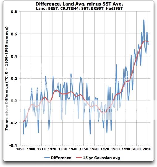
A final oddity is the decoupling of the land temperatures from the ocean temperatures. Figure 4 shows a longer version of the same data, this time extending back to the 1870’s:
 Figure 4. Long-term land air temperature and sea surface temperature records, expressed as an anomaly around the 1900-1980 average.
The oddity to me in Figure 4 is that since about 1974, the land temperatures have been rising much faster than the sea surface temperatures. The SST records and the land temperature records run quite close to each other up until about 1975 or so, but after that land temperatures have been rising much more quickly, while the sea surface temperatures (and to a greater extent the sub-surface temperatures) have not followed suit.
Once again, I’m out of explanations for the decoupling of the temperatures. Clearly it’s not CO2. Urban heat islands? Aerosols reducing the clouds over the land? I have no idea. All suggestions welcome. That’s the beauty of settled science, there are always unexplained questions to
Best regards to everyone,
w.
THE DATA
Levitus provides two different global pentadal datasets. One covers the layer from 0 to 700 m depth, and the other covers a thicker layer, from 0 to 2000 m depth. I wanted to see what was happening in the “missing link”, which is the data covering the deeper layer, from 700m to 2000m depth.
The good news is that since we are dealing in oceanic heat content, the heat content of the lower layer is simply the difference between the two datasets.
My spreadsheet with the results is here.
Sorry Willis I was not clear. The issue of land ocean contrast has been discussed ( there are more papers if you follow the references) The precise question “why the divergence” may be addressed in some so that is why I pointed you at them. You read them very quickly cool.
In some studies you will find folks comparing the observed land ocean contrast to the modelled land ocean contrast the measure of merit that I think they use is different than the one you use and I believe they have a physical basis for preferring it, basically the ratio of the changing rates.
I thought you might have looked at some of the references.
http://www.mit.edu/~pog/src/byrne_land_ocean_warming_contrast_2013.pdf
http://onlinelibrary.wiley.com/doi/10.1029/2006GL028164/abstract
for some possible hints
“Surface temperatures increase at a greater rate over land than ocean in simulations and observations
of global warming. It has previously been proposed that this land-ocean warming contrast is related
to different changes in lapse rates over land and ocean because of limited moisture availability over
land. A simple theory of the land-ocean warming contrast is developed here in which lapse rates
are determined by an assumption of convective quasi-equilibrium. The theory predicts that the
difference between land and ocean temperatures increases monotonically as the climate warms or
as the land becomes more arid. However, the ratio of differential warming over land and ocean
varies non-monotonically with temperature for constant relative humidities and reaches a maximum
at roughly 293K.”
here is another way to look at it.
You have one time series. Not too much you can understand from that except the ratio changes.
Willis: “As you can see, the choice of smoothing methods makes little difference. The oddity is still the differing trends of the land and ocean records around 1970. How come?”
This is basically a reworking of what stacase first brought up http://oi52.tinypic.com/24v5umd.jpg and is quite informative. It was not part of your post or your reply to me which I criticised for using decadal linear ‘trends’ of distorted 5y running means. It’s odd that you choose to reply to that criticism by showing _something else_ where it ‘makes little difference’. In what you posted it _did_ make a difference and that was why I commented. Enough on that.
So what does stacase’s approach show?
Well basically something that is quite similar to the temp record in overall shape. Now if the difference is similar to SST record then this confirms my point that it simply a greater sensitivity of land to whatever is driving overall change. Clouds, sun, GHG, whatever, land shows greater variance and this is in line with the difference in heat capacity that I already pointed out.
How does the land-sea difference plot vary from just being a linear difference in sensitivity?
1. post-75 rise is stonger than just linear scaling. This is probably the ‘oddity’ you are trying to focus on, so plotting it this way is probalby informative.
2. 1880-1915 does not dip like SST record. This is a substantive difference in form which is probably the most important deviation from the simple sensitivity argument.
Two caveats so far. Early data may be less reliable so some caution on interpretting #2. There is a danger of mixing too many things in your last plot here, especialy since BEST is a fair bit different to CRUtem, so again some caution needed.
Mosh has separated out 0.1/dec a likely UHI and other bias. That’s 0.1/0.16 ie about 60% of the difference.
If the post 1970 ramp is reduced by that amount your plot would come closer to a linear sensitivity as per #1 , so you get your oddity back and it ties my land-sea sensitivity argument in with Mosh’s observation.
Convergence of three different perspectives on this is encouraging.
Now rather than plotting the difference, it may be interesting to plot ratio of land anom to SST anom and see how this looks over time and whether it shows Mosh’s 60% UHI.
“Mosh’s 60% UHI.” That’s 60% of the anomaly difference, not total UHI+other bias.
So from 1940 to 197tysomething Antarctica warms, the globe cools, and land cools faster than the ocean. 197tysomething to 1997 The Arctic warms, the globe warms, and land warms faster than the ocean. Gentlemen, this just mimics the diurnal cycle. Land always warms faster and cools faster than water. Land is a better blackbody. Continental mass is concentrated in the northern hemisphere (next to the Arctic). Just that simple.
The current PDO phase cools the planet because if blocks El Ninos. Hola?
Steven Mosher says:
May 6, 2013 at 7:43 pm
Steven, I guess I was not clear. I know the issue of land-ocean contrast has been discussed by various folks. I’ve read a reasonable number of papers on it.
What I haven’t seen in any of the papers is a discussion of why there was such such a change around 1970. That’s the exact question I raised.
In response to my raising the question, you’ve assumed I know nothing about the subject … and you’ve waved your hand at the large pile of papers on the subject. Yes, I’ve read some of them, certainly not all of them or even a majority.
And I read the four you cited, in the hope that one of them would answer the question.
But you fooled me. I thought you’d pointed to them because they contained the answer. That’s why I asked it on the web, because I’d like to know. I thought you were answering the question.
Now I find out that despite your pretended authority on the subject, and despite your assumption that I’m the unlettered idiot in the game, clearly, YOU DON’T KNOW THE ANSWER EITHER.
So can I invite you give your paternalistic tone a rest until you do find out the answer? Because until then, my friend, our ignorance is on a par—neither of us knows the answer.
Regards,
w.
Greg Goodman says:
May 6, 2013 at 7:53 pm
As I understood you, you had complained about using 5-year averages, saying
so I showed the data with Gaussian smoothing instead of 5-year smoothing, to show that the smoothing choice was unimportant. Sorry if I didn’t understand your meaning.
If your main concern was calculating a linear trend using smoothed data, the smoothing choice generally does not change the linear trend appreciably.
Finally, are linear trends useful? I only brought them into the discussion because some folks, including you, didn’t seem to be able to see the difference in the graphs. You said:
Since it was clear that you couldn’t see from the graphs that the trends were coherent and moved in parallel from 1900-1970 and then diverged after that, I drew the picture with numbers instead, to show the divergence in the trends numerically … you seem very opposed to that, which is OK.
But if you can’t understand the pictures and you reject the numbers, on what basis are you claiming that they don’t decouple after about 1970?
w.
Mosher quotes:
http://www.mit.edu/~pog/src/byrne_land_ocean_warming_contrast_2013.pdf
http://onlinelibrary.wiley.com/doi/10.1029/2006GL028164/abstract for some possible hints ‘Surface temperatures increase at a greater rate over land than ocean in simulations and observations of global warming. It has previously been proposed that this land-ocean warming contrast is related to different changes in lapse rates over land and ocean because of limited moisture availability over land. A simple theory of the land-ocean warming contrast is developed here in which lapse rates are determined by an assumption of convective quasi-equilibrium. The theory predicts that the difference between land and ocean temperatures increases monotonically as the climate warms or as the land becomes more arid. However, the ratio of differential warming over land and ocean varies non-monotonically with temperature for constant relative humidities and reaches a maximum at roughly 293K.’
This is in line with what I stated in my earlier post re the data of Best and Lasner. The question is which land is heating faster than the ocean and which ocean basin(s) faster than the land. Lasners Ruti project shows that coastal areas and inland areas at altitude are more linked to ocean temperatures than other land areas. We might thus expect these other land areas to be the ones that heat or cool faster than the oceans depending on precipitation cycles, such as the link between precipitation in the SE USA and ENSO and similar links with inland Australia. To solve this problem needs the evaluations to be on a zonal basis with the climate zones linked to the temperature changes in the ocean(s) that most affect them.
These shifts have been elaborated by Swanson and Tsonis,
http://www.worldclimatereport.com/index.php/2009/04/08/has-the-climate-recently-shifted/
Tsonis, Swanson, and S. Kravtsov,
http://onlinelibrary.wiley.com/doi/10.1029/2008GL036874/abstract
Douglas
http://judithcurry.com/2011/11/30/shifts-phase-locked-state-and-chaos-in-climate-data/
Vaughan
http://www.billhowell.ca/Paul%20L%20Vaughan/Vaughan%20120324%20Solar-Terrestrial%20Resonance,%20Climate%20Shifts,%20%26%20the%20Chandler%20Wobble%20Phase%20Reversal.pdf
Stockwell and Cox Structural break models of climatic regime-shifts: claims and forecasts
http://arxiv.org/abs/0907.1650
The latter may be the answer to your question re 1997, they state:
‘ …we find evidence for a significant change in the temperature series around 1997, corroborated with evidence of a coincident oceanographic regime-shift. ‘
“But if you can’t understand the pictures and you reject the numbers, on what basis are you claiming that they don’t decouple after about 1970?”
I don’t reject all numbers , just the trends you presented and for clear reasons I should not need to repeat but since you seem intent on missing the point by focussing on one or other aspect, I’ll summarise. Running means have distorted the data. Linear trends are not good for this sort of data before distortion. The round number intervals you chose are aritrary as far as the data goes and mean you are linear trending across significant variations in the data on a similar scale without regard to where you start and end.
So yes, I reject those numbers. Not because I don’t like looking at numbers or I’m dumb. But for good reasons which I’d already stated.
I can “understand pictures” and I presented a rate of change “picture” that I thought was more informative than your trends. So far you have totally ignored it , presumably because it does not support your decoupling idea.
Since ‘trends’ are rate of change rate of change, it is a more rigorous way to examine that aspect of the data, yet you ignore it.
I could adopt the tone of your last reply and suggest you can’t understand the pictures but I know you can, so I’ll suggest you look at the rate of change plot again and see what it can tell you about “decoupling”. Maybe I’m missing something. That is why I previously asked you to comment if you thoughy my reading of it was wrong or incomplete.
Also note that in the course of what has been shown I have said that stacase’s approach, which you have adopted seems to show there may be a change of behaviour in the period you indicate, so don’t waste time arguing to refute something when the discussion has moved on.
Instead of getting obviously irritated why others don’t totally agree, try to see if there is some convergence of ideas. Your article admits ignoreance of the cause and the discussion lead to a point where you, Mosh and I all seem to be converging on something, as I noted in my last post.
http://wattsupwiththat.com/2013/05/05/by-land-and-by-sea/#comment-1299108
The way land temperatures increase faster than sea is something I regarded as dubious for a long time and I think this was well worth bringing up. If everyone gets irratable it’s not going to get anywhere, which would be foolish since I think some insight is being gained here.
I’ll try to find time to plot this as a ratio and see what it shows.
Stay cool, regards.
Well ratio turns out to be not such a good idea. It’s ill-conditioned since, by definition, both spend a fair amount of time around zero.
I’ve plotted the crutem3 – hadsst3 difference :
http://climategrog.wordpress.com/?attachment_id=220
I don’t see anything fundamentally different in the final segment. All parts seem to show greater volatility in land which, again, is not surprising on simple heat capacity arguments.
What may be more significant is that the earlier half deviates from the idea of simply following sea temperature but with bigger swings though it does do that in the most general terms.
Whether this deviation indicates residual problems in the data, over-manipulation by “bias correction” or something meaningful in climate is anyone’s guess.
Since hadSST has been ‘adjusted’ to a degree that is as big as the signal that remains and CRU has ‘lost the data’ so no one can even check for processing errors, it is not surprising that none of this ties up too closely.
I’ve spent as much time as I think this mess warrants, the rest is IMO looking for meaning in the noise and corruption of the data.
I think Mosh’s estimation of UHI and other bias from comparing RSS to thermometer record is about the most sense we’ll get out of this.
http://climategrog.wordpress.com/?attachment_id=221
I’ve replaced the earlier plot with one including SST for comparison.
The most significant question this raises for me is why, in the early 20th c. , the two anomalies were almost in anti-phase. Ignoring pre1860 as unreliable, most of the rest seems to tie in with the idea the the difference follows SST, ie land anom= 2x SST anom.
That break in phase seems odder to me than the larger the sensitivity shown in land temps.
Greg Goodman says:
May 7, 2013 at 1:35 am
Since you first made that objection, I supplied you with numbers that met all of those objections. Yet you still complain. I’m not following this.
Since you originally made that objection, I have presented the annual data without the 5-year averaging, and without the linear trends. I showed the differences between the ANNUAL DATA. I’ll post them again, since they seem to have escaped you.
Please point out where I have “distorted the data” in that graph. Then point out the “linear trends” you object to.
My question has to do with the SHAPE of the curve, not the values. The values are meaningless, since the temperatures are expressed as anomalies. If you want to express them around some other anomaly, it doesn’t change the SHAPE of the curve.
It is the change that shape in 1970 that is of interest, regardless of the value used as the basis for the anomaly. Up until then the land and sea ran in parallel. After that, they went separate ways. That has nothing to do with the numbers or the anomaly base.
So there you have it, Greg.
1. Those are annual numbers.
2. There is no mention of linear trends or trend lines.
3. The interval picked for the anomaly is makes no difference to the shape. Pick another one if you like.
4. There are no 5-year running means to “distort the data”.
As far as I know, every single one of your objections are satisfied … and have been for a while. I gave you exactly what you requested, and you are still not happy.
Good reasons? Perhaps you have others unmentioned, but none of your stated reasons apply in the slightest.
w.
“Please point out where I have “distorted the data” in that graph.”
Willis, I never said you had distorted _that_ graph.
“My question has to do with the SHAPE of the curve”.
So what is it about the SHAPE that we should regard as significant or pointing to a problem?
Sure, one bit is straight the other bendy . Which SHAPE is ‘normal’ and which problematic. Is there any reason why they should be the same or why their being different tells us something?
You may be right but I don’t see you presenting a convincing argument for the supposed ‘decoupling’ yet.
I have presented two ways of looking at the data that suggest a general 2x land sensitivity and a simple reason why that may be so, you have not even commented on it.
http://climategrog.wordpress.com/?attachment_id=221
If there is a divergence or a ‘decoupling’ I see the early 20th c. as more anomalous than the end of the record.