They say “imitation is the sincerest form of flattery”, so color me flattered. I’ve been remiss in writing about this effort by Roger Tattersall (aka Tallbloke) and his colleague Tim Channon, but a tip from WUWT reader David Schofield brought me to think this would be good to mention it, so they can make comparisons. First, as you may know, they have an ongoing effort to catalog UK surface measurement stations. Details here.
They are using the Leroy 2010 methods as I use in Watts et al 2012, for example here.
A recent post talks about 20 UK CLIMAT stations, which are used to report to GHCN. It might be interesting to see where those stations are located in relation to this:

This is an official output from the UK DECC website called “The National Heatmap”:
http://ceo.decc.gov.uk/nationalheatmap/
The plot is generated by turning on layers using the interface. TB’s stations that he has surveyed could easily be added since this is a Google Earth product. All he has to do is get the source data from DECC. Or, some manual overlays could be tried.
Given the recent paper highlighted on WUWT about heat density/UHI in China versus surface temperature, this would seem to be a good exercise.
Here’s a closeup of London, showing the heat map along with power station locations plotted.

The station that got all this started with an errant temperature, Gravesend, is east of London along the Thames. I theorized then that that Thames itself might be a source of heat for that station, and given the density of power plants along it shown above, there might be some truth to that theory.

Broadness Radar. Swanscombe, Kent, Great Britain. This is the shipping radar station at broadness helping keep river traffic safe Date: 4 September 2005. Photo by Glyn Baker via Wikimedia Commons and Geograph. http://commons.wikimedia.org/wiki/File:Broadness_Radar_-_geograph.org.uk_-_48941.jpg
Look at the location located by Tim Channon:
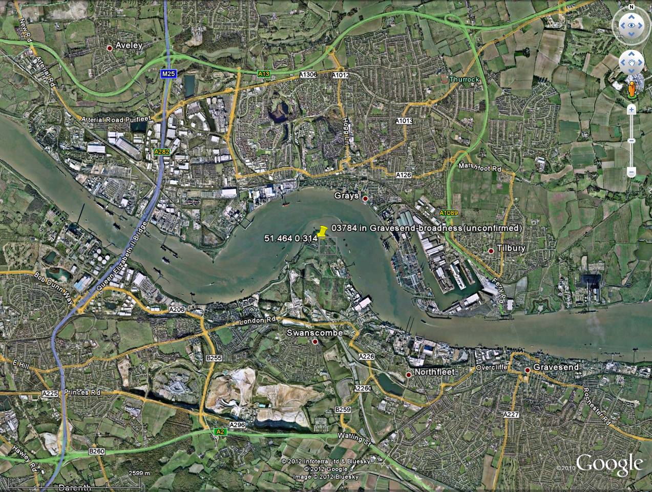
That spit of land juts into the Thames. If the Thames is warmed by power plant cooling outlets putting out waste heat upstream, I would think this station is getting a huge dose of the heat seen in the national heat map.
Cardiff, Swansea? Edinburgh, Glasgow? Belfast ? no sensors. How come only English areas are recorded, Do Wales Scotland and Ireland not count?
Matt says:
October 10, 2012 at 1:03 pm
@michaeljmcfadden,
One thing that has been blogged about here before is the dropping number of stations in the global land surface temp products particularly GISS.
======================================================================
1940 there were some thousands of stations:
http://bacontime.files.wordpress.com/2012/09/climate_and_man_002.jpg
Please see this link for more details: http://en.wikipedia.org/wiki/Solar_energy
Basically, all human energy producing activities per annum amount to less than one (1) hour’s worth of energy from the sun.
Which are the 20 UK Climat surface stations, please?
Its a shame the heat island effects havn’t saved the crops in Britain this year , lack of warm sunshine and cold rain has done for the farmers . The grape crops have just been left on the vines as they are not worth picking . Who would have thought there would be widespread crop failures due to cold in this ever warming world ?
The National Heat Map is built from a bottom-up address level model of heat demand in England. The model estimates the total heat demand of every address in England, but based on published sub-national energy consumption statistics and without making use of metered energy readings.
The map is of essentially waste heat, not temperatures as some have assumed. Some studies show waste heat contributes minimally to UHI. Other studies suggest it can be a significant factor.
And, I and some others concluded that the reason for the high temperatures at the Gravesend site is the low albedo (dark) mudflats that surround it on 3 sides.
There are two things competing with temperatures. One is the actual temperature in an undisturbed, pristine environment. The other is the temperature experienced by residents of a town, city, or metropolis. Both of them should be actually measurements of enthalpy, with humidity taken into the computation.
The first is the only true measure of what the pristine planet is doing, provided only pristine measuring sites are used in determining enthalpy – this would include temperatures/humidity at the same height over a body of water, not just land. There should be rigorous standards for measuring these quantities, and there should be significant oversampling, both spatially, and temporally.
The second can’t have the same rigor applied, as the temperatures/humidities experienced by the residents are comprised of the varied environmental modulations of the base temperature/humidity (that of a now fictional pristine site). These measurements are just the actual life experiences of those residents. Some weather broadcasts are now including the “Feels like” temperature, which includes the humidity. I personally would love to hear a report saying, “Tomorrow’s enthalpy will be…, so get out your (fill in the blank).”
@ur momisugly Matthew W
That is not the image I was looking for. There was an animation that showed the locations of temp stations globally from something like 1890 to ~2000.
Matt,
Is this what you are looking for?
http://jonova.s3.amazonaws.com/graphs/stations/great-dying-of-thermometers.gif
small quibbleDavid Schofield brought me to think this would be [a] good [time] to mention it,
@ur momisugly Matthew W & michaeljmcfadden
Here is the article I was refering to. Go watch the video
http://wattsupwiththat.com/2008/03/06/weather-stations-disappearing-worldwide/
It’s not a heat map.
Check out Didcot power station – it produces no heat. Neither does one of the largest users of electricity in the country, which is situated just down the road in Culham. Nearby houses produce more heat according to theis DECC product.
It’s a utilities bill map, which ignores real sources of heat, and users of oil, lpg, coal, wood, and those with special deals with power stations.
Charles Nelson – yes, we are generating more heat than ever before. But it goes somewhere. It radiates into space. The amazing thing we have learned about our planet is that the atmosphere keeps the planet atmosphere temp in a certain range, allowing us to live. The overall temp can vary, but across shorter terms, say decades, if we geenrate more heat, it heats the atmosphere, then radiates into space.
The global warming hypothesis is that one part of the regulatory system, the atmosphere, is itself changing. The carbon dioxide added does not leave, and its addition holds more heat in, overall. If the carbon dioxide global warming hypothesis is true, we would be getting a warmer planet even if all of our heat-generating human activity were at a steady state – we would generate more heat, but a greater portion would be retained.
“marchesarosa says:
October 10, 2012 at 3:56 pm
Which are the 20 UK Climat surface stations, please?”
Goodness knows if this will post, copied from an actual source file.
local stations={ { wmo=3005, name='Lerwick', lat=60.1391666666667, long=-1.18472222222222}, { wmo=3017, name='Kirkwall Airport', lat=58.95352188819607, long=-2.901431693510928}, { wmo=3026, name='Stornoway', lat=58.21361824254632, long=-6.318955738311116}, { wmo=3066, name='Kinloss', lat=57.6456067915196, long=-3.563464535150946}, { wmo=3091, name='Aberdeen / Dyce', lat=57.20497061327473, long=-2.205313861954394}, { wmo=3100, name='Tiree', lat=56.50001018774803, long=-6.880803487104119}, { wmo=3162, name='Eskdalemuir', lat=55.31209027497275, long=-3.206307301991473}, { wmo=3171, name='Leuchars', lat=56.37735298771637, long=-2.86192902784711}, { wmo=3257, name='Leeming', lat=54.29698920443254, long=-1.533062211300392}, { wmo=3302, name='Valley', lat=53.25267670440459, long=-4.53652739944032}, { wmo=3377, name='Waddington', lat=53.17535595567492, long=-0.5233386419626107}, { wmo=3414, name='Shawbury', lat=52.79469108656707, long=-2.664777635006615}, { wmo=3502, name='Aberporth', lat=52.13947375127079, long=-4.571154152607138}, { wmo=3590, name='Wattisham', lat=52.13947375127079, long=-4.571154152607138}, { wmo=3740, name='Lyneham', lat=51.50313207002159, long=-1.992399086381173}, { wmo=3772, name='London, Heathrow', lat=51.47916444653322, long=-0.4505671614755646}, { wmo=3797, name='Manston', lat=51.3463666867272, long=1.335387206040604}, { wmo=3808, name='Camborne', lat=50.21831496050969, long=-5.327559840358448}, { wmo=3862, name='Hurn, Bournmouth Airport', lat=50.77935751853183, long=-1.836177830278091}, { wmo=3917, name='Belfast, Aldergrove', lat=54.66377729916611, long=-6.22513985034386} }Is Durham used?
a) I’m close.
b) I know where it is.
c) I know there has been a big housing estate built nearby.
DaveE.
http://www.metlink.org/pdf/articles/urban_heat_island_-_manchester.pdf
shenington says:
October 10, 2012 at 5:02 pm
It’s not a heat map.
It’s a utilities bill map
It’s a map of space heating demand. And assuming those spaces are heated on average the same amount, a map of waste heat from buildings. Although lacking some sources of waste heat, such as electronics. Because they are true climatists, they don’t tell you how they did the calculation, but presumably its derived from the interior space of buildings.
At last someone is having a good look at the station locations. I’d always thought some to be a bit bizzarre to say the least – this was (and probably still is) one near to me in Manchester : http://www.flickr.com/photos/kh1234567890/sets/72157622974758406/
Forgot d.
Never received a reply when I asked If I could go and check it.
DaveE.
I have photocopies of the original hand-written thermometer records for the first ever weather station in the world, at Durham, UK. The actual written data for the early 1700’s is between 5 and 10 deg C cooler than the Met Office quoted temperatures derived from the same records. I have emailed the Met Office several times over the last 5 years for clarification on the differences and have been ignored. Since I am busy making a living I have not chased this up vigorously, especial as it looked like the sceptics had “won the argument”.The other interesting thing I found out while accessing the historical records is that even up until 2011, no calibration data of the instruments at Durham university have been archived/stored/ are available…
There have been kind words, thank you.
David A. Evans says:
October 10, 2012 at 5:28 pm
Is Durham used?
It is marked as active. Not seen that one in ages and IIRC was a CET station removed because of UHI yet why so? Not wonderful, but fair enough, however, play with Google Earth history, ouch.
Roughly 54.768, -1.58612
Changes like that ought to be clearly mentioned in the formal records.
Not seen it mentioned in extremes so I’ve not paid attention. (quite a few are known but not yet posted as articles, in part because I am trying to avoid deluging someone else’s blog)
Leroy’s rating of the quality of location of atmospheric measurement stations is very good. Have you published it, Anthony? It would make a good post by itself.
This French guy, Leroy, has spent many years on assessing the quality of weather station sites. I translated a 1990’s paper by him for Anthony. He is quite meticulous. That French love for Cartesian logic does not allow Warmista Wibblyism.
What is most interesting is that he provides strict criteria for the ACCURACY of a weather station’s different measurements. Thus, under this condition, the error bar will be this much; under that condition, the error bar of that measurement will be this much. And, the error bars are different for each type of measurement in each environment.
kh1234567890 says:
October 10, 2012 at 5:35 pm
At last someone is having a good look at the station locations. I’d always thought some to be a bit bizzarre to say the least – this was (and probably still is) one near to me in Manchester ”
There is one marked as current at 53.4668,-2.25152, sheesh, although it might not be accurate.
The Google Earth history is unusual, from 2000, see a building rise but this poses a problem: the data starts 1996 when the new building was not there. Maybe it was on the old library. A quick look I can’t see a screen in Hulme Park which is opposite and a more typical location.
Matt says:October 10, 2012 at 1:03 pm
Is this the animated GIF you are referring to?
http://i44.tinypic.com/23vjjug.jpg