Guest post by David Archibald
A number of solar parameters are weak, and none is weaker than the Ap Index:

Figure 1: Ap Index 1932 to 2026
Figure 1 shows the Ap Index from 1932 with a projection to the end of Solar Cycle 24 in 2026. The Ap Index has not risen much above the previous floor of activity in the second half of the 20th Century. It is also now far less volatile. With now less than a year to solar maximum in 2013, the Ap Index is now projected to trail off to a new low next decade.

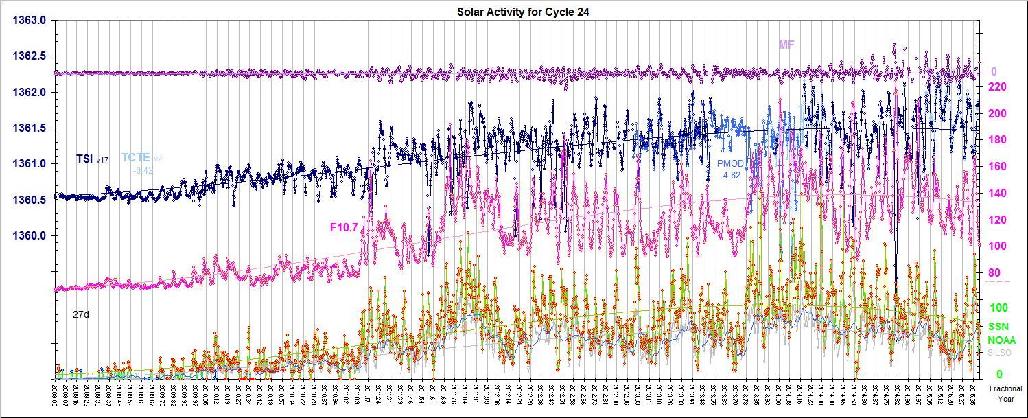
Figure 2: Mean Field, TSI, F10.7 Flux and Sunspot Count from 2008
This figure is from: http://www.leif.org/research/TSI-SORCE-2008-now.png
What is evident from Figure 2 is that the spikes down in the F10.7 flux and sunspot count are almost to absolute minimum levels. The underlying level of activity is only a little above that of solar minimum.

Figure 3: Oulu Neutron Count 1964 – 2026
Similar to the Ap Index, activity is only slightly above levels of previous solar minima. The figure includes a projection to the end of Solar Cycle 24 in 2026 which assumes that the neutron count in the next minimum will be similar to that of the 23/24 minimum. Previous cold periods have been associated with significant spikes in Be10 and C14. Perhaps the neutron count might get much higher yet into the 24/25 minimum.

Figure 4: UAH Monthly Temperature versus Low Global Cloud Cover
The cloud cover data for this figure was provided by Professor Ole Humlum. There is a significant relationship between low global cloud cover and global temperature. Assuming that the relationship is linear and remains linear at higher cloud cover percentages, this figure attempts to derive what cloud cover percentage is required to get the temperature decline of 0.9°C predicted by Solheim, Stordahl and Humlum in their paper entitled “The long sunspot cycle 23 predicts a significant temperature decrease in cycle 24” available at: http://arxiv.org/pdf/1202.1954v1.pdf
Figure 4 suggests that the predicted result will be associated with a significant increase in cloudiness.

Figure 5: Low Level Cloud Cover plotted against Oulu Neutron Count
This figure, most likely repeating other people’s work, suggests that there is little correlation between neutron count and cloud cover. Higher neutron counts may be a coincident with colder climate than a significant causative factor. Perhaps EUV, the Ap Index and other factors are more significant in climate change. Also, on a planet with a bistable climate of either ice age or interglacial, it may be that accidents of survival of snowpack over the northern summer are also important.
Perth-based scientist David Archibald is a Visiting Fellow of the Institute of World Politics in Washington where he teaches a course in Strategic Energy Policy.
David Archibald says:
July 2, 2012 at 7:46 pm
Altrock’s green corona emissions diagramme, and the man himself, says that the equatorward progression of this cycle is 40% slower than the previous cycle. 40% slower than 12.5 years makes it 17 years long.
This is the kind of extrapolation that a true dilettante might make. You make the unwarranted assumption that each cycle starts from the same latitude, which is not the case. Smaller cycle start from a lower latitude so have shorter to go [cf. cycle 20]. Here is what the green corona has been doing. As anybody can readily see the current cycle is not standing out as particularly different: http://www.leif.org/research/Green-Corona-1940-2011.png
Great discussion … it seems there is a lot we don’t know about our sun and its effects on our weather and climate.
Oh how easy it must be to be a CAGW proponent where everything is known and discovered, and all is certain.
markx says:
July 2, 2012 at 8:06 pm
Oh how easy it must be to be a CAGW proponent where everything is known and discovered, and all is certain.
That applies equally well to the solar ‘enthusiasts’, cf. Archibald’s post upthread.
Sorry to ask a really dumb question … but what is the Ap index and what is the significance of it being low?
anon2nz says:
July 2, 2012 at 9:45 pm
what is the Ap index and what is the significance of it being low?
It is a measure of the disturbances of the Earth’s magnetic field brought about by the solar wind hitting the Earth, and thus gives us information about the solar wind and the sun’s activity. A low Ap means that the sun is very quiet with few sunspots and solar storms.
MattN says: July 2, 2012 at 3:10 pm
What is the lag time associated with this? We’ve been beating the solar-drum for a while now, certainly the last 4-5 years. When are we going to start seeing the effects?
Sun is doing its thing, but the Earth has a say too what climate might do next. Northern Hemisphere is doing as expected
http://www.vukcevic.talktalk.net/GSC1.htm
southern one not so, too much moving liquid around.
Steve C says:
July 2, 2012 at 2:41 pm
Leif Svalgaard says:
July 2, 2012 at 11:32 am
“I shall say that Archibald very likely is wrong. There is no evidence for such a long cycle, next minimum more likely in 2021.”
Although, if that claimed link between long sunspot cycles and reducing temperatures is anywhere near right, that’s still a (roughly) 12-13 year cycle and so potentially not good news. Don’t sell off that snow blower yet.
But solar cycle 23 was 12+ years long – yet UAH global temperatures are still about 0.3 deg above the average for the 1981-2010 period. David Archibald continually refers to a “1970s cooling period” on many of his graphs which he blames on the weak SC19, but there wasn’t cooling in the 1970s. According to every global and NH temperature record I’ve seen, it actually began warming in the 1970s. The cooling began in the 1940s and ended in the 1970s, i.e. during solar cycle 19 (also 12+ years).
Leif Svalgaard says
That applies equally well to the solar ‘enthusiasts’, cf. Archibald’s post upthread.
Henry says
My simple sample displaying the drop in maxima does prove that global cooling has started and for all people (like me) not making money out of “global warming” , that is something to be excited about. It seems you are still denying that it is in fact getting colder?
http://www.letterdash.com/henryp/global-cooling-is-here
What is missing in this presentation is the development of the UV and, affected by this, the concentration of ozone. IMHO that is what is causing the drop in heat that we get from the sun.
Do we have any figures on that?
HenryP says, July 3, 2012 at 3:36 am
http://www.iac.ethz.ch/en/research/chemie/tpeter/totozon.html
Might be a whole lot more to ozone that that perhaps. Consider the trendlines on the top graph inverted. Interesting timing in the greater scheme of things.
From climate point of view, subject most of us are interested in, I think AA (or even better IHV) index tells more, only problem I have with is Bartels rotation, Carrington tables would be more useful.
Possible relationship between “Noctilucent Clouds” and Solar UV production?? Less UV more Noctilucent Clouds traveling further South [usually more North. +70 lat.]. Since the Noctilucents are composed of small ice crystals, extremely high in the atmosphere [~250,000 feet], and are reflective, maybe this is one of the UV relationships to the Earth’s Climate…. More UV less Noctilucents [less reflectivity] more warming; less UV more Noctilucents [more reflectivity]. This could be the link between high Sunspot counts [increases in 10.7 cm Flux] UV and a feedback loop to the Climate.
FROM WIKI:
————————
Ultraviolet radiation from the Sun breaks water molecules apart, reducing the amount of water available to form noctilucent clouds. The radiation is known to vary cyclically with the solar cycle and satellites have been tracking the decrease in brightness of the clouds with the increase of ultraviolet radiation for the last two solar cycles. It has been found that changes in the clouds follow changes in the intensity of ultraviolet rays by about a year, but the reason for this long lag is not yet known.[12]
Noctilucent clouds are known to exhibit high radar reflectivity,[10] in a frequency range of 50 MHz to 1.3 GHz.[13] This behaviour is not well understood but a Caltech professor, Paul Bellan, has proposed a possible explanation: that the ice grains become coated with a thin metal film composed of sodium and iron, which makes the cloud far more reflective to radar,[10] although this explanation remains controversial.[14] Sodium and iron atoms are stripped from incoming micrometeors and settle into a layer just above the altitude of noctilucent clouds, and measurements have shown that these elements are severely depleted when the clouds are present. Other experiments have demonstrated that, at the extremely cold temperatures of a noctilucent cloud, sodium vapour can rapidly be deposited onto an ice surface.[15]
——————————
Noctilucents reflect radar [outbound energy], and, therefore, reflect Solar energy inbound.
My projections are:
a) Less Solar UV, more Noctilucents, more cloud reflectivity.
b) More cloud reflectivity at all energy levels, Cooler Earth temperatures.
c) Models projections of Flux at ~100 units -> -0.1C/2.5 years.
Dr. Hathaway’s July ‘prediction’ appears to be identical to the last.
http://solarscience.msfc.nasa.gov/images/ssn_predict_l.gif
The bottom line, AFA earth’s weather is concerned, is if TSI at the top of atmosphere changes significantly. I think I’ve seen enough of Leif’s graphs/comments to think it doesn’t.
Solar magnetic changes are still interesting regardless.
vukcevic says:
July 3, 2012 at 5:25 am
From climate point of view, subject most of us are interested in, I think AA (or even better IHV) index tells more, only problem I have with is Bartels rotation, Carrington tables would be more useful.
Geomagnetic activity is recurrent in the Bartels rotation scheme, not in Carrington rotations.
John Finn says:
July 3, 2012 at 3:35 am
The cooling began in the 1940s and ended in the 1970s, i.e. during solar cycle 19 (also 12+ years).
You mean cycle 20, not 19 [which was the strongest observed]
Dr. Lurtz says, July 3, 2012 at 5:58 am
Any thoughts on the appearance of NLCs 2 years after Krakatoa errupted in 1883, stratospheric ozone depletion related perhaps?
Any NLC relationship to large partical events causing ozone depletions at high altitudes?
http://www.earthobservatory.nasa.gov/Features/ProtonOzone
It does seem PSCs and NLCs might be canaries in the coal mine but understanding what they’re chirping about is a different matter. How far has the science advanced recently in this respect?
Well, Mr. Archibald, it appears crop (corn & beans especially) yields will be down 30% or so. Not because of cold, but heat and drought. Because Death Valley has moved from last year’s Red River, Oklahoma & Texas to this year’s Republican River drainage in Nebraska and Kansas.
Figure 3 shows neutron counts vs time, with an obvious cyclic/sinusoidal relationship. Figures 4 & 5, temp vs cloud cover and cloud cover vs neutron count, show a clustering of values and mathematically determined linear relationships that lie between the two clusters. I suggest that colour coding the neutron and cloud cover values may reveal that the time factor has created a non-linear relationship to the data that confuses the neutron and temperature relationships.
The time factor is important for what is going on in the sun or in a time-delay relationship between neutron levels and cloudiness. Or that the neutron-cloudiness relationship is non-linear or threshold controlled.
I would not discount the neutron-cloudiness connection based on this data, but look deeper to see what other factor is influencing things.
Doug Proctor says:
July 3, 2012 at 8:11 am
may reveal that the time factor has created a non-linear relationship to the data that confuses the neutron and temperature relationships.
You make the assumption that such a relationship is a given and then suggest we try to see why it is not observed. It really goes the other way: we can only say that there is a relationship if we actually observe one.
Dr.S.
Bartels rot is ~1% (27.2753 /27) faster then Carrington. AA spectrum periods calculated from Brot are about 1% shorter then non-smoothed SSN so I would think Carrington rotation would be more appropriate.
Over long periods the geomagnetic recurrence rate is very close to 27 days. Bartels’ rotations are exactly 27 days</b). The two systems were defined independently, but it's not totally coincidental that the rates are nearly the same. It's the Sun's influence on the Earth's magnetosphere through the solar wind that causes geomagnetic activity, after all. Stanford University.
hm, very close is not same as exactly.
AJB says
http://wattsupwiththat.com/2012/07/02/the-sun-has-changed-its-character/#comment-1023474
Henry says
thanks so much, I have bookmarked that page (showing good those ozone results).
According to information available from the site they only started regular – 3x per week – measurements in 1968 so I think before that it was perhaps done a bit haphazardly. I also doubt the general accuracy of measurements before that time. So let us go with the data from 1970/
You can see the linear fall since 1970 and the linear increase since – would you believe it – 1995.
But…., you could also put that whole episode since 1970 into a hyperbolic curve
– and would you believe it –
then it probably fits into my parabolic curve for the fall in maximum tempratures.
http://www.letterdash.com/henryp/global-cooling-is-here
So here we really have the whole story. All happening right in front of my eyes.
The drop in ozone level caused “global warming” since 1970 and the increase in ozone since 1994 is currently causing my observed “global cooling”
However, my mathematics tells me that this is all part of a natural process. Man had little or nothing to do with it. Please tell me if anyone here disagrees with me?
This article’s figure 5 for cosmic ray flux versus cloud cover gives no source for its data beyond Humlum, but it is most likely graphing cloud cover as reported by the ISCCP. The ISCCP is like the IPCC of cloud cover data (and also used in climate4you.com cloud cover graphs).
However, there is a giant problem with that, using a compromised data source (the analogue of using Mann’s hockey stick for temperature history) which is contradictory to other sources which in contrast rather show the effect of cosmic rays.
A little background:
The ISCCP figures for global cloud cover (portrayed at http://climate4you.com/images/CloudCoverTotalObservationsSince1983.gif ) claim a slight decrease in average cloud cover over 2004-2009, as do their figures for low-level clouds in particular. Such would superficially seem contrary to how average cosmic ray flux overall increased over that time period. However, what is really going on can be realized by comparing the prior ISCCP-reported cloud trend with a plot of Earth’s albedo as can be seen at http://www.pensee-unique.fr/images/pallesciencefig.jpg and http://www.pensee-unique.fr/images/palle2009.jpg
The decrease in Earth’s albedo (decrease in reflectance) observed over 1986 to around 1997 corresponds to a period of declining cloud cover. (Reflecting less sunlight was a top cause of global warming, up to the famous peak of temperatures in 1998, followed by subsequent stagnation to decline in temperatures relative to 1998). That’s to be expected. Fewer white clouds cause less reflection of sunlight, an albedo decrease. Conversely, the increase in albedo over 2000-2004 corresponds to a period of increased cloud cover, again as to be physically expected.
Suddenly, though, everything changes for whether the ISCCP’s reported cloud trends match the actual observed albedo change. Look now at 2004-2009. There ISCCP cloud data supposedly disproves cosmic ray theory, with supposedly an overall decrease in cloud cover during the 2004-2009 period of cosmic ray flux increasing. Yet that is exactly when the ISCCP fudges their publicized cloud trend, as may be seen comparing to the albedo change. Observed albedo increased over that time period.
True average cloud cover change over that time period was an increase rather than the ISCCP’s reported fraction of a percent decrease 2004-2009. Cloud cover trends didn’t actually start going in the opposite direction of albedo change contrary to physics and past history. Rather, what was special about the year 2004 and onwards is that the CAGW movement recognized one of the greatest threats they have ever faced, with Dr. Shaviv’s landmark discoveries and published papers of 2003.
Eliminating the correlation between change in cosmic ray flux and the cloud cover reported by the dominant IPCC-like ISCCP source was utterly critical. Such was just as important as the following other sample examples of about exactly the same idea, the standard pattern:
* The Medieval Warm Period was critical to eliminate. Thus we got Mann’s hockey stick, as familiar to many skeptics (indeed to most skeptics, aside from those here who are undercover CAGW proponents trying to keep skeptics steered away from dangerous observations). But not all data sources could be conveniently adjusted, so cross-checking with other sources disproves the hockey stick, even comparing to about any history published prior to the era of political “science.”
* That arctic ice extent was comparably low in the 1930s to the recent period of hype was also critical to eliminate from common public knowledge, so, thus, again there is utter contrast between what top enviropolitical institutes present as historical (such as the first graph commented on in http://wattsupwiththat.com/2012/05/03/icy-arctic-variations-in-variability/ ) and what cross-checking with historical sea ice charts reveals as http://wattsupwiththat.com/2012/05/02/cache-of-historical-arctic-sea-ice-maps-discovered/ discusses.
* The ISCCP adjustment is not even the first amongst satellites. As http://wattsupwiththat.com/2012/04/12/envisats-satellite-failure-launches-mysteries/ shows with graphs, reporting of data from the Envisat satellite had an inconvenient sea level slope suddenly “go up from 0.76 mm/year to 2.33 mm/year!”
The Envisat “adjustment” was far more blatant and risky than the ISCCP’s subtle cloud cover trend change, yet it was done anyway.
The ISCCP has been very effective, as even most skeptics of CAGW don’t realize what happened. (This is one subcomponent of a major strategy of adjusting data and revising history until solar-GCR climate connections are no longer as readily seen as otherwise the case,* including probably at least a few undercover agents pretending to be skeptics — not universally or centrally orchestrated but just natural when people of similar ideologies, motivations, and dishonesty tend to copy each other’s tactics after seeing what works).
Even pulling off the mask in my comment here is unfortunately not remotely enough as too few people will scroll all of the way down here to read it, perhaps a figure 1 to 2 orders of magnitude less than the number being misled by the figure 5 graph in this article based on falsified data.
Hopefully someday some submitter of WUWT front page articles will see what would be more helpful. If David Archibald were to correct his article, I would respect him for honesty, and, in that event, one could assume the misleading part of this article’s presentation was just an unintentional result of not knowing how wide corruption amongst some data sources has spread by now.
* Temperatures themselves appear to be influenced by a complex superposition of internal forcings from the 60-year PDO & AMO ocean cycles, the shorter ENSO, and others on top of the solar/GCR external forcings, but cloud cover correlation with cosmic rays is particularly high, as shown in the links below.
A good intro to cosmoclimatology:
http://www.space.dtu.dk/upload/institutter/space/forskning/05_afdelinger/sun-climate/full_text_publications/svensmark_2007cosmoclimatology.pdf
The adjustment of post-2004 ISCCP satellite data is one in a whole series of dishonest tactics trying to discredit the evidence for GCR effects:
http://www.sciencebits.com/RealClimateSlurs
http://www.sciencebits.com/SloanAndWolfendale
http://www.sciencebits.com/HUdebate
Leif Svalgaard says:
July 3, 2012 at 6:25 am
John Finn says:
July 3, 2012 at 3:35 am
The cooling began in the 1940s and ended in the 1970s, i.e. during solar cycle 19 (also 12+ years).
You mean cycle 20, not 19 [which was the strongest observed]
Sorry – my mistake. I did indeed mean Cycle 20.
Henry Clarke says
The decrease in Earth’s albedo (decrease in reflectance) observed over 1986 to around 1997 corresponds to a period of declining cloud cover. (Reflecting less sunlight was a top cause of global warming,…)
Henry@Henry
Up until some time ago I would have tended to agree with that statement.
Yet, now, after my recent discovery,
http://wattsupwiththat.com/2012/07/02/the-sun-has-changed-its-character/#comment-1023587
I think that is only a minor factor. Most of the energy earth gets from the sun is in the 0-0.5 um range, and most of that is absorbed into the oceans, and subsequently to receiving that radiation, it is converted to heat.
Fiddle around with that,
as ozone does,
and you have a reasonable explanation for your “global warming” cq. “global cooling” periods…
God bless you all, have a good Independence day,
rgrds.
Henry
vukcevic says:
July 3, 2012 at 8:39 am
Bartels rot is ~1% (27.2753 /27) faster then Carrington. AA spectrum periods calculated from Brot are about 1% shorter then non-smoothed SSN so I would think Carrington rotation would be more appropriate.
When you dealing with effects on the Earth [like Aa] mediated by the solar wind and the sun’s magnetic field driving it, Bartels rotations are the appropriate interval.
Over long periods the geomagnetic recurrence rate is very close to 27 days. Bartels’ rotations are exactly 27 days
The recurrence rate is 27.03 days because the solar wind structures recur with that period.
Neugebauer, M.; Smith, E. J.; Ruzmaikin, A.; Feynman, J.; Vaughan, A. H.
Journal of Geophysical Research, Volume 105, Issue A2, p. 2315-2324 (2000):
“Direct measurements of the solar wind speed and the radial component of the interplanetary magnetic field acquired over more than three solar cycles are used to search for signatures of a persistent dependence of solar wind properties on solar longitude. Two methods of analysis are used. One finds the rotation period that maximizes the amplitude of longitudinal variations of both interplanetary and near-Earth data mapped to the Sun. The other is based on power spectra of near-Earth and near-Venus data. The two methods give the same result. Preferred-longitude effects are found for a synodic solar rotation period of 27.03+/-0.02 days. Such high precision is attained by using several hundred thousand hourly averages of the solar wind speed and magnetic field. The 27.03-day periodicity is dominant only over long periods of time; other periodicities are often more prominent for shorter intervals such as a single solar cycle or less. The 27.03-day signal is stronger and more consistent in the magnetic field than in the solar wind speed and is stronger for intervals of high and declining solar activity than for intervals of low or rising activity. On average, solar magnetic field lines in the ecliptic plane point outward on one side of the Sun and inward on the other, reversing direction approximately every 11 years while maintaining the same phase. The data are consistent with a model in which the solar magnetic dipole returns to the same longitude after each reversal.
It is a bit more complicated, though, as you can see here: http://www.leif.org/research/Long-term%20Evolution%20of%20Solar%20Sector%20Structure.pdf but the conclusion is the same:
“It appears very likely that the period of the four-sector structure [in the solar wind] is within a very few hundredths of a day of 27 days. If so, Bartels (1934) was fortunate in his choice of the 27-day calendar for representing geomagnetic activity.”
hm, very close is not same as exactly.
27.03 is much closer to 27.00 than 27.28 is. It is time you learn a bit from WUWT.