UPDATE: problem solved, see below.
I wonder if NSIDC actually looks at their own output from day to day? I know that sounds harsh, but the reality is that bloggers keep finding their errors and pointing them out to them, while at the same time the head of NSIDC Dr. Mark Serreze refuses to apologize for his comment “I have yet to lose any sleep over what is talked about in WattsUpWithThat or any other similar blog that insists on arguing from a viewpoint of breathtaking ignorance.“
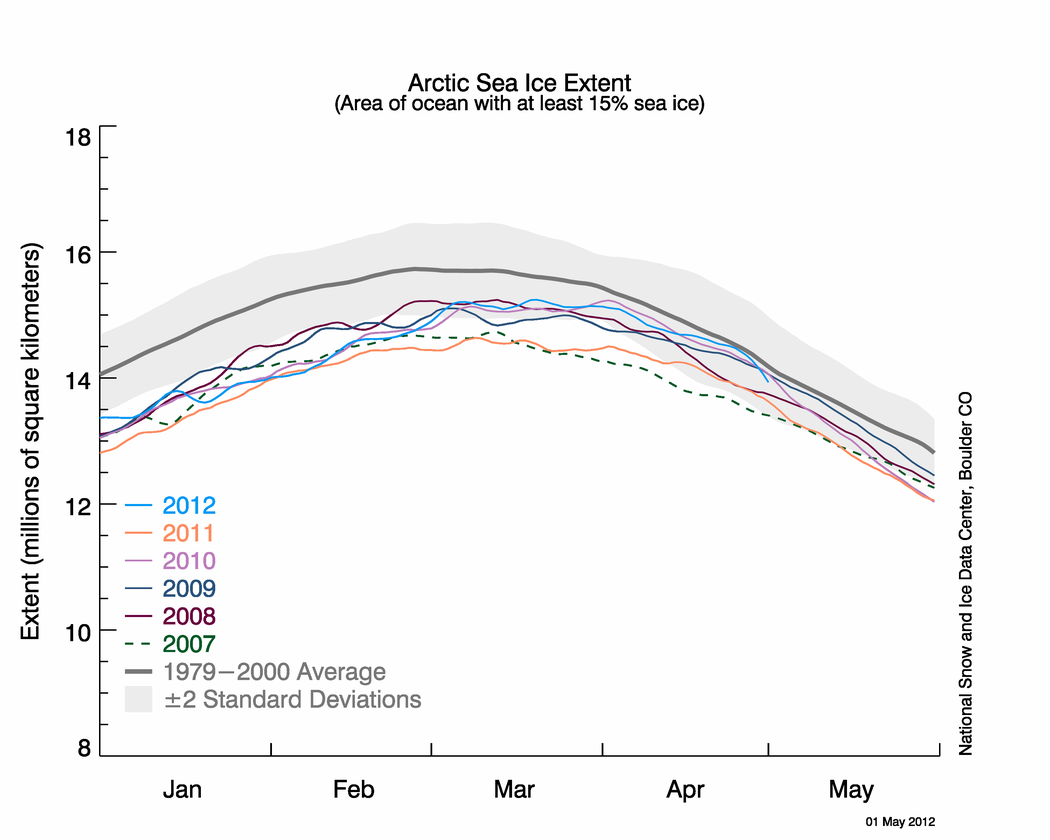
Last night I published NSIDC’s April Sea Ice Update along with an NWS report about record Bering Sea Ice. Simon F. was first to spot it within minutes.
Simon F. says:
There appears to be another glaring error on the NSIDC page about arctic sea ice. Look at these two images: http://nsidc.org/data/seaice_index/images/daily_images/N_stddev_timeseries.png & http://nsidc.org/arcticseaicenews/files/2012/05/Figure2.png – How come one practically touches the mean and the other never gets close?
I figured I’d wait until morning to see if NSIDC fixed the issue themselves. Nope. Let’s look at those graphs.

http://nsidc.org/data/seaice_index/images/daily_images/N_stddev_timeseries.png
OK, nothing wrong with this one. Note how the sea ice kisses the normal line. NSIDC alludes to this in their April Summary saying: Arctic sea ice reaches near-average extent in April

http://nsidc.org/arcticseaicenews/files/2012/05/Figure2.png
Hmmm….the blue line no longer kisses the normal line.
Since these graphs have the same scale, doing an overlay is easy.

It seems the average line has shifted. WUWT?
Why do bloggers keep having to point out NSIDC’s errors in their public presentations to their scientists? This is the second time in a month such errors have been spotted by bloggers, prompting NSIDC to do a correction last month.
NSIDC fixes their Arctic Sea Ice graphing problem
NSIDC’s oops moment – uncoordinated changes make for an interesting 24 hours
And of course the first time we pointed out a glaring error, that the satellite sensor failed, I was told it wasn’t worth blogging about.
Errors in publicly presented data – Worth blogging about?
NSIDC pulls the plug on Arctic Sea Ice Graphs
No good deed goes unpunished I suppose.
UPDATE: 9:15AM PST
I’ve heard from Dr. Walt Meier at NSIDC, and they are working to fix the problem. He sends his thanks for spotting the problem. – Anthony
UPDATE2: 2:30PM PST.
This came in earlier today at 12:32, but I was busy with other issues. The problem has been solved. Walt Meir writes:
We’ve corrected the image.
Thank you again for bringing it to our attention. It’s always good to have multiple eyes on things like this since we’re not an operational center and don’t always catch things, especially when we’re busy with other responsibilities.
Here is the corrected Figure 2 image:

Discover more from Watts Up With That?
Subscribe to get the latest posts sent to your email.
The source control and QA in non medical research seems to be way below standard of any serious commercial software developer.
In spite of everything, chaps, I think that the hypothesis “cockup” is a better fit than the hypothesis “conspiracy” in this particular case. Of course, that does not excuse incompetence or arrogance… Although, the arrogance may be what permits the incompetence to flourish.
Looking at your linked figures, it appears that the same thing happened to the Antarctic plots. The 1979-2000 baseline intersects the y-axis at a higher point in the current graph.
“I have yet to lose any sleep over what is talked about in WattsUpWithThat or any other similar blog that insists on arguing from a viewpoint of breathtaking ignorance.“
This guy really doesn’t understand the basics of science does he? If he did, he would realise that the whole point of science is to argue from a viewpoint of breathtaking ignorance. That is how they learn more – 90% of which is more things they don’t know. That is how scientists learn that they will always be breathtakingly ignorant. That is why science is so exciting.
Good find! Insofar as a newly constituted “normal” (mean, or average) should be lower than the one NSIDC has been using, this error is doubly funny, odd, interesting – whatever.
———————————————–
Regarding those few who seem always to want to make a kerfuffle out of posts they find non-relevant or lead-ins they find “snotty” –
Some many years ago – about when Joe Namath’s career was ending – a columnist comment on major league quarterback’s characteristics. Style and Class were the issues. Some had Style. Some had Class. A very few had both. The comment included examples other than the Style of Namath. I suppose in the just past season of the NFL, the quarterback Tim Tebow could be said to have a certain style.
Of course if you don’t like a person’s style – you have options. Complaining seems to be the least sensible.
Anthony Watts says:
May 4, 2012 at 9:24 am
I’ve heard from Dr. Walt Meier at NSIDC, and they are working to fix the problem. He sends his thanks for spotting the problem.
=============================================
horse hockey……………………
A group of people, who’s only job is to produce ice data………didn’t notice it
This is what they do…and all they do……and no one noticed?
Uh oh. When I saw the original post I thought, “Hmmm. I’m pretty sure we had touched the normal line recently…” but figured I was remembering incorrectly or had it confused with Antarctic ice or some such thing. I’m not a scientist, have never been a scientist, and didn’t stay at a Holiday Inn Express last night, so what do I know?
How sad is it that an occasional reader of WUWT spots it but the person producing the graph didn’t?
“I have yet to lose any sleep over what is talked about in WattsUpWithThat or any other similar blog that insists on arguing from a viewpoint of breathtaking ignorance.“ That comment more than anything demonstrates a laziness of intellect an unwillingness to accept honest and accurate criticism without striking back.Not a good sign for what should be a scientific mind!
The only thing in a death spiral is the credibility of the NSIDC
If the math doesn’t cooperate, change the math.
“Well, the trouble with our liberal friends is not that they are ignorant, but that they know so much that isn’t so.” – Ronald Reagan, A Time for Choosing 1964
NSIDC needs to clean up its quality control as well as fix its website so one can find the actual datasources (without clicking through 20 pointless links in a row and having to resort to searching through FTP directories instead), as well as making a good database available of the sea ice extent going back as far as possible.
They may think they are a research organization first. But if that is the case, they should hand over the data management function to another organization because there are millions of people around the world looking for this information.
Dr. Mark Serreze is probably not very nice to many people, Anthony included.
Perhaps he is just upset that Anthony hasn’t sent him something he could describe as a death threat. Alarmists seem to like acusing sceptics of that sort of thing.
I think this is all about sloppy work, which can be quickly remedied. On the other hand, the Team is all about deliberately deceitful work, which is never remedied.
I googled him and found: “October 2007: Briefed former Vice President Al Gore on Arctic climate change.” So he has a lot to answer for.
OK, if you’re looking for more errors, how about the fact that pages such as http://arctic.atmos.uiuc.edu/cryosphere/IMAGES/recent365.anom.region.6.html have not, for a few weeks, been showing the last 365 days, but the last 30-odd years? It’s not a big issue, but it does prevent one from examining the anomalies in high resolution.
Rich.
I would attribute this to laziness. The graph looks like what we want so it’s good. If it had crossed the line you know they would have been checking the graph engine the inputs etc. The two graphs be so noticeable different should have raised flags for them though one or the other doesn’t fit their meme so should have been checked and if it was right then the other…
Roger says:
May 4, 2012 at 8:55 am
My rule of thumb is:
… I find that to be rarely wrong, but unfortunately, these days that covers far too many scientific errors …
w.
You know, in most every ‘design suite’ (schematic entry, board layout etc) there are “design rule checks” (DRCs) that can be run which examine, node by node and circuit by circuit various parameters for which limits were established a priori (beforehand, usually based on board-shop minimum feature detail capability), such as how close any two traces/tracks may be placed or the minimum size annular ring on pads as well as drill sizes etc. … in the days of ‘hand layout’ such checks were performed using a ruler and a second set of eyeballs alone …. so the question is, are there any automated checks performed in their process on the data before plotting, even a difference-compare list in a log file that might flag a problem prior to publication on the public side of the website?
.
Interestingly, Dr Walt Meier is always quick to respond and thank Anthony/WUWT when errors are spotted. Although many people want to tar him with the same brush by saying that errors shouldn’t be made, I have a lot more respect for him than Mark Serreze.
NSIDC puts out a lot of new information pretty much every day so errors will happen. Having errors noticed, pointed out and responded to is exactly the process that produces science. Anyone who simply dismisses critics pointing out errors has lost all respect for themself as a scientist and I certainly would not trust anything that they “publish”.
We’ve all made mistakes and, yes, most of the mistakes we make usually err on the side of supporting our thesis because very, very few people are as critical of their own work as they probably would like to be (I am speaking from personal experience here). That is why we have collaborators, reviewers, editors, copy editors etc. to pick up on these things. Of course, if those people are not doing a good job either, then mistakes are compounded, but refusing to consider criticism is just inexcusable.
Mark’s attitude reminds me of a saying which flight instructors very earlier in flight training pass on to their student pilots, and that saying goes like this:
“There are “Old Pilots” and there are “Bold Pilots”, but, there are no old, bold, pilots because the bold pilots soon were not around.”
Also:
“Don’t be a show-off. Never be too proud to turn back. There are old pilots and bold pilots, but no old, bold pilots.” -E. Hamilton Lee
Mark it seems is still the latter, a ‘bold’ pilot, but that will resolve itself with time and age, one way or the other …
.
Willis Eschenbach says:
My rule of thumb is:
Never ascribe…
Willis, you aren’t looking at the evidence. If you can’t see the nose in front of your face the get your eyes checked.
“To save the graph, we had to destroy it”.
Willis Eschenbach says:
May 4, 2012 at 11:43 am
Never ascribe to iniquity what can be adequately explained by idiocy.
… I find that to be rarely wrong, but unfortunately, these days that covers far too many scientific errors …
============================================
horse manure…………
Willis, that little blue line is all they do….
That little blue line being where it “was” is the most attention they’ve gotten
…saying no one noticed is asinine
I’m not sure if you’re still giving them the benefit of the doubt still but colour (I’m Canadian) me skeptical. I seriously doubt they would correct any errors that favour their CAGW rhetoric unless it was pointed out to them by a “denier”.
Such as your own Will, such as your own.
The predominance of more-alarming errors over less-alarming errors is not so suspicious as the predominance of more-alarming adjustments vs. less-alarming adjustments.
The change is simply that the climatology line was raised. I suspect that they’ve adjusted their past ice data, to increase the amount of past ice. That’s what they do, make the past colder, right? So this new, higher, “old” line will become standard across all the charts. No more line-kissing for you, Anthony! And Dr. Walt’s apologies will sound hollow indeed.