UPDATE: problem solved, see below.
I wonder if NSIDC actually looks at their own output from day to day? I know that sounds harsh, but the reality is that bloggers keep finding their errors and pointing them out to them, while at the same time the head of NSIDC Dr. Mark Serreze refuses to apologize for his comment “I have yet to lose any sleep over what is talked about in WattsUpWithThat or any other similar blog that insists on arguing from a viewpoint of breathtaking ignorance.“
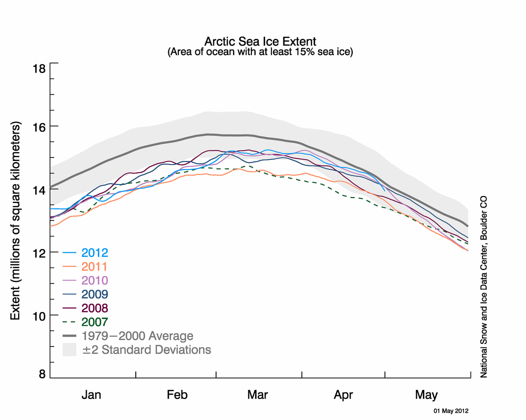
Last night I published NSIDC’s April Sea Ice Update along with an NWS report about record Bering Sea Ice. Simon F. was first to spot it within minutes.
Simon F. says:
There appears to be another glaring error on the NSIDC page about arctic sea ice. Look at these two images: http://nsidc.org/data/seaice_index/images/daily_images/N_stddev_timeseries.png & http://nsidc.org/arcticseaicenews/files/2012/05/Figure2.png – How come one practically touches the mean and the other never gets close?
I figured I’d wait until morning to see if NSIDC fixed the issue themselves. Nope. Let’s look at those graphs.

http://nsidc.org/data/seaice_index/images/daily_images/N_stddev_timeseries.png
OK, nothing wrong with this one. Note how the sea ice kisses the normal line. NSIDC alludes to this in their April Summary saying: Arctic sea ice reaches near-average extent in April

http://nsidc.org/arcticseaicenews/files/2012/05/Figure2.png
Hmmm….the blue line no longer kisses the normal line.
Since these graphs have the same scale, doing an overlay is easy.

It seems the average line has shifted. WUWT?
Why do bloggers keep having to point out NSIDC’s errors in their public presentations to their scientists? This is the second time in a month such errors have been spotted by bloggers, prompting NSIDC to do a correction last month.
NSIDC fixes their Arctic Sea Ice graphing problem
NSIDC’s oops moment – uncoordinated changes make for an interesting 24 hours
And of course the first time we pointed out a glaring error, that the satellite sensor failed, I was told it wasn’t worth blogging about.
Errors in publicly presented data – Worth blogging about?
NSIDC pulls the plug on Arctic Sea Ice Graphs
No good deed goes unpunished I suppose.
UPDATE: 9:15AM PST
I’ve heard from Dr. Walt Meier at NSIDC, and they are working to fix the problem. He sends his thanks for spotting the problem. – Anthony
UPDATE2: 2:30PM PST.
This came in earlier today at 12:32, but I was busy with other issues. The problem has been solved. Walt Meir writes:
We’ve corrected the image.
Thank you again for bringing it to our attention. It’s always good to have multiple eyes on things like this since we’re not an operational center and don’t always catch things, especially when we’re busy with other responsibilities.
Here is the corrected Figure 2 image:

Mistake? Their mistake is to not have a QA program of profession grade.
John
It is time for a post on this article:
http://www.bmartin.cc/pubs/92prom.html
This is fraud of a type, the “fraud of the whole” maybe.
“I can’t tell for sure which way the average line moved. ”
It’s easy — just look where it crosses the axis. It’s about 14.05 in the older graph and about 14.4 in the newer. The fact that the lettering is differently sized gives insight to how the graphs are produced. It might be Illustrator. That’s what I use for complex graphs. Really nice, but you have to doublecheck everything, especially when you reuse elements on new graphs.
Latitude says:
May 4, 2012 at 8:33 am
drobin9999 says:
May 4, 2012 at 8:13 am
Do we really have to have the WUWT snotty meter pegged at 10 on every post? Relax folks, this isn’t an evil plot to pull the wool over anybody’s eyes.
=================================
I agree….it’s just gross incompetence
Hmmm….’an evil plot to pull the wool over (people’s) eyes’, or…..’just gross incompetence’? The future of humankind is in the best of hands.
Probably they figure the number of people who will hear about and notice manipulations even this blatant is relatively small (and those often the minority already knowing what is going on anyway), less than they
gain from the revisionism reaching a larger trusting audience. They might even be right on that as an effective strategy. The largest of the skeptic websites in traffic, Watts Up With That has tens of thousands or so of daily visitors (far higher figures per month but most repeat visits), but, even so, the “mainstream” media and sites like Wikipedia reach a larger audience, more millions of people, supported throughout much of the educational system. What would be most disruptive would be more winters like 2009-2010 in the Europe and U.S., only more so, sometimes a few years from now in the possible event of a solar Grand Minimum developing in the future, as the 2009-2010 experience highlighted where revisionism capabilities break down on local records and how people personally notice. If such happens, even many of the CAGW movement’s elite won’t see it coming, never having been educated on real climate history, spreading inaccuracies amongst themselves as much as to others.
Figures don’t lie, but liars figure. “Adjusting” data seems like poor practice at best. How convenient that we have activist “scientists” allowed to alter historic records, and how surprising that their adjustments always make the past cooler and the present warmer? Most citizens quit paying attention to arithmetic sometime shortly after fourth grade, so cannot ascertain by themselves exactly who is telling the truth and who is not. We owe it to them to continue shouting the truth, from the rooftops if this Blogging is stopped someday!
Obviously, NSIDC used the old 1979-2000 baseline with the newly averaged current data for presentational purposes. Since this whole thing was supposed to be poorly deployed, could be an honest mistake, could be negligence.
I am curious about the apparent lack of applying this new technique at all to the Antarctic data.
Here is the current Antarctic graph:
http://nsidc.org/data/seaice_index/images/daily_images/S_timeseries.png
Here is the graph in 2008:
http://web.archive.org/web/20080502020821/http://nsidc.org/data/seaice_index/images/daily_images/S_timeseries.png
None of this appears to be recalculated. Only the Arctic needs the new averaging technique? Learn something new every day 😉
DR:
That is the real point, every error increases the global warming meme, whether it be to decrease historical temps, increase current temps, increase current sea levels, decrease historic sea levels, decrease current ice, increase historic ice – they all go one way, every single “error” makes the man on the street think global warming is a bigger issue than it is, thus we would all have to breathtakingly ignorant to not know that these folks are not scientists, they are not good arbiters of the data, and they should all be fired.
They raised the ordinate axis by a mere 1/4th of 1,000,000 square kilometers!
A mere 2,057 Manhattans!
Yikes… how did something so easy to cause happen! (If this was stated already, my apology.)
“Günther says:
May 4, 2012 at 8:04 am
What is the relevance of this? Is this so important that it deserves its own blog post? I find mistakes all the time on websites of different scientific organisations. I tell them, they thank me, no problem.”
Gunther, I’m no expert, but the relevance is that the extent had finally reached the 1979-2000 average, right? That had to be great news to everyone concerned about the environment. You couldn’t look at the graph and not notice that 2012 line had touched the mean. Then the graph gets re-issued and no longer touches it. Hmmmm – even if it’s an honest mistake, how do you not notice that it no longer touches the mean? You’d have to not even be paying attention to the point of the graph. So it seems to be very important and certainly deserves a post.
The case for satellite funding depends in part on the integrity of data and interpretation. If the satellites are functioning but the interpretation is suspect, then the argument for funding of satellites is commensurately weakened. Why spend money for bad data?
Sorry, got carried away with my Manhattans… It’s 514 Manhattans! My hectic apologies again.
Anthony Watts says: “I’ve heard from Dr. Walt Meier at NSIDC, and they are working to fix the problem. He sends his thanks for spotting the problem.”
Dr. Walt is a breath of fresh air, as usual.
Anthony, by nature and demeanor you are a gentleman and a scholar. That is what makes your blog one of the best on the Internet. However, I suggest that repeated errors, misinformation and disinformation require liberal use of the BS button.
“bloggers keep finding their errors and pointing them out to them, while at the same time the head of NSIDC Dr. Mark Serreze refuses to apologize “…
Hey, free high-tech labor just frees up the budget for those at the top!
What, do you think he’s dumb?
Better would be to turn the corrections into your Congrssman and let him pass it along down the chain.
I think it is time for a post on this article:
http://www.bmartin.cc/pubs/92prom.html
Which argues that the power structure of science drives memes, like global warming, and driving these memes if fraud.
Why doesn’t NSIDC just out source their graph and illustrations to WUWT? We’d all get more timely, and more accurate presentations.
Sorry Anthony, but I do NOT believe for a second that this was just another mistake.
And then these leftist activist scientists wonder why people like me don’t trust them. This just makes me more suspect of them and their agenda or motive(s).
The death spiral for Dr. Mark Serreze is his credibility and career, not the amount of ice in the Arctic.
We will not forget Mark, we will not forget.
Good spot Anthony! This site is such a great watch dog. Thanks.
You might want to change the acronym from WUWT? to WTF? Just kidding.
Thanks
Clive
REPLY: Not me, but a WUWT commenter, Simon F. gets the credit – Anthony
The whole grey band also seems to have moved up about 0.25.
A.C. Osborn
“The whole grey band also seems to have moved up about 0.25.”
That’s just weather!
Anthony, I had the pleasure of thanking you in person at the Heartland Institute’s sixth international conference on climate change in DC last year. It was nice to know you had all the time in the world to talk with me, a mere attendee… LOL! But seriously: 1. You’re a really nice guy, smart, intelligent & highly productive guy, thankfully. 2. But, (I post proverbially) you are too understanding of the good doctor, professors over at NSIDC. They are incompetent, thieving, Leftists, attempting to destroy our lives & the lives of our children.
In 2008 Mark Serreze said in New Scientist: “There is this thin first-year ice even at the North Pole at the moment,” says Serreze. “This raises the spectre – the possibility that you could become ice free at the North Pole this year.”
http://www.newscientist.com/article/dn13779-north-pole-could-be-ice-free-in-2008.html
Never fear, an intrepid explorer is going shank’s pony to do some science or sumfink.
http://www.penhadow.com/news/pen-hadow-announces-solo-arctic-challenge/
Anthony, since their Eco-weird echo-chamber are no longer referring to these graphs for “proof” the world is frying I suspect that they will not continue making them or caring what they look like.
Sloppy Science or politics…. that what these graphs represent.
Where are the DMI approximations?