Note: I’m blogging this from Atlanta, where I am at the TWC Pioneers reunion. Bob was kind enough to provide this post so I can relax a bit (though I think I’ll chase a NOAA USHCN weather station today anyway). His figure 10 (below) is interesting, his figure 11 even more so. – Anthony

Guest post by Bob Tisdale
With the recent release of the CRUTEM4 data came the expected two-sided discussion (argument) about the changes from the earlier version of the dataset, CRUTEM3. One side claimed the adjustments were needed, while the other side protested the increase in global surface temperature anomalies. There were also differences of opinion about where the adjustments were made. Some claimed the added Arctic surface stations were the sole contributors to the trend, and others countered that the adjustments and dataset additions impacted data globally.
Who was right about the locations of the additions and adjustments? And when did the adjustments and additions have the greatest impact in recent decades?
The changes impacted the land surface temperature anomaly data globally. The Jones et al (2012) paper Hemispheric and large-scale land surface air temperature variations: An extensive revision and an update to 2010 discussed them in detail.
To illustrate the answer those questions in ways not presented in the paper, we’ll look at the CRUTEM3 and CRUTEM4 land surface temperature anomaly data from January 1975 to the end of the CRUTEM4 data in December 2010. That period represents the late 20thCentury warming period as it continues to present, and it’s also 36 years long so we can divide the data into two equal 18-year periods. And we’ll compare the trends of the two datasets on time series and zonal-mean (latitudinal) bases. Let’s start with the trends for the two periods on zonal mean bases just get an idea of where around the globe those changes took place.
TRENDS ON ZONAL MEAN BASES
The trends of the two datasets from the beginning of the recent warming period (January 1975) to December 1992, and the differences in the trends, are shown Figures 1 and 2. The linear trends were determined at each 5 degree latitude band and plotted in centered 5 degree increments, from 55S to 85N. (Note: The Climate Research Unit [CRU] of the University of East Anglia does present Antarctic land surface temperature anomaly data, but it is sporadic and would require me to infill some missing data for the trend analyses, so I excluded the Antarctic data in the zonal mean graphs, and only those graphs. All data is included in the global time-series graphs.) To calculate the differences, the trend of CRUTEM3 at each 5 degree latitude band was subtracted from the corresponding CRUTEM4 trend. Over this period of 1975-1992, compared to CRUTEM3, the new and improved CRUTEM4 land surface temperature anomaly data has higher linear trends in the Northern Hemisphere from about 35N to 75N, but lower trends between 10S and 35N, overlooking that little blip about 27N. CRUTEM3 also has significantly higher trends than the updated CRUTEM4 north of 75N.

Figure 1
HHHHHHHHHHHHHHHHHHHHHHHHHHHHHHHHHHHHHHHHH

Figure 2
A few things to keep in mind: In a few of the zonal-mean graphs, there are major differences between the trends of the CRUTEM3 and CRUTEM4 data at the latitude of 82.5N. But the percentage of land at that latitude is minimal, only about 12%, the rest being ocean. (And, yes, there is sea surface temperature data at that latitude, even more so with a satellite-based sea surface temperature dataset.) So a major correction there doesn’t have a major impact on global surface temperature anomalies when the CRUTEM3(4) data is combined with HADSST2(3) data to form HadCRUT3(4). (High temperature anomalies simply look impressive at that latitude on maps that blow the Arctic out of proportion.) The zonal mean graphs of the land surface temperature linear trends in this post are also not weighted by latitude; corrections at low latitudes have a much greater impact on global temperatures than at high latitudes. And, of course, the CRUTEM data only represents land surface temperatures, but the oceans cover a much greater portion of the surface of the globe. Figure 3 compares the percentages of land and ocean surface area from 90S to 90N on a latitudinal basis, where the surface area percentages have also been weighted by latitude. The percentages of land surface area in 5 degree latitude bands were determined using a land mask calculator at the KNMI Climate Explorer.

Figure 3
Before we compare the trends of the two datasets during the second period, I wanted to compare the trends of 1975-1992 and 1993-2010. We could use either dataset for this, so I’ve used the newer CRUTEM4. Refer to Figure 4. The biggest difference in the trends of the two periods is the absence of the exaggerated warming in the Arctic during the early period of 1975 to 1992. That is, there’s little polar amplification during that period. Of course, you ask yourself, why? The first thing that comes to mind is the eruption of Mount Pinatubo, but I prepared a few more trend graphs on zonal mean bases that ended before and after 1992 (started in 1975) and the polar amplification was still absent for a few years before and after that volcanic eruption. (I have not presented those additional graphs.) What caused the shift toward polar amplification in the land surface temperature data during the period after 1992? Maybe a reader who’s studied the Arctic can fill us in. But we’re getting sidetracked.

Figure 4
Figures 5 and 6 compare CRUTEM3 and CRUTEM4 trends during the period of 1993 to 2010. The CRUTEM4 trends are noticeably higher than CRUTEM3 in the Southern Hemisphere from 40S to 10S, and they are significantly higher in the Northern Hemisphere, with the difference in trends peaking at the latitude band of 70N-75N.

Figure 5
HHHHHHHHHHHHHHHHHHHHHHHHHHHHHHHHHHHHHHHHH

Figure 6
Figure 7 compares the differences in trends between CRUTEM3 and CRUTEM4 for the two periods of 1975-1992 and 1993-2010. Not too surprisingly, the additions and adjustments to CRUTEM4 from 1993-2010 had a greater impact than during the earlier period.

Figure 7
A QUICK LOOK AT LONG-TERM TRENDS
For those interested, Figure 8 presents the same CRUTEM3 and CRUTEM4 trends comparison on a zonal mean basis, but with the data starting in 1900. I thought many would be interested to see that the CRUTEM datasets showed no trend since 1900 just north of the equator (0-5N). I find it interesting because there’s also been no trend in NINO3.4 sea surface temperature anomalies (an El Niño-Southern Oscillation index, with the coordinates of 5S-5N, 170W-120W) over that period, too, based on HADISST data. Just a curiosity that I’ve never seen presented before.

Figure 8
THE NUMBER OF STATIONS
There was a step decrease in the early 1990s in the number of Northern Hemisphere surface stations used in CRUTEM3. That station dropout had come under scrutiny in recent years, with some analyses suggesting that the cutback in the number of stations was, in part, responsible for the increased warming since that time. That drop in surface station quantity was addressed in Jones et al (2012) toward the beginning of the paper. It seems as though they made an effort to put that complaint to rest with their discussion of the increased number of stations and their Figure 1, presented here as Figure 9. They eliminated the sudden dropout of stations…and, to contradict the naysayers, when they added the surface stations, the surface temperature trends increased.

Figure 9
GIF ANIMATIONS OF MAPS SHOWING ADDITIONAL GRID COVERAGE
CRU definitely added data in the Arctic; see Animation 1, which presents the grids covered and color-coded temperature anomalies for CRUTEM3 and CRUTEM4 in the Arctic.

Animation 1
But they also added data elsewhere globally, as shown in Animation 2.
Animation 2
A DISCUSSION ABOUT SEA SURFACE AND LAND SURFACE TEMPERATURES
Land surface temperature records and sea surface temperature records both show that surface temperatures have warmed since 1901, Figure 10, with the land surface temperatures mimicking and exaggerating the variations in sea surface temperature—as they should.
Figure 10
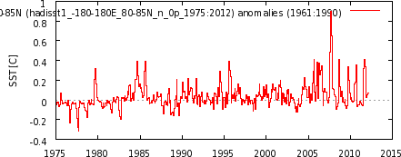
But as we can see in Figure 11, the land surface temperatures have warmed much more rapidly than sea surface temperatures in recent decades.

Figure 11
Let’s consider for a few moments that exaggerated warming of land surface temperatures that occurred in recent decades. We understand that the sea surface temperature data is biased toward being a Southern Hemisphere dataset, because the surface area of the Southern Hemisphere oceans is 1.4 times greater than that of the Northern Hemisphere oceans, and we understand that the natural variations in the sea surface temperature anomalies of the Northern Hemisphere oceans are greater than the Southern Hemisphere. The variations in the Northern Hemisphere sea surface temperatures include the Atlantic Multidecadal Oscillation (AMO) in the North Atlantic and an unnamed mode of multidecadal variability in the North Pacific [not the PDO] that appears to have a frequency and magnitude similar to the AMO, though they’re slightly out of synch. (See the discussion under the heading of PACIFIC DECADAL VARIABILITY toward the end of the post here.) We also understand that the land surface temperature data is greatly biased toward being a Northern Hemisphere dataset, since there’s about 2.2 times more land surface area in the Northern Hemisphere than in the Southern Hemisphere. So, considering the additional land surface area of the Northern Hemisphere and the additional multidecadal variability of the sea surface temperature anomalies there, we would expect some additional natural exaggeration of the land surface temperature data in response to the additional variations in the Northern Hemisphere sea surface temperatures. But how much should be expected? How much of the exaggeration in land surface temperature anomalies occurs naturally or is the result of continuous upward data adjustments?
![an unnamed mode of multidecadal variability in the North Pacific [not the PDO] that appears to have a frequency and magnitude similar to the AMO](http://i56.tinypic.com/t9zhua.jpg)
TIME-SERIES COMPARISONS
Figure 12 is a time-series graph of CRUTEM3 and CRUTEM4 land surface temperature anomalies for the period of January 1975 to December 1992, the first half of term being discussed. The two datasets are so similar for much of the period that it’s difficult to differentiate between the two. As you’ll note, there’s a very slight difference in the linear trends. But if you scroll back up to Figures 1 and 2, there were changes at all latitudes, some of them significant changes. Somehow all of those changes resulted in very little change in the overall global land surface trends with the update from CRUTEM3 to CRUTEM4.

Figure 12
On the other hand, during the period of January 1993 to December 2010, Figure 13, the new and improved CRUTEM4 data has a trend that’s approximately 0.05 deg C/decade higher than the CRUTEM3 data.

Figure 13
To some, 0.05 deg C/decade may not seem like a significant amount, but it changed the years of the record high temperature anomaly. With CRUTEM3, the record year was 1998, but with CRUTEM4, its 2007, with 2010 a close second (not illustrated). Figure 14 illustrates the difference between the two datasets with CRUTEM3 subtracted from CRUTEM4. I’ve also smoothed the difference with a 13-month running-average filter to reduce the noise. Two of the greatest adjustments came during what was once the record year, 1998, and toward the end of datasets, around 2007, just when it was needed to have 2007 as the warmest year.

Figure 14
CLOSING
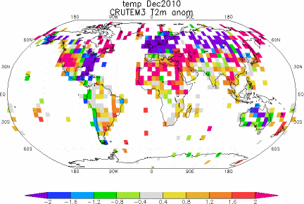
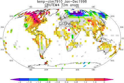
The adjustments shown in Figure 14 might lead some readers to believe the Climate Research Unit went to all that work with the single-minded goal of raising the land surface temperature anomalies after 1998 so that their records could show that global warming continued. Yup. Those adjustments just might lead people to believe that. But maybe we also need to consider the locations of the new 5X5 grids that contain data and the land surface temperature anomaly patterns in 1998 and 2007. Figures 15 and 16 present the CRUTEM3 and CRUTEM4 zonal mean land surface temperature anomalies (not trends) for the years of 1998 and 2007. And Animations 3 and 4 present maps of the temperature anomalies, and grids with and without data, during those two years for the two datasets. I’ll let you decide.

Figure 15 – (1998)
HHHHHHHHHHHHHHHHHHHHHHHHHHHHHHHHHHHHHHHHH

Figure 16 – (2007)
HHHHHHHHHHHHHHHHHHHHHHHHHHHHHHHHHHHHHHHHH

Animation 3 – (1998)
HHHHHHHHHHHHHHHHHHHHHHHHHHHHHHHHHHHHHHHHH

Animation 4 – (2007)
HHHHHHHHHHHHHHHHHHHHHHHHHHHHHHHHHHHHHHHHH
BEFORE YOU JUMP TO CONCLUSIONS
For the next two animations of global temperature anomalies, we’ll need to switch the base years for anomalies to a period that will work with RSS Lower Troposphere Temperature (TLT) anomalies and CRUTEM4, so we’ll use 1979 to 2010. Animations 5 and 6 compare the global CRUTEM4 land surface temperature anomalies to the Remote Sensing Systems (RSS) Lower Troposphere Temperature anomalies for 1998 and 2007. Again, I’ll let you decide.
Animation 5 – (1998 with RSS)
HHHHHHHHHHHHHHHHHHHHHHHHHHHHHHHHHHHHHHHHH

Animation 6 – (2007 with RSS)
HHHHHHHHHHHHHHHHHHHHHHHHHHHHHHHHHHHHHHHHH
MY FIRST BOOK
The IPCC claims that only the rise in anthropogenic greenhouse gases can explain the warming over the past 30 years. Satellite-based sea surface temperature disagrees with the IPCC’s claims. Most, if not all, of the rise in global sea surface temperature is shown to be the result of a natural process called the El Niño-Southern Oscillation, or ENSO. This is discussed in detail in my first book, If the IPCC was Selling Manmade Global Warming as a Product, Would the FTC Stop their deceptive Ads?, which is available in pdf and Kindle editions. A copy of the introduction, table of contents, and closing can be found here.
SOURCES
The monthly CRUTEM3 and CRUTEM4 data used in the time-series and zonal-mean graphs and the maps, including the RSS TLT anomalies, are available through the KNMI Climate Explorer.
The annual CRUTEM4 data used in Figures 10 and 11 is available at the Hadley Centre’s webpage here, specifically the annual data here, and the HADSST3 data is available through the KNMI Climate Explorer here.
To all the big-conspiracy-believers, don’t worry about Siberia, it will follow the AO down again.
http://virakkraft.com/AO-Kirensk.png
Just make sure the AO sensitive stations are not removed again 🙂
Bob Tisdale says:
April 28, 2012 at 3:27 pm
My concern, Kasuha, is the continued adjustments to the raw data. If we look at the adjustments NOAA/NCDC makes to its USHCN data…
__________________________________________________
Yes, I am concerned about adjustments to USHCN data too – there’s something strange with them but that is not something that can be analyzed by comparing means or trends, one has to go down to the data and identify those microscopical steps they introduce into them and find what’s wrong with these.
I have not invested time to doing any such analysis yet so I can’t say anything about them beside that they look suspicious. Most frequent adjustments are between -1 and +2 °C but there are extremes like adjustment of about 5.5 °C. But I have not analyzed whether this is or isn’t related to e.g. number of step changes. I don’t believe there’s any intent but it is possible there is a programming error, something like a single incorrectly applied rounding, which could introduce bias like this. And it is long known fact that if an error produces favorable results, people are much less willing to look for it than if it produces unfavorable results.
Regarding CURTEM3 vs CRUTEM4 comparison, though, if CRUTEM4 has these errors, then CRUTEM3 has them too at the same magnitude. Which still means CRUTEM4 is overall better quality than CRUTEM3.
I feel like looking at snakes coming out of master tamers cage helping to sell the snake oil and not any scientifically plotted data.
In my view the “changing the past” part more then everything is pushing climatology in the same fake-science group with astrology.
Bob do you have the confidence intervals to add on the comparison graphs v3 versus v4? Would be good to have a closer look at what are they are selling and the value of it. They admit now to have been off by how much in the previous work? And how much off to the previous?
****
DR says:
April 28, 2012 at 5:54 pm
Someone please explain how near surface temperature trends can exceed tropospheric trends based on greenhouse effect theory. Thanks.
****
Exactly. Straight GHG “theory” says the surface trend should be ~0.8 of the tropo trend (up or down).
Re-posting for greater clarity:
For land-only temperatures, the big political change in Hadcrut4 vs Hadcrut3 is to maximize 2007 and other recent years versus the “former” warmest year 1998 – Hadcrut4 land-only thus gives the false impression that Earth is still warming for the past decade, not flat or cooling.
Much too convenient, especially coming from the “Stars of Climategate” at Hadley CRU. Hadcrut4 looks like more “political science” and is not credible, imo – another “Hide the Decline”, aka “Mike’s Nature Trick”. Will this land-only Hadcrut4 become the new fraudulent poster-boy for the global-warming movement, like the Mann-made global warming hokey stick? Here is the plot, thanks to WoodforTrees:
http://www.woodfortrees.org/plot/uah-land/from:1980/mean:12/plot/crutem3vgl/from:1980/mean:12/plot/crutem4vgl/from:1980/mean:12
The next plot is interesting. None of these three better-quality temperature series show 2007 as the warmest year. They also show better coherence with each other than with Hadcrut4. There is interesting (and logical) conformance in the highest peak values.
http://www.woodfortrees.org/plot/hadsst2gl/from:1980/mean:12/plot/uah/from:1980/mean:12/plot/uah-land/from:1980/mean:12
For global temperatures (land and sea), the Hadcrut4 ~2007 bias is moderated by the inclusion of sea temperatures in the following plot. There is still ~0.2C warming bias in Hadcrut3&4 vs UAH, and Hadcrut4 increases this warming bias.
It is unlikely that Hadcrut4 is “better quality” than Hadcrut3, as some allege, since it exhibits even greater divergence with the much-better quality UAH satellite record.
http://www.woodfortrees.org/plot/uah/from:1980/mean:12/plot/hadcrut3gl/from:1980/mean:12/plot/hadcrut4gl/from:1980/mean:12
ferd berple says: April 28, 2012 at 12:09 pm
IMHO, this one of the most important observations made within these pages.
markx says:April 29, 2012 at 9:56 am
ferd berple says: April 28, 2012 at 12:09 pm
Climate scientists complain when someone outside of climate science talks about climate science, but ignore the fact that climate science is no qualification to build reliable computer models.
Markx: IMHO, this one of the most important observations made within these pages.
___________
Agree – when you build a mathematical model, you first try to verify it. One method is to determine how well it models the past (“hindcasting”).
The history of climate model hindcasting has been one of blatant fraud. Fabricated aerosol data has been the key “fudge factor”.
Here is another earlier post on this subject, dating from mid-2009.
It is remarkable that this obvious global warming fraud has lasted this long, with supporting aerosol data literally “made up from thin air”.
Using real measured aerosol data that dates to the 1880’s, the phony global warming crisis “disappears in a puff of smoke”.
Regards, Allan
http://wattsupwiththat.com/2009/06/27/new-paper-global-dimming-and-brightening-a-review/#comment-151040
Allan MacRae (03:23:07) 28/06/2009 [excerpt]
FABRICATION OF AEROSOL DATA USED FOR CLIMATE MODELS:
The pyrheliometric ratioing technique is very insensitive to any changes in calibration of the instruments and very sensitive to aerosol changes.
Here are three papers using the technique:
Hoyt, D. V. and C. Frohlich, 1983. Atmospheric transmission at Davos, Switzerland, 1909-1979. Climatic Change, 5, 61-72.
Hoyt, D. V., C. P. Turner, and R. D. Evans, 1980. Trends in atmospheric transmission at three locations in the United States from 1940 to 1977. Mon. Wea. Rev., 108, 1430-1439.
Hoyt, D. V., 1979. Pyrheliometric and circumsolar sky radiation measurements by the Smithsonian Astrophysical Observatory from 1923 to 1954. Tellus, 31, 217-229.
In none of these studies were any long-term trends found in aerosols, although volcanic events show up quite clearly. There are other studies from Belgium, Ireland, and Hawaii that reach the same conclusions. It is significant that Davos shows no trend whereas the IPCC models show it in the area where the greatest changes in aerosols were occurring.
There are earlier aerosol studies by Hand and Marvin in Monthly Weather Review going back to the 1880s and these studies also show no trends.
___________________________
Repeating: “In none of these studies were any long-term trends found in aerosols, although volcanic events show up quite clearly.”
___________________________
Here is an email just received from Douglas Hoyt [my comments in square brackets]:
It [aerosol numbers used in climate models] comes from the modelling work of Charlson where total aerosol optical depth is modeled as being proportional to industrial activity.
[For example, the 1992 paper in Science by Charlson, Hansen et al]
http://www.sciencemag.org/cgi/content/abstract/255/5043/423
or [the 2000 letter report to James Baker from Hansen and Ramaswamy]
http://74.125.95.132/search?q=cache:DjVCJ3s0PeYJ:www-nacip.ucsd.edu/Ltr-Baker.pdf+%22aerosol+optical+depth%22+time+dependence&cd=4&hl=en&ct=clnk&gl=us
where it says [para 2 of covering letter] “aerosols are not measured with an accuracy that allows determination of even the sign of annual or decadal trends of aerosol climate forcing.”
Let’s turn the question on its head and ask to see the raw measurements of atmospheric transmission that support Charlson.
Hint: There aren’t any, as the statement from the workshop above confirms.
__________________________
IN SUMMARY
There are actual measurements by Hoyt and others that show NO trends in atmospheric aerosols, but volcanic events are clearly evident.
So Charlson, Hansen et al ignored these inconvenient aerosol measurements and “cooked up” (fabricated) aerosol data that forced their climate models to better conform to the global cooling that was observed pre~1975.
Voila! Their models could hindcast (model the past) better using this fabricated aerosol data, and therefore must predict the future with accuracy. (NOT !)
That is the evidence of fabrication of the aerosol data used in climate models that (falsely) predict catastrophic humanmade global warming.
And we are going to spend trillions and cripple our Western economies based on this fabrication of false data, this model cooking, this nonsense?
Quoting Bob Tisdale – from the article above:
“With CRUTEM3, the record year was 1998, but with CRUTEM4, its 2007, with 2010 a close second (not illustrated). Figure 14 [ http://bobtisdale.files.wordpress.com/2012/04/figure-141.png ] illustrates the difference between the two datasets with CRUTEM3 subtracted from CRUTEM4. […] Two of the greatest adjustments came during what was once the record year, 1998, and toward the end of datasets, around 2007, just when it was needed to have 2007 as the warmest year.”
Priceless.
Bob, there’s quite a story in Figure 14 [ http://bobtisdale.files.wordpress.com/2012/04/figure-141.png ] about continental winter variance and its temporally-windowed effect on moving-climatologies. It would be interesting to see the effect of removing coastal stations (and perhaps also removing some inland stations that are strongly affect by flows from coasts). Endless supply of interesting things to potentially investigate for future articles. Looking forward to those articles whenever your volunteering schedule permits… Cheers.
What point(s) this discussion is supporting. And perhaps a note on why those points are important to the big question.
RoHa says: April 29, 2012 at 6:01 pm
What point(s) this discussion is supporting. And perhaps a note on why those points are important to the big question.
______
Allan MacRae says: April 29, 2012 at 9:07 am [excerpt]
For land-only temperatures, the big “political change” in Hadcrut4 vs Hadcrut3 is to maximize 2007 and other recent years versus the “former” warmest year 1998 – Hadcrut4 land-only thus gives the false impression that Earth is still warming for the past decade, not flat or cooling.
Much too convenient, especially coming from the “Stars of Climategate” at Hadley CRU. Hadcrut4 looks like more “political science” and is not credible, imo – another “Hide the Decline”, aka “Mike’s Nature Trick”. Will this land-only Hadcrut4 become the new fraudulent poster-boy for the global-warming movement, like the Mann-made global warming hokey stick?
@Allan MacRae
So they are fiddling the books again by taking land-only, and Bob Tisdale is exposing this imaginative accountancy?
Thanks.
Woops! No, it’s Anthony!
Philip Bradley says:
April 28, 2012 at 6:51 pm
Alvin says:
April 28, 2012 at 10:46 am
@jim, even better: What about all those drive-offs where the soccer moms leave the filling nozzle in the vehicle?
The idea that LPG/CNG is unsafe is simply false. All the evidence shows LPG and CNG vehicles are safer than petrol vehicles.
++++++++++++++++++++++++++++++++++++++++++++++++++++++++++++++++++++++++
Lots of propane powered vehicles in Alberta and for many years there were grants to provide an incentive to convert. Four issues prevented it from taking off. 1. While LPG stations are available in most places, on long trips you may have to search for refuelling stations and going south into the US requires a lot of planning as to LPG refuelling. 2. The fuel is less efficient than gasoline or diesel so your range is limited and engine power is reduced. 3. Because of 2 – large tanks are required – 25 to 30% of the useable bed space in a pick up truck or huge underslung tanks on RV’s. 4. In our Canadian winters, the propane regulators and lines are subject to freeze up although there are innovative work arounds. Most pickup truck conversions here in the past were dual fuel with folks running on gasoline in the winter and switching to propane in the summer. Most of my friends that had propane powered RV’s have switched to diesel – more range, more power, more fuel availability.