Note: I’m blogging this from Atlanta, where I am at the TWC Pioneers reunion. Bob was kind enough to provide this post so I can relax a bit (though I think I’ll chase a NOAA USHCN weather station today anyway). His figure 10 (below) is interesting, his figure 11 even more so. – Anthony

Guest post by Bob Tisdale
With the recent release of the CRUTEM4 data came the expected two-sided discussion (argument) about the changes from the earlier version of the dataset, CRUTEM3. One side claimed the adjustments were needed, while the other side protested the increase in global surface temperature anomalies. There were also differences of opinion about where the adjustments were made. Some claimed the added Arctic surface stations were the sole contributors to the trend, and others countered that the adjustments and dataset additions impacted data globally.
Who was right about the locations of the additions and adjustments? And when did the adjustments and additions have the greatest impact in recent decades?
The changes impacted the land surface temperature anomaly data globally. The Jones et al (2012) paper Hemispheric and large-scale land surface air temperature variations: An extensive revision and an update to 2010 discussed them in detail.
To illustrate the answer those questions in ways not presented in the paper, we’ll look at the CRUTEM3 and CRUTEM4 land surface temperature anomaly data from January 1975 to the end of the CRUTEM4 data in December 2010. That period represents the late 20thCentury warming period as it continues to present, and it’s also 36 years long so we can divide the data into two equal 18-year periods. And we’ll compare the trends of the two datasets on time series and zonal-mean (latitudinal) bases. Let’s start with the trends for the two periods on zonal mean bases just get an idea of where around the globe those changes took place.
TRENDS ON ZONAL MEAN BASES
The trends of the two datasets from the beginning of the recent warming period (January 1975) to December 1992, and the differences in the trends, are shown Figures 1 and 2. The linear trends were determined at each 5 degree latitude band and plotted in centered 5 degree increments, from 55S to 85N. (Note: The Climate Research Unit [CRU] of the University of East Anglia does present Antarctic land surface temperature anomaly data, but it is sporadic and would require me to infill some missing data for the trend analyses, so I excluded the Antarctic data in the zonal mean graphs, and only those graphs. All data is included in the global time-series graphs.) To calculate the differences, the trend of CRUTEM3 at each 5 degree latitude band was subtracted from the corresponding CRUTEM4 trend. Over this period of 1975-1992, compared to CRUTEM3, the new and improved CRUTEM4 land surface temperature anomaly data has higher linear trends in the Northern Hemisphere from about 35N to 75N, but lower trends between 10S and 35N, overlooking that little blip about 27N. CRUTEM3 also has significantly higher trends than the updated CRUTEM4 north of 75N.

Figure 1
HHHHHHHHHHHHHHHHHHHHHHHHHHHHHHHHHHHHHHHHH

Figure 2
A few things to keep in mind: In a few of the zonal-mean graphs, there are major differences between the trends of the CRUTEM3 and CRUTEM4 data at the latitude of 82.5N. But the percentage of land at that latitude is minimal, only about 12%, the rest being ocean. (And, yes, there is sea surface temperature data at that latitude, even more so with a satellite-based sea surface temperature dataset.) So a major correction there doesn’t have a major impact on global surface temperature anomalies when the CRUTEM3(4) data is combined with HADSST2(3) data to form HadCRUT3(4). (High temperature anomalies simply look impressive at that latitude on maps that blow the Arctic out of proportion.) The zonal mean graphs of the land surface temperature linear trends in this post are also not weighted by latitude; corrections at low latitudes have a much greater impact on global temperatures than at high latitudes. And, of course, the CRUTEM data only represents land surface temperatures, but the oceans cover a much greater portion of the surface of the globe. Figure 3 compares the percentages of land and ocean surface area from 90S to 90N on a latitudinal basis, where the surface area percentages have also been weighted by latitude. The percentages of land surface area in 5 degree latitude bands were determined using a land mask calculator at the KNMI Climate Explorer.

Figure 3
Before we compare the trends of the two datasets during the second period, I wanted to compare the trends of 1975-1992 and 1993-2010. We could use either dataset for this, so I’ve used the newer CRUTEM4. Refer to Figure 4. The biggest difference in the trends of the two periods is the absence of the exaggerated warming in the Arctic during the early period of 1975 to 1992. That is, there’s little polar amplification during that period. Of course, you ask yourself, why? The first thing that comes to mind is the eruption of Mount Pinatubo, but I prepared a few more trend graphs on zonal mean bases that ended before and after 1992 (started in 1975) and the polar amplification was still absent for a few years before and after that volcanic eruption. (I have not presented those additional graphs.) What caused the shift toward polar amplification in the land surface temperature data during the period after 1992? Maybe a reader who’s studied the Arctic can fill us in. But we’re getting sidetracked.

Figure 4
Figures 5 and 6 compare CRUTEM3 and CRUTEM4 trends during the period of 1993 to 2010. The CRUTEM4 trends are noticeably higher than CRUTEM3 in the Southern Hemisphere from 40S to 10S, and they are significantly higher in the Northern Hemisphere, with the difference in trends peaking at the latitude band of 70N-75N.

Figure 5
HHHHHHHHHHHHHHHHHHHHHHHHHHHHHHHHHHHHHHHHH

Figure 6
Figure 7 compares the differences in trends between CRUTEM3 and CRUTEM4 for the two periods of 1975-1992 and 1993-2010. Not too surprisingly, the additions and adjustments to CRUTEM4 from 1993-2010 had a greater impact than during the earlier period.

Figure 7
A QUICK LOOK AT LONG-TERM TRENDS
For those interested, Figure 8 presents the same CRUTEM3 and CRUTEM4 trends comparison on a zonal mean basis, but with the data starting in 1900. I thought many would be interested to see that the CRUTEM datasets showed no trend since 1900 just north of the equator (0-5N). I find it interesting because there’s also been no trend in NINO3.4 sea surface temperature anomalies (an El Niño-Southern Oscillation index, with the coordinates of 5S-5N, 170W-120W) over that period, too, based on HADISST data. Just a curiosity that I’ve never seen presented before.

Figure 8
THE NUMBER OF STATIONS
There was a step decrease in the early 1990s in the number of Northern Hemisphere surface stations used in CRUTEM3. That station dropout had come under scrutiny in recent years, with some analyses suggesting that the cutback in the number of stations was, in part, responsible for the increased warming since that time. That drop in surface station quantity was addressed in Jones et al (2012) toward the beginning of the paper. It seems as though they made an effort to put that complaint to rest with their discussion of the increased number of stations and their Figure 1, presented here as Figure 9. They eliminated the sudden dropout of stations…and, to contradict the naysayers, when they added the surface stations, the surface temperature trends increased.

Figure 9
GIF ANIMATIONS OF MAPS SHOWING ADDITIONAL GRID COVERAGE
CRU definitely added data in the Arctic; see Animation 1, which presents the grids covered and color-coded temperature anomalies for CRUTEM3 and CRUTEM4 in the Arctic.

Animation 1
But they also added data elsewhere globally, as shown in Animation 2.
Animation 2
A DISCUSSION ABOUT SEA SURFACE AND LAND SURFACE TEMPERATURES
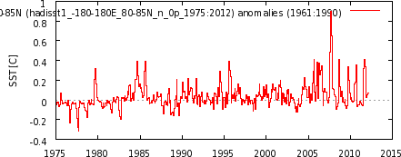
Land surface temperature records and sea surface temperature records both show that surface temperatures have warmed since 1901, Figure 10, with the land surface temperatures mimicking and exaggerating the variations in sea surface temperature—as they should.
Figure 10
But as we can see in Figure 11, the land surface temperatures have warmed much more rapidly than sea surface temperatures in recent decades.

Figure 11
Let’s consider for a few moments that exaggerated warming of land surface temperatures that occurred in recent decades. We understand that the sea surface temperature data is biased toward being a Southern Hemisphere dataset, because the surface area of the Southern Hemisphere oceans is 1.4 times greater than that of the Northern Hemisphere oceans, and we understand that the natural variations in the sea surface temperature anomalies of the Northern Hemisphere oceans are greater than the Southern Hemisphere. The variations in the Northern Hemisphere sea surface temperatures include the Atlantic Multidecadal Oscillation (AMO) in the North Atlantic and an unnamed mode of multidecadal variability in the North Pacific [not the PDO] that appears to have a frequency and magnitude similar to the AMO, though they’re slightly out of synch. (See the discussion under the heading of PACIFIC DECADAL VARIABILITY toward the end of the post here.) We also understand that the land surface temperature data is greatly biased toward being a Northern Hemisphere dataset, since there’s about 2.2 times more land surface area in the Northern Hemisphere than in the Southern Hemisphere. So, considering the additional land surface area of the Northern Hemisphere and the additional multidecadal variability of the sea surface temperature anomalies there, we would expect some additional natural exaggeration of the land surface temperature data in response to the additional variations in the Northern Hemisphere sea surface temperatures. But how much should be expected? How much of the exaggeration in land surface temperature anomalies occurs naturally or is the result of continuous upward data adjustments?
![an unnamed mode of multidecadal variability in the North Pacific [not the PDO] that appears to have a frequency and magnitude similar to the AMO](http://i56.tinypic.com/t9zhua.jpg)
TIME-SERIES COMPARISONS
Figure 12 is a time-series graph of CRUTEM3 and CRUTEM4 land surface temperature anomalies for the period of January 1975 to December 1992, the first half of term being discussed. The two datasets are so similar for much of the period that it’s difficult to differentiate between the two. As you’ll note, there’s a very slight difference in the linear trends. But if you scroll back up to Figures 1 and 2, there were changes at all latitudes, some of them significant changes. Somehow all of those changes resulted in very little change in the overall global land surface trends with the update from CRUTEM3 to CRUTEM4.

Figure 12
On the other hand, during the period of January 1993 to December 2010, Figure 13, the new and improved CRUTEM4 data has a trend that’s approximately 0.05 deg C/decade higher than the CRUTEM3 data.

Figure 13
To some, 0.05 deg C/decade may not seem like a significant amount, but it changed the years of the record high temperature anomaly. With CRUTEM3, the record year was 1998, but with CRUTEM4, its 2007, with 2010 a close second (not illustrated). Figure 14 illustrates the difference between the two datasets with CRUTEM3 subtracted from CRUTEM4. I’ve also smoothed the difference with a 13-month running-average filter to reduce the noise. Two of the greatest adjustments came during what was once the record year, 1998, and toward the end of datasets, around 2007, just when it was needed to have 2007 as the warmest year.

Figure 14
CLOSING
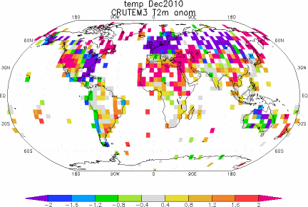
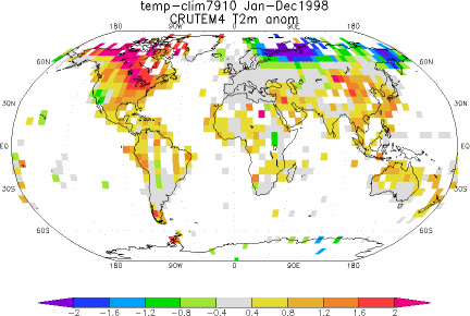
The adjustments shown in Figure 14 might lead some readers to believe the Climate Research Unit went to all that work with the single-minded goal of raising the land surface temperature anomalies after 1998 so that their records could show that global warming continued. Yup. Those adjustments just might lead people to believe that. But maybe we also need to consider the locations of the new 5X5 grids that contain data and the land surface temperature anomaly patterns in 1998 and 2007. Figures 15 and 16 present the CRUTEM3 and CRUTEM4 zonal mean land surface temperature anomalies (not trends) for the years of 1998 and 2007. And Animations 3 and 4 present maps of the temperature anomalies, and grids with and without data, during those two years for the two datasets. I’ll let you decide.

Figure 15 – (1998)
HHHHHHHHHHHHHHHHHHHHHHHHHHHHHHHHHHHHHHHHH

Figure 16 – (2007)
HHHHHHHHHHHHHHHHHHHHHHHHHHHHHHHHHHHHHHHHH

Animation 3 – (1998)
HHHHHHHHHHHHHHHHHHHHHHHHHHHHHHHHHHHHHHHHH

Animation 4 – (2007)
HHHHHHHHHHHHHHHHHHHHHHHHHHHHHHHHHHHHHHHHH
BEFORE YOU JUMP TO CONCLUSIONS
For the next two animations of global temperature anomalies, we’ll need to switch the base years for anomalies to a period that will work with RSS Lower Troposphere Temperature (TLT) anomalies and CRUTEM4, so we’ll use 1979 to 2010. Animations 5 and 6 compare the global CRUTEM4 land surface temperature anomalies to the Remote Sensing Systems (RSS) Lower Troposphere Temperature anomalies for 1998 and 2007. Again, I’ll let you decide.
Animation 5 – (1998 with RSS)
HHHHHHHHHHHHHHHHHHHHHHHHHHHHHHHHHHHHHHHHH

Animation 6 – (2007 with RSS)
HHHHHHHHHHHHHHHHHHHHHHHHHHHHHHHHHHHHHHHHH
MY FIRST BOOK
The IPCC claims that only the rise in anthropogenic greenhouse gases can explain the warming over the past 30 years. Satellite-based sea surface temperature disagrees with the IPCC’s claims. Most, if not all, of the rise in global sea surface temperature is shown to be the result of a natural process called the El Niño-Southern Oscillation, or ENSO. This is discussed in detail in my first book, If the IPCC was Selling Manmade Global Warming as a Product, Would the FTC Stop their deceptive Ads?, which is available in pdf and Kindle editions. A copy of the introduction, table of contents, and closing can be found here.
SOURCES
The monthly CRUTEM3 and CRUTEM4 data used in the time-series and zonal-mean graphs and the maps, including the RSS TLT anomalies, are available through the KNMI Climate Explorer.
The annual CRUTEM4 data used in Figures 10 and 11 is available at the Hadley Centre’s webpage here, specifically the annual data here, and the HADSST3 data is available through the KNMI Climate Explorer here.
R Barker says:
April 28, 2012 at 11:26 am
The models give them the answers they expect. Almost everything else has to be adjusted to fit the preconceived notion.
————
This is exactly what parameter driver model do best. They are very good at predicting the answer the researchers expect to see. If they don’t, the researchers will adjust the parameters
until they do.
This need not be deliberate on the part of the researchers. They simply regard any behavior of the models that doesn’t fit expectations as an error, and make adjustments.
That is why independent, blind testing and certification is a critical part of building reliable models. A necessary step that has been ignored by climate science in their ignorance of computer science.
Climate scientists complain when someone outside of climate science talks about climate science, but ignore the fact that climate science is no qualification to build reliable computer models.
P. Solar says:
April 28, 2012 at 11:46 am
http://judithcurry.com/2012/03/15/on-the-adjustments-to-the-hadsst3-data-set-2/
This article looks at the HadSST3 component of CRUTEM4
Oops, of course I meant the component of HadCRUT
Nicely dissected, Bob
RobRoy says:
April 28, 2012 at 9:27 am
As long as we’re throwing ideas out: Petroleum is not a fossil. It is a geologic deposit. Mass quantities exist. We have only just begun discovering it.
—
Over time, CO2 from the atmosphere collects at the bottom of the ocean as limestone. This is carried into the interior of the planet by subduction, along with water. The heat and pressure within the earth in the presence of iron convert the limestone to iron rich rock, releasing hydrocarbons as a by product. The lighter hydrocarbons percolate to the surface, where they are occasionally trapped by rock formations allowing for efficient harvesting by humans.
Iron is plentiful in the core of the planets and sun because it is dense, and iron is the stable product of hydrogen fusion. Over time as fusion continues, the core of stars should fill with iron, but that is the subject of another debate.
from wikipedia:
The fusion of two nuclei with lower masses than iron (which, along with nickel, has the largest binding energy per nucleon) generally releases energy, while the fusion of nuclei heavier than iron absorbs energy.
It is uncanny how each advance in climate science finds more warming and polar amplification.
(And how the global sea ice area is unimpressed by it. Don’t they adjust the satellite photographs, one wonders? Maybe that will take another breakthrough in Post Normal Science.)
Paul,
which of the JapaneseSeaLevel is the NPI?
Thank you Bob for all this work.
Since the satellite data became available, I rely upon it almost entirely and tend to ignore the surface thermometry data, since it is defective on many fronts.
Does anyone have a plotted comparison of UAH LT and the latest HadCRUT4 (or similar) anomalies since 1979? All my previous stuff is dated, ending circa 2008 and using Hadcrut3
I also recall that UAH changed to a 30-year baseline recently.
I’ve been trying to calculate the global average temperature of our house. It seems to be biassed by the cooktop, oven, gas water heater, room heaters and refrigerator. Somehow “global average temperature” seem a tad silly.
A quick read of the CRUTEM4 document turns up other matters not covered by BT, here are a couple: (1) About a third of the pre-1895 temperature records were discarded if there was a “step” discontinuity in that year. The effect (predictably) is to lower Earth’s temperature by 0.15C from 1895 back to the dawn of time. So this is predicated on the assumption that 1894 temps should be even with 1895. If in fact 1894 was a bit warmer, then all the stations showing that are biffed out — which is basically what CRU has done. This should not have passed peer review. (2) Additional Russian station data were gained through “personal contacts”, but the data has both systematically offset stations (without specifying in which direction) and random offset data. The random offsets were accounted for and processed, the systematically offset stations were assumed to have been offset by the Russians, even though the Russians denied it!! (because they did not confirm it as they had confirmed the random artifacts). I would have jumped all over this, had I been a reviewer.
Mr Berple. Yes, I understand that when a star’s fusion of matter builds that matter up to Fe It,s supernova time and all matter with a atomic number higher than Fe is created in that conflagration.. Very interesting stuff about the limestone reacting with iron (molten, I presume) to form hydrocarbons
.Any chemists on board to confirm this?
What’s the problem?
http://www.woodfortrees.org/plot/hadsst2gl/from:1975/mean:12/plot/crutem4vgl/from:1975/mean:12/offset:-0.1/scale:0.5/plot/uah/from:1975/mean:12/scale:0.6/offset:0.2
bob the correct way to compare the land to sst is to compute the land sea contrast.
it is roughly constant at 1.6.
@ferd berple says:
>Over the past 12 hours the temperature here has gone up 10C.
Heh heh…yeah that’s how it is over there. They had a killer winter in the city this year. Usually the coldest night is -35 to -40. This year, no such luck as it hit -44 and was -40 or colder for 8 days. The forecast is -1 C tonight and 27 during the day on Thursday. Welcome to a dry climate.
As for this post, Seems Anthony’s work surveying the stations showed what this story shows, unreliable haphazard data collecting. This iffy data with all the assumptions and disagreements, can’t be “adjusted” into correctness.
Attention government action zealots, this is more proof that prudence would dictate waiting for satellite data to accumulate for some years before any action.
.
I heave a great sigh as I ask this question, but here goes anyway. When I was taking my university statistics classes, we did a lot of analysis of data sets (obviously). However, none of the statistical operations we executed CHANGED THE DATA in any way; they just exposed relationships between the data from different perspectives.
Why, then, the insistence on “adjusting” the raw data from the field? Put into public opinion poll terms, it seems as though after they ask 1200 people all the poll questions, the pollsters would then take all the data about the people answering the questions to “adjust” the result: “Oh, this guy was a white, 65-year-old urbanite Democrat with a bachelor’s degree — he answered that question in a more liberal manner than an “average” guy would, so we’ll change his response from ‘Love the Affordable Care Act’ to ‘Like the Affordable Care Act very much.’ That’ll put him more in line with the ‘average’ answer to that question.”
That is a silly version of things, but I don’t yet understand why the raw temperature readings from Bumfuca, WV or Times Square, NY need to be “adjusted” for anything. The temperature there at that time and date are what they were, so why change them — unless there’s a known issue like a replacement thermometer was known to read 1 F higher than the thermometer it replaced. Otherwise, I don’t get it.
for the deepest significance, calculate the average telephone number in the northern hemisphere.
more meaning, less adjustment!
Hottest years 1-5 for the following data sets.
NASA GISS 2010 2005 2007 1998 2009
CRUTEM 3 1998 2010 2005 2003 2002
CRUTEM 4 2007 2010 2005 1998 2006
So the hottest year is????????
jaschrumpf
I can’t find Bumfuca, WV on Google Maps.Is it very small?
It might be interesting to note where the Russians are burning off the flares from their oilfields by the billions of cubic meters.
Kasuha says: “Personally I think CRUTEM4 is result of really meticulous work and it is much higher quality than CRUTEM3 was…”
My concern, Kasuha, is the continued adjustments to the raw data. If we look at the adjustments NOAA/NCDC makes to its USHCN data…
http://www.ncdc.noaa.gov/img/climate/research/ushcn/ts.ushcn_anom25_diffs_urb-raw_pg.gif
…and if we assume the rest of the land surface temperature data globally has the same adjustments, then the long-term difference between sea surface temperature anomalies and land surface temperature anomalies shown in Figure 11 above pretty much disappears.
Lance Wallace says: “Visually, it seems as though the additional stations in Russia (cold in 1998, warm in 2007) caused much of the [desired?] 2007 increase in CRUTEM4. Is that a correct conclusion, Bob?”
It appears to have had an effect. But so did the changes in the Southern Hemisphere.
http://i45.tinypic.com/2ngya1e.jpg
.
Allan MacRae says: “Does anyone have a plotted comparison of UAH LT and the latest HadCRUT4 (or similar) anomalies since 1979? All my previous stuff is dated, ending circa 2008 and using Hadcrut3”
I haven’t gotten around to comparing the HadCRUT4 data primarily because it isn’t on the KNMI Climate Explorer yet.
Steven Mosher says: “bob the correct way to compare the land to sst is to compute the land sea contrast.
“it is roughly constant at 1.6.”
And upon what are you basing the constant, Steven?
lgl says:
April 28, 2012 at 1:55 pm
“What’s the problem?
http://www.woodfortrees.org/plot/hadsst2gl/from:1975/mean:12/plot/crutem4vgl/from:1975/mean:12/offset:-0.1/scale:0.5/plot/uah/from:1975/mean:12/scale:0.6/offset:0.2
”
The problem is that you had to use fudge factors to align the series.
jaschrumpf says:
April 28, 2012 at 2:16 pm
When I was taking my university statistics classes…
————
Well, you’ve heard of frequentist statistics, and you’ve heard of Bayesian statistics, this is the new Faustian statistics.
Clearly this is a case of fiddling it until they get the answer they wanted. The rest is noise, pun intended… 😉