Note: I’m blogging this from Atlanta, where I am at the TWC Pioneers reunion. Bob was kind enough to provide this post so I can relax a bit (though I think I’ll chase a NOAA USHCN weather station today anyway). His figure 10 (below) is interesting, his figure 11 even more so. – Anthony

Guest post by Bob Tisdale
With the recent release of the CRUTEM4 data came the expected two-sided discussion (argument) about the changes from the earlier version of the dataset, CRUTEM3. One side claimed the adjustments were needed, while the other side protested the increase in global surface temperature anomalies. There were also differences of opinion about where the adjustments were made. Some claimed the added Arctic surface stations were the sole contributors to the trend, and others countered that the adjustments and dataset additions impacted data globally.
Who was right about the locations of the additions and adjustments? And when did the adjustments and additions have the greatest impact in recent decades?
The changes impacted the land surface temperature anomaly data globally. The Jones et al (2012) paper Hemispheric and large-scale land surface air temperature variations: An extensive revision and an update to 2010 discussed them in detail.
To illustrate the answer those questions in ways not presented in the paper, we’ll look at the CRUTEM3 and CRUTEM4 land surface temperature anomaly data from January 1975 to the end of the CRUTEM4 data in December 2010. That period represents the late 20thCentury warming period as it continues to present, and it’s also 36 years long so we can divide the data into two equal 18-year periods. And we’ll compare the trends of the two datasets on time series and zonal-mean (latitudinal) bases. Let’s start with the trends for the two periods on zonal mean bases just get an idea of where around the globe those changes took place.
TRENDS ON ZONAL MEAN BASES
The trends of the two datasets from the beginning of the recent warming period (January 1975) to December 1992, and the differences in the trends, are shown Figures 1 and 2. The linear trends were determined at each 5 degree latitude band and plotted in centered 5 degree increments, from 55S to 85N. (Note: The Climate Research Unit [CRU] of the University of East Anglia does present Antarctic land surface temperature anomaly data, but it is sporadic and would require me to infill some missing data for the trend analyses, so I excluded the Antarctic data in the zonal mean graphs, and only those graphs. All data is included in the global time-series graphs.) To calculate the differences, the trend of CRUTEM3 at each 5 degree latitude band was subtracted from the corresponding CRUTEM4 trend. Over this period of 1975-1992, compared to CRUTEM3, the new and improved CRUTEM4 land surface temperature anomaly data has higher linear trends in the Northern Hemisphere from about 35N to 75N, but lower trends between 10S and 35N, overlooking that little blip about 27N. CRUTEM3 also has significantly higher trends than the updated CRUTEM4 north of 75N.

Figure 1
HHHHHHHHHHHHHHHHHHHHHHHHHHHHHHHHHHHHHHHHH

Figure 2
A few things to keep in mind: In a few of the zonal-mean graphs, there are major differences between the trends of the CRUTEM3 and CRUTEM4 data at the latitude of 82.5N. But the percentage of land at that latitude is minimal, only about 12%, the rest being ocean. (And, yes, there is sea surface temperature data at that latitude, even more so with a satellite-based sea surface temperature dataset.) So a major correction there doesn’t have a major impact on global surface temperature anomalies when the CRUTEM3(4) data is combined with HADSST2(3) data to form HadCRUT3(4). (High temperature anomalies simply look impressive at that latitude on maps that blow the Arctic out of proportion.) The zonal mean graphs of the land surface temperature linear trends in this post are also not weighted by latitude; corrections at low latitudes have a much greater impact on global temperatures than at high latitudes. And, of course, the CRUTEM data only represents land surface temperatures, but the oceans cover a much greater portion of the surface of the globe. Figure 3 compares the percentages of land and ocean surface area from 90S to 90N on a latitudinal basis, where the surface area percentages have also been weighted by latitude. The percentages of land surface area in 5 degree latitude bands were determined using a land mask calculator at the KNMI Climate Explorer.

Figure 3
Before we compare the trends of the two datasets during the second period, I wanted to compare the trends of 1975-1992 and 1993-2010. We could use either dataset for this, so I’ve used the newer CRUTEM4. Refer to Figure 4. The biggest difference in the trends of the two periods is the absence of the exaggerated warming in the Arctic during the early period of 1975 to 1992. That is, there’s little polar amplification during that period. Of course, you ask yourself, why? The first thing that comes to mind is the eruption of Mount Pinatubo, but I prepared a few more trend graphs on zonal mean bases that ended before and after 1992 (started in 1975) and the polar amplification was still absent for a few years before and after that volcanic eruption. (I have not presented those additional graphs.) What caused the shift toward polar amplification in the land surface temperature data during the period after 1992? Maybe a reader who’s studied the Arctic can fill us in. But we’re getting sidetracked.

Figure 4
Figures 5 and 6 compare CRUTEM3 and CRUTEM4 trends during the period of 1993 to 2010. The CRUTEM4 trends are noticeably higher than CRUTEM3 in the Southern Hemisphere from 40S to 10S, and they are significantly higher in the Northern Hemisphere, with the difference in trends peaking at the latitude band of 70N-75N.

Figure 5
HHHHHHHHHHHHHHHHHHHHHHHHHHHHHHHHHHHHHHHHH

Figure 6
Figure 7 compares the differences in trends between CRUTEM3 and CRUTEM4 for the two periods of 1975-1992 and 1993-2010. Not too surprisingly, the additions and adjustments to CRUTEM4 from 1993-2010 had a greater impact than during the earlier period.

Figure 7
A QUICK LOOK AT LONG-TERM TRENDS
For those interested, Figure 8 presents the same CRUTEM3 and CRUTEM4 trends comparison on a zonal mean basis, but with the data starting in 1900. I thought many would be interested to see that the CRUTEM datasets showed no trend since 1900 just north of the equator (0-5N). I find it interesting because there’s also been no trend in NINO3.4 sea surface temperature anomalies (an El Niño-Southern Oscillation index, with the coordinates of 5S-5N, 170W-120W) over that period, too, based on HADISST data. Just a curiosity that I’ve never seen presented before.

Figure 8
THE NUMBER OF STATIONS
There was a step decrease in the early 1990s in the number of Northern Hemisphere surface stations used in CRUTEM3. That station dropout had come under scrutiny in recent years, with some analyses suggesting that the cutback in the number of stations was, in part, responsible for the increased warming since that time. That drop in surface station quantity was addressed in Jones et al (2012) toward the beginning of the paper. It seems as though they made an effort to put that complaint to rest with their discussion of the increased number of stations and their Figure 1, presented here as Figure 9. They eliminated the sudden dropout of stations…and, to contradict the naysayers, when they added the surface stations, the surface temperature trends increased.

Figure 9
GIF ANIMATIONS OF MAPS SHOWING ADDITIONAL GRID COVERAGE
CRU definitely added data in the Arctic; see Animation 1, which presents the grids covered and color-coded temperature anomalies for CRUTEM3 and CRUTEM4 in the Arctic.

Animation 1
But they also added data elsewhere globally, as shown in Animation 2.
Animation 2
A DISCUSSION ABOUT SEA SURFACE AND LAND SURFACE TEMPERATURES
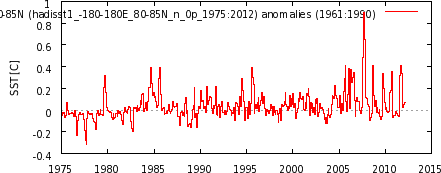
Land surface temperature records and sea surface temperature records both show that surface temperatures have warmed since 1901, Figure 10, with the land surface temperatures mimicking and exaggerating the variations in sea surface temperature—as they should.
Figure 10
But as we can see in Figure 11, the land surface temperatures have warmed much more rapidly than sea surface temperatures in recent decades.

Figure 11
Let’s consider for a few moments that exaggerated warming of land surface temperatures that occurred in recent decades. We understand that the sea surface temperature data is biased toward being a Southern Hemisphere dataset, because the surface area of the Southern Hemisphere oceans is 1.4 times greater than that of the Northern Hemisphere oceans, and we understand that the natural variations in the sea surface temperature anomalies of the Northern Hemisphere oceans are greater than the Southern Hemisphere. The variations in the Northern Hemisphere sea surface temperatures include the Atlantic Multidecadal Oscillation (AMO) in the North Atlantic and an unnamed mode of multidecadal variability in the North Pacific [not the PDO] that appears to have a frequency and magnitude similar to the AMO, though they’re slightly out of synch. (See the discussion under the heading of PACIFIC DECADAL VARIABILITY toward the end of the post here.) We also understand that the land surface temperature data is greatly biased toward being a Northern Hemisphere dataset, since there’s about 2.2 times more land surface area in the Northern Hemisphere than in the Southern Hemisphere. So, considering the additional land surface area of the Northern Hemisphere and the additional multidecadal variability of the sea surface temperature anomalies there, we would expect some additional natural exaggeration of the land surface temperature data in response to the additional variations in the Northern Hemisphere sea surface temperatures. But how much should be expected? How much of the exaggeration in land surface temperature anomalies occurs naturally or is the result of continuous upward data adjustments?
![an unnamed mode of multidecadal variability in the North Pacific [not the PDO] that appears to have a frequency and magnitude similar to the AMO](http://i56.tinypic.com/t9zhua.jpg)
TIME-SERIES COMPARISONS
Figure 12 is a time-series graph of CRUTEM3 and CRUTEM4 land surface temperature anomalies for the period of January 1975 to December 1992, the first half of term being discussed. The two datasets are so similar for much of the period that it’s difficult to differentiate between the two. As you’ll note, there’s a very slight difference in the linear trends. But if you scroll back up to Figures 1 and 2, there were changes at all latitudes, some of them significant changes. Somehow all of those changes resulted in very little change in the overall global land surface trends with the update from CRUTEM3 to CRUTEM4.

Figure 12
On the other hand, during the period of January 1993 to December 2010, Figure 13, the new and improved CRUTEM4 data has a trend that’s approximately 0.05 deg C/decade higher than the CRUTEM3 data.

Figure 13
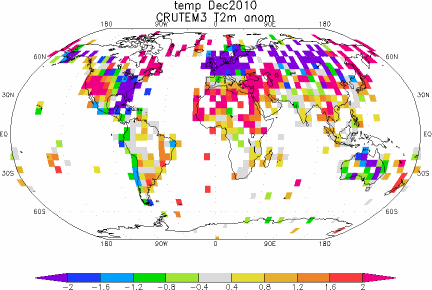
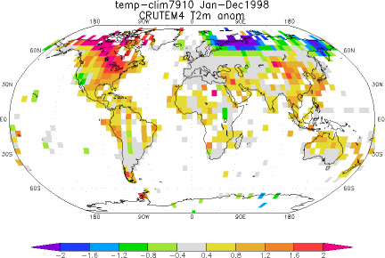
To some, 0.05 deg C/decade may not seem like a significant amount, but it changed the years of the record high temperature anomaly. With CRUTEM3, the record year was 1998, but with CRUTEM4, its 2007, with 2010 a close second (not illustrated). Figure 14 illustrates the difference between the two datasets with CRUTEM3 subtracted from CRUTEM4. I’ve also smoothed the difference with a 13-month running-average filter to reduce the noise. Two of the greatest adjustments came during what was once the record year, 1998, and toward the end of datasets, around 2007, just when it was needed to have 2007 as the warmest year.

Figure 14
CLOSING
The adjustments shown in Figure 14 might lead some readers to believe the Climate Research Unit went to all that work with the single-minded goal of raising the land surface temperature anomalies after 1998 so that their records could show that global warming continued. Yup. Those adjustments just might lead people to believe that. But maybe we also need to consider the locations of the new 5X5 grids that contain data and the land surface temperature anomaly patterns in 1998 and 2007. Figures 15 and 16 present the CRUTEM3 and CRUTEM4 zonal mean land surface temperature anomalies (not trends) for the years of 1998 and 2007. And Animations 3 and 4 present maps of the temperature anomalies, and grids with and without data, during those two years for the two datasets. I’ll let you decide.

Figure 15 – (1998)
HHHHHHHHHHHHHHHHHHHHHHHHHHHHHHHHHHHHHHHHH

Figure 16 – (2007)
HHHHHHHHHHHHHHHHHHHHHHHHHHHHHHHHHHHHHHHHH

Animation 3 – (1998)
HHHHHHHHHHHHHHHHHHHHHHHHHHHHHHHHHHHHHHHHH

Animation 4 – (2007)
HHHHHHHHHHHHHHHHHHHHHHHHHHHHHHHHHHHHHHHHH
BEFORE YOU JUMP TO CONCLUSIONS
For the next two animations of global temperature anomalies, we’ll need to switch the base years for anomalies to a period that will work with RSS Lower Troposphere Temperature (TLT) anomalies and CRUTEM4, so we’ll use 1979 to 2010. Animations 5 and 6 compare the global CRUTEM4 land surface temperature anomalies to the Remote Sensing Systems (RSS) Lower Troposphere Temperature anomalies for 1998 and 2007. Again, I’ll let you decide.
Animation 5 – (1998 with RSS)
HHHHHHHHHHHHHHHHHHHHHHHHHHHHHHHHHHHHHHHHH

Animation 6 – (2007 with RSS)
HHHHHHHHHHHHHHHHHHHHHHHHHHHHHHHHHHHHHHHHH
MY FIRST BOOK
The IPCC claims that only the rise in anthropogenic greenhouse gases can explain the warming over the past 30 years. Satellite-based sea surface temperature disagrees with the IPCC’s claims. Most, if not all, of the rise in global sea surface temperature is shown to be the result of a natural process called the El Niño-Southern Oscillation, or ENSO. This is discussed in detail in my first book, If the IPCC was Selling Manmade Global Warming as a Product, Would the FTC Stop their deceptive Ads?, which is available in pdf and Kindle editions. A copy of the introduction, table of contents, and closing can be found here.
SOURCES
The monthly CRUTEM3 and CRUTEM4 data used in the time-series and zonal-mean graphs and the maps, including the RSS TLT anomalies, are available through the KNMI Climate Explorer.
The annual CRUTEM4 data used in Figures 10 and 11 is available at the Hadley Centre’s webpage here, specifically the annual data here, and the HADSST3 data is available through the KNMI Climate Explorer here.
Stop worrying about crossing the tees and dotting the I s
it is time to spend our efforts on informing the Post Petroleum Paradigm we will leave to our children.
I agree with tom and it appears that natural gas is the, well, “natural” replacement for petroleum.
As long as we’re throwing ideas out: Petroleum is not a fossil. It is a geologic deposit. Mass quantities exist. We have only just begun discovering it.
OK, moshe; I need a little help here.
=========
I think I’ll chase a NOAA USHCN weather station today anyway
Addictive, isn’t it? Maybe Willis can come up with a 12 step program to help us…
Thank you Bob for this really detailed and interesting analysis. Personally I think CRUTEM4 is result of really meticulous work and it is much higher quality than CRUTEM3 was. There is no problem with the data itself, the problem is with interpreting the data.
First thing that must be noticed is that CRUTEM only covers land. You can see it on the maps in the article.
Second thing that must be noticed is that when comparing CRUTEM and satellite data, CRUTEM represents what can be called ‘near-ground temperatures’ while satellite data represent temperature of the mass of the atmosphere. There are some meteorological stations which also measure near-ground temperatures, where the thermometer is placed just about 20 centimeters above the ground. There are very profound differences in what these thermometers record compared to records of thermometers in the standard height. Similar kind of differences is bound to appear between recordings from meteorological stations compared to satellite recordings.
As long as there are already satellite records, then if we are concerned about evolution of global mean of the atmospheric temperature, CRUTEM can hardly be taken as reliable record. Satellite data are the reliable record. CRUTEM gives us overview about evolution of conditions in which people actually live but definitely does not give us global temperature. And of course, CRUTEM can be used as a proxy to the past when satellite records did not exist.
Visually, it seems as though the additional stations in Russia (cold in 1998, warm in 2007) caused much of the [desired?] 2007 increase in CRUTEM4. Is that a correct conclusion, Bob?
http://i40.tinypic.com/16a368w.png
I’ve now developed an analogous metric that’s coherent with NPI at interannual timescales.
Yes, I’d like to see Mosh, or anybody, try to justify that 50% of the historical warming is the result of advancement in our ability to interpret thermometer readings taken in the year 2006.
off topic I know but how do I donate?
[Reply: Along the right sidebar. Scroll down until you see the “Donate” button. ~dbs, mod.]
RobRoy says:
April 28, 2012 at 9:27 am
Yes! If petroleum is from ‘fossils’, why are there seas of ethane on Titan? Did the dinosaurs move there ahead of the asteroid strike 65 mya?
Warming in Russia (Siberia) to 2007 was real. Since then it has started to drop in temperature. It is said that the temperature in Ulaanbaatar (south of Siberia) rose 6 C in 60 years. Not sure how reliable that is but it seems to have gone down lately. Is there a long data set for Ulaanbaatar? It was a well-established centre of learning for centuries. There might be a Reaumur scale or record from Russians going back a long way.
Hey, Paul, how do those oceans make the sun wiggle around so?
===================
Will those CNG ‘filling stations’ for the soccer mom crossovers’ be self service?
Where will all the soccer gear go?
.
The divergence between satellite and thermometer data points to a serious data problem in climate science, which calls into question all decisions based on the data.
The notion that you can reliably extrapolate missing temperature data and receive an accurate view of global temperatures is at the heart of the problem.
Take a picture of the earth. Blank out large portions of the surface. Now use the finest mathematics in the world to redraw the missing information using only the surrounding areas of the picture.
What you will end up with will look nothing like the earth. The exact same thing happens in climate science. The satellites give us a picture of the earth. Climate science then uses an incomplete picture drawn from thermometers to extrapolate a picture of the earth.
No surprise, the thermometer picture looks nothing like the satellite picture. This is exactly what we would expect from our earlier example of drawing the earth by extrapolating and incomplete image.
However, the problem is that climate science insists that the picture drawn by extrapolating the incomplete thermometer data is correct, while at the same time insisting that the more complete picture drawn by satellites is wrong.
This is the illogical nonsense of modern climate science. The problem is that the satellites are not giving them the answer they expect – so the satellites must be wrong. The thermometers are giving them the answer they expect – so the thermometers must be right.
Nowhere do they consider the obvious – the evidence shows the most likely answer is that their expectations are wrong.
Crispin in Waterloo says:
April 28, 2012 at 9:59 am
Warming in Russia (Siberia) to 2007 was real. Since then it has started to drop in temperature. It is said that the temperature in Ulaanbaatar (south of Siberia) rose 6 C in 60 years.
Over the past 12 hours the temperature here has gone up 10C.
@jim, even better: What about all those drive-offs where the soccer moms leave the filling nozzle in the vehicle?
RobRoy and Babsy, I agree 100%.
Babsy, We agree. Oceans of Methane on Titan proves hydrocarbons can be natural geologic formations.
ferd berple says:
The thermometers are giving them the answer they expect
————————————————————-
The models give them the answers they expect. Almost everything else has to be adjusted to fit the preconceived notion.
Please correct me if I’m offbase here:
It appears to me that the differences subsequent to adjustments increase the ranges, i.e. the hot is hotter, the cool, cooler. Also that the differences between land records and satellite measurements are increasing, especially in the extremes. Further, that the changes result not from a weak global changes but strong regional changes.
Can it be that the rise and fall is determined by 80% with nothing and 20% with something? That the global increase is a function of the proportion of small area warming vs small area cooling?
Further, I have wondered if prior adjustments have became untenable over time, and the last 15 years of no-growth in the HADCruT are a reflection of the “corrected” data coming back into line with actual measurements. Also if in GISTemps situation, the adjustments have a systemic flaw in that the adjustments have some reliance on prior corrected temperatures, a circular modification problem.
It seems impossible that “errors” detected and corrected for yesterday need further attention today unless what is done today is a function of happened yesterday, a process that creates a sturdier wall by adding bricks behind it as it adds bricks beneath it. Are the continuing adjustments of the same type, but more numerically, or are they additional factors being considered, possibly considered with different importance factors with time?
In my experience with uncertain outcomes of technical projects, several parameters with slight optimism often become more optimistic as the project develops. They start out reasonably “okay”, but finally the increasing optimism multiplies together to produce overreaching conclusions. Here, are the corrections being applied to individual stations over time displaying this, i.e. if you take a group of local stations that are corrected, and look at their raw vs adjusted temperatures over time, do the adjustments show growth (outside of UHIE, which should DECREASE the final number)?
http://judithcurry.com/2012/03/15/on-the-adjustments-to-the-hadsst3-data-set-2/
This article looks at the HadSST3 component of CRUTEM4
tom says:
April 28, 2012 at 8:36 am
“Stop worrying about crossing the tees and dotting the I s
it is time to spend our efforts on informing the Post Petroleum Paradigm we will leave to our children.”
Uh, yeah somebody think of the chilrren.
Global annual enrgy consumption is 457 EJ, known reserves of all energy raw materials are 39,794 EJ and resources are 613,180 EJ, that gives a relationship of 1 to 87 to 1342.
This doesn’t include Uranium or Thorium in seawater and it doesn’t include anything renewable.
German study.
http://www.bgr.bund.de/DE/Themen/Energie/Downloads/Energiestudie-Kurzstudie2010.pdf?__blob=publicationFile&v=3
Keep in mind that with rising prizes some of the “resources” automatically become “reserves”. The distinction is determined by economic feasibility of production.
kim (April 28, 2012 at 9:59 am) asked:
“Hey, Paul, how do those oceans make the sun wiggle around so?
===================”
I figured it out this morning kim …but since I work close to 80 hours per week, you might have to wait decades before I’ll have time to satisfy the administrative/editorial/cosmetic demands of establishment hoop-masters ( http://en.wikipedia.org/wiki/Peter_Principle ), who have exponentially increased the manufacture of red tape in a last-ditch effort to preserve the existing hierarchy. Cheers!
_Jim says:
April 28, 2012 at 10:09 am
“Will those CNG ‘filling stations’ for the soccer mom crossovers’ be self service?
Where will all the soccer gear go?”
CNG and LPG stations are self service. You have to screw a nozzle on your tank’s inlet, and keep a button on the pump pressed as long as it fills. It switches off automatically when max pressure is detected. Foolproof technology. If you manage to drive off while it’s still screwed on your tank you will just rip out the hose but at that moment it’s not under pressure.