I have been asked to present this for review by readers here, and to solicit critical comments for the purpose of improving the presentation. Moderators please remove any off-topic comments and commenters please stick to the issues of review. – Anthony
[…]
Now, about the climate science:
‘‘It’s unchallengeable that CO2 traps heat and warms the Earth and that burning fossil fuels shoves billions of tonnes of CO2 into the atmosphere,”
“But where you can get challenges is on the speed of change.”
— Professor John Beddington
The British government’s chief scientific adviser, John Beddington, has called for more openness in the global warming debate. He said climate scientists should be less hostile to sceptics who questioned man-made global warming. He condemned scientists who refused to publish the data underpinning their reports. He also said public confidence in climate science would be improved if there were more openness about its uncertainties, even if that meant admitting that sceptics had been right on some hotly disputed issues.
“I don’t think it’s healthy to dismiss proper scepticism. Science grows and improves in the light of criticism. There is a fundamental uncertainty about climate change prediction that can’t be changed.” [As reported in The Australian“i. Other reports were similar.]
I would like [the two speakers] to address the specific issue of the deleted data in reconstructed temperature graphs.
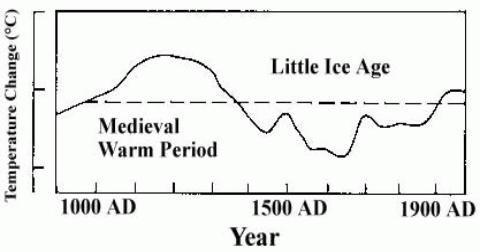
The issue is as follows: In their third report (“TAR”), the IPCC published the following graphii:

This is a graph of several temperature proxies, with the instrumental temperature record from around 1900 added. What it shows is that temperatures had been declining fairly steadily for nearly 1000 years, but then suddenly shot up in the 20th century.
It has now been discovered that some of the data series had been truncated in the graph. The result of these truncations was to make the data series look more consistent and therefore convincing. (NB. I make no statement about intent.). If the data series had not been truncated, the end result would have been very differentiii:

The two red segments are the truncated data. These two segments and the dotted curve connecting them are a single data series “Briffa-2000”1. Note that the first downward segment of the black graph (instrumental temperature) has also been deleted in the version used by the IPCC.
The extreme divergence between the “Briffa-2000” proxy and the instrumental temperature record shows that this proxy is completely unreliable (the “divergence problem”). To delete segments from the graph – especially without a prominent explanation – is bad scientific practice. Contrary to claims by various climate scientists, the deletions were not disclosed in the TAR. Nor was the “divergence problem” discussediv. As Professor Richard A Muller of University of California, Berkeley, has said “You’re Not Allowed to Do This in Science“v.
Was the “Briffa-2000” data series the only unreliable proxy data series? It seems not. Phil Jones’ 1999 “Climategate” email indicated that other proxy data series had been truncated to “hide the decline“vi.
It has been argued that this “hide the decline” graph (aka the hockey-stick) is not important in the overall scheme of things, ie. in climate science as a whole. Gavin Schmidt put it this way on RealClimate.com, “if cherry-picked out-of-context phrases from stolen personal emails is the only response to the weight of the scientific evidence for the human influence on climate change, then there probably isn’t much to it.“vii.
Unfortunately, the “hide the decline” graph is much more important than that. In the fourth IPCC report (“AR4”), the effect of solar variation on climate is discussed. Theories such as Henrik Svensmark’s are dismissed as “controversial” and then ignoredviii. Consequently, solar variation is included in the climate models purely as the direct climate forcing from total solar irradiation (TSI). Since variations in TSI are quite small, in percentage terms, the climate models allow only for small temperature changes from TSI changes.
Such small temperature changes are quite consistent with the “hide the decline” graph, because that graph shows only small temperature changes prior to the 20th century. If the IPCC had persisted with their original estimate of earlier temperatureix …

… then the climate models would have been unable to replicate the temperature changes in either the MWP or the LIA, because the total effect of all natural factors (including TSI variation) allowed for in the models is far too small. If the climate models were unable to replicate the MWP and LIA, then they would lack credibility, and any scientific conclusions based on the models could be disregarded.
But it gets worse.
With the “hide the decline” graph representing global temperature, the climate modellers had only one factor which could give a sudden upward movement in temperature in the 20th century – CO2. This was the only factor whose pattern changed significantly then and only then. The IPCC analysis is based on “equilibrium climate sensitivity” (ECS), which is defined as the equilibrium change in the annual mean global surface temperature following a doubling of the atmospheric equivalent carbon dioxide concentrationx. The way ECS was arrived at was to map the 20th-century temperature rise to the increase in CO2 concentration : “Estimates of the climate sensitivity are now better constrained by observations.“xi.
The IPCC and the climate modellers still had a problem: the scientific studies on CO2, and the physical mechanism by which it warmed the atmosphere, gave an ECS which was far too low. But the discrepancy was explained by climate feedbacks. A climate feedback is defined as follows: “An interaction mechanism between processes in the climate system is called a climate feedback when the result of an initial process triggers changes in a second process that in turn influences the initial one. A positive feedback intensifies the original process, and a negative feedback reduces it.“xii
This leads us to clouds. The IPCC state repeatedly that they do not understand clouds, and that clouds are a major source of uncertainty. For example: “Large uncertainties remain about how clouds might respond to global climate change.“xiii There are many statements along these lines in the IPCC report. Now simple logic would lead one to think that clouds would be a negative feedback:- as CO2 warms the oceans, the oceans release more water vapour, which forms clouds, which have a net cooling effect (“In the current climate, clouds exert a cooling effect on climate (the global mean CRF [cloud radiative forcing] is negative).“xiv).
But the IPCC report claims that clouds are a massive positive feedback: “Using feedback parameters from Figure 8.14, it can be estimated that in the presence of water vapour, lapse rate and surface albedo feedbacks, but in the absence of cloud feedbacks, current GCMs would predict a climate sensitivity (±1 standard deviation) of roughly 1.9°C ± 0.15°C (ignoring spread from radiative forcing differences). The mean and standard deviation of climate sensitivity estimates derived from current GCMs are larger (3.2°C ± 0.7°C) essentially because the GCMs all predict a positive cloud feedback (Figure 8.14) but strongly disagree on its magnitude.“xv.
The IPCC provide no mechanism, no scientific paper, to support this claim. It comes in some unspecified way from the climate models themselves, yet it is acknowledged that the models “strongly disagree on its magnitude“.
So, to sum up, the situation is that the “hide the decline” graph leads to nearly all of the 20th-century warming being attributed to CO2, thanks to a factor (clouds) which is not understood, is not explained, and comes from computer models which strongly disagree with each other. The inevitable conclusion is that without the “hide the decline” graph, the clouds “feedback” as described in the IPCC report would not have existed.
Now, returning to Gavin Schmidt’s comment. When he talks about “the weight of the scientific evidence for the human influence on climate change“, a very large part of that evidence is the IPCC report and everything that references it. But as I have just shown, the IPCC report itself relies for its credibility on the “hide the decline” graph. In other words, the entire structure of mainstream climate science depends on a single work which is itself based on methods which are “not allowed” in science.
So of course there are, in Professor Beddington’s words, challenges on the speed of change. If the MWP, which was of course completely natural, was about as warm as today, then it is entirely reasonable to suppose that natural factors are largely responsible for today’s warm temperatures too, and that the speed of change from CO2 has been grossly overstated by the IPCC.
Mike Jonas
References:
1 There are number of different versions of this graph, in the various IPCC reports and elsewhere, where different versions of the proxy data have been used.
viii http://www.ipcc.ch/pdf/assessment-report/ar4/wg1/ar4-wg1-chapter2.pdf para 2.7.1.3
ix http://climateaudit.files.wordpress.com/2008/05/lambh23.jpg (I could not provide a link to this graph in an IPCC web page, because earlier IPCC reports are no longer linked there. http://www.ipcc.ch/publications_and_data/publications_and_data_reports.shtml)
xi http://www.ipcc.ch/pdf/assessment-report/ar4/wg1/ar4-wg1-chapter9.pdf Executive Summary.
xiii http://www.ipcc.ch/pdf/assessment-report/ar4/wg1/ar4-wg1-ts.pdf para TS.6.4.2
Here’s an idea that I hope some middle-of-the-roaders would advocate initially, and that would later be taken up by, and administered under the aegis of, mainstream scientific journals and societies: A questionnaire to get the main participants in the climate controversy “on the record” (the way the signers of the Copenhagen Declaration did, in part) as to what they think is happening, why it’shappening, and what we ought to do about it. The following might be employed:
1. A detailed questionnaire asking their opinions on a hundred contested matters of fact and opinion.
2. Policy prescriptions. (E.g., Wind? Nuclear? How much of each, if you have an opinion. Carbon tax?)
3. Predictions about temperature, sea level, etc. at various time scales under various levels of CO2 and policy responses.
It’s important that these questionnaires not demand responses to “advanced” questions (those should be optional), because these might be stumbling blocks to those responding. Further, each question should allow the responder to indicate his level of confidence in his answer, on a one-to-ten scale. That way he can weigh in on topics outside his specialty without nailing his flag to the mast on that matter.
This poll could be refined and rerun every three years (say). This would show opinion-trends, which future sociologists also would appreciate. Results would be split out by the responders’ specialty, which would allow non-specialists to participate without skewing the most relevant results.
In a future age, when sociologists dissect what was going on and why, they will curse our generation for omitting to poll the participants on their beliefs. (I’m assuming nothing worthwhile will be done, which is the way to bet.)
Say!! Sociologists’ Associations should be passing resolutions urging such a project. (Preferably a “massive,” well-funded project.) Take it away! (Advocates (and critics) can quote this freely.)
I wish WUWT would get the ball rolling by starting a thread inviting comment on this idea.
AusieDan: “In the intervening years, the temperature data for the 1930′s has been lowered by very small increments, year by year, until now it is well below current values.”
Very well said. This lowering may have resulted from premature dropping of stations showing undesired trends. Let’s call them the ‘purple’ stations. For a repair we have to wait for results from the BEST project.
davidmhoffer says:
March 27, 2011 at 11:37 pm
R. Gates;
Obviously, there was something wrong with the accuracy of what the tree-rings were showing, and so the data was, quite justifiably truncated. >>>
C’mon sir Gates, you’re really twisting yourself in knots to justify this one. The temperature record runs from about 1880 to current, and based on that they “justifiably”truncated data that didn’t agree with it. Oh, the data with no temp record to verify against for 900 years before that is all OK though, just trust us.
Ooooops, it turns out we truncated some data from back then too. No temp record to justify it, we just decided it was wrong. We knew it was wrong because….well it was either that or WE were wrong, so obviously….
Gimme a break.
____
You really need to read more on this topic before posting such as reply. The “divergence problem” . The truncation of the tree-ring data, which was known to be inaccurate beginning about 1960 was not an “oops” event or arbitrary. There were very solid reasons for eliminating this, addressed in AR4. NOT truncating this data would have been a error. “Hiding the decline”, by truncation was scientifically the correct move. The only “trick” was done by those who tried to make it seem as though this truncation was disnhonest or unfounded.
Re: R. Gages March 27, 9:56 pm
One other point: R. Gates’ second link says…
“Phil Jones’ email is often cited as evidence of an attempt to “hide the decline in global temperatures”. This claim is patently false and demonstrates ignorance of the science discussed.”
While that may certianly be true in some quarters, it is not true for the most part at WattsUpWithThat. The point has been explained quite plainly here that “hide the decline” refers to a decline in temperature data derived from tree growth proxy which contridicts instrumental temperature data.
It is a red herring to toss that charge into the mix here.
PS: Responders should be able to append comments to all their answers. (This is easy with electronic questionnaires.) This again should remove stumbling blocks in the form of questions that were not formulated properly in respondents’ opinions.
Tom Moriarty says:
March 28, 2011 at 9:39 am
Re: R. Gates March 27, 9:56 pm
“Is it possible that the decline post 1960 and the low levels prior to 1550 are both a natural consequence of elevated temperatures?”
____
Absolutely, and it is entirely possible that both diverge for entirely different reasons as well. But in respect to the pre-1550 data, I would think if someone wanted to minimize the warming that this period showed, they would NOT have truncated this data as they did. Using that data would have skewed the entire record downward, which would have made the 20th century even appear warmer. The bottom line is this:
1) Truncating both these periods was scientifically justified
2) AR4 discussed this truncation
3) Truncating this erroneous data due the divergence with all other actual records and proxies was a “trick” only in the sense that it removed a erroneous decline that would have otherwise shown up in the data. Leaving the erroneous decline data in would have benefited the AGW “warmists” in the pre-1550 data (if they “wanted” to show how extraordinary the late 20th century warming was) but it would have benefited the AGW skeptics in the post-1960 data if they wanted to somehow show it was not as warm as all the other data were showing. This entire truncation, and “trick” of hiding the decline was justified, and all true experts in the field knew exactly what was done and why it was happening. The only real issue remains is why the N. latitude tree-ring data diverged so much during these periods of warmth.
steve mosher says:
“Greenland is one place. It is not the globe.”
True, but misleading. There is an enormous amount of evidence showing the MWP and the LIA.
This voluminous evidence contradicts Mann’s treemometer. IMHO, Michael Mann is a complete charlatan who cherry-picks and fabricates data to advance his agenda.
A good template for a handwavy sort of paper pointing up general arguments would be:
Global warming in the twenty-first century: An alternative scenario
James Hansen,*† Makiko Sato,*‡ Reto Ruedy,* Andrew Lacis,* and Valdar Oinas
It may be tosh, but it’s well-arranged, clearly-presented tosh, and it follows a logical progression, making its points clearly and concisely at a level which can be easily understood (or, perhaps, misunderstood) by a lay reader.
I found the above paper to lack certain of those qualities. Yes, the arguments are there, but, even though I sympathise with the general thrust, I would not be convinced by what is written.
JF
Mosh, just for you: http://judithcurry.com/2010/11/26/skeptics-make-your-best-case
jeez says:
March 27, 2011 at 11:36 pm
jeez is a troll peddling a pro-AGW, pro-IPCC snake oil. His claim that all of the science referenced by the IPCC must be addressed is a desperate strategem of a child. If the pro-AGW or pro-IPCC people would publish a short article, ten pages or less, that sets forth their basic theses then they might get a response. Claiming that all the trash and hippie nonsense that the IPCC assembled is like claiming that every fantasy of every buzzed-out Greenie is worth considering.
No, sir, you will not slip into this conversation the “Red Herring” that all of the science referenced by the IPCC is serious science. You will not get in the equally dangerous “Red Herring” that some of the IPCC science is serious. None of it is! It is nothing but hand waving and patched together Greenie wishes.
Not one IPCC scientist has produced one physical hypothesis that could be used to explain and predict the “supposed” forcings in cloud formation that is caused by increasing CO2 concentrations. Yet the IPCC people and the Climategaters claim that there are positive forcings and that they transform a trivial temperature rise into a dangerous rise. Without those physical hypotheses, there is no climate science that can predict a dangerous rise in temperature. You know that. Because I know that you know that, I declare that you are the most evil kind of troll, a cad and a scoundrel who is here to actually disrupt work by climate sceptics. I hope our fair minded readers can learn from this incident.
Sam Parsons,
I think you might be misunderstanding what jeez was saying. And Mike Jonas did ask for criticism, didn’t he?
Leif Svalgaard says: March 28, 2011 at 12:09 am
quote
The extreme divergence between the “Briffa-2000″ proxy and the instrumental temperature record shows that this proxy is completely unreliable (the “divergence problem”).
If the proxy is ‘completely unreliable’, deleting all of it would seem appropriate. Deleting all of Briffa does not change the result significantly, so that seems to be a reasonable thing to do
unquote
That would be like shooting the black swan and claiming that it did not exist. Outliers, anomalies, are what we should be looking for: when things don’t match our expectations, we learn new things. Climate science has form relating to the destruction of Cygnus atratus and I am dubious about the intentions behind the truncation: Google Wigley ‘why the blip’.
There may be, with the graph above, another problem to your proposed solution. Am I right in thinking that two of the lines are approximately the same thing interpreted slightly differently?How many of the lines other than the Briffa ‘failure’ include high latitude tree rings? If Briffa shows anything then it means those lines which share the same data source should also be deleted. Try it and report back — I’d love to know how much is left. I suspect it would be a thermometer line and not much else.
JF
Tom Moriarty says:
March 28, 2011 at 10:30 am
Re: R. Gages March 27, 9:56 pm
One other point: R. Gates’ second link says…
“Phil Jones’ email is often cited as evidence of an attempt to “hide the decline in global temperatures”. This claim is patently false and demonstrates ignorance of the science discussed.”
While that may certianly be true in some quarters, it is not true for the most part at WattsUpWithThat. The point has been explained quite plainly here that “hide the decline” refers to a decline in temperature data derived from tree growth proxy which contridicts instrumental temperature data.
It is a red herring to toss that charge into the mix here.
_____
The issue of “hiding the decline” is completely wrapped up with the issue of truncated data, and certainly needs to be discussed in full context– I hope you would agree with that. The link I gave was for futher discussion of this issue in more depth, and I never accused, nor would I accuse WUWT of handling this issue in any wrongful way, and this should obviously not be seen as my intent. More context is better than less if truth is what we’re after.
Again, I think the most important point is WHY did the N. Latitude tree-ring data diverge so much when temperatures stared to rise (either pre-1550 or post-1960)? This is far more interesting a topic than looking at the actual obvious and scientifically justified need for “hiding the decline” of this proxy data which would have skewed the entire record for these periods. At no point was anyone trying to hide the fact that the truncations occurred, nor trying to hide the reasons why they used the “trick” of truncation.
Julian Flood says:
March 28, 2011 at 11:06 am
Outliers, anomalies, are what we should be looking for: when things don’t match our expectations, we learn new things.
Outliers can only be defined if the data is good. If the data is bad, it should be discarded wholesale.
Let’s keep it nice and simple.
The sun affects the size of the polar vortices whilst internal ocean cycles vary the supply of stored solar energy to the air.
Those two competing forces affect the speed of the water cycle so that the surface air pressure distribution constantly changes to try and maintain balance between solar energy into the system and radiative energy out of the system.
Changes in CO2 make a discrete but imperceptible difference to the natural variations.
The entire AGW theory is based on the coincidence for a short period of time of rising CO2 levels with an upswing in the natural cycle.
Scottish Sceptic says:
March 28, 2011 at 12:41 am
RobB says:
March 28, 2011 at 1:43 am
Richard S Courtney says:
March 28, 2011 at 3:16 am
Each of these gentlepersons nailed the gist of a peer review squarely. Every comment they made should be considered and addressed.
Some of my personal comments:
I wondered why the ellipsis was at the start, which I now presume to have been placed by Anthony to indicate the above writing as an add-on to a larger work. Very confusing in that I find myself wondering just what the context is.
I was completely lost by your introductory comments and quotes. Just exactly where are you going and why? Just exactly where do you shift from historical commentary to factual findings? For that matter, what contribution do the Beddington quotes and corresponding commentary contribute to your points? To my mind they come across as chaff and misdirection. What is more, if any of your intended audience are Beddington fans/opponents you may offend them before they get to the meat of your article. If you are setting the stage for that ending reference back to Beddington, the play is long before you bring him back on stage…
“It has now been discovered that some of the data series had been truncated …” Some? One, two, three, four or more data series? Enough has been written about this that you should be able to be explicit, with references. Don’t mealy mouth facts; leave that to the plaintive out of context criers.
“…truncated…” Given the analysis others have performed on these reconstructions I question your use of the word truncated when referring to this graph construction. The phrasing implies that truncated is all that is possibly wrong with the graphs. Yet you imply with some of your later arguments about the MWP that the data is not all it should be.
I fail to understand why you include a quote from Gavin Schmidt. Sour grapes do not make your paper any better. Yeah, later on in your paper you refer back to Gavin’s remark; why you didn’t put the quote in that paragraph when you needed it is unclear to me. “”It has now been discovered…” I don’t think discovered is the correct wording here. Good honest and hard investigatory work went into identifying all of the missing pieces; discovery makes it sound like an abrupt revelation.
After the MWP commentary section you enter into a series of statements that mix opinion with allusion, rhetoric and occasional facts. Some of the facts are referenced. e.g. , “…the climate
modellersmodelers(sp) had only one factor which could give a sudden upward movement in…” You know this to be a fact or is it just opinion? e.g.2, “The IPCC state repeatedly that they do not understand clouds” They do? The IPCC actually and officially state that they do not understand clouds? Rhetoric. e.g.3, “Large uncertainties remain about how clouds might respond to global climate change.“xiii” – Fact. e.g.4, “There are many statements along these lines” Allusion; turn this statement into facts by identifying the many statements with references.Eliminate opinions and any other subjective commentary unless you identify it as opinion. Minimize allusions and rhetoric and when you do use them back them up with references.
Identify the points you want to leave your audience with and organize your paper to establishing and proving those points.
As others have said; I apologize if the criticisms are blunt and seem harsh. The comments are intended to help identify where the paper needs strengthening. I believe your premise is good and I’m looking forward to seeing your reworked write-up.
Leif Svalgaard says: March 28, 2011 at 11:16 am
quote
“Outliers, anomalies, are what we should be looking for: when things don’t match our expectations, we learn new things.”
Outliers can only be defined if the data is good. If the data is bad, it should be discarded wholesale.
unquote
A Wittgensteinian position with which I can have a certain sympathy. In the case above it would probably leave us with just the thermometer line. Your solution is that of the blind man who kills all swans on the grounds that he cannot tell if they are black or white: better that than planning your whole life on the basis of a lie.
But perhaps you did not mean that much wholesale….
JF
Julian Flood says:
March 28, 2011 at 11:45 am
Your solution is that of the blind man who kills all swans on the grounds that he cannot tell if they are black or white: better that than planning your whole life on the basis of a lie.
Scientists are not blind men, and do try to use all available data that are deemed good enough. This latter point is the crux of the matter. If too much of the data had to be deleted, better delete all of it in order to avoid confirmation bias [‘keeping what fits’].
This reads like a polemic, not a dispassionate analysis. The use of phrases like “but it gets worse” is fine if you are preaching to the converted, but doesn’t add a lot of weight for readers who are looking for a calm and sensible analysis of facts to help them to make up their minds.
I love a good polemic, but mostly they are completely useless for changing people’s minds. As PPs have said, it is not clear who your audience is and what you are trying to achieve.
Agree with Leif that tree rings are either in, or out. People who know about biology seem to think that they should be out. That doesn’t mean that they can’t add to our understanding, but to suggest that they should define it is hard to support. So, either accept tree rings holus bolus, or delete them from the graphs altogether. There is quite likely to be value in constructing separate tree ring graphs/analyses for specified areas, and using them as supplementary data.
Finally, please don’t think that these comments deprecate the work that you are trying to do. But, I think that going back to the basic principles of what you are trying to achieve, and how, would sharpen up and clarify the document a great deal.
Best wishes.
Smokey says:
The planet has been much warmer numerous times in the past. CO2 had nothing to do with it.
Smokey – can you offer a little more info about the source & background of that graph?
Leif Svalgaard – deleting the one proxy record doesn’t quite solve the problem. As I said, “Phil Jones’ 1999 “Climategate” email indicated that other proxy data series had been truncated to “hide the decline[reference]“.“.
The referenced email said “I’ve just completed Mike’s Nature trick of adding in the real temps to each series for the last 20 years (ie from 1981 onwards) amd from 1961 for Keith’s to hide the decline.“. It seems that “each series” had the problem.
Smokey says:
March 28, 2011 at 11:06 am
Sam Parsons,
“I think you might be misunderstanding what jeez was saying. And Mike Jonas did ask for criticism, didn’t he?”
Thanks, Smokey, but what I said needs to be said as the first post on any discussion of what constitutes the science behind AGW today. I don’t think I was wrong that jeez takes seriously a lot of the hippie smoke rings that pass for IPCC science. As we know, that hippie Pachauri has blown more of them over the last few days.
The IPCC central trend on their global temperature Jan 2000-Jan2010 anomaly is 3.9celsius/century. This is based on theoretical computer models not on real data. Compare this with the actual OBSERVED temperature trend from satelites such as the UAH and RSS temperature data streams and one gets 0.3celsius/century, less than one twelfth of the IPCC trend.(SPPI global temperature index). Nothing to worry about.
Bomber_the_Cat – thanks for your detailed comment. One word of criticism is indeed worth 1000 of flattery. I should be able to take all your points on board, though some will take a fair bit of work.
wrt #1-3, the Beddington quote links to the topic of the forum, and my document is for the benefit of the 2 speakers at the forum.
wrt #4 – I have now found the first IPCC report online.
wrt #5 – I’ll use the fact that they don’t, rather that they couldn’t.
wrt #7 – done.
wrt #8 – tidied up, plus a supporting reference.
wrt #9 – I can find no mechanism or scientific paper in the IPCC report, so I’m leaving that in until someone proves me wrong, but I have put in your wording. I need to add attribution, hopefully a general one as per Judith Curry’s submission to US Congress will be ok.
wrt #10-12 – still working on these.
Many thanks, that was very helpful.
@ur momisugly Charles Higley – now that is a really interesting thought! What if all those Victorian chemists analysing bottle of gas were right, and the carbon dioxide concentration really was >400ppm? What is the reference to E Beck? 80 000 bottle samples? Surely that would be a better measure of the preindustrial level than the guessed 280ppm?
Leif Svalgaard says “People complain that data was deleted, but should be happy if even more data is deleted, especially if all of it is deleted.”
Yes. But divergence is not limited to the Briffa series. A good illustration is to take away the instrumental record – the hockey stick shape then disappears as the proxy series do not appear to make that final leap above zero in the instrumental record.
The instrumental record and the proxy series appear to be measuring different things. Is it sensible to keep them firmly apart unless there is a fully justified case (and method) to combine them on purely scientific merit.
Another concern is whether the HS is supposed to be a global assessment, or whether it relates only to the northern hemisphere.