I have been asked to present this for review by readers here, and to solicit critical comments for the purpose of improving the presentation. Moderators please remove any off-topic comments and commenters please stick to the issues of review. – Anthony
[…]
Now, about the climate science:
‘‘It’s unchallengeable that CO2 traps heat and warms the Earth and that burning fossil fuels shoves billions of tonnes of CO2 into the atmosphere,”
“But where you can get challenges is on the speed of change.”
— Professor John Beddington
The British government’s chief scientific adviser, John Beddington, has called for more openness in the global warming debate. He said climate scientists should be less hostile to sceptics who questioned man-made global warming. He condemned scientists who refused to publish the data underpinning their reports. He also said public confidence in climate science would be improved if there were more openness about its uncertainties, even if that meant admitting that sceptics had been right on some hotly disputed issues.
“I don’t think it’s healthy to dismiss proper scepticism. Science grows and improves in the light of criticism. There is a fundamental uncertainty about climate change prediction that can’t be changed.” [As reported in The Australian“i. Other reports were similar.]
I would like [the two speakers] to address the specific issue of the deleted data in reconstructed temperature graphs.
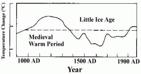
The issue is as follows: In their third report (“TAR”), the IPCC published the following graphii:

This is a graph of several temperature proxies, with the instrumental temperature record from around 1900 added. What it shows is that temperatures had been declining fairly steadily for nearly 1000 years, but then suddenly shot up in the 20th century.
It has now been discovered that some of the data series had been truncated in the graph. The result of these truncations was to make the data series look more consistent and therefore convincing. (NB. I make no statement about intent.). If the data series had not been truncated, the end result would have been very differentiii:

The two red segments are the truncated data. These two segments and the dotted curve connecting them are a single data series “Briffa-2000”1. Note that the first downward segment of the black graph (instrumental temperature) has also been deleted in the version used by the IPCC.
The extreme divergence between the “Briffa-2000” proxy and the instrumental temperature record shows that this proxy is completely unreliable (the “divergence problem”). To delete segments from the graph – especially without a prominent explanation – is bad scientific practice. Contrary to claims by various climate scientists, the deletions were not disclosed in the TAR. Nor was the “divergence problem” discussediv. As Professor Richard A Muller of University of California, Berkeley, has said “You’re Not Allowed to Do This in Science“v.
Was the “Briffa-2000” data series the only unreliable proxy data series? It seems not. Phil Jones’ 1999 “Climategate” email indicated that other proxy data series had been truncated to “hide the decline“vi.
It has been argued that this “hide the decline” graph (aka the hockey-stick) is not important in the overall scheme of things, ie. in climate science as a whole. Gavin Schmidt put it this way on RealClimate.com, “if cherry-picked out-of-context phrases from stolen personal emails is the only response to the weight of the scientific evidence for the human influence on climate change, then there probably isn’t much to it.“vii.
Unfortunately, the “hide the decline” graph is much more important than that. In the fourth IPCC report (“AR4”), the effect of solar variation on climate is discussed. Theories such as Henrik Svensmark’s are dismissed as “controversial” and then ignoredviii. Consequently, solar variation is included in the climate models purely as the direct climate forcing from total solar irradiation (TSI). Since variations in TSI are quite small, in percentage terms, the climate models allow only for small temperature changes from TSI changes.
Such small temperature changes are quite consistent with the “hide the decline” graph, because that graph shows only small temperature changes prior to the 20th century. If the IPCC had persisted with their original estimate of earlier temperatureix …

… then the climate models would have been unable to replicate the temperature changes in either the MWP or the LIA, because the total effect of all natural factors (including TSI variation) allowed for in the models is far too small. If the climate models were unable to replicate the MWP and LIA, then they would lack credibility, and any scientific conclusions based on the models could be disregarded.
But it gets worse.
With the “hide the decline” graph representing global temperature, the climate modellers had only one factor which could give a sudden upward movement in temperature in the 20th century – CO2. This was the only factor whose pattern changed significantly then and only then. The IPCC analysis is based on “equilibrium climate sensitivity” (ECS), which is defined as the equilibrium change in the annual mean global surface temperature following a doubling of the atmospheric equivalent carbon dioxide concentrationx. The way ECS was arrived at was to map the 20th-century temperature rise to the increase in CO2 concentration : “Estimates of the climate sensitivity are now better constrained by observations.“xi.
The IPCC and the climate modellers still had a problem: the scientific studies on CO2, and the physical mechanism by which it warmed the atmosphere, gave an ECS which was far too low. But the discrepancy was explained by climate feedbacks. A climate feedback is defined as follows: “An interaction mechanism between processes in the climate system is called a climate feedback when the result of an initial process triggers changes in a second process that in turn influences the initial one. A positive feedback intensifies the original process, and a negative feedback reduces it.“xii
This leads us to clouds. The IPCC state repeatedly that they do not understand clouds, and that clouds are a major source of uncertainty. For example: “Large uncertainties remain about how clouds might respond to global climate change.“xiii There are many statements along these lines in the IPCC report. Now simple logic would lead one to think that clouds would be a negative feedback:- as CO2 warms the oceans, the oceans release more water vapour, which forms clouds, which have a net cooling effect (“In the current climate, clouds exert a cooling effect on climate (the global mean CRF [cloud radiative forcing] is negative).“xiv).
But the IPCC report claims that clouds are a massive positive feedback: “Using feedback parameters from Figure 8.14, it can be estimated that in the presence of water vapour, lapse rate and surface albedo feedbacks, but in the absence of cloud feedbacks, current GCMs would predict a climate sensitivity (±1 standard deviation) of roughly 1.9°C ± 0.15°C (ignoring spread from radiative forcing differences). The mean and standard deviation of climate sensitivity estimates derived from current GCMs are larger (3.2°C ± 0.7°C) essentially because the GCMs all predict a positive cloud feedback (Figure 8.14) but strongly disagree on its magnitude.“xv.
The IPCC provide no mechanism, no scientific paper, to support this claim. It comes in some unspecified way from the climate models themselves, yet it is acknowledged that the models “strongly disagree on its magnitude“.
So, to sum up, the situation is that the “hide the decline” graph leads to nearly all of the 20th-century warming being attributed to CO2, thanks to a factor (clouds) which is not understood, is not explained, and comes from computer models which strongly disagree with each other. The inevitable conclusion is that without the “hide the decline” graph, the clouds “feedback” as described in the IPCC report would not have existed.
Now, returning to Gavin Schmidt’s comment. When he talks about “the weight of the scientific evidence for the human influence on climate change“, a very large part of that evidence is the IPCC report and everything that references it. But as I have just shown, the IPCC report itself relies for its credibility on the “hide the decline” graph. In other words, the entire structure of mainstream climate science depends on a single work which is itself based on methods which are “not allowed” in science.
So of course there are, in Professor Beddington’s words, challenges on the speed of change. If the MWP, which was of course completely natural, was about as warm as today, then it is entirely reasonable to suppose that natural factors are largely responsible for today’s warm temperatures too, and that the speed of change from CO2 has been grossly overstated by the IPCC.
Mike Jonas
References:
1 There are number of different versions of this graph, in the various IPCC reports and elsewhere, where different versions of the proxy data have been used.
viii http://www.ipcc.ch/pdf/assessment-report/ar4/wg1/ar4-wg1-chapter2.pdf para 2.7.1.3
ix http://climateaudit.files.wordpress.com/2008/05/lambh23.jpg (I could not provide a link to this graph in an IPCC web page, because earlier IPCC reports are no longer linked there. http://www.ipcc.ch/publications_and_data/publications_and_data_reports.shtml)
xi http://www.ipcc.ch/pdf/assessment-report/ar4/wg1/ar4-wg1-chapter9.pdf Executive Summary.
xiii http://www.ipcc.ch/pdf/assessment-report/ar4/wg1/ar4-wg1-ts.pdf para TS.6.4.2
I really do mean this to be constructive, but IMHO this paper is completely unsuitable for formal publication. What is the thesis? Is it about the Briffa shennanagins or is it about cloud feedbacks? I’m sorry but it reads as an amateur effort and in my view it would be laughed out of court by any publication/reviewer. I’m really sorry to be so negative, but it’s probably best to leave this sort of thing to those that know what they’re doing. There is a big difference betwen a blog post and a formal publication. This makes a good blog post although in truth there is little new in it. PS I am a skeptic at heart so this is an honest non politically biased appraisal.
Turning to clouds. These graphs at NASA provide some instructive information.
Make sure you find the right graph as there are quite a few. Look first at global upwelling (ie reflected) solar SW radiation at TOA. Note how initially it decreases over time indicating that more radiation from the sun is reaching the surface. This decrease continues from the mid 70s until there was a change in the late 90s when upwelling SW radiation at TOA started to increase. ie more was reflected away from the earth. Note that this is supported by the opposite being true of downwelling SW radiation observed at the surface. Finally, look at the last graph of albedo and note how albedo reduces until the climate shift in the late 90s and then starts to increase again. These changes in albedo are most likely to come from changes in cloud cover. Albedo is a powerful agent. A mere 1% change could account for all the warming claimed to be from CO2 in the last 40 years. What drives changes in cloud cover? Who knows, but my bet would be on ENSO/PDO/AMO.
‘It is unchallengeable that CO2 traps heat and warms the atmosphere.’ According to Prof Beddington.
Unfortunately Professor this is challengeable because for CO2 to do so violates the laws of thermodynamics.
If he wants to debate this with me he can phone or meet at a convenient place!
Addit.
The point of the skeptical rule of proof at high level, is that all theory may be examined, not dogma.
Mosh said good grief.
A valid statement, models work or they don’t.
The ‘Hockey Stick’, in all its gruesome manifestations http://www.grida.no/climate/ipcc_tar/slides/large/05.24.jpg, has been and remains the foundation of the CAGW hysteria.
The idea that the global temperature stayed within a very narrow band for ~900 years (and an indefinite period before), then suddenly leapt alarmingly in the last ~100 years (coincident with the instrumental record), is indelibly imprinted on believers’ minds — anyone who has engaged with ‘believers’ will experience that.
They are convinced that a 0.7°C rise in 100 years (or 50 years) is unprecedented.
For me (as a non-scientist), the idea that you can collect a selective bundle of highly disparate proxy temperature measurements over a relatively short period, average them and then claim that the result represents anything more than a very crude approximate trend, is preposterous.
It becomes crafty then to knit-in the instrumental record and claim to the public that it represents a valid record.
In any case, the first ostensibly scary upswing could not possibly be attribute to human fossil fuel burning:
http://www.earth-policy.org/images/uploads/graphs_tables/Global_Carbon_Dioxide_Emissions_from_Fossil_Fuel_Burning,_1751-2009.GIF
‘Warmongers’ (including most of the political class i.e. lawyers), have no appreciation of the inchoate nature of climate science.
geronimo says:
March 28, 2011 at 1:04 am
Leif, it doesn’t matter to you that scientists manipulated the data to produce a chart that suited their purpose because the other charts would do the job anyway? Is that what you’re saying?
I’m saying that Briffa’s proxy was deemed to be useless [by the author of this article], hence, deletion of it [the more, the better] should be good. People complain that data was deleted, but should be happy if even more data is deleted, especially if all of it is deleted. It is not the deletion that was bad, but the retention. Since the part that was retained agreed with the other curves, retaining it has no effect, so no harm was done. This does not mean that such practice is good [it isn’t], just that it didn’t matter for the result. The hockey stick would be there, with or without Briffa.
Another excellent piece that should make the establishment climate scientists and politicians stop and think. But I fear that drawing their attention to it would be a waste of time.
I have been engaged in an ongoing exchange of letter about CAGW with my MP. I said that I accepted it was difficult to find refereed sceptical papers on climate change a decade ago, but not now. And I asked why our politicians concerned with the subject were not advised on these. My letter was passed to our Energy and Climate Change Secretary. Here is an excerpt from his reply.
“I would like to assure Dr Stroud that we are committed to engaging with and scrutinising the scientific evidence that is available so that our conclusions are fair and balanced and result in robust policies. Earth’s climate are ongoing and these changes will continue to force the climate system and their impacts worsen as long as we humans continue to force our climate system with our greenhouse gas emissions.”
I have now given up the struggle as it is clear that the politician in charge of our energy policies will never be swayed from his articles of faith in the truth of the alarmist’s view of climate change.
* The author says in response to Scottish Skeptic that this is only part of a document. What document? Which part?
* I don’t know what the contribution of this (part) is meant to be – I have read it all before.
* The thesis that the whole of warmism fails because of a dodgy (part of a) graph is innately implausible and no real case is made. As Leif S. says – delete the damn thing and then what happens?
* References should not be only links but the sources as well.
In a previous life (before retirement) I submitted and reviewed papers. The idea of doing something like this on WUWT seems to me good – even exciting. But if this is to be done then the documents to be reviewed have to be more substantial than the average post on WUWT – you don’t review stuff like this. I would suggest preparing a document in PDF, linking it, then posting the link with an “abstract”. You could even put in equations.
Finally a point about the “original” graph (reference ix). From a historical point of view – and the document is mostly history – this is important. Surely some effort could be made to obtain that document and add a bit more detail?
Mike Jonas:
You ask for peer review of your paper.
I am a clear disbeliever in the AGW hypothesis and, therefore, could be expected to be – and I am – supportive of your thesis; viz.
“If the MWP, which was of course completely natural, was about as warm as today, then it is entirely reasonable to suppose that natural factors are largely responsible for today’s warm temperatures too, and that the speed of change from CO2 has been grossly overstated by the IPCC.”
But, with both respect and regret, my review comments amount to a recommendation to reject your paper for publication.
My following comments explain this recxommendation for rejection.
1. The Importance of the MWP.
The IPCC case for anthropogenic (i.e. man-made) global warming (AGW) does not stand-or-fall on the existence of the MWP. The first two IPCC Reports accepted the MWP existed and each of them included the same (unnumbered) graph that is in your paper and shows the MWP.
The AGW-hypothesis says increased greenhouse gases – notably carbon dioxide (CO2) – in the air raise global temperature, and anthropogenic emissions of carbon dioxide are increasing the carbon dioxide in the air to overwhelm the natural climate system.
The hypothesis is founded on three assumptions: viz
(1) It is assumed that the anthropogenic CO2 emission is the major cause of the increasing atmospheric CO2 concentration
and
(2) It is assumed that the increasing atmospheric CO2 concentration is significantly increasing radiative forcing
and
(3) It is assumed that the increasing radiative forcing will significantly increase mean global temperature.
The immense amount of evidence that the MWP existed and was global indicates nothing about any of these assumptions (and there are reasons to dispute each of them).
The existence of the MWP only has relevance to the AGW-hypothesis in that the MWP reveals a degree of natural global temperature change which must be exceeded before any such change can logically be ascribed to be evidence of a recent anthropogenic effect on global tmperature change.
3. Cloud effects and climate models.
You correctly report that climate models utilise gross assumptions of cloud behaviours which define the performance of the models.
And you correctly say,
“it is acknowledged that the models “strongly disagree on its magnitude” of climate sensitivity to altered atmospheric CO2 concentration.
Indeed, the models each provide different large climate sensitivities that are compensated by large cooling from assumed aerosol effects. See
Courtney RS, E&E (1990)
And
Kiehl JT, GRL (2007)
Kiehl’s paper can be read at
https://www.atmos.washington.edu/twiki/pub/Main/ClimateModelingClass/kiehl_2007GL031383.pdf
And his Figure 2 is especially informative.
Simply, each climate model fails to emulate recent (i.e. since 1900) change to mean global temperature (MGT) but drifts upwards relative to measured MGT. This drift is compensated by an arbitrary fudge factor that is asserted – without any justification – to be an effect of anthropogenic aerosols. As Kiehl’s Figure 2 shows, each model uses a unique ‘fudge factor’ and the range of these ‘fudge factors’ is from -1.41 W/m^2 to -0.60 W/m^2 (i.e. the largest is 2.4 times that of the smallest).
This giant range of ‘fudge factors’ is required because each model assumes a different climate sensitivity which Kiehl’s Figure2 shows to be from 0.800 W/m^2 to 2.01 W/m^2 (i.e. the largest is 2.5 times that of the smallest).
But there is only one planet Earth. Therefore, at most only one of the models applies a correct climate sensitivity (and there is no reason to think any of them applies a correct climate sensitivity).
The magnitude of the MWP as indicated by Briffa, Mann, Bradley, et al. plays no part in this; how could it when their data indicates that the magnitude of the MWP was zero?
The climate sensitivity is chosen in each model as a method to obtain maximum stability of each model and the remaining model drift is compensated by the aerosol ‘fudge factor’ applied to each model.
3. Format of the paper
The above two criticisms warrant rejection of your paper for publication. However, if it were acceptable for publication then it would require substantial alteration to format. It needs
A synopsis
An Introduction
A clear statement of conclusions
Appropriate labelling including titles and numbers to its illustrations.
Please note that I always ask an Editor to forward my review comments together with my name to author’s of papers I review as a method to enable the authors to respond directly to me if they choose. In this case, my name is above.
I regret that my comments are so negative but they are intended to be constructive.
Regards
Richard
Dear Mike,
you write: “but in the absence of cloud feedbacks, current GCMs would predict a climate sensitivity (±1 standard deviation) of roughly 1.9°C ± 0.15°C (ignoring spread from radiative forcing differences). ”
I often wondered how this (and also Nasif calculations) compare to an estimate of the direct temperature effect of CO2:
IPCC states, that the additional direct backradiation for CO2 doubling is about 3.7W/m^2. It would seem to me, that the average global temperature would have to increase according to Stefan-Boltzman (or less for a greybody):
(390W/m^2 / sigma)^0.25=(273.15K+14.84K)
(393.7W/m^2 / sigma)^0.25=(273.15K+15.52K)
http://en.wikipedia.org/wiki/Stefan%E2%80%93Boltzmann_constant
sigma = 5.67E-8 W/(m^2 K^-4)
The difference would be 15.52-14.84=0.68 degrees Celsius.
You might want to be careful about using that old IPCC graph that shows a big medieval warm period. Apparently that graph leaves out recent much warmer decades that dwarf the MWP hump. You don’t want to be accused of “hiding the incline” by using a graph with important data left off the end that gives a misleading impression that recent decades were cooler than the MWP shown in that graph. Apparently if the numbering on the vertical scale had been retained, it would be clear that the MWP shown is not as big as it looks.
The name of the author, Mike Jonas, should be shown at the top of the article, as is conventional.
Quote of the Week.
Mindbuilder,
The planet has been much warmer numerous times in the past. CO2 had nothing to do with it.
The ‘original’ IPCC estimate of global temperature given in this familiar graph (ix) is almost as much a distortion of the evidence as the Hockey Stick, and Jonas should be warned against deferring to it.
In the first place, this graph was presented in the 1st IPCC report with no quantative values, given only as a ‘sketch.’ Moreover, it is based on graphs by H H Lamb estimating temperature variation in but a small region of Europe viz, Central England.
Lamb’s uncorrupted original estimate of earlier temperature in central England are reproduced here:
http://enthusiasmscepticismscience.wordpress.com/global-temperature-graphs/1964_1966_britiansclimateinthepast-unpub-lecture-pub-inchangingclimate/
http://enthusiasmscepticismscience.wordpress.com/global-temperature-graphs/1982_lamb_climatehistoryandthemodernworldp76/
What is of great concern in the use of this fantastic representation of global temperature by sceptics in this controversy is that it simplifies secular global climatic variation against a pile of more recent evidence. What does seem to be evident is that various regions of the world did experience a Medieval Warm Period up to two centuries long, but that the peak of this moderate secular warm trend, in different places and in different proxies, range across 5 centuries or more (ie mostly across the 9th to the 14th centuries).
The proclamations in the IPCC 1st report, and in other sceptical publications, of a universal warming peaking in the 12th century was criticised by later IPCC reports (and in other warmist publications) long before the Hockey Stick appeared. But this criticism hardly impacts on the overall scepticism of AGW, nor on criticism of the methodology of Mann, Biffa and Jones.
Using this old IPCC graph as a rhetorical devise against the IPCC risks it serving to validate the charge that sceptics care more about winning the argument than defending evidence-based science.
If the 1st report (and its suppliment) is to be used rhetorically against the current IPCC position then it is easy enough to pull out so many conclusions that are sceptical and agnostic to AGW claims like those made by the IPCC after the notorious interpolations introduced into the 2nd report in December 1995.
It helps to undertand that as much as it was ignore is as much as the IPCC served to moderate against the extremism of Hansen et al right though until the final scientific review of the 2nd report in the Autumn of 1995. However, let’s be sure to defer to this early work of the IPCC for its science alone, and let’s resist celebrate it for some convenient fantasy.
After a first quick reading, the paper looks very promising. I see no problems with it. I hope to have time to make detailed comments after a thorough reading but my time is very limited. I can say that the kind of effort undertaken in this article is greatly needed at this time. Those who claim that the science is settled/solid/whatever or that there is a consensus must be made to specify what that science is and who that consensus comprises, and all this must be put together in a narrative that describes the evolution of the key claims of climate science to this point. I believe that the science has always been on life support and the consensus is a handful of people with great influence on the IPCC and the peer review process.
R. Gates says:
March 27, 2011 at 9:56 pm
“. . . as everyone knew the truncated N. Latitude tree-ring reconstructions were wrong . . .”
I notice Mr. Gates has not returned to defend his statements, IE: the trees are wrong. Perhaps he will, just to explain on what exactly, his confidence in tree-ring data is based. Clearly there must be something beyond simple coincidence of tree-ring data matching measurements, or tree-ring data matching model predictions for periods before 1960 and pre-1800’s; particularly since there are other proxy methods available.
I can understand why there maybe some push back from the likes of Mann et al, as their life’s work is called into question (at best, apparently a bit dodgy to at worst, a complete waste of time). But what is it that compels the Mr. Gates’ out there to put their faith in tree-ring data for any period?
Just ask’n . . .
-Barn
Jeez – it appears that I may owe you an apology.
I took your earlier post as a very subtle attack by a warmist, particularly your last sentence that went “Much, if not most, of the research is severable from the work of Mann, Briffa, and Jones. I’m not saying it’s valid, just that much of it stands without this single line of evidence.”
I felt that you may be trying to lead the author away on an ever expanding search, which is one of the topics used by Trolls when trying to disrupt serious discussions.
Like you and a number of other commentators, I am not sure of the purpose of this paper. I have assumed that is directed to Dr Beddington, in an attempt to make him stop and think.
Certainly somebody with some weight should challenge him to address the issues that he just glosses over.
I was trying to point to some of the basics, namely:
• Is a rising temperature a net benefit or a net problem?
• Has the temperature really been rising at all?
• Water feedbacks – are they positive or negative?
• Challenge the claim “that CO2 traps heat and warms the Earth ”
If the aim of the paper and its audience is different, then obviously it should be targeted appropriately.
Excessive use of italics and quotation marks around politically charged phrases quickly turned me off. The overall effect is that of bashing the reader repeatedly upside the head with slogans. The article is written with all the subtlety and sensitivity of someone shouting in your ear from a six inch range. I don’t like being hectored, even when I don’t disagree with what is being said. I much prefer articles that present facts and let me think for myself, rather than trying to tell me what to think all the time.
So no – I didn’t like it.
“Alexander K says:
March 28, 2011 at 1:15 am
Two points present themselves from the foregoing discussion and have excited my curiosity;
1 If a proxy technique fails over much of the time for which it is being employed, the results from using that proxy should be discarded completely as being unreliable. Being a ‘little bit unreliable’ is anamolous [sic]to being ‘a little bit pregnant’.”
Well, IMHO one really should note in the report that data was omitted and why. Speaking for myself, I think that ‘It didn’t support our hypothesis’ is not an acceptable reason for omitting data.
“2 The laboratory experiments which determined the ability of carbon dioxide to trap heat were carried out in sealed containers. How do such experiments relate to real-world conditions?”
Arrhenius and others were measuring basic physical properties of carbon dioxide. There is no reason to believe that those properties would be different in the atmosphere than in a sealed container … or in outer space for that matter.
Mindbuilder says:
March 28, 2011 at 3:35 am
I (somewhat) concur with Mindbuilder. Would it be possible to replace the second graph with one that contains more information?
Here’s a good candidate (trend lines added):
http://img705.imageshack.us/i/globaltempgraph.jpg/
Original source:
http://www.longrangeweather.com/global_temperatures.htm
Mike, “One word of criticism is worth 1000 of flattery”, so here goes….
1. The first quote from John Beddington, “It’s unchallengeable that CO2 traps heat and warms the Earth and that burning fossil fuels shoves billions of tonnes of CO2 into the atmosphere,” needs a reference.(The fact that it may be the same as a subsequent reference doesn’t mean that you can omit it here). What is the point of this quotation anyway? It seems irrelevant to the rest of the article.
2. On Beddington’s other quote, “I don’t think it’s healthy to dismiss proper scepticism. Science grows and improves in the light of criticism”, It would have avoided confusion (amongst some other commentators) if you include the date on which he said it ( i.e. January 2010). Some of the commentators above seem to think that Beddington has become more ‘liberal’ recently, rather than the other way around.
3. “I would like [the two speakers] to address the specific issue of the deleted data …” ? This implies a context which we haven’t been given. Who are the two speakers?
4. The graph showing the Medieval Warm Period and the Little Ice Age is fundamental to the point that this article is trying to make. It therefore requires a PROPER reference to its provenance. The reference given, which is basically I can’t find one and its the IPCC’s fault somehow, is not good enough! You need a proper, solid reference for this ‘putative’ graph.
5. “.. the climate models would have been unable to replicate the temperature changes in either the MWP or the LIA” – needs requires some evidence or a reference to some.
7. “The way ECS was arrived at was to map the 20th-century temperature rise to the increase in CO2 concentration “. This is not the only way that ECS has been estimated. Attempts have also been made to estimate it from palaeoclimate data. Also, you make a reference to a very large document at this point. You should provide at least a paragraph number within that reference to limit the search, e.g Section 9.6.1.
8. “Now simple logic would lead one to think that clouds would be a negative feedback…”. Well, it would indeed have to very simple. One man’s simple logic may not be the same as another man’s simple logic. Clouds also have a warming effect at night ,which is a positive feedback. Is there more positive feedback than negative feedback? It is not simple. You need to re-word that sentence.
9. “The IPCC provide no mechanism, no scientific paper, to support this claim. It comes in some unspecified way from the climate models themselves”. Are not the climate models a mechanism for supporting the claim? Would it be more accurate to write something like “There is no evidence for this claim apart from climate models…etc.”. Is it true that there are no scientific papers on this subject?
10. “The inevitable conclusion is that without the “hide the decline” graph, the clouds “feedback” as described in the IPCC report would not have existed”. NO – that is not an inevitable conclusion, nor is it a logical one. The earlier IPCC reports also described cloud feedback and also implied it was positive.
11. “…the entire structure of mainstream climate science depends on a single work which is itself based on methods which are “not allowed” in science”. NO, climate science existed before the ‘hide the decline’ graph and its conclusions were pretty much the same. This is your opinion showing through – it is not logical.
12. “the speed of change from CO2 has been grossly overstated”. I would have taken the opportunity here to question the ‘speed of change’. A fraction of a degree over 120 years? I would point out that changes have happened much faster in the past, for example a change of up to 10 degrees in maybe 10 years coming out of the Younger Dryas during this inter-glacial period.
I also agree with what jeez says March 27, 2011 at 11:36 pm and John Kehr after him.
P.S. The correct reference for your Medieval Warm Period graph is ‘Climate Change, The IPCC Scientific Assessment (1990), Figure 7.1(c), Page 202’.
The article above concentrates on proxies and instrumental data. It might also do well to consider written history and archaeology. For large parts of the globe, especially Europe and China, there is much written evidence to support a Medieval Warm Period that was warmer than it is now. There is also archaeological evidence that indicates that certain crops were grown in places where they are not now viable because it was warmer then than it is now.
As a hobby, I used to study Viking history. The Medieval Warm Period enabled the European settlement of Greenland. When the climate cooled, Greenland was abandoned by them. When the AGW crowd tried to erase the MWP, they turned me from a supporter to an interested and active skeptic.
Here’s a link to a previous WUWT article on history/archaeological based evidence of the MWP. http://wattsupwiththat.com/2009/11/29/the-medieval-warm-period-a-global-phenonmena-unprecedented-warming-or-unprecedented-data-manipulation/
Mr. Jonas, I liked the article very much, I thank you. However, there’s some difficulties I see with the article. As was noted, I don’t know the targeted audience, nor the purpose, so the desired criticism may or may not be relevant. First, while I agree the hockey stick graph is very important to the CAGW cause, I’ve a difficulty believing models are based on the understanding of an oft debunked graphic. I may be wrong, but it seems you’ve failed to make the case for this. I view the hockey stick graph as iconic rather than substantive. While it is referenced, and the alarmism must generally fit the narrative of the graph, I don’t think they’re basing their quasi-science on the graph itself.
Obviously, you have brought to the forefront some very pointed questions which must be answered, particularly, which other graphs truncated the earlier part? Also, how can we model future climate if we can’t quantify the effects of clouds today, much less demonstrate a knowledge of cloud coverage in the future? These are great points! I’d recommend a significant re-wording, with a different “tie-in” with regards to the graph-IPCC-modeling, or strengthen the ties.
Just my 2 cents. Keep up the great work!
James
Might I add that after the comments recently here at WUWT about Professor Tim Flannery – the original Mann “hockey stick” graph is central to Flannerys book “The Weather Makers”. This is emphatically so in that it is located on page 162 of the 332 page book and central to his thesis.
On the next page (164) is this inimitable quote; “With all scenarios they [the model makers] discovered that by 2050 human influences on the climate will have surpassed all natural influences. In other words, there will no more (sic) climatic ‘acts of God’, only human-made climate disasters.” – bracketed insert mine.
Tim Flannery as the new Commissioner for Climate Change is conducting a series of forums around Australia and their web site;
http://climatecommission.gov.au/
does not give any dates or venues for these forums – maybe they don’t want to have any sceptics (deniers 😉 present at these meetings? The first one was held a few days ago and was televised on the ABC and I have to say was sickening in it’s propaganda content. Here is the invite; “This is your opportunity to ask questions and share ideas with the Climate Commissioners and participate in the national conversation on this vital issue.” Anyone who looked half like a climate sceptic was given short shrift and ignored.
R Gates writes:
“Obviously, there was something wrong with the accuracy of what the tree-rings were showing, and so the data was, quite justifiably truncated. ……. It is, in my opinion, very dishonest at best to use the “hide the decline” comment to insinuate that there was any attempt at dishonesty, academic or scientific, but rather, the truncation of the data was valid,”
From a strictly scientific perspective, the issue is less about dishonesty, but rather the fact that if the “accuracy” is wrong from 1960 forward, there is no basis to assume that any of the data are remotely accurate.
Mr. Gates, its would seem that you are making up for yourself the issue for every “skeptics”. Most of us can speak for ourselves. The only act of “dishonesty” that I can see is that the “Alarmists” refuse to acknowledge the real issue being raised scientifically, that the tree-ring proxies may not be appropriate proxies for determining temperature in the present or past. [ie., if they are wrong now, why should anyone believe they were accurate in the past. … a lucky correlation for the first half of the temperature record doesn’t make the rest of it accurate]